Here’s the view of La Niña today:

The Multivariate ENSO Index (MEI)
by Klaus Wolter, NOAA Earth Systems Research Laboratory

El Niño/Southern Oscillation (ENSO) is the most important coupled ocean-atmosphere phenomenon to cause global climate variability on interannual time scales. Here we attempt to monitor ENSO by basing the Multivariate ENSO Index (MEI) on the six main observed variables over the tropical Pacific. These six variables are: sea-level pressure (P), zonal (U) and meridional (V) components of the surface wind, sea surface temperature (S), surface air temperature (A), and total cloudiness fraction of the sky (C). These observations have been collected and published in COADS for many years.
The MEI is computed separately for each of twelve sliding bi-monthly seasons (Dec/Jan, Jan/Feb,…, Nov/Dec). After spatially filtering the individual fields into clusters (Wolter, 1987), the MEI is calculated as the first unrotated Principal Component (PC) of all six observed fields combined. This is accomplished by normalizing the total variance of each field first, and then performing the extraction of the first PC on the co-variance matrix of the combined fields (Wolter and Timlin, 1993). In order to keep the MEI comparable, all seasonal values are standardized with respect to each season and to the 1950-93 reference period. The MEI is extended during the first week of the following month based on near-real time marine ship and buoy observations (courtesy of Diane Stokes at NCEP) summarized into COADS-compatible 2-degree monthly statistics at NOAA-ESRL PSD. Caution should be exercised when interpreting the MEI on a month-to-month basis, since the input data for updates are not as reliable as COADS, and the MEI has been developed mainly for research purposes. Negative values of the MEI represent the cold ENSO phase, a.k.a.La Niña, while positive MEI values represent the warm ENSO phase (El Niño).
You can find the numerical values of the MEI timeseries under this link, and historic ranks under this related link. You are welcome to use any of the figures or data from the MEI websites, but proper acknowledgment would be appreciated. Please refer to the (Wolter and Timlin, 1993, 1998) papers (NOW available online as pdf files!), and/or this webpage.
If you have trouble getting the data, please contact me under (Klaus.Wolter@noaa.gov)

How does the 1998-2000 La Niña event compare against the seven previous biggest La Niña events since 1949? Only strong events (with a peak value of at least -1.2 sigma) are included in this figure. Note that some events last through the full three years shown here (for instance, 54-56), while others revert to “normal” or El Niño conditions by the second or third year (especially in 64-66). The 1998-2000 La Niña does not resemble any previous event in this comparison figure. It started late (about three months later than the previous latest case), and it featured a superimposed annual cycle (peaking around May and troughing around November) that does not match the other events displayed in this figure. However, the weak La Niña period after the 1982-83 El Niño had similar characteristics. Click on the “Discussion” button below to find the comparison of 2010 MEI conditions against several strong La Niña events.

How does the 2002-04 El Niño event compare against the seven previous biggest El Niño events since 1949? Aside from 2002-04, only strong events (with a peak value of at least +1.4 sigma) are included in this figure. The 2002-03 El Niño event peaked below that threshold, with just over +1.2 sigma in early 2003. Overall, I would rank it just barely in the top 10 El Niño events of the last half century. In its evolution, it bears some resemblance to the 1965-67 event (highest temporal correlation), but shared with 1991-93 its reluctance to drop below the zero line once it had run its course. The El Niño event of 2006-07 reached a similar peak as the 2002-03 event, but lacked ‘staying power’, and collapsed in early 2007. The most recent event (2009-10) will replace 2002-03 in this comparison figure by the middle of 2011. Click on the “Discussion” button below to find the comparison of 2010 MEI conditions against several strong La Niña events.

The six loading fields show the correlations between the local anomalies and the MEI time series. Land areas as well as the Atlantic are excluded and flagged in green, while typically noisy regions with no coherent structures and/or lack of data are shown in grey. Each field is denoted by a single capitalized letter and the explained variance for the same field in the Australian corner.
The sea level pressure (P) loadings show the familiar signature of the Southern Oscillation: low pressure anomalies in the west and high pressure anomalies in the east correspond to negative MEI values, or La Niña-like conditions. Consistent with P, U has positive loadings mostly west of the dateline, corresponding to easterly anomalies along the Equator. The meridional wind field (V) features its scattered negative loadings north of the Equator across the eastern Pacific basin, denoting the northward shift of the ITCZ so common during La Niña conditions, juxtaposed with large positive loadings northeast of Australia.
Both sea (S) and air (A) surface temperature fields exhibit the typical ENSO signature of a wedge of positive loadings stretching from the Central and South American coast to the dateline, or cold anomalies during a La Niña event. Negative loadings north and east of Australia contribute significantly to the overall temperature pattern. At the same time, total cloudiness (C) tends to be decreased from the central to the western equatorial Pacific, and decreased close to equatorial South America as well as over Indonesia.
The MEI now stands for 26.1% of the explained variance of all six fields in the tropical Pacific from 30N to 30S, having regained more than 8% since May/June. For comparison, this value is 1.5% lower than the one registered in 1997, attesting to an overall weakening of ENSO variability in the last decade, but not as much as last month or even last August-September, since the large size of the current event is starting to register in this metric. The loading patterns shown here resemble the seasonal composite anomaly fields of Year 0 in Rasmusson and Carpenter (1982).

Consistent with the continued strengthening of La Niña conditions, all of the key anomalies in the MEI component fields that exceed or equal one standard deviation, or one sigma (compare to loadings figure), flag typical La Niña features, while no comparable El Niño-like features reach the opposite one sigma threshold. Significant negative anomalies (coinciding with high positive loadings) denote strong easterly anomalies (U) along the Equator and west of the dateline (up to -2.5 standard deviations), anomalous northerly anomalies (V) north of Indonesia, while both sea surface (S) and air temperature (A) anomalies continue to show -1 to -1.5 standard deviations in the central and eastern tropical Pacific basin. Significant positive anomalies (coinciding with high negative loadings) denote strong positive sea level pressure (P) anomalies (up to +2.5 standard deviations) over the southeastern (sub-)tropical Pacific, very strong westerly (U; up to 3.2 standard deviations) and strong southerly wind anomalies (V; up to 2.2 sigma) over the northeastern tropical Pacific, warm sea surface (S) and air temperature (A) anomalies, the latter up to +2.9 sigma, and increased cloudiness (C) north of Java. Again, all of these cardinal anomalies flag La Niña conditions.
Go to the discussion below for more information on the current situation.
If you prefer to look at anomaly maps without the clustering filter, check out the climate products map room.
Discussion and comparison of recent conditions with historic La Niña events

In the context of recent plunge of the MEI into strong La Niña conditions, this section features a comparison figure with strong La Niña events that all reached at least minus one standard deviations by June-July, and a peak of at least -1.4 sigma over the course of an event. The most recent bigger La Niña events of 1998-2001 and 2007-09 did not qualify, since they either did not reach the required peak anomaly (the first one) or became strong too late in the calendar year (both).
The most recent (August-September) MEI value shows a continued drop from earlier this year, reaching -1.99, or 0.18 sigma below last month’s value, and 3.39 standard deviations below February-March, a record-fast six-month drop for any time of year, while slowing down a bit at the shorter time scales. The most recent MEI rank (lowest) is clearly below the 10%-tile threshold for strong La Niña MEI rankings for this season. One has to go back to July-August 1955 to find lower MEI values for any time of year.
Negative SST anomalies are covering much of the eastern (sub-)tropical Pacific in the latest weekly SST map. Many of these anomalies are in excess of -1C.
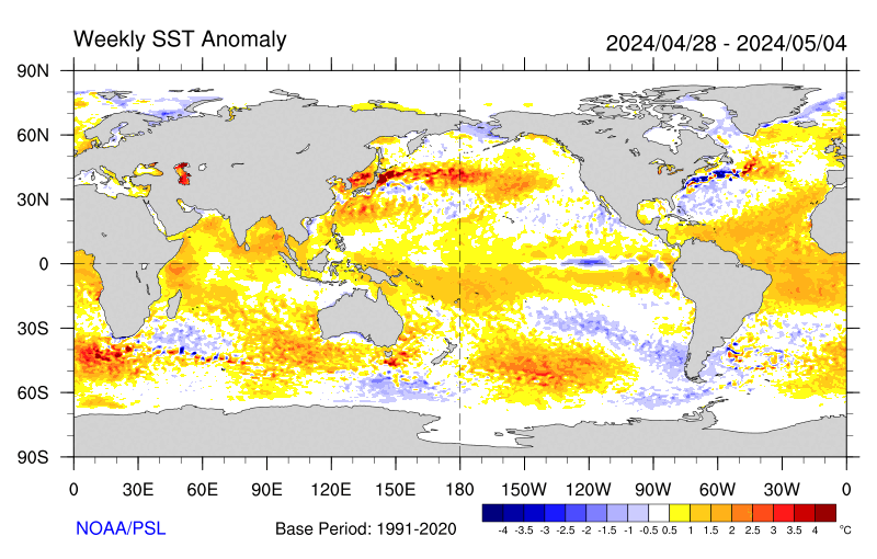
For an alternate interpretation of the current situation, I highly recommend reading the latest NOAA ENSO Advisory which represents the official and most recent Climate Prediction Center opinion on this subject. In its latest update (7 October 2010), La Niña conditions are expected to last at least into the Northern Hemisphere spring of 2011.
There are several other ENSO indices that are kept up-to-date on the web. Several of these are tracked at the NCEP website that is usually updated around the same time as the MEI, in time for this go-around. Niño regions 3 and 3.4 showed persistent anomalies above +0.5C from June 2009 through April 2010, with a peak of +1.6C for Niño 3 and +1.8C for Niño 3.4 in December 2009, only to drop to about -0.5C or lower in both regions by early June 2010, reaching just shy of -1.0C for the month of July, and below -1.5C for September Niño 3.4 anomalies and below -1.2C for Niño 3. For extended Tahiti-Darwin SOI data back to 1876, and timely monthly updates, check the Australian Bureau of Meteorology website. This index has often been out of sync with other ENSO indices in the last few years, including a jump to +10 (+1 sigma) in April 2010 that was ahead of any other ENSO index in announcing La Niña conditions. After a drop to +2 in June, July rebounded to +20.5, August continued at an impressive +18.8, only to be followed by an even more impressive +25.0. The last time that this index showed higher values in September was back in 1917, which was also the only time on record that this happened for this month. An even longer Tahiti-Darwin SOI (back to 1866) is maintained at the Climate Research Unit of the University of East Anglia website, however with less frequent updates (currently through March 2010). Extended SST-based ENSO data can be found at the University of Washington-JISAO website, currently updated through May 2010 (which ended up just slightly below the long-term mean value).
Stay tuned for the next update (by November 5th) to see where the MEI will be heading next. After peaking seven months ago at +1.5, it has dropped just about as fast as it can, and continues to correlate highest with 1970, of the ‘analog’ cases shown here. Given the continued drop in the MEI into exceptionally strong territory, La Niña conditions are guaranteed well into 2011.
REFERENCES
- Rasmusson, E.G., and T.H. Carpenter, 1982: Variations in tropical sea surface temperature and surface wind fields associated with the Southern Oscillation/El Niño. Mon. Wea. Rev., 110, 354-384. Available from the AMS.
- Wolter, K., 1987: The Southern Oscillation in surface circulation and climate over the tropical Atlantic, Eastern Pacific, and Indian Oceans as captured by cluster analysis. J. Climate Appl. Meteor., 26, 540-558. Available from the AMS.
- Wolter, K., and M.S. Timlin, 1993: Monitoring ENSO in COADS with a seasonally adjusted principal component index. Proc. of the 17th Climate Diagnostics Workshop, Norman, OK, NOAA/NMC/CAC, NSSL, Oklahoma Clim. Survey, CIMMS and the School of Meteor., Univ. of Oklahoma, 52-57. Download PDF.
- Wolter, K., and M. S. Timlin, 1998: Measuring the strength of ENSO events – how does 1997/98 rank? Weather, 53, 315-324. Download PDF.
The views expressed are those of the author and do not necessarily represent those of NOAA.
Another enlightening discussion from Erl. Much obliged. Milestone, I gather.
“lower tropospheric satellite temperatures are up at record levels again over the past few days. WUWT?”
Bet it has something to do with overall cloudiness. Albedo up 2% over 1998? H2O aloft is the reason for both and for lower levels of visible and UV integrating into SO. Our next few years will begin the evident decline in temps DA has been forecasting.
Steve W,
First, the alarmist crowd are the climate change skeptics. Here, we have always known that the climate has constantly changed, just like it’s changing today. But Michael Mann’s acolytes still believe in his flat temperature record over the past thousand years [the hokey stick shaft], until the beginning of the industrial revolution. They have been proved wrong repeatedly, but being true believers they refuse to accept the reality of historical climate change.
Your points #1 & #3 are in error, as follows:
#1 is backward; rises in CO2 follow rises in temperature on all time scales. Effect can not precede cause, therefore the coincidental rise in CO2 now is an effect of prior warming cycles. CO2 has an effect on current temperatures, but that effect is insignificant. Further, as always the model predictions are falsified by real world observations.
Point #3 is in error. If temperatures ‘tracked well’ with increased CO2, then the temperature would be on the same curve as CO2.
Once you accept the fact that warming causes increased atmospheric CO2, and not vice-versa, you will see that the entire CO2=catastrophic AGW hypothesis is falsified.
You’ve come to the right place to learn the truth. Good for you.
@vukcevic says:
October 11, 2010 at 2:07 pm
Well I think I may have an answer:
http://www.vukcevic.talktalk.net/LFC20.htm
“Dotted white lines mark regions where rising tides of hot air indirectly create the bright, dense zones in the [plasma] bands.”
Have you considered the possibility that you have cause and effect reversed? The even longitudinal spacing of the bright zones, together with the apparent lack of association with underlying topology would tend to disconfirm rising hot air as the cause.
hyper.real says: October 12, 2010 at 1:50 pm
…………..
Not, I have not, it is direct quote from NASA. I can reassure you they know about these matters far more than I do, and I suspect they know more than an average reader of this blog.
http://www.nasa.gov/centers/goddard/news/topstory/2006/space_weather_link.html
Quote ”Dotted white lines mark regions where rising tides of hot air indirectly create the bright, dense zones in the bands.” is in bold italics next to the illustration.
The link to NASA’s was and is available in my illustrated article.
Owen says: “It will be interesting to see how low the tropospheric temps go as the full la nina develops. What if they don’t set all time lows? What can be said then?”
The TLT anomalies of the mid-to-high latitudes of the Northern Hemisphere took an upward step after the 1997/98 El Nino. The rest of the globe did not.
http://bobtisdale.blogspot.com/2009/06/rss-msu-tlt-time-latitude-plots.html
Gary Gulrud
Hi Gary, Yes, its the long sought link and indeed a breakthrough. Still working away at the ramifications of it and I will have a comprehensive paper in due course. And thank you for your continuing interest.
“Researchers now want to understand whether the effect changes with seasons or large events, like hurricanes. “
http://www.nasa.gov/centers/goddard/news/topstory/2006/space_weather_link.html
Good find vukcevic.
–
Erl, thanks for the stimulating notes.
Bill Illis, thanks (as always) for illuminating notes.
“”” Steve W says:
October 12, 2010 at 10:27 am
Seeing at there are a lot of climate change sceptics positing here, I wondered which of the following statements people disagree with:
1. CO2 is a greenhouse gas. (measurement in isolation, atmospheric CO2 record tracked by temperature record)
2. CO2 is at it’s highest level in the atmosphere for 400,000 years
3. Concentration increases of CO2 in the atmosphere track well to known human production of CO2 (industrial, slash & burn agriculture, etc.)
Thanks. “””
Well Steve one thing I am not is a climate change skeptic; but I’ll address your question anyway.
As to number one CO2 most certainly is a greenhouse gas, as that term is used in climatism; but I would idsagree with the second part of #1 in brackets. If you have been monitoring CO2 and Temperature for the last 400,000 years then you know full well that in fact it is the CO2 record that tracks the Temperature record; and not as you have stated it; so you have the cause and effect reversed; so nyet on #1.
Well a nyet on #2 as well,; CO2 is about as low as it has ever been in the last 600 million years and by a factor of at least 20 times smaller than its highest levels all of which was survived by life on earth, whcih actually flourished under high CO2.
#3 I might give you a true on; but then human population also tracks with the CO2 increase so is the CO2 the cause of the Human population increase ?
Correlation does not prove causation.
I’m familiar with a correlation between Experimental Observation, and Theoretical Derivation in which the agreement is to better than one part in 10^8; how does that grab you for correlative tracking. And I also know that the theory in that instance is quite wrong; absolutely fraudulent in fact; and yet it tracks with experiment to a part in 10^8.
So be carful what you buy into, based on statistical lying with number manipulation.
On point 1, there seesms to be agreement here that CO2 follows temerature and not the other way round. I’d like to understand your mechanism for that. There’s a mechanism for temperature following CO2 (Its greenhouse gas effects can be measured in a laboratory bell jar) after all, but more likely an anti-mechanism for CO2 to follow temperature (increased plant life from higher temerature absorbs CO2)
So what is your mechanism for CO2 following temperature?
On point 2, I’m well aware that CO2 consentrations are very low for the longer term (600m years) history of the planet, Temperatures were also very different Higher then. I focussed on the last 400k years because that is a preiod that’s somewhat easier to measure via direct trapped air measurements in ice, vs chemical compositions of rocks.
Point 2 question again is: do peole here accept that CO2 levels are at a higher level than at any time in the last 400k years?
Point 3, Is do people accept the correlation between the amount of CO2 released to the atmosphere by human activites and the increased concentration of CO2 in the atmosphere as measured in point 2?
Note that at no point do I say or think that the climate was static before the industrial age, nor do I say or think that humans won’t cope just fine with an average temperature increase of 2 to 5deg C over the next 100 years.
I do however think that it’s idiotic to draw a line through 10 years of data and project it out 100 years (where was the temperature measured anyway?)
I also think it’s idiotic to say that a single La Nina event and associated cold winters indicates that climate change isn’t happening.
The subject is obviously very complicated has a lot of latancy (No plot should have only 10 years on the x axis, especially when data is availbaly for much longer periods), and have many drivers (solar cycle for example). There are also strong mechanisms that could counteract warming as they have in the past (Younger Dryas) hence I the description should be climate change rather than global warming.
So I’m still interested in responses, especially if ther is good data backing your points of view.
Thanks