by Willis Eschenbach
People keep saying “Yes, the Climategate scientists behaved badly. But that doesn’t mean the data is bad. That doesn’t mean the earth is not warming.”

Darwin Airport – by Dominic Perrin via Panoramio
Let me start with the second objection first. The earth has generally been warming since the Little Ice Age, around 1650. There is general agreement that the earth has warmed since then. See e.g. Akasofu . Climategate doesn’t affect that.
The second question, the integrity of the data, is different. People say “Yes, they destroyed emails, and hid from Freedom of information Acts, and messed with proxies, and fought to keep other scientists’ papers out of the journals … but that doesn’t affect the data, the data is still good.” Which sounds reasonable.
There are three main global temperature datasets. One is at the CRU, Climate Research Unit of the University of East Anglia, where we’ve been trying to get access to the raw numbers. One is at NOAA/GHCN, the Global Historical Climate Network. The final one is at NASA/GISS, the Goddard Institute for Space Studies. The three groups take raw data, and they “homogenize” it to remove things like when a station was moved to a warmer location and there’s a 2C jump in the temperature. The three global temperature records are usually called CRU, GISS, and GHCN. Both GISS and CRU, however, get almost all of their raw data from GHCN. All three produce very similar global historical temperature records from the raw data.
So I’m still on my multi-year quest to understand the climate data. You never know where this data chase will lead. This time, it has ended me up in Australia. I got to thinking about Professor Wibjorn Karlen’s statement about Australia that I quoted here:
Another example is Australia. NASA [GHCN] only presents 3 stations covering the period 1897-1992. What kind of data is the IPCC Australia diagram based on?
If any trend it is a slight cooling. However, if a shorter period (1949-2005) is used, the temperature has increased substantially. The Australians have many stations and have published more detailed maps of changes and trends.
The folks at CRU told Wibjorn that he was just plain wrong. Here’s what they said is right, the record that Wibjorn was talking about, Fig. 9.12 in the UN IPCC Fourth Assessment Report, showing Northern Australia:
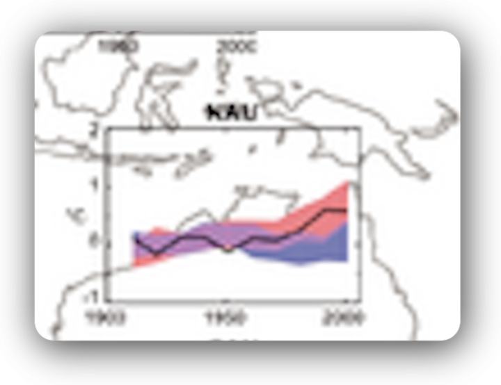
Figure 1. Temperature trends and model results in Northern Australia. Black line is observations (From Fig. 9.12 from the UN IPCC Fourth Annual Report). Covers the area from 110E to 155E, and from 30S to 11S. Based on the CRU land temperature.) Data from the CRU.
One of the things that was revealed in the released CRU emails is that the CRU basically uses the Global Historical Climate Network (GHCN) dataset for its raw data. So I looked at the GHCN dataset. There, I find three stations in North Australia as Wibjorn had said, and nine stations in all of Australia, that cover the period 1900-2000. Here is the average of the GHCN unadjusted data for those three Northern stations, from AIS:
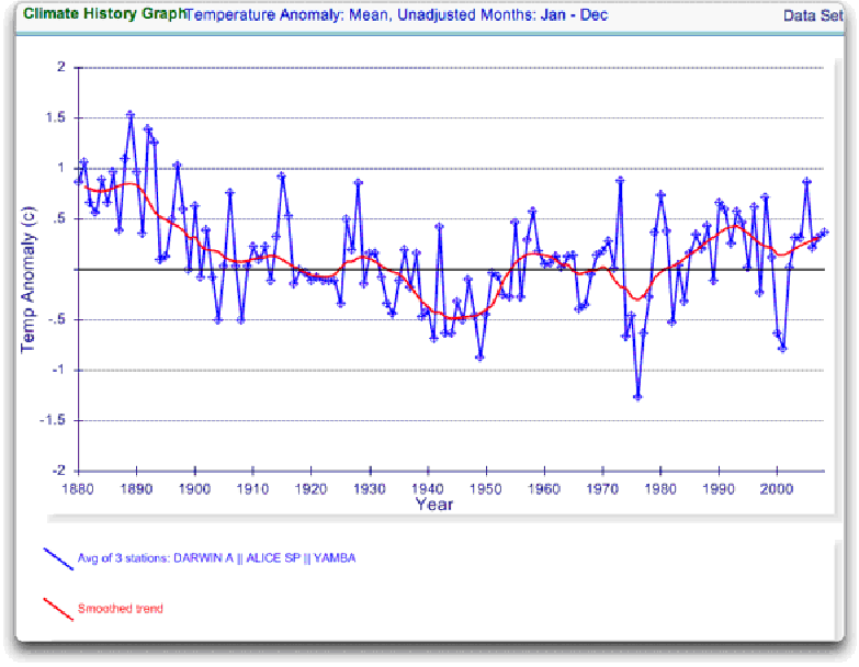
Figure 2. GHCN Raw Data, All 100-yr stations in IPCC area above.
So once again Wibjorn is correct, this looks nothing like the corresponding IPCC temperature record for Australia. But it’s too soon to tell. Professor Karlen is only showing 3 stations. Three is not a lot of stations, but that’s all of the century-long Australian records we have in the IPCC specified region. OK, we’ve seen the longest stations record, so lets throw more records into the mix. Here’s every station in the UN IPCC specified region which contains temperature records that extend up to the year 2000 no matter when they started, which is 30 stations.
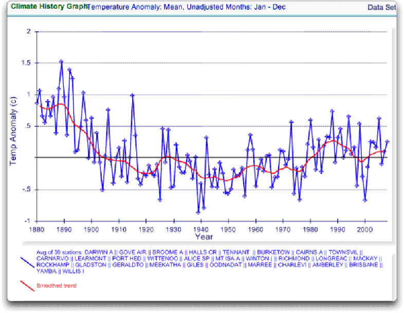
Figure 3. GHCN Raw Data, All stations extending to 2000 in IPCC area above.
Still no similarity with IPCC. So I looked at every station in the area. That’s 222 stations. Here’s that result:
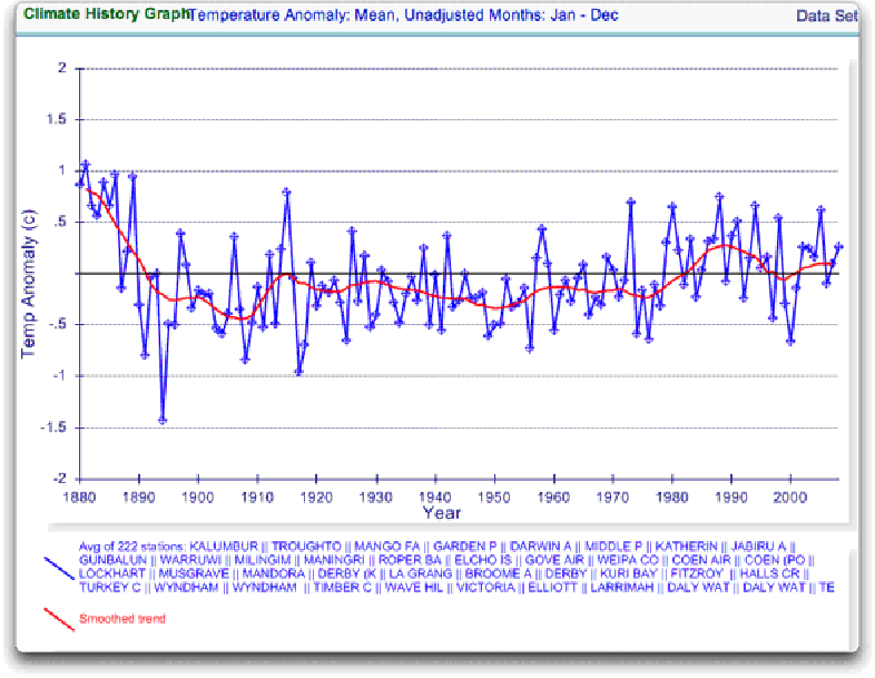
Figure 4. GHCN Raw Data, All stations extending to 2000 in IPCC area above.
So you can see why Wibjorn was concerned. This looks nothing like the UN IPCC data, which came from the CRU, which was based on the GHCN data. Why the difference?
The answer is, these graphs all use the raw GHCN data. But the IPCC uses the “adjusted” data. GHCN adjusts the data to remove what it calls “inhomogeneities”. So on a whim I thought I’d take a look at the first station on the list, Darwin Airport, so I could see what an inhomogeneity might look like when it was at home. And I could find out how large the GHCN adjustment for Darwin inhomogeneities was.
First, what is an “inhomogeneity”? I can do no better than quote from GHCN:
Most long-term climate stations have undergone changes that make a time series of their observations inhomogeneous. There are many causes for the discontinuities, including changes in instruments, shelters, the environment around the shelter, the location of the station, the time of observation, and the method used to calculate mean temperature. Often several of these occur at the same time, as is often the case with the introduction of automatic weather stations that is occurring in many parts of the world. Before one can reliably use such climate data for analysis of longterm climate change, adjustments are needed to compensate for the nonclimatic discontinuities.
That makes sense. The raw data will have jumps from station moves and the like. We don’t want to think it’s warming just because the thermometer was moved to a warmer location. Unpleasant as it may seem, we have to adjust for those as best we can.
I always like to start with the rawest data, so I can understand the adjustments. At Darwin there are five separate individual station records that are combined to make up the final Darwin record. These are the individual records of stations in the area, which are numbered from zero to four:

Figure 5. Five individual temperature records for Darwin, plus station count (green line). This raw data is downloaded from GISS, but GISS use the GHCN raw data as the starting point for their analysis.
Darwin does have a few advantages over other stations with multiple records. There is a continuous record from 1941 to the present (Station 1). There is also a continuous record covering a century. finally, the stations are in very close agreement over the entire period of the record. In fact, where there are multiple stations in operation they are so close that you can’t see the records behind Station Zero.
This is an ideal station, because it also illustrates many of the problems with the raw temperature station data.
- There is no one record that covers the whole period.
- The shortest record is only nine years long.
- There are gaps of a month and more in almost all of the records.
- It looks like there are problems with the data at around 1941.
- Most of the datasets are missing months.
- For most of the period there are few nearby stations.
- There is no one year covered by all five records.
- The temperature dropped over a six year period, from a high in 1936 to a low in 1941. The station did move in 1941 … but what happened in the previous six years?
In resolving station records, it’s a judgment call. First off, you have to decide if what you are looking at needs any changes at all. In Darwin’s case, it’s a close call. The record seems to be screwed up around 1941, but not in the year of the move.
Also, although the 1941 temperature shift seems large, I see a similar sized shift from 1992 to 1999. Looking at the whole picture, I think I’d vote to leave it as it is, that’s always the best option when you don’t have other evidence. First do no harm.
However, there’s a case to be made for adjusting it, particularly given the 1941 station move. If I decided to adjust Darwin, I’d do it like this:
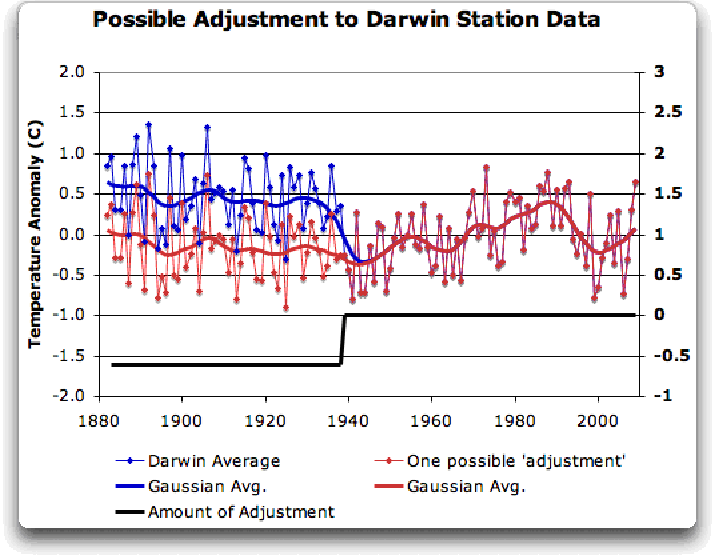
Figure 6 A possible adjustment for Darwin. Black line shows the total amount of the adjustment, on the right scale, and shows the timing of the change.
I shifted the pre-1941 data down by about 0.6C. We end up with little change end to end in my “adjusted” data (shown in red), it’s neither warming nor cooling. However, it reduces the apparent cooling in the raw data. Post-1941, where the other records overlap, they are very close, so I wouldn’t adjust them in any way. Why should we adjust those, they all show exactly the same thing.
OK, so that’s how I’d homogenize the data if I had to, but I vote against adjusting it at all. It only changes one station record (Darwin Zero), and the rest are left untouched.
Then I went to look at what happens when the GHCN removes the “in-homogeneities” to “adjust” the data. Of the five raw datasets, the GHCN discards two, likely because they are short and duplicate existing longer records. The three remaining records are first “homogenized” and then averaged to give the “GHCN Adjusted” temperature record for Darwin.
To my great surprise, here’s what I found. To explain the full effect, I am showing this with both datasets starting at the same point (rather than ending at the same point as they are often shown).
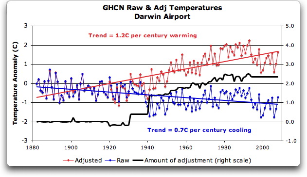
Figure 7. GHCN homogeneity adjustments to Darwin Airport combined record
YIKES! Before getting homogenized, temperatures in Darwin were falling at 0.7 Celcius per century … but after the homogenization, they were warming at 1.2 Celcius per century. And the adjustment that they made was over two degrees per century … when those guys “adjust”, they don’t mess around. And the adjustment is an odd shape, with the adjustment first going stepwise, then climbing roughly to stop at 2.4C.
Of course, that led me to look at exactly how the GHCN “adjusts” the temperature data. Here’s what they say
GHCN temperature data include two different datasets: the original data and a homogeneity- adjusted dataset. All homogeneity testing was done on annual time series. The homogeneity- adjustment technique used two steps.
The first step was creating a homogeneous reference series for each station (Peterson and Easterling 1994). Building a completely homogeneous reference series using data with unknown inhomogeneities may be impossible, but we used several techniques to minimize any potential inhomogeneities in the reference series.
…
In creating each year’s first difference reference series, we used the five most highly correlated neighboring stations that had enough data to accurately model the candidate station.
…
The final technique we used to minimize inhomogeneities in the reference series used the mean of the central three values (of the five neighboring station values) to create the first difference reference series.
Fair enough, that all sounds good. They pick five neighboring stations, and average them. Then they compare the average to the station in question. If it looks wonky compared to the average of the reference five, they check any historical records for changes, and if necessary, they homogenize the poor data mercilessly. I have some problems with what they do to homogenize it, but that’s how they identify the inhomogeneous stations.
OK … but given the scarcity of stations in Australia, I wondered how they would find five “neighboring stations” in 1941 …
So I looked it up. The nearest station that covers the year 1941 is 500 km away from Darwin. Not only is it 500 km away, it is the only station within 750 km of Darwin that covers the 1941 time period. (It’s also a pub, Daly Waters Pub to be exact, but hey, it’s Australia, good on ya.) So there simply aren’t five stations to make a “reference series” out of to check the 1936-1941 drop at Darwin.
Intrigued by the curious shape of the average of the homogenized Darwin records, I then went to see how they had homogenized each of the individual station records. What made up that strange average shown in Fig. 7? I started at zero with the earliest record. Here is Station Zero at Darwin, showing the raw and the homogenized versions.
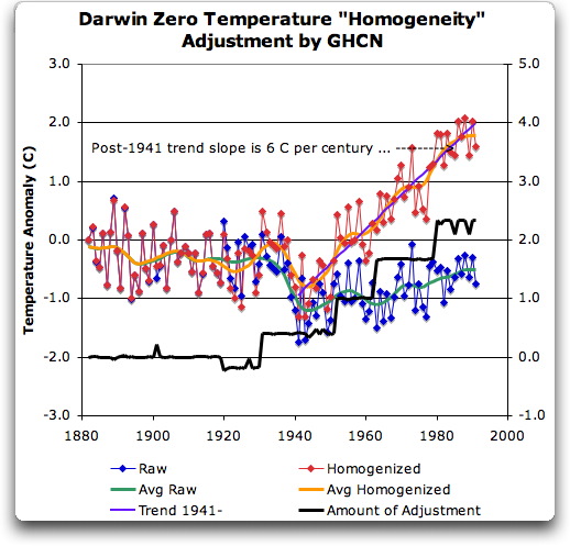
Figure 8 Darwin Zero Homogeneity Adjustments. Black line shows amount and timing of adjustments.
Yikes again, double yikes! What on earth justifies that adjustment? How can they do that? We have five different records covering Darwin from 1941 on. They all agree almost exactly. Why adjust them at all? They’ve just added a huge artificial totally imaginary trend to the last half of the raw data! Now it looks like the IPCC diagram in Figure 1, all right … but a six degree per century trend? And in the shape of a regular stepped pyramid climbing to heaven? What’s up with that?
Those, dear friends, are the clumsy fingerprints of someone messing with the data Egyptian style … they are indisputable evidence that the “homogenized” data has been changed to fit someone’s preconceptions about whether the earth is warming.
One thing is clear from this. People who say that “Climategate was only about scientists behaving badly, but the data is OK” are wrong. At least one part of the data is bad, too. The Smoking Gun for that statement is at Darwin Zero.
So once again, I’m left with an unsolved mystery. How and why did the GHCN “adjust” Darwin’s historical temperature to show radical warming? Why did they adjust it stepwise? Do Phil Jones and the CRU folks use the “adjusted” or the raw GHCN dataset? My guess is the adjusted one since it shows warming, but of course we still don’t know … because despite all of this, the CRU still hasn’t released the list of data that they actually use, just the station list.
Another odd fact, the GHCN adjusted Station 1 to match Darwin Zero’s strange adjustment, but they left Station 2 (which covers much of the same period, and as per Fig. 5 is in excellent agreement with Station Zero and Station 1) totally untouched. They only homogenized two of the three. Then they averaged them.
That way, you get an average that looks kinda real, I guess, it “hides the decline”.
Oh, and for what it’s worth, care to know the way that GISS deals with this problem? Well, they only use the Darwin data after 1963, a fine way of neatly avoiding the question … and also a fine way to throw away all of the inconveniently colder data prior to 1941. It’s likely a better choice than the GHCN monstrosity, but it’s a hard one to justify.
Now, I want to be clear here. The blatantly bogus GHCN adjustment for this one station does NOT mean that the earth is not warming. It also does NOT mean that the three records (CRU, GISS, and GHCN) are generally wrong either. This may be an isolated incident, we don’t know. But every time the data gets revised and homogenized, the trends keep increasing. Now GISS does their own adjustments. However, as they keep telling us, they get the same answer as GHCN gets … which makes their numbers suspicious as well.
And CRU? Who knows what they use? We’re still waiting on that one, no data yet …
What this does show is that there is at least one temperature station where the trend has been artificially increased to give a false warming where the raw data shows cooling. In addition, the average raw data for Northern Australia is quite different from the adjusted, so there must be a number of … mmm … let me say “interesting” adjustments in Northern Australia other than just Darwin.
And with the Latin saying “Falsus in unum, falsus in omis” (false in one, false in all) as our guide, until all of the station “adjustments” are examined, adjustments of CRU, GHCN, and GISS alike, we can’t trust anyone using homogenized numbers.
Regards to all, keep fighting the good fight,
w.
FURTHER READING:
My previous post on this subject.
The late and much missed John Daly, irrepressible as always.
More on Darwin history, it wasn’t Stevenson Screens.
NOTE: Figures 7 and 8 updated to fix a typo in the titles. 8:30PM PST 12/8 – Anthony
What a relief! I no longer have to worry about global warming. Or pollution. Or carbon emissions, or limited energy resources. I am so happy now. I can go back to being an idiot.
As noted by others, the 1941 issue is most likely the result of record destruction in February 1942 after the major Japanese raid on Darwin (there were actually others ongoing until 1943). There was no sealed road from Darwin to the rest of Australia until mid 1942, with transport primarily being by sea; it wouldn’t be suprisinging to find that any central record keeping may have relied on dispatch of the data once a year or once every 6 months for example (and hence the record for parts of 41 was destroyed in Feb 42.)
One thing to note, is that you’re ignoring comparing temperature records (if the still exist) to the north. Darwin is 720kms from Dili, East Timor, and closer again to Maluku in Indonesia. It’s not perfect, but it might give you another data set to compare to (presuming they exist somewhere)
Billy Sanders (22:49:26) :
Not sure what your point is, Billy. I worry about pollution and limited energy resources. I don’t worry about carbon emissions and global warming.
JJ
Which is why you should ask.
No, they should have “told”, right from the start. Otherwise they have no Science. No one even needs to ask. If they don’t tell, they have nothing scientific to “ask” about.
The “nasty” conclusions result from exactly what the “Team”, which has a large supporting gang, has done and is still doing: Perpetrating Scientific Fraud. Conspiring to pass off what is not Science as Science. There may be other frauds.
Smokey: “The leaked emails and code only reinforces my suspicion, and any contrary and defensive red faced arm-waving does nothing to convince me otherwise.”
Correct if I’m wrong Smokey, but I sense that you don’t trust climate scientists very much.
In these situations I find it useful to repair to my rule-of-thumb measure of trustworthiness. Using the “Beard Index” I find the AGW scientists are highly trustworthy, and that there is empirical evidence to show this.
Compare the carefully cultivated beards of Schmidt and Mann with that of McIntyre. Clearly, Schmidt and Mann take great care to present a manicured and precise front, much like their climate work.
In contrast, McIntyre looks like he was just dragged out of bed. Can we expect precision and good work from a man who neglects his appearance so? I think not.
I have found my index a great comfort during difficult times such as we are currently undergoing. I think you would also find great benefit from this easily applied and highly reliable measure.
>Not sure what your point is, Billy. I worry about pollution and limited energy resources. I don’t worry about carbon emissions and global warming.
Oh. Cherry-picked environmentalism. Nice.
Wow. WOW.
A simple request: bugger with all the “adjustments”. Over a large-enough data series, they should all average out anyway and back to zero, absent some systemic effect like UHI.
What does the average temperature do if you just take raw, unadjusted data, and average it all up. All stations, all sites, all years. I’d *start* with that data and analysis.
Enough manipulation. Publish the raw data, write the code to analyze it in just a few minutes, and publish the raw statistics and averages.
Yeah, Willis. Billy is the man who defines what environmentalism is, and if you don’t meet his requirements, then you are a Cherry Pickin’ Denier!
Willis,
In your analysis, you quoted from the NOAA GHCN methods document, regarding the homogeneity adjustments. This passage from that document demands your immediate attention:
A great deal of effort went into the homogeneity
adjustments. Yet the effects of the homogeneity adjustments
on global average temperature trends are
minor (Easterling and Peterson 1995b). However, on
scales of half a continent or smaller, the homogeneity
adjustments can have an impact. On an individual
time series, the effects of the adjustments can be enormous. These adjustments are the best we could do
given the paucity of historical station history metadata
on a global scale. But using an approach based on a
reference series created from surrounding stations
means that the adjusted station’s data is more indicative
of regional climate change and less representative
of local microclimatic change than an individual
station not needing adjustments. Therefore, the best
use for homogeneity-adjusted data is regional analyses
of long-term climate trends (Easterling et al.
1996b). Though the homogeneity-adjusted data are
more reliable for long-term trend analysis, the original
data are also available in GHCN and may be preferred
for most other uses given the higher density of
the network.
Emphasis mine.
This would seem to be capable of containing the ultimate answer to many of your questions.
It is documented that the described homogeneity adjustment methods may result in ‘enormous’ adjustments at the single station level. It is asserted that these adjustments have minor effects on global average trends, and a reference is given in support of that assertion. It is documented that these adjustments produce datasets that are potentially less valid at the single station level than the unadjusted data, which is why they look goofy to you.
This provides an explanation for what you are seeing that does not involve outright ciminal fidgeting with the data at the individual station level to match ‘preconceived notions’.
The homogeneity adjusted series are held to be not only valid, but more representative than unadjusted series, for the purpose of regional and larger scale long term trend analysis.
If you have a legitimate beef with what you are seeing at Darwin, it would appear that it likely is not with adjustments that have been applied surreptitiously, but rather with the assertion that the adjusted data are superior for large scale, long term trend analysis.
If you are going to address that issue, you are going to need to abandon clock analogies and the like. The maths involved do not always operate intuitively, and cannot be refuted by such analyses. You are going to need to refute the theoretical basis, much as Steve M did with Mannian PCA. I’ll wager that is going to take some reading on your part. It would appear that papers by Easterling and Peterson would be a good place to start.
It remains a possibility that criminal fidgeting has occurred with the Darwin station data, but an alternate explanation for large adjustments lies before you now, one previously outside your knowledge.
This is why you should ask.
JJ
Ah yes… the Beard Index. I know it very well.
I’m 61 and many of my friends and acquaintances have beards. Mine comes and goes like the winter snows. I’ve long noticed bearded mean (sadly I’ve not yet interviewed a bearded woman) fall into two clear categories as follows:
(1) The hang loose types who hate shaving (because it basically sucks). These guys require to have obligingly mellow lovers who don’t mind smooching their way through that mess of hair ‘come what may’. These guys basically don’t give a damn. They don’t mind growing old either gracefully or disgracefully or grumpily if that is to their taste. To these guys getting old usually means more laughs, deeper friendships, better wines, worse beards and increased refinement of their BS detector.
(2) Next we have the control freaks, those often anally retentive types who carefully construct for that well manicured beard, carefully sculptured around the facial contours and features to highlight their ‘good points’. These guys are usually stuck with whiny lovers who don’t like facial hair and demand a well manicured flightpath to a very occasional peck on the lips or nose or whatever. These guys are generally secretly obsessed with wherever it is they perceive themselves to be (well) positioned in that all important human pecking order. After all, its all about presentation n’est pas? Naturally, these guys are not ageing with anything other than resentment – indeed ageing too is simply another…..Catastrophe.
Quite frankly, Type 1 are my kinda guys.
Type 2 have a beard essentially for one reason. It’s called Hide the Decline.
heres something odd.
whats weird about this
http://www.metoffice.gov.uk/climatechange/science/monitoring/locations.GIF
I am intrigued that you include YAMBA in your readings, in the second diagram, and call it a Northern Station. It would be surprising if it fits the bill for a neighbouring station. Is that what the CRU people did, or just what you did?
YAMBA lat -29,43 long 153.35 is about 3,000km from Darwin. It sits on a different ocean (Pacific) next to my home town, and has very equitable climate. It is the YAMBA you get when dialing up on the AIS site.
3000km, to give some context, is a little more than the distance between London England and Ankara Turkey. More than the distance from Detroit Michigan and Kingston Jamaica.
One of the UEA CRU emails (0839635440.txt) is relevant to this. It is from John Daly to n.nicholls@BoM.Gov.Au and includes data from Station 66062 which shows Sydney Observatory’s annual mean temperature.
16.8 16.5 16.8 17 17 16.7 17.1 17.4 17.9 17.4 17.2 17.1 16.9 17 17.2 17.2 17.4
17.6 17.6 17.6 16.7 17.1 16.8 17.4 16.8 17.3 17.8 17.5 17.1 17.2 17.6 17.3 17.1
16.9 16.9 17.3 17.3 17.3 17.6 17.5 17.4 17.2 17.1 17.3 17.2 17.2 16.9 17.5 17.4
17.2 17 17.5 17.4 17.5 17.7 18.3 17.8 17.4 17.2 17.4 18.3 17.3 18 18.1 18 17.5
17.3 18 17 18.2 17.4 17.6 17.5 17.4 17.1 17.4 17.3 17.5 17.7 18 17.8 18 17.4
17.8 16.8 17.5 17.4 17.6 17.6 17.2 17.4 17.9 17.9 17.6 17.7 17.8 17.7 17.6 17.8
18.3 18 17.6 17.8 17.8 17.8 18.1 17.9 17.5 17.8 18.3 18 17.7 17.3 17.5 18.5 17.4
17.8 17.7 17.8 17.7 18 18.5 18.2 17.8 18.1 17.5 17.8 17.8 18 18.6 18.1 18.1
18.6
These arent labelled, but the start year is 1859. If you download the current 66062 data from BoM there is complete agreement until 1970, after which no agreement. A partial comparison is given here: –
Sydney 66062
Year 2009 data 1992 data Difference
1961 17.8 17.8 0.0
1962 17.8 17.8 0.0
1963 17.8 17.8 0.0
1964 18.1 18.1 0.0
1965 17.9 17.9 0.0
1966 17.5 17.5 0.0
1967 17.8 17.8 0.0
1968 18.3 18.3 0.0
1969 18.0 18.0 0.0
1970 17.7 17.7 0.0
1971 17.9 17.3 0.6
1972 18.0 17.5 0.5
1973 18.7 18.5 0.2
1974 17.8 17.4 0.4
1975 18.4 17.8 0.6
1976 18.0 17.7 0.3
1977 18.4 17.8 0.6
1978 18.0 17.7 0.3
1979 18.4 18.0 0.4
1980 18.8 18.5 0.3
Once Again a step type adjustment followed by a somewhat random walk.
Kind of intriguing that it is so similar
Mike Bird
The law of great numbers, that as the number of samples increase the average (and median) will become more and more close to its true value, indicates that with many stations, raw and homogenized station data should start to look familiar. Alas they don’t. If there was a persistent false cooling trend it could still be justified, but I would rather guess that there is a false warming trend due to urban heat islands than a false cooling trend.
I live in France. On Monday I was driving on the motorway here and was listening to “Radio Traffic” for news about any snarl ups when they broadcast a short interview with a person (can’t remember his name but I think he was Senegalese) who has been appointed by the environment minister here – Borloo – to work on the climate justice campaign at Copenhagen and after.
He described how he had been invited by Borloo into his office and that Borloo has shown him a photo of the earth by night on which he pointed out that while there were lots of lights in Europe and South Africa, the whole strip of central africa was dark. According to this person, Borloo asked him to work on electrification of Africa. This, he said, would be paid by 250 billion euros raised from a Tobin Tax on financial transactions.
This was news to me. Also, it makes no sense. First, electrifying Africa is not going to cut Co2 emissions. Second, the Tobin tax has not been passed into law. It is still talk. And to assume that you can raise Euro 250 billion from it is crazy since as soon as a tax like this is imposed the amount of transactions will fall and you will collect less than you might think. Also, who asked us if we want this? But it seems to have been decided. Crazy!
I found this. OK, it’s not decided, but it is being pushed by France at Copenhagen.
http://www.ambafrance-us.org/climate/interview-jdd-jean-louis-borloo/
From a web-site in Australia that struck me as very poignant when seeing Stuffushagen in the news:
My parents used to recall the times pre WW11 and the rise of fascism and the Nazis. They often referred to the Nuremberg Rallies…the whipping up of fanatical belief and ideology…the shrill propaganda spewed forth by those sated with power, hate and bigotry. They also spoke of the punishment inflicted on those who dared to disagree.
My parents have now passed on, yet I was reminded of their stories while I watched the reports on the events unfolding in Copenhagen. For the first time in my life, I felt a sickening sense of fear for the future.
It might be for a different cause and acted out by different players, yet the message is the same…the cult is powerful, ruthless, intolerant…and God help those who disbelieve.
Hmm, makes one think hey?
Willis:
A very fine analysis.
I have one question.
Do you have an explanation for the homogeneity adjustment made for a single year in 1900 (as indicated in your Figure 7)?
It seems that the purpose was to force agreement at 1900 between the raw and adjusted data sets.
Other adjustments are much larger than the adjustment I am querying, but my query is important.
If the 1900 adjustment was only made to force agreement at the start of the century then this adjustment is de facto evidence that adjustments are made for purely arbitrary reasons.
Richard
steven mosher (00:43:07) :
heres something odd.
whats weird about this
http://www.metoffice.gov.uk/climatechange/science/monitoring/locations.GIF
What are you getting at? The uneven coverage of the US? (Lots of red dots in the western US, not so many in the midwest — where it is cooler). But the red dots are just a subset of the total.
Or is it the dots sprinkled throughout the oceans, in places where there might not seem to be islands, normally?
What do you see?
JJ (00:09:31) :
I quoted from the same section earlier, but Willis apparently missed it (easy enough, in a thread this huge). I’d be curious about his take on it. I also asked if the bit about “Yet the effects of the homogeneity adjustments on global average temperature trends are minor” is quantified anywhere.
It seems to me the best place to start is with the raw daily data and find out how many “missing” months have a small handful of days missing, and estimate the monthly average for those days, either by ignoring the missing days or interpolating them.
John, thanks for your interesting comment. I agree that the daily data needs to be looked at … so many clowns, so few circuses. Also, we need an answer about dealing with the missing data. Interpolate? If so, how? Another issue for surfacetemps.org to publicly wrestle with.
Reply:
Just a suggestion. I would think using the mean of the data even for the month with days missing would be the best way to go. The effect of using incomplete data sets would be added to the error analysis and not to the data itself. The data with have footnotes that detail the information that is missing. The statisticians should be able to address this. Given the number of individual stations used to estimate the global temperature, the deviations from the true mean of the months calculated from incomplete data, should nullify each other. The amount of error introduced would be far less than error introduction from “artificial interpolation” Interpolation could only be used by determining which stations best parallel each other and the offset. However I would think parallel and offset would be better used in determining the probable error introduced by using that particular incomplete data set than by “adjusting” the information with a “best guess fudge”
I would also agree with MIke (12:14:18) :
Once the data is “cleaned up” and monthly averages determined I see the advantage of using “acceleration as the measuring tool instead of measured value” because there would be no need to try and splice data sets together from different locations to make one long data set.
I took a look at the data for Ross-on-Wye from the GHCN database. I took this one because Ross is an old town with long records, untroubled by very heavy traffic and therefore any Stevenson screen there is unlikely to have been tainted by “adjustments”. This was the first station I looked at – NO GLOBAL WARMING!
I would give you a link but the GHCN database is down. What a curious coincidence….
Anyway, I’m looking in detail at the statistics for Stornoway now. A small island in the far north. Had hoped that the data would be untainted but it seems the Stevenson screen is next to an airport – bet that wasn’t there in the 30’s! Oh, and it now has electronic thermometers for remote reading – bet they didn’t have those in the 30’s either!
Anyway, the means for the annual distribution show a 0.35Celsius increase in the last 10 years compared to the first 10 years. Problem is the averaged monthly show a variation ranging from -0.03 to +1.0 Celsius taken over the same period. That tells you that you can’t rely on the annual means because they don’t necessarily reflect the means of the underlying distributions. Furthermore even in the monthly averages you can see a variation of 6Celsius over each January from 1931 to 2008. This is due to what is commonly referred to as weather. So the Climate change signal is 0.35Celsius in a weather signal of 6Celsius. Is that statistically significant? I don’t think so.
I’m a little confused as to how temperature trends are computed. With or without raw data. It was mentioned that CRU started their use of Darwin in 1963. Exactly what do they use for Darwin temps prior to 1963? Is this where they use an average of other stations? If not, then throwing in a tropical station in the middle of a sequence would clearly bias the results. Is this what E.M. Smith often refers to as “the march of the thermometers”?
JJ (00:09:31) :
If one uses a temp station A to adjust temp station B, then station A gets more weight. The more it is used to adjust other stations, the more weight it gets. This procedure does not increase the “paucity” of stations, it just spreads the influence of a given station around. These guys have not proved their method makes the data more suitable for a genrealized climate change quantification. Just saying it does not make it so.
An interesting post – hope you get the coverage you deserve!