By Joseph D’Aleo, AMS Fellow, CCM
In this recent post, we discussed the problems with recent data that showed the argument presented by the EDF’s millionaire lawyer playing clueless environmentalist on Lou Dobbs Tonight that this will be the warmest decade is nonsense. This claim was well refuted and Al Gore’s credibility disassembled by Phelim McAleer, of the new documentary Not Evil, Just Wrong that challenges the lies and exaggerations (totalling 35) in Al Gore scifi horror comedy film, An Inconvenient Truth. 9 were serious enough for a UK judge to require a disclaimer itemizing them be read whenever, the movie was shown in the schools.
The world’s climate data has become increasingly sparse with a big dropoff around 1990. There was also a tenfold increase in missing months around the same time. Stations (90% in the United States which has the Cadillac data system) are poor to very poorly sited and not properly adjusted for urbanization. Numerous peer review papers suggest an exaggeration of the warming by 30%, 50% or even more. The station dropout can be clearly seen in the two maps below with the number of station going from over 6000 to just 1079 from April 1978 to April 2008.


See the big gaps in the recent data in Canada, Greenland, Africa, South America, parts of western Asia, parts of Australia.
SEE FOR YOURSELF
Take this test yourself to see how bad a shape the global data base is. Look for yourself following these directions using the window into the NOAA GHCN data provided by NASA GISS here.
Point to any location on the world map. You will see a list of stations and approximate populations. Locations with less than 10,000 are assumed to be rural (even though Oke has shown that even a town of 1,000 can have an urban warming of 2.2C).
You will see that the stations have a highly variable range of years with data.
Try and find a few stations with data that extends to 2009. To see how complete the data set is for that station, click in the bottom left of the graph Download monthly data as text.
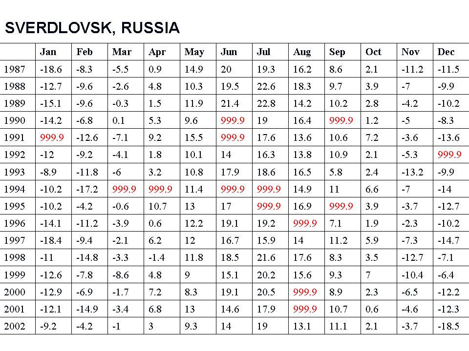
For many, many stations, you will see the data set in a monthly tabular form has many missing data months mostly after 1990 (designated by 999.9).

See larger image here
This required the data centers to estimate data for the grid box for that location with other stations nearby (homogenization). In the 2008 plot above only 1079 stations were used. NASA went to locations within 250 km (155 miles) to find data for the grid boxes. For grid boxes without stations within 250 km, they are left blank, thus the large gaps.
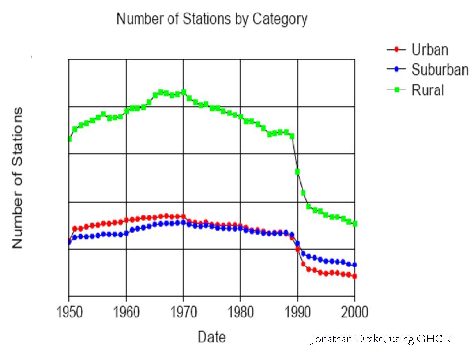
Most of the stations that dropped out were rural. More of the missing data points are having their missing months filled in with more urban data in the grid boxes.

See larger image here
WUWT Volunteer John Goetz created this video that shows the worldwide dropout of weather stations:
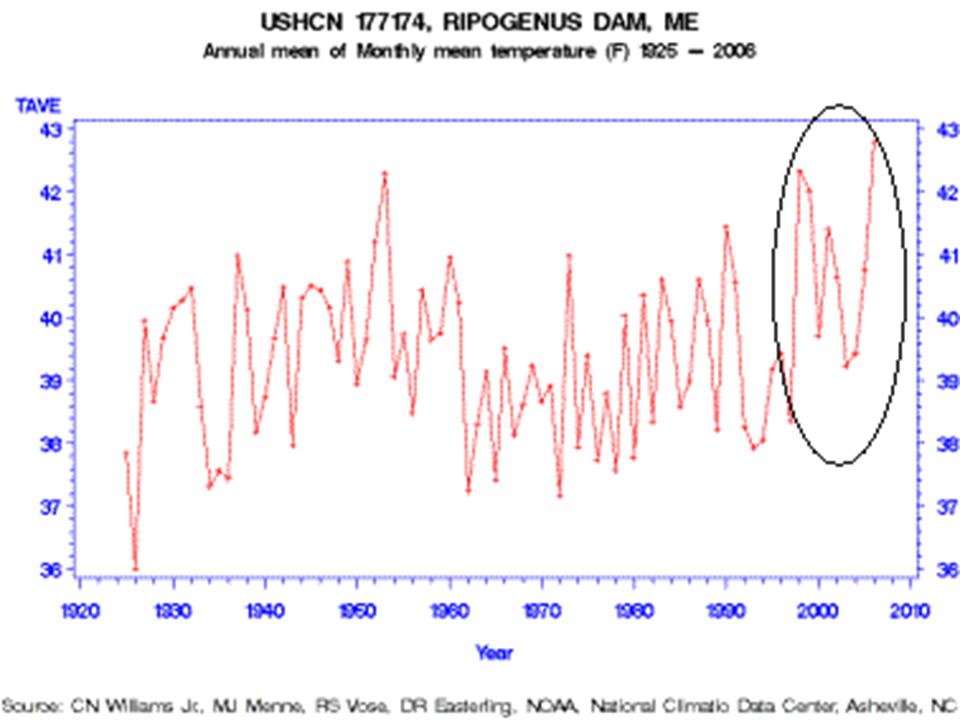
One example of how good or bad this works is from Maine. Volunteers completed surveys of the United States Historic Climate Network (USHCN) temperature stations in Maine for Anthony Watts surface station evaluation project. The survey determined that every one of the stations in Maine was subject to microclimate or urbanization biases. One station especially surprised the surveyors, Ripogenus Dam, a station that was officially closed in 1995.

See larger image here
Despite being closed in 1995, USHCN data for this station is publicly available until 2006! (GISS stopped in 1995)
Part of the USHCN data is created by a computer program called “filnet” which estimates missing values. According to the NOAA, filnet works by using a weighted average of values from neighboring stations. In this example, data was created for a no longer existing station from surrounding stations, which in this case as the same evaluation noted were all subject to microclimate and urban bias, no longer adjusted for. Note the rise in temperatures after this before the best sited truly rural station in Maine was closed. GISS does display this station that did incorporate the “filnet” data input for missing months although as noted they stopped its plot in 1995 which NOAA extended artificially to at least 2006.
How can we trust NOAA/NASA/Hadley assessment of global changes given these and the other data integrity issues? Given that Hadley has destroyed old original data because they were running out of room in their data cabinet, can we ever hope to reconstruct the real truth?
As one of our scientist readers noted: “Well, the 999.9s you showed me today sure opened my eyes…the ramifications are stunning. I knew about the drop-off of stations before but never that existing station reports are so full of gaps or that they’re getting temperature readings from “ghost” stations. This is, as you have said, GARBAGE. See PDF here.
PS
All data I collect I will make available through Anthony. It will not be a pristine site, (far from it, it’s my back garden), but we may be able to gain some insight.
DaveE.
PPS
I am also planning a variation of Woods experiment using double glazed units, (which I have made), one of which is plain glass, the other low E.
I did plan on using low metal glass but to be fair I had to use normal glass as there is currently no low metal low E glass available.
DaveE.
Ian (13:38:36) :
I like many others who post here, am very concerned regarding the accuracy, reliability and consistency of the data which underpins the concept of runaway global warming. …… Sorry for the negativity but I feel so frustrated that fair debate in the MSM is not permitted.
I, too ,feel that way sometimes. Just keep fighting the good fight!!! It’s been said before that a lie told over and over again will be believed. How much more effective then, would a truth told over and over again be?
“This is something I intend to check as soon as I have enough funds to build my continuous temp monitor.”
Anthony sells a relatively cheap ($60) device to do what you want to do.
See the sidebar.
Tom in Texas (14:03:35) :
My plans go way beyond available technology. Data logging is just a small part of it & $60 + shipping is more than I need. I will get there soon.
Forgot to mention RH monitoring too. Bloody expensive little sensors they are.
DaveE.
Much has been observed and extensive analysis has taken place on land surface temperature records. However, the seas cover 70% of the earth. I would suggest that those who follow the AGW debate would be very interested in understanding how HadCru and GISS calculates ocean surface temperatures. And please do not say that GISS uses satellite data — that is a very misleading claim even though there is some truth in it. Also, does Phil Jones claim that his agreements with foreign countries prevent from sharing his data on sea surface temparatures?
George E. Smith 13:26;58 states:
The drop out of rural data points is critical here.
For me, the most accurate way of measuring global temperature, free of UHI effects, is to SOLELY use rural stations.
This article shows either a cunning plan since 1990 to artificially drive the ‘global warming’ agenda, or a rather fortuitous series of events which happened to make such an agenda more likely to apparently fit the hypothesis.
<<<<<<<<<<<<<>>>>>>>>>>>>>>>>>>>>
George, I agree completely with the first line of your comment pasted above. And I am particularly aghast that so much initially blank data has been fudged from nearby sites. I also believe there is a huge differrence in temperatures between urban, suburban and rural areas, just as the local TV weather forcasters give us predictions of temps in the city and the suburbs — tonight it will be cold in nearby Philadelphia, with frost predicted in the northern suburbs and a freeze in some rural areas. Sometimes the difference can be a degree or two F.
However, I have a problem with the concept accompanying the fourth (unnumbered) figure titled “Number of Stations by Category” in D’Aleos commentary. Presumably, with so many rural stations having been eliminated, according to the graph going from around 7700 in 1980to around 5200 in 1990 ro around 3100 in 2000, thus would tend to effect a positive bias the measurements.
But I wondered if this is a fair conclusion because wouldn’t the effect depend on the ratio of rural to urban/suburban stations rather than the actual numbers? So to make some ratio measurements over three decades, it was necessary to average the suburban and urban numbers in 2000, whereas the numbers for those two almost coincided in 1980 and 1990. My averaging for 2000 may not be realistic, but in any case, my measurements oddly show a slightly increasing ratio of rural to suburban/urban stations. The data points on the curves are fairly large, but in carefully scaling the points at the three decade marks over this recent 20 year period, I found these ratios: 1980: 2.52; 1990: 2.68; 2000: 2.77.
Would you agree that, in view of this slightly increasing ratio for rural stations, any bias problem with the stations involves the probably rapidly growing heat islands in the urban areas rather than the diminishing number of rural stations so long as their ratio is almost constant if not rising slightly?
Bob
Yawn, yawn, yawn,
temperatures’ boredom,
yawn, yawn, yawn,
they have it all wrong.
I like how Canada doesn’t show any stations…… but wait…
how come there is some of the most signifigant warming going on in the Hudsons Bay area??
http://global-warming.accuweather.com/GHCN_GISS_HR2SST_1200km_Anom09_2009_2009_1951_1980.html
IS THIS WARMING JUST INFILL???? anyone? Bueller?
Michael, making it on ‘prisonplanet’ is not such a high honor.
Be sure to delouse for fleas (or anything else) picked up from over there after leaving …
.
.
.
In other news, the mainstream here in the UK are starting to ask questions:
Honestly, I nearly fell off my chair, but I’m not surprised. The whole rotten edifice is starting to crumble.
Apologies if this question has already been answered; I don’t think I missed a mention of this, but it’s possible. What, exactly, HAPPENED in 1988-1992? What was going on there? The slow drop leading up to that fall is also interesting, too, but…Really, now. Why were so many weather stations allowed to go offline? Anyone know?
Joseph’s global GISS plot may exaggerate missing data. I looked up April 2008 on the GISS site here, and there were a lot less missing areas. The version shown here may show data as missing when first posted, but which came in later.
Mizen2, I’m on the case, Ellie from Belfast put me on to it and I might have done a post that would have beat Joe dAleo here but I wanted to do more on Yamal before getting involved in what could be a big and much-needed project we could do for the UK. I want to go and hunt for UK records that have really long histories. And I want help with this. All the amateurs we can get on the case. You see, GISS castrated all the records at 1880 at one end, and often in modern times I’ve found hints that a station with someone who might actually care, still keeps records, even when the station stops in the GISS records.
UK Met Office was under the RAF originally which is why so many UK records are RAF, and perhaps also why so many UK records are at current airports.
I’ve done a whole load of blink comparators. Yes, THE PATTERN IS DIFFERENT TO USA. All the end temperatures are left alone and the start temperatures are depressed. Four crimes in one! Pre-1880 castrated. UHI ignored. Integrity of early recorders poo-poohed. Trend “worse than we thought”.
Mizen2, anyone else in the UK, please get in touch!
Why is this a problem? I mean 12 thermometers should be plenty to prove either case, as long as they are in Yamal, right?
Patrick
So I guessed right, the only station still operating in the southern half of England, is on the site of an airport. Unbelievable.
Uploaded by your’s truely on Youtube.
Glenn Beck’s One Minute Response to Recent Global Cooling News 10-13-09
Washington is cold:
http://www.wenatcheeworld.com/news/2009/oct/12/record-cold-hits-region-snow-on-the-way/
Ronan
See my #7732 on http://www.harmlesssky.org/ for an explanation of what happened around 1990.
tonyb
Current trends for the temperature records based on thermometers from 1979 to the last data point:
(degrees/decade)
HADCRUT: 0.157
GISS: 0.159
And the satellite records which do not rely on thermometers:
UAH: 0.125
RSS: 0.153
TonyB, when I go to Harmless Sky the URL doesn’t change in the title bar at all at all. Can you please give a date, title of post, and comment number if appropriate?
Nick Stokes (15:15:20) : It’s true that some data comes in eventually which would register as missing at first, however there are still large portions of the world which have had and still have very little data. Africa has the most severe problem as far as I can tell. And that’s important because the evidence seems to me to indicate very little warming there.
What’s striking is how little influence all that data coming in seems to have. Should not the additions make some difference? Apparently not. That’s probably because the areas where data tends to be the most sparse never come in.
I would seem that AGW is really dying from reading the Headlines in mainstream newspapers re australians are less and less interested, BBC etc. I wonder if it was SM tree story that really cracked it. The next one to crack entirely and should be pursued relentlessly is that HADcrut data. Anyway I look forward to the day where I dont have to waste my time looking at sites like this or RC or CA (meaning we should not have to waste time looking at weather issues LOL). THis site will I hope be remembered as one of the main ones to have brought reality back I hope they are awarded a prize!
timetochooseagain (16:53:10) :’
Well, my main point is that the graph presented above is misleading in its depiction of missing stations. I don’t know basis you are using for saying that the info when it comes in makes little difference. However, it’s not so surprising. If you look at the plot with 1200 km interpolation, almost everything is covered. There is reasonable correlation on the 1200 km scale, and the world average calculated with proper weighting with the smaller initial set of points is pretty good.
Nick Stokes:
“If you look at the plot with 1200 km interpolation, almost everything is covered. There is reasonable correlation on the 1200 km scale, and the world average calculated with proper weighting with the smaller initial set of points is pretty good.”
Are you serious? Of course a 1200 km interpolation will have a reasonable correlation with itself!
When you are measuring something like a 0.5 deg C change in 100 years, and the difference between stations only 20 miles apart is over 4.0 deg C each day, then there is something very wrong.
I no longer debate the obvious…