As we’ve seen in this report from John Goetz, GISS: worlds airports continue to run warmer than ROW a significant portion of the GHCN (Global Historical Climate Network) surface temperature record is measured in airports, not rural open fields. Airports, airport expansion, and air travel frequency tend to be linked with the population, growth, and wealth trends of a city. It stands to reason that since the majority of thermometers in the GHCN record are at airports, they’d have a broad application of UHI. Joe tries out a simple method of approximating what the signal might look like with a UHI removal. – Anthony
Chasing a More Accurate Global Century Scale Temperature Trend
By Joseph D’Aleo, CCM, AMS Fellow

Hadley Center Annual Mean Temperature since 1895 shows a warming of about 1C since 1895. – Click for larger image
The long term global temperature trends have been shown by numerous peer review papers to be exaggerated by 30%, 50% and in some cases much more by issues such as urbanization, land use changes, bad siting, bad instrumentation, and ocean measurement techniques that changed over time. NOAA made matters worse by removing the satellite ocean temperature measurement which provide more complete coverage and was not subject to the local issues except near the coastlines and islands. The result has been the absurd and bogus claims by NOAA and the alarmists that we are in the warmest decade in 100 or even a 1000 years or more and our oceans are warmest ever. See this earlier story that summarizes the issues.
No one disputes the cyclical warming from 1979 to 1998 that is shown in all the data sets including the satellite, only the cause. These 60-70 year cycles tie in lock step with the ocean temperature cycles and solar Total Solar Irradiance. The annual mean USHCN temperatures are shown below along with the annual TSI and PDO+AMO.
 Click for larger image
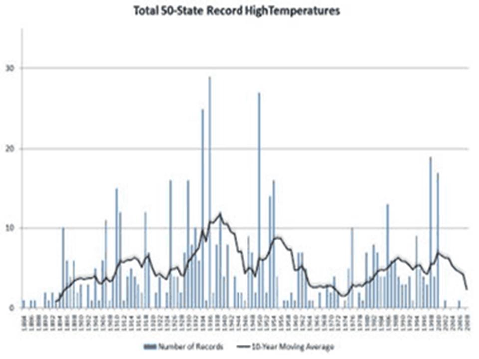
One needs simply to look at the record highs for the United States and globe to see that the warmest years are not all in the last two decades (although some were to be expected given it is one of two peaks in the cycles). The first image below shows the decadal state record all-time highs. The 1930s still clearly dominates (24 state all time records) with only one state (South Dakota) in the 2000s tying a 1930s all-time heat record.
 Click for a larger image
The following image (enlarged here) shows the record monthly highs by individual year. Note the 1930s and 1950s dominate and this decade showing the least record highs than any decade since the 1800s.

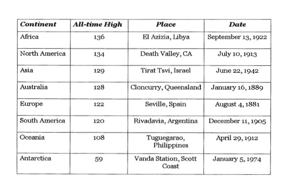
Here is the NCDC compilation of the continental all-time records (enlarged here), note for all the populated continents, the records were in the 1800s and early 1900s.

TRYING TO GET AT A BETTER LONG TERM TREND
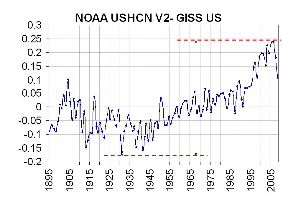
NCDC removed the UHI effect for the US in 2007 in version 2 of the USHCN. GISS maintains their version of a UHI adjustment of this NCDC USHCN data. By differencing the two, I found the following (enlarged here):
 NOAA USHCNV2 -vs- GISS – click for larger image
It shows an artificial warming of about 0.45 C or 0.75F for the NOAA data for removal of the urbanization adjustment. Phil Jones of the Hadley Center, co-authored a paper that showed the UHI contamination of China was 1 degree Celsius (1.8F) for the century, so this contamination appears not to be unreasonable, in fact it may be conservative.
I then took that UHI adjustment for the United States and applied to the global data. The Hadley center data is dominated by land areas with their ocean temperatures mainly coming from ships and in the northern hemisphere. Here’s what Hadley says about marine data “For marine regions sea surface temperature (SST) measurements taken on board merchant and some naval vessels are used. As the majority come from the voluntary observing fleet, coverage is reduced away from the main shipping lanes and is minimal over the Southern Oceans.”
I subtracted the UHI annual contamination from the annual Hadley CRUT3v global temperatures. I got the following (enlarged here):
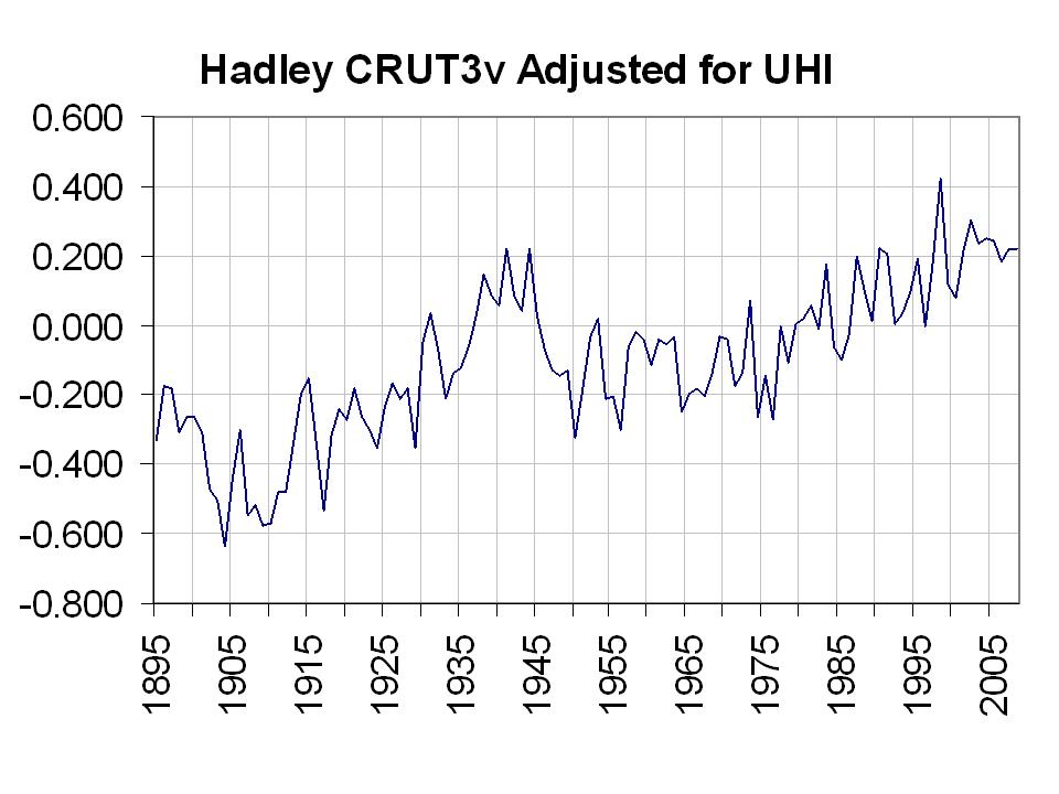

This gives a much more believable view of global temperatures, consistent with the natural forcings and more in line with records shown. The greatest warming was in the early 20th Century. The warming since 1930s and 1940s was negligible (0.2C). It suggests much to do about nothing in DC and Copenhagen. See PDF here.
UPDATE: This post has been changed to include a raw Hadley CRUT3v global plot, a NOAA-GISS difference plot and a corrected adjusted Hadley plot now all in Celsius. This is a work in progress and an attempt to see what Hadley plot might look like with an adjustment for UHI that numerous peer review papers suggest is necessary. Your suggestions are welcome (jsdaleo at yahoo.com).
Hadley, NASA GISS and NOAA GHCN v2 graphic plots all show 0.4 to 0.5C warming for the two decades which is double the satellite
http://www.cru.uea.ac.uk/cru/data/temperature/nhshgl.gif
http://data.giss.nasa.gov/gistemp/graphs/Fig.A2.lrg.gif
http://www.ncdc.noaa.gov/gcag/GCAGdealtem?mon1=1&monb1=1&mone1=1&bye1=1979&eye1=1998&graph=Lineplot&klu=1&dat=BLEND&mon2=00&bye2=00&eye2=00&mon3=00&ye=00¶m=Temperature&proce=80&puzo=0&ts=6&non=1&begX=0&begY=0&endX=71&endY=35&sbeX=0&sbeY=0&senX=71&senY=35
Adam S
Hold the blog. It’s all irrelevant. Temps are still increasing – now 40.24F higher than this time last year.
http://discover.itsc.uah.edu/amsutemps/execute.csh?amsutemps+001
Ed: You asked, “Can you provide a link or two for the recent studies that suggest minimal variation in TSI? I’m very curious about the mechanism for determining that.”
Preminger and Walton (2005) “A New Model of Total Solar Irradiance Based on Sunspot Areas”.
http://www.agu.org/pubs/crossref/2005/2005GL022839.shtml
You’d have to ask Leif for others or you could run through his website here:
http://www.leif.org/research/
Re: Joseph D’Aleo (13:02:02)
“Hadley, NASA GISS and NOAA GHCN v2 graphic plots all show 0.4 to 0.5C warming for the two decades which is double the satellite”
Are you kidding me!? This is mind numbing… Try actually plotting the data yourself.
All four major global temp datasets (including RSS and UAH) have very similar trends for the two decades in question. Maybe your talks don’t “resonate” because you’re feeding people a bunch of BS.
http://www.woodfortrees.org/plot/gistemp/from:1980/to:1999/trend/offset:-0.27/plot/gistemp/from:1980/to:1999/offset:-0.27/plot/rss/from:1980/to:1999/trend/plot/rss/from:1980/to:1999/plot/uah/from:1980/to:1999/trend/plot/uah/from:1980/to:1999
And you still haven’t justified applying UHI corrections to the ~ 70% of the globe that is ocean. Land areas don’t get “weighted” more just because there is better coverage! Mind numbing…
timetochooseagain: You asked, “How come nobody has literally done an identical analysis to that of the PDO in the Atlantic?”
I believe that type of evaluation brings out the ENSO signal in the SST data. Refer to Zhang et al (1997) “ENSO-like Interdecadal Variability: 1900–93”. They were first to calculate the PDO (NP in the paper):
http://www.atmos.washington.edu/~david/zwb1997.pdf
The process they use to calculate the PDO is described in my post “Misunderstandings About The PDO – Revised”. It’s right after Figure 2:
http://bobtisdale.blogspot.com/2009/04/misunderstandings-about-pdo-revised.html
On the other hand, Mestas-Nunez and Enfield (1999) “Rotated Global Modes of Non-ENSO Sea Surface Temperature Variability” were researching the non-ENSO related variability and they calculated the AMO in a complex manner:
http://www.aoml.noaa.gov/phod/docs/gmsst2.pdf
Enfield et al (2004) simplified the process in “The Atlantic Multidecadal Oscillation and its Relationship to Rainfall and River Flows in the Continental U.S.” by detrending the North Atlantic SST anomalies:
http://www.sfwmd.gov/portal/page/portal/pg_grp_sfwmd_hesm/portlet_opsplan_2/portlet_subtab_opsplan_clmvar/tab19738261/enfieldmestas_2001.pdf
The NOAA ESRL data and description are found here:
http://www.cdc.noaa.gov/data/timeseries/AMO/
Note how the ESRL uses a 121-month filter to make the AMO nice and smooth.
The unsmoothed AMO data is here:
http://www.cdc.noaa.gov/data/correlation/amon.us.long.data
BTW, you can even make NINO3.4 SST anomalies show their multidecadal variability with a 121-month filter:
http://i43.tinypic.com/33agh3c.jpg
Joseph D’Aleo
Oh, come on!
Show us the figures! Not poor resolution graphs.
You made the claim that “RSS and UAH” … “confirmed the warming of the 1979-1998 period but at about half the rate of the data centers”
So. Show us the data from RSS and UAH.
Show us the data from “the data centres” – HADCRUT3 and GISSTEMP?
What do you mean by rate? It seems from your reply that you are subtracting the temperature anomaly of 1979 from 1998 [“all show 0.4 to 0.5C warming for the two decades”]. Is that really what you are doing? That is egregious cherry-picking that relies on noise for much of any imagined effect.
But even then, for the period I quoted above, Jan 1979 to Dec 1998, your claim does not hold. The figures are as follows:
UAH from -0.146C to +0.289C, a rise of +0.435C.
RSS from -0.227 to +0.312C, a rise of +0.539C.
Both of which “show 0.4 to 0.5C warming for the two decades” which is what you mention for the NASA GISS and HADLEY. So, even cherry-picking doesn’t support your claim.
Show us:
1. the data for all four (or five including NOAA GHCN v2) series that you used to make your claim.
2. what, precisely, you mean by “rate”. Are you using linear regression? If not, why not? If not, what are you using? And over what time interval, precisely? Define what you mean.
You made the claim. Defend it. So far, you have just asserted, and as far as I can see, wrongly.
Adam (14:42:16) : The only one being mind numbing here is you. Sure the trends are similar, but they aren’t supposed to be that similar! And UAH, which has the best product, is still considerably less in the rate it shows. One more time, this time with feeling, eh?
http://www.woodfortrees.org/plot/hadcrut3gl/from:1979/offset:-.15/mean:12/scale:1.2/plot/uah/mean:12
Slioch (15:31:38) : See my response above.
Re: timetochooseagain (15:56:26)
“Sure the trends are similar, but they aren’t supposed to be that similar!”
Please… I don’t give a crap what you think the trends should or shouldn’t be… I care what the data say the trends are. What should be disturbing to you is that a supposedly reputable meteorologist who goes around giving talks on climate change can’t even compare two temperature time series. Seriously, this ranks with some of the worst posts I’ve ever seen on WUWT, and every time Joe responds it gets even worse. I’m with Slioch… Lets see the graphs Joe! And let me emphasize it again… why in the hell would you apply a UHI correction to the 70% of the globe that is ocean?
Anthony, how can you not be embarrassed by this guest post??
REPLY: How can you not be embarrassed to be a representative of Iowa State University with that sort of language? Clean it up. Read the latest response from Joe. – A
More cracks in the AGW foundation: click
I don’t know what planet you are referring to. This is from the latest UAH Monthly summary
Sept. 8, 2009
Vol. 19, No. 4
For Additional Information:
Dr. John Christy, UAH, (256) 961-7763
john.christy@nsstc.uah.edu
Dr. Roy Spencer, UAH, (256) 961-7960
roy.spencer@nsstc.uah.edu
Global Temperature Report: September 2009
Global climate trend since Nov. 16, 1978: +0.13 C per decade
——————————————
That is 0.26 in the 20 year 1978-1998 period.
The Hadley data includes virtually none of the southern hemisphere ocean and the SH is 80% ocean and is limited in the northern hemisphere. In Hadley’s own words
“For marine regions sea surface temperature (SST) measurements taken on board merchant and some naval vessels are used. As the majority come from the voluntary observing fleet, coverage is reduced away from the main shipping lanes and is minimal over the Southern Oceans.”
Also this plot from Klotzbach showing how NOAA GHCN is departing fram UAH and RSS since 1979
http://icecap.us/images/uploads/NCDC-SAT.jpg
Joel Heinrich (02:46:07) :
GISS, HadCRU and all the other climate averages I am aware of use minimum and maximum temperatures exclusively in determining climate averages.
I’d be surprised if Germany uses a different method for climate averages. Perhaps they may report weather averages using different method?
Joe D’Aleo: You wrote, “As for the argument by some posters or commenters that the AMO and PDO are derived differently and represent patterns not simply magnitudes, let me agree but note that the “patterns” in both oceans with the two phases of the indices are the same.”
Your argument after the word “but” does not address the problem. The AMO does not represent a pattern if you’ve derived it differently from the PDO. If you’ve created the AMO by detrending North Atlantic SST anomalies, the AMO only represents the difference between the SST anomalies of the North Atlantic and the linear trend of those anomalies, nothing more. It is used to show the semi-periodic cycle in the North Atlantic SST anomalies.
The PDO is represented in illustrations as the 1st EOF of the North Pacific SST anomalies, North of 20N. Here’s an illustration of the first EOF of the global ocean dataset performed by Atmoz. The pattern in the North Atlantic you are referring to is suppressed in his illustration:
http://atmoz.org/img/first-eof-world-sst.png
From his webpage here:
http://atmoz.org/blog/2008/08/03/on-the-relationship-between-the-pacific-decadal-oscillation-pdo-and-the-global-average-mean-temperature/
And here’s an illustration of the first EOF of the North Atlantic I created using the KNMI Climate Explorer. It shows a pattern that is similar to that of the PDO:
http://i37.tinypic.com/2rwahqx.jpg
So yes, you’re correct that they show similar patterns.
BUT
That map of the North Atlantic SST pattern was created by an EOF analysis, not by detrending the North Atlantic SST anomalies.
I’m not saying that there is not a cycle in the North Pacific SST anomalies that at times coincides with the AMO. There is one. It can be seen if you detrend North Pacific SST anomalies in the same way you detrend North Atlantic SST anomalies for the AMO. Or you could combine them by detrending the SST anomalies of the global SST anomalies between 20N and 65N. All three are illustrated in the following graph:
http://i34.tinypic.com/2ppfnyf.png
You wrote, “Both warm modes are accompanied by general net global warmth. Cold modes have the opposite configurations and results.”
If the North Atlantic SST anomalies are rising (reflected also by a rising AMO, assuming the rise exceeds the linear trend) then North Atlantic SST anomalies are contributing to a rise in global temperature.
But the same cannot be said about the PDO, since it represents the pattern of SST anomalies in the North Pacific, North of 20N. If the PDO is positive, the SST anomalies in the Eastern North Pacific are positive with respect to the SST anomalies in the Western North Pacific. The warm anomalies in the Eastern North Pacific are contributing to the temperature of the Pacific Northwest of North America, but at the same time, the cooler SST anomalies in the western North Pacific are contributing to the cooling of Northeast Asia. I discussed this in great detail in my post “Revisiting ‘Misunderstandings About The PDO – Revised’” under the heading of “The PDO, In And Of Itself, Does Not Raise And Lower Global Temperature According To Its Phase”:
http://bobtisdale.blogspot.com/2009/05/revisiting-misunderstandings-about-pdo.html
Since the PDO is a lagged aftereffect of ENSO, any rise in global temperatures while the PDO is positive would be attributable to ENSO. You can make NINO3.4 SST anomalies show their multidecadal variability with a 121-month filter:
http://i43.tinypic.com/33agh3c.jpg
When the frequency and magnitude of El Nino events exceed the frequency and magnitude of La Nina events, global SST anomalies rise. And the opposite can be said when the frequency and magnitude of La Nina events exceed the frequency and magnitude of El Nino events. I’ve illustrated this in a number of posts here at WUWT and at my website.
Regards.
Adam,
NOAA pulled out the satellite input into the global sea surface temperature because of ‘complaints’ it had a cold bias. That leaves scattered ship reports. I am told they are making no effort to use any input that may be possible from the 3307 ARGO buoys http://www-hrx.ucsd.edu/www-argo/statusbig.gif, so the 70% ocean data isn’t all you think it is.
Anyway, since the adjustment made is less than 1/3 the contamination Phil Jones found for China (1.3C per century), it is like adjusting for land only. Since NOAA, NASA and Hadley seemed to have lost Canada, Brazil, Africa, parts of Russia, Greenland, the UHI contamination for China is probably not an outlier.
Dr. Oke who won the AMS Landsberg award for his pioneer work on UHI in 2006 or 2007, found that even a town of 1000 could have a UHI of 2.2C. See more on that in this post: http://www.warwickhughes.com/hoyt/uhi.htm
See Phil Jones “Great Leap Forward” here http://www.climateaudit.org/?p=1241 for his flip from 0.05C per century global to 1.3C per century for China for the UHI contamination.
I would also suggest that since Adam has co-authored papers, let Adam come up with a better method to remove the UHI effect from a dataset and present it here for review and try-out. That’s what this is all about. Trying out an idea. If Adam would focus a portion of that energy he puts into derision toward application to the problem he might do something valuable and helpful.
– Anthony
Bob Tisdale
I agree with your argument, didn’t want to detour too far down that path. I agree there is the cumulative warming effects of more El Ninos during +PDO and cooling from La Ninas during -PDO. The warming in +PDO and El Ninos is net- there are cool pockets – e.g the southeast US just as there are regional warm pockets in La Nina (again southeast US).
The warm tripole of the +AMO corrrelates with general warmth across most NH continents on an annual basis, though can be offset by -PDO. When they are both negative – we are at our coldest, both positive, warmest.
Regards
——————
Adam, Slioch, et al
This quote from the secind link above
“What constitutes an urban site versus a rural site? Peterson and others who support the IPCC viewpoint consider a town with a population of less than 10,000 people to be rural and not to require any adjustment for urbanization. Nothing could be further from the truth.
Oke (1973) and Torok et al (2001) show that even towns with populations of 1000 people have urban heating of about 2.2 C compared to the nearby rural countryside. Since the UHI increases as the logarithm of the population or as about 0.73 log (pop), a village with a population of 10 has an urban warming of 0.73 C, a village with 100 has a warming of 1.46 C, a town with a population of 1000 people already has an urban warming of 2.2 C, and a large city with a million people has a warming of 4.4 C (Oke, 1973).
Try this thought experiment: In 1900, world population is 1 billion and in 2000, it is 6 billion for an increase of a factor of six. If the surface measuring stations are randomly distributed and respond to this population increase, it would equal 2.2 log (6) or 1.7 C, a number already greater than the observed warming of 0.6 C. If however we note that UHIs occur only on land or 29% of the Earth’s surface, than the net global warming would be 0.29*1.7 or 0.49 C which is close the observed warming. It is not out of the realm of possibility that most of the twentieth century warming was urban heat islands.”
As for the
Anthony, Joseph D’Aleo has published a follow-up article:
ep 27, 2009
Why We Need a New Global Data Set
By Joseph D’Aleo, CCM, AMS Fellow
I believe this is a more accurate (though still not perfect) plot of global temperatures than those produced by Hadley, NOAA, and NASA GISS. It combines data from all three centers, using data from two (NOAA and GISS) to adjust the third (Hadley)
http://www.icecap.us
Yes Adam, I would like to see what you come up with.
Slioch
See the difference NOAA GHCN vs UAH and RSS
http://icecap.us/images/uploads/NCDC-SAT.jpg
Re: Joseph D’Aleo (17:19:16):
“… That is 0.26 in the 20 year 1978-1998 period…”
Okay… now we are getting somewhere. So, you are taking the linear trend from 1978 to present and applying to the years 1978 – 1998. When you use that same method for GISS and Hadcrut you get 0.32, nowhere near twice the warming that you claim. Plus, if you use RSS, you get 0.30. So maybe you ought to rescind that “twice as much warming” claim. Its not even close.
“…since the adjustment made is less than 1/3 the contamination Phil Jones found for China (1.3C per century), it is like adjusting for land only.”
Are you even being serious? You are severely abusing the results of the Jones et al study whose main findings can be summarized as:
– London and Vienna had no UHI signal in temperature trends because the influence of the cities weren’t changing over time.
– Only very small UHI effects were implied for “land-based” datasets in China.
– Urban related warming was 0.1 degree C per decade from 1951–2004.
So, based on those results, you think its logical to argue that land areas of the ENTIRE GLOBE have been impacted the same way URBAN areas of China have? Plus, you extrapolated the 50 years Jones examined to an entire century… how is that justified?
Re: wattsupwiththat (18:02:25)
“I would also suggest that since Adam has co-authored papers, let Adam come up with a better method to remove the UHI effect from a dataset and present it here for review and try-out.”
Sorry, not my area, but plenty of others have used various methods to examine UHI impact on global temp records. Most have found results contradicting those here. So, Anthony, do I get extra credit for not being anonymous (involuntarily)?
REPLY: No you get extra credit when you contribute something besides sniping. – A
Adam (19:18:15) : “You are severely abusing the results of the Jones et al study whose main findings can be summarized as:
– London and Vienna had no UHI signal in temperature trends because the influence of the cities weren’t changing over time.
– Only very small UHI effects were implied for “land-based” datasets in China.
– Urban related warming was 0.1 degree C per decade from 1951–2004. ”
This is grossly misleading 1. No idea why Vienna and London are thrown in (hey, small, unrepresentative sample much?) 2. The warming over China in the entire period before urban warming is taken out is equivalent to .26 degrees C per decade-in line with the supposed global land trend:
http://hadobs.metoffice.com/crutem3/diagnostics/global/nh+sh
3. The after the fact land trend is .16 degrees per decade, which is much less, and is less than the global rate.
4. That’s especially problematic because that part of the world should be warming faster:
Ramanathan, V., M.V. Ramana, G. Roberts, D. Kim, C. Corrigan, C. Chung, and D. Winker, 2007. Warming trends in Asia amplified by brown cloud solar absorption. Nature, 448, 575-578.
The Jones et al. paper is quite frankly devastating.
Joe D’Aleo says:
That graph, which is from your own website, looks incorrect to me. Can you explain how it jives with graphs we can make using WoodForTrees, like this (which is like Adam’s except extended up through the current year): http://www.woodfortrees.org/plot/gistemp/from:1980/to:2009/trend/offset:-0.27/plot/gistemp/from:1980/to:2009/offset:-0.27/plot/rss/from:1980/to:2009/trend/plot/rss/from:1980/to:2009/plot/uah/from:1980/to:2009/trend/plot/uah/from:1980/to:2009
Your graph also makes no sense, as it shows the total deviation between NCDC and the satellite record over that period to be equal to about what the total rise in the NCDC record was! That implies that the satellite record didn’t rise over the period, when in fact even UAH rose at 0.13 C/decade, only modestly less than the NCDC rose. Frankly, I think you screwed up the graph.
By the way, while we have your ear, could I ask you something that has been troubling me for a while: Why do you produce plots (like this: http://icecap.us/images/uploads/MSUCRUCO2.jpg or http://icecap.us/images/uploads/CO2MSU.jpg ) that compare temperature and CO2 on the same graph in such a way that you would expect the temperature trend to have the same slope as the CO2 rise if the transient climate response were about 8 or 9 C / doubling? If you wanted to make a comparison to the IPCC expectations, wouldn’t it make sense to use a scale where the transient climate sensitivity were about 1/4 of that…Or, do you worry that on such a graph it would be much more obvious that, given the obviously large temperature fluctuations, one can’t really say whether or not the temperature trend is following the expectations over such a short time period?
@ur momisugly timetochooseagain (10:12:23) :
I do not question the results of the paper that Pielke refers to but I do question his statement:
Thus minimum temperatures over land are very sensitive to their immediate local environments. Their use to characterize minimum temperatures as being spatially representative over a larger area, such as used to diagnose global warming and cooling, are not appropriate.
I undertand how actual recorded local temperatures may be influenced, but why would the TREND in temperature at these places be affected?
It is not as if these locations are moving? Overnight temps are rising faster than afternoon temps which is not a surprise because of the convective nature of the afternoon boundary layer. Overnight layers may not be as stable as we have believed but they are certainly more stable than daytime layers. Pielke himself states this in the second link you provided:
In addition to the thermodynamic stability and wind speed, the nocturnal boundary layer is sensitive to changes in land surface characteristics, such as heat capacity [Carlson, 1986; McNider et al., 1995a]. Additionally, it is also much more sensitive to external forcing such as downward longwave radiation from greenhouse gas forcing, water vapor, clouds, or aerosols than is the daytime boundary layer [Eastman et al., 2001; Pielke and Matsui, 2005]. The main reason for this sensitivity is that the nocturnal boundary layer is shallower than the daytime boundary layer. Thus heating of the surface due to infrared radiation or changes in heat capacity or conductivity of heat from the soil is distributed through a smaller air layer.
Then Pielke summarizes with:
In summary, given the lack of observational robustness of minimum temperatures, the fact that the shallow nocturnal boundary layer does not reflect the heat content of the deeper atmosphere, and problems global models have in replicating nocturnal boundary layers, it is suggested that measures of large-scale climate change should only use maximum temperature trends.
Of course, then it means less AGW in that specific respect because max temps have warmed at a much lower rate. Strange that Pielke states how overnight temps are more strongly influenced by downwelling greenhouse gas IR so why would he remove a component that he is trying to measure?!
I still cannot see how TREND would be affected if one considers all of Pielke’s “problems”. For example, wouldn’t wind speed changes average out over the long haul so that the underlying trend sticks out?
Regarding the Peterson paper from 1998 as being ancient. Are we not looking at historical data and not just newer data? So what if we are looking at 1950 to 1990? Comparison between temperature trends of the full corrected land data set used in global temperature trend analysis and a subset of rural stations suggests there is very little residual effect of urbanization remaining in the data. And more importantly, this study was done well before surfacestations.org and parallels the NOAA analysis that some here think is a conspiracy.
Here are some newer articles that also refute Pielke’s claims:
http://hadobs.metoffice.com/urban/Parker_JClimate2006.pdf
Conclusion: The analysis of Tmin demonstrates that neither urbanization nor other local instrumental or thermal effects have systematically exaggerated the observed global warming trends in Tmin.
http://ams.allenpress.com/perlserv/?request=get-abstract&doi=10.1175%2FJCLI3431.1
Conclusion: comparison between U.S. Historical Climatology Network (HCN) time series from the full dataset and a subset excluding the high population sites indicated that the UHI contamination from the high population stations accounted for very little of the recent warming.
And of course IPCC WGI 2007 at http://www.ipcc.ch/pdf/assessment-report/ar4/wg1/ar4-wg1-chapter3.pdf
Conclusion: Urban heat island effects are real but local, and have not biased the large-scale trends. A number of recent studies indicate that effects of urbanisation and land use change on the land-based temperature record are negligible (0.006ºC per decade) as far as hemispheric- and continental-scale averages are concerned because the very real but local effects are avoided or accounted for in the data sets used.
So far the data suggests that “the rising tide lifted all boats” which seems common sense to me.
Thanks for this reference, Smokey. Check out the Calgary Herald, folks.
Quotes from it:
[In reference to Latif]: “They failed to observe the current cooling for years after it had begun, how then can their predictions for the resumption of dangerous warming be trusted? My point is they cannot. It’s true the supercomputer models Latif and other modellers rely on for their dire predictions are becoming more accurate. But getting the future correct is far trickier. Chances are some unforeseen future changes will throw the current predictions out of whack long before the forecast resumption of warming.”
Chris
Norfolk, VA, USA
By the way, another way of looking at my last point without getting into the transient climate sensitivity is simply this: If you look at what the rise in CO2 in those ICECAP plots corresponds to on the temperature axis, you find that it is about 0.63 to 0.7 C per decade. By contrast, the IPCC AR1 WG1 Summary for Policymakers (SPM), available here http://www.ipcc.ch/ipccreports/ar4-wg1.htm states (on p. 12), “For the next two decades, a warming of about 0.2°C per decade is projected for a range of SRES emission scenarios.”
Philip_B (17:32:47) :
Joel Heinrich (02:46:07) :
GISS, HadCRU and all the other climate averages I am aware of use minimum and maximum temperatures exclusively in determining climate averages.
I’d be surprised if Germany uses a different method for climate averages. Perhaps they may report weather averages using different method?
Average hourly data?