As we’ve seen in this report from John Goetz, GISS: worlds airports continue to run warmer than ROW a significant portion of the GHCN (Global Historical Climate Network) surface temperature record is measured in airports, not rural open fields. Airports, airport expansion, and air travel frequency tend to be linked with the population, growth, and wealth trends of a city. It stands to reason that since the majority of thermometers in the GHCN record are at airports, they’d have a broad application of UHI. Joe tries out a simple method of approximating what the signal might look like with a UHI removal. – Anthony
Chasing a More Accurate Global Century Scale Temperature Trend
By Joseph D’Aleo, CCM, AMS Fellow

Hadley Center Annual Mean Temperature since 1895 shows a warming of about 1C since 1895. – Click for larger image
The long term global temperature trends have been shown by numerous peer review papers to be exaggerated by 30%, 50% and in some cases much more by issues such as urbanization, land use changes, bad siting, bad instrumentation, and ocean measurement techniques that changed over time. NOAA made matters worse by removing the satellite ocean temperature measurement which provide more complete coverage and was not subject to the local issues except near the coastlines and islands. The result has been the absurd and bogus claims by NOAA and the alarmists that we are in the warmest decade in 100 or even a 1000 years or more and our oceans are warmest ever. See this earlier story that summarizes the issues.
No one disputes the cyclical warming from 1979 to 1998 that is shown in all the data sets including the satellite, only the cause. These 60-70 year cycles tie in lock step with the ocean temperature cycles and solar Total Solar Irradiance. The annual mean USHCN temperatures are shown below along with the annual TSI and PDO+AMO.
 Click for larger image
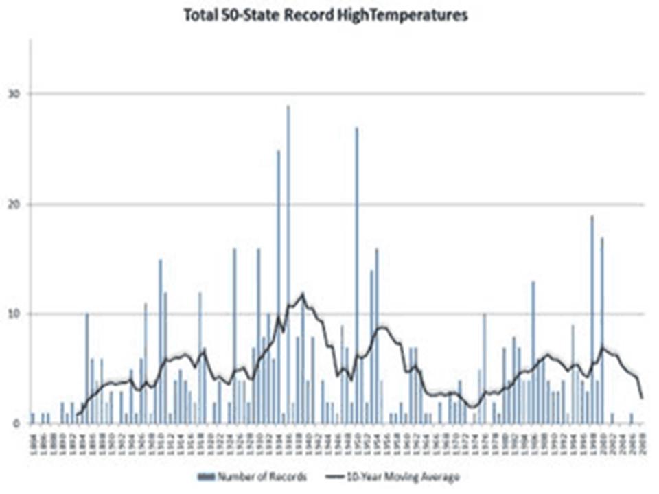
One needs simply to look at the record highs for the United States and globe to see that the warmest years are not all in the last two decades (although some were to be expected given it is one of two peaks in the cycles). The first image below shows the decadal state record all-time highs. The 1930s still clearly dominates (24 state all time records) with only one state (South Dakota) in the 2000s tying a 1930s all-time heat record.
 Click for a larger image
The following image (enlarged here) shows the record monthly highs by individual year. Note the 1930s and 1950s dominate and this decade showing the least record highs than any decade since the 1800s.

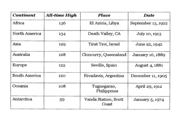
Here is the NCDC compilation of the continental all-time records (enlarged here), note for all the populated continents, the records were in the 1800s and early 1900s.

TRYING TO GET AT A BETTER LONG TERM TREND
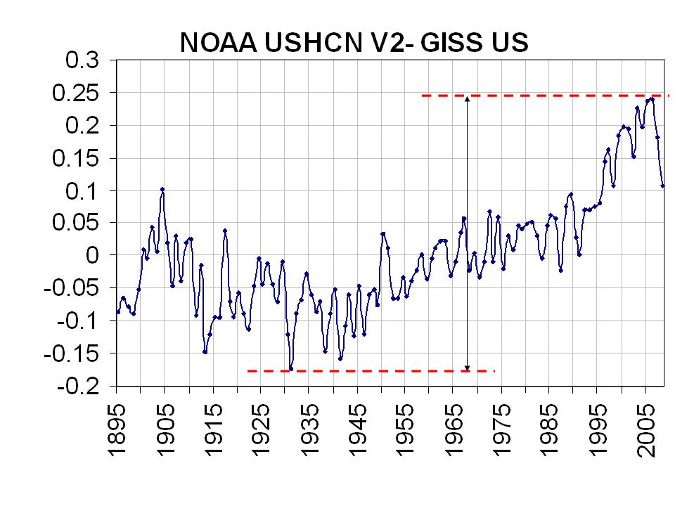
NCDC removed the UHI effect for the US in 2007 in version 2 of the USHCN. GISS maintains their version of a UHI adjustment of this NCDC USHCN data. By differencing the two, I found the following (enlarged here):
 NOAA USHCNV2 -vs- GISS – click for larger image
It shows an artificial warming of about 0.45 C or 0.75F for the NOAA data for removal of the urbanization adjustment. Phil Jones of the Hadley Center, co-authored a paper that showed the UHI contamination of China was 1 degree Celsius (1.8F) for the century, so this contamination appears not to be unreasonable, in fact it may be conservative.
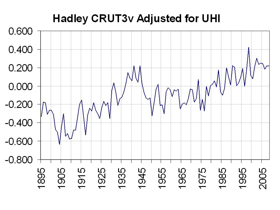
I then took that UHI adjustment for the United States and applied to the global data. The Hadley center data is dominated by land areas with their ocean temperatures mainly coming from ships and in the northern hemisphere. Here’s what Hadley says about marine data “For marine regions sea surface temperature (SST) measurements taken on board merchant and some naval vessels are used. As the majority come from the voluntary observing fleet, coverage is reduced away from the main shipping lanes and is minimal over the Southern Oceans.”
I subtracted the UHI annual contamination from the annual Hadley CRUT3v global temperatures. I got the following (enlarged here):

This gives a much more believable view of global temperatures, consistent with the natural forcings and more in line with records shown. The greatest warming was in the early 20th Century. The warming since 1930s and 1940s was negligible (0.2C). It suggests much to do about nothing in DC and Copenhagen. See PDF here.
UPDATE: This post has been changed to include a raw Hadley CRUT3v global plot, a NOAA-GISS difference plot and a corrected adjusted Hadley plot now all in Celsius. This is a work in progress and an attempt to see what Hadley plot might look like with an adjustment for UHI that numerous peer review papers suggest is necessary. Your suggestions are welcome (jsdaleo at yahoo.com).
@John Finn (17:04:19) :
“The “amplification factor” in the troposphere is something like 1.2”
what is your source of 1.2 ?
looking at the picture below it should be around 2 between -45° and +45° latitude, what already covers about 70% of the earth’s surface. Elsewhere it is roughly factor 1 giving a total of approx. 1.7.
http://www.climateaudit.org/wp-content/uploads/2008/06/hadat43.gif
It hit 59 degrees in Antarctica?
Manfred (22:21:02) :
@John Finn (17:04:19) :
“The “amplification factor” in the troposphere is something like 1.2″
what is your source of 1.2 ?
I’ve seen it quoted lots of times. Here’s one source.
http://en.wikipedia.org/wiki/Satellite_temperature_measurements
“Climate models predict that as the surface warms, so should the global troposphere. Globally, the troposphere should warm about 1.2 times more than the surface; in the tropics, the troposphere should warm about 1.5 times more than the surface.”
There’s also a discussion here at CA
http://www.climateaudit.org/?p=3048
which includes the following: “In this respect, the March 2008 satellite data for the tropics is pretty interesting. The graph below shows UAH (black) and RSS (red) for the tropics ( both divided by 1.2 to synchronize to the surface variations – an adjustment factor that John Christy said to use in an email)”
I could be wrong but I assumed the factor of 1.2 related to the expected amplification of the troposphere relative to the surface. Apart from this there are studies which have cited the 1.2 figure which I’m sure I can dig out if needed (and I could be bothered 🙂 )
This graph appears to (possibly) follow extremes of terrestrial polar motion radius, but I can’t make out the x-axis labeling:
http://icecap.us/images/uploads/ANNUALHIGHS.jpg
Any chance the x-axis text-size can be quadrupled in size? … or perhaps a link to the data?
Philip_B (17:19:22) :
“Indeed the smog, smoke and particulate pollution did block sunlight from reaching the surface. However, the surface temperatures are compiled from just 2 values, minimum temperature and maximum temperatures for the day.”
No it’s not. At least in Germany it never was. I don’t know if there is a difference and if, how big it is, but it should differ in some way. Does anyone know how the mean temperatures are compiled in other countries?
http://www.dwd.de/bvbw/appmanager/bvbw/dwdwwwDesktop?_nfpb=true&_windowLabel=dwdwww_main_book&switchLang=en&_pageLabel=dwdwww_start
I’ve wondered about the effect of smoke and smog. It doesn’t affect just the developing world. In Britain there were various Clean Air Acts in the 50’s/60’s that have been very successful. Now our air is far cleaner. I have seen it stated several times that much of the warming Britain and western Europe enjoyed during the 20th century was due to this environmental legislation. If so, it’s a huge irony that this warming, apparently so feared by the greenies, was caused by successful environmental improvements!
As well as cleaner air allowing more heat to reach the surface, I wonder if there’s another important factor. If there are less particulates in the air, would this reduce the amount of clouds by some amount? And if so, could this mechanism also contribute to the warming?
Chris
Ian George (15:32:57) :
Whoops. Note the temp for 24/9/09 on the UAH satellite site – 40.13F above this time last year. What’s up?
http://discover.itsc.uah.edu/amsutemps/execute.csh?amsutemps+001
It seems that we’ve reached the tipping point. Hansen was right, I suggest give him more funding.
“Most of the observed warming has been in the minimum temperature (about 70%) and reduced smog and smoke would (and probably does) account for the warming from the mid-1970s to the mid-1990s due to clear air legislation in the developing world.”
I have never seen charts showing the separate evolution of both the Tmin and Tmax components of the temperature, always the aggregate. I think that such a chart would be extremely informative since most of the alleged effects of AGW seem to be related to increases in Tmax during the summer, while in fact, the reality is that we have experienced less colder nights during the winter (that increases the average temperature, but it is hardly something to worry about, unless you are the owner of a skying resort).
The AGW scam is based in a number of false claims, specially the following three:
1) CO2 (and other greenhouse gases) are the cause of warming. They are not.
2) The warming experienced is unprecedenteted. It is not.
3) The consequence of warming is more extreme weather. It is not, mostly it has resulted in less extreme weather (since the gradient of temperatures has reduced).
I notice that most of the discussions on this blog and similar ones I follow, are focused on the first two issues, but I think that precisely the third one is the most important, because even if the first two were true, it is the third which makes all the difference.
As an example, there is a diagram in the Technical Summary of the IPCC 4AR (Box TS5. Figure 1 – page 53) that shows how the increase in mean temperature translates into more extreme weather. This is an oversimplyfied analysis, very easy to debunk.
We know from life that clouds overhead cool the surface at thermometer height in the tropics and temperate zones. Never been to polar zones. Do we know that the same applies there?
Manfred says:
In addition to having to integrate over the whole globe, you also have to consider the fact that the satellite data does not measure the temperature at one altitude but rather a weighting of temperatures over a broad range of altitudes.
This updated version sure isn’t much better… Just because land areas have better coverage doesn’t mean they are given more “weight” in the global temperature calculation. In other words, nothing changes the fact that you are applying a UHI correction to ~ 70% of the globe that is covered in oceans. Also, I still don’t see the relevance of the copied and pasted “Sun and Ocean Cycles Versus Temperature” chart that uses US temperatures to make an argument about GLOBAL trends… I’d like to see that same chart, but using a global temperature dataset and a more recent TSI record. The last thing I’ll point out… In your “NOAA USCH V2 – GISS US” plot you use the two most extreme values in the chart to derive your “artificial warming”. If I used that same technique to derive the warming during the last 30 years from the UAH global temp time series http://www.woodfortrees.org/graph/uah, I’d get total warming of about 1.2 degrees C, but of course I would have been “cherry-picking” in the worst way.
Joe D’Aleo says:
So, you seem to be justifying using the UHI correction on the entire global temperature because of the sparser coverage for sea surface temperatures. However, I don’t think that they just average all of the measurements that they have. I think they weight them by the area that they represent. So, if sea surface temperatures are sparser, each sea surface temperature measurement will tend to represent a larger area and will thus get weighted more. (Depending on how they do things, it may be that coastal land stations end up representing more area over the oceans than sea surface temps. end up representing area over land…but even if this were true, I imagine it would not be a huge effect, and thus sea surface temperatures would end up representing a significant part of the global temperature record.)
@ur momisugly timetochooseagain (16:16:07) :
The main issue as far as I can see is that Joe has applied an “UHI correction” to the entire globe, including the oceans.
@ur momisugly John Finn (17:04:19) :
This looks to be a case of torturing the data to get a result we like.
Takes the words right out of my mouth. This analysis is awful. If Joseph wanted to impress us with record temps, he should have shown how overnight low temps have trended because that will be a much better indicator of AGW than afternoon highs. Of course, choosing the US and a few international locales does not prove much about global temps.
In science, we are supposed to collect the data and then interperate the results to arrive at a conclusion. Joseph began with the conclusion and worked backwards.
Regarding the topic of UHI, has there been a rebuttal to the following articles (among several others) that show that UHI has not affected trends in temperatures?
http://www.ncdc.noaa.gov/oa/about/response-v2.pdf
http://www.agu.org/pubs/crossref/1999/1998GL900322.shtml
Joe D’Aleo: Regarding your “Sun and Ocean Cycles Versus Temperatures” graph that appears in many of your posts and most recently in the one above.
The LST anomalies of the United States do in fact follow the SST of the U.S. Coastal Waters.
http://s5.tinypic.com/209r3t2.jpg
From my post “SST Anomalies of U.S. Coastal Waters”:
http://bobtisdale.blogspot.com/2009/03/sst-anomalies-of-us-coastal-waters.html
But those are SST anomalies. Your graph, however, uses a curious summing of PDO+AMO. The PDO data is the leading Principal Component of the North Pacific SST anomalies, North of 20N, after Global SST anomalies have been removed. The AMO from the NOAA ESRL is simply detrended North Atlantic SST anomalies. If memory serves me well, to sum the PDO and AMO data, you do standardize the AMO data, but one fact remains: you’re adding the leading PC of the North Pacific SST anomaly residuals and detrended SST anomalies. The PDO reflects a pattern of SST anomalies, while the AMO data from NOAA ESRL does not. In effect, you’re comparing apples to the pattern of the “dimples” on the orange rind.
Also as Adam noted above, the Hoyt and Schatten (1993) data is very much outdated. The problem does not lie in the fact that their data ends in 1978 and that you’ve spliced the ACRIM data to it, though there is debate about the ACRIM data, too. The problem with the Hoyt and Schatten TSI data is the variation in the minimums. Recent studies indicate the major variations in TSI minimum do not exist. Here’s a link to a copy of Hoyt and Schatten (1993):
http://www.countyofkings.com/planning/Plan/Dairy/comment%20PDF's/21-3.pdf
In “IPCC 20th Century Simulations Get a Boost from Outdated Solar Forcings”…
http://bobtisdale.blogspot.com/2009/03/ipcc-20th-century-simulations-get-boost.html
…which was also posted here at WUWT…
http://wattsupwiththat.com/2009/03/05/ipcc-20th-century-simulations-get-a-boost-from-outdated-solar-forcings/
…I illustrated the difference between the Hoyt and Schatten [green curve] and the current understanding of TSI variability as represented by Svalgaard [purple curve] in terms of TSI:
http://s5.tinypic.com/fp6qyp.jpg
And I also illustrated the comparison in terms of their impacts on global temperature:
http://s5.tinypic.com/2mg6rll.jpg
Climatologists hindcast 20th century global temperature for the IPCC using outdated TSI reconstructions to help their models reproduce the rise in global temperature from the 1910s to the 1940s. The Global Warming Art website also uses it in their illustration of “Climate Change Attribution”… http://www.globalwarmingart.com/wiki/Image:Climate_Change_Attribution_png
…which was discussed in this post:
http://bobtisdale.blogspot.com/2009/01/agw-proponents-are-two-faced-when-it.html
Looks like both sides want to massage the data.
Thanks for the clarification Bob. I was about to ask for the source of that TSI reconstruction which peaks suspiciously in 1945 (to match temp?). Curious bit of work…
Can you provide a link or two for the recent studies that suggest minimal variation in TSI? I’m very curious about the mechanism for determining that.
Thanks, Ed
Can anyone direct me to a good resource for historic length of day versus long/lat?
Seems there is plenty of data for global, but I’d like to look at hemispheric data to see if it could be used detect variations in obliquity into and out of the little ice age.
Scott A. Mandia (07:13:21) : “If Joseph wanted to impress us with record temps, he should have shown how overnight low temps have trended because that will be a much better indicator of AGW than afternoon highs.”
Actually, using the Minimum temps would be much worse:
http://pielkeclimatesci.wordpress.com/?s=minimum+temperature&searchsubmit=Find+%C2%BB
With regard to the papers-the second is ancient, but the best recent work on issues with the data is:
http://www.climatesci.org/publications/pdf/R-321.pdf
And, with regard to the talking points memo:
http://pielkeclimatesci.wordpress.com/2009/07/03/roger-a-pielke-sr-comments-on-the-ncdc-talking-point-response-to-the-report-%E2%80%9Cis-the-us-surface-temperature-record-reliable%E2%80%9Dby-anthony-watts/
http://wattsupwiththat.com/2009/06/24/ncdc-writes-ghost-talking-points-rebuttal-to-surfacestations-project/
http://www.climateaudit.org/?p=6370
http://wattsupwiththat.com/2009/07/30/on-climate-comedy-copyrights-and-cinematography/
The last link also contains stuff which isn’t so pertinent. The publications arguing that the warming trends in the surface data are exaggerated are extensive.
I tried to answer many of your questions on this post including why I felt you can use the AMO and PDO like I did here: http://icecap.us/index.php/go/joes-blog/why_we_need_a_new_global_data_set/
Unfortunately we can’t do a more elaborate Hadley/IPCC data evaluation because Phil Jones at Hadley has refused to provide raw data and adjustments made and claims to have lost some of the original data for want of storage capabilities. They only have for some regions the homogenized, modified data. See this post for more: http://icecap.us/index.php/go/political-climate/opinion_the_dog_ate_global_warming1/
The data centers want to treat their information as proprietary to them but unlike public corporations, they are repositories of data for use by educational and research institutions and researchers and are obliged to properly maintain the original data, make it available to anyone who is qualified to work with it, AND document each and every adjustment made and why.
Can you imagine what would happen after an audit or investor review of an annual financial report of any public corporation if they hid key financial information and only supplied carefully processed/manipulated information that showed them in the best possible light. Do we have the ENRON(s) of weather here? All three data centers have a vested financial interest in promulgating global warming. They each have reputations and major funding at risk. In other words, the foxes are in charge of the data chicken coups.
The only independent data sources are RSS and UAH with satellite analysis. They work closely together addressing issues raised and make those adjustments in both directions public. Their work has confirmed the warming of the 1979-1998 period but at about half the rate of the data centers, consistent with that up to 50% contamination in the literature.
In all my talks (I give dozens a year), I try and address all the issues with the surface data bases including those uncovered by Anthony and some of you) and point out the fact that numerous peer review papers estimate artificial warming contamination of 30-50% or even higher. But just stating that seems to not easily resonate with people. It is hard to visualize mentally what that means.
I do show the US data before and after UHI was removed in 2007 and that helps, but I wanted to try and find a way to adjust the IPCC’s Hadley source with a UHI adjustment to show what 30-50% means, that the warmest 10 years were not in the last 12 years, and that the changes are cyclical and can be related to natural factors, and importantly in the end, that EPA regulation, US congressional legislation and any Copenhagen action is unnecessary and unwarranted.
You should take a closer look at the problems
http://icecap.us/images/uploads/US_AND_GLOBAL_TEMP_ISSUES.pdf before you dismiss the brief post and the need to somehow get at the real trends and determine if indeed we have a problem before spending trillions of dollars and destroying the world’s economy and our future.
Great. Hey Mods, that one had a lot of links, could you dig it out of the filter for me? Thanks.
Bob Tisdale (07:47:05) : The AMO’s ambiguous definition has been making me think that there has to be a better way to get whatever signal is there. How come nobody has literally done an identical analysis to that of the PDO in the Atlantic?
Joseph D’Aleo (10:13:05) : My only real problem is that the adjustments suggested here are not in accord with my attempt here:
http://www.climateaudit.org/phpBB3/viewtopic.php?f=3&t=740
But I totally agree that the data, especially in the land surface data sets, exaggerates the warming.
See slides eight and nine:
http://searchanddiscovery.com/documents/2009/110119christy/ndx_christy.pdf
Re: Joseph D’Aleo (10:13:05)
“The only independent data sources are RSS and UAH…”
Okay then… so how do the trends from RSS and UAH compare with the 1980 to present trends in your “adjusted” HadCRUT time series? Wouldn’t that comparison be a very simply way to verify your “analysis” using an independent data source?
Joseph D’Aleo claims, “The only independent data sources are RSS and UAH with satellite analysis. … Their work has confirmed the warming of the 1979-1998 period but at about half the rate of the data centers, consistent with that up to 50% contamination in the literature.”
Not according to the linear trends given for the global mean temperatures for the four (two surface, two satellite) series. For example, RSS from Jan 1979 to Dec 1998 inclusive is shown here (click on ‘raw data’ to see the figures):
http://www.woodfortrees.org/plot/rss/from:1979/to:1999/trend
The other series can be accessed by changing the ‘Data source’ appropriately.
The results are as follows:
Jan 1979 to Dec 1998 global mean linear trend:
HADCRUT3 +0.0153C/year
GISSTEMP +0.0143C/year
UAH +0.0113C/year
RSS +0.0154C/year
So, Mr D’Aleo can you tell us:
Do you accept the above figures?
Do you accept that they in no way support your assertion that the satellite series show warming at “about half the rate” of the surface series? (Indeed the highest rate is given, marginally, by RSS).
If you don’t accept the figures please explain why not and provide your figures and their source.
The idea that we should subtract UHI from the world temperature set is a good one.
I’d like to see it done with just the Hadley surface data instead of the whole set.
Slioch (11:34:39) : That’s idiotic. The satellites are expected to show warming at 1.2 times the surface rate, so the real comparison would then be:
HADCRUT3 +0.0153C/year (divided by 2 is about .008)
UAH/1.2 +0.0094C/year
In other words, with the best satellite data set, the surface trend is much larger than would be expected based on the amplification ratio which is commonly cited. Indeed, it is almost twice as large as it should be.