Guest post by Steve Goddard
UPDATE 1-15-08:
I tried an experiment which some of the null questioners may find convincing. I took all of the monthly data from 1978 to 1997, removed the volcanic affected periods, and calculated the mean. Interestingly, the mean anomaly was positive (0.03) i.e. above the mean anomaly for the 30 year period.
This provides more evidence that normalizing to null is conservative. Had I normalized to 0.03, the slope would have been reduced further.
Yesterday’s discussion raised a few questions, which I will address today.
We are all personally familiar with the idea that reduced atmospheric transparency reduces surface temperatures. On a hot summer day, a cloud passing overhead can make a marked and immediate difference in the temperature at the ground. A cloudy day can be tens of degrees cooler than a sunny day, because there is less SW radiation reaching the surface, due to lower atmospheric transparency.
Similarly, an event which puts lots of dust in the upper atmosphere can also reduce the amount of SW radiation making it to the surface. It is believed that a large meteor which struck the earth at the end of the Cretaceous, put huge amounts of dust and smoke in the upper atmosphere that kept the earth very cold for several years, leading to the extinction of the dinosaurs. Carl Sagan made popular the idea of “nuclear winter” where the fires and dust from nuclear war would cause winter temperatures to persist for several years.
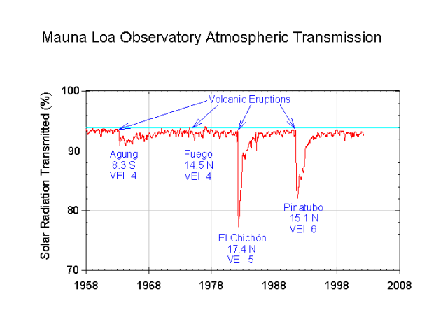
Large volcanic eruptions can have a similar effects. This was observed in 1981 and 1992, when volcanic eruptions caused large drops in the measured atmospheric transmission of shortwave radiation at the Mauna Loa observatory. These eruptions lowered atmospheric transmission for several years, undoubtedly causing a significant cooling effect at the surface. At one point in late 1991, atmospheric transmission was reduced by 15%. An extended period like that would lead to catastrophically cold conditions on earth.
In recent years, there has been a lot of interest in measuring how much warming of the earth has occurred due to increased CO2 concentrations from burning fossil fuels. This is difficult to measure, but one thing we can do to improve the measurements is to filter out events which are known to be unrelated to man’s activities. Volcanoes are clearly in that category. In yesterday’s analysis, I chose to null out the years where atmospheric transparency was affected by volcanic eruptions, as seen in the image below. Atmospheric transmission is in green, and UAH satellite temperatures are in blue.
Atmospheric transmission in green. Monthly temperature deviation in blue, with overlap periods nulled out.
The question was raised, why did I null out those periods?
I made that decision because the null level is the mean deviation for the period, and because that is the most conservative approach. As you can see in the image below, there is a large standard deviation and variance from month to month, which makes other approaches extremely problematic. There were also corresponding El Ninos during both of the null periods, which would have been expected to raise the temperature significantly in the absence of the the volcanic dust. Had I attempted to adjust for the El Nino events, the reduction in slope (degrees per century) would have been greater than what I reported. This is because the temperature anomaly during each El Nino would have been greater than zero (above the null line.)
Due to the large standard deviation and large monthly variance, any attempt to calculate what the temperature “should have been” in the absence of the volcanic dust would likely introduce unsupportable error into the calculation. One can play all sorts of games based on their belief system about what the temperature should have been. I chose not to do that, and instead used the mean as the most conservative approach.
There is no question that the volcanic dust lowered temperatures during those periods, and because of that the 1.3C/century number is too high. My approach came up with 1.0. A reasonable ENSO based approach would have come up with a number much less than that. If you take nothing else away from this discussion, that is the important point.
UAH, with non-nulled temperatures in green.
Furthermore, it is also important to realize that the standard approach of reporting temperature trends as linear slopes is flawed. Climate is not linear, which is why Dr. Roy Spencer fits his UAH curves with a fourth or fifth order function, rather than a line.
Steven Goddard: your
This provides more evidence that normalizing to null is conservative. Had I normalized to 0.03, the slope would have been reduced further.
As I said yesterday, commenting on your original posting, you get the same slope, but the whole graph shifts down, when a new reference period is calculated. Positive peaks are lower, and negative troughs are deeper.
However, the slope, when I delete the volcano years, is indeed slightly lower, compared to the values when zero is input. But not by much.
If the volcano years are deleted, there is the same slope, regardless of the calculated reference period.
My slopes:
All data 1.275
Zero values in volcano years 1.0365
delete volcano years 1.0203
Make that four years.
John J — I remember the 70s and the fix for the ‘global ice age hoax’ was to cover Antarctica and Greenland with carbon black. The then brand new 747 could be fitted out with dump tanks to make dispersal of the carbon black easy., Old tires could serve as an almost limitless source of carbon black. The ice would melt, we would do this as long as necessary, staving off the coming ice age.
What if we had actually done this and then the solar maximum of the late 20th century occurred and then … WOW would we and the polar bears been sorry then.
I say we leave it alone. Keep our planet as clean as we can, and enjoy. Study the science until we have a really good idea of what is really going on with climate. I would say that 100,000 years of study with decent instruments would be a good time frame.
I say we hold off on the SO2 and the various AGW fixes, how do taxes fix the climate, anyone, and just stick to science, real science.
Yeah, there is more than a little dollop of cheek in here, but the truth is there also.
jorgekafkazar please…
That wasn’t high-school algebra, I teach this stuff at the university. I win my life doing lest squares. You can’t replace trended data with non-trended data, you add a bias that lowers the slope estimate.
In a timeseries a data point is an (x,y) point. When you remove the x you remove the corresponding y.
After reading all the comments so far I have to agree (with Joel and others) that this exercise in invalid. If the volcanoes were independent events, that is, the temperatures after the volcanoes were exactly the same as they would have been without the volcanoes, then this exercise would be valid. However, we all know that is not true. Climate inertia is real.
For example, let’s say I go gambling for 10 hours and play the slots, get lucky and win $2000. However, I took a break in the middle and lost $2000 at blackjack. I can’t walk out and ignore the blackjack losses when computing my trend over the 10 hours. While I could track a trend of SLOT WINS, using only the slots wins in total win/loss is invalid.
This is essentially what this exercise is doing with heat.
Steve Goddard, it is easy to show that your method is not conservative. Remove all your data and replace it with the average, the slope is 0.0 by definition. There have been several suggestions. For what you proposed you can put it in an X:Y OLS without the data, or you can use the relaxtion method I suggested. There are other than equivalents. It would make your points stronger. As it is the slope is computed incorrectly for the point you are making.
Over 200,000 new undersea volcanoes over 100 meters high discovered: click
OK, so it’s from New Scientist. But still.
For who is interested in the ongoing Chaitén Volcano eruption you can find the most recent update at:
http://volcanism.wordpress.com/2009/01/15/chaiten-update-15-january-2009/
This unique volcano has the potential to blast a huge amount of basaltic silica into the stratosphere.
From the report:
“Fresh upwellings of lava, increasing the pressure beneath the unstable dome, have the potential to produce explosive collapse on a larger scale than anything we have so far seen, generating pyroclastic flows with sufficient energy to sweep through the Chaitén river valley as far as the sea. If any new lava injections are insufficient to bring about a collapse on this scale, the present steady-state situation of ongoing dome growth and constant minor collapses may continue”.
You can view the Chaitén Eruption via the North Camera stationed at the Chaitén Airport via this site: http://www.seablogger.com/?page_id=11086
This web cam provides a direct view on Chaitén with sometimes spectacular events.
A complete archive and hundreds of pictures of Chaitén can be found here:
http://inglaner.com/volcan_chaiten.htm
The SI/USGS Global Volcanism Program latest weekly report:
http://volcanism.wordpress.com/2009/01/15/siusgs-weekly-volcanic-activity-report-7-january-2009-13-january-2009/
Willem de Rode (04:58:27) :
Willem
Ok I see your point, but the temperatures, in the 2 cases, would eventually converge at some ‘equilibrium’ point – and we have had 18 years since the last eruption.
If you get a chance look at monthly data plots from UAH or GISS, you will quickly see that the variability in the data makes an argument on wether the true temperature trend is 1, 1.2 or 1.3 K per century pretty much irrelevant.
I plotted the GISS data with the UAH data the plots are in my photo gallery http://gallery.me.com/wally#100002&view=grid&bgcolor=black&sel=3 both the whole trend and the 1979 to 2008 data.
I adjusted the base value of the GISS data to the average of 1979 to 2000 so it matches the UAH data set. The smoothed lines are a 13 month average.
The data sets do have slightly different linear trends and the UAH data set has more scatter but they are really close overall. I was really surprised given how bad some of the weather stations are.
Thankyou jorgekafkazar and smokey. so they found 200K and there is possibly 3 million volcanoes according to the new scientists article.
It appears more and more that the oceans and their currents ENSO, PDO AMO are the driving force behind world temps. Surely the amount of heat coming from the mantel below is affecting the heat content of the oceans, and thus the atmosphere.
Richard M, I disagree. Sure the stratospheric volcanoes will leave their imprint on the system, but not a long term one (unless they are much more frequent). Once atmospheric transmission goes back to normal the system should resume it’s long term trend (if any).
Steve Goddard’s analysis is rather interesting. The current “warming” looks more impressive than it is because of those periods with a large change in atmospheric transmission.
I only disagree with this awkward habit seen in climate scientists of patching the data when doing their fits. Sometimes one needs to do it (like when trying to get the shape of some distribution function) but I fail to see the need for that when computing a simple straight line.
Are these data available somewhere? I would like to make a robust slope estimation (least squares is not adequate to this kind of data with strong outliers).
Filipe,
The GISS and UAH monthly data are at http://vortex.nsstc.uah.edu/data/msu/t2lt/uahncdc.lt
http://data.giss.nasa.gov/gistemp/tabledata/GLB.Ts.txt
You can fit more complex functions to the data and get better correlations coefficients but I’m not sure they mean much. The fit I liked best used two sin terms and a linear term, the fit was about the same as a 4th order polynomial but it blew up less when extrapolated.
Filipe (18:59:07) :
“Richard M, I disagree. Sure the stratospheric volcanoes will leave their imprint on the system, but not a long term one (unless they are much more frequent). Once atmospheric transmission goes back to normal the system should resume it’s long term trend (if any). ”
Sorry, but you haven’t convinced me and I have no idea why you would not consider the effect to be “long term”. Ignoring possible side-effects, If the system goes back to long term heating, but from a lower base, that will show up in the trend. Just like in my gambling analogy there will be a different amount of money/heat in the system. It cannot be ignored in an honest examination. If something other than heat were being measured, then you might have a point.
The trend being measured is essentially HEAT. If the cooling of the volcanoes reduced the total heat in the system then the trend is invalid. But, notice the “if”.
Personally, I think there are all kinds of other feedbacks going on constantly in our climate system. They also impact any trends. The cooling by the volcanoes *could* have set off warming feedbacks and the net result of volcanoes might have been MORE heating. We simply don’t know.
As a result I find these kind of exercises somewhat futile.
After reviewing my post I think I missed your point.
Yes, the trend may go back to what it was before the volcanoes. However, this is not what is measured in the exercise. The trends produced above cover the the entire period including the volcanoes. That is the problem.
Hi Filipe,
Thanks for your offer to do some more analysis. In part one of the article, I had mentioned the methodology was using a Google Spreadsheets linest() which assumes that all X values (years) are equally spaced. Thus the removal of a year would create an incorrect calculation.
Please note that the UAH temperature plot indicates several distinct regimes. A flat period from 1979-1997, which was punctuated primarily by the two volcanic events. This was followed by step upwards and a recent step downwards. Because the 1978-1997 period was essentially flat, the nulling of the data is essentially the same as removing those years.
I will appreciate hearing the results of your analysis, though I am quite certain that any correct method will lead to a reduction in slope from the 1.3C/century value.
Smokey,
Thanks for the volcano article cited. I find it quite fascinating.
This relief map of the ocean’s floor is an artist’s impression of soundings done prior to 1981. It’s interesting to behold and ponder. The mid-Atlantic rift area seems particularly interesting.
http://shop.nationalgeographic.com/product/889/4777/703.html
Great link Bill P especially when you look at
The Pacific Warm Pool.
http://i42.tinypic.com/2hdqydy.jpg
http://s7d2.scene7.com/is/image/NationalGeographic/1074183.jpg?
Joel, a bit more care when quoting, please. I believe it was Tom in Florida who said:
which you attributed to me.
janama said (18:54:03) :
‘Thank you jorgekafkazar and smokey. so they found 200K and there is possibly 3 million volcanoes according to the new scientists article.’
Does anyone know what perecentage of;
a) the earths surface they represent?
b) What % of the oceans floor they represent?
c) The range of their influence-for example a 1sq mile volcano affecting the temperature for a 1 sq mile area around them is not necessarily significant but affecting 20sq miles would be.
I guess we ought to add in other ‘heat sources’ such as geysers to the above calculations.
Just trying to get some idea of the overall impact of these types of heat sources as that big ball of molten rock at the Earths core must ultimately have some effect.
TonyB
«I had mentioned the methodology was using a Google Spreadsheets linest() which assumes that all X values (years) are equally spaced.»
Ok, that explains it, you do need to replace the values with something. I’ll still try to get the slope by not using those points though (as soon as uah pages come back online).
Good article. I have been mulling over the volcano effect on the MSU record also and “guesstimated” a correction for the mean similar to yours (my Excel abilities being less than yours). The effect of the two volcanoes on the MSU data makes it look to the untutored eye as if there is a global warming problem. All they have done is to introduce a downward bias on the first half of the record and exaggerate the warming in the second half. Had these volcanoes not gone off we might not have had this AGW hysteria.
I agree with Ron de Haan, Chaiten will blow even while it lulls us to sleep.
Filipe,
I figured out how to add X values to linest() and tried removing the volcanic tainted months, as you suggested. This actually lowered the slope slightly, but at the reported precision is still 1.0 . The value changed to 1.02, which is the same as Les Johnson reported above.
I’m interested to hear what you come up with. thx.
Filipe,
You can also get the UAH data here:
http://www.woodfortrees.org/data/uah/from:1978