One of the most popular global warming feedbacks is considered to be changes in the extent of polar ice. The story goes that as the ice melts, more heat gets absorbed in the ocean, leading to higher temperatures. Today we test that theory.
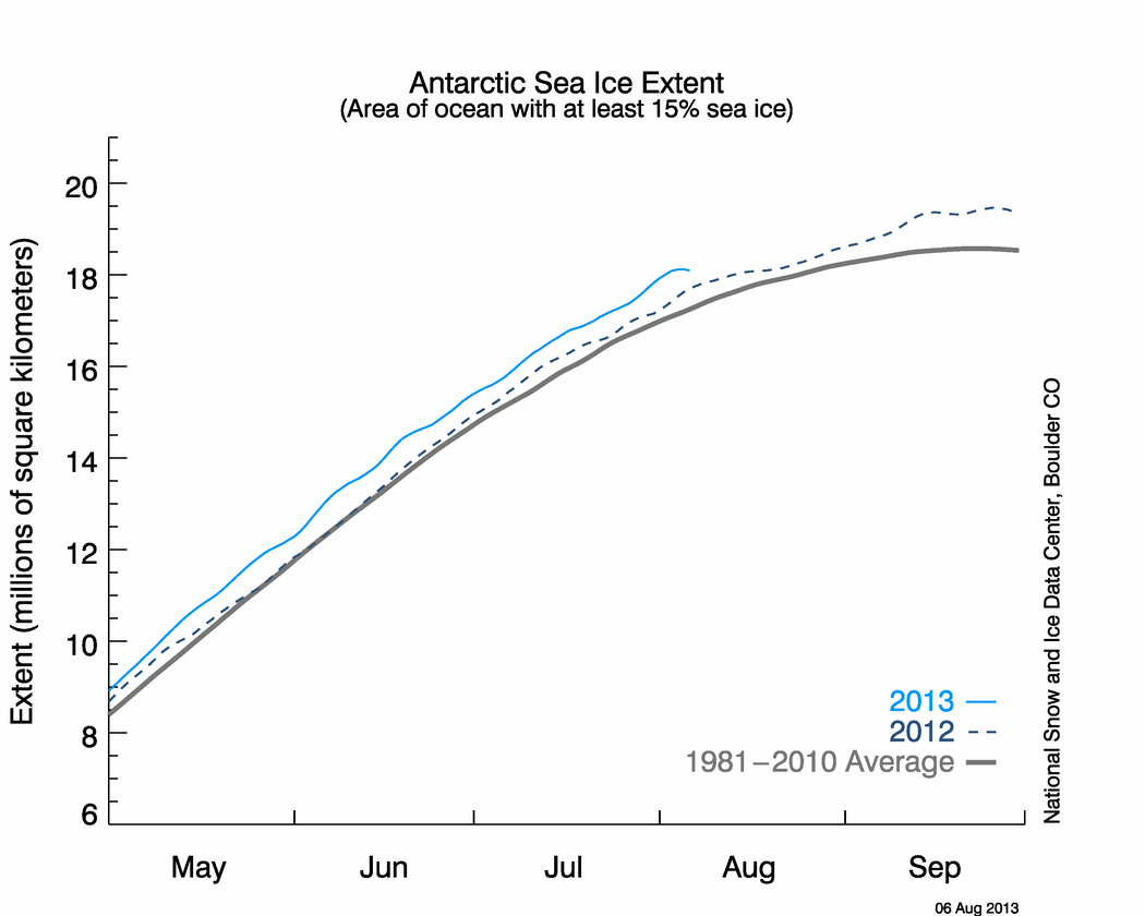
According to NSIDC, Antarctic ice extent is nearly 20% above normal, as seen in the graph and map below.


If the theory is correct, the large amount of excess ice should be cooling Antarctica – and that is exactly what we see happening. Temperatures in Antarctica have been running persistently below normal, as seen in the maps below.


There is just one problem with all this. The effect is exactly opposite of what has been predicted by global warming modelers. Antarctic ice is increasing and temperatures are cooling.
So you cannot say accurately that, “…the ice sheet is now at its lowest extent recorded for this time of year”… It is misleading to say the least, and meant to drive an agenda at worst
Pamela Gray
It’s a reasonable statement to make about that graph. It may be that the graph is an inappropriate measure, but the sudden drop between ‘highest’ and ‘lowest’ is clear enough….
All the easy ice froze as it usually does at this time of year which is why there’s not much spread in extent between the various year’s data…Here’s the last 10 days data, it hasn’t been horizontal as you put it….
Phil
The numbers you provide do show a fairly flat period – and you can easily see from the graph that nothing like this has happened at this point before (or, indeed, at any other position on the graph. So I think we are looking for an unusual cause for the graph to flatten…
It’s been exceptionally warm across the north Atlantic and north Pacific. This is where ice is failing to form…The Arctic Ice is in big trouble – nearly all old ice gone and new ice struggling to form.
David
Your first point seems reasonable – new ocean currents are limiting ice growth. But your last one does not make sense to me – the new ice has formed at a record rate during Oct/Nov. So it does not look as if the whole arctic is suffering a melt-back…
All of the perennial ice basins are already saturated with ice.
The amount of multi-year ice next summer will be a function of winds and polar drift through this winter, but so far it appears that there will be a significant increase in the amount of multi-year ice in 2009 compared to 2008.
Steven – second worst areal extent on record and lowest volume on record. You can’t seriously believe the Arctic ice is recovering…
Mary, I was clearly referring to temperature and shorter term trends. Farmers look at temperature trends in relation to how long it will take, and how expensive it will be, to prepare a field to grow something else that can survive and even thrive in an upturn or downturn trend. Farmers have to be flexible and react rapidly since many of the things we grow are very sensitive to small temperature differences. If we don’t have a diverse bag of products and a willingness to adjust to the ups and downs of temperature changes, we rapidly go out of business.
As to your contention that Anthony’s graph was okay with me back then but not now, I can only say that I am willing to learn more about what makes that graph go up and down. And in detail. So I began a study on the Arctic and found out lots of things I didn’t know. I have a curiosity that always drives me to say, “why”. Are you willing to do the same study or do you just want to stick to your one tune?
david,
2008 Arctic ice has been ahead of 2007 ice for the entire year, mostly by a large margin. One source shows it dip below 2007 for a few hours at the narrowest neck on the graph, and some “end of the worlders” are jumping with joy. Besides being irrelevant, it isn’t true. The graph has turned back upwards, and is just about where it is supposed to be this time of year.
http://www.ijis.iarc.uaf.edu/seaice/extent/AMSRE_Sea_Ice_Extent.png
Steven Goddard (21:52:55) :
david,
2008 Arctic ice has been ahead of 2007 ice for the entire year, mostly by a large margin. One source shows it dip below 2007 for a few hours at the narrowest neck on the graph, and some “end of the worlders” are jumping with joy.
Actually it’s those who are questioning the validity of the data who’ve kept bringing it up. Where’s the jumping for joy?
Dodgy Geezer (14:50:17) :
Phil
The numbers you provide do show a fairly flat period – and you can easily see from the graph that nothing like this has happened at this point before (or, indeed, at any other position on the graph. So I think we are looking for an unusual cause for the graph to flatten…
Then what do you think happened from 11,16,2006 to 11,25,2006 or 12,22,2007 to 12,28,2007 or 01,04,2006 to 01,21,2006? Particularly the last, a 17 day hiatus.
Steven Goddard (14:54:18) :
The amount of multi-year ice next summer will be a function of winds and polar drift through this winter, but so far it appears that there will be a significant increase in the amount of multi-year ice in 2009 compared to 2008.
Not by the usual definition of ‘multi-year ice’, also there appears to be a good flow out of the Fram strait and the Beaufort sea will start off with much less multi-year ice than last year with much of it fragmented.
OK, go to cryosphere http://arctic.atmos.uiuc.edu/cryosphere/
and look at the individual maps . A lot of the stasis is coming from heating in the Greenland sea.
Go to
http://weather.unisys.com/archive/sst/sst_anom_loop.gif
We see there, between greenland and iceland , not a transport of heat, but a hot spot in the anomaly . Do you think the sun has shone so hard there, next to the longest night? Knowing that there is geothermal activity in the area, seeing how local the spot is, it looks suspiciously as if there is geothermal heating coming up there.
It is a hypothesis, but unfortunately the volcanic people are on a different frequency than people worrying about AGW and delusions , so it cannot be tested . When the new satellite ( UCU? ) which will be able to see gases down to sea surface is launched we will have online data that could prove or disprove such hypotheses ( AIRS it seems can only talk from 5000 meters up).
Here are the geothermal resources of Iceland. Maybe the magma does not discriminate between land and sea.
http://www.energy.rochester.edu/is/reyk/
anna v, the anomaly you point out is also smack in the path of the warm ingoing current. These currents arise from oscillating large ocean currents. If these flip from cold to warm and then back again every few decades, it would make sense that a warming trend would show up right where you have pointed it out. When the current flips to cold (and especially when all such Arctic outgoing and ingoing currents occasionally flip at the same time to cold) we will see a cooling trend in this same area and normal to above normal extent and area of Arctic Ice. The large currents are a lot like the windshield wipers on a school bus, mostly out of sync but cycle eventually together. That larger in-sync cycle could help explain these longer planetary cycles of warm/cold decades that break all expectations and cause people to say that the sky is falling (blaming either cold or warm pet causes, take your pick).
The more interesting question is where do these currents get their heat from? Is it from heavy water sinking to the bottom where ocean volcanic vents heat it up, while the surface cools, and then the conveyor belt of water eventually carries that heat up to the surface, forcing the cold water down? Do these vents have a cycle of their own, much like land-based vents do? Is it the Sun? Is it some kind of cycle to the Jet Stream? Is it due to some kind of Arctic ice melt cycle? Is it due to an ocean cloud cycle? Is it a combination of these factors? Okay, I am going to stop. My brain hurts.
“Then what do you think happened from 11,16,2006 to 11,25,2006 or 12,22,2007 to 12,28,2007 or 01,04,2006 to 01,21,2006? Particularly the last, a 17 day hiatus…”
Phil
I see what you mean, though I had discounted those as not being exactly comparable. Of course I was quite wrong to have said ‘anywhere on the graph’ – ALL the curves show a flat and then declining curve as they pass their peak! The Nov 2006 pause just looks to me like a slow-down in growth. The other two are more comparable, particularly Jan 2006, which is nearer to 27 days if you include small growth in the hiatus. The Dec 2007 pause is not as long, but there are two of them!
I had rather discounted the Jan 2006 halt, which, you are correct, is unquestionably longer, because I saw it as associated with reaching the peak extent, and hence being more a flattening of the curve. Does this pause in Dec 2008 mean that we won’t get much more than another 10k km2 of ice? I was hoping for a record, or, at least. over 14k km2.
Before anyone starts flinging brickbats, I should point out that I am not a warmist, and I am a fervent disbeliever in CO2 driven warming, but I do want to make hypotheses in accordance with data. I found it worrying that, with such a strong icing rate earlier in the year, we should have a sudden halt for a week or so (though I am heartened to see that the rise has resumed). And I think it is very important for us to appreciate why these pauses may be happening, before we get told that it is all because of Global Warming. Who knows, maybe one day the warmists might actually have a real piece of evidence supporting their cause…..
Here’s a map of the motion of the sea ice showing the flow out via the Fram Strait (predominantly the older ice):
Apparently the image tag is banned, try here:
http://i302.photobucket.com/albums/nn107/Sprintstar400/20081218-20081220.jpg
PeteM: “But the idea that on average the world isn’t going to change due to increasing the concentrations of CO2 has any impact is really taking a step too far…..”
The question is, is the increase in CO2 concentration a cause, or an effect? Historical records generally show increasing CO2 following a warming inflection, so how do we know that the recorded increase in atmospheric CO2 is not due to natural causes? Is our small (< 3%) additional contribution to annual CO2 production really responsible for a dramatic rise in atmospheric CO2? If so, that would indicate positive feedback, which likely would have led to a runaway greenhouse eons ago. In a negative feedback dominated system, a 3% rise in production of CO2 should lead to… a 3% increase in atmospheric CO2 concentration.
>The graph has turned back upwards, and is just about where it is supposed to be this time of year.
The current Arctic sea ice extent and volume is not even close to average. This is F.A.C.T.
As for volcano’s, the sea ice near Iceland is near normal… http://nsidc.org/data/seaice_index/images/daily_images/N_daily_extent_hires.png .
Bart (12:08:43) :
The question is, is the increase in CO2 concentration a cause, or an effect? Historical records generally show increasing CO2 following a warming inflection, so how do we know that the recorded increase in atmospheric CO2 is not due to natural causes? Is our small (< 3%) additional contribution to annual CO2 production really responsible for a dramatic rise in atmospheric CO2?
We know from isotope analysis that the source is not biological and that the increase is consistent with fossil fuel.
david,
Arguing with you is pointless. Sea ice extent is just about where it always is this time of year. A few days ago it was at the high end of the very narrow recent range, and today it is near the low end of the range. In a few days it will probably swing back the other way. None have any statistical significance.
http://www.ijis.iarc.uaf.edu/seaice/extent/AMSRE_Sea_Ice_Extent.png
The map you linked shows this quite clearly. Please stop the FUD.
Steven,
One source shows it dip below 2007 for a few hours at the narrowest neck on the graph, and some “end of the worlders” are jumping with joy.
Actually, I was surprised that it wasn’t discussed at all in the blogs that favor the AGW-hypothesis. As for myself, like I said I’m alarmed rather than alarmist, so you won’t actually see me jumping for joy when it turns out Arctic Ice is melting faster than predicted. At the same time it might speed up action on mitigating strategies. I know most people here dread all those wasted trillions on climate issues, but the only trillions I see going anywhere at the moment are the Iraq war and banks, credit card companies and auto makers.
Anyway, I’m experiencing contradictory feelings when it comes to the Arctic Sea Ice, although all in all I hope of course it is a natural cycle and mankind doesn’t/cannot have a significant impact on climate.
Who knows, maybe one day the warmists might actually have a real piece of evidence supporting their cause…..
I was wondering about this. Purely hypotethically speaking: If the 2009 minimum extent would break the 2007 record, what would this do to the opinion of people who believe GW is not A? Do you, Steven or Pamela, consider the possibility that AGW is having an impact on the Arctic? And if not, would you start considering it (and enter the discussion about possible implications and effects) if the 2007 minimal extent record would be broken? Or would that still be too soon for you to mean anything?
On the other hand if the 2009 minimum extent would be above vice-champion 2008 I’m sure even more people would be compelled to believe the jury is still out on AGW (most people I know believe this already, so much for MSM). From a PR point of view this wouldn’t be good news for people who want to see drastic measures taken to keep CO2 levels below ??? ppm. Which is only logical.
“” E.M.Smith (21:06:09) :
George E. Smith (00:22:03) :
Justin, you have to be a little careful here. See what you excerpted about sunlight being reflected by the ice.
George, did you see the link I posted that showed O3 as being down 40% at the poles and it being a significant part of the GHG profile ( 1/3 ). Have you considered what it would mean to heat loss to have 40% less ozone? 13.3% less total GHG effect ought to do something! How does the absorption spectrum of O3 relate to that of water and CO2? You’re much better at figuring this out than I am…
I’d expect that 13% more heat loss at both poles might have something to do with our present frigid weather coming from the poles… “”
E.M. ;
Without going back and refreshing, I roughly recall you raising the issue.
It seems to me that Ozone (O3) affects warming in tw different ways.
First of all, the single biggest cause of difference between the Air mass zero solar spectrum and the air mass one spectrum, is the absorption due to Ozone.. AM0 is the spectrum outside the atmosphere; AM1 is the equatorial noonday spectrum at ground level as a result of traversing one atmosphere of air.
Now at the poles and particularly over Antarctica, you never get an AM1 spectrum, because the solar path is always oblique, so the short wavelength loss from ozone is even more severe at the poles, or the polar egions in general.
Since short wavelength UV is largely respponsible for the Atomic Oxygen that forms Ozone, then you would expect lack of Ozone production during the winter midnight, and ozone holes.
One can find papers and reports from the 50s and 60s that hint at Ozone holes long before they were actually observed as such.
In the immediate post WW-II ear, the Airforce, and NASA’s forerunner, were quite concerned with radiation hazards of high altitude flying (military); and people such as Thekaekara et al did a lot of high altitude studies of solar spectra and atmosphere for that reason. In 1969 they published what to that time was the most respected value of the solar constant before satellite measurments, at 1351 W/m^2 ( 1969 I believI graduated in 1957, and we used the value 1353 when I was in school.
But what those early papers reveal, is that the color temperature of the sun, was known to have aseasonal variation, and on top of that an eratic variation (unexplained) ; but it was believed that the cause was cseasonal and other changes in the short wavelength end of the ground level solar spectrum. I’m not aware of any specific attribution to Ozone, but in light of modern knowledge one can ifer thaqt the cause was ozone variation, and probably Ozone holes which have always been with us. No I am not going to claim the CFC thesis is bogus; butt I do think it is somewhat argumentative, but there clearly were ozone holes long before their were CFCs (but not necessarily as severe).
I can tell you as a kid growing up in New zealand, I got the worst damn sunburns at the beach or ski slopes, than I have ever experienced in california, of fishing down in Baja, Sea of Cortez.
Now that ozone absorption would lead to upper atmosphere warming by direct absorption of solar energy near the peak (out to maybe 600 nm).
Then Ozone has a well known IR absorption band from about 9-10 microns’ which is pretty near the peak of the BB spectrum,. for 15 deg C, the so-called mean global temperature. The Ozone IR band is much sharper than the CO2 band for several reasons. Ozone is a thin high altitude layer, whereas the effective CO2 is a ground level thick layer, so the4 realm of the ozone is lower density, and lower temperature, so the Doppler, and collision broadening of the intrinsic Ozone absorption line is much smaller than the CO2 band at 14.77 microns, which broadens to about 13.5-16.5 microns.
The ozone band exhibits another explainable phenomenon..
The depth of the CO2 absorption band is not much dependent on the incidence angle oof observation (form outer space), sinnce it is very nearly saturated, and supposedly has a logarithmic absorption versus CO2.
On the other hand, the depth of the Ozone dip is very dependent on angle of obliquity of obsevation, and this can readlily be understood by imagining a thin laminate of ozone in a shell around the earth, and just look geometrically, how the total layer thickness varies significantly with oblique viewing from outer space (up to 80 degrees from normal incidence.
Now with modern polar orbit satellites there is no need to make ozone measurements form oblique angles since the satellite is going to go right overhead sometime. The data I mentioned is from a quite old textbook, “The Infra-Red Handbook” which predates polar orbit satellites by many years. It is largely a military handbook for weapons designers who need to understand optical signal propagation and noise sources, for guided weaponry (side-winders and such). (no I never worked on such things; but that book if you can find it, is a gold mine of infromation valuable for climate discussions, since it has the reflectance curves for darn near any kind of terrain you want to know., and atmsopheric transmission data for any range of wavelenghts of possible military significance. it was basically developed under US Navy sponsorship by a group at U of Michigan (I believe)
But long and short of it is that I would expect Ozone to exhibit lots of effects maybe good and bad related to polar climate, and specially Antarctic. I actually returned to NZ in March of 2004, which is going into their Spring, and while out fishing in Bay of Islands (north end), I once again got a nice sunburn; so it isn’t that I just have gnarled leather skin that California doesn’t bother. Next time I’ll remember the SunBlock.
Pamela Gray (19:21:21) :
Farmers look at temperature trends in relation to how long it will take, and how expensive it will be, to prepare a field to grow something else that can survive and even thrive in an upturn or downturn trend. Farmers have to be flexible and react rapidly since many of the things we grow are very sensitive to small temperature differences
Here Here! As a specific example: I’ve had trouble the last couple of years getting tomatoes to produce. Why? Pollen grain growth to fertilization is very temperature dependent and variable by variety. This year the temperature dip dropped below the ~80F needed and my brandywine gave me nothing. I did pick up a Siberian to trial (expecting cold) and it STILL has a tomato on it now! They set fruit as low as 45F or so. In between were my Arkansas Travelers and Prudens Purple that did OK in summer but were finished months before the Siberian. All from a few degrees variation.
Next year I will be growing a lot of Siberian and trying to make Siberian x brandywine. (I REALLY like brandywine…but it just won’t produce much here near the coast unless temps are abnormally high.)
Phil. (13:42:35) :
We know from isotope analysis that the source is not biological and that the increase is consistent with fossil fuel.
You ought to look at the “CO2 – Temperature link” thread… I’ve lifted a bit from there to post here, please forgive the duplication:
From an article by ALEXANDER COCKBURN, with questions…
http://www.thenation.com/doc/20070611/cockburn
As for the alleged irrefutable evidence that people caused the last century’s CO2 increase, the “smoking gun” invoked by one of my critics, Dr. Michael Mann, and his fellow fearmongers at realclimate.com, the claim is based on the idea that the normal ratio of heavy to light carbon–that is, the carbon-13 isotope to the lighter carbon-12 isotope, is roughly 1 to 90 in the atmosphere, but in plants there’s a 2 percent lower C13/C12 ratio. So, observing that C13 in the atmosphere has been declining steadily though very slightly since 1850, they claim that this is due to man’s burning of fossil fuels, which are generally believed to be derived from fossilized plant matter.
OK, so both C12 and C13 are stable and they are looking for a ‘plant’ signature in burned fuel, not a decay signature. One Small Problem… C4 metabolism plants absorb more C13 than do C3 metabolism plants. Over the last 100 years we’ve planted one heck of a lot more grasses world wide than ever before. Grasses are C4 metabolism…
Have they allowed for this? If so, how? I’m not sure how one would figure out the C4 vs C3 plant population ratio of the world, and certainly don’t see how you would figure out what it was 10,000,000 years ago.
On the naïve and scientifically silly assumption that the only way that plant-based carbon can get into the atmosphere is by people burning fuels, they exult that here indeed is the smoking gun: Decreases of C13 in the atmosphere mean that our sinful combustions are clearly identifiable as major contributors to the 100 ppm increase in CO2 since 1850.
This is misguided, simply because less than a thousandth of the plant-based carbon on earth is bound up in fossil fuel. The rest of the huge remaining tonnages of plant-based carbon are diffused through the oceans, the forests, the grasslands and the soil. In other words, everywhere. Obviously, lots of this C13-deficient carbon has the chance to oxidize into CO2 by paths other than people burning fuel, i.e., the huge amount of plant material that’s naturally eaten or decayed by the biosphere.
And as C4 plants have been sought out (they are more efficient, so more food per growth unit) we get more C13 in the plants. There are even efforts to transplant the C4 genes into C3 plants to get better yield. This would argue for more C13 being sequestered in soils over time as C4 plants have expanded. Have they examined the C12 vs C13 ratio changes in soils over time?
Perhaps even more significant, cold ocean waters absorb lightweight C12 preferentially, resulting in lots of C13-deficient carbon in the oceans. This low-C13 carbon most certainly would have been released massively into the atmosphere over the course of the world’s warming trend since 1850, when the Little Ice Age ended.
And would also argue that volcanic emissions from subduction zone volcanoes ought to be C13 deficient to the degree that ocean bottom ooze is being recycled. Has this been considered?
All of these larger natural pathways for emitting low-C13 carbon into the atmosphere have been considerably accelerated by this same warming trend. So once again, the greenhousers have got it ass-backward. The 100 ppm increase in CO2 can’t be uniquely attributed to humans because at least as plausibly it could be the effect, not the cause, of the warming that started after the Little Ice Age denied by Dr. Michael “Hockey Stick” Mann.
It looks to me like there are very significant issues in trying to assert that C13:C12 ratio changes in the air can tell you anything about CO2 origin in fuel burning…
From: http://www.springerlink.com/content/f5272856220314nk/
We get that the C12:C13 ratio is different in oils than in coals and varies in the source lipids from which oil is made.
Lipid fractions of organisms have consistently lower C13/C12 ratios than do the whole organisms. The average difference between nonlipid and lipid materials for all organisms studied is about 0.5% and ranges in individual species from as little as several hundredths to more than 1.5%. This suggests that petroleums and other noncoaly organic matter in ancient sediments are derived from lipids, or at least from certain components of the lipid fraction. In contrast, coal deposits apparently are derived from whole plants or from the cellulosic fraction of land plants, which is the major nonlipid constituent, of plant tissues.
Has the petroleum from around the world been tested for differences in C12:C13 ratio? I’d expect significant variation based on the above. Is this allowed for in the attribution of atmospheric CO2 to fuel burning?
From:
http://www.isgs.illinois.edu/pttc/Illinois%20petroleum/IP111%20Isotopic%20Identification%20of%20Leakage%20Gas%20from%20Underground%20Storage%20Reservoirs–A%20Progress%20Report.pdf
Bacteriogenic methane from Illinois generally has a C13 values in the range of -64 to -90% relative to the Peedee Belemnite ( PDB ) standard. The 11 samples from pipelines and storage reservoirs that have been analyzed have all had C13 values in the range of -40 to -46%.
Which seems to show that biological source methane can vary widely in C13 content and that pipeline gas is not the same signature as biological, coal, or petroleum. Has this be allowed for? If so, how? (Frankly, given the biological origin variance I don’t see how it’s possible…)
(I hand typed the above quote and there was what looked like maybe a sigma in front of the C13’s… could not get a cut/paste to work fast…)
It looks to me like there are more holes here than bucket… I don’t see how C12:C13 ratio can be reasonably used to make any clear assertion about where the CO2 in the air comes from. How much Clathrate out gasses each year on the ocean bottoms? With what C12:C13 ratio? How much natural gas leaks from the ground? What are the ratios for bacteria produced methane from various ecosystems including ocean bottom? Are they all the same? How do you know? Since bacteria have been shown to eat oil and natural gas, how do you distinguish their CO2 from those eating wood?
George E. Smith (18:02:45) :
Thanks for the info. I’ll try to absorb it and integrate it into my (still forming) hypothesis that the solar dimness is causing the 9-10 micron O3 window shade to be lifted via O3 reduction and letting all the heat out. Globally we are down on O3, at the poles by as much as 40%. Makes a few tenths of CO2 look like chump change… IMHO…
E.M.Smith (21:03:58) :
Phil. (13:42:35) :
“We know from isotope analysis that the source is not biological and that the increase is consistent with fossil fuel.”
You ought to look at the “CO2 – Temperature link” thread… I’ve lifted a bit from there to post here, please forgive the duplication:
I don’t get my science from an English Lit major, you’d be well advised to do likewise.
Try reading: Modeling Terrestrial Ecosystems in the Global Carbon Cycle With Shifts in Carbon Storage Capacity by Land-Use Change,
W. R. Emanuel & G. G. Killough, Ecology, Vol. 65, No. 3. (Jun., 1984), pp. 970-983.
E.M.Smith (21:21:04) :
Thanks for the info. I’ll try to absorb it and integrate it into my (still forming) hypothesis that the solar dimness is causing the 9-10 micron O3 window shade to be lifted via O3 reduction and letting all the heat out. Globally we are down on O3, at the poles by as much as 40%. Makes a few tenths of CO2 look like chump change… IMHO…
Yes but there’s less of it so the total heat lost is less than that via CO2.
Check out the Modtran spectrum for the earth’s atmosphere below, the notch at 667 cm-1 is CO2 and that at ~1000cm-1 is O3.
http://s302.photobucket.com/albums/nn107/Sprintstar400/?action=view¤t=Modtran-dry.gif