One of the most popular global warming feedbacks is considered to be changes in the extent of polar ice. The story goes that as the ice melts, more heat gets absorbed in the ocean, leading to higher temperatures. Today we test that theory.
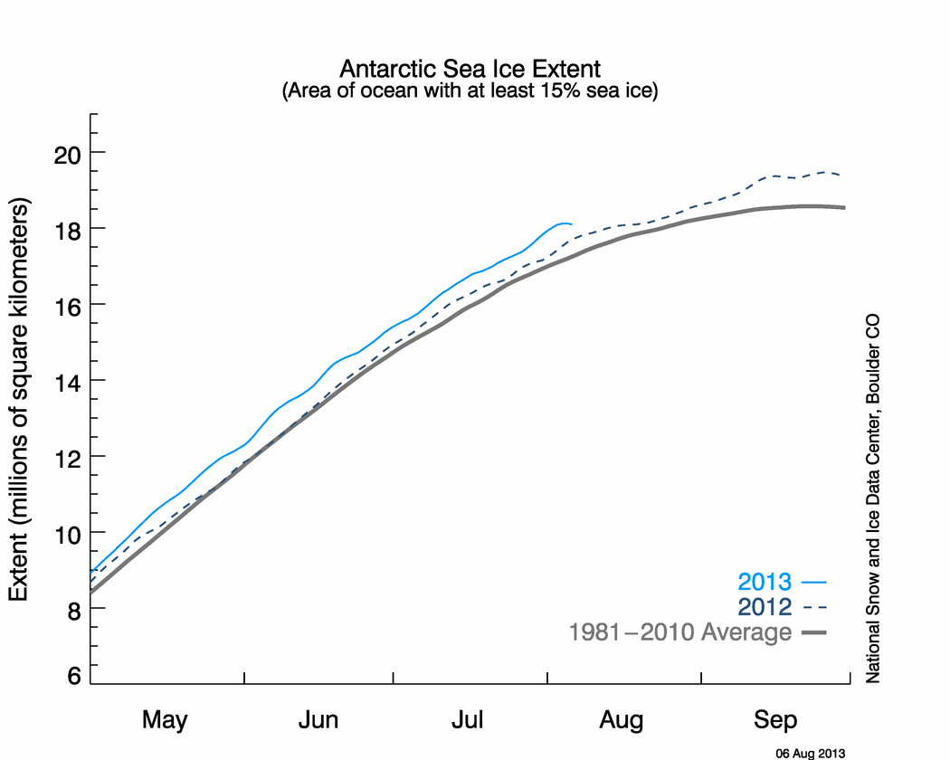
According to NSIDC, Antarctic ice extent is nearly 20% above normal, as seen in the graph and map below.


If the theory is correct, the large amount of excess ice should be cooling Antarctica – and that is exactly what we see happening. Temperatures in Antarctica have been running persistently below normal, as seen in the maps below.


There is just one problem with all this. The effect is exactly opposite of what has been predicted by global warming modelers. Antarctic ice is increasing and temperatures are cooling.
Basil…try this year long comparison instead:
http://arctic.atmos.uiuc.edu/cryosphere/IMAGES/current.365.south.jpg
“Basil (08:56:01) :
Steve,
What would be your response to a charge of “cherry picking” here, in using a one day map, as opposed, say, to what we see in a 365 day map like you see here?
http://www.cdc.noaa.gov/map/images/rnl/sfctmpmer_365a.rnl.html
Note the red across Antartica.
Jeez, Basil! A MERCATOR PROJECTION map for polar data? Do you even have a clue, when you’re being hosed? Back away from the edge!
Once again I see the dastardly head of the dreaded “1979 – 2000” base period.
Let’s look at it this way. Arctic sea ice is below that base period, Antarctice sea ice is above. Perhaps the reality is that Arctic sea ice was above normal during the base period and Antarctic sea ice was below normal. Now it’s the other way aroung and perhaps this is normal. Or perhaps there is no normal and it just varies because that’s the way it has always been.
Now, where did I leave that glass of fresh tangerine juice I just squeezed this morning?
Hansen’s 1984 paper about expected warming of Antarctica (fig 2-4) predicted significant warming in the Antarctic, which was basically symmetrical with the Arctic.
http://www.epa.gov/climatechange/effects/downloads/Challenge_chapter2.pdf
The discussion below is fairly typical of how the press reports about Antarctica.
Climate change has struck Antarctica particularly hard, and the continent has not lost any of its strange appeal to those stricken by wanderlust. Worryingly, Antarctica’s atmosphere is actually the fastest-warming place in the world: Although rapid warming at the surface of Antarctica has been well-documented, even more rapid increases in mean temperature have been recorded at altitudes much higher above the continent. What’s more, it is the largest warming of its kind found anywhere on Earth.
http://www.worldchanging.com/archives/004763.html
The Arctic is certainly acting as predicted by models, there has been a dramatic pause in freezing and the ice extent is now at the lowest level recorded for this time of year (so much for all the predictions of record freezing this winter!) http://www.ijis.iarc.uaf.edu/en/home/seaice_extent.htm.
The Antarctic though hasn’t been acting as predicted for sure. It must be remembered though that the models have consistently shown greater heating in the higher latitudes of the northern hemisphere than the southern. The Antarctic is also more susceptable to effects of changes in wind speed/direction due to it being surrounded by the oceans and also the high altitude of the continent due to deep ice sheets. This is an interesting paper on the Antarctic occilation http://www.phys.uu.nl/~broeke/home_files/MB_pubs_pdf/2004_vdB_AnnGlac.pdf.
REPLY: “ice extent is now at the lowest level recorded for this time of year”
On what basis? The graph only goes back to 2002. Do you have prior data that shows it is in fact “the lowest level recorded” or or you just embellishing? – Anthony
OT: Using SESC sunspot numbers since June, we hit 500 spotless days.
Further to my http://wattsupwiththat.com/2008/09/13/this-is-what-passes-for-a-sunspot-these-days/#comment-40519 comment, I started with the, “Adding up every daily blank sun for the past three years, we find that the current solar minimum has had 362 spotless days (as of June 30, 2008).” quote from the http://wattsupwiththat.com/2008/08/13/spotless-days-400-and-counting/ post. I found the SESC numbers as tracked by the NOAA in their http://www.swpc.noaa.gov/ftpdir/indices/old_indices/ directory. From the DSD.txt files, I get the following data:
July gives 3/31 — That is there were only three days with sunspot numbers
August gives 0/31
September gives 3/30
October gives 11/31
November gives 14/30
December gives 3/19 days so far
That gives a total so far for this half of the year: 34/172
362 + 172 – 34 = 500
That gives us 500 spotless days in the past 3 years for the transition between solar cycle 23 and solar cycle 24. For 2008, their data has 235 spotless days so far for 2008. We are now only 34 days to the next milestone.
John M Reynolds
Basil,
Did you notice your map resulted from the run of a model?
Re Ed Scott (09:59:11) :
It has long seemed to me quite ludicrous to try to take an average of the earth’s temperature in the way that we do now that we have so much computing power, yet no matter how we do it there will always be biases and inaccuracies.
Scientists currently take the average of data from geographically spread sites and plot it on a temporal axis, looking for trends. This necessitates many of the adjustments such as time of day etc.
If instead we were to plot the data from each station on a temporal axis, making only site-specific adjustments and calculate the trends, then average only the geographically spread trends…. how much difference would this make. Quite a lot I suspect.
Of course there will always be the problem with the actual number and spread of stations, such as the abundance across the inhabited world and the paucity in sparsely inhabited regions such as Siberia, and the Poles.
How do GISS, HADCRUT etc. adjust for area? (i.e. 10 stations in a state vs 10 stations in a continent) and has anyone taken issue with it?
Spencer Weart posted at RealClimate in February entitled “Antarctica is Cold? Yeah, We Knew That”
http://www.realclimate.org/index.php/archives/2008/02/antarctica-is-cold/
The last sentence reads:
“Bottom line: A cold Antarctica and Southern Ocean do not contradict our models of global warming. For a long time the models have predicted just that.”
Someone questioned their conclusions and I unsuccessfully attempted to post a followup to refute Gavin. SOP.
Regardless, no matter what happens, the Team always has an out.
Basil (08:56:01) :
Basil
A Mercator projection widely distorts the relative area of the poles and gives a false perception of the amount of global change to the uninformed user. What is actually a spot (the North/South Pole) is stretched out to the circumference of the world. The often used Robinson projection (National Geographic Society) is a little better but perhaps something like the Waterman projection with a separate representation of the Antarctic would provide a more truthful overview.
Regards
Michael
Mary,
You might note that Arctic ice is about 10% below normal, while Antarctic ice is about 20% above normal. Both are close to 12Mkm2. How does that work out for the planet as a whole?
http://nsidc.org/data/seaice_index/images/daily_images/N_timeseries.png
http://nsidc.org/data/seaice_index/images/daily_images/S_timeseries.png
Another important point is that for most of the important months of sunshine in the Arctic (mid-April through mid-August) ice extent was close to normal. There were only about three weeks during that period when ice loss had a significant effect on Arctic albedo.
http://eva.nersc.no/vhost/arctic-roos.org/doc/observations/images/ssmi1_ice_area.png
This is in sharp contrast to Antarctica, which is being strongly cooled by ice gain through their recent summers.
To Basil (08:56:01) : ‘cherry picking’
Basil, you point ou to surface temperatures at Antarctica. How many meteoroligical stations are there representing 10 million km2?
Looking at http://vortex.nsstc.uah.edu/data/msu/t2lt/uahncdc.lt
I find a 0.3 Celsius below average temperature for the last eleven months.
As reported by Canadian public broadcaster CBC, a woman doctor earlier this week won a 100 km ski race in Antarctica. Well done…
Unfortunately typical for the reporting were two back to back comments in the voice over: one the standard MSM mantra that Antarctica is warming and its ice melting due to AGW, and in the next sentence the casual observation that daily highs during this high summer race ranged from -20C to -10C….. Until further notice, ice doesn’t melt at those temperatures.
Tropical ice will have a much greater impact on albedo than polar ice will. What has the ice been doing in the Andes the last couple of years?
Folks , as we are approaching a particular holiday – Happy Christmas to all those adding comments on this forum .
As someone who happens to agree with the accumulating evidence about MMGW/AGW I wish to remind the majority of those profering opinons here that you are repeatedly hearing a particular sceptical point of view on this forum . Very few comments here challange this view or express a view outside of that philosophy .
I’ve spent the afternoon enjoying a few (alcoholic) beverages with a relative who has spent 20 plus years in the area of biological research and foresty. When I asked then about whether there were significant changes indicating the world was warming (in line with MMGW) his unequivocal answer was yes.
I’m not saying everyone understands all details of what is going to happen .
I’m not saying computer models should be believed as the truth .
But the idea that on average the world isn’t going to change due to increasing the concentrations of CO2 has any impact is really taking a step too far…..
Hopefully 2009 will be a better year for all .
Mary Hinge:
The data I am looking at shows that the ice area anomaly has indeed dropped the past couple of weeks but the ice is still greater than the past two years.
Steven,
Are you saying that it wouldn’t matter if Arctic sea ice would disappear completely during summer, as long as Antarctica would gain the same amount of ice?
I translated a documentary once called ‘Katabatic’ and it said that the Antarctic was so big and cold that it was a dominant factor in that part of the world, in that it pulled all the hot air on high altitudes surrounding Antarctica down. This hot air would cool off and flow down the Antarctic mountains towards the coast at enormous speeds (these winds ‘falling’ off mountains are called katabatic winds), making life impossible on the continent. Anyway, I gathered from it that Antarctica is so big and cold that global warming cannot affect it very much (for the time being), although I don’t know if that holds for the West Antarctic Ice Sheet as well. I haven’t read about that for a while and I have a terrible memory.
So I reread RealClimate’s post DR just mentioned (thanks for that) and mention it again: http://www.realclimate.org/index.php/archives/2008/02/antarctica-is-cold/
I read this today about the Arctic, if true quite interesting: http://climateprogress.org/2008/12/15/nsidc-arctic-melt-passes-the-point-of-no-return-we-hate-to-say-we-told-you-so-but-we-did/
And I think we will be hearing more about methane releases the coming months/years. It could be quite heavy stuff although it’s too soon to say anything definitive about it. I’m curious as to what the reactions will be from people who are not so sure about AGW.
The cryosphere site shows a continuous increase in Arctic sea ice area while the ijis site showed a decline and is still below what it was two weeks ago. Cryosphere shows over 800,000 sq. Km during that time while IJIS shows a decline of about 100,000 sq. km..
As for heat loss 15% sea ice coverage means 85% open water. Unless the sun is high then that open water is going to be radiating/conducting thermal energy into the atmosphere and into space.
tetris: The woman who won that Antarctic race started out on skis, but the ice was melting so fast she changed to a kayak. That is how she won the race.
AF
Dear PeteM,
I’ve spent 35 plus years in the area of biological research and forestry, and I can unequivocally assure you that there have been NO significant changes indicating the world was warming. I challenge the conclusions of your unnamed, ‘expert’ relative. Tell him or her that I am willing to debate them on that point in this forum or any other.
To what extent is cooling in the Antarctic reflected in the Northern Hemisphere temperatures?
It isn’t.
If you meant to ask, ‘To what extent does cooling in the Antarctic affect the Northern Hemisphere temperatures?’, then the answer is,
Over periods up to a decade to a few decades, the 2 hemispheres are separate climate systems with very little heat exchange between them, ie what happens in one hemisphere doesn’t affect temperatures in the other.
Over longer time frames (centuries?) heat is exchanged between the hemispheres by the Great Ocean Conveyors.
http://en.wikipedia.org/wiki/Thermohaline_circulation
Steven (or Anthony)
There is an easy way to prove or disprove greenhouse warming
Just compare temperature with OLR!
Greenhouse warming works by trapping longwave energy, therefor OLR should decrease as temp increases and increase when temp decreases.
The opposite occurs if warming is caused by shortwave (Cloud albedo) forcing.
The OLR will increase as temp increases and decrease as temp decreases!
If you haven’t checked the satellite record of clouds it shows a 2-3% decrease in clouds!
cheers
mccall (10:50:24) :
That’s not a Mercator projection, in fact, it’s not a projection at all, just a cartesian plot of latitude and longitude and is the most common sort of climate map we see. I see no reason to take Basil to task for referring to that sort of a map. A Mercator projection cannot cover the whole world, as the poles
have to take up infinite area. In this cartesian map they just get stretched out into a line.
See http://www.colorado.edu/geography/gcraft/notes/mapproj/gif/unproj.gif
vs http://www.colorado.edu/geography/gcraft/notes/mapproj/gif/mercator.gif
Personally, I think the “Sinusoidal Equal Area” map would make the most sense for us. http://www.colorado.edu/geography/gcraft/notes/mapproj/gif/sinusoid.gif
All links came from http://www.colorado.edu/geography/gcraft/notes/mapproj/mapproj_f.html
Oh my yes, I do remember my days in chem lab. Putting water into a test tube, warming it over a Bunsen burner, and watching the ice form within the test tube . . . but wait, that isn’t what happened at all, now is it?
I am still waiting for when these forecasters can predict the temperature or weather 10 days hence, let along 30-50 years hence. The “global warming” models haven’t made a single prediction that was accurate in the least to date. Garbage program, garbage output.
How many times does a fortune teller have to tell you a wrong fortune before you figure out that the fortune teller is a fraud?
The Antarctic is not warming much because of an increase in the polar vortex. This is well known and reproduced by climate models. The impact on sea ice is to spread it further away from the continent – ie increase extent and decrease thickness due to enhanced Ekman drift. This is complex stuff, so I’m not surprised that non-experts wrongly believe that the Antarctic somehow refutes global warming.
BTW the Arctic ice appears to be in serious trouble – http://nsidc.org/data/seaice_index/images/daily_images/N_timeseries.png . There is no meaningful polar vortex or ozone hole to provide a short term buffering for this ice. If the situation doesn’t improve soon next summer is going to get very ugly.