Guest essay by Sheldon Walker
A new website has been created, which offers a new perspective on global warming.
The website is called “mta-graphs.com”
Temperature series like Gistemp or UAH, are turned into 2 dimensional coloured graphs, called global warming contour maps.

A contour map is basically a colour coded collection of thousands of linear regressions. It is mathematically based, and the colour displayed for each trend is determined by the trends rate of warming, as calculated by a linear regression.
A contour map lets you see how the warming rate has changed at different times, and how it varied for different trend lengths. It makes understanding global warming almost as simple as recognising a colour.
The website currently has 27 temperature series from UAH available for viewing. The selections currently available are:
– Global
– Northern Hemisphere
– Southern Hemisphere
– Northern Polar
– Northern Extra Tropical
– Tropics
– Southern Extra Tropical
– Southern Polar
– Countries – Australia, USA 48, and USA 49
Most selections are available in “Land and Ocean”, “Land only”, and “Ocean only”. Now you can actually see the difference between how much the Land is warming, and how much the Ocean is warming.
Check out the extreme warming in the Northern Polar temperature series.
Check out the lack of warming in the Southern Polar temperature series.
Other temperature series like Gistemp, Hadcrut4, and Berkeley/BEST, will be added soon.
Because contour maps show how the warming rate has changed over time, they are great for showing the recent Slowdown.
Here are some quick instructions for spotting a Slowdown. On any contour map, look at the colour at the top point of the triangular contour map. This color represents a linear regression done over the full date range of the map. This can be considered to be the “average” warming rate for the whole map.
If the top point is coloured yellow, then this means that the average warming rate was between +1.0 and +2.0 degrees Celsius per century.
If the top point is coloured light-orange, then this means that the average warming rate was between +2.0 and +3.0 degrees Celsius per century.
The warming range for each colour is given in the legend of every contour map.
Light-green means a warming rate between 0.0 and +1.0 degrees Celsius per century. So Light-green is a Slowdown compared to yellow or light-orange.
You now have all of the information that you need to find a Slowdown. Find a contour map with yellow or orange at the top point of the triangular contour map. Now look for any green colour on the map. If you can find any green, then you have found a Slowdown. If you need any help, most 8 year olds are very good at this.
If anybody has any questions, then I will be checking the comments below this article.
Unfamilar format so i don’t know what I think of it yet, but what does blue mean?
Falling temps?
He’s only showing half the ledgend. Look on the referenced website (beyond the first page). Dark blue <= -5
could we at least spell “color” correctly?
as for what “blue” means, traditionally it means you’ve stopped breathing… 😉
“Colour” is spelled correctly !!
“put de limey in de coconut…”
(apologies to Harry Nilsson)
You realize that more than half the English speaking world uses the “color” spelling, do you not?
Stupid autocorrect. I keyed in see oh el oh you are. It won’t let me spell color the way virtually all UK counties, past colonies do.
If you count the English as a second language crowd (i.e. many Commonwealth nations) I doubt you’re correct.
It’s not our fault you Colonials can’t spell properly!
@catweazle666
Ah, two people separated by a common language. 😀
DJ,
If not true now, American English speakers will indeed become outnumbered by British English speakers as more Indians learn the language. Now only about ten percent of Indians speak English to some extent, or around 125 million, but that number could quadruple in coming decades.
However there’s the issue of proficiency:
http://www.bbc.com/capital/story/20161028-native-english-speakers-are-the-worlds-worst-communicators
And some parts of it write much better English than you do.
G
“How is it that you Ameddicans cannot pronounce the word ‘shedyule?'”
“Because we went to a different shool!”
Is language a concensus issue? 50% +1.
ITYM ‘consensus’
Well “color” is spelled correctly, and so is “colour” spelled correctly.
It’s your spell checker that is the stupid one here, not the author.
G
concur.
I would like to be able to tell Word to accept spellings from both its American and British dictionaries, because I sometimes write documents containing quotes in British English. It seems likely that people have suggested this to Microsoft. But they haven’t acted. That’s their character.
It’s not a trivial change.
Do you do it by creating a third library that is a combination of the two libraries?
Do you do it it by merging the two libraries at run time?
Which words do you merge? All of them, just the more commonly used ones?
If this makes sense, are their other language libraries where we need to support merging?
Well said george.e.! Like myself you are obviously bilingual; speaking English and American fluently. We are after all as Winston Churchill observed “two English speaking peoples separated by a common language”…the odd superfluous vowel is of little import but beware of ‘bumming a fag’ (when out of cigarettes) or knocking someone up (when discussing a future visit)…at least on this side of the pond.
bahamamike
Potato, potatoe.
“Let’s call the whole thing off !”.
The domainname is registered to a identity hiding registrar in Australia, so the site is likely in Australia too. How would you prefer Australians to spell colour, and why? It’s their language.
Quelle couleur?
And you spelled “what” wrong too! :>)
¿Qué?
Howdy Neighbour. Colour is a correct spelling, no need to humour us with being a grammer cop.
As stated for example at http://grammarist.com/spelling/color-colour/ “Though color occasionally appears outside the U.S., it is still considered a misspelling. Most non-U.S. publications favor the -our spelling used in these examples:”
So the vast majority of the English world would flip u a “u”
“It’s a damn poor mind that can only think of one way to spell a word.”
~President Andrew Jackson
It’s all Noah’s fault..
http://www.quickanddirtytips.com/education/grammar/why-we-have-both-color-and-colour
but it gets complicated.
https://en.wikipedia.org/wiki/American_and_British_English_spelling_differences
Correctly and incorrectly, that’s two.
If I remember history correctly, English spelling did not settle down until the mid 1700’s. Shakespeare and Raleigh in the 1500’s and 1600’s were notorious for multiple spellings of their own names. I seem to remember that Samuel Johnon wrote the first English dictionary.
Sorry I’m thick – I need more explanation of these fascinating graphs, please
Well you don’t really; they are so intuitive; we should all be using them to plot everything.
One of the fundamental laws about mathematics is, that it is 100 % fictional anyway, so you are free to make up your own, for any purpose you like.
Just don’t fall into the trap of believing that any of it is real.
G
” more explanation”
In the similar graphs here, you can click on points in the triangle, and it pops up details, and also shows the corresponding trend on a time series graph.
Ugh! The graphs are appalling and extremely intuitive. You have 4 axes labels which half of don’t have titles, a legend with random divisions. So awful I wouldn’t accept it from a 1st year student.
The information is there, but there is a skill to presenting it – and I’m sorry to say this is a counter-example of what should be done for clarity. I’m not trying to be harsh, nor dismissive of the attempt to visually present the time-evolution of values, what I’m saying is that with some worth the presentation could actually be intuitive and approach publication quality. But at the moment it is not there yet, sorry.
I really want to like these plots, but I’m repulsed by the amateurishness of the presentation. A reorganization of a the plots and some polish could transform them into outstanding, I hope this happens.
Moa on December 4, 2016 at 4:25 pm
… this is a counter-example of what should be done for clarity.
Yes, but… sometimes it is no longer sufficient to complain about this or that matter being too repulsive to use. One has to learn how to use complex tools.
Thanks for the suggestions. As explained in the text, the rainbow colors are from an inverse tan of normalised temp. You need a non-linear scale to avoid using up all the colors to discriminate extreme values. The key has equal values on that scale.
The scheme is naturally triangular. There are three constraints; in Sheldon’s case, end year ≤ 2016, start year ≥ 1979 and trend length ≥ 0 (in my case, 1 year). So it’s the intersection of three half planes. It’s natural for me to have three axes labelled for each constraint variable. The fourth (hypotenuse) is where start=end year, so labels represent both. I added it so you could pick out ENSO events.
But I agree that the necessarily triangular approach is not intuitive, as I think the response to Sheldon reflects that too. That is why I tried to augment it with the ability to click on points for identifying data (including a response on the time series graph).
The trend direction is shown by colour. The length is indicated on the Y axis. The X axis displays the span over which the trend can be calculated. It takes a bit of study, but once you grasp it, the idea is brilliant. What you see is that the strongest trends are the short term spans along the base. The nice thing is that in addition to the span length, the X axis provides a historical dimension. So, looking at the chart, there has been a steady-ish trend toward COOLING in the longer terms in the more recent past From the span, it appears only satellite data was employed.
The ‘guy’ around 1995 reminds me of the Chinese[and Japanese] sign for FIRE: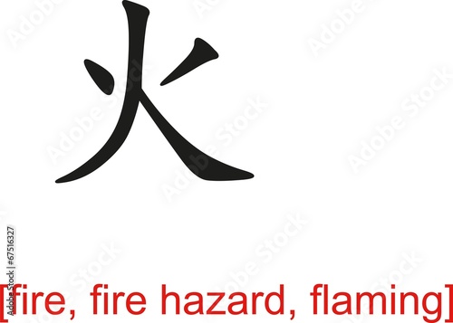
Interesting, but please don’t encourage the “face on Mars” crowd.
From “the smile on the Sun” crowd:
http://i.amz.mshcdn.com/IYJhl5cjA3uhvFb8L7p_CJ7MPpI=/950×534/https%3A%2F%2Fblueprint-api-production.s3.amazonaws.com%2Fuploads%2Fcard%2Fimage%2F305267%2F536e1732957546e3bfe4746c106c60c6.jpg
🙂
And the symbol for fire is very close to the symbol for “great, big”, etc.
大
“Here come da heap big warmy warmy Bigtime warmy warmy. Is big big hot. Plenty big warm burny hot. Hot! Hot hot! But now not hot. Not hot now. De hot come go, come go. Now Is Coldy Coldy. Is ice. Hot den cold. Frreeeezy ice til hot again. Den de rain. It faaaalllll. Make pasty.”- via Bishop Hill
https://wattsupwiththat.com/2013/06/19/hump-day-hilarity-big-kahuna-warmy/
A classic. The source is Telegraph blogger Sean Thomas.
The “guy’s” red leg and foot, that is centred on June 1997, is the warming phase of the 1998 El Nino.
Red is strong warming, greater than or equal to +5.0 degrees Celsius per century.
The blue immediately to the right of the red, is the cooling phase of the 1998 El Nino.
Blue is strong cooling, less than or equal to -5.0 degrees Celsius per century.
If you consider the red and blue areas together, then it is centred on 1998.
Given that this is an El Nino, “fire” is probably an appropriate sign.
Looks like someone running…
And if you look at the ocean only graph there is a huge green Godzilla menacing the fire!
Better perhaps to do these graphs in the normal way and show the rest of the available data for dates prior to the apex.
Actually, it shows all possible trends for the data. You can only have one trend that contains all of the data (the one at the apex). For trends that are one month less there are only two possible trends, for trends two months less there are only three and so on. They are drawn relative to the center of the trend and not one of the ends as you’re probably used to seeing. This type of chart literally shows all trends.
How many trends and of what length do we have data for with a middle date of 1980? My point is why throw away data prior to 1980 (even if you want to limit the segment to 35 years)?
@HAS
No data, none, nada is being thrown away. Each point on the graph represents the center of a trend that can be calculated for that length between the two endpoints of the data. If your data starts in 1980 you can’t create a 30 year trend that is centered on a date that is before 1995(15years before and fifteen years after). Similarly, you can’t create a 15 year trend that starts before 1987.5. What might be throwing you is the fact that they graph uses the center point of the trend for display. Take half the trend length and subtract it from the x axis value and you’ll get the start point. Similarly, I can’t create a trend at the end of the data of a given length where the end of the trend length would exceed the data available. It’d just create a shorter trend (and that’s displayed in the next row down).
Please note that these contour maps can use ALL of the data from a temperature series. The graph above is for UAH, and this temperature series only started in 1979.
I started with 1980 on the UAH contour maps, because it made the graphs “tidy”. So the graph is only missing 1 year of data.
If you want to see data before 1980, then look at the Gistemp series.
Gistemp will be put on the mta-graphs.com website some time in the next week. The Gistemp contour maps are interesting. You can easily see when global warming started.
With the Gistemp contour maps I have created a number of date ranges.
1880 to 2016 – the BIG picture
1970 to 2016 – the time of fairly consistent global warming
1980 to 2016 – for comparision with the satellite temperature series, like UAH
I’m not sure that keeping ALL the data is useful. It would seem that the alternating red and blue at the base of the triangle is just the noise (short-term internal variability) in the data giving high slope values. A novel and colorful approach to displaying data, but I’m not convinced it has great utility. What can what predict or explain from this display that wasn’t known before?
My point is the data doesn’t start at 1980.
Very interesting. The graphs on the website do show that global warming isn’t really global. It’s mostly Northern Hemisphere and mostly polar.
Yup, almost completely due to the AMO cycle.
And that is a problem because we are guessing Arctic temperatures, not measuring them. There are no thermometers over sea ice. So there are huge areas being filled by some sort of extrapolation from what little data there is. And satellites cannot measure north of ~ 80° due to orbit issues.
Arctic amplification might be real, but hard to say.
It might be good data and information, but the website layout is so atrocious and wrong, that it makes the site useless.
1. An australian site with no open ownership
2. No evidence that the source data is actually downloaded and processed correctly.
3. A chart format that seem to confuse people (see above)
4. No uncertainties
5. No description of the methods
6. no code, impossible to verify that the correct sourecs were used, that they were downloaded an reformated without error, that the trend was calculated correctly.
Alt-science
Oh good lord. 🙁
‘Alt-science’. Is this your spin on the new ‘alt-right’ catch phrase Progressives made up for the election?
Do any of your criticisms apply to the site with similar graphs, which is maintained by Nick Stokes?
(Screwtape quoting the Father of Lies to his acolyte, Wormwood (C. S. Lewis))
There has been no statistically significant warming trend for decades. And NO warming outside the bounds of natural variation. None.
This presentation, so garishly besmeared with the inaccurately (as used) misleading terms warming and warming rate and slowdown
is simply a clever way of continuing to push AGW.
Wrapping a colorful silk ribbon of genuine science around a big package of JUNK.
What a “red scarf” (Kip Hansen, IIRC, in WUWT article), we have here!
“Very Poor.”
Janice, please don’t let it go to your head, but I always – ALWAYS – enjoy and appreciate your comments.
Thank you, JMichna. I needed that. I was pretty bummed out, just now, upon returning here to see that almost no one rating this article agreed with me. The rating is up to “Good,” now. Sigh. Thank you, so much, for taking the time to encourage me! 🙂
And, now, it’s up to almost “Excellent”!! ??? This article wasn’t an expose of that site, folks. It is a favorable description of it.
“The rating is up to “Good,” now.”
Rating? What rating?
Hi, TA — The 5 star rating just above the Comments section.
* Very poor
** Poor
*** Average
**** Good
***** Excellent
I rated it * (Very poor)
Having looked at this presentation of data, I agree with you, Janice. It does not make relationships more apparent, like how one variable like temperature varies over time. It could be sheer conservatism on my part, but the multi-color graphing does not make anything more clear. Perhaps changing “spaghetti graph” charts so one can show only one or two of the tracks would be a better use of computer programming time.
The ratings you mention don’t show up on my screen. I guess that’s because I have an addon that restricts all scripts from executing on a webpage unless I specifically authorize it to execute, and I don’t usually allow much.
You tellum Janice. Sounds a lot like putting lipstick on a pig.
G
Hi, um, George. OKAY! 🙂
Why do all pyramids rest on extreme trends only (red and dark blue, or +4 to 5 or -4 to-5 C/century?) The extreme trends extend upward to about 5 years in most cases.
Suggested improvement: Every ordinary least squares (OLS) regression has both a slope and a standard error for that slope. Color all the slopes that are not significant white. How much white will we see?
http://etc.usf.edu/clipart/40600/40694/pb_tri_40694_lg.gif
Heck Janice; a one sided pyramid ! ?
That would fit well with climate science.
G
Janice Moore–
Very clever response to my question about how much white (nonsignificant regressions) we would see! I really burst out laughing on seeing that.
Nonetheless, some of the trends actually are significant at the p<0.05 level. If blogger Sheldon Walker can run thousands of regressions, he can at the same time calculate the standard error and determine which are significant. I challenge him to improve his pyramids in that way.
For example, the regression on UAH global anomalies through October 2016 (455 monthly values) is 1.23 +- 0.08 (standard error SE) K per century, meaning the 95% confidence interval lies between 1.08 and 1.38 K per century. Highly significant but a fair amount of uncertainty.
For the USA 49 (including Alaska but not, apparently, Hawaii) the slope is 1.56 +-SE 0.25 with the 95% CI between 1.06 and 2.06 K per century. Still significant but considerably greater uncertainty.
Dear Lance,
Very glad to know I gave you a laugh with that. Well, we could argue about significance (given the HIGH uncertainties….), but, here ya go.
An OBTUSE scalene (the area colored in red is the % of the meaningfully significant trends in the article’s triangle — yeah, it’s colored, er, coloured, in in almost a straight line….. just a coincidence….. heh)
http://image.mathcaptain.com/cms/images/113/triangle-midsegment1.png
Bottom line: any trends (genuine) are well within the bounds of natural variation.
Your WUWT ally,
Janice 🙂
“Janice Moore–
Very clever response to my question about how much white (nonsignificant regressions) we would see! I really burst out laughing on seeing that.”
I did, too! Good one, Janice!
They’re that extreme because the data is that variable and only larger datasets reduce the affect of that variability.
Actually, the extreme trends at the bottom make the point when you look at how variable those trends are. Any trend less than ten years is basically worthless in determining long term trends (not that the longer ones are much better). Removing them would just give credence to the ones left as having predictive power.
“Prophecy is hard especially about the future”
I see that Nick Stokes has already included not only the trend but also the significance at his Moyhu site:
https://moyhu.blogspot.com.au/p/temperature-trend-viewer.html
He grays out the trend as its significance goes down, so you can toggle between the trend and significance to see how many of the trend colors go down. As I suspected, a large percentage of the trends disappear. For some reason, however, many of the shortest-term trends move toward the red or dark blue (most positive and most negative) regions while apparently still retaining significance. So I have the same question for Nick as for Sheldon–why?
Lance,
Sorry I missed your comment before I responded below. I think the short-term significance is mostly ENSO. Stat sig doesn’t distinguish cause, just deviation from random model. In those terms an El Nino spike is outside the model, and hence significant.
” Color all the slopes that are not significant white. How much white will we see?”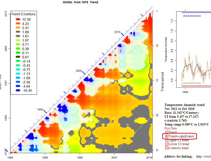
I do that here, based on AR(1) autocorrelation. You can also plot CIs and t-values. Here’s an example; you have to press the button ringed red:
Nick, some of your trend pictures remind me Benoît Mandelbrot and the good old fractal times!
@Lance,
very good suggestion. I have already done this, but I used magenta for the trends which were statistically insignificant.
Most of the trends of length 10 years and less were statistically insignificant, as well as most of the slowdown and cooling trends of length greater than 10 years. Statistics seem to be biased toward global warming, in that it is mostly warming trends that are statistically significant!!! (Did I hear a cheer go up from the Alarmists? Don’t count your chickens before they are hatched – there are good reasons for this)
My personal view is that statistical significance is over-rated. Note, I am not saying that it is useless, but it has to be used in the right context.
“Statistics seem to be biased toward global warming,”
Only if you think an El Nino step is a trend and you think putting linear trends across step changes is valid.
(youtube)
I think it’s a pretty neat graph. Well done.
The site certainly needs some work, I hope with all the attention they’re getting today, they’ll pick some of the low hanging fruit. (Not cherries, tasks that are easy to do and have the best return.)
Here’s the rest of the key. Putting only half of it on their UAH index page is low hanging fruit!
http://wermenh.com/images/mta_logo.gif
We should update the original post to include this.
Another thing that would be easy to fix – when I went to http://mta-graphs.com/ it created a tab labeled “UAH Home”. For a while I thought mta-graphs.com was at UAH, but when I found they are registered in Australia I realized their home page is the index page for UAH data. It would be helpful if they used a <title> of “MTA: UAH index.
Ah, it’s gradually dawning on me this is Sheldon’s site.
To all those who think this kind of analysis is somehow meaningful…you do realize that the climate is not a linear system, don’t you?
I keep explaining to people that “climate” “changes” constantly, and yet the TV tells them they are evil and destroying the “environment”. Who they gonna believe, me or the “Omni-Directional Sludge Pump” they spend entirely too much time staring at?
h/t Sideshow Bob
So, the graph in this post? It shows that in 1998 the entire world burned up and we are all dead? Or what?
I think describing UAH as “raw data” is a bit extreme. How is it raw? Here are plots of UAH 5.6 and UAH 6. They are rather different. Which one is raw?
I describe UAH as “raw data”, because I get it from the UAH website, and I don’t process it in any way before I analyse it. So it is “uncooked” or “raw”.
What UAH do to produce that data, is not my immediate concern.
My aim is to show what the UAH data means.
You could say that about the other data sets.
All the data sets are processed data, but some appear to go beyond processing into adjustments the validity of which adjustments appear moot.
The real problem is the quality of the data. lack of spatial coverage and short time scales. Non of the data sets is fit for scientific purposes. Janice’s tounge in cheek response showing an all white triangle is probably far nearer the truth than many would wish to accept.
I describe UAH as “raw data”, because I get it from the UAH website, and I don’t process it in any way…
That’s a well strange definition of raw data. Under raw data I rather would understand that kind of data which was not or minimalistically processed by the suppliers themselves.
GHCN unadjusted for example is so raw that it contains here and there huge errors whose corrections are first visible when comparing the erroneous records with those of the GHCN adjusted dataset (see for example the VOSTOK station records).
Ah, found it. A long time ago when I was still new to WUWT, as was solar cycle 24, there were some similar plots called Morlet wavelet transforms. They have a log scale for the Y axis, which makes it easier to see the periods as octaves or see them over a long range of times. E.g.:
https://wattsupwiththat.com/2008/09/22/new-cycle-24-sunspot/
They were also used in
https://wattsupwiththat.com/2009/05/23/evidence-of-a-lunisolar-influence-on-decadal-and-bidecadal-oscillations-in-globally-averaged-temperature-trends/
I don’t actually know what that graph means, but it looks scary. It suggests that the Old Ones are reaching down to get us.
Top graph very disturbing. Those people are clearly on fire.
What I get from the graph is that 2001 was the center of a 30 year trend of warming less than one degree C per century.
We know from other sources that there was no statistically significant trend for nearly two decades. The graph doesn’t show this because it gets lumped in with either 0 to 1(light green) or -1 to 0 (mid green). I wonder what the graph would look like if the bands were shifted half a degree. The middle band would then be -0.5 to +0.5. That would make periods with little or no trend more obvious.
I’m not sure that these new graphs really bring clarity, impressive as they are, especially if you are trying to show temperature, climate and CO2 fluctuations to people not greatly trained in the sciences.
Incidentally, when the first emigrants left England for the New World the spelling they knew and took with them was color without the u. Apparently everyone in the U.K. then decided to take revenge for tobacco by gradually introducing the u into the spelling here so that we could be snobby and have pointless arguments about literacy.
I tend to just regard “colour” or “honour” as an indication the writer is non-US. The only real useful thing in British spellling is using “arse” for “ass” when not discussing a donkey.
Don’t forget muffler for exhaust.
And what about pants for trousers. Now that really sucks.
Knickers.
Say, Mr. Verney, that is interesting. What is the British word for “muffler?” A muffler is a PART of the exhaust system (in American useage). Is it called a “sound dampener” or the like in British useage? There are exhaust pipes and, with no muffler. they will be very loud. If you have “dumps,” forward, just aft of the firewall or so, VERY loud. 🙂
I DO like “trousers,” but, I have a lifelong habit of using “pants” for all long, fairly loose, legwear. I’m trying to correct myself (for the past 3 years or so). Do they call “jeans” (Levis and the like) “dungarees?”
Are knickers worn (in general) by anyone not in a costume in England, these days? They are not worn in the U.S. now (except by someone eccentric or by someone playing the part of a 19th century British man or the like).
Janice, having read a fair amount of British fiction, “knickers” is Brit for “panties”.
Janice Moore: What is the British word for “muffler?”
Silencer.
Oh, BROTHER. Thank you, Tom Halla. When did THAT happen? I have never heard women’s unmentionables called “knickers” in — my — life. Thank you for saving me MORE embarrassment (**blush**) at some future date (no, not a “date” — that can’t happen in my life for, likely, decades. No. I’m not in prison. Heh.).
Janice, I’m not really sure how old the usage is, but I have bought British magazines for about 25 years, and it was in continuous use.
“Knickers” (and trousers, too) — see above.
Oh, I dunno. Using ‘burgled’ instead of ‘burglarized’ saves umpteen trees and a lot of police time when writing up the effects of multicultural diversity.
Ah, did you guys screw up automobile terminology because you didn’t like Henry Ford? E.g. bonnet for hood, boot for trunk, and windscreen for windshield? (American screens let air through but block mosquitoes.)
I kind of like torch for flashlight. I don’t need a strobe light to light my way in the woods….
https://blog.hemmings.com/index.php/2014/03/12/a-conversion-guide-to-british-auto-terminology/
http://forums.digitalspy.co.uk/showthread.php?t=1818966
I like “coach” for bus. Sounds so much more like a fairy tale. I might meet my Prince Charming if I ride one! (nah, he never takes the bus, lol).
In general, I think the British tend to favor, er favour, more charming or picturesque or quaint terms (at least, to an American ear). And that is wonderful.
So! I won’t use them except for special purposes, but, hurrah for the British, three cheers for sitting rooms and head lamps and party frocks (hm… just checked the Telegraph, looking for British terms, and it used “dresses”, so, scratch “frocks” and make that, and launderettes (how much daintier and cleaner they must be than an American “laundromat” or a “laundry service” — smile)!
This is fun! Thanks for this sub-topic, sub-thread! 🙂
We had a Path. professor from S. Africa who would always refer to the trash can as the rubbish container. She also had a quirk of opening her office window with the air conditioning on, claiming she needed “cross ventilation”.
I don’t use it myself, but I don’t usually mind Americans using American English as long as they follow the grammar and punctuation rules for American English. But I do get irritated when they start putting commas after subject clauses, or writing things like “if I would have been there, I would have seen it”.
Ah, that list brings back memories of my old MG Midget though I doubt if there was an equivalent term for a side curtain (which my car had).
Roundabout is a term that I’ve also heard used in the states.
Then there’s loo for john, lift for elevator, flat for apartment…
Wow
When I first saw the graph, I thought someone had finally started studying clouds!
I work with Nick Stokes’ trend viewer
https://moyhu.blogspot.de/p/temperature-trend-viewer.html
since a lot of time. It is by far more elaborate than the stuff I see here.
Very interesting graphing technique. Thank you. Similar info can also be gained from trend profiles.
https://papers.ssrn.com/sol3/papers.cfm?abstract_id=2839119
By far more interesting than UAH’s “traditional data”
http://www.nsstc.uah.edu/data/msu/v6.0beta/tlt/uahncdc_lt_6.0beta5.txt
is its “2.5° grid” companion, from which the former possibly is derived.
It consists of a set of files “tltmonamg.YYYY_6.0beta5” (1978 < YYYY <= actually 2016), located in the same UAH directory.
Each file contains data for 12 months (at least if present or existing). The data consists of 72 latitude stripes of 144 longitude cells (but the 3 northernmost and the 3 southernmost stripes contain no valid cell data).
Having processed the files into a complete dataset, you may compute lots of things out of it
– the world anomalies for a given month;
– the anomalies for different 2.5° latitude stripes, from 82.5-80S up to 80-82.5N;
– those for a given cell rectangle (e.g. the Nino3.4 region: 5N-5S,120W-170W);
– trends for such parts of the Globe over a given time period;
– and lots of other different things.
Here too, you can rely on pretty work done by Nick Stokes: a WebGL based globe representation, on which you may expand, for example, the UAH data you processed, and view it in 3D. You may drag the mouse on it, and the globe follows the mouse movements.
It starts with displaying a dataset produced by Nick (the world's 50 year linear trends, computed for each globe cell):
https://s3-us-west-1.amazonaws.com/www.moyhu.org/maps/webgl/grid.html
Here a snapshot of the globe’s BEST trend map around the North Pole:
http://fs5.directupload.net/images/161205/7ky4pcu3.png
To use the tool, you just need to enter your data in the field, and click on "Plot new".
Amazing.
Actuall I’m using it to display the trends for 1979-2016 of all the 9504 UAH grid cells with valid data; I’ll show that when I get really satisfied with the color map handling.
Heat maps suck!
So do vaccuums