Guest Post by Bob Tisdale
UPDATE: See the 2 updates under the heading of A QUICK OVERVIEW OF SHIP-BUOY BIAS ADJUSTMENTS.
# # #
Alternate Title: NOAA Has a Sea Surface Temperature Dataset with an EVEN HIGHER Warming Rate than Their Full-of-Problems ERSST.v4 “Pause-Buster” Data
Whether or not there had been a slowdown in global surface warming before the El Niño of 2015/16 depends on which sea surface temperature dataset researchers elect to use in studies. Even over the full term of the satellite-era of sea surface temperature data, the differences in warming rates can be quite large.
Figure 1 is a time-series graph of six global sea surface temperature datasets for the satellite-era of November 1981 to November 2015. (November 1981 is the start month of the original version of NOAA’s Reynolds OI.v2 satellite-enhanced data, and, as of this writing, the HadISST data from the UKMO have only been updated through November 2015.) I’ve also shown the trend lines for the datasets with the highest and lowest warming rates. The HadISST dataset from the UK Met Office (UKMO) is the sea surface temperature dataset that’s used most often in research papers. Of the 6 datasets presented, it has the lowest warming rate over the past 34 years. At the other end of the spectrum is NOAA’s high-resolution (1/4 deg), daily version of NOAA’s Optimum Interpolation sea surface temperature data (a.k.a. Reynolds OI.v2). It is presented at websites like the University of Maine’s Climate Reanalyzer and used in products where daily sea surface temperatures are needed. (That version of the Reynolds OI.v2 is NOT the dataset I present in my monthly sea surface temperature updates. More on the two versions of Reynolds OI.v2 SST data in a moment.) And as you’ll see shortly, the differences in warming rates of those 6 datasets are even greater (slightly) during the NOAA-selected global-warming hiatus period of 2000 to 2014.

Figure 1
But first, Figure 2 shows the spread between those 6 sea surface temperature datasets. The anomalies are all referenced to the WMO-preferred period of 1981-2010, almost the full term, so not to bias the results. And the “global” data were limited to the latitudes of 60S-60N, excluding the polar oceans, because the data suppliers account for sea ice differently. The monthly minimum and maximum values for the 6 datasets were first determined. Then the spread was calculated by subtracting the monthly minimums from the monthly maximums. Also shown in maroon is the spread smoothed with a 12-month running-mean filter.

Figure 2
Even before the early 2000s, when the number of buoy-based measurements skyrocketed, the spreads between sea surface temperature datasets are quite large. Keying off the smoothed data, the spread varied between 0.05 deg C and 0.1 deg C from the start until 2004. Then there was an upward shift in 2005, and after that shift, the spread cycled near 0.1 deg C. There was another obvious shift in the spread in 2013. The spread between sea surface temperature datasets is now cycling as high as 0.15 deg C.
For a global-warming hiatus period, NOAA used the period of 2000 to 2014 in two recent papers:
- Karl et al. (2015) Possible artifacts of data biases in the recent global surface warming hiatus, and
- Huang et al (2015) Further Exploring and Quantifying Uncertainties for Extended Reconstructed Sea Surface Temperature (ERSST) Version 4 (v4)
As noted earlier, the trend difference is slightly greater for the NOAA-selected global-warming hiatus period of 2000 to 2014. See Figure 3. Once again, NOAA’s high-resolution (1/4 deg) version of NOAA’s Optimum Interpolation (Reynolds OI.v2) sea surface temperature data is showing the highest warming rate. (Does anyone wonder why alarmists love that dataset?) But this time, the dataset with the lowest warming rate is NOAA’s ERSST.v3b, which, oddly enough, is still being updated by NOAA even though it was replaced by NOAA’s ERSST.v4 “pause-buster” data.

Figure 3
I suspect some readers are imagining that the differences between warming rates have to do with the ship-buoy bias adjustments—that some of the datasets include the ship-buoy bias adjustment and others don’t. You may be surprised to discover two of the sea surface temperature datasets, one with and one without ship-buoy bias adjustments, have basically the same warming rates for the period of 2000 to 2014. More on that later.
A QUICK OVERVIEW OF SEA SURFACE TEMPERATURE BIAS ADJUSTMENTS
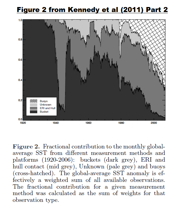
Sea surface temperatures have been measured using a number of different technologies over the years. At first (and continuing to this day), buckets of different types were tossed over the sides of ships, then hauled back aboard, where sailors would place thermometers in the water-filled buckets. Depending on the air temperatures on deck, the bucket-based temperature measurements could be biased cool. Buckets were the sole method used before the 1930s. Then ship-based engine room inlets (ERI) began to be used to sample sea surface temperatures, so there was a mix of measurements from buckets and ship-inlets from the 1930s to the 1970s. Buoys have also been used to sample ocean surface temperatures since the 1970s, with a very large increase in buoy-based observations starting in the early 2000s from drifting buoys (they are not ARGO floats). So even today there is a mix of sampling methods from buoys, ship inlets and buckets. The dominant sampling method has varied with time. See Figure 2 here from Kennedy et al. (2011) Reassessing biases and other uncertainties in sea-surface temperature observations measured in situ since 1850, part 2: biases and homogenization. Because those sampling methods have biases toward one another, data suppliers adjust the source data. The impacts of those adjustments vary with time depending on the mix of measurement technologies.
For the period discussed in this post (2000 to 2014), the ship-buoy bias adjustments are said to play a major role. Unfortunately, the uncertainties of the ship-buoy bias are extremely high.
My Table 1 is Table 5 from Kennedy et al. (2011) Reassessing biases and other uncertainties in sea-surface temperature observations measured in situ since 1850, part 2: biases and homogenization.

Table 1 – Table 5 from Kennedy et al. (2011)
As listed, for the global oceans, researchers have found that there is a ship-buoy bias of 0.12 deg C with a standard deviation of 0.85 deg C…the buoys reading cooler than the ship inlets. Let’s rewrite that bias in terms that you may be more familiar with: It’s 0.12 deg C +/- 1.7 deg C. In other words, the uncertainty of the global ship-buoy bias is an order of magnitude greater than the observed bias.
I’ve seen a climate scientist reframe those uncertainties in a blog comment. Unfortunately, I can’t recall when or where. (If you know of that comment, please link it on this thread and I will include it here.) Regardless of how they are framed, the uncertainties in the ship-buoy bias still exist and they are quite large.
UPDATE 1: Nick Stokes writes in the comment here on the thread at WUWT:
This is Ross McKitrick’s bungle. It is just wrong. 0.85 is the standard deviation (SD) of the pairings that go to make up the average. SE is the standard error of the mean – the figure 0.12 that you are quoting. That is basic stats. It’s 0.12 +/- 0.01.
[End Update 1]
The uncertainties of the ship-buoy bias are so great that researchers in the early 2000s didn’t bother to account for them. But as the 21st Century unfolded and the slowdown in global warming became more and more evident as time passed, the researchers began to search for excuses for the slowdown and began to search for ways to increase the warming rate for the post-1997/98 El Niño period. So they blamed the ship-buoy bias and began to adjust sea surface temperature datasets for it. The most recent sea surface temperature data supplier to do so was NOAA with their ERSST.v4 “pause-buster” data.
UPDATE 2: To confirm my statement The uncertainties of the ship-buoy bias are so great that researchers in the early 2000s didn’t bother to account for them… see Reynolds et al. (2002), where they write:
We have not corrected the OI.v2 in situ data by the factors in Table 2 because of the uncertainties of the biases in the table. However, any correction of satellite data is further complicated by in situ biases and their uncertainties.
[End Update 2.]
DATASETS PRESENTED
Of the 6 sea surface temperature datasets presented in this post, 3 have been adjusted for ship-buoy bias and 3 have not. Let’s start with the datasets that have been adjusted. They include:
- NOAA ERSST.v4 (NOAA’s recently introduced “pause buster” data, infilled, in situ only)
- UKMO HADSST3 (UK Met Office product, not infilled, in situ only)
- NOAA Optimum Interpolation/Reynolds OI.v2 – High Resolution (NOAA’s satellite-enhanced data/AVHRR-only, ¼-deg resolution, infilled, presented daily) KNMI recently added it to their Climate Explorer.
Notes: The notation “in situ only” means the dataset includes only observations from ships (buckets and ship inlets) and from buoys (moored and drifting). The “satellite-enhanced” datasets also include in situ observations and the satellite-based data are also bias adjusted with the in situ data. “Infilled” means that data suppliers use statistical devices to create data for ocean grids without observations, providing a dataset that, seemingly, is spatially complete. [End notes.]
The datasets that have not been adjusted for ship-buoy biases are:
- NOAA ERSST.v3b (NOAA’s former dataset, infilled, in situ only)
- NOAA Optimum Interpolation/Reynolds OI.v2 – “Original” (NOAA’s original satellite-enhanced data, 1-deg resolution, infilled, presented weekly and monthly) I’ve listed it as “Std” for standard resolution and standard timeframes in the title blocks on the graphs. This is the Reynolds OI.v2 data I use in my monthly sea surface temperature updates.
- UKMO HADISST (UKMO’s interpolated/infilled product, satellite-enhanced)
A REFERENCE ILLUSTRATION
Last month a paper was published about the uncertainties of the new NOAA ERSST.v4 “pause-buster” sea surface temperature data. That paper is Huang et al. (2015b) Further Exploring and Quantifying Uncertainties for Extended Reconstructed Sea Surface Temperature (ERSST) Version 4 (v4). (Preliminary accepted version is here.)
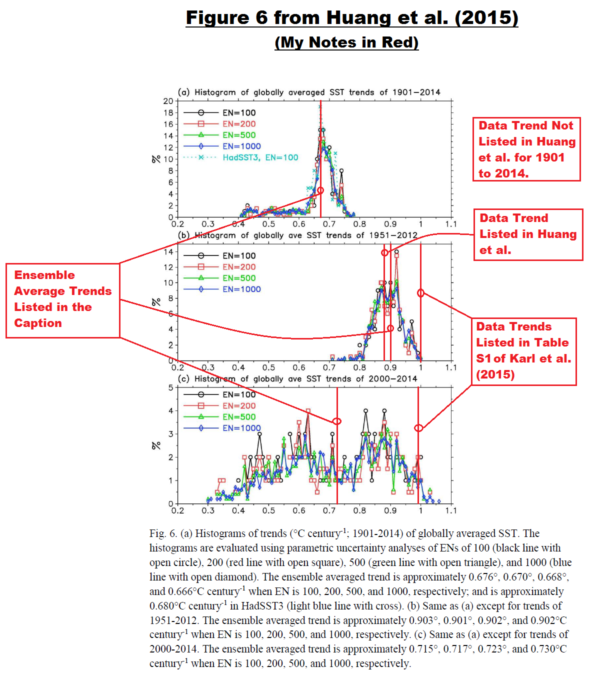
My Figure 4 is Figure 6 from Huang et al. (2015b). It includes histograms of trend uncertainties that were determined from the model used to calculate the new NOAA ERSST.v4 data for three periods: 1901 to 2014, 1951 to 2012, and 2000 to 2014.

Figure 4 – (Figure 6 from Huang et al. (2015b))
The trend uncertainties presented in their Figure 6 are “parametric uncertainties”. More on that topic later in the post.
A BRIEF EXCURSION TO THE PERIOD OF 1951-2012
One of the curiosities illustrated and discussed in the recent posts (here and here) was how the trends of NOAA’s new ERSST.v4 “pause-buster” sea surface temperature data resided at or toward the high ends of the uncertainty ranges for the periods of 1951 to 2012 and 2000 to 2014. See the illustration here from the post The Oddities in NOAA’s New “Pause-Buster” Sea Surface Temperature Product – An Overview of Past Posts.
But there’s another curiosity in that illustration. Note how Figure 6 from Huang et al. (2015b) includes a histogram for the UKMO HADSST3 data, but only for the period of 1901 to 2014, Cell a. The obvious intent was to show the similarities between the two datasets for that time period. That raises a question: Why did NOAA exclude the histograms for the HADSST3 data during the other two periods? They can’t include it in one and not the others and not draw attention to the fact that it’s missing from others.
We illustrated and discussed in the post Busting (or not) the mid-20th century global-warming hiatus how the UKMO adjusted their HADSST3 data for the 1945 discontinuity presented in Thompson et al (2008) and for the trailing biases, while NOAA had not.

Figure 5
As a result of NOAA’s failure to make those adjustments, the new global NOAA ERSST.v4 data have a noticeably higher warming rate (+0.099 deg C/decade) than the UKMO HADSST3 data (+0.076 deg C/decade) for the period of 1951-2012. I’ll let you speculate about why NOAA did not include the histogram for the trends of the HADSST3 data for that period in Figure 6, Cell b from Huang et al. (2015b).
Note: My Figure 5 above is similar to the bottom graph in Figure 13 from the post Busting (or not) the mid-20th century global-warming hiatus. I’ve ended the data in 2012 in Figure 5 above to agree with the timeframe used by NOAA in Huang et al. (2015b). [End note.]
But what about the period of 2000 to 2014 shown in Cell c of Figure 6 from Huang et al.? Where does the UKMO HADSST3 data fit in that period? I’ve included Cell c from Huang et al. (2015b) in the next two illustrations for illustration and discussion purposes.
COMPARISON OF DATASETS WITH SHIP-BUOY BIAS ADJUSTMENTS
The top illustration in Figure 6 is a time-series graph that includes the global sea surface temperature anomalies for the NOAA ERSST.v4 “pause-buster” data, the NOAA Reynolds OI.v2 (high resolution, daily version) satellite-enhanced dataset, and the UKMO HADSST3 data. It covers the NOAA-selected hiatus period of 2000 to 2014. All three datasets have been adjusted for ship-buoy biases. Quite remarkably, the trends range from +0.054 deg C/decade for the HADSST3 data to +0.131 deg C/decade for the NOAA Reynolds OI.v2 (high resolution version) data, with the NOAA “pause-buster” data coming in at +0.097 deg C/decade.

Figure 6
Referring to the trend histogram, we can see that the +0.131 deg C/decade trend for the NOAA Reynolds OI.v2 (high resolution version) data is so high it’s out of the range of trend uncertainties for NOAA’s latest and greatest ERSST.v4 data. (Off the chart, not even close.)
We can also see that the trend of the HADSST3 data for the period of 2000 to 2014 resides in the lower half of the ERSST.v4 trend uncertainty range. Once again, I’ll let you speculate about why NOAA did not include the histogram of the HADSST3 trend uncertainties in Figure 6, Cell c from Huang et al. (2015b).
COMPARISON OF DATASETS WITHOUT SHIP-BUOY BIAS ADJUSTMENTS
Figure 7 includes NOAA’s original Reynolds OI.v2 satellite-enhanced data, the NOAA ERSST.v3b in situ-only data, and the UKMO HadISST satellite-enhanced data. These 3 datasets have not been adjusted for ship-buoy biases. Their trends for the period of 2000 to 2014 are clustered much more closely together than the datasets that have been adjusted for ship-buoy biases. The trends of the datasets that haven’t been adjusted for ship-buoy bias range from +0.039 deg C/decade for the NOAA ERSST.v3b data to +0.052 deg C/decade for the original NOAA Reynolds OI.v2 data, with the UKMO HadISST data between them at 0.046 deg C/decade.

Figure 7
For all three of the datasets without the ship-buoy bias adjustments, we can also see that the trends for the period of 2000 to 2014 fit within the range of trend uncertainties that NOAA determined for their “pause-buster” ERSST.v4 data. But instead of the trends residing up at the high end of range like NOAA’s “pause-buster” data, these three datasets without the ship-buoy bias adjustment have trends below the average. Some readers might believe the datasets without the ship-buoy bias adjustments provide conservative estimates of the warming rate from 2000 to 2014, where the trend of the NOAA “pause-buster” data is far from conservative, more in the realm of extremism.
Referring to the histograms in Figures 6 and 7, there is only one sea surface temperature dataset that falls outside of the range that NOAA determined for their ERSST.v4 data, and it is the high-resolution version of the NOAA Reynolds OI.v2 data. I believe we can treat that version of NOAA’s Reynolds OI.v2 data as an outlier and also treat it as an unrealistic product for global warming presentations.
We can also see in Figures 6 and 7 that the 2000-2014 trend of the UKMO HADSST3 (+0.054 deg C/decade), which has been adjusted for ship-buoy bias, is basically the same as the trend of the standard NOAA Reynolds OI.v2 satellite-enhanced data (+0.052 deg C/decade), which has not been adjusted for ship-buoy bias.
THE OUTLIER’S IMPACT ON THE SPREAD
Figure 8 is the same as Figure 2, except that I’ve excluded the outlying high-trend, high-resolution, daily version of the Reynolds OI.v2 data from NOAA.

Figure 8
The upward shifts in the spread in 2005 and 2013 no longer exist when we exclude the outlying version of NOAA’s Reynolds OI.v2 data (that’s favored by alarmists). Makes one wonder where those shifts come from. Excluding that outlying dataset also reduces the spread before 2005. See Animation 1.

Animation 1
PARAMETRIC UNCERTAINTY
Based on observations from ships, buoys and in some cases satellites, data suppliers (NOAA and UKMO) use computer models (not the same as climate models) to determine the monthly, weekly and daily values of sea surface temperatures in the ice-free oceans. There are a number of factors called parameters that data suppliers can adjust in the computer models in order to produce their sea surface temperature end products. Parameters are commonly thought of as tuning knobs. The uncertainties shown in the histograms from Huang et al. (2015) are parametric uncertainties. That is, they are the uncertainties associated with the 24 parameters NOAA uses to “tune” the ERSST.v4 “pause-buster” sea surface temperature data.
As shown in this post and in the post The Oddities in NOAA’s New “Pause-Buster” Sea Surface Temperature Product – An Overview of Past Posts, NOAA has selected those parameters so that the warming rates of their ERSST.v4 data reside at or near the extreme high ends of the ranges of parametric uncertainties for the periods of 1951 to 2012 and 2000 to 2014.
CLOSING
Please understand that I am not saying the high resolution/daily version of NOAA’s Reynolds OI.v2 data doesn’t serve a purpose. There are many applications that require daily sea surface temperature data. And there are studies where higher resolution data are preferred, like research into western boundary currents and their relationship to local sea surface temperatures. Caution has to be exercised, though, when using that version of NOAA’s Reynolds OI.v2 data as a reference for global ocean warming. There are some seemingly unjustifiable warm biases in that dataset.
In many respects, the new NOAA “pause-buster” ERSST.v4 is also an outlier. It is the only sea surface temperature dataset (with or without ship-buoy bias adjustments) whose 2000-2014 trend resides near the high end of the trend uncertainty histogram NOAA created for that dataset.
The ERSST.v4 trend is so unusual, so high it might make one wonder if it would fall outside of a trend histogram created from HADSST3 data during the NOAA-selected hiatus period of 2000-2014. Unfortunately, NOAA did not present the histogram with the uncertainty range for the HADSST3 in Huang et al. (2015b) for that period.
SOURCE
The sea surface temperature data presented in this post are available from the KNMI Climate Explorer.
They are busy modifying that data.
Don’t worry they’ll “find” that sea level data sooner or later.
…and that “data” will be an island that has “sunk”, but only if they redefine “island” and “sunk”.
Bob, don’t be surprised at what excesses they might go to. Having gotten clean away with climategate and a series of wink-wink whitewash investigations and now karlizing the surface temperature record, they have been emboldened to do whatever it takes to stay afloat on the funds and on the mood of governments. They know that we know it stinks, but so far we haven’t been able to get the upper hand. Remember, we be few and they be many. An impossible rise in RSS’s temperature record trend is what they have been grooming us for next.
The sea level rise is all over the place. One chart released with the “Doomsday Clock” data set the other day showed a current rise of 60mm per year, accelerating since 1993. Even Univ. Of Colorado has the current rise at only 3.5mm per year, the 100 year norm. A quick calculation, rounded, means that a current 60mm indicates a little less than a 1 foot rise in sea levels in the last 20 years. Hmmmm. I think we might have noticed that.
60mm is approx. 2.5 inches. Times 20 years is 50 inches of rise and plainly not correct. Not “a little less than 1 foot”- it is a little more than 4 feet
john, it accelerates from zero, 60mm is not the average, but the current.
Do any of these organizations even employ a professional Statistician?
No, they seem to be ok with stealing the corrections from the amateurs, without citation, and only after ridiculing their ideas before they steal them.
CJ: +100
Yeah, that “Daily, High-Resolution” OI.v2 dataset from NOAA really looks weird. Here’s how it compares with the “Standard” (weekly/monthly) OI.v2 series:

Note how almost the entire difference between the two (a pretty substantial one at that!) arises within the relatively short segment between ~ 2002 and 2006/07 …
“As listed, for the global oceans, researchers have found that there is a ship-buoy bias of 0.12 deg C with a standard deviation of 0.85 deg C…the buoys reading cooler than the ship inlets. Let’s rewrite that bias in terms that you may be more familiar with: It’s 0.12 deg C +/- 1.7 deg C. In other words, the uncertainty of the global ship-buoy bias is an order of magnitude greater than the observed bias.”
This is Ross McKitrick’s bungle. It is just wrong. 0.85 is the standard deviation (SD) of the pairings that go to make up the average. SE is the standard error of the mean – the figure 0.12 that you are quoting. That is basic stats. It’s 0.12 +/- 0.01.
Maybe (or maybe not) true from a statistics definitions standpoint. But it seems to me that this makes no common sense at all. As I understand it, this represents the cooling affect of evaporation on a bucket of water after it is pulled out of the ocean. That amount of cooling would be highly dependent on the amount of time between extracting the bucket from the ocean and when the reading is taken. To say they know this to be exactly .12 +/- .01 seems excessively overconfident.
“As I understand it, this represents the cooling affect of evaporation on a bucket of water after it is pulled out of the ocean. “
No, nothing to do with buckets. It’s an estimate of he bias between measurements at ship engine inlet and measurements by buoys.
My mistake then. Still, although I admit to ignorance as to what exactly is causing this bias and what variables are involved, +/- .01 in general seems excessively confident to me.
The reality of engine intake measurements is that they are made to monitor engine cooling performance- not for scientific inquiry. The newer ships will have digital sensors while there are probably still some that are cheap, low quality, chronically inaccurate glass thermometers. Both kinds sit in wells that often stick out far enough in warm engine rooms to effect the reading. Everybody thinks that a digital readout is way more accurate than a glass thermometer- not necessarily so at all! Most digital sensors are effected by the above mentioned well anomalies as well. I also doubt that all these intake pipes are insulated, or that those that are have their insulation in good shape. I doubt all the sensor locations are the same distance from the actual intake point. The sensor readings are also affected by length of the sensor wire which is usually a fine gauge, the length of the conductor from the sensor wire to the readout point and the quality of the junctions. After all this is taken into account, most digital systems have calibration offsets which can be programmed in, but which may vary for different temperature ranges. If NOAA says they covered all these factors and they have data which is of higher quality than the buoys- I’m afraid my next comments would be pretty rude. And that before any claims to .01 degree accuracy. Pure nonsense! Their data on engine room temperatures is more accurate. Problem is, they think it’s water temps.
John Harmsworth –
You made some very valid comments.
I have worked with thermowells on on water systems for 40 years. They are great “indicators’ but good fractional degree accuracy is not likely, at least with the ones I am used to. I have both mechanical and digital readouts on my own infloor heating and water to water heat pump in my farmhouse. I can switch devices in the thermowells and get different readings. The amount of insulation has an effect and the type of well. But in most applications I was involved with, we were happy with an accuracy of a degree F. Most instrument companies will claim a 1% accuracy (full scale) for high quality instruments which gives you a half degree F at 50 degrees for the highest quality, but it’s often more like 2-3%. Lots of thermocouples are +-1.5C. However, when your goal is making sure the water stays above 32 degrees F or you need the temperature for calculating chemical additions, a degree or so is fine. Monitoring of engine water falls into the same category. Not worried about fractions of a degree, just wanting to make sure everything is running as it should. In my case, I take water in at 41.5 degrees and discharge at 37 degrees F when the pump and wells are running properly. If it varies, then I look for reasons. (The discharge temperature varies with the output settings for the hot water from the heat pump.)
Based on my experience measuring water temperatures from wells, rivers, lakes, water systems and other applications, I can’t see that using ship water intakes for determining SST’s makes very much sense. In fact, none at all.
No one was likely calibrating those instruments:
http://morewinemaking.com/articles/bimetal_brewing_thermometers
Further, who knows how accurate/precise the devices were. For those interested, this is a paper on temperature measurement:
http://web.mst.edu/~cottrell/ME240/Resources/Temperature/Temperature.pdf
John, in addition to the factors that you mentioned, ship intakes vary in depth based on the size of the ship. Big ships have deeper intakes than smaller ships, as a result the temperature of the water will vary from ship to ship, even if the ships are sailing right next to each other.
Beyond that, the draft of a ship changes based on how heavily it is loaded, which will in turn affect the depth of the water intake point.
Unless you are towing the buoy behind the boat, you have no idea whether there is an bias or what the bias is. You can not have paired measurements unless the measurements are taken by the two methods at the same location.
“You can not have paired measurements unless the measurements are taken by the two methods at the same location.”
They pair measures taken within 50km and in a time window of night hours. The space difference makes for temperature differences because of gradients. That is the main part of the SD. But those errors cancel. Ships pass to the warm side of a buoy as often as to the cool. That is why they looked at 21000 pairings and averaged. The smaller SE reflects the gain of averaging a large number.
Towing behind the boat would actually create a bias as the ship is both disturbing the water and dumping engine cooling water behind it. This provides another question. Wouldn’t ship temperature reading mostly be taken in shipping lanes? What bias does that create? Only NOAA K-noaas!
Oh my, you mean the dreaded Shipping Heat Intensification Tranche effect. This might need more adjustment.
I wonder if they can invent thermometers (presumably digital) which have programmed in the temperature from computer models. That way the inaccuracies of actually measuring the temperature can be removed and the cost and complexity of those physical systems removed. Then we could have thermometers that could tell us the temperature everywhere or at any time simply by using models rather than actually having to have a device in the location physically measure it.
I don’t know why we even bother to measure the actual temperature physically since whatever the number is it will be adjusted till it matches the computer models anyway. This way we can avoid the tedious and untimely process of adjustment adjustment and simply get the “real” temperature right away. Then I know what clothes to wear or how to plan my day. I don’t have to look outside and see the actual weather. I can just look at the models and know the weather.
With these new GISS thermometers I will be able to go outside and when my body tells me it’s cold I can simply tell my body it needs to be adjusted. Obviously it’s not cold outside. GISS tells me it is 83F. The same with sea water. When I get in the Pacific and I feel it seems as if the water is 32 degrees and GISS tells me it is 60 I can know my body is lying to me again.
“They pair measures taken within 50km and in a time window of night hours.”
In other words, they faked it.
Thanks, Nick. I’ve added two updates to the post.
The standard deviation and the standard error of the man convey different information. For example, if you measured the average daily temperature for a year, then calculated the variability you would get a standard deviation. If you collected this data for 100 years and wanted to calculate the variability, the standard deviation would again be the appropriate metric, and would be about the same as the calculation from 1 or 10 years of data.
But if you looked at the average temperature for the year, one year of data would not tell you much. Collecting 10 years of data would tell you more, and by 100 years of data your estimate of the mean temperature over a year would be quite accurate.
Scientists often cite the standard error of the mean in statistics because it tells them how confident they can be in the mean of one group of data versus another group of data. And that helps them do hypothesis testing. But you can have very strong statistical significance for small differences with tiny variability, even if those differences are small enough to be irrelevant and meaningless.
In this case, the standard error of the mean is useful as a way to decide if a bias exists. However, the standard deviation is also appropriate, and tells us how much variability exists in the data.
If the real bias is 0.12 and the standard deviation is almost 1.0 then that does indicate a huge amount of variability in the bias detected among the different measurements, relative to the magnitude of the bias being reported.
Nick Stokes:
As I understand it, the standard deviation is telling you how much error (i.e., variability from presumed perfect agreement) is likely to show up between the measured pairs. The standard error (of the mean) is telling you how much additional error is likely to arise from averaging the errors of all the paired measurements.
So why wouldn’t you report both estimates since they both convey important information?
Kennedy, properly, listed the standard deviations for each sub-population as well as the full sample set. So what is wrong with expecting this information to be preserved in later, derivative studies?
“The standard error (of the mean) is telling you how much additional error is likely to arise from averaging the errors of all the paired measurements.”
No, that’s completely muddled. 0.01 is the uncertainty of the mean. Not additional uncertainty. The SD is important information, but not about the uncertainty of the mean.
Here is a familiar setting. Political poll, 2 candidates A and B, about equally favored. Pollster asks 1000 people, and scores 1 for pro-A, 0 for pro-B. Gets, say, 0.51 and reports a sampling error (uncertainty) of .03. In fact, the SE (standard error of mean) is .015; they report the 95% level.
The SD applies to the individual question, and is close to 0.5. That’s the uncertainty you have after asking just one person. That’s why they ask 1000, to get the sampling error down to .03.
When you are measuring SST with two separate devices theory expects the measurements to be identical. Therefore, the SD “should” be 0.0 except for measurement errors/bias (in device or process or both). Bias is what they are actually trying to detect so that a correction of the proper size may be applied to the historical record. The fact that the 2 σ SD was a spread of 1.7C (instead of 0.0) tells us something important about how uniformly well the selected sample pairs measured the actual SST.
In contrast, you would not expect the simple opinion poll to have zero variance, even in theory. The SE in the opinion poll gives you the sampling margin of error compared to a theoretical poll of the entire population. Displaying the SE from the paired SST sample as the presumed margin of error for the global ocean SST correction is probably what upset so many skeptics, even though it is mathematically correct.
As with opinion polls, it is still possible to screw up your sampling assumptions. In the case of Kennedy and related papers, while they made every effort to compare like-to-like, the paired sample population was a matter of convenience (close in time and within 50 km) as much as design. Given that a specifically dedicated SST sampling effort that avoids confounding wind, current, cloud, etc., effects between floats and boats is probably beyond the capacity of anyone to produce, you have to use what is at hand.
I was impressed by the thoughtful and comprehensive approach used in the two Kennedy papers. As far as I can tell, arguing about the relative importance of the SD of ship-buoy pairs isn’t going to change the ultimate result. But it does give armchair critics like me something to do.
“When you are measuring SST with two separate devices theory expects the measurements to be identical.”
No, the measurements are taken at different times and places. Up to 50 km apart in space, and up to a couple of hours in time (I forget exactly) and restricted to a pre-dawn period. That is the main source of SD. Because of the differencing, you’d expect this error to be unbiased – the measurements are made independently, and the difference could go either way.
Reading my reply after posting it left me a bit disappointed in my own explanation. The improved version would simply be “the dispute is over the amount of uncertainty in measurements that is lost or ignored when you talk about standard error of the mean to the exclusion of standard deviation.”
Skeptics see a large SD and want to stress the uncertainty underlying the paired measurements, for obvious reasons. The Karl paper needed to justify their adjustment of the SST record and highlighted the SE, for equally obvious reasons.
Here is an illustration of the potential importance of standard deviations from Wikipedia, which I understand is the arbiter of all internet disputes 🙂
Caption:
“Example of samples from two populations with the same mean but different standard deviations. Red population has mean 100 and SD 10; blue population has mean 100 and SD 50.”
Image:
https://upload.wikimedia.org/wikipedia/commons/f/f9/Comparison_standard_deviations.svg
Although I should have expressly written “co-located ship-buoy pairs” I believe it is correct to state that Kennedy was testing for possible instrument bias by assuming the co-located ships and buoys were measuring the same point in time/space.
The fact that SD captures both instrument bias AND time/space differences is the reason you cannot, with perfect confidence, declare that the average difference between the co-located pairs was a entirely due to a “ship warming” bias of 0.12C — since some unknown portion was potentially due to other confounding factors. Whatever that unknown quantity is, skeptics believe it is larger than 0.01.
Furthermore, if the creation of the co-located ship-buoy database was NOT an effort to seek (as nearly as possible) identical time/space measurement comparisons between the competing instruments, it seems that you could simply average all of the ship data to compare with all of the buoy data (co-located or not) and come up with the same 0.12 C difference between the data sets.
“Whatever that unknown quantity is, skeptics believe it is larger than 0.01.”
Doesn’t sound very skeptical.
“it seems that you could simply average all of the ship data to compare with all of the buoy data”
No, there is a trade-off. By allowing a greater separation, you get a larger SD, but have a larger sample to average over. Up to a point these balance, but after a while, the sample doesn’t expand as fast as the error, so there is an optimum. But this shows why the SD doesn’t help – it increases while the expanding sample size is keeping confidence in the mean fairly stable.
“the dispute is over the amount of uncertainty in measurements that is lost or ignored when you talk about standard error of the mean to the exclusion of standard deviation.”
I think its better expressed as what is the error when applied to all buoy readings including those that were not paired.
I don’t doubt that 0.11-0.13 adjustment to all the data in the pairings would give the same answer as adjusting the data in the pairs individually but what is the uncertainty if you wanted to apply a single correction to all the buoy data? Its certainly not ±0.01 and the back of envelope (as if it were random error of many readings of a single measurement) of ±0.17 is better and not a blunder.
Hey Nick. How would say the given SE relates to the accuracy of adding .12 for any given year? It occurs to me that, say hypothetically, if they used one and only one ship intake measurement, then the adjustment for that measurement should be -.12 +/- .85. But if they took 210000 measurements from ships intakes in a given year, then the adjustment for that year would indeed by .12 +/- .01.
Of course we know they improperly applied the adjustment to the.buoys instead of the ship intakes, which actually makes the above question seem moot. But that’s a different issue.
“I don’t doubt that 0.11-0.13 adjustment to all the data in the pairings would give the same answer as adjusting the data in the pairs individually”
They don’t adjust the data in pairs. It’s an adjustment that they either add to ship readings or subtract from buoys to put them on the same basis. The pairing by proximity is just a device to get that estimate. The actual nature of pairings and their SD is of no interest ongoing.
As JSG says, 0.85 is the uncertainty of an estimate based on a single pairing. If you have N pairings, the average is more certain. This is an absolutely standard use of the standard error, using the standard form SE=SD/sqrt(N). If you google “difference between standard deviation and standard error” you’ll get dozens of well meaning explanations.
Appreciated but the error of the mean is not necessarily going to be the uncertainty when you apply it to other data. That eqn is for perfectly random errors around the mean and for that set of data. You can’t just assume, especially as it varies a lot with regions, that the correcting all data by 0.12 will only create an extra 10% uncertainty.
We are discussing ship data not designed for the purpose so its variation with ships and not random. I must admit that I didn’t realise that the regions were that close. I find that suspicious.
So I take it that they only adjusted the buoys that were paired?
Thanks Nick for telling that!
With the uncertainties in the real numbers, maybe the y-axis chart scales are too fine on your graphs.
Re plot the data with a scale of 1 to -1 and use a thicker line. Might need a high res display to actually see any fluctuations. Problem solved.
So you’ve got 3 unadjusted data sets that track each other very well, and then you look at them and say “That can’t be right, they all agree!”
My, hot air, aren’t you foolish! Please advise where I wrote or implied what you quoted with “That can’t be right, they all agree!”
Have you been hanging out with Miriam O’Brien at HotWhopper? That sounds like something she would write.
bob, I think you misunderstood. I meant the guys making the adjustments.
In other words I can’t think of a valid reason to take 3 different data sets that show good agreement and adjust them so they agree less…
Thanks, Bob.
This is a very informative post.
As to “why NOAA did not include the histogram of the HADSST3 trend uncertainties in Figure 6, Cell c from Huang et al. (2015b)?”
I think NOAA found it “inconvenient”. It would point to an internal contradiction.
“These are the days of miracles and wonders”, Paul Simon, Boy In The Bubble.
Hilarious!
Here are grown people discussing a temperature change in the earth’s OCEANS of less than 1/10th of a degree.
At least the Physicists (when they adopted quantum theory) had the humility and honesty to say…there are some things we simply CANNOT MEASURE.
Closer to 1/100ths of a degree.
It is a basic law of physics that a warmer sea surface will quickly warm the atmosphere above it via evaporation
So why do the satellites say this is not happening?
The satellites DID say we just had the warmest November and December on record. However these numbers are not even close to the April 1998 numbers. Are the satellites just a bit slow? The next four months should tell the tale.
Here is a plot of the RSS monthly averages in late 1997 (blue) and 1998. There is a lag.
http://www.moyhu.org.s3.amazonaws.com/2016/1/1998.png
Yes Nick
But ENSO peaked back in August.
I think it highly lilkely that RSS/UAH will rise for the next couple of months or so, as I am on record for saying.
The 12-month running average will probably go above 2010, but will it go above 1998?
Highly unlikely! But let’s just bide our time and wait a few months. If it does not by then , we will know there is definitely something wrong with SSTs.
Paul, I hate to contradict you but the sea surface temperature data indicate that the NINO3.4 anomalies peaked in November/December 2015, depending on the SST dataset.
Time for a Bob Tisdale plot:
1997 and 2015 are pretty much in phase.
Except the energy release is further west, which historically has a different outcome on weather systems worldwide.
I think the cooler 1&2 regions suggest two things, 1) Westerly winds are not as intense so there is less evaporative transfer happening and 2) Cool water upwelling is not a suppressed off SA coast so there is more cool water mixing, reducing evaporative potential. End of DEC-MAR is when 97/98 heat transfer to the atmosphere really spiked up in satellite data. Expect the same here, but maybe not quite as much. We may have more heat stay in the ocean surface and spike the PDO higher and reinforce the warm blob in the northern pacific later this year.
Pressure, convection, and radiation also affect how much/when evaporation happens. Cloud formation and precipitation determine when and where it is turned into sensible heat.
Whatever the on-the-ground (er, make that, on-the-water) reality, something is putting the kibosh on El Nino. El Nino gave us a normal Fall and last week of December, then a wet first week and a half of January. Since that wet week, the sensible weather here in the Southern fringes of NorCal has trended drier and drier. We are now down to about one decent front per week, with a few washed out drizzlers in between. Flow is back to NNW to SSE, bad deal for PW. Unless we go back to a wetter regime there is no way the drought will be broken during the current water year.
These numbers are all meaningless, please change them to the number of Hiroshima style nuclear detonations involved.
KTM, are you a new troll here, spouting off about the foolish Hiroshima-bomb metric?
First off: that silly metric is presented in discussions of ocean heat content, not sea surface temperatures, which are two very different variables. This post is about sea surface temperature data, so you’re barking up the wrong tree with your comment.
Second: Why don’t you compare that Hiroshima-bomb metric to the amount of sunlight reaching the surface of the Earth daily plus the amount of infrared radiation from the natural greenhouse effect ? When you’re done, please come back and show us your results.
Ciao.
I think hew forgot the SARC tag, Bob!
Bob,
I think there may have been an implied sarcasm font on KTM’s post, but KTM would have to confirm that.
It’s obvious sarcasm.
Belated /SARC 😉
I wonder whether anyone attempted to gage the ocean water temperature by measuring the speed of sound in the water. That speed is a function of temperature, for example for 20degC it is 1482 m/sec and for 30degC it is 1507 m/sec (Google). Assuming a baseline distance of 1000 km and measuring the time it takes for a sound signal to travel that distance one could get readily measurable water temperature as a function of that time with the free bonus of getting an average temperature over that distance. Technology exists for sending&receiving sound signals over long oceanic distances. As an added advantage, the cost of the shore based equipment to do that would certainly be much cheaper than dispersing and maintaining a number of buoys.
Jaroslaw Sobieski, Hampton, VA
Walter Munk at SIO once proposed such an acoustic measurement scheme world-wide, but it was never implemented because of environmentalists’ cries of possible harm to cetaceans.
The main problem is that over 1000 km, you get very little signal that has taken the direct path. Most will have been reflected many times, from bottom and surface. That really spreads any pulse you try to carry, and gives a poor estimate of sound speed. Added to that – there is a lot of temperature variation over the path, especially in the vertical. There is no way that would measure SST.
… that plus.
Temperature is not the only thing that affects the speed of sound in water. We also have salinity to worry about.
The problem of which signal is a result of the direct path is easily dealt with. If we use a pseudorandom sequence of sufficient length to remove any ambiguity. This works for sonar, radar, and seismic signals.
Notwithstanding the above, sonar provides plenty of surprises (when you’re trying to find a submarine for instance) and probably isn’t a very reliable way to measure temperature.
Many, many years ago, I read about someone who had developed an instrument that used a broad spectrum radio receiver to count lightning strikes. Supposedly this device was sensitive enough that it could detect lightning anywhere in the world.
On the theory that a warmer atmosphere would result in more thunderstorms, somebody proposed that this device could be used as a proxy for measuring changes in atmospheric temperature.
So let’s be clear. The average global temperature of the oceans is about 17 degrees C and it has reportedly increased by about 0.1 degrees in the last decade, while the global air temperature is about 14 degrees and it has not increased for 18 years?
Look how far the new high res dropped the 1997/98 El Nino. That is a prime example of how their adjustments always makes the rate of warming increase.
Where do I find a page of Argo based temperature graphs? This is something to follow together with cryosphere/watts sea ice pages, and satellite temperature reports.
tegirinenashi, ARGO data are available through the ARGO website:
http://www.argo.ucsd.edu/
If memory serves, they offer specialized software there to process it.
From Nature http://www.nature.com/nclimate/journal/v6/n2/full/nclimate2872.html
http://www.nature.com/nclimate/journal/v6/n2/carousel/nclimate2872-f5.jpg
Looks like the deep southern oceans ate the heat. Why did we have an Arctic death spiral and record sea-ice extent around the Antarctic?
I’m sorry but I’m too cheap to buy it and so have no idea what the temperatures change to what depth that plot is derived from, nor SST.
No offense to Bob or his excellent analysis, but the numbers give new meaning to the phrase “pissing in the ocean”. Teeny tiny changes that may or may not be representative of the actuality of what is going on out there globally while politicians adulterate them and use them for their own purposes. It’s enough to make one pull their hair out. I, for one, am however getting to thin on top to resort to that. I will simply say that I doubt the significance of the numbers in the grand scheme of global climate and the supposed mechanism of CO2 to any effect upon them in any event.
Teeny tiny trend of 0.01 K/year is very different from 0.03 K/year. It makes a difference.
[A 66% decrease in warming? Or, “Studies show global warming is 3 times previous calculations”? .mod]
Thanks yet again Bob, for another great article and expose, They are still at it in all departments. They got clean away with famous Climategate, they sailed through the pre-arranged whitewashed investigations and they are now attacking all the surface temperature records and sea level and temperature records at will. They can do whatever they like these days from their politically teflonned Bunker. They do whatever it takes to keep the funds and grants rolling in.
Quick question related to ship intake vs buoy adjustments. Do they adjust the buoy readings up? Or the ship intake readings down?
Hmmm. In answering my own question, I found:
Here. http://sciences.blogs.liberation.fr/files/noaa-science-pas-de-hiatus.pdf
(Noting over course they concluded that ship-intake data had a warmer bias then buoys, so a positive .12 was put on all the buoys.)
Does no else see this as a huge problem!?!??! By their own admission in above paper, it says…
And yet they apply a positive adjustment to the buoys, instead of a negative correction to ship data. Seems like that’s letting the tail wag the dog.
Now some may argue that applying a positive correction to buoys is no different than applying a negative correction to ship-data, as far as it’s affect on the trend.. But I would argue this is probably not true. It depends on the data and specifically when each of the data sources was most used. I would speculate changing the ship-data would result in a “sag” in the graph from 1940’s to 1990’s, while restoring the “pause”.
So there! Global hiatus restored erased by NOAA but restore just some random guy (me) on the internet. How funny. 🙂
Just Some Guy says: “Now some may argue that applying a positive correction to buoys is no different than applying a negative correction to ship-data, as far as it’s affect on the trend.. But I would argue this is probably not true.”
Adjusting one up versus the other down should have no impact when the data are presented as anomalies. BUT it would impact the data when presented in absolute form.
Bob. Consider a simple plot of three points.
YEAR, ANOMALY, SOURCE
Raw data
1930, 1 from water bucket
1960, 1 from ship intake
1990, 1 from buoy
Adjust buoys +.12
1930, 1, from water bucket
1960, 1, from ship intake
1990, 1.12, buoy
Adjust ship intakes -.12
1930, 1 from water bucket
1960, .88, from ship intake
1990, 1, from buoy
Would the trend with ship intakes adjusted not be zero while the trend with buoys adjusted show warming?
Depends on the data, no?
Which is done will have little effect on long term trend.
It depends on what you want to look at. If you want to see a long term trend that is good for political messaging… If you want to see the short term dynamics that will most likely lead us to usable models to predict regional changes…
Bob,
This is a complete analysis, as usual for you! I have a question, something I’ve never seen explained —
The surface atmosphere data is different than the sea surface temperature (SST) data — but the SST data is used in its calculation. How big a role does it have? Restated, what would the marine air temperature data — or the land and sea global temperature data — look like calculated without SST?
If its small, the new SST data has little effect on the atmosphere warming debate.
All I’ve seen about the role of SST in calculating Marine Air Temperature (MAT) is in “Temperature Trends in the Lower Atmosphere Steps for Understanding and Reconciling Differences” by Karl et al, part of the U.S. Climate Change Science Program, April 2006.
They describe the process of calculating MAT, which is a dogs’ breakfast.
As always in climate science, opening the box and looking inside reveals another box.
Editor of the Fabius Maximus website, (1) sea surface, (2) marine air and (3) land air surface temperatures are three independent surface temperature datasets. The exception, of course, is the new ERSST.v4 data, which is adjusted so that the ship-based observations mimic the UKMO night marine air temperature data (HadNMAT2). Land air temperature data shows a higher warming rate (short and long term) than sea surface and marine air temperature data. All of that data are readily available from the KNMI Climate Explorer.
Cheers.
Bob Tisdale — appreciate if could give me some insight on two points:
— 60 oN – 60 oS will represent global average?
— Figure 3 shows a cyclic pattern [excluding El Nino peak of 2010] — instead of linear fit, will it be possible to the sine curve fitting to the data that clarfies many issues
Dr. S. Jeevananda Reddy
Dr. S. Jeevananda Reddy, sorry. I don’t do sine curve fitting, but the data are available at the KNMI Climate Explorer for anyone to analyze as they wish:
http://climexp.knmi.nl/selectfield_obs2.cgi?id=someone@somewhere
Cheers.
We still have the ice caps and nearly 2 decades of almost identical temperature fluctuations. Time to put this non-debate to rest.