Guest Post by Bob Tisdale
This post provides an update of the unusual warming event in the sea surfaces of the eastern extratropical North Pacific…what is now regularly called “The Blob”. It does not appear to be ready to depart anytime soon. See the sea surface temperature anomaly map in Figure 1 for the location of The Blob.

Figure 1
For a reasonably easy-to-understand overview of The Blob and its companion the Ridiculously Resilient Ridge, and their impacts on North American weather, see the recent USAToday article How ‘the blob’ caused USA’s weird weather. The article, of course, closes with a seemingly mandatory alarmist prophecy about future weather. Other than that, it’s well worth the read if this subject is new to you. There are links to a number of other posts and papers about The Blob at the end of this post.
In this post, we’ll look at the impacts of the North Pacific on global sea surface temperatures and global land+ocean surface temperatures. As I’ve stated before, the unusual warming of the North Pacific, which is linked to weather there, was the primary cause of the record high global surface temperatures reported by GISS, NCDC and the UKMO in 2014.
Lower troposphere data are next. The Blob appears in the lower troposphere temperature anomaly data, though it was stronger in 2013 than 2014.
We’ll present the sea surface temperature anomalies for a number of regions of the North Pacific, zooming in on the location of The Blob in the eastern extratropical portion. Sea surface temperature anomalies for The Blob are higher in the first 3 months of 2015 than they were in 2014.
Next is the depth-averaged temperature data for the North Pacific during the ARGO-era, including the depths of 0-700 and 0-2000 meters. The North Pacific to depth has cooled, not warmed, since 2005, even with The Blob.
Last, I’ve included an animation of the sea surface temperature anomalies for the North Pacific, which indicates The Blob originated in the western extratropical North Pacific and worked its way eastward.
As a reminder, let’s start with the absence of warming in the surface of the North Pacific for the 2+ decades, leading up to the formation of The Blob.
NORTH PACIFIC SEA SURFACES SHOWED NO WARMING (BASED ON THE LINEAR TREND) FOR ALMOST TWO AND A HALF DECADES
This portion of the post is for those new to the discussion of the North Pacific sea surface temperatures and The Blob.
Figure 2 shows the annual sea surface temperature anomalies for the period of 1989 to 2014. As you’ll note, the periods of 1989 to 2012 and 2012 to 2014 are shown in different colors. Based on the linear trend of 0.00 deg C/decade for the period of 1989 to 2012, the data for the surface of the entire North Pacific ocean shows no evidence of long-term warming for 24 years, almost 2 ½ decades. Then, in 2013 and 2014 there were weather-related upticks, which, laughably, alarmists claim were evidence of human-induced global warming.

Figure 2
I’ve borrowed Figure 3 from the post here. In addition to the sea surface temperature data for the North Pacific, it shows that the average of the outputs of the climate models used for the IPCC’s 5th Assessment Report, basically the consensus of the models. The models indicate the surface of the North Pacific should have warmed more than 0.5 deg C from 1989 to 2012…IF it was warmed by the manmade greenhouse gases that drive the climate models…but the surface there didn’t warm.

Figure 3
And as I noted in that post, If the manmade greenhouse gas-forced climate models used by the IPCC cannot explain the 24-year absence of warming of the surface in the North Pacific, it can’t be claimed that the weather-related warming there in 2013 and 2014 were caused by manmade greenhouse gases. That little bit of common sense eludes alarmists.
For a more detailed look at how poorly climate models simulate the surfaces of the oceans during the satellite era, see the January 2015 post Alarmists Bizarrely Claim “Just what AGW predicts” about the Record High Global Sea Surface Temperatures in 2014.
And for a discussion on the use of the model mean, see the post here.
THE SIZEABLE WEATHER-RELATED UPTICK IN NORTH PACIFIC SEA SURFACE TEMPERATURES WAS THE PRIMARY CAUSE OF THE REPORTED RECORD-HIGH GLOBAL SURFACE TEMPERATURES IN 2014
We discussed in a number of posts over the past year how the weather events in the North Pacific—The Blob and the impacts of the developing El Niño—were responsible for the record high global sea surface temperatures in 2014. We can once again show this by comparing the observed global sea surface temperature anomalies to the global data with the North Pacific removed. See Figure 4. In it, we used the coordinates of 0-65N, 100E-90W for the North Pacific data and assumed that the North Pacific covered 21.3% of the surface of the global oceans. (Refer to the NOAA webpage here.) Without the impacts of the two weather-related events in the North Pacific in 2014 (The Blob and the El Niño), the record-high year for global sea surface temperatures would still be 1998.

Figure 4
And for those interested, we can perform the same simple analysis with the global land+ocean surface temperature products from GISS, NCDC and UKMO. I’ve used their respective sea surface temperature datasets (ERSST.v3b for GISS and NCDC and HADSST3 for the UKMO HADCRUT4 data), the coordinates of 0-65N, 100E-90W for the North Pacific, and assumed the North Pacific covers 14.9% of the globe. The results for the three surface temperature products are shown in Figure 5.

Figure 5
Without The Blob and the El Niño events in the North Pacific in 2014, 2010 would still be the warmest year…and that was a result of the aftereffects of the 2009/2010 El Niño.
DOES THE BLOB SHOW UP IN THE LOWER TROPOSPHERE TEMPERATURE DATA?
We only need to look at lower troposphere temperature anomaly maps of the North Pacific region for the year 2014 to answer that question. Refer to Figure 6. Both RSS and UAH lower troposphere temperature anomalies are displayed.

Figure 6
Figure 7 compares the sea surface temperature anomalies for The Blob region (35N-55N, 150W-125W) to the lower troposphere temperature anomalies. All show sizeable upticks in 2013, with the lower troposphere data rising faster. Then, in 2014, the lower troposphere data show a slight cooling while the sea surface temperature data continue to rise. But that divergence is not unusual for two different metrics in such a small part of the globe. As shown, the sea surface temperature data and the lower troposphere data are often out of synch there.

Figure 7
REGIONAL SEA SURFACE TEMPERATURE DATA FOR THE NORTH PACIFIC
For each of the following portions of the North Pacific, I’ve provided two graphs. The top cells are time-series graphs for the full term of the monthly Reynolds OI.v2 sea surface temperature data, November 1981 to March 2015. Before the upswings in 2013 and 2014, all regions show multidecadal periods of little-to-no warming based on the linear trends. I’ve shown those periods in blue for each region, along with the linear trend line, to reinforce that point.
The bottom graphs compare the evolutions of the sea surface temperature anomalies for the years 2012, 2013, 2014 and year-to-date 2015.
North Pacific – Figure 8 presents the monthly sea surface temperature anomalies for the North Pacific from the equator to the Bering Strait (0-65N, 100E-90W). See map here. It’s quite obvious that the monthly and yearly sea surface temperatures of the North Pacific are quite volatile, and that can be said for all of the smaller subsets that follow. But as noted earlier, the data showed no long-term warming from 1989 to 2012. Then, quite surprisingly, sea surface temperatures there took a sizeable upswing in 2013 and 2014. The upswings, of course, were caused by The Blob and the evolution of the 2014/15 El Niño.

Figure 8
The surface temperature anomaly data for the North Pacific show large seasonal components in 2013 and 2014, with the anomalies peaking in August in 2013 and in August and September in 2014. Sea surfaces in the North Pacific warmed noticeably in 2013 and 2014.
Extratropical North Pacific – For this portion, we’re using the coordinates of 20N-65N, 100E-100W. Think of the North Pacific north of the big island of Hawaii to the Bering Strait. See the map here. The sea surfaces of the extratropical North Pacific, Figure 9, also show an extended period with little long-term warming before the upswing in 2013 and 2014. Here, the period without warming lasts from 1994 to 2012, almost 2 decades. The temporary dip and rebound from 1991 to 1993, likely caused by the effects of the eruption of Mount Pinatubo, impose a slight warming trend on this region if we try to extend the period back to 1990.

Figure 9
The seasonal components for the extratropical North Pacific sea surface temperature data during 2013 and 2014 are also very strong. This year, the sea surface temperatures are comparable to 2014, though they are evolving differently.
Eastern Extratropical North Pacific – Closing in on The Blob, Figure 10 presents the sea surface temperature anomalies for the eastern extratropical North Pacific (20N-65N, 180-100). See the map here. So we’re looking at the portion of the North Pacific that’s north of the big island of Hawaii and east of the dateline. There, looking backwards before the upswing in 2013, there is no long-term warming (based on a linear trend) from 1984 to 2012, even with the temporary warming event of 2004/05.

Figure 10
The sea surface warming in the eastern extratropical North Pacific occurred primarily in 2013. There was a seasonal warming in 2014, but 2014 and 2015 are starting at basically the same value. Sea surfaces there in March 2015, however, are about 0.3 deg C warmer than in March 2014.
The Blob – For Figure 11, I’ve used the coordinates of 35N-55N, 150W-125W for The Blob. See the map here for the location. While quite volatile, the sea surface temperatures of this region showed no warming (based on the linear trend) from the start of the Reynolds OI.v2 data to 2012. That’s 3 decades of no surface warming in that region before the upticks in 2013 and 2014.

Figure 11
The Blob definitely evolved in 2013. In fact, compared to 2013, the sea surface temperature anomalies of the blog remained relatively flat in 2014. Sea surface temperatures of The Blob are rising early in 2015 and are presently well above the levels seen in 2014.
And just in case you’re wondering, The Blob region shows no long-term warming for 80 years, according to NOAA extended reconstructed sea surface temperature dataset ERSST.v3b. See Figure 12. Unlike the other graphs in this section, I’ve included the years 2013, 2014 and year-to-date 2015 in that trend analysis.

Figure 12
California-Mexico Coastal Waters – The surface temperatures of the waters off the coasts of California and Mexico also made a recent upswing, but there it happened in 2014. Refer to Figure 13. For this region, we’re using the coordinates of 15N-40N, 125W-100W. See the map here. Prior to 2014, the sea surfaces there cooled since the start of the Reynolds OI.v2 data. In fact, the California-Mexico coastal waters still show no long-term warming, even if we include the 2014 and 2015 data. See the graph here.
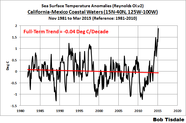

Figure 13
The surface warming of the California-Mexico coastal waters began late in 2013, which is well before the strong Kelvin wave, which initiated the 2014/15 El Niño, reached the coasts of the Americas. As you will see, however, in an animation that follows, the California-Mexico coastal waters warmed from the south northward, which suggests that the warming there was also not caused by the warm waters of The Blob migrating southward.
There was a recent study of the sea surface temperatures in that region. See Yuan and Yamagata (2014) California Niño/Niña. The California Niño/Niña is said to be independent of the El Niño/La Niña events in the tropical Pacific. That California Niño/Niña phenomenon, however, occurs in July-August-September, which doesn’t align with the warming there in 2014.
ARGO-ERA NODC DEPTH-AVERAGED TEMPERATURE ANOMALY DATA SHOWS THE NORTH PACIFIC COOLING TO DEPTHS OF 700 METERS AND 2000 METERS SINCE 2005
Figure 14 presents the NODC’s annual depth-averaged temperature data for the North Pacific (0-65N, 100E-90W) for the depths of 0-700 meters and 0-2000 meters. Note that the NODC depth-averaged temperature data for the depths of 0-2000 meters begins in 2005 at the KNMI Climate Explorer, limiting the data to the ARGO era, so I’ve also only illustrated the 0-700 meters data for that time period. Both show noticeable negative trends over the past decade.

Figure 14
The Blob does appear in the depth-averaged temperature data to those two depths. See Figure 15, which uses the coordinates of 35N-55N, 150W-125W for The Blob. At both depths, the upticks in 2014 were greater than those of 2013.

Figure 15
HOW DEEP DOES THE BLOB GO?
Figure 16 is a cross section of the subsurface temperature anomalies of the Eastern Pacific Ocean available from the ECMWF webpage here. It presents the output of their ORAS4 reanalysis. Keep in mind, a reanalysis is the output of a computer model that uses data as inputs. But with all of the ARGO floats bobbing around in the oceans, and assuming the ARGO data are used in this reanalysis, this should be a reasonable representation.

Figure 16
The cross section is for the month of March 2015 and, in the top portion, it presents the average subsurface temperature anomalies to depths of 500 meters. The x-axis (horizontal axis) stretches from 50S on the left to 50N on the right. The longitudes are 160W-90W. Basically, if we were to take a slice of the Pacific Ocean that was bordered by the coordinates of 50S-50N, 160W-90W and look from east to west, those are the average temperature anomalies at depth. The Blob is visible to the right, and appears as the elevated subsurface temperature anomalies. So The Blob is not simply a surface phenomenon. But we would expect that with wind-driven ocean mixing.
I’ve also highlighted the most recent Kelvin wave, which is making its way from west to east along the equator. Much of that pocket of warm water will rise to the surface over the upcoming months and likely strengthen the current El Niño.
NORTH PACIFIC SEA SURFACE TEMPERATURE ANOMALY ANIMATION
I’ve provided Animation 1 to confirm that the elevated sea surface temperatures originally formed, as one would expect, in the west-central North Pacific during the back-to-back La Niñas of 2010/11 and 2011/12. What came next was unexpected. Those elevated sea surface temperatures then migrated eastward to create The Blob.
Animations of maps of monthly sea surface temperature anomalies can be quite volatile, with weather effects and seasonal components creating a lot of visual noise. To minimize the monthly volatility, each of the following maps presents the average sea surface temperature anomalies for a full year. The annual maps then advance on a monthly basis. That is, the first map covers the 12-month period of January 2010 to December 2010. The second map is for February 2010 to January 2011. The third map: March 2010 to February 2011. And so on through the last map for April 2014 to March 2015. This is similar to smoothing time-series data with a 12-month running-mean filter.
Animation 1
You’ll also note the evolution of the 2014/15 El Niño later in the animation. It appears to enhance The Blob and cause the sea surface temperatures to rise along the west coast of North America.
FURTHER READING
We’ve been discussing the unusual warming event in the North Pacific since it first made its presence known in the July 2013 sea surface temperature data. For additional information, see the posts:
- About the Unusual Warming Event in the Extratropical North Pacific Sea Surface Temperature Anomalies (August 2013)
- The Hotspot in the North Pacific (February 2014)
- June 2014 Sea Surface Temperature (SST) Anomaly Update (July 2014)
- On The Recent Record-High Global Sea Surface Temperatures – The Wheres and Whys (August 2014)
- Axel Timmermann and Kevin Trenberth Highlight the Importance of Natural Variability in Global Warming… (November 2014)
- Researchers Find Northeast Pacific Surface Warming (1900-2012) Caused By Changes in Atmospheric Circulation, NOT Manmade Forcings (December 2014)
- Did ENSO and the “Monster” Kelvin Wave Contribute to the Record High Global Sea Surface Temperatures in 2014? (December 2014)
- Alarmists Bizarrely Claim “Just what AGW predicts” about the Record High Global Sea Surface Temperatures in 2014 (January 2015)
Also see Anthony Watts’s April 2015 post “Warm blob” in Pacific Ocean not caused by climate change, affects U.S. weather at WattsUpWithThat. It includes the press release for two papers: Bond et al. (2015) Causes and Impacts of the 2014 Warm Anomaly in the NE Pacific and Hartmann (2015) Pacific sea surface temperature and the winter of 2014.
CLOSING
The Blob is a naturally occurring weather event. Along with another natural event, the El Niño of 2014/15, The Blob caused the reportedly record-high global surface temperatures in 2014. The Blob is coupled with an atmospheric phenomenon known as the Ridiculously Resilient Ridge. The Blob and the Ridiculously Resilient Ridge have enhanced the drought in California and are responsible for the reported high surface temperatures there as well. Likewise, they are also said to be major contributors to cold weather and snow in the eastern U.S.
The sea surfaces of the North Pacific hadn’t warmed for nearly 2.5 decades and then warmed unexpectedly in 2013 and 2014. The sea surfaces of The Blob region according to NOAA’s long-term data show no warming for 8 decades. Regardless of that reality, alarmists nonsensically attribute The Blob to the emissions of manmade greenhouse gases.
The Blob is not only a sea surface temperature phenomenon. It appears in the Lower Troposphere Temperature data and in the NODC’s depth-averaged temperature data for the depths of 0-700 meters and 0-2000 meters. Of course, the NODC depth-averaged temperature data for the North Pacific show no warming during the ARGO era.
There are a number of questions now, including:
- How long will The Blob and the Ridiculously Resilient Ridge last?
- Assuming a La Niña follows this El Niño, will the La Niña be strong enough to overcome The Blob and the Ridiculously Resilient Ridge?
- What will be the combined effects of the strengthening El Niño, The Blob and the Ridiculously Resilient Ridge on weather worldwide over the next 12 months?
- Will the El Niño be strong enough to overcome the other two and bring rain to California, or will The Blob and the Ridiculously Resilient Ridge continue their influences there?
- Will The Blob have a long-term impact on the sea surface temperatures of the Eastern Pacific Ocean as a whole? That is, will The Blob be responsible for another upward shift in the sea surface temperatures of the East Pacific Ocean like that in 1976/77?
I’m sure you can think of others.
SOURCE
The data and maps presented in the post are available through the KNMI Climate Explorer.
Bob,
Are data available for sea surface temperatures to tell whether a similar blob may have been a factor in the late 1970’s drought in California? I don’t even know where to start looking.
pbh
Check Joe Bastardi’s latest analysis at Weatherbell.com.
Interestingly enough, the Blob appears in the western Pacific ocean in the beginning of the GIF, near Japan and drawing a line reversing direction points back to the location of the Fukushima disaster. Could the Blob be heat generated by radioactive debris?
No.
All the heat from all the fuel at Fukushima couldn’t tick the ocean temp up even .00001 deg.
If the radiation is weak enough that it takes the most sensitive equipment that we have to detect it, how is it going to warm trillions of tons of water?
A more likely scenario is the earthquake that led to the disaster also opened up a rift that is releasing heat. It would have to be enormous, but I saw the same flow in the GIF.
That’s what it looks like to me too.
Hmmm, earthquake, rift, disaster, Japan…
OMG, lord help us all.
It’s Godzilla, not the blob!
When the deep ocean heating wakes him up, we will have a three-way battle between Godzilla, The Blob, and the Giant Spiders.
Ha.
@ur momisugly micro6500 What about an upwelling of water caused by the earthquake? I can’t remember the displacement of the two plates but it was substantial 12 -30 meters sideways and who knows how much up/down. ( I realize the tsunami was caused by different effects) but the timing seems eerily similar.
asybot commented
http://en.wikipedia.org/wiki/2004_Indian_Ocean_earthquake_and_tsunami
I
That was the Christmas Day Tsunami, the Tōhoku earthquake and tsunami lifted the ocean floor 3 meters in some places, and “Earth’s axis shifted by estimates of between 10 cm (4 in) and 25 cm (10 in)”wiki.
So I see no reason that these couldn’t have some effect on chaotic currents, a small disturbance at the nozzle of a hose can make a big difference in the discharge pattern.
Has anyone taken a hard look at climate states and earthquakes? Wouldn’t it be a hoot to find that the 30-60 year ocean driven climate states are due to regular changes to the ocean floor!
Mr. Tisdale……you forgot the /sarc tag after your post.
So warming in the ocean proves that AGW is not warming the ocean. Got it.
your stupidity astounds.
Were you the captain of the debate team in college?
… still proving my point. Thanks Flash.
It makes no sense to use more energy than necessary to dispatch your for.
The “Blob” is no more made by CO2 than El Ninio.
Who are we, in our hubris, to believe that we understand all ocean circulation and natural heat variances? That we may discount each and everyone as unnatural?
My view exactly. We are still just observers, probably for generations to come. Someday we will be predictors with reasonable experience and knowledge of the cycles and random possibilities. But control of the climate will only come when the manipulation of our universe is well within our grasp.
hit yourself in the hand with a hammer every day for 100 years and your hair will fall out. this is proven by the large numbers of old, bald carpenters. proving that hammer hitting hand (HHH) causes hair loss (HL). if your hair doesn’t fall out, it is because you are not hitting yourself hard enough. exactly how hard you need to hit can only be determined by experts performing large numbers of studies requiring billions in government grants.
I think diagnosis by phrenology and followup treatment via trepanning may have caused this advice to be written.
you can then discove3r personality traits of the person by reading the bumps on the head. That is just an added bonus.
It Was settled science in the past. Many text books were written and the science was called Phrenology.
Also if you are right handed your right arm and hand will get stronger and your left hand will swell up. Can I have a grant, a warmist and a hammer to pursue this line of research?
The missing heat for the last 19 years that the oceans ate has been found. I believe this vindicates many climate alarmists… right?
Flashie
How can you possibly make that connection? Did ALL the CO2 in the atmosphere conspire and congregate in that area and thereby heat that spot? You really are a silly boy with an agenda.
Is someone paying you to make a fool of yourself, or is this a volunteer effort.
If it were AGW doing the warming, there would be a warming trend over the last 50 years. Instead the temperature is constant until about 2 years ago.
There is a trend (just look at the LOTI) over 50 years. The question if the blob is partly attributable to AGW is just impossible to answer. The team did not predict it.
Maybe this is the heat that was supposed to have warmed the Weddell Sea, took a wrong turn at Albuquerque. Or maybe Hansen was holding his globe upside down when he inputed the model.
If your “big picture” of global climate change is that CO2 is increasing, then you might be a warmist! (with apologies to Mr. Foxworthy)
Give that man a standing bloviation.
I like that Max…can I use it?
If you bothered to read the actual post you’d realise that he’s pointing out the LACK of warming for 24 years in the region followed by the sudden onset of the ‘blob’ shows that it’s a natural phenomenon and not a CO2 driven one that would create a more constant gradual warming over a larger area.
It’s interesting you can see the heat bleeding east into the west coast. And i think the main reason it shows up in global temps (record 2014 temps) is the homogenization process where they extrapolate temps into area’s that are not measured.
This is also a good example of what I think has been going on around the globe, surface data prior to all of the “making it better” crud done to it, show that the average previous day’s warming is a little less than the following nights cooling, it does this because warm moist air moves from the tropical oceans over land where the water rains out as the air mass cools off, the extratropics are the cooling zones of the tropical steam generator that is the tropical oceans.
So if it hadn’t suddenly got a lot warmer, then we could say there was no warming in the North Pacific. But it did……….but it was only “weather-related”, presumably unlike the previous 15 years of weather which were not “weather-related”??
Weather can not disprove AGW, but a single weather event can prove AGW.
/sarc
Isn’t it that way with every conceivable dataset? Everything Proves AGW but nothing can Disprove it (Null Hypothesis).
Observing the blob’s formation and effects:
One wonders if previous blob’s had key parts in causing the long term droughts evident in archaeology.
One also wonders why someone, like you Bob, has not given the warm water an official name; e.g. “Gulf of Alaska temperature Oscillation”. (I’m sure you can derive a far better name / description.)
[I propose] the inverse phase be called the “Pacific Easterly Radiative Reduction Oscillation”
See, the PERRO chases the GATO all the around the ocean…
[else the porpoise has a purpose for his proposal to pursue his proposed pussy … .mod]
Typo pardon me: I propose the…
Beware of the blob, it creeps
and glides and slides
Across the ocean floor
Right through the door
And off the pacific coast
A splotch, a blotch
Be careful of the blob
Wait a minute….How did they finally Defeat the Blob
Hey, there’s the fire !
I’ll stop it !
Wait a minute.
Let me have that a minute.
[ Coughing ]
CO2 ! Hey, that’s it !
It’s cold !
That’s why it didn’t come in the ice box
after us. It can’t stand cold.
– You got any more
of these things? Huh?
– [ Man ] No.
This thing’s running out.
The phone. Hey, Dave !
Hey, Dave ! Hey, Da–
Anybody on the phone?
Hey, Dave !
Dave, can you hear me?
CO2 !
Dave !
– What did he say?
– Al, what’s up?
Shhh. Quiet.
CO2?
Phil ! Phil, do you got
any CO2 extinguishers?
Not many.
Some soda acid.
Well, get the CO2s out here and start
hitting around those cellar windows.
– What?
-Just do it, Phil !
And check these buildings for fire
extinguishers. But only the CO2 kind.
– Bring back every one
you can get your hands on.
– All right. Okay.
Hey, maybe we can help.
Let’s get some guys together.
– Lieutenant, I know where
there are 20 extinguishers
– Good. Where?
CO2 the cure for the BLOB
Two observations.
1. During previous El Nino cycles, or before previous El Nino cycles, has such a hot spot in the NW Pacific Surface temperature been measured before?
Or, is this the first time that satellites have been able to measure a phenomenon that might be very common over previous El Nino cycles?
2. The “Brother of the Blob” is a smaller hot spot on the other side of the Aleutian Island chain – thus indicating that the island chain does not “stop” or break up the blob’s heat source, but does significantly reduce it by breaking up the currents surrounding the Big Blob. These are the same two areas that have 2014 lowest sea ice extent and lowest area the entire winter sea ice season.
So, why did the Blob and Blob’s Brother appear in those locations this year?
Only two possibilities, winds or currents, or both(well three possibilities).
So, why did the Blob and Blob’s Brother appear in those locations this year?
=========
Persistent meridional flow of the jet stream carrying increased warmth pole-ward along the west coast and increase cooling towards the equator along the east coast.
RAC…it has been there for several years now.
figure 16 maybe should extend northward to 55N to better visualize the depth structure of the blob at the current time?
Is it possible that there might be some volcanic activity warming that particular area in some way?
Slightly off topic, I see that the Tripod in the Nenana Ice Classic is at about 45 degrees. Looks like an early finish this year.
I can only think of one teacher (professor) in my life that presented their material in such a simple, logical and easy-to-understand way.. complete with lots of pictures! Thank you Bob for every article you put out.
What is really a shame is this is a very interesting transient phenomenon that evidently comes along once is a hundred or so years and is well worth the study on how it effects the weather globally.. but the real science behind it will be clouded by the global warming hype.
Five years from now the Pacific will be much different and how it gets there will be fun and interesting to watch. At least we have better tools to observe it. Just need to keep the tool keepers honest.
We know that much of Alaska did not get covered with thick glaciers unlike most of Canada and the Northeast/Great Lakes region. We know that the Pacific was warmer than the Atlantic during Ice Ages. We now know that when it is unusually warm in the northern Pacific, it gets terrifically cold in the same regions where glaciation was thickest during Ice Ages.
This means that determining if we are going into an Ice Age era or a global warming era, we look at the Great Lakes/Hudson Bay region and if there is a warm spot in the Alaska/Northeast Pacific region and super cold in the Hudson Bay region, we are in Ice Age conditions, not global warming.
This is quite likely what happened in the past, too. I am betting if we had the data during the 1970’s, we would have seen the same warm west/cold east effect. Instead of wailing about warming, we should be very concerned about cooling since we know the next solar cycle will be extremely weak.
emsnews on April 21, 2015 at 6:33 am
– – – – – – –
emsnews,
I was not previously aware of that thinking on a possible Ice Age initiation signal. It has made me curious.
Any additional llinks to further reading?
John
Glaciation will occur where it occurred last.
Relationship of Multidecadal Global Temperatures to Multidecadal Oceanic Oscillations:
Joseph D’Aleo and Don Easterbrook, September 2011
Global temperatures, ocean-based teleconnections, and solar variances interrelate with each other. A team of mathematicians (Tsonis et al., 2003, 2007), led by Dr. Anastasios Tsonis, developed a model suggesting that known cycles of the Earth’s oceans – the Pacific Decadal Oscillation, the North Atlantic Oscillation, El Nino (Southern Oscillation), and the North Pacific Oscillation – all tend to synchronize with each other. The theory is based on a branch of mathematics known as Synchronized Chaos. The model predicts the degree of coupling to increase over time, causing the solution to “bifurcate”, or split. Then, the synchronization vanishes. The result is a climate shift. Eventually the cycles begin to synchronize again, causing a repeating pattern of warming and cooling, along with sudden changes in the frequency and strength of El Nino events. They show how this has explained the major shifts that have occurred including 1913, 1942, and 1978. These may be in the process of synchronizing once again with its likely impact on climate very different from what has been observed over the last several decades.
http://www.oarval.org/ClimateChangeBW.htm#D%27Aleo-Easterbrook
@ur momisugly Andres Valencia…those dates you show are all close to the phase shifts in climate from warm to cool and back again.
Andres Valencia
Thanks for posting this, I believe that Taonis et al are definitely looking in the right direction ie synchronised chaos (alternately synchronised and not). This indeed makes sense of the oceanic shifts at the dates you mentioned. There is quite a lot of good literature on nonlinear dynamics in ocean phenomena such as ENSO. The climate establishment is trying to supress such enlightened oceanography because it paints a picture of natural decadal term oscillations which dilutes their shrill and idiotic picture of simple linear warming in a passive simple climate system for today’s new breed of simple people.
It would be nice to try to review such research when time allows. Some papers use the term “ground state” of the Pacific, which changed at the dates you listed. I remember in an earlier thread Joe Bastardi mentioning that there was a similar hot North Pacific blob during the 50’s. That marked a transition between a warming and a cooling period, and it could mean the same now.
My own hunch is that the recent warming period was characterised by stronger poleward transport of equatorial warm water, driven like a beating heart by ENSO. In this regard it may even be the La Ninas that are most important in this warm water pumping – or naybe the el Nino-La Nina cycle.
Now we are transitioning to a period in which no amount of Kelvin waves, warmist hysteria or even encouragement from Bob Tisdale can get an el Nino to start, even though the conditions were such that people trained in the prior oscillation cycle expected one. But none came. This is what is meant by a change in the Pacific ground state. It just ain’t in the mood for el Nino-La Nina cycles any more.
In the short term the result of this is a slowdown in north Pacific circulation with the pumping effect of ENSO gone. Eventually this will weaken poleward heat transfer and thus cause cooling. However a more short term result of this circulation slow-down could br this blob of surface warm water, perhaps due to reduced vertical mixing.
Synchronised chaos is where answers to this will be found and I hope Tsonis et al are going to be allowed to continue this research.
since we know the next solar cycle will be extremely weak.
Do we?
According to current theory, there is a strong relationship between the speed of the solar conveyor (a current of plasma that runs from the sun’s equator to poles under the surface) and the strength of the following solar cycle. During cycle 23 the speed of the conveyor fell through the floor, which strongly implies that cycle 25 (the next one) will also be very weak.
The fact that the weakness of cycle 24 caught all the experts by surprise may put a damper on this prediction, since the conveyor was still strong in cycle 22.
No, we don’t, because it’s in the future. But:
http://sidc.oma.be/images/wolfmms.png
shows a Ri trending lower.
From Monthly and smoothed sunspot number (Ri) (SILSO, Royal Observatory of Belgium, Brussels), http://sidc.oma.be/silso/monthlyssnplot
emsnews commented
I believe this as well.


This is the average day to day change of min and max temps, you can see that max averages near zero, and min is all over the place.
Adding Eurasia, you see they had a cold Min from the 50’s to the 70’s
Australia
Africa
South America
You can see temps are flat, then min temps drops for a while, and then go back up and are flat again. This is not how a global effect would present itself, but you are all presented with this photo-shopped/AutoTuned pile of bilge that’s suppose to represent temps, and it hides the fact that there is no global temp trend, anywhere!
Especially in Oz.
emsnews…the warming ocean in this area also corresponds to solar grand minimum events from what I can see from studying the many regional temp graphs available. The UK area has something similar in that it does not appear to cool along with the rest of Europe during a cold trend. It does feel the cold later on though.
The jet stream was forming that same pattern in the 70’s, with a high ridge leading up to Alaska and a big dip in the Eastern US.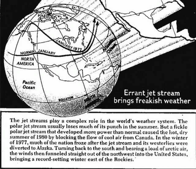 ?w=640&h=552
https://stevengoddard.wordpress.com/2015/01/29/only-one-thing-has-changed-since-1977/
Have a look at the other jet stream posts.
https://stevengoddard.wordpress.com/?s=jet+stream
If you started the animation about 8 months or so earlier, one would see the Blob is really just the left-over heat from the 2009-10 El Nino cycling in the North Pacific Gyre. It is a good animation of the Gyre being responsible for the current pattern, but starting it a little earlier would provide a very valuable piece of information.
Although most maps of the North Pacific Gyre like this one, don’t show the connection to the equatorial ENSO currents, there is one nonetheless.
http://eatingjellyfish.com/wp-content/uploads/2011/10/gyres1-s.png
I guess what is interesting is that the time it takes for a complete circulation in the Gyre appears to be longer than I assumed before and longer than one might have thought; 7 or 8 years apparently.
Semi-off-topic, but the upcoming El Nino appears to be strengthening. Could be a large one as the atmospheric processes seem to syncing up with it now.
Likely a contributing factor. But, why is it so much warmer than it was in this region 5 years after the 1998 super El Nino? There must be other factors involved.
It would be interesting to see a time lapse view of the undercurrents along the Northern edge of the Pacific Gyre. Is there something similar to the kelvin wave at the tropics that drives an El Nino?
Yes, the Blob most likely is a left over from that super warm el Nino. By the way, having an el Nino in SUMMER is opposite of its normal formation which is Xmas time. The sun has been steadily pumping out energy via sun spot activity during the entire crest of this solar cycle which weaker than previous ones.
This does mean that the ‘top’ of the cycle is LONG instead of a spike and this may have caused some moderate to weakly strong heating of the Pacific Ocean on the equator. But it is ending rapidly and will be gone pretty soon.
This may be the last ‘warm cycle’ activity for a long, long time if some of the solar astronomers are correct.
I agree, but it looks like a full cycle could be as much as 15 years. It took 5 years or so to form in the eastern Pacific and start to spread along the west coast of North America. (from NORTH PACIFIC SEA SURFACE TEMPERATURE ANOMALY ANIMATION) Based on that it will take another 5 years to dissipate (2020) and then start circulating back. Whether it brings heat back or not is another kettle of fish. Your 8 year estimate could be correct. It took 4 years for radiation from Fukishima to show up on the west coast of North America. But there are gyres within gyres and Japan is already part way through the cycle so it could be much longer – like 15 years. Some of us won’t be here to check.
Great post Mr Tisdale. I wonder how it has affected the fishing?
The slowdown of the gyre is connected with a general slowdown of poleward heat transport including that of the gulf stream (causing the sea level rise of NW USA) and this is also connected with why there will be no el Nino. The Pacific ground state has changed. A period of global cooling will follow.
Hmm…your figure two (3?) showing the model projections- they seem to be getting on track with help from the blob.
fig 12 looks to be the most pertinent, since it is about the only one that gives a long view. It is about time for PDO to change direction, though this change is rather abrupt.
There is also the latent heat being dropped by ice recovery in the Arctic. This will be injecting huge quantities of heat into the region. The UHA record, which is certainly more uniform in coverage than surface measured SST, clearly shows the warmth centred on the Bering Straights. Due to the persistent Coriolis driven ocean currents this will run down the west coast.
Animations #1 is also informative. We see this W-E movement being focused by the form of the N. Am coastline. This is what would happen if this is multi-annual tidal movement.
fig 16 shows warm surface waters that may have been drawn to the equator by the recent eclipse alignment causing unusually strong tide raising forces.
Max lunar declination is at approx 23+5 deg N/S so the “anomalies” will play out water entering and leaving around 20 N/S. It will flow in and out in both the equatorial and polar direction in both hemispheres.
Such a multi-annual tidal resonance would look a lot like fig 16.
Crap, WP ate my post ( again ).
I’m not going to type it all again. Basically most this is multi-annual tidal resonance being focused by the N. Am coastline as shhown in anoim #1. There is probably significant contribution from the latent heat being dumped into Bering Str. by Arctic ice recovery.
E. Pac cross-section in fig 16 also shows warm waters were drawn to equator by recent eclipse configuration. N. Pac is the polar counter part of the flow from 20 N/S to the equator. Max lunar declination is around 23+5 degrees N/S so the main anom shows in the middle of that range around 15-20 N/S.
WP only eats one’s long, involved, brilliant posts.
That’s why I now focus on being brief and utter irrelevant.
WP ate my spelling.
Max says “WP only eats one’s long, involved, brilliant posts.”
That’s why I write my long, involved and brilliant ones in Word and then copy and paste to WP.
Cheers
Bob Tisdale: “The sea surfaces of The Blob region according to NOAA’s long-term data show no warming for 8 decades.” ?itok=e3kGJ5sc
Why did you limit the data comparison to only 8 decades? I know, because referring to a longer period wouldn’t match up with your biased agenda. Can everyone say cherry picking the data?
Just looking at these links for data in that region for the entire data record going past 11 decades tells a different story:
http://wxweb.meteostar.com/SST/index.shtml?point=585
http://wxweb.meteostar.com/SST/index.shtml?point=586
Plotting of the yearly averages from those data sets of the blob area shows a linear regression increase of 0.9C since 1900 with a major new peak set in 2014. It goes right along with this long-term plot of NH SSTs: http://www.woodfortrees.org/plot/hadsst3nh/from:1850/mean:60/offset:0.8/plot/hadsst3nh/from:1910/offset:0.53/trend
If the warming was only due to the influence of the ocean cycles as you surmise in your little bubble world, then the entire atmosphere all the way into the lower stratosphere would be warming, but its not:
But then as you have admitted to me many times in the past, you are a not scientist, so….
Dennis Hlinka says: “Why did you limit the data comparison to only 8 decades?”
Welcome back, troll. Do you realize how foolish that sounds? “only 8 decades?”
The answer to your question should be obvious…but the obvious has always eluded you, Dennis. The intent of the graph was to show how far back in time the data for The Blob region showed no warming at that specific location. Get it? It’s real easy, Dennis.
You wrote: “Just looking at these links for data in that region for the entire data record going past 11 decades tells a different story”
I suggest you check the latitudes and longitudes of the data you linked to, Dennis. They don’t represent the Blob. It’s sad that you, a meteorologist, have such difficulty with reading maps and determining coordinates. Do your clients understand you can’t read a map and can’t determine global coordinates?[Oops, my mistake, Dennis. Correction. I’ve never been to that website before, and I’ve just re-read the links. I was looking at the coordinates on the drop-down menu, not what was shown for that specific subset of the obsolete HADSST2 data. You were in the right location. My mistake, sorry. See the continuation of this comment below.]
Do you still have difficulty comprehending why I don’t allow you to post comments at my blog, Dennis Hlinka? Anyone who has read your comment here will understand it.
Adios, troll.
PS: Dennis, the HADSST2 data you linked is obsolete, replaced by HADSST3. Aren’t you aware of that either? Sheeesh.
Good-bye, Dennis.
*drops microphone on floor*
Dennis, the following is a continuation of the correction to my first reply to you.

I’ve extended the ERSST.v3b data for the blob location back to its January 1854 start date in the following graph. As you might recall, the NOAA ERSST.v3b data are used in your alarmist-preferred GISS land-ocean temperature index data, (which makes me wonder why you provided links to obsolete HADSST2 data with so many months of missing data).
I wouldn’t pay much attention to the data before 1880. So here’s a graph of the same data starting in 1880.
Because there was no warming from 1935 to present (see Figure 12 in the post) and because the anomalies in the 1880s are comparable to the most recent few decades, then I believe it’s safe to say that the trend is caused by the dip and rebound in the sea surface temperatures there that started in the 1890s and ended in the 1930s. In other words, you are using a naturally caused dip and rebound to explain the long-term warming of the blob region of the North Pacific.
Good-bye, Dennis. You’ve wasted my time, once again.
Dennis, this is a stupid post.
Until recently the jet stream followed a great circle route (Japan-Alaska-California). Now it runs along the 30th parallel until it takes an abrupt turn north toward the “blob”. Here’s the questions.
Is the abrupt turn caused by the RRR and pushing warmer water north to create the “blob”.
Or is the warmer water of the “blob” forcing the abrupt turn and causing the RRR.
Or does the “blob” increase the water vapor over the Canadian shield reducing TSI and creating a cold blocking high over the east coast thus causing the RRR.
I’m guessing the answer to your question is “yes” probably the two effects you mention reinforce each other.
btw it boggles my mind how some people can think CO2 warms only small parts of the oceans while other parts such as the entire north Atlantic cool. Magical molecule seems to promote magic thinking! Even more weird is how they imagine a change in air temperature of a fraction of a degree can possibly overwhelm the variations in solar radiation into the ocean.
That micro degree change of air temperature gets lost in the enthalpy of vapourization causing no change on SST would it not? This question has never been adequately answered to my satisfaction. If this is true then given the heat capacity of the oceans, how is AGW theory relevant in any way except as a trivial, hair splitting question for academics?
Isn’t a warming ocean the most profound argument against AGW since that warming clearly has to come from changes in cloud cover and ocean circulation? It’s not like the 1.4 × 10^21 kg of ocean water are reaching a new equilibrium with a .3 degree change in the average atmosphere temperature?!
Questions…questions…
The G.A.T.O. is responding to the M.O.U.S.E which is currently (!) residing over the northerly extent of it’s range.
So the answers are:
1) It could be
2) That would not be inconsistent.
3) Perhaps, but it requires years of further study to be sure.
Could ocean floor tectonic activity, geothermal heat flux, etc. contribute to this heating? The area is a volcanic hot spot, Mt St Helens, etc.
i predict it will be there until it’s gone.
Is The Blob natural or influenced by global warming? I prefer to wait for the peer-reviewed scientific literature on that one. It begs the question how did the ocean get so warm ie where did the extra thermal energy come from?
Other options is it is influenced by the Arctic Amplification of global warming.
The Jan-Mar 2015 average temps for California are most unusual.
given our short history of monitoring ocean temps it would be pretty far fetched to say this “blob” is unusual let alone caused by co2 emissions. I wonder what the water temps looked like in the late 20’s after a drought in California that started in 1910. Oh yeah i remember we weren’t monitoring ocean temps in any reliable way then.
Charlie,
was the drought you refer to accompanied by high temps?
Any anyway no one is saying CO2 concentrations cause anomalies like the blog directly. But there can be indirect affect on air and sea circulation caused by arctic amplification.
Well since there is no overall arctic amplification just raised temperature for a period over certain regions like Alaska and also lowered temperatures in areas like eastern Canada…which by the way with the rest of the arctic ground station and satellite temps even out any sort of unethical reports or arcrtic amplification. There is a short history of accurate ocean temp and even ground temp recording in this area.. even if California’s temps were higher now than in the 20’s or 30’s. (I don’t think there is any accurate source for those temps of that period for that state) That is really hard to connect to co2 when considering climatic observation for the rest of the globe. In fact it would be completely irrational
“Nobody is saying that “blob” is caused by co2 emmisons”
of course they are. Have you been reading any of the hundred or so articles printed weekly worldwide on climate change? Did you notice they blame everything in weather on co2? Maybe you stay away from mainstream media?
Charlie.
I think you have misquoted me.
Also I was just referring to the blob, but you have answered like I was referring to all climate change. That is a straw man argument.
To answer your question about mainstream media – actually I take all mainstream media with a grain of salt. A media article can be a misrepresentation or just wrong. I don’t trust any mainstream media article if it does not give citations etc which can be checked.
Interesting if the IPCC crowd devotes any time to a publication about this. I do not think the CAClimate Change/GlobalWarming/ClimateDisruption peer review crowd financing has the depth of knowledge to attack this. Either that or they spent money doing it already and figured that if they call it CACCH/GW/CD would get blasted even worse than they are, as a localized blob cannot be caused by a global effect.
Of course, I might be wrong, but can’t find any papers
This is going to require considerable field research to get to the bottom of it. It looks like we’re going to need to go monitor Alaskan glaciers calving off over the next few summers. These are most easily accessed by cruise ship. Of course we will have to check out the water temperatures off the beach in Hawaii every winter, although this can be done on foot or perhaps by jet ski.
And I believe it will also be necessary to spend some time on the Colorado river during the peak of white water rafting season.
Oh well, no use complaining about it.
Isn’t it obvious that we’ve just found where the ocean heat is hiding doncha’ know. Where do I apply for my grant!
“The Jan-Mar 2015 average temps for California are most unusual.”
Most unusual compared to what and when,Harry?
sunsettommy
compared to what is considered usual for California of course – check the NCDC website. If west coast state have had their highest Jan-March temps on record, and there is a blog of abnormally warm water off the coast, I would wonder if the events were related.
While I agree that anthropogenic CO2 is probably making little to no contribution, something is going on that deserves more analysis. Look at Figs 9 & 10 upper panels – Illustrate a channel by setting trend lines of peaks and valleys – clear warming of the channel from 1987 of about 0.6 degrees C averaging the peaks and valleys slopes for Fig 10 and 0.7 degrees for fig 9.. Now consider Fig 12 and create a similar channel – cooling ca 1938 to 1972 then warming 1972 to 2015. Note that the 2015 peak (so far) is about 0.2 degrees C warmer than the 1938 peak – could be instrument error, or could be real warming continuing. Seems to be a distinct cyclical warming that may not yet be finished, with the current peak maybe at the same level as 1938. Given the long term warming since the LIA one would expect a current peak to be higher. Are we seeing a 75-80 year cycle??
http://www.woodfortrees.org/plot/hadsst3nh/from:1850/mean:60/offset:0.8/plot/hadsst3nh/from:1910/offset:0.53/trend looks like a ca 70 year cycle withwarming of <0.5 degrees C over 140 years, which would suggest about 1.0-1.5 degrees C warming since the LIA. Seems like wae are seeing a normal cycle around a long term trend.
CLOSING
The Blob is a naturally occurring weather event. Along with another natural event, the El Niño of 2014/15, The Blob caused the reportedly record-high global surface temperatures in 2014. The Blob is coupled with an atmospheric phenomenon known as the Ridiculously Resilient Ridge. The Blob and the Ridiculously Resilient Ridge have enhanced the drought in California and are responsible for the reported high surface temperatures there as well. Likewise, they are also said to be major contributors to cold weather and snow in the eastern U.S.
My reply . Exactly. The entire closing Bob has provided is 100% correct.
Generally, when the central Pacific is cooler there is less evaporation and precipitation available and therefore the California drought becomes worst: however, when it warms there is considerably more evaporation and precipitation that can reduce the drought conditions. I think you must consider the relationship between the Blob and the conditions in the central Pacific in the California drought discussion.
MICRO 6500 what is your data source? I see a clear trend in the NH mins with NA delayed relative to the total hemisphere, and Africa and SA well aligned in the latter part of the NH cycle, with Australia data insufficient to be useful. If you look at Arctic temperatures only, excluding UHI effects as much as possible, you see that all of the warming/cooling is in the mins also. The maxs are surprisingly stable. In theory CO2 will have its greatest effect at night, in winter and at higher latitudes, ie in the mins. Interesting. Food for thought
NCDC Global Summary of Day’s data set. But I don’t mess with it, which is why some places are missing, or the spikes are much larger than others.
I have lots of data here http://sourceforge.net/projects/gsod-rpts/
and lots of words on how it was done. http://www.science20.com/virtual_worlds
So max temps are “flat”, Min temps’s seem to go up and down for longer periods, but the periods are not happening at the same time, the only thing that I can thing of that has the juice to push surface temps around are the oceans.
Curiously if you look at the average station temp increase yesterday, and compare to last night’s cooling, this morning will be cooler than yesterday morning, ie it cools more than it warmed, it’s not much colder, but the average of 65 million samples for all stations with more than 360 day’s/year of samples.
So, if min temp is up, it’s not because it didn’t cool enough last night.
Thanks muchly
“In theory CO2 will have its greatest effect at night, in winter and at higher latitudes, ie in the mins”
If CO2 exerts it’s warming effect by slowing down the flow of heat through the atmosphere, then wouldn’t it have its biggest effect where there is the most heat to slow down, in the tropics, during the day, and in summer?
As an analogy consider a mattress lying in the middle of the highway. At night when there is very little traffic, it will not have much of an effect, but during rush hour it will cause a huge backup.
In any case, if you’re going to talk about the theory,then we will have to talk about the models and where’s the hot spot?
menicholas commented
No theory, measurements.
Tropics aren’t doing anything different.
YEAR RISING FALLING DIFF
1940 11.94945355 11.95218579 -0.00273224
1941 12.33450842 12.34555425 -0.011045828
1942 13.01334036 13.00950474 0.003835616
1943 14.20131894 14.20417447 -0.002855526
1944 14.59890337 14.59860598 0.00029739
1945 13.75322363 13.75143895 0.00178468
1946 13.45881572 13.45804567 0.000770048
1947 13.72501371 13.72288288 0.002130826
1948 14.7346127 14.73513339 -0.000520694
1949 14.60375662 14.60059315 0.003163467
1950 14.33023195 14.33593042 -0.005698471
1951 14.78784026 14.78210689 0.005733373
1952 14.42088805 14.42457912 -0.003691077
1953 13.4449503 13.44436183 0.000588469
1954 13.26760464 13.26669363 0.000911009
1955 13.43221566 13.43172755 0.000488116
1956 13.32665429 13.32544614 0.001208154
1957 14.76409823 14.76305419 0.001044041
1958 16.21905687 16.22150864 -0.00245177
1959 14.99190903 14.99250081 -0.000591776
1960 15.30150976 15.30134029 0.000169463
1961 14.78201147 14.77992677 0.002084701
1962 14.67334399 14.67074217 0.002601825
1963 15.19818542 15.1927566 0.005428817
1964 14.98863984 14.99815694 -0.009517103
1965 15.11541095 15.11180818 0.003602771
1966 15.49171536 15.48698598 0.004729378
1967 15.10211836 15.10854327 -0.006424913
1968 14.28795914 14.28285989 0.005099249
1969 14.33642687 14.34123957 -0.004812708
1970 14.01689397 14.01586699 0.001026979
1971 12.01844227 12.01962427 -0.001181996
1972 12.675471 12.67129664 0.004174363
1973 14.36202944 14.37848206 -0.01645262
1974 14.86821097 14.854812 0.01339897
1975 14.19158686 14.21912473 -0.027537872
1976 14.92657178 14.91406146 0.012510319
1977 14.56232303 14.55700932 0.005313712
1978 14.74185892 14.74388849 -0.002029571
1979 16.06932031 16.07073886 -0.001418547
1980 16.12955199 16.25251317 -0.122961175
1981 15.76470565 15.76415351 0.000552142
1982 15.78284806 15.78565373 -0.002805668
1983 15.50870497 15.51123269 -0.002527717
1984 16.09198194 16.08816914 0.003812799
1985 14.99684334 14.99843224 -0.001588895
1986 14.74872543 14.74021417 0.008511254
1987 15.30402077 15.30510528 -0.001084504
1988 15.30693507 15.31066401 -0.003728931
1989 16.18060542 16.17855518 0.002050245
1990 15.88407764 15.88291117 0.001166469
1991 15.96795389 15.9738465 -0.005892606
1992 16.55757155 16.55683061 0.000740937
1993 15.78335048 15.78926161 -0.00591113
1994 15.84243087 15.83849838 0.003932489
1995 15.94233607 15.95069175 -0.008355678
1996 15.87928885 15.87264474 0.006644109
1997 15.71072924 15.70890877 0.001820474
1998 16.24724961 16.24689976 0.000349848
1999 15.36025881 15.36545965 -0.005200837
2000 16.07008205 16.07122082 -0.00113877
2001 16.2840974 16.28510774 -0.001010344
2002 16.37675996 16.37346527 0.003294685
2003 16.44125324 16.44425648 -0.003003238
2004 16.91362492 16.91771846 -0.004093544
2005 16.02493836 16.01917292 0.005765442
2006 16.52623941 16.52982232 -0.003582908
2007 16.03037566 16.0336862 -0.003310536
2008 16.21280748 16.21293763 -0.000130147
2009 16.40395211 16.40285625 0.001095863
2010 15.99867628 16.00479773 -0.006121453
2011 16.08599135 16.08289445 0.003096904
2012 16.54798283 16.57830206 -0.030319229
2013 16.51935872 16.52079838 -0.001439655
9999 15.06073967 15.06328346 -0.002543788
“Tropics aren’t doing anything different.”
I am not sure where these numbers are from, but…
I agree.
More falsification of the basic theory.
Thank you Micro.
Menicholas commented
NCDC’s Global Summary of Days data, I’ve been looking at the day to day change on an individual station, then averaging that with other stations. Basically how the temperature evolve at a station, then how collects of stations by area to see how the measured surface temp changes.This is based on stations that have 360+ days of data per year. My baseline is the stations previous day’s temp.