Guest Post by Bob Tisdale
The CO2 obsessed are patiently awaiting the GISS and NCDC global surface temperature data for December 2014 and for the calendar year. GISS normally publishes their monthly updates on or around the 15th of the month, while NCDC publishes theirs about the same time. The UKMO updates their HADCRUT4 land+sea surface temperature product later in the month.
In the post here last month, we showed that the GISS Meteorological Annual Mean (December to November) surface temperature in 2014 was just shy of the 2010 value. See Figure 1.

Figure 1
I suspect there will be a noticeable increase in December 2014 so that the calendar mean of the GISS land-ocean temperature index in 2014 is slightly warmer in 2014 than in 2010…maybe by 0.01 deg C.
For NCDC, as shown in Figure 2, the meteorological annual mean (December to November) surface temperature in 2014 was 0.01 higher than the 2010 value.

Figure 2
And as illustrated in Figure 3, the HADCRUT4 data are the same as GISS, inasmuch as their Meteorological Annual Mean (December to November) surface temperature in 2014 was 0.01 deg C less than the 2010 value.

Figure 3
Will Gavin Schmidt, the new head of GISS, release their data early to steal the headlines, or will GISS and NCDC publish their long-anticipated press releases at the same time?
The suspense has to be driving the CO2 obsessed crazy…or should that be crazier?
To spoil their day, I’ve already written and prepared the graphs for a post titled The Uptick in Global Surface Temperatures in 2014 Doesn’t Help the Growing Difference between Climate Models and Reality. As you can well imagine, a swing in 2014 of a few hundredths of a deg C doesn’t noticeably change the outcome of that post, but I’m waiting for the December 2014 values to finalize it. I believe most of you will enjoy it.
The point you will make with your “prepared” post is the relevant one: the divergence between models and observations grows even larger with 2014 data. And this is before the “knee” in the curve bends their projections up non-linearly. As a modeler, I would have critically re-examined my assumptions a long time ago.
The modellers will produce the model outputs that earns them the money grants and intramural funding awards that the politically-motivated grantors want to see, that pays their salaries. Failure to produce the alarmist’s output is cause for funding termination.
The desired output was pre-defined by the biased assumptions that built and tuned the models of what is, in the real-world, an unmodel-able, nonlinear, highly interconnected on a decade scale, chaotic system.
Climate Science in the US and UK is corrupt. Completely. and Sadly.
Indeed, It’s time for that “knee” to genuflect to reality.
I am looking forward to that post Bob.
Just once though I would like to see you post one of those graphs using whole degrees on the y-axis and going from, say, -20C to 50C. I think that we sometimes lose sight of the near nothing changes that we are all debating. Anyway, thanks for the update and looking forward to that post you mention.
“Just once though I would like to see you post one of those graphs using whole degrees on the y-axis and going from, say, -20C to 50C. I think that we sometimes lose sight of the near nothing changes that we are all debating. Anyway, thanks for the update and looking forward to that post you mention.”
I also believe this would be very helpful
Mark and Trent,
You mean like this:
http://suyts.files.wordpress.com/2013/02/image_thumb265.png
I’m pleased to see dbstealey’s graph of Global Warming. I presume it’s in degrees Fahrenheit? Did you graph it yourself?
I’d be grateful to see one prepared in Kelvin, and preferably with a link to the web page GISS has their data on, not merely to GISS said it, user can hunt through everything GISS ever said in order for user to find out where they said it.
If anyone can create such a graph I’d appreciate it.
Leo Morgan,
http://3.bp.blogspot.com/-QXdunHCrwfA/VLg67ZumzrI/AAAAAAAAASA/Peeyw9DRJKk/s1600/GISTemp%2BKelvin%2B01.png
GISTemp LOTI data are here: http://data.giss.nasa.gov/gistemp/tabledata_v3/GLB.Ts+dSST.txt
Bottom of this page describes how to convert anomaly to absolute (add 14°C): http://data.giss.nasa.gov/gistemp/abs_temp.html
Tack on another 273.15 for Kelvin.
Leo Morgan,
Whoop, let’s try that again:
http://4.bp.blogspot.com/-lPGChYUUeuc/VLhzJqwRhtI/AAAAAAAAAS4/ehDtihKNKIw/s1600/GISTemp%2BKelvin%2B01.png
2014 was a sort of, almost, coulda-woulda-shoulda, been an El Nino year. The upticks in those plots above all correlate with El Nino years (98, 02, 04-05, 06-07, 09-10). The big downticks are the La Nina years. If it had been the whopper El Nino year the warmists had hoped for last April-May, then 2014 final temp anomaly would have been much larger. But the latest weekly 3.4 SST departure is at 0.4º C and still dropping, and nothing in the subsurface pipe to rescue it. So this one is finished. It’s ENSO neutral to La Nina from here forward in 2015.
A La Nina is quite possible for the second half of 2015 going into 2016. So my money is on a notable downtick on those charts for 2015, i.e. this time next year.
Given the extent of data homogenization, gridding, conflation in all these data sets, any claim to 2014 being the warmest is utter nonsense. The satellites say otherwise.
Nevertheless, IPCC-exponent Thomas Stocker claims the end of “The Pause” because of this alleged “heat record” of 2014. He wrote in a Swiss newspaper (issued on 28th of December 2014):
“I am glad about the record year 2014 because the term warming hiatus is now disproved.”
(Translation of “bin ich froh über das Rekordjahr 2014, denn der Begriff «Erwärmungspause» ist nun vom Tisch”)
Full text see here:
http://www.schweizamsonntag.ch/ressort/meinung/kann_die_menschheit_die_erderwaermung_stoppen/
That is a rather unscientific conclusion of course, but Stocker is more a political activist than a true scientist, according to this very fitting quote by Matt Ridley about the alleged heat record of 2014:
“True scientists would have said: this year is unlikely to be significantly warmer than 2010 or 2005 and left it at that.”
“I am glad about the record year 2014 because the term warming hiatus is now disproved.”
This is what kills me about the climate obsessed. He’s glad that terrible, awful things might be happening to the planet. So certain was he of catastrophe, that he sees any evidence, no matter how weak, as a good thing merely because he thinks it vindicates his belief.
How sad to wish catastrophe on your fellow man just so you can be right?
I know. It disgusts me. I really don’t know how they manage to hold their food down.
The only conclusion I can draw is that he really doesn’t believe AGW and therefore sees no downside to wishing for a record year. Or he’s a monster.
DavidMHoffer’s remark about how sad it is that they wish for catastrophe just so they can be right, is spot on!
The irony.
The satellites. The temperature indexes with most adjustments. And depends on models. RSS even uses a climate model to adjust for diurnal drift.
Don’t make me have to post ” GISS Global Temperature Series on Alcohol Thermometer in Fahrenheit”
………….again
Can you do it in Centigrade this time !!!
But it’s so… GOOD, Lat!
Here’s another:
http://butnowyouknow.files.wordpress.com/2009/07/globa-mean-temp.gif
Can you find or do you have a record of what the ‘Annual Mean’ as reported were back in 2010, 2005, 1998 and see how much they have been reduced / altered in the last release?
Eagerly anticipated by the BOM here in Australia too. Their Annual Climate Statement 2014 states:
“Based on preliminary data (January–November), the estimated global mean temperature for 2014 is 0.57 ± 0.10 °C above the 1961–1990 average. Using this three-dataset method, 2014 is likely to be the warmest year on record (global observations commence in 1880).”
Our Bureau staff are up there with the keenest global warming enthusiasts in the world.
Ken Stewart
I kept this bit of highly emotive over the top alarmism as well.
But that’s not what has actually happened ….is it?
Over the top highly emotive clap trap.
So far they’re not doing real well in their crystal ball gazing and I’m certainly not holding my breath for the statement, “we got it wrong……..again.”
http://www.news.com.au/technology/environment/summer-201415-weather-forecast-bushfires-heatwaves-and-severe-heat/story-e6frflp0-1227076059759
Oops.I forgot to mention Ken, note the date at the link.
Anticipation about what? Year 2014 was not a record warm year . Satellite data verifies this which is the only relevant data.
Anyone else seeing huge savings on their winter heating bills?
I don’t see any relevant savings. On the contrary, the scare makes it easy to add more tax on energy and increase the public sector until every one dog and person has hir/its own personal bureaucrat checking at all times that regulations on personal health are being followed and greens are eaten.
No, the ‘green’ taxes keep them rising. Some of the tax is labelled as such and is obvious, but in the UK there are the transport costs which keep rising which are the costs of linking the windmills that are in remote places or out at sea to the grid with new power lines and pylons.
You are only too right on this. More than 1/2 of the electricity bill is made up of charges/expenses/subsidies/taxes that would not be there but for the UK Government’s drive towards renewables/green energy.
About 18 months ago the BBC interviewed (on Hard Talk) the boss/financial direcctor of SSE. He clearly stated that only half the bill pertains to supply costs, and that about 25% of the bill pertains to new infrasture required to link the windmills/solar to the grid, and about 25% for green taxes and subsidies paid for home insulation, boiler replacement etc and assisting those in fuel poverty.
The supply costs (a little under 50%) are also higher than they need to be since these costs include paying windfarms for expensive electricity at an inflated/government guaranteed rate, the costs of paying windfarms not to produce electricity when the grid already has more power than required, the costs of balancing the grid with diesel generators (which is even more expensive than off-shore wind).
If power generation was by only only fossil fuels (coal and gas), the supply costs would be significantly reduced.
In essence the electricity bills could be decreased by 55%/60% but for government policy. The position with respect to gas bills is not so stark since gas bills do not need to include the infrasture upgrade, nor the high costs of supply by renewable sources (windffarms/solar), nor paying windfarms not to produce electricity, nor balancing the grid etc. Gas Bills, which are generally higher since most people heat their homes by gas, are probably only about 15%/20% higher than they would otherwise be but for the drive towards renewables.
The Government likes quoting dual fuel invoice proces since this masks/conceals the true excess cost of electricity, and how electricity has gross inflated these past 10 or so years.
One day, an investigative journalist will get to the bottom of all of this and the full extent of the rise in energy prices due to Governement Policy. When this comes out, the consumer will not be a happy bunny.
In my opinion the hype on year 2014 being a record warm year (which it is not ) should not be getting so much attention . Other then to say satellite data says otherwise end of story.
That is how I look at it ,why others play along with their nonsense I do not get.
Thanks, Bob. A microscope was needed for this.
I’ll just wait, expecting more of the same, political “facts” are in the mix.
Bob,
Far more interesting than the possibility of a scientifically meaningless single-year record broken by a few hundredths of a degree is whether your model-observation comparison will be done in absolutes this time, or anomalies. If anomalies, my bet is that the reference period will NOT be 1986-2005. Do feel free to surprise me.
Do surprise us all and please explain failed predictions such as the one in the previous post regarding the disappearance of Arctic ice… that has never taken place.
We muffed it.
If global temps were climbing the way the IPCC models said they would be at this point, then quibbling over starting dates would be irrelevant. But since the temps haven’t even come close to the IPCC models scenarios, we find ourselves quarrelling over minutiae. That should at least tell the unbiased observer that the IPCC GC models are in serious trouble at the present time.
So Brandon, how much minutiae are you willing to quibble over?
@Brandon
Who is “we”? And please explain like an adult what “it” is that you “muffed”.
The 2nd graph you posted below is interesting, btw.
joelobryan,
Ok. What do you think the IPCC said temperatures would be at this point, how far exactly are they off, and how do you know quibbling about starting dates would be irrelevant if all that were the case?
Man, you’ve got a lot of quantifying to be doing before even thinking about leaping to that conclusion.
In this context, any significant portion of 0.25 °C, as shown in Bob’s graph from his post on Sunday the 11th:

or if you like, the “anomaly” plot from the same post:
I already know that Bob’s plan to compare NCDC and GISTemp LOTI to CMIP5 using an 1880-2014 rather than the conventional 1986-2005 reference period won’t make a difference worth splitting hairs about. Different story for the above two plots, which is what this conversation is really about.
Brute,
My fellow human beings.
[chuckle] Well yes, children are known for being candid to a fault at times. I’m not so sure it’s the best thing to grow out of.
Ask a specific question about a missed prediction, and you may get a more specific answer. Real simple concept.
The Greenland Summit Holocene temperature record from Alley (2000)? What specifically do you find interesting?
Gates says:
We muffed it.
Along with every other alarming prediction.
Brandon, you have an unseemly obsession with the base-year period of 1986-2005. Don’t you find it at least odd–maybe troubling–that you have a fixation about those years?
I guess you’ll have to wait to see if I use the base years of 1880-2014 (full term of the GISS LOTI data, so not to skew the results) or your preferred 1986-2005.
I wouldn’t get my hopes up if I were you. I just thought I’d let you down easy, so that you might be able to come to terms with it over the next day or two.
You may want to seek professional help about your base-year fixation. It’s not healthy, Brandon, not healthy at all.
Bob,
When comparing recent observations with previously published predictions, I find it helpful to compare apples to apples:
http://www.climatechange2013.org/images/figures/WGI_AR5_Fig11-25.jpg
As well, note that the RCPs begin in 2006. So when the topic is model divergence from observation, it makes the utmost sense for the reference period to not include the out of sample observational data. That way, each successive update does not change the reference values used to calculate the anomalies, and again facilitates comparing apples to apples.
If common mathematical sense is a psychiatric disorder, I hereby admit that I am certifiably nuts.
Brandon, I will not comparing the last 20 years of historical model simulations of climate (1986-2005) to the 20 years of 2016-2035. In other words, the 20 years that you are obsessed with are not serving as a reference for my post. You’ll need to get over it.
Have a good day.
Bob,
Apparently you misunderstand. Selection of the reference period does not limit the period of comparison. What it does do is ensure consistency across all such comparisons no matter what observational series and/or time periods are being compared.
Being consistent with standards is not something I’m likely to “get over”. Nor would any other honest skeptic who is vetting the common sense and integrity of random people posting charts on the Internet who appear ignorant of the standards to begin with, and who are belligerent when both their existence and rationale are pointed out to them.
I can’t remember much what it was like in 1986, when we didn’t have these mega droughts and super hurricanes, and sea level was so much lower. My recommendation to Bob Tisdale is to use the average over the current century. Or if it has to be longer it could be the average from 1995 to 2014?
A second proposal I have for Brandon Gates is to select the 10 climate model runs which use the RCP 6 inputs and have the closest match to actual data over the last 30 years, and show them in a plot ranging from 1985 to 2050. This will allow me to figure out if I really have to worry before we run out of oil.
I know I sound like a broken record but I think we are going to see very high oil prices by 2035 (more or less). I’m more worried about the economic impact of high energy costs, and the adverse effect of the dumb CO2 reduction efforts in places like California and Germany, which could cause a lot of economic harm. So I’m very interested in seeing what you think are your best models so I can use them to think about this topic.
I think it’s pretty easy to prove that we were no where near a mega drought, or had an abundance of super hurricanes. Further, we are no where near running out of oil or natural gas. Take a look at the number of LNG plants that are due to open for export here in the US. Enormous amounts. Who would have ever thought that we would be ever exporting any fuels? If gas and oil prices rise, it will be from increased tax hikes to supposedly counter global warming. Let’s see how much of that money does anything except. It is in reality an unequal tax on the poor. Governments pass special bills all the time, like for storm water abatement, like in Colorado. I’m sure it is the same in many other places. The money goes into the general fund, and whoosh, it’s gone. After ten years they are back asking the public for more money because nothing was done. New Jersey is a perfect example of that with preserving farm land. The first green acres project did anything but. And the next bought property that couldn’t or shouldn’t be developed in the first place. After 30 or 40 years, and many lost farms later, and the closing of I 95 between Hopewell to NY, and it helped the bond holders of the turnpike ( truckers HAVE to pay a toll) (which was to save a farm and is now wall to wall housing), they did finally manage to buy the development rights. Which means that the state can now build or sell those rights whenever it wishes, for any purpose.
I saw an ad for global warming that what we are eating is contributing to GW. So since it is a well established fact that being obese is not only unhealthy, but results in a poorer quality of life, that we establish a government that controls the amount of calories that you consume. Additionally, you will be required to join a gym and prove that you exercise regularly. Since that directly affects medical costs and everybody is getting to know how well the current health care system is working. That doesn’t mean you can keep your health care or that prices will go down. If not you will be subject to fines and penalties. I don’t see anything that can go wrong with that idea. (sarc)
Fernando Leanme,
I did the six best RCP6.0 model runs selected according to your criteria, and plotted them against GISTemp LOTI and NCDC for two reference periods.
1986-2005:
http://3.bp.blogspot.com/-tEqxVSGwIis/VLhrzHbuORI/AAAAAAAAASg/CJuA01lJyaA/s1600/GISTemp%2BNCDC%2BRCP60%2BBest%2B6%2B1986-2005%2Bbaseline%2B1985-2050.png
1880-2014:
http://3.bp.blogspot.com/-K2xNSjw51IM/VLhsIGdKB_I/AAAAAAAAASo/5pX8acAv50E/s1600/GISTemp%2BNCDC%2BRCP60%2BBest%2B6%2B1880-2014%2Bbaseline%2B1985-2050.png
All this talk of “new records” is getting old. Anybody know when the global cooling is supposed to start?
Already in progress according to the better quality satellite data.
http://www.woodfortrees.org/plot/rss/from:1996.75/plot/rss/from:1996.75/to:2005/trend/plot/rss/from:2005/to/trend
I beg to differ
..
http://www.woodfortrees.org/plot/rss/from:2011/plot/rss/from:2011/trend
Ooooh, David, that ‘warming’ looks so scary. Here, look at this one . .
http://www.woodfortrees.org/plot/rss/from:2010/to:2014/plot/rss/from:2010/to:2014/trend
. .yeah, it makes a difference when you start and stop, huh . . . though I like Richard M’s plot better – longer period.
Yeah, you are right.
It does make a difference when you start.
…
For example, if you look at the entire data set…..
http://www.woodfortrees.org/plot/rss/plot/rss/trend
Not much global cooling happening.
I like to look at the big picture [“the entire data set” as Socks says], because looking at any particular tiny slice of time can give the wrong impression. This chart is from the 1800’s.
And this chart shows the same thing, from a slightly different perspective.
Notice that the global climate and temperature always stays within the same relatively tight parameters, as the planet continues to emerge from the Little Ice Age [LIA].
Recent warm temperatures are nothing unusual or unprecedented. In fact, we have been very fortunate to have lived in such a “Goldilocks” climate for the past ≈150 years. Here is another view, using NASA/GISS data:
http://suyts.files.wordpress.com/2013/02/image_thumb265.png
At times not so long ago geologically, temperatures changed by TENS of degrees, within only a decade or two! If that happened now it would be catastrophic.
All the wild-eyed Chicken Little arm-waving over a few tenths of a degree fluctuation will seem preposterous to future generations. There is nothing either unprecedented, or unusual happening. Everything we observe now has happened in the past repeatedly, and to a greater degree, and more often than recently. We should consider ourselves lucky, instead of constantly wringing our collective hands over little non-events.
The sky isn’t falling, as the alarmist crowd wants us to believe. It’s not even a little acorn. The carbon scare is literally nothing at all.
Nice charts.
The Greenland chart doesn’t show recent behavior.
They all show warming.
When will global cooling start?
David Socrates says on January 13, 2015 at 5:38 pm . . .
YES, I agree with using the data set you did. But NOT the SINGLE trend line. How about this?
http://www.woodfortrees.org/plot/rss/plot/rss/from:1979/to:1999/trend/plot/rss/from:1998.25/to:2015/trend
So the ‘trend’ for the last 15+ years is slight cooling. So according to your question “when does global cooling start?’ , well it did 15+ years ago .
But in the next 10-15 years:
will it go on about the same ? OR will it go down FASTER? OR maybe it will go up?
Depends if the solar activity is SOMEHOW a player – or the AMO/PDO.
But the MAIN thing is, even IF CO2 were a player in it, it sure isn’t that big of a player compared to ‘natural variation’. AND, even if temps do start up again BECAUSE of CO2, there is PLENTY of time to adapt.
. .so stop being so alarmist, and just enjoy this nice INTERGLACIAL weather/climate. . .
If “So the ‘trend’ for the last 15+ years is slight cooling.: why all the fuss about 2014 ???
David, I am not fussing about 2014. Sure, the media is trying to make a big deal of it.
Let’s just watch temps SEVERAL MORE YEARS, maybe a decade or two, and see how the trend continues;
Let’s NOT just ‘cherry pick one’ that, in the temperature swings, MAY be on the higher side, and make something of it. I don’t care. But you do for some inane reason. . .
You can have the last comment ( as I’m sure you will); Enjoy it. I’m outta here for now . . . it won’t change my opinion on what I see is your ‘alarmism’ . . .
Q: How long is a piece of string?
A: Twice the length from the middle!
Given the start point of the satellite record is arbitrary, I propose that measuring the trend from either end is just as relevant:
http://www.woodfortrees.org/plot/rss/plot/rss/from:1997/to:2015/trend/plot/rss/from:1979/to:1997/trend
Martian C
..
I’ve been waiting now for over 15 years for the global cooling to start.
..
I’m disappointed it hasn’t.
Scott Wilmot Bennett
Look what happens to your “graph” when you use a different data source
..
http://www.woodfortrees.org/plot/hadcrut4gl/plot/hadcrut4gl/from:1997/to:2015/trend/plot/hadcrut4gl/from:1979/to:1997/trend
Exactly the same parameters.
And here is yet another view. We are realizing that nobody knows global temperatures to within a couple of tenths of a degree. There is too much disagreement between the various data sets.
What we’re left with is this: within reasonable error bars global T is flat, and has been for many years. Not one alarming prediction of runaway global warming, accelerating sea levels, disappearing Arctic ice, vanishing polar bears, etc., has ever come true. Every prediction has failed; no exceptions.
So why would reasonable folks still listen to anything the alarmist crowd says? They haven’t been right yet, not once — but now suddenly they have the right answers?
Nope. Nope, nope. One great big ball of NOPE. They don’t have the answers. Not the right answers, anyway.
dbstealey,
You proudly post the following chart:
http://i.snag.gy/BztF1.jpg
All the way to the right it reads, “Mann Hockey Stick”. You mean you actually trust that garbage now? [1]
ftp://ftp.ncdc.noaa.gov/pub/data/paleo/icecore/greenland/summit/gisp2/isotopes/gisp2_temp_accum_alley2000.txt
For the past 10K years the temperature min/max rates of change at Greenland’s summit are:
Min: -0.36/decade
Max: 0.36/decade
Don’t be alarmist.
——————
[1] It isn’t Mann’s Hockey Stick, it’s the tail end of the data from Alley (2000) cited above.
David Socrates, when your first choice is to pick a La Nina starting point to try and claim some warming, all you are doing is proving you are dishonest. I could have chosen 2001 and it would also have shown cooling as well (or 1998) but that really doesn’t line up with any mechanism. My choice of 2005 is based on the approximate date the PDO changed modes.
I suspect you are in denial of natural climate factors so it is probably a waste of time. You aren’t interested in the truth.
Gates says:
All the way to the right it reads, “Mann Hockey Stick”. You mean you actually trust that garbage now?
I never trusted Mann’s garbage.
And:
It isn’t Mann’s Hockey Stick, it’s the tail end of the data from Alley (2000) cited above.
Ah, but it is part of Mann’s Hokey Schtick. You know — the part you fell for.
Just compare Mann’s nonsense with the twenty or so identical ‘hiockey stick’ global warming episodes that came before. Only Chicken Little could get alarmed about something like that.
And:
Don’t be alarmist.
Don’t be a fool.
===============
Richard M says:
You aren’t interested in the truth.
None of them are.
“EVERYBODY PANIC!!”
~ Ms. C. Little
http://suyts.files.wordpress.com/2013/02/image_thumb265.png
.
☺☺☺☺☺
Really??? You really think 4 years of data in global climate is a trend? Why not just show the last 4 months that “proves” warming at 12 degrees per century. e-Gads!
No – there’s no cooling. The RSS trend is NOT significant – not even close.
Socks sez:
why all the fuss about 2014 ???
There wouldn’t be any fuss at all if the alarmist clique wasn’t constantly lying about ‘the hottest year EVAH!!‘
dbstealey,
Alley’s not in on the racket?
http://uc00.files.wordpress.com/2010/05/mbh98smooth.png
Alley (2000) data only go to 1855.
MBH98 was a NH reconstruction. Read up on polar amplification: http://bit.ly/1C9fzGF
Gates says:
We muffed it.
Along with every other alarming prediction.
[Repeated for effect.]
dbstealey,
Being alarmed is a personal choice. In answer to this graph you posted:
http://i.snag.gy/BztF1.jpg
Here’s what it looks like with the instrumental record for comparison:
http://2.bp.blogspot.com/-hksiecM4u3Q/VLYC3ecYOKI/AAAAAAAAAP4/ZsJFpmrxgZo/s1600/GISP2%2BHADCRUT4CW%2BHolocene.png
Oh yes, and you were saying something about Mann’s Hockey Stick?
http://1.bp.blogspot.com/-G1qMbhCpQ-k/VLYSTfkAj-I/AAAAAAAAAQI/NSaunzIV6t8/s1600/GISP2%2BHADCRUT4CW%2BHolocene%2BRate.png
dbstealey,
This would be the Hockey Stick comparison plot:
http://4.bp.blogspot.com/-Iwu98liKyZg/VLc5_rQcK9I/AAAAAAAAAQ0/U2Kigt7-3rU/s1600/GISP2%2BHADCRUT4CW%2BMBH98.png
The previous post gives that the 2014 ice loss of Greenland as only 2% of the average loss of recent years. If this is true, it is a very impressive indicator of NH cooling.
This could be the beginning of the cooling trend that the alarmists so feverently long for.
The “average” loss is still a “loss”…
…
Got any idea when there will be a net “gain?”
We don’t want a “gain” sockrats. Glaciation is bad for us.
In fact, a warmer world is better than a cooler world.
But sockrats didn’t know that. See what one can learn at WUWT? Assuming one wants to learn.
I agree, arbitrary windows in the data, are interesting but maybe not very useful:
http://www.woodfortrees.org/plot/hadcrut4gl/plot/hadcrut4gl/from:1850/to:1932.5/trend/plot/hadcrut4gl/from:1932.5/to:2015/trend
Let’s be thankful the LIA ended long before we were all born. SO that our great-great-grandparents had to deal with its epic climate changes,changes whose hand we invisibly mention in passing, like The Great War, the Great Depression, Our Darkest Hour, when men sought power over the weak and control of their lands. We are where we are today only because our predecessors successfully adapted to Climate Change coming out of the the LIA. And we will too,not because that intellectually dishonest brand of CC that permeates our presents and defiles our past, but in spite of it.
dbstealey’s problems with the time of present continues. According to him the blade of Mann’s hockeystick ended in 1855.
rooter,
You mistake me for someone with problems.
Sure I have problems. Who doesn’t? But I have no problem with the runaway global warming scare.
Measurable man-made global warming is nonsense. No problem. ☺
dbstealey:
Your mistake is your problem. The mistake that 1855 is now.
My guess is that you will continue having that problem. You will present the same graphs and mix 1855 and now.
http://mz-mz.net/wp-content/up/768431a8-0f29-40e2-a93c-7a043391fbd6.jpg
A Saudi snow camel.
Uh oh, an effigy of the Prophet.
Infidel!
Why is the camel smiling?
Good thing it wasn’t a snowman…..
http://www.reuters.com/article/2015/01/12/us-odd-saudi-snow-idUSKBN0KL15N20150112
Snowmen condemned in Saudi Arabia amid concern they ‘promote lustiness and eroticism’
http://www.abc.net.au/news/2015-01-13/saudi-cleric-condemns-snowmen-as-anti-islamic/6013480
“Sheikh Mohammed Saleh al-Munajjid replied: “It is not permitted to make a statue out of snow, even by way of play and fun.”
“They are afraid for their faith of everything … sick minds,” one Twitter user wrote.
Another posted a photo of a man in formal Arab garb holding the arm of a “snow bride” wearing a bra and lipstick.”
The anticipated potential global annual temperature record for 2014 may be of interest to some but it has very little interest and significance for many regions of the globe, especially North America . The 2014 annual temperature anomaly for Contiguous US was the 4th coldest in 17 years and only 0.26 F from being the coldest in 17 years. The annual temperature anomaly for US has been trending negative at -0.47 F/decade since 1998. In United States where annual , winter, spring, fall and 9 month of the year temperature anomalies are all trending colder or negative for almost 2 decades or 17 years , a one year global temperature spike due to mostly ENSO effects has very little significance to the general public .. However it will be played up in anticipation of the Paris Conference and all other more relevant temperature trends like the cooling of North America seasons and Northern hemisphere winters , may not be even mentioned in the media headlines.
Places like Australia will make up for it. http://www.bom.gov.au/jsp/awap/temp/index.jsp?colour=colour&time=latest&step=0&map=meananom&period=12month&area=nat
The only two places with 2-2.5°C above the long term average have single stations for 100s of kilometres. One is missing data from 1969-1999 and the other only started in 1998. I don’t think that there is a station in the pink areas around them and one skirts two stations that were only 1°C warmer than the average. That will balance out about 100 stations in the US that have long records and were 2°C colder than the long term mean.
Correction – there is no station in one of those read areas (SW Queensland) but there a few stations on the fringes of the pink area around that area. http://www.bom.gov.au/climate/data/
An interesting point. If the UN operated on the Bentham principle of “the greatest good for the greatest number” then the climatic effects on the regions of highest population density would be the priority .
If climate change means undesirable cooling in the highly populated areas of Europe and North America then that might take priority for future policy(eg on fossil fuel) over the detrimental effects of those policies on warming on the populations of South East Asia – or maybe not , but at least debate it.
Unfortunately the UN is misnamed and sometimes does not appear to take a “whole globe” view on these issues but seems to listen only to the opinions of a few selected groups of nations.
So much hoopla over a tad of a degree.
Since it’s not warming in the U.S., where exactly is the warming coming from?
The 2014 El Nino that wasn’t still released a good deal of heat into the Earth’s climate system last Fall.
Perhaps from the 98 per cent of the world which is not part of the contiguous USA
And 70% of that we can’t live on, it’s water. And of that 30%, the US is still the most desired destination. ” No body says thank god I made it to North Korea. ” Or Saudi Arabia or Syria or any number of other places…
Can anyone tell me what the 2014 global mean (if such a thing has
any meaning) is likely to be in absolute terms? 14 point something ?
One decimal point will do thanks very.
It depends on the source. The way I see it nobody seems to know for sure.
Tamino over at Empty Mind doesn’t just claim that the pause/hiatus has ended, he calls it a myth in the first place using GISS temps.
The figure that is supposed to show how well the data fit the model has a proper title in Real Climate.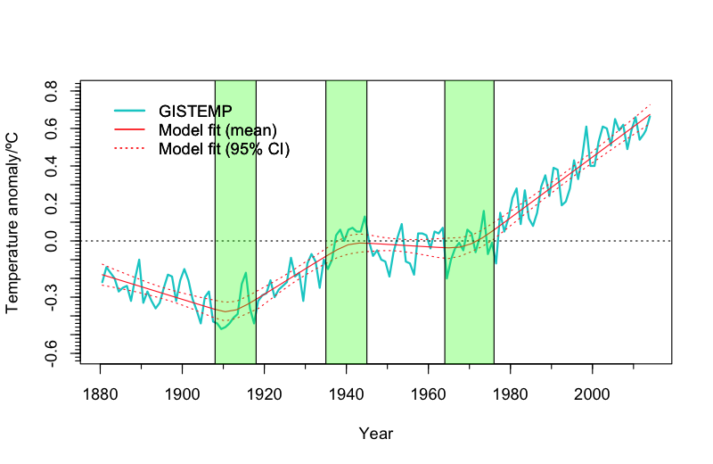 ?w=500&h=325
Robert B, the model you’ve linked is a breakpoint analysis model, not the output of climate models simulating global surface temperatures.
Correct me if I’m wrong, but as I understand it, El Nino’s don’t indicate an energy gain in the biosphere, but represent an energy transfer from the ocean to the air above the ocean, thus making the energy more easily measured. So even with a “record” warm year, it would not be an indication of record energy in the system.
Dave O., an El Nino is just a sneeze with respect to the heat capacity of the oceans, but to the atmosphere, an El Nino is a monumental event. An El Nino also helps to distribute sunlight-created warm water from beneath the surface of the tropical Pacific to the surface of the extratropical Pacific and Indian Ocean. And through teleconnections, an El Nino helps to reduce cloud cover outside of the tropical Pacific, allowing sunlight to warm the oceans to depth. So there’s a little more to an El Nino than what you’ve described.
Thanks
Dave O., PS: The ocean heat content of the tropical Pacific was higher before the 1997/98 El Nino than before the start of this year’s event:
From the post here:
https://bobtisdale.wordpress.com/2014/04/10/the-201415-el-nino-part-2-the-alarmist-misinformation-bs-begins/
Cheers.
Of course the heat content in that area in the Pacific was higher. 1997-98 had a massive ninjo. No ninjo i 2014-2015. Lack of high heat content there equals no ninjo.
rooter, your comment is not worth responding to, but I will. There was an El Nino in 2014. And, according to the data, NCDC ocean heat content for the tropical Pacific was much lower before 1996/97 than yet El Ninos occurred frequently.
It’s too bad you waste everyone’s time by commenting here at WUWT.
No one but you will define 2014 a ninjo year Tisdale. Check the ONI index. Or the SOI. Or MEI.
Total miss Tisdale.
Here’s a satellite image of the UHI around Minneapolis last night. Do you think they took that into account when calculating global temps?
fbcdn-sphotos-d-a.akamaihd.net/hphotos-ak-xap1/t31.0-8/s960x960/1669614_907712642595532_719275901374672686_o.png
I guess I’ll never get the image embedding thing down. Here’s a link to the NWS facebook page that showed the MN UHI
https://www.facebook.com/NWSTwinCities/photos/a.209333942433409.59745.200752513291552/907712642595532/?type=1
RH,
Drudge has this one a lot. I like it:
http://vortex.plymouth.edu/ustemp.gif
A balmy night.
A few months ago Anthony ran a story about the tabulation of record highs and lows for 2014, national and globally, showing they were about the same for the global numbers. I’d like to see how the year end numbers came out when the December data comes available. My simple mind tells me most adjustments to raw temperature measurements should be negative, to negate urban heat effects, proximity to asphalt, cement, or buildings, etc., and there would be much fewer occasions where adding to raw measurements would be necessary. High and low records though, are based on raw measurements, I am assuming, only because in over 30 years of hearing reports about new temperature record highs and lows for a location no one has ever mentioned whether it was before or after adjustments. So if 2014 was the hottest year ever globally, even after adjusting the raw measurements for urban heat effects (and other effects), then the raw measurements should have a really high ratio of record highs to record lows, a record high ratio one would suspect. A comparison of the record highs to lows for previous years would be interesting too.
Sadly, the USHCN dataset and its analogues in Australia and the NZ have seen the older temps adjusted downward relative to present. If they were adjusting for UHI effects, the adjustments of the past would be upward relative to present. The adjustments always seem to be such that the linear trend from past to present is steepened upward… always. Never downwards, if it were random corrections to the db it should have some near equal distribution. Sadly, the data keepers are corrupting the databases for politically contrived purposes, probably due to Noble Cause Corruption.
To be fair many times it can be said they are adjusting becasue the ‘right ‘ adjustments make a considerable difference to current and future career prospects . Its not all politics.
“The CO2 obsessed are patiently awaiting the GISS and NCDC global surface temperature data”
So much money and effort expended on something so meaningless.
[trimmed, off-subject. .mod]
I anticipate that the previous years’ poster child for global warming, Artic Ice decline, will not be discussed at all after the “2014 was the hottest year ever” story comes out. “Hottest year ever” claims should be pointed to reports like http://wattsupwiththat.com/2015/01/13/al-gore-wrong-again-polar-ice-continues-to-thrive/ and ask why the ice at both poles increased during the “hottest year ever” if Artic Ice decline was such strong evidence of global warming (Antarctic Ice increase has never counted of course).