We’ve all seen that Arctic Sea ice area and extent has expanded and is back to normal. NANSEN Arctic ROOS just got their web page plots back online yesterday after an outage, and there’s a bit of a surprise when compared to NSIDC’s plot.

Sources:
http://arctic-roos.org/observations/satellite-data/sea-ice/observation_images/ssmi1_ice_ext.png
http://nsidc.org/data/seaice_index/images/daily_images/N_timeseries.png
Here’s a magnified view with the NANSEN graph zoomed and set to match the NSIDC scale, done with the help of my graphics program:

Both datasets use the SSMI satellite sensor, both datasets plot extent at 15%. Yet we have significant differences in the output which would seem to point to methodology. Note that in the magnified view, NANSEN has a peak “normal” of ~15.25 million square kilometers while NSIDC’s “normal” is higher at ~15.75 million square kilometers. You’d think there would be a standard for deciding what is the “normal” baseline wouldn’t you? [Note: The NSIDC average is for 1979-2000, NANSEN’s is for 1979-2006] Maybe the scientists can hammer this out at the next ice conference.
Regarding the plots above.
NANSEN says:
“Ice extent is the cumulative area of all polar grid cells of the Northern Hemisphere that have at least 15% sea ice concentration, using the NORSEX algorithm. Ice area is the sum of the grid cell areas multiplied by the ice concentration for all cells with ice concentrations of at least 15%. Ice extent and ice area are calculated for a grid resolution of 25 km.”
NSIDC says:
“Extent defines a region as “ice-covered” or “not ice-covered.” For each satellite data cell, the cell is said to either have ice or to have no ice, based on a threshold. The most common threshold (and the one NSIDC uses) is 15 percent, meaning that if the data cell has greater than 15 percent ice concentration, the cell is considered ice covered; less than that and it is said to be ice free.”
NSIDC also says:
“Other researchers and organizations monitor sea ice independently, using a variety of sensors and algorithms. While these sources agree broadly with NSIDC data, extent measurements differ because of variation in the formulas (algorithms) used for the calculation, the sensor used, the threshold method to determine whether a region is “ice-covered,” and processing methods. NSIDC’s methods are designed to be as internally consistent as possible to allow for tracking of trends and variability throughout our data record.”
Given that both NANSEN and NSIDC use the same SSMI sensor data, and calculate the extent based on 15% concentration, that half a million square kilometers difference in the “normal” sure seems significant in the context of the magnified extent view NSIDC presents. A half million here, a half million there, and pretty soon we are talking about real ice extent differences.
Another interesting difference is that NANSEN plots Arctic Sea ice area in addition to the extent. Here’s that graph:

Arctic Sea ice area is above the “normal” line as defined by NANSEN. As far as I know, NSIDC does not offer an equivalent plot. If I am in error and somebody knows where to find NSIDC’s area plot, please let me know and I will include it here.
One final thing to note about the difference between NANSEN and NSIDC. I don’t recall the director of NANSEN/Arctic ROOS ever coming out and saying something like “Arctic ice is in a death spiral” or making any sort of press announcements at all. They seem content to just present the data and let the consumer of the data decide.
In contrast, NSIDC has a whole section that addresses sea ice in the context of global warming. I haven’t found a comparable section on NANSEN Arctic ROOS.
Of course we know that NSIDC director Mark Serreze is very active with the press. Perhaps some of our media friends reading this should seek out someone at NANSEN for the next sea ice story so that there’s some balance.
The differences in the way each organization presents their data and views to the public might explain the differences in the way the output is calculated. One might take a “glass half full” approach while the other takes a “glass half empty” approach. Or it may have a basis in science that I’m not privy to yet. The point is that there are significant differences in the public presentation of sea ice data between the two organizations. One showed sea ice extent as normal, the other took sharp right turn just before it was expected to happen.
I welcome input from both of these organizations to explain the difference.
In related news, Steve Goddard writes:
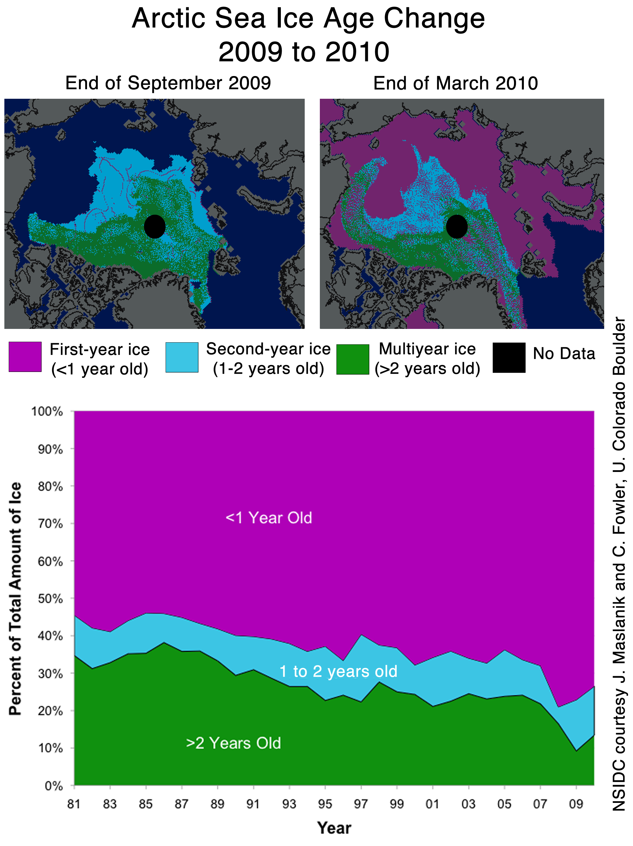
NSIDC seems to confirms the WUWT 12 Month Ice Forecast. Twelve months ago, WUWT forecast that 3 year old ice would increase during the next year, and explained why. NSIDC confirmed the accuracy of the forecast with their most recent Sea Ice News.

Source: http://nsidc.org/images/arcticseaicenews/20100406_Figure6.png
Note that 3+ (>2) year old ice has increased from 10% to about 14% during the past year, shown with the two black horizontal lines near the bottom. That shows an impressive growth of 40% relative to last year.
Ice older than one year has also increased by a substantial amount over 2008 and 2009. The implication being that ice thickness has been increasing for the last two years. Older ice is thicker ice.
So we will leave it up to the readers to do the math. Thickness has increased. Area has increased. What does that tell us about volume? What does that tell us about the “Arctic Death Spiral“?
Don’t be fooled though. “Decreasing ice is climate. Increasing ice is weather.”
I was a Teen Age Werebear.
===============
Anthony.
I really enjoy your website.
It has become a standard read of mine!
Thanks
“Mistakes” happen all the time, but why are all the errors in favor of AGW???
Strange !!!
Great catch. I’ve been talking with some colleagues about sea ice recently, and this apparent discrepancy is an important one. Thanks.
The NSIDC average is for 1979-2000, NANSEN’s is for 1979-2006. Walt Meyer has explained their choice to stop at 2000 many times (they want an unchanging reference). You can disagree with his choice but it is a choice and nothing’s fishy.
“hide the decline”
What a fuzz about nothing !!!! Both data gives about the same absolute amount of sea ice. The one gives just a normal amount and the other a almost ignorable shortage compared to normal.
I don’t see any reason to make noise about these data. Gosh….How low do we need to go to make a scene about something normal ?….If this normal situation is actually something whith a high news value….then there is something wrong ! If we stayed under normal vor the last 8 years, then it should be logical and normal to conclude something is terribly wrong with the Arctic sea ice content.
These folks homogenize temperatures all day long, why can’t they homogenize 15% ice extent? This is absurd, and if Anthony did not do such a careful explanation, appears calculated. I do note, though, the trend line still differs.
By tomorrow or Saturday, the NSIDC and Nansen graphs should look more similar. NSIDC’s averaging algorithm creates some lag.
Also, NSIDC uses a higher baseline from 1979-2000, so their average is higher.
For me it’s a simple choice.
I am with Nanson Arctic Roos.
I don’t carry the concept of death spirals and I detest the the scaremongering tactics in support of power and money grabbing politicians.
There is nothing wrong with the climate or the Arctic, we won’t experience any dramatic effects in the rise of ocean levels.
The only thing we have to fear are the carbon scam artists that are after our money.
That’s it.
Good news. In europa they are launching another satellite today. It will measure freeboard. It can then calculate how much ice is submerged. Then they can toss in some proxies from morrocco and we will have more data. I am shocked that they can now create a trend from a single point.
NSIDC has raised the bar, to make it easier for Serreze’s “death spiral” to limbo under.
The most obvious difference between the two is that NSIDC defines normal based on the period 1979-2000, while NANSEN uses a period of 1979-2006. Those extra six years would have brought the average down; if they add in 2007 to the average next year, it should be even lower.
The really interesting figure should be the level of melt reached this September. We’ll see then how fares the dreaded death spiral…
All this suggests to me that the cycle is headed for the opposite end of the spectrum: Above normal ice pack conditions. The pendulum swings back.
The director of NERC sent out this just after the Gore-Støre report. May be of interest here:
Press Release
Nansensenteret (http://www.nersc.no), Bergen
15. December 2009
Gore – Gahr Støre report; “Melting snow and ice, a call for action”;
http://www.regjeringen.no/upload/UD/Vedlegg/klima/melting_ice_report.pdf
The report prepared by the Norwegian Polar Institute after a “closed” conference in April 2009, is superficial. The authors, according to Gahr Støre are “world leading scientists”, refer to few published work and often to themselves. For example, the ice chapter has only10 published articles – of which only 8 deal with the ice in Arctic and two the ice in Antarctic. Of the 8 articles just 4 of them refer to articles written by 2 of the 5 authors. Other important and published articles are not mentioned.
Several statements in the ice chapter are incorrect. In the introduction (page 34) it says “”Sea ice extent in the Arctic has shrunk by almost 40% since 1979”, the correct numbers is 4,1% per decade or 12,3% since 1979 – not 40%. 4,1% per decade comes from the Nansen Center ice information system; http.arctic-roos.org.
Furthermore, it is not mentioned that the ice extension has great natural variability. In the period 1915-1935 for example, during the natural warming of the Arctic, the ice decreased 0.6 mill km2 while in the summer of 1996 the ice increased with 1.6 mill km2 – caused by the North Atlantic Oscillation. The connection between the increase in CO2 and decrease in the ice spreading is not mentioned either – see for example Johannessen 2008 (enclosed).
The chapter about the Greenland ice sheet has also few references, only 7 articles, which are referred to by the authors – this is not good enough. Regarding the increase of the ocean level Gore and Gahr Støre have over-interpreted the report. They say that the ocean level will increase with 1 to 2 m. The highest value that is mentioned in the report is in the range of 0.5m – 1.5m and with great uncertainty with regard to the increase of 1.5m in this century.
For more information or questions please contact;
Ola M. Johannessen mobile: +4790135336.
What’s the problem here, they both clearly use a different baseline?
Nansen uses a 79-06 average and NSIDC uses a 79-00 average, that wholly explains the difference in their normal lines. Same measuring system + same “ice-covered” definition + different baseline == different normal value…
REPLY: Sure the baselines differ. I’m pointing out that the public presentations differ significantly and who defines “normal”? Normal seems to be in the eye of the beholder of the data. Essentially it is an anomaly, and you can make an anomaly look like anything you want with a simple choice of defining the baseline. – Anthony
” Frederick Michael (09:51:36) :
The NSIDC average is for 1979-2000, NANSEN’s is for 1979-2006. Walt Meyer has explained their choice to stop at 2000 many times (they want an unchanging reference). You can disagree with his choice but it is a choice and nothing’s fishy.”
That doesn’t explain the decline compared to the incline…
It shows how the artificially chosen baseline measurement affects the reported anomaly.
What is “normal” for the Arctic sea ice? We’ve only measured it by satellite for slightly over 30 years. How do we know what normal really is?
Sea ice forecasts are now made out of fudge … Climate changes, it gets hot, then it gets cold. And cold is much worse for life on earth than is hot.
Does anyone know where the “Ice by Age” data comes from? I tried searching for the IceBridge data from NASA but apparently I am a little useless. I did find a great picture of a crack in the ice though, With an alarming proclaimation about open water in the NW Passage.
The images are visually making my BS detector going off and I would like to see the raw data and any algorithms used to create the graphics.
Since most are smarter than me around here anybody got this?
There is a review and extension of area taken NSDIC very interesting. http://www.americanthinker.com/2010/04/was_the_arctic_ice_cap_adjuste.html
According to the NSIDC web page, “Fossil fuel burning is responsible for climate change”
Does this mean that “fossil fuel burning” has been going on for 4.5 billion years of continuous climate change on Earth?
I bet if extent increases above normal, the +/- 2 sigma shading stretches out to +/- 3 sigma, and/or the base period is adjusted to increase the mean.
If there were an options contract on it, I’d be all in. C’mon ProShares, I want a climate market!
There is nothinhg unusual, all of this happened before.
Read (a book from 1943):
http://www.archive.org/stream/arcticice00zubo#page/444/mode/2up
I don’t think that NSIDC do use the same sensors now. Following the problems with the F13 satellite last summer NSIDC switched to the F17 following cross calibration. Arctic-ROOS did something different and came on-line with a product that has varied from the other sources ever since, NSIDC, ASMR-E/JAXA and MODIS appear to be self consistent while Arctic-ROOS is the outlier.
REPLY: Could be, the point I’m making here is that the public presentation differs significantly. Who’s got the “right” presentation? I don’t know. – A