 Understanding Climategate’s Hidden Decline
By Marc Sheppard The American Thinker
Close followers of the Climategate controversy know that much of the mêlée surrounds an email in which Climate Research Unit (CRU) chief Phil Jones wrote about using “Mike’s Nature Trick” (MNT) to “hide the decline.” And yet, 17 days and thousands of almost exclusively on-line op-eds into this scandal, it still seems very few understand exactly which “decline” was being hidden, what “trick” was used to do so, and why Jones’s words have become the slogan for the greatest scientific fraud in history.
As the mainstream media move from abject denial to dismissive whitewashing, CRU co-conspirators move to Copenhagen for tomorrow’s UN climate meeting, intent on changing the world as we know it based primarily on their now exposed trickery. Add yesterday’s announcement of a UN investigation into the matter, which will no doubt be no less corrupt than those being investigated, and public awareness of how and why that trick was performed is now more vital than ever.
So please allow me to explain in what I hope are easily digestible terms.
First and foremost — contrary to what you’ve likely read elsewhere in the blogosphere or heard from the few policymakers and pundits actually addressing the issue, it was not the temperature decline the planet has been experiencing since 1998 that Jones and friends conspired to hide. Certainly, the simple fact that the email was sent in November of 1999 should have allayed any such confusion.
In fact, the decline Jones so urgently sought to hide was not one of measured temperatures at all, but rather figures infinitely more important to climate alarmists – those determined by proxy reconstructions. As this scandal has attracted new readers to the subject, I ask climate savvy readers to indulge me while I briefly explain climate proxies, as they are an essential ingredient of this contemptible conspiracy.
Truth be told — even reasonably reliable instrumental readings are a relatively modern convenience, limiting CRU’s global measured temperature database to a start date somewhere in the mid-19th century. That’s why global temperature charts based on actual readings typically use a base year of 1850 or somewhere thereabouts.
And yet — most historical temperature charts, including the one Al Gore preached before in An Inconvenient Truth, go way back to 1000 AD. That’s where proxies come in.
While historical documents (e,g, ship’s logs, diaries, court and church records, tax rolls, and even classic literature) certainly provide a glimpse into past temperature trends, such information is far too limited and generalized to be of any statistical value. So climate scientists have devised means to measure variations in such ubiquitous materials as lake sediments, boreholes, ice cores, and tree rings to evaluate past temperature trends.
They then employ complex computer programs to combine such “proxy” data sampled throughout a region to plot that area’s annual relative changes in temperature hundreds or even thousands of years prior. By then combining the datasets, they believe they can accurately reproduce hemispheric and global temperature trends of the previous millennia.
And while reconstructions — as past temperature interpretations from proxy data are called — can differ greatly from one source to another, those generated by the CRU have often been accepted as the de facto temperatures of the past.
Largely because the UN’s Intergovernmental Panel on Climate Change (IPCC) proclaims them to be.
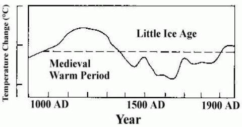
Warmist Public Enemy Number One: The Medieval Warming Period
It’s important to understand that early analyses of these “proxies” clearly demonstrated that three radical temperature shifts occurred within the past millennium, as do many contemporary studies. Indeed, the years 900-1300 AD were labeled the Medieval Warming Period (MWP), as global temperatures rose precipitously from the bitter cold of the previous Dark Ages to levels several degrees warmer than today. The Little Ice Age, a sudden period of cooling, then followed and lasted until the year 1850. And then began the modern warming period, which was by no means unique and appears to have ended with the millennium itself.
Originally, even the IPCC accepted that pre-20th century analysis. In fact, the 1990 First Assessment Report used this schematic IPCC 1990 Figure 7c (courtesy of Climate Audit) to represent last millennium’s dramatic temperature swings.

But this image of a fluid climate system subject to abrupt and natural up-and-downturns made unprecedented 20th century warming about as marketable as Florida swampland. And opportunists who depended on the aberrance of post-industrial revolution warming in order to condemn and control mankind’s CO2 emissions soon recognized that perhaps the LIA but most certainly the MWP simply had to go.
And as many of these hucksters were closely connected to the IPCC – both sender and recipient names on those illuminating CRU emails include many of its editors, lead authors and contributors — that task was far less daunting than one might imagine.
Proxies, Tricks and Hockey Sticks
The first step was taken in the 1995 Second Assessment Report, when the above Figure 7c was replaced with a 1993 reconstruction from RS Bradley and Phil Jones himself that used 1400 AD as its base – effectively wiping the MWP off the radar-screen.
But it wasn’t until the 2001 Third Assessment Report (TAR) that the MWP simply vanished. This multi-proxy reconstruction of Northern Hemisphere temperature anomalies appeared in chapter 2, page 134, of the Working Group 1 (WG1) report [PDF].

IPCC 2001 WG1 Fig 2.20
Of course, the first thing you’ll notice is that both the MWP and LIA have indeed disappeared. In fact, temperatures appear to trend downward throughout the millennium until a sharp jump upward last century. But if you look closer, you’ll also notice that the “reconstructed” series terminate in 1980. What forms the dramatic blade to the hockey stick shape (yes, this is indeed the famous “Hockey-Stick” graph) is instead the distal segment of the 1902 to 1999 instrumental data series.
Mann has recently claimed that the available proxy data ended in 1980, but even his coconspirators at RealClimate admit that’s nonsense. The truth is that the proxy data was scrapped because unlike those measured, reconstructed temperatures showed a marked decline after 1980. And, as the chart plotted temperature anomalies against what the plotters selected as the “normal” period and temperatures of 1961 to 1990, the reconstruction would have been quite unremarkable otherwise. So at the 1980 mark, the actual post-1980 measurements were actually attached to the truncated proxy series to create the illusion they were one.
The figure below, found on the same page of the WG1 report reveals this trick more clearly. This chart plots the original 4 reconstructions used: 2 from Mann et al, 1 from Jones et al and 1 from Briffa et al. Notice how all but the first series continue to trend downward around 1960 while instrumental readings begin to trend upward? And even that series ends abruptly in 1980.

IPCC 2001 WG1 Fig 2.21
So not only did conspirators cherry-pick the one series of the four that approximated measured temperatures the longest, they also terminated that series at the point that it too, began to trend down. They then joined it to the actual 1980-1999 temperatures to “hide the decline” in the final product, as that decline created an inexplicable divergence between the reconstructed and measured temperatures. The existence of which challenges the entire series dating back to 1000 AD.
Remember, all of the temperatures prior to 1850 were estimated by computer algorithms and no actual readings exist to prove or disprove those figures. So a relatively short window of opportunity exists to test the programs against observations. Had 20th century measured temperatures continued to align with those recreated as smoothly after 1960 as they did previously, then the programmers could declare their code and hence their millennial temperatures sound. But the divergence, if allowed to stand, instead revealed serious design flaws in the proxy reconstructions. Which suggests that just as the decline was dealt with through trickery, so was the MWP.
And it seems that each time the trick was used, its involvement would be more deeply concealed.
Every multi-volume IPCC Assessment has been accompanied by a relatively brief and highly-politicized Summary for Policymakers (SPM). This synopsis invariably commands the bulk of the media and political attention. Here’s the version of the graph depicted prominently on page 3 of the 2001 TAR SPM [PDF], the only version of the report most policymakers and reporters would ever actually see. Notice how they further obscured their chicanery by omitting the series defining legend and the “1988 instrumental value” declaration:

IPCC 2001 SPM Fig 1b
And despite the fact that the only confirmable segment of the series failed that very test, which should have declared the entire series null and void, the chart’s caption informed policymakers that:
“the rate and duration of warming of the 20th century has been much greater than in any of the previous nine centuries. Similarly, it is likely that the 1990s have been the warmest decade and 1998 the warmest year of the millennium.”
And it’s this highly fraudulent version that has become the poster child of the equally fraudulent Anthropogenic Global Warming (AGW) movement.
Thanks in large part to the trick that hides the decline.
Trick or Cheat
Now we’ll take a closer look at exactly what Jones meant when he wrote that he had “just completed Mike’s Nature trick of adding in the real temps to each series for the last 20 years (ie from 1981 onwards) and from 1961 for Keith’s to hide the decline.”
Why did Jones refer to the ruse as “Mike’s Nature Trick?”
As die-hard Hockey Team opponents and fans alike already know – the original 600-year version of the now infamous “Hockey-Stick” graph was dubbed MBH98 because it first appeared in the Michael Mann, Raymond Bradley and Malcolm Hughes paper Global-Scale Temperature Patterns and Climate Forcing Over the Past Six Centuries [PDF], originally published in the science journal Nature in 1998. And “Mike’s Nature Trick” received its dubious designation among CRU insiders for the very same reason.
As to the rest of the sentence — It seems Jones was working on a cover chart for a forthcoming World Meteorological Organization report [PDF], WMO Statement on the Status of the Global Climate in 1999, when he wrote the email. As the graph would incorporate one reconstruction of his own plus one each from Michael Mann and Keith Briffa, he was informing them that he had used the trick on Mann’s series at the same 1980 cutoff as MBH98, but found it necessary to use 1960 as the cutoff on the Briffa series.
And what I uncovered in the source code told the tale why. While Mann used multiple proxy sources, Briffa’s reconstructions were based solely on a property of annual tree ring growth known as maximum latewood density (MXD). And the MXD-only-driven plots began to diverge from actual temperatures as early as 1960. In fact, while many of CRU’s programs are designed to exclude all data after 1960 for later manual splicing with instrumental data, others employ “fudge factors” to force the generated plot to more closely adhere to measured temperatures as far back as 1930.
And as you’ll soon see, Jones’s admitted use of MNT took it to an entirely new level of fraud.
Here’s the original reconstruction, with the three proxy and measured temperature (black) series intact:

Notice how Briffa’s series (green) begins to trend sharply downward around the mid-20th Century. Jones’s series (red) soon follows but less sharply and then begins to trend higher. Mann’s (blue) appears to flatten out around the same year that Jones’s begins to fall. Meanwhile, all three have broken with the measured rising temperatures of the late 20th Century.
Now take a look at the chart actually published by the WMO, with all three proxy series having been surreptitiously subjected to MNT:

Since the release of CRU’s FOI2009, alarmists have continued their claim that there’s nothing deceptive about the “trick” and that it has been openly discussed in scientific journals like Nature since 1998.
But I defy anyone to compare the above chart – the one Jones wrote he had applied MNT to – to the unadulterated version above it, and tell me there’s been no deception committed. At least with MBH98, a sharp eye might recognize the ruse. Here — there is no indication given whatsoever that the graph represents an amalgam of proxy and measured temperatures. This, my friends, is fraud.
And I hope that those investigating the fraud will carefully consider this explanation of his WMO cheating given last week by Jones: [my emphasis]
“One of the three temperature reconstructions was based entirely on a particular set of tree-ring data that shows a strong correlation with temperature from the 19th century through to the mid-20th century, but does not show a realistic trend of temperature after 1960. This is well known and is called the ‘decline’ or ‘divergence’. The use of the term ‘hiding the decline’ was in an email written in haste. CRU has not sought to hide the decline. Indeed, CRU has published a number of articles that both illustrate, and discuss the implications of, this recent tree-ring decline, including the article that is listed in the legend of the WMO Statement figure. It is because of this trend in these tree-ring data that we know does not represent temperature change that I only show this series up to 1960 in the WMO Statement.”
And they’ll immediately recognize the dishonest denial they’re dealing with when they read the WMO Statement figure from the inside cover Jones referred to:
“Northern Hemisphere temperatures were reconstructed for the past 1000 years (up to 1999) using palaeoclimatic records (tree rings, corals, ice cores, lake sediments, etc.), along with historical and long instrumental records. The data are shown as 50-year smoothed differences from the 1961–1990 normal. Uncertainties are greater in the early part of the millennium (see page 4 for further information). For more details, readers are referred to the PAGES newsletter (Vol. 7, No. 1: March 1999, also available at http://www.pages.unibe.ch) and the National Geophysical Data Center (http://www.ngdc.noaa.gov).”
Even if MNT had been explained as Jones claimed — which it wasn’t — just how was the observer expected to differentiate the reconstructed from the actual data? And good luck finding that newsletter.
Spin it anyway you want – Mike’s Nature Trick is Phil’s WMO cheat.
More Tricks of the Charade
While suddenly the most famous, Mike’s is not the only in CRU’s bag of tricks.
Many of the programs I reviewed contained routines to exclude proxy data that demonstrated poor correlations with local temperature, which of course explains why CRU’s 19th through mid-20th century proxy temperatures appeared to be observationally accurate. Others “estimated” values for missing data.
And then there’s the Yamal matter – also a popular subject of the CRU emails.
In an October 5th email to climatologist Tom Wigley, Jones took issue with a piece I had written that day exposing the lies in CRU-based UN climate reports, which included a section on Keith Briffa’s mistreatment of Polar Ural data in order to exaggerate 20th century warming. That email prompted the reply from Wigley — now familiar to AT readers — in which he admitted it was “distressing to read that American Stinker item,” before offering to help Briffa, who “does seem to have got himself into a mess,” write an “explanation” for his deceitful cherry-picking of Yamal peninsula data.
Indeed, Keith’s Yamal Trick also “fudged” proxy reconstructions, not by overwriting them with instrumental data ala Mike, but rather by underhandedly stacking the actual dataset with trees hand-picked to assure his predetermined outcome. Yet both methods intentionally corrupted reconstruction results for the same devious purpose — to skew late 20th century temperatures higher in order to artificially create the dreaded hockey stick effect.
Now, you might be wondering why all this fuss is being made over late 20th century temperatures when even we realists accept that they did rise until 1998. Hopefully, you now understand why the divergence between proxy and measured temperatures betrays a potential serious flaw in the process by which temperatures are reconstructed from tree-ring density. And that any reconstruction demonstrating such a flaw-revealing divergence should be dismissed outright, not presented as policy fodder.
But there’s another issue at stake here.
Anthony Watts has surveyed over 75% of the 1200-plus U.S weather stations from which national temperatures are accumulated. Most of those were found to be inaccurate by more than 2°C, largely due to being located within 10 meters of an artificial heating source. In fact, less than 10% met strict placement guidelines set forth by the National Oceanic and Atmospheric Administration. Not to worry — NOAA claims it has methods to “adjust” for such bias, including the use of “smoothing” adjustments to “homogenize” station data to that of surrounding stations.
Unpublished computer programs artificially adjusting the data — what could possibly go wrong with that?
Would you be shocked to learn that at ICCC 3, Watts told us he had calculated such adjustments to raw temperature data between 1940 and 1999 to be 0.5°F to the positive? That accounts for almost one half of the 1.2°F warming over the last century.
And that’s here in America. Try to imagine what kind of shenanigans might be going on elsewhere in the world.
Consequently, even the “instrumental” temperatures the CRU crooks were fudging their results to align with were likely themselves fudged. So they were pumping the incline while hiding the decline.
Hold the Fudge and the MWP won’t budge
In a June 2003 email to Jones and company, Mann discussed the notion of expanding CRU charts to 2 millennia, in an effort to ‘try to “contain” the putative “MWP.”’ No deception in that, I suppose. Of course, an honest 2000 year reconstruction, such as this one from CO2Science.org, adapted from a 2005 Moberg et al. temperature history derived from tree-rings and lake and ocean sediments, would actually emphasize rather than “contain” the MWP:
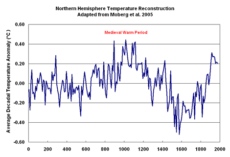

Any questions why Mann and friends work so diligently to “contain” (hide) the MWP?
As you can see, the post-LIA warming that began around 1850 is neither unprecedented nor spectacular. And certainly not worth rewiring the economic circuitry of the planet over.
And the CRU/IPCC reconstructions have been counterfeited for the express purpose of hiding that very fact.
After all, the stakes are enormous – perhaps trillions of dollars and unquestionably every American’s personal liberties. Tomorrow, over 20,000 delegates from 193 nations will gather in Copenhagen to craft an agreement which would not only force American power consumption to levels equal to those of about 1910, but would also have us pay reparations for an imaginary “climate debt” we’ve accumulated by building the world’s greatest economy of all time. That debt is based on the amount of CO2 our financial growth has purportedly pumped into the atmosphere, which, according to the conclusions of the IPCC, based largely upon reports from the CRU, has selfishly imperiled the planet by inducing climate change.
Of course, asking Americans to pay reparations based on the claim they’ve done harm to other nations by spoiling the climate is like asking me to pay damages to my neighbor based on his claim that he can’t sell his house because my great-grandmother’s ghost is haunting it.
As many have known and Climategate has proven, either would be equally preposterous.
But at least belief in ghosts is only marginally inspired by fraud.

Sponsored IT training links:
Join HP0-D07 online training program to successfully pass 642-415 and 650-393 exam.
I think this is the clearest summary for the lay-person I have seen – there is so much material out there it is difficult to sort the wheat from the chaff! But this could be one to send to your elected representatives……………..
This article hits it right on the head!
If the MWP exists there is no crisis!, no tipping point, no unprecedented warming, no mandate for a new world order and trillions in spending!
What good our proxies if there predictions do not match documented instrumental measurement? None in the scientific world, apparently everything in the political world.
This analysis unfortunately is too hard for 99.9% of citizens. It is excellent science, and well presented, but I wager that there is not one MSM journalist that will read more than a few paragraphs.
That does not mean that WUWT should not post it though. It just means that the Jon Stewarts and Rex Murphys of the media will have 1000 times the impact using comedy and sarcasm.
The only other way to reach the public is for state and federal prosecutors to go after the principals of climategate for fraud.
The perp walk is inevitable for them, if there is any justice system left in the USA or the UK. If I were a third level scientist at CRU I would be seeking immunity right now, in exchange for the inside information on the higher ups. Fraud, destuction of FOI information, conspiracy to commit… there has to be jail time coming for those involved.
JMHO
Excellent article.
But one result of eliminating the MWP and the LIA is the resulting magnitude of the the CO2 + positive feedbacks coefficient placed into the AGCMs to account for low solar effects and for inflated instrument readings. When that GIGO is run out to the year 2100, all of the AGCMs predict doom.
Ma’mm Boxer is not the only moronic politician from the Golden State. The govenor is aptly named by his movie, The Terminator.
Climate Action in California
I used to review some of the stations on the GISS dataset that temperatures going back before 1880. Some sets such as DeBilt went back to the early 1700’s. These were removed from the GISS dataset, perhaps because they showed climate variation rather than a monotonic decline. Does anyone know where to find these sets?
The truth is so refreshing.
Thank you very much for giving this detailed, clear explanation.
Good point Gary. The way to really hit a home run would have been to tie that in as you say.
The e-mail string in the file 1168022320.txt from Phil Jones gives some explanation of the source of the IPCC figure 7c.
…”So, that’s how a crude fax from Jack Eddy became the definitive IPCC record on the last millennium!”
http://www.eastangliaemails.com/emails.php?eid=765&filename=1168022320.txt
Good work!
Good stuff
This is an excellent piece of writing.
Thanks for the excellent and concise explanation. This one (and Rex Murphy’s diatribe against the fraud) are destined to be posted on my door at work. I’ve promised to give a guest talk about the global warming fraud in a colleague’s lecture series, and this summary of exactly what was fraudulent in the actions of Briffa, Jones, Mann et al will be a great help. I was glad to see Anthony’s work mentioned here, too. We are living in interesting times.
I’ve been musing about which of the shadier episodes in the history of science the CRUtape letters most resembles, and how this scandalous misuse of science ranks against other outstanding moments both positive and negative. I really cannot think of a parallel: eugenics built on over a century of scientific racism, but all the participants believed they were being perfectly rational, and the problem was a low standard of evidence and a high level of preconceptions about the role of heredity in controlling behaviour. I certainly can’t think of anything of this scale or kind in recent memory, either – even the problem of the collapse of scientifically-managed fish stocks has more to do with underfunded science, a level of incompetence or wishful thinking in understanding the parameters used to judge the stock sizes, and other factors beyond the control of scientists (political interference or intransigence), the self-serving deceptive actions of fishermen, etc).
I don’t think it will do much good, but I’m sending a link to this article to my Senators.
So the key question is this:
‘What is the range of probabilities that the Medieval Warm Period was as warm or warmer than today, based on ALL the reviewed science using temperature proxies and how certain are we that the use of temperature proxies is sufficiently reliable to justify using it in this crucial debate?’
Presumably, like in biomedical research, from time to time eminent researchers collate all the literature into accessible reviews, which normally include tables to summarise the current positions held by a variety of academic researchers?
Based on that, where does CRU sit in that compilation of data?
1. As a fairly average representation of a diversity of views?
2. As an outlier showing more extreme variations than 90% of other publications?
3. Initially an outlier 20 years ago, but become increasingly mainstream as research has continued to the present day?
On the outcome of those questions can key deductions be made, me thinks….
Marc, this is a fantastic job across the board; investigation, analysis, construction, explanation; and you’re right in that one only needs to be “climate savvy” , not a scientist, to understand it. This ought to be disseminated as widely as possible. Many thanks for the huge effort that must have gone into this. – Mike Spilligan; UK.
Anthony, thank you for bravely continuing this information. I am very concerned politicians and social scientists will have their day in Copenhaagen.
It appears Brown has latched on to the cause and so perhaps save his party’s future rebuke at the polls.
Mr. Obama is set to be the savior of the world.
In the face of these massive political pressures, somone needs to keep unadulterated information flowing.
I thank you for this.
O/T. In the Independent today:
“Blair is paid thousands of pounds to ‘endorse’ a fossil-fuel power plant”
A really excellent article.
Excellent article.
Need more like this. Less OMG!! We’ve found the SMOKING CODE!
Superb explanation. Clear and concise. Many thanks.
Great post for us none scientists. Should be mandatory reading for all politicians. If they pass cap and trade the only thing we’ll be able to do is breathe if we can pay the tax.
Where does the 0.0 baseline come from?
So the scientific analysis has been subject to some unreasonable massaging. It doesn’t mean that polar bears are running out of room; that Bolivia is having to move people out of its capitol due to water shortage because the glaciers are shrinking; the same goes for the Alps and the Himalyas.
The Earth has got hotter and the scientific anlysis has been cooked. Now where do we go from here?
Stephen Bishop UK