From Dr. Roy Spencer’s Global Warming Blog
by Roy W. Spencer, Ph. D.
The Version 6.1 global average lower tropospheric temperature (LT) anomaly for January, 2026 was +0.35 deg. C departure from the 1991-2020 mean, up a little from the December, 2025 value of +0.30 deg. C.

The Version 6.1 global area-averaged linear temperature trend (January 1979 through January 2026) remains at +0.16 deg/ C/decade (+0.22 C/decade over land, +0.13 C/decade over oceans).
The following table lists various regional Version 6.1 LT departures from the 30-year (1991-2020) average for the last 25 months (record highs are in red).
| YEAR | MO | GLOBE | NHEM. | SHEM. | TROPIC | USA48 | ARCTIC | AUST |
| 2024 | Jan | +0.80 | +1.02 | +0.57 | +1.20 | -0.19 | +0.40 | +1.12 |
| 2024 | Feb | +0.88 | +0.94 | +0.81 | +1.16 | +1.31 | +0.85 | +1.16 |
| 2024 | Mar | +0.88 | +0.96 | +0.80 | +1.25 | +0.22 | +1.05 | +1.34 |
| 2024 | Apr | +0.94 | +1.12 | +0.76 | +1.15 | +0.86 | +0.88 | +0.54 |
| 2024 | May | +0.77 | +0.77 | +0.78 | +1.20 | +0.04 | +0.20 | +0.52 |
| 2024 | June | +0.69 | +0.78 | +0.60 | +0.85 | +1.36 | +0.63 | +0.91 |
| 2024 | July | +0.73 | +0.86 | +0.61 | +0.96 | +0.44 | +0.56 | -0.07 |
| 2024 | Aug | +0.75 | +0.81 | +0.69 | +0.74 | +0.40 | +0.88 | +1.75 |
| 2024 | Sep | +0.81 | +1.04 | +0.58 | +0.82 | +1.31 | +1.48 | +0.98 |
| 2024 | Oct | +0.75 | +0.89 | +0.60 | +0.63 | +1.89 | +0.81 | +1.09 |
| 2024 | Nov | +0.64 | +0.87 | +0.40 | +0.53 | +1.11 | +0.79 | +1.00 |
| 2024 | Dec | +0.61 | +0.75 | +0.47 | +0.52 | +1.41 | +1.12 | +1.54 |
| 2025 | Jan | +0.45 | +0.70 | +0.21 | +0.24 | -1.07 | +0.74 | +0.48 |
| 2025 | Feb | +0.50 | +0.55 | +0.45 | +0.26 | +1.03 | +2.10 | +0.87 |
| 2025 | Mar | +0.57 | +0.73 | +0.41 | +0.40 | +1.24 | +1.23 | +1.20 |
| 2025 | Apr | +0.61 | +0.76 | +0.46 | +0.36 | +0.81 | +0.85 | +1.21 |
| 2025 | May | +0.50 | +0.45 | +0.55 | +0.30 | +0.15 | +0.75 | +0.98 |
| 2025 | June | +0.48 | +0.48 | +0.47 | +0.30 | +0.80 | +0.05 | +0.39 |
| 2025 | July | +0.36 | +0.49 | +0.23 | +0.45 | +0.32 | +0.40 | +0.53 |
| 2025 | Aug | +0.39 | +0.39 | +0.39 | +0.16 | -0.06 | +0.82 | +0.11 |
| 2025 | Sep | +0.53 | +0.56 | +0.49 | +0.35 | +0.38 | +0.77 | +0.30 |
| 2025 | Oct | +0.53 | +0.52 | +0.55 | +0.24 | +1.12 | +1.42 | +1.67 |
| 2025 | Nov | +0.43 | +0.59 | +0.27 | +0.24 | +1.32 | +0.78 | +0.36 |
| 2025 | Dec | +0.30 | +0.45 | +0.15 | +0.19 | +2.10 | +0.32 | +0.37 |
| 2026 | Jan | +0.35 | +0.52 | +0.19 | +0.09 | +0.30 | +1.40 | +0.95 |
The full UAH Global Temperature Report, along with the LT global gridpoint anomaly map for January, 2026 and a more detailed analysis by John Christy, should be available within the next several days here.
The monthly anomalies for various regions for the four deep layers we monitor from satellites will be available in the next several days at the following locations:
El Nino event still slowly decaying..
I wonder how much further it will drop over the next few months.
Funny how deniers live in their own little fantasy world.
We’ve been in a La Nina since late 2024, and we’re now beginning to transition out of those conditions.
When you step back and look at the bigger picture:
Jan24: 0.80 C
Jan25: 0.45 C
Jan26: 0.35 C
Post Tongan eruption cooling effect intact, exactly as predicted by climate realists!
Jan 1984: -0.5C
Jan 1997: -0.3C
Jan 2001: -0.19C
Jan 2018: +0.15C
Jan 2026: +0.35C
Looking at Januaries under similar La Nina influence.
Global warming on track.
Feb16: 0.83 C
Feb20: 0.76
Secular cooling intact, despite Tongan eruption.
go back to 1940 and your bubble bursts
It may be on track, but what is causing it?
Curious minds want to know.
Nobody knows what’s causing it.
Eldrosion seems to think they do which is why I asked them.
I notice he didn’t reply. Maybe he has no answer. That would be my guess since nobody knows the answer, including him.
To abused the Clinton campaign slogan,
“It’s the sun, stupid!”
Ahhhh . . . such humor . . . it makes my day!
In particular, in the context that you used it, I love the word “exactly” when describing the inherently inexact measurements involved with weather/climate parameters, especially when averaged over global scale.
With all due respect to Dr. Spencer and UAH for their monthly reporting on GLAT variations and its long term trend, I wish that they would always put this caveat (or equivalent words) in such reports:
“Note the temperature data reporting to two decimal places is only derived from mathematical procedures. Any actual single temperature measurement derived from weather satellite MSU instruments and necessary conversion corrections has 2-sigma uncertainty of up to +/- *x* °C, and the global average that is plotted has an uncertainty of +/- *y* °C”,
where *x* and *y* are the actual mathematical values to be supplied by Spencer/UAH at the time of reporting . . . I suspect each currently has a value in the range of 0.3 to 0.5.
As for “exactly as predicted“, I am confident there no real (hah!) climate scientist that would buy into such absurdity . . . to wit:
“It is the mark of an educated mind to rest satisfied with the degree of precision which the nature of the subject admits and not to seek exactness where only an approximation is possible”
— Aristotle, Nicomachean Ethics
Anyone concerned about whether the anomaly is 032C or 0.37C is missing the point. It’s like the difference between 320 ppm ATM CO2 and 370 ppm it doesn’t matter about anything but there is merit is having a consistent procedure tracking changes to establish a quantitative trend. IMHO everything about climate/CO2,especially deep ice core data, should be reported with huge error bars.
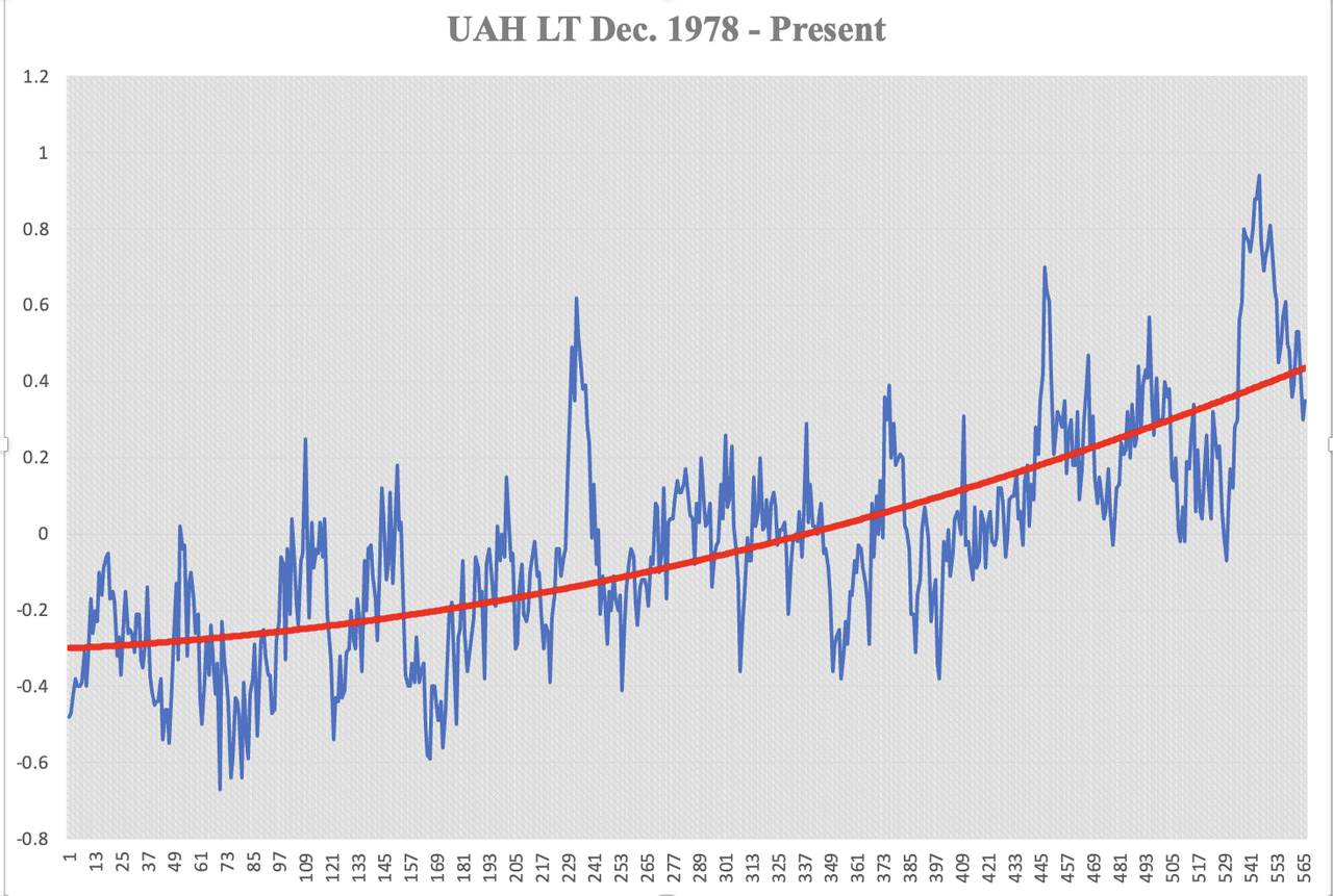
While there is no explanation of what the heavy red line is purported to be, trend lines only inform about the past and have nil, zero, predictive value.
Its an indication of the effect of the last three major El Nino events.
Shows how much warming they have given.
Isolating the El Nino events, and looking at the sections between the major El Nino events shows that…
… there is basically NO OTHER WARMING
(click to see chart properly)
No, heat is required to make thermometers hotter. Cargo cult “science” is fun, but Nature can’t be fooled.
The Earth continues to cool, as it has for four and half billion years.
Sorry about that.
Not exactly. There is the little thing known as latent heat. It doesn’t affect thermometers but can be seen by satellites monitoring radiation.
Not exactly.
“There is the little thing known as latent heat. It doesn’t affect thermometers but can be seen by satellites monitoring radiation.”
Indeed so. There is also a little thing known as the 2nd law of thermodynamics, of course, which causes the global average temperature to rise as local and regional heat sources dissipate their energy through the planetary climate-system. No increase in primary energy-input from the Sun is required for this to happen – it is purely an effect of increasing entropy of the climate system.
_________________________________________
O.T.:
PS: Thanks for re-explaining the ‘5-number’/‘Box & Whisker’ statistical method (here), Jim. I’ve got the idea now – ’just needed a little time free of distractions to grasp it properly.
I also did a little research on the ’net about it as well and was surprised to discover that it is a large area of statistical territory which I never knew existed, even though it has been in existence since 1977! I am looking forward to exploring it further as time allows. Thanks for revealing it to me!
My brother Tim and I have had several discussions about this in terms of uncertainty. The GUM is primarily about normal distributions or those that can be “considered” normal. It does cover some other distributions but not in detail. Many of my metrology books cover probability density functions used for other types of distributions.
Ultimately, the 5-number will allow a standard and easily understood description of the variation in measurements. It deals easily with asymmetric data surrounding the median. The first quartile and third quartile gives a definite range and the median says where the center of that range is. Viola! What more do you need?
Exactly, does anyone else besides me expect another cyclical spike in about 26 years even without another HTHH eruption?
Assuming you are referring to the UAH graph of GLAT presented under the first paragraph of Dr. Spencer’s above report, that is simply not true.
Look again and you may find this orange text with an associated orange arrow pointing directly to the heavy red line: “Running, centered 13-month average”
Be careful out there.
So what is your explanation for the width of the current peak if it isn’t being driven by El Nino?
The peak and some of the cooling can be attributed to El Niño, but the cooling since late 2024 is due to La Niña.
A very similar pattern occurred between 2016 and 2018, as well as from 1998 to 2000.
Yes, and strong El Nino gives a spike in atmospheric temperature..
Then it cools.. All totally natural.
Funny how you believe that adding CO2 to air makes thermometers hotter, as well. “We’ve been in a La Nina since late 2024, . . . “. What does that even mean?
Maybe you could write a cookbook – “Word Salad for Dummies of the Climate Variety.”
What do you reckon?
Oh rly.
Since when was the “bigger picture” an accelerating warming? Because if you go back a bit more than 1978, it cools more quickly with a better fit linearly. And of course in the 70s we were still adding CO2 so no prizes for cherry picking “UAH” and claiming acceleration.
and in the WW2 era 1940 – 1945, when peak CO2 emissions would have been happening across a lot of the Northern Hemisphere, what did temperatures do?
The temperatures cooled by over 2.0C from the 1930’s high temperature point to the late 1970’s
That was the reason climate scientists of the era were speculating that the Earth might be entering another Ice Age.
your so called “bigger picture” spans a whopping 48 years.
please see the big picture below.
Agree. Attempting to squeeze climates into 30 year cycles causes all kinds of problems, 300 years would be better and 1000 years gets my vote..
Especially when there is a significant climate cycle with a ~70 year period. That basically guarantees flipping back and forth between panic about warming or cooling when a 30 year “climate” is used.
What you are doing is making a mistake in attempting to curve fit an exponential function to time versus anomaly value. It is typically called curve fitting for a reason. The two variables are not related n but you try to fool people into thinking they are. If you want to make an impression, don’t use time, use CO2 as the independent variable.
Otherwise you need to do something similar to what is known as integration by parts. You will find large chunks of time with no growth and short periods with a transition to higher values. Neither seem to be related to a constant and consistent growth in CO2.
I find the term “deniers” to be a very interesting one. Apart from any subliminal or deliberate reference to holocaust deniers, the term clearly implies “climate change” denial! But here’s where it gets interesting because paradoxically, it seems that those who support AGW theory, are the deniers of climate change over the millennia?🧐
Yes, the term ‘denier’ shouldn’t be used lightly, but there are cases where it’s justified. This current case, where the ENSO index data is being completely disregarded and the current cooling is being attributed to El Niño instead of La Niña, is one of those instances.
If people don’t want to be called deniers, they shouldn’t outright deny the data.
Then stop DENYING that the current cooling is the decay of the energy from the 2023/5 El Nino.
How much more cooling will there be is the question.
The “data”, as you call the constructs, are shockingly deficient in their probity, provenance and prosecution.
Not fit for any basis of public policy-making or infrastructure development expenditures.
Right.
And yet how many alarmists acknowledge the greening planet? Or increasing population supported by increasing crop yields?
How many alarmists have understood table 12.12 (page 1856) in the AR6 WG1 report that summarises the science as acknowledging that nearly no alarming climate changes like precipitation or storms have been measured or are even expected to be measured this centaury?
“If people don’t want to be called deniers, they shouldn’t outright deny the data.”
I don’t think anyone is denying the data. There’s absolutely no doubt that the current data shows unusual warmth, especially considering the phase of Enso. However, what most are questioning is whether such warmth is unprecedented within climate history. The most serious deniers are those who claim that climate doesn’t change over the millennia – as per the shaft of the hockey stick.
“There’s absolutely no doubt that the current data shows unusual warmth”
There is no unusual warmth today. It’s not any warmer today than it was in the 1930’s, or the 1880’s.
There is no unprecedented warming today as the Climate Alarmists claim. The only evidence available, the historical, written temperature records show it was just as warm in the recent past as it is today.
What this means is that even though CO2 levels have increased over the years, the temperatures are no warmer than in the recent past, with much less CO2 in the air.
The written, historical temperature records shows there is no connection between the amount of CO2 in the air and the temperature of the air. They refute all Climate Alarmists claims about CO2 and the Earth’s temperatures.
This little blink in geologic time from the 1850-2050 “Fossil
Fuel Era to the 2050- ? Nuclear Era is meaningless. The difference between 280 ppm and 560 ppm ATM CO2 is the difference between dangerously low to a small improvement. $billions for studies, $trillions for inefficient, unreliable, short life cycle wind and solar all for absolutely no benefit.
yep – “history deniers” is what I call them.
(both the climate conspirators and the holocaust deniers)
1978 to 2026 Is a very short time, to be making any long term predictions about the future, suggest you look at the CET record going back to the mid 1600s and see how temperatures fluctuated..
I missed where he/she did so. Would you please link? NOT calling you out – I just missed it.
BOB, are you sure that “he/she” are the preferred pronouns?
C.T.M. has enough work to do as it is.
He doesn’t need more frivolous complaints about gender denialism.
I could not care less. Can you link to the comment?
Nice chart. We’re still in an Ice Age. Wake up my long dead corpse when the current >2 million year old ice age ends.
Your chart merely shows natural variation for a 4.5 billion year old planet.
From the BOM (updated 3 Feb) : …
“La Niña continues to weaken
Absorbed solar radiation. !!
Zero human causation
So the observed fact that you know nothing of the current state of the ENSO, has forced you to move goal-posts to the parroted “zero human causation”.
Oh, and as I asked somewhere else today, just what is causing the reduction in clouds? as that is the ultimate causation.
Indeed, according to NOAA there has been a ‘double dip’ La Niña, i.e. two consecutive La Niña’s, starting the 3-mth period MJJ 2024. The Last El Niño ended in FMA 2024 and there hasn’t been a positive 3-monthly ENSO value since MAM 2024.
Yet wee nasty thinks we’re still recovering from an El Niño that peaked in late 2023, bless him.
Intro to time series:
https://www.wmbriggs.com/post/59251/
Signal & noise & the Deadly Sin of Reification:
https://www.wmbriggs.com/post/59791/
Trendology:
https://www.wmbriggs.com/post/59886/
I see you have discovered the statistician to the stars. He has some good information pertinent to climate science.
Someone posted a Briggs link a few months ago, and then he started his series on time series analysis last month. So far they are spot on exactly how climate science fools themselves and the public with linear regression.
I have several of his articles in my bibliography.
“I see you have discovered the statistician to the stars.”
If by “stars” you mean “gullible”, I’d agree.
Just dipping into the “trendology” post.
It isn’t. It doesn’t even look significant on the graph.
Using GHCN monthly data for Sault Ste Marie. Trend between 1931 and 1955 for July is – 0.51 ± 0.71°C / decade (2σ uncertainty interval). p-value is 0.16.
Not a good start.
Everything that follows is just a strawman argument. You cannot assume that a significant trend means the trend will continue indefinitely.
This thread is always fun. Tends to bring out the crazies to argue about how many angels can dance on the head of a pin.
Tru dat.
The square root of negative infinity?
Do angels emit CO2? If so, maybe they’re not dancing but just hopping around because the pinhead is too hot? 😎
This is the 6th warmest January in the UAH data set. Though apart from 2024, there isn’t much to choose between the warmest months.
Apart from 2024, most of the top 10 are fairly close, so there isn’t much significance to the exact rankings.
The map shows the highest anomalies over Greenland, whilst Europe and parts of the US are the main cold areas.
As an experiment here’s the same map using the tidyterra package and a gradient fill.
And here are the last 12 months.
Cue:
“Thank you for showing the eL NINO !!!!”
How much further do you think it will drop as the rest of the El Nino energy decays.??
How long until the next major El Nino gives a warming surge ??
Thanks for showing the cooling since mid 2024.. Doing a good job. 🙂
How much further do you think the UAH value will drop as the rest of the El Nino energy decays.??
How long until the next major El Nino gives a warming surge ??
The next El Niño will probably be at the end of 2026 so can expect to see further increases then.
Will it be a small El Nino that doesn’t cause a large spike.. ?
They seem to happen several years apart.
Here are the annual averages from 1979-2025.
All that warmth where no body lives.
Dinger, do you reckon Trump is after Greenland for its anomalies?
I wouldn’t be surprised if he is secretly setting up the “President D. J. Trump Greenland Anomalies” trading market.
Probably in silent partnerships with Kim Jun Il, Vlad Putin and Ji Jing.
The ‘product’ is robust, made-to-order numbers constructs that always have at least 2 decimal places, and ‘+’ sign in front of them.
These numbers are critical possessions for outfits like the UN, the EU, the WEF, most leftist media outlets, and any governments determined to sell the Net Zero boondoggle to naive voters.
I bet the UN, the EU, The Guardian, etc are already bidding.
Here’s an idea, Dinger – you could initiate “The UK Anomalies Buyers Club”!
Fortune, fame and even an Al Gore / Mikey Mann type Nobel Prize would be a cert for you.
(I have collaborated on a successful stock market listing prospectus, so I can write word salad bullshit and dodgy numbers ’til the cows come home. Or regulators get sick of reading the application versions, and just approve it because – no hit on their pockets.)
I can make arrangements to help you with this opportunity / initiative.
Interested, Dinger?
I hang out here most days.
Please don’t be too obvious when you ‘reply’ to me with a ‘yes I’m interested’ message as a comment.
Subtlety is not one of your strong points. No offence.)
Look at all the white through the middle of the globe !!
Just some hot/cold patches from the wobbly polar vortex in the North.
Increased absorbed solar radiation absorbed solar due to a drop in cloud cover will do that..
CO2 will not…
“due to a drop in cloud cover”
Following the causative agent back … what caused the reduction in cloud cover?
Not humans !
None answer.
Fair question. People rattle off seemingly plausible “answers, which fall apart under examination.
Might just as well say it’s due to magic, and leave it at that.
Anomalies are not warmth! Anomalies show the amount of change but not the actual temperature. For example February can easily be “warmer” than January, yet have a lower anomaly.
To be a true measurement, all of these values need to have a standard deviation included with them so one can evaluate how pertinent the actually is. A value of 0.1±0.5 is not very informative.
“Anomalies are not warmth!”
You still don;t get how anomalies work.
Here’s the same rankings for January using absolute temperature. (This is based on the weighted mean of the gridded data).
Guess what, this still the 6th warmest January in the the UAH data set.
But as I said, I wouldn’t read too much significance into the actual ranking giving how close the values are.
“February can easily be “warmer” than January, yet have a lower anomaly.”
Which is why I was only comparing January. If you want to compare the actual temperature across all months than January will always be cold, because it’s winter over most of the land. Nearly all the warmest months occur between June and August. This January was only the 359th warmest month, or the 208th coldest month on record.
Here’s a graph of UAH LTL global average temperature. I’ve marked each January with a blue dot.
You have refuted nothing I have said.
Anomalies can not indicate absolute warmth. Is absolute January temperature warmer than absolute February? How do you know just from seeing the anomalies?
“You have refuted nothing I have said.”
You said you couldn’t tell if it was the 6th warmest January using anomalies. You were wrong. So now you will move the goalposts again.
“Anomalies can not indicate absolute warmth.”
Of course they don’t. Whoever said they did?
“Is absolute January temperature warmer than absolute February?”
We won;t know until the February data is published. Historically 11 years have had a warmer February than January, compared to 36 years where February was warmer.
“How do you know just from seeing the anomalies?”
You don’t. How many more times does this have to be explained before you actually try to understand the point of an anomaly?
Why don’t you ever quote what I actually said.
I said:
Not once did I ever say you could not compare multiple January anomalies, albeit only if they have the same baseline.
I quoted what you said. You quoted me saying it was the 6th warmest January, then replied “Anomalies are not warmth!”.
That was the point I was repsponding to girst. your implication that it wasn’t the 6th warmest if you were not using anomalies. If that wasn’t your point, why even mention it?
I then addressed your point about February. But it’s irrelevant to my original comment which was only about Januarys.
You still don’t understand what “warmth’ (temperature) and “rate of change in temperature” (acceleration) actually is do you?
Here is a simple question. What is the baseline absolute temperature being used to calculate the January anomaly?
The usual Gorman diversion. Rather than defend the first claim just change the subject and through out patronising insults.
The question of the rank of this January has little to do with the rate of change. And rate of change of temperature is nor “acceleration”. And none of this has anything to do with the difference between a temperature and an anomaly.
“What is the baseline absolute temperature being used to calculate the January anomaly?”
There is not a single baseline temperature. that’s sort of the point of using anomalies. They show the temperature relative to an average for a specific location at a specific time of the year.
If you really want to know what the base value is for any location. you can do what I do and download the relevant file from the UAH site.
https://www.nsstc.uah.edu/data/msu/v6.1/tlt/
Here are some maps I’ve produced showing the base temperature across the globe for each month. The colours are rather arbitrary.
“To be a true measurement, all of these values need to have a standard deviation included with them…”
Please provided a reference to support that absurd claim, then take it up with Dr Spencer and WattsUpWithThat.
It would help if you actually explained what standard deviation you want, and why you consider it relevant to a specific measurement.
For the record, the standard deviation across all Januarys is 0.31°C, though about a tenth of a degree is due to the warming trend. The mean anomaly for January is -0.04°C, so this January is about 1.2 standard deviations above average.
If you detrend the anomalies using a linear trend, the standard deviation reduces to 0.21°C, and this January is almost exactly on the trend, a residual of 0.02°C.
As a matter of interest I’d like to see these uncertainty rollups, from observation and on. Is there a way to drill in that I have not pursued? Not that it will make a bit of difference to the actual, statistical durability of the trends, but just to see how they treat correlated distributions and so on. I’d also like to see the usual gaggle here emote on how the calculation process differs from their Bizarro interpretation of how uncertainties propagate. It would be a hoot to watch them dig in even deeper.
The UAH warming trend from July 2012 to January 2026 is 0.38C/decade.
Having the Hunga-Tonga warming close to the end provides most of that trend. It’s already dissipating which means trends starting in 2023 are probably going to be negative for many years.
I’m not the only one who thinks Hunga Tonga warming is a fantasy of wishful thinking…
https://newsroom.ucla.edu/releases/hunga-volcano-eruption-cooled-southern-hemisphere
Just look at the graph. Volcano effect is so obvious (/s) Temp spike when it blew….was it 2006 ? 2023 ? 15 days after 2021 ?
DMK,
Right on!
But I’m surprised you missed the BIG temperature spike, starting mid-1997 and ending mid-1999, that was caused by . . . ummm, caused by . . . caused by the stealth volcano that erupted sometime between early-1996 and mid-1997. /sarc
The logic is pretty good once your factor in cloud changes and the lack of cooling following the 2023-24 El Nino.
“trends starting in 2023 are probably going to be negative for many years.”
I saved a cooling prediction that John Daly made on January 9, 2001:
http://www.john-daly.com/press/press-01a.htm
We know a lot more about natural climate cycles now and we also know the strength of the greenhouse effect has remained constant for many decades. Knowledge is useful.
LOL… chooses a period with two strong El Nino events.. Well done.!
Shows you are learning that it is the El Nino events that are causing the warming.
The trend from 1958 to 1997 was zero point zero.
From the paper that graph was taken from states in the Discussion:…
“Initial analyses of the resulting data set do not fundamentally alter our understanding of late 20th Century free atmospheric temperature changes. Namely:
1. Linear trend analysis shows that between 1958 and 2002 the troposphere warmed at a similar rate to the surface both globally and in the tropics, consistent with climate model predictions.
2. This linear trend agreement is misleading. Almost all of the tropospheric warming is the result of a step-like change in the mid to late 1970s which has been ascribed to a “regime shift”, particularly in the tropics.
We know that during and a few decades after WW2 there was a cooling caused as result of anthro aerosols, which diminished from the start of clean-air* acts brought in from the late 60’s (the US in 1970). (hence step-like change in the mid to late 1970s )
The paper includes these graphs….
“Global and tropical (20N to 20S) mean linear temperature trends (K/decade) derived using Median of Pairwise Slopes fit [Lanzante, 1996] for HadAT2 for the full period and pre-MSU and MSU record eras. Bold error bars denote 5th and 95th percentiles, and faint error bars the absolute maximum and minimum from our distribution. Stars denote surface trends from HadCRUT2v [Jones and Moberg, 2003] subsampled to 500 hPa HadAT2 radiosonde availability. There are no available uncertainty estimates on the surface data, but they will have some uncertainty associated with them. Uncertainty ranges aloft reflect observational uncertainty alone following section 6.2 and not the goodness-of-fit of the linear trend to the underlying data. The analysis was repeated using a simple ordinary least squares (OLS) estimator to assess sensitivity (not shown). For the satellite era, OLS produced systematically slightly increased tropospheric trends because of the outlier effect of the strong warming associated with the 1997/1998 ENSO, but the impact is within MPS trend uncertainty bounds. Otherwise the two approaches led to essentially indistinguishable results.”
*
“1967/1968: The UK passes the Clean Air Act 1968 to strengthen the 1956 Act. The US passes the Air Quality Act of 1967 to expand federal enforcement.
1970: The US passes the Clean Air Act Amendments of 1970, a major, comprehensive law that authorized the Environmental Protection Agency (EPA) to set national air quality standards.
1993: The UK consolidates its legislation into the Clean Air Act 1993.
International Scope:
While these key acts were pioneered in the UK and US, other countries, including Japan and various European nations, introduced their own clean air regulations during the late 1960s and 1970s, as air pollution was increasingly recognized as a global, transboundary issue.”
Omitted from the posted graph is one that is in tandem in the paper that shows stratospheric temp trends …
https://agupubs.onlinelibrary.wiley.com/doi/full/10.1029/2004JD005753
” Within the stratosphere there is a strong and significant cooling at all latitudes.”
“From the 1958 to 2002 the lower stratosphere cooled, punctuated by volcanic warming events.”
Stratosphric cooling is of course a significant mark of the GHE.
But all these effects that “could” have been attributable to selected chaotic dynamics could also have be attributed to various OTHER chaotic dynamics?
Like me trying to pinpoint the source of an annoying small watermark that sometimes appears at the bottom edge of my outside exit door, “logical” cause theories and remedies 1, 2, and 3 have been frustratingly wrong 🤬😫
When the chances of so many of these “effects” lining up to produce the extant trends is too small for me to calculate on my laptop modified for engineering projects, it might be time to pull out our collective thumbs.
Thanks for the sensible reply.
Any tiny possible hapenstance gets chosen if it fits the outcome they want.
Common sense be damned.
Back in the day, the religious gurus insisted that the chances that Earth orbited the Sun rather than the Sun orbiting the Earth were too small for them to calculate on their beads.
They eventually pulled out their collective thumbs.
Fortunately, we’re now seeing ancient history beginning to repeat itself.
Big oil is still the rational answer it seems.
“Just Stop Oil” has gone the same way as the ancient religious gurus.
“Back in the day, the religious gurus insisted that the chances that Earth orbited the Sun rather than the Sun orbiting the Earth were too small for them to calculate on their beads.”
Bad analogy. No data supported them. Just faith. The wishful thinking is now with non AGW wigiters. They bring cherry picked time periods and geography’s, along with a Bizarro statistical imagineering to the table to pimp their wishful thoughts onto the rest of us. All goes to shit in superterranea….
And agree (obviously) on jetting Just Stop Oil. Let it compete openly, on a cradle to grave, distributed, incremental IRR basis with other forms of energy. No subsidies, no environmental, safety, health Ben Dovers. Even with giving them a complete bye on ACC (but not on old fashioned air poisoning) happy to compare.
Interesting here that when I mention the actual costs of fossil fuel use, my respondents don’t want to hear it. Rather they infer (too wormy to say so directly) that we should communize them onto the rest of us and that if we disagree, then we’re Just Stop Oil..
All very fascinating but ….The trend from 1958 to 1997 was zero point zero.
Meanwhile the CO2 went up 15%. Stratospheric cooling cause is unknown and no longer cooling anyway.
Next theory?
Trending global anomalies is a waste of time. You cannot deduce the baseline temperature it is based on. For example, Canada and northern Asia could have large anomalies while rest of the globe have zero. Yet the actual global temperature could change very little.
True, but more important is there is no actual global temperature.
“Trending global anomalies is a waste of time.”
Make sure to send your complaint to Lord Monckton:
https://wattsupwiththat.com/2021/03/05/the-new-pause-lengthens-by-another-month-to-5-years-7-months/
It appears like most of the Hunga-Tonga warming has faded away. We could still see up to an additional 0.2 C cooling over the next couple of years.
The next big change would seem to be the 64 ± 4 year cycle phase change. The last warm-to-cool transition occurred in 1962. We would appear to be due and maybe as soon as this year. Whenever it occurs, I expect to see a quick cooling of as much as 0.5 C over the first few years along with the AMO going negative.
Of course, Mother Nature often throws us some curve balls. Another major eruption or El Nino would certainly mask any changes.
Don’t forget the coming Solar minima starting after solar cycle 25 finishes later this year, cooling is coming people!
What makes you think there ever was any Hunga Tonga warming?
Scientific data. While we also saw a weak El Nino that is often blamed for the warming, most of the warming is directly attributable to the eruption. The 2025 cooling seen in the UAH data makes it pretty obvious now.
The initial warming was countered by SO2 emissions. After about a year and half the SO2 was losing its effect which then caused the warming to take hold. After the peak warmth in 2024, the cooling was very small showing how weak the El Nino really was. We even reached La Nina conditions without much cooling. The cooling finally got serious last Spring.
TILT!
I’m sorry, did I type too fast?
“AI Overview
Scientific data indicates that the January 2022 Hunga Tonga-Hunga Haʻapai eruption injected massive amounts of water vapor—a potent greenhouse gas—into the stratosphere, initially creating a potential for warming. However, analysis shows a net cooling effect on the Southern Hemisphere by 0.1°C between 2022 and 2023. While the water vapor could cause long-term, minor warming, the immediate impact was dominated by aerosol-driven cooling. “
The immediate effect was a reduction in clouds AND aerosol cooling. They canceled out for about a year and a half until the aerosols dissipated. Oh right, I already explained that above. AI is simply repeating someone’s opinion. I’ll stick with the scientific data.
No the AI is sampling scientific papers ….
This one FI: https://agupubs.onlinelibrary.wiley.com/doi/full/10.1029/2023GL104634
”Abstract:
On 15 January 2022, the Hunga Tonga-Hunga Ha’apai (HT) eruption injected SO2 and water into the middle stratosphere. The SO2 is rapidly converted to sulfate aerosols. The aerosol and water vapor anomalies have persisted in the Southern Hemisphere throughout 2022. The water vapor anomaly increases the net downward IR radiative flux whereas the aerosol layer reduces the direct solar forcing. The direct solar flux reduction is larger than the increased IR flux. Thus, the net tropospheric forcing will be negative. The changes in radiative forcing peak in July and August and diminish thereafter. Scaling to the observed cooling after the 1991 Pinatubo eruption, HT would cool the 2022 Southern Hemisphere’s average surface temperatures by less than 0.037°C.”
Pretty obvious they ignored cloud changes. That means they missed the biggest influence. Clearly the paper is worthless.
I’ll await your published scientific paper that demonstrates this might be true. Heck, I’ll read through it even if it’s not “peer-reviewed”.
Why is it a thirteen month running average? Is there a reason or is it just a number that was picked?
Ask a search engine….its commonly used to….well you’ll see…
https://climatechangedispatch.com/why-the-13-month-moving-average-on-satellite-data/
So, it was chosen for convenience for the graph maker.
I suppose if people want to waste their time (and other peoples’ money) preparing completely pointless graphs, that’s their right.
Pretending that it supports the mad notion that adding CO2 to air makes thermometers hotter, is a symptom of a slight mental defect – a refusal to accept reality.
The basis of insanity.
The UAH data will probably drift down into the +0.2 area again before the next warm episode fully takes hold. Right now, El Niño is predicted to arrive later this year, with the potential for a strong episode next winter. My fingers are crossed, because here in Colorado La Niña really wrecked winter this year. A lack of snow plus higher temperatures will deplete the end-of-season snow pack, reduce downstream runoff, potentially increase the fire danger, and affect water supplies.
Suppose I have a street with thirty houses in different architectural styles. They are made of stone, concrete, wood, steel, and glass, among other things, and contain a large amount of air.
Now, I’m going to determine the specific weight of the materials in those houses at random locations. I’m skipping the crawl space and the attic, as they’re difficult to access. I’ll do this consistently every day at the same points in space and determine an average specific weight for all the houses.
After ten years of measurements, I compare the series of measurements with those from the construction period in the second half of the 19th century. The average specific weight appears to have increased by 0.63 kg/m³. What conclusion can I draw from this regarding the condition of all houses? Answer: exactly the same conclusion you can draw about the difference in average temperature across 30 climate types: none at all, nada, zip.
Temperature, like specific weight, is an intensive quantity. It’s independent of volume or weight. If you want to quantify the effects of temperature differences, you’ll need to look at enthalpy. It depends on volume, air pressure, and humidity, and isn’t linear with the temperature itself. If I have to stay somewhere with a temperature of 40 degrees Celsius, I’d rather be in a dry desert than in a wet rainforest where the heat is much more oppressive.
Temperature anomalies are completely meaningless for determining the state of the climate.
According to climate science, Las Vegas and Miami have the same climate since they have similar temperatures. Hmmm…….
No “Climate” as climate science knows it is a gobal thing that is a measure of the energy in the climate system.
And is not in any way the same equating local temperatures.
That supports my position that there are thousands of different climates operating in particular localities all around the globe, so “averaging” dodgy temperature “data” for a relatively small sampling of them is a nonsensical activity, producing nothing meaningful at all.
(but I suppose it does provide a necessary religious worship idol for those people so inclined)
That was just a TG goad. He MUST know better. Right? Right?….
“Climate” determined by temperature alone is a worthless endeavor, even for the globe.
If that were the cas all scintific endeavour would be would be “worthless”.
The experts in the field and common sense inform oterwise.
Scientific endeavors are meant to abide all steps of the scientific method.
I believe there is a fundamental principle of a requirement for a “NULL HYPOTHESIS” in the scientific method.
Can you pls post a reference to when this principle was given an exclusion for climate “science”?
Thanks.
The energies in the multiple coupled earth energy systems is not uniform across the planet. It is not a global “thing.”
Of course it’s global.
All those separate local climates are powered by the total energy in the global climate system.
They are not separte from it.
It is a contiguous system.
And so by dint of averaging them all over a suitable time period we must also measure the gobal surface energy trend in the total climate system.
Different localities respond differently to weather events and atmospheric cycles.
Always have, always will.
Geographies, ocean currents, topographies, land surface cover, etc etc.
Look at what the situation(s) are now in the Pacific North West localities compared to the areas in the East of the North American continent.
The jet stream decided to waive its expected wave, apparently.
No. All those separate local climates are powered by the energy incident to the location.
Proof? What is the climate in the Sahara versus the Climate of Antarctica. If both were powered by the total energy, they would be the same.
20 C and 0 C average 10 C. The T^4 can be calculated for 20 and 0, averaged and it does not equal the T^4 for 10.
30 C and -10 C average 10 C. T^4 for 30 C is not the same as T^4 for 20 C.
It is not a continuous system. Land masses separate water masses.
There is no single global temperature. They calculate averages of averages or estimates. Bogus.
Use some critical thinking. The devil’s in the details and the details is where to look.
“Proof? What is the climate in the Sahara versus the Climate of Antarctica.”
Both are using a part of the total energy in the global climate system and therefor they and other parts of the Earth’s surface constitute the global climate system when surface temps are sampled and summed.
”If both were powered by the total energy, they would be the same.”
Sorry but that is non-sensical.
And I’m at a loss to understand it.
“Different localities respond differently to weather events and atmospheric cycles.”
That all comes “out in the wash”.
Air masses bring an inherent temp and humidity as they pass through (regularly enough to constitute THE climate) – they only linger within Hadley cells with as subsiding under the subtropical jets and in passing anticyclones within the waving polar jets.
Thus the climates you speak of are either regularly varying or semi stationary (bar unusual events like a Spanish plume) eg: it is all weather – the spikes/dips you see on the UAH graph at the top.The trend in the energy system can be seen by drawing a running average through that data.
IOW: the global average temp is perfectly able to be reflected by averaging out weather aka local climate over the globe.
Have you ignored or just don’t understand that averaging temperatures is not an accurate proxy for energy. If it was, locations with the same temperature would have the same climate.
If quoting averages is “your thing”, at least be a smidgen scientific and quote the standard deviation of the distribution from which the mean derives. If you are quoting other as your resource but they don’t show the standard deviation, you should ask yourself how reliable that source truly is.
“And I’m at a loss to understand it.”
Obviously.
Becaue it makes no sense – not to me or most sentient peeps
“20 C and 0 C average 10 C. The T^4 can be calculated for 20 and 0, averaged and it does not equal the T^4 for 10.”
But it’s not much different, less than 1% error.
This is called the “rectification effect”. [Trenberth et al. 2009]
Earth’s rectification effect is about 1 C or 6 W.m-2.
All those separate local climates are powered by the total energy in the global climate system.
Word salad that means nothing. The total energy is not the same throughout the globe. First, there is day and night that have different energy distributions. Second, energy is absorbed based on a sine/cosine during the day. Third, after sunset, there is another energy function taking place. The earth is never in at an equilibrium because it is rotating.
Treating it as an average won’t cut it.
The usual Gorman trip down a rabbit-hole, casting aside common-sense.
The planetary thermostat: Why global temperature cannot be scaled away
A fascinating theory by physicist Peter Ibach explains why, despite rising temperatures, there is no threat of uncontrolled escalation – and why the extreme conditions of past geological eras are structurally impossible today.
The earth energy system operates as a thermal engine. The oceans are the energy source. Clouds are the governor. It is not this simple in implementation, but the simplicity defines the basics.
Peter Ibach touches on most of this and he is correct.
I find the UAH data interesting. There are opposing opinions about what is really happening and why, both short and long term.
But in my view,
Perhaps yours too,
It has NOTHING TO DO
With CO2.
Thank you for listening.
https://drive.google.com/file/d/1knv0YdUyIgyR9Mwk3jGJwccIGHv38J33/view?usp=drive_link
And more here with references and an explanation from the dynamics of energy conversion within the general circulation.
https://drive.google.com/drive/folders/1PDJP3F3rteoP99lR53YKp2fzuaza7Niz?usp=drive_link
I have asked many time for people to show the warming that is NOT caused by El Nino spike+step events..
Still no takers.
To be honest, I was expecting a bit more of a cool off! Transition back to neutral or El Ninõ will probably nullify any potential cooling in the months following. But if cooling does resume, despite El Ninõ, then there will be some very interesting questions to answer.