Guest essay by Larry Hamlin
NOAA has released its summer 2024 (June through August) contiguous U.S. maximum temperatures (shown below) clearly demonstrating the dust bowl era period of the 1930’s remain the highest summer temperatures measured in the U.S.

This outcome is despite more than 4 decades of failed climate alarmism propaganda claims hyping phony politically driven schemes wasting trillions of dollars based on falsely alleging that we face (what we can now see) is a clearly non-existent “climate emergency”.
NOAA’s contiguous U.S. maximum summer temperature data (shown below) clearly demonstrates that the decade of the 1930s dominate the highest measured summer temperatures with these outcomes driven by natural climate behavior.

Additionally, NOAA has released its Contiguous U.S. Maximum Temperature Anomaly data through August 2024 (shown below) clearly showing that there is no consistent upward trend established by these measurements during the period 2005 through August 2024. This data does not support alarmists’ phony political claims of a “climate emergency”.

Furthermore, NOAA’s Regional U.S. maximum temperature data for all 9 regions shows these regions did not experience a record high summer 2024 temperature outcome.

Climate alarmists have hyped that this year’s hurricane season is going to be one of the highest ever experienced with this claim unsupported by the latest hurricane results data (shown below) from the Colorado State University tropical storm data center.

The data demonstrates that the total global ACE for the entire Northern Hemisphere is only about 2/3rds of the 30-year measured average. Again, the climate alarmist election year political hype is unsupported.
As usual the media climate alarmist hype is erroneous and unsupported by measured data.
In fact, such highly relevant data is concealed, ignored and completely misrepresented to serve purely political climate alarmist purposes – with heightened deceit in this election year.
Well. Imagine that.
The trendology clown show won’t like this one.
It’s a nonsense metric anyway.
Indeed.
But Larry didn’t add a trend.
Here’s why:
Depends where you start the trend from, but there is no sign in this or any of the other charts of anything that can reasonably be called a climate crisis or emergency. No hockey stick, just a small century long warming, probably cyclical in origin with a small increment recently from rising CO2 levels.
Certainly there’s nothing which would justify the Western push to net zero. The measures proposed (electrification and moving generation to wind and solar) are completely ineffective, but even were they effective, there is nothing in the charts to make one think they are necessary. Even if you could get the rest of the world to go along, which you cannot.
No. He didn’t add that trend line because it is not scientifically respectable to do so. A trend line can only be understood in terms of a well-defined and well-justified window.
You’re getting way ahead of yourself doing what you’ve done. You’ve drawn a line and fooled yourself into thinking there is a well-defined window and that it means something, just by virtue of being drawn.But it is just graffiti.
Agree. Posted my reply before I read yours.
You say, “here’s why” then add a trend line, I guess implying that it means something. How about adding a trend line from, say, 1895 to about 1935 and see what you get. Then add one from 1935 to, say, 1965 and see what you get. Your trend line is meaningless.
Great illustration of the effect of URBAN warming since the 1970’s as urban areas expanded and densified.
Only human causation you will ever find.
Still warmer in the 1930s,40s than now. !
so you’re showing a single slope line starting around 1900?
good job!
And we are concerned about approx .008°F warming per year over a 130 yr period. What kind of questionable chemicals did you put in your morning coffee?
A linear trend line when there is an obvious sinusoidal component and the trend line does not include complete cycles.
Your post is dishonest since he wasn’t talking trends, he was talking about today’s summer temperature highs are COOLER than they were in the 1930’s,
Your chart is a deflection attempt which is why you get so many negative votes.
…aaand the trendology clown jumped right in with both (clown) feet.
🤡’s will be 🤡’s
You couldn’t find any icons of a donkey?
Kamala’s face is everywhere, so, it ain’t that hard.
That may be but Ashtabula had the highest temperature in their recorded history of 33 years last year.
So Ashtabula has no temperature record prior to 1991. Amazing!
Ashtabula was made up sarcasm. Do we have to put /sarc after every obvious sarcastic comment?
Some of us are sensitive and outraged easily. We need trigger warnings.
Look for large lensed, plastic framed glasses on women and tightly wound hairbuns on men as your first clue. If that isn’t around, you can also look for hyphenated last names on a political endorsement list.
Tightly wound in all respects. After all, they are trying to save the world.
Sometimes what is sarcasm to one is deadly serious to another.
Particularly true in nations divided by a common language.
I forget the /sarc tag sometimes. I’m more inclined to put a 😎 .
But there some here that are serious when they say what would be an obvious sarcastic comment from someone else.
If the reader isn’t familiar with the commenter’s name and the kind of they usually say, it can be hard to tell.
But there is a town called Ashtabula. Not so obvious that it was sarcasm.
One swallow a summer doesn’t make.
Four good glugs a day should do it. 😉
I misread that as “gulags” and yet it still made sense, somehow.
There are 18 sips in a pint and 18 holes on a golf course.
Coincidence? I think not.
Conventional or Imperial pint?
One can adjust the ‘sip’ to accommodate either.
I used to have some temperature data from Painesville from the late 1960s. I might still have some data from computing average temps by high and low and by averaging the three hour points. Don’t have the recordings or the card decks I transcribed things to.
Advancements in technology are good. But when they “dispose of” past records, they are not.
I have a box full of old VHS tapes, cassettes tapes, a scanner that had a function and attachment that could digitize old film negatives and slides. I used it to digitize 1,500 of my Dad’s old slides going back to 1946 and up to the early 1970’s.
After Windows stopped supporting the version, and that old PC it ran on “died”, the scanner (and a bunch of programs) wouldn’t work anymore.
If I hadn’t held on to a couple of our VHS players, those tapes would be useless. (Some were old home movies.)
Fortunately, one of the old VHS players could covert VHS (unless it was copyrighted) to DVD. So I was able to convert them.
But that’s all personal.
What about access to information and data that’s not “personal”?
Aside from books, things written and recorded on paper, we’re at the mercy of the “Advancements in technology”.
(Sorry. I launched into a bit of a rant. I’ll only add, that if you depend on something from the internet (aside from, maybe TheWayBackMachine) for data and/or information, you are at the mercy of those who can control access to the information.)
PS I have an old Edison record player and about 30 records. No electricity involved. And a bunch of books. They can’t change whatever is recorded there.
It is clear that all US government agencies responsible for forecasting and reporting the weather are not doing a proper job. All top managers need to be fired and blackballed from ever holding another government job. Let’s see if the next batch of managers can be less corrupt.
You are talking about government agencies. Are you sure that the “managers” have any say in what is reported?
All US government agencies have information departments and all departments have GS grade managers. The WG peons release what they are told to release.
Where have you been? Asleep?
I don’t know Andy but if we could do this in even one agency the swamp would sit up and take notice.
The swamp is impervious to science, management, and taxpayers.
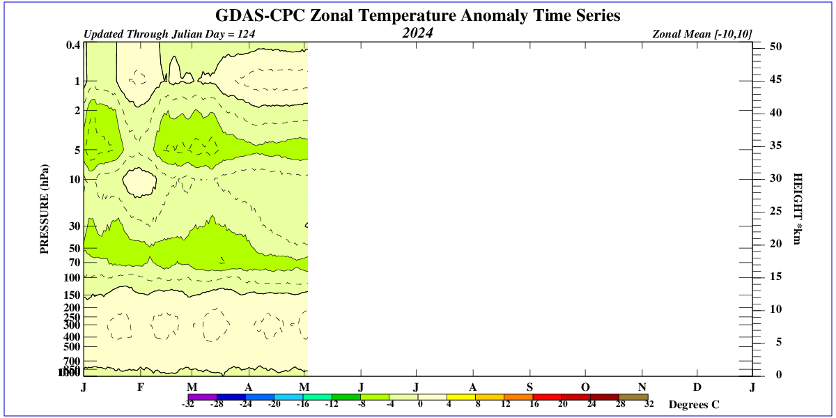
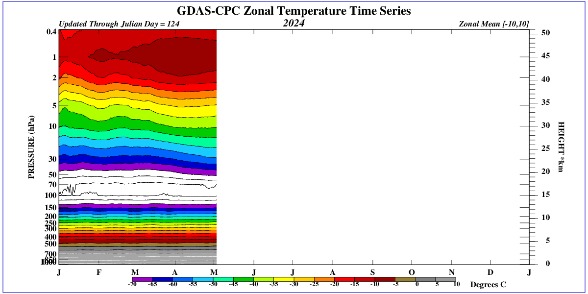
Is there a similar chart for global surface stations?
It seems that the record UAH temps are diverging from the ground stations, which I don’t think the did before.
(I know “global average” is crap, just interested to see the comparison.)
If there is significant divergence, are they going to re-converge after we roll past the hot El Nino lag?
If you know it’s crap, why would you want to see it? It has no physical meaning.
Well, if you look on the right-hand column of this WUWT webpage you can clearly see that the UAH graph for global lower atmospheric temperature is clearly diverging from the US “surface temperature” (as measured/plotted for USCRN).
However, the two graphs represent two completely different measurements sets.
Whether or not they should correlate to each other is scientifically debatable.
The CliSciFi ‘science’ says the troposphere should be warming faster than the surface.
Generally agree. Not a statistician, so take this comment with a grain of salt. I would note for your last sentence that the two do correlate to each other. The question is twofold. How well do they correlate and, more importantly. does the correlation mean anything?
UAH is 70% ocean which has been warming much slower than the land due to thermal inertia. USCRN is 100% land.
“The linear warming trend since January, 1979 now stands at +0.16 C/decade (+0.14 C/decade over the global-averaged oceans, and +0.21 C/decade over global-averaged land).” Roy Spencer, Ph.D.
Since 2005, UAH and USCRN have similar. warming trends. Probably just a coincidence.
I believe UAH has been rising faster than USCRN since 2014, but that is data mining.
Only a complete mathematical clown compares whole of globe with just America and over different time periods as well.. Just DUMB.
From 2005 to 2015, all USCRN, UAH-USA48 and ClimDiv were cooling at insignificantly different rates.
Then a slight bump at the 2016,17 El Nino
Even with the recent El Nino, since 2017 that have all been pretty close to zero trend.
Only the El Nino events have any warming effect in any of the three series.
That statement is incorrect. UAH data does not include measurements of ocean water temperatures. It does include the measurement of lower atmospheric temperatures as they occur over the oceans, but those temperatures can vary greatly from ocean water surface temperatures due to things like prevailing winds, the movement of cold and warm fronts, the development of clouds and storms, the development of El Nino and La Nina events, and the fact that sunlight warms the atmosphere much faster than it warms ocean waters.
If you believe UAH anomalies are not correctly reporting changes in of ocean temperature, please send an eMail to Roy Spencer and John Christy, both science Ph.D. and tell them that they are fools.
Then post another comment here explaining HOW you “know” they are wrong. he is a fool.
You misunderstand (once again!).
I don’t believe, I know. I know for a fact that UAH presents data on lower atmospheric temperatures as measured by instrumentation on orbiting satellites, NOT on ocean (water) temperatures.
It’s reading comprehension 101.
What do they measure? Is the molecule they are measuring available at the sea surface? Asking for a friend?
The microwave sounding instruments used on orbiting spacecraft to derive atmospheric temperatures measure thermal emissions in microwave portion of the EM spectrum from different atmospheric species (e.g., oxygen, water vapor).
The earliest microwave sounding units (MSUs), onboard the National Oceanic and Atmospheric Administration (NOAA) polar-orbiting satellites NOAA-6, -7, -8, -9, -10, -11, -12, and -14 measured thermal emissions in the troposphere and lower stratosphere at four separate microwave frequency bands centered at 50.30, 53.74, 54.96, and 57.97 GHz.
The MSU instrument was retired and replaced by the AMSU-A instrument when NOAA-15 was launched in 1998. For continuity, the four MSU channels were kept by AMSU-A and designated as AMSU-A channels 3, 5, 7, and 9. AMSU-A had eight more temperature sounding channels (4, 6, 8, 10–14) than MSU.
Bottom line: microwave sounding instruments do NOT measure molecules . . . they measure EM radiation emitted by atmospheric constituents due to their intrinsic temperatures.
As regards your second question, when you state “available at the sea surface” are you referring to the liquid side or gas side of the air-water interface?
That was my point. They do not measure the temperature of CO2 molecules nor ocean surface (liquid) temperature.
Since the troposphere in the tropics is warmer a kilometer above the surface, and this effect is not seen near the surface, it is logical that some of the sun’s radiation is retained in the upper troposphere and does not raise the temperature near the surface.
Excellent article!
Related to the indicated temperatures in the graph of “Contiguous US Maximum Temperature – June-August” in the above article, I will just add that if UHI warming effects on those measurements was properly accounted for then the NOAA trending from 1995 to present would be even flatter than shown, with even lower peak values during that interval.
Liars just have to Lie! https://time.com/7019186/superstorm-era-is-here-essay/
The charts need to start back at the end of the Little Ice Age, around 1850.
If they did so, we would see that the 1880’s were just as warm as the 1930’s (according to Phil Jones) and just as warm as today.
What we would really see is the cyclical nature of the climate where, afer 1850, the temperatures warmed for a few decades and then cooled for a few decades and then repeated the process, with the difference between the warmest part of the cycle and the coolest part of the cycle being about 2.0C.
What we would also see is there is no unprecedented warmth in the world as the Climate Alarmists claim. It’s no warmer today than in the recent past, even though much more CO2 is in the air now than was in the air in the past.
So more CO2 in the air has had no impact on rasing the temperatures beyond what they have been in the recent past. CO2, therefore, is a minor player in the scheme of things and the reduction of CO2 is not something we should be doing. We should not bankrupt ourselves over a benign gas like CO2. There is no reason to do so.
A chart with a longer timespane would show this visually.
Well said Tom, the undecided public who generally don’t read blogs of this kind to get their info will remain ignorant of real climate trends. So, we have to get influencers and politicians to sprook the real story about our benign climate and the lack of evidence for dangerous modern warming from any cause, especially human related CO2 or other GHG emissions.
Larry Hamlin is consistent
Consistent data mining baloney
The US is 1.5% of the global surface area
Maximum daily temperatures are 1/2 of average daily temperatures
The Summer is 1/4 of a year
Both USCRN and nClimDiv have been warming faster than global surface trends
USCRN since 2005:
+0.34 degrees C. per decade
nClimDiv since 2005:
+0.27 degrees C. per decade.
This website’s home page continues to post the lie that USCRN has no trend since 2005:
“The US Climate Reference Network record from 2005 shows no obvious warming”
WUWT lie on home page.
Food for leftist fact checkers!
RG is a consistent fungal luser and AGW scam apologist.
Only warming in USCRN or its homogenised twin, ClimDiv, is because of the 2016 El Nino bulge, and now the 2023 El Nino.
From 2005-2015 they were both cooling, and even with the current 2023/4 El Nino is pretty close to zero trend since 2017.
That first statement is clearly falsified by comparing the graphs of UAH global lower atmospheric temperature to that of USCRN data that are given in right hand column of this webpage.
The second statement is falsified by the observation that between 2005 and 2024 (today) the USCRN graph shows an average rise of about 0.5 °C . . . that works out to about +0.25 °C per decade, far below your claim of +0.34 °C per decade.
Those statements are inconsistent: “no trend” is not the same as “no obvious warming”.
And as to the your last statement that I quote above, anyone that believes a trend calculated at 0.25 °C/decade is “obvious” when it is based on average temperature data reported/graphed to a purported precision of about ±0.01 °C (look closely at the USCRN graph) is . . . well, is sorely mistaken and knows nothing about achievable in-the-field temperature measurement accuracies.
I presented accurate data
I do not come here to lie and deceive, as you do
You are a liar about USCRN
That is the truth.
The WUWT home page lies about USCRN and so do you.
I have the data
You have the claptrap.
You appear to be “allergic” to data you do not like.
Your remote, armchair psychoanalysis and ad hominem attack are worth exactly what I paid to get them.
BTW, too many words.
How accurate? How did you determine the accuracy?
I wish some of these folks would post some university lab instructions that allow or even encourage the calculation of ΔT’s that are 1 or even 2 magnitudes less than the the actual resolution that is measured.
So what. According to warmists:
It may be 1.5% of the globe but a much larger % of land!
Richard here is the TITLE of the post:
He was only talking about USA, comprehend…..?
What are the error bars on those 2005 temperature rates?
Steve Milloy’s one-minute video looking at the temperature data: Exposed: Summer 2024 cooler than 1934 in the US
What this highlights is the folly of using daily mid-range temperatures as a metric. They are worthless for telling what is actually happening with climate and anomalies calculated from the worthless metric are even worse.
Rising minimums will raise the mid-range values just like rising maximums will. It should be apparent by now that it is mainly minimum temps pushing the “global average temperature” (based on worthless mid-range temps) higher. But higher minimums are generally *beneficial* – more food, fewer cold deaths, lower heating costs, etc.
The other takeaway is that higher minimum temps do *not* mean higher maximum temps. The maximum daily temp is almost totally driven by the sun and is not dependent on the temperature at sunrise. This can be seen in the variance of temps in the summer and winter. You actually get a higher variance in the winter than in the summer. That’s another knock on the GAT – you can’t just jam variables with different variances into an average value calculation without weighting something to insure you are comparing apples to apples and not to oranges, e.g. NH temps with SH temps (cold vs warm or warm vs cold).
It’s all a statistical crock of rectal output, from the start to the finish. Nor is that denying that it might be getting warmer! The issue is that WE DONT KNOW based on the inane scientific edifice that climate science is today.
What is even crazier is the idea that energy policy should take as its goal the management of something as statistically odd as the average global temperature.
“Record High Election Year Hype”
Political left seems to be abandoning/suppressing it this season.
Deceit:
K. Harris claimed her middle class mother bought their first house in CA when she was 14.
The facts are K. Harris lived in the wealthiest suburb in Canada from age 12 to 18.
The litany of lies continues.
We know she is lying. She knows she is lying. She knows we know she is lying.
And she, nor the damn media care at all.
It may be much worse and deceitful than that. She may not be lying, but purposely and willfully (and very skillfully) misleading and “bending” the truth. Her mother could have (not going to waste my time checking) “bought” the house when she was 14 but not moved in until she was 18. That way she tells a mistruth and lets the listener make the false connection. Then when confronted she can say she didn’t lie about it.
My head hurts…
Depends on your definition of CA.
What is real interesting is running the June-August MINIMUM temperatures and seeing the post 1970’s steep rise.
The Warming Continues.
Right On Schedule, Blizzard On Beartooth Highway… | Cowboy State Daily
“Maximum Summer Temperatures” must be measured with the same instruments, or any comparison requires a correction factor. Liquid-In-Glass instruments take several minutes to record a temperature, but modern platinum thermocouples do it in a few seconds. Do not believe everything you read.