Originally tweeted by Ryan | Forecast (@RyanMaue) on December 24, 2021.
Tonight, I'm going to talk about Temperature Anomaly maps and how they are constructed, used, misused and abused for weather and climate including science and advocacy. This should be fun.
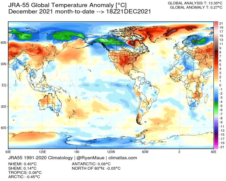
Using weather models or historical observation data, grids are formed of daily, monthly and annual temperatures over a given time period maybe 20 years or 100 years+.
This Period of Record (POR) dataset is then used to select or construct the baseline climatology e.g. 1991-2020.
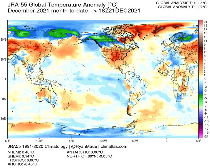
This map is month-to-date gridded Japanese reanalysis data — a type of weather model output from forecasts run consecutively using a modern model but the original data from decades ago. This is meant to faithfully represent the true state of 3D atmosphere & ocean.

The baseline used here is 1991-2020 called the Climate Normal period. You may often see 1981-2010 or 1961-1990 or even 1951-1980. These 3 decade chunks are designed to represent the climate regardless if there are rapid changes or not.
Let's compare with a previous December 2015 during El Niño. The global anomaly is +0.53°C over the 1991-2020 mean, while this December 2021 is +0.27°C. Yes, that is a cooling of 0.25°C if compared directly.
But you wouldn't say global warming stopped because December 2021 is cooler than December 2015. That would be misinformation w/o proper context — and that is the long-term data trend convincingly upward.
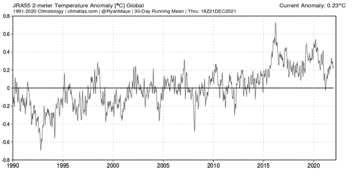
Here's every day T anomaly since 1990 from same Japanese dataset.

This is the daily global temperature anomaly smoothed by running 30 day mean. You should see dramatic spikes on weekly and monthly time scales against backdrop of slow trend of background global warming.
What causes spikes? Ocean and atmosphere primarily thru weather.
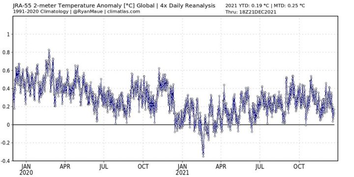
Let's zoom in closer to see the sub-daily changes in global temperature meaning capturing 4x daily the temperature anomaly when Earth is half dark / half sunlight.
Check out the wild swing from -0.4°C to +0.4°C from March 2021 to April 2021. That's +0.8°C in a month. Whoa!
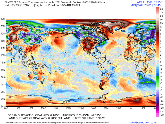
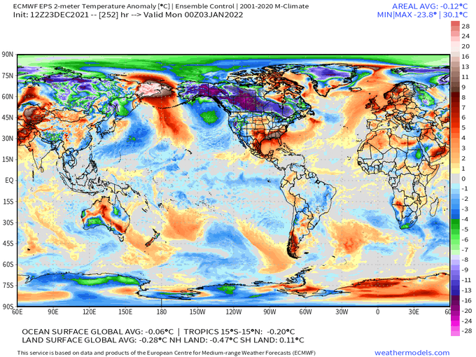
Here's a current example from ECMWF operational weather model. Global T anomaly drops from +0.21°C to -0.12°C in 10 days, a dramatic global cooling by 0.33°C. Yeah, that's entirely weather related on such short time scales — and this is b/c of how cold/warm air affects land.
But I see more red than blue, it's obvious which one is warmer. I'd say that's misleading as the maps are flat projections, and the most extreme values are most assuredly concentrated in narrow or small regions. Plus, this is a snapshot instant while 24-hours different story.
But, I see extremely warm temperatures in United States and the global anomaly is +0.20°C so that's proof of climate change.
That's misleading for 2 reasons:
You can't point to 1% of the Earth and say "climate change" when there's obviously balancing cold elsewhere.
And, you can't compare raw temperature anomalies on different parts of the globe at the same time!
Why? The background variance or typical temperature change on a given day may be +/- 50°F in Alberta or Minnesota vs. only +/- 1°F in the tropics.
You must normalize!
Together, comparing small areas of temperature anomalies on different parts of the globe is doubly misleading, a cardinal sin.
Remember you need to look at the global anomaly on long time scales, not compare daily weather maps.
Next, the color scale 🎨🖌

If you colored the daily temperature anomaly map by only 1 color representing the global anomaly of -0.12°C it would be gray, no signal. A blank gray map. All of the anomalies ranging from -24°C to +30°C all average out globally to gray. Amazing!
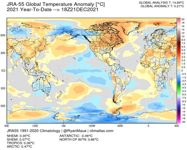
Let's do the same thing for Year to Date. The color scale is chopped in half so gray is +/- 0.25°C but the global temperature anomaly fits just the same.
You can certainly pick out the dominance of La Niña in the Tropical Pacific (colder blue).
Originally tweeted by Ryan | Forecast (@RyanMaue) on December 24, 2021.



Anomalies really should be stated in standard deviations, but explaining that would be a bit of effort. The other reason it is not done is that once deviations are weighted for how much variation exists commonly, it would look a lot less ominous.
“GLOBAL ANALYSIS T: 13.35°C” — hundredths of a degree? 3-1/2 significant digits?
Nonsense.
Arrhenius reported it as 15C about 125 years ago.
As much nonsense as “global anomaly”.
This is what 13.35°C looks like. Highest temperature 39°C and lowest temperature -5°C. You may believe 13.35°C is correct but I don’t.
To be clear, I called the datum in the graph “nonsense”; I certainly don’t believe it.
The thirty year “average” baseline used to calculate the anomaly has an uncertainty in the unit digit at least and probably in the tens digit (e.g. +/- 10C). And we are trying to identify a difference in the hundredths digit?
It’s not really too much effort. Anomalies hide variance. And it is the variance that truly tells you about climate. Standard deviation is just a measure of variance (i.e. just square the SD).
Anomalies really don’t tell you anything about variance of temperatures and, therefore, climate.
” Anomalies hide variance. ”
Just a little bit more of guessing à la Gorman.
The opposite is the case: absolute temperatures hide the variance, while the removal of seasonal dependencies from their deviations from a mean value makes this variance visible at all.
Were you not the one who brazenly claimed some weeks ago that anomalies would be used solely to show the effect of CO2? Or was that a ‘thought’ of the other Gorman specialist?
Anomalies literally show nothing. Trying to average temps from two hemispheres at different seasons is unlikely to provide useful information.
These are periodic phenomena, i.e., cyclical. Especially prior to 1980 or so, temps were recorded to the nearest integer. Trying to coax 1/100ths of a degree from this info is a fools errand. You can’t use statistics to obtain more precision than what was originally measured.
You have never in the past shown any references that state this is ethical or that it can be done.
I have given you multiple references of university chemistry and physics departments along with instructions from certified labs that require not doing this very thing.
Don’t try cherry picking some arcane blog. Show a university textbook or certified lab instructions that allows depicting measurements to have more resolution than what was measured.
“Were you not the one who brazenly claimed some weeks ago that anomalies would be used solely to show the effect of CO2?”
Nope. I think you are hallucinating.
“The opposite is the case: absolute temperatures hide the variance”
Really? The actual data hides the variance in temperature? The fact that summer temps can see a daily 30F change and in the winter can see an even wider daily change somehow *hides* the variance?
Variance tells us the spread of the data values. Anything you do to minimize that spread of data gives you a false representation of the data.
Seasonal temperatures create a multi-modal distribution of temperatures. Simply taking an average of those gives a false representation of the data. Anomalies can’t change that. Anomalies hide what is happening with the data, especially *annual* anomalies.
You can argue that anomalies don’t hide the variance of temperatures till you are blue in the face but it won’t change the facts one iota.
Good suggestion. Thus, turning the “anomaly” into a probability of sorts. However, the standard deviation would likely be period dependent rather than a stationary characteristic.
Good presentation of temperature display problems. The difficulty of detecting, recording, and interpreting world-wide temperature variations is why geologists prefer to analyze the division between H2O in the solid or liquid phase (gas phase being close to common to both) to interpret earth temperature cycles. Simply examine the larger swings of sea level and the general temperature state is displayed. If 150 meters of sea level variation is normal what importance does 10 centimeters have? Terminal moraines, anyone?
Here is a simple question that I have not found an answer too, which is frustrating.
In a gas medium of N2 at a fixed pressure and temperature of 20c and with a sparse water vapor continuum.
What is the total IR power emitted per H2O molecule. I do not want a discusion of the spectrum and on and on…
Just total emitted power? Ignore possible dimer effects…
Equation for?
Thanks
Not sure what you are getting at. Is your reference to power as in work/time?
If the temperature and pressure are fixed, then no work is done.
Just the IR radiated power per water molecule. (Black body if it applies in this case)
The tempature will drop as power radiated.
I am looking for the basic cooling equation for water in a nitrogen atmosphere…
try this…
https://en.wikipedia.org/wiki/Electromagnetic_absorption_by_water#Atmospheric_effects
Within most of the troposphere the recaptured radiaiton cancels out most of the emissions so there is no signicant effect on temperature.
At the top of the troposphere there is a different story…
Since the nature of emissions is quantum the IR energy radiated by each molecule is random but a peak value can be derived from Stephan-Boltzman’s Law I think. However if the radiated energy is reabsorbed by other water molecules it won’t have any net effect on temperature.
So the answer: “It’s complicated”
Yes, I have many texts with the complicated story that ends up with cooling tables and no way to validate simulation not to mention check units.
My desire is to start with basics…
I am tacking down lecture in following reply
Thanks
Multiple variables of which CO2 is a bit player.
“… just total emitted power …”
The equations for thermal radiance, which is emitted by objects whose temperature is greater than absolute zero, are discussed in slide two of this lecture, which focuses on passive microwave emissions from H2O and O2. For these wavelengths, much lower than the black-body wavelengths, the classical Rayleigh-Jeans equation provides reasonable accuracy within 1%.
Very little energy is emitted, but it is very useful for radar imaging etc.
https://topex.ucsd.edu/rs/Lec11.pdf
Thanks, direct link does not work but general search found it.
Per reply above, I am looking for basics of thermal radiation and so on. I understand the complications of absorption and all, I want tools to evaluate simulated cooling tables I find all over with no mention of the basic energy radiation process other than a wave at black body radiation.
Will also be looking for other sources, co2 and so on.
In my mind big one is what happens to latent condensation heat. Seen reports that up to 5% of latent heat is immediatly radiated.
Thanks
Average global temperatures are nonsense.
> 30 discrete climatic regions around the globe, points of measurement totally disparate, diddling with records is omnipresent.
If all this was presented in a public prospectus for stock market investment raising, the promoters would be jailed.
Annual temperature, even at a single location, is a multi-modal distribution tightly tied to the seasons, i.e. the tilt of the earth and the location’s latitude. The usefulness of the average value for a multi-modal distribution is questionable thus creating an “anomaly” from it is questionable as well. It’s even worse when you try to average all those anomalies on a global basis, e.g. Northern vs Southern hemispheres where one is cold and the other is hot – two major nodes!
It’s like creating a distribution of adult male heights from Japan and Sweden and expecting the average to tell you something about the population. Try ordering t-shirts for all of them based on the average height!
Lest anyone forget, the daily ‘average’ is actually the mid-range value of the Tmax and Tmin. It might actually be near the daily true average sometimes, if we actually knew what the daily average actually was.
Mercator or cylindrical map projections distort the relative area of land masses, particularly at the poles. The Arctic is generally accepted to be warming about 3X faster that they rest of the Earth; thus, it distorts the subjective perception of the total warming. For visual presentations, an equal-area projection should be used! It shows two areas of land (or ocean) that are equal in area as having map areas that are equal.
It has long been suggested that careful analysis of Tmax and Tmin differences over time from selected sites away from UHI effects would provide useful data in assessing the influence of CO2 on global temperatures.
Good point about Mercator projections.
To illustrate Mr. Spencer’s point I am surprised that the old TMEAN = (TMAX + TMIN)/2 is still in use.
Or have they caught up with the fact that the true TMEAN based on continuous distribution throughout the day can differ significantly from that produced by the old formula.
For those who never progressed beyond grade 3 or 4 at school, consider the hypothetical class of 20 children, where 10 are exactly 4ft 8ins tall and 10 are exactly 5ft 6ins tall. TMEAN is 5ft 1ins.
A new child joins the class and is measured at 6ft tall. TMEAN, as measured by TMEAN = (TMAX + TMIN)/2, is now 5ft 4ins. But the true TMEAN is still only 5ft 11/2 ins.
Some years ago I raised this with Steven Mosher who explained that because the old thermometric measurements could only produce TMAX and TMIN , climate scientists still used this measure for the sake of consistency. I do not believe that consistency should be allowed to trump accuracy.
For the purposes of comparing to historical temperatures, all that there is are the mid-range daily values. There are no true means to compare to. True arithmetic means are a relatively new development in meteorology.
For calculating the baseline values, from which anomalies are derived, one may have a mix over a 30-year period, but for consistency, one should stay with the mid-range for all the daily and derived monthly temperatures. Therefore, one does not have a true monthly average of daily means; what is available is the monthly mean of daily mid-range temperatures.
The bottom line is that claims are made for the precision of temperature averages and anomalies that are not warranted by either the individual temperature readings or the mid-range values calculated from them.
But, when the public is told that “This year is the hottest ever by 0.01 deg C,” they are not told what the constraints are on the claim. The public then assumes that there is no uncertainty at all in the claim. The public is being fed lies of omission. Perhaps not as reprehensible as lies of commission, but a lie nevertheless.
Solomon Green said: “have they caught up with the fact that the true TMEAN based on continuous distribution throughout the day can differ significantly from that produced by the old formula”
Yes. Everyone is aware of this. It turns out that there is not much difference between the (Tmin+Tmax)/2 and the full integration methods at least since 1979 and for the global mean temperature trend. The BEST, GISTEMP, and HadCRUTv5 warming trends are all +0.19 C/decade. The ERA warming trend is also +0.19 C/decade. Note that ERA integrates every 12 minutes and provides hourly grids.
Mid-range temperatures are not good proxies for actual climate. A range of 30F-50F gives the same mid-range value as 20F-60F.
If the daily temperature profile is assumed to be sinusoidal then the *average* temperature from integration is related to 0.63 x T_max. That is *far* from being equal to the mid-range temperature.
If you want a *true* picture of the climate at some site then look at the cooling degree-day and heating degree-day values for that site. That will give you a *much* better picture of what the climate actually is – it’s what HVAC engineers use to size heating/cooling units. And I assure you these engineers are *far* more concerned with climate at a location than are the so-called climate scientists.
There is absolutely *no* reason why this can’t be done with modern temperature stations. Clyde is correct, sticking with traditional mid-range values is just *easier*. I would *love* to see climate models that predict cooling/heating degree-day values for the next 80 years, especially on a GLOBAL basis. It would quickly become clear that a global metric of temperature is useless. Which is probably another reason why the CAGW advocates won’t move to using cooling/heating degree-days.
Clyde Spencer: “Lest anyone forget, the daily ‘average’ is actually the mid-range value of the Tmax and Tmin.”
That’s true for surface station datasets like BEST, GISTEMP, HadCRUT, etc. Reanalysis datasets like JRA provide aggregates (min, max, average, sum, etc.) based on the integration of sub-hourly timestamps. JRA provides Tinstantaneous, Tmin, and Tmax fields on 3-hour grids. Unfortunately JRA does not provide a Tavg field on either the 3-hour or 6-hour grids, but they do provide a Tavg field on their monthly grid. You derive the daily Tavg by the formula Tavg =(T03min+T03max+T06min+T06max+T09min+T09max+T12min+T12max+T15min+T15max+T18min+T18max+T21min+T21max)/16. ERA has a bit more temporal resolution on its grids which allows for Tavg = Σ[TMINn+TMAXn, 1, 24] / 48.
The point that you appear to have missed is that the various ‘flavors,’ are a new development.
The historical record, which one compares to, to determine the trend of changes, didn’t have these options. For a rigorous comparison of apples to apples, the same statistic should be used, i.e. daily mid-range.
Reanalysis goes back to the 1800’s just like the surface station records. And with the Osman et al. 2021 publication they now go back thousands of years. We don’t want the same methodology used repeatedly. We want different groups using different subsets of available data and wildly different methodologies providing measures of climatic properties just like they do in all other disciplines of science already. And just like this increases confidence of measures in those other disciplines it also increases the confidence of the measure of climatic properties like the global mean temperature as well. Having reanalysis, satellite, radiosonde, etc. datasets corroborating the conclusions of the traditional surface station datasets is a good thing.
Reanalysis does not give you an adequate temperature that can be compared to current measurements. You have no idea that the absolute temperature baselines compare at all! That also doesn’t count the time resolution problem. You simply can’t compare annual temps to 500 year averages, heck not even 50 year averages. What is the single average temp for 1900 – 1950 or 1950 – 2000? What is the average temp for 1521 – 2021?
Temperature is a *very* poor metric for energy in the atmosphere. The energy content at any point in the atmosphere, i.e. its enthalpy, is highly dependent on the absolute humidity at any point in the atmosphere.
It is the *enthalpy*, i.e. the energy content, of the atmosphere that should be of concern, not its temperature. And I sincerely doubt that *any* model even attempts to use the specific heat of CO2 to estimate the enthalpy of the atmosphere at any point.
Assume independence. Add them all up. And get a synthetic value divergent from reality.
If the temperatures are truly random and independent with little or no correlation then when you combine them the variances of each add. Pretty soon your variance and standard deviation becomes so large that the resulting average is useless.
You touch on an important point. Just what is the desired utility of the various measurement statistics that can be calculated? Unless that can be articulated clearly, the numbers tossed around are just an exercise in pushing buttons on a calculator.
One of the apparent common purposes of something like an average global temperature is for alarmists to convince the public that warming is real and dangerous. They do this by showing annual changes of as little as 0.01 deg C, typically while ignoring measurement precision and annual variance in the actual temperatures. It is all disingenuous ‘smoke and mirrors!’
And when you do that, you get statistically significant warming, no matter what data set you use, whether surface or satellite.
Lol…my new Christmas thermometer reads 4 digits 😉
Why do you hate humanity?
Ha ha Derg’s thermometer reads four degrees. He thinks that’ a long term trend.
Do you have a reading comprehension problem? He said “4 digits,” not 4 degrees!
Wouldn’t make any difference. He could have a thousand digits….He still wouldn’t be able to see (or acknowledge) the long term trend is up.
Apparently in the world you live in, there is no such thing as periodicity or even reversals of trends. That appears to me to be a form of climate change denial!
” the long term trend is up.”
And if it is, what’s the problem? Warm is good – life flourishes in the warm.
Cold is bad – disease and famine flourish in the cold
“Statistically significant”? Really? Only if you ignore the variance in your distribution and the significant digits in your calculation.
The calculations used in this calculator incorporate variance (also autocorrendion) and state trend error margins at +/- 2 sigma (>95% confidence).
Over the past 30 years, the best estimate warming trend in every global temperature data set, surface and satellite, is greater than its 2-sigma uncertainty; hence, statistically significant warming.
Sorry, you and the climate scientists leave out so many factors that it is unbelievable.
Your link is a TREND calculator. And it makes the same mistake with uncertainty that all CAGW advocates do. The calculator ignores the uncertainty propagated into each individual data point. It evens classifies uncertainty as “noise” on the signal. Noise? NOISE? Noise is typically considered as random and thus can be cancelled out. Such a definition totally ignores that uncertainty also includes non-random factors that you simply can’t cancel out. Not only that but *NATURAL VARIATION* is not noise.
“the adjusted data of Foster and Rahmstorf (2011) which removes some of the short term variations from the signal.”
Need I say more?
There aren’t any global temperature datasets. Averaging temp readings from thousands of different places does NOT give you a “global temperature”. It gives you some fantasy number that bears no resemblance to reality.
If you look at the JRA graph it’s pretty obvious the 21st century warming started around 2014. So, is there something special about that year that caused CO2 to unleash its pent up warming? Or, could it have been something else? Oh, say like the PDO going positive in February of 2014?
Richard M
It’s pretty obvious that there is a warming trend since the start of the 21st century (and before that). Average temperatures may be higher recently, but shouldn’t we expect that as an outcome of a long term warming trend?
There was no warming from 1940-1980 so your “long term” isn’t all that long. Only around 40 years and about the same as the previous cooling. It appears to have warmed over those 40 years only a couple of times. Here’s the last one.
https://woodfortrees.org/graph/hadsst3gl/from:1997/to/plot/hadsst3gl/from:1997.33/to:2013/trend/plot/hadsst3gl/from:2014/to/trend
And, those times correlate to natural ocean phase changes. Don’t you find that odd? And now, we know from CERES data that they also correlate with reductions in clouds. Hmmm. Even more odd, a very reasonable mechanism
https://www.mdpi.com/2073-4433/12/10/1297/htm.
Using long time scales I think the trend is getting cooler. But I guess it’s a matter of definition, which is not a strong point for alarmists.
Temperature anomalies only work if the change from -1 C to +1 C is just the same as the change from 10 C to 11 C. Considering the substantial differences in energy required to effect the same temperature change, using anomalies to compare temperatures doesn’t make much sense. This is clearly seen in Arctic temperatures where there is pronounced flattening around 0 C because of the substantial amount melting ice. There is no way that a 1 degree change in Arctic temperature is comparable to a 1 degree change in Saharan desert temperature.
Are you not comparing a 2 degree difference to a 1 degree difference?
He is, but it doesn’t change the substance of the argument.
” There is no way that a 1 degree change in Arctic temperature is comparable to a 1 degree change in Saharan desert temperature. ”
This is sheer nonsense.
An anomaly difference of 1 °C in the Arctic is the same as one in the Sahara.
The opposite is true: a difference of 1 °C of absolute temperature in the Arctic is something totally different from the same difference in the Sahara (or even in the Netherlands, he he).
You give the impression to think that the Sahara anomalies and the Arctic anomalies are constructed out of one and the same mean.
Anomalies (i.e. departures from a mean with annual cycle removal) are constructed, using a local mean, station by station on land, buoy by buoy at sea, grid cell by grid cell in the atmosphere.
That is the reason why you can pretty good compare two stations showing different absolute temperatures (due to e.g. different altitudes) on the base of their local departures from a common mean.
Numerically they are the same. However, the practical consequences can be different. The point being that while the difference between two measurements may be the same, where they occur in the possible range can be quite significant! Examples are the freezing of freshwater versus saltwater, or the neutral point on the pH scale.
” Examples are the freezing of freshwater versus saltwater… ”
This is exactly the example you should have avoided.
While I am talking about temperatures, you divert by talking about composite information to be obtained by mixing, for example, salinity and temperature anomalies computed out of the absolute information measured by buoys.
This is something quite different.
I repeat: ” An anomaly difference of 1 °C in the Arctic is the same as one in the Sahara. ”
What matters is how to correctly average them, if wished or needed, into a more global value, by applying the accurate latitude weighting: a 1 degree grid cell at 80°N is way smaller than one at 30 °N.
Yet you are implying that 1 degree at the different locations is caused by a single phenomena, i.e., solely by CO2, yet the energy supplied to each location by the sun is vastly different. How does the use of anomalies account for the different energy levels?
You miss the entire point. You are assuredly a mathematician and not a physical scientist. The big difference between the two locations is enthalpy. Enthalpy is the measurement of energy in a thermodynamic system. Enthalpy of the atmosphere depends on factors like absolute humidity, the specific heat of dry air and the specific heat of water vapor, and temperature.
If absolute humidities are different at two points then different amounts of energy are required to raise a volume of air 1C.
This has nothing to do with grid size. Nor is it apparently included as a weighting factor when combining temperatures into an average.
I see someone gave me a down check instead of actually specifying where my assertion is wrong. Typical for the CAGW advocates.
h = h_a + Hh_g
h – enthalpy
h_a – specific enthalpy of dry air
H – humidity ratio
h_g – specific enthalpy of water vapor
h_a = (c_pa)T where c_pa is the specific heat of air and is considered to be a constant
H = m_v / m_a
(m_v is the mass of water vapor and m_a is the mass of dry air. This is usually called the absolute humidity)
h_g is obtained from the steam tables for a specific temperature.
What this leads to is the following. As temperature goes down with altitude so does the enthalpy. As the absolute humidity goes down with altitude so does enthalpy (i.e. m_v goes down meaning less water vapor in the volume of air, ultimately m_v goes to zero)
The term H * h_g could be considered to be the “latent heat” of water vapor. As that water vapor exits the volume of air (rain, snow, etc) that contribution to the enthalpy of the volume of air is lost.
note 1: You can get close even without steam tables. Assume h_g = 2500 + 1.84T. 2500 is the specific enthalpy of water vapor at 0C. 1.84 is the specific heat of water vapor at constant pressure.
note 2: This process should be familiar to anyone designing air conditioning equipment. I sincerely doubt very many CAGW advocates (be they scientists or mathematicians) are familiar with this. It’s one reason the climate models are a joke.
Sir, we are using temperature as a proxy for energy, which is what we really want. Equal temperature changes do not mean equal energy changes. A humid atmosphere has a higher heat capacity than a dry atmosphere. The amount of energy going into a phase transition is not well represented by the change in temperature either. Take a glass, add ice cubes and water, and allow it to melt while stirring. Heat goes in, melting the ice, but the temperature does not change at all until all the ice is melted. This happens every day where ice and water meet, but is poorly reflected by the temperature change. Same with the tropics. An increase from 38°C to 39°C results in a significant increase in the evaporation rate over a change from 10°C to 11°C. There again, a lot more heat is moving but the temperature change is still 1°C. Using long-term trends from well-sited stations helps reduce this because we are comparing apples to something closer to apples than oranges. However, infilling ruins this because you don’t have the same conditions at each thermometer. The climate scientists do a temperature average when they ought to be doing an energy balance, which is harder to do.
See my reply above.
I’m talking about temperature, and you talk about the composition of temperatures with other phenomena like humidity.
That is what is done in models (where the composition schemes are way less trivial).
Yet all the propaganda is about 1/100ths of a degree in the GAT. The hottest evah!
Why do we never see any discussion about the different projections from models? Are all the models correct? Tell us which one you BELIEVE in!
You simply cannot ignore enthalpy. Is the altitude of stations included in their recorded data? It isn’t in any data I’ve looked at. Is humidity recorded in station data prior to 1980? After 1980? I sincerely doubt it.
How do the models compensate schemes work when they don’t even have the pertinent data?
Loren,
Don’t let bindidon fool you. You have it absolutely correct. He is a mathematician that has very little knowledge of physical science. When he says “the models compensate for this” he’s making an unsupported assumption and calling it a “fact”. Since absolute humidity and elevation are not recorded data for most stations then “tuning” a model to match only past temperature data is a fools errand. Temperature is *not* a good proxy for actual energy in a thermodynamic system.
You totally discount the energy involved at different points on the earth. Also the energy the anomalies portray. That is part of the problem you have in using averages of various locations. The sun’s energy is not an average value at every point on the earth. Even long term averages at different points can not remove the errors caused by ignoring supplied energy from the sun.
Yes, and as I have recently had pointed out to me, it isn’t just a matter of the instantaneous solar flux that has to be considered, but the total energy received at the surface, which varies with the length of daylight, i.e. with the seasons.
There definitely needs to be grey colour for the smallest +/- interval. Not doing that is dishonest.
And, does this actually predict what the weather(climate) will be next week?
Weather prediction, along with climatology, has always fascinated me. How could so many credentialed folks be so wrong so consistently about what the daily/weekly/monthly variations in temps, etc. and still get paid handsomely for it. I should have gone into the weather prediction field.
The earth is gonna do what it is gonna do and “man” is unable to change that fact.
Just sayin’.
Funny you bring that up. Was looking at a couple of weather sites with a friend last night. He said the one he uses is very accurate. Prediction for this morning: 40F with no precipitation. Woke up this morning to 33F and two inches of snow.
I’ve never yet read a convincing argument for temp anomalies against pure temp records.
The claim is that anomalies provide a way to do better interpolations for missing station readings because it normalizes altitude differences between nearby stations.
However, they should then convert the anomalies back to actual temperatures, which they rarely do.
BERNARD STEPHEN FITZGERALD
A good stuff for you to read:
http://www.drroyspencer.com/2016/03/uah-v6-lt-global-temperatures-with-annual-cycle/
Temperature anomalies as used everywhere are not simply values relative to e.g. some 30-year average; they are constructed such that for e.g. monthly data, each monthly anomaly is not the difference between its absolute value and the global mean, but the difference between its absolute value and the global mean of the same month.
This is what Roy Spencer names ‘removing the annual cycle’: while absolute temperatures show what is warmest and what is coldest, anomalies with annual cycle removal show what is warmer and what is colder than a mean, independently of the original, absolute value.
This is the reason why, when sorting anomaly-based time series in descending order, you often see winter months at top, while a sort using absolute temperature invariably will show summer months at top.
Furthermore, anomaly-based time series allow to compare data which at a first glance appear not comparable, e.g.
or
Simply because their temperature ranges are so different (about 60 K for LT vs. LS).
Years ago, I made three graphs comparing, for the second example (LT vs. LS)
1.
2.
3.
From my personal point of view, I would prefer alternative (3), regardless whether I look at the two series as a layman or would have to develop some software comparing them.
The climate is the *entire* temperature profile at a location and is based on the absolute temperatures.. The difference between an absolute temperature and the global mean of the same month gives you no information about the actual climate at any specific location. First, the global mean is an average of a multi-modal data set. Thus the global mean is useless to begin with. It would be like calculating the mean of the adult male heights in Japan combined with the adult male heights in Sweden. What does the mean actually tell you that is useful to know? If you use that mean to create an anomaly with the heights of men in Mexico just what does that anomaly tell you about the men of Mexico?
”
The enthalpy of the atmosphere is totally different at the surface and in the lower troposphere. You can’t compare energy contents at the two locations using only temperature. Absolute humidity plays a significant role. This is just one of the major flaws in climate science today.
”
Same problem. Different enthalpies in both. Big difference in humidities and thus in actual energy content.
BERNARD STEPHEN FITZGERALD
Another, more recent example: a comparison of about 130 USCRN (Climate Reference Network) stations with about 4,000 other stations available in theGHCN daily data set:
I can’t even imagine comparing them using absolute values.
The comment preceding this one is… awaiting approval 🙂
Why? Tell us what is so hard about comparing absolute values? You can calculate averages very easily with a computer!
Maybe it has more to do with how they are displayed on a graph!
0.05° / 25° = 0.2%
0.05°/ 2° = 2.5%
That’s 150 times the change in absolute temps. If you wanted to alarm people, which value would you use?
Or even 0.05° / 300K = 0.02%
” Tell us what is so hard about comparing absolute values? You can calculate averages very easily with a computer! ”
Yeah.
Anyone who claims s/he would better understand what happens when looking at absolute temperatures
than at anomalies with annual cycle removal like shown above, proves that s/he never and never analyzed any temperature series.
And indeed: that is the impression I get when looking at what the Monte-Carlo and the Gorman’s write everywhere on this blog.
They all remind me much more retired teachers than former engineers.
*
By the way, these absolute temperatures pretty good confirm what Roy Spencer told years ago, namely that removing their annual cycle contributes to better trend estimates.
Absolute trend: -0.2 ± -0.9 °C / decade
Anomaly trend: +0.2 ± 0.1 °C / decade
And… why is the anomaly trend suddenly positive, instead of keeping negative like the absolute trend?
That happens because making all monthly departures relative to their own monthly mean in the baseline reveals things kept invisible when looking at absolute values.
When you sort, for the period 2007-2021 (where at least 100 USCRN stations are active) the monthly absolute values, you obtain at the top:
2007 8 22.33
2007 7 22.22
2009 7 21.58
2011 7 21.57
2008 7 21.52
2016 7 21.44
2010 7 21.42
2012 7 21.37
2019 7 21.35
2017 7 21.31
Comparing the anomalies however gives:
2014 12 1.91
2015 12 1.78
2016 2 1.56
2016 1 1.35
2016 3 1.29
2015 10 1.10
2007 1 0.99
2016 4 0.97
2018 5 0.89
2016 11 0.88
Suddenly, lots of winter months get pushed atop! So what?
Nota bene: This has nothing to do with anomaly building: it is in the data.
Reconstructing absolute values out of the UAH anomalies for the lower troposphere also gives winter months a the top of a sort, but the trend for the absolute values is the same as that for anomalies.
Some late scrambling happened here.
The end should of course read:
Reconstructing absolute values out of the UAH anomalies for the lower troposphere gives like all absolute temperature series winter months a the top of an ascending sort and vice-versa, but the trend for the absolute values is the same as that for anomalies.
You are going on and on and then show a negative trend for absolute with a large variance while the anomaly is a small positive trend with a small variance.
Does this not make you wonder how well anomalies represent what is happening?
The problem is that the variance of the average is less than the average of the variance. Thus when first averaging the calculated error is less than the true error.
For example: You cannot project daily temperatures using monthly averages because the average is independent of the variance. Two locations with widely different variance can have the same average..
Similarly you cannot project monthly temperatures from annual averages. Or annual temperatures from decadal averages.
Thus the use of averages in climate science to reduce computational complexity has led to an incorrect and misleading estimate of natural variability.
Nice sentences, but… what about showing data like time series, proving the correctness of your claims?
It’s plain easy to write such things!
Can you write a time series from an annual anomaly temp that gives the involved absolute daily or monthly temps or even the involved daily or monthly anomaly temps? How about devolving the variances associated with each?
If these are easy, describe the equations to do so!
Do it yourself, Gorman, I am not your lackey.
Ed Fox is *NOT* your lackey either!
“It’s plain easy to write such things!”
You indicated it is very easy to do! So do it if it is so easy.
Show us how you include periodic functions (trig functions)?
If I give you an average temp of 30F then what was T_max and T_min? If I give you an anomaly of 0.02F then where were the temperatures that form the anomaly?
My guess is that you can’t. If you can’t then you can’t write an equation for a time series to show what Ed asserts.
You may be able to write equations, but you really should learn some logic. Understanding the meaning of the operation you are performing is critical to understanding it’s usefulness. Ed Fox’s explanation is very logical and does not need a time series to prove correctness. Correct math based on absurd assumptions does not explain the real world.
The temperature anomaly metric is one of diverse instrumental, analytical, model, and presentation choices that contribute to the propagation of errors that underlie the lack of skill to hindcast and forecast climate change.
Nice sentences, but… what about showing data like time series, proving the correctness of your claims?
It’s plain easy to write such things!
The diverse errors are documented. The propagation of errors was previously reported. The lack of skill to hindcast and forecast is attested to by domain experts including Pielke Sr. and Jr.
” The diverse errors are documented. ”
Then show us that all, n.n. I’m not your lackey.
And where was the “propagation of errors” previously reported?
Folks, I’m guessing it’s from the same, fatally flawed “Propagation of Errors” paper referenced here, and only here…
Cut and paste is a great strategy.