By Andy May
I had a very interesting online discussion about CO2 and temperature with Tinus Pulles, a retired Dutch environmental scientist. To read the whole discussion, go to the comments at the end of this post. He presented me with a graphic from Dr. Robert Rohde from twitter that you can find here. It is also plotted below, as Figure 1.

Rohde doesn’t tell us what temperature record he is using, nor does he specify what the base of the logarithm is. Figure 2 is a plot of the HadCRUT5 temperature anomaly versus the logarithm, base 2, of the CO2 concentration. It is well known that temperature increases as the CO2 concentration doubles, so the logarithm to the base 2 is appropriate. When the log, base 2, goes up by one, it means the CO2 concentration has doubled.

In Figure 2 we can see that the relationship between CO2 and temperature is close to what we expect from 1980 to 2000, from 2000 to today, warming is a bit faster than we would predict from the change in CO2. From 1850 to 1910 and 1944 to 1976 temperatures fall, but CO2 increases. From 1910 to 1944 temperatures rise much faster than can be explained by changes in the CO2 concentration. These anomalies suggest other forces are at work that are as strong as CO2-based warming.
Figure 3 is just like Figure 2 but the older non-infilled HadCRUT4 land plus ocean temperature record is used.

The HadCRUT4 record is not infilled, just actual data in sufficiently populated grid cells, and it shows the well-known pause in warming from 2000 to 2014, shown in green. Compare the green region in Figure 3 to the same region in Figure 2. They are quite different, even though they use essentially the same data.
So, with that background let’s look at a plot like Robert Rohde’s. Our version is shown in Figure 4. The various periods being discussed are coded in the same colors as in Figures 1 and 2.

The R2 (coefficient of correlation) between Log2CO2 and temperature is 0.87, so the correlation is not significant at the 90% or 95% level, but it is respectable. Here we need to be careful, because correlation does not imply causation, as the old saying goes. Further, if CO2 is the “control knob” for global warming (Lacis, Schmidt, Rind, & Ruedy, 2010), then how do we explain the periods when the Earth cooled? The IPCC AR6 report also claims that CO2 is the control knob of global warming on page 1-41, where they write this:
“As a result, non-condensing greenhouse gases with much longer residence times serve as ‘control knobs’, regulating planetary temperature, with water vapour concentrations as a feedback effect (Lacis et al., 2010, 2013). The most important of these non-condensing gases is carbon dioxide (a positive driver)”
AR6, p. 1-41
Jamal Munshi compares the correlation between temperature and CO2 to the correlation between CO2 and homicides in England and shows the homicides correlate better (Munshi, 2018). Spurious correlations occur all the time and we need to be wary of them. They are particularly common in time series data, such as climate records. Munshi concludes that there is “insufficient statistical rigor in [climate] research.”
Figure 5 shows the same plot, but using the older HadCRUT4 record, which uses almost the same data as HadCRUT5, but empty cells in the grid are not infilled.

In Figure 5 the coefficient of correlation is worse, about 0.84. This record also has the same problem with reversing temperature trends as CO2 increases. HadCRUT4 shows the pause better than HadCRUT5, but oddly, the trend is a better match to the CO2 concentration.
Conclusion
I’m not impressed with Rohde’s display. The coefficient of correlation is decent, but it does not show that warming is controlled by changes in CO2, the temperature reversals are not explained. The reversals strongly suggest that natural forces are playing a significant role in the warming and can reverse the influence of CO2. The plots show that, at most, CO2 explains about 50% of the warming, something else, like solar changes, must be causing the reversals. If they can reverse the CO2-based warming and overwhelm the influence of CO2 they are just as strong.
Works Cited
Lacis, A., Schmidt, G., Rind, D., & Ruedy, R. (2010, October 15). Atmospheric CO2: Principal Control Knob Governing Earth’s Temperature. Science, 356-359. Retrieved from https://science.sciencemag.org/content/330/6002/356.abstract
Munshi, Jamal (2018, May). The Charney Sensitivity of Homicides to Atmospheric CO2: A Parody. SSRN
What a tangled web we weave …..
GIGO.
You look at the relationship between temp and CO2. You find a convenient correlation.
I would humbly suggest that you look at the relationship between the temperature corrections and CO2.
This one here is USHCN, but as we all know all the surface temperature data sets track each other very well. (I think we all know why) So what we can say for one, we can say, at least to some extent, for the others.
Check out the correlation coefficient.
(click to embiggen)
What adjustments are you looking at? Why are you only looking at USHCN?
The adjustment is the correction factor added going from “Raw” to “Final”. USHCN used to have a fair (with reservations) explanation of how the whole thing was done. Maybe they still have that page up, I have not looked in a long while.
Anyway, USHCN is a good go-to data set for this because they publish the correction factor data set along side the temperature data set. I do not know if anybody else is so up-front with the corrections that get added in.
Fair note:
That is not my graph, lazy and in a hurry, I swiped it from RealClimateScience, proper attribution. Eventually I will get around to making up my own.
USHCN became obsolete in 2014, and NOAA has not used it to calculate US averages since. The corrections were dominates by TOBS, which is an issue which comes from the volunteer COOP network; global indices to not make a TOBS correction.
Obsolete? Because it didn’t match well enough? When is data obsolete?
In fact WUWT had innumerable complaints about the USHCN dataset. NOAA replaced it in 2014 with a bigger and better one.
Not that it makes much difference. The USHCN average matches the USCRN average almost exactly, as well as the new ClimDiv average.
“The corrections were dominates by TOBS”
OK, why are TOBS correlated to 0.973 with CO2 ?????
TOBS is Time Of Observation Bias. Why on Earth would as Observation Bias be correlated with Atmospheric CO2 ?????
I Know! I Know!!!
The temperature observers breathed too much CO2 and slowed down, therefor the readings are earlier than reported. The data needed to be corrected. You slow down so much when you breath too much CO2.
I hate when that happens.
We’re relying on Tony Heller for these numbers, with USHCN averages that he calculated himself, not NOAA. I haven’t seen any other source for the claims.
But whatever, it is an obsolete index for a restricted part of the world with some particular adjustment issues.
False, he uses the USHCN data as pointed out at his blog, in fact he even posted the CODE script to downloading it effectively:
Python3 Script For Getting USHCN Monthly Temperatures
Posted on October 6, 2019 by tonyheller
Excerpt:
This script gives easy access to USHCN monthly raw, TOBS and Final adjusted temperatures.
Getting the data:
wgetftp://ftp.ncdc.noaa.gov/pub/data/ushcn/v2.5/ushcn.tavg.latest.FLs.52j.tar.gzwget
ftp://ftp.ncdc.noaa.gov/pub/data/ushcn/v2.5/ushcn.tavg.latest.tob.tar.gzwget ftp://ftp.ncdc.noaa.gov/pub/data/ushcn/v2.5/ushcn.tavg.latest.raw.tar.gz
A lot more in the LINK
USHCN was based on a subset of COOP stations. Of course, many of them still exist and report data, which you can download.
But NOAA does not use that subset of station data to calculate a national average. It uses a much larger set, nClimDiv. I have long challenged you to produce any NOAA national average post 2014 that is based on USHCN. You have never done it. All the USHCN averages since then are created by Tony Heller, using his flaky methods. And that is what is in these graphs.
You were replied repeatedly on this, which is why I think you are deliberately avoiding it.
You repeatedly stated it was “obsolete” when the NOAA themselves say it is being used up to this day and that COOP is still running to this day as well, here is what the NOAA says about USHCN:
U.S. Historical Climatology Network (USHCN) data are used to quantify national and regional-scale temperature changes in the contiguous United States (CONUS). The dataset provides adjustments for systematic, non-climatic changes that bias temperature trends of monthly temperature records of long-term COOP stations. USHCN is a designated subset of the NOAA Cooperative Observer Program (COOP) Network, with sites selected according to their spatial coverage, record length, data completeness, and historical stability.
LINK
What it says about the still running COOP:
What is the Coop Program?
The National Weather Service (NWS) Cooperative Observer Program (Coop) is truly the Nation’s weather and climate observing network of, by and for the people. More than 8,700 volunteers take observations on farms, in urban and suburban areas, National Parks, seashores, and mountaintops. The data are truly representative of where people live, work and play.
LINK
=====
Never once said that USHCN is generating the “national average” you made it up which I call a lie since I never disputed ClimDiv being the current set up, it NEVER replaced USHCN because they are two very different database set ups as clearly shown once again from the NOAA:
NOAA’s Climate Divisional Database (nCLIMDIV)
This dataset replaces the previous Time Bias Corrected Divisional Temperature-Precipitation Drought Index. The new divisional data set (nCLIMDIV) is based on the Global Historical Climatological Network-Daily (GHCN-D) and makes use of several improvements to the previous data set.
LINK
You keep saying USHCN is OBSOLETE that is what I keep disputing and YOU keep avoiding the hard evidence that the NOAA still updates the data daily and is part of the still running COOP set up.
They don’t consider it obsolete at all and your repeated lies on this fails at the feet of what the NOAA says about it.
You need to stop calling it Obsolete, which you keep doing over and over, it is a LIE which you need to stop making.
What is the right amount of CO2?
Nick, why do you continue to mislead and LIE about it?
I gave you hard evidence that the NOAA is still using it and collecting the data every single day, yet you ignore it, why?
When different databases have different data one doesn’t simply denigrate one over another. You may chose one over another because it provides you with data that you like or because it gives you the output you desire. That doesn’t make the others WRONG, obsolete, or otherwise unusable. To claim otherwise is simply practicing propaganda.
My problem with Nick is he keeps stating it is “obsolete” when the NOAA doesn’t see it that way which is why I keep posting what the NOAA says about it, he ignores a lot of it to promote another lie that “nClimDiv” replaces the USHCN when the NOAA does not agree with that either, quoting the NOAA:
USHCN was never replaced or shut down after 2014 as Nick idiotically claims, quoting him:
It was NEVER replaced at all, as shown here of another quote from the NOAA:
bolding mine
his lies are getting more and more obvious.
NOAA says “This dataset, called nClimDiv, replaced the previous operational dataset, the U.S. Historical Climatology Network (USHCN), in March 2014.” [1].
Very good to show this but you didn’t quote this part at all which again supports my contention that it isn’t obsolete as Nick claims over and over:
USHCN is still being updated every day as shown here from the NOAA FTP link
Andy May went over this just a year ago showing that USHCN still exist and running as a database up to today.
Recent USHCN Final v Raw Temperature differences
It is clearly not obsolete and still being updated every day by the NOAA.
Are you thinking of another data set, Nick? The NOAA US Centers for Environmental Information (NCEI) website describes the USHCN data this way: “U.S. Historical Climatology Network (USHCN) data are used to quantify national and regional-scale temperature changes in the contiguous United States (CONUS). The dataset provides adjustments for systematic, non-climatic changes that bias temperature trends of monthly temperature records of long-term COOP stations. USHCN is a designated subset of the NOAA Cooperative Observer Program (COOP) Network, with sites selected according to their spatial coverage, record length, data completeness, and historical stability. ”
Doesn’t sound obsolete to me.
You know very well what the corrections are, Bellend, and you know that USHCN selected only the most reliable stations that have continuous records and are located where the UHI correction is minimized. How do I know that you know? You and I had this discussion only a week ago, when you lied and said that recent corrections are quite small.
So why are you faking like you don’t know?
I asked because I see the word “adjustments” used to mean many different things. It can be any change to raw data, it can mean any change from one version of a data set to another, it can mean using weighted averaging or any other statistical technique. Anything to distract from the actual rise in temperatures.
I’ve seen unsourced charts like this one used all the time, with no explanation as to how the figures were derived. Without that information why would any skeptic take it on trust that the graph is an accurate reflection of anything?
Could you point me to the comment where you claim I lied to you?
What is the right amount of CO2?
‘Click to EMBIGGEN’?
This is the sort of language a three year old child might use! The correct word is ‘enlarge’ of course.
Are you by any chance an American?
I guess humor is lost on some people.
embiggened cromulence was one of my favorites.
Or a fan of The Simpsons.
Sounds like someone needs to read up on their “Homerisms“.
Your is the sort of comment made by an old person who doesn’t know any cultural references.
The episode’s 25 years old. You don’t have to be that young to get it.
Correlation is not the only problem. The values of the “global temperature” calculated from the data of the 19th century and according to modern data are unlikely to be reliably comparable. Both the number of meteorological stations and the distribution are significantly different (see maps: https://climateaudit.org/2008/02/10/historical-station-distribution/). The same applies to measurements of CO2 concentration in the atmosphere: frequency and location of sampling, accuracy of analysis. How accurate is the primary data on which the correlation is based?
And, of course, various authors have repeatedly said that, firstly, the correlation itself is not evidence of a causal relationship and, secondly, a change in temperature may be the cause of a change in the concentration of CO2 in the atmosphere, and not vice versa.
Exactly! With Covid lockdown, global industry/transportation emissions of CO2 were down 5.5%, but actual content of the atmosphere was unchanged, because the lowered partial pressure of CO2 resulted in increased outgassing from the oceans. So, yes. A temperature rise results in ocean outgassing and so does reduction partial pressure.
There is a lot more going on with CO2 than the climateers think. Passage of a huricane over the sea also causes outgassing!
If CO2 increase is causing temperature increase shouldn’t the CO2 increase precede temperature increase instead of rising together as shown in these graphs?
In 8 Ice Ages, the temperature change preceded the CO2 in 16 of 16 cases (beginnings and ends). By about 600+- 400 years. Highly correlated. Doesn’t prove that temperature causes CO2 change (although one might consider Henry’s Law) but it DOES show CO2 could NOT be causal.
This is the stake through the heart of the CO2 hypothesis.
Henry’s Law is almost certainly the explanation as other trace gases (methane, nitrous oxide, xenon) show the exact same behaviour.
Does rising temperature cause outgassing of CO2 from the oceans (decreased solubility) and land (increased consumption of organics in the soil by bacteria/fungi ==> CO2)?
If so how much? Enough to account for the correlation seen in the graphs in the article?
“The R2 (coefficient of correlation) between Log2CO2 and temperature is 0.87, so the correlation is not significant at the 90% or 95% level, but it is respectable”
That’s not how you calculate significance. I don;t have the data to hand but I’m sure the correlation is significant well above the 95% level.
You appear to be faking like you know statistics, Bellend. You don’t have the data, but you’re “sure” that the correlation is “significant well above the 95% level”. In order to know the significance you would need both the data AND the errors in that data.
Why are you fabricating phony statements? Is it just to cast aspersions on an honest piece of work by Andy? If that’s your motivation you’ve failed.
This constant word play on my name might be effective if it wasn’t already a self-depricating pseudonym.
I’m sure the correlation is significant, becasue I’ve calculated numerous times in the past with different data sets and it always shows a statistically significant correlation, because I know that an r^2 of 0.87 is significant when looking at almost 200 years worth of data, and because it’s self evident just from eyeballing the graph.
Here’s my own graph comparing HadCRUT4 data with log2 of CO2.
I make the r^2 value 0.85 and the p-value is 2.2e-16. So yes, I thing the correlation passes a 95% significance test.
Stick with the p value evaluation. Looking at R^2 is worthless. If R^2 had any statistical meaning, it wouldn’t change when the plot was partially or totally detrended.
For once, I’m going to have to agree with you. Any time a linear regression explains or predicts more than 87% of the variance in the dependent variable, I don’t see how it cannot be statistically significant with several data samples. The actual correlation coefficient is greater than 0.93, which is an excellent correlation in anybody’s book! The problem is usually when the correlation coefficient is very small and there is a question as to whether there is a trend, or the dependent variable is constant.
Andy has used an unfamiliar term for R^2; it is usually either just called “r-squared” or the “Coefficient of Determination.”
For the fence sitters, it might be useful to read this:
https://people.duke.edu/~rnau/rsquared.htm
Fabulous, I was looking for something like this.
Just Like This.
Clyde Spencer for the win!
Clyde, great read and perfect. When I get time I need to figure out a way to analyze the correlation between CO2 and temperature properly, taking the fact they are both increasing time series into account. R^2 is not a good statistic for time series, especially when they are long and both increasing.
Andy,
Correlation is fundamentally an index of how the dependent variable changes with changes in the independent variable. It has limits of +/-1, with the correlation coefficient being identical to the slope of the regression line. When the correlation coefficient is near zero, it implies that there is no relationship. The dependent variable is constant. That is the situation where the statistical significance becomes questionable.
Something you might consider is to de-trend the scatter plot by subtracting the regression line. Then calculate the standard deviation (SD) of the residuals. The larger the SD, the greater the variation in the dependent variable. It is a measure how much the dependent variable varies over the time interval of measurement. However, because it is essentially constant, the spread and probability distribution are described by the SD or its standard error.
why do we start out assuming that temp is the dependent variable.
It is mathematical convention to map the independent variable to the x-axis. We are dealing primarily with time-series. Time continually changes, and only increases. Therefore, it is commonly treated as an independent variable that we have no control over. You can swap axes if you want. However, it doesn’t make any sense to assume the temperature affects time!
I wouldn’t think time ‘affects’ temperature much either.
How does temperature affect CO2 concentration?
Thanks Clyde, when I get a break I will try that. Good idea.
Andy,
Only one of the two parameters you mention has been on a continuously-increasing trend over time and that is atmospheric CO2 concentration.
If one objectively examines the variation of GLAT over time, one finds a large interval where GLAT decreased with time (the 30 year interval from 1945 to 1975) and the more recent interval of the last seven years where, per UAH data, there has no statistically significant increase in GLAT despite atmospheric CO2 concentration increasing by some 3+%(ref: WUWT article at https://wattsupwiththat.com/2021/11/09/as-the-elite-posture-and-gibber-the-new-pause-shortens-by-a-month/ )
Even though the temperature data is more questionable in terms of accuracy and areal coverage, one could also look back to the earlier period of 1880 to 1910 (slightly after 1850, the generally accepted start date for the Industrial Revolution) when there was another 30 year period of decreasing GLAT.
Linear or even logarithmic curve fits over a hundred or more years easily hide the fact that there are significant periods of anti-correlation of atmospheric CO2 concentration to increasing global temperature.
In statistics, the reliability of the correlation coefficient is determined by comparing it with the critical value of the Pearson coefficient for a given number of pairs. https://www.real-statistics.com/statistics-tables/pearsons-correlation-table/
Co variants, not dependent.
I am reminded of the correlation between ‘ice-cream sales’ and ‘drownings’ in Florida, or the ‘murders’ correlated to the number of ‘Churches’.
You can find any number of spurious correlations on line. The name of the game is to find which are and which aren’t. In this case, not….
I believe that “covariant” is more properly restricted to analysis of variance with multiple independent variables.
Calling something a “dependent” variable when considering the behavior of the data points on the ordinate versus the abscissa only speaks to the simple mathematical relationship of the points on a 2D scatter plot. It does not imply a physical cause and effect relationship. There is nothing wrong with referring to a data point as the dependent variable when dealing with a spurious correlation. The point is, one has a representative function of the form y = mx +b, where y is determined by the factors on the right-hand side.
You have to be EXTREMELY careful when looking at the relationship between two time series that are both increasing (or decreasing come to that) because these will ALWAYS give you a correlation, with a high R-squared and a strong p-value.
All you’re doing by taking the log of the data is effectively enabling it to be used in a linear regression.
None of this means there isn’t a relationship but the analysis done here proves absolutely nothing.
It’s worth saying that this is one of the biggest traps into which climate science can fall — and it’s used all the time to hoodwink people.
How very true, thank you.
The climate alarmist data manipulators are well aware that a poor correlation between CO2 and temperature falsifies their hypothesis. That’s why they had to torture tree ring data to eliminate the MWP and LIA and continually are adjusting the historical record to produce a better correlation. We all know that correlation does not prove causation, but lack of correlation disproves it.
Forget about the pre 1976 part. There is no good correlation anyhow. There is a warming trend since then, but from that alone there is no way to conclude it had to be from CO2..
“This result shows the increased cirrus coverage, attributable to air traffic, could account for nearly all of the warming observed over the United States for nearly 20 years starting in 1975..”
https://www.nasa.gov/centers/langley/news/releases/2004/04-140.html
More importantly however, we know it can not be CO2, and that is the part all you sillies are missing. GHGs do not stack! There are overlaps, not producing multiple GHEs, but only one. That is the reason why in the literature you find terms like “single factor removal” and “single factor addition”. You could translate it into net- and gross- GHE of the respective agents.
The same thing applies to any change in GHG concentration. Only the net growth matters, not the gross growth. And this makes all the difference. Other than models, which stack gross GHEs, modtran can not lie, and so it produces just the result below. It is not the whole truth, but a finger pointing out the most important issue..
https://greenhousedefect.com/the-holy-grail-of-ecs/the-2xco2-forcing-disaster
ES, I take the liberty again of adding the 3200 ppm CO2 case to your 400 and doubling to 800 ppm cases. So this represents a very extreme case with huge amount of CO2 in the atmosphere, comparable to burning more than double all available fossil fuels. This would take about 5 centuries for humanity to accomplish, plus fossil fuel extraction would become more expensive than nuclear power long before that point. The temperature offset shows how much the expected warming would be.
The high correlation does not necessarily imply causality. Given that a lot of CO2 is dissolved in the oceans, and that the solubility of CO2 in water decreases with rising temperature, in the absence proof either way, it is equally likely that rising CO2 levels in the atmosphere is a RESULT of warming, rather than a cause.
Good comment, and suggests that the actual cause of some warming (post Little Ice Age) has some other co-variant effects. Suggesting a cause-and-effect relationship between co-variants is wrong.
So what are all those government functionaries doing in Glasgow? /s
On second thought, erase the /s. We know.
Now we have some additional evidence to support this view.
“The TOA net flux was +0.75 W/m2 in 2020. The data shown in Figure 1, Figure 2 and Figure 3 suggest that the root cause for the positive TOA net flux and, hence, for a further accumulation of energy during the last two decades was a declining outgoing shortwave flux and not a retained LW flux. ” – Hans-Rolf Dübal and Fritz Vahrenholt, October 2021
In order to determine the effect of CO2 over this period we would need subtract out the warming from the additional solar energy. I suspect that would create a cooling trend and completely destroy the CO2 – temperature correlation. Since this study is CERES based, maybe someone familiar with CERES is working on this already.
“It is well known that temperature increases as the CO2 concentration doubles…temperatures rise much faster than can be explained by changes in the CO2 concentration. These anomalies suggest other forces are at work that are as strong as CO2-based warming.”
Exactly. And that gap between measured temperature rise over the last century and a half, about 1C, and the logarithmic plot where it “should” be is where the climate zealots insert their “forcings” and “feedbacks”. Then they amplify it beyond all reason to get absurdities like RCP8.5 which has become the de facto standard used in every study however tangentially related to climate, effectively destroying any scientific value the studies might have had while feeding the insatiable doom-lust of the zealots.
“The R2 (coefficient of correlation) between Log2CO2 and temperature is 0.87, so the correlation is not significant at the 90% or 95% level, but it is respectable. Here we need to be careful, because correlation does not imply causation, as the old saying goes.”
Andy,
I recall that Beenstock et al looked at the cointegration between temperature and CO2 and found that there was no causality. I think McKitrick referred to this as well. I know the alarmists weren’t impressed, but was wondering if you had ever looked at this work.
I read McKitrick and Christy’s analysis, the 2018 paper, and I thought they did a good job. I think the CMIP5 models are falsified. The CMIP6 models appear to be worse, not better.
I’m not a math whizz kid, but isn’t it a no-no to compare a linear relationship (CO2 and Temp) by making one a log and keeping the other normal?
Alexy,
No, it is perfectly legitimate to transform the data on one or both axes as long as it is made perfectly clear what has been done. Sometimes transforms are absolutely necessary, particularly when dealing with a time-series with non-Guaussian distributions.
I kinda get that, but the claim has always been that there is a direct relationship without using log of values. I feel that there is an attempt to find a strong relationship when there isn’t. For some reason, I seem to see (peripherally) an elephant tail wiggling.
Why use log base 2? why not base 3,4,5 ?
The claim has always been that there is a logarithmic relationship between CO2 and temperature See Arrhenius 1896 for the earliest statement of this relationship.
Not if the relationship is a logarithmic one. Each doubling of CO2 allegedly causes the same amount of temperature rise, so having it on a logarithmic scale is appropriate.
I wasn’t aware it was logarithmic.
I’ve been told repeatedly that each ppm CO2 is equal to a certain temperature rise. As far as I am aware there was no mention of logarithmic values.
The 3rd assessment report (TAR), and the 4th assessment report (AR4), have an expression showing a relationship between CO2 increases and “radiative forcing” as described above:
ΔF = 5.35 logₑ (C/C0)
where:
C0 = pre-industrial level of CO2 (278ppm)
C = level of CO2 we want to know about
ΔF = radiative forcing at the top of atmosphere.
(For non-mathematicians, logₑ, or the symbol “ln”, is the “natural logarithm”).
This isn’t a derived expression which comes from simplifying down the radiative transfer equations in one fell swoop! Instead, it comes from running lots of values of CO2 through the standard 1d model and plotting the numbers on a graph.
The implication of this is —
280ppm to 560ppm = 1.2c rise
(on average each 100 ppm results in a .4 C rise)
560ppm to 1120 ppm = 1.2c rise
(on average each 100 ppm results in a .2 C rise)
1120 ppm to 2240 ppm = 1.2c rise.
(on average each 100 ppm results in a .1C rise)
Ok got it. The value is logarithmic based on models.
My point was that there is little point of making logarithmic values for values so small and over such a small range.
The logarithmic relationship is based on empirical measurements.
Alexy, without getting too wonky, the molecular structure of CO2 determines the relationship to temperature rise. This is fairly advanced atomic physics that I don’t completely understand, but I heard it from Dr. Will Happer, an expert in the subject.
I wasn’t really discussing the temperature effects of CO2. Just questioning the need to represent something in a particular way.
So more a statistics question.
How does this temperature increase happen? Please explain.
Its like a lot of things in nature, its a non-linear relationship. Compare for instance wind force, which rises as the square of the speed. This is what makes cycling at speed so hard, and its why the peleton groups, and its why as you increase speed in a car wind noise rises faster than your increase in speed.
Double the diagonal measurement of your monitor, and you will get more than double the screen area. Look at the decibel scale in sound.
Its just that with CO2 its diminishing effect with ppm. If you start out at a given temperature and then double the ppm you will roughly raise temperature by 1c. To get another 1c you have to double again. So starting from the supposed rough pre-industrial concentration, and in round numbers:
300ppm – starting temp
600ppm +1C
1200ppm +2C
2400ppm +3C
This is assuming there are no other factors at work.
The way that we get to forecasts of 4C and higher, and what could make the relationship between CO2ppm and temperatures not subject to the above diminishing returns is feedback.
Suppose a doubling from 300 to 600ppm has two effects. One is the direct warming from the CO2. The second is a response of the climate to that 1C warming. Imagine that with every 1C of direct warming we also get 2C or more of warming from the response. It could be, for instance, that water vapor rises and that has a warming effect. Then we will still have a modest level of warming from CO2 increases directly, but the total warming will be much greater than just from that.
A few questions come to mind on this.
1. The assumption here is based on the effect of increased CO2 being consistent and independent for it’s direct effect. However, we have seen analysis that seem to indicate we are at or near full saturation of the CO2 greenhouse effect. Is this accounted for in the deg K/2CO2 relationship?
2. Accepting that an increase in temperature has response effects, whether from CO2 or not, the response of the climate needs to be understood as well. You mention increased water vapor. This makes me think increased moisture in the atmosphere will result in increased cloud cover. I have also seen conversations discussing how clouds are poorly understood. Can we truly call this a positive response when we don’t understand clouds?
3. Increasing water vapor would require evaporating water from oceans, lakes, etc. This requires a fair amount of energy to change water state. Would this not in effect move heat from the surface to higher levels of the atmosphere, effectively carrying it past at least some of the CO2 GHE? I would expect this would effectively increase the temperature of the upper atmosphere, thus providing a higher temp gradient to radiate heat back to space at a higher rate. Another negative feedback effect.
4. Increased atmospheric water would lead to increased cloud cover. Would this not increase the albedo of the planet, reducing incoming solar radiation, thus reducing the amount of energy reaching the surface? This would result in a negative feedback associated with H2O. Is this factored in the 2C response?
The diminishing response to CO2 increases is not a predictor of what the total effects on the climate will be.
Its just physics. Its based on the absorption spectrum of the atmosphere with varying percentages of CO2.
It is an important question, but its like looking at a car and saying that it has several gallons of gas in it, and that is so much power. The next question is, how far can I drive it? Very different question.
The question is, if CO2 content is raised, what is the effect on global temperatures? Just as the car, depending on its design and engineering, may do anything from 10 to 50+ miles on a gallon, so the planet average temperature. It may do anything from staying the same to rising by 4C+.
What it does depends on how the various mechanisms work. Including clouds and water vapor and feedbacks as you remark.
So the amount of forcing from a doubling of CO2 is an important parameter, but it tells us nothing about how the climate will respond to that forcing.
Its like I put a very warm duvet on. What happens to my temperature? Nothing. But I sweat a lot! I increase the heat under a pan of water, what happens to temperature? It rises to 100C and then stops rising. But it evaporates.
This why its so misleading to phrase the issue as being just physics. Its not at all. Its about the properties of the whole system which determine how it reacts to a given stimulus. Its governed by physics, works in accordance with the laws of physics, but how it responds is not just physics in the way that the absorption spectrum of CO2 is.
I guess part of my issue with the topic is, as you stated originally, this starting point on the effects of CO2 in the atmosphere
You have a linear response to doubling. But this is based on the observed, not quite doubling of CO2 from 280 to 415 ppm, is it not? Problem arises when you try to run models backwards against historical records and suddenly the models are too cold. Seems to indicate the narrow band we have observed does not extrapolate. Now, I have to question the factors associated with CO2, and if it runs cold backwards, then it must run hot forwards (e.g. the factor for CO2 is too large), so is the 1C/2xCO2 too large as well? All drives me to question how can anyone think this science is settled.
The Equilibrium Climate Sensitivity is usually stated as a temperature increase for a doubling of CO2 concentration. However, I’m pretty sure that it varies with both ambient temperature and water vapor. That may help explain why there has always been such a large range in ECS. These subtle details are usually ignored by alarmists.
These plus the fact the atmosphere is never in equilibrium.
Clyde, The direct response from doubling CO2 is about 0.97 deg C. This is generally agreed. The rest of any ECS estimate are feedbacks. The AR6 assessment of feedbacks and their uncertainty is attached. Notice the big unknown is cloud feedback.
‘if’, ‘allegedly’. Thanks for that. Totally convinced now.
I am not a Climate Scientologist, nor do I play one on TV!
Good to know.
So it’s settled, as temperature increases so does CO2. All we have to do is wait for the temperature to go down for the CO2 to decrease. Simples.
Are they claiming that CO2 is a control knob to temperature?
What % is CO2 of the Earths atmosphere?
CO2 is measured in ppm. Percent and ppm are both units that give a ratio, just with a different decimal location. 10,000 ppm is the same as 1%. So, when you hear about pre industrial CO2 of 280 ppm, that is 0.028% of the atmosphere. Current CO2 of around 415 ppm is 0.0415% of the atmosphere.
Advocates of CAGW are innumerate. I pointed out to one that the increase of CO2 in the air corresponded to an increase from 3 molecules to 4 molecules of CO2 per 10 000 air molecules. He looked shocked.
1960 0.8C lower than 2000?
Try the co2 over this chart instead.
”This analysis makes use of a greater number of stations than previous radiosonde analyses, combining a number of digital data sources. Neighbor buddy checks are applied to ensure that both spatial and temporal consistency are maintained. A framework of previously quality controlled stations is used to define the initial station network to minimize the effects of any pervasive biases in the raw data upon the adjustments. The analysis is subsequently expanded to consider all remaining available long-term records. The final data set consists of 676 radiosonde stations”
I agree,
@Andy Can you please do a graph of CO2 against raw unadjusted Temperature, not Anomalies.
With the 1930’s in the USA and pre 1900 in Australia, at about the same level as the current temps, add in falling temps in Antarctica since 1985, it makes a joke of rising CO2 against any increase in temperature.
CO2 only correlates to temperature when it is in phase with natural warming. Proof that natural variation dominates.
(Correlation is not cause)^4
No, but if you’re looking for a cause, a close correlation is a good place to start. Is there an alternative potential cause that correlates as well?
Unless there is evidence that there is no historical relationship. When you can explain the exact same temperature rises earlier in the 20th century before CO2 emissions became significant, I’ll start listening to you. Until then I’ll assume that you, and the IPCC, don’t know what causes temperatures to rise.
Loydo doesn’t know much.
..and what he does know is wrong.
Yes, this is correct.
”a close correlation is a good place to start.”
Oh what a load of manure. The ”correlation” above is MADE UP. See my chart of REAL balloon-measured atmospheric temps above (which agrees perfectly with satellite) and find the correlation over the same time period. It doesn’t exist. The only observable ”correlation” is over a small amount of time – if that. Not over the 60 years. Co2 had no effect over temps for at least 40 years from 1940.(more that one of your ridiculous climate data points) Please explain that before assuming the current dodgy hypothesis.
A better correlation is the increase in the number of people on the planet. It will be an expensive exercise for you when you wander the streets with your AK-47 to lower temperatures.
Never forget that paper that theorised that Genghis Khan was a Climate Hero for killing so many people
Lack of pirates! We need more Pirates!
See Fig. 3 here:
https://wattsupwiththat.com/2016/02/26/analysis-of-the-relationship-between-land-air-temperatures-and-atmospheric-carbon-dioxide-concentrations/
Sure Loydo, notice the rise in temperatures over the last three hundred years and the decline in pirates over the same time period. The correlation is clear.
Posted before I read yours. Great minds etc.
Nick—“Is there an alternative potential cause that correlates as well?”
YES – solar (from DebunkingClimate.com)
Fact: Solar cycles are a better fit to climate than CO2.
Evidence: Shaviv, N. J., 2005. On climate response to changes in the cosmic ray flux and radiative budget. J. Geophys. Rsch., VOL. 110, A08105, doi:10.1029/2004JA010866, 2005
Friis-Christensen, E., and K. Lassen, Science, 254, 698-700, 1991 http://www.sustainableoregon.com/thesun.html
More Evidence: “…most of the temperature trends since at least 1881 can be explained in terms of solar variability, with atmospheric greenhouse gas concentrations providing at most a minor contribution. Soon, Connolly, and Connolly http://www.debunkingclimate.com/CO2_Solar_Corrlations.html
Sorry, but that correlation is taken from Hoyt & Schatten 1993 – which is now well outdated and recognised as such by even Bob Tisdale back in 2011
https://wattsupwiththat.com/2011/01/02/do-solar-scientists-still-think-that-recent-warming-is-too-large-to-explain-by-solar-activity/
“You are also attempting to use the obsolete Hoyt and Schatten data to show a correlation in the early part of the data and a divergence of the GISS data in the latter part. The point is, since solar minimums are now considered to be relatively flat (not as presented by Hoyt and Schatten), not one of that unusual mix of temperature datasets you present would correlate with solar in the beginning of the data either.
Here is the more up to date data with the Svalgaard data the current accepted ….
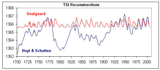
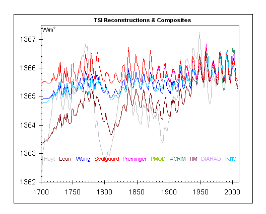
No correlation ……… and there were only variations of around 4 W/m^2 anyway in that data – so that is 1 W/m^2 (less 30% for albedo) absorbed at the surface.
Current CO2 forcing is 4x that.
Considering those data above …
Prenger was from 2005
Krivova was from 2007
Tim was from 2007
Soon’s paper from 2015
So, why I ask myself, did Soon use a solar data analysis from 1993 – a full 22 years before his paper? (I couldn’t possible guess – sarc)
This is the classical logical error of arguing from ignorance. Known to the medieval logicians at least, and probably eariier.
The fact that you cannot think of any other cause has no bearing one way or the other on whether the cause you HAVE thought of is really the one.
But to tackle the question directly, in order to show that the rise in CO2 is very likely to have cause the recent rise in temperature, you would have to look at previous warming and cooling episodes and plot the correlations, if any, with movements in CO2.
I don’t think it works. We had the RWP, the MWP, both of which were global. We then had the LIA, which was not preceded by any reduction in CO2 levels. We then had the warming of the 1920s and 1930s, complete with ice cap reduction in the Arctic. Then we had cooling. Then warming started up in the eighties.
None of the warmings were preceded by rises in CO2. It is far more likely that CO2 has some effect, but that there is another cause or collection of causes of warming episodes which we have yet to discover.
You also have to look at the very long ago episodes, when warming preceded CO2 rises. Its clear that warming can happen without CO2 rises, and its also clear that cooling can happen without CO2 falls.
The whole argument is on very shaky ground.
Here’s your “alternative potential cause“.
“The TOA net flux was +0.75 W/m2 in 2020. The data shown in Figure 1, Figure 2 and Figure 3 suggest that the root cause for the positive TOA net flux and, hence, for a further accumulation of energy during the last two decades was a declining outgoing shortwave flux and not a retained LW flux. ” – Hans-Rolf Dübal and Fritz Vahrenholt, October 2021
Pretty clear the warming of the last two decades was due to a reduction in clouds. Interestingly, Loeb et al 2021 shows the cloud changes correlate well with the PDO.
Tuesday follows Monday, therefore Monday caused Tuesday is also a correlation .
… the problem is that you (and those like you) decided what the cause is, and then went looking for a justification.
A justification is neither correlation or causation.
Yes, returning to an equilibrium state from the LIA.
It remains possible that ALL the observed temperature changes are natural with the effect of CO2 being zero.
Once one accepts that other causes can be ‘as strong’ then it is but a small step to accept that other causes can provide a full explanation.
”It remains possible that ALL the observed temperature changes are natural with the effect of CO2 being zero.”
It’s beginning to look more than possible.
There can be no natural causes for global temperature rises otherwise the need for a One-World Global Government would disappear out the window, we must accept that Socialism is the only salvation for mankind & the planet, FACT, therefore everything bad is Capitalist caused, ask Marx, Engels, Lenin, Stalin, Mao, Pol-Pot!!!
Ask Prince Charles, the FLOP26 keynote speech let it all hang out….
True, he’d do & say anything to maintain his profile & standing within the gullible & naive or Green, community!!!
Yes. If you cannot account for the warming episodes by rises in CO2, then the only residual claim to be made is that they happen for other reasons, but that the warming is slighly accentuated by the rise in CO2.
If you look at the cycles of warming and cooling, this seems to be the most plausible explanation: something, we do not know what, causes fluctuations in temperature. If we change the makeup of the atmosphere, this will have an impact on how much it warms, when it warms, but it won’t cause the cycles themselves. And the amount of increased warming due to the additional CO2 will be small.
When discussing the infuence of other causes besides CO2, Andy May states:
”If they can reverse the CO2-based warming and overwhelm the influence of CO2 they are just as strong.”
which misses the point. Looking at the graphs other effects are random short term effects that average out to zero over times scales longer than a decade. Suppose that the temperature is given by
T(x) = 0.01 *x + 10 cos(x)
then for short time periods T is dominated by the cos(x) term but over longer time periods the linear term will dominate. The temperature graphs plotted above appear similar.
Oooh! A meaningless mathematical formula. I’m impressed.
” Looking at the graphs”
There’s your problem right there.
Little ice age 🤓
This equation will not allow for any natural variation – e.g. the 1930’s doesn’t exist in such an equation. It’s very much like the climate models that turn into a linear equation after a few years. No pauses, no cooling, no variation.
That alone should clue anyone into understanding that such an equation doesn’t describe reality.
If the Marxists controlling the dementia patient convalescing in the White House are unable to institute one-party rule, we may yet get to the Grand Unified Theory of Climate where CO2 is just a bit player! The star, of course, would be our own star; the warm and generous Sol!
The rest of the cast consists of all the planets of our Solar System, with their varied magnetic and gravitational forces affecting Earth’s orbit and upper atmosphere; and the major ocean cycles and oscillations like ENSO, PDO, and the AMO! Considering that there is 45X as much CO2 in the oceans as in our atmosphere, it seems far more likely that the moderate warming since the LIA is by far the biggest contributor; and that the human addition is just a little splash on the top that adds a little more greening and warming to planet locked in an ice age!
We all know that the HADCRUT 4&5 data presented is adjusted data. We also know that much of the data in earlier years is just made up. The US has decent data coverage going back to the late 1800s. If you look at the unadjusted data in the US over the last 100 years, the correlation with CO2 just isn’t there. It is a wasted effort to use a worldwide temperature composite. In fact, I would say it’s outright fraud.
“If you look at the unadjusted data in the US over the last 100 years, the correlation with CO2 just isn’t there.”
That’s right. Use a legitimate surface temperature chart and the correlation is just not there.
Try correlating the CO2 chart with unmodified, regional surface temperature charts from anywhere in the world, and the correlation is just not there.
The Bogus, Bastardized, instrument-era Hockey Stick charts were created so they would correlate with CO2, as a means of fooling people into thinking CO2 has something to do with the Earth’s temperatures. But when you compare CO2 to actual Earth temperatures, the correlation is just not there.
You seem to have caught the ire of one of the Adjustors with this comment.
Really? It’s a good thing to agitate alarmists. 🙂
Oh come on people, all this sciency talk about correlations and co2 graphs, we’ll never get a carbon social credit system in place with that attitude. Sheesh..
“It is also important to emphasize that the surface temperature needed for the dynamic energy balance is the actual surface temperature. The meteorological surface air temperature (MSAT) is the air temperature measured in an enclosed box at eye level, 1.5 to 2m above the ground. At night, the surface temperature and MSAT are often similar. However, during the day, the land surface temperature may easily be 20ºC warmer than the MSAT.”
https://www.amazon.co.uk/Dynamic-Greenhouse-Climate-Averaging-Paradox/dp/1466359188/ref=pd_ybh_a_68?_encoding=UTF8&psc=1&refRID=4YAW5G6N8R4EBGJGC286
I’ve been trying to emphasize this very thing when discussing radiation and emission temperatures. One must be precise when talking about the “surface”. The surface is the land and oceans, it is not the atmosphere. The surface atmosphere is an entirely different body and must be treated differently.
“The net IR emission from the surface depends upon the surface and air temperatures, the humidity and the aerosol content or cloud cover. It is determined by the balance between the upward LWIR flux from the surface and the downward LWIR flux from the the atmosphere. Under clear sky conditions, when the surface and air temperatures are similar, the net surface cooling flux is approximately 40 W/m2 ….Under low humidity conditions, this may increase to 100W/m2 and under low cloud or fog conditions, the flux may be zero.
The diurnal change in magnitude of the flux terms is so large that an increase of 1.7W/m2 in downward LWIR flux from 100 ppm increase in atmospheric CO2 concentration can have no effect on the surface temperature.”
Roy Clark
Roy Clark one of America’s if not the worlds great guitarist.
https://m.youtube.com/watch?v=lxDQQDF6j0Y
lol.. see also
https://youtu.be/tUdTcP-fs9g
But hasn’t the temperature graph been tampered with, sorry adjusted, to make the warming look more extreme? Unless it is audited by independent data experts it is basically useless.
“But hasn’t the temperature graph been tampered with, sorry adjusted, to make the warming look more extreme?”
Yes, it has been, and for that very reason.
A Lie, Bogus Hockey Stick charts, have been presented as the truth. CO2 correlates with the lie, because the lie was created for this purpose.
“A Lie, Bogus Hockey Stick charts, have been presented as the truth. CO2 correlates with the lie, because the lie was created for this purpose.”
I have 3 issues with your theory Tom
So Tom, just saying this is all a lie is pretty much meaningless. You are going to have to prove the lie and that is the bit skeptics fall over on.
If you say so. So you don’t think it has not gotten warmer? You can’t argue with that….. and I mean you “can’t” argue with that.
Best you submit a paper to explain your theories.
I’ll ask again. WHAT is getting warmer? If “warm” means maximum temps then, no, it isn’t getting warmer. If you are talking enthalpy then who knows? The climate scientists seem to studiously avoid enthalpy. If you are talking the Global Average Temp then, again, who knows? The uncertainty associated with the GAT is far larger than the differences trying to be ascertained by using the GAT.
I *am* working on a series of papers describing the problems with climate science today, from the loss of variance by using mid-range values to avoiding propagation of uncertainty of anomalies to not taking the the time dependence of temperature profiles into account when cramming independent measurements into a data set.
“The cold fact is all adjustments of the major data sets are explained in detail and there for all to see”
Could you point me to those explanations, please?
I would like the explanations for all the changes made to the temperature record prior to 1979, please.
I guess I ought to add for those who don’t know that there are no detailed explanations for changes to the temperature record before 1979. Simon is just blowing smoke, as you will see when he does not provide the explanations.
See Menne et al. 2018 for details on the GHCN-M land station dataset.
See Haung et al. 2017 for details on the ERSST ocean observation dataset.
“If some of the data sets have been tampered with dishonestly, why do the they pretty much all agree?”
They all use the same basic data. You think everyone of those Hockey Stick organizations went out and collected their own data? Obviously, you do.
“Why is it still warming?’
”
As compared to what? If we compare current temperatures to the 1930’s, it is actually cooling, not warming. If we compare the current temperatures to 2016, the hottest year evah!, it is cooling now.
If you only focus on the time period after 1979, then you are not getting the whole picture.
Isn’t “Where is it warming?” an important question to ask as well?
I have the most recent USHCN values for the 1218 weather stations in the lower 48, and Nick says they match the climDiv numbers well enough, so I used them to figure the TMAX temperature trends for each station over the last 30 years for Jan-Feb-March, from 1992.
I limited my sample to stations with at least 25 out of 30 years of good data, and only accepted years with at least two of the three months having good data. Since I’m only looking at trends and not averages or anomalies, I assume the two-month years will balance out.
Results: out of 1218 stations, 914 fit my criteria — 75%. From those stations I used an R script to create a bar graph of the average temp for each year at a station, and to calculate the tend.
503 out of 914 stations had flat or cooling trends. Oregon and Washington States were 23-3 and 36-1 respectively in favor of cooling/flat trends.
This is a very simple look at the data, but if CO2 is supposed to be such the driver, how can two entire states have cooling trends across their entire area over the last 30 years?
Of course there is a relation, but it is temperature that leads and CO2 that follows in accordance with the Henry Law regarding solubility af gases i liquids. Check Humlum et al. 2013 https://www.researchgate.net/publication/257343053_The_phase_relation_between_atmospheric_carbon_dioxide_and_global_temperature
and icecore data from Vostok and Greenland.
and
and
and
You “skeptics” always resurrect this bs. Somehow you are unable to understand it. Well, it has been explained to you 1012020202 times that the reason for the “reversal” is well known, well understood, and anthropogenic, it is the sulfur pollution (from fossils) and the resulting aerosols’ sun blocking effect. The clean air acts of the 60s-70s-80s are the reason why they had disappeared. Nowadays sulfur is removed from fossils as a matter of routine.
And you are unable to follow scientific literature:
Aerosol particles cool the climate less than we thought
The impact of atmospheric aerosols on clouds and climate may be different than previously thought. That is the conclusion of cloud researcher Franziska Glassmeier from TU Delft. The results of her study will be published in Science on Friday, January 29th.
Sulfate aerosols cool climate less than assumed
Life span of cloud-forming sulfate particles in the air is shorter than assumed due to a sulfur dioxide oxidation pathway which has been neglected in climate models so far
New study: Cooling by aerosols weaker and less uncertain
The new study “Rethinking the lower bound on aerosol forcing” in the Journal of Climate, written by Prof. Bjorn Stevens, director at the Max Planck Institute for Meteorology (MPI-M) and head of the department “The Atmosphere in the Earth System”, presents a number of arguments as to why the cooling effect of aerosols is neither as strong nor as uncertain as has previously been thought.
Now you may reflect about your posting
Good links, Krishna. Thanks.
Forgot to mention, less aerosols cools, less CO2 increases warming, in model calculations 😀
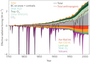
Whatever the uncertainty in the -ve radiative forcing of aerosols – there was an indisputable increase in the post WW2 industrial build-up and hence atmospheric aerosols – as can be seen as intuitive via the quite sudden increase in energy usage (vast majority fossil burning).
 ?
?
And the IPCC does account for the large uncertainty – and knows of ship-track data issues ….
https://www.ipcc.ch/site/assets/uploads/2018/03/TAR-05.pdf
“Until recently, evidence of the impact of aerosols on cloud
albedo itself has been confined primarily to studies of ship tracks
(e.g., Coakley et al., 1987; Ferek et al., 1998; Ackerman et al.,
2000) although some other types of studies have indeed been
done (e.g., Boers et al., 1998). However, new analyses have not
only identified changes in cloud microstructure due to aerosols
but have associated these changes with increases in cloud albedo
as well. An example of this, from Brenguier et al. (2000), can be
seen in Figure 5.6, which displays measured cloud reflectances
at two wavelengths for clean and polluted clouds examined
during ACE-2. Thus, our understanding has advanced
appreciably since the time of the SAR and these studies leave
little doubt that anthropogenic aerosols have a non-zero impact
on warm cloud radiative forcing. An estimate of the forcing over
oceans (from satellite studies) ranged from −0.7 to −1.7 Wm−2
(Nakajima et al., 2001).”
In fact total (+ve) radiative forcing doesn’t really escape the -ve effects of anthro and volcanic aerosols until post Pinatubo in 1991.
Not only that but there was a prolonged -ve (cool) PDO/ENSO regime from the mid 40’s to the mid 70’s coinciding with the increase in aerosols.
No wonder there was a downturn over that period – coming as it did after a marked warm phase……
In short denizens – it has to be looked at in totality.
CO2 on its own cannot because of anthro pollution and NV.
At least during that period it cannot.
But note CO2 forcing has now reached levels whereby even a La Nina struggles to downturn the GMST.
And we know how/why denizens just love a LN.
And the great snake-oil seller Monkton has to use a risen plateaux (that is above a linear trend of the whole series) on the outlier cold global temp series UAH TLT V6 (not surface even) to claim a pause.
“But note CO2 forcing has now reached levels”
What a joke! An unsubstantiated assertion. You don’t know what the CO2 forcing is. Yet you claim to be able to see it plainly. What a joke.
Krishna, you should avoid talking about things you don’t understand. These articles do not contradict what I said. At least try to read them first. The first is not even about sulfur dioxide. The second is more about the modern situation. These articles have a definite geoengineering “afterthought” as well.
The third is at least relevant, but sadly (to you) it’s more like about fine tuning the effect I’ve mentioned above. This is a popular scientific article about a study where the author used a (simplified) model (ugh, the scary word… here it doesn’t mean “climate model”, you don’t have to p00p your panties) of aerosol forcing giving it a much better uncertainty.
The author shows (paragraph 7) that climate modelling in the specified period and under those specific circumstances overestimates the cooling effect of (mostly sulfur related) aerosols (the error is small before you shxt your pants in joy) but also underestimates GHG related warming as well, and the two (small) errors cancel each other. Again, please at least try to read these articles first.
There is no more evidence for human-derived aerosols affecting the Earth’s temperatures in any significant way than there is for human-derived CO2 affecting the Earth’s atmosphere in any significant way.
The Global Cooling crowd has been trying to sell human-derived aerosols as something significant for decades now, and haven’t found one bit of evidence to back up their claims. It’s all assertions and assumption, just like the CO2 fiasco.
Climate Science has been off on the wrong track for a long time, caused by unwarranted assumptions.
Tom Abbott:
You say “There is no more evidence for human-derived aerosols affecting the Earth’s temperatures in any significant way than there is for CO2 affecting the Earth’s atmosphere in any significant way”
In their discussion of atmospheric aerosols, NASA states that “Stratospheric SO2 (from volcanic eruptions) reflect sunlight , reducing the amount of energy reaching the lower atmosphere and the Earth’s surface, cooling them., and, anthropogenic aerosols (from the burning of fossil fuels) “absorb no sunlight but they reflect it, thereby reducing the amount of sunlight reaching the Earth’s surface” ,so that their climatic effects are identical.
Therefore, changing amounts of atmospheric SO2 aerosols ARE the control knob for Earth’s climate. If they are reduced, temperatures rise, and if they are increased, temperatures decrease.
In 1979, industrial SO2 aerosol emissions peaked at 136 Megatons, and by 2019, they had fallen to 79 Megatons, due to global Clean Air efforts. This is the reason for our increasing temperatures since then!
A plot of anomalous global temperatures shows a temperature response to a change of approx. 0.1 Megatons, so Earth’s climate is extremely sensitive to changing levels of SO2 in the atmosphere.
Henry, the problem I have with your analysis is you use a bogus, bastardized Hockey Stick chart as confirmation of your hypothesis. Since the Bogus Hockey Stick chart does not represent reality, it does not confrim your hypothesis.
Tom Abbott:
No, I am relying upon the NASA analysis which states that SO2 aerosols reflect incoming sunlight and cool the earth’s surface. It follows that if the amount of SO2 aerosols present tin the atmosphere are decreased, there will be less cooling, and temperatures will increase.
It literally DOES NOT MATTER what the reported temperatures are The “bogus, bastardized Hockey Stick Chart” is completely irrelevant.. .
The important thing is WHAT caused the temperatures to change..
,
You want to prove a correlation? How does CO2 correlate with Tmax or Tmin? CAGW proponents would have everyone believe it is Tmax and we are going to burn up like a witch on a pile of logs.
https://wattsupwiththat.com/2021/11/08/co2-and-temperature/#comment-3384683
“You want to prove a correlation? How does CO2 correlate with Tmax or Tmin?”
It definitely does not correlate with Tmax.
If you go by Tmax, it shows temperatures were just as warm in the Early Twentieth Century as they are today, and CO2 does not correlate with high temperatures back then.
“It definitely does not correlate with Tmax.”
It definitely does correlate with Tmax.
See my above comment. If you don;t like that data, please show what data you have that does not show a correlation with CO2.
If you have evidence of CO2 correlating with high temps in the U.S. during the 30’s you need to show it.
So, having asserted, with no evidence, that there was no correlation between maximum temperatures and CO2, you move the goal posts to just US maximum temperatures, in one decade.
And I dare say if there turns out to be a correlation there, you will insist that it’s only summer high temperatures, or only temperatures in one part of the US that counts. Or you’ll simply reject the dats as having been adjusted.
There will always be parts of the world where the correlation isn’t in evidence, partly because the world is complex, and partly because the smaller the region the more variation you will have.
My data shows that Tmin has been increasing which raise the anomalies. Tmax is pretty much steady. Maybe if you used raw data from various location w/o UHI you would see the same.
GAT doesn’t impress me at all. Averages, and worse averages of anomalies are worthless. You can’t even tell me the temperature in Brazil vs North Dakota in August using GAT. How can you tell what regions ate doing using GAT?
You can’t even tell anyone what the standard deviation of the GAT is. It is lost in the averaging and no one ever goes back to propagate it properly thru all the calculations. All you know is that some computer calculated a mean to ten decimal places so that is the uncertainty.
Any hint as to which data you are using? If you reject global averages I assume you mean you’ve found individual stations where maximums haven’t increased, but how do you know if they are typical of the planet?
We are seeing record global harvests over the past twenty years. Something is causing this. Attached is a file for Topeka, KS growing season length and date of first frost. The bottom graph is missing the x-axis but it’s the same as the top graph.
Date of first frost typically determines the length of the growing season. Growing season getting longer is mostly driven by increasing minimum temps, not maximum temps.
What makes *you* think that it isn’t minimum temps going up that is causing this?
Do they have to be “typical of the planet?” Doesn’t their existence at all point to a problem in the CO2 hypothesis?
USHCN data I just crunched today shows that TMAX in Jan-Feb-Mar in Washington State and Oregon has been cooling for the last 30 years, as have a majority of the stations in the US.
Test comment, since a previous comment failed to get accepted.
Rich.
OK that worked 🙂 Apologies to all for the distraction.
No problemo.
If I didn’t want a distraction from work and life, I wouldn’t be here.
Really? Where is the whopping 0.8 degrees anomaly caused by the 1998 El Nino?