by Roy W. Spencer, Ph. D.
The Version 6.0 global average lower tropospheric temperature (LT) anomaly for September, 2020 was +0.57 deg. C, up from from the August, 2020 value of +0.43 deg. C.

The linear warming trend since January, 1979 remains at +0.14 C/decade (+0.12 C/decade over the global-averaged oceans, and +0.18 C/decade over global-averaged land).
For comparison, the CDAS global surface temperature anomaly for the last 30 days at Weatherbell.com is +0.38 deg. C.
With La Nina in the Pacific now officially started, it will take several months for that surface cooling to be fully realized in the tropospheric temperatures. Typically, La Nina minimum temperatures (and El Nino maximum temperatures) show up around February, March, or April.
Various regional LT departures from the 30-year (1981-2010) average for the last 21 months are:
YEAR MO GLOBE NHEM. SHEM. TROPIC USA48 ARCTIC AUST
 2019 01 +0.38 +0.35 +0.41 +0.35 +0.53 -0.14 +1.14
 2019 02 +0.37 +0.47 +0.28 +0.43 -0.02 +1.05 +0.05
 2019 03 +0.34 +0.44 +0.25 +0.41 -0.55 +0.97 +0.58
 2019 04 +0.44 +0.38 +0.51 +0.53 +0.49 +0.93 +0.91
 2019 05 +0.32 +0.29 +0.35 +0.39 -0.61 +0.99 +0.38
 2019 06 +0.47 +0.42 +0.52 +0.64 -0.64 +0.91 +0.35
 2019 07 +0.38 +0.33 +0.44 +0.45 +0.10 +0.34 +0.87
 2019 08 +0.38 +0.38 +0.39 +0.42 +0.17 +0.44 +0.23
 2019 09 +0.61 +0.64 +0.59 +0.60 +1.14 +0.75 +0.57
 2019 10 +0.46 +0.64 +0.27 +0.30 -0.03 +1.00 +0.49
 2019 11 +0.55 +0.56 +0.54 +0.55 +0.21 +0.56 +0.37
 2019 12 +0.56 +0.61 +0.50 +0.58 +0.92 +0.66 +0.94
 2020 01 +0.56 +0.60 +0.53 +0.61 +0.73 +0.12 +0.65
 2020 02 +0.75 +0.96 +0.55 +0.76 +0.38 +0.02 +0.30
 2020 03 +0.47 +0.61 +0.34 +0.63 +1.09 -0.72 +0.16
 2020 04 +0.38 +0.43 +0.33 +0.45 -0.59 +1.03 +0.97
 2020 05 +0.54 +0.60 +0.49 +0.66 +0.17 +1.16 -0.15
 2020 06 +0.43 +0.45 +0.41 +0.46 +0.38 +0.80 +1.20
 2020 07 +0.44 +0.45 +0.42 +0.46 +0.56 +0.39 +0.66
 2020 08 +0.43 +0.47 +0.38 +0.59 +0.41 +0.47 +0.49
 2020 09 +0.57 +0.58 +0.56 +0.46 +0.97 +0.48 +0.92
The full UAH Global Temperature Report, along with the LT global gridpoint anomaly image for September, 2020 should be available within the next few days here.
The global and regional monthly anomalies for the various atmospheric layers we monitor should be available in the next few days at the following locations:
Lower Troposphere: http://vortex.nsstc.uah.edu/data/msu/v6.0/tlt/uahncdc_lt_6.0.txt
Mid-Troposphere: http://vortex.nsstc.uah.edu/data/msu/v6.0/tmt/uahncdc_mt_6.0.txt
Tropopause: http://vortex.nsstc.uah.edu/data/msu/v6.0/ttp/uahncdc_tp_6.0.txt
Lower Stratosphere: http://vortex.nsstc.uah.edu/data/msu/v6.0/tls/uahncdc_ls_6.0.txt
Note: when UAH updates the full climate report, I will add it here. – Anthony
https://www.nsstc.uah.edu/climate/
This is shaping up to be the second warmest year in the UAH record, courtesy of the 2019-20 El Niño, which peaked in February, like the 2015-16 Super El Niño. Definitely top five, even if Q4 cools off.
But, given La Niña likely next year, 2021 should continue the downtrend in the satellite record since February 2016. How long does a downtrend have to last to be considered significant?
The downtrend is also in the “surface” record, despite its being cooked to a crisp. The trend will soon disappear, thanks to adjustments, should it persist much longer.
This is shaping up to be they double camel’s hump pattern once again. It will now drop over the next two years to a trough around 0.2C on this scale.
The ENSO meter is already strongly negative, heading into La Nina territory.
The time between the twin peaks is consistently close to 3.5 years by eye.
This is the power density spectrum of UAH TLT data I did in 2013. There is a well defined peak in SH, NH and tropical TLT at 3.7 years.
https://climategrog.wordpress.com/uah_ns_tr_chirp/
My own projection is that it is likely to finish very close to 1998, slightly more likely to finish above than below for 3rd place but could be close. This though is not taking into account any cooling due to La Niña in the last few months of the year.
“How long does a downtrend have to last to be considered significant?”
There isn’t any fixed length, it depends on the strength of the trend and the amount of variability. But it’s unlikely to happen anytime soon, even with continuous cooling. In any event, it would be pretty daft to claim that a cooling trend started from the height of a super large El Niño event.
The Skeptical Science Trend Calculator, not including the current month, shows a cooling trend of 1.2°C / century since the start of 2016, but with a confidence interval of ±12.7°C / century.
You have to start in 2009 to see a significant warming trend of 3.41 ± 3.37°C/ century. But I don;t think that could mean that temperatures are actually been rising at that rate.
Daft? How is starting a cooling trend in 2016 more daft than starting a warming trend in 1979, the second coldest year of the past century, after the PDO switch year of 1977?
Start in 1980 you get the same trend. Start in 1981 the trend goes up slightly. Start just about any time before about 1995 and the trend is between 1.3 and 1.5°C / century. Even if you start with the big El Niño of 1998 the trend only drops to 1.1°C / century.
There’s a big difference measuring a trend over say 10 or 15 years and measuring it over 40 years.
Besides, 1979 was not the second coldest year of the past century. In the UAH set it’s the 6th coldest year in the past century, in a data set that only starts in 1979.
John, the UAH data set has only 41 complete years of data, so you can’t make claims about 1979 being the second coldest year of the past century using this data set.
To do that you would have to examine the data from another data set to make claims about global temperatures over the past century. I have done that. Using the NCDC-NOAA data set of surface temperatures and looking at the years from 1920-2019, the coldest year is 1929 and the warmest year is 2016. Ranking the years from coldest to warmest, 1979 is #61. That is, over the past century, there have been 60 years colder than 1979.
Even looking at the 41 years of data in the UAH data set, 1979 is not the second coldest year. The year 1979 is tied for the sixth coldest year. The year 1985 is the coldest in the 41 year record in the UAH data set, 1982 is second, 1992 is third, 1984 is fourth, and 1986 is the fifth coldest. The year 1979 is tied with 1989 for the sixth coldest year over the past 41 years, so it was not particularly cold.
Moreover, the year 1979 was not chosen to be the start date of the data set because of its ostensibly cold temperatures. In fact, it wasn’t chosen at all. It is the first year in the data set simply because it was the first year for which they had a complete record of temperatures derived from satellite data.
In contrast, and not to be argumentative, but it appears that you chose February, 2016 as the starting point of your trend specifically because it was the high point of the Super El Nino and had the highest monthly temperature anomaly on record. Of course temps have gone down from that point. That was inevitable and predictable, and it does not indicate a trend. So I think that’s why Bellman suggested that choosing February, 2016 as a start date for determining a trend for climate change was “daft”, while using, not choosing, 1979 as a starting point is perfectly reasonable.
Bellman, David G
I have explained that to Mr Tillman a while ago, but he discarded my arguments.
It is so easy to get convinced about how wrong he is by comparing the trends since 1979, 1990 and 2016:
https://woodfortrees.org/plot/uah6/from:1979/plot/uah6/from:1979/trend/plot/uah6/from:1990/trend/plot/uah6/from:2016/trend
that I get the impression that he simply keeps in denying this simple fact.
I have no problem with that.
J.-P. D.
Climate change is a long-term process, so to get a sense of the trend, you’ve got to look at the long-term record. That trend is clearly depicted in the graph at the top of the page. So, no, four years doth not a trend make, especially when the start date of that four-year period is the high point of a Super El Niño.
There has been intermittent global warming for 325 years. “Record warm years” are to be expected until the warming trend ends and a cooling trend begins. All real time measurements since the late 1600s were made DURING a warming trend, so “hottest year evah” should be expected, irregularly …
and celebrated.
Please send more global warming to Michigan where we live. We love global warming hete, and our plants love more CO2 in the air.
Hallelujah! Also, please sens that warming to Western Canada.The last 20 years here have been some of the best growing conditions in our history, thanks to Global Warming.
David G
You speak, like does commenter John Tillman, about a ‘Super El Niño’, clearly meaning the 2015-16 edition.
This gives the impression that 2015/16 was in your opinion the strongest edition in the recent El Niño history, and that this opinion is based on the UAH record, which shows 2015/16 far above the 1997/98 edition.
This, however, is not correct when you consider the ENSO data for the last decades:
When comparing the UAH anomalies for the two periods relative to their respective begin (i.e. to Jan 1997 resp. Jan 2015), ant thus removing the anomaly difference between the periods, you obtain this:
https://drive.google.com/file/d/11H1Y959how-bVRQLkUW2mV5OyIBty5Ra/view
And this is pretty good confirmed by comparing the grid-based anomaly distribution made by the Japanese Meteorology Agency for the years 1998 resp. 2016.
As we can see in the MEI graph, the 1982/83 edition was even a little bit stronger than 1997/98, but this was hidden by the El Chichon eruption, was is visible in all temperature time series.
J.-P. D.
This is a surprise. The http://temperature.global/api.php was up +.1 in early Sept and is now down -.13. This is a rolling 12 month so it takes something to move the needle up or down.
With the numbers high across the board, something just doesn’t seem right. I would have thought about even or slightly down. Even the La Niña is pretty well going full force. Even the 7 day ocean trend is blue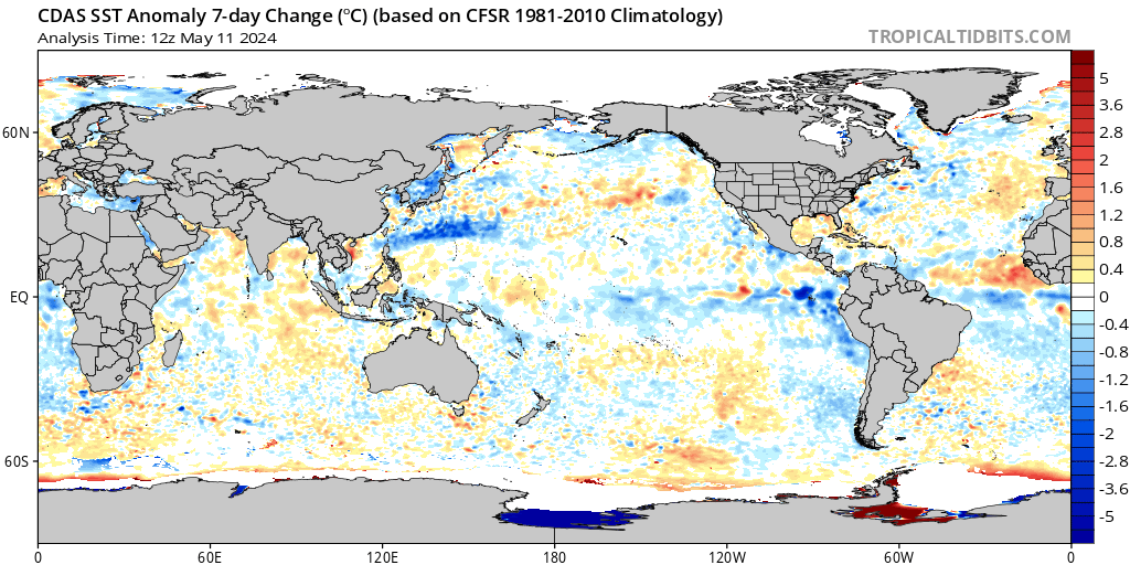
Low Arctic sea ice would mean more heat lost to the air from the water.
Haven’t looked at the geographic breakdown.
But here in Chile and the SH generally, it has been a colder than usual, wet and windy winter, and so far, spring, but for one warm, sunny day. The other sunny days have (no surprise) been cold at night, and windy, like today and yesterday in Valparaiso.
Plus, highest Antarctic sea ice maximum since the dedicated satellite record (starting in 1979), set in 2014.
John Tillman
” Plus, highest Antarctic sea ice maximum since the dedicated satellite record (starting in 1979), set in 2014. ”
Correct, with 19.76 Mkm² in September.
But when you look at the daily anomalies of the Antarctic sea ice extent (reported by colorado.edu):
https://drive.google.com/file/d/1BCEkUrq8b2d_DwZZZRM43rQwMDrWnEdM/view
you see that though keeping way below years like 2012 and 2015, 2020 in turn is a lot above 2019, and passed during August over the mean of 1981-2010.
Valparaiso isn’t Punta Arenas, but doesn’t the cold Humboldt current move quite near Chile’s coast, before feeding NINO1.2?
Rgds
J.-P. D.
There has been something wrong with this data since the heat wave in Siberia in the winter. We keep seeing evidence of cooler than normal but this data set keeps running hot. I think there needs to be a more careful look into the raw data.
To Thomas Gasloli October 2, 2020 at 11:32 am
Absolutely a more care look needs to be done. Cold cold cold everywhere except California this summer and California seems to carry the temp record!
” We keep seeing evidence of cooler than normal … ”
1. Where do you live, Mr Gasloli? Maybe in the northern part of CONUS?
In Europe for example, we see no evidence at all of ‘cooler than normal’.
2. UAH LT is not a surface record: the average absolute temperature it reports is around 265K, i.e. 24 °C below the Globe’s average surface temperature.
This means that the average altitude of the UAH temperature measurements is around 4 km.
At that height, everything is different: you measure for example intensive poleward advection streams originating from the Tropics, phenomena simply unknown to us.
J.-P. D.
No evidence at all of “cooler than normal” in Europe? Italy just suffered its coldest September in fifty years. Moreover, the spell of cold weather was the result of a belt of cold air from northern Europe. I would think that qualifies as evidence, despite how weak it may be, and ‘cooler than normal’ in Europe.
Except Italy didn’t suffer the coldest September in fifty years. According to Joseph Bastardi’s comment from a post a few days ago, most of Italy was above average in September.
One night might have been the coldest single night in 50 years in some parts of Italy, though I still haven’t seen any actual details apart form the endless repeating of a single local news story. But that’s far from saying the whole of September was the coldest in 50 years.
rbabcock
There is a 4-5 month lag between ENSO signals at the surface and the tropospheric reaction to them.
J.-P. D.
agree
agree with rbabcock
October 1, 2020 at 2:31 pm
This is a surprise.
–
Still the world moves in mysterious ways.
La Nina 5 months falling temps and now this rise.
Most of the heat anomaly other measures seems to be in the Arctic which is not very hot anyway. Strange that an upturn in heat in a cild region can make a cold change in a hotter region [La Nina] irrelevent.
Still that is what Roy is paid for.
He must have it right
“The Version 6.0 global average lower tropospheric temperature (LT) anomaly for September…”
Roy, Paul – for the non-professionals among the readership, may I suggest adding a paragraph at the start of the article to provide some context.
– Conceptually, what is the Version 6.0 global average lower tropospheric temperature anomaly?
– Is it important, or just a statistical / model construct ?
– How does it fit into the grand scheme of Climate Modelling ?
Console yourselves with the fact that once you have written the context paragraph you can simply plug it in to every subsequent article on this topic, for the edification and enjoyment of your readers!
I always love these “global temperature” reports which have nothing at all to do with my reality.
Late August and September are normally brutal in Texas – this year has seen the mildest temperatures I have seen since moving here in 1998. We have hardly used the air-conditioner. I can’t remember so many pleasant rains. For 3 out of 6 weeks we might as well have been living in Washington along the coast.
Whatever brought us this strange late summer weather, I beg it to repeat itself year after year. If this is global warming – bring it on!
Talking about global temperature is the same as talking about average number of children. No one has 2.4 children….
Or averaging the numbers in a phone directory. Sure, you can do it.
Or even anomalies of phone numbers.
The high temperature records all moved to Arizona…:)
Language is an amazing thing. In Texas you consider lower temperatures in Summer as an indicator of a ‘mild’ Summer. In the UK, in the Winter months we consider higher temperatures as an indicator of a ‘mild’ Winter.
Having spent some time in Qatar know what you mean about brutal temperatures though. Remember car registering 46C and walking through a dust storm that felt like I was in a blast furnace.
I like ‘mild’ I do (and not just the beer).
What if Global Temperature drops, by a full degree C or more, in the coming decade? Do you think anyone will notice if every year is touted as the hottest ever while it happens? Honestly, how would we know?
Max P
I recall 1979 as being very cold. Hard to believe that after 40 years it’s warmed up about a half of a degree C.
Bloody cold here on the canadian prairie too
But when looking at the useless global average it must even out
Pat from kerbob
I never was anywhere in Canada; about Canadian temperatures I only know through downloading temperatures reports by weather stations located there 🙂
And what see is: the Canadian Prairies in AB, SK and MA not only are a cold corner: it is even cooling a bit there during the May-July period:
https://drive.google.com/file/d/195lz2_Fczm7aFsXtcA4lU_rzyzTZCbdm/view
But… luckily, Canada’s Prairies aren’t the Globe.
J.-P. D.
Over satellite recorded history. Earlier periods are inferred through proxies, dismissing observations as anecdotal when inconvenient to the prevailing paradigm. So, is it progressive? Is warming and greening good, bad, or ugly? Is it her Choice or Her Choice? It seems that, despite the models forcing perception, it is the latter.
The large scale Oceanic warming is obvious, Look at the change. GLOBALLY. in all the SST’s and imagine how much WV that is putting into the air and the effect on temperatures where its coldest and driest, the areas most prone to warm simply due to higher wet bulbs. This is a rare large difference between UAH the gold standard, and ours, which is a good way, compared against itself, to see where this is going. This is tied for the warmest Sept on the CDAS record. BTW a key way to know how much affect WV has is to notice the largest differences from the averages are usually in the winter, when again, lower temperatures can be affected more. In the end. UAH IS THE GOLD STANDARD. but our CDAS site can give a hint as to where things may be going. As long as the oceans warm overall, even with the La Nina, we are a long way from returning to average. I have opined this is a step up function with each super nino defining the start of a new higher plane, though each increase is less than the one before ( example. increase post 83 v post 98 v 16. Just some overall ideas, but I ask folks to go to our SST site and you can see the huge difference in the entire SST picture from 2010 till now. Of course Oceanic warming has many causes, and co2 is likely not one of the main ones. There is so much we do not know about what is going on underneath that it limits what we can be certain of. Another possible reason for the warmth of the oceans is simply the intersection of a few very long term cycles, that may not be able to be recognized, sort of like trying to see the forest from the trees, on the order of decades, perhaps centuries. This is old PSU stuff, when we used to have some profs opine on the the different climate cycles. Solar was huge also. In any case as far as the large scale oceanic cycle idea. take a “rogue wave” which mariners know about, the sudden appearance of a huge swell, is likely caused by a combination of other waves propagating out and intersecting. But those source regions of the waves may be days away and not easy to recognize. Remember the temperature is simply one sign outdueling the other. The place where it can warm most is where its driest or coldest, so its distorted. Much of the planet between the arctic and antarctic circles has had much less warming. Now why might that be? Well if we look at the correlation of temperatures with saturation mixing ratios , we find very slight increases are correlated with much larger temperature swings where its very cold. So the increase in WV may be unrecognizable in its effect on temperatures that are quite high, but show up much greater where its cold and dry. And all that goes into the mix. But the earth is not burning up. Try swimming at. 60 degrees. not fun Anyway it makes fun stuff to talk about, till we are no longer allowed to talk about it
Joe, my brother, please, for the sake of God and all that is holy, paragraphs!
😉
Yes, the oceans are driving global temperatures. This graph of the last 6+ years is very informative.
https://woodfortrees.org/plot/hadsst3gl/from:2014/to/offset:-0.2/plot/hadsst3gl/from:2014/to:2018.1/offset:-0.2/trend
The first El Nino drove up temperatures for about 4 years but produced no real long term warming. The El Nino ended about half way through the process and it took awhile longer for the oceans’ surface to cool.
After the cooling another El Nino took hold and once again drove up ocean surface temperatures. Yet again it will take awhile for them to cool. Probably won’t be quite as long as I suspect the current La Nina will be stronger and may even last two years. I do expect to see the same omega shape when done. That will return the global temperature right back down to where it was in 2014.
What’s interesting is the last 6 years will drive up any trend ending in recent years even if the temperatures drop back to the pause level.
“I have opined this is a step up function with each super nino defining the start of a new higher plane, though each increase is less than the one before ( example. increase post 83 v post 98 v 16.”
Ah, someone else noticed the step function in temps. I think that we’re looking at air temps the wrong way. If the atmosphere is heating up where is the heat going? Obviously the majority has to go out of the atmosphere. Then what does the average mean as far as retained heat content? That would be the minimums. If over time the minimum is going up then that is a proxy for the heat content to be rising. Eyeballing the chart we have the minimum anomaly before the 98 nino in 1985 at -.5 after it is about -.3. After the last nino it’s up to about .1. So that’s about a .6 change in 35 years or .17deg per decade or 1.7 deg per century.
” Try swimming at. 60 degrees. not fun ”
I grew up swimming in Lake Eufaula in Oklahoma – which is fairly near to Tulsa. Tulsa averages about 7 degrees cooler then where I live now in Texas.
The near-shore lake water gets so hot in July through August it feels Hot when you get in it. You have to dive down to about 6 to 8 feet to get to cool feeling water. This would have been mostly in the 1960’s through 1980’s. The Illinois River was still pretty clean back then and stayed moderately cool. No idea what it’s like these days.
I don’t even bother with Texas lakes. You go for the rivers and streams – moving water. Or the ocean.
So try swimming in 90 degree water on a hot day…not fun! LOL
The ENSO/UAH lag is the reason UAH temp anomalies haven’t yet decreased from the strong La Nina cycle that is developing.
Even with this La Nina/UAH lag, I thought UAH temp anomalies would start falling from September because NINO3.4 has fallen sharply since July and is currently at -0.8C, but I guess UAH global temp anomalies won’t start falling until October.
http://www.bom.gov.au/climate/enso/indices.shtml
The way this strong La Nina is developing, ENSO3.4 could fall to around -2.0C by April of next year and UAH6.0 could hit -0.2C by around August of next year factoring in the ENSO/UAH lag.
Given the massive ocean cooling that is occurring, especially in the Southern Hemisphere, and the La Nina cooling, the 2015/16 Super El Nino event will finally be offset by the end of next year.
The respective 30-year PDO and AMO cool cycles are also due to restart soon, and I think the falling global SSTs anomalies are evidence they may start sooner than later:
https://www.ospo.noaa.gov/Products/ocean/sst/anomaly/
We’ll see soon enough.
“massive ocean cooling” is not occurring SAMURAI-san. In fact it’s the opposite.
ENSO3.4 is just a skin temperature over a fraction of the globe. Sure it dips a bit during La Nina phases and that will probably be reflected in a warming pause in the troposphere. As the OHC graphs show, massive ocean warming that shows no sign of subsiding is a fact and the ENSO cycle will have zero net affect on that.
Loydo-san:
If you look at the NOAA SST chart link I posted, you’ll see massive areas of cooling in all oceans, especially in the Southern Hemisphere, which I attribute to the PDO and AMO moving to their 30-year cool cycles.
Please also note that almost all the silly gray areas NOAA just added since June 2020 should be blue, but they added it to hide the massive amount of SST cooling taking place…
There is an anomalous cool area typical of a L Nina pattern in the Pacific east but overall you can’t really say there is more cool than warm. Apart from that my point is that the skin temperature doesn’t reveal the “ocean” heat to depth. While this graph stays on that relentless trajectory any surface oscillation is just noise,
 ?itok=og51DNqa
, completely swamping the noise of PDO, AMO and ENSO.
There will be “massive ocean cooling” if that graph spende the next 30 years declining. Don’t hold your breath on that one.
Loydo
Niña cooling is not surface only – here are temperatures down to 150m
I said ENSO3.4 is a skin measurement, it is. And yes the ENSO is apparent down to a depth of a couple of hundred metres. The point I was making is that the shallow ENSO, the global SSTs (and the atmosphere for that matter) are the wagging tail of the dog of OHC. 2km deep is an enourmous volume of warming inertia – surface fluctuations are just noise and atmospheric fluctuations (what Roy’s graph measures) are noise on noise. To imply that a slight cooling in a shallow regional strip is a sign of “massive ocean cooling” aside from the fact that its part of an “oscillation” is not at all accurate. In fact the opposite is true and the warming trend appears to be accellerating.
https://www.data.jma.go.jp/gmd/kaiyou/english/ohc/ohc_global_en.html
In the face of observations coolism is just comical.
SAMURAI
” The way this strong La Nina is developing, ENSO3.4 could fall to around -2.0C by April of next year… ”
As usual, SAMURAI only has a look at the present situation, as depicted by BoM’s and other ENSO experts, instead of presenting us their forecast for this allegedly ‘strong’ La Niña, e.g. this:
http://www.bom.gov.au/climate/enso/index.shtml
There we can see that
– though BoM warns about “La Niña underway in the tropical Pacific” with a picture showing BoM’s ENSO outlook having moved from “alert” mode down to “La Niña” mode,
– they nevertheless show us below in the same page the “Average of international model outlooks for NINO3.4”.
And there we see that the ‘strong’ La Niña will soon come back to the neutral mode, with NINO3.4 SST anomalies around -0.9 C, and the Indian Ocean Dipole coming back to the neutral mode as well.
The average NINO3.4 forecast for the incoming La Niña:
http://www.bom.gov.au/climate/ocean/outlooks/#tabs=Graphs®ion=NINO34
The next hint on a weak La Niña is from The Tokyo Climate Center:
http://ds.data.jma.go.jp/tcc/tcc/products/elnino/elmonout.html#fig2
There is some little evidence that if La Niña’s power would be increasing, the lowest bar in Fig.2 would say ’20 % neutral | 80 % La Niña’, isn’t it?
This no more than Cooling alarmism.
J.-P. D.
For a september that set record cold in many parts of the world, with unusual snow , I find this very odd. Is there any reason UAH would be so divorced from surface temperatures?
The lower tropospheric temperatures are linked to surface temperatures but there is a time gap difference lag in tropospheric temperature responses if I understand Roy’s past comments.
Maybe it is destined to fall next month.
But I would not bet on it.
The reason for the end of the pause and high temperatures thereafter are due to increased shortwave radiation (not TSI): https://www.climatexam.com/single-post/temperature-increase-since-2016-is-not-anthropogenic
The radiation values of CERES must be deseasonalized and that is why the latest observational values are for October 2019.
We agree the increase is not AGW, but not why.
The pause was ended because SW was higher from the SC24 maximum TSI that started under clearer skies previously established by the former low TSI prior to the maximum, yin-yang like.
You don’t use TSI for anything. Why not?
I have an Earth sciences degree but have never practiced Earth Sciences in a professional or amateur way. So know enough to understand the principles discussed (and enjoy following everyone’s comments here) but not really the deep science. That said, and putting aside how meaningful global average temperature really is, I am always amazed at how temperature changes are discussed in, and to, fractions of a degree. With temperature measurements obtained using methods and systems that will have both systematic and human errors varying under environmental circumstances and global temperatures changing on a daily basis by tens of degrees Celsius, how can anyone be so confident that there can be changes to a tenth of a degree especially over long periods like a 100 years? What exactly, in the real world, does “…..warming trend of 3.41 ± 3.37°C/ century” or “….cooling trend of 1.2°C / century ………. but with a confidence interval of ±12.7°C / century” really mean? Or have I missed anything here?
SW,
You are correct.
People who claim that such and such a past year was hot or cold are simply gossiping and not adding to the science. The measurement errors are indeed so large that many publications are merely wading through the weeds of noise. I would hesitate to link a climate effect to a temperature change smaller than about 2 deg C over a multi year term. All this talk about species migration, harm to crop yields and the (catastrophic) like are not going to stand the test of time because the T changes, since adequate T measurements started to become available, are so small that imagined effects are just rattling around between uncertainty brackets. Geoff S
Steve Wood
Apologies if this is stating the obvious, but as I understand it, confidence intervals in any time series, not just temperatures, are a mathematical way of stating a range of values within which the ‘true’ value, the ‘actual’ rate of warming in this case, lies. These are usually stated with 95% confidence (2σ), meaning there’s only a 5% chance that the ‘true’ value lies outside the calculated range.
So you use the time series data to calculate, usually by linear regression, what amounts to a ‘best estimate’ of any trend it may contain. In the case of Dr Roy’s monthly UAH_TLT temperature anomaly data, the trend from its start in December 1978 is currently +0.14 °C/dec. Roy doesn’t usually state the confidence interval, but it can be calculated (admittedly, with some difficulty for non-mathematicians like me).
Thankfully there are a few web sites that do this. I usually use Kevin Cowtan’s calculator at the University of York: http://www.ysbl.york.ac.uk/~cowtan/applets/trend/trend.html
This confirms that the full UAH warming rate rounds to +0.14 ±0.05 (2σ) °C/dec. So the ‘best estimate’ value is +0.14 °C/dec but there is a reasonable possibility that it could be as high as +0.19 or as low as +0.09 °C/dec. There is a less than 5% probability that the ‘true’ rate lies outside this range, whether higher or lower.
Since the lower end of the 95% range is still showing a warming trend, the warming in UAH since Dec 1978 is said to be ‘statistically significant’. As Bellman mentioned near the top of the comments, the longer the time series, the more stable the confidence intervals tend to be, especially in the case of TLT satellite temperature data which are strongly influenced in the short term by things like ENSO.
Not to be picky, but the parameter you are calculating is not the entire picture. The confidence range you are calculating is for the data series alone. There is no uncertainty included. every measurement has uncertainty built in, either systematic or random. I have scanned the UAH website and can find no statement as to the measurement uncertainty. Maybe I missed it.
Remember, uncertainties add in quadrature, i.e., Root Sum Square (RSS). This means that when you add data in order to find an average you must propagate the uncertainty throughout. AND, you do not divide the RSS by “n”. You will find the uncertainty grows larger in the average you calculate.
This is all covered in an beginning level book by Dr. John R. Taylor, “An Introduction to Error Analysis: The Study of Uncertainties in Physical Measurements”.
The University of Colorado, Boulder has had some good physicists and he’s one of them.
The technical write up explaining UAH measurement and results may well be more specific but all I know is what Roy Spencer has said in comments, which is that UAH measurements are accurate to 0.2C (which I interpret to +/- 0.1C per measurement). In conformance to standard reporting, the values arc rounded to two decimal places. In one place he said the 15/16 El Nino measured 0.02C higher than the 97/98 El Nino, but since that value is less than measurement error, it could not be said that the later incident’s temperatures were significantly different from those of the earlier – or at least that is what I understood him to say.
AndyHce
” In one place he said the 15/16 El Nino measured 0.02C higher than the 97/98 El Nino, but since that value is less than measurement error, it could not be said that the later incident’s temperatures were significantly different from those of the earlier… ”
What Roy Spencer reports is not temperature: it is anomaly, i.e. departure of monthly averages to remove the annual cycle.
My reply is a bit off your topic, but it was amazing for me to discover that, when reconstructing absolute temperatures out of Mr Spencer’s grid data (anomalies + climatology), the highest temperature was not in 2016, but in 1997 (-7.35 °C), a bit above 2016 and 2019 being on par with -7.48 °C:
https://drive.google.com/file/d/1Mc0wcb9B78AKhNt5BfPu4OdLsR9ODcvm/view
J.-P. D.
Steve Wood,
What exactly, in the real world, does “…..warming trend of 3.41 ± 3.37°C/ century” or “….cooling trend of 1.2°C / century ………. but with a confidence interval of ±12.7°C / century” really mean?
It means there is great confidence that the pin has been found and that exactly how many angels (within half or double the amount) can fit on it while ‘Twerking’ and singing ‘Lady in Red’ like Crazy Frog.
In other words it is a meaningless short term indication that averaged global temperature can be kind of measured, and these temperatures change from month to month, year to year, and decade to decade but we’re no nearer really understanding what it all means.
“… how can anyone be so confident that there can be changes to a tenth of a degree especially over long periods like a 100 years? What exactly, in the real world, does “…..warming trend of 3.41 ± 3.37°C/ century” or “….cooling trend of 1.2°C / century ………. but with a confidence interval of ±12.7°C / century” really mean?”
I’m not claiming this will happen over 100 years. The per century is just an indication of the rate of change. Just as saying someone is driving at 60km per hour does not mean they will continue to drive for the next hour at the same speed.
And the main thing my figures mean is that over these short periods the figures mean very little. A cooling trend of 1.2 ± 12.7°C / century means that with approximately 95% confidence we can expect the actual trend to have been between -13.9 and +11.5°C / century. In other words it tells us pretty much nothing.
All this is based on a number of assumptions, including the calculations for autocorrelation (I use figures from the Skeptical Science Trend Calculator, others might argue that the confidence intervals are too large). It also says nothing about the accuracy of the data. I’m using UAH as that’s what this post is about, and it’s the one “skeptics” here trust, but it should be noted it’s currently something of an outlier compared to other data sets.
Thanks Bellman, and to others. To clarify, I wasn’t trying to disagree with any of the figures, more trying to wrap my head around why, when such large uncertainties are quoted, such measurements should have any validation.
Global warming is long term thing, on scale of months or few years it means little.
But I think it’s fair to say global average air temperature has increased by about 1 C over the last 100 years.
And we recovering from a colder period called the Little Ice Age and increased CO2 may be part of reason for the slight warming over the 100 years.
I tend to think that if global CO2 levels rise from 400 to 800 ppm there will be global average increase of 0 to .5 C.
Decades ago, I thought a doubling CO2 might cause 2 to 3 C increase in global temperature, but due to the measuring of global temperatures, I think it’s allow me to lower the possible range of possible warming.
And I think there are errors in measurement, but without any systematic measurement
it’s significant improvement over otherwise individuals guesses of what is happening in regard to changes of global temperature. A lot better than using various proxy temperatures of past record which haven’t been measured. But the even more inaccurate proxy temperatures, are also somewhat useful.
But big picture is we living in Ice Age, and any warming is a lot better than cooling- returning to Little Ice Age global temperatures, or it would a lot worst than 1 C increase in global temperature.
And we had about 7″ increase in sea levels in last 100 years, and does seem to a problem if in next 100 years we have another 7″ increase in sea level and even 1 foot would be not a problem.
The surface temperature “data” contain lots of infilling wild guesses that are never verified, repeated adjustments to historical data, a changing environment around the weather stations, few Southern Hemisphere measurements before WWII and people compiling the numbers who predicted lots of global warming, and WANT their prediction’s to be correct.
UAH is measured in the troposphere where the greenhouse effect occurs, which is a stable environment. Also, very little infilling is required and the owners of the data are NOT making predictions about the climate that they want to come true.
UAH data since 1979 has a good chance of being accurate. Surface data are not fit for real science, especially before WWII. The 1940 to 1975 surface cooling is being gradually “adjusted” away, and one surface compilation has already adjusted it away = magic.
Only a fool would consider the infilled, always changing, surface temperature “data”, to be real science — it is junk science.
What does the USCRN say?
I’m not a scientist, but 41 years of data- compared to a planet billions of years old- are you seriously saying a trend can be deduced from that? This whole thing (climate change) continues to be a big political joke.
It’s political scam. And lousy religion.
I like the space cadet religion better.
Let’s explore the Moon and then Mars.
Which mainly related to starting a electrical power market in Space.
If discover mineable lunar water, and it’s commercially mined, that leads
to eventually being space faring civilization. And if want to control global climate,
a spacefaring civilization, could do that- if that is wanted. Or terraform other planets- mine the acid clouds of Venus, and/or add tropical lakes on Mars.
A trend can be calculated for virtually any time period. To claim that that trend says anything about the future is a very different thing.
Roy,
I enjoy your monthly global temperature updates.
Several things that I wonder about though:
1. What is the appropriate significant digit for monthly average temperature? You report at hundredths of degrees C. Wow, that is pretty precise!! Is it appropriate? Does each layer of the atmosphere, region, and global average have same precision?
2. Somewhat related, what is the uncertainty band for for each reported average temp. Does uncertainty vary from month to month or area to area? Is it symmetric (such as +/- 0.01) or asymmetric (such as +0.1/-0.2).
3. Is the monthly average temperature data a compilation of shorter time interval data (such as day/hour/minute). I would interested at seeing data at shorter time interval to help visualize/understand appropriate significant digit and uncertainty band.
Roy,
I enjoy your monthly global temperature updates.
Several things that I wonder about though:
1. What is the appropriate significant digit for monthly average temperature? You report at hundredths of degrees C. Wow, that is pretty precise!! Is it appropriate? Does each layer of the atmosphere, region, and global average have same precision?
2. Somewhat related, what is the uncertainty band for for each reported average temp. Does uncertainty vary from month to month or area to area? Is it symmetric (such as +/- 0.01) or asymmetric (such as +0.01/-0.02).
3. Is the monthly average temperature data a compilation of shorter time interval data (such as day/hour/minute). I would interested at seeing data at shorter time interval to help visualize/understand appropriate significant digit and uncertainty band.
http://www.drroyspencer.com/research-articles/
From that:
https://journals.ametsoc.org/jtech/article/20/5/613/2532/Error-Estimates-of-Version-5-0-of-MSU-AMSU-Bulk
gb,
Thank you for the links. Some of my takeaways from scanning paper:
Roy divides atmosphere layers into lower/middle troposphere (TLT), middle troposphere (TMT), and lower stratosphere (TLS).
There are uncertainties by area “For a randomly selected monthly gridpoint anomaly, the results suggest the 95% CIs are ±1.0°, ±0.6°, and ±0.8°C for TLT, TMT, and TLS”
There are uncertainties in monthly estimates by atmosphere layer “Global mean monthly anomalies for TLT, TMT, and TLS likely are known to within ±0.20°, ±0.15°, and ±0.35°C”. This means that the September 2020 TLT of 0.57 °C could be within window of 0.37-0.77. Maybe the 13 month running average line should have a fat width of 0.4 degrees to better visualize the ±0.20° uncertainty.
He has good info on different readings from satellite to satellite and satellite to radiosonde measurements. Satellite data does need to be calibrated for drift with time.
I agree with statement in paper “additional and independent evaluation of these products is necessary, which will also assess the impact of the accumulation of all sources of measurement error and nonthermometric effects (e.g., humidity, surface emission changes, etc.”
I would be interested to see shorter duration satellite data for comparison to the monthly averages.
Again, many thanks for link to paper.
The TempLS mesh anomaly (1961-90 base) was 0.837deg;C in September vs 0.742°C in August over at Nicks.
The map shows an impossibly hot Antarctic based on above average ice extent the last month [must have had cold air over that continent].
The Arctic is also shown as extremely hot which is fair enough given the current ice loss.
Weird.
Snow in South Australia.
Italy very low.
What is going on with the algorithms??