![]()
By Chris Martz | September 16, 2019
There are plenty of climate scientists in the world that I highly respect, many of whom I don’t share the same views with on climate change. However, these scientists are respectful towards others, they’re pretty honest with their data, and still have scientific integrity.
There are a select few scientists out there, however, whom I have lost all respect for - Dr. Michael Mann being one of them.
I haven’t lost my respect for Dr. Mann because I disagree with his claims that there is a climate crisis (that I could care less about; that’s his opinion and he’s entitled to it), but rather for the way HE treats other scientists and his poor judgement and representation of data.
His true colors really shined last Friday, September 13 when he posted this Tweet:
Hey John Christy & Roy Spencer: hope you’re not finding that record century mark heat too uncomfortable down there in Huntsville 😮 https://t.co/u61EOUI4wX
— Dr. Michael E. Mann (@MichaelEMann) September 13, 2019
The chief meteorologist at the CBS affiliate in Boston, Eric Fisher, posted a Tweet noting the record heat that was occurring in the Southeastern United States Friday afternoon.
On Friday, temperatures as high as 100°F (37.8°C) were recorded in Alabama (Huntsville), and many locations in Alabama and nearby states neared, tied, or set new daily record highs.
Just to the east in Georgia, Atlanta recorded record high temperatures on four consecutive days (Figure 1).¹ The high of 96°F (35.6°C) on September 11 was a tie with 2010, thus it was not a new record.¹

Figure 1. Highest maximum temperatures recorded in Atlanta, Georgia by day between September 10 and September 13. – Threaded Extremes.
Of course, Michael Mann decided to quote Eric’s Tweet and use this heatwave as an opportunity to ridicule University of Alabama Huntsville‘s (UAH)Dr. Roy Spencer, a meteorologist, and Dr. John Christy, Alabama’s state climatologist, who monitor satellite-based global temperatures.
Mann stated “Hey John Christy & Roy Spencer: hope you’re not finding that record century mark heat too uncomfortable down there in Huntsville.”
Aside from Mann making himself look like a fool, he couldn’t get his facts straight either.
The supposed record high of 100°F (37.8°C) on Friday in Huntsville that Dr. Mann alludes to wasn’t even a record. Had Mann actually looked at temperature data from NOAA, he’d have realized that September 13th’s record high actually still stands at 101°F (38.3°C) from 1927.¹

Figure 2. Highest maximum temperatures (degrees F) in Huntsville, Alabama by day between September 1 and September 13. – Threaded Extremes.
Dr. Spencer stumbled upon Mann’s Tweet and replied stating that Alabama has around 100 years of temperature data showing no long-term warming trend, in addition to the very simple fact that we can not confuse weather and climate; something both most climate activists AND quite a few skeptics have a hard time comprehending.
Hey John Christy & Roy Spencer: hope you’re not finding that record century mark heat too uncomfortable down there in Huntsville 😮 https://t.co/u61EOUI4wX
— Dr. Michael E. Mann (@MichaelEMann) September 13, 2019
Instead of cherry picking a handful of days to declare a climate emergency, I’m going to look at the long-term trends, because that is what climate is.
Raw NOAA USHCN data from Tony Heller‘s UNHIDING THE DECLINE software shows little to no warming in Alabama over the last 124 years. Two takeaways from this are a.) there is a lot of year-to-year variation, and b.) there’s a lot of multidecadal variability.²
Alabama’s warmest year on record was 1927, with an average statewide temperature of 77.2°F (25.1°C) 66°F (18.9°C) Conversely, Alabama’s coolest year on record was 1903 with an average temperature just above 67°F (19.4°C) 59°F (15.6°C) (Figure 3).

Figure 3. Average temperature at all Alabama USHCN stations. – UNHIDING THE DECLINE software.
In 1954, all USHCN stations across the state averaged around 109 days (~30% of the year) with maximum temperatures of at least 90°F (32.2°C) (Figure 4).

Figure 4. Percent of days at or above 90F at all Alabama USHCN stations. – UNHIDING THE DECLINE software.
So, instead of apologizing to Roy, Michael decided to dig his hole deeper and cherry pick data. He responded with “Who’s confused Roy?”
Since we have ~100 years of Alabama temperature data that show no warming trend, we know better than to confuse daily weather with climate. (John, the AL State Climatologist, doesn't use Twitter).
— Roy W Spencer (@RoyWSpencer) September 14, 2019
The map that Dr. Mann posted is from a 5-year-old Climate Central article. Climate Central is an organization that is made up of scientists and journalists who research and report facts [and opinions] about climate change. The map shows meteorological summer temperature trends in the U.S. from 1970 to 2013 (Figure 5).³
So, right of the bat, this map is essentially useless now since it hasn’t been updated in six years.

Figure 5. Summer temperature trends. – Climate Central.
Even so, I would like to address two other issues I have with this map.
The first issue I have is that the data used in this map is not only NOT up-to-date, but also, the beginning of the time period used is 1970.
The U.S. has by far the most coherent surface temperature record in the world with many station databases extending as far back as the 1890s. Globally, only 762 stations have data spanning from January 1905 to January 2019 (Figure 6), and that number is significantly less the farther back you go.⁴ Most of these stations are in the U.S. Since 1880, only 106 stations have been continuously active globally.⁴

Figure 6. GHCN V3 station locations in January 1905 and January 2019. – NASA GISS.
Because the U.S. has such a good temperature record, I find it rather peculiar that Climate Central chose to start their data in 1970.
In fact, starting graphs in 1970 is quite a common move by Climate Central. I have pointed out numerous times on Twitter that their graphs need to cover the entire period of record, or at least back to 1900 to see the full trend.
The graph below (Figure 7), titled “U.S. Summers Are Getting Hotter,” was published by the organization back in June of this year.⁵ As usual, they started the x-axis in 1970 and they completely obliterated the period 1895 to 1969.

Figure 7. U.S. summers are getting hotter. – Climate Central.
Why did they do this? Answer: because they want to fool their followers into thinking the U.S. is burning up. Had they included pre-1970 data, their argument wouldn’t hold water.
The average summer temperature across the U.S. has increased slightly over the last 124 years (Figure 8).⁶ The Dust Bowl era had summers just as warm as recent summers, the only difference being the 1930s had warmer days and cooler nights while more recent years have had cooler days, but warmer nights.
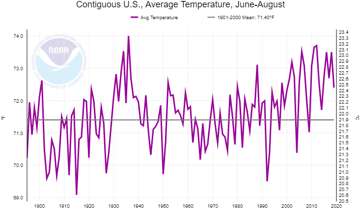
Figure 8. Contiguous U.S. average summer temperature. – NOAA Climate At A Glance.
In terms of describing how hot a summer has been, I don’t like using the average temperature (mean of the maximums and minimums). Rather, I like to use the average maximum temperature, because overnight lows are not generally “hot.”
The average summer maximum temperature has seen even less change since 1895 (Figure 9).⁶ The 1930s by far had hotter summers than anything that we’ve seen in the last four decades.
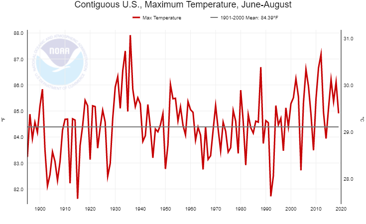
Figure 9. Contiguous U.S. average summer maximum temperature. – NOAA Climate At A Glance.
Another metric I like looking at are heat wave indices.
Heatwaves are very typical of summer and thus the frequency and intensity of them are very important statistics for long-term trends.
According to the Fourth U.S. National Climate Assessment, the average duration of heat waves has declined from eleven days during the 1930s to 6.5 days during the 2000s (Figure 10).⁷ That’s a 41% drop!

Figure 10. Warm spell duration. – U.S. Fourth National Climate Assessment.
Moreover, the average maximum temperature during a heat wave has also declined from 101°F in the 1930s to 99°F since the 1980s (Figure 11).⁷

Figure 11. Average warmest temperature each year. – U.S. Fourth National Climate Assessment.
The other issue I have with the Climate Central map doesn’t have to do with the map itself, but rather with the way it was being used.
In Mann’s original Tweet, he attempted to blame the heatwave on global warming. This is probably because he has no training in meteorology, and thus can’t come up with a meteorological explanation for this. If he just did a simple Google search, he’d find some really good articles on heatwave mechanisms… just sayin’.
Hey John Christy & Roy Spencer: hope you’re not finding that record century mark heat too uncomfortable down there in Huntsville 😮 https://t.co/u61EOUI4wX
— Dr. Michael E. Mann (@MichaelEMann) September 13, 2019
It’s also important to note that the heatwave Dr. Mann is referring to has occurred in September. Because of this, the Climate Central map he posted is an invalid scientific argument against Dr. Spencer. He’d have a much stronger case if he were to post September temperature trends, specifically for Huntsville, Alabama, which is the location he mentioned in his initial Tweet.
So, let’s take a look at the average maximum temperature in Huntsville for the first 15 days of September throughout the entire period of record.
So far this month, the average maximum temperature in Huntsville has been exactly 95°F (35°C).⁸ 2019’s month-to-date average maximum temperature for the city is so far ranked as 7th warmest.⁸ That is statistically significant, no doubt about it (Figure 12).
Another thing to note about the table below is that of the top ten warmest first 15 days of September for Huntsville, eight occurred prior to 2000, seven occurred prior to 1960, and six occurred just in the span of 17 years between 1922 and 1939. ⁸ That’s even more statistically significant than this year ranking 7th place.

Figure 12. Maximum 15-day mean max temperature for Huntsville, Alabama. – xmACIS2.
The average maximum temperature for September 1-15 in Huntsville, using the standard period 1981-2010, is 86.8°F (30.4°C).⁸ Since 2000, nine Septembers have had average maximum temperatures at or below average for the first 15 days (Figures 13 and 14).⁸

Figure 13. Average September 1-15 maximum temperature in Huntsville, AL. – xmACIS2.
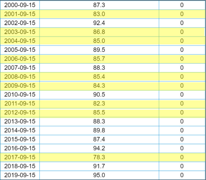
Figure 14. Average September 1-15 maximum temperature in Huntsville, AL. – xmACIS2.
During the period 1920-1939, only seven September 1-15ths were cooler than average by maximum temperature (Figure 15).⁸
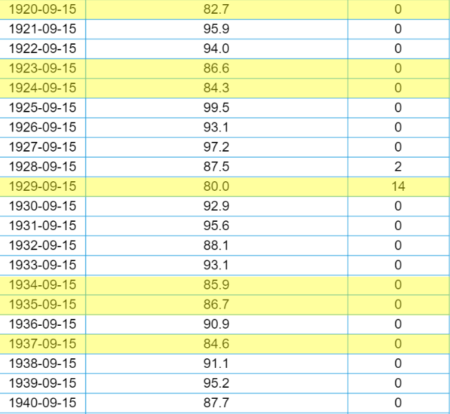
Figure 15. September 1-15 average maximum temperature in Huntsville, AL. – xmACIS2.
As for the leftover Septembers that were above average for the first 15 days, the average temperature departure was 6.6°F during 1920 to 1939 and 3.9° from 2000 to 2019, nearly 3° cooler than 1920-1939.
These statistics are very easy to find and take little time to evaluate. Instead of Dr. Mann being honest and/or credible with his data, he cherry picked one hot day of weather and ignored the long-term trend, which is what climate is.
Here’s an analogy: weather is like the atmosphere’s mood, climate is the atmosphere’s personality. Both are prone to change, but on much different time scales.
If you put junk science in, you’ll get junk science out.
REFERENCES
[1] Threaded Extremes. Accessed September 16, 2019. http://threadex.rcc-acis.org/.
[2] Heller, Tony. “UNHIDING THE DECLINE For Windows.” August 14, 2017. Accessed September 16, 2019. https://realclimatescience.com/unhiding-the-decline-for-windows/.
[3] Kahn, Brian. “Here’s How Much U.S. Summers Have Warmed Since 1970.” Climate Central. June 3, 2014. Accessed September 16, 2019. https://www.climatecentral.org/news/us-summer-temperatures-climate-change-17510.
[4] “GISS Surface Temperature Analysis.” NASA GISS: NASA Goddard Institute for Space Studies. Accessed September 16, 2019. https://data.giss.nasa.gov/gistemp/stdata/.
[5] “Summer Temperature Trends in the Contiguous U.S.” Climate Central. June 5, 2019. Accessed September 16, 2019. https://www.climatecentral.org/gallery/graphics/summer-temperature-trends-in-the-contiguous-us.
[6] “National Time Series.” Climate At A Glance | National Centers For Environmental Information (NCEI). 2018. Accessed September 16, 2019. https://www.ncdc.noaa.gov/cag/national/time-series/.
[7] “Chapter 6: Temperature Changes in the United States.” CSSR. 2017. Accessed September 16, 2019. https://science2017.globalchange.gov/chapter/6/.
[8] xmACIS2. Accessed September 16, 2019. https://xmacis.rcc-acis.org/.
Chris Martz
“So, right
ofoff the bat, this map is essentially useless now since it hasn’t been updated in six years.”Thanks for the spell check Mark, I didn’t catch that one. Sometimes I accidentally forget to add the “f.” I know how to spell, and thanks for correcting it. Appreciated.
Regardless of records etc has anybody ever said it can’t get hot? The point is whether what we are seeing is due to natural variation or not. Having a bit of hot weather somewhere – and given the almost infinite ways of dividing the Earth somewhere will be a record just about all the time – proves nothing whatsoever.
“Climate Central is an organization that is made up of scientists and journalists who research and report facts [and opinions] about climate change.”$200K comp including two at or near $400K+. Together, nine officers were >$100K and pocketed over 34% of the non-profit’s total contributions (which dropped 24% vs the prior year). Total compensation consumed 79% of their total income. For the year, they operated at a $940K loss which was 3.3X their remaining fund balance. No wonder Heidi Cullen left. There was no more money to pay her $394,000 price tag.
https://projects.propublica.org/nonprofits/organizations/261797336/201813199349305036/IRS990
When you censored the opinion part of my post, you also trimmed out some important facts…
This quote is the most interesting:
“the only difference being the 1930s had warmer days and cooler nights while more recent years have had cooler days, but warmer nights.”
UHI effect? I REALLY like the approach of using daily maximums to look at trends, not the averages. If the world is warming the maximums should be going UP, even if they aren’t record highs. Night time highs are too distorted by UHI effects for so many stations that they are worthless.
“UHI effect? I REALLY like the approach of using daily maximums to look at trends, not the averages.”
It sounds like UHI to me. I agree about using daily maximums and not the averages.
I agree too averages are completely misleading and are calculated after adjustments. They also do not factor in wind direction which can change temperatures by as much as 10c here in Sydney.
More humid air does the same thing.
Dry air gets cold at night by allowing radiations to flow freely out to space and heats up easily by day due to having a lower specific heat.
Also less humid = less clouds = cooler night, hotter daytime.
Correct, this is a combination of more water vapor in the atmosphere and increased UHI. In rural areas, it’s mostly water vapor.
Like “climate change” ..”global Temperature” is a Guess. NOAA uses about 6500 world wide sites to actually measure Temperature and then uses Guesses/proxy data to “smooth” the resulting “Projections”. Throwing darts at numbers on a wall has become Climate Science.
Media fails to make the distinction between Projections and Predictions and that Scenarios (made up stories) based on Proxies (made up data) are fed into unreliable computer models to produce the projection (wild a** guess).
NOAA could provide more accurate global Temperature ESTIMATES by taking the Temperature at the 23,000 locations of Starbucks Coffee.
What I found most amazing was how my Twitter feed covered up all the graphs proving Mann wrong with “sensitive material” warnings. So I guess nay graph that upsets Michael Mann or contradicts him is “sensitive material”.
Alarmists have very sensitive eyes, psyches, and feelings. They must be protected from any truth that may offend them.
M. Mann is still waiting for his “Participant Trophy” for the Hokey Stick
Why is this fraud not facing a trial for organized fraud? It’s not junk science – it no science at all. A lie is not science. An opinion is not science. I have opinions every second, even when I dump. That’s still not science. Mann has done science a disservice as we will never be able to innocently believe scientists anymore. Maybe that’s a good thing after all.
Mann blocked me and I never called him anything before he blocked me(only after). He blocked me because he had read threads proving that I knew too much. BTW , Heat waves prove that they have nothing to do with CO2 levels. If you look at the previous year week or day for a heatwave you will usually find that the ave temp for that week or day was many degrees cooler. A 2ppm increase in atmospheric CO2 can’t account for the vast temperature increase in 1 year.
This is a very interesting post. Thanks, Chris Martz.
Among the other things I take from this post, I think the charts are instructive.
All the charts show the cold period of the 1910’s; the warm period peaks of the 1930’s; the cold period of the 1970’s; and the warming from the late 1970’s to the present, with present warming being cooler than the warm peaks in the 1930’s.
So looking at these charts we can see the reason climate scientists were worrying about the Earth heading into another Ice Age in the 1970’s, because it had been cooling for decades and had reached a low not seen since the early 20th century.
Now, fast-forward to today and what do we see but the fraudulent Hockey Stick chart erasing all these features of the global climate in an effort to sell the fraud to the public.
Below is a link to the Hansen 1999 US surface temperature chart (on the left in the page), whose temperature profile looks very much like the charts shown in this article, with the 1930’s being warmer than today; and next to the Hansen 1999 chart is the fradulent Hockey Stick chart (on the right in the page).
Look at how the fraudulent Hockey Stick chart has cooled the 1930’s and warmed the 1970’s, in comparison to the Hansen 1999 chart, so if you didn’t know history and your only knowledge of past weather was the Hockey Stick then you would be completely unaware of the very hot Dust Bowl 1930’s and the very cool “ice age” of the 1970’s, because they don’t show up on the chart.
Everyone knows, even the alarmists, that the Ice Age scare occurred, and they know why, yet they erase the evidence from the global temperature record. They had no choice but to do this. It was the only way they could cool off the 1930’s. So they disappeared the ice age scare and hoped noone would notice. And, for the most part, noone has noticed, or at least it has not been a major topic of conversation, although it should be because it looks like pretty solid evidence of fraud.
All the unmodified regional charts from all around the world still show the warm peaks of the 1930’s, and the cold periods of the 1970’s. They all, more or less, resemble the temperature profile of the Hansen 1999 chat. So the Hansen 1999 temperature profile is the real global temperature profile. The real temperature profile says to us that there is no unprecedented warming today and therefore there is no need to worry about CAGW or an overheating world.
NONE of the unmodified charts resemble the fraudulent Hockey Stick chart. That would be because the Hockey Stick chart does not represent reality. It is science fiction created to fool people into being very scared, so they can be manipulated.
http://www.giss.nasa.gov/research/briefs/hansen_07/
The hokey stick represents a well homogenized proxy that was abandoned at the point where it just couldn’t provide confirmation anymore, and the UHI tainted surface record was stitched onto it
What kind of a human being is Michael Mann?
The sort to forge a Nobel Prize and award it to himself, then present the document and claim he is a Nobel winner.
Who does this?
A transparent lie, easily checked, as fraudulent as anything I have ever even heard of.
He makes the merely vainglorious seem humble by comparison.
Documented here by Tony:
https://realclimatescience.com/
Apparently, Mann not only bastardizes the historic temperature records, he also bastardizes the Nobel Peace Prize and creates his own version of the award to make it look like it was awarded to him personally.
Heller has it all documented on his website. I guess Mann is consistent: He makes up temperatures and he makes up awards for himself.
And we are going to turn our society upside down on the advice of this man? I don’t think so.
https://realclimatescience.com/2019/09/michael-mann-fake-nobel-prize-fake-science/
Here’s how the Nobel Institute described Mann’s bastardization of their Nobel Peace Prize:
Heller: “The Nobel Prize committee says the he was not awarded the Nobel prize, and that he forged his fake document.”
“1) Michael Mann has never been awarded the Nobel Peace Prize.
2) He did not receive any personal certificate. He has taken the diploma awarded in 2007 to the Intergovernmental Panel on Climate Change (and to Al Gore) and made his own text underneath this authentic-looking diploma.
3) The text underneath the diploma is entirely his own. We issued only the diploma to the IPCC as such. No individuals on the IPCC side received anything in 2007.”
Geir Lundestad, director of the Nobel Institute
end excerpt
I’m sure “quite a few skeptics” do confuse weather and climate as alarmist do, but maybe not as many as your impression?
When some alarmist, like Mann and sources “hyping” the weather in support the “CAGW” meme (like TWC), use the a weather event, often past weather events are used in rebuttal.
Like you did in response to Mann. Countering the hype.
I believe that most times that you see skeptics “confusing” weather with climate, it is done to mock alarmists. That has been my experience.
Yes, many skeptics use cold waves and snowfall as evidence that global warming isn’t occurring. That’s not good science either, but alarmists are the bigger problem.
You missed my point Chris, which leads me to believe you are missing the point of many skeptics who point to cold weather as climate as a way of illustrating the conflation of weather and climate found in the writings/ponderings/rantings of every alarmist. Often skeptics do this tongue in cheek, and assume that we will get the joke without a sarc tag. Can you show me examples of a skeptics seriously conflating weather and climate?
Or as someone put it:
The Climate Is What You Expect; The Weather Is What You Get
A synopsis of the history of this phrase is found here:
https://quoteinvestigator.com/2012/06/24/climate-vs-weather/
“Here’s an analogy: weather is like the atmosphere’s mood, climate is the atmosphere’s personality. Both are prone to change, but on much different time scales.”
That is unquestionably the best analogy I’ve ever read – about anything.
Anthropomorphism is a way of expressing objective facts in a somewhat subjective manner.
(My previous comment hasn’t shown up yet. This is meant as a “PS” to it.)
For my little spot on the globe, Columbus Ohio, the record high for Sept. 13 was 95 set in 1897 and tied in 1939.
If you look at the current NWS records, you’ll see it listed as the record high 95, 1939.
They show the most recent tie as the year of the record now.
(To be fair, they seem to treat record low the same way.)
The year the record was set is not always what you see. You see the most recent year the high/low record was reached.
The same maroons who are proclaiming the current heat wave as proof of global warming were dismissing the record cold from this past winter as just weather.
Hypocrites, all of them.
They’re working hard on it-
“Simulating the conditions of a world long gone can make climate models – which scientists use to predict of the future of climate change – more accurate.”
https://www.msn.com/en-au/news/techandscience/a-new-model-of-the-earths-climate-50-million-years-ago-is-revealing-worrisome-clues-about-what-our-future-could-look-like/ar-AAHuXQI
Climastrology needs lots more stimulations like this to build a great edifice of climastrological models. That way the climastrologists can’t be accused of erroneously claiming settled science. Oh and send more grants for more fine tuning models.
Yowzah it’s unprecedented giant ice slabs forming an impenetrable turtle shell causing lots of runoff filling the oceans but wot could get under the slabs through crevasses and we’d all be doomed-
https://www.msn.com/en-au/news/techandscience/something-strange-is-happening-to-greenlands-ice-sheet/ar-AAHuRth
Hold all the XYZocene stimulations for more accurate predictions with the current computer models as this is serious dooming stuff.
In the course of a human lifespan, most cycles nature seem strange and frightening.
The dishonest BBC produced a TV programme recently called “Climate Change – the Facts” which was chortled at all over the blogosphere and jocularly renamed “Climate – Change the Facts”. It was a truly dreadful pack of lies and featured Mikey Mann. I asked the Beeb via complaints procedures whether they remembered Climategate and how could they spit in the face of their taxpayers by parading the most disgraced scientist on the planet. The answer was as you would expect.
I was thinking of making and selling t-shirts “Blocked by Michael Mann” – even if only half the people bought them I could maybe retire……with a hockey stick type sales trend.
Do you get the strong impression their science isn’t really that settled at all and it has stuff all predictive capability-
“Ultimately the whole design is to improve our models,” says Matthew Shupe, an earth scientist at the University of Colorado and NOAA’s Earth System Research Laboratory who will be on the expedition. “That’s why we’re out there. I think we’ll learn so much more about the physical processes that will help us in our predictive capabilities.”
https://www.msn.com/en-au/news/techandscience/scientists-are-about-to-spend-a-year-trapped-in-arctic-ice/ar-AAHvb7F
I have one hypothesis regarding choosing 1970 as the base start period. That is likely because of the systems that choose to do their calculations with are Unix/Linux based and thus uses the standard Epoch time. Rather than adjusting their code/programming to account for the default Date (such as in Java’s java.util.Date class), they chose to just start with 1/1/1970.
https://stackoverflow.com/questions/1090869/why-is-1-1-1970-the-epoch-time
https://stackoverflow.com/questions/2533563/why-are-dates-calculated-from-january-1st-1970
You get glimpses of Green junk science all over the place as rapid technological advance with data gathering and number crunching exposes a dearth of like long term information and temperature proxies are the classic example of making it up. But you can’t make it up with whale numbers and there’s no proxies for the past other than whale kill numbers-
“The gray whale population could be the largest since whaling was ended in the 1940s. It’s possible that there are too many whales for the food that’s available.
It’s unknown whether there were similar die-off events before whaling began and whether this is part of a natural population cycle or something new. Scientists have no idea what the original gray whale population was before they began to be hunted for their blubber, which was made into oil for lamps.”
https://www.msn.com/en-au/news/world/121-gray-whales-found-dead-on-beaches-cause-of-death-unknown/ar-AAHyn1v
Same story in Australia with Humpbacks crawling all over our coastline and the more threatened Southern Right numbers doubling every 10 years after the cessation of whaling. Basically the whales are saved everywhere (thank you fossil fuels) and have been for some time. Simple logic would tell you sooner or later their numbers would press on their food stocks and Nature would take its course on setting an upper bound for whale numbers.
But of course the great Green blob will be Hell bent on trying to pin every washed up whale on the evils of mankind but that will be a lot harder than tree ring circuses particularly as beachgoers get sick of the stinky carcases washed up. Rainbow Warriors your days are finished and now you have to get real jobs.
Chris Martz ==> Very nicely done — informative and thorough.