
From the website Statistical Modeling, Causal Inference, and Social Science at Columbia University comes this hilarious but real bit of data analysis. Looking at short trends in the global surface temperature data, the analysis shows that global temperature has not increased under Republican presidents, only Democrats. It’s probably spurious correlation, but still very entertaining. – Anthony
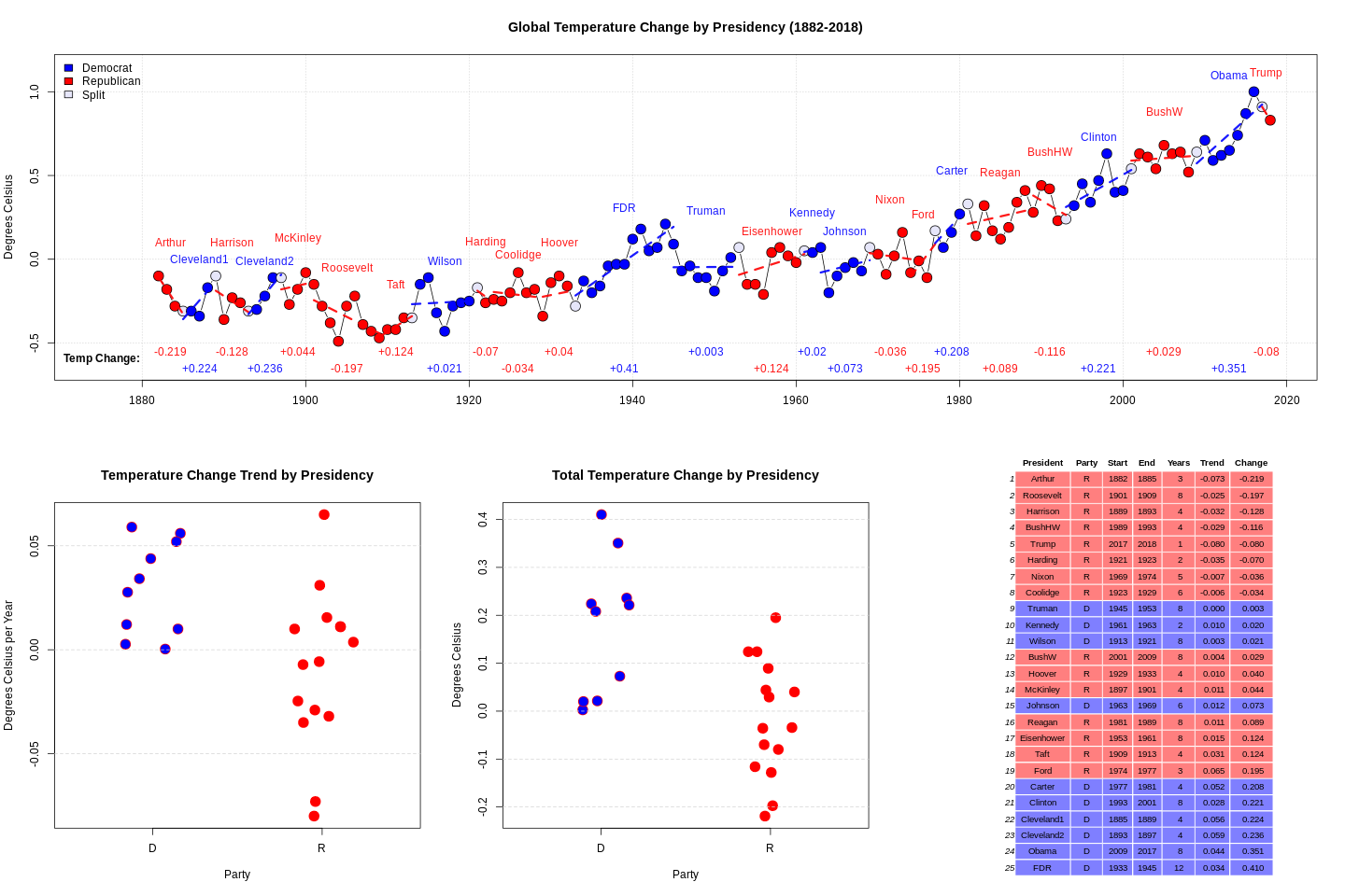
Andrew writes: An anonymous blog commenter sends the above graph and writes:
I was looking at the global temperature record and noticed an odd correlation the other day. Basically, I calculated the temperature trend for each presidency and multiplied by the number of years to get a “total temperature change”. If there was more than one president for a given year it was counted for both. I didn’t play around with different statistics to measure the amount of change, including/excluding the “split” years, etc. Maybe other ways of looking at it yield different results, this is just the first thing I did.
It turned out all 8 administrations who oversaw a cooling trend were Republican. There has never been a Democrat president who oversaw a cooling global temperature. Also, the top 6 warming presidencies were all Democrats.
I have no idea what it means but thought it may be of interest.
My first thought, beyond simply random patterns showing up with small N, is that thing that Larry Bartels noticed a few years ago, that in recent decades the economy has grown faster under Democratic presidents than Republican presidents. But the time scale does not work to map this to global warming. CO2 emissions, maybe, but I wouldn’t think it would show up in the global temperature so directly as that.
So I’d just describe this data pattern as “one of those things.” My correspondent writes:
I expect to hear it dismissed as a “spurious correlation”, but usually I hear that argument used for correlations that people “don’t like” (it sounds strange/ridiculous) and it is never really explained further. It seems to me if you want to make a valid argument that a correlation is “spurious” you still need to identify the unknown third factor though.
In this case I don’t know that you need to specify an unknown third factor, as maybe you can see this sort of pattern just from random numbers, if you look at enough things. Forking paths and all that. Also there were a lot of Republican presidents in the early years of this time series, back before global warming started to take off. Also, I haven’t checked the numbers in the graph myself.
h/t to Dr. Roger Pielke Jr.
Ok, I agree its really funny, albeit ‘not’ serious. Makes some great 2020 election memes.
The adjustocene is real
Yes. It’s all a bit of harmless fun, and possibly educative for some, until they came out with that statement about needing to identify the unknown third factor. If you are sitting on somebody’s academic committee then you haul them over the coals for making that kind of a statement.
Come on guys. The presidency doesn’t explain the climate so it must be the climate that explains the presidency.
When it is warming Americans get so fed up with hearing it all the time that they go elect a Republican only to get a rest. As the rate of change in temperature has a 4-year periodicity that can be seen clearly in David Middleton’s figure above that changes course every two cycles, American politics is synchronized to a climatic periodicity.
Soon Republican politicians will start promising a temperature decrease in their campaigns. That has to drive democrats crazy.
Correlation does not imply causation.
But it does make you go “hmm…”
More like “what the … “
My theory is the onslaught of increased taxes and just plain “stupid policies” makes everyone run a little hot. All those extra “anger calories” burning 24/7 is increasing the gorebull temperature.
Save the World!! Elect a Republican. Do it for the Children!
Puzzled why the headline says “Global temperature has not increased under Republican presidents, only Democrats” when the graph shows almost half of Republican presidents had a warming trend.
It is known as “summing the total”. When you sum the total of “Republican Presidents” it shows that the temperature HAS NOT INCREASED for the Republican Presidents.
Would you like me to show you how?
If the article was referring to aggregate Republican Presidents it would have been helpful to actually show the total sums rather than just listing the changes President by President.
Not though that the main reason for Republicans causing a net cooling was down to Arthur and Roosevelt causing around 0.4°C of cooling in the late 19th early 20th century. Post WW2 Republican Presidents have caused a net warming.
At the risk of taking this joke too seriously, there’s a reason why adding up arbitrary trend lines doesn’t make sense. Look at the combined 12 years of Reagan and Bush. Clearly temperatures rose during that period, by about 0.15°C, but using the logic of adding up all the sub parts the article says Reagan caused 0.089°C caused, Bush caused 0.116°C of cooling for a net cooling.
ROFL Hey! It correlates so it MUST be true!
Food. It gets cheaper and more abundant when it warms. That drives economic growth. That would be a near instntaneous correlation to warming and economic growth.
Re. the mention of the “National Debt” W hat don’t understand is that if a person, male or female is in debt, sooner or later they have to pay it back or be declared “Bankrupt”
But these basic rules do not appear to apply to government We see the farce here in Australia and no doubt elsewhere where the polititions are now saying that there is Good Debt and Bad Debt.
Good Debt allows them to build grand things such as road and rail but bad debt only pays the salaries of the government employees.
As for “Balancing the budget, well let s not mention the Debt.
MJE
It is the government’s prerogative to devalue the currency by inflation. The populace works to increase its value, the government takes that value away by printing money (“quantitative easing” as it is called today).
When it gets out of hand you change the name of the country to Venezuela, Zimbabwe, the Weimar Republic, or some such.
I love the Dune series. I routinely reference the Bene Gesserit Litany Against Fear’s “Fear is the mind killer…”
Seems to be so apropos in so many situations.
If there’s any real phenomenon at work here (e.g. geomagnetic, astronomical if not astrological) it surely would link globally to more trends, assuming the United States citizens are not some special category of beings influenced by short terms changes in world temperature trends or their underlying causes.
The correlation the other way, that some elected administration can influence measurements repeated globally by organizations not having much of a relationship to any change in US political climate, seems completely and utterly unfalsifiable as hypothesis and therefore not scientifically relevant.
I’m glad we’ve had a few topics covering the temperature record, as it gives me a chance to talk about what I’ve been doing without it being a big non sequitur. A while back after I found the NOAA GHCRN data with its daily files, I’ve been playing around, loading it into my database at home and checking to see which stations have good coverage over a period of years.
Tonight I took two stations that had good coverage and were separated pretty well by distance and ran some numbers on them. The Stations were USW00093729, CAPE HATTERAS AP, and RSM00024908. VANAVARA, at some 60 deg. North latitude.
I was able to get full baselines from the station data, from 01-JAN-1981 to 31-DEC-2010, for all months. For a test year, I used 2013 which had good coverage as well. Long story short, here are the numbers I got:
RSM00024908 had a 30-year mean for April of -3.3C and a 2013 mean for April of -2.0, giving an anomaly of +1.3C.
USW00093729 had a 30-year mean for April of 15.5 C and a 2013 mean for April of 15.1, giving an anomaly of -0.4 C. What I found surprising were the errors once I tracked them correctly. At least, I can say I used methods shown multiple times at various math and statistics websites.
RSM00024908 ‘s 30-year mean for April had a standard error of 0.09C, with N=894. Dividing the standard error by the square root of the number of samples = 0.03 C. The Hatteras station had a standard error of 3.9, and dividing that by the square root of 394 = 0.13.
We’re not done yet. Calculating the anomaly means subtracting the baseline 30-year April mean from the 1-year April mean, and that carries with it it’s own error propagation. To calculate the standard error for adding or subtracting two values with error, you solve them in quadrature, which means you take the square root of the sum of the squares of the individual errors. In the RSM00024908 case, we have sqrt(0.02^2 + 0.13^2) = 1.1. That is a pretty big error. Station USW00093729 had errors of 0.7 and 0.13, which gives us sqrt(0.7^2 + 0.13^2) = 0.7. The final anomalies with error came out as 0.4 +/- 0.7C at Cape Hatteras, and 1.1 +/- 1.3C at Vanavara.
Those are not very good numbers, but I can’t see any error in how I applied the various formulae to calculate the standard error and the error in the mean. If you had similar numbers and. 5000 stations, the numbers still wouldln’t be that great. A standard error of 1.4 after running the numbers and then dividing by the square root of N still have an error of 0.14.
These are much larger than the anomalies and error bars we see in the literature, so it would be interesting to take an even closer look to see where the errors lie.
Well, holy hell. I messed up big somewhere when doing the figuring in my third-to-last paragraph. Either I had a copying error when pasting into the Excel cells, or I messed up copying from the Excel results.
Not good, no matter how you look at it. Maybe this will teach me not to try to do cipherin’ when I’m tired. I’ll have to check my figures and post a correction.
I am sure the counter would be that typically Dems rules result in more economic activity by some measures, do CO2 goes up.
Basically these are after the fact arguments, since proponents can never point to specific actions that create the result.
Simple.
Under Dems the science is politicized and data homogenized to political will, Repubs change the big chiefs and the real world data is recorded without being politically inflated.
I recall seeing a plot comparing sunspot number to the number of Democrats in the US Senate.
Pretty good correlation 🙂
So, to solve global warming Trump needs to be President permanently? I think democrats would rather let the world burn 🙂
I have done the math (using the “Slope” command in Excel) to confirm all the way back to Abraham Lincoln.
The AVERAGE Republican stint has seen the temperature drop 0.03C
The AVERAGE Democrat stint has seen the temperature rise 0.11C
As Joe Biden might say – a four letter word – Karma.