I called the Arctic sea-ice turn upwards a few days ago here. From NASA/GODDARD SPACE FLIGHT CENTER and the “you could also say 31st highest on record” department.
End-of-summer Arctic sea ice extent is eighth lowest on record
Arctic sea ice appeared to have reached its yearly lowest extent on Sept. 13, NASA and the NASA-supported National Snow and Ice Data Center (NSIDC) at the University of Colorado Boulder have reported. Analysis of satellite data by NSIDC and NASA showed that at 1.79 million square miles (4.64 million square kilometers), this year’s Arctic sea ice minimum extent is the eighth lowest in the consistent long-term satellite record, which began in 1978.
Arctic sea ice, the layer of frozen seawater covering much of the Arctic Ocean and neighboring seas, is often referred to as the planet’s air conditioner: its white surface bounces solar energy back to space, cooling the globe. The sea ice cap changes with the season, growing in the autumn and winter and shrinking in the spring and summer. Its minimum summertime extent, which typically occurs in September, has been decreasing, overall, at a rapid pace since the late 1970s due to warming temperatures.
This year, temperatures in the Arctic have been relatively mild for such high latitudes, even cooler than average in some regions. Still, the 2017 minimum sea ice extent is 610,000 square miles (1.58 million square kilometers) below the 1981-2010 average minimum extent.
“How much ice is left at the end of summer in any given year depends on both the state of the ice cover earlier in the year and the weather conditions affecting the ice,” said Claire Parkinson, senior climate scientist at NASA’s Goddard Space Flight Center in Greenbelt, Maryland. “The weather conditions have not been particularly noteworthy this summer. The fact that we still ended up with low sea ice extents is because the baseline ice conditions today are worse than the baseline 38 years ago.”
The three years with the lowest Arctic ice extents on record –2012, 2016 and 2007– experienced strong summer storms that hammered the ice cover and sped up its melt. “In all of those cases, the weather conditions contributed to the reduced ice coverage. But if the exact same weather system had occurred three decades ago, it is very unlikely that it would have caused as much damage to the sea ice cover, because back then the ice was thicker and it more completely covered the region, hence making it more able to withstand storms,” Parkinson said.
On the other side of the planet, Antarctica is heading to its maximum yearly sea ice extent, which typically occurs in September or early October. This year’s maximum extent is likely to be among the eight lowest in the satellite record — a dramatic turn of events considering that 2012, 2013 and 2014 all saw consecutive record high maximum extents, followed by a sudden large drop in 2015 and a further although smaller decrease in 2016. So far, the September Antarctic ice extents this year are comparable to those of a year ago.
“What had been most surprising about the changing sea ice coverage in the past three decades was the fact that the Antarctic sea ice was increasing instead of decreasing,” Parkinson said. “The fact of Arctic sea ice decreases was not as shocking because this was expected with a warming climate, although the overall rate of the decreases was greater than most models had forecast.”
Parkinson said that although it is still too early to talk about a long-term reversal in the behavior of Antarctic sea ice, the decreases witnessed in the past two years provide important data to test the various hypotheses that scientists have put forward to explain why Antarctic sea ice coverage had been increasing, overall, between 1979 and 2015.
Adding the Antarctic and Arctic sea ice extents month by month through the satellite record shows that globally the Earth has been losing sea ice since the late 1970s in each portion of the annual cycle of ice growth and decay.
“In fact, this year, every single month from January through August experienced a new monthly record low in global sea ice extents,” Parkinson said.
###
NSIDC concurs here

Source: https://nsidc.org/data/seaice_index/
Phew! That was a close one.
I guess we’re all gonna live, now.
Until next year.
Wasn’t Arctic ice free in the summer under Holocene Optimum, 8.000 – 5.300 years ago? I worry if there is more sea ice and glaciers and I cheer up if there is less. Who wants a new ice age?
“Who wants a new ice age?” Probably the traditional print-media in a year or five, when they think it might help advertising revenues.
While the North Atlantic Oscillation may work to a ~sixty year cycle, the MSM probably doesn’t, and can’t afford to.
“PS: For perspective, sea levels around Australia in the Holocene peak 7,000 ya were 1 – 2m higher and have been falling since then. (But notice the resolution on those Australian graphs at that link are nowhere near as good as this new study). Further back in the past, sea levels were 9m higher around Kalbarri Western Australia circa 120,000 ya.” Jo Nova.
Asian sea levels changed rapidly 6,000 years ago — natural sea level rise “unprecedented”
http://joannenova.com.au/2017/02/asian-sea-levels-changed-rapidly-6000-years-ago-natural-sea-level-rise-unprecedented/
End of Arctic ice was predicted a short while back for 2018, so hold your breath. As for the reporting, the minima is unchanged for the past 8 years.
Sorry, that is nonsense. There has been plenty of variability. Are you saying that it is the same this year as it was 8 y ago?
Sea ice volume jumped by 45% in one years in 2013. The 2016 OMG low was the same as the 2007 OMG low and also significantly greater than the 2012 OMG OMG low.
Certainly not “unchanged”.
2012 was the low point on Arctic ice.
The tide has turned.
Arctic fluctuations are cyclical. End of story.
Approximate 60-year cycle, Eric?
“The minimum ranked 8th ( i. e.: after a record minimum Max in the winter 16/17, for which Super El Nino was responsible)” It is amazing that the ice, which is very well-regarded for thin, is hardly thicker than a half meter after Piomas and ARC in wide parts of the eastern arctic. But it survived until september. Are PIOMAS and ARC Fake News performers in terms of ice thickness? There are still a few swamps of impossibilities to dry. Good luck Mr Trump. At least, Cryosat 2 from europe did not support these ice thicknesses until its ending of the data in May (because ice mass measurement by satellite in summer is a heavy to impossible business), but the ice was remarkably thicker in this region in may, which is so poorly regarded by PIOMAS. This is noticed even by starved AGW fans in the Sea Ice Blog. Bravo!
Another addition: According to the own graphics of the NSIDC all monthly cuts since June were over the 2012 line. How does that fit with the sentence that every month to August has seen a record minimum? Fake News? ?w=1440&h=1170
Yes, I was going to comment on that too. Is the graph recent data that wasn’t available when the misstatement was made? (I’m trying to be charitable)
I believe they were referring to the global sea ice extent. With the step change in Antarctic ice downward from 2014 and the low-ish Arctic extents this year, the combined might well be lower. I have not done the actual math myself.
So NOW the CAGW scare-mongers comment on the total sea ice going down (Arctic+Antarctic), but didn’t want to talk about the previously increasing Antarctic sea ice, excluding it and only talking about the decreasing Artic sea ice.
What’s the betting that now they will switch to talking about decreasing and/or records for TOTAL sea ice minima, even if the Arctic starts increasing again?
The PDO and AMO make the Arctic and Antarctic go in different directions
Ah, I love science by assertion. Saves so much time.
Like robust, settled, what else could it be, what pause? Then in 2013, if you add changes in ocean currents, hey presto, the hiatus can be explained!
http://www.nature.com/nature/journal/v501/n7467/full/nature12534.html
A bit like the assertion that we’re going to die in a fiery maelstrom, surrounded by raging seas, with millions of refugees crossing the globe… Oh, hang on.
While the daily average extent for the last 10 years bottomed out on day 260, years like 2016 and 2009 hit minimum on day 254. This year’s extent was at 4.7M km2 for a week, hit bottom at 4.6M on day 253, then rose up and over 4.8M km2. SII (Sea Ice Index) 2017 is similar to MASIE, though a bit lower lately. The graph below shows September comparisons through day 260.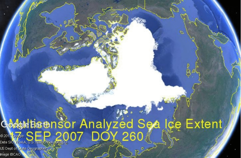 ?w=1000
Some take any year’s slightly lower minimum as proof that Arctic ice is dying, but the image below shows extents from 2007, mostly smaller than 2017.
https://rclutz.wordpress.com/2017/09/18/arctic-ice-exceeds-at-minimum/
In that animation from 2007, it’s amazing how stable the Greenland icecap looks through those years…no real change, and according to recent measurements – the Greenland icecap is actually growing…
Greenland’s ice sheet is not growing. It is losing ice, almost every year.
But the rate is slow. At the current estimated average rate of net ice melt in Greenland it would take between 90 and 150 centuries to melt it all (depending on whose estimates you believe).
That doesn’t have much effect on sea-level: just 0.5 to 0.8 mm/year of sea-level rise (= 2–3 inches per century).
The rate doesn’t seem to have been much affected by anthropogenic CO2, but even if it were, it wouldn’t matter much, because the anthropogenic spike in CO2 levels will probably last only another century or two, at most — not nearly long enough to put much of a dent in Greenland’s ice.
actually this year the greenland ice cap saw a net growth. but this is the first time it did.
JPP, the MASIE charts are covering only the sea ice, so changes in Greenland ice cap are not visible in this image.
Ron, there is a lot of variability caused by weather so looking at the daily minimum date is not a good guide. I found that it needed at 14d low-pass filter to get a unique turning point each year. Having done that we see that date of minimum sea ice was drifting later until 2007 and has been getting progressively earlier ever since.
https://judithcurry.com/2016/09/18/is-the-arctic-sea-ice-spiral-of-death-dead/
Yes, the Sept. monthly average will be used to indicate the annual minimum, and that is looking to end up at least 4.8M km2, compared to 3.6M in 2012 and 4.2M in 2007.
Ron, thank you for that link and that animated gif. Nice work there.
Dave, you asked a great question on my blog, and let also respond here:
Dave, thanks for asking a great question. All queries are good, but a great one forces me to dig and learn something new, in this case a more detailed knowledge of what goes into MASIE reports.
You asked, where do they get their data? The answer is primarily from NIC’s Interactive Multisensor Snow and Ice Mapping System (IMS). From the documentation, the multiple sources feeding IMS are:
Platform(s) AQUA, DMSP, DMSP 5D-3/F17, GOES-10, GOES-11, GOES-13, GOES-9, METEOSAT, MSG, MTSAT-1R, MTSAT-2, NOAA-14, NOAA-15, NOAA-16, NOAA-17, NOAA-18, NOAA-N, RADARSAT-2, SUOMI-NPP, TERRA
Sensor(s): AMSU-A, ATMS, AVHRR, GOES I-M IMAGER, MODIS, MTSAT 1R Imager, MTSAT 2 Imager, MVIRI, SAR, SEVIRI, SSM/I, SSMIS, VIIRS
Summary: IMS Daily Northern Hemisphere Snow and Ice Analysis
The National Oceanic and Atmospheric Administration / National Environmental Satellite, Data, and Information Service (NOAA/NESDIS) has an extensive history of monitoring snow and ice coverage.Accurate monitoring of global snow/ice cover is a key component in the study of climate and global change as well as daily weather forecasting.
The Polar and Geostationary Operational Environmental Satellite programs (POES/GOES) operated by NESDIS provide invaluable visible and infrared spectral data in support of these efforts. Clear-sky imagery from both the POES and the GOES sensors show snow/ice boundaries very well; however, the visible and infrared techniques may suffer from persistent cloud cover near the snowline, making observations difficult (Ramsay, 1995). The microwave products (DMSP and AMSR-E) are unobstructed by clouds and thus can be used as another observational platform in most regions. Synthetic Aperture Radar (SAR) imagery also provides all-weather, near daily capacities to discriminate sea and lake ice. With several other derived snow/ice products of varying accuracy, such as those from NCEP and the NWS NOHRSC, it is highly desirable for analysts to be able to interactively compare and contrast the products so that a more accurate composite map can be produced.
The Satellite Analysis Branch (SAB) of NESDIS first began generating Northern Hemisphere Weekly Snow and Ice Cover analysis charts derived from the visible satellite imagery in November, 1966. The spatial and temporal resolutions of the analysis (190 km and 7 days, respectively) remained unchanged for the product’s 33-year lifespan.
As a result of increasing customer needs and expectations, it was decided that an efficient, interactive workstation application should be constructed which would enable SAB to produce snow/ice analyses at a higher resolution and on a daily basis (~25 km / 1024 x 1024 grid and once per day) using a consolidated array of new as well as existing satellite and surface imagery products. The Daily Northern Hemisphere Snow and Ice Cover chart has been produced since February, 1997 by SAB meteorologists on the IMS.
Another large resolution improvement began in early 2004, when improved technology allowed the SAB to begin creation of a daily ~4 km (6144×6144) grid. At this time, both the ~4 km and ~24 km products are available from NSIDC with a slight delay. Near real-time gridded data is available in ASCII format by request.
In March 2008, the product was migrated from SAB to the National Ice Center (NIC) of NESDIS. The production system and methodology was preserved during the migration. Improved access to DMSP, SAR, and modeled data sources is expected as a short-term from the migration, with longer term plans of twice daily production, GRIB2 output format, a Southern Hemisphere analysis, and an expanded suite of integrated snow and ice variable on horizon.
http://www.natice.noaa.gov/ims/ims_1.html
Yep, pay attention to how much more ice there is around the Canadian islands, 2017 by far the most.
I noticed that. No open NW Passage this year.
The low area, as usual, was along Siberia and Alaska, where there has been volcanic activity.
to me that means more multi year ice.
Bob,
Most assuredly, IMO.
I think that I have told the environmental alarmists a trillion times not to exaggerate. Their credibility is evaporating.
Where is Griff…he has a few debts to settle if I recall correctly. I wonder how our friend weasels out of this one?
Simples. He can’t figure out a way to make taxpayers pay for it. Phony lefties never use their own money.
Oh. C’mon. 1.7 million square miles is “essentially” ice free. 😛
Their creditibility is sublimating.
The earth is getting a cold
That often happens when you have a fever!
Perhaps the Earth is presently having a cold sweat!!
I saw an article which claimed the the early 1980’s typically had greater than normal ice extent than much earlier years, although there was questions about the credibility of that article.
If it were true it would indicate that comparing 2017 to 1981 might be cherry picking.
Can some verify or discredit the claim that the early 1980 period had abnormally high Arctic sea ice extent?
Yes. Satellite records actually go back to the late 1960s early 1970s. Those graphics show a peak when the official record starts, which happens to be the peak of the “Ice Age Scare”.
For most of the last 10000 years sea ice was considerably lower then today.
Oh, here is a link…
https://realclimatescience.com/government-arctic-sea-ice-fraud/
And an image, showing the very warm US 1930s – 40s also had low sea ice…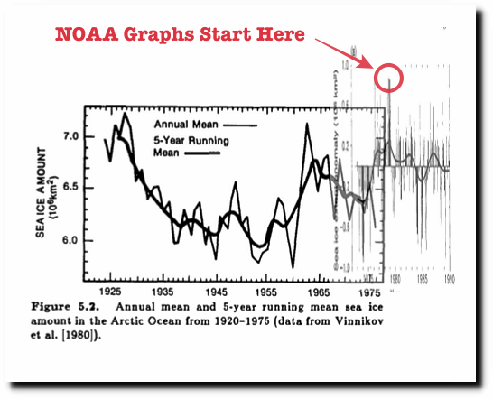
Antarctic ice has 5yr ‘bounces’ and last year was due for decline. The strong 2016 El Nino likely aggravated the larger than expected drop. With the entire SH covered in cold water, this year will see a strong return to recovery.
Similarly the cold water in the NH and a deepening approach to La Nina aided by the cool global oceans overall, will see a substantial, steep recovery in Arctic ice and cold winters in North America.
The cooled Gulf stream waters, intercepted by the mass of cold water in the north Atlantic will deliver a bitter cold winter to UK, Scandinavia and Siberia. Cold lobes from NE Russia could chill continental Europe, particularly Germany and eastern Europe, but France is likely to suffer, too. Heavy snows in the Alps.
Global temperatures will drop and the Pause will re-establish itself to likely 10years without warming. Remember this forecast. It is based entirely on dropping Ssts.
Cold lobes from the NE (Russian Central North)
Noted Gary. Thanks.
The Farmer’s Almanac has been spot on all year for Southern Ontario. We are loving our first real summer weather just as the equinox approaches. They call for snow in mid-October. We’ll see. No El Niños around here now.
I have also been of the opinion that Europe will face a severely cold winter at the end of this year. Here is a spot in Siberia which I have kept track of for the last 2 years, …https://earth.nullschool.net/#current/wind/surface/level/overlay=temp/orthographic=-248.48,66.32,672/loc=128.537,62.442
That area is where the first deep fall/winter cold has set in over the last 3 winters. This winter I think that this Siberian cold spot will set in more to the west. If that happens, then this should lead to minus temps penetrating as far west as into France. Last winter the -12 F temps or lower stopped in eastern Poland.
Here is a new location which I have kept track of this year. This location as well as a corridor running north and south of this spot remained fairly cool ever since the end of last winter. It is only in recent weeks where surface winds warmed this area slightly as compared to points further to the east in Siberia. I am wondering if this indicates that the fall/winter cold spot will develop here first. The cold spot will show itself next month. …https://earth.nullschool.net/#current/wind/surface/level/overlay=temp/orthographic=-258.75,66.32,672/loc=94.389,62.565
Goldminor, I’ve ordered an extra cord of wood this year for no other reason than I had some left from last year. I’ve book marked those links and watch what happens, and see if that wood gets used (Plan for the worst, hope for the best).
It would seem that the date of minimum ice is a better indicator of a warming planet than total volume. Can anyone tell me if the date has gotten substantially latter in recent decades?
Antarctic ice this year simply results from the freakish weather conditions late last year and early this year.
The actual gain in Antarctic sea ice from low to high was impressive, but couldn’t offset the very low minimum, due to the combo of ENSO variability, winds off the continent and other purely weather phenomena last year and early this.
Meanwhile, it looks more and more as if the low of 2012, confirmed by a triple bottom with equal lows before and after it, signals the end of Arctic sea ice decline in the dedicated satellite era, ie from 1979.
Dear Deplorable Deniers,
More Than 99% Of Scientists Agree – We’re All Going To Die
https://www.washingtonpost.com/99%_Of Scientists Agree _We’re All Going To Die-9083-fbfddf6804c2_story.html?hpid=%3Ahomepage%2Fstory&utm_term=.56bf1df360ed
This Deplorable disagrees; I don’t plan on dying.
Arrogant 1 percenter
Thank you, Don. My work experience does reflect that.
In the arctic, the difference in reflectivity between ice and water is very small, due to the low angle at which sunlight hits either ice or water.
The arctic is the world’s air conditioner because the more exposed water up there, the faster heat is lost to space. It’s one of the world’s largest negative feedbacks.
The long term trend of the loss of Arctic ice shows that the “air conditioner” isn’t able to keep up with the warming.
The long term trend is almost universally UPWARD

The first 7000+ years of the Holocene had FAR less sea ice than now, often essentially ice-free in summer
Current levels are above what they have been for 90-95% of the last 10,000 years.
Anonymously HIGH !!!!
Icelandic sea ice graphs show that late 1970’s extent was up there with the EXTREMES of the LIA, the coldest period in 10,000 years.
And what warming ?
Warming by “data adjustment” does not affect sea ice.
The only warming in the satellite period has come from ocean events and ocean cycles.
But those two main ocean cycles are starting to reverse.
“The long term trend of the loss of Arctic ice shows that …”
We have DAILY data on sea ice coverage for 35 years. Do you think the most informative scientific analysis we can do to try to understand the functioning of the cryosphere is to fit a straight line to all that data?
This obsession with “trends” is the biggest obstacle to understanding anything.
Greg, the use of trends is OK if one covers at least one full period of any cyclic behavior. A satellite-derived trend of Arctic sea ice extent out to about 2040 would be acceptable to me.
Greg, I wonder what their “long term trend” would look like for the period 1944 to 1979? What would the field of climate look like if it began in 1944 instead of 1975. CO2 was negatively correlated with temperatures over that earlierperiod.
Look at the chart I posted. Essentially 3000 years of upward trend in Arctic sea ice. !!!
Then a slight dip since the LIA, which was the coldest period in 10,000 years.
Move to Siberia if you want it like the LIA again.
But you won’t will you, Mark.
I bet you choose to live somewhere warmer, with lots of fossil fuel powered heating in winter.
And an image, showing the very warm US 1930s – 40s also had low sea ice…
What long term trend?
Ice has been declining since the record highs of the late 70’s, but so what.
Ice has been growing for the last few years.
MarkW,
As demonstrated with igloos and recommendations for snow blocks to construct an emergency survival hut if stranded in the mountains, snow is a good insulator and probably plays a more important role in reducing the rate at which ice melts from insolation than does simple reflectivity.
Yes Mark’s point was exactly what I wanted to point out and he saved me the time. So-called scientists always go on about the positive feedback and tipping points of more incident solar but the facts simply to not support that idea.
Once vase starts tipping it gets ever faster until it smashes on the floor. You can not have a pause half way down. Last years ice min was the same as 2007 and this year is significantly more. That is absolutely incompatible the idea of a positive feedback being the cause of the 1997-2007 decline.
Yet this failed hypothesis gets trotted out year after year by those incapable of doing anything more intelligent that straight line fitting to the data.
1 – There isn’t that much snow lying over the arctic ocean ice. It’s basically a desert.
2 – The arctic sea ice starts melting from the bottom up and the ice starts getting thinner way before the air temperatures get anywhere near the melting point. The heat is supplied by the ocean. The thickness of the ice depends on the air temperature above. The temperature at the top of the ice has to cause enough heat flow to keep the bottom of the ice at the freezing point or lower.
3 – If anything, a nice thick blanket of snow would speed up the melting of the ice by slowing down the heat flow through the ice.
4 – My then employer used to send me to the arctic. We camped on the ocean ice because that allowed us to create temporary landing strips. The nearby land was never flat enough. We measured the ice thickness every day and left when the ice became so thin that the aircraft couldn’t safely land on it. You could not tell from the top that the ice was getting thinner.
I think MarkW is bang on with this comment. When ice cover is high the water is building heat and air temps are colder. When the ocean warms a little the ice becomes unstable and moves toward minimum extent phase where heat loss is maximum and air temps are warmer. We are near the end of that phase now. Get out your woolies! Cold and dry, coming right up!
So the sea ice is one and a half Wadhams this year. What was the extent in the 1930’s, which might have been warmer? 1981 seems a curious start point, as there are satellite images earlier, back to the 1960’s. Perhaps they give the “wrong” impression?
Its the 30–year cosmology, ending in 2010. We will get a new one after 2020.
Er, climatology.
Yes…
Year to year changes in seasonal extreme sea ice extent not a global warming thing although it is usually portrayed as such and often used to raise cataclysmic alarms as in “the arctic is screaming”.
https://dx.doi.org/10.2139/ssrn.2869646
The Arctic is screaming : “I’m not dead yet !! “
We’ll have to do it a favor then…
https://youtu.be/uBxMPqxJGqI
Holy Grail
Wait, does whatever ice does anywhere in two years constitutes a trend?
Huh?
Define “trend” and what you think it would tell us if you had one.
Yes, but you need at least a quarter of cycle to detect a cyclical event.
Walter, hate to nitpick, but one needs a full cycle to determine a “cyclical event.”
Which goes to my prior comment that one needs to wait to look at the period 1979 to about 2040 to determine the satellite-measured Arctic sea ice extent trend.
But five years without a new record low is a trend not predicted by CACA adherents.
Look at the alarmist posters here who were sure that this year would see a lower low than 2012. Didn’t happen, just as they were told would be the case.
While the ten years 2007-16 averaged lower than 1997-2006, what will alarmists say when and if 2017-26 proves higher than the previous decade?
“The fact that we still ended up with low sea ice extents is because the baseline ice conditions today are worse than the baseline 38 years ago.”
Why are changes in conditions that favor ice loss “worse”? Why can’t they just be more favorable for ice loss than 38 years ago? In other words, “why always with the negative vibes?”.
The Arctic sea ice extent of the late 1970’s was not a “baseline”
It was an extreme high bar, up with the extremes of the LIA>
If these clowns really want to go back to this chilly times, they should move to Siberia, and let us enjoy what we have……
….. the Modern SLIGHTLY Warm Period.
….. the Modern SLIGHTLY Silly Period.
And the MSSP replaces the MWP, Greg.
Greg, Slightly????
But the climate extremists don’t need no stinking facts.
They have deceptive hype:
http://www.zmescience.com/science/news-science/2nd-hottest-year-19092017/?utm_source=pushnot
What planet are they living on? We certainly did NOT have an above-average temperature cycle this summer in my area or anywhere around here, north or south.
I think those Warmians and Globull Extremists need some time with professional counseling, someone who will nod understandingly, and offer them sympathetic understanding and tranquilizers.
Arctic ice growing again. 8th lowest minimum this year.
After a record warm winter in the Arctic last year leading to the lowest ice maximum, the ice melted at the slowest rate recorded, leading to the 8th lowest ice minimum.
On Greenland the situation was quite different. It snowed and snowed, leading to the largest yearly ice gain recorded, which was quite a change from years and years of ice loss.
This year the ice gain started even earlier
Are these changes only temporary, or are they an early harbinger of the ice age to come?
With the Greenland chart from DMI: https://lenbilen.com/2017/09/18/arctic-ice-growing-again-8th-lowest-minimum-this-year/
Perhaps the Greenland SMB gain is indicating the presence of the start of a Gleissberg cycle.
I’m confused about that graph. Does it show 2017 within 2 std deviations of mean extent? Then why is this graph, also nsidc, different?
http://nsidc.org/arcticseaicenews/charctic-interactive-sea-ice-graph/
The Charctic graph is an averaging set of some sort. 3 day, 3 different methods? can’t remember.
And what is the “mean extent”……. meaningless, because it part of a drop from the extreme high levels of the late 1970’s
The data for NSIDC is here.. ftp://sidads.colorado.edu/DATASETS/NOAA/G02135/north/daily/data/
and shows that currently, 2017 is above 2007, 2008, 2010, 2011, 2012, 2015 and 2016.
“The underlying data used to produce these images and graphs may be obtained from NSIDC. NSIDC produces the daily extent values using a five-day trailing mean. Graphs shown here may vary slightly from graphs displayed in Arctic Sea Ice News & Analysis, due to differences in handling leap years. However, the underlying data values are the same that NSIDC displays for its daily extent image and graph.”
Still hoping someone can answer my question as to why the graphs, both from nsidc look different. As near as I can figure, the underlying data is the same, graphs should be the same….. except they aren’t.
David , look at the legend in what you link to. There are several (three) grey marks in the key. “interquartile , interdecile and 2StdDev”
I don’t see three levels of grey on the graph, just two. My guess is that the shaded areas are NOT std dev on that graph.
In fact if you click on “std dev” in the key you get the 2SD intervals shown and it looks to be the same as what is shown here.
Just noting that the NSIDC are using the 5-day “trailing” average for this announcement. The actual lowest day was Sept 12 at 4.611 M km2.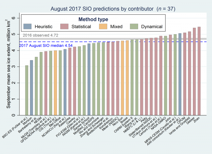
While 5 day averaging is a good idea in the Arctic sea ice, using a 5 trailing average for dates is just not right mathematically. In addition, they will likely add about 280,000 km2 to these numbers later (for the area around the north pole that is not counted in the numbers). I didn’t say climate scientists were good at math, just the opposite of course.
So, the NSIDC will record the September average as being around 5.07 M km2 (last year 4.74 M km2 and still the 8th lowest) and when it is compared to the Arctic Sea Ice Prediction game. Only the top three are in the ball-park this year.
ftp://sidads.colorado.edu/DATASETS/NOAA/G02135/north/monthly/data/N_09_extent_v2.1.csv
https://www.arcus.org/sipn/sea-ice-outlook/2017/august
Because you can drag a zoomable area on the chart and turn various options on and off. You can also click on most extent points and will be shown an image of the actual extent on that day.
The legend at the bottom left of the image above show what options were active at the time the chart image was captured.
Irrelevant.
Okay, never mind. I found the answer. Graph at top of page shows standard deviation, Charctic graph shows interquartile and interdecile deviation. I’m not a statistician but clearly they are measuring differently.
The graph was not “captured” it is still interactive. Click on std dev in the key as you will see ot.
Because you have a choice with Chartic, you can click on the menu items, ‘median and interquartile, interdecile’ which the version you show does, or ‘average +/-2SDs’ which the other one does. You can also choose to plot the record from any other year by selecting it from the menu.
Belated thanks to you and to Greg. I thought I had used all of the features of the Charctic graph but clearly I had not.
Whatever the facts are, the CAGW enthusiasts will continue to tell us that it is worse than they predicted and we have to double down on the Paris Agreement to offset the loss of Trump….or we are all going to die.
“… all going to die.” Okay, but they should go first, don’t you think?
Then the rest of us can just get on with our lives. I have things to do.
Just what exactly was the ice doing before 1979? Trends of 38 years for an old old planet, completely meaningless.
It was up and down, but generally cooler than now, to the point that there was global cooling alarmism in the press, including images of a ‘new ice age’.
NO, according to Met Office data, it was perfectly flat before 1960 ! You think I’m joking ?
Well they started at a 30th century peak -cherry…
Damm typos. 20th century
So basically 3rd lowest in the arctic and 8th lowest in the antarctic. The downward spiral continues.
No, the downward spiral doesn’t continue – look at the trend over the last 10/11 years – flat. Arctic now in “pause” – will be interesting to see if that continues. If 15 years (per climate scientists) was enough to confirm a pause in surface temperatures, how long must Arctic ice extent show no trend before a pause is confirmed there? I’m guessing we are in for at least a few more years of variable extents within the current range (given potential La Nina, and other factors), so there’s a good chance for at least a 15 year period, given we are now at 11 years (since 2007).
Any ideas about how such a standard might be set (the definition of a period that would confirm an Arctic Pause)?
Yes, but if you ignore the data for the last 11 years and fit a straight line to over 13,000 daily observations you get a … a straight line.
You then call this straight line a “death spiral” and say OMG, it worse then we thought.
You clearly do not understand how to do climate analysis.
As long as is necessary !!!
” The downward spiral continues.”
You mean the RECOVERY from the extreme levels of the late 1970’s?
…….. When it was up there with the extremes of the LIA?
Still a ways to go to get down to MWP levels,
and MUCH further to get down to the levels of the first 700+ years of the current interglacial.
Wouldn’t you agree, Bruce. 😉
“So basically 3rd lowest in the arctic ”
NO. 8th lowest in the Arctic in a paltry 38 year record since the end of the global cooling scare.
Bruce, no not correct…
The data for NSIDC is here.. ftp://sidads.colorado.edu/DATASETS/NOAA/G02135/north/daily/data/
and shows that currently, 2017 is above 2007, 2008, 2010, 2011, 2012, 2015 and 2016.
Now what happens to trends when we do not pick cherries…
A very nice example of the “cut-off-graph” game.
Bruce,
No it doesn’t. Arctic sea ice quit getting lower in 2012. It has grown since then. This year was eighth lowest, not third.
Antarctic sea ice has been low this year because of weather events last year. It was the highest on record since 1979 in 2014, before the Super El Nino, so it grew while Arctic sea ice was shrinking, which alone shows that CO2 isn’t to blame for sea ice loss or gain.
So you’re admitting that since 2014, the antarctic has been in a death spiral too – it’s worse than we thought! /s
These statements from NSIDC are so carefully constructed to not violate their sea ice “meme” that it is really starting to disgust me. The headline should be “remarkable recovery of sea ice from last year’s low value”, but instead they talk about “8th lowest”, conveniently pushing the fact that this year’s extent is much larger than 10 years ago (2007) under the CAGW rug.
Instead they give excuses that the weather was favorable to low melting. Note that when the significant storms of 2012 broke up ice and led to massive melting, they blamed it on global warming, not weather. Why can’t they just state the facts, and quit the editorializing? Are they so afraid that skeptics are going to use this to destroy their carefully built story that they can’t present a simple factual analysis? What a joke!
There are still a few swampos to drain in the US. But also here in Germany. “Wetteronline” a weather-provider with a long history in climate-alarmist storys sees the minimum in this years only little over a new Minimum-Record. ( In reality it was up to 1 million km² over 2012 according to many ice graphics providers). And only “cooler weather” had us prevented from a new Rekord. But they use a graph from 1980 untill 1999 for comparison and simply overturn the last 18 years. An email to the weather service remained as yet unanswered, however, the contribution yesterday disappeared in the archive.
I notice this constantly that contrary observations are ignored. But if they actually believed that changing climate was indeed dangerous, wouldn’t contrary news be rejoiced? If a tornado was heading towards me, I would be screaming with joy if it then turned away from me. This constant rejection of what ought to be good news gives great insight. This is not a reasonable debate, they are not thinking logically or at all, this is not a scientific question. This issue is merely a team they cheer for.
PS I have no reason to imagine more ice is better than less!
Dave, I observed long ago that government documents concerning global warming were, at their core, sales jobs. That was before I developed any opinions concerning AGW.
Please look at the language used in IPCC and U.S. Government reports, especially their summaries. They are deliberately obtuse and omit direct and clear information contrary to the CAGW meme. [God, I love that word: meme.]
Low ice sheet? I think there’s a doTERRA essential oil for that.
How many significant Arctic Cyclones this year?
Are you saying that the Arctic sea ice minimum is dependant purely on weather ?
When ice does melt as much as they would like this is due to “mild” weather. When it melts more it is not due to weather it is due to AGW.
“This year, temperatures in the Arctic have been relatively mild for such high latitudes, even cooler than average in some regions. ”
The Arctic is extremely cold all year round, every years. How the hell does being colder than average make it “mild”?
Oh, I get it, she means not “extremely hot” as it has been in recent years !
Yes, and it is similarly too early to talk about a long-term reversal in the behavior of Arctic sea ice, but it’s starting. 2012 was the turning point.
Greg,
Simple explanation my good man.
Milder means – “not yet homogenised”.
No but 2012 had a high melt from storms breaking up the ice.
Wind has a huge effect on Arctic ice extent. The ice protects the surface from wind disturbance and so reduces ice destruction. Open water means more wave action and ice destruction. These modes are self reinforcing and explain the 60+ year cycle. When ice cover gets to maximum, water temps slowly rise as no heat is being released to the atmosphere. Eventually the ice extent and thickness cannot be sustained. At that point the wind takes over and drives ice destruction toward the minimums we have seen lately where only old, folded ice is left and the water temps have dropped.
We are at that point now where ice extent and thickness will start to build again. Maximum ice extent means minimum air temperatures.
The bias in thought is so evident “… ice conditions today are worse than the baseline 38 years ago. …”. Where is the evidence that less sea ice is “worse” for the planet? Is there prior evidence from the past that shows that less sea ice is worse for the planet?
Look and you will see.
The only thing which I can see, Dave, is that you are unable to point to what is “worse”. I see no out of the ordinary examples of the changing climate causing negative living conditions for mankind.
Less sea ice is definitely better, but humans have no effect or control over it. We can however build more and bigger ice breakers if needed.
Control to Griff.
Control to Griff.
We have a problem.
Come in Griff.
Come in Griff.
Ctrl F ‘Griff’ brought me here. Saw 5 matches and thought ‘G’s been busy again!’.
so are we doomed from fire or from ice? I keep forgetting which it is.