Guest essay by Leo Goldstein

The MSM is actively promoting a new piece of dubious “climate science”: the article Tropospheric Warming Over The Past Two Decades doi:10.1038/s41598-017-02520-7, https://archive.is/EOXfw by B. Santer et al., published in Nature Scientific Reports on May 24.
For well-known reasons, Santer et al decided to debate not scientists, but Scott Pruitt, the new Administrator of the U.S. Environmental Protection Agency. The authors of the article (SVP for Santer vs. Pruitt) have beef mostly with Pruitt’s statement about warming hiatus in the last two decades:
After a recent Senate confirmation hearing, Scott Pruitt – the new Administrator of the U.S. Environmental Protection Agency – received a written question regarding observed warming estimates. In response, Mr. Pruitt claimed that ‘over the past two decades satellite data indicates there has been a leveling off of warming’.
Dr. Roy Spencer debunked SVP on his blog next day. I can add only a few remarks.
After “remov[ing] the stratospheric cooling contribution,” SVP arrived at an apparent trend of 0.01 degree Celsius per year. Even if this value is statistically significant, 0.01 degrees Celsius per year does mean levelling off. Scott Pruitt was correct. Such apparent trend is in line with non-alarmist computations. But Santer et al. decided to further embarrass themselves by comparing variability from measurements to the “natural variability” from the IPCC models! Unsurprisingly, the IPCC models agreed with themselves. SVP accurately stated that the comparison was done with the computer models, not with the real world. It has not even claimed to refute the statement of the new EPA head. SVP abstract says:” Satellite temperature measurements do not support the recent claim of a ‘leveling off of warming’ over the past two decades.” The WaPo journalist has made an additional step, turning shoddy scientific work into a fake news article “Scientists just published an entire study refuting Scott Pruitt on climate change”. This dynamic, reminiscent of the children’s “telephone game,” has been observed in the putative climate science and its communication for nearly three decades.
SVP would be rejected by any reputable publication. Nevertheless, it passed the supposed peer review by Nature Scientific Reports in a mere 29 days: Received on March 6, Accepted on April 4, Published on May 24; praised and brandished by WaPo and ThinkProgress on the very same day. The publication date might have been selected to influence the G7 meeting. The Nature Group announces median times for its review process (https://archive.is/G3tT4). The median time from submission to acceptance is 124 days. The median time is not very useful metric, so we investigated actual times to acceptance of the last 500+ articles, published in the Nature SRep from May 16. Less than 1% of these articles were accepted within 30 days from submission. All articles in this exclusive club, except for SVP, report experimental research (supporting material is available). This exceptionally quick acceptance, combined with the invalid scientific methodology of the article, suggest that Nature SRep accepted SVP without bona fide peer review, or despite negative recommendations of the reviewers.
Nature Scientific Reports should not be confused with the Nature Climate Science, which does not hide its nature (no pun intended). The Nature Publishing Group (a British corporation) it is owned by the Springer Nature, a German corporation. The latter also owns the Scientific American, a non-academic alarmist mouthpiece. The Springer Nature is owned by the Holtzbrinck Publishing Group, a German corporation, and BC Partners, a British corporation.
Thanks to H.J. for collaborating on this article.
A somewhat simple-minded view on the graph below would be: “Oh I see! By around 2004 the surface people began to manipulate their data:
http://fs5.directupload.net/images/170526/w3ib9xn3.jpg
But… maybe we need to impose us a deeper look at the differences between the two plots.
Your chart clearly shows that even in the lower troposphere the UAH running 20-year trend was never negative and in fact over the past few years has picked up again.
So much for Scott Pruitt’s assertion that the satellite trend has “levelled off” over the last 2 decades!
DWR54 on May 27, 2017 at 1:55 am
Thanks for your answer, but it did not match my point at all.
While you try to make a rather uninteresting point against Pruitt, Goldstein & alii, I asked about reasons for a strange departure of surface trends wrt those of the lower troposphere, what I consider be far more important.
It’s a bit late now here at WUWT+9, otherwise I would have created right now a new chart including these 20 year trends for the RATPAC B radiosondes (at both surface and 500 hPa atmospheric pressure levels), in order to make the problem a bit more visible.
Good night / Gute Nacht / Bonne nuit
“Average Surface Temperatures””
To make it more clear, Nick is specifically saying that they’re not comparing Average Surface Temperatures at all. What they’re doing is comparing “Average **Estimated** Surface Temperatures”
How good is their estimation from year to year? God only knows. What are the error bars on that one??
You’d be better off strictly comparing the stations that you DO know temperatures to from year to year if you’re actually interested in trends. Trends in guestimated numbers are worthless.
kcrucible on May 26, 2017 at 8:50 am
You seem to have a double problem, possibly due to your lack of experience:
– you miss all what people do anyway;
– you claim about things they don’t.
Why don’t you search for information, instead of conveniently supposing what is wrong?
Look e.g. at the station data (believe me, that’s hard work):
https://www1.ncdc.noaa.gov/pub/data/ghcn/v3/
Then download GISS’ land-only data (less work):
https://data.giss.nasa.gov/gistemp/tabledata_v3/GLB.Ts.csv
compare it with the stations’ data, and draw qualified conclusions! Maybe it helps (you).
Bindidon, you seem to also have a problem. You ignore what was said.
Nick specifically said to get a world average temperature they need to “infill” with data. We already knew this. This data was never measured. This is applied via an algorithm that spreads the available data (ie station data) to the unavailable data plots. Maybe you’re not clear on that.
How accurate is the algorithm? Not very. Certainly not enough to guarantee certainty of temperatures to within .1 degrees, which is claimed.
Averaging a bunch of artificially generated data gives you an answer that’s an average of artificial data. It’s not the average world temperature.
And yes, of course the station data matches the GISS land data at those stations… those are the fixed points. It’s the points that are AWAY from the stations that I question.
Bind,
you also have a problem. Probably you don’t understand the infilling method.
Nick specifically mentioned what we already knew… which is that most of the GISS land data is artificial. It’s created by spreading the temperatures out away from the measured stations and guessing what the other points MIGHT be. The further away you get from actual station data, the more and more questionable it becomes.
So yes, OF COURSE, the station data matches the GISS data at those points… the GISS data derives from those points. Those points aren’t the question… the question is how accurate a guess is that’s a thousand miles away from the nearest measurement. It’s certainly not within .1 C certainty.
If you average up a bunch of guesses, you get the average of a bunch of guesses. It’s a number, but its relationship to reality is questionable.
kcrucible on May 27, 2017 at 6:43 am
Probably you don’t understand the infilling method.
Rires dans la salle… Thanks for getting us laughing a bit with a thoroughly redundant answer.
Again, I posit: We are in an interglacial period during which it always warms and warms…until it doesn’t. Then back to another ice age.
And what causes it to stop warming, then go back to an ice age?
Isn’t that akin to asking ……. “what causes your vehicle to slow down and then come to a complete stop in the middle of the highway?””
Me thinks its called “lack of energy”.
Jim,
The Holocene warmed until the end of its Climate Optimum, ~5 Ka. From either then or the end of the Minoan Warm Period, ~3 Ka, our interglacial has been cooling, long term. The Cool Periods have been getting colder and the Warm Periods cooler over those millennia.
The Current WP should be followed by a less Little Ice Age, then probably another, still cooler WP, then maybe by a new Big Ice Age. Or not yet then, but eventually.
Chris,
The warming trend of the first 6000 years of the Holocene ended from three to five thousand years ago. Since then, we’ve been in a long-term cooling trend. What will cause the next ice age glaciation is the same as the prior ones, ie largely the alteration in albedo of the NH, as snow piles up at high latitudes, due to change in the angle of incidence of sunlight from the axial tilt cycle. The colder climate also then affects the SH, as more sea ice forms in the Southern Ocean, further afflicting our planet’s reflectivity.
SVP does prove one thing. The alarmists are not doing science, but politics and religion. The proof is the pal review that was not even close to being a peer review. But they know that.
I forecast, cold, wet, and windy.
The warming in the last 150 years was almost 100% due to changes in the solar cycle.
If that assertion is correct, the IPCC models are 100% incorrect.
It appears the solar cycle has been interrupted.
The majority of the cooling will be in the latitude of 40 to 60 degree.
There is additional cooling in the Southern Atlantic as the geomagnetic field strength is more than 30% reduced in that region.
http://www.ospo.noaa.gov/data/sst/anomaly/2017/anomnight.5.25.2017.gi
Getting back to Pruitt’s comment:
 https://www.merriam-webster.com/dictionary/level%20off

“Over the past two decades satellite data indicates there has been a leveling off of warming.”
— EPA Administrator Scott Pruitt
UAH 6.0, green = linear trend since 1979, blue = linear trend “over the past two decades” (since 1996.25):
http://www.woodfortrees.org/plot/uah6/mean:12/plot/uah6/trend/plot/uah6/from:1996.25/trend
Q-Fracking-ED
Correction: another journal is named Nature Climate Change, not Nature Climate Science.
Some people here whose name might be a hint of English being their native tongue seem to have some difficulties with a proper understanding of what “to level off” really means.
Here is a graphical translation given by one of my british friends:
http://fs5.directupload.net/images/170526/38kyh4vt.png
That would be an accurate depiction of “levelling off. ” Is English not your primary language?
No (German, French).
Who gives a rat’s ass about foreign ignorance of plain Englsh?

In English, this is levelling off:
This is levelled off:
This is the link to my above comment.
The regions in blue area had record snowfall, late cold spring, and are now having high rainfall events.
http://www.ospo.noaa.gov/data/sst/anomaly/2017/anomnight.5.25.2017.gif
In Europe you would be immediately banned off a real climate site when writing such injuries.
In America, you would be institutionalized.
The human fantasy that we are somehow going to fine tune temperature to a degree or two is absolute
unscientific fraud . Drain the Swamp has this over hyped $trillion dollar con game written all over it .
Great if it keeps warming . Let’s hope so .
Looked at Santer et al. in Scientific Reports. They have no idea what to do with a global temperature curve and treat them like random noise. The early part of the century’s temperature does look like it may be almost flat and some have noticed it. It is an illusion because there is slow cooling there that is hard to pick out. I left a comment to his article in Scientific Reports and am attaching a copy below. Pull down na Roy Spencer temperature chart and look at it while reading my comment.
*******************************************************************************************************************
Arno_Arrak • mAY 27, 2017
Somehow, 38 references do not convince me that there has been global warming for two decades. Part of the problem is that the authors do not understand temperature data in front of their eyes. I am now referring to the UAH satellite temperatures that Roy Spencer puts out monthly. They all start with the year 1979 when the satellite system began to function. This gives us a good historical background to compare with today’s measurements. To begin with, this historical record may be divided into subsections where different influences control the observed temperature. None of this is random drift and using amalgamating computer software to wipe out differences is not allowed. To start with, in the beginning years of this period, 1979 to 1997, there was a hiatus. I recorded it in my book in 2010 as figure 15. But would you believe, IPCC would have none of it and transmogrified the official temperature graph into a non-existent warming period. I have a NASA document proving that there was no warming there but these pigheaded IPCC creatures still insist on showing that fake warming to this day. During the hiatus, an ENSO segment was active and planted five El Nino peaks there. The center points of these ENSO oscillations line up horizontally confirming the existence of the underlying hiatus. Next in line is the super El Nino of 1998. It takes up only two years, from 1997 to 1998. It is not a part of ENSO nut interrupts the ENSO sequence preceding it. It is only half as wide as a regular ENSO cycle is but its peak is twice as high. The low point after it leaves is in 1999 is followed immediately by a rapid temperature rise. In three years, it raises global temperature by 0.35 degrees Celsius. If the temperature rise for the entire century is 0.8 degrees we are talking here of the equivalent temperature rise ten times faster than the average rise is for the entire century. After rising, the temperature seems to flatten out and then gradually turn down for a cooling. This behavior can only be explained if the temperature rise was caused by a mass of warm water left behind by the departing super E;l Nino in 1999. The flattened section just after the temperature rise is a slow start for cooling and is the reason for people thinking that there was a hiatus there. What we should expect is for the cooling to continue because the super El Nino is no longer there to replenish the heat. But determining the temperature history beyond what follows becomes a complicated task because of interference by the La Nina of 2008 and the El Nino of 2010. Jointly they cover op the temperature background and you must wait for them to finish. If you do that you find that It is possible to draw a straight line from year 2002 to year 2012 that represents cooling by 0.28 degrees in that ten year segment.rs. Beyond 2012 the temperature curve turns up again in preparation for the El Nino of 2016 that is about to form. In determining these temperatures, you must not include any El Ninos or La Ninas in your measurements because they are temporary features of global temperature. The cooling curve from 2002 to 2012 can be extrapolated to tell us that when the El Nino of 2016 will be finished the likely global temperature floor will be something like it was in the eighties and nineties before IPCC started monkeying with global temperature. And, by the way, there vis no warming now, just cooling today. And don’t try recruiting any El Ninos into your warming fable.
o ***************************************************************************************************************
My earlier comment is worth repeating here for convenience.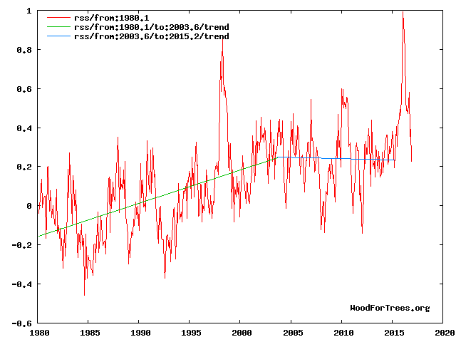
“My main reason for showing the Akasofu curve was to show an example of an interpretation which at least honors the 60 year cycle which clearly exists over the last century.Here is my paper’s Fig 4 interpretation as of end 2016 which shows the 2016 El Nino as the temporary deviation from the cooling trend which it most likely is.
Fig 4. RSS trends showing the millennial cycle temperature peak at about 2003.6 (14)
Figure 4 illustrates the working hypothesis that for this RSS time series the peak of the Millennial cycle, a very important “golden spike”, can be designated at 2003.6. ………..
The RSS cooling trend in Fig. 4 and the Hadcrut4gl cooling in Fig. 5 were truncated at 2015.3 and 2014.2, respectively, because it makes no sense to start or end the analysis of a time series in the middle of major ENSO events which create ephemeral deviations from the longer term trends. By the end of August 2016, the strong El Nino temperature anomaly had declined rapidly. The cooling trend is likely to be fully restored by the end of 2019.
From Figures 3 and 4 the period of the latest Millennial cycle is from 990 to 2004 – 1,014 years. This is remarkably consistent with the 1,024-year periodicity seen in the solar activity wavelet analysis in Fig. 4 from Steinhilber et al 2012 (16).
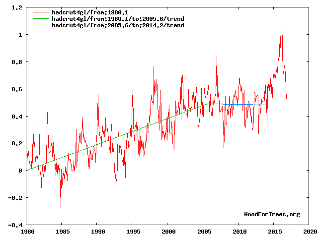
Here is how the millennial inflection point appears in the Hadcrut gl data – Fig 5
And in the temperature /cloud cover relationship.
Ben is desperate to make up for his earlier paper where he falsified the models by suggesting they never (at the 95% level) showed 17 years hiatus in control runs but then 5 years later nature did exactly that in reality.
Now he leaps onto the post El Nino trend to “fix” his faux pas.
So Santer has hid the hiatus by tacking on a weather event to the period. Ben, you’re transparent.
The solution to claims of oh so scary global warming is cash . Cut off the cash and global
warming hysteria will disappear faster than the 1970’s global cooling climate Armageddon .
Here is simple proof … if Time magazine says something then the opposite is true .
Natural variability has a 6 billion year resume of running climate . Prove that is not the case
scientists . The rest of the climate fear mongering frauds can take a hike .
Tax payers aren’t your personal piggy bank .
Charges should be laid against the perpetrators and enablers of the world’s largest fraud .