
Global climate trend since Nov. 16, 1978: +0.12 C per decade
March temperatures (preliminary)
Global composite temp.: +0.19 C (about 0.34 degrees Fahrenheit) above 30-year average for March.
Northern Hemisphere: +0.30 C (about 0.54 degrees Fahrenheit) above 30-year average for March.
Southern Hemisphere: +0.07 C (about 0.13 degrees Fahrenheit) above 30-year average for March.
Tropics: +0.03 C (about 0.05 degrees Fahrenheit) above 30-year average for March.
February temperatures (revised):
Global Composite: +0.35 C above 30-year average
Northern Hemisphere: +0.54 C above 30-year average
Southern Hemisphere: +0.15 C above 30-year average
Tropics: +0.05 C above 30-year average
(All temperature anomalies are based on a 30-year average (1981-2010) for the month reported.)
Notes on data released April 3, 2017:
In March the globe saw its coolest average composite temperature (compared to seasonal norms) since July 2015, and its coolest temperatures in the tropics since February 2015, according to Dr. John Christy, director of the Earth System Science Center at The University of Alabama in Huntsville. Temperatures in the tropics are essentially “normal” relative to the 30-year average.
Compared to seasonal norms, the warmest spot on the globe in March was over eastern Russia, near the city of Yakutsk, with an average temperature that was 5.58 C (about 10.04 degrees Fahrenheit) warmer than seasonal norms.

Compared to seasonal norms, the coolest average temperature on Earth in March was over eastern Alaska near Dot Lake Village. March temperatures there averaged 4.08 C (about 7.34 degrees F) cooler than seasonal norms.
The complete version 6 lower troposphere dataset is available here:
http://www.nsstc.uah.edu/data/msu/v6.0/tlt/uahncdc_lt_6.0.txt
Archived color maps of local temperature anomalies are available on-line at:
As part of an ongoing joint project between UAH, NOAA and NASA, Christy and Dr. Roy Spencer, an ESSC principal scientist, use data gathered by advanced microwave sounding units on NOAA and NASA satellites to get accurate temperature readings for almost all regions of the Earth. This includes remote desert, ocean and rain forest areas where reliable climate data are not otherwise available.
The satellite-based instruments measure the temperature of the atmosphere from the surface up to an altitude of about eight kilometers above sea level. Once the monthly temperature data are collected and processed, they are placed in a “public” computer file for immediate access by atmospheric scientists in the U.S. and abroad.
Neither Christy nor Spencer receives any research support or funding from oil, coal or industrial companies or organizations, or from any private or special interest groups. All of their climate research funding comes from federal and state grants or contracts.
— 30 —
When thinking about global temperatures this is the key thing to keep in mind:
Why is it that those graphs always end several years before the present?
Aren’t somebody updating them in real time?
Why not?
That one appears to end in 2014, ie less than three years ago. IMO that’s a few years, not several.
It could be that sources don’t make annual updates to their graphs.
But I don’t think that adding 2015 and 2016 would improve the picture for GIGO model epic failures, even with the benefit of two super El Nino years.
I asked about the Observations on the plot and was told that they use a 60 month (5 year) smoothing. So you lose the last two years due to the smooth. I have seen this plot in other locations where the 60 month smooth was explicitly stated.
I do so hate boxcar smoothing. I would probably use one if I had to, but I would still hate it.
Why don’t those graphs compare actual surface temperatures to modeled surface temperatures as opposed to temperatures high above the earth?
Oh that’s because the people that run this website are serial liars and “scientific” (I use that term loosely) frauds.
Thanks for that tidbit. Smoothing should not be necessary for this. Straight honesty should work best, and trends should not be computed on smoothed data.
Roy W Spencer 4/7/2016
We choose to plot the data relative to the same point early in the record. We usually do it relative to the average of the first 5 years of data, so that noise in both datasets has a minimum effect on aligning their starting points.
Mods, this is a protest comment… Ugly comments directed at Anthony & Co should be DELETED(!)
(y’all deserve way better than that; thanx for hearing me out, fonzie)
Hey, this was an honest question. And I got a good answer. Not an ‘ugly comment’.
No, Dr Svalgaard, i was referring to the comment by Bruce! (i guess that i should have made myself clear on that) BTW, it’s indeed an honor to provide you with an good answer to your honest question. It’s a rare opportunity for us to give back to you that which you so readily give to others. (thank you)…
As Willis always stresses: always cite precisely what/whom you are objecting to or commenting about.
(will do)…
Here is an updated monthly data chart comparing all of the important climate model forecasts at the time they were made (ie. when the predictions start versus when they were just using historical temperature data) against the temperature observations of the NCDC and the average of RSS/UAH.
These are all the same baseline so are comparable. Smoothing is only done on some of the IPCC models because they still have seasonality left in (the models can’t get seasonality right) – 12 month centred moving average is used.
NCDC is above most of the climate model forecasts in Feb 2017, adjusted temperatures of course, so we will have to see what the numbers in March 2017 are given UAH fell. RSS/UAH are well below now after the impacts of the 2015-16 Super El Nino have worn off.

Same chart with the NCDC line removed and just against the average of RSS/UAH lower troposhere (I don’t believe the NCDC numbers anyway).
[Note the climate model forecasts are for the surface while RSS/UAH are for the lower troposphere. The climate models in the lower troposphere actually have about 20% more warming so one should keep this is mind, the models should have an even greater upward trend than shown here].

Thanks Bill.
I have a general problem with this kind of thing. Since, as you point out, the climate model forecasts are for the surface while RSS/UAH are for the lower troposphere and thus may not be directly comparable, it would seem to me that the proper way to compare would be to regress the models to the satellite data over the time of their overlap and find the difference during that time. Then subtract that difference so that the two series match each other during the interval of overlap.
The number of people capable and willing is too low. NOAA for example never were willing to do that. You average Joe writing here is not capable of finding the data, running the models, plotting the results.
“Why don’t those graphs compare actual surface temperatures to modeled surface temperatures as opposed to temperatures high above the earth?”
There are a number of reasons, most notably that the models predict certain trends for certain altitudes, the models don’t predict any particular station temperatures, the surface station network is of poor quality and has been gradually dismantled, we have thousands of times more measurements from satellites, and the way the models assume CO2 warms the rest of the atmosphere requires certain trends at certain altitudes.
Leif,
In related area, have you noticed that the averages and accompanying SDs used in the Arctic ice data still start in 1979 and continue to not be updated beyond 2010?
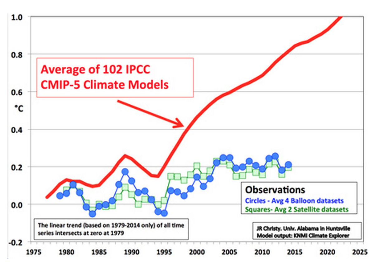
Just so we are clear what we are commenting on: the graph above is a “stylized” rendition of the IPCC’s very own graph that appeared in AR5. I don’t know who would be responsible for updating this data other than the IPCC – maybe in the next report?
Also, I don’t think that updating this graph to included observed temperatures up till 2016 [including the 2015-2016 El Nino driven upswing] would do anything to change the three fundamental messages this IPCC graph in fact conveys, namely 1] the ‘Pause” ; 2] that the ensemble of IPCC “endorsed” climate models are perfect examples [ 150+ of them] of GIGO, with zero predictive value and 3] that the socio-political CAGW/CACC meme is based not on what Mother Nature is actually serving up, but on “predetermined outcome” computer generated garbage.
Isvalgaard look:
The troposphere has not warmed quite (sic!) as fast as most climate models predict:
http://images.remss.com/figures/climate/RSS_Model_TS_compare_globe.png
from: http://www.remss.com/research/climate
Your link says:
“The mean value of each time series average from 1979-1984 is set to zero so the changes over time can be more easily seen.”
I think that five years are not enough to establish a good average. Perhaps 11 years would be better, or even 21 years [to cater for the people who thinks the Sun is controlling matters].
Leif, you do not want to pin the data to an average in the middle of the time span.
All you are doing then is fooling yourself that the two comparison data streams look the same on a chart. After all, they are both centred in the middle of the chart no matter how different they are. Zeke Hausfather does this all the time with his charts. There doesn’t appear to be any adjustments in the temperature record because the old and new temps have Zero anomaly in the middle of the chart and look identical. Except there is actually 0.3C difference between the two.
When the climate models made their forecasts, they were doing so with a certain base period in mind. Most of that was done with 1961-1990 base period, some with 1951-1980 and some 1981-2010. So when they say 2016 was supposed to +0.80C in the 1961-1990 base period, one should just leave it at 0.80C.
The lower troposphere can also be adjusted to a 1961-1990 base period and then there is a valid comparison and no fake centering all the data in the middle.
Leif, you do not want to pin the data to an average in the middle of the time span
Yes I do want to do just that. In order to minimize systematic differences due to different locations and conditions.
Since the regressional trend is a linear operator, computing it on smoothed data is identical to smoothing the trend with the same kernel. There’s no meaningful distortion of climatic results; only the high-frequency wiggles are affected.
However, and that is the important point: smoothing reduces the number of independent points and so the usual measures for statistical significance become too high if you do not take into account the smaller number of independent data points.
“””””…..
TonyL
April 3, 2017 at 5:29 pm
I asked about the Observations on the plot and was told that they use a 60 month (5 year) smoothing. So you lose the last two years due to the smooth. …..”””””
Actually Tony, you lose the whole shebang due to the smooth.
The original observed and measured data WAS correct (presumably), and you just threw it all away in exchange for a prettier but fake graph.
G
Since no one, least of all classical statisticians, has any realistic idea of the number of stochastically independent data points in a geophysical time series with a complex power spectrum, the academic conceit of reduced relaiabilty is frivolous
The Bureau of Meteorology in Australia stopped updating its public display cyclone intensity/frequency charts many years ago. I guess because they went off script by not being as frequent and intense as predicted by the extreme weather warministas
Ah, but as Rep. Beyer stated during the House Climate Science Hearing, that is only about a half a degree error. Who is going to fault a model that is only off a mere, tiny half of a degree? And none on the panel could refute his argument.
Actually, it’s now closer to 0.6 degrees, but that’s still nothing.
I’m still irritated there was no discussion on that, even realizing that time was running out. Politicians are so clever.
It used to be that public speakers could think on their feet. That 0.5 degrees is 25% of the “catastrophic” limit of 2.0 degrees. When you drift that far from the target, that’s significant.
” that is only about a half a degree error. Who is going to fault a model that is only off a mere, tiny half of a degree?”
Anyone who notices that half a degree is most of the predicted deviation from the naive forecast.
If a prediction is less accurate than the naive forecast, it is not useful for planning purposes.
When your margin of error is greater than the signal you claim to have found, then you ain’t found nuttin.
They could have said; ” That’s what we have been trying to tell you; any warming is just not even worth worrying about.!! ”
G
Ah, but as Rep. Beyer stated during the House Climate Science Hearing, that is only about a half a degree error. Who is going to fault a model that is only off a mere, tiny half of a degree? And none on the panel could refute his argument.
Actually, it’s now closer to 0.6 degrees, but that’s still nothing.
I’m still irritated there was no discussion on that, even realizing that time was running out. Politicians are so clever.
All three of the GFS/CFSR global temperature anomaly sources that I have found were up slightly from February to March by the following amounts: UM CCI +0.032°C, WxBELL +0.035°C, and Karsten Haustein’s GFS/GISS-adjusted +0.033°C (change March minus February).
The global surface temperature anomaly estimates have once again diverged higher from the TLT estimates since about June 2016 after briefly coming together during the peak of the 2015-2016 El Niño. Also, since about June 2016, the tropical surface temperature anomaly continued dropping slowly, while the global surface temperature anomaly began rising slowly, such that the global average is now about 0.2°C to 0.3°C higher than the tropics zone (30N-30S). This discrepancy may be a sign that excess heat from the last El Niño event is still being vented at the higher latitudes in the Northern Hemisphere and once that excess heat is gone, the global surface temperature anomaly average should drop back down closer to the tropical average.
I remembered incorrectly. The divergence of global and tropics began in September 2016. Below is a graph based on the University of Maine Climate Change Institute (UM CCI) surface global temperature anomaly estimates.
I also forgot to mention that the tropics and Southern Hemisphere have been matching fairly well since September 2016 and thus the indication that the higher latitudes of the Northern Hemisphere (30N-90N) are venting heat.
More details here:
https://oz4caster.wordpress.com/cfsr/
http://www.drroyspencer.com/wp-content/uploads/UAH_LT_1979_thru_March_2017_v6.jpg
Mods, what’s up with that little blue question mark thingy? The glory of word press is that you should be able to post a graph for all the world to see. (if i wanted peops to click on links, i’d just as soon post ’em over at dr spencer’s with his crappy software… ☺)
The decline in global temperature post-El-Nino is continuing, a bit later than I expected, but still on trend.
Let’s see where UAH Global LT bottoms out and when – at 0.0C or what? Less? More? When?
Any informed guesses? Bill Illis?
It looks like about 0,2 C (UAHLT global temp) at end March 2017 will be about the minimum, versus a calculated 0.0C. This +0.2C offset seems a bit unusual.
UAHLTcalc Global (Anom. in degC, ~four months later) = 0.20*Nino3.4IndexAnom + 0.15
Allan, will an uninformed guess do? (☺) Just glancing over the comments here and at Dr Roy’s, it seems most have missed the “transcendence” of this months temperature update. Temperatures are now squarely back where they were in 2002 when the hiatus began. And barring any el nino like event, the temps should continue to drop as we head into our next solar min. The MOMENT OF TRUTH has finally arrived (!) These next few years should tell us a lot. How low will temps go after a weak solar cycle? Will there be a step rise after the recent big el nino? Will the carbon growth rate plummet with temps? Will the agw crowd be vindicated by continued warming? Will Svalgaard be too embarrassed to post another comment (“the last leif falling”)?! For the answer to these and other questions, stayed tuned…
Will Svalgaard be too embarrassed to post another commen
You have this very wrong. It is every scientist’s prerogative to be wrong [and most are, most of the time]. Only true believers [like Javier, Salvatore, Mann, and sooooo many others] are never allowed to be wrong.
https://www.facebook.com/photo.php?fbid=1281382265272666&set=a.1012901982120697.1073741826.100002027142240&type=3&theater
It looks like about 0.2 C (UAHLT global temp) at end March 2017 will be about the minimum, versus a calculated 0.0C. This +0.2C offset seems a bit unusual.
UAHLTcalc Global (Anom. in degC, ~four months later) = 0.20*Nino3.4IndexAnom + 0.15
100% jocularity, Dr Svalgaard. Just had to sign off with a funny; i write whatever comes to the tip of my pen. (and yours has the added convenience of that “last leif” thing in there) In reality, i want to know what ferdinand will have to say if and when his carbon data begins to completely fall apart. He’s gonna be eating a lot of of crow and i’ll be right there spoon feeding it to him. (somebody’s got to do the job and bart’s just too nice a guy to do it)…
I’m going to pull a Griff and assume that any current trend will continue to infinity.
Over the last year, the earth has cooled by about 0.6C.
This proves that within 100 years, the entire planet will be frozen solid. It’s time to start panicking and spending lots of government money.
Same temp now and 1940. We are doomed.
Just because everybody asks…..
When will “The Pause” return???
Here is my take. I use the simplistic definition of a slope less than zero, rather than the more sophisticated definition of statistical significance. Using the simple definition, I have The Pause at 18 years, 8 months. It runs from May 1997 through Dec. 2015.
Pause Value: +0.138
Here is my take:
http://i63.tinypic.com/358ustf.jpg
(click to embiggen)
So what will it take for the pause to re-establish?
I looked at the cases for one and two years. I extended the data array by 12/24 months and determined the values required for a slope less than 0 for the range May 1997 to the end.
The results are the two red lines on the right side of the plot.
For 12 months: -0.20
For 24 months: -0.022
For 12 months, that is a huge drop, and must be sustained for a full year. I do not think that is plausible.
For 24 months, the drop is more reasonable, and could happen for two years if we get a big La Nina.
IF, always If.
Either way, it does not look like the pause is going to reappear anytime soon.
Just for curiosity, I solved for 3 years and got this value:
For 36 months: +0.037
That is totally reasonable, but 3 years is not “anytime soon”
The definition of the pause was always questionable. What is really important is whether the trend is well within statistical insignificance. The pause as defined was always going to end at least temporarily with a big El Nino. A better definition is to ignore ENSO active months and only plot ENSO neutral months with a trend inside some minor range (say ± .03 C / decade). If we do this the pause is still active and now over 20 years long.
The definition of “Pause” that I use is the very picture of “questionable”.
I see what you are saying with eliminating ENSO-active months. As I am an empirical type of guy, I hate to throw data away if I can help it.
You say ENSO-neutral months are holding steady at (say ± .03 C / decade), that is interesting. I would not have thought it was so steady.
The definition of the pause is a complete lack of CO2 based warming acceleration in the measured temperature data!
Richard M
Where do you start counting from though? Every rolling 3-month period starting Apr-May-Jun 1997 was ENSO positive until AMJ 1998. You’d also have to discount that period from your calculations, otherwise you’d be counting the El Nino that started the ‘pause’ and not the one that ended it. Obviously that would bias your result.
DWR54, I did what I said. I discounted all non-neutral months from 1997 forward with a 4 month lag. The trend actually comes out almost perfectly flat.
Tony, i don’t think one needs to get that “heady” about the pause. Temps are right back down where they were in 2002 when we stopped warming. (thus the pause is back)…
What we have here are dueling trend lines. Do not overlook that big blue line which is showing a long term secular trend of +0.123 deg./decade. It fits the data at least as well as the pause line fits it’s subset of the data.
They can not both be right as far as future forecasts go.
As far as the Sun Cycle/Ocean Cycle people predicting a long term cooling, it is not looking too good for them either.
Looking into my Crystal Ball:
The future history will note that this El Nino event was wildly different between North and South hemispheres, unlike previous El Ninos. This was the signature event signaling that the Earth’s climate had changed phase, and a radical cooling was commencing. Unfortunately, this signal event was missed by nearly everybody, due to an unjustified concern of extreme warming.
Yakutsk, with an average temperature that was 5.58 C (about 10.04 degrees Fahrenheit) warmer than seasonal norms.
“The month of March is characterized by very rapidly rising daily high temperatures, with daily highs increasing from -10°F to 25°F over the course of the month, exceeding 33°F or dropping below -18°F only one day in ten. ”
https://weatherspark.com/averages/33774/3/Yakutsk-Sakha-Yakutiya-Russian-Federation
Mark – would love to use what you just said – where did you get your figures please ?
Here is an interesting thought about what those numbers show in relation to how the NH and SH differ during a Warm Period. If you were to show the numbers to an AGW believer without specifying the time period, then they would likely say that the warming was not global just as they claim that the MWP or RWP were not global. The obvious answer, to me at least, is that during a global warming period this difference will always be seen as it comprises the difference between land masses heating up while ocean masses warm more slowly. This gives the appearance that the warming is mainly a feature of the NH.
When is someone going to call these measurements out for the fraud that they are? The temperature data sets I’ve seen are measured to tenths of a degree. The most accurate possible mean derived from that accuracy is 0.1 +/- 0.5 degrees. The statistical formulae that use multiple measurements to derive better precision — not accuracy — require the measurements to be of the same thing, and to presume the error will be normally distributed. One can’t take measurements of a thousand — or five thousand — different places on Earth and claim to be measuring the same thing.
Even so, multiple measurements only reduce the uncertainty in the mean. They do not improve the accuracy of the mean itself; that is to say, they can change the calculation of the mean from 15.5 +/- 0.05 to something like 15.5 +/- 0.001. The precision of the mean can be improved, but not its accuracy.
Here’s an experiment I just performed. I went to the http://www.timeanddate.com website and grabbed 466 temperatures from cities around the world as of 8:28PM EDT. I loaded these into an Excel spreadsheet and ran some calculations — not using the stats functions, but by programming the actual formulae for mean, range, uncertainty in the measurement, standard deviation, and uncertainty in the mean. All the temps were in whole degrees F, but for purposes of this experiment I added “.0” to fake the measurements to tenths of a degree — the same as for other global data sets.
Here are the results:
Mean: 58.76F = 58.8F +/- 0.05F
Range R: 108.0F +/- 0.05F
Uncertainty in the measurement (R/2): 54.0F +/- 0.05F
Standard deviation (aka Uncertainty in the measurement): 21.68F = 21.7 +/- 0.05F (note that the standard deviation, assuming normal distribution of the measurements, is half that of the actual calculated range R/2)
Uncertainty in the mean (calculated directly from the measured values): 2.62F = 2.6F
Uncertainty in the mean (calculated using formula assuming normal distribution): 1.05F = 1.0F
From these we can determine that the large range of the 466 measurements actually increases the uncertainty in the mean from +/- 0.05F to +/- 2.6 F. Using statistical formulae assuming normal distribution also increases the uncertainty in the mean, to +/- 1.0F.
Multiple measurements would certainly reduce uncertainty if they were measurements of the same thing at the same time and place (measuring the temp in a room with a thousand thermometers, all accurate to the same degree), but they do nothing for taking measurements from a thousand different places on Earth within a 24-hour period, and acting as though one were measuring a thing called “Earth’s temperature.”
The formulae I used are standard statistical formulae for error analyses that I pulled from the University of Pennsylvania Physics and Astronomy undergrad lab website:
http://virgo-physics.sas.upenn.edu/uglabs/lab_manual/Error_Analysis.pdf
The document explains significant digits, precision, accuracy, and other statistical calculation at a level that anyone with basic college math skills can follow. They are also very clear as to what multiple measurements can achieve in respect to precision, and how to properly express the results.
I see nothing in them that implies that a thousand, or five thousand, measurements of temperature from different places on Earth — heavily skewed toward developed nations and sorely lacking at the poles — can allow one to claim an accuracy of hundredths of a degree, much less without even showing the uncertainty.
Errr, my third sentence in the first paragraph, ” The most accurate possible mean derived from that accuracy is 0.1 +/- 0.5 degrees,” obviously contradicts the uncertainty in the mean I calculate later. The uncertainty can be lowered quite a bit, but the accuracy of the mean will always only be to the tenths.
Hm, amazing how many corrections one finds one needs to make after posting, even with a proofreading. I didn’t mean to imply that the tenths of a degree in other global data sets were faked — I meant that I was faking it to make it the same accuracy as the other data sets.
Settle down.
Do not get so excited.
The data set you are looking at today is satellite data, not discreet data of individual cities or weather stations. And, no, the data is not normally distributed. You are correct that taking 500 cities and calculating the average is dubious. Calculating a SD based on that mean is erroneous. What you have done is to have pooled data (from the various cities) together, when they are not self-similar. (wrong technique)
Now consider this:
You take the temperature of 500 cities and average the results.
Next month you do it again.
The following month you do it again.
You create a trend line.
Things have changed. You no longer care so much about the absolute value of the 500 city average. Instead, you have a good idea whether your data set is trending up or down. That information might be useful to you.
In short, it is a different exercise altogether.
Second Issue:
Why do I put out numbers with digits in excess of the justified precision?
As a common courtesy. We all know that when doing calculations, we should carry more digits than required, so as to avoid rounding and truncation errors. We always round to the correct number of Sig. Figs. at the end.
People can take the presented numbers and carry on with their own calculations, free from precision errors.
I think the not caring part is the big problem with the global temperature exercise. The exercise with the city data demonstrated that the uncertainty in the mean can be over an entire degree. How can one determine a trend from a figure like 15.4C +/-1.0C? If the uncertainty of the mean is that high, there is no justification for claiming a trend, unless the mean changes by more than a degree. Claiming a change — even in an anomaly — of hundredths of a degree with an uncertainty of one degree is worse than meaningless.
Forgive me for being blunt, but putting out values with more than possible significant digits, with no statement of uncertainty, is very misleading. If one wants others to “carry on with their own calculations,” then one should provide the raw data. The statement regarding carrying more digits than required to avoid rounding and truncation errors strikes me as disingenuous. Putting out numbers with two or three decimal places, with no uncertainty given is not very useful for further calculations. How can one go further without knowing the correct values and uncertainty?. Sure, when doing the calculations, you’re going to get results that can’t be justified given the accuracy of the raw data, but those numbers shouldn’t be published , except as part of “showing one’s work.”
A statement like “Global Composite: +0.35 C above 30-year average” is a terrible example of how to publish valid data. To be scientifically accurate, and presuming the temps are measured to tenths of a degree, that should read “Global Composite: +0.4C +/- 0.5C above 30-year average.” Given the uncertainty in the mean that my experiment showed, this result should probably be something more like “0.4C +/- 1.0C”, which at least demonstrates the lack of precision in the result.
James
I think there is a misunderstanding expressed here:
” They do not improve the accuracy of the mean itself; that is to say, they can change the calculation of the mean from 15.5 +/- 0.05 to something like 15.5 +/- 0.001.”
I agree with the great portion of what you wrote but it is not the +/- that improves.
You could have 15.5 +/- 0.05 and improve it to 15.53 +/- 0.05 but the uncertainty at the end is a characteristic of the equipment (or propagation of errors if you are calculating something first).
It is not possible to improve the accuracy equipment by making a lot of measurements with it, as you correctly pointed out. You can, if the distribution is Normal, correctly arrive at better estimate of where the middle of that range is, but not diminish the range. To get a smaller range you have to get a better instrument. That is why people bother to make precise instruments. A precise instrument can be calibrated, which makes it accurate as well.
Thanks for your efforts.
James Schrumpf on April 3, 2017 at 6:21 pm
Here’s an experiment I just performed.
James Schrumpf, you are at least the 1000th person claiming about that and thinking it’s time to reinvent the wheel…
Please have for example a very first look at
http://fs5.directupload.net/images/170404/mx9ygdok.png
and move then to the chart’s origin:
http://www.ysbl.york.ac.uk/~cowtan/applets/trend/trend.html
So you might understand that your claim about a pretended lack of considering uncertainty is bare nonsense.
I can’t imagine you having anything to teach Dr Kevin Cowtan as far as statistics computation is concerned.
IT sure seems like someone could teach Cowtan a thing about logic. The error for the trend tells us what? How about the error estimates for the data itself?
Gees, lucky that step change is there at the 1998 El Nino , isn’t it.
ALWAYS have to use that step change.. which is totally unrelated to any anthropogenic CO2 warming.
Trends away from those NON-CO2 El Ninos, are basically ZERO.
Ask Kevin Cowtan to adjust for volcanoes and ENSO and he wille find no warming since 1993
http://www.nature.com/ngeo/journal/v7/n3/fig_tab/ngeo2098_F1.html
no warming from 1993 on
http://www.nature.com/ngeo/journal/v7/n3/fig_tab/ngeo2098_F1.html
I’m perfectly willing to be convinced that I’m wrong, so help me out here. From everything I’ve read about this, the repeated measurements only improve the precision if they are of the same thing at the same time. If I take the temperature of a room 100 times with a thermometer measuring in tenths of a degree, I can use the deviation in the mean to get a more precise measurement of the mean, or true, temperature in the room.
But a weather station or satellite takes one temperature at a given time for a given place. How is it justified to use a multiple measurement adjustment in that case?
Provide some guidance here, too, please: If I take nine measurements of a room’s temperature in F and get the following results: 75.1, 75.1, 75.1, 75.1, 75.1, 75.1, 75.1, 75.1, 75.2.
The mean is 75.1F, the standard deviation is 0.03F, and the uncertainty in the mean is 0.009. Does this mean I am justified in saying the mean of the temperatures is 75.11F +/- 0.009F? Or am I only justified in claiming it is 75.10F +/- 0.009F? Or something else altogether?
John Bills on April 4, 2017 at 1:35 pm
Ask Kevin Cowtan to adjust for volcanoes and ENSO and he wille find no warming since 1993
Firstly, John Bills, I get a bit sad about all these ridiculous “No warming since…”.
During the last 10 years, people like you changed the starting date several times because a decline became a pause which becomes a slightz increase, and many even change the period’s end date in order to avoid accounting for the 2016 step-up “due to” ENSO.
I prefer to consider what happened since the very beginning of the satellite era, and thus keep starting by january 1979 (the first month RSS and UAH started providing us with data).
I have a much better figure for you:
http://fs5.directupload.net/images/170403/4nselsum.jpg
because you see in it that a removal of ENSO and volcanoes (mainly changes in SAOD) gives for RSS3.3 TLT during 1979-2013 a trend of 0.086 °C / decade. As the original decadal trend was 0.124 °C at that time (0.135 °C inbetween), this means that ENSO and volcanoes account for 30% of the RSS warming trend.
What are the remaining 70% due to? Well, John Bills: I have no idea about that!
RWturner on April 4, 2017 at 11:27 am
How about the error estimates for the data itself?
Sometimes things are so incredibly evident that mentioning them is simply redundant.
James, you simply do not understand.
The formulas in your UofP text book, don’t give a rip about where you got the numbers.
Statistics ALWAYS works exactly, on ANY finite set of finite real numbers, no matter what, or where the numbers came from.
You can get a flock of numbers from a telephone directory or yellow pages, and ALL of your statistical algorithms will work on them and give you an exact result.
It just doesn’t MEAN ANYTHING; except for what the text book calls it.
Mean / average / upper quartile / standard deviation / they are all just names for numerical origami numbers you come up with by following a totally made up formula to a bunch of numbers.
G
Looking at these numbers “…Northern Hemisphere: +0.30 C (about 0.54 degrees Fahrenheit) above 30-year average for March. Southern Hemisphere: +0.07 C (about 0.13 degrees Fahrenheit) above 30-year average for March….”, It would be easy to conclude that the warming was not global in its impact. Just as the alarmists claim that the MWP was not a global event.
It’s almost like all the warming was due the +AMO which is NH event.
Plus the addition of the former Blob as well as the multiple years of positive ENSO region conditions as compared to negative conditions.
It is certainly true that this El Nino was largely a No. hemisphere event. I find it interesting that the “Super El Nino” event of 1998 was well balanced between North and South, while this one was very different.
goldminor
The MWP wasn’t a global event, it was bi-hemispherical and ignored the tropics. The Earth does not heat and cool homogeneously. The tropics stay about the same for ages and ages, literally.
By global I meant that the SH had some response that corresponded with the NH. Yes, I can see that the Tropics are little changed through these periods. My main point was that during any Warm Period the greatest effects are seen in the NH versus the SH as can be seen by the numbers posted for each hemisphere.
It is absolutely ridiculous to state temperatures with no error ranges and to claim that this can be done to two decimal places. Sheer pseudo scientific nonsense.
https://wattsupwiththat.com/2017/04/03/global-temperature-report-march-2017/comment-page-1/#comment-2467727
Uncertainty should only be expressed with one significant digit, and the measurement should have no more. That figure should be expressed as 0.1F +/- 0.06F. How does anyone justify a number such as 0.123F +/- 0.062F? That is unscientific.
My issue is that we look at temperatures of the atmosphere.
Very clearly we are seeing the flow of energy from the Tropics to the Arctic and then yes to the Universe.
The temperature of a car is poorly defined by the exhaust temperature. Yes the Arctic is red hot at minus 20C
Let me assure you the southern hemisphere is not boiling and the weather is very 70s.
Two El Nino’s may well be the rollover of world temps.
Perma-drought is over and aquifers all over the world or returning to normal and the tropics are at best normal the exhaust will cool in due course.
All statistical artifice and complete claptrap. 0.07 C and 0.3 C forsooth. And error bar is? Complete rubbish. Lies, damn lies, then there are statistics….
The error bars on the satellite data are very large; much larger than those on the surface data. You can check the updated best estimate trends with 2 sigma error margins for each global temperature data set at this site hosted by the University of York: http://www.ysbl.york.ac.uk/~cowtan/applets/trend/trend.html
The quoted UAH trend since Nov 1978 of 0.12 C/dec is confirmed ( 0.124 ±0.062 °C/decade (2σ)). Bringing it up to the start of the ‘pause’ (say Jan 1997 – the start month tends to move around a bit depending on the source) the trend is 0.067 ±0.167 °C/decade (2σ).
You might say then that the change observed in UAH since 1997 is centred on 0.067 °C/decade, but it might be as high as 0.234 or as low as -0.100 °C/decade. Since the error margin is larger than the best estimate trend, the trend is said not to be statistically significant.
By contrast, using exactly the same method of calculation, the surface data sets all show statistically significant warming since 1997. GISS shows 0.177 ±0.103; HadCRUT4 shows 0.137 ±0.100 ; NOAA shows 0.162 ±0.095; and BEST shows 0.175 ±0.096 (all °C/decade (2σ)).
Note that i) the error margins on the surface data are considerably smaller than those on the satellite data over the same period, and ii) the best estimate trends in the surface data are all within the upper error margin of the satellite data.
Given the lack of quality control on the ground based network and the fact that they are at least 2 orders of magnitude short in regards to having sufficient sensors, plus the fact that the sensors they do have are clustered in two small sections of the globe.
The true margin of error for the ground based system should be at least 5.0C.
Cowtan? LOL. The citation used in that analysis is junk — purportedly knowing the exact influence of all natural factors on global average temperature — and not confirmed by any other analysis.
What’s the evidence to support this assertion please? Perhaps it’s just your opinion.
RWturner
The link (not ‘citation’) doesn’t purport ‘to know the exact influence of all natural factors on global average temperature’. What on earth made you think it did?
It just reports a mathematical analysis of the published data.
Simple DWR54, First off, the quality rating for most of the ground based system states that given the rating for those stations, the error due to local site issues is from 3-5C. That’s before considering the errors caused by creeping urbanization.
Secondly, the fact that almost 90% of the totally inadequate number of stations are located in South and Central Europe, the US minus the desert southwest and Southern Canada. In total, barely more than 5% of the surface area, and both clusters in the northern hemisphere.
MarkW
“…the quality rating for most of the ground based system states that given the rating for those stations, the error due to local site issues is from 3-5C.”
Citations are always useful in these disputes Mark. And surely weighting takes account of all your other concerns?
And the methodology used?
Data: (For definitions and equations see the methods section of Foster and Rahmstorf, 2011)
The paper that found that global warming correlates to global warming!
“GISS shows 0.177 ±0.103”
False precision. GISS and NOAA don’t have anything that measures surface temps to 0.001 degrees. The best instruments commonly available are ± 0.002 (Pt100 4-wire matched pair of RTD’s) which gives a stable at 0.01C. They are not using these at all surface measurement points. They are used in the ARGO floats but they also drift over time an unknown amount.
I have previously checked the ± value for Pt100 RTD’s and did so again recently for some I bought in China: right on spec. ± 0.002.
Adding together hundreds of different instruments each of which has its own ± value does not mean the precision improves by an order of magnitude. Quite the opposite. The claims for that level of precision are unsupportable.
Even measuring with a single instrument it is not acceptable:
“NOAA shows 0.162 ±0.095”
One could say 0.16 ±0.02 which is to say 0.14 to 0.18. As soon as the thousands of different instruments are compiled into a single output, the ±0.02 claim is unsustainable.
This is pretty basic stuff. Averaging thousands of temperatures read to 0.01 C with an accuracy of 0.02 C cannot give an answer xx.xxx ± x.xxx. As the mathematician David Andrade-Garcia would say with a laugh, “That’s silly!”
That link is not a citation, it is a page where you enter some numbers, select a few items from drop-down menus, click a button, and get a “trend” and some highly precise numbers of unknown origin.
As the saying goes, “Anyone can fake a web page.”
At the bottom of all this statistical frenzy there is a data set with a latitude, longitude, timestamp, and temperature recorded to tenths of a degree. Everything else starts from that: all the regression analyses, trends, what have you. Databases are what I do, and have done for over 30 years now. I chuckled in sympathy with that poor DBA from the Climategate emails, trying to make sense of the records kept by The Gang, or The Club, or whatever they called themselves. This is not a complicated data set.
What we do know is that there is a very small, very clustered set of data points at the bottom of the pile, and a whole lot of analyses stacked precariously on it, purporting to account for the global temperature. From my table of city temps across the globe, I ended up with a standard deviation of 21.7F, and the uncertainty in the mean was +/- 2.6F. That’s an awful lot closer to +/- 5F than it is to +/- 0.0001F. When the data set includes temperatures from -50F or more at the poles to 120F in some desert or steaming jungle, I don’t see how one can get any kind of precision as claimed.
Crispin in Waterloo but really in Muizenburg
Astonishing how often this misunderstanding needs to be addressed. Once again, the precision here comes not from the accuracy of the measurement instruments but from the averaging process. Everyone understands that when statisticians tell us the average American family contains 2.6 people they don’t literally mean that each American family contains 0.6 of a person. Why the difficulty when this simple statistical tool is used in temperature data?
Re “false precision”. Why single out GISS? Every global temperature producer we have, including UAH, produce data to 3 decimal places of a degree.
James Schrumpf
Read back a little James and you’ll see that it was me who initially stated that the link wasn’t a citation in the first place. Re “… of unknown origin”: the link contains further links to a peer reviewed source showing exactly how the trend and error margins were derived. Far from being “unknown”, the origin is right there in plain sight.
People in the “average American family” aren’t counted in tenths of a person, so having tenths of a person in the average is not allowable. Whole people are counted, so statistically, only whole people can be used as the average. One can’t take the series of [3, 5, 6, 3, 1] and claim the mean is 3.6. There’s no decimal point in the family size count, so there can’t be in the mean. The correct average is 4, with some uncertainty statement.
The averaging process you refer to requires multiple measurements of the same thing: the length of a board, the time it takes an object to fall, or the temperature in a room. Where, in the global temperature data sets, are such measurements? A weather station or satellite takes one measurement of the temperature at a position at a given time, and that is all. They don’t contain a thousand measurements of the temperature at station XYZ every hour; they have one measurement of that temperature.
Is it being claimed that the record from each weather station for a given moment in the day constitutes one of the “multiple measurements” required for calculating a more accurate average? If so, this would be the equivalent of measuring a thousand different boards, averaging the lengths, and claiming to have the average length of “a board” precise to three decimal points. I do not think that is how the multiple measurements averaging is supposed to work.
I still can’t see where this method is applicable for a global temperature mean. Even if one allows that the individual measurement at a given moment from all the weather stations on Earth constitute multiple measurements of the same thing, the range of temperatures across the Earth ensures that the standard deviation is at least 20+ degrees — F or C, take your pick. From a standard deviation of that size, one gets an uncertainty in the mean of +/- 0.35F.
Now, what I would like to see is a demonstration, using representative temperature data from across the Earth for a given time, of an averaging process that results in an uncertainty down to the thousandth place. Somebody can surely produce such a demonstration without pointing to some paper that doesn’t demonstrate the process either. How does it work? Seems like a simple question, but I haven’t seen anyone yet able to provide one.
Mark Twain, anybody?
Are we still on Schedule for a return to El Nino this year? Last Winter, JoeB predicted a return to El Nino by June or July. A few weeks ago, I read somewhere to expect an El Nino by late Summer, early Autumn.
All these bogus thermodynamic gymnastics (cold to hot flow, perpetual looping, energy from nowhere), misapplications of S-B equations (Q=σ(T_TSI^4-T_surface^4) / 4 = σT_effective^4, non-participating media, relative areas), the absurd multi-concentric atmospheric shells acting as thermal diodes or gated transistors are desperate attempts to justify two notions:
1) That at 396 W/m^2 the surface/ground/earth loses heat, i.e. cools so rapidly (it doesn’t) that icy Armageddon would result if not for the 333 W/m^2 RGHE cold to hot perpetual loop downwelling from the sky and warming the ground (it’s colder and can’t),
http://writerbeat.com/articles/14306-Greenhouse—We-don-t-need-no-stinkin-greenhouse-Warning-science-ahead-
2) That the earth is 33C warmer with an atmosphere than without,
http://writerbeat.com/articles/15582-To-be-33C-or-not-to-be-33C
two notions that are either 1) patently false and/or 2) contradicted by physical evidence.
Yes it was cold here in interior Alaska. We were 14.4f below normal for the month at the surface for Fairbanks in March. Dot Lake is about 180 miles east of here.
“In March the globe saw its coolest average composite temperature (compared to seasonal norms) since July 2015, and its coolest temperatures in the tropics since February 2015,”
As we all know, all the heat first must pass through the tropics and then exits mainly through the poles. I take the data in the tropics as a sign that the in progress cooling trend will continue. Following ENSO over the next few months will be interesting. Where are the ENSO experts? Is the below average temperatures in east Asia an early indication of anything?
“Global composite temp.: +0.19 C (about 0.34 degrees Fahrenheit) above 30-year average for March”
A more typical media statement is e.g. “March was 0.19 C “above average”
In the interests of the public’s understanding these kinds of statements need to further substantiated by including the basis on which the “average” was established .
This from NIWA, New Zealand: “We use the period 1981-2010 to determine the average which is World Meteorological Organisation standard. It is a moving 30 year average so in 2021 we will begin using 1991-2020 as the new “average”.
Therefore I suggest that any organisation using this standard should be including this fact in their statements e.g. “…………. x degrees above the 1981-2010 average”. This matters.
How will the statements look after 2021 if and when they move the average base 10 years forward?
Throughout the last 19.3 yrs the official NZ record’s trend has been statistically static (measurements show a very slight decline). Should this stability continue there is going to be a lot less opportunity to use the + value that influences the public’s perception that records continue to be trending on the up side. There will be a lot more negative values. Ouch.
Michael Carter on April 4, 2017 at 12:01 pm
… e.g. “…………. x degrees above the 1981-2010 average”. This matters.
Reading documents a bit more carefully avoids writing redundant things about them. This matters too, doesn’t it? 🙂
Let us be a bit more serious. You write
« Throughout the last 19.3 yrs the official NZ record’s trend has been statistically static (measurements show a very slight decline). »
Could you give us a valuable proof of that? I would enjoy it.
Because recently I extracted all really NZ-based GHCN stations out of the GHCN station file (by excluding the Chatham and Raoul Island stations), and produced a time series out of ther GHCN unadjusted data from 1880 till 2016.
Here is a chart showing the GHCN data (red plots)
http://fs5.directupload.net/images/170405/sy5npn98.jpg
where you clearly can see a contradiction to the supposition you publish above.
Some GHCN trends in °C / decade, with 2 sigma CI:
– 1880 – 2016: 0.16 ± 0.01
– 1979 – 2016: 0.56 ± 0.04
– 1996 – 2016: 1.20 ± 0.09 (That’s 12 °C per century!)
Near the GHCN plot you see a UAH time series constructed out of those 2.5 ° TLT grid cells encompassing the NZ’s GHCN stations (in blue).
Even if it looks a bit flat when compared with GHCN‘s, the tropospheric trend isn’t flat at all:
– 1979 – 2016: 0.15 ± 0.04.
A very slight decline… really?
This report is encouraging if one wants cooler temperatures but we need time to see how it unfolds , it is just to soon and the sun must stay quiet this burst of activity will hopefully be an isolated event.
Very frustrating, patience much is needed.
I have to add other reports for march show warmer then what UNH reported . Who to believe? More frustration.
“Very frustrating, patience much is needed.”
Salvatore, my attitude is just the polar opposite(!) i am enjoying the “death by a thousand cuts” of the agw crowd immensely. The slower and more agonizing the fall of the global temps the better. We’ve got a good 3-5 years til the end of SC24 and i’m going to enjoy every succulent minute of it…