All global temperature data sets confirm that global temperature has fallen rapidly in recent months as the recent El Nino ended.
Guest essay by Dr David Whitehouse, The GWPF Science Editor
Over the last couple of years there have been many articles about how they have been record-breakers in global temperature. It’s often sold as a simple ‘the planet is getting warmer only because of us’ story. As I have discussed before the concurrent El Nino was dismissed by some climate scientists as having an insignificant contribution to that record. However, there is a great deal of confusion and diversity in the assessment of its contribution. Some scientists maintain that it was the recent very strong El Nino that elevated the temperature to record levels.
Nevertheless some maintain that warm records would have been broken without the El Nino (although the significant contribution made by the highly unusual warm “Pacific Blob” is usually ignored).
As the 2015/16 El Nino started to wane wiser heads said the records would fade along with it, “No El Nino, no record,” they said, showing that the El Nino was responsible for edging the years to be records.
It is obvious that the world is cooling after the El Nino and nobody knows how much it will as global temperatures bottom out. So the time is right, one would have thought, to monitor that cooling process and see what can be deduced to set the recent record warm years into their proper context.
In doing so it seems that you can write a straightforward article, clearly one that can be revisited in the coming months with new data, present some current data, discuss the caveats surrounding it, and still get criticised, especially about what the article did not say. Cut and past comments and quotes blossomed in many blogs, sloppy statistics are banded about, along with not a little hubris wrapped up in ignorance and gratuitous use of the ‘denier’ label.
David Rose’s article in the Mail on Sunday simply reported what has happened recently to the Lower Tropospheric temperature over land. This data set responds more quickly to temperature changes that other sets which follow suite later. Land temperatures heat up and cool down quicker. They show the El Nino spike very clearly and the possible return to pre El Nino temperatures.
Some have said the article is flawed because it has cherry-picked the particular data used, some have even said “extreme cherry-picking,” implying it is the only data set that shows the global temperature drop. This is nonsense.
Firstly the graph is not an outlier as critics could have seen if some had bothered to look. Other temperature data sets show something similar – that the global temperature has fallen a lot in recent months as a result of the ending of the El Nino. Here are a selection of them showing that the lower tropospheric temperature is not unusual but typical. The same story could have been written using any of these graphs.


Hadcrut4 northern hemisphere data (mostly land)
As has been said, the temperature of the lower troposphere over land has the quickest response to such changes and should be looked at first to provide an indication of what might happen in the future. It has been done many times before without revolt. The graph used is an example of what is happening, and data that should not be ignored because some find it inconvenient.
Some have even dismissed the data because it’s land only, ignoring how useful land only data can be. After all, why would all the temperature data sets produce them? Obviously data should be used carefully and it is encouraging to see the other data sets in collaboration with the land-only tropospheric data.
Secondly, even if it had been unusual it would still have been worth talking about in a responsible manner. The thing we teach young scientists – because it is at the very heart of science – is to keep their eyes open for the unusual, the unexpected and the outlier. The most important words in science are, I contend, “that’s strange,” used when seeing something that attracts intention. Perhaps Alexander Fleming in 1928 should have ignored the single petri dish among many that showed a fungus growing on straphylococci as he would be cherry-picking his results!
Some argue that all the atmospheric land data should be displayed as it starts in 1979. This was one gist of one frequently quoted response to the Mail on Sunday article.
The anonymous analyst ignores what the article says, builds a straw man case and deliberately misses the point. He says the article wants…
“you to think that the worldwide heating we’ve seen for decades now has somehow, magically, come to an end … that it has shown some kind of “pause.”
He also maintains that one can draw a straight line through the 1979 -2016 lower tropospheric data that shows there is no pause or hiatus.
The blogger shows the lower tropospheric data back to the start of the data set in 1979 and says showing the post-1997 “hiatus” data on its own is misleading as there is a clear trend from 1979 upwards. Except that there isn’t.
There is no way to reproduce the trend observed either during the period 1979 – 1997 or 1979 – 2016 in the post 1997-data (ie half the data set) because a straight line does not represent the data over its entirety. It is obvious that a straight line doesn’t work when one examines the residuals (the difference between observed and predicted data) which are not randomly distributed.
Carbon Brief’s “Factcheck” commits all of the above sins. It gets itself into a muddle right from the start saying that without the El Nino we would have had recent record years when in fact they would probably have been what it was like before the El Nino in being all statistically identical to one another. Then it says that temperatures are dropping “modestly” to where they were before the El Nino started. To Carbon Brief the satellite data published by the Mail on Sunday is an “obscure” data set which disagrees with other data sets. See above.
The proof of the claim that the recent El Nino had a minimal effect on recent record temperatures will be found next year. If it is true 2017 would be another record warm year.
So let’s summarise. As the El Nino has faded global temperatures are dropping, not just in lower tropospheric land data (where it has been seen the strongest so far) but in the other data sets as well. Without the El Nino (probably the strongest on record) and the Pacific Warm Blob there will be no new record next year, or probably the year after if the la Nina sets in. Temperatures are more likely to return to pre-El Nino levels. If so, the 2015/16 El Nino would be shown to be a temporary blip in a continuous “hiatus” period which, nevertheless remains the warmest period of the instrumental temperature era. For all we know, at the end of next year we could see the global warming “hiatus” approach its third decade.
Source: http://www.thegwpf.com/despite-denial-global-temperatures-are-dropping-fast/
Commentary by Anthony Watts:
The anonymous blogger Dr. Whitehouse refers to in his article quoted in the NYT is known as “Tamino”, the self-described “Hansens Bulldog” who runs a laughably named blog called “Open Mind”. His real name is Grant Foster, and he lives in Maine. I always find it hilarious that even though Foster is well-known throughout the blogosphere for years since he was outed, and published a paper with Stephan Rhamstorf of RealClimate blog, he still hides behind a pseudonym. Perhaps he suffers from the same irrational fears that Dr. Peter Wadhams suffers from; “big oil hitmen“. Foster, along with some unscrupulous others touted the big run up of global temperature due to the large El Niño of 2015/2016. which has now dramatically faded, and even the warm “blob: is replaced with cold:

Now that the El Niño of 2015/2016 has faded, so have global temperatures. Their chickens have come home to roost.
Willis calls these people “Unscientific Americans“.
For those who were using the El Niño of 2015/2016 to push “hottest year ever” scenarios, the drop in temperatures now raise the question of whether 2016, if a record, will be statistically significant at all.
Meanwhile, in case you missed it, the “father of global warming”, Dr. James Hansen recently dialed back the alarm on global warming, saying:
“Contrary to the impression favored by governments, the corner has not been turned toward declining emissions and GHG amounts…. Negative CO2 emissions, i. e., extraction of CO2 from the air, is now required.”
– James Hansen, “Young People’s Burden.” October 4, 2016.
“The ponderous response of the climate system also means that we don’t need to instantaneously reduce GHG amounts.”
– James Hansen, “We Hold Truths to be Self-Evident“ December 2, 2016.
That must have been a real kick in the nuts to “Hansen’s Bulldog”, now oddly deleted but available at the Wayback machine via this link.
Note: within 10 minutes of publication, some grammatical and punctuation errors were corrected, along with adding a sentence pointing to the recent WUWT post on statistical significance of 2016 temperatures.
I think the biggest kick in the pants….was they weren’t able to adjust it out
Who GWPF ??
G
Global Warming Policy Foundation: http://www.thegwpf.org/
a mysteriously funded organisation which puts out very poor research fronted by UK has been politician Nigel Lawson.
Basically, if they put it out, look for the detailed science based dismantling of their information the next day.
Griff said ” … has been politician Nigel Lawson.” Lawson was Chancellor of the Exchequer under Margaret Thatcher and was very successful, and obviously also a conservative. His political affiliation being your reason for disdain, am I to assume you think Gordon Brown was a better chancellor.
It does appear to be settling in (stabilizing) at another 0.25C net step increase, similar to the 1998 El Nino. If this pattern holds, future major El Nino events will potentially cause additional 0.25C step rises in temperature which could be bolstered by a further weakening of the current La Nina trend
This sharp drop in temperature was predicted four months ago in July in the following post. The global LT temperatures are “hanging up” for the past few months, but the Nino3.4 area temperatures continue to fall, so the global LT temperatures should soon catch up with the falling LT land temperatures.
Bill Illis did an earlier and more detailed analysis of this subject, with a three-month predictor of Tropical LT temperatures. John Christy did some earlier work. I don’t read enough so had to figure it out for myself.
So we KNOW quite will what drives multi-decadal temperatures and it is CLEARLY NOT CO2.
In the longer term, (large factions of centuries), global temperature is probably primarily driven by solar activity. There is some apparently credible work on this hypo, but I have not personally verified it.
The CO2-drives-dangerous-global warming hypothesis has always been false, and the conduct of its leading proponents proves their deceitful intentions (e.g. the Climategate emails, thug bullying and intimidation, etc.). If the global warming hypo were true, the warmist gang would not have to act like such dumb thugs.
The impact of increasing CO2 on global temperature is small, so small as to be insignificant. This is regrettable, because a somewhat warmer world would be a better world.
Regards, Allan
https://wattsupwiththat.com/2016/07/01/spectacular-drop-in-global-average-satellite-temperatures/comment-page-1/#comment-2250667
I plotted the same formula back to 1982, which is where I (I think arbitrarily) started my first analysis. Satellite temperature data began in 1979.
That formula is: UAHLT Calc. = 0.20*Nino3.4SST +0.15
It is apparent that UAHLT Calc. is substantially higher than UAH Actual for two periods, each of ~5 years,
BUT that difference could be largely or entirely due to the two major volcanoes, El Chichon in 1982 and Mt. Pinatubo in 1991.
This leads to a startling new hypothesis: First, look at the blue line, which shows NO significant global warming over the entire period from 1982 to 2016. Perhaps the “global warming” observed after the 1997-98 El Nino was not global warming at all; maybe it was just the natural recovery in global temperatures after two of the largest volcanoes in recent history.
Comments?
Regards, Allan
https://www.facebook.com/photo.php?fbid=1030751950335700&set=a.1012901982120697.1073741826.100002027142240&type=3
The idea that the Earth’s climate is heating due to man’s CO2 is total BS. It is heating up of course, but the solar activity, the ENSO, and the volcanoes (as you point out) describes at least 90% of of the UAH temp behavior.
Climate Change is a failed hypothesis.
There is a problem with your hypothesis, Allan.
Your formula depends exclusively on Niño3.4SST, and Tropical temperatures are known to vary very little over Earth’s history. It is difficult to accept that the small changes on the surface temperature of a small area of the Tropical Pacific will adequately capture long term trends in the planet’s energy budget.
That your formula appears to work now is great, but to think that from such simple reduction you can get holistic climate theories is a lot more difficult to accept.
However I have no problem with a rebound in global temperatures after volcanic cooling, because that has been observed in the past. So that part of your hypothesis I am fine with. Here is the data on the temperature recovery (orange bars) after volcanic cooling (blue bars).
http://i.imgur.com/dLwwN4e.png
As for the Blob’s contribution to warm global temperatures: It did not contribute anywhere nearly as much as the recent El Nino did. It’s area was smaller (the maps shown here stretch horizontally latitudes that are away from the equator), and it caused nothing like the amount of convection of heat from ocean to atmosphere that the El Nino did.
Obviously, I do not think anyone is claiming that it’s effect was anywhere near as big as the El Nino
+1 …it is the sum total of all the above average warm spots in the oceans that produce what we perceive as a warm period, in my opinion. The ENSO regions contribution to warming are important because of the size of the region, but hot spots such as the Blob plus the second Blob off of the southeast coast of South America that also dissipated over the last year, and other hot spots also added to the above average temps.
@ur momisugly goldminer: There are lots of issues with averages. Averages are not real, they are a statistic. Statistical averages of temperature are only a sampling. Additionally the oceans are not just a surface temperature, but are three denominational in depth and area. In other words a volume of heat or lack of heat. Then there is the problem with the measuring equipment consistency and any software written to tabulate the averages. We are in a moving target of climate. There is no such thing as normal, or extreme, or average any more here on earth than on the sun or any other object that has a climate. We make up an average from which to make a comparison on any other chosen time period, which is in itself is another choice.Not being critical, just adding my thoughts.
Isn’t it true that arctic temps this year were off the charts and, if so, that might indicate a signif contribution from the blob? (somebody correct me if i’m wrong here; thanx in advance…)
i generally say it this way: “the blob helped this el nino’s spike to be that important in the temperature records.”
with the el nino and the blob went into cool mode together, that makes a huge drop…..
That the David Rose article reporting a simple verifiable temperature drop observation got such an amazingly ‘violent’ reaction from so many warmunists in so many venues (LAT, NYT, SciAm,…) is a strong indication that they think it influential. And it is, because it exposes all the 2015/16 warmest evah hype for what it was–out of context and therefore deliberately disingenuous hype. The warmunist over-reactions are themselves of further skeptical use, because of how poorly and illogically done by disreputables such as Gleick. A point about the end of the 2015-16 El Nino is not a cherry pick. It is just about the end in 2016. Land only is not a cherry pick, especially when Rose made it clear land would react more rapidly because of less thermal inertia so shows the end more starkly. RSS is not a cherry pick; it is one of two main sat based global temp data sets and in this case agrees with the other, UAH. And finally, whinging that RSS isn’t the surface is just that, whinging. The GHE takes place in the troposphere, not at the surface.
Why the complaint about cherry-picking? I thought that side appreciated D’Arrigo Pie: https://wattsupwiththat.com/2014/04/20/people-and-data-cherry-picked-for-the-ipcc-political-agenda/
Denial is the bread and butter of climate alarmism, so why is this surprising?
They deny natural variability, the null hypothesis, the scientific method, Conservation Of Energy, the Stefan-Boltzmann Law, the satellite data and anything else that undermines their position. And then they have the unmitigated gall to call people like me who believe in the laws of physics climate deniers. Just what is it we’re supposed to be denying? What we have here is a classic case of psychological projection.
“Psychological projection is a defense mechanism people subconsciously employ in order to cope with difficult feelings or emotions. Psychological projection involves projecting undesirable feelings or emotions onto someone else, rather than admitting to or dealing with the unwanted feelings.”
“Just what is it we’re supposed to be denying?”
We’re denying the alarmist politically mandated right to assert a strongly positive water vapour feedback in the absence of any supporting empirical evidence. Think that about covers it.
“Denial is the bread and butter of climate alarmism, so why is this surprising?”
Ha ha could you write a funnier comment. So we have warming on every single matrix, see ice is at an all time low by a country mile (for this time of year) and here we have an article saying there has been a drop on one or two graphs. Well take a look at all the others. Even the sacred UAH says November was the warmest month this year since May and that 2016 is going to break all records. Now read your comment in relation to all that. I think you have just defined “denial.”
Not a denial at all since what you say is true. BUT the point is that its a 40 year record of what? That temps have been in an uptrend for 40 years? There is no proof of why or how it occurred, whether its significant or if means anything. No empirical evidence of what it even represents. That is what the denial is all about.
That’s your problem, Simon. Yes, 97% of scientists believe that the world is warming, but that’s only step one of five.
1: The world is warming
2: This is due to CO2
3: This is Bad
4: We have methods to reduce CO2
5: These methods do less damage to humanity and the environment than the emissions they reduce
1 is unquestioned. It’s just the magnitude that’s being discussed. 2 is debatable but at least partially true. The discussion of the magnitude of warming really ties in to the fraction that can be attributed to CO2. Both of these tie in significantly with 3, which is questionable at best. The IPCC really stretched to find damage done by warming and ignore its benefits, especially given that cold and dry weather has historically been far worse than warm and wet, and then there’s the fact of direct CO2 fertilization to consider. 4 is laughable, as “renewables” have routinely and consistently failed to live up to expectations, sequestration is either a joke or a nightmare depending on your point of view, and nothing else is anywhere near the right order of magnitude. 5 is a lie. There is no justification for the deliberate denial of electricity to the world’s poor. There is no justification for the millions of acres dedicated to crops burned in engines, causing mass deforestation, and the endless amounts of corruption fueled by hundreds of billions of government dollars flung around willy-nilly.
OK Simon, I’ll bite.
The problem is that you are out of real science. The laws of physics are definitely not on your side. As a result, all you can point to is trends in data anomalies. Unfortunately, the existence of an anomalous trend tells us nothing about what caused that trend or even if the trend is actually present, moreover; there’s nothing at all unusual about current trends or temperatures, even when exaggerated. In the ice cores, multi-decade average temperatures have changed at a faster rate than shorter term contemporary averages, moreover; temperatures have been higher during the current inter-glacial. During the previous interglacial, average temperatures were several degrees higher then today for many consecutive centuries. There’s a lot of variability in the trends reported in data from different sources and even different trends arising from the same data. There seems to be significant evidence of data tweaking and cherry picking for the purpose of inferring trends or making trends seem larger than they actually are and as a result, only the physics should be believed.
benofhouston.
I am curious about where you find that 97% of scientists believe that the world is warming.
Please can you give a link to this claim?
“Even the sacred UAH says November was the warmest month this year since May and that 2016 is going to break all records.”
“Warmest” by a number so small it will be a statistical tie with 1998.
@ur momisuglyTA… you’re wrong, the warming is so small it’s within the error bars. And that’s after they’ve been adjusting the numbers. I wonder if the warmest on record was a tie for normal or an actual slight drop.
And @ur momisugly Co2isnot evil, if it cools off next year, will Simon be back defending his position ? What will he have to say ? Time isn’t on the warmest side either. I can speculate what happened, 2008. For the sake of argument, I’d like to see 3 years of colder climate. On the other hand, I hope not. I’d just like to see just enough to shut these goons up. It’s really hard when they have control of the data, and they are fixing it to match their agenda.
benofhouston says:
Let’s stop there. The first 97% consensus paper was a poll with two questions, see https://wattsupwiththat.com/2012/07/18/what-else-did-the-97-of-scientists-say/ and https://wattsupwiththat.com/2013/12/10/an-oopsie-in-the-doranzimmerman-97-consensus-claim/ – they are:
Note that CO2 is not mentioned in either of them.
BTW, I agree with the 97%. In 1800 we were still in the Little Ice Age. Since then, the massive human-caused changes of forest -> pasture -> row crops -> town -> city -> airport have all brought warming.
So I disagree with your second assertion, and since you didn’t include a range of dates, I might disagree with your first assertion, or at least with the magnitude.
I quit reading there. Sorry.
rishrac December 5, 2016 at 2:53 pm
“It’s really hard when they have control of the data, and they are fixing it to match their agenda.”
If you really think the data is wrong, either deliberately or otherwise, then you need to prove it or at least come up with a good reason why. No one and I mean no one has been able to, despite trying. Let me remind you that the Best project was all about that. The team at Berkley (who were mostly skeptics)genuinely thought as you do, that the data was not accurate. So did many here (including the founder of this site who said he would accept the result ) who were convinced it was all game up for those evil scientists. But the result didn’t go their way so suddenly the team at Berkley were no longer on the Christmas card list. Then we have the Global Warming Policy Foundation who were going to prove it all wrong. That was quite some time ago and still nothing from them. I wonder why?
Bottom line is data is adjusted to make it more accurate. And all the major sets are, as problems are found, even UAH. So instead of just blowing hot air, you need to do the hard yards…. but I am guessing you wont because it’s easier to snipe from a position of ignorance.
“If you really think the data is wrong, either deliberately or otherwise, then you need to prove it or at least come up with a good reason why.”
The data is clearly unreliable given the wide range of interpretations of even the same data sets. Theoretically, adjustments should make the data better, but circumstantial evidence indicates that adjustments were made to better align the data with expectations which is certainly not making the data better but making the science worse.
Abandon the data as it’s useless for making any kind of determination of the magnitude of the effect CO2 has on the surface temperature and this is what the controversy is all about.
CO2
“Theoretically, adjustments should make the data better, but circumstantial evidence indicates that adjustments were made to better align the data with expectations which is certainly not making the data better but making the science worse.”
I call BS on your statement. What evidence? Show us what you mean? And yes, adjustments are made to make it more accurate. Simple.
“What evidence?”
How about the fact that most adjustments seem to push old data colder and more recent data warmer.
How about the fact that site selection for GISStemp must be horribly biased given the large deviations between that data set and others.
How about why GISS, whose business is satellite data, only uses sparse, cherry picked land measurements full of adjustments for GISStemp when they have access to nearly continuous world wide coverage from satellites.
Many people have pointed out numerous errors in the data that always seems to make trends appear larger than they really are, You do read the articles on this blog, don’t you?
The data and any trends is too much noise and not enough signal and more importantly, says nothing about whether or CO2 is the cause and you definitely have not been able to support that assumption. You still seem to deny that your side of the debate assumes this without any legitimate theoretical foundation. You have to admit that if this assumption is false, climate science as you think you know it collapses.
Why don’t you take a stab at trying to explain the precise mechanism where only 3.7 W/m^2 of ‘forcing’ results in an increase of surface emissions in excess of 16 W/m^2 that are required to support the nominal 3C rise. Where are the extra 12.3 W/m^2 coming from? If you think its feedback, how is the feedback larger than the forcing? Do you understand how unstable this would be?
Let’s see
2005 2.52 0.65 0.65 2.52 3.10 0.65
2006 1.76 0.60 0.57 1,76 1.10 0.57
2007 2.22 0.59 0.66 2.22 2.50 0.66
2008 1.60 0.51 0.50 1.60 1.70 0.50
2009 1.89 0.60 0.61 1.89 1.90 0.61
Why would co2 numbers change ? In tandem with temperature? All of this has taken place in the last year. Further none of these numbers changed in years …. did the instruments suddenly change ? How can we be sure ? When I write up a paper and the numbers don’t match, the paper finds its way to the garbage can, or indignation from true believers. You know what is significant about 2005 ? The co2 ppm exceed 1998, which was one of my points. None of the co2 amounts exceeded 1998 until last year. There was no extrempolis rise in temperature like 1998. So 2.52 ppm wasn’t the real amount for the last 10 years? They are changing the numbers to hide the fact that co2 follows temperature. They didn’t do that to improve science. They did it to improve their agenda. Also by using the co2 ppm by 0.58 ppm for the year, they made up about 8 BMT of co2 that is missing from their accounting.of where co2 is going. All data is from NOAA.
CO2
“says nothing about whether or CO2 is the cause and you definitely have not been able to support that assumption.”
Try this from the skeptical team that tried to discredit the data…
http://static.berkeleyearth.org/pdf/annual-with-forcing.pdf
“Try this from the skeptical team that tried to discredit the data”
Another flaky data presentation. From UC Berkeley you say …
Also within the error bars is that it was warmer in 1750 than today. One thing everyone should be skeptical of is on the error bars for newer data, which are generally far larger than stated and often adjustments push the data outside where the error bars would be without adjustments. The way this should be done is to make the error bars wider, rather than try to out psych what the data is doing in an ill conceived attempt to reduce error bars, when in fact, the error bars get larger based on the size of the adjustments. There’s also the problem of comparing changes in long term averages extracted from paleo data with short term averages extracted with instruments which are always more volatile.
Enough with unconvincing data. How about providing an answer to my question with some convincing physics. I’ll repeat the question in case you didn’t read it before.
How does 3.7 W/m^2 of CO2 forcing result in more than 16 W/m^2 (about 3C) of surface emissions when 3.7 W/m^2 of solar forcing is measured to result in no more than 6 W/m^2 of incremental surface emissions (about 1C) and according to the IPCC, solar forcing and CO2 forcing are the same on a joule by joule basis?
“How does 3.7 W/m^2 of CO2 forcing result in more than 16 W/m^2 (about 3C) of surface emissions when 3.7 W/m^2 of solar forcing is measured to result in no more than 6 W/m^2 of incremental surface emissions (about 1C) and according to the IPCC, solar forcing and CO2 forcing are the same on a joule by joule basis?”
It seems the answer is … quite comfortably.
“It seems the answer is … quite comfortably.”
Please answer the question and don’t filibuster with your nonsense. I’ll bet you can’t because it looks that the question already makes you too uncomfortable per the psychological projection analysis. The answer is likely even more uncomfortable for you which is that there is no answer and 3.7 W/m^2 of forcing simply can’t result in the more than 16 W/m^2 of surface emissions claimed by the IPCC.
Observations
Causes
Effects
Solutions (if required)
Nobody disputes the first (but there’s arguments about the details). But the first says nothing whatsoever about the other three. So stop claiming it does.
Simon… it doesn’t matter what anybody else does or doesn’t do. What matters is the evidence that I provide. What matters is the scientific integrity of NOAA. I plotted these values for years and never said anything. Co2 levels never changed in all that time. Once I was certain, I started talking about it. Then, the numbers magically changed. No rhyme or reason.
Whether I’m right or wrong on the issue should be discussed on the issue. You’ve presented no evidence that co2 didn’t follow temperatures. Just hand waving on your part.
NOAA has no scientific integrity. No one should be supporting an organization that claims to be scientific in nature while changing the numbers. It’s a political organization, and those that support it are not scientists, but political hacks. Then hiding behind statements like we’ll ” you’re not a climate scientist ” meaning you weren’t vetted by our organization or ” that data (data that was put out by the same organization) isn’t correct “. ” where did you get that data ? ” .
In the end the only person I really had to prove this to was myself. Once that is done others will follow. You think I’m the only one that knows that the data has been altered to fit a political agenda ? Do you think that your arguments are going to sway someone that is looking at the same data that I have ? In the long run, you are on the wrong side of this argument. AGW theory is dead.
To start, before any of this became anything, central was whether heat was retained or released. C/AGW asserted it was retained, by the laws of thermodynamics we said it was released. Then there was the issue of the LIA and the MWP. Of course we engaged in conversations of climate in eons past, but that comes down to we said, they said. So the focus was on more recent events that weren’t in doubt. We only had doubt in the beginning because of these things. As time, reflection, and inspection has occured, doubt has given way to certainty, there may be a lot of issues involved, but the certainty is that co2 does not cause warming. I say a small amount, others say none whatsoever. All that remains now is mopping AGW, this sorry excuse for science up.
Where are conservation of energy and the Stefan Boltzmann law being denied? Not in climate models, although the models seem to have a different flaw – being tuned to hindcast the rapid warming from the early-mid 1970s to a few years after 2000 as being manmade, none of it from an upswing in a multidecadal oscillation (apparently currently having a downswing that is a major contributor to The Pause).
Donald,
COE is being denied by claiming that a 0.8C increase in temperature arises from 1 W/m^2 of forcing which requires the surface emissions to increase by 4.4 W/m^2. Anything more than 2 W/m^2 of incremental surface emissions per W/m^2 of forcing requires violating COE because about half of the radiant energy absorbed by the atmosphere (GHG’s and clouds) ultimately ends up going out into space leaving the remaining half to be returned to the surface. They like to say it’s the feedback, but the Bode feedback model they use doesn’t apply to the climate system since 2 assumptions Bode made are not true for the climate. 1) the requirement for input to output linearity and 2) an implicit, infinite supply to provide the joules of amplified system output.
The SB law is also being denied by claiming a sensitivity of 0.8C per W/m^2. We can consider the selective spectral attenuation of surface emissions as equivalent to an emissivity which reduces the emissions of the planet, relative to the surface, by a factor of about .6 (240/390). The sensitivity of a gray body emitter with an emissivity of 0.6 is about 0.3 C per W/m^2, 1/(4oeT^3). The only way to change this is to change the emissivity (e), since both the SB constant (o) and the T^3 relationship are immutable. The required emissivity for a gray body with a sensitivity of 0.8C per W/m^2 is about 0.2 and they can not connect the dots between the measured effective emissivity of 0.6 and the emissivity of 0.2 needed to support the high sensitivity.
I agree with climate sensitivity being less than .8 degree C per W/m^2. Meanwhile, with respect to COE the amount of longwave radiation emitted by the surface and absorbed and reradiated back to the surface by clouds/GHGs can exceed the amount radiated by clouds/GHGs to space because the lower surface of clouds and effective lower surface of the GHGs has a higher temperature than the upper surface of clouds and effective upper surface of GHGs.
As for Stefan-Bolzman: Part of the claim of climate sensitivity of .8 degree C per W/m^2 is decrease of albedo, meaning increased absorption of solar radiation. I think the albedo feedback is positive, but less so than in the models – it got dialed up from what it actually is in order to explain the rapid warming from the early-mid 1970s to the end of the hindcast period (“historical”) without a multidecadal natural cycle.
Another thing: The equivalent surface emissivity resulting from greenhouse gases is not constant, but decreases as temperature increases. That is from the water vapor feedback. It is positive, but I see that it must be less positive than its constant relativity value in order for the cloud albedo feedback to be positive. I think the sum of the cloud albedo and water vapor feedbacks is equal to or slightly less than the water vapor feedback alone would be with constant relative humidity.
My personal estimate of climate sensitivity is around .4 degree C per W/cm^2.
Donald,
“Meanwhile, with respect to COE the amount of longwave radiation emitted by the surface and absorbed and reradiated back to the surface by clouds/GHGs can exceed the amount radiated by clouds/GHGs to space”
I’ve made measurements of the split based on 2 different proxies extracted from ISCCP data and both say the split varies by only a small amount on either side of 50/50. Yes, the bottom of clouds are somewhat warmer than the top, but something seems to be compensating. I suspect that it’s radiation from cloud bottom to the surface being subject to the GHG effect which warms the cloud as energy is directed back up from the space between the cloud and the surface preventing that energy from warming the surface. There are far less GHG effects between cloud tops to space owing to the lack of water vapor.
I’ve also made measurements of the planets surface emissivity as a function of temperature and the behavior is far more complex than you think.
http://www.palisad.com/co2/sens/st_em.png
Each purple dot is a month of data for a 2.5 degree slice of latitude and the data spans about 3 decades of satellite measurements. The larger dots are the 3 decade averages for each slice.
The emissivity decreases as the temperature decreases up until about 273K (0C). From 273K to 300K, the emissivity steadily increases. At 300K it decreases sharply. The cause at 273K are twofold. First, ice and snow melts above this temp and the relative reflectivity between clouds and the surface changes. Second, the GHG effect of water vapor gets much stronger. The cause at 300K is an exponential increase in evaporation where the latent heat removed from oceans starts to exceed the energy arriving from the Sun. It is pretty clear that the effective emissivity is adapting to these changes and its clouds that do this as a plot of cloud coverage vs. temperature shows the same effects.
http://www.palisad.com/co2/co2/sens/st_ca.png
The other data posted here does not show a 1º drop. And there is still silence on the UAH TLT over land, the closest comparable dataset, which is usually re-posted here at the start of the month. I would have thought a like-for-like satellite TLT over land comparison would be interesting to WUWT readers?
Here you are:
http://www.woodfortrees.org/plot/uah6-land/from:2015
Its maximum drop was 0.81, but last month it went up.
Werner Brozek – I believe you predicted the GISS anomaly for November 2016 will be .95 ℃. I see only one monthly anomaly in the entire GISS record prior to the recent El Niño that exceeds .95 ℃, which is January 2007’s .96 ℃.
So, assuming your prediction is about right, global temperatures are about to catastrophically collapsed to below the sky-high record of January 2007?
@ur momisugly JCH…I missed where Werner used the term “catastrophically collapsed” as a descriptor of current conditions.
You forgot to add this quote from Dr. Spencer, Nick:
“It should be pointed out that 2016 will end up being 0.03-0.04 deg. C warmer than 1998, which is probably not a statistically significant difference given the uncertainties in the satellite dataset adjustments.”
An 0.03-0.04 deg. C difference between 1998 and 2016. This is what you guys are hanging your hat on?
I’m replying to Nick’s quote just below this quote. I put my post under the wrong thread, one too high up the page.
That was Walter Dnes here:
https://wattsupwiththat.com/2016/11/30/november-2016-projected-temperature-anomalies-from-ncepncar-data/
That is a collapse relative to the 1.34 in February, but still very high as you say. As for what will happen in the future, I have no clue. It seems as if the La Nina was weak and very short lived, but we have to wait.
I wonder what happened to Roy Spencer’s report at WUWT. It usually appears promptly at the start of the month. And sure enough, it did at Roy’s site, where the sub-heading is:
Doesn’t quite fit with the headline here. November is actually the warmest since May, although changes in that time have been small.
Roy didn’t say it, but last month was the warmest November in his record.
Wait until the water cools off, as it’s now doing rapidly in the Arctic.
So What ?!
Still probably below real unadjusted temperatures of the 1930,40’s and way below the MWP and before.
There is NOTHING, I repeat NOTHING, unusual about the TINY amount of VERY BENEFICIAL WARMING we have had since the LIA.
I bet you choose to live somewhere warm, rather than , say, Siberia, don’t you Nick.
Beneficial? Have you seen whats going on in the middle east. Small global temperature changes have large effects on global populations. It may be beneficial for someone in Siberia or Canada, but meanwhile a much greater % of global population experience drought, flooding, famine, crop failure resulting in mass migration, conflict, political instability, state collapse, and war.
Wow, Sarat! All that from a little CO2?
Even the IPCC says “not” to current drought, flooding and crop failure from CO2.
Sarat – are you blaming the attempt by a group of Western countries to overthrow the Asad regime and the defence of him by Iran and Russia on global warming?
I want to be perfectly clear on your position.
Thanks
https://www.americanprogress.org/issues/security/reports/2013/02/28/54579/the-arab-spring-and-climate-change/
Do all you just go for red herrings here? My reply was to AndyG55 and his claim that a little warming man made or otherwise (which he claims exists, unlike most of you idiots) is BENEFICIAL. Change even “beneficial” change will not benefit those that are already in sensitive environments. World is not open there are nation states and borers. If Siberia gets better it will not benefit those in middle east whose land becomes a desert. Result there will be winners and losers, hence conflict, unrest, war.
Not to mention that we are already in a mass extinction/biodiversity loss event, BENEFICIAL WARMING will cause more of that, more hunger, ecosystem collapse etc.
One can even argue that warming can make huge territories exploitable by humans, hey maybe Antarctica, Siberia, Northern Canada can see human population increase. But short term costs are unbelievable. So cheering for beneficial warming is equivalent for cheering for a cull of a human population and suffering in a short term (the next 200 years or so).
“So cheering for beneficial warming is equivalent for cheering for a cull of a human population ”
You seem to have bought into all the scary, twisted rhetoric coming from the alarmists.
A global cooling will do far more to cull the human population. Droughts are associated with cooling, not warming since when the planet is cooler, there is less evaporation and consequentially less rain. Wars are more likely when resources like water and energy are scarce and this too is associated more with cold than warm.
Don’t worry about rising sea levels as there’s not enough CO2 on the planet to melt enough ice to make Antarctica or even central Greenland habitable, hence no catastrophic sea level rise either. Perhaps when Antarctica shifts away from the S pole, but by then, Greenland might be covering the N pole and the ice pack there will grow to be many more miles thick instead.
Playing games, Sarat ? Whether it’s warmer or not, it’s not related to co2. So in your alarmist view, what should we do ?
Simple, advocate for investment into education, science, sustainability, and development of renewable energy sources. Stop advocating for no need for CO2 reductions, even if is not responsible for GW. I urge you to visit China. Last time I visited Shanghai, I didn’t see the sun once even though there were no clouds, that’s from particulates from burning fossil fuels… That’s what you get when there is no EPA or concrete govt regulation on pollution, large cities in US are better… but not by that much.
I do not understand what everyone is fighting for here, do you really think that burning fossil fuels is sustainable, or good for environment? If there was a cleaner renewable source wouldn’t you prefer it?
So why focus on keeping things the way they are instead of advocating for change for a better?
So much of this blogs time is spent discrediting science… what service do you provide besides acting a break for improvement, better air quality, healthier ecosystems, sustainable life?
Sarat–you have at least three major ill-defined terms in your first sentence. While it is obvious you do not understand the issues, let’s take one term, “science”.
It is a procedure, not a body of knowledge. it is definitely not the faith in green ideology used by the global warming advocates. Science is the collection of data to try to test an explanation of why the natural world performs as it does. Sometimes, it is the realization that the world does not fit your prejudices about why something happens.
As an example of real science, find the thread of dispute between May, Javier, and lsvalgaard on the existence of cycles, solar or otherwise, and their effect on climate. Evidence based, and arguing about whether the records are accurate, and what the record might mean.
Sarat wrote: “I do not understand what everyone is fighting for here, do you really think that burning fossil fuels is sustainable, or good for environment?”
Fossil fuels are sustainable for the period of time the human race is going to need fossil fuels. By the time fossil fuels run out, or long before, we should have real good safe nuclear powerplants up and running that don’t produce any CO2 (if that floats your boat).
Sarat: “If there was a cleaner renewable source wouldn’t you prefer it?”
Yes. Nuclear power is a cleaner source. There is not much oppostion to nuclear from this side of the argument. The renewables you are talking about, Big solar, and Big Wind are not capable of supplying the needs of humanity by themselves, and their implementation is worse for the environment than burning fossil fuels. They are not a viable option at this time, if ever, as we are starting to see as some nations start depending for large percentages of their electricity on renewables. The shortcomings of these system is becoming apparent as we put them to work and they fail miserably.
Sarta: “So why focus on keeping things the way they are instead of advocating for change for the better?”
Most of us here are for change for the better. The devil is in the details. I personally consider renewables a change for the worse, not the better. I think it is a deadend. Renewables kill millions of our fellow creatures in the process of operating.
We should abandon Big Solar and Big Wind (personal solar or wind is ok, as long as *you* pay for it) and concentrate on eventually going nuclear for all our electricity needs. We won’t get away from using fossil fuels until we do. Renewables cannot close that gap, and cause numerous problems to operate and should be abandoned for those reasons.
Here is some less obscure science on AGW:
http://science.sciencemag.org/content/354/6313/747.full?ijkey=qgtAVB%2520WOXjw1U&keytype=ref&siteid=sci
Sarat.. your terms of education are indoctrination. You, yourself haven’t presented any ideas that are original. They are all cut and paste. An appeal to authority. You just bluntly went right on with your idea (or some ones elses) that co2 is the cause of the warming.
You do realize that ” the window of opportunity ” has closed. Even as far back as 2004, if we had destroyed the world’s economy by shutting down every co2 producing thing. Full dead stop, according to C/AGW, it would have only made a tiny impact.
My ideas do not have to be “original” to be right, some people out there have original ideas about the earth being flat and think every one else is brainwashed. Most scientists in the world agree with me, most people on this blog are not scientist, or have done research in the climate field, they cherry pic graphs that support Lack of GW today and if proven wrong in a week pick another metric.
Fact: Most data supports climate change, only a few metrics do not, this season many metrics (Global Sea Ice, global temp only due to el nino) touted by this website as proof of stasis are failing.
This site continually cherry pics evens and touts them as proof of no AGW which if you know anything about climate makes zero sense and is completely unscientific and often amounts to: My town, saw the coldest winter in a decade so GW is not real, global temperature be damned. The use of numbers of tornadoes in NA was particularly laughable.
You claimed in 2013-2014 that sea ice was “making a recovery”, and everyone was wrong to think we may see an ice free arctic in the near future… the arctic is much hotter than the rest of the globe now, and the ice keeps to it’s downward trend. Antarctic was moving up and also used here as proof of the opposite, now the ice there is also collapsing, and the Global Sea Ice graph that this website always showed as PROOF of no GW, is now at it’s lowest levels ever. So you discount it as an “Outlier.”
Also constant re-posts of Cryosphere graphs that, obviously have not been updated since the satellite sensor failed, and the rest of the scientific community moved on to the back up satellite, while this blog show it as some kind of conspiracy and ineptitude.
This article above claims is cooling and la Nina will see us return to normal… yet preliminary November data already contradicts it temp is going back up and we are nowhere close to previous La Nina lows.
Look, everyone here can dick around with graphs all they want. The only meaningful statement is from Judith Curry’s report to a group of lawyers:
“However, the above points support the conclusion that current GCM climate models
are not fit for the purpose of attributing the causes of 20th century warming or for predicting
global or regional climate change on timescales of decades to centuries, with any high level of
confidence. By extension, GCMs are not fit for the purpose of justifying political policies to
fundamentally alter world social, economic and energy systems.”
Deal with the real questions about policy, not minutia.
And what else would you expect in a super El Nino year but warmth?
although changes in that time have been small…..
Don’t worry, in another year or two it will be a lot clearer
But the headline says:
“Despite Denial, Data Shows Global Temperatures Are Dropping Fast”
Data shows. Not wait a year.
“Dropping fast” is the customary way of referring to data with a large negative gradient in lay English, Nick. Is English a second language for you perhaps?
I was referring to adjustments and algorithms……
Nick is accustomed to adjustment algorithms.
“although changes in that time have been small…..”
Don’t worry, we have the technology to make them large…
Excel anyone?
I’m clearly a skeptic, but the same question appeared to me.
1. reporting about a temperature drop of 1.2°C of a graph normally not used in the discussion (RSS land only).
2. not reporting a temperature drop of 0.4°C of a graph that is normally reported an referred as highly reliable (UAH global).
So even as a skeptic I am a bit skeptic about the skeptics. Confirmation bias? But no offense – surely there is an explanation.
I found the explanation in the text. Interesting.
Yep, you got it Johannes.
Well done.
Sceptical sceptic here too.
If the sceptical community is to be perceived as credible, we can’t adopt the alarmist’s techniques.
We need to stop crowing and wait 6 months to see what’s really happening. We will be accused of being ‘weatherists’ otherwise and that does our case no good whatsoever.
Happily, IMO, if the planet proves to be cooling, thankfully we will be rid of the greeny, liberal lefty alarmist’s. Sadly, global cooling is a bad thing for humanity, and that will be the next green clarion call.
We need to get the next year or two right folks, strategically and tactically, irrespective of Trump, he could die of a heart attack next week.
Keep our powder dry, our time will come.
Here in the UK it was the coldest November since 2010.
“It’s been rather a cold November, with temperatures widely around a degree or so below the 1981-2010 average. Scotland had the largest deviation from the average with mean temperatures -1.6°C lower than the 4.9°C long term average. Scotland has also had its sunniest November since records began in 1929 with 65.8 hours of sunshine.”
https://blog.metoffice.gov.uk/2016/11/29/autumn-and-november-2016-statistics/
Nick states:
‘I wonder what happened to Roy Spencer’s report at WUWT. It usually appears promptly at the start of the month. And sure enough, it did at Roy’s site, where the sub-heading is’.
yay Nick, another point scored in the debate of a non-problem
The reason November is warmer is the same reason for the big drop in temperature anomalies. For the time being there is big influence on NH winter temperatures. It is due the absence of sea ice in the Arctic. This allows a lot of warmth to be released into the atmosphere. In the summer this area is mostly ice free anyway so it doesn’t have near as much influence on the global temperature.
This is why last February we saw an anomaly higher than 1998 but by the time June came around 1998 was already warmer. This is also why we saw such a big drop in temperature. Now that we are moving back into the time of year when you normally have more ice, we will see a larger influence from this area on global temperatures. This will prop up global temperatures over the next 3-4 months.
Of course, Nick lets his bias confuse him about what is really happening.
All,
Most of this is theology.
Comparing data sets where one reading can be a proxy d
for hundreds – or hundreds of thousands – of square kilometres.
And, if a sea temperature from a voluntary Observing ship, even with the full efforts of the Officer of the Watch – don’t expect accuracy of better than, perhaps, 0.3 C at best.
And we are seeking to draw public policy from 0.03 C??
Round objects.
Auto remembering nights chilled to the bone, trying to get a ‘decent SST, whilst a cadet [and with a 20 metre [65 foot] freeboard]. Ah; the old Very Large Creepy Crawlies . . . .
Nick, as per the modelled “CO2 control nob virtual reality” we should never see any cooling ever, not ever, only endless accelerating warming should be observed! Even after Super El Nino’s, CO2 control nob models should usurp reality and reality should be adjusted to show accelerated warming.
Roy has been focused on longer term changes.
It used to be that people waxed ecstatic over the “warmest decade” ever, then that had to redefine decade as ten consecutive years. Then they had to settle for the warmest year ever, and lately the warmest month, or like recently, warmest November.
Nick, I’m sure you appreciate how noisy climate data is and the value of looking at periods longer than a month, but shorter than the duration of important phenomena.
Still multiple typos in article.
“sloppy statistics are banded about” should be “bandied about”
“Cut and past comments” should be “Cut and paste”
“straphylococci as he” should be “staphylococci”
“other sets which follow suite later” should be “which follow suit”
It’s a small mind that can think of only one way to write a word or phrase.
John
+ Lots.
I was a pedant.
I saw the light.
Is the intent communicated intelligibly?
If so – fine.
sdfghjkl-0oik76tdbyyvbo
That is noise to signal ratio way – wa-a-ay – too high.
But Tapho is being, may I suggest, in 2016, on an international medium like this, a little precious.
Ta[ho is entirely technically correct – but English – senso lato – is an incredibly flexible communication tool.
Auto, celebrating English, which works, which changes, which learns.
It’s obvious that global warmists evaluate data as meaning everything except what it so obviously
is telling us. If both land and ocean temps dropped in unison, now THAT would be physically illogical.
On a monthly base, they rise and fall unisono, but land just with higher amplitude.
http://www.woodfortrees.org/graph/rss-land/last:120/plot/rss/last:120
When global temperatures rise 0.6 deg over 50 years we should be concerned but when they fall 0.6 deg in one year everything is fine.
“…but when they fall 0.6 deg in one year everything is fine.”
Um, no. Not with me. I have become very concerned about Global Cooling as we go into the downswing of the AMO. What if it doesn’t stop? We need to burn coal; lots of coal.
I think the strongest motivators for what’s known as the “warmist” crowd, government gravy and the salvation complex, are so powerful that they will always overwhelm rational thought. It doesn’t matter what happens, temperature-wise. There will always be another hill on which to die, FOR THE CHILDREN!
But this is nothing new. Throughout history we’ve had volcano worshippers, goat worshippers, sun worshippers, and everything under the sun worshippers. The climate has continued to shift without their input. And when it does, and those rituals fail to revive the crops, the livestock, and the starving loved ones, whoooo boy watch out, priesthood.
You become caught between the cogs as the paradigm shifts. No amount of virgins sacrificed to the battery fac… I mean volcano can bring the rains back.
They are more like unScientific unAmericans.
There has been a whole lot of heat exhalation lately. That was unsustainable.
“As has been said, the temperature of the lower troposphere over land has the quickest response to such changes and should be looked at first to provide an indication of what might happen in the future.”
That is not exactly correct. The lower troposphere global and lower troposphere land only are acting unnisono, on a monthly base, the Land only just wih higher amplitude.
http://www.woodfortrees.org/graph/rss-land/last:120/plot/rss/last:120
It is just the higher heat storage ability of the water, the land heats up quicker an cools quicker. I do not talk about a yearly or longer base. There it is different, especially water heating up atmosphere.
Lower troposphere land only graphs do not indicate what may happen in the future, compared to global.
I’m saying this a as skeptic, just asking to be objective.
IMO, the “largest drop ever” is just a noteworthy data point until we have dropped below average. I don’t think winter temps have dropped below average yet, correct?
“… until we have dropped below average.”
And then what will it be?
A negative anomaly.
Some News PS: not one of Gore’s warnings never came to light not even close.
Ivanka Met With Al Gore — So Here’s Why He’s Totally Wrong About Global Warming
Michael Bastasch | Daily Caller – December 5, 2016 – 1 Comment
But have Gore’s warnings, which were alarming to many in 2006, come true?
Sorry did not come out properly :Ivanka Trump met with former Vice President Al Gore in Trump Tower Monday to discuss global warming issues — just days after news broke the future first daughter wanted to become her father’s climate czar.
A source close to Ivanka told Politico she “wants to make climate change — which her father has called a hoax perpetuated by the Chinese — one of her signature issues.” Now, she’s meeting with the man who’s probably the most famous global warming activists alive.
Whatever Ivanka decides to do on global warming, she should be reminded that Gore has been wrong on the issue for decades. He’s incorrectly predicted the Arctic would be ice-free by now, that weather would become more extreme and that global warming would continue unabated.
Fox News reported about an hour ago that Ivanka said she was *not* going to work in her father’s administration.
Gore did meet with President-Elect Trump today and called the meeting “interesting” but that’s all he said about it.
To the author: I would prefer a presentation of the data before being treated to the rant. Please let us see what you are talking about before spinning off at the mouth. I would find your article more convincing if the data was presented first. Once the data is presented, you can give us your analysis.
You didn’t see those graphs at the top of the page?
“David Rose’s article in the Mail on Sunday simply reported what has happened recently to the Lower Tropospheric temperature over land.”
Not exactly.
David Rose did not state which graph he used, he just wrote about land temperature. No mention of lower troposphere. Even I was confused if this was a fake or real graph.
The problem was that many skeptic readers jumped on a train that was not there, even talking about the end of the pause.
Using a compound of the four main graphs (satellite;:UAH,RSS / surface: Hadcrut, Gisstemp) and therefore avoiding cherry picking, the pause is still not there, and the temperature afte a sharp drop after the el Nino spike is still slightly above the 2014 level.
http://www.woodfortrees.org/graph/wti/from:1997/plot/wti/from:1997/trend
After a rise of 0.6°C, the average global temperatue went down by 0.5°C. More we will see in the future.
Here’s the graph for RSS Land only freaks:
http://www.woodfortrees.org/graph/rss-land/from:1997/plot/rss-land/from:1997/trend
still no pause.
And last but not least DrRoySpencer.com (UAH land only).
http://www.woodfortrees.org/graph/rss-land/from:1997/plot/rss-land/from:1997/trend
no pause.
I say again Johannes.
Well done.
Someone apart from the cheering fan-boys.
Overall, the two satellite graphs show little change over the 20 year time span, and that is with the start point of Jan 1997 at a deep low in the record. What is that around 0.1C rise over twenty years?
“with the start point of Jan 1997 at a deep low in the record”
BTW, If you want to see a good average, you cant start at the top of a spike. Which means you lose
half of the “warm” content of the spike in your averaging of a time span.
“Producing” a good average, you need to take most of the inclining part of the spike as well.
(just a hint if someone needs to produce a certain result…) Never believe a graph you haven’t designed yourself.
Anyway – at a times length of 19 years, it will not change much.
“Never believe a graph you haven’t designed yourself.”
And always accept your own fallibility.
You posted the RSS link twice at the expense of the UAH link, you wanted:
http://www.woodfortrees.org/graph/uah6-land/from:1997
Thank you.
Anyone know what the two-tailed p-value is on the t-test of the regression coefficients in those figures ? I doubt that either is statistically significant and if they are, then the +ve result is driven mostly by the large degrees of freedom. Furthermore, it would be good to know what a proper autoregressive covariate does to the coefficients. Whatever the case, the effect size seems miniscule.
>> “Tamino”, the self-described “Hansens Bulldog”…
Read as “Hansen’s Bullfrog”, oops. Would that count as torturing the text until it confesses? 🙂
El Nino releases a massive amount of heat from the ocean to the atmosphere. That heat gets replenished with energy from the Sun. The Sun may be entering a long period of very low activity. Is this going to be a problem?
““The ponderous response of the climate system also means that we don’t need to instantaneously reduce GHG amounts.”
– James Hansen, “We Hold Truths to be Self-Evident“ December 2, 2016.”
That’s pitiful, doing a 180 like that! “Has no shame” comes to mind.
When I first read this article there were no comments posted. By the time I wrote that little post just above and posted it, there were 51 comments on the page! 🙂
I love reading WUWT articles and comments.
Thanks Anthony!
Over the past year or so, we have been force fed monthly “warmest ever” tales of woe! A typical scold would show up, hyperventilating, a few days before month end and predict another “record breaking” monthly anomaly. It was always Climate Change, dangerous, and if the strong El Nino was mentioned at all, it would be toward the end and dismissed.
I find it very confusing that 20 days in 2015 or first half of 2016 lasted so much longer than they seem to these days where such a brief period is only weather!
Could this be an undiscovered El Nino effect?
Time warp?
November 2016 was the warmest November in the UAH satellite record and Dr Roy Spencer of UAH has stated that 2016 is “almost certain” to be the warmest year in the satellite record to date.
You could be forgiven for not knowing that if this is the only site you visit to get your information about global temperatures, since no mention of it has yet been made here.
“warmest year since” is a construct, which doesn’t say much. Better is averaging (OLS) od a timespan longer tha ten years. Best is about 60 years, the average length of a complete AMO or PDO cycle.
Johannes S. Herbst
“Better is averaging (OLS) od a timespan longer tha ten years. Best is about 60 years, the average length of a complete AMO or PDO cycle.”
We can do that too. Here are 60 year running centred averages for global surface temperatures (HadCRUT4): http://www.woodfortrees.org/graph/hadcrut4gl/mean:720
DWR54 December 5, 2016 at 2:30 pm wrote: “November 2016 was the warmest November in the UAH satellite record and Dr Roy Spencer of UAH has stated that 2016 is “almost certain” to be the warmest year in the satellite record to date.
Yes, “almost” certain. Here’s what else Dr. Spencer says:
Dr. Spencer: “It should be pointed out that 2016 will end up being 0.03-0.04 deg. C warmer than 1998, which is probably not a statistically significant difference given the uncertainties in the satellite dataset adjustments.”
It looks like a tie between 1998 and 2016 for hottest year in the UAH satellite record.
It is an ENSO cycle, and not much more. As El Niño does not have a clear relationship to purported global warming, why all the fuss? The temperature is coming back down, as it is a cycle, not a Hansenite start of runaway global warming.
I don’t see a temperautre drop in this November UAH graph: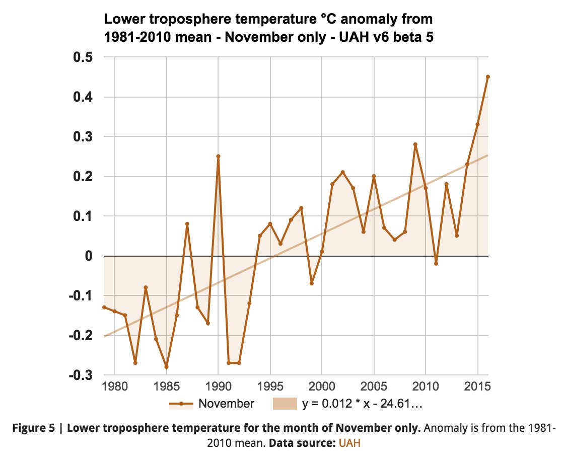 . But then again, I just look at the facts and not hype from either side.
“I don’t see a temperature drop in this November UAH graph”
Sometimes during the declining phase of an El Nino, the temperature will drop for a couple of consecutive months, and then it will blip up the next month, then it will continue on down the next month. That’s what looks to be happening here in 2016.
If you look closely at the 1998 El Nino declining phase, on the UAH chart, you can see several instances where the temperature blipped up temporarily, then continued down.
I thought we might get more relief from the deadcat bounce a while back but now it’s really gone over the cliff.
I think the guy who posted the original claim of falling temperatures prematurely. There was a uncommon situation where the Arctic ocean was warm and Siberia (land) was cold. While the two may equal out, it will show up as a cooling in the land dataset and a warming in the ocean dataset. When looking at Roys UAH for November, it seems to hold true.
The globe may be cooling, but not as fast as claimed, and it was a premature conclusion overselling the data and some of the criticism was correct and avoidable.
http://www.drroyspencer.com/2016/12/uah-global-temperature-update-for-november-2016-0-45-deg-c/
It is noticeable that Roy Spencer’s UAH update for November has not yet been featured on this blog. Normally it is posted here pretty soon after Dr Spencer posts it at his own blog.
Dr Spencer’s sub-heading to his update states: “November Temperature Up a Little from October; 2016 Almost Certain to be Warmest in 38 Year Satellite Record”: http://www.drroyspencer.com/2016/12/uah-global-temperature-update-for-november-2016-0-45-deg-c/
Contrast that sub-heading with the title of this post…
Why is it you people keep on leaving out this item which is posted on Dr Spencers site:
“Why is it you people keep on leaving out this item which is posted on Dr Spencers site:”
Doesn’t take many guesses Bruce.
Especially as UAH (V6.0 (beta5)) is the current fave, because it is the coolest of course.
See above as to how much of an outlier it is vs radiosondes.
BruceC
Re: “Why is it you people keep on leaving out this item which is posted on Dr Spencers site…”
There you go. Another reason for this site to post Dr Spencer’s UAH update in full. Why have they not done so yet? Is it possibly because it sits so awkwardly with the ‘global cooling’ narrative currently being run here?
Bruce, they like talking about UAH when it says 2016 might be the hottest year in the satellite record, but they don’t want to mention that the difference between 1998 and 2016 is miniscule and only makes 2016, 0.03-0.04C hotter than 1998.
It’s much less impressive if you say 2016 and 1998 are tied for hottest year, rather than saying 2016 is the “hottest year evah!”. It’s called promoting what makes your case and ignoring what does not.
That talks of the decline since February, not the slight jump from October.
Yes, I suspect the unusual dichotomy between recent Arctic and Siberian temps has played a part in the (erroneous) TLT data.
Here are the current T2m temps…..
http://www.meteociel.fr/modeles/gfse_cartes.php?ech=6&code=0&mode=9&carte=1