Guest essay by Christopher Monckton of Brenchley
Yet another screaming Reuters headline, this time Earth on track for hottest year ever as warming speeds up, precedes yet another screaming, inaccurate, prejudiced Reuters “news” article about the totalitarians’ current hot topic.
http://sustainability.thomsonreuters.com/2016/07/21/earth-on-track-for-hottest-year-ever-as-warming-speeds-up/, written from Geneva, cites the World Meteorological Disorganization as saying the Earth is warming at “a faster rate than expected”.
Um, no, it isn’t.

The Global Warming Speedometer for January 2001 to June 2016 shows observed warming on the HadCRUT4 and NCEI surface tamperature datasets as below IPCC’s least prediction in 1990 and somewhat on the low side of its 1995 and 2001 predictions, while the satellite datasets show less warming than all IPCC predictions from 1990 to 2001. Later IPCC predictions are too recent to be reliably testable.
All of the observations have been much affected by the recent el Niño spike, which may yet be followed by a correcting la Niña, in which event it is possible that the Pause may resume, though don’t bet on it yet. Theory would lead us to expect some warming over the medium to long term, though on balance not very much.
Now, was it really too much work for Reuters, which prides itself on its numerical data, to check IPCC predictions against observations, rather than rebarbatively regurgitating a handout that any of its customers could have downloaded from WMD all by their little selves?
“June,” says Reuters’ gripping work of fiction, “marked the 14th straight month of record heat.” Now, let me see, when Ted Cruz displayed WUWT’s Pause graph in the Senate last November, at which time there had been no global warming for 18 years [9] months, was there not a great deal of whining about how a mere 19 years was too short a period to draw any conclusions?
Yet Reuters, the supposedly bankable financial/statistical news agency, unquestioningly recycles self-serving WMD propaganda to the effect that 14 months is enough to confirm what Private Fraser in Dad’s Army had long told us: that “We’re a’ doomed!”

“We’re a’ DOOMED!”
Next, Reuters unquestioningly reports a WMD spokesman as saying: “What we’ve seen so far for the first six months of 2016 is really quite alarming. This year suggests that the planet can warm up faster than we expected in a much shorter time … We don’t have as much time as we thought.”
Er, no. Just look at the predictions and then look at the measured reality, even after all the data tampering. It ought to be plain even to the meanest journalistic “intelligence” at Reuters that the planet is actually warming up far more slowly than They had expected.
Next, Reuters unquestioningly repeats that “The average temperature in the first six months of 2016 was 1.3° Celsius (2.4° Fahrenheit) warmer than the pre-industrial era of the late 19th Century, according to space agency NASA”.
Unh, no. Even if one relies upon the most tampered-with and prejudiced of all the global temperature datasets, that of “space agency NASA”, the rate of global warming since the dataset began in January 1880 has been less than 1 degree, equivalent to a mere 0.7 degrees per century. Not exactly scary. It’s well within natural variability.
Is there no longer anyone at Reuters with enough elementary mathematical knowledge to know that in statistics one should not make arbitrary comparisons between periods of months and periods of decades? Better to determine the trend on the data:

Next, Reuters unquestioningly “reports” that “under the Paris Agreement, nearly 200 governments agreed to limit global warming to well below 2 C° (3.6 F°) above pre-industrial levels, while ‘pursuing efforts’ for a ceiling of 1.5 C° – a lower limit already close to being reached.” Aargh, no. Taking the mean of all three surface datasets, the warming trend since 1880 is little more than 0.9 degrees, leaving 0.6 degrees to go before the new arbitrary “ceiling” of 1.5 C°” is reached, and 1.1 degrees to go before the pre-existing arbitrary “ceiling” of 2 C° is reached.
Is there no one at Reuters who can do elementary least-squares linear-trend analysis? The quite unnecessary proposed “lower limit” of 1.5 degrees is by no means “close to being reached”.

Next, Reuters unquestioningly cites an “expert”: “There’s almost no plausible scenario at this point that is going to get us anything other than an extraordinary year in terms of ice (melt), CO2, temperature – all the things that we track.”
Ooof, no, no and thrice no.
As for ice melt, yet another totalitarian propaganda expedition intended to “raise awareness” of climate “catastrophe” by trying to sail around the Arctic in the summer has just come a cropper owing to – er – too much ice. Neither the North-East Passage nor the North-West Passage is open, so the expedition is holed up in – of all ghastly places – Murmansk. That’ll teach Them.
I once saved the owners of the swank rent-a-suite megaship The World from losing a fortune when her otherwise perfectly sane skipper had conceived the notion of sailing her through the North-West Passage, and had sold them on the idea.
The World was lying in Fremantle at the time. My lovely wife and I were spending a few days aboard. We were grockling all over the ship when, by mistake, we stumbled into the skipper’s day cabin, where he and his brother officers were merrily laying plans to penetrate the North-West Passage.
The skipper took us up to the bridge and, with that faraway gleam in his eye that bespeaks the adventurer, told us all about his idea. I called up the University of Illinois’ global and Arctic sea-ice data on the ship’s computer and gave the skipper a short lecture on the very few occasions over the previous century or two when the North-West Passage had been open.
The Arctic, I said, was unpredictable, wherefore he should not be too ready to join the True-Believers in subscribing to every barmy but transiently fashionable dogma of the New Religion. He saw at once that the thing was impossible and cabled the owners to tell them to think again.
Can we perhaps get just one Reuters “journalist” away from the various global institutional profiteers of doom in whose lavishly-marbled, planet-destroyingly air-conditioned halls they spend their useless days for long enough to check the data from the real world outside?
Here is what the University of Illinois’ data at WUWT’s sea ice page show. Not very scary:

According to the National Snow and Ice Data Center’s graph, also available at WUWT’s sea-ice page, it’s possible, though not all that likely, that there will be no Arctic icecap for a week or two this summer:

Even if the ice disappears for a week or two so what? The same was quite possibly true in the 1920s and 1930s, which were warmer than today in the northern hemisphere, but there were no satellites to tell us about it. Would a couple of weeks’ total ice loss drastically alter the Earth’s albedo? No: the latitude is too high, and in any event nearly all of the Earth’s albedo is reflection from clouds: the surface has very little to do with it, except perhaps during the snow-cover season in the Northern Hemisphere winter, but four-fifths of the snow-cover albedo comes from the land, not from the Arctic Ocean.
As for CO2, notwithstanding all the totalitarian propaganda about the need for the world to repent of its sins of emission (propaganda for which Reuters has been a relentlessly and cloyingly sycophantic cheer-leader), emissions continue to increase at a rate somewhat above IPCC’s do-nothing, business-as-usual case in 1990:

If the real purpose of all that propaganda had been to reduce the world’s output of CO2, no doubt that output would have begun to fall by now. But the true purpose, which is being achieved, is the war on and destruction of the U.S. coal industry, formerly one of the largest financial supporters of the Republican Party.
As far as I can discover, Reuters’ idle “journalists” have never reported that the one IPCC prediction that has undershot reality is its prediction of the global CO2 emissions rate. The net effect of all those international conferences has been precisely zero.
As for temperature, will this really be an “extraordinary year”? Let us do what no Reuters “journalist” has the knowledge, wit or interest to do, and put today’s temperatures in the geological perspective of the last four interglacial warm periods.
All four of those warm periods, over the past 450,000 years, were as warm as, if not warmer than, the present. All those prehistoric SUVs, one supposes.
As far as I can discover, Reuters has never pointed out that, sub specie aeternitatis, there is nothing in the least exceptional about today’s global mean surface temperature. The world has seen it all – and survived it all – before.

Next, Reuters gets round to admitting the existence of the recent strong El Niño spike, though, of course, the propagandist who wrote the piece somehow fails to point out that this is a natural and regularly-occurring event, not a sudden consequence of global warming:

El Nio spikes in 1998, 2007, 2010, and 2016. The rate of global warming since 1990, equivalent to 1.26 K/century, is a long way below IPCC’s predicted 2.8 [1.9, 4.2] K/century interval in 1990.
Instead, Reuters unquestioningly parrots the WMD’s Secretary-General: “Climate change, caused by heat-trapping greenhouse gases, will not (disappear). This means we face more heatwaves! More extreme rainfall!! And potential for higher-impact!!! tropical cyclones!!!!”
Well, one might expect warmer weather to bring more heatwaves. But does Reuters really need no less a personage than the WMD’s lacklustre, overpaid Sekjen to tell us that?
And, even then, would it not have been better if Reuters had checked the best weather records in the world, those of the United States, to see when the frequency of record daily temperature maxima – the measure of heatwaves – was at its highest?
The answer, as the mere facts show, was in the 1930s, when CO2 concentration had barely risen above its pre-industrial value.

As for “More extreme rainfall”, even IPCC, both in its special report on extreme weather and in its Fifth Assessment Report, has been compelled to concede that there is little evidence for “more extreme rainfall” to date, and not much reason to expect it.
Could not Reuters’ “journalist” have sobered up for long enough to totter along from the marble halls of the WMD (headquartered in Geneva, where she is supposed to have written the story) to the marble halls of IPCC (also, conveniently, headquartered in Geneva, where the authorities are more indulgent of official corruption than anywhere else on the planet)?
As for “more high-impact tropical cyclones”, the graph of accumulated cyclone energy over recent decades gives the lie to that one:

The accumulated cyclone energy index from weatherunderground.com
Next, the Reuters’ propagandist provides her own opinion that “Repeated extremes, such as heatwaves! downpours!! or droughts!!!, could encourage more action to limit greenhouse gas emissions.”
We’ve dealt with heatwaves and downpours. As for droughts, the most comprehensive recent survey, Hao et al. (2014), shows that there has been something of a decline in the fraction of the global land area under drought:

Finally, the open propaganda proposition: Reuters quotes a “climate expert” [x, an unknown quantity; spurt, a drip under pressure] at the International Institute for Applied Taxpayers’ Money Gobbling in Vienna: “Research shows that for the general public extremes make climate change more tangible, more understandable. It could help to motivate people to engage in climate action, and do something.”
Translation: “The data don’t support our climate profiteering. The facts don’t support it. The graphs don’t support it. Even the weather doesn’t support it. There has not been enough bad weather to let us get away with using it as an excuse for gobbling still more taxpayers’ money. Something must be done, and soon, or we shall have to work for a living.”
Is Reuters’ story, like so very many others it has published in sullenly prejudiced furtherance of the the climate scam, downright fraudulent?
Just type the words “Reuters disclaimer” into a search engine. What comes back, in with-knobs-on capitals, is this:
“THOMSON REUTERS EXPRESSLY DISCLAIMS ALL WARRANTIES, EXPRESSED OR IMPLIED, AS TO THE ACCURACY OF ANY THE CONTENT PROVIDED, OR AS TO THE FITNESS OF THE INFORMATION FOR ANY PURPOSE.”
It’s not as though we hadn’t been fairly warned that Reuters is just another junk website peddling totalitarian propaganda rather than mere facts.
However, Reuters takes money – and a lot of it – from various organizations on the premise that, even if it does not always achieve accuracy and disinterest, it will at least attempt these things. Its “Handbook of ‘Journalism’” opens with these ringing words:
“Everything we do as Reuters ‘journalists’ has to be independent [eh?], free from bias [what?] and executed with the utmost integrity [really?]. These are our core values [values?] and stem from the Reuters Trust Principles [principles?]. As a real-time, competitive news service [news service?] whose reputation rests on reliability [coulda fooled me], we also value accuracy [pull the other one, squire, it’s got bells on] …”
The Ten Absolutes of Reuters “Journalism” include these: always to hold accuracy sacrosanct, to correct errors openly, to strive for balance and freedom from bias, to reveal conflicts of interest, to guard against putting “journalists’” opinions in a news story, and not to fabricate. [Pass the anti-giggle potion, Hermione!]
Notwithstanding the capitalized, butt-covering disclaimer, then, Reuters is holding itself out as an organization whose news “journalists” will at least make an effort to be accurate, honest, impartial, unbought, factual and truthful.
Except on climate change, it seems.
Now read this posting again. Does wafting around the gilded palaces of Europe’s corruption capitals and vomiting out, year after year, totalitarian rentaquotes about Man’s imagined (and largely imaginary) influence on climate that are manifestly, repeatedly and materially at odds with the facts and the data, and are challenged by an increasing body of published scientific research, including 250 “consensus”-busting papers this year alone, demonstrate any recognizable effort whatever to be accurate, honest, impartial, unbought, factual or truthful?
If, like me, you don’t think so, go to https://reuters.zendesk.com/anonymous_requests/new, leave a comment telling them what you think, and send monckton {at} mail.com a copy of your message and any answer you get.
Many years ago, I used to know the then Chairman of Reuters, Lord Barnetson. He was an honest man and would not have tolerated garbage like Reuters’ latest. It may be that someone in the organization still has a conscience, as he did.
Give it a try. We should not only talk to each other here but also quietly let the outside world know the truth. The truth will prevail eventually, but the more we call out the peddlers of falsehoods the sooner it will prevail, and the fewer innocent people the terrible policy consequences of their falsehoods will kill.
Discover more from Watts Up With That?
Subscribe to get the latest posts sent to your email.
As usual the good lord (lord spelled with no capital) has it right….again….thanks.
Amongst other things he said:
More upward tampering ex post facto. That makes 4 out of the 5 longest-standing datasets that have been adjusted net-upward by a significant amount in the past few years, with the effect of bringing sober observation closer to wild prediction. Only UAH has gone the other way, owing to spurious heating of the sensors by onboard instrumentation.
Henry says:
my point exactly.
I simply don’t trust any data sets anymore, except my own:
Minimum temperatures are falling, as you can see from my results, so, there is no room in the equation for any AGW. Not even as a possible “small factor”. Those on the “green” gravy train have every interest in pushing the “official measuring ” organisations in a certain direction on their own so-called data sets>
and , OTOH,
the sun is at its most destructive in its 87 year cycle so any probe material used in space to measure T will simply not hold out. Earth is in a cooling cycle, as its atmosphere re-organizes itself to protect us from the most energetic particles from the sun. It’s amazing to be able watch this happening. Unfortunately, it seems I am all alone or perhaps there are just a few people with me like those giving their own honest opinion on this site…
It is like peeing in your pants, when you are lucky that the pants are black: it gives you a warm feeling.
[un?] fortunately nobody notices….
@Allan macrae
as you can see from my graph, minima started dropping about 18 years ago; the graph includes the data for 2014. that means 1996.
most of my graphs on other data also suggest a turning point around 1995.
Hmm, OK, you pulled my original comment, fair enough but what I alluded to, in that Reuters is merely plugging the official UK-EU government line is, made is it not?
Tacit approval or officially ordained, the link is clear and Reuters are only being ‘good little boys’ or in this case, girl.
Until, the ‘our’ the UK {and EU, US governments for that matter} government redirects to totally dismantle the green agenda – ends the specious lies and the subterfuge concerning this great scam. If also must follow on behalf of the HMG to curtail and end the corporate carousel palliative rip off [ paying for useless technologies; birdmincers, rank upon rank of diesel generators…. real driver of climate
bolloxscam …….to cease forthwith to making taxpayers liable to fund an insane adventure in moonbeam technologies and by iniquity and inequity, taxpayers are enforced by law to fund this evident madness [man made warming]….Thus, I beg, defenestrating jejune reporters’s copy ex Reuters however clever it is, is of no real value whatsoever – is it?
Government, banksters and corporate giants to me are, the real enemy – Reuters are only the messenger boys.
Every article written about AGW, CAGW and/or the GHG effect should be required to answer “how does CO2 cause the observation?” If we are going to blame CO2, we should force researchers and the press to specifically state how CO2, whose only impact on the climate is trapping IR between 13 and 18µ, can cause the observed observation/warming. Record daytime temperatures are not caused by trapping outgoing radiation of wavelength 10µ, they are caused by more incoming viable radiation reaching the earth’s surface and oceans. Warming does not prove CO2 is the cause, especially record high temperatures that can only be reached by adding more energy to the system, not trapping existing energy.
http://www.azimuthproject.org/azimuth/files/earth_and_sun_emission.jpg
http://faculty.icc.edu/easc111lab/labs/labi/waveradi.jpg
..Clouds…which the models cannot “model” !
See my reply to RB just upthread. You apparently misunderstand the GHE.
I wonder why the Plank curve is always represented in a wavelength scale for climate purposes. Showing it on a frequency scale yields a much better physical insight, since the total energy there is simply the area below the curve. Notice that your first graph uses a logarithmic scale for wavelength. The total radiative flux in a 1 micrometer band between 1 and 2 um should be compared with a flux between 20 and 21 um.
@Rud Istvan
try and understand that the biggest anti-GHE is being ignored…
https://wattsupwiththat.com/2016/07/09/alarmism-claiming-normal-as-abnormal-began-on-a-global-scale-with-ozone/#comment-2260215
Bravo Lord Monckton. Is it possible to get a compact, readily understandable, climate in a nutshell crib sheet to Trump’s campaign people, or to DJ Trump himself for such a personage as yourself? I think he’s the guy to finish off this gross global fraud and defund this Marx brothers grandest Totalitarian putsch.
Small light-bulb moment reading this: the chart on the frequency of temperature maxima invites us to conclude that there is ‘nothing to see here’ because of the downtrend in the frequency of maxima.
However, in a stable climate, the frequency of maxima naturally falls: each successive maximum raises the bar for the next. I can’t do the maths in my head, but some kind of tailing down towards zero is to be expected, unless there is warming.
Overall the graph is hard to interpret! It might be consistent with ‘nothing to see here’ but very hard to tell at a glance.
Russel, you say:
Small light-bulb moment reading this: the chart on the frequency of temperature maxima invites us to conclude that there is ‘nothing to see here’ because of the downtrend in the frequency of maxima
Henry says
where is your chart//?
Wow – I learn a lot here. Thanks to all 🙂
To make claims regarding climate change and AGW, there has to a long history of data to compare human activity to actual conditions on the ground (or water). Truthfully, reliable data only exists for as long as the satellite technology created to acquire it. 40 years of data, millennia of post-ice age history involving humanity….and climate models presented in ways to support AGW theory as the only links connecting the dots. We have a miniscule amount of data, yet the climate industry and the governments it owns are engaging in massive fraud to convince us that humanity somehow has control over climate change borne of an inherently chaotic system.
Some interesting discussion.
U.S. Coal/ jobs etc. “should” be a big topic in the upcoming Presidential Election!
Should be, yes, but the Main Stream Media will do whatever is necessary to keep it from being anything but a minor footnote.
Agree with you Rob.
When politicians get energy policy completely wrong, almost nothing else that they do really matters. They drive up energy costs, kill jobs, and increase winter mortality rates, especially among the elderly and the poor.
This is abundantly clear in the UK – they have much higher energy costs, and much higher Excess Winter Mortality Rates than Canada and the USA.
Fortunately, the Brits are finally abandoning their ridiculous green energy policies and returning to energy sanity.
Cheap, abundant reliable energy is the lifeblood of society – it IS that simple.
When misinformed politicians fool with energy systems, innocent people suffer and die.
Regards, Allan
Allan MacRae. P. Eng.
Reference: “Cold Weather Kills 20 Times as Many People as Hot Weather” by Joseph D’Aleo and Allan MacRae, September 4, 2015
https://friendsofsciencecalgary.files.wordpress.com/2015/09/cold-weather-kills-macrae-daleo-4sept2015-final.pdf
“What we’ve seen so far for the first 6 months is really quite alarming. ”
No worries 6 months is just weather not climate. 🙂
http://www.vukcevic.talktalk.net/ETMf.jpg
In our unquenchable desire to search for truth we often do not notice things that nature warns us about (paraphrasing MTC)
I have a question regarding this chart (from an earlier post in this thread):
Is this a “real world” estimation that includes things like the cooling effect of precipitation or is it an estimation assuming no other atmospheric temperature forcings?
In other words, is it saying for a certain level of Atmospheric CO2 we will have a specific temperature increase or is it saying that the most the increase can be is what is shown, but other factors may lessen the overall CO2 effect?
I built this chart. 8 years ago now. Maybe i have been in this game for too long now, I don’t know.
But it is a depiction of two things:
–> the black line is what the 3.0C per doubling of CO2 theory implies. What it is really based on. A simple thing like the level of water vapor depends entirely on the level of CO2. Climate scientists like Andrew Lacis, Gavin Schmidt, and Richard Alley have speculated that this is true but the theory itself actually is based on that. If there is no CO2, there is no water vapor (well maybe 5% left). The Earth is frozen desert. In mathematical terms. It also implies that CO2 cannot possibly be more than 3.0C per doubling despite what the climate scientists try to depict in their distribution of potential temp increase per doublng of CO2 charts. The 3.0C per doubling formula is an absolute Max. (Every climate scientist is just bad at basic math, that is why they migrated into the field in the first place which is why they do not get this).
–> the red line is what the actual Hadcrut3 temperature observations to 2008 observations imply the real CO2 sensitivity is. Natural cycles are removed first before one gets to this level.
A more-up-to-date chart would have the red line – real observations – flattened somewhat and the temperature increase value at doubling would be in the 1.5C range versus 1.85C in the chart.
I have gone through all this crap 10 ways from Sunday (I have a degree in Math) and it always, always, always turns out exactly like this. The theory is just wrong by something like 50% or more and climate science today is really all about trying to AVOID people recognizing this truth. Delay the reckoning until i retire or until I am dead. I have a Phd program and $400,000 per year of NSF funding each year and I will not jeopardize that. That is what a climate scientist is today.
Bill Illis July 23, 2016 at 8:06 pm
“Maybe i have been in this game for too long now, I don’t know.
Now THAT was alarming!
Please, Bill. Never give up. I look for your replies in comments because you communicate the technical details in a way this dumb ol’ engineer can comprehend. And when you call B.S. on some erroneous point made in comments or in an article, you have the intellectual guns and the data behind you.
To borrow from the old E.F. Hutton commercial, “When Bill Illis talks, people listen.”
Doesn’t time fly? It is now almost exactly 9 years since “the greatest morale challenge of our time” was called by one on the most challenging prime ministers of Australia’s time.
But isn’t it completely strange that this catastrophe that the world faces was NOT MENTIONED ONCE in the 75 minute speech by the Republican candidate for the next president of the United States?
Even stranger is the fact that all of the newspapers I have read since, that have echoed Mr Rudd’s alarm over the years, NOT ONCE mentioned Mr Trump’s apparent glaring omission. Good gracious me, what has happened?
Have the dams suddenly started filling? Do the children still know what snow is? Could it be that the people are beginning to suspect that our current warming really IS within natural variation? Are the birds still singing in the trees? Or, are there just many more moral challenges these days?
Whatever the answer, my only advice to prospective doomsayers to avoid any future unpleasant embarrassment, is to make sure you have well and truly left this earth before the date of your predicted doomsday cataclysm.
“Are the birds still singing in the trees?”
Millions fewer birds are singing in the trees. The windmills got them.
Dear Reuters,
I find your news stories kinda useful
http://cdn.thisiswhyimbroke.com/images/horror-story-toilet-paper-640×533.jpg
perhaps, as a chemist, I need to inform some of you of a few basic truths.
first of all, it took ages for earth to produce enough CO2/CO3 to produce life. You need at least ca. 200 ppm CO2 in the air to be able to get life [crops]
Apart from the CO2 in the air, there are giga tons and giga tons of CO3 dissolved in the oceans….an unlimited supply of CO2 if it is warming:
CO3 (2-) + H2O + warming => CO2 (g) + H30(1+)
the opposite also happens! Coldness is a sink for CO2
CO2 + H2O + coldness => CO3 (2-) + OH (1-)
ergo,
CO2 increase follows a warming trend
Hence, the link between increasing CO2 and warming is negative….
it is like saying cancer causes smoking when we all know that it is the other way around…..
true enough
I have the reactions the wrong way around as they don’t balance properly…
I must be getting[very] old?
should be
CO3 (2-) + H2O + warming => CO2 (g) + 2OH (1-)
the opposite also happens! Coldness is a sink for CO2
CO2 + 3H2O + coldness => CO3 (2-) + 2H3O (1+)
sorry….
Should that be “alleged” link between CO2 and warming? In the case of the alleged link between smoking and cancer, we know something else must be involved because some people who smoke do not get cancer and some people who get cancer never smoked.
The alarmists claimed that one of the consequence of a warming climate would be an increase in the frequency and intensity of tropical storms [cyclones in Australia].
When the frequency didn’t increase, but rather seemed to decrease, the response was that in a warming world the frequency of tropicals storms would decrease [for some reason] but their intensity would increase.
Records kept by BOM in Australia show that since the 1970s [records are a bit patchy earlier than that] cyclone frequency has decreased and that their intensity has remained the same or decreased slightly.
http://www.bom.gov.au/cyclone/climatology/trends.shtml
Then there is the Atlantic……..according to NOAA researchers..”the historical tropical storm count record does not provide compelling evidence for a greenhouse warming induced long-term increase”
http://www.gfdl.noaa.gov/historical-atlantic-hurricane-and-tropical-storm-records.
Is there more information on the Arctic cruise ship(s) which Lord M says is/are currently holed up in Murmansk? I notice that a large cruise ship (the “Crystal Serenity”) is supposed to be taking a trip through the N-W passage in August. Is that still happening? Any info would be welcome.
It’s not a cruise ship, it’s a yacht and Monckton was mistaken about it being holed up in Murmansk (that’s the problem with believing what ‘Steve Goddard’ says).
To add to Phil’s reply, the Northabout left Murmansk on the 20th July and is currently in the Kara Sea.
You can track their progress here
http://polarocean.co.uk/
I’ve no idea if this challenge will succeed, but dismissing them as a “Ship of Fools” is pretty insulting.
Thank you.
Breitbart.com and realclimatrscience.com have the details of the latest Ship of Fools expedition.
mark my words
that ship will get stuck
just like the ship of Willem Barentz….
@Phil.
I have repeatedly explained to you in the past what “absorption” really means. Are you saying that ozone is not a GH gas? Both ozone and peroxide have absorption in the UV region. Unfortunately you don’t exactly what it means?
Anyway for those interested here we can do the GH-effect 101 again (and that includes the anti-GH effect caused by ozone, peroxides and other TOA)
“I am watching with some amusement a lot of scholar discussions on the green house effect as I realised again that the people that I encounter on most scientific blogs don’t understand the chemistry principle of absorption and subsequent re-radiation. In fact very few people do understand it because if they did they would have raised the alarm bells ringing long time ago. But they all got stuck at Tyndall and Svante Arrhenius. …
They know that CO2 (carbon dioxide) “absorbs” in the 14-15 um region. Most people think that what it means is that the molecules absorbs photons here which then subsequently get transferred as heat to neighboring molecules. Then it absorbs again, and so on, and so on…and all the absorbed light is continuously transferred to heat…
Although this may happen up to a certain saturation point as soon as the light or radiation hits on the gas, that is in fact not what is causing the heat entrapment.
The best way to experience re-radiation for yourself is to stand in a moist dark forest just before dawn on a cloudless night. Note that water vapour also absorbs in the visible region of the spectrum. So as the first light of sun hits on the water vapour around you can see the light coming from every direction. Left, right, bottom up, top down. You can see this for yourself until of course the sun’s light becomes too bright in the darkness for you to observe the re-radiated light from the water vapour.
A second way to experience how re-radiation works is to measure the humidity in the air and the temperature on a certain exposed plate, again on a cloudless day, at a certain time of day for a certain amount of time. Note that as the humidity goes up, and all else is being kept equal, the temperature effected by the sun on the plate is lower. This is because, like carbon dioxide, water vapour has absorption in the infra red part of the spectrum.
We can conclude from these simple experiments that what happens is this: in the wavelengths areas where absorption takes place, the molecule starts acting like a little mirror, the strength of which depends on the amount of absorption taking place inside the molecule. Because we can assume that the molecule is like a perfect sphere, 62,5% of a certain amount of light (radiation) is send back in the direction where it came from. This is the warming or cooling effect of a gas hit by radiation in the absorptive region.
Unfortunately, in their time, Tyndall and Arrhenius could not see the whole picture of the spectrum of a gas which is why they got stuck on seeing only the warming properties of a gas. [closed box experiments]
If people would understand this principle, they would not singularly identify green house gases (GHG’s) by pointing at the areas in the 5-20 um region (where earth emits pre-dominantly) but they would also look in the area 0-5 um (where the sun emits pre-dominantly) for possible cooling effects.
We also know that CO2 aborbs in the UV area and this re-radiation is in fact used to identify CO2 on other planets
In all of this we are still looking at pure gases. The discussion on clouds and the deflection of incoming radiation by clouds is still a completely different subject.
So what everyone should be doing is looking at the whole spectrum of the gas molecule 0-20 um. Unless you come to me with a balance sheet of how much cooling and how much warming is caused by a gas, we don’t actually know whether a substance is a net warmer or a net cooler.
Seeing that CO2 also causes cooling by taking part in the life cycle (plants and trees need warmth and CO2 to grow), and because there is clear evidence that there has been an increase in greenery on earth in the past 4 decades, I think the total net effect of more carbon dioxide in the atmosphere could even be zero or close to zero. But unless we cone up with a test method and measurements, we will never know for sure.
For proof that CO2 is (also) cooling the atmosphere by re-radiating sunshine, see here:
http://www.iop.org/EJ/article/0004-637X/644/1/551/64090.web.pdf?request-id=76e1a830-4451-4c80-aa58-4728c1d646ec
They measured the re-radiation from CO2 as it bounced back to earth from the moon. So the direction was sun-earth-moon -earth. Follow the green line in fig. 6, bottom. Note that it already starts at 1.2 um, then one peak at 1.4 um, then various peaks at 1.6 um and 3 big peaks at 2 um. It all comes back in fig. 6 top.
This paper here shows that there is absorption of CO2 at between 0.21 and 0.19 um (close to 202 nm):
http://www.nat.vu.nl/en/sec/atom/Publications/pdf/DUV-CO2.pdf
There are other papers that I can look for again that will show that there are also absorptions of CO2 at between 0.18 and 0.135 um and between 0.125 and 0.12 um.
We already know from the normal IR spectra that CO2 has big absorption between 4 and 5 um.
So, to sum it up, we know that CO2 has absorption in the 14-15 um range causing some warming (by re-radiating earthshine) but as shown and proved above it also has a number of absorptions in the 0-5 um range causing cooling (by re-radiating sunshine). This cooling happens at all levels where the sunshine hits on the carbon dioxide same as the earthshine. The way from the bottom to the top is the same as from top to the bottom. So, my question is: how much cooling and how much warming is caused by the CO2? How was the experiment done to determine this and where are the test results? (I am afraid that simple heat retention testing might not work here, we have to use real sunshine and real earthshine to determine the effect in W/m3 / [0.03%- 0.06%]CO2/m2/24hours)”
henryp July 26, 2016 at 7:57 am
@Phil.
I have repeatedly explained to you in the past what “absorption” really means. Are you saying that ozone is not a GH gas? Both ozone and peroxide have absorption in the UV region. Unfortunately you don’t exactly what it means?
I know exactly what it means Henry.
In the UV O3 absorbs causing an electronic transition, however the upper state is above the dissociation limit and the molecule falls apart resulting in an O2 molecule and an O atom:
O3 + h𝜈 -> O2 + O
That has nothing to do with O3 being a GH gas, the UV supplied the energy to break the bond and there is no re-radiation of it. Similarly for peroxide:
H2O2 + h𝜈 -> 2OH
Ozone also absorbs in the IR, principally at ~1000 cm-1, without dissociating, which allows it to act as a GH gas.
@Phil.
https://wattsupwiththat.com/2016/07/22/is-the-reuters-news-agency-committing-fraud/comment-page-1/#comment-2265147
let me get an answer from you on that comment now, otherwise you come back with the same story again on the next thread…
Already answered:
https://wattsupwiththat.com/2016/07/22/is-the-reuters-news-agency-committing-fraud/comment-page-1/#comment-2265266
@Phil.
no. We disagree.
the graph clearly shows the purple line starting at 0.6 um and it can be implied to go back further, below 0.6
similarly, it also does not show the absorptions and subsequent re-radiation of water and CO2 beyond 4 um but you and I know that it is there –
coming back from the moon-
that is=
HenryP July 26, 2016 at 1:09 pm
@Phil.
no. We disagree.
the graph clearly shows the purple line starting at 0.6 um and it can be implied to go back further, below 0.6
No, that’s the Chappuis-Wulf band, in the visible:
http://joseba.mpch-mainz.mpg.de/spectral_atlas_data/cross_sections_plots/Ozone/O3_ChappuisWulf_lin.jpg
As you see it only extends to 450nm.
The UV band, the Hartley-Huggins band, below 350nm is not covered in that paper, and that is the band associated with O3 dissociation.
http://www.intechopen.com/source/html/6775/media/image2.jpg
dear Phil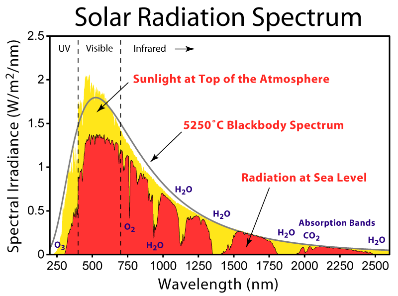

I have already explained this to you before.Look here.
the spectrum shows all the absorption bands of the important components that cut away a portion from the sun’s rays (i.e. the difference between the yellow and red)
[pity that at some point chemists started talking about “absorption”. That has caused a lot of confusion. In my days we used to call it extinction]
The O3 has major absorption in the UV region, causing it to back radiate, just like the other gases.
Ozone itself is made by the sun’s most harmful rays. As is the H2O2 and N-Oxide.. That is our protection against the most harmful rays from the sun. In a time of very low solar polar magnetic field strengths, such as now, more harmful rays are released and more ozone & others are manufactured TOA. Hence we have ozone increasing, both in the NH and the SH. Peroxide has almost the same spectrum as ozone…so we can add it in there with the O3 in the solar spectrum.
More ozone & others means that the difference between the red and yellow becomes bigger.
That anti-GH effect is much bigger than the GH effect.
Do you understand why it is cooling now?
henryp July 27, 2016 at 2:10 am
dear Phil
I have already explained this to you before.Look here.
You have stated it before, it was wrong then and it is still wrong!
The O3 has major absorption in the UV region, causing it to
back radiatebe destroyed,just likeunlike the other gases.Ozone itself is made by the sun’s most harmful rays. As is the H2O2 and N-Oxide.
The UV energy absorbed by the O3 molecule has been used to break a O-O bond, unlike the case of IR absorbed by CO2 which causes the bond to vibrate at a higher frequency and therefore have the ability to radiate IR (unless it’s depleted by multiple collisions before it has time to radiate).
@CO2 is not evil
would be nice if some of the astronauts had left a T measurement instrument on the moon transmitting the results on a regular basis….
HenryP,
They did leave some measuring equipment, but it’s probably inoperative now and I haven’t been able to fund a source for the original data. It would be a very good indicator of the effects of all energy from the Sun, rather than just that we think we know about. If we saw a small change on the Moon which was not as big terrestrially, it would be a clear indication of net negative feedback. It it reflected a bigger change, it would be representative of net positive feedback.
Frederik Michiels on July 23, 2016 at 1:00 pm
O R on July 23, 2016 at 1:45 pm
O R you should be carefull by comparing RATPAC data with UAH: RATPAC A is a homgenized dataset … In order to calibrate the satellite records you need the RATPAC B data which is the raw data.
This opinion looks a bit strange for anybody having analysed the IGRA context and, by extension, its RATPAC subsets.
Simply because everybody can see that the full IGRA dataset looks 100% more raw and unadjusted than does the RATPAC B.
This is best shown by plotting together the following three datasets for the period 1979-2016:
– the original RATPAC B dataset called „monthly combined“;
– the dataset constructed by filtering, out of the full IGRA dataset, all records produced by the 85 RATPAC B radiosondes;
– the full IGRA dataset.
http://fs5.directupload.net/images/160726/7f76pxli.jpg
According to Kevin Cowtan, the IGRA dataset shows a much higher deviation from linearity than does the dataset generated by the RATPAC B sondes, and the latter shows similar compared with the data originating from the original RATPAC B „monthly combined“.
There is evidence that, if the original RATPAC B dataset never had been subject to modifications of any kind, there would be no difference at all between it and that what has been extracted out of the full IGRA dataset for the 85 RATPAC radiosondes.
“I once saved the owners of the swank rent-a-suite megaship The World from losing a fortune when her otherwise perfectly sane skipper had conceived the notion of sailing her through the North-West Passage, and had sold them on the idea.”
Could you say when this happened? Presumably not in 2012 when The World successfully sailed through the North-West Passage,
Presumably when Monckton was in Fremantle in 2011, in which case they clearly ignored his advice and sailed through the NW Passage at the next available opportunity! There’s even a youtube documenting the voyage.
That’s what I was thinking, but The World didn’t visit Fremantle in 2011, but was there in Feb 2012, when it was already scheduled to go through the Northwest Passage.
https://web.archive.org/web/20120101215229/http://aboardtheworld.com/journey
So if this is the point when Monckton persuaded the skipper that it was impossible, they must have ignored his advice. In which case he didn’t save them a fortune.
Phil. says
The O3 has major absorption in the UV region, causing it to back radiatebe destroyed, just likeunlike the other gases.
Henry says
You just changed my words. Can you also change the graph that I quoted?
Truth is that very few people really do know what is happening, exactly, TOA, as evident from the introduction of this report
http://www.nat.vu.nl/en/sec/atom/Publications/pdf/DUV-CO2.pdf
I do know is that ozone is increasing, both NH and SH and it started going up from 1995 which corresponds with the dates I have for the Gleissberg [various factors including my own data sets on maxima and minima]
ozone scare was a red herring just like the CO2 scare is a red herring…..
HenryP July 27, 2016 at 9:30 am
Phil. says
The O3 has major absorption in the UV region, causing it to
back radiatebe destroyed,just likeunlike the other gases.Henry says
You just changed my words. Can you also change the graph that I quoted?
No I just corrected your statement. Regarding the graph you quoted, as I pointed out before it shows no UV reflected from the moon in the O3 absorption band, so there is no correction necessary, it doesn’t show what you claim it does!
When O3 absorbs UV below ~350nm the molecule falls apart in about 1psec, there is no surplus energy to radiate so the reradiation of ~50% back to space is impossible.
@Phil.
I think you are being deliberately misleading now?
this graph
shows that a large portion of UV is being back radiated by the ozone, [+ peroxides + N-oxides]. In fact, everything indicated as yellow is back radiated by the so-called greenhouse gasses. It is the anti-GH effect that perhaps people like you donot want to talk about?
One can only wonder why.
Figure 6 from the earthshine [via the moon] investigation quoted by you exactly confirms the absorption bands of the solar spectrum including the purple one from O3 which can be seen declining towards the UV region, exactly as one would expect from the graph on the solar spectrum.
Perhaps you have to re-write your books?
Good luck with that.
HenryP,
It’s just like the GHG effect in the atmosphere. About half of what’s absorbed by the atmosphere from the surface is radiated back to the surface and about half escapes to space. The same is true with the GHG effect at higher wavelengths, except that the energy being absorbed arrives from the top, rather than the bottom of the atmosphere, yet still has 2x the area to eventually leave so about half of the solar input absorbed from space is reflected back out to space while the remaining half is radiated back to the surface. It’s a basic geometric requirement that the data confirms even as consensus climate science conveniently ignores this inconvenient reality of physics.
If we count the effects of absorption of surface radiant emissions by GHG’s and clouds, about 76% of what’s emitted is absorbed. At an average surface temperature of 287K, it emits 385 W/m^2, thus the atmosphere absorbs 293 W/m^2 leaving only 92 W/m^2 to escape. However, we need 239 W/m^2 to escape to match the power arriving from the Sun which is a deficit of 239-92 = 147 W/m^2. This can only come from the 293 W/m^2 being absorbed by the atmosphere, leaving 146 W/m^2 which when added to the 239 W/m^2 from the Sun is equal to the 385 W/m^2 being emitted by the surface. Not only are the boundary conditions at the top and bottom of the atmosphere met, the 50/50 split required by geometry emerges.
Do you think its a coincidence that half of the radiation absorbed by the atmosphere is required to make up the difference in planet emissions and the other half is required to make up the difference in surface emissions at its elevated temperature?
Trenberth incorrectly assumes the 76% is closer to 90%. If we plug in his number, the atmosphere absorbs 346 W/m^2 leaving only 39 W/m^2 to escape and a deficit of 200 W/m^2, which when subtracted from the 346 W/m^2 absorbed again leaves 146 W/m^2 which when added to 239 W/m^2 becomes the 385 W/m^2 required to replace the power emitted by the surface.
If the transparent window is really as narrow as Trenberth claims, then the required split becomes 57.8% of the radiation absorbed by the atmosphere must be emitted to space while only 42.2% is returned to the surface. This contradicts the consensus requirement to claim that more than 100% of what the atmosphere incrementally absorbs must be returned to the surface in order to support the claimed sensitivity. His attempt to obfuscate this obvious problem is why he incorrectly conflates radiant power transported by photons with non radiant energy transported by matter relative to the radiant balance of the planet. Unfortunately, when you add non radiant energy to the atmosphere, it can only be returned to the surface (Trenberth incorrectly refers this to back radiation even though is has nothing to do with photons). If you add 54 W/m^2 to the amount absorbed, you must increase ’emissions’ by the same amount, 439 W/m^2, absorbed power becomes 400 W/m^2, 40 W/m^2 escapes, 199 W/m^2 of the 400 W/m^2 is required to make up the output deficit and the remaining 201 W/m^2 is added to 239 W/m^2 to arrive at the 439 W/m^2 of ’emissions’. OK, now we have the required 50/50 split, except that the surface is not emitting 439 W/m^2 of NET radiant energy because if it was, its temperature would be about 10C warmer than it actually is.
HenryP July 27, 2016 at 11:30 am
@Phil.
I think you are being deliberately misleading now?
No that’s what you’re attempting!
this graph shows that a large portion of UV is being back radiated by the ozone, [+ peroxides + N-oxides]. In fact, everything indicated as yellow is back radiated by the so-called greenhouse gasses.
It shows nothing of the sort, the color yellow indicates that the light at the TOA hasn’t made it to the surface. It does not show that any of the UV is being back radiated by the ozone.
Figure 6 from the earthshine [via the moon] investigation quoted by you exactly confirms the absorption bands of the solar spectrum including the purple one from O3 which can be seen declining towards the UV region, exactly as one would expect from the graph on the solar spectrum.
That graph shows nothing below 600nm, that is your fantasy.
Here’s the Earth’s UV/visible spectrum from the LCROSS mission.
http://blogs.discovermagazine.com/badastronomy/files/2009/08/lcross_spectrum2.jpg
Note the absence of UV below ~320 (where O3 absorbs).
Phil. says
it shows nothing of the sort, the color yellow indicates that the light at the TOA hasn’t made it to the surface. It does not show that any of the UV is being back radiated by the ozone.
Henry says
So explain to us all how and why exactly the yellow did not make it to the surface when clearly it was there TOA? Please also explain your theory as to why the yellow indicated in the UV region did not make it to sea level?
HenryP July 27, 2016 at 12:34 pm
Phil. says
“it shows nothing of the sort, the color yellow indicates that the light at the TOA hasn’t made it to the surface. It does not show that any of the UV is being back radiated by the ozone.”
Henry says
So explain to us all how and why exactly the yellow did not make it to the surface when clearly it was there TOA? Please also explain your theory as to why the yellow indicated in the UV region did not make it to sea level?
As is clearly indicated on the graph in Blue in the visible and IR regions it is predominantly absorbed by CO2 and H2O. Below ~300nm you have strong absorption by O3 and O2 also Rayleigh scattering becomes important here (1/𝝺^4 dependence), you also have Mie scattering from clouds in the Vis and near IR.
None of the light that you see in the clouds in this image made it to the surface.
http://coopergreendesign.com/blog/wp-content/uploads/2010/04/earth1.jpg