Guest Post by Bob Tisdale
THREE MAPS ILLUSTRATING SIMILAR GLOBAL SURFACE TEMPERATURE CHANGES OVER DIFFERENT 30-YEAR PERIODS
The GISS map-making webpage allows users to create global maps of surface temperature anomalies for specific time periods or to create maps of the change in surface temperatures over user-defined time periods based on local linear trends.
My Figure 1 includes 3 maps from that webpage. They are color-coded to show where and by how much surface temperatures have changed around the globe over three different 30-year periods, based on the GISS Land-Ocean Temperature Index (LOTI) data. I’ve highlighted in red the respective global temperature changes in deg C. They’re basically the same at 0.48 deg C and 0.49 deg C. You’ll note that I’ve also blacked-out the time periods, because I’ve asked the question Which 30-Year Warming Period Is Recent?
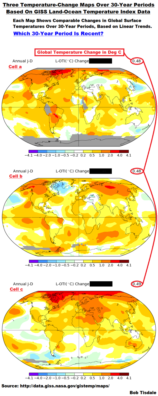 Figure 1
Before I provide the answer, here’s some…
INFORMATION ABOUT THE DATA AND CLIMATE MODELS
Global Land-Ocean Surface Temperature Anomaly Data
There are a number of suppliers of global land plus ocean surface temperature data. For this exercise, we’re presenting the GISS Land-Ocean Temperature Index (LOTI) reconstruction, which is a product of the Goddard Institute for Space Studies. The GISS Land-Ocean Temperature Index (LOTI) is a merger of much-adjusted near-land surface air temperature anomaly data for the continental land masses and much-adjusted sea surface temperature anomaly data for the ocean surfaces. Starting with the June 2015 update, GISS LOTI uses the new NOAA Extended Reconstructed Sea Surface Temperature version 4 (ERSST.v4), a.k.a the “pause-buster” reconstruction, which infills grids without temperature samples. For land surfaces, GISS adjusts GHCN and other land surface temperature products via a number of methods and infills areas without temperature samples using 1200km smoothing. Refer to the GISS description here. Unlike the UK Met Office and NCEI products, GISS masks sea surface temperature data at the poles, anywhere seasonal sea ice has existed, and they extend land surface temperature data out over the oceans in those locations. GISS uses the base years of 1951-1980 as the reference period for anomalies. The values for the GISS product are found here.
For summaries of the oddities inherent in the new NOAA ERSST.v4 “pause-buster” sea surface temperature data see the posts:
- The Oddities in NOAA’s New “Pause-Buster” Sea Surface Temperature Product – An Overview of Past Posts
- On the Monumental Differences in Warming Rates between Global Sea Surface Temperature Datasets during the NOAA-Picked Global-Warming Hiatus Period of 2000 to 2014
Climate Models
Later in the post we’ll present model-data comparisons. We’re using the model-mean of the estimates of past global surface warming (1880 to 2015) based on the climate models stored in the CMIP5 (Coupled Model Intercomparison Project Phase 5) archive, with historic forcings through 2005 and RCP8.5 forcings thereafter. (The individual climate model outputs and model mean are available through the KNMI Climate Explorer.) The CMIP5-archived models were used by the IPCC for their 5th Assessment Report. The RCP8.5 forcings are the worst-case future scenario.
NOTE: If climate model forcings are new to you, see Chapter 2.3 of my free ebook On Global Warming and the Illusion of Control – Part 1 (25MB pdf), and if you’re new to RCPs (Representative Concentration Pathways), see Chapter 2.4.[End note.]
We’re using the multi-model mean (the average of the climate model outputs) because the model-mean represents the consensus of the modeling groups for how surface temperatures should warm if they were warmed by the numerical representations of forcings that drive the models. See the post On the Use of the Multi-Model Mean for a further discussion of its use in model-data comparisons.
30-Year Periods
In the maps and graphs, we’re presenting temperature changes based on linear trends over 30-year periods. Why 30 years? Because climate is typically defined as the average of a weather-related variable over 30 years. See the Frequently Asked Questions webpage from the World Meteorological Organization (my boldface):
Climate, sometimes understood as the “average weather,” is defined as the measurement of the mean and variability of relevant quantities of certain variables (such as temperature, precipitation or wind) over a period of time, ranging from months to thousands or millions of years.
The classical period is 30 years, as defined by the World Meteorological Organization (WMO). Climate in a wider sense is the state, including a statistical description, of the climate system.
Back to the quiz:
ONE IS RECENT; TWO ARE NOT
The bottom map (Cell c) shows the changes in temperature (based on local linear trends) for the most recent 30-year period of 1986 to 2015, the center map (Cell b) covers 1964 to 1993 (ending more than 2-decades ago) and the top map (Cell a) shows the temperature changes for the 3-decade period of 1916 to 1945, ending 70+ years ago.
There are aspects of the maps that give away the answers. There’s a lot of temperature-change data missing in the high latitudes of the Southern Hemisphere in Cell a, which suggest the period is before the 1950s. There are few to no surface temperature observations in Antarctica before the 1950s. For the other two, there is more warming in the Arctic in Cell c than in Cell b, and that suggests that Cell c is the newer of those two. Why? Naturally occurring polar amplification, which impacts the Arctic, has been stronger recently than it was a couple of decades ago.
NOTE: For those new to polar amplification, see Chapter 1.18 of On Global Warming and the Illusion of Control – Part 1. As illustrated and discussed in that chapter, not only is polar amplification a naturally occurring phenomenon that works both ways (amplifying warming during global warming periods and amplifying cooling during global cooling periods), it is a phenomenon that is not simulated properly by climate models…but that’s not surprising because there are many naturally occurring phenomena that climate models are still not capable of simulating correctly. [End note.]
In Figure 2, I’ve uncovered the time periods, and, to the right of the maps, I added time-series graphs of the global GISS LOTI data that correspond to those time periods.
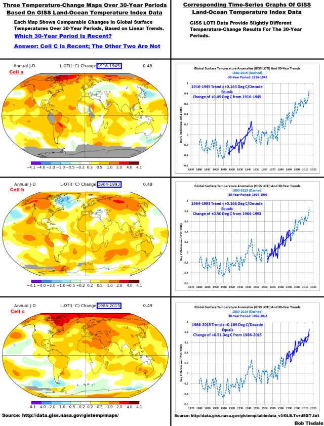
Figure 2
You’ll note that the temperature changes shown on the maps are slightly different than the temperature changes that MS EXCEL derived from linear-trend analyses of the time-series data. Why? I don’t know for certain so I won’t speculate. Regardless of whether we look at the temperature changes from the maps or from the data, they are similar for the three time periods.
If you’re a newcomer to the ongoing debate about human-induced global warming, you may have run across a phrase similar to “global warming is worse than we thought”. There may have been some truth to that statement a number of decades ago. But comparisons of model outputs with even the newly revised Land-Ocean Temperature Index data from the Goddard Institute of Space Studies show that is no longer true. That is, recently global warming over 30-year periods is occurring at a rate that is slower than predicted by climate models.
CAN THE CLIMATE MODELS USED BY THE IPCC SIMULATE THE TEMPERATURE CHANGES OVER THOSE THREE PERIODS?
Answer: The models used by the IPCC are do a reasonable job for the period of 1964 to 1993, but they come nowhere close to being able to simulate the warming that occurred from 1916 to 1945, and climate models are over-predicting warming during the most-recent 30-year period.
Figure 3 includes model-data comparisons of global surface temperature anomalies using time-series graphs for our three periods of 1916-1945, 1964-1993 and 1986-2015. The data are represented by the GISS Land-Ocean Temperature Index and the models are the multi-model mean (average) of the climate models stored in the CMIP5 archive. (See the preliminary notes about the data and models.)
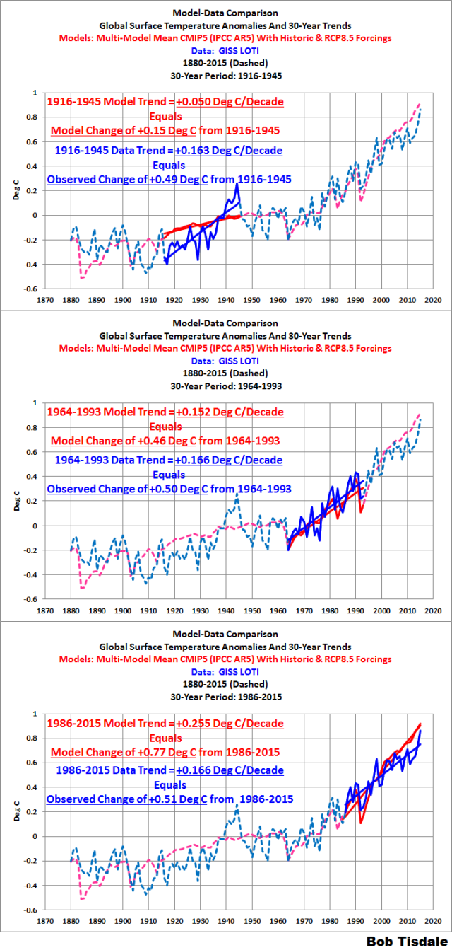
Figure 3
The comparison in the center graph shows the model change in surface temperatures almost matching the data for the period of 1964 to 1993. In other words, the models appear to be performing reasonably well during this period. And the bottom graph shows that, according to the GISS Land-Ocean Temperature Index and the CMIP5-archived climate models, global warming over the most-recent 30-year period is occurring at a rate that’s noticeably lower than simulated by the consensus of the climate-modeling groups. The consensus of the modeling groups indicates that global warming should have occurred at a rate of 0.255 deg C/decade but the data indicate global surface warming has occurred at a rate of only 0.166 deg C/decade from 1986 to 2015.
Let’s focus on the early warming period of 1916-1945 because it’s critical to the evaluation of model performance and to our understanding of what causes global surfaces to warm. According to the GISS LOTI data and the CMIP5-archived climate models, global surface temperatures warmed at a rate from 1916 to 1945 that was substantially higher than was hindcast by the models…more than 3 times faster than determined by the models. That means the forcings used to drive the models can’t explain most of the surface warming from 1916 to 1945.
What caused the additional warming in the 30-year period of 1916 to 1945 that the models can’t explain? If the forcings used to drive the models can’t explain the warming, then the warming obviously must have occurred naturally. There are naturally occurring, coupled ocean-atmosphere processes like the Atlantic Multidecadal Oscillation and the El Niño-Southern Oscillation that can cause global surfaces to warm naturally over multidecadal timeframes.
Note: For those new to the Atlantic Multidecadal Oscillation, see Chapter 3.3 of On Global Warming and the Illusion of Control – Part 1. El Niño events, when they dominate, can also cause long-term global surface warming. See Chapter 3.7 of that ebook. You’ll also discover that climate models do not—cannot—simulate the naturally occurring processes that can cause global surfaces to warm over multidecadal periods…and that means the modelers try to explain the naturally occurring portion of the warming in recent decades by using carbon dioxide and other greenhouse gases. [End note.]
Back to performance of the models: Those differences between model and data trends from 1916 and 1945 also call into question the performance of the models where they align better later in the 20th Century. During the 30-year period from 1964 to 1993 the warming rate of the models aligns well with the observed trend shown by the data. Is this proof that the models are properly simulating the effects of the manmade greenhouse gases and other forcings that are used to drive the models? Of course not. We’ve already seen that global surfaces can warm naturally at a rate that’s much higher than hindcast by the models, and that additional natural warming from 1916 to 1945 suggests that most of the warming seen in the latter part of the 20th Century could also have occurred naturally. Further, that means it’s likely the climate models are far too sensitive to manmade greenhouse gases, which in turn means the model projections of future warming are much too high.
We already have an indication the model forecasts are too high: It’s plainly obvious in the over-estimated warming for the most-recent 30-year period of 1986 to 2015 shown in the bottom graph of Figure 3.
The fact that the models better align during the latter part of the 20th Century also suggests the models are simply tuned to perform well at that time. Unfortunately, as far as I know, only two of the dozens of climate modeling groups around the globe have documented how they tune the models they submitted to the CMIP5 archive.
CLOSING
There are a number of take-home points to this post. First, during the three global warming periods discussed in this post—1916-1946, 1964-1993, and 1986-2015—there were similar observed changes in global surface temperatures. It’s tough to claim that the recent global warming is unprecedented when surface temperatures rose at a comparable rate over a 30-year timespan that ended about 70 years ago.
Second, climate models are not simulating climate as it existed in the past or present. The model mean of the climate models produced for the IPCC’s 5th Assessment Report simulates observed warming trends for one of the three periods shown in this post. Specifically, during the three global warming periods discussed in this post, climate models simulated three very different rates of warming (+0.050 deg C/decade for 1916-1946, +0.155 deg C/decade for 1964-1993, and +0.255 deg C/decade for 1986-2015), yet the data from GISS indicated the warming trends were very similar at +0.16 deg C/decade and +0.166 deg C/decade. If climate models can’t simulate global surface temperatures in the past or present, why should anyone have any confidence in their prognostications of future surface temperatures?
Third, the models’ failure to simulate the rate of the observed early 20th Century warming from 1916-1945 indicates that there are naturally occurring processes that can cause global surfaces to warm over multi-decadal periods above and beyond the computer-simulated warming from the forcings used to drive the climate models. That of course raises the question, how much of the recent warming is also natural?
Fourth, for the most-recent 30-year period (1986-2015), climate models are overestimating the warming by a noticeable amount. This, along with their failure to simulate warming from 1916-1945, suggests climate models are too sensitive to greenhouse gases and that their projections of future global warming are too high.
Fifth, logically, the fact that the models seem to simulate the correct global-warming rate for one of the three periods discussed does not mean the climate models are performing properly during the one “good” period.
Sixth, is there a maximum rate at which global surface temperatures can warm? We’ll discuss this further in an upcoming post.
Bob,
That’s not fair. You know that it’s illegal to put the recent warming period into perspective.
//SARC
I tried to look in to the three 30 year segments with reference to southwest monsoon rainfall’s 60 year cycle as large number of papers including IPCC report indicated the global warming affected the Indian southwest monsoon.
In the three segments, temperature over India and its surrounded ocean/seas presented within the 0.2 – 0.5 oC range. The first two 30 year segments coincided with increasing rainfall arm of a 60-year cycle sine curve while the third 30 year cycle arm coincided with decreasing rainfall arm of a 60-year cycle sine curve. This is not the same with Andhra Pradesh state rainfall with two monsoons and cyclonic activity along its coast. The first two 30 year segments coincided with below the average 28 year part of 56 year cycle in the southwest monsoon and above the average 28 year part of 56 year cycle in the northeast monsoon and cyclonic activity. The third 30 yearsegment coincided with the opposite pattern to the first two.
Dr. S. Jeevananda Reddy
Polar Amplification – Extrapolating Temperatures from 1200km away.
1200km smoothing is the same as someone living in Spokane WA using the temperature in Death Valley to plan their day.
Tch. This is why you never get the big money – researching the wrong thing.
The models are correct – the money is all being spent to figure out why the data is so wrong…
(Do I need a tag?)
Actually, you do not need a tag.
Consider how much time and effort if put into adjusting, modifying, and correcting the historical temperature record. The money spent is surely an non-trivial fraction of the “research” budget.
Perhaps more money than a lot of people would like to admit.
Bob you just missed millions of $$$$ by making a wrong comparison and oh where is the magic CO2 molecule that does it all sentence? you know El nino PDO the sun and AMO are just worthless to mention. the data is incorrect, the models are right!
(guess no need for sarc tags?)
though i was wrong in my guess because i thought cell B was the most recent one
Yeah, me too. I thought I saw an orange ‘carbon footprint’ right below Madagascar.
Besides using a 30 year period, I believe the WMO also recommended using a reference period that ends in the most recent decade (1981-2010).
Has anyone ever taken GISS data and reset the reference period for anomalies?
I’d like to see the difference between the two periods (GISS, 1951 to 1980 vs WMO recommended 1980 to 2010).
1. I believe the WMO also recommended using a reference period that ends in the most recent decade (1981-2010).
Well, to believe is good, but to search for the truth is even better:
https://www.wmo.int/pages/themes/climate/statistical_depictions_of_climate.php
2a. I’d like to see the difference between the two periods (GISS, 1951 to 1980 vs WMO recommended
1980 to 20101961-1990)WMO’s period choice inbetween is quite a bit old; better indeed is to select 1981-2010 instead. Not because it would be better, but because it is the only way to compare historical surface temperature records with satellites’ brightness measurements in the troposphere within a 30 year period.
2b. This is not a GISS problem; thus it may be better to show how unadjusted temperature anomalies
http://fs5.directupload.net/images/160712/fzo8skcq.jpg
more generally compare with those sharing a common baseline
http://fs5.directupload.net/images/160712/ncr2ir4g.jpg
In the first plot, all anomalies are shown wrt the producer’s baseline (GISS, BEST: 1951-2000; NOAA: 1901-2000; RSS: 1979-1998; UAH: 1981-2010).
In the second, I have plotted all records baselined wrt UAH.
Why do we keep presenting GISS data here which has been shown to be complete “adjusted” @@@@! Notalotofpeopleknowthis and Tony Heller have provide ample evidence of F@@@@.
Exactly! GISS has been “adjusted”, so I wonder how the warming would look with real data.
“I wonder how the warming would look with real data.”
My sentiment exactly.
Unfortunately, the data Bob is using is all the powers-that-be have left us to work with.
I like this comparison Bob has made, though. It probably brings things into better perspective than other ways of looking at it.
I did guess that the cell missing all the antarctic data was the oldest one. That was my only clue.
now change the smoothing radius to a more rational 250km. you’ll loose about -0.1 of a degree
no…..the Arctic has not been anomaly warm since 1916
That is not an anomaly…that’s normal…100 years is not an anomaly
Almost all models are tuned to perform well on historical, otherwise the modelers would be out of work.
Even so, running models forward in a linear fashion with our current level of understanding, on our chaotic climatic system of systems over 100 years is crystalballery
Also remember MWP and early century warming models could not produce, so they tried to revise both periods from history, so the models would then be “right”
This is an example of what is known as “cherry picking” and is pretty much useless since each “slice” encompasses a small subset of the data and, more importantly, is without context. As a demonstration of the pointlessness and utter “bogosity” of this methodology, take the entire data set of 135 years, slice it into thirds of 45 years each, giving ranges of 1880 – 1925, 1926 – 1970, and 1971 – 2015, and perform the same analysis again.
And yet, this is what models do. They slice and dice in order to tune models to what is known before letting them run ahead into future scenarios. However, it is the very mistake that makes them useless. A short term stochastic system with millennial term trends will be useless if tuned to short term trends.
I see what you mean. We need to ignore all historical periods in which the rate of NATURAL warming was indistinguishable from current MODEL-BASED MAN-MADE warming. Otherwise, we might fall into the trap of believing that MODEL-BASED MAN-MADE warming is not real.
No. It simply means that selecting one period that matches does not make the model usable. Selecting periods that do match also does not make the model usable.
Easy. Still waiting to see people queuing 3-fold around the block to buy the newest must-have climate model app.
“You’ll note that the temperature changes shown on the maps are slightly different than the temperature changes that MS EXCEL derived from linear-trend analyses of the time-series data. Why? I don’t know for certain so I won’t speculate.”
_______________
GISS explain this in their FAQ page: http://data.giss.nasa.gov/gistemp/FAQ.html#q212
Missing data on each map is in-filled using the regional average *over the period selected*; whereas the index files use the *entire period* of the record to infill missing data. GISS recommend that in such cases the number in the index files should be considered definitive.
DWR54, thanks.
If by chance, it does get warmer and AGW scientists default to the CO2 hypothesis, they may be creating a type 2 error, given their null hypothesis is that rising human industrial CO2 is causing the warming trend. And what would be the source if this error? Failure to consider a confounding factor that is driving both CO2 and temperature.
If this confounding factor is related to oceanic discharge/recharge, or some other natural driver we have no hope of controlling, we should be considering catastrophic cooling sometime in our future and use this warm period to stock up as well as create ways to deal with continued industry in the face of oncoming ice sheets. That kind of innovation takes 100’s of years to develop. Let’s hope we do that instead of worrying about warming.
Alas, I don’t think humans think in terms of millennial scale. If they did we would be going about using global warming, not mitigating against it. The Sun is shining. Make hay. Or else.
That error is most likely because of the use of short term models and large scale bias in the face of a very complicated, ill-understood climate system. To think that such avoidable errors could be the blame for billions of deaths because we failed, as a human race, to prepare while the land is warm, for the next entirely natural ice age astounds me.
http://nora.nerc.ac.uk/500331/1/2012-07-09846-NEEM_revised.pdf
Since the research article I linked to measures methane in ice cores, I would also like to provide a link to a personal methane monitor. Certainly for those concerned about “societal greenhouse gases”, this is a must-have.
http://www.gizmag.com/ch4-fart-tracker/37260/
By the way, let’s hope the phrase, “societal greenhouse gases”, never comes about because if it does, the end game is near. At that point in time, the target will have changed from fossil fuel to us.
Bob,
1. Cell A is clear in telling for which area’s there were no data: the grey parts. How would the most recent map look like when only measured – and not ‘filled in’ or ‘adjusted’ – data would be represented? Which area’s and how much of the surface would be grey?
2. What is interesting in the three maps which are all about the same average rise of temperature, is the different pattern (!) they show. In every period we find warmer and colder area’s in different parts of the world indicating that every warming period knows its own (!) type of changing weather patterns, all together resulting in a same average warming. Which makes it even more difficult to find ‘the reason’ for warming or cooling. It emphasises the complexity and perhaps also the chaotic character of climate processes.
3. I am very interested in how maps for the cooling periods will look like. Which pattern will they show? Those maps can give us some useful information too.
yes. bob forgot to mask the datasets.
Here is a clue
When people go to GISS site and download crap, rather than going to the source data
and doing the comparison correctly, you can just throw their work in the garbage.
The full coverage in the last chart tells you its the current chart.
All that aside we FULLY EXPECT to see exactly what Bob has shown.
Fits the theory perfectly
Steven, thanks. The 1916-1945 map is showing measured and not ‘filled in’ temperatures: the grey parts are not measured and not ‘filled in’. I would like to see the other two maps with also ‘grey area’s’ for the regions where we didn’t measure.
Besides that, I am interested in the map we get when only not-adjusted data are used and ‘the filling in’ of other area’s than where the measurement took place is limited to small area’s around the measuring point, big enough to show on the map
.
I understand such a map will have many gray area’s with small, coloured spots. That map will show me where we are looking at ‘real measurements’. I expect many area’s will be gray and I want to know ‘where’. Probably large parts of the the polar regions, Siberia but perhaps also big parts of the world.
In fact I want to know two things:
1. which part of the world is hardly measured but still is shown as ‘measured’.
2. which part of the world consists of ‘original – not adjusted – data’.
Where are we ‘guessing’? Where are we ‘adjusting’?
Wim Röst, the best I can do for you is limit the latitudes to 60S-60N, i.e. mask the poles. It does nothing to change the outcome of this post:

And for Steven Mosher, I didn’t forget to mask the data. As illustrated above, masking the poles does not influence the outcome of this post.
Thanks Bob. I wasn’t doubting about the graphics, but thanks anyway. I am just interested in how the maps will look like when we don’t fill in open spaces with ‘computered temperatures’. And so, when there is an area without real measurements, this area has to stay grey. In that way we can see which areas have real temperatures and which areas are ‘guessed’. I would like to know where (!) we are guessing. Perhaps you can (sooner or later) produce such a map, also for the present temperatures.
For me maps are an important source of information. Therefore I want to know where things are ‘filled in’. Besides that I am really interested in the maps I refered to in: Wim Röst July 12, 2016 at 1:07 pm. Perhaps you can find some time to produce the mentioned maps. Unfortunately I am not technically skilled so I have to depend on others like you to produce them. Thanks for all your maps so far, I read them all with big interest.
All this talk of models gets tiresome. If we knew enough to correctly model the climate only 1 model would be necessary. Conglomerating 50 or 100 models that we know are wrong does not produce any new information.
Tom Halla July 12, 2016 at 7:48 am
Exactly! GISS has been “adjusted”, so I wonder how the warming would look with real data.
As far as land is concerned, GISS relies on the GHCN ensemble of weather stations managed by NOAA.
That data you find here:
http://www1.ncdc.noaa.gov/pub/data/ghcn/v3/
All you need is to compare adjusted with unadjusted measurements. It’s a bit of work!
And now you download
http://data.giss.nasa.gov/gistemp/tabledata_v3/GLB.Ts+dSST.txt
and
http://data.giss.nasa.gov/gistemp/tabledata_v3/GLB.Ts.txt
so you can compare them too.
And the complete result of your comparison then looks a bit like this (I lack the time to make the chart looking more accurate):
http://fs5.directupload.net/images/160713/a2hkgd3g.jpg
You see immediately the results of GISS’ homogenization of the raw dataset: GISS’ trend for land only is much lower than the trend for the two GHCN records, and land+ocean of course is even a bit “cooler” due to the… oceans 🙂
What about you doing exactly the same job, Tom Halla?
Where is the raw data that shows the 1930’s being hotter than 1998 (and 2016)? You know, the data the Climate Change Gurus had to modify in order to sell their CAGW theory as being real. We would like to have *that* unmodified dataset to play with please.
Sorry TA: all the time you misunderstand climate basics. We are talking here about global average temperatures.
1934, known as “the hottest year evah”, is within the world’s hottest year ranking list, on position… 49.
What you mean all the time is: how warm your CONUS has been in the 1930ies in comparison with more recent periods.
When I have time enough to do, I will filter that CONUS data out of the unadjusted GHCN record, and come back right here with a plot of it. Be patient!
TA
“Where is the raw data that shows the 1930’s being hotter than 1998 (and 2016)?”
_______________
That’s true in the US, but not globally. The raw global data never showed the 1930s as being warmer than more recent temperatures.
As promised: here is the list of the hottest monthly averages for the USA49 (CONUS + AK), absolute temperatures in °C, computed out of the GHCN record:
http://www1.ncdc.noaa.gov/pub/data/ghcn/v3/ghcnm.tavg.latest.qcu.tar.gz
1901 7 25,46
1936 7 25,07
2012 7 25,03
1934 7 24,86
2006 7 24,68
2011 7 24,64
1931 7 24,45
2002 7 24,45
1980 7 24,38
1935 7 24,30
1998 7 24,13
Big surprise: your 30ies were topped by 1901, sorry TA 🙂
Not a surprise at all: 1998 isn’t even in USA’s top 10. It was a global phenomenon due to El Niño, which moreover influenced troposphere temperatures by far more than were the land surfaces.
It’s a bit early in the year to talk about 2016! But 2015 is on this USA hot list at position 72.
Bindidon July 13, 2016 at 12:22 am wwrote: “Sorry TA: all the time you misunderstand climate basics. We are talking here about global average temperatures.”
and
DWR54 July 13, 2016 at 12:23 am wrote: “TA : “Where is the raw data that shows the 1930’s being hotter than 1998 (and 2016)?”
_______________
“That’s true in the US, but not globally. The raw global data never showed the 1930s as being warmer than more recent temperatures.”
That’s not logical. 🙂
The reason I say that is if it were the case that we are talking about U.S. temperatures only, then there would be no need for the Climate Change Gurus to join in an international conspiracy to modify the temperature data, because all they would have had to do was use the same argument you two are using and dismiss it as just being regional, rather than global. No conspiracy needed.
But they didn’t use your argument. They did not dismiss it as a regional temperature. Instead, they conspired to change the temperature record in order to make it look like the 1930’s was just your average little blip on the temperature chart. They turned the historic temperature chart into the Hockey Stick.
BTW, any time you see a Hockey Stick chart, you should know that you are looking at contaminated data that does not represent reality accurately.
The satellite temperature data from 1979 on, is all you can really count on as to its accuracy. Any temperature data before that time has been contaminated by the Climate Change Gurus.
Now, instead of building your Climate models on top of the orignal surface temperature data, you build your models on top of the Climate Change Gurus contaminated surface temeperature data. You start out with a Hockey Stick and just add to it.
The Climate Change Gurus have messed the original surface temperature sata up so much it is almost impossible to unscramble. But we know what they did, and we know their intent, because we have their emails. 🙂 They conspired to change *global* temperatures.
Bindidon July 13, 2016 at 4:37 am wrote: “As promised: here is the list of the hottest monthly averages for the USA49 (CONUS + AK), absolute temperatures in °C, computed out of the GHCN record:
1901 7 25,46
1936 7 25,07
2012 7 25,03
1934 7 24,86
2006 7 24,68
2011 7 24,64
1931 7 24,45
2002 7 24,45
1980 7 24,38
1935 7 24,30
1998 7 24,13
Big surprise: your 30ies were topped by 1901, sorry TA :-)”
If 1901 was higher than 1936, then that just makes it a longer term longterm downtrend we are in from 1901 to 2016. My main focus is with the 1930’s going forward. There were hotter periods before 1901, too.
Thanks for the list of temperatures. I had forgotten which was hotter, 1934 or 1936, and you have refreshed my memory.
I note 1931, 1934, 1935, and 1936, are in the top ten. And I saw an article recently where NOAA or NASA was claiming some recent temperature period had exceeded the previous record for that time period, which occurred in 1933, so any way you look at it, the 1930’s was an exceptionally hot decade.
Bindidon July 13, 2016 at 4:37 am wrote: “Not a surprise at all: 1998 isn’t even in USA’s top 10. It was a global phenomenon due to El Niño, which moreover influenced troposphere temperatures by far more than were the land surfaces.
You are swithching between apples and oranges, Binidon. You talk about global, then about regional and you are mixing them up in this conversation.
Even if 1998, is No. 11 on that list of regional U.S. temperatures, it makes no difference to the argument, because the satellite temperature for 1998, the global temperature, was the hottest in the satellite record until Feb. 2016, when it was exceeded by one-tenth of a degree, and which temperature has now fallen well below the high of 1998.
It was the 1998, global satellite temperature that the Climate Change Gurus were conspiring over, not the regional U.S. temperature, and they felt the need to modify the global temperature record of the 1930’s, to make it look cooler than the present, as a means to push their CAGW agenda.
Quoting U.S. surface temperature data isn’t going to change that. If the Climate Change Gurus were talking about regional temperatures, there would have been no need to conspire internationally to change the data.
… …to join in an international conspiracy to modify the temperature data.
I can’t communicate with people obviously suffering under an incurable conspiracy syndrome.
[Why not? .mod]
Simply because such communication is, over the long term, imho boring and fruitless.
The same would apply for me if I answered to each valuable skeptic argument with a “Yes may be you’re right, but there is this worldwide cosnpiracy of coal, oil and gas behind, they all try to offset any influence of humans on climate”.
Bindidon July 14, 2016 at 7:09 am wrote: “… …to join in an international conspiracy to modify the temperature data.
I can’t communicate with people obviously suffering under an incurable conspiracy syndrome.”
[Why not? .mod]
Climategate is real, Bindidon. It is a *real* conspiracy. One you cannot deny, which is why you replied the way you did.
That’s ok, that’s usually the way the conversation goes when the subject of Climategate comes up. Alarmists can’t defend it, so they try to ignore it, or portray it as crazy or as regional.
Easy,
since you have not masked them appropriately you are comparing apples and oranges and grapes.
And once again, Steven Mosher’s unsupported opinions are shown to lack any relevance. Limiting the latitudes to 60S-60N, (i.e. masking the poles) does little to influence the outcome of this post:
Cheers.
As with climate model apps sell-off day – what about Halloween.
Nice post and some good comments too.
Formerly climatology was regional, as defined by Koppen and others, notably Trewartha.
The paper by Belda et Al (2014) is probably the best to date in reconstructing the Koppen-Trewartha climate classification map from modern datasets.
Belda confirms what H.H. Lamb said about climate chant between the beginning and end of the 20th century: there was not much change. Lamb wrote, “In fact, from about the beginning of this century up to 1940 a substantial climatic change was in progress, but it was in a direction which tended to make life easier and to reduce stresses for most activities and most people in most parts of the world. Average temperatures were rising, though without too many hot extremes, and they were rising most of all in the Arctic where the sea ice was receding. Europe enjoyed several decades of near-immunity from severe winters, and the variability of temperature from year to year was reduced. More rainfall was reaching the dry places in the interiors of the great continents (except in the Americas where the lee effect, or ‘rain-shadow’, of the Rocky Mountains and the Andes became more marked as the prevalence of westerly winds in middle latitudes increased).” (end of quote) Climate,
H. H. Lamb, History and the Modern World Edition 2, Routledge, 1995
The Belda maps show the climate regions of the world (except Antarctica) for two periods, 1901-1931 and 1975-2005, based on a 30 minute grid, average area about 2500 km2, (About 50,000 grid cells cover 135 million km2, the land area of the Earth except Antarctica.)
Between the two periods separated by 75 years, 8% of the cells changed climate type. When you plot a scatter diagram of distributions for the two periods, you will find there is little divergence from the straight line passing through the origin and with slope unity. R-squared is 99.5.
The paper does not discuss error bars. However, the CRU (UK) has revised the climate data to remove wet bias, an adjustment that would increase R2, indicating even less change than these maps show.
In any other field of Earth science, using data with similar precision, we would claim confirmation of the null hypothesis that the two data sets separated by 75 years are not significantly different.
So yes, the Earth has warmed a little and most people worldwide are better off than their parents and grandparents. The people benefiting the most are those on the margins of steppe to desert and those on the margins between ice and tundra.
Climate classification revisited from Köppen to Trewartha, Belda, M. et al, Climate Research, 2014
http://www.int-res.com/articles/cr_oa/c059p001.pdf
Bob, when they are using algorithms to constantly change the temperatures over the whole record, plus spurious changes like pushing down the 1930s warm period to make 1998 the hottest on record, and jacking up recent temps to kill the pause and pushing down very old temps to make the record steeper, is going to put all the other things connected to it out of whack. How is this going to tie up with switching over to night time sea temperatures and bucket-dipping temperatures to fix unacceptable parts of the record?
I think your careful work accepting these temperatures actually validates the egregious fiddling of the temperature record. Recall Steven Mosher when he was a fearless warrior for the truth (well approximate truth at least) and his work on climategate and other malfeasance by the climateers became a big letdown when he got co-opted into the BEST temp project and became a cranky apologist for many ridiculous climate papers that came out since. Once they get around to “fixing’ the discrepancies you point out, there will be nothing left for you to say. Ironically, had they NOT pushed the earlier temperatures down, they would have had a credible case for the recent temp increase being unprecedented.
Gary Pearse on July 14, 2016 at 1:11 pm
1. … when they are using algorithms to constantly change the temperatures over the whole record
No, Gary Pearse. „They“ aren’t using such algorithms. What you see here and there and complain about is no more than the result of sometimes only few bias removals within a record’s baseline, what results in modifying the whole record, because modifying the baseline means to modify its mean value and therefore all anomalies from begin to end, since they all are obtained by subtracting that mean value from the absolute value they originate from.
You can’t work with absolute data in temperature measurement. This is explained in the FAQ of many institutions measuring temperatures.
How else could you compare, for example, UAH with GISS? Surface temperatures are around 15 °C, and those measured in the troposphere by UAH are around 264K, i.e. –9 °C.
So everybody uses these „anomaly“ ill-named deltas instead.
2. … plus spurious changes like pushing down the 1930s warm period to make 1998 the hottest on record
You don’t seem to trust the „much-adjusted“ GISS (that’s Bob Tisdale’s meaning, not mine).
Thus I present data originating from the unadjusted GHCN record instead (containing absolute temperatures each user may transform into own anomalies).
Here are the top ten for the yearly averaged GHCN series, from 1880 to 2015: one for the Globe, one for the USA (CONUS + AK). In column 2: absolute values, in column 3: anomalies wrt 1981-2010.
2.1 GHCN yearly unadjusted USA (CONUS + AK)
2012 14.13 1,17
1998 14.01 1,05
1921 13.80 0,83
1880 13.76 0,80
1934 13.74 0,78
1931 13.73 0,77
1890 13.72 0,75
1889 13.68 0,72
1881 13.66 0,70
2006 13.66 0,69
2.2 GHCN yearly unadjusted Globe
1998 15.87 1.21
2015 15.70 1.04
1991 15.62 0.96
2012 15.58 0.92
1999 15.53 0.87
1990 15.28 0.62
1994 15.26 0.60
1995 15.23 0.57
2000 15.10 0.44
2010 15.09 0.43
You see that within the GHCN record, 2 yearly means of 1930ies are in the top ten of the USA, but none is in the global one. The warm 30ies (the world wide known Dust Bowl Era, as far as USA is concerned) seem to be a rather local phenomenon.
Feel free to suppose that even the GHCN records were subject to huge a posteriori modifications, I have no problem with that.
Here is the top ten for GISS (land only, as GHCN is as well):
2.3 GISS land only Global, yearly anomalies wrt UAH’s baseline 1981-2010
2015 0.48
2010 0.41
2014 0.37
2005 0.36
2007 0.34
1998 0.32
2013 0.30
2002 0.28
2009 0.26
2011 0.26
And below, an Excel based plot of monthly anomalies for GHCN and GISS (land only, land + ocean):
http://fs5.directupload.net/images/160717/49uk6cqw.jpg
You see immediately the huge difference between raw, corrected but not adjusted data (GHCN, white) and homogenized data (the two GISS records, red and blue).
As in other contexts (e.g. that of the IGRA radiosondes), the effect of homogenization of temperature series not only is to compress the record’s data along the trend, thus reducing its standard error.
It often reduces the trend’s slope as well, sometimes by a huge amount; here are the trends for all three in the period 1880-2016, in °C / century:
– GHCN unadjusted: 2.137 ± 0.058
– GISS land only: 1.011 ± 0.016
– GISS land + ocean: 0.684 ± 0.012
In the GISS record’s top ten, 1998 is the one and only year that does not belong to the new century. So everybody might guess: „Woaaah! The GISS warmunists made it all warmer for the recent years! Sure they got all cooler a century ago!“.
But as you can see in the plot and in the top ten, GISS anomalies are smaller than those of the raw GHCN record. No more than 6% of the GISS anomalies are higher than those of raw GHCN for the period between 1880 and 1940.
Thus no, Gary Pearse: nobody „pushes down the 1930s warm period to make 1998 the hottest on record“.
And Bob Tisdale is kindly invited to present a valuable falsification of the GISS data, instead of simply pretending it is „much-adjusted“.
Sources
– GHCN unadjusted: http://www1.ncdc.noaa.gov/pub/data/ghcn/v3/ghcnm.tavg.latest.qcu.tar.gz
– GISS land only: http://data.giss.nasa.gov/gistemp/tabledata_v3/GLB.Ts.txt
– GISS land+ocean: http://data.giss.nasa.gov/gistemp/tabledata_v3/GLB.Ts+dSST.txt