Guest Post by Bob Tisdale
Quick Answer: Over the long term, the answer is yes, and the differences between datasets are noticeable. Over shorter terms, the answer depends on the data supplier.
INTRODUCTION
This is the second in a 2-part series of blog posts. We examined the impacts of the adjustments to global sea surface temperature data in the post here. Where the adjustments to sea surface temperature data decreased the long-term warming rate, the adjustments to the land surface temperature data increase the long-term trend.
But, as you’ll see, the adjustments to land surface temperatures have different impacts over shorter time periods.
PRELIMINARY NOTE
If you’re expecting the adjustments to the land surface temperature data to be something similar to those presented by Steve Goddard at RealScience, you’re going to be disappointed. Steve Goddard often compares older presentations of global land+ocean data to new presentations so that we see the change in data from a decade or two ago to now. Example here from the April 8, 2016 post here. But, in this post, we’re comparing recent “raw” land surface temperature data to the current “adjusted” data, which is another topic entirely.
“ADJUSTED” DATA
There are 4 adjusted datasets presented in the post:
Berkeley Earth – This is the recently created near-land surface air temperature data from the team headed by Richard Muller. The Berkeley Earth data are adjusted for numerous biases and they are infilled. Data here.
NASA GISS – This is the land surface air temperature portion of the Land-Ocean Temperature Index (LOTI) from the NASA Goddard Institute of Space Studies (GISS). GISS does not publish their land-only portion of the LOTI data in easy-to-use form (See note below), so I used the ocean-masking feature at the KNMI Climate Explorer to capture the land-only portion of the GISS data. The GISS land surface air temperature data are adjusted for biases and infilled with 1200km smoothing. The 1200km smoothing does not infill continental land masses completely. This is especially true in the early portions of the data, where sampling is poor.
Note: This is NOT the land-only temperature data from GISS (referred to as their Meteorological Station Data, dTs data) where they exclude sea surface temperature data and extend land surface temperature data out over the oceans for 1200km. [End note.]
NOAA NCEI – The land surface air temperature portion of the NOAA global land+ocean surface temperature data is available from the NOAA webpage here. NOAA adjusts the data for biases. I am unsure if the land surface temperature data NOAA supplies on that webpage have been infilled. The reason: The land surface temperature anomaly map here from the NOAA/NCEI Global Temperature and Precipitation Maps webpage does not appear to be infilled, while the corresponding map here of their combined land+ocean data shows infilling.
UK Met Office – The UKMO uses the CRUTEM4 land surface air temperature data for their combined land+ocean data. The CRUTEM4 data are adjusted for biases but they are not infilled. That is, if a land surface grid is without data in a given month, that grid remains blank. Annual CRUTEM4 data are available here, in this format.
“RAW” DATA
As far as I know, NOAA has not presented their unadjusted GHCN land surface air temperature data as a global dataset in easy-to-use form. However, a number of independent researchers have prepared comparison graphs of the unadjusted and adjusted global land surface air temperature data. One such comparison was prepared by Zeke Hausfather for the post How not to calculate temperatures, part2 at Lucia Liljegren’s blog The Blackboard. Zeke is now a scientist working as part of the Berkeley Earth Surface Temperature (BEST) team. On the thread of that post, I asked Zeke for the values of the “Zeke GHCN raw” dataset in his third graph from that post. (Refer to my comment here.) Zeke Hausfather kindly posted the “GHCN raw” data as part of a spreadsheet available here. (See Zeke’s comment on that thread at The Blackboard here.) It runs through June 2014, so the annual data in this post ends in 2013.
NOTE: This should be an older version of the GHCN data. NOAA has since revised it, adding new stations. Maybe in response to this post, Zeke will provide a link to a more current version of the “raw” global GHCN data and end the data in more recent times. I would be more than happy to update this post then. [End note.]
Base Years: The first 4 series of graphs are referenced to the WMO-preferred base years of 1981-2010.
IMPORTANT NOTE: This post compares land surface temperature data only. As a result, it does not include any additional warming present in the GISS Land-Ocean Temperature data associated with their masking sea surface temperature data in the polar oceans (anywhere sea ice has existed) and replacing that sea surface temperature data with land surface temperature data extended out over the polar oceans.
LONG-TERM TREND COMPARISON
Figure 1 includes the four “adjusted” land surface air temperature anomaly datasets compared to the “raw” GHCN data. The adjustments to the GISS and NCEI data create a long-term warming that is about 0.02 deg C/decade higher than the “raw” data for the period of 1880 to 2013, and slightly in excess of 0.02 deg C/decade in the case of the Berkeley Earth data. The adjustments to the UKMO CRUTEM4 data only add about 0.01 deg C/decade to the land surface air warming over the long term.

Figure 1
TREND COMPARISONS FOR 1950 TO 2013
For the period of 1950 to 2013, trend differences are very small between the “raw” GHCN data and the Berkeley Earth and UKMO CRUTEM4 data…less than 0.01 deg C/decade. See Figure 2. The adjustments to the GISS data show a slightly higher impact, roughly 0.02 deg C/decade. Not too surprisingly, the adjustments to the NOAA/NCEI land surface temperature data show the greatest change in warming rates from 1950 to 2013, almost 0.03 deg C/decade.

Figure 2
NOTE: Keep in mind that NOAA failed to correct for the 1945 discontinuity and trailing biases in their new “pause-buster” ERSST.v4 sea surface temperature data. That failure on NOAA’s part drastically increases the warming rate of that dataset since 1950 compared to the sea surface temperature data that have been adjusted for the discontinuity and trailing biases, the HADSST3 data. See the discussion of Figure 2 in the post here and the post Busting (or not) the mid-20th century global-warming hiatus, which was also cross posted at Judith Curry’s ClimateEtc here and at WattsUpWithThat here. It appears as though NOAA is trying to minimize the mid-20th Century slowdown in global warming with land surface temperature data as well, so they can claim global warming was continuous since 1950. [End note.]
TREND COMPARISONS FOR 1975 TO 2013
1975 is a commonly used breakpoint between the mid-20th Century slowdown and the recent warming period in global land+ocean data. So we’ll use that as the start of our next period for the “raw” versus “adjusted” land surface air temperature comparisons. See Figure 3. The differences between the “raw” GHCN data and all four of the “adjusted” datasets are very small for the period of 1975 to 2013.

Figure 3
TREND COMPARISONS FOR 1998 TO 2013
1998 is commonly used as the start year for the slowdown in global warming. And again, the last full year of the “raw” GHCN data from Zeke Hausfather is 2013. Figure 4 compares the “raw” and “adjusted” global land surface air temperature trends during this short-term period. The UKMO CRUTEM4 data shows basically the same warming rate as the “raw” data. The adjustments to the GISS and NOAA/NCEI data show only minor increases. The exception during the period of 1998 to 2013 is the Berkeley Earth data, which shows the adjustments added about 0.05 deg C/decade to the warming rate.

Figure 4
LONG-TERM DIFFERENCES BETWEEN THE “RAW” AND “ADJUSTED” DATA
For those interested, Figure 5 presents the differences between the “raw” GHCN data and the “adjusted” data from Berkeley Earth, GISS, NOAA and UKMO. For this presentation, the data were referenced to the base years of 1880-1909 before the “raw” data were subtracted from the “adjusted” data. The early base years were used to provide a clearer illustration of the extent of the adjustments to the long-term data. The top graph includes the annual differences, and the bottom graph shows the annual differences smoothed with 5-year running-mean filters to reduce the annual volatility.

Figure 5
IMPACTS OF ADJUSTMENTS ON LONG-TERM GLOBAL WARMING
It has recently become fashionable for alarmists to shift the data so that they can show how much global warming has occurred since “preindustrial” times. Unfortunately, most land surface air temperature datasets start well after “preindustrial” times, which, logically, are said to exist prior to the industrial revolution starting in the mid-1700s. So the best we can do is shift the data so that their linear trends align with zero at 1880. This also allows us to compare the “raw” and “adjusted” increases in global land surface air temperatures based on the linear trends. See Figure 6.

Figure 6
At the bottom of the illustration, I’ve listed the linear-trend-based changes in global land surface air temperatures from 1880 to 2013. The adjustments to the Berkeley Earth added about 0.3 deg C to the warming. For the GISS and NOAA/NCEI data, the adjustments increased the warming by roughly 0.25 deg C. The adjustments to the UKMO CRUTEM4 data only increased the warming since 1880 about 0.14 deg C.
As a reminder, we illustrated the decreases in long-term global warming that resulted from the adjustments to sea surface temperature data in the post here. In Figure 7, I’ve shifted the “raw” ICOADS sea surface temperature data and the data used in the global land+ocean datasets so that their trend lines zero at 1880. Because the ocean surfaces on Earth cover more than twice the land surfaces (roughly 70% ocean versus 30% land), the upward trend adjustments to the land-based surface temperature data only offset a portion of the downward trend adjustments to the ocean surface temperature data.

Figure 7
Curiously, the trends of the “raw” sea surface temperature data (Figure 7) and “raw” land surface air temperature data (Figure 6) are the same for the period of 1880 to 2013.
CLOSING
The title question of the post was Do the Adjustments to Land Surface Temperature Data Increase the Global Warming Rate?
As illustrated and discussed in this post, the answer is yes for the long-term land surface air temperature data.
For shorter-term periods (starting in 1950, 1975 and 1998), whether or not the adjustments have noticeable impacts land surface air temperature trends depends on the dataset. Then again, as shown in the post here, the adjustments to the sea surface temperature data over those shorter timespans can increase the warming rates noticeably.
Nice post, Bob. It more-or-less mirrors the results of our studies of the temperature records of New Zealand. The NZ Climate Science Coalition applied the correction/adjustment methodology allegedly applied by NIWA (the National Institute of Water and Atmospheric Studies) and found half the increase in temperature over a century shown by NIWA. NIWA subsequently stated that they used a different methodology (audited, would you believe, by the BOM Australia) but have steadfastly refused to release either the methodology or the audit.
My particular studies of the NZ records raises queries in my mind about relevant statistics and the use thereof. Particularly as the NIWA methodology requires the use of “nearby” stations to supplement or complement treatment of the data for a particular station (they use data from seven stations from around NZ to form their “NZ Record”, which they state is not an “official” record, but which has attained a de facto status as such). The statistical treatments used are based on normal, Gaussian distributions, and for a direct “in-fill” or complementary comparisons to be made, surely the statistics would have to be very similar, if not identical in character. However, my studies indicate that temperature distributions of temperatures, even when “smoothed” to as much as monthly averages, are not normal (unimodal) in shape. They are, at the very least, bimodal, and often multimodal. It has been suggested that temperature distributions should be bimodal because of diurnal variation, but some records I have looked at show multimodal distributions for both daily maxima and minima. On that basis, in my opinion, a comparison for the purpose of complementing the data from “nearby” stations, is only valid if the modality of the distributions is similar. Curiously, some of the comparisons were with data from two geographically dissimilar stations: one, for example, being on a relatively flat isthmus between two oceans (Auckland), while the other (Te Aroha) is at the foot of an abrupt 3,000ft range which separates the west of the North Island south of Auckland from the East Coast. The weather conditions tend to be remarkably different!
These considerations of the statistics also have caused me to be concerned about claims as to the “significance” of conclusions drawn by the proponents of AGW. I am not at all certain that their statistics are valid—but then, I’m a chemical engineer, not a statistician (although my Masters thesis was on the stochastic nature of the processes involved in the flow of two-phase fluid mixtures). Whatever may be the case, though, as others have stated, I would have expected that adjustments to cope with instrument relocation or errors should balance out over time. That does not appear to be the case and either no account has been made for UHI (likely!) and/or instrument makers aren’t very good at their game.
Finally, call me a pedant if you will (“Not so loudly you fool”—with apologies to “The Goon Show”), but I need to take issue over your title. Adjustment does not increase global warming: it only makes it look that way!
My personal thanks for the work you have undertaken. I appreciate it and use it to assist me to promulgate the truth regarding this fraught subject to those who will listen to me.
“Gary Kerkin April 16, 2016 at 7:14 pm”
If my memory serves, NIWA use only 3 stations to calculate a national average, one for the entire south island, and 2 for the north. Having contracted at NIWA and have seen how they do “work” I am confident their methods are very very shonky, and adding insult to injury, NIWA get BoM to audit their work? Blind leading the blind.
Patrick, I was referring to the Seven Station Series which is the one they use for their long-term assessment. There was a previous 11-station series which they seem to have abandoned, although I think the data is still on their web site. I have no knowledge of a 3-station series but that’s not to say you are incorrect.
I wonder how the Aus. BOM feel now, now that CSIRO is closing out a lot of climate related positions? More arrogant, perhaps?
Bob,
Here is a global land temperature estimate from the raw GHCN data through present (annual values through 2015 in the graph below). Ran their latest qcu file through my code.
http://s22.postimg.org/wv4o9dij5/GHCNM_Raw_1880_2015.png
Data file: https://www.dropbox.com/s/oyjia6dsbh146uy/GHCN%20v3%20qcu%201880-March%202016.xlsx?dl=0
It’s really Version M 3.3.0
Why does the Raw data file need to have 10 different versions so far (noting that we need to use decimal points to designate the versions and there is even an Alphabetical designation). Version 4.0.1 is now in beta testing and will be out soon.
What does version 0.0 show? I imagine that should be available somewhere.
If this is the “annual” data, why is March 2016 the end-point. Where does Feb 1998 appear.
The graph is annual data ending with 2015. The data file linked is monthly.
This is what GHCN Unadjusted Version 1.0 used to look like.
Version 1.0 1880 was at +0.25C. In Version 3.3.0, 1880 is now -0.28C.
Version 1.0 1990 was at +0.42C. In Version 3.3.0, 1990 is now +0.54C
Just the change in the Raw Unadjusted data has added 0.6C to the Land Temp trend !!!!
Version 1.0 unadjusted from 1850 to 1990 is the Blue bars here.
http://clivebest.com/blog/wp-content/uploads/2015/04/Global-compare.png
Bill,
Each version tends to add more stations. GHCN v3 has a lot more stations included than version 1, for example. The raw data file is the data NOAA has prior to any adjustments or homogenization, beyond a basic quality control (e.g. min is higher than max, or values are clearly wrong due to decimal point misplacement in the observer log or similar issues). If you don’t trust the rawest climate data we have, well, I don’t know what to say, as there is no other data to use.
Also, I have no idea what you are doing in your GHCN v1 vs v3 chart, but its not correct. The two are effectively the same, as discussed in this WUWT post back in 2012: https://wattsupwiththat.com/2012/06/22/comparing-ghcn-v1-and-v3/
Zeke,
“…there is no other data to use.”
Wrong. GHCN raw data are already partially adjusted.
If you want to produce a real curve of raw temperatures, you must use data before processing by national offices and only long time series (eg covering the entire twentieth century).
We know the magnitude of the effect of adjustments on regional temperatures and it is +0.5 ° C over the twentieth century.
This argument is specifically why Tony Hellers research is so vital.
You say that many stations were added over the years. But there are dozens of articles where the world’s most eminent climate scientists had reviewed all the data available to them back in the 70s 80s or 90s and concluded that there was either global cooling, or there was zero evidence of any warming since the turn off the century.
Even the first ipcc report states that there was no evidence of global warming since the turn off the century. This was the first global consensus document, yet now everyone agrees that there is clear evidence of warming during these same time periods.
If the raw data showed warming, how could past scientists get it so wrong, so often?
Has anyone compiled a list or better yet, a graphic of what stations are included in each version. I do not think the station count always goes up as Zeke implies.
Zeke, thank you much for the updated unadjusted data. I’ll redo this post and publish the update in a few days.
These aren’t climate scientists, they are magicians.
Not only did they manage to make the adjustments inflate the temperature of every different time period rather than have a 50/50 mix of positive and negative adjustments, they also managed to get global land and air temperatures from 1880 to 2013 to perfectly agree to one hundredth of a degree!
What are the odds? !
Sea and air, doh!
No… fiddling with the data does not change reality = wearing cop shoes does not make you a cop.
Regarding: “Unfortunately, most land surface air temperature datasets start well after “preindustrial” times, which, logically, are said to exist prior to the industrial revolution starting in the mid-1700s.”:
The impact of industrialization on atmospheric CO2 was mainly after the first commercial oil well in North America went into production service in 1858, and after the first one in the US struck oil in 1859.
From the article:
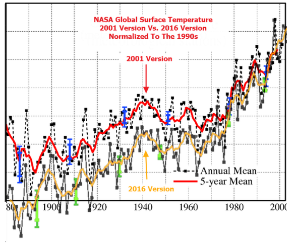
Look at those four charts. Every one of them now shows at least four years that are hotter than 1998. Where just recently, 1998, was always refered to as the hottest year in the satellite record, and was only exceeded by the decade of the 1930’s (see Climategate emails). Now, 1998, is an “also-ran”, and the decade of the 1930’s is nowhere to be seen, thanks to global warming advocates’ manipulation of the temperature record.
Yet, the official claim is that only in 2016, for one month, did the temperature exceed the 1998 record.
How do those charts square with that?
How can you have a serious conversation about surface temperatures when you are using data this distorted? You can’t.
These distortionist are the boldest people I have ever seen. They change the surface temperature records right before our eyes, and then expect us to start the discussion from there. NO! Let’s discuss these distortions you have introduced into the record first. Without good data we are wasting our time and money.
TA claimed “Where just recently, 1998, was always refered to as the hottest year in the satellite record, and was only exceeded by the decade of the 1930’s (see Climategate emails).”
That statement is nonsensical, because there is no satellite record of the 1930s.
It makes sense to me, Tom . . but your accusation seems nonsensical . .
I think that if we get either Trump or Cruz as the next US President, people like Watts, Tisdale and Heller to mention a few will surely be in the forefront when it comes to bringing the US temperature records nearer to reality and establishing the real degree of uncertainty. I cannot understand how the CAGW proponents can claim so much certain warming since 1880 as the uncertainty around older temperature records in particular must be so wide that the so-called global warming must be within in a wide envelope so as to be almost meaningless. Never mind UHI and its influence on recent land surface temperatures. This has been one of the best articles of recent times in my humble opinion. Most contributions have been serious in contents. Bob Tisdale has developed into a first class contributor.
The only legitimate temperature chart that should be used in the discussion is a chart that has the 1930’s temperature spike, and the 1998 temperature spike on the same line. That’s what the REAL temperature profile looks like.
Exactly, you cannot infill data if you do it not data, you cannot homogenize data if you do it is no longer data, data is what was measured at one point and time anything else is not data. Funny people against waterboarding terrorists have no problem waterboarding data. Funny they have no problem believing that the terrorists might give you the answers you expect when you torture him but somehow data may not do the same. AS Ron White put is “you can’t fix stupid”
if it was global warming then no adjustments should be necessary. Statistically a random sample of data from any site should show the same warming level as the average or it is actually regional not global. The distribution should be plotted for individual sites and any extreme deviant should be tested to check there are no measurement flaws causing the deviation before inclusion in the data set.
Of course this is the requirement for an engineering project testing a product exclusively for sale in a well known pound chain shop so it is unreasonable to expect such high standards. Unfortunately science no longer seem to have to meet any standards at all.
^^This ^^ . . . (post by David Cage)
I wish when people reported global temperatures, they would report the actual temperature rather than the difference between the actual temperature and some idiosyncratic temperature defined as the baseline for that particular study or graph.
The rationale for reporting anomalies in local temperatures make sense in a lot of contexts, but absolute global temperatures have a lot more value in terms of relating them to the physical world and how humans actually experience the data, not to mention intercomparability/replication with other studies and graphs that may define their own idiosyncratic baseline.