UPDATE: 2/25/16 DMI offers an explanation and an apology here
One of the graphs we have had on the WUWT sea ice page has been the DMI graph showing 30% concentration of sea ice extent, there has been a widening divergence between the two Arctic sea ice extent graphs produced by DMI. WUWT reader David Burton writes:
Until a few days ago, Denmark’s Meteorologiske Institut (DMI) graphed Arctic sea ice extent two ways. They had a graph comparing the current year to the preceding ten years’ “30%+ concentration” Arctic sea ice extent, with coastal zones masked out, by graphing each year in a different color on the same horizontal timescale.
They also had (and still have) a graph comparing the current year to the preceding four years’ “15%+ concentration” Arctic sea ice extent (and I don’t know how they handle coastal zones in that version). In both graphs, the current (partial) year is plotted with a heavier black line.
Until a few days ago, depending on which graph you choose, you could “prove” that Arctic sea ice extent is either the highest (in the “30%+” graph) that it’s been in the last eleven years, or the lowest (in the “15%+” graph) that it’s been in the last five years.
On 2016-02-18 DMI discontinued the “30%+ concentration” version, which showed high recent ice extents.


This is how DMI describe their 30% graph data:
Total sea ice extent on the northern hemisphere since 2005. The ice extent values are calculated from the ice type data from the Ocean and Sea Ice, Satellite Application Facility (OSISAF), where areas with ice concentration higher than 30% are classified as ice.
The total area of sea ice is the sum of First Year Ice (FYI), Multi Year Ice (MYI) and the area of ambiguous ice types, from the OSISAF ice type product. However, the total estimated ice area is underestimated due to unclassified coastal regions where mixed land/sea pixels confuse the applied ice type algorithm. The shown sea ice extent values are therefore recommended be used qualitatively in relation to ice extent values from other years shown in the figure.
Compare the description of the other DMI graph of sea-ice extent at 15% concentration:
Total sea ice extent on the northern hemisphere during the past years, including climate mean; plus/minus 1 standard deviation. The ice extent values are calculated from the ice type data from the Ocean and Sea Ice, Satellite Application Facility (OSISAF), where areas with ice concentration higher than 15% are classified as ice.
The total area of sea ice is the sum of First Year Ice (FYI), Multi Year Ice (MYI) and the area of ambiguous ice types, from the OSISAF ice type product. The total sea ice extent can differ slightly from other sea ice extent estimates. Possible differences between this sea ice extent estimate and others are most likely caused by differences in algorithms and definitions.
Paul Homewood notes on his blog:
Now there may be good reasons for this difference, and it must be pointed out that DMI has never stated that there is any problem with the 30% version, or reason to doubt it.
Assuming both are right, we have a situation where there may be less ice in coastal regions and/or less 15% ice, but more of the 30% concentration. Given the fact that some of the mixed land/sea pixels can confuse the algorithm, there is good reason to think the 30% version is actually more reliable.
But the real problem is that DMI has now withdrawn their 30% graph, offering this explanation:
I have removed the old sea ice extent graphics and the new graphics (http://ocean.dmi.dk/arctic/icecover.php) is now our one and only official sea ice extent.
When I introduced the new graphics I also announced that the old graphics would be removed after some time – and now is the time, sorry.
I spend too much time explaining the differences and it was quite confusing for many – so, I decided to remove the old graphics. However, all the data are available here http://osisaf.met.no/p/ if you would like do the plotting your selves.
The link for the data which they offer is not of any use to laymen, so effectively the DMI has withdrawn this data from the public eye. Now, when the old link is clicked, we get this:

There has been so much skulduggery going on in the climate establishment in recent years that it is hard to avoid the conclusion that this graph has been withdrawn simply because it gives the “wrong” results. I may be being harsh, but if DMI wants to avoid these sort of accusations, the answer is imply to restore the graph, whether convenient or not.
I would tend to agree.
There is clearly no equipment failure, nor computing failure, it’s simply the person in charge of the product has become irritated at having to explain the differences with the 15% graph to the public. Instead of simply creating an explanation page to link in the 30% graph page, he simply disappeared it to make his job easier. That’s some really lazy science, and does not serve the public interest, something DMI is tasked to do by their own mission statement:
Mission and vision
Mission
We create and communicate knowledge about weather, climate and seas for the benefit of society.
Vision
We are a world-class meteorological institute. We help citizens, public authorities and private companies to transform knowledge into safety and growth.
Whether it is “skullduggery” or not as Homewood notes, climate science has this continuing habit of not showing adverse results, something Steve McIntyre has noted on more than one occasion through the years.
Since we are still learning about sea ice trends, factors, and effects (unless you are one of those who think the science is settled and nothing more to learn) it seems to me that this graph offers an important insight into change in the Arctic that can’t be seen [elsewhere], that may be a precursor to change at the 15% concentration level.
Given their mission statement, I think DMI should restore the graph. For those that agree, you can contact them at: kontakt@info.dmi.dk If you do email them, please be respectful and cordial; accusations, rants, and anger won’t really mesh with them wanting to cooperate with the public.
UPDATE: The typical haters, such as Neven Acropolis, are making claims in comments that I see this as some sort of “conspiracy”. I do not and any such claim is false and political in nature. I see this as nothing more than a DMI employee who has become annoyed at having to answer questions about the 30% graph, and made a decision to pull it, something supported by the DMI reply email posted by Paul Homewood. In that email DMI doesn’t explain why they’ve chosen to remove it and only make the 15% graph official, only that they have.
WUWT readers may recall that once before I was accused of making conspiratorial thinking when NSIDC’s graph went wonky, even NSIDC told me it “wasn’t worth blogging about” only to have egg on their faces days later when it was clear the satellite data had failed, and it was the result of the instrument on the spacecraft, something I alluded to. That pretty well silenced those people, but of course they never apologized for it.
Given that the DMI 30% graph is made from the same satellite data as the 15% graph, people such as Neven will have a very hard time claiming that somehow the the 30% graph is flawed, and the 15% graph is not. There’s no separate satellite instrument to capture 15% vs. 30%, as that is done in post processing, so we can rule out equipment failure as an issue.
As I noted, Steve McIntyre has shown through the years that there is a tendency in climate science to not publish adverse data and/or results that are inconsistent with conclusions of papers and institutional outlooks. This may be one of those times, or it may simply be a grumpy product manager who is tired of answering questions about it. Hopefully DMI will clarify their position and give a credible explanation as to why they have removed it.
UPDATE2: Commenter “pethefin” notes that DMI has an entire page dedicated to the use of the 30% concentration value that is still operational:

Source: http://ocean.dmi.dk/arctic/climatology_v2/extent.uk.php
The continuation of 30% product types like this by DMI makes it pretty hard for some people to credibly claim that somehow the 30% graph that was removed was flawed where the 15% graph made from the same satellite data is not.
The
datafur is still there…http://commentpics.in/wp-content/uploads/2015/02/1781.jpg
DMI Scientist
*****************************
Thank you, so much.
#(:))
Whether it is old or new, it is clear that Arctic ice extent summer minimum was reached in 2012 and returning back as per the 60-year cycle.
Dr. S. Jeevananda Reddy
The 15% ice edge was because it was a rather obvious edge that a computer could find as opposed to all the other %’s, which computers could find but not easily. (Do you really think it’s exactly 15%? Wrong.) The 30% does not reliably correlate with the 15% edge, so which one do you believe? I’ll go with the one the computer can see as opposed to the one that is consistent with your hypothesis.
the computer sees nothing. the sooner modern day scientists realise a computer is an inanimate object incapable of anything without human input the better. we might actually see some science being done instead of “computer says” nonsense.
algorithms are human attempts to solve complex problems quickly. in climate related matters all they churn out are loose estimates of reality, usually with large but undeclared error bars.
The problem with the DMI 30 graph is not limited too the fact that it disappeared, there are lots a unanswered scientific question related to the graph:
– no scientific reason was ever given for the discontinuation at the very moment when the index was showing unexpected results,
– no explanation was given for why they completely removed the index for the beginning of 2016 at the very moment when the index had reached/tied the 10-year-high, a month earlier than the previous record, why not keep reinterpret it too and use a different color for it in the graph?
– no explanation was given for why they reinterpreted the data for 2015 so that the remarkable rise since fall 2015 disappeared:
– was the measurement method suddenly “wrong”? If yes, what adjustments were made and why and when were they made? Why was the method considered to be “wrong”? Does such a reconsideration of their methodology have an effect on the history of this product or their other products? If no, why not?
– was the measurement equipment suddenly malfunctioning?
etc.
pethefin , i would urge you to send your questions to the dmi themselves . in all correspondence i have had with them they have never failed to answer any query. nice people to deal with ,and the people answering the questions are fully aware of the political vs reality disconnect in the climate information industry. try them, i am sure you will be pleasantly surprised.
“no scientific reason was ever given for the discontinuation at the very moment when the index was showing unexpected results,”
It is possible, even reasonable, that the index started showing unexpected results because it was discontinued, and was not being maintained.
Put this tohether with the fact that all other data shows low sea ice extent and the obvious conclusion is that the 30% graph had gone wrong.
Of course that is fully possible that the graph was wrong although they discontinued it after the fact, not before. In any case, a simple scientific explanation would suffice.
On the other hand why discontinue the 30 % coverage when most of their other sea ice graph build on it? And most of all, when the DMI define open water in the following manner:
“The number of days of open waters for a given point is defined as the interval between the sea ice concentration falling from greater than 30% to less than, and remaining so for at least 5 days, until the ice concentration again climbs to above 30%, and stays so for at least 5 days”
see http://ocean.dmi.dk/arctic/climatology_v2/frzbrkowd_mean.uk.php
How can they at the same time say that we should follow 15 % coverage as the measure of sea-ice. Which is it? Open waters of sea-ice worthy of our attention? Any thoughts?
There is no reason why they should not use different definitions for different purposes. There is no “absolute” definition of open water or sea ice extent. As long as you are consistent within each category and define what you are doing there is no problem.
Thanks for you view, now we know that you are not fond of why-questions. Good to know so that I won’t waste more time.
The more you dig, the more you find. The DMI has even a third page where the 30 % coverage is being used:
http://ocean.dmi.dk/arctic/climatology_v2/stats_mean.uk.php
This one would actually be very interesting if the DMI would provide more detailed analysis on annual basis rather than the periods 1978-2014 and 2004-2014. An annual analysis of this data would easily explain any differences between the 15 and 30 % products of the DMI.
Now, will the discontinue this too?
Sorry, I mistakenly attached wrong url, this is the correct one:
http://ocean.dmi.dk/arctic/climatology_v2/extent.uk.php
for the third graph
I’ll take that back, the first url was correct, my browser was having a bad day.
Yet another DMI graph where 30 % concentration is being used:
http://ocean.dmi.dk/arctic/climatology_v2/frzbrkowd_mean.uk.php
This time they say that “The break-up date for a given point is defined as the date where the sea ice concentration falls from above to below 30% and remains so for at least 5 days”. Interesting, considering the decision to follow 15 % ice coverage instead of 30 % in the future. So from now on the DMI want’s us to follow, in their own words, broken-up sea ice, instead of the perennial sea-ice.
And of course, there’s yet another:
http://ocean.dmi.dk/arctic/climatology_v2/frzbrkowd_mean.uk.php
Which explains that “The freeze-up date for a given point is defined as the date where the sea ice concentration climbs from below to above 30% and remains so for at least 5 days”. Should we laugh at all of this or not?
The gift that keeps giving:
http://ocean.dmi.dk/arctic/climatology_v2/frzbrkowd_mean.uk.php
“The number of days of open waters for a given point is defined as the interval between the sea ice concentration falling from greater than 30% to less than, and remaining so for at least 5 days, until the ice concentration again climbs to above 30%, and stays so for at least 5 days”
So the DMI 15 % sea-ice coverage is measuring open water as sea ice? 🙂
Sorry, the links did not work. Click on the first and then choose:
– break-up date
– freeze-up date
– days of open water
I have read a bit of uproar about how “people were misusing the 30% ice extent” a while back, it seems that after about a year of this chart becoming commonly used was a problem rather than the existence of the chart.
Over the past 3 to 4 months I’ve seen the chart referenced when dealing with such nonsense as Guardn and NYT articles and twitter accounts like that doom sayer Carol Davenport.
I would imagine there was some pressure on DMI to stop the “Misuse” of this chart as it was “being used for denial”.
Such thinking is not conspiratorial in nature, it is simply a fact that one side of this debate will use “peer” pressure as much the same way as it has abused “peer” review.
But lets not fester, smile and remember the President of the Sierra club said “The Hiatus” is a reference to the 1940s” while he caressed Exxon $$ lining the inside of his pockets
Just like the MWP, when something is misused, it must be “dealt a mortal blow”
Or simply “reinterpreted”:
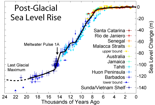
https://rclutz.wordpress.com/2016/02/22/sea-level-rise-just-the-facts/
It hard to read that when they get to CO2 vs Sea Level rise as there is no system in which they can be correlated. They can’t be superposed, they can’t get the two are not part of a linear system.
They create that link with language.
Big fan of linguistics and how language has become weaponised, this is more of the same garbage
So I half read it, should have read it all before replying, silly me.So I read it all. D’Oh
Noted the lack of funding for GRASP a more accurate measurement of sea level rise.
Surely both are stupid as normally one rounds up or down at 50%. Only areas with more than 50% ice should rationally on normal rounding methods be considered ice in non climate related science.
We really do need scientists to have to sign a declaration of ethical conduct as all science is now tainted with the criminality of just a few narrow branches of it. I use criminality in a maybe strictly legal or not sense. I regard it as blatant fraud changing data that has previously stated to be beyond question when used subsequently to extort money from another person. This declaration of beyond question to any normal person would mean the data was no longer able to be modified or parts selectively eliminated without deliberate intent to defraud since that misdirection was known would be used to extort money against the persons wishes.
If they were to eliminate either data set they should have eliminated the 15% as it is further from the 50% they should have been using.
Well it appears they have become world class, since the world standard in climate science is classed by deceit and fraudulent adjustment of data previously claimed to beyond question. To my mind as an engineer means beyond question means beyond any FURTHER questioning as it stands up to any external questions satisfactorily and all those questions have been answered to everyone’s satisfaction. Nothing is literally beyond question as there is always the simple questions of “Is this true?” “Can you prove it to me?”
I would recommend watching the DVD “Shattered Glass”. In particular watch the interview where he uses every single word except lies to describe his fabricated stories.Climate science is the same story but with him not being discovered until too late so the attitude where the story matters not truth has become the institutional norm.
In that NevenA screencap, he calls the WUWT-crowd “climate risk deniers“.
I believe this is a fairly new one. “Climate risk denier” generates only 39 hits on Google, “climate risk denialism” no more than 2.
Hateful as it is, you have to admit that it’s a clever amendment to “climate denier” or “climate change denier”.
I have been waiting for this, since it’s the only credible way to go, although they still need to drop the denier-crap. Climate-risk-averse would be a lot better but they would then have figure out what it really means. The alarmists, like the IPCC, have still trouble understanding how to count probabilities, so not likely that they will be able to up their game.
Well, as for any scientist, if you don’t want to answer a question, don’t. I ask people lots of questions they never answer. It is not a burden if you don’t answer.
Pethefin: Just for the record, watch all the DMI 30% graphs ect be eliminated within the next few days/weeks! It is not a credible institution any more. Well I ain’t using their graphs no more! LOL
If someone keeps ALL the 30% files, It will make a great story in the Danish press for future use!
There always the wayback machine:
http://archive.org/web/
The DMI has some work ahead of them in order to the their story straight:
As I pointed out above, there are three more DMI graphs where 30 % concentration is being used:
http://ocean.dmi.dk/arctic/climatology_v2/frzbrkowd_mean.uk.php
Under “Break-up date”
they say that “The break-up date for a given point is defined as the date where the sea ice concentration falls from above to below 30% and remains so for at least 5 days”.
Interesting, considering the decision to follow 15 % ice coverage instead of 30 % in the future. So from now on the DMI want’s us to follow, in their own words, broken-up sea ice, instead of the perennial sea-ice.
Under “Freeze-up date” they say:
Which explains that “The freeze-up date for a given point is defined as the date where the sea ice concentration climbs from below to above 30% and remains so for at least 5 days”.
And under “Days of open water” they say:
“The number of days of open waters for a given point is defined as the interval between the sea ice concentration falling from greater than 30% to less than, and remaining so for at least 5 days, until the ice concentration again climbs to above 30%, and stays so for at least 5 days”
So the DMI 15 % sea-ice coverage is measuring open water as sea ice, in their own words? Why?
Never-ending-story, two more DMI sets of charts with similar definitions:
http://ocean.dmi.dk/arctic/climatology_v2/frzbrkowd_trend.uk.php
http://ocean.dmi.dk/arctic/climatology_v2/frzbrkowd_std.uk.php
i think they are still doing everything they were before. they just decided not to show the 30% extent graph anymore due to the number of queries they had to answer on the issue. they do not have limitless resources and my understanding is there are only a few people in the team this involves.
i also have a funny feeling the more vitriolic emails they receive come from the alarmist side .
I fully agree with your assumptions.
This is a rare sight showing sea ice on the northern Iceland coast and sea ice covering the whole southern Greenland. There is even sea ice trying to form south of Svalbard so it looks like the first signs of the cooler North Atlantic starting to influence the sea ice further NE.
http://ocean.dmi.dk/satellite/plots/satsst.arc.d-00.png
What happens when these ocean changes cause the 15% sea-ice coverage to show more increasing sea ice in future, will there be a sudden switch back to 30%? The agenda is very strong with science last place, so who knows?
The difference between the two really only shows that the Arctic sea ice melt over the recent past hasn’t been much below 15% or the 30% sea-ice coverage would trend similar.
“…..sea ice covering the whole southern Greenland.”
To be more accurate I mean the whole southern Greenland bordering the North Atlantic coast.
The ice around Greenland will grow.
http://earth.nullschool.net/#2016/02/27/1200Z/wind/isobaric/70hPa/orthographic=-12.99,60.77,300
Matt G February 23, 2016 at 3:20 am
This is a rare sight showing sea ice on the northern Iceland coast
Doesn’t actually exist, probably clouds. Not shown on any other satellite sea ice map, more damning not on the Modis photo either.
http://rapidfire.sci.gsfc.nasa.gov/cgi-bin/imagery/single.cgi?image=crefl2_143.A2016054135500-2016054140000.2km.jpg
Shows small areas of sea ice around the coast at times that are at least 20% sea ice concentration. Nothing smaller than this is detected with this technique so despite clouds maybe hiding thin sea ice, it still supports scattered sea ice around Iceland at times recently on the northern and western coasts.
http://www.vedur.is/vedur/sjovedur/vedurtungl/hafis_thettleiki/
Your new website shows no sea ice on the northern Iceland coast. The DMI satellite map you showed before now only shows one patch of ‘sea Ice’ right where there is now cloud.
http://rapidfire.sci.gsfc.nasa.gov/cgi-bin/imagery/single.cgi?image=crefl1_143.A2016056132500-2016056133000.2km.jpg
Only showed temporary ice flows as sea temperatures recently off the northern coast are not cold enough to maintain them.
Where do they get the base satellite data? It would be trivial to generate the charts. The state of the art is so far beyond this now.
Hi Anthony: I have watched the Danmark site for a number of years. Since 2012 Danmark has said they were changing to the 15% method. It would seem they did it for standardization. I presented this huge anomaly on the 30% ice versus the 15% stating that something very interesting and unusual was going on in the part of the Arctic Ocean that is within the Islands (think Fram Straight), on Accuweather last week. That it couldn’t possibly be as warm across the whole Arctic Ocean when they have no way to measure it. I got completely blown off and in a derogatory way told that I didn’t have the experience to perceive what I saw. My comments were how standardization can lead to the loss of resolution, (In this case the 30% Sea Ice Anomaly).
Charles
The cryosphere only shows sea ice concentrations 30%+ and backs DMI 30%+, that the sea ice was higher in January 2016 than January 2015.
There was less sea ice in 2016 than 2015 around Svalbard across to Siberia, but this is made up slightly with slight gains around the Labrador sea and Greenland. The big difference during 2016 that more than makes up for less ice in the other region is the significant increase in sea ice around eastern Siberia.
http://igloo.atmos.uiuc.edu/cgi-bin/test/print.sh?fm=01&fd=03&fy=2015&sm=01&sd=03&sy=2016
http://igloo.atmos.uiuc.edu/cgi-bin/test/print.sh?fm=01&fd=16&fy=2015&sm=01&sd=16&sy=2016
http://igloo.atmos.uiuc.edu/cgi-bin/test/print.sh?fm=01&fd=30&fy=2015&sm=01&sd=30&sy=2016
Summary
The 30%+ sea ice concentrations show increase in sea ice on both data sources (cyropsphere and DMI) over the past year for January. Only the 15%+ sea ice concentrations don’t show this increase, therefore the conclusion of removing the 30% DMI from public display is down to cherry picking what is or not shown. There is no indication that the data has suddenly become incorrect and the agenda above science continues from so called scientists. The simple reason why the increased trend has occurred has been down to significant gains in Eastern Siberia over the month.
why is it so hard to realise that the DMI long since gave up doing proper quality control of the 30% data.
As I understand it there are not many of them and they likely just have more pressing jobs.
They said ages ago that the 30% would be going and, I suspect, that they just let a “bug” develop and continue in the data.
They seem to have corrected it as they closed it down.
The 15% now conforms with all other data centres and like them shows a relentless fall is ice extent.
Right, so since most of their other sea ice graphs (at least four other sets of graph on their webpage as I have explained above) are build on the 30 % coverage, will they toss them all?
How do you explain the same thing shown in the cryopshere? Have they got more pressing things to do too and let this so called bug develop? Sea ice off eastern Siberia has greatly increased this winter compared to last.
The 15%+ sea ice extent when it is only around 20% sea ice registers as no increase in ice extent. When this increases to 30%+ this represents an increase in sea ice extent for the 30%+ sea ice extent data. This is the only reason for the difference between 15%+ and 30%+ data sets and has nothing to do with a bug.
They haven’t “disappeared” the 30% graph, they’ve corrected it up to the end of 2015.
If you look at the most recent version (pale purple line on the 3rd picture in Anthony’s post), you can see the data goes all the way to the end of 2015. If you compare it to the version on the broken graph (black line in the 1st picture), you can see they start to diverge around the 1st of November.
It looks like they’ve sorted out the bug, corrected the data up to the end of 2015, and then officially retired the graph. Anyone wanting to witter on about 30% versus 15% or any other such special pleading in order to pretend the earlier version wasn’t bugged needs to account for why the final validated version of the 30% graph now shows 2015 as being no different from the rest of the pack right up until the end of December.
[you are certainly entitled to hold that opinion, but none of that explains well. Why “fix it” only to retire it. that is counterproductive -mod]
The 30% changed graph on the 3rd figure for 2015 still shows the highest sea ice extent there for any December month, but the new divergence occurs well before November comparing different versions.
For example the minimum summer ice extent on figure 3 for 2015 was above 4 M km2, where as figure one shows it to be below 4 M km2. Generally the new color and fit is very poor for 2015 and can’t been seen for most of the plot.
The 30% cyopsphere for January 2016 shows sea ice greater than 2015, whereas the 15% shows this to be lower than 2015 for DMI also. The 30% sea ice extent for December 2015 is the highest since at least 2005 because there is more ice above 30% than 15% during this period. Discontinuing just because of this turn around is poor indeed.
The 30% chart is more honest, because it eliminates much of the scattered patches of sea ice, while giving more weight to older, thicker ice.
They prefer using the 15% chart because they can show the effect of wind, waves, and currents on the more sparse patches of sea ice:
http://www.john-daly.com/polar/pack%20ice.jpg
db-“eliminates much of the scattered patches of sea ice, while giving more weight to older, thicker ice.”
This does not mean “more honest”. You are describing a particular bias.
‘seaice’, your confirmation bias is showing. Using 30% is more honest, because it eliminates the spurious readings from scattered bergs and patches like the pic shows.
This is an honest chart:
http://oi65.tinypic.com/2hoegko.jpg
sea ice levels look inverse to the AMO
“There has been so much skulduggery going on in the climate establishment in recent years that it is hard to avoid the conclusion that this graph has been withdrawn simply because it gives the “wrong” results.”
Nothing like a good conspiracy theory!
The only “skulduggery” going on has been from climate change deniers.
Harry T,
Why would you criticize your side in this debate? You are a ‘climate change denier’.
You’re part of the same crowd that believed Michael Mann’s erasing of the MWP and the LIA.
Mann claimed there was no climate change until human CO2 emissions came along. Just look at his bogus chart; you’ll see — you climate change denier, you.
HT,
If you think the world is going to warm to levels dangerous enough to humans well being than highlight it now with scientific evidence using the scientific method. Failure to do so shows your claims are as false as the very statement you claim. There was no warming in the temperature data sets until they were altered recently because they had failed to warm. The planet since 1998 only warms when adjustments are altered to the data, not the planet actually showing the same control warming.
Matt G.
And I did not even mention catastrophe.
You just keep right on denying. I do not mind if people back the wrong horse, it means more winnings for me.
“You just keep right on denying. I do not mind if people back the wrong horse, it means more winnings for me.”
This makes no sense. If you believe that deniers are “backing the wrong horse”, and global warming continues to dangerous levels, then what winnings do you get “more” of? Isn’t the whole idea that the world will spiral into death, destruction, and starvation etc….which I guess you could want MORE of….if you’re a sicko. Or perhaps you’ll be some kind of economic pirate and make it big on charging $50 for a bottle of water or $100 for a carrot or something along those lines….which also makes you a sicko.
So….either you are just a troll that makes no sense, or you are attempting to use some very lame reverse psychology, or you’re a sicko. Which is it? 🙂
HT,
Without catastrophe, the alarmist crowd has no scare for extracting taxpayer loot. Without a threatened catastrophe, all you’re arguing about is natural climate variability.
Where are your ‘winnings’? You’ve backed a losing horse, as Planet Earth is demonstrating. There’s nothing either unusual, or unprecedented happening — much as you wish there was.
Denying what? If you mean we going to get global temperatures to rise around 3c – 5c by 2100 due to humans, then I am proud to say it is nonsense.
People have already commented on this, but without castrophe there is no need for urgent action to cut back down on CO2 levels. It is the very thing why this issue has cropped up since the 1980’s and what has happened so far I predicted back in the 1990’s before the strong El Nino in 1997/98. Ie There has been nothing to worry about and very little evidence that any divergence has occurred from natural cycles.
Aphan.
“This makes no sense. If you believe that deniers are “backing the wrong horse”, and global warming continues to dangerous levels, then what winnings do you get “more” of?”
I get the bragging rights to say I was right.
Harry-
HT-“I get the bragging rights to say I was right.”
Winner winner, chicken dinner! What are you….12? I’ll make sure you get a bullhorn and a place on high ground (if you are right) so you can gloat for all to see and hear ok?
HT-“Climate change deniers astound me. They talk a lot but do not actually read the scientific research that has been done.”
Have you? Because you don’t seem to understand the difference between a published scientific paper, and “evidence”.
HT- “Check out the latest charts on sea level, they do indeed show an accelerating trend in the rise of sea level.”
Compared to what time frame? Sea levels have been both much higher than they are now, AND much lower, all without human influence. So what exactly does changing sea levels prove other than that sea levels are always changing?
HT- “If you think this was not a prediction of AGW, then you have to use the scientific method to suggest an alternate explanation and why it fits the results of the experiment better.”
What experiment? AGW people keep telling us that there is only one Earth and so they cannot actually “conduct” real experiments to prove their theories. Sounds like you know of some. Please share. Otherwise, any 12 year old geography student could have predicted that sea levels will probably rise until the next glaciation period begins, and then they’ll probably start falling again.
HT-“To answer your question (which I shouldn’t have to), global mean temperatures will increase as the CO2 concentration in the atmosphere increases. If you do not believe it is increasing, I suggest you go look at the Keeling Curve website.”
CO2 concentrations are increasing…at least that’s what “they” tell us. Yep. Correct. But global mean temperatures were increasing on their own, before human CO2 began increasing, you know that right? And empirical data and proxies prove that there is nothing abnormal or unprecedented in either the amount of, or speed of, the current warming. It’s happened before, many times, and without human CO2 influence. Now…in order for AGW theorists to demonstrate that ALL of the current warming since 1950 is related to human emissions alone, or even mostly, they MUST demonstrate that the naturally occurring warming/changing/fluctuating climate of the planet STOPPED or would have reversed in 1950 and become cooling, had it not been for the increase in CO2 in the atmosphere. But they can’t really do that can they?
Of course if they could, we’d all owe human CO2 a huge debt of gratitude for saving the human race (and many species of animals, fish, birds, and various flora and fauna) from descending into the death, plague, suffering and starvation that comes with glacial periods.
Here’s a good place to start on sea levels for you-
http://www.sealevel.info/papers.html#dn
Matt G.
“Denying what? If you mean we going to get global temperatures to rise around 3c – 5c by 2100 due to humans, then I am proud to say it is nonsense.”
Well the global mean temperature has already risen 1C above pre-industrial. It’s only a matter of time before it goes up another 1C, then another. Each 1C rise is going to be more expensive to fix than the previous 1C.
The sea level rise on it’s own is enough to justify urgent action. The US Navy is already making contingency plans to mitigate the effect of sea level rise on it’s infrastructure.
Matt G.
“There was no warming in the temperature data sets until they were altered recently because they had failed to warm. The planet since 1998 only warms when adjustments are altered to the data, not the planet actually showing the same control warming.”
Well you are proving my point about conspiracy theories. Lecturing me about the scientific method is disingenuous if you are relying on conspiracies to falsify scientific research.
Harm to humans? Do you agree that rising sea levels are harmful?
OK a hypothesis about AGW is the resulting global warming will cause sea levels to rise. Check out the latest charts on sea level, they do indeed show an accelerating trend in the rise of sea level. If you think this was not a prediction of AGW, then you have to use the scientific method to suggest an alternate explanation and why it fits the results of the experiment better.
HT:
You say
No and No.
Global mean temperature anomally is said to have risen by ~0.8°C since the industrial revolution but nobody really knows.
Global mean temperature rises by 3.8°C from June to January (and falls by 3.8°C from January to June) each year and nobody notices.
A global mean temperature rise of of 3.8°C provides nothing to “fix” and, therefore, there would need to be much evidence for credibility to be given to a claim that 1°C would require a “fix”.
Richard
Harry Twinotter,
Why is the rate of warming going to increase to support the suggestion you have made? The end of the 21st century is now around 84 years away and the rough 1 c (0.7c-0.8c) rise occurred during a longer period than this. This has also been exaggerated by changing the difference between now and the 1930’s and 1940’s. It wasn’t to do with human emissions at all for the majority of it because they didn’t start rising significantly until after World War 2. Yet this significant rise in CO2 made no difference to global temperatures between the 1940’s and 1970’s. Like it has made no difference this century and just a short period of warming between the 1980’s and 1990’s doesn’t justify your claims at all. There is no scientific evidence the rate of warming will increase, whether or not what contributions have caused it natural and man-made.
Regarding the sea level rise (exaggerated again) which it still only around 2mm-3mm a year and that results in roughly a 210 mm rise by the end of the century.
Why does 21 cm rise even if this continues by the end of the century need urgent action?
Matt G.
“There is no scientific evidence the rate of warming will increase, whether or not what contributions have caused it natural and man-made.”
Climate change deniers astound me. They talk a lot but do not actually read the scientific research that has been done.
To answer your question (which I shouldn’t have to), global mean temperatures will increase as the CO2 concentration in the atmosphere increases. If you do not believe it is increasing, I suggest you go look at the Keeling Curve website.
You did not read my response either – go see the bit where I say the increase in sea level rise is accelerating.
HT,
“There was no warming in the temperature data sets until they were altered recently because they had failed to warm. The planet since 1998 only warms when adjustments are altered to the data, not the planet actually showing the same control warming.”
I’m not proving your point at all that comes down to your ignorance and the denying of the pause is just down to this very recent adjustments to data. Since when is the data been altered to show this a conspiracy, when that is what happened and is a FACT.
Harry Twinotter ,
Please look up what the rate of warming means.
Thanks.
Over the long term the rate of sea level rise has been decreasing.