By Christopher Monckton of Brenchley
The sharp el Niño spike is just about to abolish the long Pause in global temperatures – at least for now. This column has long foretold that the present el Niño would be substantial, and that it might at least shorten if not extinguish the Pause. After all, theory requires that some global warming ought to occur.
This month, though, the Pause clings on. Though January 2016 was the warmest January in the RSS satellite record since 1979, the El Niño spike has not yet lasted long enough to end the Pause. That will happen by next month’s report. The RSS data still show no global warming for 18 years 8 months, notwithstanding record increases in CO2 concentration over the period.

Dr Roy Spencer’s UAH v.6 satellite lower-temperature dataset shows the Pause has already (just) disappeared. For 18 years 2 months there has been barely any warming, though to two decimal places the anomaly is zero:

The believers say there was never a Pause in the first place. After many unconvincing alterations to all of the principal global surface tamperature datasets over the two years leading up to the Paris climate conference, the Pause all the datasets once showed had been erased.
Significantly, the two satellite datasets continued to show a steadily-lengthening Pause till last month, but over the past year or two, long before the present el Niño set in, the three terrestrial datasets had already succeeded in ingeniously airbrushing it away.
The not necessarily reliable Tom Karl of NOAA and the relentlessly campaigning Gavin Schmidt of NASA held a joint press conference to celebrate the grants their rent-seeking organizations can milk out of their assertion that 2015 was the warmest year since 1880. But they carefully omitted the trend-line from their graph, so I have added it back. It shows the world warming since 1880 at an unexciting two-thirds of a degree per century:

NOAA’s much-altered global surface temperature record, showing a 0.9 Cº global warming trend since 1880, equivalent to just two-thirds of a degree per century.
So here’s the Houston problem, the 13th chime, the dog that didn’t bark in the night-time, the fly in the ointment, the poop in the puree, the jumbo in the Jacuzzi – the $64,000 question that would once have alerted true scientists to the possibility that somewhere their pet theory might have gone more than somewhat agley.

The Jumbo in the Jacuzzi
Since the satellites of both UAH and RSS show there has been very little global warming of the lower troposphere over the past decade or two, perhaps Schmidt and Karl would care to answer the following key question, which I have highlighted in red:

Schmidt and Karl, like the Met Office this side of the pond, say there has been rapid surface warming over the past 19 years. If so, where on Earth did it come from? The laws of thermodynamics are not up for repeal. The official theory is that CO2 warms the atmosphere and the atmosphere warms the surface. But for almost 19 years the satellites show that the lower atmosphere has barely warmed. Even if there had been CO2-driven warming higher up, for the official theory says we should expect a faster warming rate in the mid-troposphere than at the surface, how could that higher-altitude warming have magically reached the surface through a lower troposphere that has not warmed at all?
IPCC had predicted in 2007, on the basis of a single bad paper by Ben Santer of Lawrence Livermore National Laboratory, that the tropical mid-troposphere should warm twice or even thrice as fast as the tropical surface. However, as the revealing final slide shown by Schmidt and Karl at their press conference demonstrates, the predicted tropical mid-troposphere hot spot (I had the honor to name it) is in reality absent. Lower and mid-troposphere anomalies are almost identical:

One clue to the source of the warming reported by the surface datasets but not by the satellite datasets over the past 19 years is to be found in another revealing diagram presented by Schmidt and Karl at their presser.
About five-sixths of the areas of “record” surface warming shown in the NOAA diagram are areas of ocean, the el Niño-driven warming of the eastern equatorial Pacific being particularly pronounced.
Aside from the ocean warming, the land-based warming was prominent over Siberia and northern China, Europe and central America, inferentially owing much to urban heat-island effects.
In short, the warming of both land and oceans shows a pattern strongly confirming the satellite record to the extent that the warming – insofar as it is not a mere artefact of the surface-temperature tampering over the past couple of years – displays a pattern suggesting that it originates not from above in the atmosphere, where it would have originated if CO2 had been the cause, but at or below the surface.

On any view, the significant warming that the terrestrial datasets claim over the past two decades cannot have come from the atmosphere, and accordingly cannot have been caused by our enrichment of that atmosphere with greenhouse gases – if, that is, the satellites are correct that the lower troposphere has not been warming.
When the first temperature-monitoring satellites began to deliver data, NASA said the satellite temperature record would be more reliable than the surface record because the coverage was more complete, the method of measurement standardized and the coverage and coverage-bias uncertainties that plague the terrestrial record were absent.
Now that the satellites of both UAH and RSS have been showing so little warming for so long, expect that story to begin to change. If the satellite data are broadly correct, then either the terrestrial data are wrong owing to unjustifiable tampering or they are detecting genuine warming that may be from urban heat-island influences or from deep-ocean warming but cannot be from the atmosphere and is not caused by our sins of emission.
One way to prop up the specious, crumbling credibility of the terrestrial temperature datasets and of the CO2 panic at the same time is to attack the satellite datasets and pretend that the measurement method that NASA itself had once said was the best available is somehow subject to uncertainties even greater than those to which the terrestrial datasets are prone.
I am not the only one to sense that Dr Mears, the keeper of the RSS satellite dataset, who labels all who ask questions about the Party Line as “denialists” and in early 2016 took shameful part in a gravely prejudiced video about global temperature change, may be about to revise his dataset sharply to ensure that the remarkable absence of predicted warming that it demonstrates is sent down the memory hole.
What of ocean warming? The ARGO bathythermographs show little warming at the surface from 2004 until the current el Niño began. What is more, ARGO stratigraphy shows that the warming is generally greater with depth. The warming of the ocean, then, appears to be coming not from above, is it would if CO2 were the driver, but from below.
I should have liked to show graphs to establish that the warming is greater in the lower than in the upper strata of the 1.25-mile slab that ARGO measures. But the ARGO marine atlas is clunky and does not seem to be as compatible with PCs as it should be. So I have been unable to extract the relevant data. If anyone is able to produce complete stratum-by-stratum anomaly-and-trend plots of the ARGO data for its 12 full years in operation from January 2004 till December 2015, please let me know as soon as the December 2015 ARGO data become available. The latest monthly update is very late, as the ARGO data often are:

If the eventual data confirm what I have some reason to suspect, then a further killer question must be faced by the tamperers:

Though the Pause is gone, the problem it poses for the Thermageddonites remains. For their own theory dictates that, all other things being equal, an initial direct warming should occur instantaneously in response to radiative forcings such as that from CO2. However, for almost 19 years there was not a flicker of response from global temperatures, casting serious doubt upon the magnitude of the warming to be expected from anthropogenic influences.
To the believers, therefore, it was important that the Pause should not merely cease, for Nature is, as expected, gradually taking care of that, but vanish altogether. The need to abolish the Pause became still more urgent when at a hearing in December 2015 Senator Ted Cruz, to the great discomfiture of the “Democrats”, displayed the RSS graph showing no global warming for 18 years 9 months.
So to another killer question that Schmidt and Karl ducked at their presser, and must now face (for if they do not answer it Senator Cruz can be expected to go on asking it till he gets an answer):

The now-glaring discrepancies between prediction and reality, and between the satellite and terrestrial datasets, are plainly evident from all datasets even after the tampering. Yet until now there has been no systematic analysis to show just how large the discrepancies have become. So here goes.
In 1990, at page xxiv of the First Assessment Report, IPCC predicted near-linear global warming of 1.0 [0.7, 1.5] K over the 36 years to 2025, a rate equivalent to 2.78 [1.94, 4.17] K/century. However, in the 26 years since 1990 the reported warming rates are equivalent to only [1.59, 1.73] K/century from the terrestrial datasets (blue needles) and [1.14, 1.23] K/century from the satellites (green needles). IPCC’s 1990 central prediction, the red needle, accordingly shows almost double the warming reported by the terrestrial datasets and at least two and a half times that reported by the satellite datasets.
Somehow, the flagrant over-prediction that the discrepancy graphs of temperatures from 1990, 1995 and 2001 to today illustrate did not get a mention in the colourful material circulated to the media by the SchmidtKarlPropagandaAmt.

The models’ extravagant over-prediction becomes still more self-evident when one looks at IPCC’s next excitable prediction. In fig. 6.13 of the 1995 Second Assessment Report, IPCC predicted a medium-term warming rate of 0.38 K over 21 years, equivalent to 1.8 K per century, assuming the subsequently-observed 0.5%-per-year increase in atmospheric CO2 concentration.

Here, at least, IPCC’s prediction is within shouting distance of the terrestrial temperature data, though still extravagantly above the satellite temperature data. But IPCC’s 1990 least prediction was well above its own central prediction made just five years later. IPCC’s 1990 central prediction was 50% above its 1995 prediction, and its 1990 high-end prediction was 130% above its 1995 prediction.
The reliability of IPCC’s predictions deteriorated still further in 2001. On page 8 of the Summary for Policymakers, it predicted that in the 36 years 1990-2025 the world would warm by [0.4, 1.1] K, equivalent to [1.11, 3.05] K/century, again a significant downshift compared with the interval of medium-term predictions it had made in 1990, and implying a central estimate equivalent to about 2.08 K/century (the red needle on the following temperature clock) over the 25-year period:

Three points are startlingly evident in these graphs. First, IPCC has inexorably and very substantially cut its predictions of medium-term warming since the exaggerated predictions in its First Assessment Report got the climate scam going in 1990.
Secondly, even its revised predictions are substantial exaggerations compared with observed, reported reality.
Thirdly – and this is very odd – the most basic measure of the uncertainties in temperature measurement in any time-series, which is the interval between the least and greatest reported trends on that series, has widened when most indications are that it should be narrowing.
To demonstrate that error-bars on temperature measurement should be narrowing in response to all those taxpayer dollars being flung at it, the HadCRUT4 dataset – which to Professor Jones’ great credit publishes the error-bars as well as the central estimate of observed temperature change – shows a considerable narrowing of the uncertainty interval over time, as methods of measurement become less unreliable:

The very reverse of what the HadCRUT4 dataset shows should be happening is happening. As Table 1 shows, the discrepancy between the least (yellow background) and the greatest (purple background) reported temperature change over successive periods is growing, not narrowing:
| Start date | GISS | HadCR4 | NCEI | RSS | UAH | Uncertainty |
| Sat:1979 | 0.60 | 0.61 | 0.37 | 0.45 | 0.42 | 0.51
K/century |
| K/century | 1.63 | 1.65 | 1.55 | 1.23 | 1.14 | |
| AR1:1990 | 0.45 | 0.41 | 0.43 | 0.29 | 0.26 | 0.73
K/century |
| K/century | 1.73 | 1.59 | 1.66 | 1.11 | 1.00 | |
| AR2:1995 | 0.33 | 0.28 | 0.32 | 0.09 | 0.09 | 1.14
K/century |
| K/century | 1.55 | 1.31 | 1.53 | 0.42 | 0.41 | |
| AR3:2001 | 0.18 | 0.13 | 0.20 | –0.02 | 0.03 | 1.46
K/century |
| K/century | 1.22 | 0.85 | 1.35 | –0.11 | 0.19 |
Table 1: Reported (dark blue) and centennial-equivalent (dark green) temperature trends on the three terrestrial (pale green background) and two satellite (blue background) monthly temperature anomaly datasets for periods starting respectively in January of 1979, 1990, 1995 and 2001 and all ending in December 2015.
Note how, on all datasets, the warming rate declines the closer to the present one begins. This, too, is contrary to official theory, which says that the warming rate should at least remain constant given the ever-increasing anthropogenic forcings acting on the climate. It is also contrary to one of the most mendacious graphs in the IPCC reports:

The official storyline, derived from the bogus statistical technique illustrated in the above IPCC graph, is that the rate of global warming is itself accelerating, and that we are to blame. The Swiss Bureau de l’Escroquerie is investigating this and, no doubt, many other outright frauds in IPCC documents.
However, note how rapidly the measurement uncertainty, here defined as the difference between the least (yellow) and greatest (pink) reported centennial-equivalent temperature trend in Table 1, widens even as the start-date of the period under consideration comes closer to the present, when by rights it should narrow. Another killer question for the believers to answer, therefore:

If one excludes the data after October 2015, which are temporarily influenced by the current el Niño spike in global temperatures, the warming rate since 1950 is lower now than at any previous date since that year.

This widening of the divergence between the terrestrial and satellite datasets is clear evidence that the effect of the tampering with all three terrestrial datasets in the two years preceding the Paris climate summit has been what one would, alas, expect of the tamperers: artificially to increase the apparent warming rate ever more rapidly as the present approaches.
A legitimate inference from this observation is that the tampering, however superficially plausible the numerous excuses for it, was in truth intended and calculated to overwhelm and extinguish the Pause that all the datasets had previously shown, precisely so that those driving and profiting from the climate scam could declare, as they have throughout the Marxstream news media, that there was never any Pause in the first place.
Let us hope that Professor Terence Kealy, former Vice Chancellor of Buckingham University, takes a very close look at this posting as he conducts his own review of the tamperings with the various terrestrial datasets.
The current el Niño, as Bob Tisdale’s distinguished series of reports here demonstrates, is at least as big as the Great el Niño of 1998. The RSS temperature record is now beginning to reflect its magnitude. If past events of this kind are a guide, there will be several months’ further warming before the downturn in the spike begins.
However, if there is a following la Niña, as there often is, the Pause may return at some time from the end of this year onward. Perhaps Bob could address the likelihood of a la Niña in the next of his series of posts on the ENSO phenomenon.
The hiatus period of 18 years 8 months is the farthest back one can go in the RSS satellite temperature record and still show a sub-zero trend. The start date is not cherry-picked: it is calculated. And the graph does not mean there is no such thing as global warming. Going back further shows a small warming rate. And yes, the start-date for the Pause has been inching forward, though just a little more slowly than the end-date, which is why the Pause has continued on average to lengthen.
The warming rate taken as the mean of the RSS and UAH datasets since they began in 1979 is equivalent to 1.2 degrees/century:

However, the much-altered surface tamperature datasets show a 35% greater warming rate, equivalent to 1.6 degrees/century:

Bearing in mind that one-third of the 2.4 W m–2 radiative forcing from all manmade sources since 1750 has occurred during the period of the Pause, a warming rate equivalent to little more than 1 C°/century is not cause for concern.
As always, a note of caution. Merely because there has been little or no warming in recent decades, one may not draw the conclusion that warming has ended forever. Trend lines measure what has occurred: they do not predict what will occur.
The Technical Note explains the sources of the IPCC’s predictions in 1990 and in 2005, and also demonstrates that that according to the ARGO bathythermograph data the oceans are warming at a rate equivalent to less than a quarter of a Celsius degree per century. In a rational scientific discourse, those who had advocated extreme measures to prevent global warming would now be withdrawing and calmly rethinking their hypotheses. However, this is not a rational scientific discourse.
Key facts about global temperature
These facts should be shown to anyone who persists in believing that, in the words of Mr Obama’s Twitteratus, “global warming is real, manmade and dangerous”.
Ø The RSS satellite dataset shows no global warming at all for 224 months from June 1997 to December 2015 – more than half the 445-month satellite record.
Ø There has been no warming even though one-third of all anthropogenic forcings since 1750 have occurred since 1997.
Ø Since 1950, when a human influence on global temperature first became theoretically possible, the global warming trend has been equivalent to below 1.2 Cº per century.
Ø The HadCRUT4 global warming trend since 1900 is equivalent to 0.77 Cº per century. This is well within natural variability and may not have much to do with us.
Ø The fastest warming rate lasting 15 years or more since 1950 occurred over the 33 years from 1974 to 2006. It was equivalent to 2.0 Cº per century.
Ø Compare the warming on the Central England temperature dataset in the 40 years 1694-1733, well before the Industrial Revolution, equivalent to 4.33 C°/century.
Ø In 1990, the IPCC’s mid-range prediction of near-term warming was equivalent to 2.8 Cº per century, higher by two-thirds than its current prediction of 1.7 Cº/century.
Ø The warming trend since 1990, when the IPCC wrote its first report, is equivalent to little more than 1 Cº per century. The IPCC had predicted close to thrice as much.
Ø To meet the IPCC’s original central prediction of 1 C° warming from 1990-2025, in the next decade a warming of 0.75 C°, equivalent to 7.5 C°/century, would have to occur.
Ø Though the IPCC has cut its near-term warming prediction, it has not cut its high-end business as usual centennial warming prediction of 4.8 Cº warming to 2100.
Ø The IPCC’s predicted 4.8 Cº warming by 2100 is well over twice the greatest rate of warming lasting more than 15 years that has been measured since 1950.
Ø The IPCC’s 4.8 Cº-by-2100 prediction is four times the observed real-world warming trend since we might in theory have begun influencing it in 1950.
Ø The oceans, according to the 3600+ ARGO buoys, are warming at a rate of just 0.02 Cº per decade, equivalent to 0.23 Cº per century, or 1 C° in 430 years.
Ø Recent extreme-weather events cannot be blamed on global warming, because there has not been any global warming to speak of. It is as simple as that.
Technical note
Our latest topical graph shows the least-squares linear-regression trend on the RSS satellite monthly global mean lower-troposphere dataset for as far back as it is possible to go and still find a zero trend. The start-date is not “cherry-picked” so as to coincide with the temperature spike caused by the 1998 el Niño. Instead, it is calculated so as to find the longest period with a zero trend.
The fact of a long Pause is an indication of the widening discrepancy between prediction and reality in the temperature record.
The satellite datasets are arguably less unreliable than other datasets in that they show the 1998 Great El Niño more clearly than all other datasets. The Great el Niño, like its two predecessors in the past 300 years, caused widespread global coral bleaching, providing an independent verification that the satellite datasets are better able than the rest to capture such fluctuations without artificially filtering them out.
Terrestrial temperatures are measured by thermometers. Thermometers correctly sited in rural areas away from manmade heat sources show warming rates below those that are published. The satellite datasets are based on reference measurements made by the most accurate thermometers available – platinum resistance thermometers, which provide an independent verification of the temperature measurements by checking via spaceward mirrors the known temperature of the cosmic background radiation, which is 1% of the freezing point of water, or just 2.73 degrees above absolute zero. It was by measuring minuscule variations in the cosmic background radiation that the NASA anisotropy probe determined the age of the Universe as 13.82 billion years.
The RSS graph (Fig. 1) is accurate. The data are lifted monthly straight from the RSS website. A computer algorithm reads them down from the text file and plots them automatically using an advanced routine that automatically adjusts the aspect ratio of the data window at both axes so as to show the data at maximum scale, for clarity.
The latest monthly data point is visually inspected to ensure that it has been correctly positioned. The light blue trend line plotted across the dark blue spline-curve that shows the actual data is determined by the method of least-squares linear regression, which calculates the y-intercept and slope of the line.
The IPCC and most other agencies use linear regression to determine global temperature trends. Professor Phil Jones of the University of East Anglia recommends it in one of the Climategate emails. The method is appropriate because global temperature records exhibit little auto-regression, since summer temperatures in one hemisphere are compensated by winter in the other. Therefore, an AR(n) model would generate results little different from a least-squares trend.
Dr Stephen Farish, Professor of Epidemiological Statistics at the University of Melbourne, kindly verified the reliability of the algorithm that determines the trend on the graph and the correlation coefficient, which is very low because, though the data are highly variable, the trend is flat.
RSS itself is now taking a serious interest in the length of the Great Pause. Dr Carl Mears, the senior research scientist at RSS, discusses it at remss.com/blog/recent-slowing-rise-global-temperatures.
Dr Mears’ results are summarized in Fig. T1:

Figure T1. Output of 33 IPCC models (turquoise) compared with measured RSS global temperature change (black), 1979-2014. The transient coolings caused by the volcanic eruptions of Chichón (1983) and Pinatubo (1991) are shown, as is the spike in warming caused by the great el Niño of 1998.
Dr Mears writes:
“The denialists like to assume that the cause for the model/observation discrepancy is some kind of problem with the fundamental model physics, and they pooh-pooh any other sort of explanation. This leads them to conclude, very likely erroneously, that the long-term sensitivity of the climate is much less than is currently thought.”
Dr Mears concedes the growing discrepancy between the RSS data and the models, but he alleges “cherry-picking” of the start-date for the global-temperature graph:
“Recently, a number of articles in the mainstream press have pointed out that there appears to have been little or no change in globally averaged temperature over the last two decades. Because of this, we are getting a lot of questions along the lines of ‘I saw this plot on a denialist web site. Is this really your data?’ While some of these reports have ‘cherry-picked’ their end points to make their evidence seem even stronger, there is not much doubt that the rate of warming since the late 1990s is less than that predicted by most of the IPCC AR5 simulations of historical climate. … The denialists really like to fit trends starting in 1997, so that the huge 1997-98 ENSO event is at the start of their time series, resulting in a linear fit with the smallest possible slope.”
In fact, the spike in temperatures caused by the Great el Niño of 1998 is almost entirely offset in the linear-trend calculation by two factors: the not dissimilar spike of the 2010 el Niño, and the sheer length of the Great Pause itself. The headline graph in these monthly reports begins in 1997 because that is as far back as one can go in the data and still obtain a zero trend.

Fig. T1a. Graphs for RSS and GISS temperatures starting both in 1997 and in 2001. For each dataset the trend-lines are near-identical, showing conclusively that the argument that the Pause was caused by the 1998 el Nino is false (Werner Brozek and Professor Brown worked out this neat demonstration).
Curiously, Dr Mears prefers the terrestrial datasets to the satellite datasets. The UK Met Office, however, uses the satellite data to calibrate its own terrestrial record.
The length of the Pause, significant though it now is, is of less importance than the ever-growing discrepancy between the temperature trends predicted by models and the far less exciting real-world temperature change that has been observed.
Sources of the IPCC predictions
IPCC’s First Assessment Report predicted that global temperature would rise by 1.0 [0.7, 1.5] Cº to 2025, equivalent to 2.8 [1.9, 4.2] Cº per century. The executive summary asked, “How much confidence do we have in our predictions?” IPCC pointed out some uncertainties (clouds, oceans, etc.), but concluded:
“Nevertheless, … we have substantial confidence that models can predict at least the broad-scale features of climate change. … There are similarities between results from the coupled models using simple representations of the ocean and those using more sophisticated descriptions, and our understanding of such differences as do occur gives us some confidence in the results.”
That “substantial confidence” was substantial over-confidence. For the rate of global warming since 1990 – the most important of the “broad-scale features of climate change” that the models were supposed to predict – is now below half what the IPCC had then predicted.
In 1990, the IPCC said this:
“Based on current models we predict:
“under the IPCC Business-as-Usual (Scenario A) emissions of greenhouse gases, a rate of increase of global mean temperature during the next century of about 0.3 Cº per decade (with an uncertainty range of 0.2 Cº to 0.5 Cº per decade), this is greater than that seen over the past 10,000 years. This will result in a likely increase in global mean temperature of about 1 Cº above the present value by 2025 and 3 Cº before the end of the next century. The rise will not be steady because of the influence of other factors” (p. xii).
Later, the IPCC said:
“The numbers given below are based on high-resolution models, scaled to be consistent with our best estimate of global mean warming of 1.8 Cº by 2030 [compared with pre-industrial temperatures]. For values consistent with other estimates of global temperature rise, the numbers below should be reduced by 30% for the low estimate or increased by 50% for the high estimate” (p. xxiv).
The orange region in Fig. 2 represents the IPCC’s medium-term Scenario-A estimate of near-term warming, i.e. 1.0 [0.7, 1.5] K (compared with 1990) by 2025.
The IPCC’s predicted global warming over the 25 years from 1990 to the present differs little from a straight line (Fig. T2).

Figure T2. Historical warming from 1850-1990, and predicted warming from 1990-2100 on the IPCC’s “business-as-usual” Scenario A (IPCC, 1990, p. xxii).
Because this difference between a straight line and the slight uptick in the warming rate the IPCC predicted over the period 1990-2025 is so small, one can look at it another way. To reach the 1 K central estimate of warming since 1990 by 2025, there would have to be twice as much warming in the next ten years as there was in the last 25 years. That is not likely.
But is the Pause perhaps caused by the fact that CO2 emissions have not been rising anything like as fast as the IPCC’s “business-as-usual” Scenario A prediction in 1990? No: CO2 emissions have risen rather above the Scenario-A prediction (Fig. T3).

Figure T3. CO2 emissions from fossil fuels, etc., in 2012, from Le Quéré et al. (2014), plotted against the chart of “man-made carbon dioxide emissions”, in billions of tonnes of carbon per year, from IPCC (1990).
Plainly, therefore, CO2 emissions since 1990 have proven to be closer to Scenario A than to any other case, because for all the talk about CO2 emissions reduction the fact is that the rate of expansion of fossil-fuel burning in China, India, Indonesia, Brazil, etc., far outstrips the paltry reductions we have achieved in the West to date.
True, methane concentration has not risen as predicted in 1990 (Fig. T4), for methane emissions, though largely uncontrolled, are simply not rising as the models had predicted. Here, too, all of the predictions were extravagantly baseless.
The overall picture is clear. Scenario A is the emissions scenario from 1990 that is closest to the observed CO2 emissions outturn.

Figure T4. Methane concentration as predicted in four IPCC Assessment Reports, together with (in black) the observed outturn, which is running along the bottom of the least prediction. This graph appeared in the pre-final draft of IPCC (2013), but had mysteriously been deleted from the final, published version, inferentially because the IPCC did not want to display such a plain comparison between absurdly exaggerated predictions and unexciting reality.
To be precise, a quarter-century after 1990, the global-warming outturn to date – expressed as the least-squares linear-regression trend on the mean of the RSS and UAH monthly global mean surface temperature anomalies – is 0.28 Cº, equivalent to little more than 1 Cº/century. The IPCC’s central estimate of 0.71 Cº, equivalent to 2.8 Cº/century, that was predicted for Scenario A in IPCC (1990) with “substantial confidence” was approaching three times too big. In fact, the outturn is visibly well below even the least estimate.
In 1990, the IPCC’s central prediction of the near-term warming rate was higher by two-thirds than its prediction is today. Then it was 2.8 C/century equivalent. Now it is just 1.7 Cº equivalent – and even that is proving to be a substantial exaggeration.
In 1995 the IPCC offered a prediction of the warming rates to be expected in response to various rates of increase in CO2 concentration:

Figure T4a. IPCC (1995) predicted various warming rates. The prediction based on the actual rate of change in CO2 concentration since 1995 is highlighted.
The actual increase in CO2 concentration in the two decades since 1995 has been 0.5% per year. So IPCC’s effective central prediction in 1995 was that there should have been 0.36 C° warming since then, equivalent to 1.8o C°/century.
In the 2001 Third Assessment Report, IPCC, at page 8 of the Summary for Policymakers, says: “For the periods 1990-2025 and 1990 to 2050, the projected increases are 0.4-1.1 C° and 0.8-2.6 C° respectively.”
Is the ocean warming?
One frequently-discussed explanation for the Great Pause is that the coupled ocean-atmosphere system has continued to accumulate heat at approximately the rate predicted by the models, but that in recent decades the heat has been removed from the atmosphere by the ocean and, since globally the near-surface strata show far less warming than the models had predicted, it is hypothesized that what is called the “missing heat” has traveled to the little-measured abyssal strata below 2000 m, whence it may emerge at some future date.
Actually, it is not known whether the ocean is warming: each of the 3600 automated ARGO bathythermograph buoys takes just three measurements a month in 200,000 cubic kilometres of ocean – roughly a 100,000-square-mile box more than 316 km square and 2 km deep. Plainly, the results on the basis of a resolution that sparse (which, as Willis Eschenbach puts it, is approximately the equivalent of trying to take a single temperature and salinity profile taken at a single point in Lake Superior less than once a year) are not going to be a lot better than guesswork.
Unfortunately ARGO seems not to have updated the ocean dataset since December 2014. However, what we have gives us 11 full years of data. Results are plotted in Fig. T5. The ocean warming, if ARGO is right, is equivalent to just 0.02 Cº decade–1, equivalent to 0.2 Cº century–1.

Figure T5. The entire near-global ARGO 2 km ocean temperature dataset from January 2004 to December 2014 (black spline-curve), with the least-squares linear-regression trend calculated from the data by the author (green arrow).
Finally, though the ARGO buoys measure ocean temperature change directly, before publication NOAA craftily converts the temperature change into zettajoules of ocean heat content change, which make the change seem a whole lot larger.
The terrifying-sounding heat content change of 260 ZJ from 1970 to 2014 (Fig. T6) is equivalent to just 0.2 K/century of global warming. All those “Hiroshima bombs of heat” of which the climate-extremist websites speak are a barely discernible pinprick. The ocean and its heat capacity are a lot bigger than some may realize.

Figure T6. Ocean heat content change, 1957-2013, in Zettajoules from NOAA’s NODC Ocean Climate Lab: http://www.nodc.noaa.gov/OC5/3M_HEAT_CONTENT, with the heat content values converted back to the ocean temperature changes in Kelvin that were originally measured. NOAA’s conversion of the minuscule warming data to Zettajoules, combined with the exaggerated vertical aspect of the graph, has the effect of making a very small change in ocean temperature seem considerably more significant than it is.
Converting the ocean heat content change back to temperature change reveals an interesting discrepancy between NOAA’s data and that of the ARGO system. Over the period of ARGO data, from 2004-2014, the NOAA data imply that the oceans are warming at 0.05 Cº decade–1, equivalent to 0.5 Cº century–1, or rather more than double the rate shown by ARGO.
ARGO has the better-resolved dataset, but since the resolutions of all ocean datasets are very low one should treat all these results with caution.
What one can say is that, on such evidence as these datasets are capable of providing, the difference between underlying warming rate of the ocean and that of the atmosphere is not statistically significant, suggesting that if the “missing heat” is hiding in the oceans it has magically found its way into the abyssal strata without managing to warm the upper strata on the way.
On these data, too, there is no evidence of rapid or catastrophic ocean warming.
Furthermore, to date no empirical, theoretical or numerical method, complex or simple, has yet successfully specified mechanistically either how the heat generated by anthropogenic greenhouse-gas enrichment of the atmosphere has reached the deep ocean without much altering the heat content of the intervening near-surface strata or how the heat from the bottom of the ocean may eventually re-emerge to perturb the near-surface climate conditions relevant to land-based life on Earth.

Figure T7. Near-global ocean temperatures by stratum, 0-1900 m, providing a visual reality check to show just how little the upper strata are affected by minor changes in global air surface temperature. Source: ARGO marine atlas.
Most ocean models used in performing coupled general-circulation model sensitivity runs simply cannot resolve most of the physical processes relevant for capturing heat uptake by the deep ocean.
Ultimately, the second law of thermodynamics requires that any heat which may have accumulated in the deep ocean will dissipate via various diffusive processes. It is not plausible that any heat taken up by the deep ocean will suddenly warm the upper ocean and, via the upper ocean, the atmosphere.
If the “deep heat” explanation for the Pause were correct (and it is merely one among dozens that have been offered), the complex models have failed to account for it correctly: otherwise, the growing discrepancy between the predicted and observed atmospheric warming rates would not have become as significant as it has.
In early October 2015 Steven Goddard added some very interesting graphs to his website. The graphs show the extent to which sea levels have been tampered with to make it look as though there has been sea-level rise when it is arguable that in fact there has been little or none.
Why were the models’ predictions exaggerated?
In 1990 the IPCC predicted – on its business-as-usual Scenario A – that from the Industrial Revolution till the present there would have been 4 Watts per square meter of radiative forcing caused by Man (Fig. T8):

Figure T8. Predicted manmade radiative forcings (IPCC, 1990).
However, from 1995 onward the IPCC decided to assume, on rather slender evidence, that anthropogenic particulate aerosols – mostly soot from combustion – were shading the Earth from the Sun to a large enough extent to cause a strong negative forcing. It has also now belatedly realized that its projected increases in methane concentration were wild exaggerations. As a result of these and other changes, it now estimates that the net anthropogenic forcing of the industrial era is just 2.3 Watts per square meter, or little more than half its prediction in 1990 (Fig. T9):

Figure T9: Net anthropogenic forcings, 1750 to 1950, 1980 and 2012 (IPCC, 2013).
Even this, however, may be a considerable exaggeration. For the best estimate of the actual current top-of-atmosphere radiative imbalance (total natural and anthropo-genic net forcing) is only 0.6 Watts per square meter (Fig. T10):

Figure T10. Energy budget diagram for the Earth from Stephens et al. (2012)
In short, most of the forcing predicted by the IPCC is either an exaggeration or has already resulted in whatever temperature change it was going to cause. There is little global warming in the pipeline as a result of our past and present sins of emission.
It is also possible that the IPCC and the models have relentlessly exaggerated climate sensitivity. One recent paper on this question is Monckton of Brenchley et al. (2015), which found climate sensitivity to be in the region of 1 Cº per CO2 doubling (go to scibull.com and click “Most Read Articles”). The paper identified errors in the models’ treatment of temperature feedbacks and their amplification, which account for two-thirds of the equilibrium warming predicted by the IPCC.
Professor Ray Bates gave a paper in Moscow in summer 2015 in which he concluded, based on the analysis by Lindzen & Choi (2009, 2011) (Fig. T10), that temperature feedbacks are net-negative. Accordingly, he supports the conclusion both by Lindzen & Choi (1990) (Fig. T11) and by Spencer & Braswell (2010, 2011) that climate sensitivity is below – and perhaps considerably below – 1 Cº per CO2 doubling.

Figure T11. Reality (center) vs. 11 models. From Lindzen & Choi (2009).
A growing body of reviewed papers find climate sensitivity considerably below the 3 [1.5, 4.5] Cº per CO2 doubling that was first put forward in the Charney Report of 1979 for the U.S. National Academy of Sciences, and is still the IPCC’s best estimate today.
On the evidence to date, therefore, there is no scientific basis for taking any action at all to mitigate CO2 emissions.
Finally, how long will it be before the Freedom Clock (Fig. T12) reaches 20 years without any global warming? If it does, the climate scare will become unsustainable.
 Figure T12. The Freedom Clock approaches 20 years without global warming
SST Anomaly
http://www.ospo.noaa.gov/data/sst/anomaly/2016/anomnight.2.4.2016.gif
cool 😉
There is no pause.
A “pause” implies what was happening BEFORE the “pause” , will continue happening AFTER the “pause”.
No one knows the future climate trend (so the future climate should not be implied by using the word “pause” )
There was global warming from 1976 to 1998 before the “pause”.
There appears to have been a flat trend between the El Nino peaks in 1998 and 2015/2016.
If global warming resumes after the 2015/2016 EL Nino peak, only then would it be correct to call the flat trend a “pause” in a global warming trend that started in the 1800s.
If the 2015/2016 El Nino peak does NOT exceed the 1998 El Nino peak, then it would correct to wonder if the 1850 Modern Warming had ended in 1998.
A warming trend MUST have new average temperature peaks, just like a stock bull market must reach new peaks. If we go several decades without a new peak, it’s possible the warming trend has ended.
It’s possible the 1850 Modern Warming will continue for hundreds of years after the 2015/ 2016 El Nino peak … or perhaps it ended in 1998.
No one knows.
The correct answer to many climate science questions is “no one knows”.
A logical interpretation of the data between the 1998 and 2015/2016 El Nino peaks is that CO2 increased a lot, but the average temperature barely changed — making the “CO2 is the Climate Controller” theory (since 1975) look even more foolish.
If you have a series of noisy data that randomly goes up and down, you are likely to occasionally get new record highs and new record lows. If at some point you stop getting both record highs and record lows, that means the variability is becoming increasingly restricted, and the noisy dataset has revealed its absolute limits. If you stop getting record highs but still get some record lows, that means your long-term trend is downward, and there may not be a lower limit to its variability. If you stop getting record lows but still get some record highs, that means your long-term trend is upward, and there may be no upward limit.
In the last 130 years, the last time we got a record low annual temperature was more than 100 years ago. We have had several dozen years with record high average temperature since then.
Further, the annual averages are drifting increasingly far away from the record lows that were set in the first 30 years. In fact, we have not had a single month in which the global average temperature was at or below the 20th century average since some time in the 1980s.
This implies there is a very strong long-term upward trend in global temperatures.
“very strong upward trend in global temperatures” ???
You’re a lunatic if you believe that.
The VERY rough estimates are a mere + 1 degree C. since 1880.
I doubt if the starting point had accuracy better than +/- 1 degree C.
It is also well known that 1800s thermometers tended to read low.
So if you trust the data, and I don’t, we are somewhere between no change and +2 degrees C. warmer than 1880.
So what?
Earth’s climate is ALWAYS changing.
It’s GREAT news we are slightly warmer — I hope for more warming in the future.
1300 to 1800 were too cool.
CO2 levels were too low for healthy plant growth in the 1700s (they still are)
It’s GREAT news that CO2 levels have increased.
I hope for more CO2 in the air for even faster plant growth.
The claim that CO2 is the “climate controller” has been nonsense for all 4.5 billion years of climate history.
The demonization of CO2 by leftists is a not very well disguised strategy to implement BIG GOVERNMENT socialism — I call it “Save the Earth Socialism” — it has nothing to do with real science.
I’m still waiting for the apology for demonizing DDT in the 1960s leading to millions of unnecessary deaths from malaria in the following decades.
But environmentalists never care about the damage they do to our planet, and the people who live on it, by launching one false environmental boogeyman ( false crises used to gain power and government grants ) after another.
Only a fool would demonize an airborne plant food.
Only a fool would demonize CO2 when the climate in 2015 is better than it has ever been in the past 500 to 1000 years, for both people and animals and plants.
Richard Greene,
Very bad things happen at a 2 degrees C global temperature rise.
http://www.metoffice.gov.uk/media/pdf/s/e/2degrees-map.pdf
http://www.climateemergencyinstitute.com/2c.html
http://www.livescience.com/17340-agu-climate-sensitivity-nasa-hansen.html
And particularly:
http://dels.nas.edu/resources/static-assets/materials-based-on-reports/booklets/warming_world_final.pdf
I understand you are likely to dismiss these studies as being unreliable, because they are not from people you like and trust. Confirmation bias is not uncommon. I challenge you to read and consider the studies anyway.
“Very bad things happen at a 2 degrees C global temperature rise.”
A counterfactual statement of the type used to make children behave, lest the bogey man come for them. This is sheer scare-mongering.
Bartemis.
You are not making a rational argument. You are free to respond to the information in the links I provided, rather than simply provide an unsupported assertion embedded within an unprovoked ad hominem. I assume you can do better.
None of these scare stories show the least sign of coming true. Major storms show no trend. Droughts globally are actually declining in severity. Sea level is not accelerating. It’s tales of monsters under the bed to scare children. It’s the shaman warning the people the gods are angry. It’s counterfactual nonsense.
I’m really sick to my teeth of it.
Bartemis,
You made some assertions with no evidence to back them up. None of your assertions are true. I invite you to present some evidence to support these assertions.
blockquote> Major storms show no trend.
This assertion is untrue. Please examine this site. We can also mention the superstorms Sandy and Katrina and the immense storm that just dumped 3 feet of snow on some places on the US east coast. 2015 saw record-breaking storms in the Pacific (for the first time ever, there were three typhoons at once in the Pacific). 2015 set a record for the number of category 4 and 5 hurricanes and typhoons. 2015’s Hurricane Patricia was the strongest storm ever to hit Mexico.
This is also false. There have recently been historically large droughts in the western US, Australia, and the Middle East, among other places. They are becoming more severe and longer lasting.
dcpetterson,
You are sounding increasingly foolish:
…your long-term trend is upward, and there may be no upward limit.
“No upward limit”? …heh
The recent warming trend has happened repeatedly, before industrial CO2 emissions could have made any difference:
http://jonova.s3.amazonaws.com/graphs/hadley/Hadley-global-temps-1850-2010-web.jpg
And your climate propaganda links are wasted here. This is the internet’s Best Science site, so please post that anti-science nonsense where it belongs. Hotwhopper, or pseudo-skeptical pseudo-science come to mind.
Millions of years ago the planet was up to 10º warmer than now, without any problem; during those warm spells the biosphere exploded with life and diversity. CO2 levels were up to fifteen times higher than now, without ever triggering runaway global warming — or any global warming, for that matter.
Even during the past few hundred thousand years the planet’s temperature was warmer than now. Those were good times for the biosphere. But most of the time it was far colder:
The alarmist crowd has been so wrong so often that rational folks no longer pay attention to their ravings. Skeptics comment just to make sure new readers don’t see alarmist nonsense, without being exposed to the other side — the rational side — of the debate. Then readers can make up their own minds.
And you know what? Plenty of alarmed folks have changed into skeptics of the ‘dangerous man-made global warming’ scare. But I can’t recall a single case of a skeptic deciding that climate alarmism is credible.
@dbstealey
First, there is no need to be insulting or impolite. Please do not refer to climate science as “climate propaganda”. Schoolyard taunting tends to make you look desperate, and tends to make your points less convincing. I have been unflaggingly polite, and I would appreciate the same in return.
Thank you for those graphs. I appreciate you taking the time to present them.
In the first one, where you depict what you say is a “repeating” temperature increase, note that the last one — the one we are in now — extends higher than any of the others. Also, that temperatures are still increasing. Unless you can explain what caused each of these increases, you have merely presented observations, but you haven’t proved or disproved anything.
There was quite a bit of coal burning going on in the nineteenth century, and coal is still a primary cause of carbon emissions. So I’m not sure why you say “industrial CO2 emissions could have made any difference:” in those earlier instances.
Yes, there was a great diversity of life millions of years ago. Humans were not around however, and neither was human civilization. In fact, none the plants and animals we rely on today existed then in their current form. They all evolved during conditions very different from what was “millions of years ago.” They need time to adapt if the world were to warm again, and it is now warming much too fast to allow evolutionary adaptation. Rising temperatures now would not destroy life on Earth, but that would destroy human civilization, which is something I care about.
You say, “… the planet was up to 10º warmer than now… CO2 levels were up to fifteen times higher than now”. Do you not see the connection between those two facts? Rising CO2 levels have played a significant role in early every significant temperature increase in Earth’s history.
You mention that the Earth has been both warmer and colder in the past. That is true, and climatologists are aware of what caused those fluctuations. The fact of previous fluctuations does not negate the current one, nor do previous fluctuations negate what climate scientists know of the causes for the current one. If you wish to discuss the causes, we can do so.
Climatologists recognize that we should now be in a global cooling phase, moving toward another glacial epoch. The climate would be getting colder now — if it were not for increased greenhouse gasses overwhelming that trend, and warming the planet instead.
Thanks again for the conversation.
dcpetterson says:
Please do not refer to climate science as “climate propaganda”.
Why not? That’s exactly what it is when people can get away with posting total propaganda like this:
http://www.realclimate.org/images//Marcott.png
^THAT^ is climate propaganda.
Next:
…note that the last one — the one we are in now — extends higher than any of the others. Also, that temperatures are still increasing.
What else would you expect, when the planet is recovering from the Little Ice Age (LIA); one of the coldest episodes of the entire 10,000+ year long Holocene? Since even the IPCC can’t separate natural variability in global temperatures (T) from the assumed AGW, all they — or you — are doing is speculating. Until you can produce a verifiable, testable, empirical and replicable measurement quantifying the fraction of AGW out of total global warming, all you are doing is making data-free assertions.
Next:
Unless you can explain what caused each of these increases…
Umm-m… no. You don’t understand: skeptics of a conjecture or hypothesis have nothing to prove. You are making the claim, therefore you are the one who needs to explain it. The onus is entirely on those making the ‘dangerous AGW’ conjecture to provide proof, or at least strong, convincing evidence.
But your side has completely failed. Despite your multi-million dollar GCMs, not one of you was able to predict the most significant event of the past century: the fact that global warming stopped. (I understand; the new Narrative is to lie about it now, and claim that global warming is chugging along as always. Lies are all the alarmist contingent has, because they certainly lack any convincing evidence.)
Next:
There was quite a bit of coal burning going on in the nineteenth century, and coal is still a primary cause of carbon emissions.
Now you’re just winging it. A very few countries that were beginning to industrialize had started using coal, but there’s no comparison to current use. But let’s say you’re right, and that CO2 was rising fast in the middle of the past century. Global temperatures should have been going up. But they weren’t.
Next:
Rising temperatures now would not destroy life on Earth, but that would destroy human civilization…
If it weren’t for assertions, you wouldn’t have much to say. That whole paragraph is only your personal opinion, nothing more.
Next:
If you wish to discuss the causes, we can do so.
That’s your job. You’re making the conjecture, you need to explain it convincingly. But I have yet to see convincing evidence showing that a rise in CO2 is the cause of rising global T.
finally, some extra-preposterous nonsense:
The climate would be getting colder now — if it were not for increased greenhouse gasses overwhelming that trend, and warming the planet instead.
If I may deconstruct…
…Thank you:
What you’re saying is that the rise in human-emitted CO2 — which is only around 3% of the total emitted from all sources — is exactly balancing the expected rise in global T. It balances so perfectly, in fact, that as global human emission continue to rise year-over-year, temperatures are being kept flat.
Does that pass the smell test with you? Because it reeks of nonsense to me. You’re saying that global emissions from the U.S., the EU, China, Russia, India, and a hundred smaller countries, is increasing at exactly the right amount to keep the planet from either warming, or cooling. Is that what you believe? Sounds like religious dogma to me.
Incidentally, dbstealey, both of the graphs above end too soon and do not show enough.
The first one ends in 2009, and global temperatures have increased rather sharply since then. If the intent was to claim temperatures were about to spike and head back down c. 2009, that certainly did not happen.
The second one can be augmented by showing something of the cause for the fluctuations. I will try to include an informative image here if I can (I’m not sure how, so if I fail, a link to the image is here and an article about it is available here.) This image includes CO2 levels. You can see CO2 level is strongly correlated with temperature, CO2 levels are now at historically high levels. We have known for over a hundred years that CO2 is opaque to infrared radiation, and satellite readings show the Earth is retaining far more heat than it absorbs from the sun.
Geez, I’m typing too fast. I said, “satellite readings show the Earth is retaining far more heat than it absorbs from the sun.” I mean to say, “satellite readings show the Earth is retaining far more heat than it is releasing into space.” It is absorbing more heat from the sun than it radiates in the form of infrared light. This excess heat is increasing the temperature of the climate as a whole.
dcpetterson
February 7, 2016 at 3:41 pm
What exactly was so bad about the Holocene Climatic Optimum (c. 8000 to 5000 years ago), which was about two degrees C warmer than now, with little or no summer ice in the Arctic Ocean and a green Sahara?
I apologize, I messed up the formatting on that last reply. I think most of the links work, except this one which documents sea level rise.
dcpetterson:
You said
That is absolute nonsense!
It seems you don’t know the difference between temperature and temperature anomaly.
Global temperature rises by 3.8°C (i.e. nearly double 2 degrees C) from January to June each year and nobody notices.
Also,
Global temperature falls by 3.8°C (i.e. nearly double 2 degrees C) from June to January each year and nobody notices.
If you want to know how and why read this.
Simply, water is a better heat-sink than land and there is a greater proportion lof water in the Southern Hemisphere (SH) than the Northern Hemisphere (NH). Therefore, SH winters are warmer than NH winters and SH summers are cooler than NH summers. But it is summer in the SH when it is winter in the NH and vice versa. Global temperature is the average of SH and NH temperatures.
Richard
Trend since 1996.
http://i66.tinypic.com/9gwl77.jpg
The trendline doesn’t look flat, does it? It has an actual upward slope.
The flat trend appears only when you cherry-pick the proper month to start from, Any other starting point does not provide the desired result. That is the definition of “cherry picking”.
Utterly negligible. And way, way less than projected by the modelers. The AGW hypothesis is busted. The climate systems of the Earth are more complicated than they thought, or hoped.
About 0.1 degree per 20 years.
We can now expect La Nina and the trend is still lower.
For this particular cherry-picked subset of the data, yes.
The point is, the slope is not zero, as Monckton claims.
There is no “pause”.
Utterly negligible as in statistically indistinguishable from zero.
There are no monsters under the bed. Go back to sleep.
Let’s use Dr. Phil Jones’ starting date: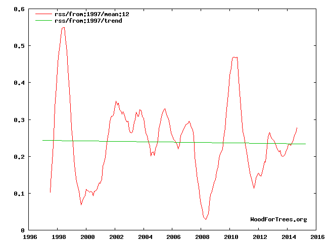
Jones designated the 1997-98 year as the starting year to determine if global warming has stopped. He is your guy, dcpetterson, so go argue with him if you don’t like it.
And Bartemis is right, any changes are negligible. They are wiggles in the noise. Temperatures over the past century and a half have been flatter than any comparable period in the geologic record:
http://4.bp.blogspot.com/-lPGChYUUeuc/VLhzJqwRhtI/AAAAAAAAAS4/ehDtihKNKIw/s1600/GISTemp%2BKelvin%2B01.png
You’re trying to manufacture a false alarm. Stop it, it’s dishonest. There is nothing unusual or unprecedented happening. Everything observed now has happened before, repeatedly, and to a much greater degree.
The starting year in Jones’s interview was 1995, why don’t you use that?
“Jones designated the 1997-98 year as the starting year to determine if global warming has stopped.”
He was talking about HADCRUT. RSS is much more variable. And yes, he said 1995, not 1997-8.
It doesn’t sound a lot but if this is an average down to a depth of 1900 metres it’s not trivial. Using the 0.023 deg per decade I get a forcing of 0.58 w/m2 which supports the TOA energy imbalance figure of 0.6 w/m2
John Finn
Please tell us why an air temperature rise of 0.2 degrees per century, or a global average ocean water temperature increase of 0.2 degrees is significant, that is “not trivial”. The global air temperature anomaly CANNOT rise any warmer than the global average sea water anomaly! That more heat energy is contained with a 0.2 degree warmer ocean sets an absolute limit on how far the atmosphere can heat up. Which is the temperature as the water heated up, in your simplified flat-earth diskworld of average global temperatures and uniform water conditions.
You make a valid point. However, there is an argument that, over the past decade or so, more energy has gone into heating the oceans rather than the atmosphere. If that is true then presumably the reverse can also happen which would result in the atmosphere warming at considerably more than 0.023 degrees per decade.
At the end of the day, the ARGO data supports an imbalance. We can’t necessarily rely on the fact that all excess energy will end up in the deep ocean.
But, with an upper limit in how far it can rise.
John Finn asserts:
However, there is an argument that, over the past decade or so, more energy has gone into heating the oceans rather than the atmosphere.
Show us the heat hiding in the oceans. Post verifiable data-based evidence.
Otherwise, your assertion fails.
No surprises with the seasonal “Super” El Niño effects. It’s weakening now. Look for La Niña by Fall 2016…Global Cooling…and a return of Hurricanes to their traditional tracks
through the Caribbean and Gulf of Mexico.
Trend AMO since 2009.
http://i67.tinypic.com/208trid.jpg
Rob:
So you are implying there way “global cooling” between ’98 and ’14?
When in fact the la ninjas predominated and during which time 15 of the 16 hottest years on instrumental record have occurred.
You are correct though in a way.
The Earth SHOULD have cooled a little in that time ….. we’re it not for CO2 forcing.
“No honest analysis of any global temperature data set shows an 18 year pause in global warming.”
No honest analysis of global temperature data says anything is going on now that HASN’T HAPPENED IN THE PAST.
Fixed it for ya.
The 2015-16 El Nino was a short sharp spike. By my reckoning SST peaked in November. NOAA prog’s ENSO neutral by mid year, La Nina prior to year end.
The central claim of the climate alarmist contingent is being falsified by the only Authority that matters: the real world.

The alarmist crowd was flat wrong. And ‘dcpetterson’ is making false statements when he says that extreme weather events are increasing. They’re not. And deaths from extreme weather are a good proxy:
Hurricanes show no rising trend, in either intensity or number:
http://policlimate.com/tropical/global_major_freq.png
And tornadoes have been decreasing:
http://www1.ncdc.noaa.gov/pub/data/cmb/images/tornado/clim/EF3-EF5.png
The question I have is: ‘dcpetterson, where have you been getting your misinformation from? Certainly not from this ‘Best Science’ site. Probably from the ‘skeptical’science blog, amirite?
That’s just a climate propaganda blog. Stick around here for a while, you might learn something.
Thanks, db. I considered hunting down all that data to show him, but suffered an extreme attack of ennui. It gets tiresome rebutting these talking points from the automatons. Which is not to say it does not need to be done, continuously and repeatedly.
dbstealey February 8, 2016 at 10:32 am
The alarmist crowd was flat wrong. And ‘dcpetterson’ is making false statements when he says that extreme weather events are increasing. They’re not.
dbstealey February 8, 2016 at 1:46 pm
So, Phil., you prefer to believe that NOAA propaganda, over other NOAA tornado data that contradicts it in the charts I posted? And over peer reviewed studies of extreme weather events? And over Dr. Ryan Maue’s meticulous hurricane data?
The NOAA data showed ‘extreme weather events’ to be increasing, you cherry picked some data referring to particular types of events. In aggregate the NOAA graph shows ‘extreme weather events’ to be increasing for the US at least.
I suggest you look further than just stealey’s charts, here for instance:
https://www.ncdc.noaa.gov/billions/time-series
So basically, no actual trend, just a couple of El Nino years that stick out. And, this after marked expansion of human habitats into disaster prone areas.
More stories to frighten children. Meh.
You must be looking at the wrong graph, the one I posted has a statistically significant increasing trend.
Mmmm… so the picture extends to the right with the little slider dealy. So, basically, a sudden step up in a period of no warming. What does this prove? That we better hope for more warming soon?
If you look through all the categories, the only one that actually shows any particular upward movement is the one labeled “severe storms”. And, the time at which it shows an uptick is 2008. Hmmm…. What could have happened in 2008 to cause the losses attributed to “severe storm” to pile up? What could it be…
So, Phil., you prefer to believe that NOAA propaganda, over other NOAA tornado data that contradicts it in the charts I posted? And over peer reviewed studies of extreme weather events? And over Dr. Ryan Maue’s meticulous hurricane data?
None of the scary, alarming predictions made by the climate alarmist contingent have ever come true. Every alarming prediction was wrong. And now it appears that NOAA is publishing false propaganda. It’s almost as if they have an agenda…
The central hypothesis of the alarmist contingent is that a rise in CO2 will cause runaway global warming and climate catastrophe (I know, now it’s “climate change”).
The scary predictions didn’t happen. They were wrong, all of them. The climate alarmist side has been consistently, completely wrong in its alarming predictions.
In science, when your predictions fail you’re supposed to reject your hypothesis, try to figure out why it failed, and then re-formulate a new hypothesis in an effort to find correct answers.
But that’s in regular science. The kind of science that sent men to the moon. In Climate Change Science™ (CCS), things don’t work like that. In CCS™ you dig in your heels, and refuse to ever admit you could have been wrong. You put together fancy but false and misleading charts to convince the public that climate doom is right around the corner.
And then you enlist anonymous folks to take potshots from the peanut gallery on skeptic sites that allow and encourage views from all sides of the debate — while never criticizing all the alarmist blogs for censoring posts they don’t agree with.
If your side actually honestly believed what you say, that wouldn’t be necessary. Your bought and paid for scientists would still be willing to debate publicly, if they believed what they were telling the public.
That would be the case, if the alarmist crew was honest. Wouldn’t it?
Absolutely bloody spot on !
The temperature graphs published by NOAA show a definite leveling of temperature starting about 2002. This start followed the pattern of the two previously recorded pauses which began in about 1880 and 1940. Both lasted about thirty years. Therefore, it is premature to say that the current pause has ended just because a particular climate event, such as the current El Nino, temporarily distorts the running average temperature. The current pause should continue until about 2032 if past recorded temperature history is any guide.
Mr Monckton,
My warmist friend doesn’t believe in the pause, and actually claims that global warming has accelerated in recent years, and is now faster than it was in the 20th century. She calls it a surge! I tried to use your statistical method to disprove that nonsense, but instead came to the conclusion that warming has indeed been “surging” since December 2006! Let me explain what I did, and maybe you can explain what I did wrong…
The average rate of warming in RSS monthly data in the 20th century (1979 to Dec 1999 – a period that includes the monster El Nino in 1998) was 0.145 deg. / decade. Agreed?
So, using your method of testing climate trends, I calculated the longest period up to the current month for which the linear trend is greater than 0.145 deg/decade (the 20th century reference). As it turns out, that period starts in December 2006. So using your method of defining climate periods, it seems my warmist friend is right – even RSS data show that for the past 9 years the Earth has been warming at a faster rate than it did in the 20th century! How can the second half of the 18 year pause be a 9 year surge?
I will attempt an answer.
Trends of under 10 years when the final 4 months are records or near records for their respective months due to a very strong El Nino can be very distorting. Here is the slope for December 2006 to September 2015:
Temperature Anomaly trend
Dec 2006 to Sep 2015
Rate: 0.882°C/Century;
CI from -2.043 to 3.807;
t-statistic 0.591;
Temp range 0.192°C to 0.269°C
The 0.882/century is not at all alarming. But December 2006 to January 2016 gives a totally different picture as follows:
Temperature Anomaly trend
Dec 2006 to Jan 2016
Rate: 1.461°C/Century;
CI from -1.650 to 4.572;
t-statistic 0.920;
Temp range 0.174°C to 0.307°C
That huge jump to 1.461/century is due to the El Nino.
Note this:
Temperature Anomaly trend
Jul 2009 to Jan 2016
Rate: -0.079°C/Century;
CI from -5.180 to 5.021;
t-statistic -0.030;
Temp range 0.280°C to 0.274°C
The slope is even negative from July 2009 to January 2016!
Werner,
Even if we exclude the last 4 months of data, Monckton’s method would still give a surge starting in May 2007. So the final 8+ years of his pause would be a surge. When a “statistical” method leads to such logical absurdities, or is so sensitive to start/end values, surely you have to question the method?
“Trends of under 10 years when the final 4 months are records or near records for their respective months due to a very strong El Nino can be very distorting.”
The same is true when the period starts with a big El Nino. And the distortion doesn’t fade to zero after ten years. Basically, the Pause will end because the 1997-2016 period has been bookended with peaks. If you split near the middle, one half will be downtrend and one uptrend.
Nick,
Of course many experts believe that for climate time-series T’s, ten years is not enough to consider trending, and that’s with straight linear trends when it is not known if the underlying long-term trend should be straight or curvilinear.
My comment below to dcpetterson is also relevant.
BTW, if you download the RSS data:
http://data.remss.com/msu/graphics/TLT/time_series/RSS_TS_channel_TLT_Global_Land_And_Sea_v03_3.txt
EXCEL tells me that the average anomaly for 1998 is 0.55 C
Whereas for 1997 to 2000 (inclusive of the peak) it is only 0.21 C
Also, for 2010 alone it is 0.47 C
Whereas 2008 thru 2012 inclusive it is 0.21 C
So, what is all the excitement about over the peaks?
The contrast between the surface T and RSS T for 2010 is interesting don’t you think?
True. But check the ENSO numbers after May 2007 here:
http://www.cpc.noaa.gov/products/analysis_monitoring/ensostuff/ensoyears.shtml
Any time you end near a spike OR start near a La Nina, AND have a short period, surges happen. And as Nick says here:
Jim,
It is generally agreed that a “surge” of eight or ten years in climate T data is statistically meaningless in terms of trend (whilst in itself perhaps having some interest in a particular context).
Please see the following 2011 paper in GRL by seventeen authors:
Separating signal and noise in atmospheric temperature changes: The importance of timescale
B. D. Santer, C. Mears, C. Doutriaux, P. Caldwell, P. J. Gleckler, T. M. L. Wigley, S. Solomon, N. P. Gillett, D. Ivanova, T. R. Karl, J. R. Lanzante, G. A. Meehl, P. A. Stott, K. E. Taylor, P. W. Thorne, M. F. Wehner, F. J. Wentz
They conclude that at least seventeen years are required for trend. Note that one of the authors is none other than Tom Karl director of NCDC at NOAA and father of the recent controversial SST adjustments in Gistemp.
Ben Santer, Tom Wigley and Susan Solomon are also famously influential.
Werner,
I think he was joking.
It was just a tongue-in-cheek illustration of the spurious logic used to look for the Pause. You can use the same technique to look for rapidly rising temperatures
However another reader may think that it was an excellent question and may be wondering what the response may be.
Werner and bobfj,
I know there is no surge. I know short term variability from ENSO etc make trends estimated from snippets of data meaningless. That was point. You can’t learn anything about trends by cherry picking start times, which is what Monckton does. His method is rubbish.
There are perfectly good methods for objectively detecting changes in trends in time series. They are called changepoint models. They use all of the available data to test whether and when trends have changed. Many people (including me) have applied them to climate data. Those methods find zero evidence of a recent “pause” in any annual global temperature series (surface, satellite or balloon). You might find a slowdown in RSS monthly data starting around 2003 using a changepoint model, but only if you ignore autocorrelation. In fact, the only way to find a genuine trend change in RSS data is to subtract the corresponding balloon data from it.
graph is from tamino: (https://tamino.wordpress.com/2015/09/24/exogenous-redux/)
Jim,
With your latest wisdom, starting with:
“I know there is no surge. I know short term variability from ENSO etc make trends estimated from snippets of data meaningless. That was point. You can’t learn anything about trends by cherry picking start times, which is what Monckton does. His method is rubbish.”
I was amazed WRT your earlier pleadings including:
“I tried to use your [C. Monckton] statistical method to disprove that nonsense, but instead came to the conclusion that warming has indeed been “surging” since December 2006! Let me explain what I did, and maybe you can explain what I did wrong…”
“Even if we exclude the last 4 months of data, Monckton’s method would still give a surge starting in May 2007. So the final 8+ years of his pause would be a surge. When a “statistical” method leads to such logical absurdities, or is so sensitive to start/end values, surely you have to question the method?”
Putting aside a temptation to report you for trolling (in the internet definition) it occurs to me that perhaps naively you may not have properly read or understood the lead article, for you did write:
“So, using your [C. Monckton] method of testing climate trends, I calculated the longest period up to the current month for which the linear trend is greater than 0.145 deg/decade (the 20th century reference). As it turns out, that period starts in December 2006. So using your method of defining climate periods, it seems my warmist friend is right – even RSS data show that for the past 9 years the Earth has been warming at a faster rate than it did in the 20th century! How can the second half of the 18 year pause be a 9 year surge?”
Be advised that the start value of the zero change line-plot in the lead article is end of January 2015 backwards to a point when zero net-trend ends with a meaningful span of over eighteen years. Any intervening peaks or valleys are not relevant to the net result. Your statement immediately above is not relevant to the article and if you carefully read it, you will find:
“Our latest topical graph shows the least-squares linear-regression trend on the RSS satellite monthly global mean lower-troposphere dataset for as far back as it is possible to go and still find a zero trend. The start-date is not “cherry-picked” so as to coincide with the temperature spike caused by the 1998 el Niño. Instead, it is calculated so as to find the longest period with a zero trend.”
Don’t be upset that Christopher Monckton did not respond to your misleading and irrelevant comments.
BTW my full name is Bob Fernley-Jones (Mechanical engineer retired). Do you have a name etcetera?
Bob, if the definition of troll is someone making a serious criticism of a blog post by asking a hypothetical, then guilty as charged. I did not mean to deceive, I thought it would be obvious that I was criticising Moncktons methods, not asking a genuine question about a surge.
I know exactly how Monckton calculates his pause- I can post an R script to replicate it if you like. I used the exact method to calculate a surge, to show that his cherry picking can achieve any desired result. I started at jan 2016 too, and worked backwards to find the longest period with ‘net trend’ greater than 0.0145. It’s cherry picking whether you start at the end and work back, or start at the beginning at work forward. What makes it cherry picking is throwing out the data before the earliest date (whether you call that the start or end). When you ignore earlier data you inevitably get the intercept (start value) wrong, which in turn makes your trend estimate wrong. Ask Monckton, or yourself, how and when temps got to the value at which they paused? Did they magically and permanently jump up 0.2 deg the day before the pause started (see my comment to Janice earlier in comments- I can’t repost graphs now)? A pause starting 1997/8 simply cannot be supported by any objective analysis of the full data. That is why the start time of Moncktons cherry pause keeps getting later, and why it will vanish completely next month.
It is not a cherry pause. Suppose a reporter wanted to say the longest time in the past when oil was as low as today. He would come up with X years and Y months. Is that a cherry pick? No way! Now suppose oil drops further next month and the time when it was at the new low is 4 months earlier and this is reported as such. This is also not a cherry pick. Now should the price go up, the new time may be 5 months later when the oil was that low. Again, this is not a cherry pick. You are just factually reporting how long ago the oil price was as low as today.
Jim,
I see you even obfuscate over the internet definition of the word ‘troll’!
Here it is per MS Encarta online dictionary:
7. fool internet user into responding: online intransitive verb to lure other Internet users into sending responses to carefully designed incorrect statements
• You claimed to find a surge from December 2006 and secondly from May 2007.
• You then claimed “I know there is no surge”
• Christopher Monckton describes a linear trend of zero of over 18 years, so your analysis is irrelevant because there are ups and downs throughout the time-series.
• You obfuscate on methodology when a simple solution is to download the RSS data into a spreadsheet and do an OLS trend for the period found by Christopher Monckton. (Regardless of how he got there)
You might have noted my close-by comment that NOAA guru Tom Karl and sixteen other authors have concluded 17 years is enough to determine a meaningful trend.
a simple solution is to download the RSS data into a spreadsheet and do an OLS trend for the period found by Christopher Monckton.
No. A simple solution is download RSS data and test whether there is any evidence of a change in trend at Monckton’s pause date. This is Monckton’s view RSS:
http://www.jimstonefly.yolasite.com/resources/images/moncktons-view_24777862841_o.png
Do you really think there was an instantaneous and permanent 0.2 degree jump in atmospheric temps the day before the pause started?
This is what you get when you allow for a continuous change in trend at Monckton’s pause date:
http://www.jimstonefly.yolasite.com/resources/images/image1.png
Warming didn’t stop when Monckton says it did.
And this is what you get when you use a proper change-point model to objectively test whether and when there have been any changes in trend:
http://www.jimstonefly.yolasite.com/resources/myview.png
Yes there is evidence of a slow down (not a stop) in warming, but it starts around 2003 – about the time when satellites diverge from balloons…
BTW Santer et al say you need at least 17 years. As the above shows, when you start near a monster El Nino, you’re gonna need more.
Jim,
In your latest obfuscation, gleaned I guess from dogma at the ‘Skeptical Science’ or ‘Tamino’ websites, there was an attempt to post three images, but they do not open my end.
Beneath the first attempted image you wrote:
“Do you really think there was an instantaneous and permanent 0.2 degree jump in atmospheric temps the day before the pause started?”
From this I presume that you mean that the linear trends of the plateau and the warming period before it do not line up.
Unfortunately, it seems that you do not comprehend the significance of this. What is strongly indicated is that the true long term underlying trend is not a series of straight line trends but is curvilinear.
To illustrate that point, I’ve plotted HadCrut4 from 1850, courtesy of WoodForTrees together with three trend lines (OLS):
http://woodfortrees.org/plot/hadcrut4gl/from:1850/plot/hadcrut4gl/from:1979/to:1996/trend/plot/hadcrut4gl/from:1997/to:2015/trend/plot/hadcrut4gl/from:1850/trend
There is an underlying quasi-cyclic waveform of about 60+ years (times ~2 ½) versus a very, very poor fit to the full term linear trend. The two shorter trend lines are equivalent I think to what you were trying to say. (Unfortunately WFT does not provide polynomials)
It is a statement of fact that the RSS data for the recent 18,8 years shows an OLS trend of zero. In other words, there has been no net warming for longer than 17 years…. this is a fact. These are the actual data and not anything you can change by your statistical argument.
What this means is open to speculation but we are arguably on a developing plateau of notable similarity to those of around the 1870’s and 1940’s. Additionally, from past behaviour, 2017 and 2018 are likely to be cooler, which adds to the likelihood of a third full such oscillation.
~~~~~~~~~~~~~~~~Repeating from above~~~~~~~~~~~~~~~~~
EXCEL tells me that the average [RSS] anomaly for 1998 is 0.55 C
Whereas for 1997 to 2000 (inclusive of the peak) it is only 0.21 C [Below full term average of 0.25 C]
Also, for 2010 alone it is 0.47 C
Whereas 2008 thru 2012 inclusive it is 0.21 C
So, what is all the excitement about over the peaks?
Bob,
Its a shame my images don’t show – Please try this link – which should show all 3 (I set up a wordpress site just for you!):
https://quantitare.wordpress.com/2016/02/10/rss-2/
We are in complete agreement that the true trend may be curvilinear. That is exactly why you can’t cherry pick an interval (of any length) and give the OLS slope for it as evidence for either a pause or a surge. That is why it is certainly not a “fact” that RSS shows no warming for 18 years – you can only reach that conclusion if you ignore the data prior to the start of the period – thereby assuming that temps magically jumped to the value at which they “paused”. Whether you use a series of linear segments or a polynomial the fitted trend must – by definition – be a continuous function of time. And you must use proper statistical methods to avoid overfitting (i.e. not arbitrary curve fitting). This is not ‘dogma’ from SkS or tamino. This is basic statistics. I analysed the data myself to see what the data says. The data says warming did not stop 18 years ago.
Jim,
If you cannot accept that the following statement in para 2 of the lead article is a statement of fact then you are in denial of truth.
“The RSS data still show no global warming for 18 years 8 months, notwithstanding record increases in CO2 concentration over the period.”
Whatever statistical treatment you prefer, it does not alter those actual data values and I’m typing this very slowly in the futile hope that you might grasp it as so, beyond dogma.
What it is, is a strong indicator of a developing plateau on that 60-year quasi-cycle (which Bartemis mentions as one autoregressive process below) but of course some years are required before that can be confirmed as a third plateau since 1850. And, note that the article makes no attempt to forecast longer trends I guess because that is a different and speculative matter.
Thank you for the graphics, but I’m amused that it includes linear trends despite the powerful evidence of a waveform.
I was also entertained by your self-defeating argument of need for data before a particular period in order to determine the trend for that period. So where is this mandatory data before 1979 and by implication for after Jan 2016?
Look, don’t bother to reply, I’ve become bored with this and would ignore.
Bob,
Your precious “fact” will vanish into thin air next month, at which point I guess you can take comfort in quasi-cycles and magical instantaneous jumps, and any other mathturbation Monckton and co. throw your way.
I’ll stick with science.
goodbye
It’s just an El Nino, Jim. Nothing to get excited about.
Jim says:
Yes there is evidence of a slow down (not a stop) in warming, but it starts around 2003…
And you accuse others of cherry picking??
I prefer to use the WoodForTrees databases because the charts and trend lines are generated automatically. See here.
Even the left-leaning Washington Post shows global temperatures declining:
And you accuse others of cherry picking?? ?w=660
That result is not a cherry pick – its an objectively derived result using all the data. Look at my plot again (and try reading all of what I wrote).
or look here: https://quantitare.wordpress.com/2016/02/10/rss-2/
I don’t go looking for a particular result and throw out data that doesn’t fit the desired outcome (why did you end you WFT tree graphs in 2014?). I use all of the data to fit a continous trend line, using an objective change-point function to identify any changes in trend. I don’t arbitrarily split the data into 2 groups and fit separate lines that don’t meet up. In your WFT plots, how do you explain the sudden jumps from end of the first trend line to the start of the second? Where did that heat from which your ‘cooling’ starts come from?
The apparent slow down RSS since 2003 is not a cooling, its a reduced rate of warming, and its probably an artefact of drift in satellite sensors (its not evident in balloon data), incomplete accounting for autocorrelation (its barely evident in annaul RSS data), or both. Or maybe its real, and the rate of warming since 2003 has been slightly reduced. Time will tell. Dodgy stats on cherry picked data will not.
dbstealey,
Another way of looking at the RSS data is seen in the following WFT graphic with the trend from 1979 through to Jan 2016 added:
http://woodfortrees.org/plot/rss/plot/rss/from:1997/trend/plot/rss/from:1979/trend/plot/rss/from:1979/to:1997/trend
By definition, these are the OLS linear trends for those three nominated periods which may be useful in particular contexts.
Interestingly, by eyeball the WFT 37-year trend gives an end T of roughly 3.4 C, whereas Jim’s 37 year trend gives roughly 2.7 C, or substantially cooler.
Maybe we should recommend to the Oz CSIRO that the new climate policy emphasis shift to mitigation should include getting Jim to diminish warming with his methodology?
I don’t think Jim has named his software but maybe we could try other methodologies to hopefully reduce warming. I dunno, how about LOWESS (LOESS), or a second order polynomial…..or?
Whatever, the surface T records strongly show an underlying curvilinear long-term trend.
Jim says:
This is not ‘dogma’ from SkS or tamino. This is basic statistics. I analysed the data myself to see what the data says. The data says warming did not stop 18 years ago.
May I deconstruct? Thank you:
Less than one year ago there were reams of proposed explanations by the alarmist crowd, including plenty of discussion of the “basic statistics” being used (and if you like I can post thirty or forty of their reasons for the so-called “pause”. Just ask).
All sides accepted the fact that global warming had been stopped for many years. The only quibbles were over how many years. Was it 18 years? Was it fifteen years? Or was it 22 years? Should we use RSS? Or UAH?
Scientists on the alarmist side were not claiming that global warming was continuing. The overwhelming ‘consensus’ agreed that global warming was in a “hiatus”. People were arguing about whether to call the fact that global warming had stopped a “pause”, or a “plateau”, or a “hiatus”, or a “peak”, etc. Even IPCC scientists were openly discussing “The Pause”.
Since, as you say, this is “basic statistics”, and since the same data was available then, those well educated folks had all the tools necessary to understand what was, and what was not, happening. And they all agreed that the (so-called) “pause” was in effect; global warming had stopped many years ago.
Then, practically overnight the Narrative turned on a dime. Now the new talking point is “global warming never stopped”. And, “satellite data is no good!”
That may fool the true believers at hotwhopper. But readers here aren’t the lemmings that hotwhopper or SkS caters to. We aren’t stupid, we see the agenda. So when you thump your chest and say, “I used the exact method to calculate a surge…” &etc., we can see that you’re just monkey-piling on the latest talking point:
The data says warming did not stop 18 years ago.
You’re not fooling the folks here. You’re just parroting the latest alarmist narrative. And you aren’t nearly as smart as you think you are.
db,
I may not be as smart as I think I am, but I’m smart enough to know the difference between “stopped” and “warming more slowly than before”.. So are all the climate scientists who never said “global warming stopped”. I also know the difference between cooling and warming at a reduced rate (see your Washington Post graph – it doesn’t show what you claimed – read the caption -carefully).
I was stupid to come here though…
[???? .mod]
[‘Jim’ has lost this particular debate. -another mod]
The 20th century ended in Dec 2000, not 1999.
True. But that just makes the Monckton-calculated surge even longer. Lucky its only as real as his pause.
dcpetterson:
In the long nest of comments above, WRT to:
“The RSS data still show no global warming for 18 years 8 months, notwithstanding record increases in CO2 concentration over the period.”
You did assert above that:
“The problem is that this claim is untrue. The RSS data shows a big spike in RSS temperatures toward the beginning of that 18 year 8 month period, which skews a trendline that starts exactly at that 18 year 8 month period. You simply cannot get a flat trend line if you start somewhere else.”
So you have not noticed that the big spike is followed by two substantial reversals, and is preceded modestly by one other cooler year?
In case you are not aware, the big spike is part of what is known as the ENSO, where the O stands forOscillation. It might be a bit difficult for you to grasp but the big spike is substantially counterbalanced in the time-series by the negative phase of that oscillation. Thus, 1998 should not be considered on its own.
Note too that the zero line starts at end January 2015 and goes back to eight months before the big spike year.
ENSO is not a predictable cycle and hence the descriptor of ‘oscillation’. It is widely opined from past climate behaviour, that 2016 will be warmer than 2015 and then there will be a negative phase the following year or so.
For the record to whoever first said this, using:
http://moyhu.blogspot.com.au/p/temperature-trend-viewer.html
The slope is negative for RSS for a total of 26 months as follows: 9 months from June 1997 to February 1998, 14 months from January 2001 to February 2002 and 3 months from July 2009 to September 2009.
But if February is above 0.88, very few if any months will be the start of a negative slope. This would be a jump of about 0.22 from January which can happen due to the El Nino.
The sub-thread that ‘dcpetterson’ was commenting on was far too long, and way upthread, so my reply to his comment is here:
dcpetterson says:
Please do not refer to climate science as “climate propaganda”.
Why not? That’s exactly what it is when people can get away with posting total propaganda like this:
http://www.realclimate.org/images//Marcott.png
^THAT^ is climate propaganda.
Next, regarding the Phil Jones graph I posted, dc says:
…note that the last one — the one we are in now — extends higher than any of the others. Also, that temperatures are still increasing.
What else would you expect, when the planet is recovering from the Little Ice Age (LIA); one of the coldest episodes of the entire 10,000+ year long Holocene? Since even the IPCC can’t separate natural variability in global temperatures (T) from the assumed AGW, all they — or you — are doing is speculating. Until you can produce a verifiable, testable, empirical and replicable measurement quantifying the fraction of AGW out of total global warming, all you are doing is making data-free assertions.
Next:
Unless you can explain what caused each of these increases…
Umm-m… no. You don’t understand: skeptics of a conjecture or hypothesis have nothing to prove. You are making the claim, therefore you are the one who needs to explain it. The onus is entirely on those making the ‘dangerous AGW’ conjecture, to provide proof, or at least strong, convincing evidence…
…but your side has completely failed. Despite your multi-million dollar GCMs, not one of you was able to predict the most significant event of the past century: the fact that global warming stopped. (I understand; the new Narrative is to lie about it now, and claim that global warming is chugging along as always. Lies are all the alarmist contingent has, because they have never produced any convincing evidence.)
Next:
There was quite a bit of coal burning going on in the nineteenth century, and coal is still a primary cause of carbon emissions.
Now you’re just winging it. A very few countries were beginning to industrialize in the 1800’s, and had started using coal, but there’s no comparison to current coal use. But let’s say you’re right, and that CO2 was rising really fast in the middle of the past century. Global temperatures should have been going up. But they weren’t. From 1940 to 1980, global T kept declining — despite steadily acceleration in CO2 emissions.
Next:
Rising temperatures now would not destroy life on Earth, but that would destroy human civilization…
If it weren’t for assertions, you wouldn’t have much to say. That whole paragraph is only your personal opinion, nothing more, so I’ll leave it as such.
Next:
If you wish to discuss the causes, we can do so.
That’s your job. You’re making the conjecture, so you need to explain it convincingly. But I have yet to see any convincing evidence showing that a rise in CO2 is the cause of rising global T.
Finally, some über-preposterous nonsense:
The climate would be getting colder now — if it were not for increased greenhouse gasses overwhelming that trend, and warming the planet instead.
May I deconstruct? Thank you:
What you’re saying is that the rise in human-emitted CO2 — which is only around 3% of the total emitted from all sources — is exactly balancing the expected decline in global T. It balances so perfectly, in fact, that as global human emissions continue to rise year-over-year, temperatures are being kept flat; like balancing a pencil on its point.
Does that pass the smell test with you? Because it reeks of preposterous nonsense to me. You’re saying that global emissions from the U.S., the EU, China, Russia, India, and a hundred smaler countries is constantly changing at the exact amount necessary to keep the planet from either warming or cooling. Is that what you believe? Sounds like religious dogma to me.
@dbstealey ,
That’s an odd thing to say. Let me quote the paragraph you said was only my personal opinion, and see if I can tease out of it which part you objected to:
The wild ancestors of all the domestic species you mentioned most certainly did exist millions of years ago, by which I guess you mean the still balmy Pliocene (5.33 to 2.58 Ma), last epoch before the glacial Pleistocene. Some domestic varieties have been bred to become quite different in appearance from their forebears, such as corn (maize), but even in that extreme case, its genome is virtually identical with its ancestral grass teosinte.
Human civilization arose when temperatures were higher than now, during the Holocene optimum, and flourished during the Egyptian, Minoan, Roman and Medieval warm periods, which were also hotter than now. The earth is self-regulating, so it’s highly unlikely that the supposedly dangerous two-degree rise will happen in the next century. But even if it did, human civilization, humans, other animals and plants, fungi and microbes will all have plenty of time to adapt.
This is a MODTRAN output from 0.1km up with 0.00ppm and 400ppm CO2. Clearly CO2 has little to any impact on the atmospheric layer where all the thermometers are located. Ground measurements, according to MODTRAN aren’t measuring CO2’s impact, they are measuring conduction and convection.

dbstealey:
A link to the quote would be more useful. I know my own memory often plays tricks. Maybe you are thinking about this quote from one of the hacked emails:
But there’s no mention of a 95% confidence interval, and he is specifically saying it 15 years from 2004/5.
Bellman,
I put quote marks around Jones’ words. That’s exactly what Phil Jones said, verbatim. That’s what I was referring to. As for the Climategate info, that may be where I got it from. Or not. There is so much information on Phil Jones and the Climategate debacle in the archives here that I could spend six months re-reading it and not get through it all.
dbstealey:
What you said above was:
The only quote marks are around the words “Yes, but only just.”. Is that the only part you are quoting verbatim? The part I was disputing was where you only quoted him indirectly.
Bellman
It is an accurate, valuable summary of Dr Jones’ comment. Quibbling about any such differences is meaningless, unless it becomes your purpose to dilute the value of the entire thread with such solvents – which solve nothing but smell the atmosphere. A goal often seen in the past by CAGW writers.
RACookPE1978:
Sorry, it wasn’t my intention to devalue this thread by asking for evidence for a claim. My original point was that regardless of who said it, it’s still wrong. 15 years might show a statistically significantly trend, or it might not, you can only tell by doing the statistics.
Nevertheless, I’d still like to see an actual link to something resembling dbstealey’s quote before assuming it’s accurate.
Perhaps you should be looking up not down!
richardscourtney February 8, 2016 at 1:25 pm
Phil,:
What I wrote is right.
Your response started with an error which demonstrated what I wrote is right.
I replied pointing out that your error demonstrated what I wrote is right.
You have responded to that by claiming quantity equates to quality and admitting your error but failing to acknowledge or apologise for your error while pretending you have not misrepresented what Phil Jones said.
Your error was a demonstration that you cannot read what people write and you misrepresent what they say. Your pretending you understood what Phil Jones said is further demonstration of that because dbstealey was right about what Phil Jones said and you are wrong (as usual).
What stealey claimed Jones said was wrong, I quoted the actual transcripts of the BBC interview,as usual stealey (and you) are wrong.
http://news.bbc.co.uk/2/hi/8511670.stm
Phil.,
Yes, I was going by memory, and I posted the wrong date. I should have checked it.
That’s the difference between us. When I’m wrong I admit it. When you’re wrong — and you are, just as much as anyone — you skedaddle without a word.
Not true, you’re the one who disappears without a trace when your ‘charts’ are shown to be wrong, and then come back moths later and post the same rubbish.
Phil.,
If I thought my* charts were wrong, I would admit it. Unlike you. You just put tail ‘tween legs and skedaddle.
*Those aren’t my charts, they are charts I saved from what I believe to be reputable sources. Go argue with them if you’re so unhappy. But I haven’t been convinced by your assertion that they’re wrong. Because you’ve been wrong before. You just can’t admit it.
You did more than get the date wrong:
dbstealey February 8, 2016 at 7:18 pm
Bellman says:
I don’t know if that was actually what Jones said, but if he did he was mistaken.
I know that’s exactly what Phil Jones said, verbatim. I’ve been following the corruption exposed in the Climategate emails since they were made public. That’s why I was able to quote him from memory.
You ‘misquoted him from memory’:
“In an interview Dr. Phil Jones was asked if global warming had stopped. He replied, “Yes, but only just.” He added that fifteen years would need to pass before it could be stated with greater than a 95% statistical certainty that global warming had stopped.”
In February of 2010, Phil Jones was asked some questions in an interview with the BBC. The distorted view of his reply is what you are referring to.
The question was:
“Do you agree that from 1995 to the present there has been no statistically-significant global warming?”
To which Jones replied:
“Yes, but only just. I also calculated the trend for the period 1995 to 2009. This trend (0.12C per decade) is positive, but not significant at the 95% significance level. The positive trend is quite close to the significance level. Achieving statistical significance in scientific terms is much more likely for longer periods, and much less likely for shorter periods.” (The trend was actually significant at the 93% level).
That’s verbatim, not what you claimed.
He did not say that 15 years would be required to achieve significance, in fact in a later interview Jones said the following:
“The trend over the period 1995-2009 was significant at the 90% level, but wasn’t significant at the standard 95% level that people use,” Professor Jones told BBC News.
“Basically what’s changed is one more year [of data]. That period 1995-2009 was just 15 years – and because of the uncertainty in estimating trends over short periods, an extra year has made that trend significant at the 95% level which is the traditional threshold that statisticians have used for many years.
“It just shows the difficulty of achieving significance with a short time series, and that’s why longer series – 20 or 30 years – would be a much better way of estimating trends and getting significance on a consistent basis.”
So in summary you got it all wrong! I await your admission of your errors.
Given your fallible memory can we have a verifiable example?
[Reply: Everyone makes errors. No one is infallible. -mod.]
“The positive trend is quite close to the significance level. Achieving statistical significance in scientific terms is much more likely for longer periods, and much less likely for shorter periods.” (The trend was actually significant at the 93% level).”
In actual fact, such talk is nonsense without an accurate model of the statistical properties.
The general assumption appears to be that the variation about any trend is characterized by an AR(1) process, and a number for the correlation time is basically pulled from the air.
However, the data are not actually well characterized by such a model. They are characterized more accurately by a sum of AR(2) processes, one of which has a characteristic period of approximately 60 years. There is virtually no possibility of significant confidence in any trend estimate using much less than that span of data. A 30 year trend is just about the worst possible.
Phil.,
It’s predictable that you can’t bear to discuss the times you’ve been wrong. When you’re caught you just disappear from the thread. Now you’re running around in circles, clucking and flapping your wings over a verbatim quote I made. You’re trying to apply the statement between the quote marks. They are quotation marks for a reason. That is what I was referring to, and you don’t get to re-frame it for your convenience. The quotation marks rule. Besides:
It is impossible to speak in such a way that you cannot be misunderstood.”
~ Karl Popper
Let’s discuss your errors now, shall we? Would you like that? No, you wouldn’t. The point I made is not that you have been wrong before. Of course you have, you’re human. The point I made is that we’re different, you and me. On the rare occasions that I’ve made a misteak, I’ve admitted it. I do it partly for personal reasons: it is a self-correcting mechanism that makes me more careful.
You, on the other hand, Anonymous “Phil.”, have alawys just disappeared when someone calls you on a mistake. You slink off like a wounded animal to lick your wounds. You have never admitted to being wrong. And with your large number of comments, unless you’re Jesus Christ reincarnated, you’ve made mis-steps. I remember you being called on one only a couple of weeks ago. Your usual M.O. was followed: you disappeared.
I’m not anal retentive like a few other commenters; I don’t keep logs of your comments or anyone else’s. But I have enough common sense to know that you make mistakes. I remember thinking, ‘how will Phil. handle this one?’ You always skedaddle.
Willis is head and shoulders above you, and even he makes an occasional mistake. It’s very rare. But when he does, he mans up and admits it. In that respect, you’re very different from Willis, and me, and most others here.
I was off by a couple years regarding Jones’ time frame. So what? You’re trying to make it a big deal because that’s all you’ve got. You’re trying to avoid the fact that you make misteaks, too. We just handle it differently, you and me: I admit it when I’m wrong. You never do.
Next, I recall Dr. Phil Jones saying in the CRU emails (7/05/2009):
“Bottom line: the ‘no upward trend’ has to continue for a total of 15 years before we get worried.”
Note the date.
dbstealey February 11, 2016 at 1:54 pm
Phil.,
It’s predictable that you can’t bear to discuss the times you’ve been wrong. When you’re caught you just disappear from the thread.
I have no problem discussing such things, I asked you to give an example but you’re unable to come up with one!
Now you’re running around in circles, clucking and flapping your wings over a verbatim quote I made. You’re trying to apply the statement between the quote marks. They are quotation marks for a reason. That is what I was referring to, and you don’t get to re-frame it for your convenience. The quotation marks rule.
The four words in quotes were the only part you got right! You misrepresented the question asked and the rest of the answer despite claiming to be “able to quote him from memory”.
Let’s discuss your errors now, shall we? Would you like that? No, you wouldn’t. The point I made is not that you have been wrong before. Of course you have, you’re human. The point I made is that we’re different, you and me. On the rare occasions that I’ve made a misteak, I’ve admitted it. I do it partly for personal reasons: it is a self-correcting mechanism that makes me more careful.
Yes, I made a mistake in a reply upthread, misattributing your statement to courtney, for which I apologized.
You, on the other hand, Anonymous “Phil.”, have alawys just disappeared when someone calls you on a mistake. You slink off like a wounded animal to lick your wounds. You have never admitted to being wrong. And with your large number of comments, unless you’re Jesus Christ reincarnated, you’ve made mis-steps. I remember you being called on one only a couple of weeks ago. Your usual M.O. was followed: you disappeared.
There you go again, making a claim you can’t back up! By the way, being contradicted by you or courtney, for example, doesn’t mean it’s a mistake, in fact to the contrary.
I’m not anal retentive like a few other commenters; I don’t keep logs of your comments or anyone else’s. But I have enough common sense to know that you make mistakes. I remember thinking, ‘how will Phil. handle this one?’ You always skedaddle.
I was off by a couple years regarding Jones’ time frame. So what? You’re makitrying to make it a big deal because that’s all you’ve got. You’re trying to avoid the fact that you make misteaks, too. We just handle it differently, you and me: I admit it when I’m wrong. You never do.
Despite being called on some of the ‘charts’ you post you refuse to acknowledge they’re in error and continue to post them despite references to the originator of the data pouting out your error. Plots of Alley’s data from GISP for example.
Next, I recall Dr. Phil Jones saying in the CRU emails (7/05/2009):
“Bottom line: the ‘no upward trend’ has to continue for a total of 15 years before we get worried.”
Note the date.
Yes it predates the interview which was the subject of these posts by about 6 months, what’s your point?
Phil.:
I write in hope of helping you understand what you say you don’t.
You ask dbstealey
dbstealey’s correct and accurate point is that you were and are wrong. Please read what he wrote; viz
The date then was in 2009 and, therefore, a ‘no upward trend’ from then for more than 15 years would make them “get worried” (i.e. would falsify their climate model projections). Other start dates could also apply because of the word “continue”, but more than 15 years from 2009 is THE one absolutely certain and indisputable meaning of what Jones said.
No amount of your usual wriggling will overcome the simple fact that what dbstealey said was right. Will you now admit your error, or will you run away as is your usual practice when you are shown to be wrong?
Richard
Richard Courtney,
I suspect that all we’ll see is the usual tap-dancing by ‘Phil.’ He is still trying to say that what was outside the quote marks is the quote.
That’s wrong. As I commented to Bellman:
I put quote marks around Jones’ words. That’s exactly what Phil Jones said, verbatim. That’s what I was referring to. As for the Climategate info, that may be where I got it from. Or not. There is so much information on Phil Jones and the Climategate debacle in the archives here that I could spend six months re-reading it and not get through it all.
The ‘elephant in the room’ in all this discussion is the fact that Planet Earth is simply not doing what the alarmist crowd endlessly predicted. The planet is not doing what they want. So they try to beat the data into submission in an effort to convince readers that dangerous AGW is right around the corner, or they quibble and nitpick over what is, or isn’t, a quote: “Oh, look! A squirrel!”
But their runaway global warming has been right around the corner for more than 18 years now, and their failed predictions sound like the boy crying “Wolf!” Or more accurately, like Chicken Little clucking that the sky is falling…
…but the sky isn’t falling. It was only a tiny acorn; an appropriate parable, no?
richardscourtney February 13, 2016 at 9:09 am
Phil.:
I write in hope of helping you understand what you say you don’t.
dbstealey February 13, 2016 at 11:17 am
Richard Courtney,
I suspect that all we’ll see is the usual tap-dancing by ‘Phil.’ He is still trying to say that what was outside the quote marks is the quote.
That’s wrong.
The two prime prevaricators on the blog chime in and get everything wrong as usual!
richardscourtney February 13, 2016 at 9:09 am
Phil.:
I write in hope of helping you understand what you say you don’t.
You ask dbstealey
Yes it predates the interview which was the subject of these posts by about 6 months, what’s your point?
dbstealey’s correct and accurate point is that you were and are wrong. Please read what he wrote; viz
I know it’s difficult for you to keep up courtney but what stealey said, and what i responded to was:
“In an interview Dr. Phil Jones was asked if global warming had stopped. He replied, “Yes, but only just.” He added that fifteen years would need to pass before it could be stated with greater than a 95% statistical certainty that global warming had stopped.”
As I posted before this is false, Phil Jones was not asked “if global warming had stopped”, he was asked “Do you agree that from 1995 to the present there has been no statistically-significant global warming?”
Which is what he made the following reply to:
“Yes, but only just. I also calculated the trend for the period 1995 to 2009. This trend (0.12C per decade) is positive, but not significant at the 95% significance level. The positive trend is quite close to the significance level. Achieving statistical significance in scientific terms is much more likely for longer periods, and much less likely for shorter periods.”
He did not add “that fifteen years would need to pass before it could be stated with greater than a 95% statistical certainty that global warming had stopped”, hint the period discussed was already 15 years!
He later added:
“The trend over the period 1995-2009 was significant at the 90% level, but wasn’t significant at the standard 95% level that people use. Basically what’s changed is one more year [of data]. That period 1995-2009 was just 15 years – and because of the uncertainty in estimating trends over short periods, an extra year has made that trend significant at the 95% level which is the traditional threshold that statisticians have used for many years. It just shows the difficulty of achieving significance with a short time series, and that’s why longer series – 20 or 30 years – would be a much better way of estimating trends and getting significance on a consistent basis.”
stealey tried to wriggle out of his problem by the following
Next, I recall Dr. Phil Jones saying in the CRU emails (7/05/2009):
Bottom line: the ‘no upward trend’ has to continue for a total of 15 years before we get worried.”
Note the date.
To which I replied:
“Yes it predates the interview which was the subject of these posts by about 6 months, what’s your point?”
To justify stealey’s statement that “Phil Jones added that fifteen years would need to pass” Phil Jones would have needed to have had a Tardis.
Also, it was not ‘no upward trend’ in the period mentioned in the question (it was actually +0.12ºC/decade), but whether it was statistically significant, on year later from 1995-2010 it was positive and statistically significant at the 95% level.
courtney said: ‘No amount of your usual wriggling will overcome the simple fact that what dbstealey said was right. Will you now admit your error, or will you run away as is your usual practice when you are shown to be wrong?
Well I’ve demonstrated that what stealey said was wrong, so it’s your turn to admit your error, I won’t hold my breath.
Well I’ve demonstrated that what stealey said was wrong…
No, you only believe you have. Wake me when you understand quotation marks.
Well stealey we agree that the four words you put in quotes are correct, unfortunately they’re the only part of your posting that is correct, you got the question wrong and the rest of the statement wrong.
Of course you won’t apologize for your errors because despite your blustering it’s not what you do.
Phil,
You assert that I’m wrong, but that’s only because you’re only parsing it the way you want.
That makes you wrong.
Typical stealey he knows he’s lost the argument, he can’t argue the facts so he makes some stupid remark and runs away!
No amount of parsing will make ‘has global warming stopped’ = ‘Do you agree that from 1995 to the present there has been no statistically-significant global warming’.
Over that whole period of 15 years the trend was +0.12ºC/decade.
You messed it up stealey, your memory let you down, man up and admit it.
You claimed that when you make mistakes you admit them, as a self-correcting mechanism that makes you more careful. So here’s a example for you to learn from, not to make quick posts from memory and get them wrong, check the facts first.
Typical “Phil.”, he knows he’s lost the argument, but he can’t argue the facts so he makes some stupid remark and runs away!
Wake me when A.C. “Phil” learns what quotation marks mean.
You messed it up stealey, your memory let you down, man up and admit it.
Unlike you, “Phil”, I already wrote that I got the year wrong. I did it promptly, a few days ago. You could look it up, if you wanted to get your facts straight. But you’re still fixated on it for only one reason; to deflect from the central issue:
Global warming stopped many years ago. You were wrong, “Phil”. Completely wrong, like the rest of the alarmist crowd. You picked the wrong side of the argument, and Planet Earth is making a fool of you.
It’s time you checked the facts. Global warming stopped. You were wrong. Admit it.
dbstealey February 16, 2016 at 8:48 am
Unlike you, “Phil”, I already wrote that I got the year wrong. I did it promptly, a few days ago.
Yeah, it took about a day for you to respond to my pointing that error out.
You could look it up, if you wanted to get your facts straight. But you’re still fixated on it for only one reason; to deflect from the central issue:
No you made several other errors which you have refused to acknowledge, the only thing you got right were the four words in quotes. You got the question Jones was responding to wrong and made erroneous claims about his follow-up remarks.
Global warming stopped many years ago. You were wrong, “Phil”. Completely wrong, like the rest of the alarmist crowd. You picked the wrong side of the argument, and Planet Earth is making a fool of you.
It’s time you checked the facts. Global warming stopped. You were wrong. Admit it.
It hasn’t stopped, and your ‘cherry picking’ won’t make it so.
Anonymous Phil sez:
Yeah, it took about a day for you to respond…
So? That’s the best you’ve got? Lame.
You keep harping on what’s a truly minor error, and as if you never make misteaks. But you make mistakes too, because you’re no different from anyone else. More anal retentive maybe…
…the only thing you got right were the four words in quotes.
As the great Ronald Reagan would say, “There he goes again.” Phil, my little chihuahua, when words are in quotation marks, that is the quote. You’re twisting yourself into a pretzel trying to make an issue where none exists. And since you write your comments during working hours, 24/7, you’re cheating your employer. But that’s been pointed out before.
Next, you assert that global warming…
…hasn’t stopped, and your ‘cherry picking’ won’t make it so.
LOLOL!! Phil, my little anonymous coward, less than one year ago everyone, IPCC included, was coming up with dozens of reasons trying to explain why global warming had stopped. One year ago, you were not arguing that global warming was chugging along as always. But now you are.
So you have no credibility. You’re just parroting the latest talking points.
Now, if you want a couple dozen links showing that everyone was trying to figure out why global warming had stopped, just ask. “Pretty please” will make it 3 dozen links. ☺
(I might add that I’m retired and taking care of an invalid; I have plenty of time to reply. So every time you try to get in the last word… it won’t work, puppy. I’ll be here to set you straight… ‘global warming hasn’t stopped,’ heh)
dbstealey February 16, 2016 at 1:22 pm
And since you write your comments during working hours, 24/7, you’re cheating your employer. But that’s been pointed out before.
I do not post during my working hours so you’re wrong, no surprise there.
One year ago, you were not arguing that global warming was chugging along as always. But now you are.
I haven’t changed my opinion on the fact that global warming hasn’t stopped, nor what I post on so you’re wrong again.
Sometime around 2032, observers of the global temperature graphs will observe that the period from 2002 until around 2032 will closely approximate the periods from 1880-1910 and 1944-1974. They may then predict that the period from 2032 until around 2062 will closely approximate the periods 1910-1944 and 1974-2002. They may also conclude that there is a high probability that the previous record of temperature behavior is probably a valid predictor of future temperature behavior, at least over a period of up to 500 years. Hopefully, there may also occur a widespread notion that the ridiculously low level of CO2 in the atmosphere is a non-player where current global temperature is concerned. With equal hope one can wish that such a realization will occur before then. Global warming caused by a gas that is present in only one part per 2500 parts of atmosphere. Give me a break.
Cyanide in your bloodstream in that concentration will certainly kill you.
The question isn’t so much the concentration per se as it is the strength of the effect of the particular substance.
That’s unlikely, because temperature does not “behave”. Global climate changes over timescales of multiple decades are effects which have causes. They don’t just happen automagically according to some uncaused rhythm. If the causes change, then so will the effects. You can project a likely future change if you understand what has caused changes in the past, and if you know what comparable causes are affecting the situation now. Merely charting prior changes won’t tell you very much about the future.
That’s the reason climate scientists are confident in their projections of continued warming–not because they project past trends into the future, but because they can explain those past trends by looking at the what caused those trends to happen, and looking at which of those causes continue today.
This isn’t just statistics. Climatologists aren’t just manipulating numbers that relate to past measurements. Any assertion that global temperature increase will suddenly stop requires one to deny what we know to be true of physics, chemistry, orbital mechanics, fluid dynamics, oceanography, paleontology, biology, and a host of other sciences. Playing statistical games with noisy datasets the way Monckton is doing is just mathturbation.
dcpetterson says:
Cyanide in your bloodstream in that concentration will certainly kill you.
Oh, please, not that old canard. CO2 is not cyanide.
CO2 is every bit as essential to life on earth as H2O is.
A little water can kill you, too. If that’s the best argument you can come up with, you belong at hotwhopper.
And:
Climatologists aren’t just manipulating numbers that relate to past measurements.
Maybe not. But they do plenty of manipulating, and the result always ends up showing scarier global warming, never cooling. What are the odds of that, eh?
If they were being honest, about half the “adjustments” would show more warming, and half would show more cooling… IF they were being honest.
Shouldn’t the past going on 20 years be called a plateau rather than a pause, since no one knows if the next identifiable temperature trend will be up or down? Given history, moves down follow moves up at most if not all time scales.
No.
Long term, the trend is up. This is absolutely known, without question.
You may be referring to the concept of “reversion to the mean,”, which means that a short-term deviation in one direction from a long-term trend will likely be followed by a comparable short-term deviation in the other direction, thus cancelling out the original deviation.
In this case, the known long-term trend is sharply upward. The short-term deviation has been a slight downward anomaly, which taken the form of a faux “pause”. It will likely be cancelled by a short-term deviation in the opposite direction, which is an even sharper upward spike, These will cancel, and the long-term trend trend of increasing global temperatures will resume.
We saw this previously in the early 1970s when temperatures rose only slowly, to be followed by a very rapid increase in the late 70s. Another slow period happened in the early 80s, followed by extremely rapid increases in the late 80s. Another slow period happened in the early 90s, followed by an amazingly rapid rise in global temperatures from about 1995 to about 2005 (with the unusual enormous El Nino spike in 1997 that Monckton is so on about).
The 70s were slightly warmer than the 60s. The 80s were significantly warmer than the 70s. The 90s were quite a bit warmer than the 80s. The 2000s were a lot warmer than the 90s. And so far, the 2010’s are blowing away the 2000’s. Decade by decade, the world is undeniably heating.
So yes, we know what the next identifiable trend will be — long term anyway, and that’s all that matters.
GM asked:
Shouldn’t the past going on 20 years be called a plateau rather than a pause…
And dcpetterson answered:
“No.”
That’s not an answer, that’s just an assertion; an opinion. A baseless opinion, since it’s based on nothing more than… your opinion.
So much for credibility, eh? And it gets worse. You cite “hotwhopper” as your authority.
Now we know where you get your misinformation from: a thinly trafficked blog run by a lunatic real estate saleswoman. (Ahem… an *allegedly* lunatic saleswoman. Person. Or whatever.)
You’ll understand if I don’t click on your link. I never give clicks to that blog, as both her readers know. Why anyone would pay attention to a real estate agent’s opinion on the state of the climate is a mystery. But it does explain how you get your misinformation.
dbstealey:
I, too, laughed at the ludicrous answers to Gloateus Maximus from dcpetterson, but you didn’t mention the funniest answer from dcpetterson.
Gloateus Maximus had asked
and dcpetterson replied
The obvious point is that the future is an unknown land and whatever is causing the Pause is now negating any other trends so it cannot be known if the Pause will end with warming or cooling.
The funniest point is that dcpetterson’s assertion is the opposite of reality.
In reality, long term (i.e. over the last 10,000 years) the trend is DOWN. This is absolutely known, without question.
Short term (i.e. over the last 300 years) recovery from the LIA has caused the trend to be up. This is also absolutely known, without question.
In future (i.e. when the Pause ends) the trend will be up if recovery from the LIA continues or will be down if recovery from the LIA has ceased. Either up or down is absolutely known, without question.
Richard
Richard,
As usual, you cut to the heart of the matter. The long term trend is clearly down. There will be fluctuations along the way, but unless there is a sustained rise in global T, the Null Hypothesis remains un-falsified.
The alarmist cult uses “Say Anything” as a tactic. But Planet Earth always has a way of debunking their belief system.
dcpetterson,
“You may be referring to the concept of “reversion to the mean”…”
No, GM does not mean that. For instance El Nino spikes are only part of ENSO events as I pointed out to you up-thread (and which you ignored).
RSS data downloaded into EXCEL reveals averages for two big El Nino peak years together with their surrounding 4-years that probably define the full oscillation (including the corrective La Nina).
1998 El Nino spike year = 0.55 C
1997 > 2000 = 0.21 C (Four-year average including 1998 spike)
2010 El Nino spike year = 0.47 C
2008 > 2011 = 0.22 C (Four -year average including 2010 spike)
1997 > =0.25 C (eighteen years plus January 2016)
Notice that the four-year averages are slightly below the 18+ average of “The Pause” (which I think would be better named ‘plateau’).
From past performance, 2017/18 should correct the expected warm 2016.
Richard,
It helps to laugh over this stuff,
Cheers Bob Fernley-Jones
bobfj:
I agree “It helps to laugh over this stuff” and recently the laughs are coming thick and fast possibly because warmunists are feeling ‘cornered’ by the accelerating demise of the AGW-scare.
Here we are discussing the silly assertions that dcpetterson copies from – he admits – hotwhopper!
But dcpetterson’s behaviour is not the daftest display from what dbstealey calls the recent “gaggle”. Another poster – who repeatedly tried to wave ‘red herrings’ in this thread – repeatedly copied stuff to another thread, demonstrated he understood nothing of what he had copied, then claimed to have worked at UKMO for 47 years!
Laugh? You couldn’t make this stuff up.
Richard
Indeed I did not refer to regression to the mean.
Climate cycles on timescales from multidecadal to the order of 100 million years. As Richard notes, the current millennial-scale, long-term GASTA trend is down, for at least 3000 years if not 10,000. Antarctic ice quit retreating 3000 years ago.
On the centennial scale, we are in the Modern Warming Period, which followed the Little Ice Age Cold Period, which followed the Medieval WP (centered on c. AD 1000), which followed the Dark Ages CP, which followed the Roman WP (BC/AD), which followed the Greek Dark Ages CP, which followed Minoan WP (1000 BC), which followed a cold period, which followed the Egyptian WP (2000 BC), which followed a cold period, which followed the Holocene Climatic Optimum (3000 BC).
On the multidecadal scale, we’re coming out of the late 20th century warming cycle, so should expect the next 30 years to be cooler. Although being in the Modern Warming Period, the secular trend is warmer, but each warm interval is still followed by a counter-trend cool cycle, just as in prior interglacials. During cool periods such as the LIA, the secular trend is cooler, but interrupted by counter-trend warm intervals, often pronounced, as in c. AD 1710-40, recovering from the depths of the Maunder Minimum. These cycles typically last 25-30 years, associated with the main oceanic oscillations. CO2 has little to do with it, being an effect more than a cause of T fluctuations.
This is now out of date, as Dr Roy Spencer has adjusted the beta data again, and UAH now shows a Great Pause starting in October 1997.
Thank you very much for that! It was my understanding that if the January 2016 anomaly was added to the UAH6.0beta4, then the pause would have disappeared. But now that all of beta5 has been published, we see that there have been many changes. For example, the warmest 14 years were all changed by between 0.001 and 0.003. I could give all numbers, but I will just give 2: 1998 went up from 0.482 to 0.484; 2015 went down from 0.266 to 0.264.
If you wish to see all, check the numbers opposite the 12 month “global” for each year.
Beta4:
http://vortex.nsstc.uah.edu/data/msu/v6.0beta/tlt/tltglhmam_6.0beta4.txt
Beta5:
http://vortex.nsstc.uah.edu/data/msu/v6.0beta/tlt/tltglhmam_6.0beta5.txt
Of course the problem with adding January 2016 to the old data is that we don’t know if January would have been the same under version 4. UAH haven’t updated version 4 to include January yet.
However, it’s interesting that none of the monthly changes are significant – no more than 0.04 degrees in any month, and the change in any long term trend has only changed by completely insignificant amounts, just a few hundredths of a degree per century. Yet this is enough to change from no pause whatsoever, to a pause lasting over 18 years. I think this illustrates why I regard the pause as defined by Monckton to be statistically meaningless.
I should point out that the above is comparing versions 4 and 5 of the current beta UAH data. The official UAH data (5.6) does not show any pause, and has been rising at 0.9C per century since October 1997.
The creators and supporters of the ‘GW hypothesis’ ** posit, a priori, that it is caused by man. They (see IPCC charter) do not focus on the total body of Earth Atmosphere System (EAS) evidence which marginalizes the credibility of the GW hypothesis.
Christopher Monckton, I suggest the best strategy of the independent critical individuals applying objective reasoning processes (aka – some of the Skeptics) is to publicly stress that the ‘GW hypothesis’ is a self-limiting and purposely isolated myopic focus on human beings.
** GW hypothesis is that burning fossil fuels must result in GASTA increases regardless of all existing natural dynamics of the Earth Atmosphere System (EAS) and regardless of contrary geological knowledge of past temperatures in Earth’s pre-industrial climate.
John
“That is unlikely because temperature does not behave.” A review of the recorded temperature since 1880 reveals a pretty definite temperature “behavior.” Thirty years or so of pause followed by about thirty years of a little less than one degree F of temperature rise. A definite pattern has emerged and has held from 1880 until the present. It may not continue but there is no current evidence that it won’t continue until the end of the current 500 year warming cycle that should end about 2350. The recent effort by Dr. Carl to alter the pattern by disclaiming the current pause will probably not be supported by the future temperature record if it is not improperly recorded.
Someone needs to tell Christy and Spencer at UAH to get with the program. In reporting on their January satellite data, it was noted,
So, the satellite data says global warming is now at +0.12°C per decade, which is +.1.2°C per century, which is right about what NASA and NOAA say.
Also, (emphasis mine):
Someone needs to tell Christy and Spencer about Monckton’s cherry-picked start point — or someone needs to tell Monckton that the people who actually produce the satellite data (Christy and Spencer and the folks at RSS) don’t agree with the notion of a “pause”.
With all due respect, the above is poorly phrased. Here are the top 14 years for UAH6.0beta5:
The most recent 7 full years are from 2009 to 2015. Yet only 3 of those 7 years are in the top 7. The most significant numbers are that 2015 was in third place at an anomaly of 0.264 but 1997 was way down at -0.007.
@Werner Brozek,
Thanks for your data, but it doesn’t address Christy and Spencer’s point. I went to woodfortrees,org and graphed the last seventeen years of UAH data, and this is what I got:
http://woodfortrees.org/plot/uah/from:2000/plot/uah/from:2000/trend
I suspect this isn’t the recently-adjusted and modified UAH6.0beta5 data though. Can you do a graph with trendline of the last seventeen years of that data, so we can compare it to Christy and Spencer’s point? Thanks.
IMO, the ten years 2016-2025 will be cooler than 2006-15 and 1996-2005. And maybe the period 2026-35 than 1986-95 and 1976-85. A return to the chilly interval of 1946-75 is possible.
@Gloateus Maximus,
So let’s check back again in 2025, and once more in 2035, to see how well your expectations hold up.
In the meantime, do you have a summary of the physical processes that will cause the changes in temperature that you expect?
I ask because climatologists have detailed physics and chemistry and fluid dynamics which power their expectations. We know how the chemistry of the atmosphere interacts with visible light and with infrared radiation, and with the ocean and glaciers and ice sheets and the like. Physicists also know quite a lot about solar output and orbital mechanics. That’s why climatologists are really confidant that long-term trends seen in the last half century are going to continue.
If you have a description of physical processes that will cause the fluctuations you expect, it would be interesting to see what you have. There might be some reason to think your expectations are more likely than the expectations based on known physics and chemistry and geology and botany and oceanographics. What’cha got?
dcpetterson:
Yes, I’m pretty sure WFT will be using UAH 5.6, a presume because that is still the “official” version. By my calculations the trends since the start of 1999 are,
UAH 5.6: +1.62C per century
UAH beta 6 v5: +0.74C per century
RSS: +0.54C per century
Bellman,
Thanks for those calculations.
You need to go to:
http://moyhu.blogspot.com.au/p/temperature-trend-viewer.html
However it only goes to December with UAH6.0beta4. WFT only does UAH5.6.
Here are the last 17 years:
Temperature Anomaly trend
Jan 1999 to Dec 2015
Rate: 0.708°C/Century;
CI from -0.215 to 1.632;
t-statistic 1.503;
Temp range 0.061°C to 0.181°C
(So yes, the last 17 years give a positive slope.)
Here are the last 18 years where the slope is negative:
Temperature Anomaly trend
Jan 1998 to Dec 2015
Rate: -0.043°C/Century;
CI from -1.212 to 1.127;
t-statistic -0.071;
Temp range 0.145°C to 0.137°C
@Werner Brozek
As Christy and Spencer said, the 2015/2016 El Nino has had 17 years of warming to raise its baseline over that of the 1997/1998 El Nino.
Thanks for confirming, as Christy and Spencer said, the Earth has continued to warm in the last 17 years — even in the recently-“adjusted” UAH data. I appreciate it.
And when you go to 18 years (and start at the peak of the 1997/1998 El Nino), then you get a negative slope — because you’re starting with that massive El Nino. Thanks for confirming that as well.
I think we’ve settled this question, yes?
I have climate history, ie the real world instead of GIGO models and faulty assumptions falsified by observations.
Since the end of the LIA c. 1850, roughly 30 years of warming were followed by 30 years of cooling, which were followed by 30 years of warming, followed by 30 years of cooling, followed by 30 years of warming (more like 20 in that case), which has been followed so far by a flat to slightly cooling spell.
During the late LIA, from its depths during the Maunder Minimum, there were in the early 18th century 30 years of warming more rapid and of higher magnitude than the late 20th century warming, followed by a flat spell, followed by the Dalton Minimum cooling, so the pattern apparently wasn’t quite as cyclical then. But the Maunder was unusually frigid, so the cycle might have been slightly perturbed.
This basic pattern of alternating warming and cooling also extends as far back in the Holocene as you care to look, and in other interglacials. To an even greater amplitude, it also happens during glacials.
Werner,
‘dcpetterson’ says:
I think we’ve settled this question, yes?
He still doesn’t understand.
I’d recommend putting ‘Monckton’ in the search box. Start at the beginning. Lord M has been amazingly consistent, and has answered all the questions raised here many times before.
His California State Assembly testimony described the following predictions:
• Global temperature is rising more slowly than IPCC’s least estimate
• Sea level has been rising for eight years at just 1.3 inches/century
• Ocean heat content has barely risen in 6 years
• Hurricanes and tropical cyclones are quieter than for 30 years
• Global sea-ice extent has changed little in 30 years
• Methane concentration is up just 20 parts per billion since 2000
• The tropical hot-spot the IPCC predicts as our footprint is absent
• Outgoing radiation is escaping to space much as usual.
All of the alarming predictions made over the years have failed. They were wrong. All of them.
When one side of a debate have been consistently, universally wrong in everything they’ve predicted, rational folks will begin to question either their science, or their motives.
One thing is certain: there are no skeptics on the alarmist side of the debate.
Addendum:
Considering the flattish interval in the mid- to late 18th century (c. 1740-90), the CET shows a slightly truncated (c. 25-year warming followed by a similarly shorter than usual cooling, neither drastic) before descent into the Dalton Minimum cold spell, probably second only to the Maunder in LIA chilliness.
So not out of pattern at all.
The unusually frigid year of 1739 was a harbinger of the truncated cooling after the big recovery from the end of the Maunder with the coldest known year, 1709:
http://www.atlasobscura.com/articles/frost-fair-of-london
It is not that straightforward.
Check out this 14 year period where the slope was negative:
Temperature Anomaly trend
Jan 2001 to Dec 2014
Rate: -0.191°C/Century;
CI from -1.362 to 0.979;
t-statistic -0.320;
Temp range 0.144°C to 0.117°C
Any time you start with an El Nino, the slope is as negative as can be. When you start with a La Nina, it is as positive as can be. Since the above negative 14 year period is inside the 17 year period, I cannot agree that we have 17 years of warming.
It is more like a 14 year flat period followed by El Nino conditions that made 2015 the third warmest on record. And the later months were especially warm. 2016 is merely building on this, whereas 1998 had much less to build on.
His “problem” is not with Monckton. It is with Spencer and Christy who appear to contradict Monckton. See my explanation here:
http://wattsupwiththat.com/2016/02/06/the-pause-hangs-on-by-its-fingernails/comment-page-1/#comment-2142739
I would rephrase that as follows: Temperatures were pretty static until an El Nino warmed 2015, and now 2016 is building on a warm 2015.
dcpetterson,
“Someone needs to tell Christy and Spencer about Monckton’s cherry-picked start point — or someone needs to tell Monckton that the people who actually produce the satellite data (Christy and Spencer and the folks at RSS) don’t agree with the notion of a “pause”.”
It seems that you may not have actually read the lead article:
• Is there something you don’t understand about the stated methodology quoted next? (Let me know if you need more help). The start point is at the end of the time-series and treated mathematically to run back to find the full extent of net zero trend:
“Our latest topical graph shows the least-squares linear-regression trend on the RSS satellite monthly global mean lower-troposphere dataset for as far back as it is possible to go and still find a zero trend. The start-date is not “cherry-picked” so as to coincide with the temperature spike caused by the 1998 el Niño. Instead, it is calculated so as to find the longest period with a zero trend.”
• Christopher Monckton does not need to be informed of Dr Mears disagreement because he devotes about a whole page to discussing it. Hint: do a search for: ‘dr mears writes’
@bobfj
Thanks for your response. To your first point, yes, I read the article. Being a skeptic, I didn’t take Monckton’s careful wording at face value. I ask you to review the part where Monckton says, “It is calculated so as to find the longest period with a zero trend.”
As I and others explained in the comments above, there are exactly six months in the entire RSS data record going back to 1979 which show a “zero trend” from then until January of 2016. Nick Stokes’ graph above in the comments (search for the phrase, “I’ll show this plot again”) shows where those six points are. That graph also explains why Monckton carefully chose 2001 as his comparison point in the passage that begins ‘dr mears writes’. As Nick Stokes’ graph shows, one of the six zero trend points starts in 2001.
As Monckton admits, he looked for the longest of these six time periods. You can check it yourself at woodfortrees.org. Call up the RSS data with various start points, and graph a linear trendline. Try, for instance, 2008 or 2003 as starting points. You won’t get a zero trendline. I’ve challenged others to do so, but they seem reluctant to look at the data.
Monckton did not go back in time from 2016, trying each month until he finally found one that didn’t show a flat trendline (which is what he seems to imply, and what others here seem to think he did). Instead, he went back in time from 2016, trying each month until he finally found one that did show a flat trendline. There aren’t many such months. He did this, because that’s what he wanted to find. He chose the longest one, because that’s what he wanted. That is also what he said he did, if you read him carefully. It is a classic example of cherry picking, despite his denial of it (i.e., examining the data looking for a pre-decided result that is not consistent with the majority of the data).
To your second point, as I suggested, someone should tell Christy and Spencer about Monckton’s assertions, to see if they modify their their statement that “2016 has 17 years of warming to raise the base temperature from which the El Niño begins“ as compared to 2008.
@bobfj
I want to stress my point, at the risk of being redundant. Please read this paragraph carefully:
“Our latest topical graph shows the least-squares linear-regression trend on the RSS satellite monthly global mean lower-troposphere dataset for as far back as it is possible to go and still find a zero trend. The start-date is not “cherry-picked” so as to coincide with the temperature spike caused by the 1998 el Niño. Instead, it is calculated so as to find the longest period with a zero trend.”
Monckton says flat out. the cherry picking he did wasn’t for the purpose of coinciding with the el Niño. It was for the purpose of finding the earliest of the few existing zero-trend start points. Monckton is very clear about this. He didn’t care about coinciding with the el Niño. He cared about ferreting out those obscure zero-trend start points.
Why do you think every month he has to change the date at which Something Happened in the past to supposedly stop the warming trend? Every month, he discovers that the date he had last month for this momentous Global Warming Stop Event has somehow changed. He never tells us what the physical process was that stopped the warming trend. He just keeps changing the date when it happened. It is as if, as time goes by, the date of the 9/11 attacks keeps changing to a later and later date — maybe it “really” happened in October or December or January of the following year.
The fact that he keeps changing the start date, and that you can’t find a zero trend on more than a half-dozen start dates in the whole record since 1979, tells us that this “pause” exercise doesn’t describe real-world events. It only describes short-term statistical noise. Monckton even admits this, by telling us exactly what result he searched for in the statistical data dump.
(I am more or less repeating my earlier comments that may have been missed.)
No, that is not the case! Suppose a reporter wanted to say the longest time in the past when oil was as low as today. He would come up with X years and Y months. Is that a cherry pick? No way! Now suppose oil drops further next month and the time when it was at the new low is 4 months earlier and this is reported as such. This is also not a cherry pick. Now should the price go up, the new time may be 5 months later when the oil was that low. Again, this is not a cherry pick. You are just factually reporting how long ago the oil price was as low as today.
He looks for below 0 actually.
The slope is negative for RSS for a total of 26 months as follows: 9 months from June 1997 to February 1998, 14 months from January 2001 to February 2002 and 3 months from July 2009 to September 2009.
But if February is above 0.88, very few if any months will be the start of a negative slope.
@Werner Brozek
Thanks. So, from 1979 through 2015, a period of 27 years, there are 444 months. Of those 444 months, 26 (or less than 6%) show a negative trendline from that month to today — and all 26 of them are clustered into three brief groups within the last half of that 444-month period. This indicates the over-all long-term tend is up, and one can only argue otherwise by cherry-picking some recent short-term noise.
If you want to argue that Something Happened to change the slope of this trend around eighteen and a half years ago or so, then tell us what that Something was. You are arguing that the trendline of global temperatures in the troposphere (up where airplanes live) changed as in the following graph.
http://www.woodfortrees.org/plot/rss/from:1979/plot/rss/from:1997.2/trend/plot/rss/to:1997.2/trend
Also that the moment in the past where the trendline broke keeps altering itself somehow.
If a reporter wanted to claim the price of oil changed its trajectory at some point in the past, that reporter would look for some world event to explain the change in the trajectory of the price of oil.
Tell us, what was that event that changed the trendline of world temperatures in the troposphere (up where airplanes live)?
True. That’s because the “negative slopes” are all artifacts of noisy data, and are not indicative of any actual long-term physical processes. The long-term physical process that is driving the overall changes we’re seeing is AGW.
I had a typo. 1979 through 2015 is, of course, 37 years, not 27.
It is significant that only the RSS data shows this Global Event that indicates a supposed break and sudden jump in temperature trend in early 1997 and sudden, unprecedented transition to a temperature flatline. UAH doesn’t show it, and UAH uses basically the same raw data. Glacial melts don’t show it. Surface temperatures don’t show it. Neither does ocean surface temperatures, or deep-sea heat content. Nor do melting ice sheets or the continued shrinking of sea ice. Nor is there any indication of such a Global Event anywhere in the weather data. The only possible culprit is the 1997/1998 El Nino, and Monckton is quite clear that he says that’s not it.
Since only the RSS data shows this break, and even then only if you pick exactly the right moment to graph it, this seems to indicate either that the RSS data is noisy, or that it may be an outlier.
dcpetterson,
To help you overcome confusion I add bold emphasis to key words by Christopher Monckton:
“Our latest topical graph shows the least-squares linear-regression trend on the RSS satellite monthly global mean lower-troposphere dataset for as far back as it is possible to go and still find a zero trend. The start-date is not “cherry-picked” so as to coincide with the temperature spike caused by the 1998 el Niño. Instead, it is calculated so as to find the longest period with a zero trend.”
Along the way there are ups and downs, which are the features that the OLS linear regression is used to smooth away. You should not be confused by any shorter term positive and negative slopes findable in between.
If you download the RSS data into a spreadsheet and check for the (longest) period as determined by Christopher Monckton, you will find that his statement is true. He also states that come February the pause will probably end (when starting from end February).
You also accuse that just because this current longest period of 18,8 years ends in 1997 it is cherry-picking the 1998 EL Nino hot year. In fact, that just happens to be where the longest zero trend ends, and is thus not a cherry-pick.
More inconvenient for you is that you continue to focus on the peak of the ENSO event but if you consider the average of the whole oscillation, (roughly four-years), it is slightly cooler than the average of the 18,8 year average. (See up-thread for more detail, including 2010).
Note too that Christopher Monckton has pledged to continue the monthly assessments which would embrace the peak of the 2015/16 El Nino. Would you accuse him of cherry-picking then too?
dcpetterson,
Sorry, I mean to emphasise as follows:
“Our latest topical graph shows the least-squares linear-regression trend on the RSS satellite monthly global mean lower-troposphere dataset for as far back as it is possible to go and still find a zero trend. The start-date is not “cherry-picked” so as to coincide with the temperature spike caused by the 1998 el Niño. Instead, it is calculated so as to find the longest period with a zero trend.”
That is correct since you can also get a negative slope from January 2001 as noted.
WFT uses 5.6 so it does not show it, but 6.0beta4 also shows it. Even beta5 shows it as starting from October 1997.
How do you know it is not simply a recovery from the LIA? And even if it were AGW, the rate is clearly not catastrophic.
“Recent” can mean many things, but anything over 15 or 17 years is significant according to people who claim to be experts.
bobfj and dcpatterson:
Please note that dcpetterson is being egregiously and deliberately disingenuous. For example, he again asserts
But in this thread it has repeatedly been explained to dcpetterson (e.g. here) that Viscount Monckton adopted his method because that method removes the possibility of any cherry-picking.
However, dcpetterson ignores all information and continues to parrot untrue talking points he admits he gleaned from h0twh0pper.
Richard
dcetterson says:
Being a skeptic,…
LOLOL!!
Stop it, you’re killing me!
Now, on a more serious matter, he’re’s a WFT chart that debunks just about everything you believe in.
“Skeptic” …heh
What scale are you using for CO2? Here’s my rescaled WFT graph, looking at all the RSS data.
How about starting in 1850? Let’s see, about 0.7 degree C increase in GASTA (cooked books say one degree, but that’s totally bogus), with 115 ppm gain in CO2, or 0.006 degree C per ppm. That means that at 570 ppm projected for end of this century, earth should have warmed another one degree C. So 1.7 degree C in 250 years. Scary.
Bellman,
Those trends seem pretty parallel to me. Interesting.
If one doesn’t concentrate on short-term noise, but on long-term physics, the world seems consistent.
DC,
The last 20 years of rapidly rising CO2 and slightly falling GASTA are not noise. They are longer than the interval in which rising CO2 and slightly increasing GASTA allegedly coincided, ie roughly from 1978-96. That noisy period was preceded by 32 years in which GASTA plummeted while CO2 rose monotonously, ie 1945-77.
And of course most of any warming since 1850 is natural. That from growth in beneficial CO2 is at best minimal and probably not measurable. But the exercise attributing all the welcome warmth to CO2 is instructive, IMO.
True, though I find it curious how similar the old UAH trend is to all the surface trends.
dcpetersen, sorry my previous comment was assuming you were talking about the UAH RSS trends I posted rather than the CO2 / RSS graph.
To be fair about the CO2 that was just me playing about with the scale until I found a match. I don’t think it makes much sense to use any scale unless you know how much warming you’d expect for a given increase, which as I understand it is still argued over. In any event the relationship should be logarithmic, and as you said CO2 is not the only thing affecting temperature.
Bellman,
Indeed. It seems to have required some massive “adjustments” to the UAH data to make it “diverge” from the surface trends in recent years. These “adjustments” to the UAH data have had the effect of “cooling” recent years, so as to “reduce” the recent warming trend. Odd.
dcpetterson:
Maybe, but I wouldn’t want to imply there’s anything suspect about the adjustments. The new version does agree reasonably well with the RSS data. Hopefully the details of the beta version will be published soon and scrutinized those with more expertise than me.
I just find it amusing that some here seem to completely ignore the UAH adjustments, whilst holding any adjustment to surface data as evidence of fraud, and are even implying that any adjustments to RSS will also be suspect.
That is one perspective. The other is that UAH converged closer to RSS.
The UAH product was changed significantly, the altitude range increased from a most representative altitude of 2km in 5.6 (and RSS) to 4km in 6.0. It corresponds more to TMT than TLT and includes more Lower Stratospheric data than formerly.
http://www.drroyspencer.com/wp-content/uploads/MSU2-vs-LT23-vs-LT.gif
http://images.remss.com/figures/measurements/upper-air-temperature/wt_func_plot_for_web_2012.all_channels2.png
Bellman says:
I don’t think it makes much sense to use any scale unless you know how much warming you’d expect for a given increase, which as I understand it is still argued over. In any event the relationship should be logarithmic, and as you said CO2 is not the only thing affecting temperature.
Correctomundo. The amount of AGW vs GW is being argued for the simple reason that there still aren’t any measurements of AGW. In their anti-science way, the alarmist crowd then assumes that the warming is man-made. The correct default position is the skeptics’ view: it’s natural unless it’s shown to be otherwise. See Occam’s Razor, the climate Null Hypothesis, the Scientific Method, etc.
(My usual disclaimer: I think AGW exists, based on simple radiative physics. But it is too small to measure with current instruments).
There are lots of charts showing exactly the same log relationship. This is just one:
If you extrapolate from the current ≈400 ppm, out to 600, 800, or even 1200 ppm, you can see that any rise in global temperature would still be too small to measure.
Thus, the “carbon” scare is debunked.
Finally, Werner makes the point that RSS and UAH are converging. They are.
That chart is showing a sensitivity of less than 0.4C per doubling of CO2, which I think is a lot less than anything claimed, so naturally anything you extrapolate from it will be too small.
No. What Warner was talking about UAH 6 being closer to RSS than UAH 5.6. What your graph shows is two diverging trends appearing to converge because they use different offsets. Here’s thegraph with UAH offset to a common baseline.
Bellman says:
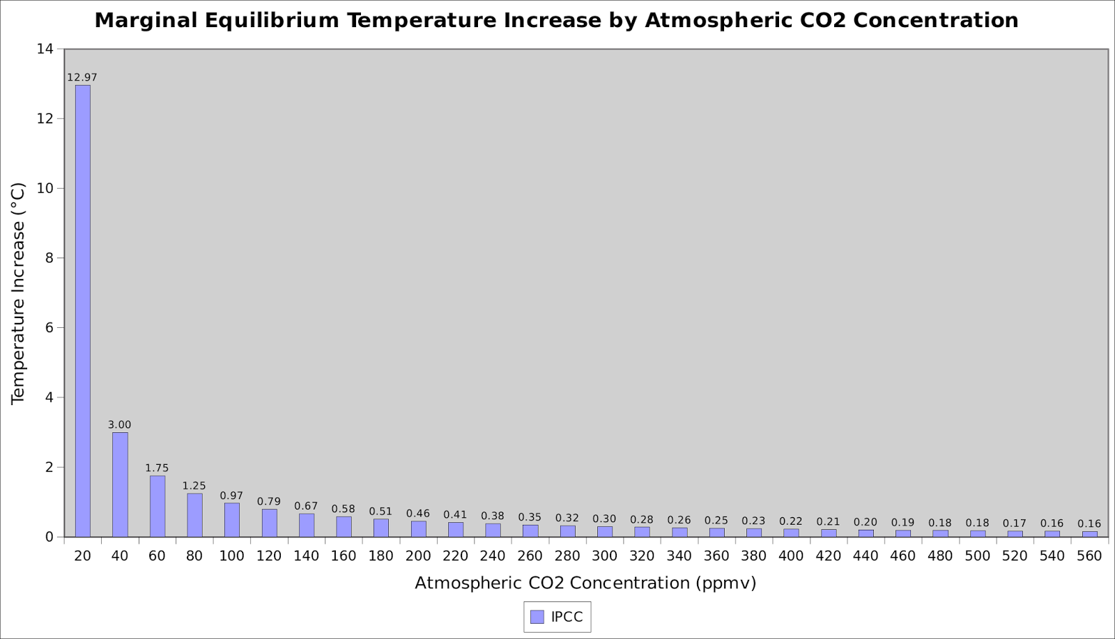
That chart is showing a sensitivity of less than 0.4C per doubling of CO2, which I think is a lot less than anything claimed, so naturally anything you extrapolate from it will be too small.
OK then, here’s a different source.
And here’s another one:
And here is yet another chart from a different source, showing the same thing:
As dcpetterson observes:
I think many of the people here dismiss data they don’t like, rather than consider what it actually means.
That’s what you’re doing, Bellman. I posted the relevant radiative physics charts showing the effect of CO2. But you don’t like it, so you assert otherwise.
Here on the internet’s ‘Best Science’ site, baseless assertions are no more than opinions. I posted verifiable facts. They demonstrate why there are no measurements of AGW, and why we don’t need to worry about any future rise in CO2.
Empirical observations verify that. You can’t accept it, for whatever reason. But unless you can produce replicable, testable, empirical measurements quantifying AGW, all you’re doing is making assertions that are not supported by the real world.
dbstealy:
I may be misunderstanding something, but those two charts are showing completely different things. The first has a temperature scale going up to 1.8 degreees C, whilst the second goes up to 14 degrees C. The second seems to be showing an order of magnitude more warming. It’s showing 3C warming for a doubling of CO2, whilst your first graph only showed 0.4C.
Sorry about the duplicated quote in the above comment, I was trying to copy the images, but was unsuccessful.
Bellman,
I agree completely. My point was simply to underline the inconsistency of people who object to surface temperature data ostensibly on the basis of “adjustments,” but don’t object to the far more frequent adjustments that have been made to the UAH data.
For myself, I consider all the data to be valuable, and I don’t assign any dark motives to any of the data providers. Troposphere data and surface data measure two different things — the troposphere and the surface, respectively. I don’t expect them to react identically, or at the same rate, just as I don’t expect the Arctic and the Sahara to react the same. Both sets of data show long-term upward trends, so they are in general consistent anyway.
In contrast, I think many of the people here dismiss data they don’t like, rather than consider what it actually means.
Yes. And as a consequence, simultaneous plots of UAH6.0 and RSS should be more parallel than before. Unfortunately, this cannot be shown on WFT since it only shows 5.6.
Here’s my attempt at a comparison showing 12 month rolling averages:
I should have mentioned that all the anomalies in that graph are based on the period 1981 – 2010.
It looks good to me! RSS and UAH6.0 are now very close.
Werner Brozek February 12, 2016 at 6:44 am
It looks good to me! RSS and UAH6.0 are now very close.
Which is a problem because they aren’t the same product any more as shown at:
Phil. February 11, 2016 at 3:17 pm
Thank you! However I am not in a position to comment on the difference it would make to the long term trend. I know it is colder higher up, but would the slope necessarily change over the last 37 years for either trend?
Werner Brozek February 13, 2016 at 7:05 am
“Which is a problem because they aren’t the same product any more as shown at:”
Thank you! However I am not in a position to comment on the difference it would make to the long term trend. I know it is colder higher up, but would the slope necessarily change over the last 37 years for either trend?
Not only is it colder higher up but it is cooling, so yes the slope will change.
The current method is said to be:
LT = 1.538*MT -0.548*TP +0.01*LS
As an illustration using RSS data which is available the new LT product (version 6) is close to RSS TTT which is calculated in a similar manner:
TTT=1.1*TMT – 0.1*TLS
TTT has a trend of 0.115, vs TMT trend of 0.081, TLS trend of -0.260 and TLT trend of 0.124 K/decade.
So it would be expected that the change in altitude weighting factors would lead to a reduction in trend from 0.124 to 0.115. Spencer said that the change in trend would be 0.140 to 0.114 some of which would be due to the diurnal correction.
Thank you! So it appears that we just have a strange coincidence that the numbers are now closer.
Werner Brozek February 14, 2016 at 9:00 am
Thank you! So it appears that we just have a strange coincidence that the numbers are now closer.
Not necessarily a coincidence, it depends on how the parameters for calculating LT are chosen, obviously they could be chosen to match RSS.
@Gloateus Maximus
You seem to be assuming a) that there is a linear relationship with no feedbacks, and b) that only the data you like is valid.
I think we can all agree that by ignoring data one doesn’t like, and by imagining relationships without showing the physical processes behind those conjectures, anything at all can be proved or disproved.
To which of my comments are you referring?
That showing that even bogus reconstructed temperature “data” don’t support a high ECS?
If that’s to what you refer, it can be easily shown that present HadCRU, GISS and NOAA reconstructions are tendentious works of science fiction, by comparing them with reconstructions by the same agencies from the 1970s to ’90s.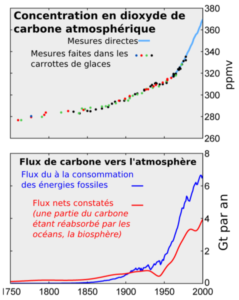
But let’s do the same thing using BEST, an actual reconstruction by Mosher’s own Berkeley/Lawrence Livermore Labs. It shows a gain of less than 1.2 degrees C from AD 1850 to 2015 for combined land and sea GASTA. It’s bogus like all the other so-called “data sets”, but let’s go with it, for purposes of discussion.
http://berkeleyearth.org/land-and-ocean-data/
The gain from 1850 to about 1945 is around 0.5 degrees C. During that time, much of the CO2 gain was from naturally warming oceans, with relatively little added by human activity. CO2 climbed from about 285 ppm to an estimated 310 ppm or less during those 95 years. So, about 25 ppm, or 0.02 degree per ppm. Again, this CO2 gain would largely be from natural warming, ie an effect, not a cause.
But in the next 70 years, ie 1946 to 2015, CO2 increased about 90 ppm, presumably due more to human activity than continued natural warming during recovery from the LIA. Using BEST’s bogus “data”, that means 0.7 degrees C during a monotonous increase in CO2 of 90 ppm, or .0078 degree per ppm. That implies that should CO2 reach double its AD 1850 level, ie 570 ppm, late in this century, we should expect a further warming of 1.3 degrees C (170 ppm x .0078 deg/ppm). Added to BEST’s bogus 1.2 degrees since AD 1850, that’s a total of only 2.5 degrees C warmer than at the end of the chilly LIA. That’s a good thing!
But in actuality, any such warming is almost sure to be much lower than this, since the planet is due for another cool period, as during the 32 years after WWII, despite rapidly rising CO2. And of course CO2 hasn’t been the main warming forcing since then anyway, as I’ve assumed in this example, for illustrative purposes.
Net feedbacks to more plant food in the air, such as water vapor, are almost sure to be negative not positive.
The GCMs show a linear relationship between CO2 and warming, so why shouldn’t I make that assumption?
There are far too many unsupported assertions in your post for me to respond to them. As one example, you seem to assume we are “recovering” from the LIA, as if this a “recovery” is not already complete, and as if it was a global (rather than regional) effect. Nor have you furnished any mechanism for this imagined continuing “recovery.”
You also seem to assume that response to increased greenhouse gasses is instantaneous, that there is no lag between production of these gasses and the maximum degree of their effect.
You say “the planet is due for another cool period, as during the 32 years after WWII,” offering again no mechanism for this imagined effect.
That’s just the most obvious difficulties. Meanwhile, you’ve changed the topic away from Monckton’s cherry picking.
DC,
Of course we are recovering from the LIA. That’s not an assertion but an observable fact. The warming from the end of the LIA c. AD 1850 to c. 1945 could not have been mainly driven by the small increase in CO2 during that interval, hence was indubitably natural in origin.
The recovery actually began during it, in the early 18th century, but was partially reversed by the cooling of the Dalton Minimum.
Each trend reversal is a recovery. Thus, the Medieval Warm Period was a natural recovery from the Dark Ages Cold Period and the LIA was a recovery from the MWP.
And NB that despite lacking rapidly rising CO2 levels, the late 19th century and early 20th century warmings were virtually indistinguishable from the late 20th century warming, except possibly for the super El Nino of 1997-8.
For that matter, the early 18th century warming, recovering from the depths of the Maunder Minimum, was of greater amplitude and lasted longer than the the late 20th century warming.
Besides which, during the first 32 postwar years under rapidly rising CO2 levels, earth cooled dramatically, such that in the 1970s, scientists worried about the impending next big ice age.
dcp says:
There are far too many unsupported assertions in your post for me to respond to them.
Then: Qui tacet consentire videtur. Silence = consent.
Next:
…you seem to assume we are “recovering” from the LIA, as if this a “recovery” is not already complete, and as if it was a global (rather than regional) effect.
There is a mountain of evidence showing that both the MWP and the LIA were global events. And who are you to tell folks that the planet’s recovery from the LIA is now complete? How would you know that? You’re claiming that you have the ability to predict the future. Is that what you want readers to believe?
Next, you say:
You also seem to assume that response to increased greenhouse gasses is instantaneous, that there is no lag between production of these gasses and the maximum degree of their effect.
The *only* observed lag is the fact that changes in CO2 lag changes in temperature. In other words, changes in temperature cause subsequent changes in CO2. This is really basic.
Finally, you keep asserting ‘Monckton’s cherry picking’, which shows that you still don’t get it.
dbstealey,
Still no theories about mechanisms to support your assertions. That’s okay, I know there aren’t any.
Yeah. You’re right.
Jim, Phil, me, Bellman, Nick, we’ve all explained how Monckton’s cherry picking works, and several times too, Yet some continue somehow to deny the obvious. You’re right — I don’t get it.
Anyway, thanks for the conversation. We’re going in nonproductive circles. See ya another day.
I see that dcpetterson has gone off in huff apparently as a goodbye, with:
“Jim, Phil, me, Bellman, Nick, we’ve all explained how Monckton’s cherry picking works, and several times too, Yet some continue somehow to deny the obvious. You’re right — I don’t get it… … see ya another day”
******Precious! Almost worth framing!******
I don’t think that all of those five commenters have denied that if you download the RSS data and do an OLS linear trend running back from end January 2016 for 18 years and 8 months, that the result is a zero slope. FACT!
They have a mixture of other obfuscations and some argue that shorter term trends can be found within that period that invalidate the 18,8-year trend. This is despite that some of them admit that such shorter trends have no statistical significance.
Yet, the very purpose of OLS linear trending is to iron out all those ups and downs throughout a time series (putting aside that the underlying trend might better be curvilinear as agreed by Jim).
Strangely, they seem to overlook that Chris Monckton confirms his start point of longest zero trend as being from the most recent month of available data and that next month (end February) ‘The Pause’ (zero trend) will probably end. Yet, they still accuse him of cherry picking the start and end points.
Another complaint is that the alleged cherry-pick deliberately takes in the 1998 El Nino, but they have not responded to advice given four times that the RSS average of the roughly four years that cover the full ENSO event (including La Nina) is below the average of the full 18,8 years! (The El Nino peak should not be separated from the full ENSO event).
I need an emoticon with head slowly shaking like the Centurions in the movie ‘Life of Brian’ (Jewish rebels fighting each other).
bobfj:
I haven’t denied it. That’s precisely the point we’ve been making (though I don’t understand why you insist on the trend running backwards).
If you run a trend from June 1997 to now you get a negative slope. The question is, why are you running a trend from that specific month? The answer is that the month has been chosen as the endpoint of the trend precisely because it is the earliest date that gives you a negative slope – and hence it has been cherry picked.
The trouble is the 18 years 8 months trend has no statistical significance. The confidence interval for the Great Pause is around plus or minus 1.6C. Statistically it is indistinguishable from the trend leading up to the pause or the trend over the entire RSS history.
Yet Monckton instists on starting a new trend line half way through the series. You don’t consider that the Pause might be one of those ups and downs that needs ironing out?
I would say that having an entire 18 year pause disappear just because of one extra month of data demonstrates just how meaningless is Moncktons definition.
Which illustrates just how warm this pause has been.
However even if the pause does disappear, the new slope in February may only be 0.0001/year from December 1997. That certainly would not be anything to be concerned about.
The period of statistically significant warming may be more appropriate then.
Werner Brozek:
That’s one of the points I’ve been trying to make. It’s meaningless to argue about the difference between a negative slope of a few hundredths of a degree per century and a rise of a few hundreds of a degree per century. Monckton’s definition of a pause is statistically meaningless.
Of course, you are probably right – when the pause disappears the argument will probably change to “there’s been no statistically significant warming in x years”, whilst ignoring the fact that there’s been no statistically significant pause over any time period.
I see your point. As for Monckton’s definition, most scientists will have some understanding of what “statistically significant” means, however most other people’s eyes just may glaze over when you mention “statistically significant”. So regardless what you may think of his definition, people understand “no warming” much better than “no statistically significant warming”.
Bellman,
Thanks for providing continuing entertainment, although I doubt if there are many readers still around to share the laughs now that this thread heads towards the bottom of the main page.
Just a quick one though: Christopher Monckton has been running an update series of articles on The Pause, as and when new monthly data progressively becomes available. He has pledged to continue the series and concedes that February data “might at least shorten if not extinguish the Pause”. Thus, with each new article the starting datum is changed for the latest available full month of data.
I’m truly puzzled as to why you think that the concisely restrained start datum is cherry-picked. It caused me to look-up ‘cherry-pick’ in the MS Encarta online dictionary:
2. select only what you like; to sift through, e.g., evidence or options, selecting only what you like or what supports your strategy, plans, or preconceived notions
Any chance you could clarify your semantics?
Oh, and given the latest available data is the start datum, why do you profess difficulty that the no-warming trend runs backwards from that datum?
Oh and……………oh forget it
bobfj:
Thanks, good to know my work is appreciated.
I could try, but if you cannot see why Monckton saying is the same as sifting through evidence, selecting only what supports your strategy, then I suspect anything I say is not going to help you. It’s either obvious to you or it’s not.
Let’s start by seeing if we agree how the pause is calculated by Monckton. I say it works like this:
Step 1: Start by setting a candidate month to the first month of the RSS data set (January 1979).
Step 2: Calculate the linear trend from the candidate month to the final month in the data (currently January 2016).
Step 3: See the direction of the slope calculated in step 2. If it is negative, stop. The candidate month is the start of the longest pause. If the slope is positive, move the candidate forward one month and go back to set 2.
(You could also do it starting with the most recent month as the candidate and working backwards, But in order to find the longest pause you won’t be able to complete the checking until you reach the start of the data set, so it will take longer to calculate.)
Assuming you accept that definition, what is the consequence of any pause you find?
Firstly, if this method can find a pause, it will find a pause. What this means in practice is that the date you state as the start of the pause will be date that has a negative trend. This is cherry picking because you’ve selected the start date specifically because it resulted in a negative trend. If you had chosen a start date at random you would have probably found a positive trend.
Secondly, the length of the said pause will be the longest possible such length. This is a cherry pick as you are using the length of the pause as the headline and so want it to be as long as possible.
Bellman:
You really are the joke that keeps on giving!
This laugh was one of your best
Copying nonsense from SkS is your idea of “work”! Brilliant! I am still laughing now.
Richard
Richard,
I once had dealings with a Christadelphian family in South Australia. It included an extreme group who moved to the Adelaide Hills to escape the destruction that was to come to the evil city below on 1/January/2000.
Even the moderate ones (doing quite well amongst the heathen) had some rock solid opinions in the Old Testament. For instance, that the Earth is only about 6000 YO. I would point them to plastically folded rock visible in road cuttings, but they countered no, these are recent designs of God. Also, that the Grand Canyon was eroded in an alleged 40 day flood. I suggested that was a tad unlikely, and why nothing like it near Jerusalem etcetera…..again, no.
The comedy above is rather déjà vu.
Bellman says:
…I don’t understand why you insist on the trend running backwards
Really? All real trends run ‘backward’. Really.
When they run forward they’re called predictions.
dbstealey:
When someone discusses the trend between 1997 and 2015, I assume they mean the trend starting in 1997 and ending in 2015, rather than one starting in 2015 and ending in 1997.
Christopher Monckton seems to agree with my definition of where the trend starts when he says:
And yes, the start-date for the Pause has been inching forward, though just a little more slowly than the end-date, which is why the Pause has continued on average to lengthen.
If little Timmy stopped growing when he was five years old, and now he’s ten, mom and dad would count back and say, “Timmy stopped growing when he was five!”
Same-same.
Well yes, but “stopped growing when he was five” means he started to stop growing at that age. They certainly wouldn’t say his pause in growing started when he was ten.
Bellman,
This is becoming increasingly silly. Either you see things really differently, or you’re being disingenuous. I prefer to think you see it very differently from most people, so let’s just leave it at that. You believe what you want to, and I’ll continue to point out that for the past (whatever number of years), global warming has not been happening. It stopped. Or ‘paused’. Like most folks, I look back to the last time there was any measurable global warming.