From the University of Alabama, Huntsville, and courtesy of the current El Niño here’s something climate advocates will probably like, even though they wrongly say the satellite record is no good.
Notes on data released Feb. 4, 2016:
As widely anticipated, global temperatures in January set a record for the month, eclipsing January 1998 as the warmest January in the satellite temperature dataset, according to Dr. John Christy, director of the Earth System Science Center at The University of Alabama in Huntsville. In a sense, that could mean 2016 is in a “race” to see if it will pass 1998 as the warmest year on record. In addition to a major El Niño Pacific Ocean warming event, 2016 has 17 years of warming to raise the base temperature from which the El Niño begins.

While the global temperature in January was a record setter, in the tropics January 2016 fell significantly (more than 0.25 C) short of the 1998 record. It could mean less energy is available to be transferred from the ocean into the atmosphere. It could mean the heat transfer might peak later this year than in previous El Niño years or might already be near its peak. What we know is that under the best of circumstances the climate system is complex and difficult to forecast. It will be interesting to see how this plays out in the coming months.

Global Temperature Report: January 2016
Global climate trend since Nov. 16, 1978: +0.12 C per decade
January temperatures (preliminary)
Global composite temp.: +0.54 C (about 0.98 degrees Fahrenheit) above 30-year average for January.
Northern Hemisphere: +0.70 C (about 1.25 degrees Fahrenheit) above 30-year average for January.
Southern Hemisphere: +0.39 C (about 0.70 degrees Fahrenheit) above 30-year average for January.
Tropics: +0.85 C (about 1.52 degrees Fahrenheit) above 30-year average for January.
December temperatures (revised):
Global Composite: +0.43 C above 30-year average
Northern Hemisphere: +0.53 C above 30-year average
Southern Hemisphere: +0.37 C above 30-year average
Tropics: +0.61 C above 30-year average
(All temperature anomalies are based on a 30-year average (1981-2010) for the month reported.)
The warmest Januaries in the satellite temperature record are:
Warmest Januaries
How much warmer than seasonal norms
2016 0.54 C
1998 0.49 C
2010 0.48 C
2013 0.43 C
2007 0.41 C
2003 0.31 C
2005 0.27 C
2015 0.27 C
2002 0.21 C
2004 0.18 C
Warmest NH Januaries
2016 0.70 C
2010 0.55 C
2007 0.48 C
2003 0.41 C
1998 0.40 C
2015 0.39 C
2013 0.34 C
2002 0.31 C
2005 0.30 C
1995 0.23 C
Warmest SH Januaries
1998 0.58 C
2013 0.51 C
2010 0.41 C
2016 0.39 C
2007 0.33 C
2004 0.30 C
2005 0.24 C
2003 0.21 C
2006 0.20 C
2014 0.17 C
Warmest Januaries in the tropics
1998 1.13 C
2016 0.85 C
2010 0.60 C
2007 0.55 C
1983 0.51 C
2013 0.42 C
2003 0.42 C
2004 0.32 C
1988 0.32 C
2005 0.29 C
Compared to seasonal norms, the warmest average temperature anomaly on Earth in January was over north central Russia, near the small town of Volochanka. January temperatures there averaged 7.20 C (almost 13 degrees F) warmer than seasonal norms. Compared to seasonal norms, the coolest average temperature on Earth in January was over the northern Pacific Ocean, where the average January 2016 temperature was 2.78 C (just over 5 degrees F) cooler than normal.
The long-term climate trend ticked up over the rounding margin this month, so the global climate trend since December 1978 is now 0.12 C per decade.
In other news, the 6.0beta5 version of the satellite temperature record, which has been available online for public comment for about eight months, is now complete and should soon be submitted for peer review in the scientific literature. The newest version of the dataset provides a more consistent transition between earlier MSU Channel 2 data and the new AMSU Channel 5. The new code causes no change in the long-term global temperature trend.
The complete version 6 beta lower troposphere dataset is still available here:
http://vortex.nsstc.uah.edu/data/msu/v6.0beta/tlt/uahncdc_lt_6.0beta4.txt
Archived color maps of local temperature anomalies are available on-line at:
As part of an ongoing joint project between UAHuntsville, NOAA and NASA, Christy and Dr. Roy Spencer, an ESSC principal scientist, use data gathered by advanced microwave sounding units on NOAA and NASA satellites to get accurate temperature readings for almost all regions of the Earth. This includes remote desert, ocean and rain forest areas where reliable climate data are not otherwise available.
The satellite-based instruments measure the temperature of the atmosphere from the surface up to an altitude of about eight kilometers above sea level. Once the monthly temperature data are collected and processed, they are placed in a “public” computer file for immediate access by atmospheric scientists in the U.S. and abroad.
Neither Christy nor Spencer receives any research support or funding from oil, coal or industrial companies or organizations, or from any private or special interest groups. All of their climate research funding comes from federal and state grants or contracts.
— 30 —
Anthony: Climate advocates don’t say the satellite record is no good, they say it underestimates the long-term warming trend.
…which is good?
What the @ur momisugly!#% is them difference ??
…only becuase the satellite record disagrees with that they think the warming trend should be.
Anything that agrees with them is right, and anything that disagrees with them is wrong, because they *know* what is right. They are the final arbiters of Truth.
“Measurements? We don’t need no steenking measurements!” (apologies to Mel Brooks)
Which in itself is s nonsensical statement for more reasons than one.
When you have three long term independently sourced and independently analyzed data series from the very atmospheric layer that the alarmists have been telling us is the canary in the coalmine, that all three fundamentally contradict the 150+ global climate models based on often poorly sourced, extrapolated and regularly adjusted data, anyone with a background in data analysis or R&D due diligence knows there is an incontrovertible problem.
The prima facia probability in fact is that based on the questionable quality of its sources and the assumptions built into the models, the surface derived conclusions are systemically biased towards overestimating things.
The recent Karl, et.al. attempt to recast data sources to fit the CACG/CACC hypothesis only serves to underscore the biases that has been the norm in the climate establishment for the past three of decades.
Independently verifiable data always trumps assumptions and hypotheses.
tetris,
“When you have three long term independently sourced and independently analyzed data series from the very atmospheric layer that the alarmists have been telling us is the canary in the coalmine, that all three fundamentally contradict the 150+ global climate models based on often poorly sourced, extrapolated and regularly adjusted data, anyone with a background in data analysis or R&D due diligence knows there is an incontrovertible problem.”
Yes.
Indeed – anyone with common sense would tell them they have a 2000 pound gorilla in the room problem.
Auto.
If the bulk atmosphere should contain the largest signal but has the smallest, and the deep ocean should contain the smallest signal but has the largest, what does that tell you about the validity of the underlying hypothesis?
“By denying scientific principles, one may maintain any paradox.”
-Galileo Galilei
A temperature record (satellite or other) is not a future estimate in any sense of the word. It does validate or disprove a past prediction. It is the warmists with their agenda driven tarot cards, making wild predictions in the past, that have been disproved by current satellite data.
Or THEY overestimate the long-term warming trend.
Now we are a the peak – from now on its global cooling!
What are they cooking with up there in Siberia ?? Those are some serious anomaly colors up there.
They better not use that stuff at Vostok Station or else the Antarctic highlands will be a big lake.
g
Let me guess. Reindeer?
Even though there is a spot with a 7 degree anomaly, I can assure you by the temperatures they usually have there, it is a small and beneficial anomaly.
That area coincides with the area that is causing the current Arctic Sea Ice extent to be so low. Surely they are suffering from the -1 C temperatures rather than their usual -8 C temperatures.
true, i have no idea where they come up with this stuff. I dont buy any overall data put together anymore. All of china and most of africa were well below noms the entire month…
“Anthony: Climate advocates don’t say the satellite record is no good, they say it underestimates the long-term warming trend.”
Daniel, there’s a link in the first sentence, follow and read.
Here is the lower troposphere temperature record – the satellite and extended back to 1958 using the weather balloon data-radiosondes – versus the ENSO.
Points to make:
– yeah, the ENSO is a huge controller of the lower troposphere temps;
– sorry, there is very little global warming in this scenario of 57 years (when it is supposed to be increasing at 1.3 times faster that the surface at this level of the atmosphere – the surface records only show you an unreliable record if you want an unreliable record);
– there is a lag of 3 months from the Nino 3.4 to when the lower troposphere is impacted and this operates on a continuous on-going basis every month;
– one can see the volcanoes certainly do get it the way and the straight one-to-one relationship but if you made adjustments for the volcanoes (which is not hard to do, I have done it), the relationship would be very clear; and,
– the temp anomalies are not going to peak until next month – February, 2016 – global lower troposphere temps will approach 0.7C and the tropics may exceed 1.0C. Then it will drop slowly as the ENSO has dropped slowly since November, 2015.
http://s12.postimg.org/4o3rgglil/RSS_UAH_Had_AT_ENSO_1958_Jan16.png
+1
NASA has produced an accelerated warming trend by manipulating past surface data to the point its weather and climate products are now works of fiction. I would say the truth of the satellite data certainly disagrees with the works of fiction being produced elsewhere in NASA.
Look at the real residuals of the surface temperatures compared to that of the satellite temperatures and get back to us.
Warmest year, warmest month, I’m soon expecting for warmest day, then hour to be declared. Any advances?
Warmist (sic)minute?
Auto – exaspersatedly . . . .
https://youtu.be/sDSud7vAH_0
I like it ! Warmest day since yesterday !
The warmest minute, of the warmest hour, of the wamest day, of the Warmist religion!
How can the world 2016 average come to a higher value than the 1998 average?
There must be some seriously wierd biasing of the data, or is there more than NH, Tropic & SH?
1998 = 0.4 + 0.58 + 1.13 = 2.11
2016 = 0.7 + 0.39 + 0.85 = 1.94
Wouldn’t there only be NH and SH, with the Tropic area portions of both?
That would give
1998 = 0.4 + 0.58 = 1.06
2016 = 0.7 + 0.39 = 1.09
So 2016 would be slightly higher.
But why doesn’t the massive temp in the Tropics show up more in 1998?
I think we are seeing the Heat from the tropics being lost to northern hemisphere and staright to space.
ie. Cooling, hence the very cold Asian areas.
@A C Osborn – This line “1998 = 0.4 + 0.58 = 1.06” is wrong; 0.4 + 0.58 = 0.98.
And there we have it: The difference between 1.06 and 1.09 is 3 hudredths of a degree.
For bragging rights,OK. But for reality, it’s nonsense.
There is nothing unusual or unprecedented happening. The current pattern is the same as the late ’90’s El Niño.
Our planet continues to recover from the Little Ice Age — the [third] coldest episode of the 10,000 year long Holocene that we’re still in. And we had better hope it continues.
When I look at the graphic, Monthly Global . . Anomaly, I see two trend lines; both are flat lines, one is on the left 1/2, and it is below normal, and the other is on the right 1/2, and it is above normal.
The satellite record is acknowledged when it conforms to orthodoxy. Otherwise it’s back to the UHI and box o proxies.
Relatives of the 58 Taiwanese who perished in freezing conditions on 28 January and the Mites50 year record snowfall might wonder about some of these statements.
My friends in South America and South Africa have not commented on abnormal weather in their parts of the world..
Mid December to mid January in South Africa was unbelievably hot. Many towns set all time highs in records going back over 100 years, including Johannesburg, with hit 38 deg C, and Pretoria, which exceeded its previous record by a massive 1.7 degrees, at 42.7.
There was also a once-in-a generation drought across the summer rainfall area, which meant that barely 50 per cent of the usual maize plantings were able to take place. As a result South Africa will have to import several million tonnes of maize (corn to you US guys), putting its transport infrastructure under great strain.
Meanwhile in the SW of Australia, weather was much cooler than normal. Doona weather, with rain
YAY!
I hate cold winters so I’m a strong supporter of global warming. Sahel greening… warmer winters… some Viking farms on Greenland emerging from permafrost… how anyone can see this as anything but good news is beyond my ken.
.
.
.
(Memo to self: need to buy M4GW t-shirt. Check to see if Elmer is peddling them. If not, order custom H.R.4GW t-shirt.)
If the surface temps are higher than the lower troposphere, then wouldn’t the GW signal mostly be the result of UHIs and land use and not so much GHGs?
We’re still nowhere close to the ‘Climactic Optimum’, but I remain hopeful we will get there eventually.
https://en.wikipedia.org/wiki/Holocene_climatic_optimum
The last couple of years remind me of 2009 and 2010 when the warmists were crowing that The Pause was over. By the end of 2017 The Pause will likely exceed 20 years.
If you believe the MET office predictions, temps will be flat to down for the next 5 years, extending the pause to 24 years or more.
Nonsense. The MET predicted warmer temps over the next five years. Go read what they said, not what some blogger wishes they said…
The Met’s record isn’t very good, so if they’re predicting cooling I’m worried.
I used to love going up a mountain – because the only way was down. But then the vile ecos destroyed the environment by polluting it with windmills. Now all one sees from the top of the evil is the stupidity of our leaders. Still that doesn’t stop the only way being down!
Good post.
Lower tropospheric temperature and surface temperature are different things. It is clear to anybody looking at the data that very strong El Niño produce more atmospheric warming that surface warming. This is due to the nature of El Niño, that transfers directly heat from the Pacific surface to the atmosphere. La Niña appears to have the opposite effect and strong La Niña years appear to show more atmospheric cooling than surface cooling. These differences are important and should be taken into account because we are comparing different things.
Sample validation is a solid engineering practice.
There is only ONE pristine surface data set in the world.
Here is the comparison of that surface data set against the regional satellite data.
http://s19.postimg.org/uuy2ft3jn/Combined_USA_temperatures.png
Given that these sets are so close, but the surface data appears to be “peakier” in both directions, I see no reason at all to doubt the global satellite data.
And PLENTY of reasons to doubt the sparse, irregular, much fabricated GISS and HadCrud.
It’s HadCRUFT actually 😉
The main problem with GISS LOTI and HadCRUFT is that you cannot meaningfully “average” land and sea data. They are vastly different media. Radiosonde and satellites are measuring one consistent medium on a global scale.
+10
Brilliant. Thank you.
Looking a the map, where people live,on land, it appears to have cooled or not warmed.
Since the “warm” parts appear to be in the Arctic, we should look at the position of the AMO.
The “30 year ” period on which the “mean” is based is shaded blue.
http://s19.postimg.org/7c5hbcs6r/amomean.jpg
Look where the AMO is heading.
fascinating. There’s no long term trend in the AMO. It looks like it is zero.
what’s the source?
Come on Peter, AMO is a DETRENDED north Atlantic SST. Hence by definition there is no trend.
That is nonsense anyway since it implicitly assumes that there is an independant “trend” to be subtracted. ie you start with the assumption that there is a long AGW trend and the rest is net zero “internal oscillation”. They impose their preconceived ideas on the data before they start.
Peter, I can’t find the original source of that particular AMO graph.. but there are plenty similar . search for Atlantic Multidecadal Oscillation images.
Mike, while there may have been a trend in AMO as we climbed out of the LIA, matching with Reykjavik temperatures show that very little trend removal.
http://s19.postimg.org/5vfcwbc8j/amoreyk.jpg
If you look at the pre 1910 temps from 8 Iceland temps you can see that they are below the pre-1910 AMO pattern …but after that, it is almost a perfect match. Maybe there is just no real trend anymore (just like the satellite data shows)
http://s19.postimg.org/45zuayng3/iceland.jpg
Its also very obvious why the alarmista ALWAYS like to start the Arctic sea ice graphs in 1979.
The match is again quite uncanny. Here I have taken the November NH sea ice levels, inverted and put against the AMO.
http://s19.postimg.org/4crolmgmr/amo_vs_NHice.jpg
As we know, Arctic sea ice levels have leveled off the last few years.. exactly as the AMO would predict, and if you look at the first AMO graph you will see a blue dot. top right, which represents ‘now’.
That dot is a bit more than 1sd from the mean of the shaded blue area…just like the current level of Arctic sea ice is.
In other words, there is absolutely NOTHING unusual about the current level of Arctic sea ice. Its almost exactly where it “should ” be.
AndyG55,
You can get the AMO data from here. The link at the bottom under “Method” gives you the SST averages, unsmoothed & not detrended. If you deseasonalise rather than detrend these you’ll get the following, which is far closer to reality:
http://s23.postimg.org/800bfnr95/Amo_Deseasoned.png
Come on Peter, AMO is a DETRENDED north Atlantic SST. Hence by definition there is no trend.
Actually I had no idea it was detrended. Source?
And no need to be sarcastic.
Peter
Check out Hadcrut4 versus the Raw Undetrended AMO figures. They are almost exactly the same. (this chart is about a year old now).
http://s8.postimg.org/7vabnd979/Hadcrut4_vs_Raw_AMO_Feb14.png
The Atlantic Multidecadal Oscillation (AMO)
The Atlantic Multi-Decadal Oscillation (AMO) is a fluctuation in de-trended sea surface temperatures in the North Atlantic Ocean. It was identified in 2000 and the AMO index was defined in 2001 as the 10-year running mean of the detrended Atlantic SST anomalies north of the equator. There is a significant negative correlation with US continental rainfall with less rain during a positive AMO index. (H.A. Dijkstra, “On the physics of the Atlantic Multidecadal Oscillation”, Institue for Marine and Atmospheric Research, Netherlands, 2005) [http://www.knmi.nl/publications/fulltexts/drsg2006.pdf]
http://appinsys.com/globalwarming/amo.htm
When I did my analysis of global temperatures, the nearest I got to significant trend was over a period of around 60 years. At least within the data I was checking, this is the only “abnormal” effect (the trend varies more than would be expected given the variability of the rest of the data.
That graph is the clearest indication yet, that the one “abnormal” effect on climate is indeed part of natural trends.
Global climate trend since Nov. 16, 1978: +0.12 C per decade
Which means in about 1,000 years Canada will be about 10 C warmer. SO have a way to go yet, wouldn’t throw out those winter coats yet.
Of course at the current rate of technology advancement, in a thousand years we’ll be controlling the weather by democratic vote and genetically engineering humans that can live under the sea. The winter coats may be a moot point by then.
“1,000 years Canada will be about 10 C warmer”
And that warming would be in winter….. like it is now.
do any Canadians really have a problem with that?
Lol. Can’t speak for Canadians, but as a survivor in upstate NY, no, I’m not complaining.
“Of course at the current rate of technology advancement, in a thousand years we’ll be controlling the weather by democratic vote and genetically engineering humans that can live under the sea.”
Nah. we will all be distributed consciousnesses in a quantum computer simulation of reality.
Oh hang on, according to latest particle physics, we already are…
What should we expect merely from tiny variations in solar output. Not much in 11 years or even 22 years, but 100 years or 200 years?
In my opinion, solar output is a neglected factor in climate studies and sunspots are only one dataset. Several other lines of evidence implicate solar variations as drivers of climate change.
https://geoscienceenvironment.wordpress.com/2015/11/01/the-gleissberg-cycle-part-2/
Buying some property in Canada for my kids, I am still freezing my butt of in Alabama…….
Thanks, Dr. Christy.
I think it is possible that El Niño peaked in November 2015, this is what I read in the MEI index, at http://www.esrl.noaa.gov/psd/enso/mei/
In that case, then it is possible that the global temperature has peaked on January 2016.
But if El Niño does not subside we might see a February 2016 warmer than January 2016.
I have prepared a 247KB .gif version of 012016globalmap.png (737KB) that I will publish in 8 pages at Observatorio ARVAL.
This I will do as soon as http://nsstc.uah.edu/climate/ is updated.
this how i see the situation as well andres . the good thing is we will find out very soon.
2016 0.54 C
1998 0.49 C
2010 0.48 C
2013 0.43 C
That looks like a statistical 4 way tie to me. Possibly 5 or 6 way.
The metrologist in me (sic, that is not meteorology, it’s the science and art of making and reporting measurements) says that Jan 2016 is tied for the highest recorded temperature in the satellite record.
Peter
And as a reminder to newer readers, the satellite record is very new.
For further information, ask Dr. Google about:
Medieval Warming Period
Roman Warming Period
Minoan Warming Period
Holocene Optimum
For extra credit, formulate your own search phrases that will compare the above with the last Glacial Maximum.
For extra extra credit, expand your searches to include the Eemian.
Both satellite data sets show a record high January, even above 1998. And in 1998, the final average was very close to the January anomaly. Will it happen this year? I do not know, but with similar ENSO numbers for 1997 and 2015 since May of each year, it certainly cannot be ruled out.
RSS came in at 0.663, a new January record. Its pause is still 18 years and 8 months, however it will disappear in February if February is 0.88 or higher. Should February not be above 0.88, then it will disappear in March based on Nick’s work here:
http://moyhu.blogspot.com.au/2016/01/the-fleeting-pause.html
(If the January anomaly exceeds about 1.3°C, the Pause is gone. This is unlikely.
If the Jan and Feb anomalies exceed on average about 0.77°C, the curve will be above the axis. For reference, the Dec anomaly was 0.543°C. I think this is quite likely.
If the first three months exceed 0.59°C on average, that would suffice to extinguish the pause. That is barely above the December value, and I think very likely indeed.
If Jan-April exceed 0.5°C, that will also suffice.)
The UAH pause is too close to call before the complete beta5 version is out. The pause is either gone, or it will hang on by the skin of its teeth from December 1997. However barring a huge volcanic eruption near the equator very shortly, the UAH pause will be gone when the February numbers come out.
It’s not gone… just hiding waiting for La Nina.
To be a truly impressive nino, a boy child needs to exceed not only in mathematics, which might be thought of as the 3.4 region, but also philosophy and logic, which could be thought of as the other two nino “regions”.
The reality is that the nino “regions” are themselves crude approximations based on ad hoc judgements. The three official “regions” all ignore the SOI, the first ad hoc judgement and hypothesis, which to this day correlates better with SW American rainfall than any of the official “regions” except the 1+2.
In my opinion we need a NOI, a northern index from Hawaii to Vietnam or wherever, just to be consistent.
Interestingly, if you grab RSS for January, (now available)
http://data.remss.com/msu/monthly_time_series/RSS_Monthly_MSU_AMSU_Channel_TLT_Anomalies_Land_and_Ocean_v03_3.txt
USA is actually negative. But the rest of the NH was rather warm (relative to “average”)
and 60-82.5N had an almost pleasant winter !! 🙂
Werner, didn’t you get the memo? The “pause” never happened, so it can’t end.
Some sources are more believable than others. Perhaps the pause will be hiding in the deep ocean.
An anomaly of 0.57 for the next 2 months in RSS will see that Pause gone by March – so it can even be cooler than January and the Pause will still disappear.
I suspect it will soon be re-chistened – perhaps as the Slowdown ???
And once the El Nino is over and the temperatures start to drop, the “pause” will re-establish and lengthen considerably. Could even reach out to the whole of the satellite record. 🙂
“the warmest average temperature anomaly on Earth in January was over north central Russia, near the small town of Volochanka. January temperatures there averaged 7.20 C (almost 13 degrees F) warmer than seasonal norms.”
Here’s a funding-proposal some joker should submit to the NSF, just to get its bias on the record when it rejects it. Ask for money to investigate how much the seasonal norm in Siberia was distorted by under-reporting of temperatures under the XSSR. And further to calculate how much a correction for that under-reporting would reduce the amount and trend of global warming.
Don’t be too concerned about that Siberian anomaly – when you look at absolute temp vs. the scary looking red blotch, it’s still pretty darn cold, and I’m sure they’re grateful for a little break.
” In addition to a major El Niño Pacific Ocean warming event, 2016 has 17 years of warming to raise the base temperature from which the El Niño begins.”
17 years of warming during the ‘pause’? That sounds awfully warmist of Dr. Christy.
The “planet” has continued to warm, however statistically insignificantly during the crawl, just not very much. The increment of “the warmest year ever” is equally small.
“17 years of warming during the ‘pause’? That sounds awfully warmist of Dr. Christy …”.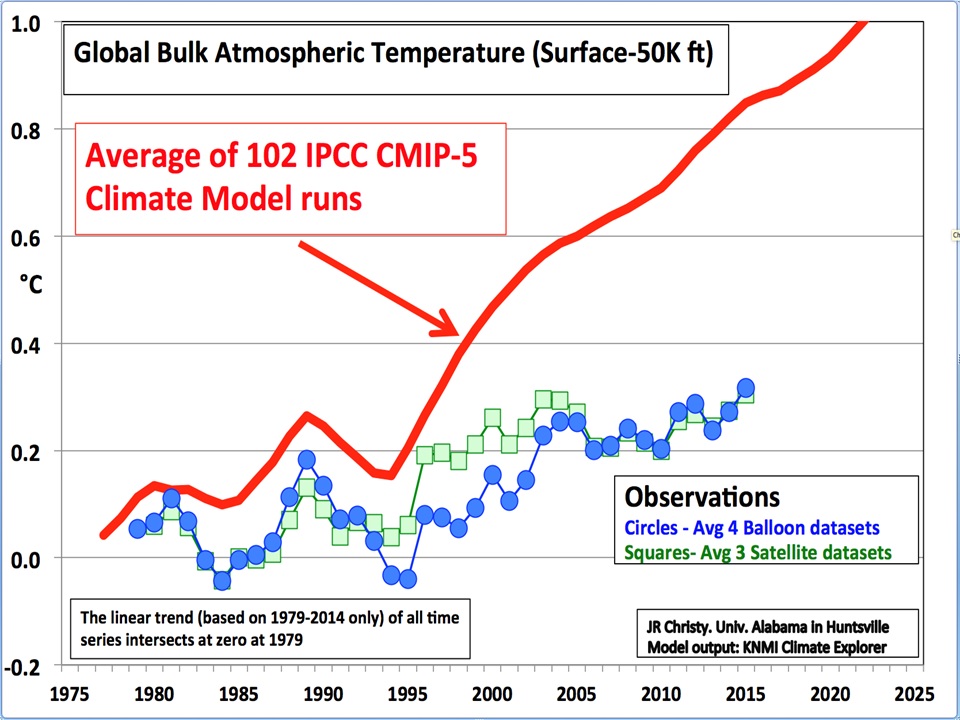
==========================================
Pause or no pause is a very silly, very childish, red herring in the great climate change™ kerfuffle.
Any material anthropogenic warming signal should be well and truly apparent in the data for the bulk of the atmosphere by now and it simply isn’t happening.
That’s good news, isn’t it?
I would love to see a lot more warming, global temperatures somewhere near the Holocene Optimum seems more.. “optimal” to me.
The graph’s circles and squares don’t show the 1998 spike. Kind of curious about that.
I believe they are based on a 5 year average so since 1998 was surrounded by La Ninas, 1998 would not stand out.