Guest essay by C.R. Dickson
Most people have no trouble relating to temperature, because they use it every day when they set the thermostat in their homes, adjust the temperature dial on an oven, or watch a weather report on TV. On the other hand, practically no one recognizes a temperature anomaly, the yardstick for measuring man-made global warming. That’s because outside of climate studies, no one uses it.
A temperature anomaly is the difference obtained by subtracting an average temperature from real temperature data. Climate studies work with anomalies instead of real temperatures because anomalies are assumed to be more accurate over large geographical areas (see note 1). The rapidly rising graphs of temperature anomalies also conveniently dramatize catastrophic global warming.
So it’s easy to see why a few journalists made a big fuss over a very flat looking graph of average global temperatures posted in a tweet from the National Review. The graph in Figure 1 below (see notes 2 and 3) is like the one displayed in the tweet.

This graph supposedly hides global warming because the small increases in temperatures aren’t obvious. An online article in The Huffington Post stated it was an improper visualization that makes “just about anything seem stagnant,” and The Fix at The Washington Post complained that “it is misleading” because it “hides the actual change in temperatures.” Also online, Business Insider said the graph zooms “out so much that it makes it seem like global average temperatures haven’t changed at all.”
Of course, the journalists decided the temperature graph was up to no good, and they countered with their own graphs of the national debt and the Dow Jones Industrial Averages. It was graph vs. graph on the way to the world’s end.
With a bit of an effort, it’s easy to discover that the temperature changes are identical for both global temperature anomalies and for global temperatures (see note 4). The difference is that the graph of the anomalies is a magnified view, not a normal one.
Magnification doesn’t change the object you are viewing; it just lets you see more details. A blood cell or a microbe doesn’t get any bigger when it’s magnified; it only looks larger.
For example, the normal view of a piece of glass shown in Figure 2 appears to be very smooth. As can be seen in Figure 3, the magnified view has numerous peaks and valleys making the surface look rough, not smooth. Although the imperfections seem larger in the magnified view, they are the same size as in the normal view.

The same thing happens with reconstructed temperatures and temperature anomalies. When you magnify the average global temperatures in Figure 4, the unseen changes become visible, as Figure 5 clearly shows.

Fortunately, people normally do not use a magnified version of the world to proceed with their daily lives. That’s why no one drives down a highway guided by a microscope magnifying the road’s surface. For the same reason, weather forecasters use the real temperatures instead of magnified temperature anomalies.
Because it’s so difficult to observe man-made global warming, some experts at NASA GISS believe the accuracy of climate models requires a one hundredfold increase in order to see the small amount of warming.
“A doubling in atmospheric carbon dioxide (CO2), predicted to take place in the next 50 to 100 years, is expected to change the radiation balance at the surface by only about 2 percent. If a 2 percent change is that important, then a climate model to be useful must be accurate to something like 0.25%. Thus today’s models must be improved by about a hundredfold in accuracy, a very challenging task.”
A paper by Graeme Stephens et al. in Nature Geoscience also shows how hard it is to find global warming. They reported the uncertainty in the earth’s warming imbalance as 0.6 watts per m2 ± 17 watts per m2. The enormously large uncertainty in this very small number means that it is difficult, if not impossible, to observe. Just like NASA said it was!

But how small is this imbalance? It’s only 0.06 percent of the 1,000 watts per m2 of sunlight falling on the earth’s surface at noon. Another interesting comparison is that 0.6 watts per m2 is like a small AA battery discharging over a few hours (see Figure 5). Consider this: Little batteries that turn on televisions do not power hurricanes.
Small numbers with large error bars, combined with excessive averaging, is a recipe for ambiguous results. The reaction to the temperature graph is a perfect example of how political motivations can twist ambiguities into disagreements. Confusion is created by using temperature as if it were the same as an anomaly, but somehow the temperature graph is misleading while the anomaly graph is not. What is hidden is the fact that both graphs display no real temperature data.
Fortunately, unambiguous data is the cornerstone of scientific research. If independent researchers cannot obtain the same answer, then there is something wrong with the data, the experiment, or both. Speculations, theories, and hypotheses come and go in science, but good data lasts forever. That is why catastrophic man-made global warming, like all consensus “science,” will eventually go the way of phlogiston, spontaneous generation, and luminiferous ether.
NOTES:
1. Hansen et al. discusses using anomalies instead of actual temperatures, and there is some limited information on errors. Hansen also complains about talk shows, politics, public perception, and the news media on pages 20-23. Real Climate talks about temperature and anomalies and for additional discussions go here, here, and here.
2. The graph in the tweet showed up in a WUWT comment here. Additional comments led to this site . The graphs in Figures 1, 4, and 5 are in degrees Fahrenheit because that’s what the National Review graph used.
3. The NASA GISS tabulated values were updated in the process of making the above graphs. A large number of historical values were changed without explanation making the tabulated values a moving target.
4. To create temperature anomalies NASA GISS takes real-world temperatures and subtracts a subjective “best estimate for the global mean for 1951-1980,” which is calculated to be 14 degrees Celsius, or 52.7 degrees Fahrenheit. The temperature changes (ΔT) for both graphs are the same because one graph is offset from the other by a constant 52.7 degrees F.
5. The solar irradiance is for AM 1.5 (approximately 48.2 degrees zenith). A value of 3.9 watt hour (14 kilojoules maximum energy) is typical for 1.5 volt AA battery discharging at a 50 mA drain. (0.6 watts / m2) x (6.5 hour) = 3.9 watt hour / m2.
ABOUT:
C. R. Dickson is a retired chemist and physicist with a Ph.D. from Columbia University. He has worked for Polaroid, Allied Chemical, RCA, and the Solarex Thin Film Division, a solar cell company formed as an RCA technology spinoff. He also served as a scientific advisor to the United Nations Industrial Development Organization in Vienna, Austria.
http://www.globalwarming.org/wp-content/uploads/2009/10/lindzen-talk-pdf.pdf
No it doesn’t. It simply shows that natural variability can overcome the forcing of relatively low levels of CO2. Concentrations for much of that period were less than 320 ppm.
Proving variables other than CO2 are driving climate. There has been no significant warming for the past 18+ years as well reinforcing that CO2 is not a primary climate driver.
…so…..400 is still relatively low
So is 800ppm relative to the experimentally determined C3 plant optimum around 1000-1200. Even calcifying phytoplankon coccolithophores are greening despite supposed ‘ocean acidification’, refuting definitively the saturating carbon sinks argument. Not happy days for warmunists.
“It simply shows that natural variability can overcome the forcing of relatively low levels of CO2”.
That is one way to state it. Another is that ‘CO2 doesn’t do diddly squat with respect to the real world temperatures weather and temperatures.’
Of course graphs can confuse, and some are intended to confuse. Language can also confuse … intentionally or not.
John Finn, that graph shows a difference in the “average temperature” today (53.75) and 1940 (54.25 F) as -0.50F!!! CO2 concentrations today are close to 400 ppm.
BUT you disagree that it indicates that climate sensitivity to atmospheric CO2 is near-zero.
Please explain what you mean, because all I can see is that Allan is absolutely correct and you make no sense.
John you are priceless
Why do you get to pick when and where natural variability is the culprit and where CO2 is? You are clue less.
I think the normal view is also a better representation of what a 2 degrees F temperature change feels like.
Humans cannot see temperature changes; they can feel them. How many people could feel a 2 degree temperature change in 10 minutes let alone 120 years, assuming anyone could live that long.
Is it any wonder most people other than “climate scientists” have lost interest in this nonsense?
I can readily tell a 2 F° in my office at work. 73°F (23°C) is okay 75°F and I turn on the fan. Below 65° at home and I pull a fleece long sleeved shirt over my short sleeved shirt.
Likewise. The core-house thermostat at 69° keeps most of the house above 67°.While we do not agree on the absolute, we do agree the 2 degree range can be felt.
Ric, It sounds like you are saying 75 degrees F. is your upper tolerance limit, while 65 degrees F. is your lower limit. This makes me want to ask whether you notice a 2 degree change in the middle of your comfort zone.
When your room is at 65 degrees, a 2 degree increase is an improvement, is it not?
The relevant question in respect to the global warming issue is whether the Earth is nearer a low limit of tolerance or a high limit of tolerance. I believe 2 degrees warmer would be a good thing.
SR
I can usually notice a 2 F° change in my comfort zone if I’ve been inside for a while.
I can’t outside as sun, wind, and humidity have major influences on comfort.
One important point about outside conditions is the influence of small changes in the overall temperature. That 2 F° difference, call it 1 C° warmer than average, leads to noticeable things like:
More rain storms in winter thanks to a northward shift in the rain/snow line that’s very important in New England coastal storms.
More precip in storms (so we may have about the same snowfall overall).
Earlier snowmelt in spring (that 1 C° warmth integrated over the whole season is a major effect).
Likewise. lower heating costs for the season.
Likewise, a longer growing season.
Your claim about noticing a +2 degree F. warming inside your home may be true, but is irrelevant.
Most people try to keep a constant temperature in their home — when a person is used to that constant temperature, a +2 degree F. change is significant.
Also, greenhouse warming would have little effect on temperatures during the day — it would increase nighttime lows.
So, would people notice it was +2 degrees C. warmer at 5am, from global warming over many decades, assuming they were awake?
Wouldn’t most people, in most locations, prefer the coolest part of each day to be slightly warmer than it is currently?
It was about 10 degrees F. yesterday at sunrise in the Detroit metropolitan area where I live.
Perhaps after many decades of global warming from greenhouse gasses, assuming that is possible,it would have been 15 degrees F. at dawn instead of 10 degrees F. at dawn.
Do you think anyone here should panic about that +5 degrees C. warming from 10 to 15 degrees F. … and want to ban fossil fuels … killing the local auto industry?
Or should we be happy if the mornings are not as cold as they used to be, due global warming?
My own answer:
Give me more global warming — I love it !
And my plants want more CO2 in the air – They love it !
The “unmagnified” view becomes telling when it references a smaller area.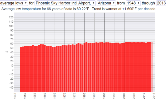
Here is a comparison of annual average low temperature trends for Phoenix Int’l AP and Casa Grande Ruins Nat’l Monument, 42 miles southeast. Once surrounded by farm land, Casa Grande is now being encroached by housing and commercial development. The weather station closed in 2013.
Didn’t someone recently claim airports aren’t affected by UHI?
The difference between the top of the MWP and the bottom of the LIA wasn’t very much in terms of global average temperature. The difference in the condition of people was profound.
I agree with the alarmists that a small change (say perhaps four degrees) in global average temperature could have big effects. The chance of such an increase is very small. History shows us that, even if it did happen, the majority of the effects would be beneficial (but, yes, every silver lining does have a cloud for someone).
If you graph the average global temperature with the whole range from absolute zero the curve will be pretty flat. It will be hard to see the times when Canada was covered by thousands of feet of ice.
…the default setting seems to be a lot colder Bob
The temperature at maximum glaciation is a little less than 3% less than it is now. Doesn’t sound like that much … 🙂
not talking about glacier periods Bob….
CommieBob, reading all the comments I was waiting for someone to make exactly the comment you made. Even the difference between glacials and inter-glacial would be lost to the eye if we were to display temperature graphs with the y-axis ranging between 0 K and 300 K.
Are you aware that the time-integral of a forcing is an energy change?
Are you aware that energy change, divided by effective thermal capacitance, times a scale factor gives temperature change?
Is it clear that if the forcing and temperature go up and down nearly together that the temperature can not be a scale factor times the time integral of the forcing?
If your answer to any of these is no, your engineering science skill sucks. If you answered yes to all of them you have just demonstrated that CO2 has no significant effect on climate and climate change is caused by something else.
Compelling evidence CO2 has no effect on climate is presented in a peer reviewed paper at http://eae.sagepub.com/content/26/5/841.full.pdf+html
The two factors that caused average global temperature change for the last 300 years or so (97% match since before 1900) are identified at http://agwunveiled.blogspot.com
Dr Dickson, a nice presentation of the real magnitude of the doom that awaits us all. As you know, I’m sure, they also converted 0.2C/Century trend in ocean warming to very scary zeta joules of increase in ocean heat content.
If that isn’t enough, they have an automatic algorithm that continuously recalculates historical temp (virtually all downwards prior to about 1945 and upwards since that time to reinforce the trend expected by the models).Mark Stern’s in his recent Senate testimony highlighted this cleverly by querying how can you have any certainty about forecasting what you predict for a hundred years hence when you can’t even forecast what the temperature will have been in 1950!?
Dang! This phone won’t let me print STEYN
I know I’ve said it before, but here goes. Min/max is temp at two moments of a day. It is handy, but it is a handy junk stat. It is what cloud or the absence of cloud permits as much as a record of how “hot” or “cold”. Add in UHI (which nobody would have doubted till it became necessary to doubt just a few years ago) plus all the other limitations and distortions and you really have to wonder why anybody would be interested in a “global” temp. Give me anecdotes and old press extracts any day.
But such are the times. We have people in charge who seem never to have looked up on a cloudy day or night and connected that cloud with a low day time temp or high early morning temp. Or maybe, when they are crunching their numbers and drawing their graphs, they can exclude the actual world, and all its cloud. Very zen…but hardly science.
The author is a physicist, what does he know about climatology? Only a fool would go to an astronomer for a horoscope.
Only a fool would go [anywhere] for a horoscope.
Physics is the glaring deficiency in climate science (particularly the part where air heats water). We need more of them to show up and correct all the mistakes climate scientists make.
Ding Ding Ding Ding We have a winner!
LOL!
I look forward to the follow up post where Dickson suggests the normal way to plot sea level change is as a function of total ocean volume with the Y axis scaled in billions of cubic kilometers.
Um…I don’t get your point Leo Geiger.
Scientists measure volume in 3 dimensional cubic units, such as liters, cubic meters, gallons and ounces. Scientists measure sea level change in linear units-cm, inches, meters etc.
Either one could be plotted on a graph as the Y axis vs time as the X axis and be perfectly acceptable and “normal”
Dickson’s Y axis scaling in both anomalies and temperatures is in linear temperature units vs time as the X axis. Which is perfectly acceptable and normal.
Do you not understand graph norms?
Yes, sea level is linear, that is correct. Volume is not the right metric. But the important part is to correctly assign the zero. We cannot plot changes in sea level – for example changes from the average – without falling foul of the same criticisms that plotting changes in temperature are prey to. The only answer is plotting sea level from the center of the Earth. People normally do not use a magnified version of the world to proceed with their daily lives. They are not concerned with the small changes of a few feet in sea level as the tide changes. Only in the overall distance from the center of the Earth to the surface of the sea. This only changes by a very small percentage as the tide comes in and out, so we don’t need to be conerned with that.
The Zero Line or point cannot always be in the bottom left corner because some data sets aren’t just showing data from one point forward. Also, if you want to plot data that goes both above and below the zero point, you have to move your zero point up. When you do that, you just need to INDICATE that on your graphs because some people don’t know how to read graphs.
Show the ‘normal view’ graph going back a number of centuries – to include the MWP and LIA – then ask if the projections past 2015 will equal, match or exceed any of the earlier peaks.
And the temperature scale should be with the MWP at the top of the graph and LIA at the bottom. Only then do you get a meaningful graph (with no hockey stick shaft, please.)
“For the same reason, weather forecasters use the real temperatures instead of magnified temperature anomalies.”
Actually, they use both
http://w2.weather.gov/climate/l3mto.php?lead=13
At Berkeley Earth we dont use anomalies. We do everything in temperature and then output anomalies
for display and comparison
“. Climate studies work with anomalies instead of real temperatures because anomalies are assumed to be more accurate over large geographical areas (see note 1). ”
NO. GISS and hadcrut use anomalies because their methods require them. Anomalies dont change anything.
as for presentation, of time series data, you are wrong there as well
( http://www.edwardtufte.com/bboard/q-and-a-fetch-msg?msg_id=0001OR)
” In general, statistical graphics should be moderately greater in length
than in height. And, as William Cleveland discovered, for judging slopes
and velocities up and down the hills in time-series, best is an aspect ratio
that yields hill-slopes averaging 45°, over every cycle in the time-series.
Variations in slopes are best detected when the slopes are around 45°,
uphill or downhill. 5 To put this idea informally, aspect ratios should
be such that time-series graphics tend toward a lumpy profile (below left)
rather than a spiky profile (below right) or a flat profile. Both graphs
here show the same data. The aspect ratio for this lumpy graphic is
chosen in accord with the 45° rule.”
William S. Cleveland, Visualizing Data (Summit, New Jersey, 1993), 87-91, 218-227;
William S. Cleveland, The Elements of Graphing Data (Summit, New Jersey, revised
edition, 1994), 66-79.
C.R.-“For the same reason, weather forecasters use the real temperatures instead of magnified temperature anomalies.”
SM-“Actually, they use both http://w2.weather.gov/climate/l3mto.php?lead=13”
Weather and climate are two different things. Using your link, I had to click on “climate” to find forecasts that use anomalies. And on all of them, using anomalies makes the changes look BIGGER even though they are NOT. (which CR Dickson ALSO pointed out…they are the same-but they create different impressions!)
SM-“. Climate studies work with anomalies instead of real temperatures because anomalies are assumed to be more accurate over large geographical areas (see note 1). ”
How does that even make sense? It’s like saying “rather than using all of the temperatures we actually record, we use the ODDBALLS that are outside of those real temperatures averaged, because someone assumed that THOSE ODDBALLS reflect the averages more accurately than the real temperatures do”.
But again, “climate studies” are not “weather forecasts”. CR Dickson appears to know the difference.
“In general, statistical graphics should be moderately greater in length than in height. And, as William Cleveland discovered, for judging slopes and velocities up and down the hills in time-series, best is an aspect ratio that yields hill-slopes averaging 45°, over every cycle in the time-series.Variations in slopes are best detected when the slopes are around 45°, uphill or downhill. 5 To put this idea informally, aspect ratios should be such that time-series graphics tend toward a lumpy profile (below left)rather than a spiky profile (below right) or a flat profile.”
SM-“as for presentation, of time series data, you are wrong there as well”
Do you even understand what you just posted?
“Over every cycle in the time series”. The time series cycle in the original chart that inspired CR Dickson (not created by him) used 20 year spans, and had a total of six cycles on it. NOT HIS PRESENTATION. In order to make a “lumpy” graph with a 45degree angle over the whole graph AND keep all of the six cycles represented by the “anomaly data”, instead of the temperature data originally used on that graph, you’d have to stretch the horizontal aspect of that puppy sideways so far it wouldn’t fit on our computer screens! That is why using ANOMALY data spread out over time, instead of the temperature data over time (as used in the original graph that inspired the article) is SO WRONG. You can’t do it correctly, with the right aspect ratio AND keep the time series the same. (Imagine pulling hard and far enough to make “lumps” from “spikes”) That’s part of CR Dickson’s POINT, so how was “he” wrong there as well?
Weather and climate are two different things. Using your link, I had to click on “climate” to find forecasts that use anomalies. And on all of them, using anomalies makes the changes look BIGGER even though they are NOT. (which CR Dickson ALSO pointed out…they are the same-but they create different impressions!)
###########
The CLAIM was that weather forecasters dont use anomalies.
THEY DO,, when talking about the climate.
SM-“. Climate studies work with anomalies instead of real temperatures because anomalies are assumed to be more accurate over large geographical areas (see note 1). ”
How does that even make sense? It’s like saying “rather than using all of the temperatures we actually record, we use the ODDBALLS that are outside of those real temperatures averaged, because someone assumed that THOSE ODDBALLS reflect the averages more accurately than the real temperatures do”.
Anomaly does NOT MEAN ODD.
Let me explain Anomaly to you.
Suppose you weigh yourself every day for ages 20-40. And your average weight is 200 Lb.
When you turn 41 you start using anomalies.
from 41 to age 50, your weight was 205
in Anomaly this would be +5.. Anomaly from the long average.
You can easily turn anomaly back into weight. ADD 200!!!!
Anomaly doesnt mean ODD, or exceptional.. An Anomaly of ZERO means Average !!
The guy who wrote the post is a dolt
You can easily turn anomaly back into weight. ADD 200!!!!
Did you mean ‘SUBTRACT 5!!!!’ ?
Mosher-
“Anomaly does NOT MEAN ODD.”
It doesn’t? Let’s DEFINE the word ANOMALY for you-
Anomaly- “something that deviates from what is standard, normal, or expected.
synonyms: “oddity, peculiarity, abnormality, irregularity, inconsistency, incongruity, aberration, quirk, rarity”
SM-“. Climate studies work with anomalies instead of real temperatures because anomalies are assumed to be more accurate over large geographical areas (see note 1). ”
NOW-if scientists don’t mean “anomaly” when they use the word “anomaly”, maybe they need to use a DIFFERENT WORD. Using the word anomaly when you mean something else, makes scientists DOLTS by definition.
And I REPEAT- and clarify MORE-
How does that even make sense? It’s LIKE saying “rather than using ONLY the temperatures we actually record over a large area, or an AVERAGE of them, we APPLY THE ODDBALL deviations from the NORM that occur over a large geographical area TO THE entire area, because we ASSUME that THOSE ODDBALLS reflect the average temperatures over that area more accurately than the actual real average of those temperatures do”.
“An Anomaly of ZERO means Average !”
Do you see how irrational this is? If the anomaly is ZERO…there is NO CHANGE, NO deviation! Average means standard, normal, expected. ANOMALY by definition means the OPPOSITE of that!
If you base your zero anomaly (normal value) upon a short snippet of a rather large sine wave, you are GIGO from square one. More observation and less prediction is in order for the present state of climate science.
“Consider this: Little batteries that turn on televisions do not power hurricanes.”
They don’t? That explains it. I thought my remote had broken.
Were you trying to use it to turn the weather channel on?
I’m disappointed that no one has mentioned Edward Tufte, author of books like The Visual Display of Quantitative Information. If you have the opportunity to go to one of his One Day Courses, do so! Expensive ($420), but you get copies of several of his books.
One thing he recommends for graphs like this is to aim for a slope of about 45°. Too low and you get the ridiculous flat graph people are fawning over here, too high and it appears exaggerated, call it the analog SHOUTING in text.
It also helps if the readers have read his books too….
Lotsa of Tufte and words of wisdom from Dilbert. Doesn’t get much better than this.
http://www.jmp.com/about/events/summit2010/protected/elements_graphing_figard_ppr.pdf
h/t to Steve Mosher for the Tufte reference to 45° while I was reading comments.
http://wattsupwiththat.com/2016/01/11/graph-vs-graph-political-journalism/comment-page-1/#comment-2117899
no problem.
everytime I see people try to attack the anomaly charts I think… have they read Tufte
I think “They need to read Tufte.” 🙂
I totally agree. You don’t even need to buy the books. A bit of googleing around will get one a pretty good taste of Tufte’s wisdom.
If you want to show that the earth’s average temperature is remarkably constant you would go for the flat graph. Other than that, I agree, such a graph is kind of useless. For instance, if I wanted to describe ice ages and interglacials I would make the vertical axis cover about ten degrees C. If I wanted to describe the annual temperature range in Saskatchewan I would make the vertical axis about 100 degrees C. (180 deg. F).
That’s the point. The earth’s average temperature IS remarkably constant. Attempting to show otherwise, one has create graphs that make it APPEAR like earth’s recent temperatures are not ALSO remarkably constant by using “anomalies” and pretending they reflect temperatures accurately.
When scientists (or their fawning fans) are FORCED to compare earth apples to earth apples-instead of comparing WORMS in apples, to apples-it makes them go batcrap crazy and make statements like “that ridiculous flat graph people are fawning over”.
At the bottom of a tight mountain valley in Afghanistan I am lead into a cave by a US Army Ranger/CIA operative. As we enter I hear talking in the direction we are walking. It grows louder. He stops and turns to me. “Keep quiet! This will be Good! Just listen and watch.” We proceed into the cell. This is More Than Good! This is Fantastic!.
[???? .mod]
…WTF ???
I shall remember this comment the next time I decide if I should type “plot” or “graph” to describe an image.
just wow, ROFL
“Plot” ??????? Wow. Put that one in “the file” Marcus!
Perhaps the opening of a new Zork adventure.
I personally think we need to worry much more about population growth than climate change, but fortunately population is leveling off, too:.png)
This is an example of an incredibly misleading graph, in fact, I’ll call it wrong. The horizontal scale at first glance is linear, but when you read the axis, you see the intent is logarithmic. However the rightmost quarter is wrong. The leftmost quarter covers 9000 years, then next 900, then 90. So the rightmost should cover 9 years, but it covers 10! there should be an infinite number of sections that follow, for 0.9 years, 0.09, 0.009, ad infinitum. That sure would show the population leveling off!
To show the rate of change of the population, the better graphs would have a linear timescale on the X-axis, then the slope of the log(population) would reflect the rate, e.g. 10% growth per decade.
For something like what we really have, you really need two graphs, with a dividing line between the development of reliable food supplies and antibiotics. There would be a low rate of growth in the first graph and a much higher rate later.
Good grief, there are no good plots. This is the best I’ve come across so far:
https://en.wikipedia.org/wiki/File:World_population_%28UN%29.svg
When someone has an agenda they don’t care about truth or accuracy. I’m betting the “overpopulation” meme will be pushed to the fore when the climate scare collapses. They won’t be able to claim the atmosphere or the oceans are at risk due to mankind for a very long time (not without being run out of town), so that leaves food supply or overpopulation to stampede the people into handing over control.
Nothing will make these people let go. Nothing. They want total control, they want total power and they want the human population of this planet to be all but wiped out. You can already see their plans for bypassing their failed mission should this massive scare (CAGW) be put down. They’ve been testing the water for years to find out what still might scare people and they will run with something – anything.
Until civilization learns to cope with idle minds dreaming of catastrophe and the overthrow of mankind, civilization is capped at a certain level. I’m hoping we’ll wake up to this constant manipulation, take charge and proper care of our kids’ schooling and not be hoodwinked again and again, but I suspect that would require a big step in our development.
You can fit the entire population of the planet into Texas, with each person having 1000 square feet, give or take. We are far from over populated even though people that live in large cities their whole lives, and fly between them think so.
If we are being completely fair we have to note that the problem isn’t that we don’t have enough room. The question is about the resources it takes to sustain ourselves.
The Club of Rome commissioned a study called The Limits to Growth which purported to show that our population would collapse due to resource depletion. Guess what. It was based on a computer model. Sigh.
As many people have pointed out, the solution to resource depletion is technological development. In other words, we do more with less. As long as we can keep doing that, we’ll be fine.
The problem isn’t overpopulation, and it isn’t depletion of resources. The problem is that everyone wants to live in the same choice spots.
Disclaimer– Texas doesn’t want them. I checked. 🙂
well it would be good to see fig.5 reworked with real data instead of the homogenised BS promoted by NOAA. GISS etc. That way maybe it would show that the 1930s were really warmer than today….and that there has been no warming from that baseline.
chris moffatt,

Max/min T by decade:
Here’s a chart of record high T’s in the 50 U.S. states:
[click in charts for a better view]
Even NOAA shows that different regions have different temperature trends.
And here are world wide temps from around the globe, from the 1800’s to now.
Just for laffs, here’s a chart of what Michael Mann used, and what he threw out:
http://icecap.us/images/uploads/MannData.JPG
More Mann shenanigans:
http://www.middlebury.net/op-ed/hope-it-lasts.jpg
And finally, some needed perspective. It’s cold a lot more often:
http://www.scottcreighton.co.uk/images/Spiral-Precession/Glacial_eras.jpg
“Small numbers with large error bars, combined with excessive averaging, is a recipe for ambiguous results. The reaction to the temperature graph is a perfect example of how political motivations can twist ambiguities into disagreements. Confusion is created by using temperature as if it were the same as an anomaly, but somehow the temperature graph is misleading while the anomaly graph is not. What is hidden is the fact that both graphs display no real temperature data.”
Climatology in a nutshell.
The lack of error bar is number one tell.
The gross idiocy of an estimated average global temperature to 0.1 of a degree, sums up this pseudo science.
Pseudo science being a kind description of the participants and propaganda.
Of course if error bars were used and honestly reported, Climatology would not exist.
Basically we have seen very little advance in the study of earths climate since the days of Hubert Lamb.
Our problem integrating new information from better measuring systems is difficult, given that the corruption of our historic records makes any trends near impossible to detect, if they exist.
Currently the speculation over trends in the anomalies of the Estimated Average Global Temperature is as valuable as the number of angels who can dance on a pin.
Ridicule and contempt is all the C.C.C (CAGW)pushers have earned.
Here’s a chart by premier bogus chart fabricator and Nobel Prize winner Michael Mann:
http://www.scientificamerican.com/sciam/assets/Image/articles/earth-will-cross-the-climate-danger-threshold-by-2036_large.jpg
(click in chart to embiggen)
Scientific American should be ashamed for publishing that nonsense.
Meanwhile, back here on Planet Earth:
http://s30.postimg.org/40mvrxtld/Earth_Surface_Temp_Watts_m2.png
And commenters who pointed out that an arbitrary zero line chart is deceptive are right. Such charts are used ALL THE TIME by gov’t agencies like NOAA, NASA/GISS, USHCN, etc. They use them to deceive the public. But when a non-arbitrary trend line chart is used, we see that there is nothing unusual happening:
http://s16.postimg.org/54921k0at/image.jpg
There’s a great quote in that excellent chart (produced by ‘NikFromNYC’) by Dr. Timothy Leary: “He who controls your eyes controls your mind.” That is exactly what they’re doing.
I don’t think Timothy Leary had visions of mathematical graphs in mind….
He’s outside looking in….
Maybe not, Ric. But Leary’s comment was spot on.
The climate alarmist contingent, including the President and most of the media, is doing everything it can to control minds. That chart above (by ‘NikFromNYC’) is excellent. It shows how a chart can either show that global temperatures have recently started a scary rise, or are merely following a normal, steady warming trend that’s been rising since the LIA.
Same data, just a different trend, depending on whether they use a zero baseline or a trend line. When people understand their shenanigans, it stops being scary.
It’s typical alarmist propaganda; there’s nothing unusual or unprecedented happening. But it helps to explain how Mann fabricated his very alarming chart:
http://www.coyoteblog.com/photos/uncategorized/hockeystick.gif
There’s nothing unusual or unprecedented occurring now. It’s all happened before, repeatedly:
http://s6.postimg.org/uv8srv94h/id_AOo_E.gif
What on earth is a ‘faux pause’?
Is it a construct from the brain of Mann or from unScientific American?
Doesn’t matter who constructed it Billy, in doing so, that person/people actually committed a faux pas, by calling it a faux pause. I love it double irony almost as much as double entendre!
The larger issue here, is that anomaly is used because we don’t have the predictive capability to even simulate earth’s temperature at this point. Instead of using actual physics, researchers *define* an anomaly, and then start trying to fit that anomaly to models (which can be super-simple, like Hansen’s early models *must* have been due to the lack of compute power available at the time). But either way, it’s an *enormous* hand-wave that would only be considered in the most speculative of sciences… everybody else wanting to have a phenomenon be matched with theory before being analyzed with perturbation theory.
Mikey Mini Mann is whining again……….
http://www.huffingtonpost.com/michael-e-mann/doubling-down-on-denial-and-deceit_b_8163952.html
That was from 9/15. Considering all the coverage it got (not), it didn’t get much traction.
“Doubling down on denial and deceit” by Michael E. Mann
Was this a public confession? An enormous projection? A mental delusion? Or just a delicious double irony? ROFL
i understand and agree with the overall point of the article, but it is really poorly written. enhancing visualization of certain features by adjusting graph offsets and scales is old hat and not worthy of all this prose. also, the example of the battery is terrible, comparing power to power per unit area….makes no sense at all. we need better presentation if we’re going to preach to anybody but the choir.
“we need better presentation if we’re going to preach to anybody but the choir.”
HAHAHAHAHA!!! The problem being, the CHOIR gets it, the public doesn’t. This is the PERFECT way to present this to the public…so they GET it. The fact that the “lackies” of the AGW movement are in such a HUFF about the simple little graph in figure 1, proves that THEY might need to learn something too.
I find Lindzen’s graph much more instructive as to how ridiculously overstated our trend measurements are:
https://enthusiasmscepticismscience.wordpress.com/global-temperature-graphs/slgrotchafterlindzen/
If you go back to the climategate emails, there are several telling Mann not to despair about not getting a grant. They have found a way to keep the money rolling in.
Probably this is the method. Magnifying the Y-axis. How sleazy, and what fools it makes of our politicians. Australia’s Prime Minister went so far as to say he had closed his mind to sceptics 5 years ago. What a dunce.
That’s because Turnbull stands to make millions from a carbon trading scheme with his mates at the “millionaire” maker, Macquarie Bank.