Guest Post by Bob Tisdale
As expected, annual global lower troposphere temperature (TLT) anomalies in 2015 for both the RSS and UAH datasets ranked a remote third warmest. See Figures 1 through 3.

Figure 1 (RSS)
# # #

Figure 2 (UAH)
# # #

Figure 3 (RSS-UAH Comparison)
RSS data through December 2015 are here. UAH data (beta 6.4) are here through November, and the December 2015 value of +0.44 deg C is from Dr. Roy Spencer’s blog post here.
Keep in mind, however, that lower troposphere temperature anomalies are expected to rise sharply in 2016 in a lagged response to the 2015/16 El Niño. See the post Evolutions of Global Surface and Lower Troposphere Temperature Anomalies in Responses to the 1997/98 and 2015/16 El Niños.
Next on the list is a post presenting meteorological annual mean (December-November) surface and lower troposphere temperature anomalies. I’m waiting for UKMO to publish their November 2015 HADCRUT4 values.
Of course, the zealots will rely on GISS (Goddard), which shows a different curve. It does seem that the least ominous reporting is the least “corrected”.
No, the satellite record is not the least corrected. The 2015 change to UAH far exceeds anything done to GISS.
Mr. Stokes, your post is a distortion of the facts:
1.
(Sources: Bob Tisdale, http://wattsupwiththat.com/2015/12/14/november-2015-global-surface-landocean-and-lower-troposphere-temperature-anomaly-model-data-difference-update/ ;
And see https://bobtisdale.wordpress.com/2015/07/16/the-three-faces-of-the-giss-land-ocean-temperature-index-loti/ )
(Source: Bob Tisdale, https://bobtisdale.wordpress.com/2015/07/20/fundamental-differences-between-the-noaa-and-uah-global-temperature-updates/ )
On the other hand,
(Source: Ibid.)
(Source: Ibid.)
Nick: Are the “corrections” to the satellite data like the “adjustments” to GISS, biased to warm (later) and cool (earlier)? Any indication the “corrections” to satellite data are biased at all?
Is there a list of all the changes, or at least the times in which they were changed, to the temperature records? I would wager that the percent change in the surface record is much greater than the percent change in the satellite record since 1988.
Nick, any resolution to the infilled adjustment problem. Or does your climate change stance see no problem at all?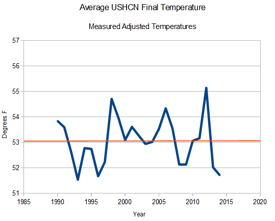 ?w=640
100% Of Reported US Warming Since 1990 Is Fake
Posted on February 4, 2015 by stevengoddard
https://stevengoddard.wordpress.com/2015/02/04/100-of-reported-us-warming-since-1990-is-fake/
The animation below flashes between the average of measured adjusted USHCN temperatures, and the estimated (infilled) ones – which are marked with an “E”. As you can see, all US warming since 1990 is due to infilling fake data. And even the measured zero warming temperatures have been tampered with using various other adjustments. USHCN is losing data at a spectacular rate over the last three years, with more than 50% of the 2015 data marked as estimated, and nearly 40% of the 2014 data marked as estimated.
Basically you people are comparing apples and oranges here. One is a direct measurement and the other is an indirect measurement. If you want to take all corrections into account starting from the raw data you will run into the problem that the raw data from the satellites is not temperature data but radiation data.
Aran:
Direct data?
– A thermometer that in reality a thermister hidden in dirty white boxes?
– Often located close to large areas of black asphalt, concrete and brick.
– Missing a temperature? They use a lovely algorithm that seeks a hotspot up to 1200km away to borrow the temperature from.
– Not forgetting that there are multitudes of temperature ‘adjustments’ for various vague and unlikely reasons.
Aran, just what do you think is a thermister?
Aran, just what do you think radiation is?
Aran, please explain why a resistor is more accurate than radiation?
“Nick: Are the “corrections” to the satellite data like the “adjustments” to GISS, biased to warm (later) and cool (earlier)? Any indication the “corrections” to satellite data are biased at all?”
Well, here is the plot for the satellite period:
http://www.moyhu.org.s3.amazonaws.com/2015/12/uahadj1.png
It shows difference between versions – GISS now vs archived, and UAH6 vs UAH5.6, all on the same anomaly base (1981-2010). GISS changes are much smaller, and have no real trend in that time; the big UAH change lowers the trend.
“Is there a list of all the changes, or at least the times in which they were changed, to the temperature records?”
The land temperature records do not change. Adjusted values of the calculated monthly averages are used to calculate the global mean anomaly.
“Nick, any resolution to the infilled adjustment problem.”
There is no infilled adjustment problem. All global averages are formed by interpolating values in between where you have readings. Unless you have readings at every single point on the surface (impossible), that is what you have to do. Estimating missing station values, and then using those to interpolate, is just another valid way off interpolating. But yes, there has been a change. They don’t do it that way any more. They now use a fine grid.
Goddard’s calculation is just wrongly done.
Nick says:
Goddard’s calculation is just wrongly done.
http://stevengoddard.files.wordpress.com/2014/09/screenhunter_241-sep-15-17-20.jpg
Nick, GISS is just wrongly done…
http://notrickszone.com/2015/11/20/german-professor-examines-nasa-giss-temperature-datasets-finds-they-have-been-massively-altered/#sthash.DhrnOCtw.TERa2fvE.dpbs
…deliberately, it appears.
ATheoK:
I know what thermist[b]o[/b]rs are and what radiation is.
I agree that traditional temperature measurements are indirect at the transducer level, but that holds for practically any measurement. And yes, satellite measurements are indirect, not only at the transducer level, but also due to e.g. corrections that have to be made continuously, and reconstructions that have to be made from different devices etc.
“Aran, please explain why a resistor is more accurate than radiation?”
This is a ridiculous statement and I have made no such claims
No, the satellite record is not the least corrected. The 2015 change to UAH far exceeds anything done to GISS.
Yes. But it is also worth mentioning that UAH5 was subject to an identifiable error and UAH6 is now almost identical to RSS.
RSS has shown very little adjustment throughout its history.
Your point being? That all of a sudden the satellite data are less accurate than the ground data? Or what exactly?
You seem to like making pedantic corrections without ever explaining what the corrections then mean.
Nick Stokes says, January 6, 2016 at 12:37 pm:
“There is no infilled adjustment problem. All global averages are formed by interpolating values in between where you have readings. Unless you have readings at every single point on the surface (impossible), that is what you have to do.”
In the Arctic (and also somewhat in the Antarctic) infilling is a major problem to the GISTEMP global product:
https://okulaer.wordpress.com/2015/12/23/why-gistemp-loti-global-mean-is-wrong-and-hadcrut3-gl-is-right/
GISS is wrongly done by infilling areas and estimating 40%-50% of data. This is why there is a large divergence between it and satellite data.
http://i772.photobucket.com/albums/yy8/SciMattG/GlobalvDifference1997-98ElNino_zps8wmpmvfy.png
The claim for some of the adjustments is down to missing most of the Arctic and infilling from warmer land temperatures from the south. The increased estimated data was for the simple reason to control the outcome and becomes even less observation data tool. Just a load of scientific nonsense with far too much human control and so little accuracy observation trend comparisons. The change in yearly temperatures in the GISS does not reflect any natural global temperature trends.
Each El Nino after the event is slowly decreased in peak over the years with this awful tampered data set and La Nina increased a similar way. Ah, but changes are both warm and cooler? Yes they are, but to a deliberate affect in order to reduce the AMO, solar and ENSO influence towards global temperatures and instead to match the model. It is a prime example of why climate science has rarely been based on science, but mainly political tool for confirmation bias towards the awful climate models. GISS has therefore become a tool with using only about 0.05% planet land observation surface and even less over the ocean (0.02%).
The sample of data used is so small, the same number anywhere around the planet could show any trend you want it to show. That’s why each tampering to human adjusted tool leads to further overall warming because different cherries are picked. Very recently though the infilling and estimating has been a significant part of the recent divergence between satellite especially since 2001.
1) Ocean/sea surface temperatures change very little compared to land temperatures.
2) Land temperatures generally warm to the south of the Arctic when atmospheric pressure there is low.
3) Land temperatures generally cool to the south of the Arctic when atmospheric pressure there is high.
infilling in the Arctic is therefore always wrong when the changing atmospheric pressure over the Arctic causes different opposite temperature anomalies to the south of it. If this same method had been done to data during the 1960’s and 1980’s for example, it would have warmed the Arctic a lot more back then.
The points raised here show why cherry picking different methods over short periods of years leads to orange and apples with general bad scientific practice. The GISS is no doubt the worse excuse for data there is in all global temperature sets, but yet we have people trying to defend it for mysterious reasons scientifically as a good observation tool.
The fact that the Arctic region is the least cold during negative AO and NAO episodes, due to high pressure around the north pole leading to colder air filtering south into the mid-latitudes, contradicts their claims when compared to colder periods in the past. During recent decades when the AO and NAO episodes have been mainly positive, deliberate changes trying to show more warming in the Arctic have been seriously misunderstood when it comes to terms with understanding the atmosphere above and around it.
The deliberate excuses have been false based on faith to show more warming in the NH. The fact that when the AO and NAO episodes are positive due to low pressure around the pole leads to warmer temperatures further south, but colder temperatures around the pole itself. This is the reason why UAH especially covering far more of the North pole than any other surface data set, doesn’t support they are missing any warming in surface global temperatures due to lack of observations there.
The corrected version below still has warm bias that can not be removed compared to other ‘proper’ data sets.
http://i772.photobucket.com/albums/yy8/SciMattG/GISS-corrected2_zpssymskhge.png
Wish I’d seen this earlier, but for the record…Nick Stokes on Jan. 6 at 12:37, indicates he’s responding to my question with a plot. The plot does not compare GISS pre-adjust to GISS post-adjust (thank you to dbstealey for showing that GIGO) or satellite pre-adjust to post-adjust. Could be the satellite “corrections” (Nick’s term) warmed the results, couldn’t it? Could be there’s no such “pre” or “post” satellite data to compare, then the answer is “don’t know”. That’s better than posting a non-responsive chart hoping we’ll be misled into thinking the satellite “adjustments” are biased to cool just because the results show cooler than the (known biased) GISS plots.
post-adjust)
“The plot does not compare GISS pre-adjust to GISS post-adjust (thank you to dbstealey for showing that GIGO) or satellite pre-adjust to post-adjust. “
There is no GISS pre-adjust or GISS post-adjust published. There is just GISS. Nor is there any UAH pre-adjust. Both have just a procedure for calculating an index. All you can tell is how that has changed over time. And that is what I plotted. And it is the only answer to your questions that is available. You framed the questions.
The point of my plot is that the change in UAH in 2015 greatly reduced the trend. And the changes in satellite-era GISS since 2005 have been small, with no obvious effect on trend.
Nick Stokes says:
There is no GISS pre-adjust or GISS post-adjust published. There is just GISS.
You are truly deluded. As Janice Moore says, your post is a distortion of the facts.
I have many more charts showing NASA/GISS ‘adjustments’ of the temperature record. They are a lot different than other database records. Your defese of the GISS shenanigans is highly questionable, and it makes me wonder about your unstated agenda.
I’m waiting for UKMO to publish their November 2015 HADCRUT4 values.
Be patient, they have to calculate how much to ‘normalise’ the data to get an ‘on message’ result.
Why else do they need a big new supercomputer?
well if we do get a sharp rise in line with the past two events we will be seeing plenty oh my god we are all gong to die headlines. i prefer to think we had a 2014/15 event of lower magnitude than the previous two events and the far less abrupt rise shown in this lt chart is showing the steady increase in temps to a lower peak.
time will tell of course.
This is what Dr Roy Spencer said on his website about his UAH satellite temperature data set:
“Since 2016 should be warmer than 2015 with the current El Nino, there is a good chance 2016 will end up as a record warm year…it all depends upon how quickly El Nino wanes later in the year.”
So he feels the temps are up, and could be a record come 2016. I agree with Dr Roy Spencer, the El Nino is only peaking now, and has many months to run into 2016.
El Nino will likely lead to a very warm 2016 and with the PDO shifting into a positive phase, it is likely that global temperatures will be on the uptick for the next decade or two. I think those denying AGW will have a harder and harder time trying to explain their point of view.
https://www.ncdc.noaa.gov/teleconnections/pdo/
if El Niño leads to a warm 2016 as you predict, then it is in fact very easy for me to explain my point of view. Watch me: “It’s warm because of El Niño, not CO2.”
But you are citing what are natural events, and which are not the result of CO2.
As far as I am aware, no deni*lists of GW suggest that natural phenomena cannot drive temperatures upwards. The issue for the warmists is to present good quality observational evidence in which the signal of CO2 (if any at all) can be separated from the noise of natural variation. To date, this has not been possible, and that is why it is never presented in any of the IPCC reports.
Luke, you’ve got your PDO c.32yr cycle phase wrong.
richard verney
The problem with the “natural cycles” argument is you have to explain the sharp increase in temperatures over the past 150 years. If it were all due to cycles, you would expect there to be ups and downs but no systematic change. So I send it back to you, what is the explanation for the large increase in heat in the atmosphere and oceans over the past 150 years?
http://cdn.zmescience.com/wp-content/uploads/2013/03/10000-year-graph.jpg
How does warming correlated to the positive phase of the PDO support AGW? I would think most logical folks would find it is just the opposite. If the climate only warms during the +PDO then it is more likely a natural influence.
And, if the PDO does switch to positive mode this soon, the idea that it is a consistent 60 year cycle will be falsified. This means the PDO could exist in its warm phase longer than its cool phase and be completely responsible for almost all the warming coming out of the LIA.
What’s really strange is why Luke would identify a process that falsifies AGW as one that supports it.
Richard M (Nixon???? heh — that is what I always think… 🙂 ) 10:58
— AGW speculation has never made a prima facie case.
— Much as Slippery Luke would like to send the question “back to you,” he cannot.
— Luke cannot cite one piece of quantifiable evidence to make AGW likely, much less to shift the burden of proof to its detractors.
The null hypothesis, i.e., natural forces overwhelmingly drive climate on earth wins.
Luke: And when your prediction fails, you’ll call it a projection before switching to a new name and forgetting it (and “Luke”) entirely. Maybe “Mark”, “Matthew” and “John” will still be available.
Thank you, Janice Moore. I have only been following this site for several months, and I thought I may have got a false impression.
On Wed, Jan 6, 2016 at 1:29 PM, Watts Up With That? wrote:
> Paul Courtney commented: “Luke: And when your prediction fails, you’ll > call it a projection before switching to a new name and forgetting it (and > “Luke”) entirely. Maybe “Mark”, “Matthew” and “John” will still be > available.”
Luke, we will be here and waiting with your crow.
“The problem with the “natural cycles” argument is you have to explain the sharp increase in temperatures over the past 150 years. If it were all due to cycles, you would expect there to be ups and downs but no systematic change.”
We shouldn’t really need to cover this here because there are probably more than a dozen explanations of this for the laymen (any scientifically literate person could already point that out without reading the explanations). The short answer is, it is unscientific, misleading, and downright fraudulent to splice annual instrumental temperature data onto the end of 50+ year smoothed proxy based temperature data.
Hi, Tom Halla,
Glad you are here! You’re welcome, lol. Yeah, Luke is sort of a Uriah Heep. Tries to come off as soft and ‘umble. He is a SNAKE. I naively tried and tried to “help” him awhile back (I’ve only been here since April, 2013, so, really, I’m sort of a “newbie,” too). LOL, “fool me once… .” Then, when I lambasted him pretty sharply, BusterBrown (who I think may also be a troll…, but not sure…. a very subtle one, if so….) came to Luke’s rescue. So, now, if I think of it, I add something about the true nature of the troll I am YELLING at. 🙂
Happy commenting!
Janice
P.S. re: time (it took me aback and I looked at my computer clock and looked at my computer clock….. AH, HA! the light came on!) in your comment, lol, that’s nothing — I quoted someone as commenting at “11:65”.
No, no, I can’t claim to have been cleverly meaning “12:15”). lol
Tom Halla: P.P.S. It wasn’t BusterBrown who thought I was unfairly harsh with Luke, it was justanotherperson see why I forgot the name, heh?
Luke:
Watch out! When you bring out Mann’s long-discredited “hockey stick” to claim unnatural warming during the last 150 years, you’re skating on very thin ice.
Luke,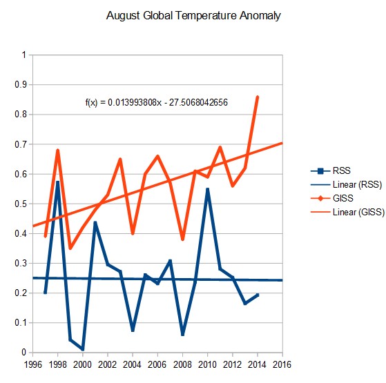
Please, enough with Marcott. Do a search here and you’ll see why he’s been so thoroughly debunked.
You say:
…the sharp increase in temperatures over the past 150 years.
You’re assuming too much, Luke. For one thing, you’re assuming that we are getting unbiased info:
For another thing, during the past 150 years we have not observed a “sharp” ∆T:
http://4.bp.blogspot.com/-lPGChYUUeuc/VLhzJqwRhtI/AAAAAAAAAS4/ehDtihKNKIw/s1600/GISTemp%2BKelvin%2B01.png
Very few skeptics are “denying” AGW, Luke. It is YOU who cannot produce a single verifiable measurement of AGW. That’s because AGW is so minuscule. Otherwise, it would have been measured by now. But you don’t get that.
— Luke
January 6, 2016 at 10:53 am
richard verney
The problem with the “natural cycles” argument is you have to explain the sharp increase in temperatures over the past 150 years. —
As your graph sort of shows there was a recent cooling period- which is called the Little Ice Age and from the coolest time of LIA there has been about 1 C per century warming trend, and your
“sharp increase” has been about 1 C per century, and currently the warming is about 1 C per century. Or we are still recovering from the Little Ice Age at a non alarming rate of 1 C per century.
But your graph is incorrect as the warming period of the Holocene Climate Optimum was much warmer than the present, or as wiki indicates:
“The Holocene Climate Optimum warm event consisted of increases of up to 4 °C near the North Pole (in one study, winter warming of 3 to 9 °C and summer of 2 to 6 °C in northern central Siberia).”
https://en.wikipedia.org/wiki/Holocene_climatic_optimum
And there lots of still frozen tree stumps of trees which grew during this time [in regions in which trees can not grow in this current cooler climate.
Janice Moore
Please tell me where in the CO2-global warming causation linkage you go awry.
1. Human activities have resulted in an increase in CO2 (and other greenhouse gasses but let’s keep it simple) in the atmosphere. This can be documented both by: 1. measurements of CO2 emissions, 2. measurements of CO2 concentration in the atmosphere, and 3. the declining isotope ratio of Carbon 13 to Carbon 12 in atmospheric CO2 indicating that the increased CO2 we are observing is caused by the burning of fossil fuels (fossil fuels have a lower C13 to C12 ratio than the atmosphere). If you doubt this, you have to deny some very well documented measurement techniques in chemistry and physics.
2. CO2 is a greenhouse gas- meaning that it allows most short-wave radiation to pass through the atmosphere but absorbs long-wave radiation leading to warming of the atmosphere. If you don’t believe this then you have issues with basic physics.
3. The warming caused by CO2 is amplified by other factors- principally the increase in water vapor in the atmosphere due to the initial warming caused by CO2. Again, if you have issue with this then you have issues with basic physics.
Luke says: January 6, 2016 at 3:57 pm
Janice Moore, Please tell me where in the CO2-global warming causation linkage you go awry….
Guess I’ll beat Janice to the draw here, so I’ll tell you where YOUR “CO2-global warming causation linkage you go awry”:.
1. Human activities have resulted in an increase in CO2
True, it seems.
2. CO2 is a greenhouse gas
True again – basic physics.
3. The warming caused by CO2 is amplified by other factors- principally the increase in water vapor
NOT true. Where’s the “simple physics” on this one? Many measures of atmospheric humidity show no increase. Even if H2O increases, clouds might increase (another not-so-simple physics) and reflect more sunlight. So Water Vapor is NOT the simple physics you say it is, and that’s where Luke goes awry.
The evidence I’ve seen of actual warming (radiosonde and satellite data, which are truly global) shows no increase above the simple physics in 1. and 2. above, and no sign of the convoluted physics you invoke in 3.
@ur momisugly Luke (re: 3:57)
I will not tell you anything, Luke, for:
1. You do not genuinely want to learn.
2. You have not yet made a prima facie case for AGW, thus, the burden of proof STILL l1es with you.
*********************************************************
@ur momisugly Any reader impressed or confused by Luke the Slithering Snake:
Please see Richard Keen’s excellent comment here: http://wattsupwiththat.com/2016/01/06/annual-global-lower-troposphere-temperature-tlt-anomaly-update-distant-third-warmest-for-2015/comment-page-1/#comment-2114283
(glad you “beat” me, RK — your post is better than anything I would have written (as you can see from the above, lol).
[Please do not insult slitheryn snakes by comparing them to CAGW apologists, astrologists, or climastrologists. 8<) .mod]
So temperatures are up because of purely natural variability (PDO and El nino). I think it’s you that will have a hard time explaining why we need CO2 to explain the increase.
Is this really the level of debate that the Alarmists think is convincing?
Richard verney
Thank you for your thoughtful response. Apparently Janice does not want to have a debate.
So you agree that CO2 has increased over 40% due to human activities and that CO2 is a greenhouse gas. Apparently you don’t agree that as the atmosphere and oceans warm due to the increase of CO2 and other greenhouse gasses that water vapor will increase in the atmosphere. Water vapor is introduced into the atmosphere via evaporation – the rate depends on the temperature of the ocean and air, being governed by the Clausius-Clapeyron relation first described back in the 1850s. If you are questioning that relationship you have a lot of explaining to do. The relationship between temperature increases due to CO2 and increased water vapor has been confirmed by satellite measurements (see below).
Andrew Dessler and colleagues from Texas A&M University in College Station confirmed that the heat-amplifying effect of water vapor is potent enough to double the climate warming caused by increased levels of carbon dioxide in the atmosphere.
http://www.nasa.gov/topics/earth/features/vapor_warming.html
Luke, may I recommend reading Bob’s book. It’s free. You can also learn from watching Joe Bastardi’s updates at weatherbell.com.
Luke January 6, 2016 at 10:53 am
Marcott…Mann…
You’re taking the pi$$, right?
Marcott himself has in fact withdrawn that graph, as you could easily have found out if you had done a minimum of research.
As to your comment “3. The warming caused by CO2 is amplified by other factors- principally the increase in water vapor in the atmosphere”, the three analyses of the NASA NVAP satellite data show otherwise, Solomon et al in fact show a 10% decrease in stratospheric water vapour in the decade post – 2000.
http://www.climate4you.com/GreenhouseGasses.htm
http://onlinelibrary.wiley.com/doi/10.1029/2012GL052094/full
https://www.sciencemag.org/content/327/5970/1219.abstract
You haven’t a clue what you’re wittering about, have you?
Hi, Mod — lol, sorry about that. I forgot. You’ve told me that before… . I do NOT like snakes. I will try to remember that you (and many others) do. (shudder) You have a bigger heart than I…. I don’t even like cats (beautiful and lovely to watch, but lousy pets, imo — their self-centeredness requires a generous heart, thus, we know that Mark and Two Cats must be a real sweetie pie), much less, snakes.
AND THANK YOU FOR MAKING WUWT THE BEST BLOG IN THE WORLD!
NOAA is already showing 2015 as the hottest year out of the last 136 years, based on Jan-Nov. data. And yes, the SSTs are driving the result, with global land in Nov. only in 5th place.
https://www.ncdc.noaa.gov/sotc/global/201511
In a couple of weeks we will be able to see the preliminary global results for all the 12 month.
2015 is going to come in as very warm indeed, much warmer than the last great El Nino of 1997/1998.
…based on “Karlized” data.
Sorry Harry, but didn’t you read the article? 2015 in not “…much warmer than the last great El Nino…”. It is coming in third place. All 12 months are already available with the satellite data. If you are talking about the surface data, which has been much manipulated to produce more warming than there actually is, then yes…the false data will likely show 2015 to be the warmest year in modern history.
Yesterday I saw the movie ‘The Big Short’. As I watched the massive banking scam unfolding on the big screen, I couldn’t help but see the similarities between the banking fraud and the climate fraud. In both cases, crap data was passed off as AAA bonafide accurate information. 97% of the ‘experts’ agreed that the mortgage industry was rock solid! People who relied on that information made decisions that cost them dearly. In the banking scandal $5 trillion was lost, but only one poor schmuck from the banking industry was ever charged with a crime, and he was a nobody in the scheme of things. The American people had to pay the bill and the perpetrators gave themselves bonuses for pulling off the biggest heist in history with impunity. No doubt, the climate shysters are counting on the same thing when their golden goose gets cooked.
The surface data is crap. The Theory is crap. The assumptions behind the AGW theory are crap. The authority figures who keep insisting that reality is adhering to the theory are obviously full of crap. Yet they keep on going to their beautiful conferences in their limousines and slapping each other on the back, just like the bankers did. Sure…they will say that 2015 was the warmest year on record, and they will say the same thing about 2016, but not all the data fudging in the world will be able to save them from what will become obvious in 2017 and beyond. Until then, they will make as much money and grab as much power as they possibly can. Afterwards, they will give themselves bonuses and find a new way to rob people of their wealth and freedom.
A couple of weeks being the time it takes to adjust the temperatures, and cook up a narrative!
Harry We are in some of the coldest temperatures in the last 8000 years and somehow you think we should be concerned that it been a warm year. Considering the land base temperature measurement cannot tell us much, since humans only occupy 3% of the earth surface and that is where most of the thermometers are and the satellite record is far to short I think all you got is a bucket of spit and you are trying to sell it to me as a bucket of fine wine. Sorry I not buying it from you or any other warmest. I am not one of PT Barnum’s “a fool that is born every minute” but I do believe those who are in the global warming or sorry global climate change crowd are.
jclarke
I also was thinking of the similarities while watching that movie. Appears the 97% were wrong about that issue as well. I’m afraid deciding who was right and who was wrong will take a lot longer in the AGW debate. But I’m sure those who were short felt like it was an eternity.
“H. Twinotter”,
You don’t have a clue about reality:
http://i1.wp.com/www.powerlineblog.com/ed-assets/2015/10/Global-2-copy.jpg
You wrote:
2015 is going to come in as very warm indeed, much warmer than the last great El Nino of 1997/1998.
Temperature trends during the past century are almost identical to trends centuries ago, before there were any industrial CO2 emissions:
http://s6.postimg.org/uv8srv94h/id_AOo_E.gif
Get up to speed on the climate Null Hypothesis, and you will understand your mistake…
…hopefully.
http://www.vukcevic.talktalk.net/CET1690-1960a.gif
firetoice2014.
“…based on “Karlized” data.”
Who?
jclarke341.
I was reply to the previous comment which referred to the NOAA figures.
The rest of what you say is a conspiratorial rant, not worth commenting on.
dbstealey.
“You don’t have a clue about reality:”
Oh look, the resident attack-poddle is out for another yap. Back in your kennel.
Vukcevic.
You have posted without a comment. But you do know the CET is not a global data set, if that is your point?
Pity these graph data can’t be extended 5k years to the left.
https://youtu.be/yegKl2nKBQI
http://www.longrangeweather.com/global_temperatures.htm
H. twinotter says:
Oh look, the resident attack-poddle is out for another yap. Back in your kennel.
That’s the kind of impotent ad-hom that ‘Hairy Twinotter’ always writes when he can’t refute the data.
In fact, HT can’t refute anything we’ve posted. All he does is emit his usual baseless opinions, like the one that started this H-twinotter-demolishing sub-thread:
2015 is going to come in as very warm indeed, much warmer than the last great El Nino of 1997/1998.
O’really? Look at 2015, and compare with 1997/1998:
http://realclimatescience.com/wp-content/uploads/2015/06/ScreenHunter_9549-Jun.-17-21.12.gif
You lose again, Hairy. To an ‘attack poddle’, LOLOL!!
“Oooo, you D. B. Stealey……. I … oooh…… you make me so mad……… you…….YOU
H. Twinotter (a.k.a. Daffy Duck — gotta be…..)
LOLOLOLO!!!
Thank you for highlighting that, O Science Giant and Debater Extraordinaire, D.B. Stealey!
#(:))
Your quibble, Chaam Jamal (8:11m), is a waste of time. D. B.’s graph is up to date enough to prove the point he was making: 1997/98 > 2015.
Dr. Roy Spencer’s graph, here: http://www.drroyspencer.com/2016/01/uah-v6-global-temperature-update-for-dec-2015-0-44-deg-c/
is quite up to date and it also backs up Mr. Stealey:
1997 > 2010 > 2015.
And YOUR point is?
Moot.
[Reply: ‘Chaam Jamal’ is a sockpuppet. Also posts under the name ‘Richard Molineux’ and others (K. Pittman, etc.) As usual, his time writing comments has been completely wasted, as they are now deleted. –mod]
Unmentionable @ur momisugly 7:14pm, why settle on 5k? Why not go back +400k?
The current Holocene (warm period) is the lowest in temp, but has the highest CO2 level.
http://i255.photobucket.com/albums/hh154/crocko05/Temp%20vs%20CO2%20-%20400000%20years_zpskyy0qvra.jpg
What’s more interesting is that 80% of that +400,000 years, temperatures have been at or below the 1961-1990 global average temperature, with the current Holocene just barely above the reference period compared to the previous 4 ‘warm periods’.
http://i255.photobucket.com/albums/hh154/crocko05/Past%20400000%20year%20temps_zpsmqmty7yo.jpg
Now a question for Harry and Luke:
How can the current Holocene have the highest CO2 levels, yet have the lowest temps over the past +400,000 years?
Chaam Jamal,
I’m surprised you showed up to comment again, after getting thrashed over your pitiful defense of John Cook’s “97%” nonsense. Other commenters destroyed your lame arguments, you know that, don’t you? I’ll link to the thread if you like. Just ask.
Now, about your WoodForTrees graph: I used a pic I already had in a folder so readers could see it without having to click on it like with yours, and without my having to convert the chart to a .gif file.
But why explain that to someone like you? In your own link there are several higher temps before 2015: 1997-98, 2007, 2010, and 2011. They were all higher than 2015.
So what was your point? To defend ‘Hairy Twinotter’? You failed badly, because he wrote:
“2015 is going to come in as very warm indeed, much warmer than the last great El Nino of 1997/1998.”
Look at the chart again. Either chart will do. Specifically, look at 1997/1998. Compare 1997/98 (like Hairy said) to 2015.
Now tell the world that Hairy Twinotter was right, or he was wrong. But he can’t be both. Your answer will reveal your credibility — or lack of it.
[Reply: ‘Chaam Jamal’ is a sockpuppet. Also posts under the name ‘Richard Molineux’ and others (K. Pittman, etc.) As usual, his time writing comments has been completely wasted, as they are now deleted. –mod]
BY:
BruceC
January 6, 2016 at 9:07 pm
Unmentionable @ur momisugly 7:14pm, why settle on 5k? Why not go back +400k?
—
More than 5k was overkill, with respect to industrial era variability, to put some perspective on the alleged climate arghmurgencee and current cycle(s). But I’m fundamentally OK with more. : )
Janice Moore.
It sounds like you approve of dbstealey’s childish insults, which is uses to distract from his poor discussion abilities and Climate Change denial.
To each his own. There is no accounting for taste.
“Harry Twinotter January 6, 2016 at 6:15 pm
jclarke341.
I was reply to the previous comment which referred to the NOAA figures.
The rest of what you say is a conspiratorial rant, not worth commenting on.”
So my question to you Harry: Are you one of the few conspirators who know what is going on, or one of the ignorant legion of believers who never bothered to look at the science and are just a victim of authoritative statements?
Hairy Twinotter says:
It sounds like you approve of dbstealey’s childish insults, which is [sic] uses to distract from his poor discussion abilities and Climate Change denial.
That’s a text book example of ‘projection’: Hairy is imputing his own faults [poor discussion abilities] to others. Hairy’s comments have no credible evidence at all. Instead, he emits childish insults, such as:
Oh look, the resident attack-poddle [sic, again] is out for another yap. Back in your kennel.
Hairy must lack imagination the same way he lacks credible facts and intelligence, because has used essentially the same childish insult at least a half dozen times before. That’s really his whole argument.
Hairy is just angry at being shown, with scientific evidence, that he is once again flat wrong: 2015 will not come anywhere near to the 1997-98 warming spike as he asserted.
But thanx for playing, Hairy. It gives me a chance to publicly demonstrate the irrational beliefs of the alarmist cult.
Ron Clutz says: January 6, 2016 at 6:27 am NOAA is already showing 2015 as the hottest year out of the last 136 years, based on Jan-Nov. data….
Hah… I bet they’re already showing 2016 as even hotter, based on yesterday afternoon.
Next week they’ll release the prelims for 2017.
Right — the warmest (hottest) month (year) (week) you name it — and it is tomorrow’s CAGW headline in USA Today. It could be “the hottest (fill in the time period) in history” for the next 100 years and still be only 0.5 deg. (or even less) hotter than today. Do we tend to lose sight of the BIG lie at the root of AGW panic politics — the modeled exponential temperature increase (hockey stick) vs. a more or less linear increase in CO2?
Let us not kill the joy for the climate alarmists for they have very little to gloat about these days. When it is announced that 2015 was the warmest year “evah,” let us not remind them that such warming was achieved through a completely natural event called El Nino. I have found that they hate to reminded of that fact.
“such warming was achieved through a completely natural event called El Nino”
Do you need to be reminded that El Nino has been going on for a long time, this El Nino is not as big as previous ones (as reported in several posts here), so El Nino cannot possibly be the explanation for “hottest evah”.
Well it is amazing as to what an El Nino combined with past temperature record “adjustments” can achieve.
If you had the 1997/98 Super El Nino on top of the heady temperatures of the MWP, or on top of the lows of the LIA, you get different results.
Presently, it would appear that there has simply been some natural warming out of the LIA interspersed with some strong to super El Ninos which have led to some peaks from time to time.
Well, seaice1, you seem to continually miss the mark of accuracy here on WUWT. Recently, over on the Greenland “ice is plugging the drains, so, when it rains, it will flood the streets” nonsense thread, now, here (and FYI for all you newbies who think I am unfairly persecuting a genuine seeker of truth, I am not: seaice1 has proven she/he is a troll but, it’s fun to write to refute him/her anyway! 🙂 .
Here is a little lesson to help you understand:
1. You bake a cake. … ?? Oh. Chocolate, of course. That’s temperatures until ~1998.
2. El Nino (1997/98) bakes a cake and puts it on top of yours. Whoopee! A two-layer cake!!
3. Temperature anomalies above average from ~1998 on are cherries “Mother Nature” sticks on top to decorate your layer cake.
4. (sound of pattering tiny feet running down the hallway)… Heeeere comes little Luke and his sister, Seaice. Their green eyes light up. “Oh, boy!! A CAKE! And look at that extra big cherry…. (O_O) (eyes BIG) — IT’S THE TALLEST CAKE EVER!!!!” they cry excitedly.
lololololol
I LOVE FOOD!!
#(:))
Once people stop miss-positioning, miss-interpolating, and miss-‘editing’ (being generous here, looking at you, BOM) the ‘data’ regarding the warming period of the late 20th century will substantially dissipate. No likely huh?
It’s in the bag anyway, sun’s going to sleep, bring your snow shoes, read it on the Internet. Well, at least that one has some merit, over a millennial timescale anyway.
Modern weather instrument, satellite, and sun cycle observations sure aren’t capturing ‘climate’ trends. And won’t for at least another three human lifetimes – minimum
Yes, there is an anthropocentric effect on weather. It is this, if you live in a city, it’s hotter in cities.
That’s it.
I view sk3ptic site pages as entertainment, the reading about people who ‘think’ or believe that they see something more than that.
As it turns out, it’s surprisingly entertaining. : )
+1
‘ Potential effects of El Niño on Australia include:
Reduced rainfall
Warmer temperatures
Shift in temperature extremes
Increased frost risk
Reduced tropical cyclone numbers
Later monsoon onset
Increased fire danger in southeast Australia
Decreased alpine snow depths’
http://www.bom.gov.au/climate/updates/articles/a008-el-nino-and-australia.shtml
NSW – widespread flooding
Top End – cut off due to flooding
I think there is too short a timeframe on El Nino to draw conclusions like those above.
Maybe it is an anomalous El Nino?
I think the true coup here would be if 2016 turns out as a record warm year as predicted by Tisdale and the Nino Nina interaction. No co2 required. It gives wuwt a jump on what the alarmists will claim.
No, the warmists just get confused by the facts which they believe are an unwarranted attack on their faith.
It also shows that the global temperature is dominated by sea surface temperatures. It is therefore fair to ask, pointedly, why causes the sea surface temperatures to change. What possible role is there for CO2 to play as the major control knob? What effect would doubling the concentration of CO2 have on the temperature of the surface of the seas, lakes and oceans?
Thanks, Bob. It is always good to look at data!
This what the Multivariate ENSO Index (MEI) looks on January 5 ’16, (Klaus Wolter, NOAA)
http://www.oarval.org/ts5Jan2016Opt.png
From http://www.esrl.noaa.gov/psd/enso/mei/
I think the MEI peaked 2 months ago.
One of the ways the global average is influenced by El Nino is through the spreading out of warm sea surface water into the Eastern Pacific. This was really evident in the 1997-98 El Nino. This has not been the case for the current El Nino. Most of the warm water came from the equatorial undercurrent and after surfacing it has been generally flowing back to the west with the trade winds. This is why the Nino 1/2 areas are not that warm.
Much of the warming we have seen so far has come from the blob which has now spread out in the NH. The difference between the NH and SH anomalies show just how this El Nino event differs. In 1997 the Tropics warmed first with only slight warming in the NH and almost none in the SH.
From RSS data:
year mon globe tropics NH— SH—
1997 10 0.220 0.422 0.254 -0.049
1997 11 0.158 0.474 0.053 -0.090
1997 12 0.302 0.754 0.091 0.012
The current El Nino has lots of warming already in the NH.
year mon globe tropics NH— SH—
2015 10 0.449 0.596 0.718 -0.006
2015 11 0.428 0.636 0.539 0.072
2015 12 0.543 0.677 0.762 0.155
Tropics continued to warm in 1998 and both the NH and SH warmed significantly from the water spreading out
year mon globe tropics NH— SH—
1998 1 0.550 1.134 0.163 0.296
1998 2 0.736 1.314 0.590 0.231
1998 3 0.585 1.116 0.406 0.170
1998 4 0.857 1.171 0.900 0.453
I really don’t see this happening unless the trade winds finally do weaken to a much greater degree. If they don’t then there won’t be any additional warm water in the NH and SH to release its energy and warm the atmosphere.
agreed.
Richard M – You have some things almost right. You are right to point to the El Nino spreading out as warm sea surface water into the Eastern Pacific. This is how the warm air of an El Nino that we feel is generated – warm water spreads out, warms the air above, warm air rises, joins the westerlies, and gets carried all over the world. That is how we, Europe, and Japan become aware pf the same El Nino. You are also right about the strength of El Ninos being variable. I don’t think it is any subsurface currents but variable wind patterns that are involved. It so happens that the westerlies and the trade winds blow in opposote directions. The dividing line between them is somewhere south of the Mexican border. If the location of this dividing line should drift north along the coast part of the rising warm air destined to announce the arrival of the El Nino will get pulled into the trade wind system and thereby weaken the observed strength of the El Nino. Irregularities of the global wind system can happen. They can be directly involved in such unusual phenomena as the warm blob in the northwest Pacific.
Arno Arrak says: “I don’t think it is any subsurface currents but variable wind patterns that are involved.”
Then you’d be thinking wrong. The volume of warm subsurface waters traveling from west to east along the Cromwell Current (a subsurface current) depends on Westerly Wind Bursts, but the strength of the trade winds changes when that warm water rises to the surface in the central and eastern equatorial Pacific.
That’s as far as I needed to read.
It’s now impossible for CAGW alarmists to justify the huge disparities that exists between HADCRUT4/GISTEMP surface temp anomalies vs, UAH/RSS/radiosonde lower troposphere datasets…
According to the CAGW hypothesis, lower troposphere temp anamolies should be 20% greater than land/ocean surface anomalies because that’s where the downwelling CO2 induced LWIR is supposed to originate….
The larger these disparities become, the more compelling the case that alarmists are intentionally “over-adjusting” raw surface temp data to keep this disconfirmed hypothesis/agenda “marginally viable; I.e. the hypothesis can’t be wrong, the raw data must be adjusted to keep the hypothesis from being disconfirmed…
That’s not how science works… If projections don’t match reality, the hypothesis is supposed to be tossed in the trash.
..If you torture the ” Data ” long enough, it will confess to anything !!
As has been noted several times, if there is a downturn in global temperature, faithfully tracked by UAH/RSS, then there must come a point where the surface data sets are going to need nothing short of a delta function to get them back in line. And then of course the game is properly up – unless they can convince people that climates execute carbon dioxide driven delta functions. The people who ‘manipulate’ the data, even if they’ve started to believe their own lies, must now be wondering. Either nature delivers a miracle save or they are going to need some quite out of the ordinary mathematics and I’m expecting some unseemly scrambling in the medium term future to distance themselves from the virtually inevitable crash and burn.
They now claim that the heat is magically jumping straight past the troposphere into the oceans.
It’s just shows how bad their grasp of elementary physics is. They’ll buy anything if you put the concept that “humans are horrible for the planet” in it.
I did a couple of correlation analyses on Excel, comparing monthly surface and satellite data against NOAA monthly ENSO3.4 data from 1979 – Nov 2015. The aim was to find a best fit lag for each set. I found that the best fit for surface was 2 months and for satellite (RSS) it was 4 months. Not sure if those are the official lag times; but they’re what I found.
The Australian BOM weekly data suggest the El Niño peaked around mid November. That being the case, and assuming I haven’t made a mess of the correlation analysis, then I predict peak surface temperature should be in January and peak satellite should be in March. (I wouldn’t advise anyone to put any money on this, though.)
I have been suggesting for some time that March/April will be the peak in the satellite data.
But what is important (and this can only be tested in around 2019/20) is whether there is a long term step change in temperature coincident with the current strong El Nino as there was a long lasting step change in temperature (of about 0.27degC) coincident with the Super El Nino of 1997/98, or whether there is merely a short lived spike in temperatures (as there was with say the 2010 El Nino) and thereafter the following La Nina brings temperatures back down and then they re-stabilize around the 2001 to 2003 anomaly level. IF the latter proves to be the scenario that unfolds then coming into 2019, when AR6 is being published, the ‘pause’ will be over 21 years in duration.
The next 5 years should be very interesting.
.
Richard, bear in mind also that the the 98 el niño and the 2010 one were followed by solar maximums (the current el niño not being so lucky). So, “the next 5 years should be very interesting” indeed…
I will stick my neck out and predict that 2016-2019 temperatures will not stabilize at the 2001-2003 anomaly after this el nino but will show a step increase.
Luke,
A step increase means a permanently higher global temperature.
I’ll fade you on that…
“December 2015 value of +0.44 deg C is from Dr. Roy Spencer’s blog ”
Is this plotted? or are you averaging the data to lose it?
Can you also reference TLT (actually altitude higher than TLT) temperatures to CRS height please.
Also how is the balloon data in comparison?.
Reblogged this on Sierra Foothill Commentary and commented:
Hare are some facts to prepare you for the hottest year discussion at the office coffee bar and at Sunday dinner with your liberal friends.
CET is calculated far more accurately than the global temperature.
Here is roll call of the 25 highest CET annual temperatures
2014 10.95
2006 10.87
2011 10.72
1990 10.65
1999 10.65
1949 10.64
2002 10.63
1997 10.56
1995 10.55
1989 10.54
2003 10.54
1959 10.52
1834 10.51
1921 10.51
1733 10.5
2004 10.5
2007 10.5
2005 10.48
1779 10.41
1868 10.4
1998 10.35
1736 10.33
1828 10.32
2000 10.32
2015 10.31
2015 is 25th .
Data UK MetOffice.
According to that list, in a record that’s 357 years long, 16 out of the 25 warmest years have occurred within the last 27. That includes the top 5 warmest and 9 out of the top 10 warmest. The warmest year record has also been beaten 3 times since 1990, most recently in 2014. Hardly evidence against a warming trend in CET.
Just what you’d expect, with the planet emerging from the Little Ice Age.
Look a the big picture, you won’t be so nervous:
http://i1.wp.com/www.powerlineblog.com/ed-assets/2015/10/Global-2-copy.jpg
DB flops out his chart for the mindless ….. again. Do you really think anyone here or anywhere would not look at that graph and scratch their head wondering why you would think it shows anything but your lack of understanding about graphs. DB, try using an appropriate left scale then it not only becomes more meaningful it becomes less useful for your bias.
Is it just coincidence that Parker et al (of the Met Office) revised Manley’s original data in 1992?
dbstealey
“Just what you’d expect, with the planet emerging from the Little Ice Age.”
________________
I’ve looked back over the CET record and can’t find any other 25 year period in which the annual temperature record was beaten on three occasions. If this is just a “recovery from the Little Ice Age” (whatever that means), then for some reason the recovery appears to be accelerating.
Simon. Why would I think db’s graph shows a “lack of understanding about graphs”? When looking at temperature variations in a system I would have thought that the most natural scale against which to view them is over the range of normal variation. No? Does that seem unreasonable to you in some way?
Why would you like to dramatically zoom in to make it appear to casual viewers as though temperatures are careering dangerously off-scale, plunging us into some Hadean nightmare scenario? Are you absolutely certain it isn’t in fact you yourself who wishes to demonstrate your bias with scale?
If I was interested in the fine detailed structure of specific changes then I would indeed zoom in but in order to obtain an overall impression of what is happening and how significant it is I would scale as db has done here. But then, I’m just one of those mindless … [physicists] again.
cephus0 said: When looking at temperature variations in a system I would have thought that the most natural scale against which to view them is over the range of normal variation.
Correct, and average annual global temperature does not range between -10F and 110F. Why choose a Y axis that is overscaled by a factor of 50 compared to the actual variation in the data being plotted? It’s patently obvious that the reason is to minimize the change in the Y variable.
The dim is very strong in this subthread. The scale is the range over which readings have been taken to produce the averaged result. If you guys wish to apply a scale which would require exquisitely delicate lab bolometry to discriminate something as vaguely defined as the temperature of an entire planetary atmosphere in order to frighten children with then be my guest. But scare your own kids please – not mine.
DWR54,
Other factors need to be considered. Has there been development near the sensors more in the last 25 years than the previous 337? Has station selection changed in such a way to bias readings toward the cities more in the last 25 years? Have adjustments been added to the record or are these all raw data? Have the stations themselves been maintained in the same manner in the last 25 years that they were in the previous 337?
I have found that the best way to know how many apples I have is to make sure I am not counting oranges.
The other thing is one would expect that in a rebound from a little ice age, the most recent years would be the warmest in general so seeing the last 25 dominating the warmest readings list should be a feature not a problem. I suspect if one took the list and removed the last 25 years and looked at the remaining 337 years, the last 25 of that 337 would likewise be around 16 of the warmest and that a similar pattern would be seen going back to the 1860s anyway.
cephus0 said: “The dim is very strong in this subthread. The scale is the range over which readings have been taken to produce the averaged result.”
You say the scale is the range over which readings have been taken. Oh, really? The y axis peaks at 110F, well below temperatures which regularly occur in AZ, parts of Africa and many places in the Middle East. The low of -10F is a joke, that would eliminate readings from large swaths of the planet including the Arctic, Antarctica, not to mention parts of Canada, the US and Russia.
No, the Y axis was selected to make the change over time look small, a technique that is obvious to all but the most obtuse.
Simon says:
DB flops out his chart for the mindless
I didn’t post it for you, Simon. You’re a True Believer, and your religious faith is tough to overcome.
But for rational readers, Simon believes the y-axis (what he calls the “left scale”) is somehow not appropriate. But he doesn’t say why, he merely asserts, as usual.
Maybe this is what Simon prefers:
http://4.bp.blogspot.com/-lPGChYUUeuc/VLhzJqwRhtI/AAAAAAAAAS4/ehDtihKNKIw/s1600/GISTemp%2BKelvin%2B01.png
Simon can’t explain what he doesn’t like about the “left scale”. But that one begins at zero, and temperatures are flat, at ≈283K. Simon probably doesn’t like that, either, even though he can’t explain why.
Then DWR54 says:
If this is just a “recovery from the Little Ice Age” (whatever that means), then for some reason the recovery appears to be accelerating.
First, I can explain what ‘recovery from the LIA’ means. Just ask. And show us where there’s any “acceleration”, DWR54. Rational folks here know that global warming stopped almost twenty years ago. Where have you been?
And Chris, who always gets things backward, does it again here:
the Y axis was selected to make the change over time look small, a technique that is obvious to all but the most obtuse.
Wrong, obtuse boy. You have it exactly backward again: the tenth and hundredth degree divisions so loved by your climate alarmist pals are scientific nonsense. Where are the error bars? Do you actually believe that global temperatures can be accurately determined to within tenths and hudredths of a degree, with no error bars??
It is YOU who loves to see such tiny temperature fluctuations selected by your alarmist cronies. They are just normal and natural temperature variations, but they have been magnified out of all proportion in order to confirm your climate alarmist bias.
A chart with a y-axis in one-degree increments (ºC, ºF, or K) is comparing like with like: it is comparing past temperature records with current temperatures. But by deviously magnifying normal tiny wiggles, you are trying to alarm the public.
It’s no different than showing someone who’s never seen a microscope a tiny insect, which appears to be a ferocious giant through the magnifying lens. It looks frightening. But it’s also deceptive and dishonest, because in reality the insect is tiny and harmless.
Same-same with your magnified y-axis. Same-same with your climate scare.
GREAT job, D.B., T.K.O
Independence Day — “Welcome to earth.” (Eddie Murphy)
(youtube)
dbstealey, as usual, you spend a large number of paragraphs to say almost nothing. You accuse me of favoring a smaller Y axis range in order to scare people. No, that is completely incorrect and complete nonsense. Look at the 3 graphs that Bob Tisdale shows in his post. Note that in all 3, the minimum and maximum Y axis values are chosen so that they are just outside of the range of the plots. This is a sensible approach, so that the person viewing the graph can actually see the data trends. You posted 2 graphs using the same approach, including US temperatures since 1880. Gee, you didn’t chose a Y axis range of 320 – why not?
[snip – make your point without labeling others -Anthony]
There is lot of misunderstanding about the CET. Summer temperatures vary very little, less 0.1C/century, while winters are responsible for most of the ‘warming’ and have risen on average by about 0.4C/century.
It is difficult to explain how the ‘global warming’ in the CET region would only work in the winter months only
http://www.vukcevic.talktalk.net/CET-s-w.gif
The ‘global warming’ you speak of would only really have impacted on CET (as all other temperature data sets) from the start of the 20th century and from the mid 20th century in earnest.
The trend in summer temperatures in CET over the past 30 years has actually been faster than the winter trend, which is flat over that period (in fact, slightly negative).
By far the fastest warming season in CET in the past 30 years has been the autumn (fall). Not sure why that is.
Natural oscillation in the summer and winter differ, spring and autumn most of the time are simply transition between two, not much unusual for summer rise during the last 30 years, it happened more than once before.
http://www.vukcevic.talktalk.net/CET-ws.gif
Tony B looked into the autumn’s discrepancy some months ago (we had short private exchange about it before he raised the subject with the MetOffice). It may be due to the Icelandic Low being stuck too far north (Arctic ice extent ?) consequently less effect on the polar jet stream meandering.
DWR54, we have your baseless assertion. Contradicting it we have vukcevic’s observation-based chart. They disagree, so one of you must be wrong.
Vukcevic has proved you wrong. This isn’t the first time.
Your assertions are merely baseless opinions. Unless you can back them up with facts and evidence, you’ve got nothin’.
As a non-specialist on these matters, can anyone explain when the last time a La Nina was strong enough to cause a ‘regime change’ in the lower atmosphere temperatures in the way that the 1998 el Nino did (and maybe the 2015/16 el Nino will do also)?
Is it just that there hasn’t been a monstrously mega la Nina since 1979 when the satellite data records began?
Are you sure it was the El Nino and not the 1998-2000 La Nina that led to the “regime change”? Why is a 3 year La Nina not considered “mega”?
Hi, rtj1211,
If you are serious about learning about ENSO (El Ninos and their trailing La Ninas) and much more about natural climate drivers including ocean currents, read Bob Tisdale’s books:
https://bobtisdale.wordpress.com/2013/10/16/ebooks-by-bob-tisdale/
Who Turned on the Heat would be a good place to start, I think.
Best wishes in your intellectual endeavors!
Janice
P.S. The El Nino releases the energy/heat heads surface temperatures up what appears at the time to be a steep mountain. The La Nina partially negates that heat release, then, temperatures level out, and instead of Mt. Everest (or as Al Gore would probably scream, “planetary emergency!! — we’re on a trajectory to land on Venus!!!”),
you find you are walking (surface temperature-wise) across this:
http://media.salemwebnetwork.com/weblog/pritchard/Another%20plateau.jpg
RTJ – ” last time a La Nina was strong enough to cause a ‘regime change’ in the lower atmosphere temperatures ”
Regime change is positive in the tropical Pacific, but negative in the North Atlantic.
One of the significant pieces of evidence for this comes from a description of the “Great Salinity Anomaly” put together by Robert Dickson (Fisheries Laboratory, Suffolk, England) with other European oceanographers. The Great Salinity Anomaly (GSA) can be characterized as a large, near-surface pool of fresher water that appeared off the east coast of Greenland in the late 1960s (see figure at upper right). It was carried around Greenland and into the Labrador Sea by the prevailing ocean currents, in the counterclockwise circulation known as the subpolar gyre. It hovered off Newfoundland in 1971-72 and was slowly carried back toward Europe in the North Atlantic Current, which is an extension of the Gulf Stream. It then completed its cycle and was back off the east coast of Greenland by the early 1980s, though reduced in size and intensity by mixing with surrounding waters. The origin of the Great Salinity Anomaly is thought to lie in an unusually large discharge of ice from the Arctic Ocean in 1967. Its climatic importance arises from the impact it had on ocean-atmosphere interaction in the areas it traversed.
http://www.whoi.edu/oceanus/v2/viewArticle.do?id=2344
And the Russians are measuring it currently. From 2012
Drastic cooling all over the Northern Hemisphere. The thing is that according to their calculations, “a great salinity anomaly” is coming, which will cause the fall of average temperature and bring about frosty winters in the coming years. The oceanologist and doctor of physical and mathematical sciences Nikolai Diansky has for years compared data about change of salinity of waters of the Arctic regions with weather changes on the planet. He took reference data from his colleagues in every corner of the globe. The scientist’s diagram prove that the global warming leads to massive melting of glaciers and increase in spillover of the Siberian rivers. As a result the Arctic Ocean has collected a lot of fresh water, which is will soon start pouring out through the Canadian and Greenland straits to the Northern Atlantic.This is where Gulf Stream, the main “bed warmer” of Europe flows. Its warm salty water is going to be covered with cold fresh water. Thus, the heat will not be let out and thus the climate in Europe and entire Northern hemisphere is going to cool down. – See more at: http://russia-ic.com/news/show/13458#.Vo15ZkOBqPw
http://weather.unisys.com/surface/sst_anom.gif
Getting colder now.
I picked up the following post on Roger Harrabins Facebook Page? Interesting?
Kevin McArdle Another correspondent who observed ‘abnormally’ warm weather and summer flowers in full leaf in the middle of winter was none other than Samuel Pepys, writing more than 350yrs ago! According to his diary entry of 15 January 1662, “It is a fast day ordered by Parliament, to pray for more seasonable weather, that it is, both as to warmth and every other thing, just as if it were the middle of May or June….for so it was almost the last winter….and the whole year after.” Definitely not a normal couple of winters well after the onset of the Little Ice Age and bang in the middle of the Maunder Minimum. And not a coal fired power station, oil or gas field or 4×4 in sight! A bit of historical perspective is required methinks.
According to the AGW fraud machine, no one is supposed to look past 1981…because they’ll run into them screaming about how we’re about to fall into a glaciation in the late 1970’s.
Perspective is the enemy of fearmongers and con men.
In looking at the latest UAH TLT graph it seems striking to me that there appears to be two modes apparent over this period. For 1979-1997, when two major stratospheric impacting volcanic eruptions occurred the overall temperature trend was flat but lower. The 1998-2015 period that was also flat but higher and dominated by now three intense El Niños.
It will be interesting to see what happens when the next major stratospheric impacting volcanic eruption occurs. Perhaps a shift back to the lower mode. We are probably overdue for one now and the next big one could even be on the scale of Tambora or larger (although certainly not wishing this on anyone, I prefer global warming and higher CO2 levels).
oz4caster: 1979-1997, when two major stratospheric impacting volcanic eruptions occurred the overall temperature trend was flat but lower…
Right! There’s two volcanic “dips” that render the whole two decades cooler.
If you like, you can flat trends for 10-20 year periods, such as the “pause” of late. In my opinion, these “pauses” are statistical flukes, only possible because the “noise” (natural variability, such as ENSO) is so much larger than the very small warming trend. On top of that, two volcanoes (el Chichon 1982 and Pinatubo 1991) lowered the early temperatures (1979-1996) by 1/10 degree, equivalent to the 1/10 degree GHG warming since then, so the 1/4 degree total warming since 1979 is half due to volcanoes and half due to GHG. Yes, Virginia, there is such a thing as global warming, but it is so minuscule that pauses can happen at any time thanks to natural variability.
To put numbers on that AGW warming trend, a simple fit of volcanoes and GHG to MSU temperatures extrapolates to all of 0.3C warming by 2100, in this modified version of John Christy’s iconic graphic:
http://i1.wp.com/industrialprogress.com/wp-content/uploads/2015/12/Keen-climate-model.png
Details of this are posted at the 2015 NOAA ESRL GLOBAL MONITORING ANNUAL CONFERENCE site. The good stuff is in the lower right corner of the poster.
Abstract:
http://www.esrl.noaa.gov/gmd/publications/annual_meetings/2015/abstracts/100-150401-A.pdf
Poster:
http://www.esrl.noaa.gov/gmd/publications/annual_meetings/2015/posters/P-48.pdf
Richard, thanks for the links. Nice poster. I did not realize lunar eclipses could be used to estimate AOD. Interesting that there were observations for Krakatoa that you were able to use and that Pinatubo was similar in effects on AOD to Krakatoa. The results in recent years seem to match indications from the Mauna Loa apparent solar transmission measurements (although I have not been able to find an update on these measurements since 2012).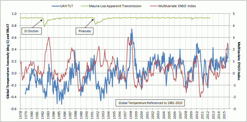
oz4caster
Here’s a 2014 update to MLO transmissions, given at the same conference I posted at but a year earlier:
http://www.esrl.noaa.gov/gmd/publications/annual_meetings/2014/abstracts/64-140401-B.pdf
and here’s their real-time updates:
http://www.esrl.noaa.gov/gmd/grad/mloapt.html
http://www.esrl.noaa.gov/gmd/webdata/grad/mloapt/mlo_transmission.gif
There was post on WUWT about those eclipses a few months ago, with 225 mostly amazing comments:
http://wattsupwiththat.com/2015/10/06/recent-lunar-eclipse-reveals-a-sign-of-global-cooling-in-the-atmosphere/
Keep in mind the MLO record is for a point, and may differ from global values from eclipses of the moon and other satellites. The Chichon and Pinatubo aerosol clouds passed directly over Mauna Loa while the clouds were still concentrated, while the Agung cloud (from south of the equator) was barely a blip at MLO but nearly as large as the other two globally.
I was on the Big Island for the total solar eclipse when the Pinatubo cloud passed over in 1991, and had to double the photo exposures of the eclipse thanks to the obscuring effect of the cloud. It also turned the eclipse from electric blue to a brownish orange.
The one positive PDO phase sandwiched in-between two PDO negative phases this century, only leads to a short global warming period around 0.3 c by 2100. Where there are doubts is in how much solar activity will decline later and what affect it will have on the PDO. How this affects the AMO and AMOC will influence the recovery of Arctic ice this century. There should also be two cold phases of the AMOC this century significantly recovering Arctic ice.
My gut feeling is that this El Nino is not as strong as 98 or 82 and that temperatures will not elevate that much in 2016
NCEP CFSV2 has it number one. Has been nailing warming and cooling periods. 35 year record
Bad grammer, don’t know what your saying here Joe?
Sun Spot….
Brooklyn grammar, not bad grammar, even though Joe’s from Rhode Island.
Of course he knows what he’s saying. I speak Philly myself, and he makes perfect sense.
Do you know what “your” saying, Sun Spot, eh?
Uh, “grammer”?
Like a “pounder”, but a smaller one in Europe?
@ur momisugly Richard Keen — +1 and +1!
🙂
Guess ol’ Grammer Spot is out on the porch, binoculars pressed to her scowling face, a watchin’ like a hawk for Joe to pull onto Maple Street without stopping at the stop sign, fingers just a twitchin’, readytuh dial 911.
Well, I speak Northern Canadian and I WANT Glo.Bull Warming !! Can you figure out WHY ???
Or, maybe his brain is running 100 times faster than his fingers.
Bob Tisdale. Earlier this week I compared the UAH anomalies for 7 year brackets around the 82/83, 91/92 and 97/98 El Nino events to try and gauge the impact of El Chichon and Pinatubo eruptions. I used the same methodology as you used for your post on January 4th but started each plot 2 years prior to the commencement of each El Nino event.
I know you’ve previously talked about a step change arising from the 97/98 El Nino event but my observation is that I saw a 0.2C step change down after the El Chicon and Pinatubo eruptions that lasted at least 5 years. In fact there still lingering impacts from El Chichon leading into the 88/89 La Nina.
Having said this my statistical skills are limited so I would be curious what anyone else could dig out doing a similar comparison.
Mr. Williams, have you read Bob Tisdale’s e book: Climate Models Fail? You might find some of the information you seek, there (you can find all his books here:
https://bobtisdale.wordpress.com/2013/10/16/ebooks-by-bob-tisdale/ ).
Here are some sample quotes from that book:
(Climate Models Fail, p. 123, 151, 255)
Also by Bob Tisdale (about ENSO events): Who Turned on the Heat? ?w=324&h=450
You can find it here:
https://bobtisdale.wordpress.com/2013/10/16/ebooks-by-bob-tisdale/
Best wishes in getting someone to answer your question! (wish I had the technical know-how to do that!)
Possible suggestion: if you reword your question (or break it into main and sub-parts), you might get more responses to your query… your question is a bit vague, it seems to me.
Janice
.. Dear Janice, are you by chance, a librarian ?? You seem to have an unending stream of memorable knowledge !!
Oh, missed this Q, by you, Marcus (when I perused the thread earlier).
No. And that is one of the LEAST desirable jobs I can imagine for myself. THANK YOU, though, for your generous compliment. I remember pretty good, but, mostly the reason I can come up with some helpful links I guess is that I’m okay at research. But, in the profession of which I am a member (though not, at the moment gainfully employed, grrr), research is the most BORING part of it (even though, once I’m into writing a memorandum it is sort of “fun,” well, more like a mystery that is worthwhile, I guess). I LIKE TALKING WITH PEOPLE (and writing creatively and SINGING AND DANCING AND ACTING AND… can you get paid to play? lolololo)
Thank you, so much, for your support. During this particular time in my life, you are a Godsend, indeed.
So, Janice, allow me another guess…
A paleoornithologist?
Actually, librarians are best known for twitching the lights on and off 10 minutes before closing. It wakes up the customers.
My father-in-law was librarian at Los Alamos some years ago, and checked out books to Gamow, Einstein, Teller, Oppenheimer, and the like. All “simple physics” tomes, in Luke’s parlance. He gave me one of the books that was surplused from the library, titled, simply, “How to build an atomic bomb”. It’s about how simple physics can warm the globe.
Hi, Richard,
No. ( lol ) I have no profession at the moment, and it is looking quite likely that, despite my credentials and active license, I never will again. It has become quite clear over the past 2 years that, despite a fine education, with my low-specific-job-experience, I am qualified to be front desk clerk at a hotel and…. that’s about it. Still “holding up my value,” though, thus, I am “between jobs.”
To give you a partial answer, and I am flattered that you are even interested in knowing (and half afraid you are just kidding and I am silly to write this!), here is my education: B.A. in 3 separate majors: Communication; Marketing; and Management; B.S. in Computer Science-Business; J.D..
Lol, you should have seen the paragraph I just deleted.
Stopping now (I can hear the blog police headed my way, Officer Tom Trevor at the lead: “Ms. Moore, you are wasting everyone’s time — move along, move along.”)
Thanks for sharing about your father-in-law. What a wonderful bunch of stories he had to share, no doubt!
I am thankful for that terrible weapon, for it saved more lives than it took. And it was bound to be used by someone… sometime. I am thankful that it was we who used it and not the enemies of freedom. Peace through strength.
Now, technology = strength. That’s why the non-communist world’s (including those on WUWT — you too, Mr. Keen) scientists and engineers of integrity are heroes to me — you all are the key to freedom!
Take care … up there 🙂
Janice
Janice Moore says…
I am between jobs….
… a professional between jobs is a “consultant”. Been there.
J.D…..
… that’s a lawyer, no? That’s a growth industry in modern science. Something to consider.
Thanks for sharing about your father-in-law. What a wonderful bunch of stories he had to share….
… oh, yeah! Amazing fellow, and I’m honored to have known him. But his stories pale in the face of my own Dad’s story of the times. He was getting ready to be drafted (passed his physicial, etc.), and offered an unpromising future on the Kantō plain near Tokyo as a minimum wage GI. But in a microsecond flash his (one-way?) trip to Japan was called off, so he stayed home and had me (consolation prize). The bomb bought him 51 good years. None of this was abstract to us; our neighborhood block in Philadelphia already had fatherless kids thanks to some Germans in France, and if the “gadget” was a dud there would have been more. Not me, though – I simply wouldn’t be here, or anywhere.
I am thankful for that terrible weapon…
… me, too, of course. But the folks we dropped it on happily slaughtered three times as many humans in Nanking as our 2 bombs did in Hiroshima and Nagasaki combined, and mostly with swords and bayonets used in the most hideous manners. So which were the more terrible weapons?
Scientists and engineers of integrity are heroes to me — you all are the key to freedom…
… Thank you, thank you, thank you, for the very heartfelt compliment that is deserved by many (some right here on WUWT). I was drafted 25 years after my Dad’s near miss, and assigned to a weather unit where I learned so much about observing, the importance of quality data (it saves lives, at least on our side), and the sheer pleasure of being a field meteorologist on night shift. I love it so much I’ve been a co-op observer for 32 years now – that’s 11,508 daily observations so far, and a grand total of 6600.2 inches of snow (I’ll never forget that 0.2 inches; seems like it was just yesterday).
Stopping now (I can hear the blog police headed my way, Officer Tom Trevor at the lead: “Ms. Moore, you are wasting everyone’s time — move along, move along.”)…
… same here. g’night.
Now we resume our regular feature on global lower tropospheric temperatures.
.
Richard Keen (12:01am today): read it with pleasure. Thanks for sharing and for the affirmation — you scientist/engineers of integrity deserve high praise.
Meanwhile, meridional flow(intense blocking) produce “Little Ice Age” conditions for England and Europe upcoming in Jan 2016. I hope they have some form of energy
left?
Please bring on the Global Warming.
Ironically, all of those green energy subsidies mandated in California have driven utility rates so high, I can’t afford to pay the heating bills necessary to overcome the lack of Global Warming.
Dear Mike Smith,
Just wanted you to know that your plight has not gone unnoticed, here. I’m so sorry that your home is uncomfortably cold. I wish I had the means to help. Perhaps, a local charity/church would be willing to help with utility costs?
Big Wind, et. al.’s greed, based on l1es about human CO2, is pure ev1l! THEIR leadership (and major investors) are not wearing a sweater, a stocking hat, and a pair of socks to bed every night to keep warm.
With sympathy and concern,
Your WUWT ally for truth,
Janice
Thank you Janice. Now I feel guilty because of your kindness. Things are not quite as dire as I possibly portrayed to make a point. Thankfully we’re not destitute but I think it’s fair to say the utility rates cause some financial struggles.
On the other hand, there are many for whom heating is a matter of life and death! Your sympathy and concern has not gone unnoticed here either.
Best wishes to you and yours.
Phew! Glad to hear that, Mike. And yet, I still feel for you with the pinch that Big Wind, et. al., is putting on the budget of a decent, hardworking, American. You made this country the powerhouse it is, so grand it can withstand even a tumor like the Sustainability Gang (for awhile ….). You deserve better.
Your POINT still stands, indeed! There are many who really ARE wearing their clothes to bed, who wonder if they can make it… . I am glad you spoke up!
Still concerned, but, relieved.
And, thank you.
Also, thanks just for responding to me — a bright spot in my afternoon! (not a lot of correspondence in my In Box… oh, well, there was Morgan Stanley…. said they had carefully considered my application … but,… BUT I DIDN’T WANT TO WORK THERE ANYWAY…… (sour grapes are good for the blues!)).
May 2016 be your best year, so far!
#(:))
Janice
Janice, you are never ending ray of sunshine in a world of many dark places…May your words always shine bright !
…..Now, back to the hockey game !!
Marcus!!! 🙂
Thank you!
YOU are a great encourager! …. you must be the COACH of that hockey team (you are really exceptional, Marcus, a gift from God (I needed some sweetness and light this evening, quite badly and prayed for some and …. there you came (didn’t know God nudged you, did you, heh?) to all blessed to be within your sphere of influence)…. so…. yes! That is good that you are getting back to the game, now, lol.
#(:))
Now…. back to my book (and Beethoven).
Up here in the chilled Rockies, I’m on propane heat (supplemented by beetle kill wood and Amazon boxes) and thoroughly enjoy the miracle of bargain priced fossil fuels – at the flick of a button.
But for some odd reason, our medical expenses went up 50% last year.
So, Janice, are you a librarian?
Hi, Mr. Keen,
I finally found that Q, lol, and answered it here: http://wattsupwiththat.com/2016/01/06/annual-global-lower-troposphere-temperature-tlt-anomaly-update-distant-third-warmest-for-2015/comment-page-1/#comment-2114370
No. I have just always read a lot. LOL, I AM TOO NOISY TO BE A (“ssshhhhh!”) LIBRARIAN!!!
#(:))
Enjoy your gorgeous living situation and keep warm (great heating strategy, there, lots of redundancy in your system! and.. (sigh) the beauty of a wood fire…. those were the days…),
Janice
P.S. Oh, I just wonder why…. “You can keep your health insurance.” Sure. After Obamacare mandates and market restrictions forced the ins. industry to up its prices to cover anticipated cost increases… I can keep it if I pay 150% of what I used to!!! Government Medicine: appealing only to those ignorant of much data from many experiments from around the world from about 1950 on. And I am going on and on! Stopping.
P.P.S. Thanks for bringing your well-informed (that is obvious) and witty insights to WUWT to educate us and to make us laugh.
Yo Janice, glad you like my jokes in the name of science (or science in the name of jokes).
After all, if you can’t laugh at global warming, obamacare, librarians, Luke, and cats, what can you laugh at?
I’ve read most of Bob’s post on this blog Janice and am familiar with the claimed temperature response to Pinatubo and am a big fan of his work.
What i haven’t seen mentioned is what comes across when you look at those 7 year spans of UAH data across the major volcanic eruptions. There are 2 possible conclusions I could draw.
1) The impact of those volcanic eruptions on the UAH records is much longer lasting than scientists claim. The fact is that at years 2-5 after the volcanic eruptions in April 82 and June 91 I’m still seeing UAH temp anomalies 0.2C below what they were for the 2 years leading up to the eruption/el nino.
2) The only other conclusion would be that the 82/82 and 91/92 El Nino’s caused a 0.2C step down in years 2-5 in contrast to what we saw with the 97/98 El Nino.
Dear Mr.Williams,
Please forgive me if my directing you to Bob Tisdale’s work seemed condescending. I’m glad to hear that you are already familiar with his research.
Your question, re-worded, seems straightforward and worth addressing. If no one technically savvy responds to you, it will be to all our loss. Sigh, it happens all the time on WUWT, however, as you no doubt realize.
Best wishes in getting Tisdale (or someone of like calibre to respond)!
Janice
P.S. Perhaps, an e mail to him via his own website, bobtisdale.com?
David,
I’ll refer you back up a few feet in this fabulous post (thanks Bob!) for details. If you go to the full poster, take a peek at the figure at the center bottom (Volcanic aerosols….). El Chichon (1982) had measureable volcanic aerosols until 1986, and Pinatubo (1991) lasted until 1995. Although Pinatubo produced 50% more aerosol than did el Chichon, it decayed/settled out faster (probably because the QBO in the stratosphere https://en.wikipedia.org/wiki/Quasi-biennial_oscillation caused the Pinatubo aerosols to sink and el Chichon’s to rise). Those years of measured volcanic aerosols agree with the years of cooling, with the exceptions of 1983, 1991, and 1995, which were all ticked upwards by el Niño. 1992 was also a weak el Niño, but the volcanic cooling that year overwhelmend the Niño.
The poster shows the relative warming and cooling contributions of volcanoes, el Niño, and greenhouse gases.
Oh, yeah… that comment upstairs in this post is at:
http://wattsupwiththat.com/2016/01/06/annual-global-lower-troposphere-temperature-tlt-anomaly-update-distant-third-warmest-for-2015/comment-page-1/#comment-2114106
Bob, your thoughts on Australia’s BoM latest ENSO report:
El Niño likely past its peak
Issued on 5 January 2016 | Product Code IDCKGEWW00
http://www.bom.gov.au/climate/enso/index.shtml
Thanks for the reply Janice 🙂 I certainly didn’t take your reply to me as condescending just someone trying to help.
Richards reply is informative too certainly backs up what I’m seeing when I chart the UAH anomalies in that the temp impacts extended beyond the 1-2 years some sources suggest.
I would go further and say that following both El Chichon and Pinatubo even at 5 years, anomalies still hadn’t returned to their pre-eruption levels on a 6 mth moving average although the results are a little clouded by ENSO events. The responses though look very similar. The 97/98 curve EL Nino also tracks similar but within 5 years the UAH anomaly on a 6 month moving average was about 0.05C above its starting point.
Its difficult though to tell whats ENSO and whats the eruptions.
And, thank you, David. Yes, indeed, I liked Richard’s fine explanation, too. Your main point is, indirectly, also a powerful refutation of AGW conjecture. Given that it is difficult to distinguish (at times) between the effects of fairly discrete, fairly readily observable, events of great magnitude like ENSO and volcanic eruptions…. HOW IN THE WORLD CAN ANYONE CLAIM (with a straight face!!) that human CO2 emissions, outweighed by natural CO2 by TWO degrees of magnitude, can do ANYTHING to alter the climate of the earth.
It may be so, but to say, “this is likely,” much less (eye roll), “the science is settled,”….. AAAAAAAAAAAAAAAAAAAAAAAAAAAAAAAAAAAAAAAAAAAAAAAAA!!!!!
Insane (or lying).
Oxford University’s Professor Myles Allen speaking on the Today programme on BBC Radio 4,said:
“You asked is this the new normal, well as I stressed, normal weather, unchanged over generations, is now a thing of the past.” (my bold)
Dear professor Allen, I suggest you statement is an embarrassment to what it use to be world class university.
(extract from the telegraph
Hear, hear!
Oxford U. powers that be: (tiny cough) Wih eht Oaksfuhd prehfuh to seh, “Professor Myles Allen who once attended Oxford.”
🙂