Guest essay by Barry Wise
Christopher Monckton has pointed out that a trend of zero or smaller can be calculated stretching back over 18 years, but critics have pointed out that this encompasses the super el Niño of 1998 and so biases the trend downward while the overall temperature is still rising. Of course they also don’t mention that the el Niño biases the trend upward when the trend is viewed in it’s entirety. Now Lord Monckton has identified a valid point and so do his critics. What if we look at how the trends vary over differing lengths of time? Can Lord Monckton be validly accused of cherry picking or are his critics nit picking? This article will attempt to show a broader view of how the trends have varied over time, both from the beginning of the the record and from the end.
To begin, at what point do we say that a trend of a given length makes sense in terms of whether it’s an indication of future global temperatures or just a statistical anomaly? Obviously the longer the better, or so one might surmise, but then that’s assuming that the data represents a linear trend. The more data you have the less any additional point will affect the overall trend. Given that, one might expect the trend to oscillate around a given value with a reduced amplitude as it zeroed in on the actual trend.
So what actually happens? For this exercise I’ll use RSS lower troposphere data since that is what Lord Monckton used. Here is the RSS data for the full period of the data from 1979 to the present with the 1998 el Niño shaded in grey and showing the least-squares linear-regression trend line for the entire data set. The el Niño time period is based on data from El Niño and La Niña Years and Intensities. The slope of the line is approximately 1.2 K/century which, as it turns out, is below the low end of the IPCC projection (1.9 to 4.2K/century) but is consistent with a doubling of CO2 with no secondary effects.

Let’s look at how the trend has varied starting from the earliest data. I’ll start with a minimum length of ten years (an arbitrary length but shorter lengths give widely varying trends that make it hard to read the graph) and I’ll increase the length in one month increments. The trends are plotted based on the end date used for the data of each trend, with the full data shown below as a reference. The shaded area brackets the 1998 el Niño so we can see where it enters into the computation of the trends. Notice how much the trends vary prior to the el Niño. Everything from about 1.6 down to .4 K/century. This would indicate that data that is less than 20 years (at a minimum) is unreliable to discern the trend over a longer term. Notice too how the trends peak with the el Niño but immediately start tailing off. By the end of the data the trend is at the 1.2 K/century we calculated before and the change in the trend is flattening out. Also of note is the rapid rise of the trends when the el Niño occurred.

Now let’s look at how the trends changes as we increase the length in one month increments starting at the present and working backwards to see how Lord Monckton’s 18 year 8 month value fits into the changes that occur as we vary the length of the data. In a similar fashion to the previous chart, I started with a minimum data length of ten years. Notice that not only are there negative trends where the el Niño data is included but there are also negative trends prior to that data. Additionally, the trends prior to including the el Niño are even more pronounced, longer and extend back to June 2000 which is over 15 years. Also of note is that this includes the 2010 el Niño which, by it’s relative location, should bias the trends in a positive direction at these lengths. At no point does the trend exceed .5 K/century for the data after the 1998 el Niño. Just prior to the el Niño the trends are approximately .7 K/century.

This article has just been my attempt to show a broader view of how the temperature trends have evolved. I make no claim to whether Lord Monckton or his critics are correct. In summary we now have over 35 years of satellite data with over 15 years post 1998 el Niño showing little, no or even negative trends at that length. The data prior to the el Niño also shows trends that are at or below that the IPCC has promoted, not to mention the entire record. While some have critiqued Lord Monckton’s trend because of the inclusion of the super el Niño I would question their consistency because I haven’t seen a similar complaint based on the much larger effect that it had on the trend from the beginning of the record. Given the lack of a positive trend post el Niño, it would appear that there was a step that occurred in the earth’s atmosphere’s temperature. The present el Niño is being touted as being another massive one. Will it too show a step?
Getting his critics to admit that it was hotter in 1998 than now seems like progress.
One factor that could indicate who has the better argument is what happens as time goes by and the “no trend” effect gets longer. If, after a year, the “no trend” is only a year longer, still starting at the same point (whether at or some time shortly before the El Nino), that would be strong evidence that the 1997 El Nino has (at least temporarily) overwhelmed the trend and perhaps should be normalized to filter out the outlier effect.
However, if, after a year, the trend has extended by more than a year, with the latest period of “no warming” allowing you to set an earlier start date for the trend, then that would be strong evidence that the 1997 El Nino has not overwhelmed the trend and the cessation of warming is real.
Note, I did not use the word “pause” anywhere in that comment. That was deliberate–it is not and logically cannot be a pause until after the warming starts up again. I’d like to see skeptics stop using that inaccurate, pro-CAGW word.
What do you mean “logically cannot be a pause until after the warming starts up again”
What if it starts cooling?
You believe it can only start warming again? What about cooling? Not possible?
rd50, Seriously? What I mean is plain, it’s basic English–something cannot be a pause in the trend unless the trend resumes at the end of the pause. In this case, that means there is no pause in the warming unless and until the warming resumes. If the warming does not resume, then it is not a pause. Period. What it does instead is irrelevant to the point.
Well there is no evidence that it is a pause by your definition, since that can’t be determined until it starts warming again.
So it isn’t a pause; it’s a stop, and it will either change to warming or apparently more likely a cooling; but right now it has stopped.
I suggest including a test of statistical significance of the slope.
When the data series includes an anomalous event, such as the el-Nino and la-Ninas of 1998 to 2000, it should be considered whether Least squares is the appropriate tool.
Chris4692; you simply are not paying attention.
The Monckton algorithm DOES INCLUDE a test of statistical significance.
The algorithm does not stop UNTIL there is a statistically significant non zero trend.
“…at what point do we say that a trend of a given length makes sense in terms of whether it’s an indication of future global temperatures or just a statistical anomaly?”
We may just be confusing the two meaning of the word “trend”. For example, take 100 numbers from a trendless series such as a random walk. A “trend” can be calculated, but it does not imply anything about the future which is the other common meaning of the word “trend”.
Global temperatures may not be a random walk, but statistically Lord Monckton has shown that we cannot differentiate the MET temperatures since 1850 from a random walk.
If global temperatures are deterministically chaotic (no, that is not a contradiction; that is the meaning of chaotic) with many drivers and interaction, we would expect the temperature series to appear somewhat like a Gaussian random walk.
Others have studied the past climate record and arrived at similar conclusions. Note the 0.5 C trend claimed in their study
“Climate has varied in the past and can be expected to do so in the future. Mankind has adapted
to both cool and warm periods, and trade and economic growth over the past 300 years has greatly
increased our ability to do so. In that context, forecasts of climate are of little value unless they are for a
strong and persistent trend, and are accurate.
The IPCC “forecasts” are for a strong and persistent trend, but they have been inaccurate in the
short term. Moreover, there is no reason to expect them to be accurate in the longer term. The IPCC’s
forecasting procedures violate all of the relevant Golden Rule of Forecasting guidelines. In particular,
their procedures are biased to advocate for the hypothesis of dangerous manmade global warming.
We found that there are no scientific forecasts that support the hypothesis that manmade global
warming will occur. Instead, the best forecasts of temperatures on Earth for the 21st Century and
beyond are derived from the hypothesis of persistence. Specifically, we forecast that global average
temperatures will trend neither up nor down, but will remain within half-a-degree Celsius (one-degree
Fahrenheit) of the 2013 average.
This chapter provides good news. There is neither need to worry about climate change, nor
reason to take action”
http://www.kestencgreen.com/G&A-Skyfall.pdf
Here is a link to an Excel file that produces an adjustable RSS chart that might be useful. It will let you see how changing the start and stop points for the regressions will change the trend. It has adjustable smoothing that is superimposed over the original data. It has an update button to download the latest RSS data. You must allow Excel to run macros for the update function to work.
https://www.mediafire.com/?5f12zar174q44qz
If you need for me to send the file directly as an attachment just let me know.
I created this with Excel 2003. It should run on newer versions of Excel. I would be interested to know if the program doesn’t run on some newer version of Excel.
The VBA code is protected to avoid the possibility of someone adding code that might be harmful.
C. Bruce Richardson Jr.
richardson@swbell.net
To cut a long discussion short, this contribution shows again that Lindzen & Shou were probably very much in the ballpark when they came up with the +/- 1.2C for a doubling of CO2. “The iris effect acts to reduce the sensitivities from the range, 1.5°–4°C, to the range 0.64°–1.6°C.”
I know this is really, really off topic, well kind of. It is about temperature. http://news.yahoo.com/freezing-migrants-cry-foul-german-cold-bites-074636764.html
The Paris conference is soon to start, Many of us have been expecting early freezes and snow. It already has been snowing early in many places but not much.
My thought is how will it be presented Paris, if there is a bad early freeze in German etc and many of the refugees perish from it?
Perhaps I’m to Machiavellian.
michael
And yes the thought that it could happen to those people frightens me.
It will be blamed on Glo.Bull Warming no matter what happens !!!!
9 inches of snow in Syracuse NY.
Interstate 81 was closed.
Accidents etc., 10 Centigrade
Never before in mid-October.
Does this mean anything.
No
El Niño events are not climate. They are not heat sources – they represent a cooling event, in fact, because they release accumulated heat from the ocean. That energy necessarily passes through and warms the atmosphere briefly, but ultimately is gone forever. It is an impulse. For long term trends it can and should be ignored, IMO. It does have value to global warming alarmists as a event to sensationalize, though, so it appeals to the news cycle hysteria mongers.
If it’s perceived to be bad, it’s climate. If it’s perceived to be normal or beyond human control it’s just a brief event that can be ignored.
I’m surprised they haven’t started claiming that our SUVs are creating holes in the sun!
http://www.dailymail.co.uk/sciencetech/article-2894840/Mystery-sun-s-south-pole-Nasa-reveals-huge-coronal-hole-solar-surface-winds-jet-500-miles-SECOND.html
This is the new normal. We’ve loaded the dice toward sun holes with our reckless negligence toward Gaia.
Ah, you made a point that got me started on this essay. I veered off into the trends though but originally I was curious about what an el Niño meant in terms of the effect on the energy budget of the earth. From that point of view the ocean is a heat storage unit (think capacitor) that when the el Niño occurs releases it across a resistance (the atmosphere) to ground (space). Some gets left behind that we see as the temperature change in the atmosphere. I know that’s a really rough analogy so please will any commenters not explain why it’s not like electronics and the ocean isn’t a capacitor. In any event, I agree that el Niño’s effectively remove heat from the system as a whole when total heat content is considered.
You are spot on, dp.
There were essentially no El Niño events during the Holocene Climatic Optimum when the planet was significantly warmer than the present. The world was then dominated by La Niña events. El Niño events start to be more frequent after the Mid-Holocene Transition, during the Neoglacial period, and therefore are a feature of a cooling planet.
The more the planet has to cool, the more El Niño events take place. As they take heat from the ocean and place it into space they are net contributors to the planet cooling.
In the last 12 years we have had 6 El Niño events (>0.5° in El Niño 3.4 area). This is some sort of Holocene record. An average of one El Niño every two years, yet global temperatures barely have changed. It is very difficult to sustain the opinion that El Niño events cause warming in the face of this evidence. They are significant contributors to the lack of warming.
I see the step function across the 1998 el nino.
This has been pointed out before by many, and is often called the climate shift.
Eye balling I see about a 0.25 degree shift up in the average level. (see fig. 1, RSS data).
It will be interesting if the current big el nino will give another step up, even after the next la nina.
And why do those earth cartoons always show the thermometer with the wrong end in the mouth?
Because the warmists have many things backwards !
IMHO the actual slope of 1.2 deg/century is the best estimate of global warming going forward. I trust the actual data more than the IPCC models. This rate of warming is caused by some combination of nature and anthropogenic. Man’s activity became significant around 1960 or so. Before that, any warming was natural. Warming from 1800 to 1960 was occurring at a rate of around 0.5 deg/century. So IMHO a reasonable projection is that natural warmingwill continue at a rate of 0.5 deg/century and man’s activity will add additional warming at a rate of 0.7 deg/ century.
These figures imply that
1. Warming is not occurring at a catastrophic rate.
2. Efforts by the UN, the EPA, etc. to reduce carbon emissions will have a negligble impact on global warming.
Barry. – you say
“To begin, at what point do we say that a trend of a given length makes sense in terms of whether it’s an indication of future global temperatures or just a statistical anomaly? Obviously the longer the better, or so one might surmise, but then that’s assuming that the data represents a linear trend. ”
Earth’s climate is the result of resonances and beats between various quasi-cyclic processes of varying wavelengths combined with endogenous secular earth processes such as, for example, changes in the earths magnetic field. It is not possible to forecast the future unless we have a good understanding of the relation of the climate of the present time to the current phases of these different interacting natural quasi-periodicities which fall into two main categories.
a) The orbital long wave Milankovitch eccentricity,obliquity and precessional cycles which are modulated by –
b) Solar “activity” cycles with possibly multi-millennial, millennial, centennial and decadal time scales.
The convolution of the a and b drivers is mediated through the great oceanic current and atmospheric pressure systems to produce the earth’s climate and weather.
After establishing where we are relative to the long wave periodicities, we can then decide which is the appropriate length of the temperature time series required to illustrate whatever working hypothesis one is suggesting and based on past patterns make reasonable forecasts for future decadal periods.
For forecasts of the timing and extent of the coming cooling based on the natural solar activity cycles – most importantly the millennial cycle – and using the neutron count and 10Be record as the most useful proxy for solar activity check my blog-post at
http://climatesense-norpag.blogspot.com/2014/07/climate-forecasting-methods-and-cooling.html
The most important factor in climate forecasting is where earth is in regard to the quasi- millennial natural solar activity cycle which has a period in the 960 – 1020 year range. For evidence of this cycle see Figs 5-9. From Fig 9 it is obvious that the earth is just approaching ,just at or just past a peak in the millennial cycle. I suggest that more likely than not the general trends from 1000- 2000 seen in Fig 9 will likely generally repeat from 2000-3000 with the depths of the next LIA at about 2650. The best proxy for solar activity is the neutron monitor count and 10 Be data. My view ,based on the Oulu neutron count – Fig 14 is that the solar activity millennial maximum peaked in Cycle 22 in about 1991.
http://3.bp.blogspot.com/-QoRTLG14Siw/VdOUiiFaI5I/AAAAAAAAAYM/NxQVb2LMefk/s1600/oulu20158.gif
There is a varying lag between the change in the in solar activity and the change in the different temperature metrics. There is a 12 year delay between the activity peak and the probable millennial cyclic temperature peak seen in the RSS data in 2003.
http://3.bp.blogspot.com/-gH99A8_0c6k/VexLL1zC7AI/AAAAAAAAAaQ/T50D6jG3sdw/s1600/trendrss815.png
There has been a slight cooling temperature trend since then .There is likely to be a steepening of the cooling trend in 2017- 2018 corresponding to the very important Ap index break below all recent base values in 2005-6. Fig 13.
I suggest that the trends as shown on the RSS plot above show most clearly what is actually going on i e that we are just past a millennial peak in a solar activity cycle.
If 2003 was a maximum in the millennial cycle of 980 years, then the previous minimum has to be located at 1513. This cannot be correct as we know that temperatures were significantly lower around 1650-1750, and even early 19th century. The position of the millennial cycle is uncertain and therefore no forecasts can be made from it.
The last peak was at about 990 +/- therefore we might expect the current peak to be between 1950 and 2010. – the data suggests about 2003.
You assume that the shape of the curve is symmetrical – it isn’t .
The minimum on the 50 year moving average is at about 1630. I use the simplest assumption which is that the shape of the curve from 990 – 2003 will repeat from 2003 -3013.
Of course ,in the real world,no cycle ever repeats exactly but I believe that my assumption is about as good as anyone can do at the present state of our understanding and that it will but us in the ballpark for longer term forecasting and climate policy purposes.
http://2.bp.blogspot.com/-4nY2wr6L-WY/U81v9OzFkfI/AAAAAAAAATM/NA6lV86_Mx4/s1600/fig5.jpg
I see, you base your theory in a particular temperature reconstruction that shows a particular peak at 990. But you know that we don’t really know if that particular peak existed or was a millennial maxima, don’t you? All we know is that between about 950 and 1300 the world was warmer than before and after.
No, I don’t assume that. Usoskin et al. 2007 have demonstrated that solar cycles are about solar grand minima. Grand maxima do not show any periodicity. There are no warming events in the Holocene, just cooling events and recovery. 8.2, 5.5, 4.2, 2.8 Kyr events and LIA are all cooling events. You have to understand the nature of solar cycles, because looking for peaks is wasting your time.
Javier See Fig 5 at.There are perfectly good peaks close enough to 10, 000. 9,000. 8,000. 7,000. 2,000.1,000.and the present.
http://climatesense-norpag.blogspot.com/2014/07/climate-forecasting-methods-and-cooling.html
For a complete discussion of the cycles See all of Section 2 at the link above.
In order to make forecasts you don’t actually have to understand solar cycles ( although that would be nice) – simply see that they exist in the data,
1. That is a single proxy from one location. You make a mistake if you assume that it represents global climate. Other proxies have other peaks.
2. Just because those peaks are separated ~1000 years you assume that they are solar in origin, yet you have no evidence of that, at all.
3. In fact the spacing of the last 4 peaks that you mention (you conveniently forget peak at -1500) is 1150 years according to Ole Humlum. You cannot reconcile that spacing with a cycle of 980 years. By the third cycle the accumulated difference is already 510 years which is half cycle.
So no, they are not perfectly good peaks, they do not support a 980 year cycle, you have no evidence that they represent global changes, and you have no evidence that they correspond to changes in solar activity.
The ~1000 year solar cycle is real, but you are not seeing it in that GISP2 graph. If you would bother to really study the subject that you write about you would have noticed in wavelet analysis of reconstructed solar activity that the ~1000 year solar cycle essentially disappears between 6000 and 1500 years ago. As it happens with many cycles, it weakens and becomes undetectable only to return for the last two oscillations.
Eyeballing graphs and peak assignation will not get you on the right track to understand Holocene climate.
Javier
You say “The ~1000 year solar cycle is real, but you are not seeing it in that GISP2 graph. If you would bother to really study the subject that you write about you would have noticed in wavelet analysis of reconstructed solar activity that the ~1000 year solar cycle essentially disappears between 6000 and 1500 years ago. As it happens with many cycles, it weakens and becomes undetectable only to return for the last two oscillations.”
My point exactly – the 1000 year cycle is real – and I agree that these cycles appear and disappear when using wavelet analysis and it does indeed return for the last two oscillations – the ones most relevant for forecasting the next 1000 years-which is my chief interest.
You also say
“1. That is a single proxy from one location. You make a mistake if you assume that it represents global climate. Other proxies have other peaks.”
Look at the other evidence of a long lived millennial cycle which I linked above in Section 2.3 at
http://climatesense-norpag.blogspot.com/2014/07/climate-forecasting-methods-and-cooling.html
And of course there are other peaks – see the smaller amplitude 60 year cycle discussed in Section 2.4
As to the solar connection see figs 6 and 10 – 14.
You have to put all the data together to make a complete picture.
The millennial solar activity peak at 1991 fits remarkably well with a possible millennial RSS 2003 temperature peak. (See Fig 3 at
http://adsabs.harvard.edu/full/2005ESASP.560…19U )
Javier
Wavelet analysis shows the solar millennial cycle very well at 2024 years which is certainly close enough to the window I am suggesting.
http://www.pnas.org/content/109/16/5967/F4.large.jpg
Sorry – typo – should be 1024 years.
The Fig is at
http://www.pnas.org/content/109/16/5967.full
TSI
http://woodfortrees.org/plot/pmod
what point do we say that a trend of a given length makes sense
===============
as a general rule, any trend that changes with the length of the sample is not a trend. it is an artifact of the sample size.
Cherry picking is not including the 1998 El Niño. It would be starting at the peak in 1998, which would give the lowest trend. The critics who allege cherry picking are projecting their own proclivity for cheating with the math and data.
The 1998 El Nino actually causes the zero trend to disappear.
If it were not for the 0.26C warming from that El Nino and associated events, the ZERO trend would cover the WHOLE 37 YEARS of the satellite record.
It’s really far more simple than all of this, but I do appreciate the article’s detail.
If you take a trend for as far back as it can go and essentially equal zero…..Monckton is simply correct. Period. That’s not cherry picking. If the time period for this was 2 months, it would be meaningless. Almost 19 years! It’s quite notable.
Even if this trend continued for 100 years , the warmists would still say ” Your cherry pickin’ the data ” !!!!!
There is no cherry picking because it is from present to the past.
It was no different when the planet was showing warming to the present back in 1999.
http://www.woodfortrees.org/plot/rss/from:1985/to:1999/plot/rss-land/from:1985/to:1999/trend
The fourteen years of warming was not cherry picked back then because it represent the recent warming to the present. Comparing no warming to the current present has been no different to this. Before then global temperatures were cooling from the beginning of the satellite data.
http://www.woodfortrees.org/plot/rss/to:1985/plot/rss-land/to:1985/trend
The problem is those calling this cherry picking, have no other than to do this because they can’t defend it and avoid confrontation. They are hypocrites because back in the 1990’s the alarmists were only doing the same thing. In both cases rightly so because all it is doing is showing how the present is behaving from the recent past.
It is much worse though because the no warming period is considerably longer than the warming period in the first place and the ignorance of this just shows what a scam global warming has been and increasingly become.
Plotting temperature vs time is really a straw man.
Why not plot CO2 on the x-axis vs temperature on the y-axis over the last 20 years and see what the regression looks like?
Here is more than you want:
http://www.climate4you.com/images/HadCRUT4%20GlobalMonthlyTempSince1958%20AndCO2.gif
and even more:
http://www.climate4you.com/images/HadCRUT4%20GlobalMonthlyTempSince1958%20VersusCO2.gif
If you include HADCRUT4 since 1958 and include satellite data instead from 1979 there is only 13/14 years that rise with CO2. Therefore that means only ~23% of data matches with the trend of CO2 and those that do lag global temperatures between 1 and 10 months.
http://i772.photobucket.com/albums/yy8/SciMattG/Derivative%20RSSvCO2_zps6tiwpduo.png
Matty G,
The data shows that ∆CO2 is caused by ∆T.
That cause-and-effect relationship is found on all time scales:
[click in chart to embiggen]
Agree, the graph also shows the same thing over the recent satellite data.
Stealey, both of your charts are “overlays”
..
[?? .mod]
@’tim r’, or should I say ‘David’,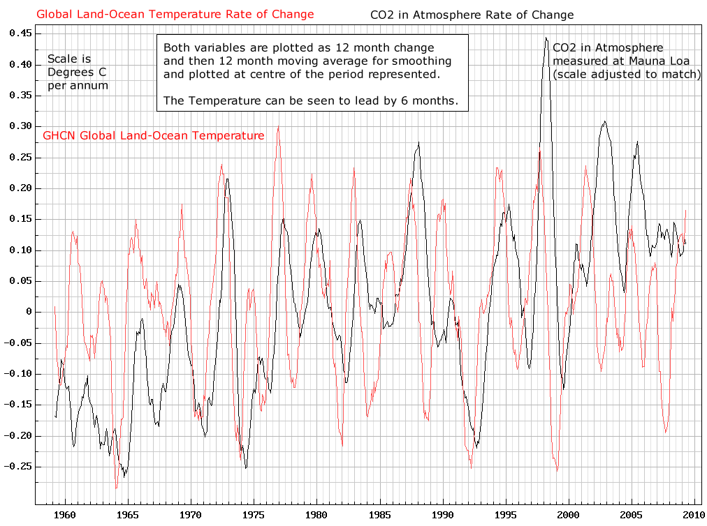
You are wrong as usual.
Look at the “Note”, right in the middle of the bottom chart in my post above. It states:
NOTE: TEMPERATURE CAUSES CO2 CHANGE
Cause-and-effect, see?
The chart above is a long term, 740,000 year view showing that changing global T is the cause of changing CO2. And here is a short term chart from 1960, showing the same cause-and-effect:
So you see, they are not overlay charts. Only the alarmist cult uses overlay charts to claim CO2 is a cause of changing T. But overlay charts don’t show any cause and effect. Thus, the alarmist cult can hide the fact that the only charts available show that ∆T causes subsequent ∆CO2.
But nice try, ‘David’.
http://zfacts.com/metaPage/lib/zFacts-CO2-Temp.gif
http://www1.ncdc.noaa.gov/pub/data/cmb/images/indicators/global-temp-and-co2-1880-2009.gif
Mr. Penn, hi
Whatever happen to the ‘pause’ in your first graph
as you can see here there is a good correlation and the PAUSE !
http://www.vukcevic.talktalk.net/GT-GMF1.gif
To Alan Penn below.
You posted two graphs below.
Certainly want to look at both.
So, please cite the source or give us a link.
I gave my graphs with full link in my post.
Please do the same.
Should be To Alan Penn above!!
Barry, you are believing the climate scammers’ nonsense: “…but is consistent with a doubling of CO2 with no secondary effects.”
Not according to this:
http://wattsupwiththat.com/2010/03/08/the-logarithmic-effect-of-carbon-dioxide/
What is ‘Beginging”?
Well, well well. What do we have here but another non-reader? If you had read my book “What Warming?” you would not have come out with all these non-sensical claims. First, your figure 1 is worthless. Putting a linear fit on data that are non-linear is equivalent to demoting all observations to random noise. And figure 2 is a fantasy. A basic thing you miss is that there is a discontinuity in this temperature region brought on by the appearance of the super El Nino of 1998. You must not combine the right and the left sides of it into one statistical mishmash. You are not the only one doing that. This stupidity is flagrant in the CMIP5 horsewhip display that attempts to, but fails, to incorporate the hiatus into itself. Lets take an overview of the data involved. I suggest you read my book and have figure 15 out to follow it. The base of my figure 15 is a combination of UAH and RSS satellite data, plotted on the same curve. They are so close to one another as to be ibdistinguishable when plotted together but you do get a noticeable reduction of noise. You will notice also that I used a magic marker to outline the trend line that includes five El Nino peaks on the left. The super El Nino itself is not part of this ENSO wave train so I left the magic marker off. It i obviously of different otigin. The magic marker starts again on the right side and is contnued until the present. There is no way you can follow this path with any statistical curve. The noise that necessitates using the magic marker comes from the cloudiness variable, combined with the changing view from the orbit. This sets the maximum noise amplitude. As soon as the super El Nino emds it is followed by a short step warming that starts in 1999. It looked at first like another El Nino starting up but it went higher. In three years it raised global temperature by one third of a degree Celsius and then stopped in 2002. That short and intense period is very likely caused by the mixing action of the returning waters of the super El Nino. This makes the year 2002, not 1997, the proper starting point for the hiatus. For the next five years temperature vacillated about a high level mean and never came down to its previous level as I had expected. I started calling it the twenty-first century high. But then a La Nina appeared in 2008. This is the cooling that Trenberth cursed in his Climategate email. It was followed by an El Nino in 2010. I thought the regular ENSO oscillations had finally returned but I was wrong – the El Nino of 2010 was followed by more of the vacillations that we saw at the beginning of the century. As the El Nino watcheers have told us we should get an El Nino this winter but I think not – that peculiar vacillation is still going on. Before taking up this behavior let us see what the El Nino wave train on the left tells us. It is a classic El Nino oscillation induced by a side to side sloshing of the pcean water in tropical Pacific. Its power source is trade winds and its natural period is about four and a half years. An El Nino wave is first formed in the werstern Pacific at the Indo-Pacific warm pool. It crosses the ocean along the equatorial counter-current and runs ashore in South America. Nino3,4 is an observation post El Nino watchers use. It sits in the middle of the equatorial counter-current and measures water temperature as the El Nino waves go by. Several months after one has passed global air temperature rises and we notice that an El Nino has arrived. The lag time is due to the fact that an El Nino wave at Nino3.4 location still has to traverse half the ocean before reaching South America. Once there it spreads north and south along the coast, warming the air above it. Warm air rises, joins the westerlies, and we finally notice the arrival of an El Nino. To close the cycle a back flow takes place. Any wave that runs ahore must also retreat and when it does so water level behind it drops by as much as half a meter. Cool water from below then fills the vacuum and a LacNina has started. As much as the El Nino warmed the air a La Nina will now cool it and mean ocean temperature remains the same. I took advantage of this in figure 15 and marked the half way-points between an El Nino peak and the bottom of its neighboring La Nina valley with dots. These dots show the time history of global mean temperature as the wave train developed. They define a horizontal staight line which which extends from 1979 to 1997. This defines the length of the hiatus of the eighties and nineties that IPCC has decided to disappear. What they have done is to show a fake warming hey call “late twentieth century warming” in its place. I discovered that HadCRUT3 was the source of this fake warming (figure 24), even put a warning about it into the preface of the book, but nothing happened. Later I found that GISS ac NCDC were its co-conspirators. Changing official temperature records to fool other scientists is a scientific crime. It needs to be investigated by RICO and appropriate punishments used as necessay. The fact that the temperature plateau has persisted throughout this century is very likely due to the deep stirring up pf subseurface warm layers by the super El Nino. The origin of the super El Nino is not the same as ENSO. It is a rare phenomenon of possibly centennial occurrence. The irregularity of twenty first century El Ninos could be related to variability of Pacific wind patterns. The westerlies that carry warm El Nino air and the trade winds blow in opposite directions. The dividing line between them is somehere south of the Mexican border. If, for any reason, that dividing line should move north more of the warm air would get trapped into the return flow of the trades. This could weaken or even suppress the El Nino. It is possible that the hiatus that followed the super El Nino has some influemce over winds but that is a speculation. That “blob” of warm water near Northwest coast may likewise be another symptom of irregular winds in the Pacific. Apparently those people who get billions to do climate research are not doing any reasearch that could explain these mysteries.
Ignoring the computational mandate that temperature change occurs as a transient in response to the time-integral of net forcing (not directly with the instantaneous value of the net forcing itself) is all too common.
If earth’s magnetic dipole is considered to be a forcing on temperature, its effect on temperature must be in accordance with the time-integral of a math function of the geomagnetic dipole, not directly with the magnitude of the geomagnetic dipole itself. Thus the graphs at vukcevic Oct 20, 12:24 am actually demonstrate that global temperature is NOT driven by the geomagnetic dipole.
The two factors that do drive average global temperature (R^2=0.97 since before 1900) are identified at http://agwunveiled.blogspot.com
The reality is that the 1997 – 2001 El Nino and associated events causes a STEP change of approximately 0.26ºC
Without that step change, there is basically NO WARMING AT ALL in the RSS satellite data.
http://woodfortrees.org/plot/rss/from:1979/plot/rss/from:2001.2/trend/plot/rss/from:1979/to:1996/trend/plot/rss/from:2001.2/trend/offset:-.26
The slight warming trend from 1979-1997 has been essentially cancelled by the cooling trend since 2001.
The current El Nino hasn’t yet provided the spike that the 1998 and 2010 El Nino’s did. It will be interesting to see if it does, but if it doesn’t the cooling afterwards could take us back down to where the satellite record started.
ps.. putting straight lines through step changes is a mugs game.
“The current El Nino hasn’t yet provided the spike that the 1998 and 2010 El Nino’s did. It will be interesting to see if it does, but if it doesn’t the cooling afterwards could take us back down to where the satellite record started.” Andy, this would not be allowed to happen. There is no way, no way at all, that all the people with a significant investment in CAGW, either by way of money or reputation, would simply accept that data. Sorry to be cynical.
Notice also that the 2010 La Nina/El Nino did not have any effect on the general cooling trend since 2001.
No step change… just a pair of cancelling spikes.
I disagree. El Chichón, Pinatubo and Hudson caused the step change. El Nino did sweet fanny adams over the longer term and probably resulted from the latter two. [1800 x 3200px, 542kB image].
http://s12.postimg.org/bmuc6dujf/UAHCO2.png
A step change to the temperature of the planet would mean a step change to the energy content of the planet which is clearly impossible. There was no massive, sudden influx of energy. Even a sudden change in net forcing would affect temperature only as the effect of the time-integral of the change to net forcing was accumulated. Thus a step change in REPORTED temperature indicates nothing more than a change in method of data acquisition or reduction.
No, you’re equating atmospheric temperature with the total heat energy of the planet. The oceans act as an energy sink which is not measured by the atmospheric temperature. When an el Niño releases that energy there is a rise in the temperature of the atmosphere as that energy is radiated into space. Some gets absorbed by the gases that are sensitive to the wavelengths of the released energy which raises the temperature of the atmosphere but it is energy that was already in the system. Just not in the atmosphere. How long that energy stays in the atmosphere is an interesting question.
ENSO represents a tiny fraction of the earth’s surface. Regardless of how and where temperature is measured (as long as it is done consistently and meaningfully), it must change slowly in response to the time-integral of the net forcing. Sudden significant changes in the average temperature of the planet can not happen even with the process you described. See the differences in the graphs for annual and 5-year smoothed measured temperatures Figures 1 and 1.1 in the analysis at http://agwunveiled.blogspot.com
On temperature trends of interest
CET is the longest instrumental record going back to 1659. While the summers’ trend-line is almost flat, the winters show greatest trend increase since. January as the coldest month shows nearly 3C rise in the average temperatures since the early 1770s, giving a clear indication of the LIA ending and the start of current long term warming period.
http://www.vukcevic.talktalk.net/CET-LIA.gif
CET: January & February 11 year moving average
And look how steady that warming trend is.
(no I don’t mean the orange line, ignore that and look at the general trend.!)
Ups and downs, sure, but no sign at all of any CO2 forced acceleration. NONE WHATSOEVER !
Critics of LMofB’s pause graph don’t understand it. I’ve explained to a few who thought he cherry picked the data how it works. Helpful
This is not the kind of data for which fitting a trend line makes a great deal of sense. We can roughly characterise it as “noisy but steady up to some time in the 90s, noisy but steady at about 0.25 higher thereafter, clear anomalies in 1998 and 2010, time of shift not well defined.” We can also say, “this is a time series; it is highly positively autocorrelated, and this gives the appearance of cycles, but 1998 and 2010 still stand out”. The thing that hits you in the eye like a poke from a clue stick is not a trend but VARIATION. You can fit a straight line to any data set, but whether the result has any practical importance is another matter. As the “Scottish Sceptic” demonstrates with his 1/f noise page, an apparent trend may be an entire illusion, and you will fall for it if you don’t start by trying to understand the nature of the variations in the data.
The Monckton test for the length of the pause is “a sequential test for change of mean”, more precisely the stopping rule for such a test. As such, it is in the vernacular sense of the word, biased. This should give no comfort to his critics: sequential tests try to stop *early*, so he is doing the very reverse of “cherry-picking”.
Nicely presented. I like your reasoning and presentation:
” The thing that hits you in the eye like a poke from a clue stick is not a trend but VARIATION. You can fit a straight line to any data set, but whether the result has any practical importance is another matter.”
Indeed more Monckton, Don’t change the approach. He is there, not predicting, simply observing. Keep observing!