Still no global warming at all for 18 years 8 months
By Christopher Monckton of Brenchley
To the growing embarrassment of the world-government wannabes who are preparing to meet in Paris next month to inflict upon the world a Solomon Binding treaty that will, in all but name, create an all-powerful global tyranny-by-clerk for the first time, the central pretext for the entire venture – global warming – continues to be conspicuous by its prolonged absence.
One-third of Man’s entire influence on climate since the Industrial Revolution has occurred since February 1997. Yet for 224 months since then there has been no global warming at all (Fig. 1). With this month’s RSS temperature record, the Pause equals last month’s record at 18 years 8 months.

Figure 1. The least-squares linear-regression trend on the RSS satellite monthly global mean surface temperature anomaly dataset shows no global warming for 18 years 8 months since February 1997, though one-third of all anthropogenic forcings have occurred during the period of the Pause.
We are now entering the northern-hemisphere autumn. That is traditionally the time when an el Niño begins to make itself felt. It is becoming ever more likely that the temperature increase that usually accompanies an el Niño will begin to shorten the Pause somewhat, though a subsequent La Niña would be likely to bring about a resumption and perhaps even a lengthening of the Pause.
Beware: the year or two after an el Niño usually – but not always – brings an offsetting la Niña, cooling first the ocean surface and then the air temperature and restoring global temperature to normal.
For amusement, watch the recent Senate Judiciary Committee hearing at which Senator Cruz cross-examined the hapless head of the Sierra Club, who had testified that global warming was dangerous but was not aware that there had not been any for more than 18 years, a point that Senator Cruz put to him several times. The reply, repeated half a dozen times as a zombie-like mantra, was that 97% of scientists thought the world was “cooking up, heating, and warming”. The Pause is beginning to claim its first victims.
The hiatus period of 18 years 8 months is the farthest back one can go in the RSS satellite temperature record and still show a sub-zero trend. The start date is not cherry-picked: it is calculated. And the graph does not mean there is no such thing as global warming. Going back further shows a small warming rate. And yes, the start-date for the Pause has been inching forward, though rather more slowly than the end-date, which is why the Pause continues on average to lengthen. And, like it or not, so long a stasis in global temperature is simply inconsistent not only with the extremist predictions of the computer models but also with the shrieking panic whipped up by the rent-seekers rubbing their hands with glee in Paris.
The UAH dataset shows a Pause almost as long as the RSS dataset. However, the much-altered surface tamperature datasets show a small warming rate (Fig. 1b).

Figure 1b. The least-squares linear-regression trend on the mean of the GISS, HadCRUT4 and NCDC terrestrial monthly global mean surface temperature anomaly datasets shows global warming at a rate equivalent to a little over 1 C° per century during the period of the Pause from January 1997 to July 2015.
Bearing in mind that one-third of the 2.4 W m–2 radiative forcing from all manmade sources since 1750 has occurred during the period of the Pause, a warming rate equivalent to little more than 1 C°/century is not exactly alarming.
As always, a note of caution. Merely because there has been little or no warming in recent decades, one may not draw the conclusion that warming has ended forever. The trend lines measure what has occurred: they do not predict what will occur.
The Pause – politically useful though it may be to all who wish that the “official” scientific community would remember its duty of skepticism – is far less important than the growing discrepancy between the predictions of the general-circulation models and observed reality.
The divergence between the models’ predictions in 1990 (Fig. 2) and 2005 (Fig. 3), on the one hand, and the observed outturn, on the other, continues to widen. If the Pause lengthens just a little more, the rate of warming in the quarter-century since the IPCC’s First Assessment Report in 1990 will fall below 1 C°/century equivalent.

Figure 2. Near-term projections of warming at a rate equivalent to 2.8 [1.9, 4.2] K/century, made with “substantial confidence” in IPCC (1990), for the 307 months January 1990 to July 2015 (orange region and red trend line), vs. observed anomalies (dark blue) and trend (bright blue) at just 1 K/century equivalent, taken as the mean of the RSS and UAH v.6 satellite monthly mean lower-troposphere temperature anomalies.

Figure 3. Predicted temperature change, January 2005 to July 2015, at a rate equivalent to 1.7 [1.0, 2.3] Cº/century (orange zone with thick red best-estimate trend line), compared with the near-zero observed anomalies (dark blue) and real-world trend (bright blue), taken as the mean of the RSS and UAH v.6 satellite lower-troposphere temperature anomalies.
I apologize that these two graphs showing prediction against reality have not been updated in recent months, but UAH is still bedding in its new version of the global-temperature dataset and the file structures and names keep changing. It is a lot of work to reprogram to keep pace with these changes, so I shall wait till things settle down.
The Technical Note explains the sources of the IPCC’s predictions in 1990 and in 2005, and also demonstrates that that according to the ARGO bathythermograph data the oceans are warming at a rate equivalent to less than a quarter of a Celsius degree per century.
Key facts about global temperature
These facts should be shown to anyone who persists in believing that, in the words of Mr Obama’s Twitteratus, “global warming is real, manmade and dangerous”.
Ø The RSS satellite dataset shows no global warming at all for 224 months from February 1997 to September 2015 – more than half the 441-month satellite record.
Ø There has been no warming even though one-third of all anthropogenic forcings since 1750 have occurred since the Pause began in February 1997.
Ø The entire RSS dataset from January 1979 to date shows global warming at an unalarming rate equivalent to just 1.2 Cº per century.
Ø Since 1950, when a human influence on global temperature first became theoretically possible, the global warming trend has been equivalent to below 1.2 Cº per century.
Ø The global warming trend since 1900 is equivalent to 0.75 Cº per century. This is well within natural variability and may not have much to do with us.
Ø The fastest warming rate lasting 15 years or more since 1950 occurred over the 33 years from 1974 to 2006. It was equivalent to 2.0 Cº per century.
Ø Compare the warming on the Central England temperature dataset in the 40 years 1694-1733, well before the Industrial Revolution, equivalent to 4.33 C°/century.
Ø In 1990, the IPCC’s mid-range prediction of near-term warming was equivalent to 2.8 Cº per century, higher by two-thirds than its current prediction of 1.7 Cº/century.
Ø The warming trend since 1990, when the IPCC wrote its first report, is equivalent to 1 Cº per century. The IPCC had predicted close to thrice as much.
Ø To meet the IPCC’s central prediction of 1 C° warming from 1990-2025, in the next decade a warming of 0.75 C°, equivalent to 7.5 C°/century, would have to occur.
Ø Though the IPCC has cut its near-term warming prediction, it has not cut its high-end business as usual centennial warming prediction of 4.8 Cº warming to 2100.
Ø The IPCC’s predicted 4.8 Cº warming by 2100 is well over twice the greatest rate of warming lasting more than 15 years that has been measured since 1950.
Ø The IPCC’s 4.8 Cº-by-2100 prediction is four times the observed real-world warming trend since we might in theory have begun influencing it in 1950.
Ø The oceans, according to the 3600+ ARGO buoys, are warming at a rate of just 0.02 Cº per decade, equivalent to 0.23 Cº per century, or 1 C° in 430 years.
Ø Recent extreme-weather events cannot be blamed on global warming, because there has not been any global warming to speak of. It is as simple as that.
Technical note
Our latest topical graph shows the least-squares linear-regression trend on the RSS satellite monthly global mean lower-troposphere dataset for as far back as it is possible to go and still find a zero trend. The start-date is not “cherry-picked” so as to coincide with the temperature spike caused by the 1998 el Niño. Instead, it is calculated so as to find the longest period with a zero trend.
The fact of a long Pause is an indication of the widening discrepancy between prediction and reality in the temperature record.
The satellite datasets are arguably less unreliable than other datasets in that they show the 1998 Great El Niño more clearly than all other datasets. The Great el Niño, like its two predecessors in the past 300 years, caused widespread global coral bleaching, providing an independent verification that the satellite datasets are better able than the rest to capture such fluctuations without artificially filtering them out.
Terrestrial temperatures are measured by thermometers. Thermometers correctly sited in rural areas away from manmade heat sources show warming rates below those that are published. The satellite datasets are based on reference measurements made by the most accurate thermometers available – platinum resistance thermometers, which provide an independent verification of the temperature measurements by checking via spaceward mirrors the known temperature of the cosmic background radiation, which is 1% of the freezing point of water, or just 2.73 degrees above absolute zero. It was by measuring minuscule variations in the cosmic background radiation that the NASA anisotropy probe determined the age of the Universe: 13.82 billion years.
The RSS graph (Fig. 1) is accurate. The data are lifted monthly straight from the RSS website. A computer algorithm reads them down from the text file and plots them automatically using an advanced routine that automatically adjusts the aspect ratio of the data window at both axes so as to show the data at maximum scale, for clarity.
The latest monthly data point is visually inspected to ensure that it has been correctly positioned. The light blue trend line plotted across the dark blue spline-curve that shows the actual data is determined by the method of least-squares linear regression, which calculates the y-intercept and slope of the line.
The IPCC and most other agencies use linear regression to determine global temperature trends. Professor Phil Jones of the University of East Anglia recommends it in one of the Climategate emails. The method is appropriate because global temperature records exhibit little auto-regression, since summer temperatures in one hemisphere are compensated by winter in the other. Therefore, an AR(n) model would generate results little different from a least-squares trend.
Dr Stephen Farish, Professor of Epidemiological Statistics at the University of Melbourne, kindly verified the reliability of the algorithm that determines the trend on the graph and the correlation coefficient, which is very low because, though the data are highly variable, the trend is flat.
RSS itself is now taking a serious interest in the length of the Great Pause. Dr Carl Mears, the senior research scientist at RSS, discusses it at remss.com/blog/recent-slowing-rise-global-temperatures.
Dr Mears’ results are summarized in Fig. T1:

Figure T1. Output of 33 IPCC models (turquoise) compared with measured RSS global temperature change (black), 1979-2014. The transient coolings caused by the volcanic eruptions of Chichón (1983) and Pinatubo (1991) are shown, as is the spike in warming caused by the great el Niño of 1998.
Dr Mears writes:
“The denialists like to assume that the cause for the model/observation discrepancy is some kind of problem with the fundamental model physics, and they pooh-pooh any other sort of explanation. This leads them to conclude, very likely erroneously, that the long-term sensitivity of the climate is much less than is currently thought.”
Dr Mears concedes the growing discrepancy between the RSS data and the models, but he alleges “cherry-picking” of the start-date for the global-temperature graph:
“Recently, a number of articles in the mainstream press have pointed out that there appears to have been little or no change in globally averaged temperature over the last two decades. Because of this, we are getting a lot of questions along the lines of ‘I saw this plot on a denialist web site. Is this really your data?’ While some of these reports have ‘cherry-picked’ their end points to make their evidence seem even stronger, there is not much doubt that the rate of warming since the late 1990s is less than that predicted by most of the IPCC AR5 simulations of historical climate. … The denialists really like to fit trends starting in 1997, so that the huge 1997-98 ENSO event is at the start of their time series, resulting in a linear fit with the smallest possible slope.”
In fact, the spike in temperatures caused by the Great el Niño of 1998 is almost entirely offset in the linear-trend calculation by two factors: the not dissimilar spike of the 2010 el Niño, and the sheer length of the Great Pause itself. The headline graph in these monthly reports begins in 1997 because that is as far back as one can go in the data and still obtain a zero trend.

Fig. T1a. Graphs for RSS and GISS temperatures starting both in 1997 and in 2001. For each dataset the trend-lines are near-identical, showing conclusively that the argument that the Pause was caused by the 1998 el Nino is false (Werner Brozek and Professor Brown worked out this neat demonstration).
Curiously, Dr Mears prefers the terrestrial datasets to the satellite datasets. The UK Met Office, however, uses the satellite data to calibrate its own terrestrial record.
The length of the Great Pause in global warming, significant though it now is, is of less importance than the ever-growing discrepancy between the temperature trends predicted by models and the far less exciting real-world temperature change that has been observed.
Sources of the IPCC projections in Figs. 2 and 3
IPCC’s First Assessment Report predicted that global temperature would rise by 1.0 [0.7, 1.5] Cº to 2025, equivalent to 2.8 [1.9, 4.2] Cº per century. The executive summary asked, “How much confidence do we have in our predictions?” IPCC pointed out some uncertainties (clouds, oceans, etc.), but concluded:
“Nevertheless, … we have substantial confidence that models can predict at least the broad-scale features of climate change. … There are similarities between results from the coupled models using simple representations of the ocean and those using more sophisticated descriptions, and our understanding of such differences as do occur gives us some confidence in the results.”
That “substantial confidence” was substantial over-confidence. For the rate of global warming since 1990 – the most important of the “broad-scale features of climate change” that the models were supposed to predict – is now below half what the IPCC had then predicted.
In 1990, the IPCC said this:
“Based on current models we predict:
“under the IPCC Business-as-Usual (Scenario A) emissions of greenhouse gases, a rate of increase of global mean temperature during the next century of about 0.3 Cº per decade (with an uncertainty range of 0.2 Cº to 0.5 Cº per decade), this is greater than that seen over the past 10,000 years. This will result in a likely increase in global mean temperature of about 1 Cº above the present value by 2025 and 3 Cº before the end of the next century. The rise will not be steady because of the influence of other factors” (p. xii).
Later, the IPCC said:
“The numbers given below are based on high-resolution models, scaled to be consistent with our best estimate of global mean warming of 1.8 Cº by 2030. For values consistent with other estimates of global temperature rise, the numbers below should be reduced by 30% for the low estimate or increased by 50% for the high estimate” (p. xxiv).
The orange region in Fig. 2 represents the IPCC’s medium-term Scenario-A estimate of near-term warming, i.e. 1.0 [0.7, 1.5] K by 2025.
The IPCC’s predicted global warming over the 25 years from 1990 to the present differs little from a straight line (Fig. T2).

Figure T2. Historical warming from 1850-1990, and predicted warming from 1990-2100 on the IPCC’s “business-as-usual” Scenario A (IPCC, 1990, p. xxii).
Because this difference between a straight line and the slight uptick in the warming rate the IPCC predicted over the period 1990-2025 is so small, one can look at it another way. To reach the 1 K central estimate of warming since 1990 by 2025, there would have to be twice as much warming in the next ten years as there was in the last 25 years. That is not likely.
But is the Pause perhaps caused by the fact that CO2 emissions have not been rising anything like as fast as the IPCC’s “business-as-usual” Scenario A prediction in 1990? No: CO2 emissions have risen rather above the Scenario-A prediction (Fig. T3).

Figure T3. CO2 emissions from fossil fuels, etc., in 2012, from Le Quéré et al. (2014), plotted against the chart of “man-made carbon dioxide emissions”, in billions of tonnes of carbon per year, from IPCC (1990).
Plainly, therefore, CO2 emissions since 1990 have proven to be closer to Scenario A than to any other case, because for all the talk about CO2 emissions reduction the fact is that the rate of expansion of fossil-fuel burning in China, India, Indonesia, Brazil, etc., far outstrips the paltry reductions we have achieved in the West to date.
True, methane concentration has not risen as predicted in 1990 (Fig. T4), for methane emissions, though largely uncontrolled, are simply not rising as the models had predicted. Here, too, all of the predictions were extravagantly baseless.
The overall picture is clear. Scenario A is the emissions scenario from 1990 that is closest to the observed CO2 emissions outturn.

Figure T4. Methane concentration as predicted in four IPCC Assessment Reports, together with (in black) the observed outturn, which is running along the bottom of the least prediction. This graph appeared in the pre-final draft of IPCC (2013), but had mysteriously been deleted from the final, published version, inferentially because the IPCC did not want to display such a plain comparison between absurdly exaggerated predictions and unexciting reality.
To be precise, a quarter-century after 1990, the global-warming outturn to date – expressed as the least-squares linear-regression trend on the mean of the RSS and UAH monthly global mean surface temperature anomalies – is 0.27 Cº, equivalent to little more than 1 Cº/century. The IPCC’s central estimate of 0.71 Cº, equivalent to 2.8 Cº/century, that was predicted for Scenario A in IPCC (1990) with “substantial confidence” was approaching three times too big. In fact, the outturn is visibly well below even the least estimate.
In 1990, the IPCC’s central prediction of the near-term warming rate was higher by two-thirds than its prediction is today. Then it was 2.8 C/century equivalent. Now it is just 1.7 Cº equivalent – and, as Fig. T5 shows, even that is proving to be a substantial exaggeration.
Is the ocean warming?
One frequently-discussed explanation for the Great Pause is that the coupled ocean-atmosphere system has continued to accumulate heat at approximately the rate predicted by the models, but that in recent decades the heat has been removed from the atmosphere by the ocean and, since globally the near-surface strata show far less warming than the models had predicted, it is hypothesized that what is called the “missing heat” has traveled to the little-measured abyssal strata below 2000 m, whence it may emerge at some future date.
Actually, it is not known whether the ocean is warming: each of the 3600 automated ARGO bathythermograph buoys takes just three measurements a month in 200,000 cubic kilometres of ocean – roughly a 100,000-square-mile box more than 316 km square and 2 km deep. Plainly, the results on the basis of a resolution that sparse (which, as Willis Eschenbach puts it, is approximately the equivalent of trying to take a single temperature and salinity profile taken at a single point in Lake Superior less than once a year) are not going to be a lot better than guesswork.
Unfortunately ARGO seems not to have updated the ocean dataset since December 2014. However, what we have gives us 11 full years of data. Results are plotted in Fig. T5. The ocean warming, if ARGO is right, is equivalent to just 0.02 Cº decade–1, equivalent to 0.2 Cº century–1.

Figure T5. The entire near-global ARGO 2 km ocean temperature dataset from January 2004 to December 2014 (black spline-curve), with the least-squares linear-regression trend calculated from the data by the author (green arrow).
Finally, though the ARGO buoys measure ocean temperature change directly, before publication NOAA craftily converts the temperature change into zettajoules of ocean heat content change, which make the change seem a whole lot larger.
The terrifying-sounding heat content change of 260 ZJ from 1970 to 2014 (Fig. T6) is equivalent to just 0.2 K/century of global warming. All those “Hiroshima bombs of heat” of which the climate-extremist websites speak are a barely discernible pinprick. The ocean and its heat capacity are a lot bigger than some may realize.

Figure T6. Ocean heat content change, 1957-2013, in Zettajoules from NOAA’s NODC Ocean Climate Lab: http://www.nodc.noaa.gov/OC5/3M_HEAT_CONTENT, with the heat content values converted back to the ocean temperature changes in Kelvin that were originally measured. NOAA’s conversion of the minuscule warming data to Zettajoules, combined with the exaggerated vertical aspect of the graph, has the effect of making a very small change in ocean temperature seem considerably more significant than it is.
Converting the ocean heat content change back to temperature change reveals an interesting discrepancy between NOAA’s data and that of the ARGO system. Over the period of ARGO data, from 2004-2014, the NOAA data imply that the oceans are warming at 0.05 Cº decade–1, equivalent to 0.5 Cº century–1, or rather more than double the rate shown by ARGO.
ARGO has the better-resolved dataset, but since the resolutions of all ocean datasets are very low one should treat all these results with caution.
What one can say is that, on such evidence as these datasets are capable of providing, the difference between underlying warming rate of the ocean and that of the atmosphere is not statistically significant, suggesting that if the “missing heat” is hiding in the oceans it has magically found its way into the abyssal strata without managing to warm the upper strata on the way.
On these data, too, there is no evidence of rapid or catastrophic ocean warming.
Furthermore, to date no empirical, theoretical or numerical method, complex or simple, has yet successfully specified mechanistically either how the heat generated by anthropogenic greenhouse-gas enrichment of the atmosphere has reached the deep ocean without much altering the heat content of the intervening near-surface strata or how the heat from the bottom of the ocean may eventually re-emerge to perturb the near-surface climate conditions relevant to land-based life on Earth.

Figure T7. Near-global ocean temperatures by stratum, 0-1900 m, providing a visual reality check to show just how little the upper strata are affected by minor changes in global air surface temperature. Source: ARGO marine atlas.
Most ocean models used in performing coupled general-circulation model sensitivity runs simply cannot resolve most of the physical processes relevant for capturing heat uptake by the deep ocean.
Ultimately, the second law of thermodynamics requires that any heat which may have accumulated in the deep ocean will dissipate via various diffusive processes. It is not plausible that any heat taken up by the deep ocean will suddenly warm the upper ocean and, via the upper ocean, the atmosphere.
If the “deep heat” explanation for the Pause were correct (and it is merely one among dozens that have been offered), the complex models have failed to account for it correctly: otherwise, the growing discrepancy between the predicted and observed atmospheric warming rates would not have become as significant as it has.
In early October 2015 Steven Goddard added some very interesting graphs to his website. The graphs show the extent to which sea levels have been tampered with to make it look as though there has been sea-level rise when it is arguable that in fact there has been little or none.
Why were the models’ predictions exaggerated?
In 1990 the IPCC predicted – on its business-as-usual Scenario A – that from the Industrial Revolution till the present there would have been 4 Watts per square meter of radiative forcing caused by Man (Fig. T8):

Figure T8. Predicted manmade radiative forcings (IPCC, 1990).
However, from 1995 onward the IPCC decided to assume, on rather slender evidence, that anthropogenic particulate aerosols – mostly soot from combustion – were shading the Earth from the Sun to a large enough extent to cause a strong negative forcing. It has also now belatedly realized that its projected increases in methane concentration were wild exaggerations. As a result of these and other changes, it now estimates that the net anthropogenic forcing of the industrial era is just 2.3 Watts per square meter, or little more than half its prediction in 1990 (Fig. T9):

Figure T9: Net anthropogenic forcings, 1750 to 1950, 1980 and 2012 (IPCC, 2013).
Even this, however, may be a considerable exaggeration. For the best estimate of the actual current top-of-atmosphere radiative imbalance (total natural and anthropo-genic net forcing) is only 0.6 Watts per square meter (Fig. T10):

Figure T10. Energy budget diagram for the Earth from Stephens et al. (2012)
In short, most of the forcing predicted by the IPCC is either an exaggeration or has already resulted in whatever temperature change it was going to cause. There is little global warming in the pipeline as a result of our past and present sins of emission.
It is also possible that the IPCC and the models have relentlessly exaggerated climate sensitivity. One recent paper on this question is Monckton of Brenchley et al. (2015), which found climate sensitivity to be in the region of 1 Cº per CO2 doubling (go to scibull.com and click “Most Read Articles”). The paper identified errors in the models’ treatment of temperature feedbacks and their amplification, which account for two-thirds of the equilibrium warming predicted by the IPCC.
Professor Ray Bates gave a paper in Moscow in summer 2015 in which he concluded, based on the analysis by Lindzen & Choi (2009, 2011) (Fig. T10), that temperature feedbacks are net-negative. Accordingly, he supports the conclusion both by Lindzen & Choi (1990) (Fig. T11) and by Spencer & Braswell (2010, 2011) that climate sensitivity is below – and perhaps considerably below – 1 Cº per CO2 doubling.

Figure T11. Reality (center) vs. 11 models. From Lindzen & Choi (2009).
A growing body of reviewed papers find climate sensitivity considerably below the 3 [1.5, 4.5] Cº per CO2 doubling that was first put forward in the Charney Report of 1979 for the U.S. National Academy of Sciences, and is still the IPCC’s best estimate today.
On the evidence to date, therefore, there is no scientific basis for taking any action at all to mitigate CO2 emissions.
Finally, how long will it be before the Freedom Clock (Fig. T11) reaches 20 years without any global warming? If it does, the climate scare will become unsustainable.

Figure T12. The Freedom Clock edges ever closer to 20 years without global warming
This monthly pause update is fun, but I think the 14 year cooling trend is more important.
If you think the 14 year cooling trend is more important, show it to us.
To show it to us, you must use the same rigorous analysis Lord Monckton is using. No more, but no less.
Whether or not the cooling trend is more important than the overall length of the pause is a matter of opinion, which I’m entitled to without rigorous analysis. But there has been a 14 year cooling trend.
http://www.woodfortrees.org/plot/rss/plot/rss/from:2002/trend
Opinion does not count.
Data analysis is required to reach a conclusion. This is not provided at woodfortrees
This is 2015.
There is NO cooling trend.
If you are entitled to your opinion without rigorous analysis then there is no point in posting, any more than CO2 is driving temperature or that anything else is doing something, anything.
rd50, thanks for your opinion.
Christopher Monckton,
Yes.
I add that I appreciate that your statement is a reasonably conservative one. That kind of approach is most effective.
John
Each Argo float measures the temperature of ocean water volume* equivalent to 8 times the volume of all the Great Lakes (Lakes Superior, Michigan, Huron, Erie, and Ontario) combined.
Total ocean volume= 1,335,000,000 km3
Total ocean area= 361,900,000 km2
Average ocean depth= 3.688 km
Source: http://www.ngdc.noaa.gov/mgg/global/etopo1_ocean_volumes.html
Number of Argo floats: 3,906 (October 2015)
Source: http://www.argo.ucsd.edu/About_Argo.html
Ocean volume measured per Argo float: 361,900,000 km2 area x 2 km depth / 3,906 floats = 185,305 km3
Total volume of Great Lakes= 22,684 km3
Source: http://www.epa.gov/glnpo/lakestats.html
Equivalent volume of all Great Lakes combined measured per Argo Float = 8.2 (185,305 km3 measured ocean volume / 22,684 km3 Great Lakes volume)
*ARGO floats only measure the temperature to 2,000m below ocean surface while the average depth of oceans is 3,688m.
There are no ARGO floats in the shallower oceans which are often the warmer oceans.
This may be important since for the short term (by which I mean a period of a 100 or so years), it s the temperature of the SST and near surface (perhaps the top 100 metres) that impact most upon air temperatures.
The spatial temperature of ARGO is poor.
Whenever ARGO is mentioned, one must bear in mind that it was adjusted to remove the buoys which were showing the greatest cooling trend. It was considered that this must be erroneous, but no independent assessment was made. No attempt was made to take a random sample of the buoys showing the greatest cooling and returning these to the laboratory for instrument/calibration testing. It was never verified whether these buoys had some fault such that the data they were returning was factually erroneous.
further, if some buoys had instrument problems causing them to falsely show a cooling trend, it is conceivable that some buoys had an instrument problem causing them to falsely show a warming rend. this was never tested. No random sample of the buoys showing the greatest warming was returned to the laboratory for instrument/calibration testing.
This is an example where pre conceived human bias distorts scientific enquiry.
See Correcting Ocean Cooling: http://earthobservatory.nasa.gov/Features/OceanCooling/page1.php
With an average of 0.320, 2015 is tied for 4th place so far for RSS. However third place is at 0.33 which I expect RSS to break by the end of 2015. However to break second place which was in 2010 with an average anomaly of 0.472, it would require an average of 0.928 over the last three months. This is higher than the highest anomaly ever recorded which was in April 1998 at 0.857.
UAH is in third place after 9 months with an average of 0.226. It would take a huge spike over the next three months to reach second place however. The average needs to be 0.698 so the September value of 0.25 really needs to go up fast which I think is extremely unlikely. The highest ever anomaly for UAH was in April of 1998 at 0.742.
As for the pause, the zero line for RSS is 0.24, and even an anomaly as high as 0.382 in September did not shorten the pause, but it merely changed the start and end by one month to leave the total length unchanged. It would take a huge spike to actually shorten the pause. This could happen, but it is too late for the pause to be shortened by more than a month or two in 2015.
Something similar could be said for UAH with respect to the pause.
When the big meeting starts in Paris on November 30, the representative from Burma☺ should have a good case to make.
But the UAH pause will vanish suddenly in the middle of 2016. The start date will creep forward month by month until it reaches December 1997, by which time there will be no other start dates to take its place. (unless, of course, there is some sudden cooling, to offset the diminishing effect which the 1998 spike has on the least-squares calculation)
For example, the decadal trend as measured from December 1997 has declined from -0.027 in March 2015 to -0.016 in September.
There is a small group of months in 2001 which also can be used as the start date of a negative trend, but these will not last more than another month or two.
The RSS pause will last a little longer – perhaps right through 2016.
But both will be intact in December this year, and after that there’s plenty of time to dream up a new slant on the monthly figures.
The last 2 or 3 summers here in So. Calif. have been really hot so if that’s with the Pause, I’d hate to experience summers after the Pause is over. I’m hoping for a Little Ice Age sooner than later!
Without the pause Californian summers would have been really, really hot or possibly even very, very hot. Be careful what you wish for.
It seems so ridiculous to talk about 0.023°C. That’s how much the oceans are warming? And it takes a decade to warm that much? What has become of all the talk about “boiling oceans”?
At this rate, it will take a long time to hard boil any eggs. But perhaps we should stop scrutinizing. After all, an old proverb states, “a watched ocean never boils”. (Or something like that.)
The claim of “No global warming for 18 years 8 months” implies a definition for “global warming.” Under this definition, the global warming in a given interval of time is multivalued. Thus, the proposition may be true that there was no global warming in an interval when it is also true that there was global warming. Thus, the fact that there was no global warming during the “pause” is without logical significance.
Are the IPCC 2100 year estimates still based on ignoring about 1/2 of CO2 emitted is being absorbed by the planet?
They used to use a compound annual growth rate of 1%, but 20 years of data shows it is only about 0.55%. It makes a big difference.
“The reply, repeated half a dozen times as a zombie-like mantra, was that 97% of scientists thought the world was “cooking up, heating, and warming”. The Pause is beginning to claim its first victims.”
The first climate refugees were Mongolians driven in their hundreds of thousands into the capital city of Ulaanbaatar by the extraordinary cold winters of 2005-2006. I think we can now spot the first climate refugees in the US of A. The vocal leadership of various alarmist institutes are fleeing the Capital in the face of mounting evidence that they are definitely in hot water. They once headed for the home of Dollar bills. Now they are heading for refuge in the hills.
What was once sacred is now scared. The transposition of AC to CA (All Covered to Cover Ass) didn’t take much. Just a few minutes before someone who actually knew what they were talking about brought facts to light and fakes to flight. The hot seat is going to become much more uncomfortable in the months and years ahead.
It’s the Pause that refreshes.
Crispin in Waterloo:
How do you deal with the fact that there was global warming and was not global warming in a given interval of time under the definition of “global warming” of proponents of the existence of the “pause”?
Thank god for Lord Monckton!! Excellent information.
I think the most important thing is to highlight the lack of correlation between CO2 growth and temperature over the past 18 years and also the 800 year lead time of CO2 emissions to temperature increases.
Rd50 and dbstealey have touched on both these points.
Regarding the overprediction of warming stated in Figures 2 and 3: I did not see a clear statement that the IPCC predictions were for surface or lower tropospheric temperature, but it seems to me that they are for surface temperature because IPCC seems more concerned with that. (Please correct me with cites if I am wrong here.) The surface-adjacent lowest troposphere has warmed since the beginning of 1979 .02-.03 degree/decade more than lower troposphere as measured by the RSS and UAH V6 TLT datasets according to the radiosonde plot in Figure 7 of http://www.drroyspencer.com/2015/04/version-6-0-of-the-uah-temperature-dataset-released-new-lt-trend-0-11-cdecade/#comments
Notably, during the period covered by HadCRUT3 and RSS, HadCRUT3 only outwarmed RSS by .018 degree/decade, and the methodology of HadCRUT3 was developed before the 2006 publishing of a paper mentioning its methodology, so its methodology was developed before The Pause was noted – and it appears reasonable honest. I see a notable warming bias (incomplete consideration for growth of urban heat islands) and a notable cooling bias (exclusion of polar regions, which have had their HadCRUT-3-eclusion as a whole warming more than the rest of the world, despite the south polar region having close to no warming since 1979). Maybe radiosonde-indicated surface-adjacent troposphere warming .03 degree/decade comes in part from weather balloons flying through more than their fair share of urban heat islands – but I think .02 degree/decade seems reasonably true, because shrinking of snow and ice cover means an increase of lapse rates in the lowest part of the troposphere where these happened. Although the Antarctic had a slight linear trend of gaining ice coverage, snow coverage had a significant loss worldwide, especially with weighting for insolation (by loss being more at higher-sun more-daylight-hours times of the snow season), in addition to the shrinking trend of Arctic sea ice.
Using .018-.02 degree/decade for how much more the surface warming rate is than the lower-troposphere-as-a-whole warming rate, I would say that the overprediction in Figure 2 is .4 instead of .45 degree C, and that the overprediction in Figure 3 is .15 instead of .17 degree C.
Donald L. Klipstein:
To state that there are “predictions” from the climate models is inaccurate and misleading. If interested, ping me for details.
I am sure that regular readers of WUWT are fully familiar with your lengthy posts on that subject.
I think that we all know that the models at best project the future, but are used as if they make predictions, worse than that they are used as if they make valid predictions not withstanding that there about 100 models all projecting different things.
If you have about 100 models which all project different things, how one can claim that the science is well known, understood and settled is beyond comprehension. It is logically absurd even taking account that models project and do not predict.
richard verney
Thanks for the help!
PS. I am taking it as read that each modeller claims that their model is based upon well known and understood science.
richard verney:
Hopefully, regular readers also understand that when “prediction” is properly used it is a kind of proposition. That it is a proposition ties a model of the kind that makes predictions to logic. On the other hand, a projection is not a kind of proposition. Thus, a model of the kind that makes projections is divorced from logic.
A model of the kind that makes predictions possesses the property of falsifiability thus being “scientific.” It conveys information to a policy maker about the outcomes from his or her policy decisions. A model of the kind that makes projections lacks falsifiability thus being unscientific. It conveys no information to a policy maker about the outcomes from his or her policy decisions.
All of the models currently being used in making policy on CO2 emissions are of the kind that make projections. Contrary to popular opinion they are not a product of a science but rather of a non-science that is dressed up to look like a science to people who are unfamiliar with the method of construction of a scientific model. This “science” is an example of a pseudoscience. The models that have been constructed by it convey no information to a policy maker on the outcomes from his/her policy decisions thus being unusable for the purpose of regulating the climate. This is the message that legitimate scientists urgently need to get across to journalists, policy makers and members of the general public. These people perenially fail to understand this message because they are repeatedly duped by applications of the equivocation fallacy that, for example, fail to distinguish between “projection” and “prediction” or between “pseudoscience” and “science.” Absent applications of this fallacy by climatologists and others, repeated failures by the leaders of global warming research to guide this research to reaching scientific conclusions would be exposed to view.
Donald L. Klipstein:
“Projection” is the appropriate term. The IPCC makes “projections” NOT “predictions.”
The IPCC in 1990 said, “We predict.”
Monckton of Brenchley:
Thank you for taking the time to respond.
I take your word for the fact that in 1990 the IPCC said “We predict.” Additional elements of the history of “predict” vs “project” are provided by the IPCC “expert reviewer” Vincent Gray in his report entitled “Spinning the Climate.” According to Gray he confronted IPCC management with the fact that it had claimed in previous assessment reports that the IPCC climate models had been “validated” (a property of a model that “predicts” and not a property of a model that “projects”) but pointed out to them that none of these models had every been validated. In tacit admission of its swindle, the IPCC responded by establishment of a policy in which the logically meaningful term “validation” was changed to the logically meaningless term “evaluation” in subsequent assessment reports. Though it was logically meaningless “evaluation” sounded like the logically meaningful term “validation.” According to Gray the IPCC failed to enforce this policy uniformly.
Lessee now.
Paris Climate Treaty – we don’t know what will be in it, but there a pretty good chance it will not be good.
TPP – secret (“It’s really good for you, but we won’t tell you what’s in it. Trust us.”) but rumored to hand us all over to big corporations and remove our internet freedoms.
TIPP – also secret, rumoured to be a similar enslavement treaty.
All approved by our governments. Hey, they always have our best interests at heart, don’t they?
We’re doomed.
Regarding: “Ø The fastest warming rate lasting 15 years or more since 1950 occurred over the 33 years from 1974 to 2006. It was equivalent to 2.0 Cº per century.” I ask for a cite, including what global temperature dataset including its version.
Notably, I have noted and published before my noting of a periodic component in HadCRUT3 that I analyzed with some crude Fourier stuff, with my findings being a period of 64 years, peak-to-peak amplitude of .218 degree C, and holding up for 2 periods from 1877 to 2005, with a negative peak at 1973 and a positive peak at 2005. This seems to indicate .68 degree/century of warming from a persistent or somewhat-persisting multidecadal natural cycle. Using this to account for warming over 33 years instead of 32 means .66 degree/century. The 1.34 degree/century difference from 2.0 would come from non-periodic natural warming, manmade warming, errors in the surface temperature dataset(s) that were not named here including their versions, and any cherrypicking for a short term dip in or shortly after1974 and/or a short term peak in or shortly before 2006.
You can’t figure out anything useful from Fourier analysis on 2 cycles of the window. You need about 8 cycles to determine anything that accuracy (e.g. 0.218 is three significant digits… what? It’s not even 1sd with 2 cycles). Most especially with measurement noise on the order of at least 0.25degC across that period of time.
A better way to do this is to look at the 1/f noise of the temperature record and use that to estimate the low end of the spectrum (simple 1-2 order extropolation on the ends of the spectrum) and do a Monte Carlo analysis of what possible variation there can be just due to noise. I’ve crudely done this and there is a somewhat significant trend (85% or so at the top edge of the MC distribution is where the GSS trend lies). That trend could be human bias, measurement error… or possibly C02. Or something else we haven’t measured. Or even a 15% chance it’s just plain old 1/f noise…
Peter
The clash between Ted Cruz and the president of the sierra club can be seen at –
http://wattsupwiththat.com/2015/10/06/sierra-club-would-rather-quote-bogus-97-mantra-than-address-facts/
I found this interview quite alarming. The erudite people who make statements that can change important public policy are not only ignorant, they do not even know they are ignorant.
Reminds me of David Suzuki in a visit to Australia in September 2013-
http://joannenova.com.au/2013/09/david-suzuki-bombs-on-qa-knows-nothing-about-the-climate/
Aaron Mair of sierra club, like Suzuki, did not even know about the pause. Suzuki did not seem to know who compiled long-term climate/temperature records.
It is frightening that these people shouting their mantras might have some effect on the future of you and me. What is more, I know of no practical way to stop them in their tracks. We face a hostile environment where the science does not matter, the propaganda does.
Rick C PE October 8, 2015 at 12:25 pm comment should be borne in mind whenever considering the various data sets.
If one looks at the entire RSS data set from launch (late 1979) to date, it is clear that between 1980 to 1996, there is simply random variation in noise with no significant trend. Then there is the Super El Nino of 1997/8. Following that El Nino, again there is simply random variation in noise without significant trend.
This data set is telling up that the only significant warming event was a one off and isolated warming coinciding with the Super El Nino of 1997/8.
The data set shows no first order correlation between rising levels of CO2 and temperature.
Lord Monckton talks about the ‘pause’ and that during this period man has emitted 1/3rd of the manmade CO2. But it is more stark than that since there is no correlation between CO2 and temperatures since late 1979 to date, and during this time, man has probably emitted at least 60% of all manmade CO2 emissions, and yet despite of this, the only warming that can be seen in the RSS data set is the step change coincident upon the 1997/8 Super El Nino!
I don’t like talking about ‘pauses’ but if one considers the ‘pause’ to be a ‘pause’ in the sense being used by Lord Monckton there are two pauses, not one, in the satellite data and both are over 15 years in duration. 15 years being some ‘magic’ figure picked by Santer. He initially claimed that if there was no warming (and I presume he means no statistically significant warming) for a period of 15 years then this should lead to questioning of the theory. But one should bear in mind that there are two periods where there is no statistically significant warming extending for periods in excess of 15 years. What is the chance that there can be two such periods, and still be consistent with the theory that CO2 causes significant warming and is the primary driver of temperatures holding dominion over natural variation?
One of the things that this data set shows is that it is extremely unlikely that there is some locked in warming due to the levels of CO2 already emitted by man taking the preindustrial level of CO2 up to about 380ppm. If there is some locked in warming (as many warmists claim), it is more difficult to have a pause when CO2 is running at a level of say 375 to 00 ppm, than it would be if CO2 was running at say 300 to 330 ppm. We often here that a ‘pause’ of about 15 years duration is not inconsistent with model projections and that some model runs project such ‘pauses’ but no detail is given as to the concentration of CO2 at the time when the model in question apparently projects a ‘pause’ of 15 (or so) years duration. Why is this? Could it be that the projections only occur when CO2 is at a level below current day levels? I do not know because the precise ‘facts’ are never outlined, eg., which of the models used by the IPCC has projected such a ‘pause’, what sensitivity for CO2 is being used by that particular model, and at what level of CO2 did the projected ‘pause’ occur in the model run etc?
I consider that Lord Monckton could present a stronger case, if the entirety of the data set is examined, rather than an examination of the tail end of the data set. That is not to say that it is not appropriate to put particular emphasis on the tail end since even the warmists acknowledge that some explanation is required due to the divergence with model projections (which models were tuned in 2005 which is well into the period of the ‘pause’). For some unknown reason, little attention is given to what RSS data is telling us regarding the period between launch in late 1978 and the period before the Super El Nino of 1997/8.
Perhaps Lord Monckton would like to give consideration to extending the scope of his presentation to cover (at least briefly) the entirety of the RSS data set, always taking into account the point made by Rick C PE .
In response to Mr Verney’s request for sight of the entire RSS dataset starting in January 1979, it is available at remss.com, and is also displayed every six months when I do my regular roundup of the three terrestrial and two satellite datasets.
A slight typo in the above post, the reference to “00 ppm” should be to “400 ppm”. The sentence should have read:
If there is some locked in warming (as many warmists claim), it is more difficult to have a pause when CO2 is running at a level of say 375 to 400 ppm, than it would be if CO2 was running at say 300 to 330 ppm.
No warming in the climate system for nearly 20 yrs, eh? And yet sea levels continue to rise. I wonder why that is.
http://climate.nasa.gov/vital-signs/sea-level/
Well at least the climate models got that one (just about) right:
http://www.cmar.csiro.au/sealevel/sl_proj_21st.html
You wonder why that is. I would proffer an explanation as to why you cannot figure this out.
This is no doubt because we do not have a proper handle on sea levels, we do not know whether they are truly rising, and if so at what rate. There is much conflicting evidence both on regional and global basis.
But if you look at the NASA web page to which you refer, you will note that between 1940 and 1975, the NASA plot suggests that sea levels rose by almost 60mm. If you look at GISS temperature data for this period, you will see that there was no warming (in fact it suggests that there may have been slight cooling). See:
http://woodfortrees.org/plot/gistemp/from:1940/to:1975/plot/gistemp/from:1940/to:1975/trend
I have chosen GISS temp data for obvious reasons (although most objective people would consider it to be the most discredited of the temperature data bases. Most objective people consider that there was quite some cooling between the 1940s and 1975 as was the case before the endless adjustments made by GISS to their temperature data set, but I say no more).
This just shows that there can be sea level rise (if that truly happened as suggested by the NASA plot) even where there is no warming. And of course, even the IPCC does not consider that man is responsible for climate change before the 1950s, and in the 1950s there was in any event no temperature increase (and possible a temperature decrease which even GISS shows).
So you will see that in the past there was some 35 or more years with no temperature rise, and yet there was apparently sea level rise during that period. Against that background, I wonder why you would therefore be surprised that there may have been sea level rise these past 18 to 20 years even though during this period there has been no temperature rise.
Yes, as evidenced by the ongoing sea level rise, heat is being added to the climate system even though atmospheric temperature estimates show little or no warming. Atmospheric temperatures measurements give only a partial picture of what’s happening in the whole system:
https://en.wikipedia.org/wiki/Effects_of_global_warming_on_oceans#/media/File:WhereIsTheHeatOfGlobalWarming.svg
My surprise is that Sir Christopher can claim that there is no ‘global warming’ when a look at additional data leads to the opposite conclusion.
Regards ocean warming (most sea level rise comes from thermal expansion) 1940-75, as you mention the picture is less clear (read less accurate data). Some points:
“the IPCC does not consider that man is responsible for climate change before the 1950s” The words you put in the IPCC’s mouth aren’t entirely accurate:
“It is very unlikely that climate changes of at least the seven centuries prior to 1950 were due to variability generated within the climate system alone. A significant fraction of the reconstructed Northern Hemisphere inter-decadal temperature variability over those centuries is very likely attributable to volcanic eruptions and changes in solar irradiance, and it is likely that anthropogenic forcing contributed to the early 20th-century warming evident in these records.”
https://www.ipcc.ch/publications_and_data/ar4/wg1/en/spmsspm-understanding-and.html
The available data show a reduction in the of sea level rise during this period:
http://iopscience.iop.org/article/10.1088/1748-9326/8/1/014051;jsessionid=9C55B7F013E4DA643AD110AA479CC7FD.c1 (Figure 2 b)
However, during this period the was already an ongoing and increasing radiative imbalance in the climate system because of human GHG emissions. Solar irradiance was also high:
http://science.nasa.gov/media/medialibrary/2008/07/11/11jul_solarcycleupdate_resources/ssn_yearlyNew2.jpg
Using atmospheric temperature is a poor proxy to find out how much heat is being added to the climate system.
“Using atmospheric temperature is a poor proxy to find out how much heat is being added to the climate system.”
True, but if you can record everything that happens in the atmosphere then it becomes a good indication on climate system.
What’s much worse than recording the atmosphere is trying to record a climate system based on only surface data over 0.1% planets surface.
Because we are in an interglacial period I would expect sea level to rise until no ice remains in land areas warm enough to sustain melting. The rate of change in sea level long term is quite linear due to the temp being pretty consistent +/- .5 deg K
If the long term trend for sea levels start to level we have equilibrium in the system and if they fall then snow and ice will be building up on land masses. If that happens an ice age will be a possibility if albedo changes sufficient amount to alter the balance.
“The rate of change in sea level long term is quite linear”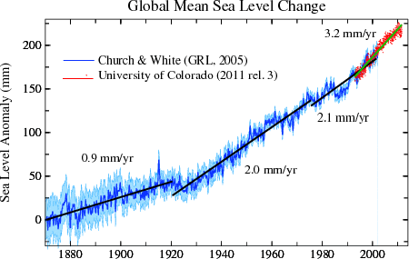
Not really:
“If the long term trend for sea levels start to level we have equilibrium in the system”
But they haven’t and there isn’t
It is extremely linear in the satellite era. Also a line from 1920 at 3mm per annum will show excellent fit to the data. If we had 5mm per annum from now we would have a rise of 42 cm by the end of the century but because a large part of the change is due to isostatic uplift it will be a lot less on actual tide gauges. What is the prediction from IPCC AR5 report?
James of the West:
In AR5 there are no “predictions” of sea level rise. Instead, there are “projections.” While predictions potentially support regulation of CO2 emissions projections do not.
James of the West:
When a straight line is fit to the observational data from 1920 this line is linear. The observational data are not linear but rather the straight line is linear. So what if the straight line is linear?
http://www.cmar.csiro.au/sealevel/sl_hist_last_decades.html
Remarkably linear.
James of the West:
In fact, the variation of the observed sea level with the time is non-linear. It is the variation in the theoretical sea level along the straight line with the time that is linear.
Terry, I agree. A better way to say it is that the sea level change over time is very well approximated by a straight line.
When a straight line is a better approximation to the sea level satellite data set than a curve it illustrates that the rate of change of sea level is not accelerating
James of the West:
You’ve raised an important issue. Thank you for providing input on this issue.
To state that the data are “very well approximated by” a straight line is satisfactory for some purposes but not for scientific purposes as “very well approximated by” is polysemic making an argument that contains this phrase an example of an equivocation. One cannot logically draw a conclusion from an equivocation but to logically draw a conclusion from an argument is what a scientist tries to do. Thus, though popular among global warming climatologists linear trend analysis is scientifically unusable.
Fortunately there is an alternative to linear trend analysis that does not draw conclusions from equivocations. Currently, this alternative is not in use among global warming climatologists.
No scientist on Earth knows how much extra igneous rocks in the oceans are raising sea levels, but likely more than GIA. Volcanic eruptions under the oceans use up some space available for sea water by creating new islands and increasing the level of sea beds. If the planet stayed the same temperature for 10,000 years sea levels would still rise.
Why do they use satellite data recently compared with surface tide gauges for sea levels?
Only because it is showing higher sea level rate with a false GIA calculation, not taking the above into account. The tide gauge records are now not used recently in data because they don’t show a rise in sea levels for almost half of the data. Plenty regions showing a decline in sea levels and plenty are showing an increase, but overall not so much.
Example from tidal gauge at tuvalu, no sea level rise noticed there.
http://www.john-daly.com/press/tuvalu.gif
“The correction for glacial isostatic adjustment (GIA) accounts for the fact that the ocean basins are getting slightly larger since the end of the last glacial cycle. GIA is not caused by current glacier melt, but by the rebound of the Earth from the several kilometer thick ice sheets that covered much of North America and Europe around 20,000 years ago. Mantle material is still moving from under the oceans into previously glaciated regions on land. The effect is that currently some land surfaces are rising and some ocean bottoms are falling relative to the center of the Earth (the center of the reference frame of the satellite altimeter). Averaged over the global ocean surface, the mean rate of sea level change due to GIA is independently estimated from models at -0.3 mm/yr (Peltier, 2001, 2002, 2009; Peltier & Luthcke, 2009). The magnitude of this correction is small (smaller than the ±0.4 mm/yr uncertainty of the estimated GMSL rate), but the GIA uncertainty is at least 50 percent.”
The uncertainly is at least 100 percent because magma going into the oceans are slightly filling in the ocean basins. This was another excuse to try and exaggerate the sea levels for the cause of course.
Don’t forgt the millions of cubic metres of erosion product that is being carried into the sea. In time all the high spots on land are going to finish up there. Then the Flat Earthers will have a field day no doubt being welcomed into the Chuch of Climate Change with open arms.
If the top surface of the ocean is warming at the three orders of magnitude less rate than the surface was supposed to (i.e. the amount of heat content the ocean can hold compare to the atmosphere), that means the heat is really hiding in the oceans and we won’t see the effects for the 1/3 of cause of human emissions for hundreds or thousands of years.
In other words, if Trenberth is right, there’s nothing to worry about. We’ll run out of fossil before we see any effect in the atmosphere.
Peter
Correlation temperatures in the northern hemisphere and the AMO cycle.
http://oi62.tinypic.com/1rt9a1.jpg
Visible is the effect it has on global temperature.
Peter let’s accept the elements of IPCC science used here and see if the result is something to worry about!
Assumption one
There is a radiative imbalance of 0.58W/m2 causing the Earth to heat up
Assumption two
This heating effect can be transmitted to deep ocean water (and even hide there).
Then do a calculation as follows with assumptions stated above.
Water covers 71% of planet surface area so a calculation for water might be a rough guide to overall effect.
Water is reasonably mixable given the calculated long time obtained.
Time chosen is length of time to raise mass of water by one Kelvin
Accepting for the sake of the calculation the excess heat imbalance per square metre that worries the IPCC.
http://ocean.stanford.edu/courses/bomc/chem/lecture_03.pdf
Formula used
Power x Time = S.M.∇T.
p = net climate imbalance( IPCC) figure = 0.58w/m2
S = specific heat capacity = 4200J/kgK
M = mass of water =1.35 x 10^21kg
∇T = one Kelvin (or one Celsius degree)
Excess heat supplied by Sun to water = 0.58 x surface area of water = 0.58x 3.6×10^14
Time = 5.67 x 10^24/ 2.09 x 10^14
Time taken = 860 years
=> I won’t lose any sleep tonight worrying about global warming!
Bryan writes:
Of course, you realize that the Social Justice Warrior warmistas are gonna interpret your straightforward lucidity as nothing more than gibberish.
Thanks for the doing the math, I’m an engineer so I got the order of magnitude about right ;-P
Minor nit, the surface are actually radiated by the sun is all of it, not just water (but the land heat just moves to the colder part – the ocean), and counterbalancing this the watts are divided by 4 (I think) because the sun only hits half the earth and even that only about half of it straight on. It would help cite the 0.58 source and show the surface area and volume calcs..
Peter
Peter asks for the the 0.58 link
http://wattsupwiththat.com/2012/01/31/jim-hansens-balance-problem-of-0-58-watts/
This is a whole planet yearly overall average and from Hansen himself
The problem with the land irradiation and subsequent heating is that warmists say all the heating is confined to a few metres at the surface.
This suits their narrative because it increases the heating effect; further difficulties arise with variable heat conduction and material emissivity.
However if the IPCC advocates agree that the deepest parts of the ocean can be heated they cannot complain if we accept their proposition and calculate accordingly
Peter asks
” show the surface area and volume calcs..”
These values can be found in google and the calculation is above
My calculation is a rough estimate based on the Ocean uptake of heat from the Hansen figure and some other estimates might give slightly different values but the result is quite clear that to increase the internal energy(heat) of the Ocean water mass by one degree Celsius takes the best part of a millennium
So the other side of the equation is how much fossil fuels there are.
In the processing of Googleing this, I’ve discovered Hubbert, Paul Ehrlich & Co have won: At least the first two pages of Google results are filled with doom&gloom, CAGW crap, etc. Actually finding a well written neutral look at how long fossil fuels will last looks to be impossible.
Basically all the analysis is on proven reserves… and we’ve gone through 2.8x the proven reserves known in 1978 since 1978. So maybe multiply all proven reserve estimates by 3?…
Just to get any idea of how wrong Hubbert is, here’s a very nice graph:
And here’s the google search URL – see if you can find an unbiased clear estimate of how much fossil fuel we have left. I can’t find one.
https://www.google.com/search?q=how+many+years+of+fossil+fuels+left&ie=utf-8&oe=utf-8
Peter
Excellent. Only one minor comment: tidy up graph T4, if possible, so the graphed and the label colors match for the FAR (1990) entry.
http://wattsupwiththat.files.wordpress.com/2015/10/clip_image018_thumb.png?w=825&h=626
If you take total accumulated OHC since 1950, it works out to 0.6 W/m^2, ± a little depending on how you treat deep ocean. This is a number that coincidentally agrees with Stephens, above. Now take the direct effect of CO2. This is log(400/280,base 2)*3.7 = 1.9 W/m^2 at the current time. Take the area under the CO2 historical curve (which is power per square meter * time) and that should give you the total accumulated energy as the direct CO2 effect. Compare the accumulated OHC and accumulated direct energy accumulation by CO2, and you will find that the accumulated OHC energy is 0.66 * the direct CO2 effect. This means feedback is negative, and the sensitivity factor is <1. (0.66 by this measurement). This is probably the best estimate we have, though it doesn't describe what might happen to surface temperatures since they are ignored in the analysis.
I appreciate your updates.
Changes of less than 1 degree C. could be nothing more than measurement errors.
” We’ve got to get rid of UAH and RSS !” 😊