Guest essay by Kesten C. Green
Global warming is a forecasting problem. The claim of the IPCC and sympathetic alarmists is that if we don’t stop emitting carbon dioxide, the Earth will be dangerously warmer in the future. How can they know that?
To put it another way, given the state of knowledge, are the IPCC using forecasting methods that are known to provide accurate forecasts?
In order to draw attention to this question, Professor Scott Armstrong in 2007 challenged former Vice President Al Gore to a bet on what would happen to global average temperatures over the next 10 years. Mr. Gore was getting a lot of media coverage at the time for his claims that temperatures on planet Earth were at a “tipping point” due to human emissions of CO2. He nevertheless declined, on the grounds that he does not bet.
With Scott Armstrong, I had published a paper evaluating the procedures that the IPCC were relying on for their scenarios of future dangerous warming[1]. We found that the procedures violated 72 out of 89 relevant evidence-based forecasting principles.
If you are not sure on whether that is bad or not, think of how many violations of evidence-based procedures by ground crew or pilots that are typically associated with a major airline crash. One or two, perhaps? Bear in mind, too, that commercial air travel is a much simpler, and better understood, situation than global climate change.
How would you react if the pilot announced before take off that he was sure that your flight was special, and so he would not be following the usual procedures?
With the draconian nature of climate policy and regulatory responses to the global warming alarm, getting the forecasting right would seem to be a fundamental requirement for avoiding making the wrong decisions. What if, as some scientists believe, we are in for another period of long-term global cooling?
With these concerns in mind, Scott Armstrong went ahead with the bet, in order to highlight the importance of using evidence-based (scientific) methods for forecasting. We set up theclimatebet.com site to monitor progress on “The Global Warming Challenge”.
The Global Warming Challenge is a notional 10-year bet between Al Gore—represented by the IPCC’s 0.03ºC per annum “business as usual” increase in global average temperatures—and Scott Armstrong—represented by the Green, Armstrong, and Soon no-change forecast[2]. Specifically, Armstrong bets that temperatures will equal the 2007 annual average against the scenario that temperature will increases from that level at a rate of one-twelfth of the IPCC annual increment per month.
The arbiter of the bet is the University of Alabama and Huntsville’s lower troposphere global mean temperature anomaly series originated and maintained by John Christy and Roy Spencer from satellite data. The final day of reckoning will be early in January 2018, when the UAH observation for December 2017 is released.
Is it really possible that the simple no-change forecast of 21st Century temperatures is better than the IPCC projections from expensive and complex computer models?
Yes, it is. That conclusion is consistent with the evidence Scott Armstrong and I present in our recently published review of evidence on the effect of complexity on forecasting[3]. We found that using complex methods increases forecast errors relative to the forecasts from simple methods that decision makers could understand by 27% on average. We expect that the results of The Climate Bet will increase that average.
Even more importantly, the IPCC has no regard for the Golden Rule of Forecasting[4]. The Golden Rule is to be conservative when forecasting by staying close to cumulative knowledge about the situation and about forecasting methods.
The IPCC scenarios are derived entirely in contravention of that fundamental rule of forecasting. The dangerous manmade global warming scenarios are premised on the unscientific (unconservative) assumption that “this situation is different”. Forecasting research tells us that ignoring the Golden Rule typically leads to an increase in forecast error of around 45%.
So how is the Global Warming Challenge progressing?
An up-tick in temperature anomalies in June saw Mr. Gore and the warming scenario score the first win against the no-change forecast since January of 2013, nearly two-and-a-half years ago. The outlook for the dangerous warming scenario remains bleak, however. Over the 7.5 years of the Armstrong-Gore Bet so far—we have now passed the ¾ mark—the errors that have arisen from projecting temperature to increase at a rate of 3°C per century are more than 50% larger than the errors from the no-change forecast.
The chart presents the entire history of the bet, to date, and the table shows the latest three years of data from UAH, and the Armstrong and Gore forecast figures.

[1] Green, K. C. & Armstrong, J. S. (2007). Global warming: Forecasts by scientists versus scientific forecasts. Energy & Environment, 18(7+8), 997–1021. Available online from http://www.forecastingprinciples.com/files/WarmAudit31.pdf
[2] Green, K. C., Armstrong, J. S., & Soon, W. (2009). Validity of climate change forecasting for public policy decision making. International Journal of Forecasting, 25, 826–832. Available online from http://www.kestencgreen.com/gas-2009-validity.pdf
[3] Green, K. C. & Armstrong, J. S. (2015). Simple versus complex forecasting: The evidence. Journal of Business Research, 1678–1685. http://dx.doi.org/10.1016/j.jbusres.2015.03.026.
See also simple-forecasting.com.
[4] Armstrong, J. S., Green, K. C., & Graefe, A. (2015). Golden Rule of Forecasting: Be conservative. Journal of Business Research, 1717–1731. http://dx.doi.org/10.1016/j.jbusres.2015.03.031
See also goldenruleofforecasting.com.
rgb @11.13…… Thank you for your patience. I have wrapped myself in a perfect thermal insulator. The thermal effect is obvious. The second layer thermal effect is not so obvious. I will now retreat and mull for awhile.
rgbatduke (July 19, 2015 at 3:20 pm) writes: “In summary, this entire thread is largely a waste of time.”
I count no fewer than 18 pearls of wisdom from RGB so far, so I would consider this thread pretty much the opposite of a waste of time. I’m definitely bookmarking this one. 🙂
I agree, not a waste of time. I pose one question: How can LWIR radiation at the TOA affect the surface? It cannot REACH the surface as it is thermalized miles above. CO2 absorbs LWIR between 13 and 17 microns, essentially capturing and thermalizing all of this radiation from the Earth’s surface, at less than 3 meters altitude. There is little if any water vapor high in the troposphere, so CO2 is the GHG preventing the atmosphere from radiating to space up there, until it thins out enough at altitude to permit LWIR to reach space. The fact that CO2 has increased in concentration, possibly due to us but possibly not, means that this happens at a higher altitude now than it did decades ago, hence colder due to the lapse rate. BUT, the atmosphere is bigger at higher altitude, hence more area to radiate. Just because there is more energy in the SYSTEM due to radiating to space at a higher altitude/lower temperature does not mean that there is more heat/energy at the SURFACE. How can CO2 re-radiating at the TOA, where it does not thermalize much as the pressure is so low, possibly heat the surface??? In other words, how does the surface know it is supposed to heat up?
I have asked this before…
Go to Willis’s “Steel Greenhouse” article, look at his two layer model, and ask yourself how the surface “knows” it’s supposed to “heat up” when the second layer is added, even though the surface doesn’t “see” the radiation from the second layer:
http://wattsupwiththat.com/2009/11/17/the-steel-greenhouse/
Willis, God love him, passed no Physics courses. If that marks me as reactionary, what can I say…
“Willis, God love him, passed no Physics courses.”
Interesting. So scientific truth is determined by what classes one passes? :-O
Well, Dr. Roy Spencer passed a few physics classes, and he agrees with Willis:
http://www.drroyspencer.com/2010/07/yes-virginia-cooler-objects-can-make-warmer-objects-even-warmer-still/
Help me understand this Nonsense. None of this data seems to make sense.
1) As I’ve pointed out countless times, the Earth has an average temperature of around 15 Degrees, the black body temperature used for all these IR charts is -18 Degree C. This is from the ACS, and it clearly shows the observed temperature to be 15, and the predicted to be -18. BTW, this following quote and graph is from the ACA, and Climate Change is a “settled science.”
http://www.acs.org/content/acs/en/climatescience/energybalance/predictedplanetarytemperatures.html
http://www.acs.org/content/acs/en/climatescience/energybalance/predictedplanetarytemperatures/_jcr_content/articleContent/image.img.jpg/1374177687088.jpg
2) Doesn’t this following quote ignore the energy that is changed in form? Plants absorb sunlight and change it into chemical energy. That energy never gets re-radiated. It can be stored as coal and oil for millions of years.
http://www.acs.org/content/acs/en/climatescience/energybalance/predictedplanetarytemperatures.html
3)
Why? Why not the observed temperature? This chart shows the absorption of the atmosphere as seen from space. I’m not sure the black body curves are correct. Note how the peaks are all behind wavenumber 666/15 microns. I don’t think that is correct.
http://www.acs.org/content/acs/en/climatescience/atmosphericwarming/_jcr_content/articleContent/columnbootstrap_1/column0/image.img.jpg/1374178157948.jpg
4)
I got criticized above for using heat instead of radiation. That is how the ACA describes it, see quote above. My question is what happens to this trapped radiation? It just doesn’t stay trapped in the atmosphere forever.My understanding of the GHG is that IR is radiated from the earth. The IR radiation will travel through the atmosphere until it hits a GHG molecule. That molecule becomes excited. The EM radiation is then converted into mechanical/kinetic energy, resulting in warming of the atmosphere. The molecule than drops out of the excited state and re-emits the EM IR radiation. BTW, read the above quote, H2O covers a lot more than just the ends, and it also overlaps much of CO2. BTW, look at the peak of the earth’s radiation. It is to the left of CO2 absorption. Why the differences?
http://theresilientearth.com/files/images/Greenhouse_Gas_Absorption-dlh.png
5) Here is a SB Curve for a black body of earth’s temperature. Clearly the peak at 10 microns doesn’t leave much IR out at 15 to be absorbed.
http://www.spectralcalc.com/blackbody_calculator/plots/guest410911159.png
6)
If the above quote is true, and all the IR at 15 microns is already absorbed and converted to heat energy, how does adding more CO2 trap more IR and create more heat? Can you absorb more than 100%? At best wouldn’t the CO2 simply lower the peak of the atmosphere it warms by capturing the IR radiation closer to earth? Once again, this “theory” doesn’t seem to make any sense.
Anyway, I think I have an actual experiment that might help shed some light on this issue, and I hope someone is a chemistry department might be able to run it.
Experiment:
1) Take an IR transparent container and fill it with 100% CO2. Shine an IR Light of peak wavelength of 15 microns through the container. Measure the temperature increase. Repeat using 200 PPM, 400 PPM, 600 PPM, 800 PPM, 1,000 PPM…7,000 PPM. Measure the temperature increase. Repeat using H2O saturated air. Measure the temperature increase.
2) Repeat the above experiment using IR of 10 Microns peak.
My bet is that you can shine 10 micron IR into 100% pure CO2 and its temperature won’t change one iota. I would love to see that demonstrated in front of Congress. I also bet that the H2O vapor filled container will absorb far more 15 micron IR than CO2, and show far greater warming.
Simply put, if this chart is accurate, there won’t be much heating due to CO2.
http://www.ar15.com/media/mediaFiles/1334/37782.GIF
BTW, the look at this chart. CO2 is blamed for the absorption out at 666 wave number.
http://wattsupwiththat.files.wordpress.com/2011/03/gw-petty-6-6.jpg?w=1050
Take a look at H2O, it is absorbing that wavelength as well, and H2O is far more abundant than 400 PPM. If the above experiment shows the H2O warming more at 15 microns than CO2, you can bet your bottom dollar this CO2 caused global warming is a hoax, and you can run experiments to demonstrate in front of congress.
http://scienceblogs.com/startswithabang/files/2011/08/molecular_absorption_spectra-739540.png
Here is a site comparing the UAH data from Jan 79 to present. Looks like pretty good agreement till after 2001. The site:
http://www.climate4you.com/GlobalTemperatures.htm#Comparing surface and sattellite temperature estimates
Click on the link labeled: Comparing surface and satellite temperature estimates
Seems like the bet would have been more meaningful if it started in 1979 and went for over 10 years.
Al Gore and Bill Nye FAIL at doing a simple CO2 experiment
http://wattsupwiththat.com/climate-fail-files/gore-and-bill-nye-fail-at-doing-a-simple-co2-experiment/
OK, I think I have an experiment that can actually settle this man made climate change nonsense, and I will use the Climate “Scientists” own data to expose them. Unlike Al Gore’s and Bill Nye’s experiment that was intended to decieve the ingnorant, this experiment will be designed to get to the truth.
Here is the much published atmospheric absorption graph. I will ignore the fact that it looks like the black body SB graphs are wrong. This is their data, and I will use it to expose this fraud.
http://wattsupwiththat.files.wordpress.com/2011/03/gw-petty-6-6.jpg?w=1050
Clearly CO2 absorbs at 666 wave number/15 microns. No one will argue with that. What the Climate Alarmists want you to ignore is that H2O also absorbs at 15 microns, as it does between 10 and 5,and 20 and 10.
http://members.casema.nl/errenwijlens/co2/h2oco2trans.gif
The experiment would be as follows:
1) Create a vaccuum in an IR tranparent container. Shine IR of peak 10 and 15 microns through it. The 10 is peak of the earth and 15 is the peak wavelength of CO2 absorption. Measure the change of the vaccuum temperature. It should be 0 Degrees.
2) Fill the IR transparent container with 70% N2, and 30% O2. Shine the IR lamp of peak 10 and 15 microns, measure the temperature change. This will be the control.
3) Gradually add CO2 in steps of 50 PPM up to 7,000 PPM. Measure the temperature. This will give a delta CO2 delta temperature graph.
4) Start again with a 70/30 mix, and add H2O just like was done with CO2. This will give a delta temperature delta H2O graph.
5) Start again with the 70/30 mix and saturate the air with H20. Gradually add CO2 like above. This will control for the H2O, and the graph created would be the marginal warming due to CO2. This part could be repeated for H2O levels of a desert, H20 Levels for the tropics, H2O levels for the arctic.
6) This experiment could then also be run at various room temperatures to measure the delta of the GHG gas effect for various temperate zones.
That experiment is so simple and common sense it could be given in front of congress to expose this fraud.The fact that climate scientists haven’t published research on such an experiment proves to me they don’t want to know the truth. They will support the crap Bill Nye and Al Gore, but they totally do a real scentific experiment that relies of differential calculus.
Facts are this experiment is already being run by nature. The coastal Antarctica is relatively warm, temperatures drop rapidly as you go inland. The reason being, as you go inland, the H2O precipitates out leaving very cold dry air, void of any H20. Plenty of CO2, but no H2O. Temperature follows H2O, not CO2. We already know this, well, we all except the Climate “Scientists” know this.
Funny how Climate “Scientists” can’t put 2 and 2 together. They simply can’t see the forest through the trees.
http://www.climatestotravel.com/Climate/Antarctica
http://www.climatestotravel.com/images/antarctica-precipitation.gif
“OK, I think I have an experiment that can actually settle this man made climate change nonsense, and I will use the Climate “Scientists” own data to expose them.”
Congratulations. You’ve just “exposed” the concept that CO2-induced warming should be most effective at higher latitudes, at night, and in the winter, which is–surprise!–exactly what those evil scientists on both sides of the CAGW issue have been saying all along.
Well done, sir, well done. For your next feat, perhaps you could “expose” an even more heinous conspiracy, perhaps the government cover-up of actual manned moon landings! 🙂
BTW, this image is a death sentence for CO2 caused warming. It clearly shows CO2 transparent at 10 microns, whereas H20 is absorbing 30%, but the key is that absorption by H20 INCREASES as the earth warms, and absorbs 50% at 9 microns and 100% at 8 microns. CO2 is transparent to the warmer temperatures. Clearly the climate “scientists” don’t understand the meaning of this chart.
H2O and CO2 fully absorb at 15 Microns, but CO2’s absorption rapidly decreases as you warm from 15 to 10 microns, and CO2 is transparent lower than 13 microns. Between the entire range of 15 to 8, H2O never absorbs less than 30%. This graph alone proves to me that this CO2 caused climate change is a pure hoax, either based upon a scientific ignorance of biblical proportions, or a deliberate fraud.
http://members.casema.nl/errenwijlens/co2/h2oco2trans.gif
Probably a waste of time, but you are doing it again. One doesn’t “warm from 15 to 10 microns”. This is a completely meaningless statement. Microns measure length, not temperature, and in context a sharp wavelength. One might, conceivably, talk about shifting the wavelength peak of the rather wide blackbody radiation curve by some length.

 K-m. To “warm from 15 to 10 microns” even if you are just talking about the shifting of the peak in a wide distribution that has plenty of integrated power in the wings one has to increase the absolute temperature by 50%. That is, you are talking about warming the surface from 288 K (average) to 288+144 = 432 C.
Look, for starters you need to learn about blackbody radiation in general, and in the context of your current nonsense, Wien’s Displacement Law:
https://en.wikipedia.org/wiki/Black-body_radiation#Wien.27s_displacement_law
To wit:
with
If you aren’t talking about shifting the peak via Wien’s Law, you aren’t talking about anything, because the Planck curve for thermal radiation from the Earth’s surface, as you show in numerous pictures above, easily runs from 1 to 50 microns. It already peaks in the ballpark of 10, but it has plenty of weight at 15 and 5 and shifting the peak by the tiny bit associated with a whole degree or even two of global warming won’t even make it worthwhile to draw new generic graphs.
Again, I urge you to stop your rants as the terminology you use in the is proof beyond any reasonable doubt that you need to go back and spend a LONG time at the wikipedia blackboard, invest in a copy of Petty for your Very Own, maybe buy a few books on introductory physics and work through the thermo sections and the electromagnetic radiation sections, you know, sort of learn some physics so that you can stop referring to lengths as if they are temperatures at an unbelievably absurd scale. You’d get laughed out of any physics department where you tried to explain this “theory” of No Greenhouse Warming because of some sort of shift in the BB spectrum.
Some of your ideas aren’t wrong, because you are, after all, pulling them off of perfectly good graphs that demonstrate the greenhouse effect overwhelmingly to anyone with the eyes to see it. Water is absolutely the most important greenhouse gas and everybody knows it and nobody denies it. That doesn’t mean CO_2 isn’t the second most important one, and it in no way proves that it isn’t still important enough to cause warming if you double its concentration. Indeed, the warmist camp claims that the CO_2-only warming is likely to be doubled or tripled by the strong positive feedback from still more powerful water vapor. Do you agree with this, because it sure sounds like you do! The thing about water, of course, is “it’s complicated”. Water in the form of clouds strongly cools during the day and can warm or cool at night. Water vapor is a greenhouse gas and pretty much warms. Water vapor also contains latent heat that lifts heat through the troposphere to warm the upper troposphere. This (by the very argument I give below) increases greenhouse-band outgoing radiation by raising the temperature at which it occurs, which in turn drops the surface temperature. All of this makes it difficult even to predict the sign of the total feedback to add or subtract from CO_2-only warming — it could alter it by a factor anywhere from 0.5 to 2 or even 3, although honestly I think the data already soundly contradicts even a factor of 2 at this point. A factor of one — basically no feedback — seems rather likely, actually.
Finally, remember that what matters it the double integral of the curves like the top of atmosphere curves, looking down that you insert above. They have to be integrated over all wavelengths or wave numbers, and they have to be integrated over all the surface area of the Earth (where the function being integrated changes constantly with latitude, longitude, temperature, cloudiness, time of day, etc, etc) and to be picky, one has to integrate over time as well to average out emissions. So you can’t argue that some bite out of the 300 K curve corresponding to surface radiation doesn’t matter because it happens at 15 microns instead of 10 or whatever — any bite implies less outgoing radiation from that part of the surface than one would get without it. Since it is the integral of this curve that has to be an approximate constant equal to incoming radiation similarly integrated, making any part of it lower forces the rest to become higher, and the only thing that raises the basic curve is raising the emission temperature of the surface.
rgb
BTW, the energy of IR 10 microns and shorter is much much much higher than the 18 to 13 microns CO2 Absorbs. H2O simply absorbs much much much more energy than CO2. Do the math.
http://www.1728.org/freq2.gif
http://chemwiki.ucdavis.edu/@api/deki/files/38305/BPOCchapter9-3-61.png?size=bestfit&width=500&height=328&revision=1
http://www2.chemistry.msu.edu/faculty/reusch/VirtTxtJml/Spectrpy/Images/emspec.gif
http://www.raysofhealinglight.com/images_ap/em_spectrum.jpg
What that means is that if I am correct in that the peak of the Black Body of 15 Degree C is at 10 microns, then this chart should have the black bodies shifted to the right, reducing the energy absorbed by CO2 and greatly increasing the energy absorbed by H2O. Once again, all signs point to H2O, not CO2.
http://wattsupwiththat.files.wordpress.com/2011/03/gw-petty-6-6.jpg?w=1050
Again, please, you are making my head hurt. It isn’t the energy of the individual photons that matters. It is the total power. And arguing that there are multiple greenhouse gases and that water is more important than CO_2 is preaching to people that know and understand this already much better than you do and doesn’t mean that CO_2 is not still important and that increasing it doesn’t still cause warming.
Try to read the wikipedia article on blackbody radiation, and learn what the power curve actually is and what it means and how to use it. Please? Do you want people to actively make fun of you when you ask them to do the math?
rgb
“doesn’t leave much IR out at 15 to be absorbed.”
Still a substantial fraction. Planck explains it, the Peak of Infrared, as well as all other, radiation, corresponds well to a certain temperature, but by no means All of the radiation from matter at a certain temperature, as the Planck distribution is always present.
Still, no one has answered my question, and I am thinking, 3 meters is 1 meter above the 2 meter mountings of almost all thermometers. Surface radiation is almost entirely absorbed just above the thermometers. At miles up, CO2 absorbs quite a bit of radiation as the temperature is more to its liking, and does not thermalize due to the lower temperature, instead re-radiating, half of which points down. But, this fraction can NEVER reach the surface as it is thermalized miles above.
Seriously, you big brains, how do TOA radiating gases, which are at around -70 to -80 Degrees Celsius and miles up, heat the surface? Thermalization, anyone? Bueller? Anyone???
I am coming to the conclusion that they do not…
“Still, no one has answered my question…”
Actually I did, or rather, Willis Eschenbach did some time ago. [shrug] You can lead a horse to water…
Actually no one ever has.
Again, Willis did, but Michael didn’t like the answer, although he failed to specify what exactly was wrong with it. There’s nothing shameful about ignorance, but willful ignorance is something else entirely.
And I did as well, two or three times, above in this thread. Not that it matters, As you say, you can lay it out but you can’t make them understand it if they don’t want to.
rgb
OK, back from class, bored, I’ll give you an answer directly.
a) Earth is heated primarily with the visible and near UV and IR band of ~6000 C blackbody radiation from the face of the sun. The cloud-free atmosphere is substantially transparent to this energy, transmitting maybe 2/3 to 3/4 of it to where it is absorbed by the surface. That which isn’t transmitted is predominantly REFLECTED by high albedo clouds, snowpack, and to a lesser extent land and water surface.
b) All of the heat it absorbs (as opposed to reflects without first “thermalizing” it in some inelastic degree of freedom(s)) must, on average, be lost as outgoing thermal radiation when the planet is in (approximate) dynamical equilibrium. If it absorbs more than it emits, it warms and output thermal radiation increases until ins balance outs. If it emits more than it absorbs, it cools until again, ins balance outs. The time required to achieve balance is not simple or necessarily small as the Earth is complex and stores and moves energy around in many places and ways.
c) Although it is vastly oversimplified, we can consider the outgoing thermal radiation to come from two sources:
d) One is direct outgoing thermal (250-320 K, average ballpark 288 K) radiation from the ground, that is not absorbed by the atmosphere and once emitted goes straight out to space. This outgoing radiation is emitted at integrated rates that are roughly proportional to the fourth power of the temperature of the surface in degrees kelvin or absolute.
e) The other is the outgoing thermal radiation from the surface that was almost instantly absorbed (within a few meters of the ground) by various greenhouse gases in the atmosphere, predominantly water and carbon dioxide but with additional, relatively insignificant fractions absorbed by ozone and argon and methane and so on. This energy is almost instantly shared with the surrounding N2 and O2 atmosphere. As always, if this atmosphere is not in thermal equilibrium with the ground temperature, it absorbs more than it re-emits or otherwise conveys both back to the ground or upward if it is too cool, absorbs less than it emits if it is too warm. Note well — some fraction is indeed returned to the ground, but the argument doesn’t really depend on this per se. Note that over 2/3 of the thermal radiation emitted by the ground is absorbed by the greenhouse gases, the opposite fraction to that which the atmosphere transmitted in the visible/6000 K band.
f) Eventually through many processes, heat is conveyed up through the atmosphere to where it finally becomes transparent to radiation emitted at its lapsed temperature. This temperature is, as you have so cleverly noted, much cooler than the ground. It therefore gives off less integrated energy per square meter in the absorption/emission bands of the greenhouse gases in these bands and doesn’t radiate at all in the bands where it is transparent (Kirchoff’s Law).
g) I reiterate — the total outgoing thermal radiation rate (power), integrated over all wavelengths and all the surface area of the Earth, must on average equal the total incoming thermal radiation rate (power) integrated over all wavelengths and all of the surface area of the Earth, and any imbalance causes heating or cooling until ins equal outs. That is specifically the sum of the outgoing thermal radiation from the surface that was not absorbed by GHGs plus the thermal radiation from the upper troposphere that is emitted by GHGs has to balance the total incoming power.
h) And here it is — the bone simple punch line. Anything that decreases the emission rate from GHGs in the upper troposphere must cause the surface to warm until emissions from the surface compensate, assuming constant input. Really. That’s all there is to it. The only question then is:
i) Does increasing the GHG concentration of the atmosphere on average, all things being equal, raise the emission height in the troposphere? The answer is almost certainly yes. Increasing the concentration of e.g. CO_2 reduces the mean free path of photons in its emission/absorption bands, and one has to go higher, to lower absolute pressures and atmospheric density, to reach the point where the mean free path for upward directed photons reaches infinity. Higher is higher up in the ALR, and colder. Colder means less integrated emissions. End of story
j) Of course one can say “Wait a minute, it absorbed LOTS of thermal energy in the CO_2 band down where it is warm, but only gives off a comparatively LITTLE up at 6 to 9 km. What happened to the difference?” You won’t like the answer, of course. It was returned to the surface by IR radiation from the greenhouse gases that are in rough thermal equilibrium with the surface temperature down at the surface. The net heat transfer to CO_2 at the surface in this (oversimplified) picture is equal to the rate energy is eventually lost to space at the top. All the rest eventually makes it back to the surface. But we already took that into account in the argument above by noting that it radiates so and so much energy, and thus and such of a fraction escapes directly and the rest is absorbed. The energy that escapes directly plus the energy that escapes from the GHG bands is what has to balance incoming absorbed solar — all of the backradiation bookkeeping is already implicit in this simple statement as it relies on the absolute loss rate, not the details of what happens to the energy in between. The latter simply doesn’t matter. Ins must balance outs, and the only way for energy to escape the earth (outside of a tiny loss to outgassing) is in the form of photons, electromagnetic radiation.
To conclude, all that matters is the spectra from Petty’s book that were reproduced above. Any physicist that sees those figures goes “yup, the GHE is real” because one can very clearly see emission from the warm ground more or less at the predicted blackbody intensities as a function of wavelength according to the temperature of the ground where the atmosphere is transparent, plus greatly reduced intensities that still follow blackbody curves, but ones corresponding to the much colder temperatures of the atmospheric height where it became transparent to the GHG absorption/emission band radiation. The fact that Petty also publishes bottom of the atmosphere spectrographs at the same locations/times looking up and observes the complementary pattern in the downwelling radiation representing the missing ground thermal radiation in the absorption bands is just icing on the cake.
So it is quite simple. Here’s your reading comprehension test. If one increases CO_2 concentration, will the effective temperature of the top of atmosphere outgoing radiation spectra in the CO_2 absorption band most likely:
i) increase
ii) decrease
iii) remain the same?
For bonus points, indicate why.
rgb
P.S. — by concentrating only on outgoing integrated power, one also trumps all questions of lateral and vertical heat transport. So I don’t care that there is latent heat transport vertically, or that heat absorbed at the equator might be lost near the poles, and only care a little bit about energy being stored in the vast heat capacity of the deep ocean, as this is a sign of disequilibration, but one that might take thousands to tens of thousands of years to have any noticable effect. It is the Earth viewed as a black(body) box that matters. Integrated, averaged, input solar power has to be compared to integrated averaged, output radiation. Truthfully all the way to raw TOA incident radiation and including all reflected energy from albedo. There isn’t the slightest doubt what the first order effect of increasing CO_2 should be. Sure, it could be (nearly) cancelled by nonlinear stuff — increasing albedo from increased cloud cover from increased water vapor from the increased temperature — feedbacks could be negative. Or positive. Or mixed, to some smaller net negative or net positive point. And whatever warming survives (or is augmented by) the feedbacks could still be overwhelmed by natural variations. I’m just explaining that the greenhouse effect is real, that increasing CO_2 almost certainly all-things-equal will raise average temperature, and yeah, pointing out that fairly reliable first principles line-by-line computations of the radiation physics suggest a warming per doubling ignoring all feedbacks of ballpark 1 to 2 C (with some slop due to the fact that we have to solve the quantum problem approximately and the fact that the Earth’s dynamical atmospheric state is not homogeneous or constant).
I truly do hope this helps. IMO the entire discussion and skeptical argument on WUWT is significantly improved (and more likely to be taken seriously) when it isn’t laced every ten comments with a comment that goes on about how increasing the concentration of a “trace gas” by 1/3 can’t possibly warm the planet by 0.4 to 0.8C. Yes, it can. It probably has. Increasing it more will probably warm it more. That doesn’t mean that we are due for a climate catastrophe. It doesn’t mean we can predict how much it will warm, or even if it will warm because we do not have any good way to separate out natural variability from CO_2 driven change either empirically or theoretically so our best attempts to assess past data are fraught with uncertainty (as is the past data itself from more than maybe 50 years ago if not even less). The actual physical models for the climate that try to use more detailed treatment of the physics are IMO both a complete waste of time and horribly biased (and diverging from observation as a double consequence). The skeptical argument is not ended by admitting that the greenhouse effect is real — it is made into something to take much more seriously. Even though the greenhouse effect is real, there is little to no evidence that we are headed toward a climate catastrophe!
Even though it is real, so far the changes it has caused have been overwhelmingly beneficial. One billion people ate dinner tonight courtesy of the extra CO_2 and its effect on agricultural plant growth. The world enjoys a very slightly longer, substantially more fruitful growing season pole to pole thanks to the almost unresolvably small warming observed over the last 165 years thanks to the extra CO_2. To be honest, no other climate changes are really resolvable in the data. Drought and flood, storm and nice weather, high and low pressure, heat wave and killing frost — all of this has changed so little that it is not resolvable from no change at all (if it HAS changed at all). Should we fear an extra 2.8 C globally? This corresponds to moving every growing subzone one notch north, so central virginia gets north carolina’s current growing conditions, and west virginia and pennsylvania get virginia’s over a roughly 100 year time span! Who cares?
That doesn’t mean that there are no risks, or that we should not be concerned. It’s just that the risks have to be pretty damned enormous to be even vaguely comparable to the benefits we already enjoy and might expect to enjoy even more should warming continue. Florida might not be plagued by frosts that wipe out the orange crop any more. Texas might not be so darned cold in the winter. England can grow wine grapes once again. Siberia might become even more productive and less deadly in the winter. Sea level rise might eventually be a concern, sure, but empirically it is completely ignorable so far and there is little good reason to think it is going to suddenly accelerate (none at all in the actual data).
And sooner or later, we will get fusion, or get off of our duffs and perfect LFTR, or drop the price per watt of solar power to $0.25 installed, or invent a cheap high density high capacity storage battery, and presto-chango, the miracle of modern capitalism and the pursuit of mere self-interest will guarantee that burning coal to make power is obsolete, almost certainly long before 2050. And then how silly will people feel, for wasting trillions of dollars and hundreds of millions of human lives and condemning billions of the poor to a life of continuing 19th century energy poverty in what should be the energy rich 21st century all because of the deliberate manipulation of the energy market using the specter or a global catastrophe that was never going to happen anyway twice over.
rgb
I have mulled. It does matter. I understand the analysis.
Super. I hereby declare you a Good Student. Now if I could only get a few others on the list to become Good Students…;-)
THANK you. Plenty good for someone who had forgotten he had once known Avrogodros (?) number.
OK, after further thought, this chart is a great example of just how pathetic the field of Climate “Science” truly is. This is what they use as their main piece of evidence.
http://wattsupwiththat.files.wordpress.com/2011/03/gw-petty-6-6.jpg?w=1050
Take a close look at that chart, it gives real scientists a way to debunk this CO2 nonsense. Here is the experiment that is needed.
1) That chart represents a snapshot of the earth for outer space. Look at what it is showing however. It shows that some of the the IR wavelengths that are absorbed by H2O don’t make it back to outer space.That is understandable given that 3/4 of the earth is covered in H2O, the atmosphere can have up to 4% H2O, and clouds also absorb and reflect the IR. My bet is that if you take an IR transparent container, fill it with H2O saturated 70/30 mix of N2/O2 with 0% CO2, shine IR of peak wavelength 10 and you get that exact chart. That chart reflects H2O absorbing IR at 15 Microns and below 8 microns.
2) Was that shapshot taken over the equator, the warm oceans? Where was that snapshot taken? My bet is if that snapshot is taken over an inland desert with extremely dry air you will get a snapshot with less absorption around 15 microns.
3) Was that snapshot taken over the S Pole? My bet is that if it was you will see much less absorption around 15 Microns.
4) Was that snapshot taken over an equatorial rain forest with dense clouds? My bet if it was there would be much more absorption near 15 Microns.
5) Facts are if the Climate “scientists” truly wanted to understand the climate they would show a whole series of graphs that control for H20. That is how a real science is done.
This chart clearly shows CO2 AND H2O absorbing 100% of the IR at 15 microns, H2O also absorbs down to 10 Microns. Why is there an absorption range for CO2 at 18 to 13, but not for H2O between 15 and 10? Why doesn’t H20 show the same absorption?
http://scienceblogs.com/startswithabang/files/2011/08/molecular_absorption_spectra-739540.png
As I said in an earlier post the climate “scientists” didn’t seem to use the proper black body curve on their chart. They deliberately misaligned them to make it look like the peak was over 15 microns. Well apparently someone didn’t get the memo and actually published a correct chart. Clearly the peak of the black body curves lay right on the 10 Microns of earth. CO2 is clearly trapping heat in the relatively cold tail of the distribution and H2O is trapping the high energy shorter wavelength IR in the left tail. Funny you can publish two wildly different charts in this “settled” science. No one seems to be concerned with the error and inconsistencies.
http://rammb.cira.colostate.edu/training/tutorials/goes_39um/images/irbnds1a.gif
Bingo!!! Look what I found. Take a look at this chart, it totally contradicts the chart I’ve been discussing, and they apparently did the experiment to control for H2O. As predicted the the cold dry air over Alaska shows an atmospheric window at 15 microns, unlike the other chart that you have no idea where it represents. Then tropics show far more radiation being absorbed. This is exactly how the climate “science” perpetrates their fraud. They simply produce inaccurate and misleading charts that simply don’t correlate with reality. This chart is game over for the CO2 driven climate change, and it totally debunks the other chart climate alarmists use as evidence. Once gain, look how there is an atmospheric window at 15 microns over Alaska as predicted above. Also look at the tropics, there is still an atmospheric window at 15 microns. That totally rules out CO2.
Ooops, that previous chart is from the earth looking up, not space looking down. It does however show that the graph from space would look wildly different depending on the location. Once again, CO2 in uniform, so CO2 can’t be causing the change.
Here is another chart challenging the CO2 as the cause theory. Bottom line, the chart the climate alarmists use doesn’t seem to be the only chart that can be used to argue the case, and its curves SB Graphs are almost certainly wrong.
http://www.nzdl.org/gsdl/collect/hdl/index/assoc/HASHedcc.dir/p143a.gif
This chart totally debunks CO2 as the cause of warming.Note: This graph is the inverse of the space snapshot, it is from earth looking up. ?w=700
1) Alaska shows an atmospheric window at 10 microns, the tropic region doesn’t. How could that be due to CO2? It can’t. Both the tropics and Alaska have 400 PPM.
2) The tropics absorb much much more energy than Alaska. That is almost certainly due to H2O.
3) The dry air in Alaska shows a blip for the CO2 absorption, but that it dwarfed by the absorption to the left of 15 microns by H2O in the tropics.
Bottom line, I challenge any climate “science” alarmist to explain how CO2 can cause the difference between these charts. If you can’t, you are admitting you are promoting a fraud if you continue to promote CO2 as the main driver.
“…you are promoting a fraud if you continue to promote CO2 as the main driver.”
[yawn] One of our alarmist blogger friends has already debunked this straw man by quoting a number of texts that say just what co2islife has re-rediscovered:
http://scienceofdoom.com/2011/02/24/water-vapor-vs-co2-as-a-greenhouse-gas/
See also RGB above.
Co2islife’s quarrel isn’t with scientists, but rather with politicians, Gaia worshippers, tree-huggers, etc.
So let’s hope he gets back to us when he’s “discovered” something a little more original, like the color of the sky or something.
These 3 charts should be enough to put 97% of consensus scientists behind bars. ?w=700
 ?w=700
This chart used by climate alarmists clearly has the SB Graphs and peaks wrong, at least according to SB Calculations from Spectral Calc, and the one size fits all absorptions clearly are not representative of observations. This chart must have been made from a model, or cherry picked to make a case. It is just too smooth to pass the stink test. Anyway, this chart is used all over the place to promote this fraud.
http://wattsupwiththat.files.wordpress.com/2011/03/gw-petty-6-6.jpg?w=1050
This is reality. This is an actual spectrograph. Yes it is the inverse of the above, but it clearly shows that there are large differences depending on where and when these spectrograph snapshots are taken. How can you reconcile this chart with the chart above? You can’t. There needs to be a congressional investigation into why a non-representational chart is being used to support the conclusions of the climate alarmists.
Results like this that have wasted trillions of tax payers’ dollars and destroyed countless lives and companies should have all these “consensus” scientists behind bars.
Lastly, this chart showing a differential between the N and S Hemisphere pretty much proves CO2 can’t be causing the difference given that it is a constant, and the above chart of Alaska and the Tropics proves that something other than CO2 is absorbing radiation in the atmosphere.
http://www.cru.uea.ac.uk/cru/data/temperature/HadCRUT4.png
The ACS even publishes that the models don’t reflect reality.
http://www.acs.org/content/acs/en/climatescience/energybalance/predictedplanetarytemperatures/_jcr_content/articleContent/image.img.jpg/1374177687088.jpg
These “scientists” simply need to be behind bars for defrauding the public and looting the public treasury. With evidence like the above charts I have to believe it is only a matter of time.
Jeeze, co2, lighten up. First of all, if you are going to use the graphs from Petty’s book, buy the damn book and read it already so that you know what you are looking at. Obviously you are just making stuff up as you go along because you don’t even know what you are looking at or bothering to read the captions. Putting up a bunch of graphs and charts isn’t anything like proof, not that you have asserted anything definite but that you want to go on a witch hunt for “scientists”, defined to be anybody that disagrees with you as far as I can tell.
You can start with me, since I disagree with you and think that your entire argument is nonsense — literally, I can’t make head or tails of most of it except that you seem quite angry all of the time and resent it in the extreme if anyone suggests that increasing CO_2 might cause actual warming of the planet (which is unfortunate since there is overwhelming evidence that it has in the past done so, is doing so in the present, and will do so in the future as well as a perfectly understandable and computable physical argument for the “direct” warming that one expects in decent agreement with observation so far). I think it is reasonable. So according to you, I need to be behind bars “for defrauding the public and looting the public treasury”.
Of course, I’m just a physicist, not a “climate scientist”, and haven’t received a single thin dime, ever, from my “defrauding the public”, and all I do every year is dump a rather large percentage of my income into the public treasury, I don’t take much out at all. I’m not breaking any law when I disagree with you; I’m exercising my constitutional right to free speech. If we judge which of us is more likely to have a well-informed opinion on the subject, do you really think you would win? If you were a prosecuting attorney trying to prove “fraud” — which I think is absurd in my case and probably in most others as well — do you really think that one single one of your misinterpreted graphs above would count as evidence? Expert witnesses — ones with PhDs — would rip them to shreds, since they obviously prove the exact opposite of what you claim, as I’ve now explained, patiently, to you what, two or three times now? You just skip down a bit further and put up the same figures and completely ignore what I’ve said and rant some more.
This is, sadly, typical dragonslayer activity. Mathematical incompetence. Scientific incompetence. But very, very loud rants, asserting all kinds of things that really demonstrate nothing but the ignorance of the speaker.
In any event, Grant Petty (whose book you are abusing in spite of not having read it or understood ten words in it) doesn’t deserve to go to jail either. Most of the scientists in the world — including most climate scientists — are honest people and really believe what they are saying. They may be wrong. They may well be overzealous. They may allow their opinion or beliefs to cloud their judgment or avoid complete scientific honesty in their assertions of proof or evidence. They may or may not be perfect scientists, or even very good scientists, but that doesn’t make them criminal scientists. And even the best scientist in the world, provided with the best existing evidence, can be wrong! It’s the name of the game.
Perhaps — and I say perhaps — there are some scientists who have departed from the path of objectivity and dipped into politics to the extent of falsifying data, hiding contrary results, exaggerating negative and downplaying the positive all to convince the public and/or politicians to select a particular political path. If so, there should probably be consequences, just as there were quite recently when a Duke medical center doc was caught out falsifying data to make a particular treatment look far better than it actually was. But putting them in jail for arriving at the wrong conclusion in good faith? Good God, man, if you did that you’d have no scientists at all in a decade. Why do you think we have things like the tenure system, a constitution that protects free speech and free thought, freedom from the kind of religious thinking your proposed witch-hunt exposes? Leave them the freedom to be wrong, even to be gloriously, badly, horribly, unfortunately wrong — as long as it is in good faith. For most people in environmental science, it is.
Just remember. It could be you that is horribly wrong. It could be me. We could be headed to a true climate catastrophe. Do you want to wake up some day in ten years with people banging down your door armed with pitchforks and torches because you publicly stated an opinion that sadly was horribly wrong, in good faith?
Save the pitchforks and torches for those that did not act in good faith. For those that falsified data, or “corrected” the data so many times that the correction was almost equal to the supposed effect. Save it for those that didn’t just make a living, but who got rich “selling” and idea that they knew perfectly well was wrong. Even save it for those that just made stuff up — made claims for “high confidence” or “medium confidence” or whatever in documents intended to sway public opinion when they hadn’t the slightest basis for making any such claim of “confidence” from the theory of statistics applied to the matter at hand, so that they were cloaking their own personal opinion in the language of science to deliberately deceive those who could not possibly know better.
In the meantime, whether or not you like it, CO_2 almost certainly acts as a greenhouse gas, is at least partly responsible for the existing average temperature the planet holds itself at, and is likely to cause that average temperature to rise if it doubles. Exactly how much the rise will be is open to considerable debate by well educated humans of good will because it is a hard problem. In my opinion, unsolvably difficult. Any answer no matter how well-founded or well intentioned can turn out to be radically wrong in fairly short order. That’s what science is all about — trying to boldly go and solve what has never been solved before, to explain what hasn’t been explained before, to discover the undiscovered. It’s a risk. Your best efforts can be wrong (and often are!).
But that, my friend, is not any sort of offense in the eyes of the law, and if you want to continue to reap the many benefits of the 10% or so of all ideas that survive the process of testing and analysis and end up as new knowledge, you will work to keep it that way instead of calling for jail for anybody who disagrees with you.
rgb
1) Why should 400PPM CO2 impact the higher latitudes more than the lower?
2) I agree on the Night one, care to provide the evidence that nights are warming relative to daytime? Is there evidence that we are actually narrowing the spread between day and night highs, low and average temps?
3) Have we been warming more in winter than summer? The S Pole has shown no warming in 50 Years.
Anyway here is just more evidence CO2 caused warming is a hoax and H2O is the true cause:
This is the American Standard Atmosphere for H2O concentration. Note gradually decreases all the way up to 10 Kilometers, or the upper troposphere. Note there is 0% H20 above 10 Kilometers.
http://www.spectralcalc.com/atmosphere_browser/plots/guest449540015.png
Note, this is CO2. It is CONSTANT all the way up to 80 Kilometers to the mesopause.
http://www.spectralcalc.com/atmosphere_browser/plots/guest1358869773.png
Care to guess which one temperature follows? CO2 or H2O? You got it, temperature follows H2O almost exactly. Note how temperature follows H2O up to 10 K, then it warms, and then between 50 and 80 K, with 400 PPM CO2 it cools. Imagine that. Atmospheric CO2 can cool, warm, and then cool again all with 400PPM. Basically CO2 does not correlate with temperatures, H2O does.
http://www.spectralcalc.com/atmosphere_browser/plots/guest1362795219.png
To address some of the comments above. Hot objects certainly do emit far far far more energy and shorter wavelength/higher frequency does contain far far far more energy. Just look at the relative energy output of the hot sun relative to the cold earth.
http://scienceofdoom.files.wordpress.com/2009/11/blackbody_curve-sun-earth.jpg
Note how the SB curve for 15 degree C peaks over 6.
http://www.spectralcalc.com/blackbody_calculator/plots/guest261968604.png
Note how the SB curve for -80 degree C, the peak of CO2 peaks at under 0.8. There is a whole lot more energy emitted from a body 15 degree C than -80 degree C.
http://www.spectralcalc.com/blackbody_calculator/plots/guest2074396910.png
CO2 would have the biggest impact on the colder climates, but at the colder climates there is simply less energy to absorb.
This chart shows that regardless of the latitude or season, the impact of CO2 is constant. The 15 micron absorption band remains unchanged. It is the other parts to the spectrum that change with latitude and season. Once again, where is the change in CO2 impact to change the temperature? CO2 is constant.
http://www.earthzine.org/wp-content/uploads/2013/12/6.1.jpg
This image clearly shows how CO2 can dramatically alter the radiance of the earth.CO2 isn’t changing the chart, H2O and clouds are.
http://www.mathstat.dal.ca/~folkins/Cloud-LWspectrum.jpg
My my my, H2O determines how much radiation reaches earth. CO2 doesn’t play a roll.
http://www.powerfromthesun.net/Book/chapter02/Image52.jpg
H2O can alter the temperature more in 3 days than CO2 is blamed for having changed it in over 100 years. What a joke.
http://www.greenmedinfo.com/blog/artificial-weather-revealed-post-9-11-flight-groundings
From this chart it is clear the impact of CO2 is constant. It is the other parts of the graph that change. Only in climate “science” can a constant be blamed for a change. Once again, the only part of this chart that changes is the part impacted by H2O and other GHGs. CO2 has a constant absorption.
https://directory.eoportal.org/image/image_gallery?img_id=217998&t=1339757099534
How can anyone look at this data and conclude that CO2 is the cause? H20 is clearly the cause of any variation. CO2 is a constant.
http://www.scielo.br/img/revistas/rbg/v21n1/a05fig03.gif
OK, I’ve finally found a chart to make my point. The chart most frequently used by climate alarmists is the “theoretical” chart on this graph. You can see that except for the O3 absorption at 10 microns the theoretical does come close to a black body of 288 Degree K under ideal conditions of clear skys and warm tropics. That however most likely represented one awfully cold night, and does not represent an average day. Note how the graph cuts off at 25 microns. Clearly CO2 absorbs an estimated 12% of the radiation causing that dip at 15 microns. The key point is that this chart represents CO2 absorption at its maximum impact, with minimal interference of other GHGs. The other key point is that this is taken from a satellite looking down. It is cherry picked data to highlight the impact of CO2.
http://www.john-daly.com/kunde74.gif
Here is the realty. The absorption per atmospheric layer is highly variable, and other GHGs pay a much much much more significant role at the earth’s surface where all the ground measurement equipment is. Note CO2 is constant, but all other GHGs absorb significant amounts near the earth’s surface.
http://www.hashemifamily.com/Kevan/Climate/Earth_Atmosphere.gif
More importantly, crystal clear skys don’t result in warming, those are the extremely cold nights when all the heat slips off into outer space. This chart shows that clouds and H2O can make CO2 absorption immaterial. Clouds can reduce the radiance of the earth from 288 K all the way down to 220 K, Now that he absorbing heat.
http://www.scielo.br/img/revistas/rbg/v21n1/a05fig03.gif
Same thing shown here.
http://www.mathstat.dal.ca/~folkins/Cloud-LWspectrum.jpg
This chart demonstrates that even at 8x the CO2 concentration of today the absorption of CO2 is basically constant. In other words CO2 is saturated at current levels. CO2 also only plays a major role during ereally cold nights when there are no clouds. CO2’s role is to prevent run away cooling, not to cause run away heating. CO2 is a safety valve that prevent the earth from freezing over nights with no clouds. It is a back up plan, redundant system to prevent an accident. It is not the lead system.
http://1.bp.blogspot.com/_nOY5jaKJXHM/TJe36s1JB0I/AAAAAAAABTE/kgD4VUKlyu0/s1600/Fullscreen+capture+9202010+123527+PM.jpg
Now the real story on why the N Hemi has been warming.
“Greenland ice cores show industrial record of acid rain, success of U.S. Clean Air Act”
http://www.washington.edu/news/2014/04/11/greenland-ice-cores-show-industrial-record-of-acid-rain-success-of-u-s-clean-air-act/
Note, how the N Hemi took a sharp turn upward about 1970. A real scientist would ask, “what changed in 1970?” You got it, the clean air act.
http://www.cru.uea.ac.uk/cru/data/temperature/HadCRUT4.png
We cleaned up the air so more irradiation reached the earth. Now, China started polluting again in about 1995, and we get a temperature stand still. It has nothing to do with CO2, China produces a whole lot of CO2. It has to do with the particulate matter identified in the ice cores. Imagine that, the Clean Air Act is causing global warming.
Lastly, if cleaning the air increased temperatures post 1970, the dirty air prior to 1970 would have been cooling the atmosphere. That means the real slope of temperature increase over the last 100 years would be lower, and we shouldn’t be adjusting downward historical temperature records, they should be increasing the temperatures pre-1970.
Re: Terry Oldberg 7/22/15 @ur momisugly 1:00 pm
One can judge the correctness of predictions but not projections. Predictions are correct only if the predicted probability values of the outcomes of events match the corresponding observed relative frequency values. If there is a match the associated model is said to be “validated.”
Not so. Even IPCC managed to get this right in one place:
Science … advances through formulating hypotheses clearly and testing them objectively. … It is not the belief or opinion of the scientists that is important, but rather the results of this testing. … [¶] Scientific theories are … evaluated by comparison with physical reality. Each successful prediction adds to the weight of evidence supporting the theory, and any unsuccessful prediction demonstrates that the underlying theory is imperfect and requires improvement or abandonment. AR4, ¶1.2 The Nature of Earth Science, p. 95.
Models that predict probability distributions exist, but they are rare and usually statistical rather than scientific. In Modern Science, scientific models map facts onto facts, though the each prediction needs to have a probability distribution in order to decide whether new facts fit the prediction. In Post Modern Science, e.g., AGW climatology, models are subjectively valid (peer-review, publication, consensus); they don’t have to do anything objectively.
Terry Oldberg said,
As they make no predictions, the IPCC’s models cannot be validated.
IPCC’s models make lots and lots of predictions. When painted in a corner, IPCC weasel-words some of its predictions as projections. Another evasion by the Panel is that it predicts climate a full century. That way its work can’t be checked in our lifetimes. But not to worry; IPCC adds that man is at the tipping point so that climatologists will have no wait for their money, recognition, and power. Meanwhile, its models predict other things, none more important than equilibrium climate sensitivity:
The response of cloud cover to increasing greenhouse gases currently represents the largest uncertainty in model predictions of climate sensitivity (see Chapter 8). AR4, ¶3.4.3 Clouds, p. 275.
That prediction failed, invalidating the radiative forcing climate models. That it failed is a matter of luck for the public because what the climatologists estimate does not fit the definition. The EPS is the rise in temperature following a rise in CO2. What these climate scientists measure is the rise in temperature preceding a rise in CO2. They seem unaware of the scientific principle of causality and the necessity to measure leads or lags.
Terry Oldberg said,
However, [IPCC’s models] can be “evaluated.” In an “evaluation,” projected global temperature values are compared to observed global temperature values by plotting them side-by-side. There are neither probability values nor relative frequency values and can be none for there are no events.
Side by side plotting? Really? Sometimes IPCC is known to plot things side-by-side. Its called chartjunk. See III. Fingerprints, rocketscientistsjournal.com/2010/03/sgw.html#more. Here, though, IPCC discusses its climate predictions referring to their factual accuracy.
A specific prediction based on a model can often be demonstrated to be right or wrong, but the model itself should always be viewed critically. This is true for both weather prediction and climate prediction. AR4 ¶8.1.1 What Is Meant by Evaluation? p. 594.
However, a model that has been tuned to give a good representation of certain key observations may have a greater likelihood of giving a good prediction than a similar model (perhaps another member of a ‘perturbed physics’ ensemble) that is less closely tuned (as discussed in Section 8.1.2.2 and Chapter 10). AR4 ¶8.1.3.1 Parameter Choices and ‘Tuning’ p. 596.
In one place, IPCC thinks climate prediction works:
Note that the limitations in climate models’ ability to forecast weather beyond a few days do not limit their ability to predict long-term climate changes, as these are very different types of prediction – see FAQ 1.2. AR4 FAQ 8.1 p. 600.
Then engages in claims that climate is not predictable, accounting for the failure of its model to predict:
The climate system is a coupled non-linear chaotic system, and therefore the long term prediction of future exact climate states is not possible. Rather the focus must be upon the prediction of the probability distribution of the system’s future possible states by the generation of ensembles of model solutions. TAR, Technical Summary, G.2 Climate Processes and Modelling, p. 78.
One part is false and another part is contradicted by IPCC’s use of ensembles. The contradiction is this:
The equilibrium climate sensitivity … is not a projection but is defined as the global average surface warming following a doubling of carbon dioxide concentrations. It is likely [66%] to be in the range 2ºC to 4.5ºC with a best estimate [50%] of about 3ºC, and is very unlikely [10%] to be less than 1.5ºC. Bold added, AR4, SPM, p. 12
IPCC asserts its estimate of the ECS is not a projection. It is in fact a prediction, and the key value is the mean of 3ºC replacing the prediction of any single simulation. And that prediction is not a probability distribution. IPCC’s error is that the real world is not so uncooperative as to have the parameters of models, i.e., chaos, nonlinearity, initial conditions. Those features are defined for models, and only for models. But IPCC has a way around this dilemma, too:
Nevertheless, to be able to make reliable forecasts in the presence of both initial condition and model uncertainty, it is desirable to repeat the prediction many times from different perturbed initial states and using different global models. TAR, TS, pp. 49-50.
IPCC reports agencies named after their dedication to predicting climate. E.g.,
… the National Centers for Environmental Prediction/National Center for Atmospheric Research (NCEP/NCAR). AR4 ¶3.1 p. 240
National Oceanic and Atmospheric Administration (NOAA) Climate Prediction Center’s Climate Anomaly Monitoring System (CAMS), … . AR4 ¶3.3.2.1, p 254.
NOAA Climate Prediction Center (CPC). AR4 ¶3.3.2.5 p. 259
And here are a few of IPCC’s claims to successful predictions:
Many studies use climate models to predict the expected responses to external forcing, and these predictions are usually represented as patterns of variation in space, time or both (see Chapter 8 for model evaluation). AR4 ¶9.1.2 p. 668.
Climate models predict that human influences will cause an increase in many types of extreme events, including extreme rainfall. AR4 FAQ 9.1 p. 696.
Lopez et al. (2006) apply the Tebaldi et al. (2005) method to a 15-member multi-model ensemble to predict future changes in global surface temperature under a 1% yr–1 increase in atmospheric CO2. AR4 ¶10.5.4.6 p. 810.
Jeff Glassman:
Thank you for taking the time to respond. My heavily edited summary of our conversation to date follows.
Oldberg:
One can judge the correctness of predictions but not projections…
Glassman:
Not so…Science…advances through formulating hypotheses clearly and testing them objectively. Scientific theories are…evaluated by comparison with physical reality. Each successful prediction adds to the weight of evidence supporting the theory…
Oldberg:
As they make no predictions, the IPCC’s models cannot be validated though they can be evaluated. Validation is the mark of a scientific model. Evaluation is not such a mark.
Glassman:
IPCC’s models make lots and lots of predictions.
Oldberg:
In claiming that the IPCC’s models make predictions, Glassman is guilty of application of the equivocation fallacy. An “equivocation” is an argument in which a term changes meaning in the midst of the argument. In Glassman’s argument the term that changes meaning is “prediction.” An argument in which a term changes meaning looks like a syllogism but isn’t one. Thus, while one is on solid ground in drawing a conclusion from a syllogism, the same is not true of drawing a conclusion from an equivocation. To draw such a conclusion is the “equivocation fallacy.”
Glassman:
The equilibrium climate sensitivity (TECS)…is not a “projection”…
Oldberg:
Glassman is correct in stating that TECS is not a “projection.” In the climatological consensus’s theory of global warming there is a function that maps the change in the logarithm of the atmospheric CO2 concentration to the change in the global surface air temperature at equilibrium. This function is an example of a “projection.” TECS is not a projection but rather is the proportionality constant in the above referenced function.
Glassman:
Climate models predict that human influences will cause an increase in many types of extreme events, including extreme rainfall.
Oldberg:
So far as I am aware all such “predictions” are predictively useless “projections.”
Note: I’ve used the term “information” in the sense in which it is used in Shannon’s theory of information. That projections convey no “information” follows directly from this usage of the term.
Here is just another chart to make my point. What climate “science” needs is a control to isolate the impact of CO2. Then Sahara Desert is the ideal condition. There is basically zero H2O to impact the GHG effect. The Sahara Desert has no clouds to stop the irradiation of the earth by the Sun, so the days get piping hot, the sand absorbs a lot of the heat in a near black body manner, very little irradiation is reflected, and at night we get to see the true impact of CO2 isolated, and not impacted by H20. The Sahara Desert can go from above 100° to below freezing. Note the below quote “heat loss is rapid.” Evidence is all over the place that CO2 can at best prevent run away cooling, but in no way causes warming. Doubt me? Go sleep naked in the Sahara.
This is for the Sahara.
http://www.infoplease.com/encyclopedia/world/sahara-climate.html
Then look at the warm relatively humid Mediterranean. Note how the right part of the graph shifts down. That is the trapping of the heat by H20. Note how the relative impact of CO2 is reduced and the band widens out. The widening out of the CO2 band (15µ) is due to H2O. This is what they say about the Mediterranean temperatures. Note how there is plenty of mention of H2O and no mention of CO2. The H2O trapping heat is what moderates the climate which has 400 PPM CO2, just like the Sahara.
https://sites.google.com/site/climatetypes/mediterranean
Lastly is the Antarctic. It shows that CO2’s range is actually a window, and there is a blip up at 15&Micro; 100% of the Antarctic’s heat trapping is do to something other than CO2. If that chart is correct, how can CO2 be blamed for the warming of the poles? That last chart looks to be a smoking gun of all smoking guns to debunking the polar ice cap melting due to CO2 nonsense.
http://members.casema.nl/errenwijlens/co2/spectra.gif
I’m not sure these Climate “Science” Ph.Ds know how to read their own graphs. Look at the bottom chart of the IR radiance of the Earth over the Antarctic. The 220k° black body represents the radiation of -55° C, and the line represents what is seen seen from outer space. The gap between the black body line and the IR line is what is “trapped” in the atmosphere (assuming the earth is a perfect black body, which it isn’t). If the IR line touches the black body line, that represents 0% absorption and 100% transmission, and would be called a atmospheric “window.” Over the Antarctic there appears to be a window at 15µ or wavenumber 666, which is CO2’s peak absorption. H2O, O3 and other GHGs clearly absorb the majority of the heat over Antarctica, and CO2 appears to absorb basically 0%. H2O goes from being a near window in the longer IR wavenumber 400 to 500, to becoming a major contributor. Also, we know the warmer climates have H2O in the atmosphere, whereas the Antarctic won’t. That absorption band around wavenumber 666 may be due to H2O and not CO2 at all. CO2 clearly doesn’t absorb in the Antarctic. Also, CO2 absorbs 100% at 15µ, whereas H2O only absorbs around 50%. The IR charts show that only 50% of the radiation is absorbed at 15µ. That is consistent with H2O, not CO2.
http://members.casema.nl/errenwijlens/co2/spectra.gif
This chart shows the 50% absorption of H2O.
http://i787.photobucket.com/albums/yy154/RichardDH/AGW/emitt.jpg
http://earthobservatory.nasa.gov/Features/Iris/Images/greenhouse_gas_absorb_rt.gif
Also, I’m not convinced they are lining up the black-body charts correctly. They look to be curve fitting them to make the best case for CO2. A black-body of 288° K should peak over 10µ. If that is the case, the area between the IR and Black-Body graph would increase over the H2O range and shrink over the CO2. Something is simply funny with those charts, and they are tweaked to favor CO2.
Note how every chart you will find outside the field of Climate “Science” will show 288° K peaking at 15µ. Also the relative scales are missing on the Climate “science” charts so you don’t get how much more energy is under the warmer Black-Body Charts.
http://scienceblogs.com/startswithabang/files/2010/02/blackbody_emissive.gif
http://www.hashemifamily.com/Kevan/Climate/BBR.gif
More problems for the Climate “Scientists.’ This chart clearly shows that the hotter a black body gets, the more kurtotic (leptokurtic) or peaked they become. They are also positively skewed if you have Wavelengthµ on the Y-Axis. As the temperature increases the black-body shifts left. The energy of a black body of 210°K is about 1/5th that of a black-body of 290°K.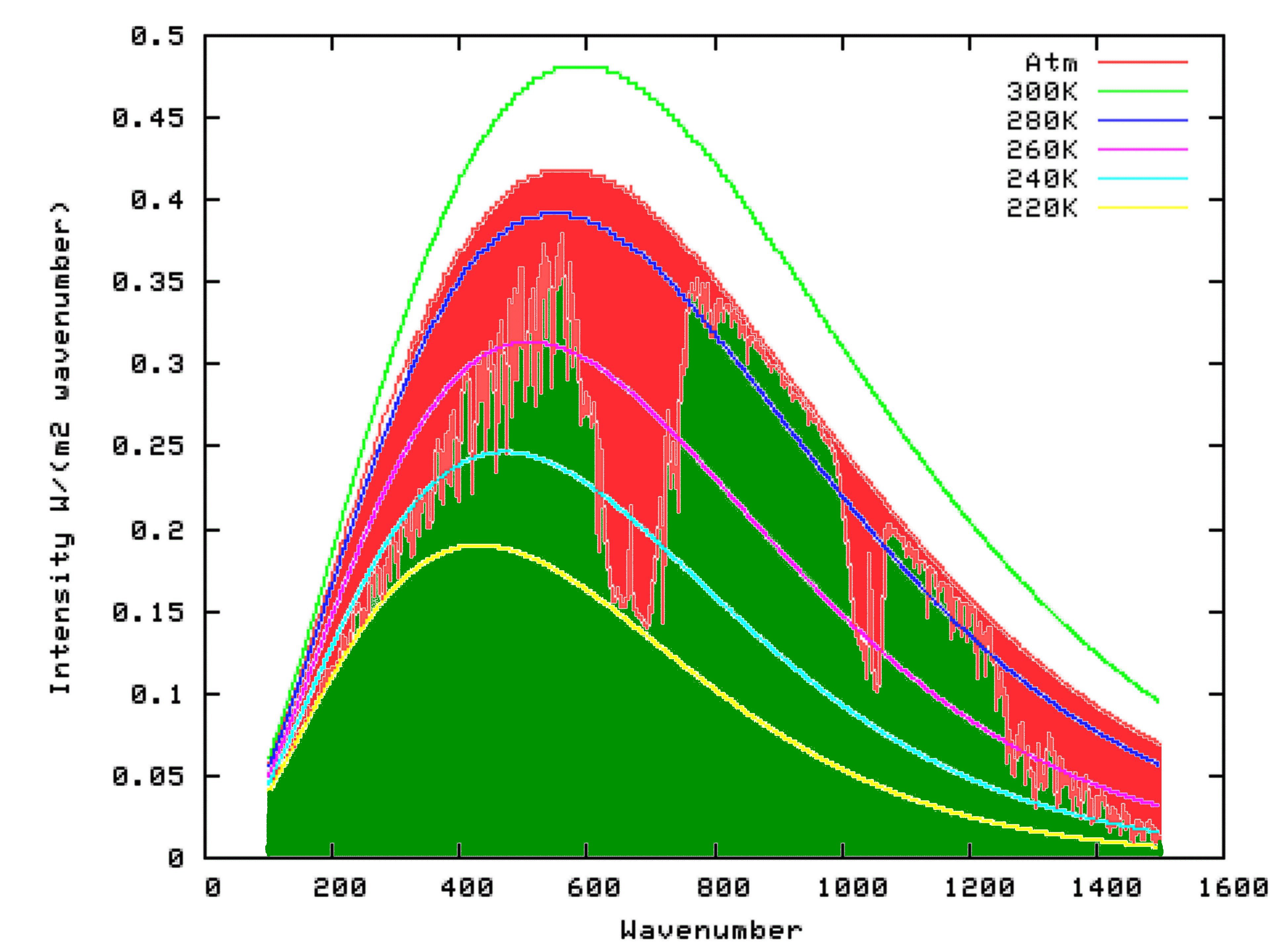

http://www.hashemifamily.com/Kevan/Climate/BBR.gif
Take a look at a Climate “Science” chart. The Black-Bodies are way off from what a calculator would give you. You can check this fact at SpectralCalc.
http://www.spectralcalc.com/blackbody_calculator/blackbody.php
The key is that the black bodies always are skewed towards the shorter, higher energy shorter wavelengthsµ. This chart clearly shows the black-body skewed towards the longer wavelengthsµ or smaller wave-numbers.
Both charts are skewed to the left, but one uses wavenumber and one uses wavelengthµ on the Y-Axis, They Can’t Both Be Correct
One of these charts must be wrong. My bet is the one published by the Climate “Scientists” is a lie.
http://www.hashemifamily.com/Kevan/Climate/BBR.gif
The implications on which one is right are huge. If the black body produced by a calculator is correct, and the black body distribution skews towards the shorter wavelengthµ, then the impact of CO2 is greatly reduced, and H2O is greatly magnified.
This chart shows the same thing. It shows the surface of the earth being 299°K, with a black body peak at 15µ A black body of 299°K is 26°C, or 80°F. A black body of 299°K has a peak of 9.5µ Either my calculator is lying to me or the Climate “Scientists” are. These charts are deliberately misrepresenting the impact of CO2 or the people that produced they are incompetent. Neither is good.
http://www.mathstat.dal.ca/~folkins/Cloud-LWspectrum.jpg
http://esrl.noaa.gov/csd/events/CT3LS/presentations/talks/50_Hintsa.pdf
This is mostly of interest, but if you look at the observed vs actual graph of Guam you will see that there seems to be an Ozone Window. In reality it looks like there is an “ozone hole” over Guam. BTW, that also implies that the Ozone Hole helps keep the Antarctic cold. Imagine that, the Ozone hold battles global warming. Maybe the banning of CFCs has resulted in the earth warming due to more Ozone?