Guest Post by Bob Tisdale
This post provides an update of the data for the three primary suppliers of global land+ocean surface temperature data—GISS through January 2015 and HADCRUT4 and NCDC through December 2014—and of the two suppliers of satellite-based lower troposphere temperature data (RSS and UAH) through January 2015.
INITIAL NOTES:
For discussions of the annual GISS and NCDC data for 2014, see the posts:
- Does the Uptick in Global Surface Temperatures in 2014 Help the Growing Difference between Climate Models and Reality?
- On the Biases Caused by Omissions in the 2014 NOAA State of the Climate Report
GISS LOTI surface data, and the two lower troposphere temperature datasets are for the most recent month. The HADCRUT4 and NCDC data lag one month.
This post contains graphs of running trends in global surface temperature anomalies for periods of 14+ and 17+ years using GISS global (land+ocean) surface temperature data. They indicate that we have not seen a warming slowdown (based on 14+ year trends) this long since the late-1970s or a warming slowdown (based on 17+ year trends) since about 1980.
Much of the following text is boilerplate. It is intended for those new to the presentation of global surface temperature anomaly data.
Most of the update graphs in the following start in 1979. That’s a commonly used start year for global temperature products because many of the satellite-based temperature datasets start then.
We discussed why the three suppliers of surface temperature data use different base years for anomalies in the post Why Aren’t Global Surface Temperature Data Produced in Absolute Form?
But first, let’s illustrate how badly the climate models used by the IPCC simulate global surface temperatures in light of the recent slowdown in global surface warming.
MODEL-DATA DIFFERENCE
Considering the uptick in surface temperatures this year (discussions linked above), government agencies that supply global surface temperature products have been touting record high combined global land and ocean surface temperatures. Alarmists happily ignore the fact that it is easy to have record high global temperatures in the midst of a hiatus or slowdown in global warming, and they have been using the recent record highs to draw attention away from the growing difference between observed global surface temperatures and the IPCC climate model-based projections of them.
There are a number of ways to present how poorly climate models simulate global surface temperatures. Normally they are compared in a time-series graph. See the example here. In that example, GISS Land-Ocean Temperature Index (LOTI) data are compared to the multi-model mean of the climate models stored in the CMIP5 archive, which was used by the IPCC for their 5th Assessment Report. The data and model outputs have been smoothed with 61-month filters to reduce the monthly variations.
Another way to show how poorly climate models perform is to subtract the data from the average of the model outputs (model mean). We first presented and discussed this method using global surface temperatures in absolute form. (See the post On the Elusive Absolute Global Mean Surface Temperature – A Model-Data Comparison.) The graph below shows a model-data difference using anomalies, where the data are represented by GISS global Land-Ocean Temperature Index (LOTI) and the model simulations of global surface temperature are represented by the multi-model mean of the models stored in the CMIP5 archive. To assure that the base years used for anomalies did not bias the graph, the full term of the data (1880 to 2013) were used as the reference period.
In this example, we’re illustrating the model-data differences in the monthly surface temperature anomalies. Also included in red is the difference smoothed with a 61-month running mean filter.
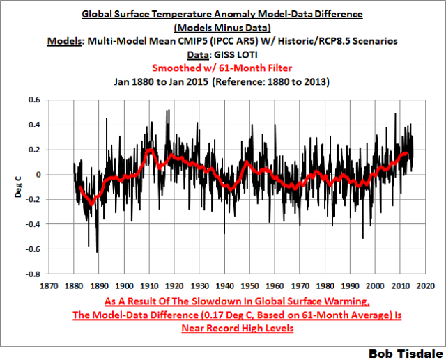
Figure 00 – Model-Data Difference
The greatest difference between models and data occurs in the 1880s. The difference decreases drastically from the 1880s and switches signs by the 1910s. The reason: the models do not properly simulate the observed cooling that takes place at that time. Because the models failed to properly simulate the cooling from the 1880s to the 1910s, they also failed to properly simulate the warming that took place from the 1910s until 1940. That explains the long-term decrease in the difference during that period and the switching of signs in the difference once again. The difference cycles back and forth nearer to a zero difference until the 1990s, indicating the models are tracking observations better (relatively) during that period. And from the 1990s to present, because of the slowdown in warming, the difference has increased to greatest value since about 1910…where the difference indicates the models are showing too much warming.
It’s very easy to see the recent record-high global surface temperatures have had a tiny impact on the difference between models and observations.
See the post On the Use of the Multi-Model Mean for a discussion of its use in model-data comparisons.
GISS LAND OCEAN TEMPERATURE INDEX (LOTI)
Introduction: The GISS Land Ocean Temperature Index (LOTI) data is a product of the Goddard Institute for Space Studies. Starting with their January 2013 update, GISS LOTI uses NCDC ERSST.v3b sea surface temperature data. The impact of the recent change in sea surface temperature datasets is discussed here. GISS adjusts GHCN and other land surface temperature data via a number of methods and infills missing data using 1200km smoothing. Refer to the GISS description here. Unlike the UK Met Office and NCDC products, GISS masks sea surface temperature data at the poles where seasonal sea ice exists, and they extend land surface temperature data out over the oceans in those locations. Refer to the discussions here and here. GISS uses the base years of 1951-1980 as the reference period for anomalies. The data source is here.
Update: The January 2015 GISS global temperature anomaly is +0.75 deg C. It increased slightly (about +0.02 deg C) since December 2014.

Figure 1 – GISS Land-Ocean Temperature Index
Note: There have been recent changes to the GISS land-ocean temperature index data. They have a noticeable impact on the short-term (1998 to present) trend as discussed in the post GISS Tweaks the Short-Term Global Temperature Trend Upwards. The causes of the changes are unclear at present, but they will likely affected the 2014 rankings.
NCDC GLOBAL SURFACE TEMPERATURE ANOMALIES (LAGS ONE MONTH)
Introduction: The NOAA Global (Land and Ocean) Surface Temperature Anomaly dataset is a product of the National Climatic Data Center (NCDC). NCDC merges their Extended Reconstructed Sea Surface Temperature version 3b (ERSST.v3b) with the Global Historical Climatology Network-Monthly (GHCN-M) version 3.2.0 for land surface air temperatures. NOAA infills missing data for both land and sea surface temperature datasets using methods presented in Smith et al (2008). Keep in mind, when reading Smith et al (2008), that the NCDC removed the satellite-based sea surface temperature data because it changed the annual global temperature rankings. Since most of Smith et al (2008) was about the satellite-based data and the benefits of incorporating it into the reconstruction, one might consider that the NCDC temperature product is no longer supported by a peer-reviewed paper.
The NCDC data source is through their Global Surface Temperature Anomalies webpage. Click on the link to Anomalies and Index Data.)
Update (Lags One Month): The December 2014 NCDC global land plus sea surface temperature anomaly was +0.77 deg C. See Figure 2. It is rose (an increase of +0.12 deg C) since November 2014.

Figure 2 – NCDC Global (Land and Ocean) Surface Temperature Anomalies
UK MET OFFICE HADCRUT4 (LAGS ONE MONTH)
Introduction: The UK Met Office HADCRUT4 dataset merges CRUTEM4 land-surface air temperature dataset and the HadSST3 sea-surface temperature (SST) dataset. CRUTEM4 is the product of the combined efforts of the Met Office Hadley Centre and the Climatic Research Unit at the University of East Anglia. And HadSST3 is a product of the Hadley Centre. Unlike the GISS and NCDC products, missing data is not infilled in the HADCRUT4 product. That is, if a 5-deg latitude by 5-deg longitude grid does not have a temperature anomaly value in a given month, it is not included in the global average value of HADCRUT4. The HADCRUT4 dataset is described in the Morice et al (2012) paper here. The CRUTEM4 data is described in Jones et al (2012) here. And the HadSST3 data is presented in the 2-part Kennedy et al (2012) paper here and here. The UKMO uses the base years of 1961-1990 for anomalies. The data source is here.
Update (Lags One Month): The December 2014 HADCRUT4 global temperature anomaly is +0.63 deg C. See Figure 3. It rose (about +0.15 deg C) since November 2014.

Figure 3 – HADCRUT4
UAH LOWER TROPOSPHERE TEMPERATURE ANOMALY DATA (UAH TLT)
Special sensors (microwave sounding units) aboard satellites have orbited the Earth since the late 1970s, allowing scientists to calculate the temperatures of the atmosphere at various heights above sea level. The level nearest to the surface of the Earth is the lower troposphere. The lower troposphere temperature data include the altitudes of zero to about 12,500 meters, but are most heavily weighted to the altitudes of less than 3000 meters. See the left-hand cell of the illustration here. The lower troposphere temperature data are calculated from a series of satellites with overlapping operation periods, not from a single satellite. The monthly UAH lower troposphere temperature data is the product of the Earth System Science Center of the University of Alabama in Huntsville (UAH). UAH provides the data broken down into numerous subsets. See the webpage here. The UAH lower troposphere temperature data are supported by Christy et al. (2000) MSU Tropospheric Temperatures: Dataset Construction and Radiosonde Comparisons. Additionally, Dr. Roy Spencer of UAH presents at his blog the monthly UAH TLT data updates a few days before the release at the UAH website. Those posts are also cross posted at WattsUpWithThat. UAH uses the base years of 1981-2010 for anomalies. The UAH lower troposphere temperature data are for the latitudes of 85S to 85N, which represent more than 99% of the surface of the globe.
Update: The January 2015 UAH lower troposphere temperature anomaly is +0.36 deg C. It rose (an increase of about +0.04 deg C) since December 2014.

Figure 4 – UAH Lower Troposphere Temperature (TLT) Anomaly Data
RSS LOWER TROPOSPHERE TEMPERATURE ANOMALY DATA (RSS TLT)
Like the UAH lower troposphere temperature data, Remote Sensing Systems (RSS) calculates lower troposphere temperature anomalies from microwave sounding units aboard a series of NOAA satellites. RSS describes their data at the Upper Air Temperature webpage. The RSS data are supported by Mears and Wentz (2009) Construction of the Remote Sensing Systems V3.2 Atmospheric Temperature Records from the MSU and AMSU Microwave Sounders. RSS also presents their lower troposphere temperature data in various subsets. The land+ocean TLT data are here. Curiously, on that webpage, RSS lists the data as extending from 82.5S to 82.5N, while on their Upper Air Temperature webpage linked above, they state:
We do not provide monthly means poleward of 82.5 degrees (or south of 70S for TLT) due to difficulties in merging measurements in these regions.
Also see the RSS MSU & AMSU Time Series Trend Browse Tool. RSS uses the base years of 1979 to 1998 for anomalies.
Update: The January 2015 RSS lower troposphere temperature anomaly is +0.37 deg C. It rose (an increase of about +0.08 deg C) since December 2014.

Figure 5 – RSS Lower Troposphere Temperature (TLT) Anomaly Data
A QUICK NOTE ABOUT THE DIFFERENCE BETWEEN RSS AND UAH TLT DATA
There is a noticeable difference between the RSS and UAH lower troposphere temperature anomaly data. Dr. Roy Spencer discussed this in his November 2011 blog post On the Divergence Between the UAH and RSS Global Temperature Records. In summary, John Christy and Roy Spencer believe the divergence is caused by the use of data from different satellites. UAH has used the NASA Aqua AMSU satellite in recent years, while as Dr. Spencer writes:
…RSS is still using the old NOAA-15 satellite which has a decaying orbit, to which they are then applying a diurnal cycle drift correction based upon a climate model, which does not quite match reality.
I updated the graphs in Roy Spencer’s post in On the Differences and Similarities between Global Surface Temperature and Lower Troposphere Temperature Anomaly Datasets.
While the two lower troposphere temperature datasets are different in recent years, UAH believes their data are correct, and, likewise, RSS believes their TLT data are correct. Does the UAH data have a warming bias in recent years or does the RSS data have cooling bias? Until the two suppliers can account for and agree on the differences, both are available for presentation.
Roy Spencer has recently updated his discussion on the RSS and UAH differences in the post Why Do Different Satellite Datasets Produce Different Global Temperature Trends?
Also, in the recent blog post, Roy Spencer has advised that the UAH lower troposphere Version 6 will be released soon and that it will reduce the difference between the UAH and RSS data.
14-YEARS+ (169-MONTH) RUNNING TRENDS
As noted in my post Open Letter to the Royal Meteorological Society Regarding Dr. Trenberth’s Article “Has Global Warming Stalled?”, Kevin Trenberth of NCAR presented 10-year period-averaged temperatures in his article for the Royal Meteorological Society. He was attempting to show that the recent halt in global warming since 2001 was not unusual. Kevin Trenberth conveniently overlooked the fact that, based on his selected start year of 2001, the halt at that time had lasted 12+ years, not 10.
The period from January 2001 to November 2014 is now 169-months long—14+ years. Refer to the following graph of running 169-month trends from January 1880 to November 2014, using the GISS LOTI global temperature anomaly product.
An explanation of what’s being presented in Figure 6: The last data point in the graph is the linear trend (in deg C per decade) from January 2001 to January 2015. It is extremely low (about +0.04 deg C/Decade). That, of course, indicates global surface temperatures have not warmed to any great extent during the most recent 169-month period. Working back in time, the data point immediately before the last one represents the linear trend for the 169-month period of December 2000 to December 2014, and the data point before it shows the trend in deg C per decade for November 2000 to November 2014, and so on.

Figure 6 – 169-Month Linear Trends
The highest recent rate of warming based on its linear trend occurred during the 169-month period that ended about 2006, but warming trends have dropped drastically since then. There was a similar drop in the 1940s, and as you’ll recall, global surface temperatures remained relatively flat from the mid-1940s to the mid-1970s. Also note that the mid-1970s was the last time there had been a 169-month period with a global warming rate that low—before recently.
17-YEARS+ (212-Month) RUNNING TRENDS
In his RMS article, Kevin Trenberth also conveniently overlooked the fact that the discussions about the warming halt are now for a time period of about 16 years, not 10 years—ever since David Rose’s DailyMail article titled “Global warming stopped 16 years ago, reveals Met Office report quietly released… and here is the chart to prove it”. In my response to Trenberth’s article, I updated David Rose’s graph, noting that surface temperatures in April 2013 were basically the same as they were in November 1997. We’ll use November 1997 as the start month for the running 17-year trends. The period is now 212-months long. The following graph is similar to the one above, except that it’s presenting running trends for 212-month periods.

Figure 7 – 212-Month Linear Trends
The last time global surfaces warmed at this low a rate for a 212-month period was about 1980. Also note that the sharp decline is similar to the drop in the 1940s, and, again, as you’ll recall, global surface temperatures remained relatively flat from the mid-1940s to the mid-1970s.
The most widely used metric of global warming—global surface temperatures—indicates that the rate of global warming has slowed drastically and that the duration of the slowdown in global warming is unusual during a period when global surface temperatures are allegedly being warmed from the hypothetical impacts of manmade greenhouse gases.
COMPARISONS
The GISS, HADCRUT4 and NCDC global surface temperature anomalies and the RSS and UAH lower troposphere temperature anomalies are compared in the next three time-series graphs. Figure 8 compares the five global temperature anomaly products starting in 1979. Again, due to the timing of this post, the HADCRUT4 and NCDC data lag the UAH, RSS and GISS products by a month. The graph also includes the linear trends. Because the three surface temperature datasets share common source data, (GISS and NCDC also use the same sea surface temperature data) it should come as no surprise that they are so similar. For those wanting a closer look at the more recent wiggles and trends, Figure 9 starts in 1998, which was the start year used by von Storch et al (2013) Can climate models explain the recent stagnation in global warming? They, of course, found that the CMIP3 (IPCC AR4) and CMIP5 (IPCC AR5) models could NOT explain the recent halt in warming.
Figure 10 starts in 2001, which was the year Kevin Trenberth chose for the start of the warming halt in his RMS article Has Global Warming Stalled?
Because the suppliers all use different base years for calculating anomalies, I’ve referenced them to a common 30-year period: 1981 to 2010. Referring to their discussion under FAQ 9 here, according to NOAA:
This period is used in order to comply with a recommended World Meteorological Organization (WMO) Policy, which suggests using the latest decade for the 30-year average.

Figure 8 – Comparison Starting in 1979
###########

Figure 9 – Comparison Starting in 1998
###########

Figure 10 – Comparison Starting in 2001
For those who want to get a rough idea of the impacts of the adjustments to the GISS and HADCRUT4 warming rates, refer to the July update—a month before those adjustments took effect.
AVERAGE
Figure 11 presents the average of the GISS, HADCRUT and NCDC land plus sea surface temperature anomaly products and the average of the RSS and UAH lower troposphere temperature data. Again because the HADCRUT4 and NCDC data lag one month in this update, the most current average only includes the GISS product.

Figure 11 – Average of Global Land+Sea Surface Temperature Anomaly Products
The flatness of the data since 2001 is very obvious, as is the fact that surface temperatures have rarely risen above those created by the 1997/98 El Niño in the surface temperature data. There is a very simple reason for this: the 1997/98 El Niño released enough sunlight-created warm water from beneath the surface of the tropical Pacific to raise the temperature of about 66% of the surface of the global oceans by almost 0.2 deg C. Sea surface temperatures for that portion of the global oceans remained relatively flat, dropping slowly throughout most of that region, until the El Niño of 2009/10, when the surface temperatures of that portion of the global oceans shifted slightly higher again. Prior to that, it was the 1986/87/88 El Niño that caused surface temperatures to shift upwards. If these naturally occurring upward shifts in surface temperatures are new to you, please see the illustrated essay “The Manmade Global Warming Challenge” (42mb) for an introduction.
MONTHLY SEA SURFACE TEMPERATURE UPDATE
The most recent sea surface temperature update can be found here. The satellite-enhanced sea surface temperature data (Reynolds OI.2) are presented in global, hemispheric and ocean-basin bases. We discussed the recent record-high global sea surface temperatures and the reasons for them in the post On The Recent Record-High Global Sea Surface Temperatures – The Wheres and Whys.
So in summary, nothing much is happening.
Is that affair interpretation?
“Affair” typo of “a fair”.
Don’t know what I’m thinking of.
Are you married?
Freudian slip? 🙂
It was auto-correct. That’s my story and I’m sticking to it!
There are times when the climate is in a rapid cooling phase, there are times when the planet is in a rapid warming phase, and there are times when there is not much change. This looks to be a time of not much change.
Of course, since the data are put out by unreliable people who “adjust” and “homogenize” to suit their unscientific agenda — it is hard to tell if the planet is cooling right now or not. We really have no way of knowing what the global temperature really is.
Figures 1 through 5. It’s all anyone should need.
I love that … a perfect example of selective evidence. How utterly unscientific — but not beyond those pushing an agenda. Just what type of education makes one do this?
Please clarify
We really have no way of knowing what the global temperature really is.
===========
different global average temperatures can have the exact same radiative energy out, depending on distribution. this is because averages are calculated as the first power of temperature, while radiation is the fourth power.
thus, a climate model that tries to predict future temperatures based on radiative energy cannot succeed, because a wide range of averages is possible due to regional variation in temperature, for the exact same amount of radiation in and out.
What happened to “2014 hottest year on record!”? None of your graphs indicate that.
None of Bob’s graphs …
That would require a graph with a mean of 12 months.
“Figure 00 – Model-Data Difference
The greatest difference between models and data occurs in the 1880s. The difference decreases drastically from the 1880s and switches signs by the 1910s. The reason: the models do not properly simulate the observed cooling that takes place at that time. Because the models failed to properly simulate the cooling from the 1880s to the 1910s, they also failed to properly simulate the warming that took place from the 1910s until 1940. ”
A loooong time ago there was some attention given to error estimates for the temperature indexes. That is now forgotten. The difference in 1880 is just outside the error estimates for the temperature index. For a short period that is. Same for 1910 – 1940.
The choices for the differences between the models and measurements are of course interesting. A simple plot of the indexes and the models would show small difference between the mean of the models and the indexes.
Tisdale did not want to show that.
(Per site policy, please use only one proxy server. Thanks. –mod.)
Troll alert!
What, were you sleeping late rooter? You weren’t the first one to post!
Keep adjuting the data and guess what you make the models match over all time periods, well of course, except for the future.
I am confident that everyone who reguarly visits this site knows only too well that due to the large error bands in the assessment of global temperatures and their anomalies that we are unable to tell whether it is today wamer than it was in the 1930s or the 1880s, save that with respect to the US land temperature data it is almost certainly the case that it was warmer in the 1930s than it is today.
Surely Rooter meant INDICES not INDEXES?
Pedantry.
It’s not good enough to be as bad as those who annoy you… we aren’t marked on a curve.
We should try to be less irritating than the grammar Nazis.
Both are correct plural of Index ref:http://www.merriam-webster.com/dictionary/index
mea culpa. Sorry for the “pedantry”, particularly when I was wrong. As pointed out by Steven Swensne, both are correct, even in English as opposed to American. But in mathematics, as shown in all my old text books, it is more usual to use the plural “indices”. Cannot think why, unless the word “indexes” can be confused with the third person present of the transitive verb to index. Unlikely!
.
I have said it before with conviction.
Every tie I have said it, I have been correct. So I will say it again.
Tomorrow will be either above or below the average for this time of the year.
Well…there’s nothing that precludes it from actually matching the average 🙂
And my tomato plants don’t really care if it’s a degree warmer on average, or a degree cooler on average, than it last year.
Neither do the lawn shrimp, or the schnook in the inlet across the street.
It surprises me that the graph “RSS Northern Polar Temperature Lower Troposphere — 1979 to Present” gives a mean trend of 0.324K/decade. This is more than 3 degrees centigrade per century!
What am I missing?
Jean. You seem to be missing the mistake in your conversion.
True, but was this supposed to be on the other post by Bob?
Thank you Bob. We are currently 1 meter above our average snowfall for the year and many of our highways are closed in the 3 maritime provinces. (Eastern Canada) .Feels like the 1960s again.
Nice. Weather and political climate are in agreement.
I’m pretty sure the GISS will, for the first time, be adjusted downward for 2014 sometime around July so they can once again claim 2015 is the warmest year ever. Gotta keep those headlines coming.
The GCMs don’t work because they make the mistake of assuming that CO2 change has an effect on climate. It doesn’t .
CO2 has been considered to be a forcing with units Joules/sec. Energy change, which is revealed by temperature change, has units Joules. Average forcing times duration produces energy change. Equivalently, a scale factor times the time-integral of the CO2 level produces the temperature change.
During previous glaciations and interglacials (as so dramatically displayed in An Inconvenient Truth) CO2 and temperature went up and down nearly together. This is impossible if CO2 is a significant forcing (scale factor not zero) so this actually proves CO2 CHANGE DOES NOT CAUSE SIGNIFICANT AVERAGE GLOBAL TEMPERATURE CHANGE.
Application of this analysis methodology to CO2 levels for the entire Phanerozoic eon (Berner, 2001) proves that CO2 levels up to at least 6 times the present will have no significant effect on average global temperature.
See more on this and discover the two factors that do cause climate change (95% correlation since before 1900) at http://agwunveiled.blogspot.com . The two factors which explain the last 300+ years of climate change are also identified in a peer reviewed paper published in Energy and Environment, vol. 25, No. 8, 1455-1471.
Dan, you seem to match historic HadCrut quite well.
Where have you goofed ?
When your time integral has a much larger peak around 1940 than HadCrut, (up somewhere similar to now), then you will be closer to the mark.
I can not find a ‘goof’.
The time-integral, considered separately, is shown in Figure 2 of the agwunveiled paper. When combined with the approximation of ocean oscillations, it produces the combined graphs, e.g. Figure 1. The rapid year-to-year oscillations in reported measurements are physically impossible because of huge effective thermal capacitance (as discussed in http://globaltem.blogspot.com). Thus IMO the calculated trend is closer to the true energy change of the planet than the physically-impossible reported measurements.
What is your basis for perceiving that HadCrut and the other agencies reported lower than actual temperatures in 1940?
Reblogged this on Centinel2012 and commented:
The change in the LOTI January 2015 issue was massive and all the way back to January 1880. I posted on my blog yesterday a plot for Dec 2014 and Jan 2015 and I would suggest that anyone interested in the subject review that plot. http://centinel2012.com/2015/02/15/nasa-giss-data-manipulation-is-now-proven-fact-not-speculation/
You lost me! Generally, I am not out to defend GISS, but unless I am totally misinterpreting what you are showing, it does not seem right. You appear to show 2010 as being 0.59 last month and 0.79 this month. Yet 2010 was 0.66 last month and it is 0.66 this month as well.
It’s the usual stuff. In December he looked up GISS GISS LOTI. In January he looked up GISS Met Stations. Same thing Lindzen did.
Climate anomalies are very small, meaningless, inaccurate, “adjusted” by political zealots, random variations of a climate statistic that has no importance to humans in the absence of real (visible) negative harm to humans, animals and plants from climate change.
.
There is no evidence of real damage from climate change.
.
Humans are healthier and live longer than ever.
.
Plants are growing faster than 100 years ago.
.
And my cat still wants to go outside.
Therefore, the expense of collecting (and all those tedious “adjustments”) average temperature statistics are a complete waste of the taxpayers money.
No one lives in the “average temperature”
.
Average temperature does not cause local weather conditions, that people do care about
99.999% of historical average temperature data are unknown (climate proxies suggest local temperature data, not global averages).
.
No one knows what a “normal” average temperature of Earth is.
.
Average temperature is a statistic used primarily as a political tool — an environmental boogeyman used to scare people into wanting, or at least accepting, a lot more government power to control the private sector.
.
There is no proof that any average of local temperatures, measured with weather stations whose count, locations and instruments have changed radically over time, is a meaningful and useful statistic.
.
And now that I’ve finished my “introduction”, Bob Tisdale does a fine job of presenting average temperature anomalies, and his charts are especially pretty.
My climate facts, comedy, and random ranting and raving, are at the website below, where I attempt to prove that Al Gore’s speeches (a lot of hot air) and general bloviating, was the primary cause of global warming in the 1990s … while his relative silence since losing the 2000 election (too busy spending his fortune since then) was responsible for the “hiatus”.
.
I attempt to prove this with my Al Gore Climate Model showing a strong correlation of Al Gore’s ‘face time’ in the mainstream media and global warming:
.
http://www.elOnionBloggle.blogspot.com
Re: Model / Data differences:
It seems illogical to me to show a model/data differences graph without noting, certainly in a legend and better by a bright vertical line, the date of the model. I’m not terribly impressed by a model that can track historically known data. A model is only useful due to, and is only really tested by, its ability to predict future behavior. The IPCC loves to update its reports, dropping old models and inserting new ones, showing years of data tracking by the models, without acknowledging that they dropped the older models from their reporting and letting everyone think their models track data well for decades.
Patrick,
You’ve touched on a point that is my pet peeve as well.
EVERY time that a comparison between a model and observed data is offered, the time point where the model prediction goes “out of sample” should be made crystal clear. I suggest that every graph should have a bold vertical line at that point. Left of the line should be marked “hind-cast”, and right of the line should be marked “fore-cast”.
Model building, by its very nature, offers strong inducements to “over-fit” or “curve-fit” the model to historical data. The temptation to do some form of this is immense, and it should by now be very apparent that the constructors of the CGMs are guilty of that error.
By boldly and consistently showing the break point, we can clearly illustrate the problem, and perhaps even encourage a bit more humility in the modelers.
Thanks, Bob. Your information is much valued.
The pause is evident since 1998, now more importantly what will the future bring?
Every once in a while science reaches a point which I call, THE MOMENT OF TRUTH.
I think that point is now upon us , and by the end of this decade we will know if solar is the main driver of the climate (which I believe 100%) or CO2.
The contrast(low solar (cooling) versus higher co2(warming) ), is now in place for this to play out.
It is a rear opportunity when mother nature will likely reveal which side is correct. We have that distinct possibility now.
I think you meant “rare” not “rear.” Perhaps you were thinking of the “Al Gore Climate Model” a few comments above?
Oh, sorry. The “Al Gore Climate Model” and “rear” belong in a methane thread…
How do we tell which side of mother nature’s rear is correct once she reveals it?
“This next push of arctic air is expected to bring air that is just as cold, or even colder than the air that brought subzero lows to the Midwest and Northeast during the weekend.
Millions will shiver from Chicago to New York City as record lows are challenged during this bitter blast. Records may also fall across parts of the Southeast where temperatures manage to fall into the teens and single digits.
Floridians will even experience a taste of the arctic chill with temperatures dipping down to the lower 30s in cities such as Orlando.”
http://vortex.accuweather.com/adc2004/pub/includes/columns/newsstory/2015/650x366_02161727_hd21.jpg
Very low solar activity.
http://www.glerl.noaa.gov/res/glcfs/anim.php?lake=l¶m=glsea&type=n
http://www.n3kl.org/sun/noaa.html
http://www.cpc.ncep.noaa.gov/products/stratosphere/strat-trop/gif_files/time_pres_WAVE1_MEAN_JFM_NH_2015.gif
thanks rare it is.
I’d be curious to know what people think of the latest global temperature anomaly trend from the WeatherBell update through January 2015 based on the “4-times daily climatological 2-meter temperature from the NCEP CFSR reanalysis”:
http://models.weatherbell.com/climate/cfsr_t2m_2005.png
And also the latest January 2015 map of global temperature anomalies:
http://models.weatherbell.com/climate/ncep_cfsr_t2m_anom_012015.png
To me, more data is better when trying to determine global temperature trends and the amount of data going into these analyses is HUGE compared to analyses based on GHCN.
Model accuracy +/- 0.35C since 1910. Not unreasonable for the state of the art, but a disaster for rational decision-making regarding the climate.
Spock2009, I don’t understand. The stated trend is 0.324 K/decade. Now, a decade is 10 years, and the scale of the absolute temperature (K) is the same as the centigrade (Celsius) scale. Therefore, 0.234K/decade is equal as 3.24 degrees per century.
Your figures 1, 2, and 3 are infested with computer footprints from a covert operation to make the temperature seem higher than it is. They were created in a cooperative venture by three ground-based temperature sources which produced a bogus warming they share. The record shows that from 1979 to 1997, an 18 year no-warming period, this bogus warming amounted to a temperature rise of 0.1 degrees Celsius. It does not end there but continues into the twenty-first century. There they impose it on top of the hiatus and this way are able to crown the year 2014 as the warmest year ever. I determined this by comparing their data to satellite data that are free of the bogus warming and computer footprints. Three temperature sources are involved: GISS, NCDC, and HadCRUT. Passing off bogus temperature as real is a scientific fraud. Apparently computer processing to bring their outputs into line with one another was used. But unbeknownst to them the computer left its footprints on all three supposedly independent temperature curves. Its traces comprise sharp upward spikes at the beginnings of years, situated in exactly the same locations in all three data sets. You will have no trouble recognizing them by overlapping these curves with either UAHor RSS satellite data sets. One of these spikes sits right on top of the super El Nino of 1998 and extends it upward by 0.1 degrees Celsius. I had spotted this fakery as I did research for my book “What Warming” in 2009 and even put a warning about it into the preface but nothing happened. At the time I had pinned it down to HadCRUT3 but after the book came out I did more research and found out about this cooperative triplet. I suggest that these three official temperature curves are corrupt and should be withdrawn. If you need to work with temperatures, do not use them – use satellite data if at all possible. The same applies to Berkeley Earth temperatures after 1979 because they deliberately ignored satellite data and chose to use these ground based data as their source material. It has been possible to expose this fraud thanks to the existence of parallel satellite data . This is not true of earlier data and we have no idea whether or when any data manipulation has taken place.