Guest Post by Werner Brozek, Edited by Just The Facts:
 - 1979 to Present")
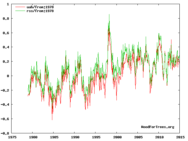
The above graphic shows that RSS has a slope of basically zero since October 1996, or a period of 18 years and 3 months. UAH, version 5.5 has a slope of basically zero for 10 years, since January 2005. I would like to thank Walter Dnes for determining the values. WFT does not show version 5.6, however the length of time for a flat period on this version is since January 2009, or an even 6 years. In contrast, the other three data sets I report on have a flat period of less than a year which in my opinion is not worth being called a pause.
Why is there this difference between the satellites and the surface measurements? Is one more accurate than the other?
There have been a numerous recent articles on the adjustments made to the surface temperature records, in Bolivia, China, Paraguay, and elsewhere; and we recently had a Meterologist in Germany who noted that:
“One reason for the perceived warming, Hager says, is traced back to a change in measurement instrumentation. He says glass thermometers were was replaced by much more sensitive electronic instruments in 1995. Hager tells the SZ:
‘For eight years I conducted parallel measurements at Lechfeld. The result was that compared to the glass thermometers, the electronic thermometers showed on average a temperature that was 0.9°C warmer. Thus we are comparing – even though we are measuring the temperature here – apples and oranges. No one is told that.'”
Below, I would like to compare the final rankings of 2014 with respect to other years for the 5 data sets that I report on as well as for UAH, version 5.6. I will do so in three parts. In the first part, I will give the ranking without regards to how close 2014 is to any other year. In the second part, I will assume that any other anomaly average that is up to 0.03 above or below the 2014 is in a statistical tie with 2014. In the third part, I will expand on this and assume that any anomaly that is within 0.1 of the 2014 anomaly is in a statistical tie with 2014.
So for the first part, the rankings are as follows:
UAH version 5.5: 7th
UAH version 5.6: 3rd
RSS: 6th
HadCRUT4: 1st
HadSST3: 1st
GISS: 1st
The above ranks are the ones that appear on line 24 of the present table. Furthermore, these same numbers will appear on line 1 of the new table when I give the data for 2015.
For the second part, here are the rankings if we assume that any anomaly that is 0.03 above or below the 2014 ranking is in a statistical tie with 2014:
UAH version 5.5: a statistical 7 way tie from ranks 4 to 10
UAH version 5.6: a statistical 3 way tie from ranks 3 to 5
RSS: a statistical 4 way tie from ranks 6 to 9
HadCRUT4: a statistical 4 way tie from ranks 1 to 4
HadSST3: It remains in 1st by itself
GISS: a statistical 3 way tie from ranks 1 to 3
For the third part, here are the rankings if we assume that any anomaly that is 0.1 above or below the 2014 ranking is in a statistical tie with 2014:
UAH version 5.5: a statistical 12 way tie from ranks 3 to 14
UAH version 5.6: a statistical 9 way tie from ranks 3 to 11
RSS: a statistical 12 way tie from ranks 3 to 14
HadCRUT4: a statistical 11 way tie from ranks 1 to 11
HadSST3: a statistical 6 way tie from ranks 1 to 6
GISS: a statistical 10 way tie from ranks 1 to 10
For those who may be interested, this is how HadCRUT3 would have done if it were still around. Assuming that HadCRUT3 would have gone up as much from 2013 to 2014 as HadCRUT4 did, then HadCRUT3 would have had a 2014 anomaly of 0.529. This would have placed it in 2nd place. Prior to this year, 1998 was at 0.548 and 2005 was at 0.482.
In the sections below, as in previous posts, we will present you with the latest facts. The information will be presented in three sections and an appendix. The first section will show for how long there has been no warming on some data sets. At the moment, only the satellite data have flat periods of longer than a year. The second section will show for how long there has been no statistically significant warming on several data sets. The third section will show how 2014 compares with 2013 and the warmest years and months on record so far. The appendix will illustrate sections 1 and 2 in a different way. Graphs and a table will be used to illustrate the data.
Section 1
This analysis uses the latest month for which data is available on WoodForTrees.com (WFT). All of the data on WFT is also available at the specific sources as outlined below. We start with the present date and go to the furthest month in the past where the slope is a least slightly negative on at least one calculation. So if the slope from September is 4 x 10^-4 but it is – 4 x 10^-4 from October, we give the time from October so no one can accuse us of being less than honest if we say the slope is flat from a certain month.
1. For GISS, the slope is not flat for any period that is worth mentioning.
2. For HadCRUT4, the slope is not flat for any period that is worth mentioning. Note that WFT has not updated Hadcrut4 since July and it is only Hadcrut4.2 that is shown.
3. For HadSST3, the slope is not flat for any period that is worth mentioning.
4. For UAH, the slope is flat since January 2005 or an even 10 years. (goes to December using version 5.5 and based on Walter Dnes’ calculation.)
5. For RSS, the slope is flat since October 1996 or 18 years, 3 months (goes to December).
The next graph shows just the lines to illustrate the above. Think of it as a sideways bar graph where the lengths of the lines indicate the relative times where the slope is 0. In addition, the upward sloping blue line at the top indicates that CO2 has steadily increased over this period.
 - 1979 to Present")
When two things are plotted as I have done, the left only shows a temperature anomaly.
The actual numbers are meaningless since the two slopes are essentially zero. No numbers are given for CO2. Some have asked that the log of the concentration of CO2 be plotted. However WFT does not give this option. The upward sloping CO2 line only shows that while CO2 has been going up over the last 18 years, the temperatures have been flat for varying periods on the two sets.
Section 2
For this analysis, data was retrieved from Nick Stokes’ Trendviewer available on his website. This analysis indicates for how long there has not been statistically significant warming according to Nick’s criteria. Data go to their latest update for each set. In every case, note that the lower error bar is negative so a slope of 0 cannot be ruled out from the month indicated.
On several different data sets, there has been no statistically significant warming for between 14 and 22 years according to Nick’s criteria. Cl stands for the confidence limits at the 95% level.
Dr. Ross McKitrick has also commented on these parts and has slightly different numbers for the three data sets that he analyzed. I will also give his times.
The details for several sets are below.
For UAH: Since July 1996: CI from -0.041 to 2.218
(Dr. McKitrick says the warming is not significant for 16 years on UAH.)
For RSS: Since December 1992: CI from -0.013 to 1.752
(Dr. McKitrick says the warming is not significant for 26 years on RSS.)
For HadCRUT4.3: Since May 1997: CI from -0.011 to 1.132
(Dr. McKitrick said the warming was not significant for 19 years on HadCRUT4.2 going to April. HadCRUT4.3 would be slightly shorter however I do not know what difference it would make to the nearest year.)
For Hadsst3: Since May 1995: CI from -0.009 to 1.715
For GISS: Since June 2000: CI from -0.008 to 1.403
Note that all of the above times, regardless of the source, with the exception of GISS are larger than 15 years which NOAA deemed necessary to “create a discrepancy with the expected present-day warming rate”.
Section 3
This section shows data about 2014 and other information in the form of a table. The table shows the five data sources along the top and other places so they should be visible at all times. The sources are UAH, RSS, HadCRUT4, HadSST3, and GISS.
Down the column, are the following:
1. 13ra: This is the final ranking for 2013 on each data set.
2. 13a: Here I give the average anomaly for 2013.
3. year: This indicates the warmest year on record so far for that particular data set. Note that two of the data sets have 2010 as the warmest year and three have 1998 as the warmest year. This is all prior to 2014.
4. ano: This is the average of the monthly anomalies of the warmest year just above.
5. mon: This is the month where that particular data set showed the highest anomaly. The months are identified by the first three letters of the month and the last two numbers of the year. Note that this does not yet include records set so far in 2014 such as Hadsst3 in June, etc.
6. ano: This is the anomaly of the month just above.
7. y/m: This is the longest period of time where the slope is not positive given in years/months. So 16/2 means that for 16 years and 2 months the slope is essentially 0. Periods of under a year are not counted and are shown as “0”.
8. sig: This the first month for which warming is not statistically significant according to Nick’s criteria. The first three letters of the month are followed by the last two numbers of the year.
9. sy/m: This is the years and months for row 8. Depending on when the update was last done, the months may be off by one month.
10. McK: These are Dr. Ross McKitrick’s number of years for three of the data sets.
11. Jan: This is the January 2014 anomaly for that particular data set.
12. Feb: This is the February 2014 anomaly for that particular data set, etc.
23. ave: This is the average anomaly of all months to date taken by adding all numbers and dividing by the number of months.
24. rnk: This is the rank that each particular data set would have for 2014 without regards to error bars. Due to different base periods, the rank is more meaningful than the average anomaly.
| Source | UAH | RSS | Had4 | Sst3 | GISS |
|---|---|---|---|---|---|
| 1.13ra | 7th | 10th | 9th | 6th | 6th |
| 2.13a | 0.197 | 0.218 | 0.492 | 0.376 | 0.60 |
| 3.year | 1998 | 1998 | 2010 | 1998 | 2010 |
| 4.ano | 0.419 | 0.55 | 0.555 | 0.416 | 0.66 |
| 5.mon | Apr98 | Apr98 | Jan07 | Jul98 | Jan07 |
| 6.ano | 0.662 | 0.857 | 0.835 | 0.526 | 0.92 |
| 7.y/m | 10/0 | 18/3 | 0 | 0 | 0 |
| 8.sig | Jul96 | Dec92 | May97 | May95 | Jun00 |
| 9.sy/m | 18/6 | 22/1 | 17/7 | 19/8 | 14/7 |
| 10.McK | 16 | 26 | 19 | ||
| Source | UAH | RSS | Had4 | Sst3 | GISS |
| 11.Jan | 0.236 | 0.260 | 0.508 | 0.342 | 0.68 |
| 12.Feb | 0.127 | 0.160 | 0.305 | 0.314 | 0.43 |
| 13.Mar | 0.137 | 0.213 | 0.548 | 0.347 | 0.70 |
| 14.Apr | 0.184 | 0.250 | 0.658 | 0.478 | 0.72 |
| 15.May | 0.275 | 0.286 | 0.596 | 0.477 | 0.79 |
| 16.Jun | 0.279 | 0.346 | 0.620 | 0.563 | 0.61 |
| 17.Jul | 0.221 | 0.351 | 0.544 | 0.551 | 0.50 |
| 18.Aug | 0.117 | 0.192 | 0.666 | 0.644 | 0.73 |
| 19.Sep | 0.186 | 0.205 | 0.592 | 0.574 | 0.81 |
| 20.Oct | 0.242 | 0.272 | 0.614 | 0.528 | 0.75 |
| 21.Nov | 0.213 | 0.245 | 0.486 | 0.480 | 0.66 |
| 22.Dec | 0.176 | 0.284 | 0.632 | 0.452 | 0.72 |
| Source | UAH | RSS | Had4 | Sst3 | GISS |
| 23.ave | 0.199 | 0.255 | 0.564 | 0.479 | 0.68 |
| 24.rnk | 7th | 6th | 1st | 1st | 1st |
This section shows data about 2014 and other information in the form of a table. The table shows the five data sources along the top and other places so they should be visible at all times. The sources are UAH, RSS, HadCRUT4, HadSST3, and GISS.
To see all points since January 2014 in the form of a graph, see the WFT graph below. Note that HadCRUT4 is the old version that has been discontinued. WFT does not show HadCRU4.3 yet.
 - 1979 to Present")
As you can see, all lines have been offset so they all start at the same place in January 2014. This makes it easy to compare January 2014 with the latest anomaly.
Appendix
In this part, we are summarizing data for each set separately.
RSS
The slope is flat since October, 1996 or 18 years, 3 months. (goes to December)
For RSS: There is no statistically significant warming since December 1992: CI from -0.013 to 1.752.
The RSS average anomaly for 2014 is 0.255. This would rank it as 6th place. 1998 was the warmest at 0.55. The highest ever monthly anomaly was in April of 1998 when it reached 0.857. The anomaly in 2013 was 0.218 and it was ranked 10th prior to 2014.
UAH
The slope is flat since January 2005 or an even 10 years according to Walter Dnes. (goes to December using version 5.5)
For UAH: There is no statistically significant warming since July 1996: CI from -0.041 to 2.218. (This is using version 5.6 according to Nick’s program.)
The UAH average anomaly for 2014 is 0.199. This would rank it as 7th place. 1998 was the warmest at 0.419. The highest ever monthly anomaly was in April of 1998 when it reached 0.662. The anomaly in 2013 was 0.197 and it was ranked 7th prior to 2014.
HadCRUT4.3
The slope is not flat for any period that is worth mentioning.
For HadCRUT4: There is no statistically significant warming since May 1997: CI from -0.011 to 1.132.
The HadCRUT4 average anomaly for 2014 is 0.564. This would rank it as 1st place. 2010 was the previous warmest at 0.555. The highest ever monthly anomaly was in January of 2007 when it reached 0.835. The anomaly in 2013 was 0.492 and it was ranked 9th prior to 2014.
HadSST3
For HadSST3, the slope is not flat for any period that is worth mentioning. For HadSSTt3: There is no statistically significant warming since May 1995: CI from -0.009 to 1.715.
The HadSST3 average anomaly for 2014 is 0.479. This sets a new record. 1998 was the warmest at 0.416 prior to 2014. The highest ever monthly anomaly was in July of 1998 when it reached 0.526. This is also prior to 2014. The anomaly in 2013 was 0.376 and it was ranked 6th prior to 2014.
GISS
The slope is not flat for any period that is worth mentioning.
For GISS: There is no statistically significant warming since June 2000: CI from -0.008 to 1.403.
The GISS average anomaly for 2014 is 0.68. This sets a new record. 2010 was the warmest previously at 0.66. The highest ever monthly anomaly was in January of 2007 when it reached 0.92. The anomaly in 2013 was 0.59 and it was ranked 6th prior to 2014.
Conclusion
Due to new records being set for GISS, HadCRUT4.3 and HadSST3, the pause for these data sets has basically disappeared. At least that is the case for now. Should lower temperatures come in 2015, then the pause may resume in each case. However, all satellite records still show a pause of several years. Due to a relatively constant adiabatic lapse rate, this is very puzzling. Do you have any suggestions as to why there is this discrepancy? Of the three ways that I have given the rankings for 2014, which do you think is the most accurate? If you want me to do a different calculation for any of the six data sets that I have covered such as “What is the 2014 ranking for RSS assuming a tie if the anomaly is within 0.06 of the 2014 number?” please let me know.
January could be a interesting one I think. 2015 might show cooling across all regions. UK being lower than average already USA being lower than average etc.
I’m going to say Australia will bump up the global average……
Why? Aus is a minisucle landspace compared to other land spaces. Or maybe because of “adjusted” data by the BoM? If so, I’d say you are correct. The BoM, the CSIRO and the MSM are still spinning 2014 was the hottest evah, even though the MetO, WMO, NASA and NOAA say different (After retraction)! And RSS (Alarmists don’t like RSS as it contradicts their view) and now so too satellite data “says” different!
On what criteria can Australia be fairly descibed as a “miniscule” landspace?
It is about 6% of the total land area of the globe and whilst it is obviously not a continent that should dominate temperature series, it is sufficiciently large to have more than “miniscule” effect on global land based temperatures.
The UK on the otherhand is rather tiny so it should not contribute much to global temperature series. Prior to last winter (ie., Dec 2013 to Mar 2014), winter temps according to CET had cooled, as from 2000, by about 1.5degC. That is noticeable cooling and the UK has been unprepared for such conditions and it has caused much travel disruption since local councils had been advised that they would not need their gritting equipment nor need to stock pile salt etc because of Met Office’s predictions that global warming would lead to mild winters.
Last winter was mild, so I guess that the coolong since the start of the millenium is not quite so large, but this winter may be considered to be a cool winter so perhaps when this winter is finished, CET will continue to show, as from 2000, a fall in winter temps of about 1.5degC.
I do not know how the rest of Northern Europe is fairing on the winter stakes, but it appears that both the USA and the UK have been experiencing colder winters these past 15 or so years, and this is why people are mocking the Dr Vinner prediction that children just will not know what snow is.
richard verney
I calculate Australia land mass as 5.2% of earth (2,970,000/57,268,900 sq miles; 7,692,000/148,326,000 sq km).
5.2 % vs 6% is “about” a 15.4% error (0.8/5.2), but why quibble about accuracy in a science discussion.
Chip. 6% is plenty close enough when you can’t measure accurately the other 95%. Don’t be an a$$
Compared to the land mass of Africa, the Americas and Eurasia, Australia *IS* minscule in comparison!
Only if they fiddle with the data. Extra hot at the end of last year, but pretty mild down under for 2015 so far
UAH version 5.6 just came out for January. There was a small jump to 0.351 from 0.322 in December.
[snip – Epiphron Elpis is yet another David Appell sockpuppet.]
A rise of 0.029 C from one month to the next does not mean this will happen for the next 100 years. Check out the table to see how much anomalies can vary from one month to the next.
@Epiphron Elpis,
The jump = .029, or 0.29/decade, by your logic, assuming January 2015 is representative.
[snip – Epiphron Elpis is yet another David Appell sockpuppet.]
According to Dr. Spencer:
“The Version 5.6 global average lower tropospheric temperature (LT) anomaly for January, 2015 is +0.35 deg. C, little changed from the December 2014 value of +0.32 deg. C”
If you feel you know better, then feel free to take it up with him.
Shelf sitters are berated, because the Monckton of Brenchley algorithm finds its way back to before that anomalous anomaly starting in 1998 with the great el nino.
He cherry picked that start date they say, to hold up that end of the rope.
So I have noticed; maybe even noted for some time that the 1998 el nino, was immediately followed by the great crash.
Now from your first figure, I can see that there is a lot of up and down goes on between two points on your green zero trend line those being at 1998 and 2005.
So that begs the question. Just what is the average of that data between those two points on your zero line at 1998 and 2005.
My eyeball says it might also be near zero, but since you have the data, is that something you can extract ??
G
See the following. The trend is flat from October 1996 to the present. However it is also flat from October 1996 to April 2000 as well as more or less flat from April 2000 to the present.
http://www.woodfortrees.org/plot/rss/from:1996.75/plot/rss/from:1996.75/to:2000.3/trend/plot/rss/from:2000.3/trend/plot/rss/from:1996.75/trend
The bottom line is that the valleys around 1998 cancel out the peak. And that is why people cannot get away with claiming we are cherry picking if we say a slope of zero starts before 1998.
If you take HadCrut4’s series of monthly global surface temperature anomalies and their associated estimates of error, there’s been no detectable global warming since 1997.
http://4.bp.blogspot.com/-dROUUOsiXJg/VNIgTqnp4XI/AAAAAAAAF08/7o08QJ7isBw/s1600/h4.png
Thank you! It appears as if you are assuming an error bar of 0.16. In that case, we could also say there is a 14 way tie for first place with Hadcrut4.3.
[snip – Epiphron Elpis is yet another David Appell sockpuppet.]
According to Nick Stokes, the warming on Hadcrut4 is not statistically significant from June 1997.
Adelaide in South Australia had its coolest January in 10 years
It has been a cool January after the first week for most of Australia. It looks like it will still be above average, officially.
Only after adjustments!
To date this has been the coolest Summer I can ever remember (in Adelaide). I have never had to put on a jumper (sweater) to go to work before so any claim of a “hot” summer will only occur in the mind of the data manipulator. There have certainly been no “extra hot” days here so far. We have had a hot spells in Feb in the past so will need to wait and see but so far, cool indeed.
James it can’t possible be the cold after all this is the warmest decade ever, your need for a sweater this year must be just you are getting old! /sarc off At least in my case that could be true. I also know for a fact the last ten years have been warmest I have every experience, yet for my siblings that does not seem to be true, I think they would blame it on that I move to Arizona and they remain in Minnesota and North Dakota. Yes putting on a Jacket is a pain, we have do that here in winter, use to do that in the summer up north. Up north you don’t take said sweater off very often this time of year and often you have to cover it with a parka! I certain don’t miss that!
Australia Jan 2015 temperature is down. I found it easily on the bom.gov.au website a couple of days ago, and can’t find it now. It was offering calendar month in a drop down list and now appears to offer only year or season. Maybe I’m just looking in a different place. From memory the Jan max temp was down a bit and the Jan min was marginally the lowest Jan min in 15 years.
Anthony, in ref to the statement ‘“One reason for the perceived warming, Hager says, is traced back to a change in measurement instrumentation. He says glass thermometers were( was)sic replaced by much more sensitive electronic instruments in 1995. Hager tells the SZ:
‘For eight years I conducted parallel measurements at Lechfeld. The result was that compared to the glass thermometers, the electronic thermometers showed on average a temperature that was 0.9°C warmer.’
weren’t you running an experiment to make this comparison?
Here is more on what Klaus Hager had to say. He is a meteorologist of 44 years and lecturer at the University of Augsburg. He is considered an weather instrumentation and measurement. Warmist please avert your eyes.
CORRECTION……I meant:
“He is considered a weather instrumentation and measurement expert.”
don’t do that to me first thing in the morning…when I’ve only had half a cup!
Jimbo, your posts are always so informative.
If you added a correction factor of 0.9 C to the glass thermometer data prior to 1995 wouldn’t that literally erase global warming?
The glass has a slow response compared with the electronic, but let’s assume that it’s in between.
So 0,45 oK cab be subtracted, left over since 1850 0,35 oK as global warming and half of it can be attributed to greenhouse gases, nothing to be worried about.
In Germany.
No because you see it makes perfect sense to keep the current because it is accurate and lower the past by even more to give the electronics a good start. /sarc
Glass has a slow response? Compared to what? I’ve used glass thermometers to check the temperature of several areas I use as cold storage for dormant trees to be transplanted, and it only takes a minute or two for said thermometers to stabilize (meaning they don’t change after that), depending on the prior temperature they were at.
Is temperature so variable or wide-ranged it has to be measured every second? My experience indicates glass thermometers have a sufficiently quick response as to be a non-issue. It takes roughly 12 hours for a climate thermometer to swing between a low and a high temperature. That should be enough time to get the job done accurately.
(The only way there would be a true 0.9 degree difference in the two instrument types is if temperature were a lognormal function and it isn’t–It sounds more like a systematic bias and the electronic instruments weren’t calibrated properly.)
“””””…..
RockyRoad
February 3, 2015 at 1:31 pm
Glass has a slow response? Compared to what? …..”””””
Well they have to try and get two readings a day to be Nyquist Kosher if you happen to believe that the diurinal Temperature excursion is a pure sinusoid with a 24 hour period (which it isn’t).
So they gotta have thermometers at least ten times faster than that.
A more likely scenario is that they simply are / were using the wrong kind of mercury in glass thermometers. And incidently, it is the Mercury which has to respond; it is to be hoped that the glass doesn’t respond to any great extent, as that would make the blessed things highly non-linear.
But as to the wrongness of said thermometers. Mercury in glass thermometers which I have bought to make accurate temperature measurements of photographic processing chemicals ( for developing color film), are ones intended for chemistry type experiments, and they typically are calibrated for an immersion length (in the liquid being measured) of circa 76 mm which is also about 3 inches. Maybe I have that immersion length wrong, but there is one length for which those thermometers are calibrated.
So if the whole thing is just suspended in air, then that type of thermometer is going to read wrong anyway.
But I think the thermometers aren’t the problem.
Thermometers read the Temperature of the thermometer (in some way).
There is no assurance that the region of the atmosphere whose Temperature you wish to know, is being read by that thermometer.
But in any case, I don’t think it matters much what the thermometer reads, it is only representative of the exact location of the thermometer, and not much else.
g
Good point! To clarify for others: you make a thermometer and put it into ice-water. Label that point 0 C. Then put it into boiling water. Label that point 100 C. Of course this is at sea level and maybe other considerations. So the expansion of the glass is automatically accounted for but only for those two points. If you assume you can make 100 equal divisions, then different expansion rates could be a problem.
Hager’s experiment seems to disagree with NOAA/NCDC’s study and the adjustments they’ve been making.
ftp://205.167.25.101/pub/data/ushcn/papers/quayle-etal1991.pdf
“Do you have any suggestions as to why there is this discrepancy?”
Duh. The surface data has been corrupted.
That the surface record has been corrupted has been well documented by a number of WUWT articles.
The other reason is UHI. Surface records are mainly in places of increased human generated heat over time. Satellite records are all over the globe.
Yep. My mathematical talents are such that I decided not to join a Yakuza gang on the grounds that a major mistake would leave me only able to count to nine and a half, so looking at all those numbers just made me dizzy.
But when I saw “Do you have any suggestions as to why there is this discrepancy?”, my first thought was “Someone – and probably not the Yamaguchi-gumi – has fiddled the figures.”
rooter
You ask
No, nobody can because none of the global temperature data sets indicates a known physical parameter (see Appendix B of here).
However, that is merely your attempt to change the subject because you could not justify your assertion which I questioned by asking
Richard
Like the UAH record then. Every temperature index except RSS v3.3 has been corrupted.
rooter
You say
It seems unlikely that the RSS v3.3 data set would be unique in this manner. Please say how you know RSS v3.3 has not been corrupted.
Richard
Richard says:
“It seems unlikely that the RSS v3.3 data set would be unique in this manner. Please say how you know RSS v3.3 has not been corrupted.”
RSS most likely biased yes. Because that is the outlier. Diverges after 1997: land thermometers:
http://woodfortrees.org/graph/crutem4vgl/from:1997/offset:-0.26/plot/crutem4vgl/from:1997/offset:-0.26/trend/plot/rss/from:1997/offset:-0.10/plot/rss/from:1997/trend
sea temperature:
http://woodfortrees.org/graph/hadsst3gl/from:1997/offset:-0.26/plot/hadsst3gl/from:1997/offset:-0.26/trend/plot/rss/from:1997/offset:-0.10/plot/rss/from:1997/trend
UAH satellites and radiosondes:
http://i.imgur.com/urp8dpp.png
Can Richard tell what temperature index RSS actually matches?
rooter
My recent post in this sub-thread has appeared out of turn. Sorry. It is http://wattsupwiththat.com/2015/02/03/only-satellites-show-pause-wuwt-now-includes-december-data/#comment-1853350.
Richard
[snip – Epiphron Elpis is yet another David Appell sockpuppet.]
Nor the lack of one, obviously.
“Do you have any suggestions as to why there is this discrepancy?”
We all know why.
There may only be one solution to the problems raised by satellite data.
The satellite data must be homogenised immediately.
The temperatures for the first 20 years of satellite monitoring do no fit the models. Therefore, they must be adjusted downwards.
Surely the satellite data should be calibrated to the Earth stations /sarc.
It still dumbfounds me how ANYONE can believe all those adjustments to all the Earth station measurements around the world all produce adjustments in the SAME direction, cooler past. This alone is enough to cry fward.
As soon as the “right” people get control of the satellite data, all will be well.
If there is no statistically significant warming for all those years, how can it be said that “the pause” is over?
This has to do with how you define the pause and what arguments you care to get into. If there is a positive trend that is statistically insignificant, it can be argued either way. So Werner picked a more strict definition of the pause (nominally zero or negative trend) to completely avoid any accusations of exaggeration. By doing so, the conclusions are more sensitive to years where you have extreme endpoints, because statistical significance is not considered. Therefore Werner’s analysis is more likely to erase pauses when a near record has been reached, but also can quickly bring the pause back after passing that near record if temperatures fall below the average afterwards. I share your sentiment that considering statistical significance would be the appropriate way of looking at it, but it opens you up to allot of argument from the alarmist side when you call it a pause and there is a positive trend, even though it is statistically insignificant from zero.
Absolutely.
As soon as the next La Nina crops up, the pause will be back on with a vengence. Say if that happens in 2016, we may have no pause during 2015, and then suddenly, in 2016, a pause going back approximately 20 years. This is a problem of dealing with short time series.
What is lost in these discussions is that the Sat temp series show only a step change in and around the 1998 super el nino, and the temperatures are essentially flat from 1979 through to 1996/7 and are again flat post 1998 to date. This is not what one would expect if CO2 drives temperatures.
Thank you! And statistical significances were covered in section 2. They show no statistically significant warming for over 18 years on the average. Then of course the satellites show no pause.
Well Hmmm, it is clear that you simply have not read any account of exactly HOW the Monckton Shelf Graph is produced.
The MSG is produced by calculating the straight line trend between the two end points, using the very standard statistical mathematics discipline for doing that. That is done even if the two end points are last month and the month before. Or if the are 18 years and three months apart. The entire data set between the segment end points is used to calculate the trend line.
Then the exact same set of numbers, and the exact same statistical mathematics regimen, is use to compute the standard deviation for that trend line.
So whether the trend line slope is zero or not, is ALWAYS in comparison with the statistical significance as represented by the standard deviation.
So there is NO BASIS for saying that statistical significance is not considered.
And the algorithm automatically pegs the end point of the data set at the most recently released data; in this case of the RSS data set.
The reason that the most recently released RSS data is used as the end point, is that it literally IS the end point. There is NO DATA from beyond the most recently (last month) data set.
The beginning point is NOT selected by Lord Monckton.
The algorithm itself finds the start point by determining that any data set, that is one month or more longer, has a NON-ZERO trend that is statistically significant.
So bearing in mind how the MSG game is played; you might want to rephrase your post.
g
Determining how long the pause is can be easily done with Nick Stokes’ site here:
http://moyhu.blogspot.com.au/p/temperature-trend-viewer.html
Put the blue marble on December 2014. Put the red marble on January 1996. Note the slope which will be positive at this point. Then use the small red > that allows you to advance a single month at a time. Click away and stop when the slope is negative.
George says, “The beginning point is NOT selected by Lord Monckton. The algorithm itself finds the start point by determining that any data set, that is one month or more longer, has a NON-ZERO trend that is statistically significant.”
========================================
Indeed claims of cherry pick are not valid at all.
Of course what really matters is that the earth is not warming at anywhere close to the rate predicted by the IPCC climate models, and even more then that, the predicted disasters are failing to materialize, yet the known benefits are in fact occurring.
OK, I’m going to ask something which I’ve been interested in for a while. It seems to me that there should be a relatively simple way to resolve the satellite is better vs land/sea is better argument.
Satellites are accepted as accurately measuring a broader spectrum and more comprehensive area of the Earth than station/buoy/etc measurements used to measure surface temps. As I understand it, those promoting the land/sea record vs satellite argue that the satellite measures the temperatures at an altitude which is not comparable with our experience at ground level.
Now, ignoring for a moment the many arguments which can be raised in objection to this, my question is: how reliably can we extrapolate the satellite readings to land/sea temperatures?
Satellites do not measure temperature! Nothing does!
Strain and temperature, my two most hated measurements.
People keep saying this, yet the scientific community as a whole generally accepts that temperature is what is being measured.Please tell me you’re not just playing semantics?
xyzzy11, sort of semantics.
There is no direct measure for temperature (or material strain). You need to use some external device to convert a physical property into electron flow to be able measure them. Both are very hard to verify, there aren’t many variable temperature sources available. You just can’t dial up 65.25 F and verify your calibration.
Strain gauges are worse, they rely on the bonding skills of the operator. And can’t be verified before or after a test. I tell the ME’s that strain measurements are faith based, use them accordingly.
xyzzy11, he’s just playing semantics.
Can anyone can think of a measurement of any sort, which somehow ports an indisputable result into our brains without any possible error. There ain’t no such thing.
Let’s say you want to know the length of a board. You get your tape measure and take a measurement. Do you now “know” the length? Not with infinite certainty and precision, you don’t.
– Maybe the tape measure is marked incorrectly. It is certainly the case that the tape measure is marked with only finite accuracy.
– Maybe it is a cold day and there has been thermal contraction
– Maybe you mis-read the number. It is certainly the case that the measurement was taken with only finite precision.
– Maybe you are schizophrenic and hallucinated a number.
– Maybe someone else took the measurement and either lied or made a reporting error.
– etc.
There is always and necessarily a chain of inferences that connects the data occurring out there in reality, with some abstraction of its meaning in our heads. That is not a complaint or a criticism of science. It simply means that Patrick is playing semantics.
“””””……
Paul
February 3, 2015 at 5:00 am
Strain and temperature, my two most hated measurements……”””””
If you think measuring “Strain” is a pain, just try your hand at measuring “stress” instead.
As for measuring Temperature. Just what is it. of which. you want to measure the Temperature ??
Paul:
Well you may not be able to, but I can. 🙂
It’s called a Peltier device. I use this system to calibrate my temperature sensors.
In any case, just because some measurements are more challenging that others doesn’t mean they aren’t useful to be measured.
Satellites cover the most area. Earth stations have very poor coverage and do not cover the oceans at all well, which is 70% of the Earth. This lack of coverage is large enough for 97% of crimatologists to make stuff up.
Ever heard of sampling?
You could of course tell what is the necessary coverage. One measurement for each m2? Km2? And what kind of criteria do you use for making your claim?
“Ever heard of sampling?”
Yep, I sample the outside temp on my drive to work. Today I saw it go from -2 at my house in the country, to +3 as I got to work at the edge of the city. A distance of 8 miles, over 18 minutes, and no large elevation change.
Except when you test for correlation between satillite and surface you find a remarkable agreement.
An agreement that IMPROVES as you move below the TLT.
[snip – see reply previously, try not to blow a head gasket – Anthony]
“””””…..
rooter
February 3, 2015 at 5:25 am
Ever heard of sampling?…..”””””
Ever heard of the Nyquist Sampling Theorem; the golden rule of ALL sampled data systems.
Namely you must sample your variable at no greater interval than one half period of the HIGHEST frequency component in your “Band Limited Signal.”
For example; if you have a band limited signal with a maximum frequency of one full cycle in 24 hours; which means it is a 24 hour period PURE SINE WAVE function, with NO higher frequency harmonic components, then Nyquist says you must space your samples no further apart that 12 hours.
But if your diurnal Temperature cycle happens to be pseudo saw toothy, so it rises rapidly in the morning at sun up, and decays more slowly due to radiative cooling after sun down, Then you have at least a second harmonic component with a frequency of one cycle in 12 hours, so now you have to place your Temperature samples no further apart than six hours, and most Temperature stations don’t do that.
So if you only sample the earth Temperature at 12 hour intervals, then The Nyquist theorem says that your reconstructed function (the temperature) contains in band aliased signals folded all the way back to zero frequency, and the zero frequency signal is in fact the AVERAGE of the temperature over the day.
So twice a day Temperature sampling cannot even give you an accurate average Temperature for the day at that location.
Well when it comes to spatial sampling, the climate scene is a joke; at least it is for ground based.
Hansen claims you can space your thermometers 1200 km apart and get “good data”.
Well I can believe you can get good data that way. But it isn’t ANY good at all for determining the average Temperature of the earth.
In the SF Bay area, we frequently get spatial Temperature cycles with periods as short as 5-10 km.
So land based spatial Temperature sampling is a total farce.
No wonder none of the data sets agree with each other or with any of the models.
“my question is: how reliably can we extrapolate the satellite readings to land/sea temperatures?”
An assumption is required: that the lapse rate is constant with respect to changes in temperature. Then a change in satellite measured temperature (within error) equals a change at the surface. But really lapse rate is not constant. It changes with moisture content. An increase in near-surface temperature means a lower lapse rate near the surface which will bring surface temperatures closer to the satellite temperature (cooler). This negative feedback is ignored by modelers as it tends to jeopardize their income.
Well there is also an assumption that the bottom end of the atmosphere; the start of your “lapse rate” is somehow identical to the actual ground surface / ocean surface Temperature. No real basis for believing that, given the multiplicity of mechanisms determining the near surface air temperature.
“It seems to me that there should be a relatively simple way to resolve the satellite is better vs land/sea is better argument.”
There is. Just ask NASA before there was money to be had riding the CAGW train.
This article was in April 1990, and this quote is from the first paragraph:
Think about it: What changed between 1990 and now?
If one rreviews the satellite data, the most obvious conclussion is that there is no CO2 induced warming to be seen in the record. No CO2 signal can be seen above measurment errors.
Temperatures were flat between launch (1979) and through to say 1996/7, and are flat post 1998 to date.
The only warming is a one off step change in and around the 1998 super El Nino. There is no evidence to suggest that that event was caused by anthropogenic CO2 emissions. It would appear to be a natural event.
The satellite data (if it can be relied upon, and the entire purpose of launching these satellites was to provide more reliable data than the land based temperature observatories) disconfirms cAGW, and strongly supports the contention that all warming is naturally driven by solar/clodiness/oceanic events.
A big problem with the satellites is of course their divergence. Much more than the surface indexes.
http://www.woodfortrees.org/graph/rss/mean:12/offset:-0.10/plot/uah/mean:12/plot/rss/to:1997/offset:-0.1/trend/plot/uah/to:1997/trend/plot/rss/from:1997/offset:-0.1/trend/plot/uah/from:1997/trend
While the satellites are different, both still show pauses of at least 6 years. Others have pauses of less than a year.
Yes, satellites have issues, that does not automatically make surface temperatures good. Actually the significant issues satellite measurement have only proves how bad the surface temps are since with all of their issues satellites have significant advantages over surface readings. A few being coverage, greatly reduced opportunity for human error.
Obviously you have heard of sampling but are happy as a gopher to ignore the margins of error inherent. At any rate it is irrelevant since sampling does not create or change data, only statistical output from empirically collected data. Proper sampling would never have ignored 70% of the target area in determining its sample points. In surface measurements adjustments such as in-filling are used to CREATE DATA. Sorry for the caps, it is simply an assist to those with thick skulls.
Inconsistent data across all the various data-sets and how historical data is constantly changing indicates global temperature is a mythical entity, or maybe better put a political entity. Whatever it is, it is certainly nothing we can place confidence in being correct to within hundredths of a degree.
Alx says:
“In surface measurements adjustments such as in-filling are used to CREATE DATA. Sorry for the caps, it is simply an assist to those with thick skulls.”
Of course data is created when sampling. When calculating an average of the measurements data for the missing areas is created. The average of the measurements represent the missing areas as well. So you must choose what method for creating that data is the best data creation method. Create the data for the areas with no measurements from the hemispheric mean or creating the data from the nearest areas with measurements.
The adiabatic lapse rates for wet and dry air should balance out after a while. And unusual circumstances such as temperature inversions should also balance out so in the long run. So while satellites use a different method to determine temperature than the surface thermometers, the results should be similar with regards to relative changes over 10 or 18 years. That is with no fudging!
Actually the folks who do RSS say the land record is more accurate
I understand they have their biases too. Do the UAH people agree?
Brozek:
Of course there must be difference between lower troposphere and surface when starting with a ninjo and covering only 6 years. Happens every time you try that.
Mosh … They didn’t until recently. I wonder why?
Good point. However January 2009 is in a La Nina region.
Mosher, such an assertion deserves a link.
Perhaps they are pushing for newer, better satellites? There is nothing done today by the European and U.S. governments that doesn’t have a political and monetary agenda attached.
Eighty nine percent of stations surveyed by Anthony Watts do not meet a criteria of less than one degree C accuracy. The worst offenders are located in cities where UHI and poor citing near heat sources poses problems. These are the very ones being used to homogenize data for the U.S. How can you possibly say things like the earth has warmed 0.7 degree C since the beginning of record keeping. The band of uncertainty has to be large enough to drive a truck through even in this very month’s output.
If the land record is better then RSS data is made up. That idea is just not credible. Fraud in the land data base is practically a given.
That depends hugely on the time frame. For the last 5 years for example, they could not be more different. See:
http://www.woodfortrees.org/plot/gistemp/last:60/plot/gistemp/last:60/trend/plot/rss/last:60/plot/rss/last:60/trend
You can’t. The folks who use satellites to measure by proxy, a Temperature, take great pains to point out that what they are inferring from their proxy determination is the Temperature of Oxygen molecules in various levels of the troposphere.
So they aren’t even measuring surface Temperatures, is my understanding.
Dr. Roy Spencer has explained the methodology in great detail. Those in the know, say the proxy is quite trustworthy. I’m not in the know, but I take their word for it.
But if the problem in your mind is translating the Temperature reference IN THE SATELLITE , to some ground thermometer that YOU trust; that really is a non issue.
The NIST is well versed in the metrology of Temperature, and anybody who needs to can determine Temperature (of their thermometer) very precisely.
Surface data needs humans to collect, not satellite data.
satillite data is massaged, adjusted, and stitched together by humans.
humans who refuse to release their code.
REPLY: Careful there buddy, NOAA/NCDC has the same SAME problem. Their code to produce the USHCN and GHCN datasets (which BEST relies on) has not been released to my knowledge. They list procedures in papers, but I’ve never seen their actual code. USHCN and GHCN is also “massaged, adjusted, and stitched together by humans.”…your point is therefore …ahem, denied. – Anthony
wrong. The code is out there.
plus we use daily data
no adjustments
no adjustments
Au contraire. BEST throws every temperature record it has into a Cuisinart, mincing long, low-frequency informative temperature records into a homogenized smoothie mash of sub-decade segments devoid of any low-frequency nutritional value. In the Fourier Domain, BEST is adjusting the signal to noise ratio down to zero.
Mosher keeps saying the code is out there.
So, there some code run on an obscure program that one needs to have a university-level computer server in order to operate properly. At the same time, we have no idea if this code is appropriate or is just completely biased as it to be.
The last time I worked with a very large dataset, it took over 5 hours of run-time on my computer (overnight of course) to reach a result. 20 different attempts at verifying the result I was trying to replicate took over one month of personal time and I don’t think I want to take that risk of a dead computer once again.
So, one could attempt to run a code and a 400 Mb datafile. Or one could simply note that the code seems to just adjust the Raw temperatures up ALL of the time and it is does so by a LARGER and LARGER amount every time the dataset is updated every few weeks.
And then, even if one found a way to run the program so that its’ “biases” were removed and we ended up with the “true temperature signal”. Mosher and Nick Stokes and Zeke Hausfather would just berate your one month of personal time effort while risking your $1,000 working computer, because you did “something” wrong in your analysis. I have seen it several times now.
That is just a losing proposition.
And it is Mosher’s responsibility to justify what his numbers are and how his code works and provide a simple to use format of the data so that we are not subject to destroying our $1,000 computer and losing one months of personal time just so that he can tell us what we did was “wrong” anyway.
Raw data, adjustments required in a simple format – not that hard.
Otherwise, I look at as a “marketing effort” for a bad theory. its funny that climate science keeps complaining how they are bad at communication. That is completely wrong. They are the best “marketers” of a bad theory in the history of science. How else does a world waste 0.5% of GDP and risk larger unemployment just because of a theory that appears to be at least 50% wrong and 100% wrong in terms of harmful impacts.
LOL, hell Mosh, much of the NCDC data is simply made up. And adjustments, why those are in abundance.
Link? Address? Phone number? You claim to know something the rest of us don’t, so let’s have it. No secrets among friends.
Of course there is a difference between surface measurements and the lower troposphere. Main difference is the reponse to Enso. Higher temperature in the troposphere during ninjos and lower during ninjas compared to surface. Easy to see:
http://www.woodfortrees.org/graph/gistemp/from:1979/offset:-0.35/mean:12/plot/hadcrut3vgl/from:1979/offset:-0.26/mean:12/plot/rss/offset:-0.10/mean:12/plot/uah/mean:12
Fair enough. But also note that RSS ranked 6th for 2014 and UAH version 5.5 ranked 7th.
UAH 5.5 ranked 2014 7th. 5.6 is ranked 3rd.
Interesting. I did not know that. Well, then you have identified how the MSU/AMSU indexes changes much more than the surface indexes.
Note that the difference between 3 and 7 is only 0.061 on version 5.5.
Indeed Werner, the satellites are not close to showing 2014 as the warmest. ?w=1280&h=790
 ?w=1280&h=790
The lapse rate is not so constant, because an increase of greenhouse gases warms the surface and cools the tropopause. The satellite datasets do not completely exclude middle and upper levels of the troposphere. And if greenhouse gases warm the surface where/when the local lapse rate is too low for convection past a thin layer above the surface, then the lower troposphere above that layer is not warmed.
Donald,
Please prove those assertions.
My conclusion is that GHGs allow upward leakage of radiation to space from within the atmosphere which reduces the amount of kinetic energy returning to the surface in adiabatically warmed descending air.
That would produce a reduction in surface temperature BUT at the same time the greater amount of kinetic energy carried by GHGs offsets that reduction for a net zero effect on average overall temperatures.
It is the power of convective overturning that adjusts the up and down heat flows so that radiation to space from within the atmosphere plus radiation to space from the surface always balance out in such a way as to leave energy radiated out to space equal to radiation coming in from space.
The satellites measure the net overall stability of the system as a whole (with small variations above and below the mean) but surface measurements are heavily skewed by short term local and regional variations that are mostly driven by ocean cycles responding to solar changes that affect global albedo via cloudiness variations.
Surface measurements are also skewed by a hopelessly inadequate system of adjusting for UHI plus many other incompetent adjustment procedures.
Donald, the only way the lapse rate can be ‘too low for convection past a thin layer is if the temperatures near the surface are the same as or lower than the temperatures higher up. Therefore, not warmer. This means from your argument that the satellites will over-estimate the temperature at the surface as they assume a normal lapse rate.
The satellites don’t assume a lapse rate – they measure atmospheric temperature, and they do so at more than one level of the atmosphere. There are datasets that are nominally for the lower troposphere, the middle troposphere, and the lower stratosphere.
Have a look at, for RSS:
http://www.remss.com/measurements/upper-air-temperature#RSS%20Sounding%20Products
Especially Figures 1,5, and 6.
And they do measure absolute temperature. For example, the global lower troposphere temperature map at: http://images.remss.com/msu/msu_data_monthly.html
The Lapse Rate must be increasing for the surface to be increasing faster than the lower troposphere. The rate by temperatures decrease as one moves higher in the atmosphere. The wet lapse rate is 6.5C per 1.0 km rise. In the satellite era, the lapse rate must have increased to 6.6C per km given the difference in the surface and the troposphere.
This is opposite to what global warming theory/the IPCC/climate models predict. The Lapse Rate is supposed to decline to 6.3C per km in the long-run.
The climate models have the lapse rate feedback at -0.7 W/m2/C while it appears to be in the +0.25 W/m2/C range instead.
Just say that it is another one of the feedbacks that the theory is getting wrong (or the surface temperature records have been fiddled with by at least 0.35C in the satellite era). Water vapor and clouds are also wrong apparently. That only leaves the Albedo feedback as being correctly predicted in the theory.
“(or the surface temperature records have been fiddled with by at least 0.35C in the satellite era).”
/////////////////////////////
That is the most likely explanation.
Whilst trees are not thermometers, one should not overlook the fact that Michael Mann’s/Briffa’s trees were not showing warming in the satellite era! This suggests that one explanation behind the divergence problem was that the land based thermometer record had been corrupted high (whether by UHI, station drop outs, homogenisation etc, or otherwise just simply unreliable).
richard verney says:
““(or the surface temperature records have been fiddled with by at least 0.35C in the satellite era).”
/////////////////////////////
That is the most likely explanation.”
verney must then assume that the indexes are correct. A bit hard to digest when we know how the satellite indexes diverges. And how the different versions change the result.
But if it really is so that verney is sure the TLT-indexes are correct, then his conclusion that the surface records have been fiddled with assumes that the models are right!
Models trumps observations for verney there.
Donald says… “The lapse rate is not so constant, because an increase of greenhouse gases warms the surface and cools the tropopause.”
————————————-
I thought the CAGW theory expected the opposite.
BTW the lapse rate is never constant in most any local area. I regularly drive up to my home from an area 2700 feet lower. The T drops and THEN warms at a higher elevation several times
Reblogged this on The Grey Enigma.
Why ?? it is here for everyone to read.
UHI boys and girls. I live in rural Ohio just 1 mile outside of a small town of 6,000 people. Flat farmland for miles around yet on really cold mornings in January and February it can be as much as 12 degrees warmer in town than just one mile outside of town. Scientists that say UHI is negligible or a 6,000 person town doesn’t have UHI need to get out of their office chairs and do some actual field work. Tell Gavin to come to where I live this week and measure temperatures at my house a mile outside of town and in town at 6:00 AM, as UHI is in full effect. Gavin will not, he has no time for field work as he’s too busy adjusting for TOBS as it matters more than UHI in his eyes.
How many rural thermometers are in these little towns of 6,000 people? Even they are being effected by UHI. Our little town didn’t exist in 1880, a railroad junction was added and it slowly grew with about 1,000 people in 1900 to 6,000 today. It is time for Gavin to do some field work, as a gov’t employee he is being paid by us the taxpayers. Earn your paycheck.
And if you move that thermometer out of the village you will get lower temperatures.
UHI was discovered more than 100 years ago. So you are a little late for that game.
rooter
The romans were aware of UHI 2000 years ago. The nobility moved to the mountains during the summer to avoid it. When Rome burnt down Nero was entreated to rebuild it to mitigate the effects of building by ensuring narrow alleys to create shade.
tonyb
Huh? Gavin and his crew say UHI is negligible. 12 degree difference at 6:00 AM between in town and 1 mile outside of town is negligible? This is a little 6,000 person town with farmland around it, not a 600,000 person city with suburbs surrounding it. UHI is huge even rural places that Gavin and yourself say it doesn’t exist. Who considers a 6,000 person town, URBAN? You call it rural farmland.
In reality, most dry-land surface data is subject to human influences. “Rural” data is not free of human influence and very probably includes anthropic effects that are harder to identify and quantify than the UHI effect. “Rural” stations are primarily in agricultural areas. That means the data is affected by land clearing, vegetation cover changes, possibly irrigation effects, and who knows what else. Wild land stations are rarely broken out for separate analysis, and even many of those can be subject to anthropic effects; clear cutting near a station will have very definite local effects for example.
Indeed tonyb. UHI was not invented now.
40% of all stations exist in places were the human population is less than 1 person per sq km
People don’t live in airports either, though it can feel like it.
Speaking of which, how is BEST treating this study which indicates the SNOTEL sites may have read 1 degree K too high after upgrades from 1995-2005! Were the step changes for these 700 sites caught and properly adjusted downward? Have you had a chance to form an opinion about their claims?
http://onlinelibrary.wiley.com/enhanced/doi/10.1002/2014GL062803/#Survey
Ignore the exclamation…. none intended. (sigh)
“Have you had a chance to form an opinion about their claims?
Yes.
But if the sensor is placed too close to say, a black top highway in that “1 person per sq km” area it would still read somewhat high, no?
And artificial heat sources are just one per station.
30 to 40 percent of stations are not used in monthly data base graphics. The number of stations have also been dramatically dropped, meaning the area covered by the remaining stations is larger. When over 30 percent of the reduced stations is not used, then the area for each individual station increases even further, up to 1200 K. Every time the raw data from all reporting stations is used, both the anomaly and the T are reduced.
David A says:
“30 to 40 percent of stations are not used in monthly data base graphics. The number of stations have also been dramatically dropped, meaning the area covered by the remaining stations is larger. When over 30 percent of the reduced stations is not used, then the area for each individual station increases even further, up to 1200 K. Every time the raw data from all reporting stations is used, both the anomaly and the T are reduced.”
Just wrong. The fact is the opposite:
http://i.imgur.com/bhlyDO9.png
Please detail what your graphic shows. The large number of dropped stations are well known, and not shown in your graphic. https://www.youtube.com/watch?feature=player_embedded&v=58mDaK9bH5o
here are the changes to the global record since 2001.
https://stevengoddard.wordpress.com/2014/10/29/creating-a-record-global-temperature-gavin-style/
Here is some US changes from dropped stations..
https://stevengoddard.wordpress.com/2014/10/20/ncdc-turns-americas-17th-coldest-year-into-an-above-average-year/
What is done to the arctic by replacing water surface with land data is certainly warming…
http://oi46.tinypic.com/1zpheme.jpg
This happens at both hemispheres and is shown here…
Neither UAH or RSS are close to the “warmest year ever…
Here is some more adjustments to the global data sets..https://stevengoddard.wordpress.com/2015/02/04/gavins-spectacular-data-tampering-in-the-1990s/
Of course before the really went to town on the 1990s, they had a 1940s problem…
From: Tom Wigley
To: Phil Jones
Subject: 1940s
Date: Sun, 27 Sep 2009 23:25:38 -0600
Cc: Ben Santer
It would be good to remove at least part of the 1940s blip, but we are still left with “why the blip”.
But even with all the hype, we are still below Hansen’s zero emissions scenario C
https://stevengoddard.wordpress.com/2014/10/15/giss-still-below-hansens-zero-emissions-scenario-c/
Oh brain clicked in 12 degrees I hope is F not C ( well it is 3.40 am pt) < 6C between farmland and a small town center I can understand.
How about we compare old NCDC/GISS/HADCRUT/BOM values (ie before the latest round of adjustements) with the Satellite data and the current values for those data sets.
I bet the old ones were closer to the Satellite data than they are now.
Which satellite data? Which version?
it’s all down to the oceans now!
****The study puts a widely reported “hiatus” in global surface air temperatures since 1998 into context…
Scripps Institution of Oceanography: Distinct Rise in Global Ocean Temperatures Detected
Comprehensive view of world oceans afforded by sensor network reveals the ongoing and steady rise of global climate system heat content
Embargoed By:
NATURE CLIMATE CHANGE FOR RELEASE: FEBRUARY 2, 2015
Researchers led by Dean Roemmich, a physical oceanographer at Scripps Institution of Oceanography, UC San Diego, found that the top 2,000 meters (6,500 feet) of the world’s oceans warmed at a rate of 0.4 to 0.6 watts per square meter (W/m 2) between 2006 and 2013. The rate translates to a warming of roughly 0.005° C (0.009° F) per year in the top 500 meters of ocean and 0.002° C (0.0036° F) per year at depths between 500 and 2,000 meters.
For perspective, Roemmich noted that the heat gain was the equivalent of adding the heat of two trillion continuously burning 100-watt light bulbs to the world’s oceans…
“When we measure globally and deep enough, we see a steady rise in the earth’s heat content, consistent with the expected greenhouse gas-driven imbalance in our planet’s radiation budget,” said study co-author Susan Wijffels of Australian research agency the Commonwealth Scientific and Industrial Research Organization (CSIRO)…
***The study puts a widely reported “hiatus” in global surface air temperatures since 1998 into context…
https://scripps.ucsd.edu/news/distinct-rise-global-ocean-temperatures-detected
2 Feb: NYT Dot Earth: Andrew C. Revkin: A Fresh Look at the Watery Side of Earth’s Climate Shows ‘Unabated Planetary Warming’
A fresh analysis of thousands of temperature measurements from deep-diving Argo ocean probes shows (yet again) that Earth is experiencing “unabated planetary warming” when you factor in the vast amount of greenhouse-trapped heat that ends up in the sea….
The study, “Unabated planetary warming and its ocean structure since 2006,” was published today in Nature Climate Change. [I’ll add a direct link when there is one.]..
http://dotearth.blogs.nytimes.com/2015/02/02/a-fresh-look-at-the-watery-side-of-earths-climate-shows-unabated-planetary-warming/?_r=0
So the ocean’s eating the heat. As one would expect. Trillions of light bulbs–now there’s an analogy I can relate to! And those thousandths of a degree (is that really reliably measurable?) are lurking, waiting for a chance to jump back out of the ocean and fry us all! Unabated! All those light bulbs! We’re all gonna die!!
And just what sort of light bulbs are those. The ones that I use turn more than half of the energy I supply them with into EM radiation; NOT heat; so you would need at least 2 trillion light bulbs.
A trillion here, and a trillion there, and pretty soon you are talking about a lot of light bulbs.
What’s much more likely to jump out of the depths is cooling from that frigid 90% of the oceans’ volume that is 3C or below. Brrr.
For all intents and purposes, the oceans are an infinite heat sink so if they absorb the “excess” heat from the air, what is the problem?
\Infinite is a big word, Werner. They can act as a very big damper on atmospheric average temperature, but in the end, the oceans warm too. The timescale should be lengthened though. Any numbers?
Let us assume for discussion sake that the deep ocean warmed 0.1 C in 60 years. Then it would take 6000 years to warm by 10 C when the increase from 3 C may start to affect us. Regardless what your views are regarding CAGW, we do not have enough fossil fuels for this amount of heating.
But – if you assume that somehow, the ocean waters ALL (every kg of them!) could be uniformly heated up by 1/10 of one degree even in 1000 years, that greater temperature cannot be transmitted (the energy transferred) to heat up any other body (such as the atmosphere or the land) by any temperature greater than 1/10 of one degree.
True enough. And even if the whole ocean warmed by 10 C in 6000 years, it would not warm the air since the air is still warmer than 13 C. Of course I am talking about averages here and the details can be very different on different parts of Earth.
So, the top 500 meters of the ocean are warming at the rate of .9 degrees F per century? Are we sure that we want to disembowel the world’s economies for that, especially since we obviously still do not know the cause of the warming?
Also, do you have any way of proving that your numbers have not been TOBSified?
Ken, I somehow hope that TOBSified classification disappears, way to close to my name.
Revkin’s piece misses two points, both fatal to his thesis. First, the increasing ocean heat measures by Argo is less than the models predict, another way to falsify them. Second,Trenberth’s speculation that an increase in deep ocean (below 2000 meters, where Argo does not measure) heat explains the pause suffers from two logical defects. First, why the ocean uptake change coincident with the pause (implicity admitting natural variation which is fatal to IPCC attribution). Second, there is no mechanism by which such heat gets so deep without first being observed in the overlying layers. And it wasn’t.
Well yes there is.
Energy penetrates to great depths in the ocean as Electro-magnetic radiation, and it can go all the way to the bottom, or until it is absorbed by some non fluorescing (non radiative) process, which will convert it finally to “heat” (noun). And with all the deep sea critters that are also light bulbs, who knows how far the radiation can be carried down ??
So yes “heat” may not be propagating to the depths, but EM radiant energy certainly is.
G
Anyone who swallows statements about the oceans warming is gullible beyond redemption. Just what relyible measuring system do we have of accurately determining the heat average heat content of the entire oceans of our planet? Even the terminology should have you cringing “watts per square meter to a depth of..” Heads up, if we’re measuring to depth, it’s no longer area, it’s volume and that means it should be watts per cubic meter!!!
Which means the amount of energy is grossly under estimated or the warming is greatly exaggerated. Was the rate of warming equal at all depths to reach the lowest level or did it vary with thermolines and flows in the ocean?
Seems to me that some very basic questions and assertions were made improperly.
Even in the Argo era, there is much to be wary of in claims of actually knowing the energy content of the world’s oceans. But the thing that consigns the sweeping conclusions of Roemmich et al to the bin of pseudoscientific alarmism is the fact that “trends” observed over seven years are virtually meaningless, given the presence of much longer-period natural temperature variations.
When will they go to work adjusting the errors out of the satelite measurements? It’s is getting out of hand, feeding pseudoscientific trolls like Watts just the amunition they need to hide the truth!
You forgot the Sarc tag, unless of course you really are that stupid.
I don’t think cloud effects on the satellite measurements are fully understood. With water vapor in the atmosphere increasing, perhaps the satellites need to be re-calibrated every decade or so. Major adjustments were made in the 1990s, but nothing since.
A 0.06 anomaly with XX.X data. This is an empty statistical construct.
I was reminded recently of the experiment Anthony did with latex paints vs white wash that helped to kick off his project to check the status of the ground based network.
In the old days, the stations were painted with white wash, but over time this was changed to latex based paints. His experiments showed that white wash did a better job of reflecting infra-red frequencies.
The RSS data shows the relative temperatures better than the land/ sea measurements which have been homogenized ,reanalyzed and readjusted by various obscure algorithms so as to be highly questionable.
The RSS data shows the peak in the millennial solar cycle in 2003 and a cooling trend since then.
http://www.woodfortrees.org/plot/rss/from:1980.1/plot/rss/from:1980.1/to:2003.6/trend/plot/rss/from:2003.6/trend
For forecasts of the timing and amplitude of the coming cooling based on the important 1000 and 60 year +/- periodicities in the temperature data and using the neutron count as the most useful proxy for solar “activity” see
http://climatesense-norpag.blogspot.com/2014/07/climate-forecasting-methods-and-cooling.html
Based on the sharp break in solar activity seen during 2005-6 in the Ap index in Fig 13 in the linked post we might anticipate a noticeable cooling below the 2003-14 cooling trend in 2017-18.
Added note the RSS graph also shows nicely the short term warming and relative amplitude of the 1998 and 2010 El Nino excursions
“The RSS data shows the relative temperatures better than the land/ sea measurements which have been homogenized ,reanalyzed and readjusted by various obscure algorithms so as to be highly questionable.”
RSS has also been adjusted. Wait until they fix the problem that Roy Spencer has pointed out.
pause is dead
From Dr. Spencer:
UAH is using version 5.5, however a more accurate version 6 has been in the works for a while, but it is not completed. Hopefully it will narrow the gap when it is done.
Mosher here shows his extreme bias. Gavin Schmidt says 62% chance that 2014 was not the warmest year.
Mosher declares “the pause is dead” based on such data.
Egregious judgement Mosher. Very bad problem for your credibility.
You mean they are adjusting data?
Ask them if they will post their code.
Your wishing it so does not make it so.
No, no, it’s just sleeping. It’s not an ex-parrot, I mean ex-pause, just yet 🙂
Rich.
I think the problem is that if the sat trends don’t fall into line with ground trends (sat trends should actually be *greatest* in the mid troposphere), it’s going to make Mosher’s endorsement of the ground records look pretty stupid. He is invested like certain other groups, in a particular outcome.
mpainter- credibility?
“Pause is dead” Which, if true, still doesn’t prove what’s killing the “pause”.
Just like how they had to get rid of the MWP, they now have to get rid of the pause. Pure irony, the only time they make any major adjustments is when they are on an ideological crusade, first to prove UAH wrong now to prove UAH right only because it hurts the skeptic message.
Mosher always whines about posting code but he never received the proper education to be able to understand it. Giving an English major computer code to look at is like asking a barber to decipher hieroglyphics.
Someone FOIA RSS so we can see the trail of Mosher e-mails begging them to adjust their data.
Stating “no pause” for some of the data sets is misleadingly incomplete.
If there is a positive trend, what is it?
How does that trend compare to the doom and gloom predictions of ‘global warming’ for the last 20 years?
See Lord Monckton’s article here:
http://wattsupwiththat.com/2015/01/28/global-warming-is-still-on-the-great-shelf/
I keep reading about “statistically significance” and “confidence limits”. To calculate statistical significance or confidence limits requires specifying a statistical model. In the context of a global temperature, what exactly is the statistical model being used, What are the underlying assumptions, and what evidence is there to suggest that these underlying assumptions are realistic?
Read Ross Mckittrik’s newish paper on that. Answers all your questions.
I have a number of devices to take temperature readings (just run of the mill department store items) and am amused how they never report the same temperature, They tend to be within a degree (Fahrenheit) or 2 of each other.
It is almost comical, how difficult it is to determine what the temperature was at any given place at any given point in time. You would think it was easy. But it is not, it is enormously complex and error prone.
As Hager said, “No has told us that”.
My question is why? How can something become so widespread without reasonable rational support? Are we leaving the age of enlightenment and rationality and reverting back to the dark ages?
Thanks, Werner.
I think that your pause is too stringent.
Good point! As long as the slope is zero, no one can argue about it, at least in one sense. But once it is a low value, no matter how small, it can be debated. So if I am too stringent, and I may well be, exactly where do we draw the line? Do “we” decide the pause is there as long as the slope is no larger than 0.03 C/decade for example?
Thanks for your clarity. But I cannot trust slopes, they look too much like predictors.
For monthly temperatures, I prefer watching the value of a 13-month moving average.
And I do agree that your look-back method is proper and shows valid results.
The pause after the 1998 El Niño goes on. To me, this pause means that CO2 cannot be the control for the Earth’s temperature.
I have for a long time wondered why no one has taken note of the fact that we are in an interglacial period during which the earth continues to warm…until it doesn’t. It would be startling if it didn’t.
At least in Greenland, the GISP2 ice core says the Holocene peak was about 8 millennia ago, and the trend has been slight cooling since. The RWP was warmer than the MWP. The LIA was cooler than the Dark Age that followed RWP and preceeded MWP.
Yes, it seems that we are already well into the down slope of this interglacial i.e. 10,700 years of GISP2, with CO2 from EPICA DomeC: climate4you.com – Ole Humlum – Professor, University of Oslo Department of Geosciences – Click the pic to view at source[/caption]
[caption id="" align="alignnone" width="578"]
Looked at from a longer perspective, this interglacial has seen a significantly slower decline than the last one, i.e. 140,000 Years, Vostok, Petit et al., 1999: BP.Blogspot.com – Click the pic to view at source[/caption]
 CDIAC ORNL – Click the pic to view at source[/caption]
[caption id="" align="alignnone" width="578"]
and it is this extended interglacial that has allowed our civilization to blossom, i.e. 400,000 Years – Vostok – Petit et al., 1999
[caption id="" align="alignnone" width="578"]
The real climate question humans should be grappling with is, when is the current interglacial going to end and what, if anything, can we do about it?
Yeah, the thing to look for is not arctic ice melt, but Canadian snow that doesn’t melt in the summer.
I have included this GISP2 Fig from Humlum as the key Fig in making climate forecasts — Fig 5 in my post at
http://climatesense-norpag.blogspot.com/2014/07/climate-forecasting-methods-and-cooling.html
It shows clearly the millennial periodicity superimposed on the insolation driven Holocene peak and decline.
Fig 9 shows the general trends during the last 1000 year cycle and Fig 14 shows the solar driver peak in 1991 and Fig 13 the big drop in solar activity in 2005/6 which might be expected to bring significant cooling in 2017-18. There is about a 12 year delay between the solar driver peak and the RSS temperature peak
in 2003 . (see comment and link at 6:40 AM above)
justthefactswuwt
There it is again. A proxy series that represents the whole world?
And people complain about infilling.
In this case the infilling is also done with a proxy record that ends in 1855. The 1855 values is infilled to “now”.
That really is something. Where is the outrage?
rooter
There it is again. A proxy series that represents the whole world?
So you suppose that interglacials are hemispheric or regional events?
And people complain about infilling.
Yes, because infilling is made up data, whereas this is actual data
In this case the infilling is also done with a proxy record that ends in 1855. The 1855 values is infilled to “now”.
No, there’s no infilling, all of the charts I posted end at year at year zero, which is 1855.
That really is something. Where is the outrage?
Outrage is left to the Warmists to spray in random directions, we’ll keep focused on a sober analysis of the facts.
justthefactswuwt says:
So you suppose that interglacials are hemispheric or regional events?
When answering how one proxy series represents the whole world. That is: infilling with one proxy series is ok because interglacials are not regional. One proxy is enough.
And goes on to say:
“Yes, because infilling is made up data, whereas this is actual data”
When responding to what is wrong with infilling. The making up of data is always done with actual data when infilling. And in this case jfw makes up data for the whole world from one set of actual data.
After that he says:
“No, there’s no infilling, all of the charts I posted end at year at year zero, which is 1855.”
Nowhere did he mention that the last year in that graph was 1855. And he does not know that the other charts have other end points than 1855.
Whatever happened to facts justthefactswuwt?
rooter February 4, 2015 at 1:31 am
When answering how one proxy series represents the whole world. That is: infilling with one proxy series is ok because interglacials are not regional. One proxy is enough.
You don’t make any sense, infilling is a known quantity, which this obviously is not. If you visit the WUWT Paleoclimate Page;
http://wattsupwiththat.com/reference-pages/global-weather-climate/paleoclimate/
and learn a bit, you’ll realize that there are several different proxies, and then I’ll leave it to you to decide whether interglacials are global, hemispheric or regional events….
And in this case jfw makes up data for the whole world from one set of actual data.
Again, you just don’t make sense, what is your point, you don’t think interglacials occur?
Nowhere did he mention that the last year in that graph was 1855. And he does not know that the other charts have other end points than 1855.
All of the graphs I showed have an end point of 1855, and I didn’t note it because 1855 was totally irrelevant to the point I was making, i.e. that we are on the down slope of this interglacial. Try reading the following thread and it’s predecessors and you might learn a bit:
http://wattsupwiththat.com/2013/04/13/crowdsourcing-the-wuwt-paleoclimate-reference-page-disputed-graphs-alley-2000/:
Whatever happened to facts justthefactswuwt?
Still here, apparently having an argument with, makesnosense…
justthefactswuwt says:
“You don’t make any sense, infilling is a known quantity, which this obviously is not. If you visit the WUWT Paleoclimate Page;
http://wattsupwiththat.com/reference-pages/global-weather-climate/paleoclimate/
and learn a bit, you’ll realize that there are several different proxies, and then I’ll leave it to you to decide whether interglacials are global, hemispheric or regional events….”
Just to defend his infilling the whole world from one proxy. Even infilled forward from 1855.
And justthefactswuwt did not follow his own advice and checked different proxies. He used only one to infill the whole world.
justforthefactswuwt is trying hard to show something:
“All of the graphs I showed have an end point of 1855, and I didn’t note it because 1855 was totally irrelevant to the point I was making, i.e. that we are on the down slope of this interglacial. Try reading the following thread and it’s predecessors and you might learn a bit:
http://wattsupwiththat.com/2013/04/13/crowdsourcing-the-wuwt-paleoclimate-reference-page-disputed-graphs-alley-2000/:
Whatever happened to facts justthefactswuwt?
Still here, apparently having an argument with, makesnosense…”
What he shows that he has not checked the facts. All ended in 1855… Wrong.
But if that was true, what is the purpose of stopping in 1855. Hide the incline?
justthefactswuwt February 3, 2015 at 7:41 am
Yes, it seems that we are already well into the down slope of this interglacial i.e. 10,700 years of GISP2, with CO2 from EPICA DomeC:
How about adding the most recent 160 years of data?
rooter
Just to defend his infilling the whole world from one proxy. Even infilled forward from 1855.
And justthefactswuwt did not follow his own advice and checked different proxies. He used only one to infill the whole world.
At least use the right word, what you are referring to “extrapolating”, not “infilling”. And yes we have to extrapolate to assess paleoclimatic data, as there hasn’t been very good satellite coverage over the last several hundred thousand years…
rooter
When responding to what is wrong with infilling. The making up of data is always done with actual data when infilling. And in this case jfw makes up data for the whole world from one set of actual data.
Can you show the “data” that I was “making up”, e.g. here’s an example of the data that HadCRUT makes up:
http://wattsupwiththat.com/2014/11/05/hadcrut4-adjustments-discovering-missing-data-or-reinterpreting-existing-data-now-includes-september-data/
Nowhere did he mention that the last year in that graph was 1855.
Because it is irrelevant to the point I am making, which is that we are on the downslope of this interglacial. Do you disagree with this point? Do you think that we are currently at the warmest point in the current interglacial? Can you present any evidence to support any of your assertions? Are you familiar with the term hyperlink and have you ever attempted to use one?
What he shows that he has not checked the facts. All ended in 1855… Wrong.
There’s a lot of conjecture around the end point of ice cores. This article claims that for Vostok “The present day (year zero) is deemed to be 1995, the year that the cores were drilled.”:
http://euanmearns.com/the-vostok-ice-core-temperature-co2-and-ch4/
Petit et al. makes no reference to present day:
http://www.daycreek.com/dc/images/1999.pdf
NOAA makes no reference to present day:
http://www.ncdc.noaa.gov/paleo/icecore/antarctica/vostok/vostok.html
CDIAC refers to the Collective Period of Record for Vostok and Dome C as 137 to 795,000 years Before Present (B.P.) (Before year 1950)
http://cdiac.ornl.gov/trends/co2/ice_core_co2.html
What do you think present day is for Vostok and what does it have to do with the argument at hand?
Phil. Tinypic – Click the pic to view at source[/caption]
 Tinypic – Click the pic to view at source[/caption]
How about adding the most recent 160 years of data?
That is an an exercise in voodoo, as was discussed in depth on this thread;
http://wattsupwiththat.com/2013/04/13/crowdsourcing-the-wuwt-paleoclimate-reference-page-disputed-graphs-alley-2000/
hence graphs that do so have earned the ignominious title of “Falsified Graphs” and are located at the bottom of the WUWT Paleoclimate page:
http://wattsupwiththat.com/reference-pages/global-weather-climate/paleoclimate/
The reason they are consider falsified is that they mix incomparable data sets. Regardless, below are a couple of them, note that even with the voodoo and highly questionable assertion that current temps are warmer today than during the medieval warming period, they still support my statement that we are on the down slope of the current interglacial:
[caption id="" align="alignnone" width="542"]
[caption id="" align="alignnone" width="542"]
Now that we’ve gotten that out of the way, you never responded to my comment here;
http://wattsupwiththat.com/2014/03/09/mysterious-new-man-made-gases-pose-threat-to-ozone-layer/#comment-1595459
where I completed my demonstration of the natural causes of the “Ozone Hole”. Would like to admit that you were wrong on that front?
I’d like a T-shirt showing the first graph but with only the x-axis labelled. That way, people would have to ask what the y-axis represented.
The bottom line is the pause continues and soon will be over. That being a down trend in global temperatures.
It won’t be long now and it will be very entertaining.