Guest Post by Werner Brozek, Edited by Just The Facts:

The above graphic shows that RSS has a slope of basically zero since October 1996, or a period of 18 years and 3 months. UAH, version 5.5 has a slope of basically zero for 10 years, since January 2005. I would like to thank Walter Dnes for determining the values. WFT does not show version 5.6, however the length of time for a flat period on this version is since January 2009, or an even 6 years. In contrast, the other three data sets I report on have a flat period of less than a year which in my opinion is not worth being called a pause.
Why is there this difference between the satellites and the surface measurements? Is one more accurate than the other?
There have been a numerous recent articles on the adjustments made to the surface temperature records, in Bolivia, China, Paraguay, and elsewhere; and we recently had a Meterologist in Germany who noted that:
“One reason for the perceived warming, Hager says, is traced back to a change in measurement instrumentation. He says glass thermometers were was replaced by much more sensitive electronic instruments in 1995. Hager tells the SZ:
‘For eight years I conducted parallel measurements at Lechfeld. The result was that compared to the glass thermometers, the electronic thermometers showed on average a temperature that was 0.9°C warmer. Thus we are comparing – even though we are measuring the temperature here – apples and oranges. No one is told that.'”
Below, I would like to compare the final rankings of 2014 with respect to other years for the 5 data sets that I report on as well as for UAH, version 5.6. I will do so in three parts. In the first part, I will give the ranking without regards to how close 2014 is to any other year. In the second part, I will assume that any other anomaly average that is up to 0.03 above or below the 2014 is in a statistical tie with 2014. In the third part, I will expand on this and assume that any anomaly that is within 0.1 of the 2014 anomaly is in a statistical tie with 2014.
So for the first part, the rankings are as follows:
UAH version 5.5: 7th
UAH version 5.6: 3rd
RSS: 6th
HadCRUT4: 1st
HadSST3: 1st
GISS: 1st
The above ranks are the ones that appear on line 24 of the present table. Furthermore, these same numbers will appear on line 1 of the new table when I give the data for 2015.
For the second part, here are the rankings if we assume that any anomaly that is 0.03 above or below the 2014 ranking is in a statistical tie with 2014:
UAH version 5.5: a statistical 7 way tie from ranks 4 to 10
UAH version 5.6: a statistical 3 way tie from ranks 3 to 5
RSS: a statistical 4 way tie from ranks 6 to 9
HadCRUT4: a statistical 4 way tie from ranks 1 to 4
HadSST3: It remains in 1st by itself
GISS: a statistical 3 way tie from ranks 1 to 3
For the third part, here are the rankings if we assume that any anomaly that is 0.1 above or below the 2014 ranking is in a statistical tie with 2014:
UAH version 5.5: a statistical 12 way tie from ranks 3 to 14
UAH version 5.6: a statistical 9 way tie from ranks 3 to 11
RSS: a statistical 12 way tie from ranks 3 to 14
HadCRUT4: a statistical 11 way tie from ranks 1 to 11
HadSST3: a statistical 6 way tie from ranks 1 to 6
GISS: a statistical 10 way tie from ranks 1 to 10
For those who may be interested, this is how HadCRUT3 would have done if it were still around. Assuming that HadCRUT3 would have gone up as much from 2013 to 2014 as HadCRUT4 did, then HadCRUT3 would have had a 2014 anomaly of 0.529. This would have placed it in 2nd place. Prior to this year, 1998 was at 0.548 and 2005 was at 0.482.
In the sections below, as in previous posts, we will present you with the latest facts. The information will be presented in three sections and an appendix. The first section will show for how long there has been no warming on some data sets. At the moment, only the satellite data have flat periods of longer than a year. The second section will show for how long there has been no statistically significant warming on several data sets. The third section will show how 2014 compares with 2013 and the warmest years and months on record so far. The appendix will illustrate sections 1 and 2 in a different way. Graphs and a table will be used to illustrate the data.
Section 1
This analysis uses the latest month for which data is available on WoodForTrees.com (WFT). All of the data on WFT is also available at the specific sources as outlined below. We start with the present date and go to the furthest month in the past where the slope is a least slightly negative on at least one calculation. So if the slope from September is 4 x 10^-4 but it is – 4 x 10^-4 from October, we give the time from October so no one can accuse us of being less than honest if we say the slope is flat from a certain month.
1. For GISS, the slope is not flat for any period that is worth mentioning.
2. For HadCRUT4, the slope is not flat for any period that is worth mentioning. Note that WFT has not updated Hadcrut4 since July and it is only Hadcrut4.2 that is shown.
3. For HadSST3, the slope is not flat for any period that is worth mentioning.
4. For UAH, the slope is flat since January 2005 or an even 10 years. (goes to December using version 5.5 and based on Walter Dnes’ calculation.)
5. For RSS, the slope is flat since October 1996 or 18 years, 3 months (goes to December).
The next graph shows just the lines to illustrate the above. Think of it as a sideways bar graph where the lengths of the lines indicate the relative times where the slope is 0. In addition, the upward sloping blue line at the top indicates that CO2 has steadily increased over this period.

When two things are plotted as I have done, the left only shows a temperature anomaly.
The actual numbers are meaningless since the two slopes are essentially zero. No numbers are given for CO2. Some have asked that the log of the concentration of CO2 be plotted. However WFT does not give this option. The upward sloping CO2 line only shows that while CO2 has been going up over the last 18 years, the temperatures have been flat for varying periods on the two sets.
Section 2
For this analysis, data was retrieved from Nick Stokes’ Trendviewer available on his website. This analysis indicates for how long there has not been statistically significant warming according to Nick’s criteria. Data go to their latest update for each set. In every case, note that the lower error bar is negative so a slope of 0 cannot be ruled out from the month indicated.
On several different data sets, there has been no statistically significant warming for between 14 and 22 years according to Nick’s criteria. Cl stands for the confidence limits at the 95% level.
Dr. Ross McKitrick has also commented on these parts and has slightly different numbers for the three data sets that he analyzed. I will also give his times.
The details for several sets are below.
For UAH: Since July 1996: CI from -0.041 to 2.218
(Dr. McKitrick says the warming is not significant for 16 years on UAH.)
For RSS: Since December 1992: CI from -0.013 to 1.752
(Dr. McKitrick says the warming is not significant for 26 years on RSS.)
For HadCRUT4.3: Since May 1997: CI from -0.011 to 1.132
(Dr. McKitrick said the warming was not significant for 19 years on HadCRUT4.2 going to April. HadCRUT4.3 would be slightly shorter however I do not know what difference it would make to the nearest year.)
For Hadsst3: Since May 1995: CI from -0.009 to 1.715
For GISS: Since June 2000: CI from -0.008 to 1.403
Note that all of the above times, regardless of the source, with the exception of GISS are larger than 15 years which NOAA deemed necessary to “create a discrepancy with the expected present-day warming rate”.
Section 3
This section shows data about 2014 and other information in the form of a table. The table shows the five data sources along the top and other places so they should be visible at all times. The sources are UAH, RSS, HadCRUT4, HadSST3, and GISS.
Down the column, are the following:
1. 13ra: This is the final ranking for 2013 on each data set.
2. 13a: Here I give the average anomaly for 2013.
3. year: This indicates the warmest year on record so far for that particular data set. Note that two of the data sets have 2010 as the warmest year and three have 1998 as the warmest year. This is all prior to 2014.
4. ano: This is the average of the monthly anomalies of the warmest year just above.
5. mon: This is the month where that particular data set showed the highest anomaly. The months are identified by the first three letters of the month and the last two numbers of the year. Note that this does not yet include records set so far in 2014 such as Hadsst3 in June, etc.
6. ano: This is the anomaly of the month just above.
7. y/m: This is the longest period of time where the slope is not positive given in years/months. So 16/2 means that for 16 years and 2 months the slope is essentially 0. Periods of under a year are not counted and are shown as “0”.
8. sig: This the first month for which warming is not statistically significant according to Nick’s criteria. The first three letters of the month are followed by the last two numbers of the year.
9. sy/m: This is the years and months for row 8. Depending on when the update was last done, the months may be off by one month.
10. McK: These are Dr. Ross McKitrick’s number of years for three of the data sets.
11. Jan: This is the January 2014 anomaly for that particular data set.
12. Feb: This is the February 2014 anomaly for that particular data set, etc.
23. ave: This is the average anomaly of all months to date taken by adding all numbers and dividing by the number of months.
24. rnk: This is the rank that each particular data set would have for 2014 without regards to error bars. Due to different base periods, the rank is more meaningful than the average anomaly.
| Source | UAH | RSS | Had4 | Sst3 | GISS |
|---|---|---|---|---|---|
| 1.13ra | 7th | 10th | 9th | 6th | 6th |
| 2.13a | 0.197 | 0.218 | 0.492 | 0.376 | 0.60 |
| 3.year | 1998 | 1998 | 2010 | 1998 | 2010 |
| 4.ano | 0.419 | 0.55 | 0.555 | 0.416 | 0.66 |
| 5.mon | Apr98 | Apr98 | Jan07 | Jul98 | Jan07 |
| 6.ano | 0.662 | 0.857 | 0.835 | 0.526 | 0.92 |
| 7.y/m | 10/0 | 18/3 | 0 | 0 | 0 |
| 8.sig | Jul96 | Dec92 | May97 | May95 | Jun00 |
| 9.sy/m | 18/6 | 22/1 | 17/7 | 19/8 | 14/7 |
| 10.McK | 16 | 26 | 19 | ||
| Source | UAH | RSS | Had4 | Sst3 | GISS |
| 11.Jan | 0.236 | 0.260 | 0.508 | 0.342 | 0.68 |
| 12.Feb | 0.127 | 0.160 | 0.305 | 0.314 | 0.43 |
| 13.Mar | 0.137 | 0.213 | 0.548 | 0.347 | 0.70 |
| 14.Apr | 0.184 | 0.250 | 0.658 | 0.478 | 0.72 |
| 15.May | 0.275 | 0.286 | 0.596 | 0.477 | 0.79 |
| 16.Jun | 0.279 | 0.346 | 0.620 | 0.563 | 0.61 |
| 17.Jul | 0.221 | 0.351 | 0.544 | 0.551 | 0.50 |
| 18.Aug | 0.117 | 0.192 | 0.666 | 0.644 | 0.73 |
| 19.Sep | 0.186 | 0.205 | 0.592 | 0.574 | 0.81 |
| 20.Oct | 0.242 | 0.272 | 0.614 | 0.528 | 0.75 |
| 21.Nov | 0.213 | 0.245 | 0.486 | 0.480 | 0.66 |
| 22.Dec | 0.176 | 0.284 | 0.632 | 0.452 | 0.72 |
| Source | UAH | RSS | Had4 | Sst3 | GISS |
| 23.ave | 0.199 | 0.255 | 0.564 | 0.479 | 0.68 |
| 24.rnk | 7th | 6th | 1st | 1st | 1st |
This section shows data about 2014 and other information in the form of a table. The table shows the five data sources along the top and other places so they should be visible at all times. The sources are UAH, RSS, HadCRUT4, HadSST3, and GISS.
To see all points since January 2014 in the form of a graph, see the WFT graph below. Note that HadCRUT4 is the old version that has been discontinued. WFT does not show HadCRU4.3 yet.

As you can see, all lines have been offset so they all start at the same place in January 2014. This makes it easy to compare January 2014 with the latest anomaly.
Appendix
In this part, we are summarizing data for each set separately.
RSS
The slope is flat since October, 1996 or 18 years, 3 months. (goes to December)
For RSS: There is no statistically significant warming since December 1992: CI from -0.013 to 1.752.
The RSS average anomaly for 2014 is 0.255. This would rank it as 6th place. 1998 was the warmest at 0.55. The highest ever monthly anomaly was in April of 1998 when it reached 0.857. The anomaly in 2013 was 0.218 and it was ranked 10th prior to 2014.
UAH
The slope is flat since January 2005 or an even 10 years according to Walter Dnes. (goes to December using version 5.5)
For UAH: There is no statistically significant warming since July 1996: CI from -0.041 to 2.218. (This is using version 5.6 according to Nick’s program.)
The UAH average anomaly for 2014 is 0.199. This would rank it as 7th place. 1998 was the warmest at 0.419. The highest ever monthly anomaly was in April of 1998 when it reached 0.662. The anomaly in 2013 was 0.197 and it was ranked 7th prior to 2014.
HadCRUT4.3
The slope is not flat for any period that is worth mentioning.
For HadCRUT4: There is no statistically significant warming since May 1997: CI from -0.011 to 1.132.
The HadCRUT4 average anomaly for 2014 is 0.564. This would rank it as 1st place. 2010 was the previous warmest at 0.555. The highest ever monthly anomaly was in January of 2007 when it reached 0.835. The anomaly in 2013 was 0.492 and it was ranked 9th prior to 2014.
HadSST3
For HadSST3, the slope is not flat for any period that is worth mentioning. For HadSSTt3: There is no statistically significant warming since May 1995: CI from -0.009 to 1.715.
The HadSST3 average anomaly for 2014 is 0.479. This sets a new record. 1998 was the warmest at 0.416 prior to 2014. The highest ever monthly anomaly was in July of 1998 when it reached 0.526. This is also prior to 2014. The anomaly in 2013 was 0.376 and it was ranked 6th prior to 2014.
GISS
The slope is not flat for any period that is worth mentioning.
For GISS: There is no statistically significant warming since June 2000: CI from -0.008 to 1.403.
The GISS average anomaly for 2014 is 0.68. This sets a new record. 2010 was the warmest previously at 0.66. The highest ever monthly anomaly was in January of 2007 when it reached 0.92. The anomaly in 2013 was 0.59 and it was ranked 6th prior to 2014.
Conclusion
Due to new records being set for GISS, HadCRUT4.3 and HadSST3, the pause for these data sets has basically disappeared. At least that is the case for now. Should lower temperatures come in 2015, then the pause may resume in each case. However, all satellite records still show a pause of several years. Due to a relatively constant adiabatic lapse rate, this is very puzzling. Do you have any suggestions as to why there is this discrepancy? Of the three ways that I have given the rankings for 2014, which do you think is the most accurate? If you want me to do a different calculation for any of the six data sets that I have covered such as “What is the 2014 ranking for RSS assuming a tie if the anomaly is within 0.06 of the 2014 number?” please let me know.
This is going to be an unpopular comment, but here goes. I never understood the witchhunt for the pause. I thought it made skeptics look silly, so I’ve avoided it as an argument. Picking short periods to prove we aren’t warming when the laws of physics say we should be warming was borderline slayer in my mind. We can just look at the temperature record from the start of the industrial era instead and just say hey guys we aren’t warming as fast as you said we would be, you are overestimating the feedbacks and the current path the temperature is heading isn’t that alarming.
The significance of the pause is twofold. First, at 18 plus years it invalidates the CMIP5 models, and therefor the longer term CMIP5 projections for temperature and climate sensitivity. That unsettles the supposedly settled IPCC comsensus. Second, it re-introduces natural variability, which means the IPCC’s “mostly” CO2 is wrong. Which itself explains why CMIP5 failed the equivalent of out of sample validation. The models were parameterized per the CMIP5 experimental design to best fit the warming from about 1975 to about 2005. That only works if the observed warming was attributable to CO2. And the pause proves it wasn’t. (Some, probably. How much nobody knows.)
I think the real point is that the pause counteracts the warming spell from 1979-98. As such, the underlying rate of warming is much less than originally believed, as you rightly say.
It reemphasises the fact that natural factors are still dominant and that climate sensitivity is much less than feared.
PDF document @NOAA.gov. For anyone else who wants it, the exact quote from pg 23 is:
”The simulations rule out (at the 95% level) zero trends for intervals of 15 yr or more, suggesting that an observed absence of warming of this duration is needed to create a discrepancy with the expected present-day warming rate.”
http://www1.ncdc.noaa.gov/pub/data/cmb/bams-sotc/climate-assessment-2008-lo-rez.pdf
Santer’s 2011 paper later said 17 years rather than 15. Its been 18.
However Werner that quote refers to simulations which do not include ENSO, after ENSO-adjustment you don’t have an absence of warming over 15 years.
RSS is flat for 15 years starting in January 2000 as well. So you can even ignore 1998 and still falsify the models. See:
http://www.woodfortrees.org/plot/rss/from:2000/plot/rss/from:2000/trend
Furthermore, here we have a slope of zero and not zero at the 95% level.
Phil, actually your comment is narrowly incorrect, and also carries a hidden hook. You use the official WMO explanation for the pause. Which conveniently overlooked that their own chart in WMO 2013 did not support the explanation. See essay Unsettling Science; the book went to press 10/14 so you might want to check WMO 2014 which is now out.
The hook is that there is no single ENSO definition, and NOAA changed theirs recently tomadd even more confusion. In general there seems to be a relative Nina/Nino natural variation that the models do not account for, but should have. Another hindcast parameterization problem. Bob Tisdale is a go to font of knowledge on this.
Brozek:
Why not show UAH as well?
http://www.woodfortrees.org/graph/rss/from:2000/plot/rss/from:2000/trend/plot/uah/from:2000/plot/uah/from:2000/trend
This is version 5.5. Version 5.6 has a higher trend. Higher temperatures after 2012
We may need to wait for version 6 to show the same as RSS. In the meantime, WFT only shows 5.5.
Rud Istvan February 3, 2015 at 1:34 pm
Phil, actually your comment is narrowly incorrect, and also carries a hidden hook.
No it is accurate, the quote which Werner linked refers explicitly to simulations which exclude ENSO as reading the page referred to makes clear. I have yet to see anyone on here who makes that quote actually mention the context in which is made.
The Pause is not a witchhunt, it’s an observation that strikes at the core of the Catastrophic Anthropogenic Global Warming narrative. The start of the industrial era is irrelevant, anthropogenic CO2 emissions did not reach levels that could have a significant influence on Earth’s temperature until ~ 1950:
http://wattsupwiththat.com/2014/03/29/when-did-anthropogenic-global-warming-begin/
Furthermore, there was no global warming during 1950s or 60s, and while Earth did warm from the mid-1970s to 1998, the warming from 1860-1880, 1910-1940 and 1975-1998 are statistically identical.
http://wattsupwiththat.com/2014/01/25/when-did-global-warming-begin/
Lastly, since, 1998, as the Economist pointed out, “The world added roughly 100 billion tonnes of carbon to the atmosphere between 2000 and 2010. That is about a quarter of all the CO₂ put there by humanity since 1750. And yet, as James Hansen, the head of NASA’s Goddard Institute for Space Studies, observes, ‘the five-year mean global temperature has been flat for a decade.’”
http://www.economist.com/news/science-and-technology/21574461-climate-may-be-heating-up-less-response-greenhouse-gas-emissions
As such, the Pause invalidates the entire premise of the CAGW narrative, i.e. large increases in anthropogenic CO2 emissions do not appear to result in significant increases in Earth’s temperature. Why would we not want to highlight that?
Even more fun are some of the easily falsifiable explanations coming out of the warmunist camp. Mann denying there is a pause in his April 2014 article in Scientific American being the funniest. Trenberth’s paper sayingbthe heatnsuddenly decided ti hide in the deep oceans where ARGO cannot measure it being second funniest. Unsettled, they are.
Well said.
http://www.cru.uea.ac.uk/documents/421974/487107/gtc.gif/dcb0816d-8f1d-4ffc-9936-8be0cafdd47f?t=1396623374258
(from the CRU’s mouth)
“Witchhunt” is a bit extreme, but if you apply the term to the search for the Pause, you should also apply it to the search for it’s lack and even the to the search for CAGW in the first place. The discussion long ago spilled out of academia and into politics and has taken on a Frankenstein persona in that arena. There is no “Law of Physics” that explicitly states that CO2 (or CH4) will warm the Earth. Physics only tells us that those molecules interact differently with certain wavelengths than O2 and Nitrogen. There are peer reviewed papers that claim this will warm the planet and other peer reviewed papers that say it will not, or at most trivially. The actual effect of any and all GHG in a real atmosphere is not, as far as this non-scientist can tell, anywhere near settled. The myriad of feedbacks, positive and negative with varying time constants from minutes to centuries and possibly many still unknown, promise to make the science side a hotly debated for many years.
The Witchhunt is mostly on the political side. In my view, the science will probably be much closer to being settled in 10-20 years or so. But politics works much faster than that. The CAGW crowd, aided by and allied with groups with vastly different agendas, want to enact draconian changes to existing socio-economic structures and they want to do it NOW. And they are winning the political war at the moment. The sceptic side has, IMHO, better science on their side but are seriously out-gunned in the political arena and need time to gather data and organize politically.
Witchhunt? Yeah. The CAGWers are trying to burn the evil pause witch at the stake and the sceptics are busy peeing on the matches and calling for the fire trucks…
Regards,
A question that I am sure others have asked before , inspired by jtfWUWT’s charts above :
” what equation/model/handwaving/ positive feedback explains why the temperature rises so quickly after a glacial . and to approx the same max temperature of 2-3C above the bench mark level , but then relaxes back much more slowly and discontinuously?”.
Is the Earth in this quaternary period to be more accurately described as a near- glacial planet than a temperate one , given that it seems to spend more time below the bench mark temperature .
One could perhaps almost be forgiven for thinking that the equilbrium temperature is -8 C below benchmark , and is periodically and brutally disrupted by global warming.
The usual reaction of warmists is to say that “satellites measure different things”.
Which is very strange, because in 2013 the UK Met Office said:
“Changes in temperature observed in surface data records are corroborated by records of temperatures in the troposphere recorded by satellites”
https://notalotofpeopleknowthat.wordpress.com/2015/01/17/met-office-say-surface-temperatures-should-agree-with-satellites/
Well, except when they are not!
Thanks, Paul. It is not only satellites, not even homogenized thermometers are helping the church of global warming these days.
Not only satellites..
Well, that depends
http://www.woodfortrees.org/graph/gistemp/from:1997/offset:-0.35/compress:12/plot/hadcrut4gl/from:1997/offset:-0.26/compress:12/plot/rss/from:1997/offset:-0.10/compress:12/plot/uah/from:1997/compress:12/plot/gistemp/from:1997/offset:-0.35/trend/plot/hadcrut4gl/from:1997/offset:-0.26/trend/plot/uah/from:1997/trend/plot/rss/from:1997/offset:-0.10/trend
Hadcrut4 not updated to the end of year here so the trend for that will be higher. As UAH version 5.6. So if you want to ditch surface you will have to ditch UAH. Actually you will have to ditch everything except RSS. Keep the outlier.
Nonsense. both RSS and UAH show 1998 as significantly warmer then 2014.
Then, of course, we had this paper from 2004, which found:
For years the debate about climate change has had a contentious sticking point — satellite measurements of temperatures in the troposphere, the layer of atmosphere where most weather occurs, were inconsistent with fast-warming surface temperatures.
But a team led by a University of Washington atmospheric scientist has used satellite data in a new and more accurate way to show that, for more than two decades, the troposphere has actually been warming faster than the surface. The new approach relies on information that better separates readings of the troposphere from those of another atmospheric layer above, which have disguised the true troposphere temperature trend.
“This tells us very clearly what the lower atmosphere temperature trend is, and the trend is very similar to what is happening at the surface…..
What remained indicated that the troposphere has been warming at about two-tenths of a degree Celsius per decade, or nearly one-third of a degree Fahrenheit per decade. That closely resembles measurements of warming at the surface, something climate models have suggested would result if the warmer surface temperatures are the result of greenhouse gases
https://notalotofpeopleknowthat.wordpress.com/2015/02/01/satellites-confirm-global-warming-standstill/
“a University of Washington atmospheric scientist has used satellite data in a new and more accurate way”
Another model no doubt…..
Yes one that Spencer et al. use to extract the temperature from the microwave signal. Unfortunately Spencer et al. had made some error in their model and didn’t allow for the decay in the orbit of the satellite for example, also a sign error in one of the terms. Once they made those adjustments the satellite results had an increased trend, much closer to the surface measurements.
unlike satellite data providers who dont release their adjustment code
here is the NCDC code.
I’ve pointed it out many times.
Some back ground
http://climatecode.org/blog/2011/07/homogenization-project-progress/
a simple to find web page
http://www.ncdc.noaa.gov/oa/climate/research/ushcn/#homogeneity
now dont blow a head gasket. or falsely clain the sofware is not out there
ftp://ftp.ncdc.noaa.gov/pub/data/ghcn/v3/software/
Steven,
Thanks for pointing out the code. What application do I need to open the source code? Is it commented?
What is the point at looking at the code when the code does absurd things like adjust temperature records backward in time and does other things that are absurdly non-real? They acknowledge they do it,then simply ignore all criticism. When you ask why, they just tell us, “that’s the way we do it.” If you’re adjusting temperatures at least, at an absolute minimum, adjust them in some way consistent with physical reality.
This is the wrong question. There is a long term upward trend in temperatures, which has been evident for over a century and was in place before CO2 could have been driving it.
So, the question is not, are the temperature sets rising, but are they rising beyond the long term trend?
The answer is: No. They are not rising, They are all, all of them, are falling relative to the long term trend.
And, BTW, the obvious ~60 year pattern which remains after taking out the long term trend is very regular, and also was in place before CO2 could have caused it. Take that component out, and there is very little if anything left which could be influenced by CO2.
All things being equal, increased CO2 concentration in the atmosphere should produce warming of the surface. But, all things are NOT equal. In a massively complex feedback system, such as the Earth’s climate system, there is no guarantee that changing levels of CO2 will have any effect at all on global surface temperatures and, in fact, the data say that they do not have a significant impact.
The 2014 Canadian winter was the coldest since 1996, what happened to Arctic amplification, for that matter what happened to cAGW in Canada as we are again in the grip of an extremely cold winter ??
Frankly I don’t believe global measurements reflect AGW after one looks at the well hidden error bars for land, sea and satellite statistical machinations.
And even if we accept that some warming is happening, the big question is how much man is contributing to it.
“Arctic amplification” could be said to be that blast of cold air that arrives in southern Canada and the U.S. when the jet stream flows southward across all that northern snow.
Apparently they have not yet figured out how to credibly “adjust” the satellite data to show warming. My optimistic side wants to think that they never will.
Meanwhile in the equatorial Pacific…
The weakening series of Kelvin waves has given way to a cold subsurface pool in the eastern tropical Pacific:
http://www.bom.gov.au/climate/enso/sub_surf_mon.gif
Trades are holding up robustly.
We have the possible suggestion of the beginning of a cold tongue:
http://www.bom.gov.au/fwo/IDYOC001.gif?1297119137
Also, perhaps most importantly, the Peruvian anchovy fishery which was depleted due to the mild el Nino, is on the road to recovery led by a very strong juvenile year class:
Research body: Peruvian sea conditions favoring anchovy biomass recovery. 9
January 2015.
Current sea conditions off the Peruvian coast are favoring the recovery process of
anchovy biomass, said Enfen, the national committee watching El Nino phenomenon.
Anchovy has expanded its spatial coverage in the Peruvian sea, although juveniles
account for most of the resource.
http://www.undercurrentnews.com/2015/01/09/research-body-peruvian-sea-conditionsfavoring-anchovy-biomass-recovery/
Strong juvenile recruitment in a pelagic fish like the anchovy means only one thing: strong upwelling bringing up nutrients and increasing larval survival via increased food item density in the spawning grounds.
All the above pointing to a La Nina.
Fascinating. Thanks.
The surface records have been so manipulated, with known defects, this is not entirely surprising.
Its getting cold in the eastern equatorial Pacific(complete bust).
We`ll see what happens in 2015.
But this discrepancy MUST be explained.
You mean this discrepancy:
http://www.woodfortrees.org/graph/gistemp/from:1997/offset:-0.35/compress:12/plot/hadcrut4gl/from:1997/offset:-0.26/compress:12/plot/rss/from:1997/offset:-0.10/compress:12/plot/uah/from:1997/compress:12/plot/gistemp/from:1997/offset:-0.35/trend/plot/hadcrut4gl/from:1997/offset:-0.26/trend/plot/uah/from:1997/trend/plot/rss/from:1997/offset:-0.10/trend
Even in the 1960s it was already clear that human influences were becoming large enough to significantly affect the climate, and the evidence has only grown steadily more robust in the succeeding decades.
In 1981 James Hansen predicted that the warming effect of our greenhouse gas emissions would be distinguishable from natural variability by the end of the 20th Century, and he was proven correct.
Many other AGW predictions have now been confirmed by observations, such as:
Arctic sea ice is in rapid decline.
Antarctic ice shelves have collapsed and disintegrated.
Global sea level is rising, and the rise is accelerating.
Antarctica is deglaciating.
Greenland is deglaciating.
Mountain ice caps and glaciers are melting worldwide.
Climate zones are shifting polewards and uphill.
The atmosphere is becoming more humid.
Extreme heatwaves have increased by more than a factor of 10.
The Arctic is warming 3 times faster than the global mean.
Snow cover is declining.
Ocean heat content is rising.
The tropical belt is widening.
Storm tracks are shifting polewards.
Jet streams are shifting polewards and becoming more erratic.
Permafrost all over the northern hemisphere is warming and thawing.
Just how much confirming evidence does a person need, before accepting that the scientists have been proven right?
WarrenLB, surely you jest. Arctic is is recovering, just like after the last decline to the mid 1940s. See essay Northwest Passage. No Antarctic Ice shelves have collapsed and disintegrated. See essay Tipping Points. Global sea level rise as been going since tide guages but is, if anything, decelerating. See essay PseudoPrecision. And so on and so on. Essays cAGw, Extreme Extremes, and Credibility Conundrums debunk more of your list. Read ebook Blowing Smoke.
When you cite a litany like that, check the facts first. Otherwise you just show that you have drunk the cool aid that was offered and you have ceased thinking for yourself.
All facts. Check them out yourself. You’re missing the picture.
I did. Spent three years doing so. Then wrote the ebook covering what I found. An ugly picture of consensus climate science emerges. Illustrations,,examples, footnotes, the whole shebang. Stuff anyone can grasp and verify. You might learn something from the book. Some of what you have apparently imbibed amounts to academic misconduct. Essays A High Stick Foul, By Land or By Sea, and Shell Games. ‘Science by press release’ via alarmingly misleading PR. Essays Blowing Smoke, Good Bad News, and Last Cup of Coffee. Palpably bad science. Essays Burning Nonscience, Cause and Effect, and No Bodies. There is even stuff that is just made up to scare folks like you into thinking climate change is a big problem. Essays Polar Bears, Credibility Conundrums, and Somerset Levels. All driving nakedly corrupted agendas. Essays Carribean Water and California Dreaming.
Nullius in Verba
warrenlb says:
All facts. Check them out yourself.
That is a classic example of a baseless assertion. Just because someone writes “all facts” means nothing. I did ‘check them out’ myself. They are not facts, as Rud Istvan shows. They are beliefs. Incorrect beliefs.
Rud already provided sources to check regarding this nonsense:
Arctic sea ice is in rapid decline.
Antarctic ice shelves have collapsed and disintegrated.
Global sea level is rising, and the rise is accelerating.
Here are more links falsifying warrenlb’s claims:
Arctic sea ice has risen above it’s multi-year average. Older Arctic ice has increased dramatically. And global ice has sharply increased.
Next, this graph is from Nature, hardly a climate skeptic journal. It is coroborrated by multiple satellite measurements. There is no acceleration in sea level rise, and very likely, a deceleration. Mean sea level is the same as it was twenty years ago.
Next, much of the sea level rise is due to isostatic adjustments. Again, satellite measurements show that the sea level has been rising at the same rate for many years. There is no acceleration.
Almost every other item in warrenlb’s list is flat wrong as well. Rather than writing a long post falsifying his assertions, I invite warrenlb to take his best shot. Pick the item he believes is the most defensible, and post it. We will see who has the facts, measurements, and evidence — and who is arguing by assertion.
Dbstealey.
…
You made another big error.
..
You posted this graph
..
http://sealevel.colorado.edu/files/2014_rel4/sl_mei.png
..
As evidence “Mean sea level is the same as it was twenty years ago.”
…
Look closely at your graph. Read the words “GMSL (60 day smoothed detrended, seasonal signals removed)
..
Notice the word “detrended”
…
Do you know what “detrended” means?
…
Yup, it means the trend has been removed
Another bogus graph.
..
Better luck next time.
Ah. Cherry-picking one item. What about all the others?
Let’s take them one by one.
PS Dbstealey
…
This graph
..
http://sealevel.colorado.edu/files/2014_rel5/sl_ns_global.png
…
Shows that in the past 20 years sea levels have risen about 50 mm (2.3 inches)
Yes, correct. You are right. Sometimes that happens when I’m posting lots of charts. I have lots more if you’d like to see them.
I’m happy to have made your day. After bird-dogging hundreds of my comments looking for a mistake, you did finally find one. However, you remain flat wrong in your belief that there is any credible evidence that human emissions are a problem. They’re not.
Now, do you agree with warrenlb’s list here? :
Arctic sea ice is in rapid decline.
Antarctic ice shelves have collapsed and disintegrated.
Global sea level is rising, and the rise is accelerating.
Antarctica is deglaciating.
Greenland is deglaciating.
Mountain ice caps and glaciers are melting worldwide.
Climate zones are shifting polewards and uphill.
The atmosphere is becoming more humid.
Extreme heatwaves have increased by more than a factor of 10.
The Arctic is warming 3 times faster than the global mean.
Snow cover is declining.
Ocean heat content is rising.
The tropical belt is widening.
Storm tracks are shifting polewards.
Jet streams are shifting polewards and becoming more erratic.
Permafrost all over the northern hemisphere is warming and thawing.
Either warrenlb is right, or he’s wrong. What say you? Opinions and assertions rejected. Post facts.
Like I posted. Here is the chart of multiple satellite measurements showing there has been no acceleration in sea level rise — one of the central tenets of the alarmist cult:
http://www.aviso.oceanobs.com/fileadmin/images/news/indic/msl/MSL_Serie_ALL_Global_IB_RWT_NoGIA_Adjust.png
Dbstealey.
..
Yes, the chart you posted does show the acceleration in sea level rise.
..
SInce the average for the 20th century was less than 2 mm/yr, going from 2 mm/yr to 2.76 mm/yr is a 37% increase
..
http://upload.wikimedia.org/wikipedia/commons/0/0f/Recent_Sea_Level_Rise.png
Like just about everyone here at this Best Science site, I flatly reject wikipedia propaganda. Just because one of Wm Connolley’s lemmings draws a red line in a chart means nothing.
Satellite data is the most accurate data by far. There is no comparison, except possibly with enough tide gauges [which tend to matlch satellite data]. The satellite data shows beyond douybt that sea level rise is on the same long term trend line as it has been. No acceleration:
http://sealevel.colorado.edu/files/current/sl_ns_global.png
I might add that this article corroborates what I wrote. Anyone disputing satellite data needs to show why it is wrong — explaining why all satellites are wrong and why tide guages are all wrong [one of my links is to a peer-reviewed paper explaining that].
None of them support the acceleration nonsense. That is only a debunked talking point by the rapidly dwindling number of mouth-breathing head nodders at Hotwhopper and similar blogs.
If sea level rise was accelerating, we wouldn’t be hearing about it by assertion, from the clueless. It would be above-the-fold news barked at us 24/7/365. But we hardly ever hear nonsense like that, even from the suckup media. It’s true that they don’t report the facts when the facts are inconvenient. That’s what WUWT does:
http://notrickszone.com/wp-content/uploads/2012/12/Puls_2.jpg
Dbstealey
..
No one is arguing that the satellite data is wrong.
They are all measuring about 3 mm per year of sea level rise.
..
However, historical data says that the average for the 20th century was 1.7 – 2.0 mm/year.
..
So, all of your “charts” are showing the acceleration.
..
Thank you for that.
Anyone who is a MMGW True Believer will look at a chart like the one above, or below from the journal Nature, which clearly shows that global SL has been decelerating, and conclude that Down is Up, Ignorance is Strength, and SL is Accelerating. But that’s OK, Scientologists believe in volcano gods, too.
Rational folks look at the data and understand that the SL scare is just more bogus alarmism:
http://www.nature.com/nclimate/journal/v4/n5/carousel/nclimate2159-f1.jpg
Go argue with Nature if you don’t like it.
Reluctant to add anything to this silly food fight.
Any presatellite tide gauge data has to be corrected for isostatic rebound and plate tectonics. Mostly it isn’t, just averaged. Well, that makes a fine hash.
The satellite era stuff has to be understood within the limitations of the sat instrumentation. Radar altimetry of the oceans from orbit is very difficult. Stuff like waves mess it up (oceans have waves, as you should know). Read essay Pseudo Precision in my book, then do your own research, then get back on the fundamental SLR closure problem showing that sometimes we just do not know.
Which in normal, but apparently not in post normal, science is OK.
Dbstealey
..
Another big error
…
Look at the label on your “chart”
..
Note “Processing group”
…
Try and post something that is not a model
The average rate of sea level rise since the last ice age is in excess of 6 mm/yr
When the subject isn’t going your way, just change the subject, eh warren? It’s in the Warmist troll playbook, after all.
warrenlb – you’re not even wrong.
Rich.
The atmosphere is not a greenhouse. I’ve been trying for decades to get my old house to heat up my woodstove. Just doesn’t work. A cooler body (house, atmosphere) cannot warm a warmer body (woodstove, Earth). Laws of Thermodynamics. Warming of the Earth happens exclusively by the Sun’s day cycle with some heat subsequently contained in the latent phase states of H2O. CO2 can’t heat anything, but is excellent plant food.
Hansen’s best case scenario — Scenario C — assumed a significant reduction in CO2 emissions. In fact the opposite happened. Despite this, his prediction of warming far exceeded what actually occurred. So Hansen was in fact wrong.
Further to this point, Hansen, Jones and now even Schmidt have (reluctantly) admitted that there has been a “pause”. Show me one Climate Scientist or model that predicted this,. You can’t. So how can they been proven right at this point? That got it wrong. It may not be the elephant in the room for you, but it’s there.
The other elephant in the room is the litany of things Warrenlb cites simply arent true, or else lack all sense of proportion. Deliberately misrepresented or distorted by the warmunist consensus. Like every single example in the lead chapter of the US government’s official 2014 National Climate Assessment. Every single one, dissected individually in essay Credibility Conundrums. Pure propaganda in service to the present administration’s agenda: the science is settled so climate change must be happening, so make some stuff up to fool yhe public into thinking it is true.
BTW, the research put me into the lukewarmer camp with Judy Curry and Matt Ridley.
I suggest you actually read Hansen’s paper rather than believe Monckton’s misrepresentation of it.
Hansen’s paper showed that the near term temperature increase would be mostly due to GHGs other than CO2 (fig 2). Scenario C assumed an end to the production in CFCs and an end to the growth of CH4, if those occurred then a pause in temperature growth was anticipated. That emission scenario actually happened.
Show me one Climate Scientist or model that predicted this
Hansen’s scenario C did (fig 3)!
could have said this 100 years ago as well, and unless you have seen it with your own eyes how do you know?
i always wondered just exactly how people can argue that sea level rise in 1910 (in the david socrates graph) was due to man made global warming, and here we have the answer. just some sort of disconnect from reality by saying well it really looked like it picked up in the 1930s.. WHAT?! this is a graph of human emissions v muana loa-
http://c3headlines.typepad.com/.a/6a010536b58035970c0120a7821ba9970b-pi
how the hell can anyone claim that the co2 levels in 1958 changed the sea level in 1910.
warrenlb and David Socrates, here’s NOAA NCDC Sea-Level Deviation back to 1870: NOAA – National Climatic Data Center – Click the pic to view at source[/caption]
[caption id="" align="alignnone" width="578"]
The rate of sea level rise before and after ~ 1950, when anthropogenic CO2 emissions became potentially significant, appear to be essentially identical. Where do you see any anthropogenic influence on sea level and can you present any evidence to support this assertion?
Good question. I look forward to their reply.
Great comment. Had not thought about the SLR issue that way. Thanks for the perspective.
You show a graph that shows sealevel rise that coincides with CO2 rise.
rooter, please. Get a grip.
Sure does look like it took off after 1930
David Socrates and rooter
As I pointed out above, anthropogenic CO2 emissions were not potentially significant until ~ 1950, so what do you think made sea level rise “look like it took off after 1930”? Furthermore, Earth didn’t start warming thereafter until ~ 1975, thus unless you want to argue that the sea level rise between 1950 – 1975 was caused by magical heat magically avoiding being measured in the atmosphere while being magically absorbed by the oceans, and resulting in thermal expansion, then the sea level rise between 1930 – 1975 should be chalked up to nature.
“CO2 emissions were not potentially significant until ~ 1950,”
…
Except that the Industrial Revolution started 100 years earlier, when coal was substituted for firewood as a primary energy source.
Right. Except that CO2 releases did NOT MATTER to the earth’s CO2 balance until post- 1950. When global average temperatures fell, remained steady, rose, and remained steady. Exactly like they fell, remained steady, rose, and remained steady BEFORE CO2 levels increased post 1950.
David Socrates EPA – Carbon Dioxide Information Analysis Center, Oak Ridge National Laboratory, U.S. Department of Energy – Click the pic to view at source[/caption]
 Carbon Dioxide Information Analysis Center – Click the pic to view at source[/caption]
 Carbon Dioxide Information Analysis Center – Click the pic to view at source[/caption]
Except that the Industrial Revolution started 100 years earlier, when coal was substituted for firewood as a primary energy source.
Thanks David, here I was thinking that Patton and Rommel where renown for their advanced equine attack strategies. Regardless, if you do some reading to get caught up;
http://wattsupwiththat.com/2014/03/29/when-did-anthropogenic-global-warming-begin/
you’ll see that there is no evidence that anthropogenic CO2 was sufficient to influence Earth’s temperatures prior to 1950, i.e. “Climate model simulations that consider only natural solar variability and volcanic aerosols since 1750—omitting observed increases in greenhouse gases—are able to fit the observations of global temperatures only up until about 1950.” NASA Earth Observatory “The observed global warming of the past century occurred primarily in two distinct 20 year periods, from 1925 to 1944 and from 1978 to the present. While the latter warming is often attributed to a human-induced increase of greenhouse gases, causes of the earlier warming are less clear since this period precedes the time of strongest increases in human-induced greenhouse gas (radiative) forcing.” NASA Geophysical Fluid Dynamics Laboratory / Delworth et al., 2000 “Internal climate variability is primarily responsible for the early 20th century warming from 1904 to 1944 and the subsequent cooling from 1944 to 1976.” Scripps / Ring et al., 2012: “There exist reasonable explanations, which are consistent with natural forcing contributing significantly to the warming from 1850 to 1950”. EPA
If you look at Global CO2 Emissions from Fossil-Fuels;
[caption id="" align="alignnone" width="542"]
Global CO2 from Fossil-Fuel Emissions By Source;
[caption id="" align="alignnone" width="542"]
and Cumulative Anthropogenic CO2 Emissions from Fossil-Fuels,
[caption id="" align="alignnone" width="542"]
you can see that Anthropogenic CO2 Emissions from Fossil-Fuels did not become potentially consequential factor until approximately 1950, and then grew rapidly thereafter. Even the IPCC tacitly admits this, in that in AR5 they only claim to be ” extremely likely that human influence has been the dominant cause of the observed warming since the mid-20th century”.
Now that I’ve answered your question, can you answer mine? “The rate of sea level rise before and after ~ 1950, when anthropogenic CO2 emissions became potentially significant, appear to be essentially identical. Where do you see any anthropogenic influence on sea level and can you present any evidence to support this assertion?”
justthefactswuwt says:
“you can see that Anthropogenic CO2 Emissions from Fossil-Fuels did not become potentially consequential factor until approximately 1950”
That is very strange. In 1950 the increase for forcing from CO2 was up 0.56 w/m2 compared to level before the industrial revolution. That is 1/3 of the increase in 2010. But that increase could not influence heat accumulation and sealevel rise.
Another issue here is of course how justthefactswuwt now have no objections to making up data for the whole ocean with infilling from gauges along the cost. Making up data with infilling used to be a problem for jtfw. Not with sealevel rise. Or one Greenland proxy.
rooter says:
Making up data with infilling used to be a problem for jtfw.
JustTheFacts is not making up data.
rooter aka makesnosense
That is very strange. In 1950 the increase for forcing from CO2 was up 0.56 w/m2 compared to level before the industrial revolution. That is 1/3 of the increase in 2010. But that increase could not influence heat accumulation and sealevel rise.
How about you present any credible evidence that CO2 was consequential prior to 1950, e.g. a link to a paper, an IPCC assessment report, something beyond your own conjecture?
Another issue here is of course how justthefactswuwt now have no objections to making up data for the whole ocean with infilling from gauges along the cost. Making up data with infilling used to be a problem for jtfw. Not with sealevel rise. Or one Greenland proxy.
Seriously, I am supposed to challenge the quality of every data source in every comment I write? Let’s put it this way, all the data is crap, our understanding of earth’s climate system rudimentary, our measurement capabilities are extremely limited and our data records in most cases are laughably brief. Taken from an objective perspective there is no credible evidence of the influence of anthropogenic CO2 emissions on Earth’s climate. Try to make some sense on that…
justforthefactswuwt says:
“rooter aka makesnosense
That is very strange. In 1950 the increase for forcing from CO2 was up 0.56 w/m2 compared to level before the industrial revolution. That is 1/3 of the increase in 2010. But that increase could not influence heat accumulation and sealevel rise.
How about you present any credible evidence that CO2 was consequential prior to 1950, e.g. a link to a paper, an IPCC assessment report, something beyond your own conjecture?”
I just did. In the very quote you supplied. 1/3 of the increase in forcing in 2010 was in place in 1950. IPCC is not denying that of course. And if you really want to have IPCC as your authoritative source, that is OK.
justforthefactwuwt says:
“Seriously, I am supposed to challenge the quality of every data source in every comment I write? Let’s put it this way, all the data is crap, our understanding of earth’s climate system rudimentary, our measurement capabilities are extremely limited and our data records in most cases are laughably brief. Taken from an objective perspective there is no credible evidence of the influence of anthropogenic CO2 emissions on Earth’s climate. Try to make some sense on that…”
If you want to use infilled data that is ok with me. But then again you could stop having objections to infilling.
You just presented credible evidence of the influence of anthropogenic CO2 emissjons on Earth’s climae. Simultaneous sealevel rise and CO2 rise.
rooter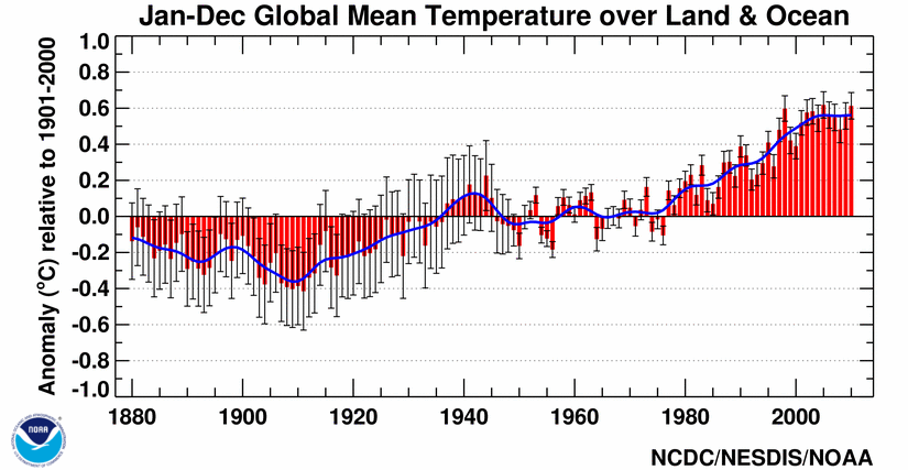 National Oceanic and Atmospheric Administration (NOAA) – National Climatic Data Center (NCDC) – Base Period 1901-2000 – Click the pic to view at source[/caption]
I just did. In the very quote you supplied. 1/3 of the increase in forcing in 2010 was in place in 1950. IPCC is not denying that of course.
Right, 1950, that’s just when the cooling began. How much forcing was in place in 1910 when the warming began?:
[caption id="" align="alignnone" width="578"]
And if you really want to have IPCC as your authoritative source, that is OK.
Yes, even they disagree with you…
rooter
If you want to use infilled data that is ok with me. But then again you could stop having objections to infilling.
You just presented credible evidence of the influence of anthropogenic CO2 emissjons on Earth’s climae. Simultaneous sealevel rise and CO2 rise.
If you did any more hand waving you’d probably take off. I would try to explain why correlation doesn’t prove causation, but I am sure that it would be lost on you…
hey warren:
We are all wondering…in what field of study did you get your [Masters]?
We are waiting for your answer.
What was the subject of your thesis?
What have you published since getting your degree?
In what peer reviewed journals can we find you work?
Since you choose to opine on this subject we appeal to your authority; just what is your position of knowledge?
Finally, whats your real name, so we can run google scholar search on your work?
the world waits.
davideisenstadt (challenging warrenlb)
I am willing to grant warrenlb has attended college. Perhaps he has written a Masters or Senior project.
Who “pal-reviewed” it? Is it on line or available in his college’s library? (Mine is, for example.)
But, more important, for this self-called “authority” quoting “authorities” as his Bible (er, religious convictions):
How many peer-reviewed articles and papers has HE completely read?
12?
120?
1200?
How many has HE read only the summary – that first paragraph where exceptions and “oh-by-the-ways” and assumptions and approximations and “did-not-study-this” (or “we studied only these three months in two voyages to the continent” are cleverly NOT stated?
12?
120?
240?
1024?
2048?
How many articles has HE read more than once?
2?
20?
40?
How many has HE called or written the authors and challenged assumptions or the conclusions or the methods?
1?
2?
4?
48?
We ask what warrenlb’s background is because we do not believe he actually understands the subject. ANY PART of the subject, much less the whole and all of its politics and all of its economic impacts on the world.
I read 2-3 papers daily (in their entirety) and often the summaries of more than 50 every week. And yes, I DO call and challenge and question the authors of those papers I quote.
(It gets bad when you can recall the problems with the supposed results and the limits of the measurements and the restrictions on the conclusions of a paper written in 1972 just by seeing the author’s name and year when it is cited by somebody else: Oh, yeah, that guy did not include the effects of diffuse radiation, that team only did a paper summary but had no measurements – but it doesn’t matter because they all used the same sources I already rejected for other reasons, that guy cut off measurements at 10 degrees, that guy is merely re-writing the paper already cited using the same results in the previous 4 papers by his team, that paper had different results for their west-bound journey than their east-bound surveys because of light reflecting off-of the ship, that guy reported evaporation results – but for freshwater still lakes high in the Andes mountains with far different air pressures – not for the Arctic but maybe I can use it anyway, that guy duplicated what she did in this other paper because their plots are exactly the same, that one result was new but he did not have any corrections for wind speed, that guy measured wind speed but it was fresh water summer months only, that team excluded low altitude data, those guys merely used the theoretical pure-water laboratory equations, that guy was good, but his team mixed the diffuse and direct radiation plots up in his final calculation, that guy reported only area approximations that mixed snow and ice and water together …. Those guys were good, but they reported only whole-month approximations, not individual daily measurements.)
“because we do not believe he actually understands the subject. ANY PART of the subject,”
…
Just because you do not agree with the position taken by someone does not give you the right to assert that they do not understand the subject. He/she might know much more about it than you do.
warrenlb has established nothing. Other than that over 280 replies he demands everybody follow HIS chosen “authorities” – even when such actions would be – ARE! – responsible for the deaths of millions of innocents, the harm to billions. For no tangible good, only imagined potential results that explicitly cause harm and injury, while not even affecting the cause that he fears!
But HE demands WE follow and obey only HIS government-paid self-selected “experts” because THEY claim THEY are the ONLY “experts”?
For example Mr RACookPE1978
…
All the papers you read, alll the articles you write, mean nothing when you post a comment such as this…
..
“Those who are to blame for the 60+ million dead killed BY the ban on DDT are desperate to avoid responsibility for their direct role in that massacre.”
…
That comment revels to all of us you don’t have a clue what the BAN covered. The “ban” wasn’t a global ban, did you know that? Did you know that you can still use DDT for vector control? No? Seems your sources of information are a bit….what the word…..oh….lacking.
…
RACook is right, of course. The U.S. led the way in stopping the use of DDT. Our refusal to allow its use was copied by most countries, leading to literally millions of deaths. “Socrates” emits more ignorance:
…you don’t have a clue what the BAN covered. The “ban” wasn’t a global ban, did you know that?
In fact, the U.S. caused a very effective global ban on DDT. Without going into all the details, the basic facts are these: when the U.S. EPA unilaterally banned DDT at the demand of ‘environmentalists’, the UN followed by placing authority for DDT use and distribution under the control of the U.S. Agency for International Development [USAID], which said it would stop sending U.S. foreign aid to any country using DDT. Since there were other insecticides available [although they were much more expensive, more persistent, and with much more serious side effects], and since foreign aid was immense compared to the DDT budgets, practically every country promptly stopped using it. [There are plans now afoot to completely phase out DDT. The unquestioned result will be that more poor people are killed.]
Just because the ban was not officially worldwide, the effect was just the same. The U.S. produced almost all DDT manufactured worldwide, exporting 60%. Political appointee Wm Ruckleshaus unilaterally made the DDT ban worldwide by decree [sound familiar?]. There are plenty of statistics showing what happened as a result: millions upon millions of poor people died from malaria. A common thread that runs through all environmental organizations is that they want lots of 3rd world people eliminated. Only the most naive and credulous cannot see that.
There is no credible dispute about any of this. The Sierra Club director applauded banning DDT, stating that “By using DDT, we reduce mortality rates in underdeveloped countries without the consideration of how to support the increase in populations.” So they encouraged deaths in underdeveloped countries in the same way that Margaret Sanger used birth control to reduce the African American population in the U.S. [I don’t want to get into a food fight over those facts, there is a mountain of evidence proving it.] Some may disagree because they are totally closed-minded, and thus blind to anything outside of their belief system. But in fact, DDT is about as harmless as a compound can be to humans and animals. People have publicly swallowed a tablespoon of DDT a day for months, without any side effects. It saves lives by the millions. But you still can’t go out and buy it in most places, even though it is nearly as harmless as CO2.
Finally, RACook is doing it the right way: by constantly reading the literature. Most alarmists made their decision early on, and they cannot change their minds now because they aren’t skeptics — the only honest kind of scientists. Instead, as the great writer Leo Tolstoy said, they are people who got on the wrong track, then told their pals what to think, and now they’re stuck feeling like chumps if they admit they were wrong. So they dig in their heels, cover their ears, and do the “LA-LA-LA-LA, I can’t he-e-e-e-ear you!” routine:
Dbstealey…
..
You can still buy DDT from India today.
The “ban” doesn’t stop them from making it.
Thank you for proving my point. India and other countries now manufacture their own DDT. They have had 40+ years to gear up. But when Ruckleshaus banned it, almost all DDT was produced by the U.S., which exported the major part of it’s production. Citation on demand. From anyone but you or your sidekick.
One metric of the importance of the “Pause” is the Warmists’ frantic multitude of the-dog-ate-my-homework “explanations” for it.
The big problem alarmists face is that there is a physical method to calibrate thermometers: water boils at 100 degrees and freezes at 0 degrees, but they will try to adjust that to fit their models.
Finally, somebody noticed. I have been saying this since 2010 when my book (What Warming?) came out. Goes to show that climate “scientists” either don’t know or don’t care about the state of data they are working with. That is the most benign interpretation I can think of. It is also possible that they were never taught how to do a scientific literature survey for articles they publish. And worse yet, it could be a deliberate attempt to suppress the existence of the hiatuses like the one we are living through. Yes, I said hiatuses in plural because there was one in the eighties and nineties they have successfully suppressed. I tend to favor the last interpretation because all the available information points to that. It is a colossal data falsification involving a collaboration of GISS, NCDC, and HadCRUT data sources. Starting in 1979 (or maybe earlier) they have given their temperature curves an upward push. It amounts to 0.1 degrees Celsius for the time interval 1979 to 1997. I discovered that while working on my book and even put a warning into its preface but they kept right on going into the twenty-first century. It has gotten so ridiculous that in their temperature curves the 2010 El Nino is now taller than the 1998 super El Nino which is impossible according to satellites. The eighties and the nineties were a period where ENSO was active and it created a wave train of five El Nino peaks there, with La Nina valleys in between. In a situation like this the global mean temperature is determined by drawing a straight line from the tip of an El Nino peak to the bottom of its neighboring La Nina valley and putting a dot in its center. These dots define the global mean temperature for the specific dates involved. Connecting the dots gives the global mean temperature trend. I did this with all the El Nino peaks in the satellite record and found that the dots lined up in a horizontal straight line. See figure 15 in my book. This makes it an 18 year no-warming stretch, equivalent in length of the current hiatus. In between these two no-warming periods is the step warming of 1999. In only three years it raised global mean temperature by a third of a degree Celsius and then stopped. It is the only warming we have had since 1979. As a result, 21st century temperatures are all higher than twentieth century termperatures, with the exception of 1998. This gave a chance to people like Hansen to misinterpret the meaning of “highest” temperture in climate science. To apply it to the total no-warming period covered by IPCC we have to add these two no-warming periods. This gives us 36 no-warming, “hiatus” years that together make up three-quarters of the time that the IPCC has been in existence. My original data were derived fro HadCRUT3 (figure 24) but after the book went to press I discovered that the three ground-based data-sets had cooperated in creating this warming. Computer processing was involved, and unbeknownst to them the computer had left its footprints in identical locations in all three data-sets. These computer traces comprise sharp upward spikes at the beginnings of years. One of them even sits directly on top of the super El Nino. These are nominally independent data-sets. residing on two sides of an ocean. Clearly, they cannot be trusted and satellite data should be used whenever possible. This has further implications for determining which year was warmest. We know it was the super El Nino year of 1998 but these incompetents chose 2014, based on it being higher than the El Nino of 2010 in their dataset. Which is only possible because thanks to falsification that El Nino stood higher than the super El Nino of 1998.
Arno see the Peak in the Millennial warming in the RSS data in 2003 and the cooling since then referred to in earlier comments
http://www.woodfortrees.org/graph/rss/from:1980.1/plot/rss/from:1980.1/to:2003.6/trend/plot/rss/from:2003.6/trend
Arno – and the true relationship of the 1998 and 2010 El Ninos
But this can’t be so! the WMO has just released its report that not only was 2014 the hottest year on record, but 14 of the 15 hottest years since the late 1800s were in the 21st century! Just follow the link and you can see for yourself!
https://www.wmo.int/media/?q=content/warming-trend-continues-2014
Certainly the world government, er, United Nations wouldn’t lie to us, right? Certainly every year this century was hotter than the 1930s by a significant margin ’cause they wouldn’t lie to us, right? Do I really need to use the sarcasm tag?
It might help if you understood what you were reading. I’m guessing you are from the US which means there is a good chance you are making the common mistake of confusing US temperatures with global temperatures.
There is strong evidence that the 14 of the 15 warmest years GLOBALLY since 1880 have occurred since 2000. While that fact is not necessarily inconsistent with a ‘pause’ in warming, certain climatic variables (e.g. ocean oscillations, solar activity) suggest we should have observed noticeable (statistically significant) cooling over the past 15 years.
I don’t go along with the catastrophic AGW scenario, but I do expect steady warming to resume again in the next 5-10 years.
this quote from Trenberth appears to be a later addition to Revkin’s piece from when i originally linked to it:
NYT Dot Earth: Andrew C. Revkin: A Fresh Look at the Watery Side of Earth’s Climate Shows ‘Unabated Planetary Warming’
In an email exchange, Kevin Trenberth of the National Center for Atmospheric Research said he was concerned that the analysis, limited to data from the relatively sparse array of Argo devices, was missing large areas of the seas that other studies, including his own, have identified as significant. As a result, he said, “their estimates look low-balled”. Here’s more from Trenberth:
“It is disappointing that they do not use our stuff (based on ocean reanalysis with a comprehensive model that inputs everything from SST, sea level, XBTs and Argo plus surface fluxes and winds) or that from Karina von Schuckmann.” [Trenbert (sic) pointed me to two studies, here and here.]
http://dotearth.blogs.nytimes.com/2015/02/02/a-fresh-look-at-the-watery-side-of-earths-climate-shows-unabated-planetary-warming/?_r=0
joanne nova under attack in the comments, which are accessed at the top of the article next to the date.
justthefactswuwt February 3, 2015 at 7:58 am says
The real climate question humans should be grappling with is, when is the current interglacial going to end and what, if anything, can we do about it?
a) when sun enters an inevitable centuries long ‘Maunder Minimum’.
b) Yes, dredging some of 800m deep sediments of the Denmark Straits in order to allow more Arctic cold water overflow into N. Atlantic.
? !
(more of cold Arctic flows into the Atlantic, more warm Atlantic can then flow into the Arctic).
Interesting, how about:
a) a very large sulfur dioxide rich volcano in the Northern hemisphere that results in a volcanic winter that we can’t recover from this late in the Milankovitch cycle.
b) a huge fleet of soot spraying planes to paint the Arctic snow and ice black, especially the edges of the proceeding ice sheets, in order to try to beat them back and artificially increase Earth’s albedo.
Northern volcanoes (Iceland, Aleuts and Kamchatka) also throw lot of ash into atmosphere causing temporary loss of atmospheric transparency, but eventually lot of it gets deposited around Arctic increasing its albedo, and at the same time the mineral content reduces melting temperature of the snow, sharp drop followed by the steep temperature rise (case of the CET ).
In the recent WUWT publication lot was said about Milankovic cycles. Planetary configuration (mainly Jupiter & Saturn) is responsible for the Earth’s orbital instability, but at the same time (according to vukcevic, these two planets as he says so himself here ) are responsible for the sun’s grand and not so grand minima, but of course Milankovic was not to know that, thus attributed sudden collapses of the temperatures to the gradual reduction in the insolation.
On more serious note, further warming may open vast areas of Canada and Siberia to agriculture, while even moderate cooling could plunge population of many countries into poverty.
Just imagine: according to the bonny bedlam boyz of SkS, the climate system has accumulated over 2 billion Hiroshimas worth of extra heat since 1998. Yowzer. And nought to show for it. It has simply vanished.
No wonder they are cuckoo for cocoa puffs.
Trouble with the Land Based Record?
http://img.brainjet.com/slides/1/3/1/2/5/0/1312502299/08bb813b22c6ed49735233a5778a744ba584c1e1.jpeg
Say it ain’t so.
Maybe it’s degrees Kelvin?
Steven Mosher February 3, 2015 at 9:02 am
wrong. The code is out there.
What a great way to say it. Just like X-files and just as ephemeral. Where is the code!? Provide a link or a contact person who can send it. In addition, the code is only part of the problem. After seeing the Harry-Read-Me document, I wonder if the annotations and metadata that are necessary to apply appropriate “adjustments” are reliable. So, maybe you could tell us where to find raw data with annotations and metadata along with the code and a description of how each type of adjustment was selected (was it on the basis of trends that seemed “wrong”, unlikely jumps in averages, annotations indicating a site had been moved or that a sensor had been changed or that the time of day of measurements had changed?). I know some of this is discussed in a general way in a few papers, but without the raw data, the annotations, the metadata, the code, and the criteria used in each case to select one adjustment vs another adjustment, why should anyone trust the final numbers? Why don’t climate scientists insist on getting their act together and making sure all of this is readily accessible? When I publish papers that include microarray data, all the journals I have published in require that the raw data be deposited in a public database before final acceptance of the paper. Typically, it is also required that if the software used to analyze the data is not commercially or publicly available it has to be included in the supplemental data for the paper. Why aren’t climate scientists interested in this level of accountability? One thing we agree about: the satellite groups also should make everything publicly accessible. If everything is so reliable, I would think there would be a rush from all concerned to get it out to anyone who is interested. How can it be viewed as anything but suspicious that this is not the case?
Steven Mosher February 3, 2015 at 9:02 am
wrong. The code is out there.
================================
Maybe Steve M should just explain how “the code” adjusted the Iceland stations. That should be much easier then explaining the entire code.
He actually provided a link for the code in another comment. I intend to take a good look at it.
From Pat at 5:40 AM
“NATURE CLIMATE CHANGE FOR RELEASE: FEBRUARY 2, 2015
Researchers led by Dean Roemmich, a physical oceanographer at Scripps Institution of Oceanography, UC San Diego, found that the top 2,000 meters (6,500 feet) of the world’s oceans
warmed at a rate of 0.4 to 0.6 watts per square meter (W/m 2)
between 2006 and 2013. The rate translates to a warming of roughly 0.005° C (0.009° F) per year in the top 500 meters of ocean and 0.002° C (0.0036° F) per year at depths between 500 and 2,000 meters.”
Last I checked w/m^2 is energy not heat. these people really need to keep the units straight
[snip – Epiphron Elpis is yet another David Appell sockpuppet.]
Werner , why do you not include the temperature data from Weatherbell, which is probably more accurate since the grid they use is more refined?
I basically use what WFT has, or at least what it used to have. Hadcrut4.3 is not shown yet.
[snip – Epiphron Elpis is yet another David Appell sockpuppet.]
If you’re looking for maximum temperature and you have an instrument that measures temperature more frequently (electronic thermometer) won’t you naturally catch any small, short increases that the glass thermometer averages away? That could easily explain a 0.9 degree C difference… Has anyone done a proper study on this?
I understood it to be some sort of a calibration problem and not an issue with a momentary blast of warm air from somewhere.