This post updates the data for the three primary suppliers of global land+ocean surface temperature data—GISS through May 2014 and HADCRUT4 and NCDC through April 2014—and of the two suppliers of satellite-based global lower troposphere temperature data (RSS and UAH) through May 2014.
Initial Notes: To make this post as timely as possible, only GISS LOTI and the two lower troposphere temperature datasets are for the most current month. The NCDC and HADCRUT4 data lag one month.
This post contains graphs of running trends in global surface temperature anomalies for periods of 13+ and 17 years using GISS global (land+ocean) surface temperature data. They indicate that we have not seen a warming halt (based on 13 years+ trends) this long since the mid-1970s or a warming slowdown (based on 17-years trends) since about 1980. I used to rotate the data suppliers for this portion of the update, also using NCDC and HADCRUT. With the data from those two suppliers lagging by a month in the updates, I’ve standardized on GISS for this portion.
Much of the following text is boilerplate. It is intended for those new to the presentation of global surface temperature anomaly data.
Most of the update graphs in the following start in 1979. That’s a commonly used start year for global temperature products because many of the satellite-based temperature datasets start then.
We discussed why the three suppliers of surface temperature data use different base years for anomalies in the post Why Aren’t Global Surface Temperature Data Produced in Absolute Form?
GISS LAND OCEAN TEMPERATURE INDEX (LOTI)
Introduction: The GISS Land Ocean Temperature Index (LOTI) data is a product of the Goddard Institute for Space Studies. Starting with their January 2013 update, GISS LOTI uses NCDC ERSST.v3b sea surface temperature data. The impact of the recent change in sea surface temperature datasets is discussed here. GISS adjusts GHCN and other land surface temperature data via a number of methods and infills missing data using 1200km smoothing. Refer to the GISS description here. Unlike the UK Met Office and NCDC products, GISS masks sea surface temperature data at the poles where seasonal sea ice exists, and they extend land surface temperature data out over the oceans in those locations. Refer to the discussions here and here. GISS uses the base years of 1951-1980 as the reference period for anomalies. The data source is here.
Update: The May 2014 GISS global temperature anomaly is +0.76 deg C. It warmed slightly (an increase of about 0.03 deg C) since April 2014.

Figure 1 – GISS Land-Ocean Temperature Index
NCDC GLOBAL SURFACE TEMPERATURE ANOMALIES (LAGS ONE MONTH)
Introduction: The NOAA Global (Land and Ocean) Surface Temperature Anomaly dataset is a product of the National Climatic Data Center (NCDC). NCDC merges their Extended Reconstructed Sea Surface Temperature version 3b (ERSST.v3b) with the Global Historical Climatology Network-Monthly (GHCN-M) version 3.2.0 for land surface air temperatures. NOAA infills missing data for both land and sea surface temperature datasets using methods presented in Smith et al (2008). Keep in mind, when reading Smith et al (2008), that the NCDC removed the satellite-based sea surface temperature data because it changed the annual global temperature rankings. Since most of Smith et al (2008) was about the satellite-based data and the benefits of incorporating it into the reconstruction, one might consider that the NCDC temperature product is no longer supported by a peer-reviewed paper.
The NCDC data source is usually here. NCDC uses 1901 to 2000 for the base years for anomalies. (Note: the NCDC has been slow with updating the normal data source webpage, so I’ve been using the values available through their Global Surface Temperature Anomalies webpage. Click on the link to Anomalies and Index Data.)
Update (Lags One Month): The April 2014 NCDC global land plus sea surface temperature anomaly was +0.72 deg C. See Figure 2. It showed a rise (an increase of +0.05 deg C) since March 2014.

Figure 2 – NCDC Global (Land and Ocean) Surface Temperature Anomalies
UK MET OFFICE HADCRUT4 (LAGS ONE MONTH)
Introduction: The UK Met Office HADCRUT4 dataset merges CRUTEM4 land-surface air temperature dataset and the HadSST3 sea-surface temperature (SST) dataset. CRUTEM4 is the product of the combined efforts of the Met Office Hadley Centre and the Climatic Research Unit at the University of East Anglia. And HadSST3 is a product of the Hadley Centre. Unlike the GISS and NCDC products, missing data is not infilled in the HADCRUT4 product. That is, if a 5-deg latitude by 5-deg longitude grid does not have a temperature anomaly value in a given month, it is not included in the global average value of HADCRUT4. The HADCRUT4 dataset is described in the Morice et al (2012) paper here. The CRUTEM4 data is described in Jones et al (2012) here. And the HadSST3 data is presented in the 2-part Kennedy et al (2012) paper here and here. The UKMO uses the base years of 1961-1990 for anomalies. The data source is here.
Update (Lags One Month): The April 2013 HADCRUT4 global temperature anomaly is +0.64 deg C. See Figure 3. It increased (about +0.10 deg C) since March 2014.

Figure 3 – HADCRUT4
UAH Lower Troposphere Temperature (TLT) Anomaly Data
Special sensors (microwave sounding units) aboard satellites have orbited the Earth since the late 1970s, allowing scientists to calculate the temperatures of the atmosphere at various heights above sea level. The level nearest to the surface of the Earth is the lower troposphere. The lower troposphere temperature data include the altitudes of zero to about 12,500 meters, but are most heavily weighted to the altitudes of less than 3000 meters. See the left-hand cell of the illustration here. The lower troposphere temperature data are calculated from a series of satellites with overlapping operation periods, not from a single satellite. The monthly UAH lower troposphere temperature data is the product of the Earth System Science Center of the University of Alabama in Huntsville (UAH). UAH provides the data broken down into numerous subsets. See the webpage here. The UAH lower troposphere temperature data are supported by Christy et al. (2000) MSU Tropospheric Temperatures: Dataset Construction and Radiosonde Comparisons. Additionally, Dr. Roy Spencer of UAH presents at his blog the monthly UAH TLT data updates a few days before the release at the UAH website. Those posts are also cross posted at WattsUpWithThat. UAH uses the base years of 1981-2010 for anomalies. The UAH lower troposphere temperature data are for the latitudes of 85S to 85N, which represent more than 99% of the surface of the globe.
Update: The May 2014 UAH lower troposphere temperature anomaly is +0.33 deg C. It is rose sharply (an increase of about +0.14 deg C) since April 2014.

Figure 4 – UAH Lower Troposphere Temperature (TLT) Anomaly Data
RSS Lower Troposphere Temperature (TLT) Anomaly Data
Like the UAH lower troposphere temperature data, Remote Sensing Systems (RSS) calculates lower troposphere temperature anomalies from microwave sounding units aboard a series of NOAA satellites. RSS describes their data at the Upper Air Temperature webpage. The RSS data are supported by Mears and Wentz (2009) Construction of the Remote Sensing Systems V3.2 Atmospheric Temperature Records from the MSU and AMSU Microwave Sounders. RSS also presents their lower troposphere temperature data in various subsets. The land+ocean TLT data are here. Curiously, on that webpage, RSS lists the data as extending from 82.5S to 82.5N, while on their Upper Air Temperature webpage linked above, they state:
We do not provide monthly means poleward of 82.5 degrees (or south of 70S for TLT) due to difficulties in merging measurements in these regions.
Also see the RSS MSU & AMSU Time Series Trend Browse Tool. RSS uses the base years of 1979 to 1998 for anomalies.
Update: The May 2014 RSS lower troposphere temperature anomaly is +0.29 deg C. It rose (an increase of about +0.04 deg C) since April 2014.

Figure 5 – RSS Lower Troposphere Temperature (TLT) Anomaly Data
A Quick Note about the Difference between RSS and UAH TLT data
There is a noticeable difference between the RSS and UAH lower troposphere temperature anomaly data. Dr. Roy Spencer discussed this in his July 2011 blog post On the Divergence Between the UAH and RSS Global Temperature Records. In summary, John Christy and Roy Spencer believe the divergence is caused by the use of data from different satellites. UAH has used the NASA Aqua AMSU satellite in recent years, while as Dr. Spencer writes:
…RSS is still using the old NOAA-15 satellite which has a decaying orbit, to which they are then applying a diurnal cycle drift correction based upon a climate model, which does not quite match reality.
I updated the graphs in Roy Spencer’s post in On the Differences and Similarities between Global Surface Temperature and Lower Troposphere Temperature Anomaly Datasets.
While the two lower troposphere temperature datasets are different in recent years, UAH believes their data are correct, and, likewise, RSS believes their TLT data are correct. Does the UAH data have a warming bias in recent years or does the RSS data have cooling bias? Until the two suppliers can account for and agree on the differences, both are available for presentation.
In a more recent blog post, Roy Spencer has advised that the UAH lower troposphere Version 6 will be released soon and that it will reduce the difference between the UAH and RSS data.
13-YEAR+ (161-MONTH) RUNNING TRENDS
As noted in my post Open Letter to the Royal Meteorological Society Regarding Dr. Trenberth’s Article “Has Global Warming Stalled?”, Kevin Trenberth of NCAR presented 10-year period-averaged temperatures in his article for the Royal Meteorological Society. He was attempting to show that the recent halt in global warming since 2001 was not unusual. Kevin Trenberth conveniently overlooked the fact that, based on his selected start year of 2001, the halt at that time had lasted 12+ years, not 10.
The period from January 2001 to April 2014 is now 161-months long—more than 13 years. Refer to the following graph of running 161-month trends from January 1880 to April 2014, using the GISS LOTI global temperature anomaly product.
An explanation of what’s being presented in Figure 6: The last data point in the graph is the linear trend (in deg C per decade) from January 2001 to May 2014. It is basically zero (about 0.02 deg C/Decade). That, of course, indicates global surface temperatures have not warmed to any great extent during the most recent 160-month period. Working back in time, the data point immediately before the last one represents the linear trend for the 161-month period of December 2000 to April 2014, and the data point before it shows the trend in deg C per decade for November 2000 to March 2014, and so on.

Figure 6 – 161-Month Linear Trends
The highest recent rate of warming based on its linear trend occurred during the 160-month period that ended about 2004, but warming trends have dropped drastically since then. There was a similar drop in the 1940s, and as you’ll recall, global surface temperatures remained relatively flat from the mid-1940s to the mid-1970s. Also note that the mid-1970s was the last time there had been a 161-month period without global warming—before recently.
17-YEAR (204-Month) RUNNING TRENDS
In his RMS article, Kevin Trenberth also conveniently overlooked the fact that the discussions about the warming halt are now for a time period of about 16 years, not 10 years—ever since David Rose’s DailyMail article titled “Global warming stopped 16 years ago, reveals Met Office report quietly released… and here is the chart to prove it”. In my response to Trenberth’s article, I updated David Rose’s graph, noting that surface temperatures in April 2013 were basically the same as they were in June 1997. We’ll use June 1997 as the start month for the running 17-year trends. The period is now 204-months long. The following graph is similar to the one above, except that it’s presenting running trends for 204-month periods.

Figure 7 – 204-Month Linear Trends
The last time global surface temperatures warmed at this low a rate for a 204-month period was the late 1970s, or about 1980. Also note that the sharp decline is similar to the drop in the 1940s, and, again, as you’ll recall, global surface temperatures remained relatively flat from the mid-1940s to the mid-1970s.
The most widely used metric of global warming—global surface temperatures—indicates that the rate of global warming has slowed drastically and that the duration of the halt in global warming is unusual during a period when global surface temperatures are allegedly being warmed from the hypothetical impacts of manmade greenhouse gases.
A NOTE ABOUT THE RUNNING-TREND GRAPHS
There is very little difference in the end point trends of 13+ year and 16+ year running trends if HADCRUT4 or NCDC or GISS data are used. The major difference in the graphs is with the HADCRUT4 data and it can be seen in a graph of the 13+ year trends. I suspect this is caused by the updates to the HADSST3 data that have not been applied to the ERSST.v3b sea surface temperature data used by GISS and NCDC.
COMPARISONS
The GISS, HADCRUT4 and NCDC global surface temperature anomalies and the RSS and UAH lower troposphere temperature anomalies are compared in the next three time-series graphs. Figure 8 compares the five global temperature anomaly products starting in 1979. Again, due to the timing of this post, the HADCRUT4 and NCDC data lag the UAH, RSS and GISS products by a month. The graph also includes the linear trends. Because the three surface temperature datasets share common source data, (GISS and NCDC also use the same sea surface temperature data) it should come as no surprise that they are so similar. For those wanting a closer look at the more recent wiggles and trends, Figure 9 starts in 1998, which was the start year used by von Storch et al (2013) Can climate models explain the recent stagnation in global warming? They, of course found that the CMIP3 (IPCC AR4) and CMIP5 (IPCC AR5) models could NOT explain the recent halt in warming.
Figure 10 starts in 2001, which was the year Kevin Trenberth chose for the start of the warming halt in his RMS article Has Global Warming Stalled?
Because the suppliers all use different base years for calculating anomalies, I’ve referenced them to a common 30-year period: 1981 to 2010. Referring to their discussion under FAQ 9 here, according to NOAA:
This period is used in order to comply with a recommended World Meteorological Organization (WMO) Policy, which suggests using the latest decade for the 30-year average.

Figure 8 – Comparison Starting in 1979
###########

Figure 9 – Comparison Starting in 1998
###########

Figure 10 – Comparison Starting in 2001
AVERAGE
Figure 11 presents the average of the GISS, HADCRUT and NCDC land plus sea surface temperature anomaly products and the average of the RSS and UAH lower troposphere temperature data. Again because the HADCRUT4 and NCDC data lag one month in this update, the most current average only includes the GISS products.

Figure 11 – Average of Global Land+Sea Surface Temperature Anomaly Products
The flatness of the data since 2001 is very obvious, as is the fact that surface temperatures have rarely risen above those created by the 1997/98 El Niño in the surface temperature data. There is a very simple reason for this: the 1997/98 El Niño released enough sunlight-created warm water from beneath the surface of the tropical Pacific to permanently raise the temperature of about 66% of the surface of the global oceans by almost 0.2 deg C. Sea surface temperatures for that portion of the global oceans remained relatively flat until the El Niño of 2009/10, when the surface temperatures of the portion of the global oceans shifted slightly higher again. Prior to that, it was the 1986/87/88 El Niño that caused surface temperatures to shift upwards. If these naturally occurring upward shifts in surface temperatures are new to you, please see the illustrated essay “The Manmade Global Warming Challenge” (42mb) for an introduction.
MONTHLY SEA SURFACE TEMPERATURE UPDATE
The most recent sea surface temperature update can be found here. The satellite-enhanced sea surface temperature data (Reynolds OI.2) are presented in global, hemispheric and ocean-basin bases.
TABLE OF CONTENTS OF UPCOMING BOOK
I linked a copy to the post here of the Table of Contents for my upcoming book about global warming, climate change and skepticism. Please take a look to see if there are topics I’ve missed that you believe should be covered. I’ve already removed the introductory chapters for climate models from Section 1, and provided a separate section for those model discussions. Section 1 now only includes the chapters that introduce global warming and climate change topics. (Thanks, Gary.) Please also post any comments you have on that thread at my blog. Otherwise, I might miss them.
Thanks
Bob Tisdale
Out of curiosity I was interested in how well the RSS data matched up with the actual surface station data. So I compared the two for various individual stations around the world. I used the global gridded RSS data and station data from Environment Canada and GISS. I compared the value in the RSS grid cell that contained the station with the station data (adjusted to the RSS base normal period). Admittedly, a rather crude method, but good enough for a first run. I found that the two compared very well, which one would hope. However, the RSS data generally did not have the extreme values (highs and lows) that the station data showed. The RSS data was almost like a slightly smoothed version of the station data. This is not surprising since the RSS data is an integrated value of the lower troposphere. I can’t really say anything startling about my findings, but it was an interesting exercise.
It is figure 8 that is the most telling for me. You would have to be blind not to see the “longterm” upward trend looking at that. While I concede you can play with starting points to show minimal warming using 1998, in fig 8 you can clearly see why the super El Nino is used to try to deny warming. Take that out and it is up all the way. Or… leave it in and see what happens with the next El Nino. If that sets new records, then I see no argument left.
Simon says:
June 18, 2014 at 12:07 pm
????
So, before man-released CO2 was significant, the global average temperature rose, fell, and was steady.
AFTER man-released CO2 was present, global average CO2 decreased for 30 years (1945-1975),
increased for 21 years (1975 – 1996) has been steady for 17+ years (1996 – 2014).
What does your chosen date of 1998 have to do with anything? 1998 is not critical year, nor a critical temperature.
What long-term trend are you denying? That “When CO2 increases, the earth’s temperature cools or remains steady for more years than it warms up?”
James Abbott says:
June 18, 2014 at 10:31 am
You don’t define how long this recovery is supposed to last nor what the equilibrium temperature will be to define a full recovery.
——————————————————————————————————————————-
Can you define what the ‘equilibrium temperature’ of the last 11,000 years is?
Simon says:
June 18, 2014 at 12:07 pm
———————————————————
You are calling a 34 year long chart ‘long term’. What do you call a 1,000 year chart?
goldminor You miss the point – read the thread again – I was referring to dbstealey’s assertion that recent warming is simply a rebound from the Little Ice Age. if that is the case he should be able to identify at what temperature the recovery is complete and over what period the recovery lasts. Otherwise its a catch-all position.
And Simon is exactly right. The large El Nino of 1998 clearly affects the way the stats can be done and is a convenient start point if you seek to flatten the subsequent trend. But even so the current pause started in 2002, not 1998.
The main point is that when we get another large El Nino, as we will at some point, then all other things being equal, from the higher base we are now at we will likely see record warm – which cannot be massaged away.
goldminor, love the questions. To answer (in my smartalec way) the following questions:
1) What is the average temp? For the last 2 million years: Cold, real darn cold.
2) What is “long term”? As long as life has been on Earth is a significant way so 400 million years give or take a few dozen million.
3) Define how long this recover is supposed to last? Sure. We’re about done. Sometime between now and 2000 years we’ll be heading into another ice age. Dr Easterbrook has his “Good, Bad & Ugly” predictions for this negative spell of the sine wave known as PDO. Check him out.
4) Mike M: Those are very interesting graphs but I’m curious about why the 1945 to 1970 dropped so much quicker than our current spell? I doubt CO2 is the cause but if a causation can be shown I’m all ears. Until then Dr Easterbrook’s explanation of each PDO providing a higher level for the next one to start at seems likely. What causes that? Don’t know yet.
5) Bob. Great to see you posting regularly. Hope things are going well for you on all fronts. “Who turned on the heat” was the best 5 bucks I’ve spent in a long time. Highly recommend it.
Cheers
goldminor
You are calling a 34 year long chart ‘long term’. What do you call a 1,000 year chart?
—————————–
It’s as long as we have on the satellite data. But you can go back 100 years and it is still very much up with the odd pause.
Eric Webb says: “Nice work Bob. One thing I noticed is how the satellite based temperature datasets (UAH & RSS) compared to GISS, NCDC, & HADCRUT4 datasets, seem to capture much larger undulations in global temperature likely due to ENSO variability, while the other datasets appear to be smoothed & particularly warmer (likely due to unnecessary adjustments) in the post 1998 era.”
Eric, lower troposphere temperatures respond differently to ENSO than surface temperatures. During an El Nino, the lower troposphere warms in two ways: First, in response to the surface warming. Second, in response to the additional evaporation from the tropical Pacific. When all of the additional moisture condenses, it releases heat to the troposphere.
kadaka (KD Knoebel) says: “Now why Had-CRU shows such a clear separation between land and sea after the 1997-98 Super El-Nino with the land running warmer, while earlier all three products averaged to the same amount and land just showed greater variability, is an interesting question.”
I suggest you subtract the HADSST3 data from the CRUTEM4 data to see if there truly is a shift after the 1997/98 El Nino.
Regards
Dougmanxx says: “Ah anomalies. The perfect way to hide the measured temperature. I always enjoy your posts Bob, and I understand, this is what you have to work with, but for me, anomalies don’t work anymore unless the “average temperature” is also included for each year…….”
We discussed the reasons the data suppliers give for presenting their data as anomalies in the post here:
http://bobtisdale.wordpress.com/2014/01/25/why-arent-global-surface-temperature-data-produced-in-absolute-form/
Patrick B said on June 18, 2014 at 9:36 am:
What good is any reported measurement without the properly calculated margin of error being reported as well? In college my various science professors would have marked this article “F” for being incomplete. Do they no longer teach proper data reporting in science?
The datasets as reported by their creating organizations have already been corrected, adjusted, filtered, anomaly-ized, perhaps homogenized, and severe heavy-duty averaging has been applied to make them “global”.
Before condemning the author of the post, please explain how you and/or your college science professors would calculate those margins of error.
@kadaka (KD Knoebel)
I’m not a statistician, but if you are claiming to give me measurements of temperature, you better be ready to tell me how accurate that measurement is. If not, the measurement is worthless. From my limited knowledge, I’m fairly confident that even the satellite measurements will have a margin of error that will overwhelm the effects they claim to measure. I’ve never believed any of the systems have the ability to measure “world temperature” to within a degree much less hundredths of a degree.
Simon says:
June 18, 2014 at 1:13 pm
—————————————-
Good point, if you do not look further back then you will never see that the globe has gradually cooled in the real ‘long term’.
James Abbot said:
“The main point is that when we get another large El Nino, as we will at some point, then all other things being equal, from the higher base we are now at we will likely see record warm – which cannot be massaged away.”
i don’t get your point. It is as if you don’t know the position held by most of us on this board. We are not denying that it has warmed and has been warming for 170 years, we deny that CO2 had very much to do with it. If we get another El Nino that FINALLY breaks the 1998 global temperature record, then we will have warmed a very small amount since 1998 (until the La Nina follows and brings that average down)….but who cares? what does that prove? just that the earth has been warming for 170 years and is still warming. The only way to prove the CO2 connection is for the earth to begin rapidly warming and making up for the past 13-17 years of no warming.
Do you get that we are not questioning warming? We are questioning the causation. CO2 may play a small part, but it is clearly NOT as much as has been claimed.
James Abbott says:
June 18, 2014 at 1:07 pm
——————————————–
That is a similar line of thought to some recent comments made in the last few days. It goes like this “Why can’t the IPCC or related organizations forecast the end of the ‘pause’, and the resumption of the warming?”. The difference in the answer to either question would be that the sceptic would say “I do not know enough of the baseline parameters that created the warming pulse to ascertain its ending”. The IPCC would say “that doesn’t matter, as our models are only meant to show what will happen after all of us alive today have gone on to the afterlife”. Pretty hard to dispute their claims, isn’t it?
I like to think of the pause as a plateau. Once you are on top of a plateau, it is then all downhill from there on. I would say that we are now witnessing the end of the ‘recovery’ from the LIA. Although, the word recovery does not seem quite correct, unless the term is also going to be applied to all of the past Warm Periods. Even then what is being stated? If after every ‘Warm Period/recovery’ there is a further fallback in temps to a lower level, how can the Warm Periods be considered a recovery in the long term?
Are you sure that you believe in co2 induced warming, or do you really believe in El Nino induced warming? Look at Simon,s ridiculous statement on El Nino. He blithely presumes that if the 1998 Grand El Nino never occurred that global temperature would still be the same today. How can he presume that? Logically, I would think that if 1998 did not occur, then all years after that would have started from a different base of conditions thus leading to randomly different results in the following years, as compared to the actual history of the last 16 years. The El Nino and La Nina are integral parts of the overall climate system.
James Abbot said: “The main point is that when we get another large El Nino, as we will at some point, then all other things being equal, from the higher base we are now at we will likely see record warm – which cannot be massaged away.”
I think most people — Bob included — have acknowledged the likelihood that a significant El Nino would cause a temperature increase, and would probably lead to a new “record.” But this isn’t really about “records” — it’s about the rate at which the planet was “supposed” to warm (according to the models) given the amount of CO2 that’s been pumped into the air. We are so far below the models that even a “record-breaking” year won’t get us back into the range the models predicted — to say nothing of the fact that once the El Nino finally ebbs, we’ll likely enter another multi-year stretch of stagnant temperatures, moving us even further below the models’ ever-upward trend.
Very few people think the “pause” is, in and of itself, proof that global warming doesn’t exist. What the pause does prove is that the rate of warming is nowhere near the doomsday scenarios that were (and still are, daily) predicted — and may even be *gasp* beneficial!
MikeUK says: “Is the recent (small) rise in temperatures related to El Nino?”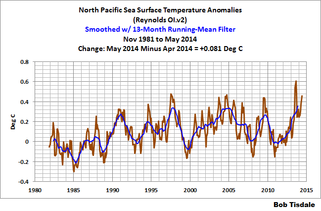
Are you discussing what appears to be a slight upward shift in the data (GISS for example) in mid-2013? If so, I would tend to blame it on the unusual warming event in the extratropical North Pacific. See the post here:
http://bobtisdale.wordpress.com/2013/08/06/about-the-unusual-warming-event-in-extratropical-north-pacific-sea-surface-temperature-anomalies/
It’s still impacting the sea surface temperatures of the North Pacific as seen in this graph from the most recent sea surface temperature update:
James Abbott says:
I was referring to dbstealey’s assertion that recent warming is simply a rebound from the Little Ice Age. if that is the case he should be able to identify at what temperature the recovery is complete and over what period the recovery lasts.
1) It is far more than an “assertion”. There is copious empirical evidence showing that the planet has been warming since the LIA.
2) It is the alarmist crowd that depends on assertions, because they lack any testable, measurable evidence showing that CO2 is the cause of global warming — that is merely Abbott’s belief.
3) Abbot throws out this nonsense: “…he should be able to identify at what temperature the recovery is complete and over what period the recovery lasts. No.
No one can predict the future of global warming with any clarity. What we can show is that there is no empirical evidence proving that CO2 has any effect on global T. Abbott believes there is, but he never produces any testable, measurable evidence.
I and others have consistently written that warming may resume, or it may not — or cooling could commence. The only thing we know for certain is that for many years now, global warming has stopped. That fact causes great consternation among alarmists, because it is yet another of their failed predictions.
In fact, none of their alarming CAGW predictions have come true. They have been 100.0% wrong. Therefore, they depend on assertions, and name calling, and appeals to authority, and confirmation bias [cherry-picking], and the belief that anything goes when ‘saving the planet’.
Whatever they’re doing, it isn’t science.
dbstealey
What we can show is that there is no empirical evidence proving that CO2 has any effect on global T.
———————————————————————————————-
I would suggest many even here would suggest this statement is false. There is loads of evidence the warming witnessed has been caused (at least in part) by increased MM CO2. I think pretty much all prominent skeptics who work in and around the field accept this fact including AW himself. It’s just they don’t agree the resulting damage will be catastrophic.
I would denying the contribution of CO2 to present day warming is so far outside the debate it does the skeptical argument no good at all.
So far, there seems to be no imminent signs of catastrophic warming or catastrophic cooling.
In any sense, the people who believe those things are coming all being wrong would be the best case scenario for civilization as a whole. That could mean many more years of ever increasing CO2, which in effect would further reduce drought and increase rainfall by way of increasing biosphere productivity.
So far, I haven’t seen any signs over here that the next Little Ice Age is upon us, but the drought easing rainfall has sure led to the strongest plant growth seen around here in years (perhaps a bit of that even being CO2 induced as it also increases the growth response from rainfall and the nitrates it washes into the soil). A steady rain pattern here for sure will mean the Summer biosphere growth going gangbusters this year.
From Bob Tisdale on June 18, 2014 at 1:36 pm:
But Mr. Tisdale, it is clearly evident on that graph, the land temperatures are averaging a step higher than the oceans.
I do not see the physical basis of subtracting ocean from land except to eyeball the differences. I’ll make it obvious. I’ll cut out the transition period, from 1997 up to 2000, and use it for linear trend endpoints, which is also why I’m trimming to 2014 as applicable for whole years.
http://woodfortrees.org/plot/hadcrut4gl/from:1979/to:2014/plot/hadcrut4gl/from:1979/to:1996/trend/plot/hadcrut4gl/from:2000/to:2014/trend/plot/crutem4vgl/from:1979/to:2014/plot/crutem4vgl/from:1979/to:1996/trend/plot/crutem4vgl/from:2000/to:2014/trend/plot/hadsst3gl/from:1979/to:2014/plot/hadsst3gl/from:1979/to:1996/trend/plot/hadsst3gl/from:2000/to:2014/trend
I threw the 1979-2014 data into a spreadsheet:
averages__hadcrut4gl_crutem4vgl_hadsst3gl_land-ocean1979-1996______0.137______0.225_____0.085______0.140
2000-2014______0.462______0.754_____0.344______0.411
As seen in the satellite era, the gap has grown much larger.
Extending back to 1900, the three products have arguably the same trend line, differences negligible. From:2000 to:2014 is radically different.
Which is very interesting. Both land and ocean have matched warming rates from:1900 to:1996. From:2000 to:2014 the ocean warming is tiny, 0.033°C/decade, likely not there at all statistically. The land warmed more than three times as fast, 0.098°C/decade, a degree a century.
Is “global warming” now land-only?
The warmists have been claiming dire consequences from global warming for many years now. I have noted that occasionally someone asks about catastrophic global cooling. My question would be who has forecast such an event? Overall, our level of advanced technology will not face the same hardship from cooling that people 2 hundred years ago had to endure. The main issue from cooling is that it will lead to changes in the growing season. The fact that there are now 7+ billion mouths to feed on this world makes the threat of cooling a real concern, which should be included into policy decisions around the world. The opposite can not be said about the warming which has helped farmers produce more than ever before.
I foresee a change to cooling as being underway. Only time will show if the thought is correct, or not. Many others who frequent WUWT feel similar in regards to a ‘probable cooling’ taking place now that should gather momentum as it continues. The rate of the cooling onset should be similar to the rate of the warming onset. There is a gradually inclining curve which swings up towards it,s peak at some point in time, and the reverse will happen in the decline. I always liked pointing to the CET record as a great example of how nature maintains a relative balance in it,s movements. Judging from the current data, the trend appears to be past the peak and already starting down since the mid 2000s, approximately. The solar minimum is always a cooler time. It is thought that the maximum is now over, and it will be interesting to see how the ssn count tapers off over the next 4 or 5 years.
Simon says:
I would suggest many even here would suggest this statement is false. There is loads of evidence the warming witnessed has been caused (at least in part) by increased MM CO2.
Then as I have been requesting for several years now, please post testable, measurable, empirical evidence showing conclusively the fraction of a degree of warming directly attributable to human emitted CO2. If you do so, you will be the first.
I have also stated repeatedly that I think CO2 has some effect on temperature, although at current concentrations that effect is simply too small to measure.
There is no scientific evidence that I am aware of showing a direct causal relationship, where ∆CO2 is the cause of ∆temperature. Again, if you have such evidence, please post it [keeping in mind that neither peer reviewed papers nor computer models constitute evidence. ‘Evidence’ is raw data and/or empirical, quantifiable obsevations].
That said, it is only my personal belief/conjecture that CO2 probably causes some minor warming. But there is no measurable cause-and-effect to support that conjecture. There is, however, a mountain of evidence showing that ∆T causes ∆CO2, and that causation is measurable, from years, to hundreds of millennia. I have yet to see the reverse. If you have such evidence, please post it.
Science is all about falsification. But there is nothing to falsify in the conjecture that “human emitted CO2 causes global warming”. That is not nit-picking. That is being scientifically rigorous; something clearly lacking in the alarmist crowd. Either post verifiable evidence, or that belief is merely a conjecture.
TBear says:
June 18, 2014 at 12:35 am
“Still, just looking at the first graph for example, the overall shape is upward and warming from 1980 to now. Its hard to deny that.”
What is your point?
The key indisputable fact is that, while CO2 % has steadily increased in the atmosphere for an extended period (circa 12 to 17 years); the temperature has not risen, as long claimed by the “team” to be caused by CO2. If fact the President, John Kerry and many others still claim, incredibly, that temperatures are still rising because of CO2 increase. Are they ignorant of the facts, living in a bubble where they are surprised by all the recent events, or are they trying to deceive us knowing that the MSM will cover up for them?
Any responsible person who understands correlations would acknowledge the fact that the claim linking increasing CO2 causes global warming is in serious question. Only a zealot or one blinded by preconceived concepts, regardless of the data, would ignore the fact that the claim that man causes global warming is broken.
You can argue all you want about selection of starting points, etc the link has been seriously broken. Admit it.
James Abbott, I think “recovery” from the LIA is an unfortunate phrase. That phrase implies that the LIA was abnormal and we have recovered from it. No state of climate is “normal.” It is always changing. I prefer the phrase: “emerging from the LIA.”