Lots of clima-hullaballo this week in the media thanks NOAA and this announcement in NOAA’s “State of the Climate” report seen here: http://www.ncdc.noaa.gov/sotc/global/
They state:
The combined average temperature over global land and ocean surfaces for November 2013 was record highest for the 134-year period of record, at 0.78°C (1.40°F) above the 20th century average of 12.9°C (55.2°F).
Much of the global “record highest” claim hinges on this one point about Russia:

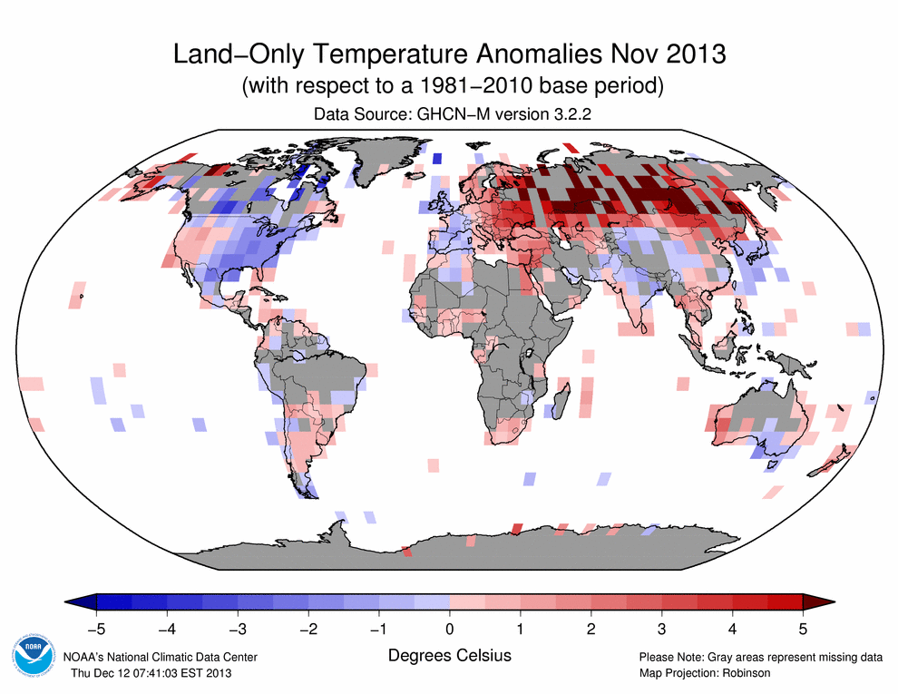
Note the +5C anomalies in that region in the map cited by NCDC:![201311[1]](http://wattsupwiththat.files.wordpress.com/2013/12/2013111.gif)
Source: http://www.ncdc.noaa.gov/sotc/global/
But, according to satellite temperatures, the ranking claimed by NCDC isn’t anywhere near to “record warmest”. Dr. John Christy gives these values for the satellite data sources of global temperature and their ranks:
- UAH Nov 2013 9th warmest Nov (0.20 C cooler than warmest Nov.)
- RSS Nov 2013 16th warmest Nov (0.22 C cooler than warmest Nov.)
And, when we look at the UAH map of the world, while Russia was certainly warmer, it wasn’t as warm as NCDC makes it to be:

Source: http://nsstc.uah.edu/climate/
Other maps from GISS suggest the NCDC presentation might be stretching the November temperatures a bit in the SOTC report, possibly because of the NCDC choice of baseline period.
GISS says 0.40 in November for the 1981-2010 base period used by UAH:

….and just 0.38 in November for 1981-2010 base period if 250km smoothing used:

Clearly, how you calculate and present global temperature anomalies makes a difference in the answer you get for November.
The difference here is that NCDC is using the “20th Century Average” where the other sources are using accepted 30 year climatology periods. Choosing that period can make a big difference in the outcome.
For example if I tweak the GISS parameters to use the 20th century, we get this, a value of 0.76C above normal, which is closer to NCDC’s value:

Source: http://data.giss.nasa.gov/cgi-bin/gistemp/nmaps.cgi?year_last=2013&month_last=11&sat=4&sst=3&type=anoms&mean_gen=11&year1=2013&year2=2013&base1=1901&base2=2000&radius=250&pol=reg
[Added: Also pointed out in comments NCDC has a lot of data gaps in Russia.
![201311[1]](http://wattsupwiththat.files.wordpress.com/2013/12/20131111.gif)
Source: http://www.ncdc.noaa.gov/sotc/service/global/map-land-sfc-mntp/201311.gif
When the data finally arrives (due to late reporting stations that trickle in), one wonders what the smoothing over Russia will look like and how much the global temperature value for November changes. NOAA/NCDC has to produce “State of the Climate” report each month, and they often do so before all the data is in, but we don’t ever see any update of those values sent to the press. ]
Another source using the GHCN surface land data and surface ocean data in an NCEP analysis, WeatherBell, agrees that Russia was quite anomalously warm, but gives a global temperature anomaly of only 0.17C:

The point I’m making is that global temperature can be significantly different, depending on how it is calculated and presented. Which way is the right way? More importantly, since monthly temperatures still fit into the scale of synoptic meteorology, i.e. affected by “weather”, does it even matter to the global warming debate?
Along the same lines, with year-end approching, we’ll soon see pushes from government and media sources to position 2013 in some rank of “warmest year ever”. With that in mind, here are some maps and temperature ranks to consider:
WeatherBell year to date shows only o.049c globally for the year, hardly alarming:

Source: http://models.weatherbell.com/climate/ncep_cfsr_t2m_anom_ytd.png
NCDC, using their century scale base period, says: “The globally-averaged temperature across land and ocean surfaces for the first eleven months of 2013 (January–November) was 0.62°C” Source: http://www.ncdc.noaa.gov/sotc/global/

GISS says only 0.19C so far for 2013, and it will likely go down with the cold December Arctic outbreak which has been seen in the Northern Hemisphere:

Source: http://data.giss.nasa.gov/cgi-bin/gistemp/nmaps.cgi?year_last=2013&month_last=11&sat=4&sst=3&type=anoms&mean_gen=1212&year1=2013&year2=2013&base1=1981&base2=2010&radius=1200&pol=reg
Global temperature on monthly and yearly time scales varies greatly depending on how it is calculated, how it is presented, and who presents it.
Which one is the real global temperature?
================================================================
Addendum: I have been wondering about that Russian red spot for 5 years. I’ve seen this red spot come and go in Russia, and I don’t know what the reason is.
I do know this: neither I nor NOAA has a good handle on the siting characteristics of Russian weather stations. I do know one thing though, the central heating schemes for many Russian cities puts a lot of waste heat into the air from steam pipes:
![russia-pipes[1]](http://wattsupwiththat.files.wordpress.com/2013/12/russia-pipes1.jpg?quality=83)
In the cities, it’s the municipality that supplies the hot water. There’s a huge network of giant pipes that move the water all over the city. It’s a closed circuit that eventually leads back to a steam plant – a huge factory that does nothing more than heat water and force it into the system.
The pipes enter practically every building within the city limits and the heat from uninsulated pipes (radiators) is what keeps everyone’s living space toasty warm throughout some extremely cold winters. A side benefit is that they never have to wait for the water to warm up in their showers!
– See more at: http://blog.arlomidgett.com/2012/01/16/thoughts-on-russia/#sthash.1gu8As1U.dpuf

While the silver pipes in photos above have insulated cladding, the steam pipes seen below are un-insulated:

The caption was telling: Smaller Russian era dwelling – blue is typical color. Pipes outside are for the steam heat that is distributed to all buildings.
Note the waste heat keeps the snow off the street in Siberia:

Above: Central heating, Novokuznetsk, Siberia, 1991 Photo by Bertien van Manen
See more about Russia at: http://wattsupwiththat.com/2008/11/15/giss-noaa-ghcn-and-the-odd-russian-temperature-anomaly-its-all-pipes/
(The addendum was edited for clarity)
Related articles
- November 2013 Global Surface (Land+Ocean) Temperature Anomaly Update (wattsupwiththat.com)
- Toasty November Vaults 2013 Into Top 5 Warmest Years (climatecentral.org)
- November Was the Warmest November Since We Started Keeping Track (theatlantic.com)
- Earth had its warmest November on record (usatoday.com)
Anybody stop to think that this anomaly might be something other than natural? It just so happens that there is a blob of heat the size of Russia centered on Russia? What are the odds of that?
REPLY: I have been wondering the same thing for 5 years. I’ve seen this red spot come and go in Russia, and I don’t know what the reason is. I do know this: neither I nor NOAA has a good handle on the siting characteristics of Russian weather stations. I do know one thing though, the central heating schemes for many Russian cities puts a lot of waste heat into the air from un-insulated steam pipes See: http://wattsupwiththat.com/2008/11/15/giss-noaa-ghcn-and-the-odd-russian-temperature-anomaly-its-all-pipes/
I’ve updated the post to reflect this – Anthony
The “real” one is the one that promotes the meme. The truth is the casualty.
I should clarify that I mean it could be caused by someone messing with the satellite data in some way, or Russian military equipment possible messing with the satellite data. As is, the very existence of an anomaly like that seems rather odd to me.
Bad timing for this news release, if the main stream press does their usual thing. The warming news will fall on deaf cold ears
http://oi41.tinypic.com/11w3v5z.jpg
RSS vs GISS, the same normal period: check for yourself.
Anthony, as I commented on Bob Tisdale’s recent thread on global temperatures, something funny is going on with the NOAA data: If you go to their site and choose to show only land data, then suddenly there’s extremely sparse coverage for November:
http://www.ncdc.noaa.gov/sotc/service/global/map-land-sfc-mntp/201311.gif
Note that there’s absolutely no coverage in several tropical areas where WeatherBell reports cold anomalies (e.g. in Africa and the Amazonas).
(Besides, a strong positive anomaly in that part of Russia means that temperatures were just above freezing in November. One degree milder in cool Russia means a smaller energy difference than 1 degree cooler in the tropics – global mean temperature is such a silly measure after all!)
I don’t know where I read it, but the Russian data may depend on what period the base line was measured. Back in the days if the USSR, the amount of fuel you received for next year’s winter, depended on how cold it was this year. So, it was normal for places in Siberia to routinely report temperatures which were significantly colder than they actually were.
Thanks Anthony, Glad to see articles like and I do know they take lots of time to put together.
I am simply not buying that it was really THAT hot over an area THAT big. Something is not right. Have we looked at the raw station data to make sure there isn’t anything stupid there?
“The difference here is that NCDC is using the “20th Century Average” where the other sources are using accepted 30 year climatology periods. Choosing that period can make a big difference in the outcome.”
There is nothing ‘accepted” about a 30 year base period. You can pick any base period you want. You dont want to go below 30, but picking a longer period will give you better statistics when it comes to measuring extrema.
REPLY: Sorry Steve, you are wrong on that count…yes, there is an acceptance of a 30 year period, so says the World Meteorological Organization:
Source: http://www.wmo.int/pages/themes/climate/climate_data_and_products.php
– Anthony
NOAA’s map makes no sense for the UK, Ireland or for Spain – particularly for Spain, Ireland and Scotland which NOAA suggests all had warmer than average Novembers in 2013. If you look at the Spanish Government’s own web-site they confirm that November 2013 was cooler than average and in the ‘very cold’ category in the whole southwest half of the country. Equally in England it was a full 1C/2F cooler than the 1981-2010 period according to the UK met office and was also cooler than normal in Scotland. The Irish met service also confirms a cooler than average November. This illustrates that NOAA’s map bears no relation to reality in these particular countries. I suspect others looking at data in other countries would find something similar.
WeatherBell year to date shows only o.049c globally for the year, hardly alarming:
###########
Weatherbell is NOT OBSERVATIONS.
Weatherbell uses NCEP
NCEP is a MODEL not observations
NCEP uses datasources that are highly suspect. for example thermometers on rooftops. thermometers on roads.
12.9’C 20th century average? I thought it was 15’C, oh wait they revised it to 14’C, damn I’m confused. Maybe that is their diabolical plan.
I replied to a lathered up global warming zealot waving around NCDC report as “proof” global warming was real and no “pause” existed, yesterday:
Plenty of “highest on record” comments in the NCDC report. All carefully worded. So what is the period of “record” they are using? Its the last 134 years appx 1900 to present. Which is pretty meaningless in terms of “climate cycle” context. And then notice the several different base periods for various of their claims. Manipulating the period you are comparing against is a simple way to manipulate the result.
As to their key point:
“The combined average temperature over global land and ocean surfaces for November 2013 was record highest for the 134-year period of record, at 0.78°C (1.40°F) above the 20th century average …”
How terrible. Combined global land and sea temps combined for NOVEMBER was 0.78 degree C above the 20th century average. Sounds reasonably accurate to me – most skeptics agree temps have increased over the last 134 years.
Of course if we read a little further we get a far more useful data point from them:
“The combined global land and ocean average surface temperature for the YEAR-TO-DATE (January–November) was 0.62°C (1.12°F) above the 20th century average” …. so the AVERAGE YEAR TO DATE global mean combined land and sea temps are just 0.62 degree C above the 20th century average. Using the total, year to date data, the global mean combined land and sea temp of just 0.62 deg C over the last 134 years.
Which shows the HADCRUT, HADSST, and RSS MSU data, and other data largely matches the NCDC GCHN data and conclusions.
The NCDC climate “report” carefully crafted its talking points to provide maximum scaremongering value. It also carefully ignores the inconvenient pause.And they bury the graphs they do, quite clearly, show the pause.
I’ll help them out – you can see their graph below. It is clear there has been no appreciable change – no warming – in the combined global mean land and sea temp data, since at least 2000 … and likely earlier.
Note that NOAA has largely “disappeared” the large warm spike in 1998. Which also eliminates the warmists claim that the “pause” is only discernible if one cherry picks and includes the unusually warm 1998 as the start point.
This simply is not true. You can ignore the rapid oscillations of the 1997-1999 period that include the warm spike in 1998, and use 2000 as a start point and you’ll get 14 years with no warming.
The data shows that there has been no increase in global mean temp for at least 14 years …none if by land, none if by air, none if by sea, and as this NCDC report shows, none if by land and sea combined.
Add the NCDC’s GHCN combined land and sea data set to the HADCRUT, HADSST and RSS MSU global mean land, sea and lower troposphere air temps respectively, which all show the “pause” – that we have seen NO warming since at least 2000 or earlier.
Buried at the end of the report NOAA’s 2013 year to date graph from the “State of the Climate” article is included below. As with the HADCRUT, HADSST, RSS US and other data sets, a simple “eyeball” view shows pretty clearly that there has been no warming for 14 years or more:
http://www.ncdc.noaa.gov/sotc/service/global/lo-hem/201301-201311.gif
Thanks for the reply, Anthony. Those steam pipes alone, uninsulated… The urban heat island effect is already bad enough. A factory just for producing steam and then pumping that steam all over a city? That HAS to have an affect!
The make a point on other possibilities, I was once told about (though this is unconfirmed) a military base in Manitoba (Canada) that uses radar jamming to hide the base. The problem is that weather satellites see the jamming as rain! I wonder if something in Russia is doing something similar to the temperature satellites, if such a thing is possible.
So the cooked data shows “hottest ever” and the uncooked data does not.
Uhuh. NOAA, GISS, etc are not measured temperatures. It is value added, adjusted, homogenised, etc. Or spliced and diced as they do at BEST.
That .6 degree is all in the adjustments.
If we can credit the climate cause with anything worthy of note, it’s the truly breathtaking array of reds they have run through and embellished our maps with, oft without perspective or scale. Every one of them now looks like we wrapped up the teenaged extras from Carrie in them. Lucky for Russia, they’ve moved beyond ‘blood red’ to ‘tonight we chacha with Lucifer red’. Congrats!
Let’s suppose the situation were reversed for some reason. For instance, let’s say that air conditioning electricity was priced lower if the preceding year had been hotter in some huge and imaginary rich tropical country, and reported temperatures had been elevated in the past as a result.
Instantly, an IPOCC team would be dispatched to interrogate knowledgeable persons there to verify if this had happened, with a view to “getting rid” of that warm anomaly by subsequently adjusting its temperatures down.
Three guesses why such an investigation and adjustment won’t occur wrt Russia.
“Anybody stop to think that this anomaly might be something other than natural? It just so happens that there is a blob of heat the size of Russia centered on Russia? What are the odds of that?”
This particular area of the world is known for having the highest seasonal range. The difference between coldest and warmest month is huge. The blob is bigger than Russia and is not uniform over Russia. In general on a month to month basis there will always be hot zones and cool zones. Its quite silly to focus on Russia being hot or the US being cold, but folks on both sides will do this. Also with less ice in the arctic we can expect just this sort of thing
REPLY: Note also that the Russian data is full of holes:
It will be interesting to see what happens when late CLIMAT reports come in. One of the problems with NCDC is deadline pressure in issuing such reports, they don’t wait for all the data to show up.
-Anthony
And here I thought an oscillation involved some areas being down while others are up. The Arctic oscillation rotated from Siberia to the U.S. and then Europe and the Middle East. That pattern was predicted by private forecast groups for commodity traders but missed by government forecasters. It appears that the focus on all things warming and evil takes time and talent away from other competencies. Just ask EPA and their CIA workforce.
Temperature varies from place to place…from hour to hour…from season to season…the whole concept of a ‘global average temperature’…is nonsense
I wonder if recent Russian high temperatures have anything to do with vodka rationing.
The end of the 1980s saw a huge Russian budget deficit and sky-high inflation. Severe shortages of basic food supplies led to the reintroduction of the war-time system of rationing – including vodka.
Apparently, food and especially vodka rations were based on low temperatures of each district or town and communities competed for food and vodka allocation. Temperature records were often exaggerated on the low side to make sure rations were high. Clearly this would produce an artificially low bias on temperature records during that period and make current temperatures seem high.
Steve,
But now there is more ice in the Arctic……but your point is well taken. Large land locked areas, far from moderating influence of sea or ocean, will have larger swings in temps. The listing of metrics by their place in the record book seems to be very misleading. A lot of the data runs the ‘records’ are based on are quite limited. But the ranking itself seems to be potentially very misleading. Your take on this would very much appreciated.
If nothing else, those steam pipes are a real eyesore.
philjourdan says: December 19, 2013 at 1:11 pm
The “real” one is the one that promotes the meme. The truth is the casualty.
Indeed as things stand, a more alarming value will achieve a higher rate of replication in the media.
http://wearenarrative.wordpress.com/2013/10/27/the-cagw-memeplex-a-cultural-creature/