Guest essay by Jan Zeman
To err is human, for messing up consistently one needs a computer. -New proverbs
Because there was a lot of publicity around the Cowtan and Way 2013 paper I decided to look into the issue.
I was not much interested in their methods (since I’m not much interested in methods of data torture, besides they have already been scrutinized by much more knowledgeable people), but rather in the following questions:
- Where did they obtain data such data that would support a “two and a half times greater” rise of global temperature anomaly “trends starting in 1997 or 1998” in their “hybrid global reconstruction” when compared to HadCRUT4 global temperature anomaly data-set?
- What such data really show and whether such data agree with other data or not?
Because the main rationale of their analysis seems to me being that there is some missing coverage for the HadCRUT4 global temperature anomaly dataset “with the unsampled regions being concentrated at the poles and over Africa” and that it is the alleged reason why the HadCRUT4 data-set is purportedly biased, first what I have looked for was whether there actually are other data covering the regions and what trends one can find there.
Tropics
For starter let’s see a comparison of HadCRUT4 and satellite lower troposphere data for tropics:

(I note that I chose trend period exactly October-October to avoid potential disputes about the seasonal variations and cherry-picking. The data and calculations are available here)
What we immediately see on the graph is that the HadCRUT4 trend 1997-present for tropics (30S-30N) is flat (but it is slightly rising for globe ~0.046°C per decade). We also see that both the UAH (the data-set Cowtan and Way likely used for their “reanalysis“ of the HadCRUT4 data-set) and the RSS satellite records show descending temperature trend in the 1997-present period for tropics. Only satellite data which show a rising temperature trend in tropics is UAH lower troposphere-land.
But since the UAH data-set shows the descending trend for tropics when the oceans (covering ~70% of the tropical region) are included, it is clear, that the satellite data-sets including the UAH for the tropics as whole clearly do not show warming in the tropics for the period. So they hardly can in a consistent way contribute to change the flat HadCRUT4 tropics trend into a rising trend for the period.
We can therefore immediately conclude that if Cowtan and Way used the UAH tropics-land data-set to anyway do so, it would be absolutely inconsistent, directly contradicted not only by the another satellite data-set (RSS), but by the UAH satellite data-set itself – which doesn’t show warming in tropics as whole for the period in question, moreover it shows visibly a cooling trend for tropics. So to take from the UAH data-set only the land data showing the warming, mess up the official data-set (showing flat trend for tropics and warming presumably somewhere else) with them, allegedly correcting its alleged bias, it would be clearly a sign of a bias on their side to put it extremely mildly.
In any case a hypothesis, that the UAH satellite data-sets somehow can change HadCRUT4 trend in tropics into a rising one for the period 1997-present is therefore not only contradicted by the RSS satellite record, but it is directly falsified by the UAH lower troposphere temperature anomaly dataset for tropics itself, because it shows descending trend there.
The divergence
Recently in the article written by Steven McIntyre he showed, that the Cowtan and Way hybrid global data start to markedly, one could say “hockeyschtickly”, diverge from the HadCRUT4 global data in about ~2005. He showed it well on this his picture:

The graph shows that it is in about 2005, where the Cowtan and Way data start to show a quite consistent divergence from the HadCRUT4 data – before they show a negative trend and then quite suddenly a positive one. Good to note here, that one of the two authors even participated in the discussion below the McIntyre’s article at the Climate Audit, but he didn’t objected it. Similar break-point for both Cowtan and Way data-sets is shown by Bob Tisdale here, and he notes what it has likely to do with the polar amplification.
It is clear from the graph the divergence most likely is the chief source of the rising trend in their global hybrid data-set purporting to tackle the bias in the HadCrut4.
There was another article written about the possible origins of this divergence in their datasets, so I will not repeat once written. And since the tropics do not show a warming trend – as I have shown above (- and I note that in the period since 2005 the HadCRUT4 data-set shows for tropics 30S-30N the relatively impressive downward trend of -0.134°C per decade – which is hard to beat with infilling poor coverage with invented values in the polar regions, simply because the 30S-30N is exactly half of the Earth surface area, while both polar regions combined less than 10%!), let’s have look at the other region where they claim low coverage causes a bias in the HadCRUT4 – the polar regions – and see what really is going on there in the period of the divergence. Because it has possibly broader implications than just falsifying Cowtan and Way 2013 results.
Polar Regions
Let’s first see what show the lower troposphere satellite data for the polar regions:

(used data and calculations available here)
What we see on the graph is that since the 1997 there is rising trend both in Arctic (steeper) and Antarctic (less steep). However this trend clearly have stopped in the Arctic before 2005 in both the satellite datasets, while it continued rise in the UAH dataset for Antarctica.
Let’s see why:

Again as in the tropics the land record in the UAH data-set shows much steeper slope than ocean record – which shows almost flat trend in the UAH.
It very much seems that the UAH data-set for the Antarctica land is contradicted by the RSS dataset.
Are there other data-sets which would support the rising trend in UAH data since 2005?
Quite to the contrary – there are other which contradict it.
First, there are the data from the Antarctica surface stations. I took the data from GHCN for them, I have made a sample of 20 surface-stations (all Antarctica surface-stations available at GHCN which are not missing more than one year data since 1997 and have data to present) and I have plotted their temperature mean with trends:

(used data and calculations available here)
From the above graph it is quite clear that although there is a rising temperature trend since the 1997, there is no rising temperature trend after 2005 measured at the surface stations in the Antarctica. The majority of them show a descending trend in the period and especially those further in the Antarctica inland (e.g. slopes for some of them: Amundsen-Scott: -1.56°C, Byrd station: -1.25, Vostok: -1.08°C) .
So is there actually a warming trend in the polar regions since the 2005?
As I have shown most definitely not in the Arctic. No data-set we have looked at shows there a warming trend since 2005.
But is there a warming in the Antarctica? The UAH data-set (although contradicted by the majority of the Antarctica surface-stations especially those in inland and by the RSS data-set) shows a warming both for land and ocean there.
Can we further contradict the UAH data-set, not just for the land, but the ocean too? I think we can very well.
Sea ice
There actually is a data-set, which very well covers the polar and sub-polar regions. It is not a temperature data-set, but it has a lot to do with temperature. It is the NSIDC sea ice index data-set and it covers the polar regions with daily cadence, extremely rarely missing coverage and with no major issues (-at least since 1988 – in 1987 there is a discontinuity) – because the sea-ice is unlike the surface temperature actually very well sensible by the satellite instruments. So let’s have look what it shows:
 |
(data with calculations are available here)
We can immediately see on the graph the monthly global sea-ice extent recently reached the highest level since 1999. Also the southern sea-ice extent – in the region which is allegedly warming according to the UAH and Cowtan with Way – reached not only higher level than in the 2005, higher than in the 1997, but it very recently again reached likely the all time high in the history of the satellite sea ice extent measurements since 1978 – which oddly went unnoticed by our climate watchdogs. (And as I look into the NSIDC daily sea ice data – available here and I do a small extrapolation – if Cowtan and Way can why not me just for fun – over the one remaining month, it looks to me very likely also this whole year sea ice averages will be the highest since 2003 and possibly even since 1999 – if you don’t believe just look carefully at this graph from UIUC.)
Mind also the trends in the above graph (which have periods exactly global minimum-to-minimum and maximum to maximum using the resolution of the daily data from 2005 global minima and maxima to 2013 minima and maxima) – both are rising.
But it is not temperature which is rising there, it is the sea ice extent. And it really doesn’t much look consistent with the Cowtan and Way global warming trend allegedly due to alleged warming in the polar regions.
Water usually doesn’t freeze on hundreds of thousands square kilometers areas upon a warming.
Grace to NSIDC we can also compare the maps for both hemispheres yearly maxima. Here it is for Arctic, mind the numbers:

We see that the yearly maximum area and extent were higher for Arctic in 2013 than in 2005. Which further confirms both the RSS and UAH satellite data for lower troposphere temperature anomaly in the Arctic, although it should be definitely mentioned that the Arctic sea ice still shows a descending trend in the period 2005- present. Nevertheless this trend has more than twice less steep slope than in Antarctica for the sea ice extent and more than half less steep slope for the sea ice area. So there is the observed net gain in the global sea ice trends of about 1.5 million square kilometers per decade for the sea ice extent and about 1 million square kilometers per decade for the global sea ice area.
I would very much think that if we speak about the global temperatures and their trends, we must also consider global not hemispherical trends which indicate them, and especially in the case of an oceanic phenomena as is the sea ice, because there is very uneven distribution of the ocean over the globe and the Arctica sea ice is also unlike that around Antarctica quite very constrained by the surrounding land as we see on the above map and subjected to currents from south on the side of the Atlantic.
Here is the comparison for Antarctica:

(Source here)
Even we can question whether the rising global sea ice trends have statistical significance, there quite clearly is no descending global sea ice trend since at least the 2005 (where the Cowtan and Way data start to diverge from the HadCRUT4 to presumably other direction than sea ice implies). Such descending trend (or at least flat) on the other hand one finds in (nearly) all official data-sets for the global temperature anomaly – including the UAH global data-set for the lower troposphere – the trend looks to me perfectly flat, but actually it shows a rising trend: +0.09°C together with HadSST2 and HadSST3 which show even +0.3°C …per thousand years… (I note that in my opinion the very slightly rising SST trends are right and caused by the current solar cycle maximum).
Closing remarks
It very much looks that the trend break-point in the Cowtan and Way data is itself a result of a bias, and miserable failure, likely when trying to account for the positive polar amplification – the problem is that most likely in times when there is quite likely a negative one.
It very much looks there quite is no reason to believe there is a warming trend in the global surface temperatures at least since 2005 – and even much less because of a bias in the global surface temperature anomalies due to the allegedly insufficient coverage in the tropical and polar regions.
In fact the global sea-ice data supported by multiple other data-sets give quite a very compelling evidence to the contrary.
And data is what counts in the science, which has the method based on the falsification not a confirmation bias. If the data don’t agree with a hypothesis it is in the overwhelming majority of cases the hypothesis which is falsified, not the data.
In this case the extensive real data quite falsify a hypothesis literally based on no data (which are invented to make such hypothesis possible) moreover clearly postulated to significantly change the outcome of the real official data-set (whatever we maybe think about the Hadley Center, CRU and MetOffice at least it is based on real measurements and with still relatively conservative approach without infills when compared to other global data-sets as NCDC or GISTEMP LOTI*) and moreover for such purpose with quite clear intent to cast a doubt about the current at the very least flat if not a cooling global surface temperature anomaly trend.
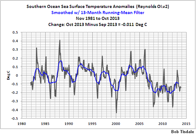
Will we believe that while the ocean somewhere cools (-as Bob Tisdale shows for southern ocean – see the footnote – and there is virtually nothing else there than ocean between the Antarctica and the 60S) – which looks quite confirmed by the rising sea ice extent there and while the tropics cool too with quite impressive rate and moeover we do not find a rising temperature trend in Arctic in any of the two satellite datasets – will we really believe there is a warming trend? A warming somewhere (maybe in Antarctica and around, and most likely not) somehow able to change the whole most likely flat or descending global surface temperature anomaly trend into a warming one – moreover with a “hypothesis that warming has accelerated…four times as likely as the hypothesis that warming has stopped“? Or we will rather take it as for other reasons than a global warming overheated Cowtan and Way computers dream?
To put it differently: Besides the data, isn’t the pathetic effort to manufacture a global warming trend using HadCRUT4 dataset and cherrypicked satellite data perhaps to allow the CAGW meme persist a little bit more, deliberately or not, the best sign of cooling?
————————————————
* If one wants to brush up on how it relates to the sea ice I recommend the final note from Bob Tisdale’s article here, which, to make this bit shorter, I allow myself to point out just one sentence from: “GISS masks (effectively deletes) sea surface temperature data anywhere sea ice has existed.”
I also note that he also shows quite consistent temperature decline for southern ocean SST from yet other data-set (Reynolds Ol.v2) – see his graph here – from here.
F.A.H. says:
December 3, 2013 at 8:14 pm
BRILLIANT! Sounds like a dead serious report shifted 180° that I would find on SkS et al.
BC
Donald L. Klipstein says:
December 3, 2013 at 8:23 pm
“I have yet to identify a linear trend in UAH ending at last reading with a complete hiatus being in existence even half that long. Anyone who can find such a thing, please get back to me!”
Here you have it.
OK, it is not perfectly flat – it has the slope +0.093C per thousand years, but at least the trend period is more than half long than the 1996.75-2013.75 RSS period.
It looks like quite a mystery where the C&W got their rising trend in their data after 2005.
JohnWho says:
December 4, 2013 at 7:57 am
@ur momisugly FAH –
“Belief in Global Warming is Correlated with Belief in Socialism at 0.85.”
Well, yeah, but that is only because the supposed “cure” for Global Warming matches a Socialist agenda.
If the “cure” was something that didn’t promote Socialism, the correlation would not be so good. The real idea isn’t to “save the world”.
If more of the environmentalists realized this, they wouldn’t be so supportive of CAGW by CO2.
———–
You’re right, but I think that number is about 0.6 ±17 environmentalists world wide.
@fah:
Excellent work, Nobel Prize standard.
I found your explanation of Kriging particularly enlightening, before reading it I had always it believed that it was a posh word for “making stuff up”, now I know better!
RichardLH says:
“Will that continue? Who knows.”
The Arctic ocean gets warmer with the negative NAO/AO episodes, they increase during weaker solar cycles. So apart from the odd exception like this during year, there should be a continuation of elevated Arctic temperatures.
Having read the essay here, I am not entirely sure that the author, Jan Zeman, actually read Cowtan and Way 2013. He does not even approach the real questions Cowtan and Way raised, nor answer them, nor refute them. C&W is about “what happens when we infill missing temperature data for geographical cells not currently covered”? This graph
http://www-users.york.ac.uk/~kdc3/papers/coverage2013/media_summary.png
is their summary (don’t blame me, it is their site)
Whenever a huge data set problem is approached with a different method, one had better get a different answer — or we’ll know you cheated in some way.
Cowtan and Way end up with a difference on total effect or their new global calculations, of about gee, even maybe 3/100ths of a degree. Both above and below HADCRUT, depending on the year, with, as mentioned, the years after 2005 showing a consistent difference (HADCRUT low, C&W higher by the hundreths of a degree).
The fuss about C&W isn’t really with their results, good, bad, or indifferent (as Steve McIntyre seems to say December 4, 2013 at 6:30 am) it is with the hype and spin they and others made of it.
And, of course, their attempt at the CliSci version of the Red Scarf Follow ( http://tinyurl.com/padltg2 🙂
KR says:
December 3, 2013 at 9:33 pm
One of the notable aspects of their hybrid method is that UAH trends are completely irrelevant to their calculation… the UAH trend discussions in the opening post are not relevant.
The trends are maybe “irrelevant” (sic!) for the calculation, but they are quite very relevant for the invalidation of the results. And I would think that to such degree, that it begs retraction of the article.
-There is actually a descending trend in the UAH data for tropics for whole the 1997-present period, so the UAH data for tropics cannot in any consistent manner contribute to change the flat 1997-present trend in the HadCrut4 tropics.
-There is no appreciable trend whatsoever in the UAH global data from 2005, yet if C&W global data contain such trend they are clearly inconsistent with the UAH dataset itself in the first place.
– There is actually a descending trend in the Arctic UAH data for the period 2005-present, so the UAH data for the Arctic can’t in any consistent way contribute to rise the Hadcrut4 values up for the period and change the descending global trend (-0.06C per decade) for the period into a rising one.
-There is actually a prominent rising trend for the Antarctica land in the UAH dataset (+0.62C per decade – by far the highest in the UAH dataset for the period), but it is absolutely contradicted by majority of the Antarctica surfacestations especially those inland and also by the RSS dataset (showing ~27 times less steep slope for the period even in the land/ocean data combined), which means already the validity of the UAH dataset for the Antarctica is quite in question.
-There is actually a rising trend for the southern polar ocean in the UAH dataset, but it is contradicted by the Reynolds Ol.v2, RSS (showing still more than twice less steep slope for land and ocean combined) and especially the sea ice index – which I would think means the direct falsification, because the sea ice index dataset is arguably much higher quality than UAH data for ocean, Hadcrut4, not speaking C&W datasets for very obvious reason – it is much easier to measure global seaice extent and area than temperature.
-There is no appreciable trend in the northern moderate zone UAH data for the period since 2005, so it can’t in any consistent way contribute to rise the Hadcrut4 global values up for the period and change the descending global trend (-0.06C per decade) into a rising one for the period.
-There is actually a rising trend for the southern moderate zone in the UAH data for the period 1997-present, but it is absolutely contradicted by the southern moderate zone RSS data, so even if this would be the source of the trend in the C&W global data (but the UAH-southern moderate zone trend is anyway too small for it and there is slightly descending trend in both Hadcrut and HadSST3 for SH), it would be directly contradicted by other dataset and therefore even so in doubt.
So I think we exhausted here all possibilities the C&W global trend (maybe irrelevant to you, but depicted prominently at the article webpage) is doubtless and when we consider this and this, there is quite a negligible chance the C&W are right that there is an appreciable 1997-present trend in the global surface air temperature anomaly – especially when we see the global sea ice trend – which is rising at very least from 2001 for both extent and area, not speking that virtually all global temperature anomaly datasets, including UAH LT-global, contradict C&W for the period 2005-present and multiple even for the 1997-present.
As it looks there are too much things contradicting C&W for it to be true and it actually has a lot to do with trends.
davidmhoffer says:
December 3, 2013 at 10:16 pm
“The writer’s first language is clearly not English.”
Yes, I’m not and English native, I’m actually a Czech. I did what I could to make my points in your language.
RichardLH says: December 4, 2013 at 7:06 am
“Nick Stokes says:(summarised)
A even more suspicious model than C&W given that it takes no account of average vertical height for Latitude bands, i.e. Lapse Rate”
It’s not a model, and there is no way of incorporating such features. The fact is, there’s missing data, and whatever you do with it attributes some value to the missing. This isn’t just climate, it goes with any data set. You can’t get around the fact that the data is missing; the best you can do is choose a replacement value that does least harm.
Simple omission attributes the global average value to those cells. The objective of any analysis is to find a better estimate. Since there is a clear latitude effect, the latitude average is simply a better choice. I’m sure it is not the best.
Volker Doormann says:
December 4, 2013 at 1:31 am
“Your gymnastic on trends
It is not my gymnastic. Just to remind you: it were Cowtan and Way who came with their bold red global trend, claiming “warming two and a half times faster than Met Office estimates” even before their paper was available for reading. And they did it claiming the alleged underestimate is caused by the insufficient coverage in the tropics and polar regions. -But unfortunately for a period, when there are for most of the time flat or rising global sea ice trends (sea ice is estimated quite very exactly and with cadence which actually allows to decide trend significance really considerably earlier than with the global temperature anomaly records) – I mean period 1997-present where the global sea ice trend is flat or rising since at least 2001, and when the UAH dataset they used shows a descending temperature trend in the tropics. So I would think that with the “trend gymnastic” you complain not to the right person which your complaints should be addressed to in the first place.
davidmhoffer says:
December 3, 2013 at 10:20 pm
“we could easily have a situation where the global average temperature trend is positive, but the energy balance of the planet is negative.
It could happen, but not for long, because the heat dissipates also faster with the fourth power of T.
There is likely also the opposite possible with oceans for the periods when there is the solar cycle minimum but peak of the visible spectrum region which has likely antiphase varibility in the spectral irradiance according to SORCE SSI data – it heats the ocean deeper, because it penetrates considerably deeper than IR and UV, but it has not much appreciable immediate temperature effect on its surface.
geo says:
December 3, 2013 at 10:56 pm
“They stitched together multiple data sets each collected by very different means and processed by very different methods, none of which show the trend individually, but only show it when stitched together? The obvious conclusion is the stitching process of disparate data sets is to blame for creating a spurious signal.
Exactly. To take just part of one dataset, say tropics land, fill holes in another dataset with it, but not notice that the first dataset actually shows cooling for the tropics and yet another too, while the dataset where they implant the data shows flat trend, so inevitably they end up with rising trend, that’s what I call cherrypicking. They could immediately show the UAH and GISS datasets, which actually show the rising global trend (UAH most likely because it has doubtful trends for the tropics and Antarctica land) and they could spare their time -but in such case they wouldn’t have their publication…
Aussiebear says:
December 3, 2013 at 11:50 pm
“It can be argued that the “assumed” Arctic and African data cannot be disproved as there is no contradictory observational data. Of course, it can’t be proved either for the same reason. It is just a result.
Actually in both the Arctic and tropics their trend is contradicted by the UAH dataset itself, and also by the RSS, the Antarctica UAH then contradicted by the surfacestations, RSS and sea ice. A result which is contradicted by other data shouldn’t be used until the contradiction is solved. And I very much doubt Cowtan and Way didn’t know their results are contradicted by the RSS, but they don’t mention it despite the obvious is couple of clicks away from them on the internet and despite they mention RSS in their paper even in evaluating sense. I very much suspect a scientific dishonesty is at play here.
The data and calculation link in article points to an Excel worksheet without the appropriate extension. Add the extension .xlsx to the downloaded file in order to open it in MS Excel or Libre Office Calc.
Kip and Steve may have already stated this above; but I’ll add my spin.
Jan’s article above reminds me of the ‘razzle dazzle play’; lot of flash, dash, fast talk and mirrors meant to convince observers of anything but where the ball is. Good article, but it puts hear say against someone’s published paper.
That there are issues with the paper is obvious. Just how a small subset of the globe, under icy conditions manage to change global temps into a hockey stick rise borders on the absurd. To me, this is part of Jan’s point above. But it doesn’t disprove C&W 2013 directly.
Take the C&W 2013 paper itself along with it’s data and methods apart to find where they abducted the data.
I calculated the C&W and other trends for 2005-12. The HAD 4 trend was -0.0904 °C/dec. That’s a little different from the published version which is NH+SH; I just did global, for consistency. The Cowtan/Way hrbrid global trend was -0.0377 °C/dec. Both are less than UAH at -0.0077 °C/dec. The plot by latitude is here.
So, the bottom line here and in other threads regarding C&W is that only those who want to believe the result will ignore the data manipulations?
Typical CAGW by CO2 believer thought process.
So, what’s new?
Doug proctor says:
“Regionality rules in a strange science where a global blanket is supposed to warm all points equally through additional back-radiation.
According to the alarmists, math rules while nature drools.”
You have it wrong. Regionality indeed does rule because the Earth’s heat engine a primary source and 2 major sinks, a circulating central heating system with temp anomalies (e.g. PDO/ENSO) and the planet has geographical features such as large mountain ranges that can dam and/or direct air-masses in preferred directions in the steering of jet-streams.
Back-radiation is more effective at the poles due to drier air that CO2 has less competition from and the IR window is more suited to capture via CO2. The tropics are moist and the CO2 GHE is weaker. (I talk here of the instantaneous effect and not the longer term H2O/WV feed-back). The planet is spinning and so a Coriolis effect away from the equatorial zone causes an equalisation with the PGF and creation of thermal winds aloft giving a consequent mass circulation of air to/from cold/warm/dry/moist regions. There is much more landmass in the NH locking in the arctic sea-ice and making it less saline (but also making it vulnerable to melt). Antarctica is “isolated” both by the Antarctic Circumpolar Current and by the strong westerly winds blowing in the Southern Oceans (exacerbated by the O3 hole). It is a massive frigid, high continent (ave height 12000ft). Warming there is effectively limited to the peripheries where glacier melt may be reducing salinity and offshore divergent winds pushing sea-ice further afield during winter to melt through summer.
When realising also that a weaker temp gradient exists towards the Arctic, then a weakening of the polar jet-stream results. This more sluggish jet meanders more meridionally and disrupts more easily, so there can be big regional differences, at least on seasonal scales as cold/warm air is advected south/north and consequent drought/heat cool/wet zones can get *stuck” more easily. We have seen examples this in recent Euro winters.
Linking this all together shows you have a situation where “regionally” indeed does rule.
And it will only get greater in a (asymmetrically) warming world.
Jan Zeman, I don’t know if there’s any merit to your essay or not, but I do know that your grammar and punctuation leave a lot to be desired. If English is your second language, perhaps a native English-speaking proofreader would have been a good idea.
No insult intended, just an observation. Presentation is as important as content.
Kristian says:
December 4, 2013 at 1:36 am
“Antarctica? Not much warming going on there since 1997/98 (60-90S), not much heat hidden at all. Neither in GISTEMP 1200 km, in Reynolds OI.v2 (SSTa), in RSS tlt (60-70S) nor in UAH tlt (60-82.5S). And especially not since 2005 (rather downhill again, strongly so for the Southern Ocean).
So, UAH tlt Africa central N-S axis. That must be where CW2013 found the missing heat of HadCRUt4. Too bad (?) they didn’t have the time or resources to cross-check with RSS tlt.”
I think they very well know the RRS doesn’t agree as doesn’t agree any other global temperature dataset – that’s why they dit all that – to have their bold red trend allegedly in the HadCrut4 (messed up), their publication and their couple of days fame – others soon find out whole the thing stinks, but the doubt will remain between the people who don’t understand, so mission accomplished for the alarmists – I bet it would need the seaice to descend down to the Scotland for the journal to retract their paper.
Nick Stokes says:
December 4, 2013 at 1:09 pm
“You can’t get around the fact that the data is missing; the best you can do is choose a replacement value that does least harm.”
So how’s about taking the records in the various data sets where they overlap in time, doing an OLS on the whole of those various data series in that time period and then aligning them by adjusting scale and offset?
Uses all of the available data rather than some smallish sub-set. Much less likely to be in error then surely?
Basically treats them all as proxies to the underlying ‘Global Temperature’ but without any preconceptions in area or importance (other than the satellite series have a larger measured coverage).
http://woodfortrees.org/plot/rss/offset:-0.09/plot/uah/plot/hadcrut4gl/offset:-0.29/scale:0.85/from:1979
Nick Stokes says:
December 4, 2013 at 3:32 pm
“I calculated the C&W and other trends for 2005-12. The HAD 4 trend was -0.0904 °C/dec. That’s a little different from the published version which is NH+SH; I just did global, for consistency. The Cowtan/Way hrbrid global trend was -0.0377 °C/dec. Both are less than UAH at -0.0077 °C/dec. The plot by latitude is here.”
Care to plot that with an area weighting so that the importance of the various latitude bands can be related to their individual contribution to the Global figure? Given that the 40S to 40N bands appear to be below 0 and comprise a much greater area than the bands outside that.
Ed Reid says:
December 4, 2013 at 5:44 am
Cowtan and Way are merely the latest is a series of wannabe, modern day, much improved embodiments of Rumpelstiltskin, purportedly able not only to weave straw (bad data) into gold (good data), but also to weave nothing (missing data) into gold (good data). Just another reason to believe that the status of what purports to be climate science is Grimm.
Well said. I’ll add that what all this people don’t realize is that actually most of the heat in the climatic system is in the ocean (I don’t say hidden), its temperature just slightly changes with it and it takes long time for fluctuations of this content to realize in the surface temperatures. As it takes for a photon created by the fusion in the solar core order of tens to hundreds of thousands of years to get to the Sun’s surface (then travel the 8 minutes to Earth and then penetrate the ocean get absorbed somewhere between zero and 200 meters depth and create the heat there), it takes for the heat to get from the depth some time to get back to the surface. I note that the deep penetraing radiation is the visible specral region, which varies in antiphase to solar cycle, so no correlation study of OHC with TSI would ever succeed to find a positive correlation even if we would be able to exactly measure the thousandth of degree changes in the ocean temperature and get exact OHC profile. For determining the surface global warming or cooling trend is much easier to measure the sea ice extent and area than make the global surfacestations composites. It is also good to note the satellites are unable to measure the surface temperatures, they have good coverage, but what they actually measure is the temperature of the atmosphere in quite thick layers which even for the LT is only a proxy to surface temperatures and the correlation is far from 1. So to infill the satellite data into a surface dataset itself is quite doubtful.
RichardLH says: December 5, 2013 at 3:03 am
“Care to plot that with an area weighting so that the importance of the various latitude bands can be related to their individual contribution to the Global figure?”
I’ve given the area-weighted totals; you don’t have to estimate by eye.
timetochooseagain says:
December 4, 2013 at 8:12 am
“I started reading this to see if there would be an interesting examination of the Cowtan and Way “result” and found a completely unwarranted and ill informed attack on the UAH dataset. I mean holy crap, you cannot have read any of the many papers examining the satellite data carefully at all.
This was not intended as an attack on the UAH dataset at all. In fact I thought I have restrained myself from such implications enough.
But it doesn’t look like that when somebody implies it. So I must declare that I don’t have anything against the UAH data. I note it doesn’t completely agree with RSS, but that’s all. Satellite measurements measure temperature of the atmospheric layers, not surface. It is almost impossible to measure the real surface air temperature as the surface stations do – that’s why nobody does it. It is not problem of the UAH data when one applies this proxy to the surface temperatures nearly as if it would be the surface record itself and ends up with a doubtful result, which for some parts is even contradicted by the UAH dataset itself (e.g. the tropics or Arctica)
Jan Zeman