Guest essay by Jan Zeman
To err is human, for messing up consistently one needs a computer. -New proverbs
Because there was a lot of publicity around the Cowtan and Way 2013 paper I decided to look into the issue.
I was not much interested in their methods (since I’m not much interested in methods of data torture, besides they have already been scrutinized by much more knowledgeable people), but rather in the following questions:
- Where did they obtain data such data that would support a “two and a half times greater” rise of global temperature anomaly “trends starting in 1997 or 1998” in their “hybrid global reconstruction” when compared to HadCRUT4 global temperature anomaly data-set?
- What such data really show and whether such data agree with other data or not?
Because the main rationale of their analysis seems to me being that there is some missing coverage for the HadCRUT4 global temperature anomaly dataset “with the unsampled regions being concentrated at the poles and over Africa” and that it is the alleged reason why the HadCRUT4 data-set is purportedly biased, first what I have looked for was whether there actually are other data covering the regions and what trends one can find there.
Tropics
For starter let’s see a comparison of HadCRUT4 and satellite lower troposphere data for tropics:

(I note that I chose trend period exactly October-October to avoid potential disputes about the seasonal variations and cherry-picking. The data and calculations are available here)
What we immediately see on the graph is that the HadCRUT4 trend 1997-present for tropics (30S-30N) is flat (but it is slightly rising for globe ~0.046°C per decade). We also see that both the UAH (the data-set Cowtan and Way likely used for their “reanalysis“ of the HadCRUT4 data-set) and the RSS satellite records show descending temperature trend in the 1997-present period for tropics. Only satellite data which show a rising temperature trend in tropics is UAH lower troposphere-land.
But since the UAH data-set shows the descending trend for tropics when the oceans (covering ~70% of the tropical region) are included, it is clear, that the satellite data-sets including the UAH for the tropics as whole clearly do not show warming in the tropics for the period. So they hardly can in a consistent way contribute to change the flat HadCRUT4 tropics trend into a rising trend for the period.
We can therefore immediately conclude that if Cowtan and Way used the UAH tropics-land data-set to anyway do so, it would be absolutely inconsistent, directly contradicted not only by the another satellite data-set (RSS), but by the UAH satellite data-set itself – which doesn’t show warming in tropics as whole for the period in question, moreover it shows visibly a cooling trend for tropics. So to take from the UAH data-set only the land data showing the warming, mess up the official data-set (showing flat trend for tropics and warming presumably somewhere else) with them, allegedly correcting its alleged bias, it would be clearly a sign of a bias on their side to put it extremely mildly.
In any case a hypothesis, that the UAH satellite data-sets somehow can change HadCRUT4 trend in tropics into a rising one for the period 1997-present is therefore not only contradicted by the RSS satellite record, but it is directly falsified by the UAH lower troposphere temperature anomaly dataset for tropics itself, because it shows descending trend there.
The divergence
Recently in the article written by Steven McIntyre he showed, that the Cowtan and Way hybrid global data start to markedly, one could say “hockeyschtickly”, diverge from the HadCRUT4 global data in about ~2005. He showed it well on this his picture:

The graph shows that it is in about 2005, where the Cowtan and Way data start to show a quite consistent divergence from the HadCRUT4 data – before they show a negative trend and then quite suddenly a positive one. Good to note here, that one of the two authors even participated in the discussion below the McIntyre’s article at the Climate Audit, but he didn’t objected it. Similar break-point for both Cowtan and Way data-sets is shown by Bob Tisdale here, and he notes what it has likely to do with the polar amplification.
It is clear from the graph the divergence most likely is the chief source of the rising trend in their global hybrid data-set purporting to tackle the bias in the HadCrut4.
There was another article written about the possible origins of this divergence in their datasets, so I will not repeat once written. And since the tropics do not show a warming trend – as I have shown above (- and I note that in the period since 2005 the HadCRUT4 data-set shows for tropics 30S-30N the relatively impressive downward trend of -0.134°C per decade – which is hard to beat with infilling poor coverage with invented values in the polar regions, simply because the 30S-30N is exactly half of the Earth surface area, while both polar regions combined less than 10%!), let’s have look at the other region where they claim low coverage causes a bias in the HadCRUT4 – the polar regions – and see what really is going on there in the period of the divergence. Because it has possibly broader implications than just falsifying Cowtan and Way 2013 results.
Polar Regions
Let’s first see what show the lower troposphere satellite data for the polar regions:

(used data and calculations available here)
What we see on the graph is that since the 1997 there is rising trend both in Arctic (steeper) and Antarctic (less steep). However this trend clearly have stopped in the Arctic before 2005 in both the satellite datasets, while it continued rise in the UAH dataset for Antarctica.
Let’s see why:

Again as in the tropics the land record in the UAH data-set shows much steeper slope than ocean record – which shows almost flat trend in the UAH.
It very much seems that the UAH data-set for the Antarctica land is contradicted by the RSS dataset.
Are there other data-sets which would support the rising trend in UAH data since 2005?
Quite to the contrary – there are other which contradict it.
First, there are the data from the Antarctica surface stations. I took the data from GHCN for them, I have made a sample of 20 surface-stations (all Antarctica surface-stations available at GHCN which are not missing more than one year data since 1997 and have data to present) and I have plotted their temperature mean with trends:

(used data and calculations available here)
From the above graph it is quite clear that although there is a rising temperature trend since the 1997, there is no rising temperature trend after 2005 measured at the surface stations in the Antarctica. The majority of them show a descending trend in the period and especially those further in the Antarctica inland (e.g. slopes for some of them: Amundsen-Scott: -1.56°C, Byrd station: -1.25, Vostok: -1.08°C) .
So is there actually a warming trend in the polar regions since the 2005?
As I have shown most definitely not in the Arctic. No data-set we have looked at shows there a warming trend since 2005.
But is there a warming in the Antarctica? The UAH data-set (although contradicted by the majority of the Antarctica surface-stations especially those in inland and by the RSS data-set) shows a warming both for land and ocean there.
Can we further contradict the UAH data-set, not just for the land, but the ocean too? I think we can very well.
Sea ice
There actually is a data-set, which very well covers the polar and sub-polar regions. It is not a temperature data-set, but it has a lot to do with temperature. It is the NSIDC sea ice index data-set and it covers the polar regions with daily cadence, extremely rarely missing coverage and with no major issues (-at least since 1988 – in 1987 there is a discontinuity) – because the sea-ice is unlike the surface temperature actually very well sensible by the satellite instruments. So let’s have look what it shows:
 |
(data with calculations are available here)
We can immediately see on the graph the monthly global sea-ice extent recently reached the highest level since 1999. Also the southern sea-ice extent – in the region which is allegedly warming according to the UAH and Cowtan with Way – reached not only higher level than in the 2005, higher than in the 1997, but it very recently again reached likely the all time high in the history of the satellite sea ice extent measurements since 1978 – which oddly went unnoticed by our climate watchdogs. (And as I look into the NSIDC daily sea ice data – available here and I do a small extrapolation – if Cowtan and Way can why not me just for fun – over the one remaining month, it looks to me very likely also this whole year sea ice averages will be the highest since 2003 and possibly even since 1999 – if you don’t believe just look carefully at this graph from UIUC.)
Mind also the trends in the above graph (which have periods exactly global minimum-to-minimum and maximum to maximum using the resolution of the daily data from 2005 global minima and maxima to 2013 minima and maxima) – both are rising.
But it is not temperature which is rising there, it is the sea ice extent. And it really doesn’t much look consistent with the Cowtan and Way global warming trend allegedly due to alleged warming in the polar regions.
Water usually doesn’t freeze on hundreds of thousands square kilometers areas upon a warming.
Grace to NSIDC we can also compare the maps for both hemispheres yearly maxima. Here it is for Arctic, mind the numbers:

We see that the yearly maximum area and extent were higher for Arctic in 2013 than in 2005. Which further confirms both the RSS and UAH satellite data for lower troposphere temperature anomaly in the Arctic, although it should be definitely mentioned that the Arctic sea ice still shows a descending trend in the period 2005- present. Nevertheless this trend has more than twice less steep slope than in Antarctica for the sea ice extent and more than half less steep slope for the sea ice area. So there is the observed net gain in the global sea ice trends of about 1.5 million square kilometers per decade for the sea ice extent and about 1 million square kilometers per decade for the global sea ice area.
I would very much think that if we speak about the global temperatures and their trends, we must also consider global not hemispherical trends which indicate them, and especially in the case of an oceanic phenomena as is the sea ice, because there is very uneven distribution of the ocean over the globe and the Arctica sea ice is also unlike that around Antarctica quite very constrained by the surrounding land as we see on the above map and subjected to currents from south on the side of the Atlantic.
Here is the comparison for Antarctica:

(Source here)
Even we can question whether the rising global sea ice trends have statistical significance, there quite clearly is no descending global sea ice trend since at least the 2005 (where the Cowtan and Way data start to diverge from the HadCRUT4 to presumably other direction than sea ice implies). Such descending trend (or at least flat) on the other hand one finds in (nearly) all official data-sets for the global temperature anomaly – including the UAH global data-set for the lower troposphere – the trend looks to me perfectly flat, but actually it shows a rising trend: +0.09°C together with HadSST2 and HadSST3 which show even +0.3°C …per thousand years… (I note that in my opinion the very slightly rising SST trends are right and caused by the current solar cycle maximum).
Closing remarks
It very much looks that the trend break-point in the Cowtan and Way data is itself a result of a bias, and miserable failure, likely when trying to account for the positive polar amplification – the problem is that most likely in times when there is quite likely a negative one.
It very much looks there quite is no reason to believe there is a warming trend in the global surface temperatures at least since 2005 – and even much less because of a bias in the global surface temperature anomalies due to the allegedly insufficient coverage in the tropical and polar regions.
In fact the global sea-ice data supported by multiple other data-sets give quite a very compelling evidence to the contrary.
And data is what counts in the science, which has the method based on the falsification not a confirmation bias. If the data don’t agree with a hypothesis it is in the overwhelming majority of cases the hypothesis which is falsified, not the data.
In this case the extensive real data quite falsify a hypothesis literally based on no data (which are invented to make such hypothesis possible) moreover clearly postulated to significantly change the outcome of the real official data-set (whatever we maybe think about the Hadley Center, CRU and MetOffice at least it is based on real measurements and with still relatively conservative approach without infills when compared to other global data-sets as NCDC or GISTEMP LOTI*) and moreover for such purpose with quite clear intent to cast a doubt about the current at the very least flat if not a cooling global surface temperature anomaly trend.
Will we believe that while the ocean somewhere cools (-as Bob Tisdale shows for southern ocean – see the footnote – and there is virtually nothing else there than ocean between the Antarctica and the 60S) – which looks quite confirmed by the rising sea ice extent there and while the tropics cool too with quite impressive rate and moeover we do not find a rising temperature trend in Arctic in any of the two satellite datasets – will we really believe there is a warming trend? A warming somewhere (maybe in Antarctica and around, and most likely not) somehow able to change the whole most likely flat or descending global surface temperature anomaly trend into a warming one – moreover with a “hypothesis that warming has accelerated…four times as likely as the hypothesis that warming has stopped“? Or we will rather take it as for other reasons than a global warming overheated Cowtan and Way computers dream?
To put it differently: Besides the data, isn’t the pathetic effort to manufacture a global warming trend using HadCRUT4 dataset and cherrypicked satellite data perhaps to allow the CAGW meme persist a little bit more, deliberately or not, the best sign of cooling?
————————————————
* If one wants to brush up on how it relates to the sea ice I recommend the final note from Bob Tisdale’s article here, which, to make this bit shorter, I allow myself to point out just one sentence from: “GISS masks (effectively deletes) sea surface temperature data anywhere sea ice has existed.”
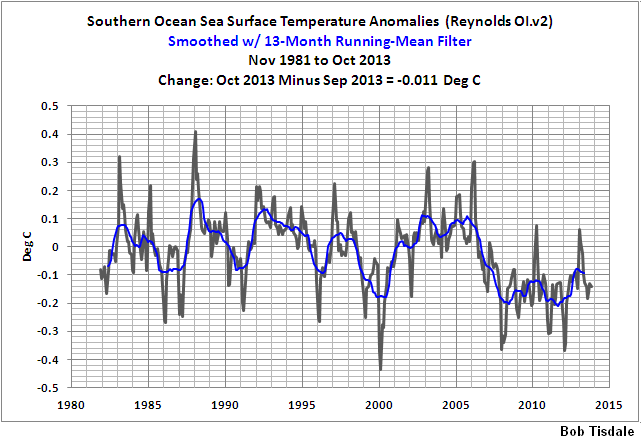
I also note that he also shows quite consistent temperature decline for southern ocean SST from yet other data-set (Reynolds Ol.v2) – see his graph here – from here.
I hate seeing trend lines where the data show huge swings compared to the trend. The next 10 years always give a different impression.
I heard once there are lies, dam lies and then there is statistics. I never could figure out why lying about dams was so bad, but I think I got the point. Anyway, I read a report recently about people who don’t believe global warming is going to end the world unless we do just what the ones who know best tell us. I think the word for those people who don’t believe is “deniers”. Anyway this report said that statistically being a denier is correlated with being a creationist. Another one I read a while ago said that being a denier is correlated with being a conspiracy theorist. It was true because statistics said it was. Then I remembered the one that said statistically there was a 97% consensus that climate scientists believe global warming is going to end the world and all. Well that seemed really cool and the headlines on the reports of the studies sounded like the truth was out there, I mean it was just settled and if you were a denier of that then you were just a nut.
Now, I am really into the climate thing, okay, and I just always wanted to do something to contribute to climate science. Not the icky part, the part about physics and chemistry and isotopes and measuring and observing stuff, for that you have to be an honest to goodness Qualified Climate Scientist (QCS). I know that. I thought maybe I could do the part about how true climate science is, like how people believe it, you know, using statistics.
So I asked a friend of mine who is for real a Qualified Climate Scientist if he thought I could do the part about consensus. He said, sure, as long as I stayed away from the hard part and just did consensus it would be okay. He said the guy who did the 97% thing just had a bachelor’s degree in physics, and even though that guy isn’t a Qualified Climate Scientist, it was okay for that guy to do consensus stuff. My friend said lots of the people who do the consensus part are even just engineers, or economists, or psychologists, so it is okay to do it as long as you use statistics. My friend knows I have at least a bachelor’s degree in physics so he knew I could do it too.
I thought, Great! I told my friend I was so excited about doing climate science.
But he said, no, no, no! If I tried to do climate science, not just the consensus part, then that would be dangerous. He said I should just do safe, consensual climate science. So I said okay, I will. He told me I would be okay just so long as I made sure to be safe, to use statistics whenever I did consensual climate science.
I was so excited. I went back to my computer to do some safe, consensual climate science, but when I got there I just kind of stared at the computer. I thought okay, what now? So I called my friend up and asked him. He said I needed data. So I said okay, how do I get data? He said it is easy for consensual climate science, all you have to do is google, no messy instruments or lab things. I said great, thanks, and hung up.
So first, by googling, I found this site: http://www.isidewith.com/poll/965637 . It asks people “Is Global Warming a threat to the environment?” Yes or No. I thought cool, that’s just what I want. I clicked on the results for different political parties and the numbers (statistics!!) are:
Party % Yes %No
Democrat 97 3
Republican 16 84
Libertarian 36 64
Green 97 3
Socialist 97 3
It was so fun I found another web site (by googling!) here: http://www.gallup.com/poll/158978/democrats-republicans-diverge-capitalism-federal-gov.aspx that asked Republicans and Republican Leaners (RRL) versus Democrats and Democrat Leaners (DDL) if they liked different stuff like socialism and all. So the numbers (more statistics!!) were
Group Percent Positive toward Socialism
DDL 53
RRL 23
So now I thought how cool would it be to find out the correlation between liking socialism and believing global warming is a threat to the environment. So I combined the numbers (statistics!) like this
Party % Like Socialism %Yes GW is a threat
Republican 23 16
Libertarian 23 36
Democrat 53 97
Green 75 97
Socialist 100 97
I had to fill in the numbers for Libertarians and Greens who liked Socialism because the Gallup poll didn’t ask them, just DDLs and RRLs. But I knew just how to do it because I had read a story about a paper about Kriging climate data. Not being a QCS, I don’t know exactly how it works but I think it is like filling in data you don’t have with what you think it should be. So I figured Libertarians are kind of like RRLs so I put in 23% for them liking socialism. Then I figured Greens seemed like halfway between Democrats and Socialists, because I read the UK Guardian sometimes and that’s just how it seems. So I filled in 75% for Greens liking Socialism. I don’t think it is exactly Kriging, so I call what I did blitzfitzkrieging, which I think means lightning fitting attack or something in German.
So, I put the numbers in Excel and did a correl(%Like Socialism,%YesGWThreat) and wow, the correlation is 0.85 between believing in GW and liking socialism. That’s really high, I think. I remember the creationist study had just 0.25 correlation between “deniers” and creationists and they said that was significant. I was so excited because 0.85 was like so much higher than 0.25 it just has to be true, I mean it is really settled. Next I needed a title for my study so first I thought “Belief in Global Warming is Correlated with Belief in Socialism at 0.85.” But then I noticed that the titles used by the guys who did consensual climate science were a lot shorter, so I just shortened it to “Global Warmists are Socialists.” And it is so cool because the statistics say it is true.
Consensual climate science felt so good I just couldn’t stop. So I noticed that 97% of each of Democrats, Greens and Socialists believed in global warming being a threat. And then I noticed, like wow, the 97% consensus study got that same number, 97%. So I did a little blitzfitzkrieging and figured the guys who did the ratings for that study were either Democrats, Greens or Socialists and did a correlation between what they believed at first and what they got from their study and OMG, the correlation is 1! I tried to think of a title for my little study on that and after shortening it I figured it should be “Consensus Raters get Results They Believe Already.”
I called my QCS friend and told him my results and he said I was doing just great. I told him I was going to keep doing consensual climate science every chance I get. He said great and just make sure I was doing it safely. I said I sure am, I am using statistics every time.
The Cowtan and Way 2013 paper should not have been published. The methodology of this paper is so bad that a 2nd grader would trash it. How this ever got through only shows the total lack of knowledge and attention in the climate science community anymore.
What garbage.
How about an unbiased look at the globe as a whole, through both of the satellite-based indices of global lower troposphere temperature?
RSS has a barely below-zero 17 year 1 month linear trend if start date is chosen at a 1996 time shortly before the century-class El Nino spike. I have yet to identify a linear trend in UAH ending at last reading with a complete hiatus being in existence even half that long. Anyone who can find such a thing, please get back to me!
An old joke from under communism: “The future is certain; it is only the past that is unpredictable.”
Cowtan and Way failing comparison to satellite data like RSS is quite relevant, and Cowtan & Way follow in a long series of repeated revisions of temperature history, turning the actual double-peak in the past century into more of a hockey stick, as in http://img176.imagevenue.com/img.php?image=81829_expanded_overview_122_424lo.jpg . If someone was naive enough to trust such revisionists, they would have to essentially believe the past is essentially greatly unknown and going to change again in the future, as again and again and again it has been drastically changed in activist publications (although publications made prior to the CAGW
movement’s existence are consistent in contrast, without the grand dishonesty movement and motive).
What F.A.H. noted is illustrative of much of the root of the problem:
From how ideological alignments work, if the Democratic Party was aligned with X, that would guarantee tens of percent of the population wanting others to believe in X just about almost whatever X was (in this case global warming). Someone can be a Democrat and not support X; it just isn’t common, though. Thus it will take a while for support for global warming claims to drop below a third to half of the population, although large enough future global cooling (not talking about subtleties in datasets but too much for people not to directly notice) will eventually overcome that.
Send the 97% here http://classic.wunderground.com/cgi-bin/findweather/getForecast?query=59427
On Friday when the high is -9F and the low is -23F I wonder if there is a fisherman in the alarmist bunch that will cut a hole in the ice on Mission Lake.
The paper is question is now publicly available at Cowtan and Way 2013 – it would be worth reading the material prior to a discussion such as this.
One of the notable aspects of their hybrid method is that UAH trends are completely irrelevant to their calculation. They use the spatial correlation of surface and satellite temperatures and the offset between them, calculated independently for each month of observations, to extrapolate the spatial pattern of surface temperatures over regions with only satellite data. Re-evaluating the spatial correlation on a monthly basis, as they note, removes any constant or time-varying bias between the two data sets. Therefore the UAH trend discussions in the opening post are not relevant.
The sub-Arctic is warming faster than the global mean, the Arctic as observed by UAH is warming faster still, hence the addition of that region to HadCRUT4 has a higher global trend than just infilling the missing regions with the global mean temperature. Simply kridging the surface temperatures (interpolation using covariances determined for the data you do have) does better than assuming missing regions have the global mean, and the hybrid method does better yet – all as validated using hold-out tests, and using independent data such as the IABP/POLES Arctic buoys. Criticism of the methods would have to address the validations as well – that hasn’t been done here.
What mins, pliz?
This article is littered with omitted words, jumbled phrases, and the like. Get a proof-reader, next time.
@ F.A.H. ….ROFL
Brian H;
The writer’s first language is clearly not English. If you read past the translation errors, there are many good points made in article.
F.A.H.
What an excellent essay.
What I find most interesting about the data presented is that for the tropics, hadcrut is essentially flat, but both RSS and UAH show a slightly negative trend. If we assume a negative trend in the tropics, and consider that energy flux is not directly related to temperature, but the fourth power of T, we could easily have a situation where the global average temperature trend is positive, but the energy balance of the planet is negative.
The article was quite interesting also.
davidmhoffer, I was thinking the same as I read through the article. It is possible. There would be little admittance of that imbalance if it ever happens. Pencils would whip.
They stitched together multiple data sets each collected by very different means and processed by very different methods, none of which show the trend individually, but only show it when stitched together? The obvious conclusion is the stitching process of disparate data sets is to blame for creating a spurious signal.
Henry Clark made the comment: An old joke from under communism: “The future is certain; it is only the past that is unpredictable.”
With all the historic data ‘homogenisation’ manipulation and torture, plus the certainty in predicting Thermageddon the day after tomorrow, this has to be the rallying call for alarmists. This comment is so apt in describing climate science, as it is practiced today, it has to be repeated:
“The future is certain; it is only the past that is unpredictable.”
I think this truly shows that just because a paper has been “peer reviewed” does not make it right. This has been a point of my discussion with Warmists. Most are convinced that being peer reviewed somehow makes it correct and incontestable. Sadly, no. To consider it correct, the results must be reproduced. Peer reviewers do not have time to do that. Reviewers only check the basic maths and methodology. That’s it.
The unfortunate aspect of the Cowtan and Way 2013 paper is that it is a computational, statistical result, predicated on infilling of data in regions with limited direct observational support. It can be argued that the “assumed” Arctic and African data cannot be disproved as there is no contradictory observational data. Of course, it can’t be proved either for the same reason. It is just a result.
Alas, because it was a Peer Reviewed study, it is popping up all over the The Internet, in blogs and opinion pieces as “proof” that The Pause is a myth.
it appears to me that , the first conclusion to draw from data reconstruction is that the error bar are underestimated or worse there can be a bias in the data.
Data lost is lost.. one step further and you are not able anymore to give an error.
Bottom line they knew that the lack of warming was a ‘real problem’ for their careers , they therefore went out to prove in fact there was no lack of warming ‘ and did whatever it took’ to pull this off .
The idea you can take weather data from one area and spread it by some ‘statistical magic ‘ over a much wider area is frankly hilarious and defines good science and common sense . Given , for example , that even two valleys next to each other can experience different weather depending on wind direction.
During last summer the CET daily max rose above its 20 year average, but now its trend is on the down slope again with the November’s Tmax fractionally below the average. The CET daily min for November also fell below the 20 year average.
http://www.vukcevic.talktalk.net/CET-dMm.htm
Compared to the 2012 November, the trend doesn’t bode well for forthcoming CET winter; my previous ‘observation’ that this winter may not be as cold as the previous two, may well prove to be wrong even before the winter proper has started.
KR says:
December 3, 2013 at 9:33 pm
—————————————
Nice try, but it won’t wash. No way, now how.
What Cowtan and Way should have done is very obvious to most. Instead of trying to justify their infilling of data, they should have validated their method.
The procedure is simple.
Instead of trying to infill data just for the sparse regions, they should have used a random algorithm to drop data from dense regions of surface data. Create 10 different global data sets and do a a Monte Carlo run infilling globally with their satellite data method.
Why wasn’t this simplest of checks done?
Well, we all know that. Every meteorologist knows that when you have widely divergent results from a Monte Carlo run, you have no predictive ability. And in the case of SKS climate propagandists Cowtan and Way, it would have shown their technique was utter tripe.
CO2 is a radiative gas. Adding radiative gases to the atmosphere will not reduce the atmospheres radiative cooling ability. The future of science, democracy and the genuine environmental movement depends on the end of the AGW inanity. Get out of the way.
F.A.H. December 3, 2013 at 8:14 pm
Brilliant! Simply brilliant. That gave me a good laugh! Thank you.
Jan Zeman: “I was not much interested in their methods (since I’m not much interested in methods of data torture, besides they have already been scrutinized by much more knowledgeable people), but rather in the following questions: “ … What such data really show and whether such data agree with other data or not?”
Your gymnastic on trends on average hemisphere temperature data of about 290 K is just mathematic gymnastic, but is senseless. All data show a similar temperature function over time with the same temperature frequencies of similar amplitudes in a range of 1 K, which is a precision of about 0.3 % for the same object.
Not such gymnastic can give answers to the basic question, what nature or geometry of temperature frequencies can explain the hemisphere or global temperature function in the past, because there is no reason, why the temperature frequencies should be different in the future.
Please see to this matter my comment here:
http://wattsupwiththat.com/2013/11/23/the-ipcc-goes-for-video-bling-and-cgi-enhanced-doom/#comment-1487084
V.
Jan Zeman,
Hmm, that’s interesting. It appears for some reason that the difference curve between the CW2013 hybrid and HadCRUt4 shows a remarkable resemblance to the UAH tlt anomaly curve for Africa 30N-30S, 19-33E, roughly covering the African gray area in HadCRUt4:
http://i1172.photobucket.com/albums/r565/Keyell/UAHtltAfrica_zps8f083c55.png
The funny thing is, the RSS tlt anomaly curve for the exact same region looks fundamentally different and is all but flat (even goes ever so slightly downhill) from 1997 to 2013:
http://i1172.photobucket.com/albums/r565/Keyell/RSStltAfrica_zps7815ebfe.png
Also, like you pointed out, neither RSS nor UAH show any upward trend for the region 82.5-60N post 2005. Rather the opposite. Theirs are pretty much equal to that of HadCRUt4 (same time, same region). Same goes for GISS’s 1200 km product which apparently covers ALL of the Arctic with its extended smoothing procedure. If anything, the trend for the region 90-60N from 2005 to 2013 is MORE down than the equivalent trend of HadCRUt4. So where is that ‘extra’ Arctic heat that HadCRUt4 is allegedly missing supposed to hide?
Antarctica? Not much warming going on there since 1997/98 (60-90S), not much heat hidden at all. Neither in GISTEMP 1200 km, in Reynolds OI.v2 (SSTa), in RSS tlt (60-70S) nor in UAH tlt (60-82.5S). And especially not since 2005 (rather downhill again, strongly so for the Southern Ocean).
So, UAH tlt Africa central N-S axis. That must be where CW2013 found the missing heat of HadCRUt4. Too bad (?) they didn’t have the time or resources to cross-check with RSS tlt.
“The future of science, democracy and the genuine environmental movement depends on the end of the AGW inanity. Get out of the way.”
Well said Konrad.. It is WELL PAST time that this myth was destroyed.. and the funding stopped.
Once the funding stops, people like KR can get on with their lives (without climate funds) and stop trying to defend the indefensible.
F.A.H.. you are in error.
Once you introduced this abbreviation. “Qualified Climate Scientist (QCS). “,
You should thereafter, used said abbreviation, meaningless as it is !
I would have been much more impressed that Cowtan & Way had got something of interest if they had managed to align the two data sets they were using (UAH and HadCRUt4) before they did any of their infilling.
The fact that we still have not achieved even that small measure of agreement to date says an awful lot about climate science.
The two data sets are supposed to be representative of the same ‘Global Temperature over time’ after all.
I keep wondering if I’m missing something critical. If you use kriging to infer absent data-points from near by (or not so near by) data points, how does that work in a dynamical system? I could see the value maybe where one was inferring, say, ore concentration in geological deposits, because the ore will still likely be there when you go to dig it up.
But when, for example, ice melts and/or moves elsewhere under the influence of wind-/currents-/salinity-/temperature-changes, what can you learn about the system by kriging as though the variables are fixed or vary in a constant and predictable manner? Or is learning about a dynamical system not the point of the exercise?
Treating the two data sets in question as the true ‘proxies’ they are for the notional ‘Global Temperature’, aligning them by OLS, scale and offset to produce the least differences in the period of overlap and then assuming that the UAH data set is the more accurate (because it has the greatest coverage without using estimated or extrapolated values) we get this graph
http://woodfortrees.org/plot/uah/plot/hadcrut4gl/offset:-0.285/scale:0.9/from:1979.
Given that the above methodology is the one used throughout climate to align data sets I think that is more likely to be accurate than point by point infilling.
Can be extended to add RSS, GIST, etc. with ease 🙂
@AndyG55
Oh wow, thanks for pointing out that error. Climate science is just so hard. I bet everybody was totally freaked out when they got to the part where I said Qualifying Climate Scientist after I already said that meant QCS and they just had no clue what I was trying to say. I mean they must have wondered did I leave out like a 2 or III or something, like did I mean a QCS III or QCS 2 or what. It must have been so confusing.
And this googling just doesn’t work all the time. I keep googling for “style guide for comment submission to WUWT” and it just doesn’t find anything for it. There’s all these other style guides for other places, but now I am so scared I made lots of other errors. I forgot to put in the line numbers, and the corresponding author, and the reference list and on an on. Climate science is just so hard. Now I am just sure nobody understood a word I said.
Anyway, thanks for pointing out the error.
Negative Arctic amplification yes. If you check the Arctic ocean UAH trend from late 2004 instead of the high point at Jan 2005, you’ll see a positive trend at least till early 2013:
http://vortex.nsstc.uah.edu/data/msu/t2lt/uahncdc_lt_5.6.txt
There really isn’t much mystery about the Cowtan and Way paper. Hadcrut 4 omits a lot of grid cells from the global average because of lack of data. The effect of omission is as if the cells were infilled with the global average. That is often not a good thing to do. Here the Arctic and Antarctic trends have been quite high, so filling polar cells with the global average is not good. Any local average would be better. That is the main effect of what C&W do.
I’ve shown here the effect if you make a very simple change – just infill with the appropriate latitude average rather than the global. It substantially increases the HADCRUT trend – not as much as C&W, because it is still not a very local approximation. If you don’t like the idea of infilling, it’s arithmetically equivalent to calculating latitude means, and then forming the global as an area-weighted sum of those means.
You can see from the graph that both this simple change and also the uAH data set give a polar amplification similar to, though somewhat less, than C&W.
I see that this post shows a discrepancy between HAD4 and C&W post 2005, and goes on to claim the trend in this period was negative. What it doesn’t show is what the C&W claimed trend actually was. HAD 4 was quite negative – -0.088C/decade. If the C&W correction makes it positive, it isn’t by much. And yes, UAH shows a rise.
Show us data (instrument readings, not “adjusted” temperatures) from a global network of properly sited, properly designed, properly calibrated, properly installed temperature sensors. That way we would know how much the globe has warmed.
Show us a universally accepted climate model which accurately replicates the instrumented temperature history. That way we might have some confidence in the modeled future scenarios.
We have spent well over $100 billion analyzing data that aren’t and models that don’t. How much more must we spend to obtain real data and functional models? The ensemble climate models continue to diverge from even the “adjusted” global temperature anomalies, which are themselves inconsistent. This situation hardly constitutes a rational basis for revising the global energy economy.
People know that info gathered by way of torture is seldom reliable. Yet AGW promoters rely on torture of data- not to mention disappearing, fabricating and ‘adjusting’ data- as a matter of course. And the inability of AGW hypesters to reconcile their conclusions about climate crisis with the problem that none of their trends are significant is unavoidable, No matter their name calling, arguments from authority, hiding from FOI requests or their $billion per day money advantage. All they can rely on is pathetic attempts to re-brand and communicate their message.
Cowtan and Way are merely the latest is a series of wannabe, modern day, much improved embodiments of Rumpelstiltskin, purportedly able not only to weave straw (bad data) into gold (good data), but also to weave nothing (missing data) into gold (good data). Just another reason to believe that the status of what purports to be climate science is Grimm.
@F.A.H. Best piece of satire I’ve seen here, or anywhere for that matter, in a long time. Thanks.
Maybe i found something to proof global warming bogus. But the strange ting that how easy it looks like its still difficult to work whit. But what i have done now the numbers show that global warming and cold winter,s don’t go to getter that well for proofing global warming.
In fairness to Cowtan and Way, readers should keep in mind that Phil Jones contributed to the design of HadCRUT4 and it should not be considered sacrosanct as an estimator of global temperature. Its omission of Arctic gridcells will result in a downward bias in periods where the Arctic is warming faster than the global average and will exacerbate model-data discrepancies. Cowtan and Way estimated the effect of HadCRUT4 leaving out gridcells. I haven’t parsed the details of their method; but any method that includes the Arctic gridcells will increase the trend – there’s no reason for suspicion of this result. In a relatively quick look at the data, it seems to me that the proposed differences are pretty much immaterial for models running hot relative to observations, which, in my opinion, is the issue of primary interest.
Is somone going to be able to drive from Iceland to Greenland this year?
Nick Stokes says:
December 4, 2013 at 5:26 am
(summarised)
A even more suspicious model than C&W given that it takes no account of average vertical height for Latitude bands, i.e. Lapse Rate (which Dr Way was kind enough to point out is not the least of the problems with trivial models such as this). More likely to get data near the coasts than on the mountain tops you know.
If you were to go the Dr Spencer’s site and download the UAH data for 60 North to 85 North (the best summary that UAH can give for the Arctic I think other than gridded), you would observe that the trend for the last decade for that column (over 2003-2013) was something like 0.0007C which I think we can all agree is flat. Indeed the last year’s figures were almost all below the trend line. Something I suspect that Artic Ice this year is also showing us.
To somehow translate that into a recent Artic Polar rise does take some believing for either C&W or you but…..
Ulric Lyons says:
December 4, 2013 at 4:54 am
“Negative Arctic amplification yes. If you check the Arctic ocean UAH trend from late 2004 instead of the high point at Jan 2005, you’ll see a positive trend at least till early 2013:
http://vortex.nsstc.uah.edu/data/msu/t2lt/uahncdc_lt_5.6.txt”
But if you check the same data since 2003 to date you get ‘flat’ (0.0007C) as a trend with a tail down during this year.
Will that continue? Who knows.
Now if C&W can omit the CET area from their data and get the figures that it produces I might be more impressed. http://www.metoffice.gov.uk/hadobs/hadcet/ That’s been in ‘free fall’ since 2006 and show no sign of stopping yet! It will of course eventually. The question is, when?
Cowtan-Way is in many ways an admirable attempt at filling in missing temperature data, but one feels referees should have queried the way the discrepancies with HADCRUT4 widened so markedly after some point in 2007-2009, see figure 5 ((b) seems particularly revealing). There is not that much data presentation in the paper and it is figures 5 and 6 which deal with the real issue of comparison between their ‘hybrid’ extrapolation and the existing global temperature record. The hybrid method is estimating small temperature differences, before adding them back to the UAH record. The scope for statistical mishaps is obviously considerable. And kriging is not a robust technique in this regard, as acknowledged by the extra care taken in Rohde et al(2013). Taking this into account, referees really should have asked for, and the authors provided, a more detailed explanation of why close agreement over 25 or so years turns into a big discrepancy in the last few years.
@ FAH –
“Belief in Global Warming is Correlated with Belief in Socialism at 0.85.”
Well, yeah, but that is only because the supposed “cure” for Global Warming matches a Socialist agenda.
If the “cure” was something that didn’t promote Socialism, the correlation would not be so good. The real idea isn’t to “save the world”.
If more of the environmentalists realized this, they wouldn’t be so supportive of CAGW by CO2.
I suspect you already know this though.
🙂
Anthony says:
“I was not much interested in their methods (since I’m not much interested in methods of data torture..”
To be consistent, this comment applies, as well, to some of this site’s most often posted authors. I understand how the temptation to attempt to drag some meaning out of meaningless data can overcome one as I have in my youthful days of data analysis done the same. Perhaps you could simply note “DT” when the data is being tortured to save some of us from spending too much time reading the essay before throwing our hands up and screaming or pulling our hair out. Today’s desktop computing power and speed make data torture too easy. Try it with punch cards sometime.
I started reading this to see if there would be an interesting examination of the Cowtan and Way “result” and found a completely unwarranted and ill informed attack on the UAH dataset. I mean holy crap, you cannot have read any of the many papers examining the satellite data carefully at all.
A regional warming trend is what C&W are claiming to define a global warming trend. This is a Computational Reality, i.e. the math works out this way when you get a global average. The Representational Reality, i.e. what is really going on, is that the “globe” has warming and cooling, and the warming is slightly greater than the cooling, but it is not global. Regionality rules in a strange science where a global blanket is supposed to warm all points equally through additional back-radiation.
According to the alarmists, math rules while nature drools.
F.A.H. says:
“So first, by googling, I found this site: http://www.isidewith.com/poll/965637 . It asks people “Is Global Warming a threat to the environment?” Yes or No. I thought cool, that’s just what I want. I clicked on the results for different political parties and the numbers (statistics!!) are:
Party % Yes %No
Democrat 97 3
Republican 16 84
Libertarian 36 64
Green 97 3
Socialist 97 3″
Please note that “Green, Socialist and Democrat” are redundant. One of the problems in public perception is the use of anomalies, ie delta T’s, in graphical presentations, which automatically introduce scale bias into the visual which result in “hockey sticks”. Though it is necessary to analyse changes, perhaps some graphical depictions of actual temperature should accompany these analyses to ensure that folks understand the actual magnitude of what is happening. Which ain’t much in the real world.
My favorite post here continues to be the fellow who recently posted that he constructed a model based upon his historical footprints and it tells him where he’ll be in the future. What a great comment! Too much of that exact thing is going on, on both sides of this debate. Goes along with Anthony’s “Data Torture” comment. Reminds me of what Leif told me once when I accused him of being an ass#### (not in so many words) and used it to be one myself and though he admitted the accusation (kind of) he indicated it was no excuse for me to “stoop to his level”. One of my favorite Leif comments. We need to be agressive in our promotion of the truth while avoiding the missuse of data. Calling out the warmists data transgressions is always valid and admirable, as this post does quite well.
Something that I haven’t seen mentioned yet.
Let’s suppose, for a moment that Cowtan and Way have identified significant warming in the Arctic which significantly increases the global temperature anomaly. Would that not constitute some regional warming affect, rather than global warming?
I am very inspired by the robust “blitzfitzkrieging” methodology F.A.H. describes. I will have to check that my tax accountant is up to speed with best practice 😉
F.A.H. says:
December 3, 2013 at 8:14 pm
BRILLIANT! Sounds like a dead serious report shifted 180° that I would find on SkS et al.
BC
Donald L. Klipstein says:
December 3, 2013 at 8:23 pm
“I have yet to identify a linear trend in UAH ending at last reading with a complete hiatus being in existence even half that long. Anyone who can find such a thing, please get back to me!”
Here you have it.
OK, it is not perfectly flat – it has the slope +0.093C per thousand years, but at least the trend period is more than half long than the 1996.75-2013.75 RSS period.
It looks like quite a mystery where the C&W got their rising trend in their data after 2005.
JohnWho says:
December 4, 2013 at 7:57 am
@ FAH –
“Belief in Global Warming is Correlated with Belief in Socialism at 0.85.”
Well, yeah, but that is only because the supposed “cure” for Global Warming matches a Socialist agenda.
If the “cure” was something that didn’t promote Socialism, the correlation would not be so good. The real idea isn’t to “save the world”.
If more of the environmentalists realized this, they wouldn’t be so supportive of CAGW by CO2.
———–
You’re right, but I think that number is about 0.6 ±17 environmentalists world wide.
@fah:
Excellent work, Nobel Prize standard.
I found your explanation of Kriging particularly enlightening, before reading it I had always it believed that it was a posh word for “making stuff up”, now I know better!
RichardLH says:
“Will that continue? Who knows.”
The Arctic ocean gets warmer with the negative NAO/AO episodes, they increase during weaker solar cycles. So apart from the odd exception like this during year, there should be a continuation of elevated Arctic temperatures.
Having read the essay here, I am not entirely sure that the author, Jan Zeman, actually read Cowtan and Way 2013. He does not even approach the real questions Cowtan and Way raised, nor answer them, nor refute them. C&W is about “what happens when we infill missing temperature data for geographical cells not currently covered”? This graph
http://www-users.york.ac.uk/~kdc3/papers/coverage2013/media_summary.png
is their summary (don’t blame me, it is their site)
Whenever a huge data set problem is approached with a different method, one had better get a different answer — or we’ll know you cheated in some way.
Cowtan and Way end up with a difference on total effect or their new global calculations, of about gee, even maybe 3/100ths of a degree. Both above and below HADCRUT, depending on the year, with, as mentioned, the years after 2005 showing a consistent difference (HADCRUT low, C&W higher by the hundreths of a degree).
The fuss about C&W isn’t really with their results, good, bad, or indifferent (as Steve McIntyre seems to say December 4, 2013 at 6:30 am) it is with the hype and spin they and others made of it.
And, of course, their attempt at the CliSci version of the Red Scarf Follow ( http://tinyurl.com/padltg2 🙂
KR says:
December 3, 2013 at 9:33 pm
One of the notable aspects of their hybrid method is that UAH trends are completely irrelevant to their calculation… the UAH trend discussions in the opening post are not relevant.
The trends are maybe “irrelevant” (sic!) for the calculation, but they are quite very relevant for the invalidation of the results. And I would think that to such degree, that it begs retraction of the article.
-There is actually a descending trend in the UAH data for tropics for whole the 1997-present period, so the UAH data for tropics cannot in any consistent manner contribute to change the flat 1997-present trend in the HadCrut4 tropics.
-There is no appreciable trend whatsoever in the UAH global data from 2005, yet if C&W global data contain such trend they are clearly inconsistent with the UAH dataset itself in the first place.
– There is actually a descending trend in the Arctic UAH data for the period 2005-present, so the UAH data for the Arctic can’t in any consistent way contribute to rise the Hadcrut4 values up for the period and change the descending global trend (-0.06C per decade) for the period into a rising one.
-There is actually a prominent rising trend for the Antarctica land in the UAH dataset (+0.62C per decade – by far the highest in the UAH dataset for the period), but it is absolutely contradicted by majority of the Antarctica surfacestations especially those inland and also by the RSS dataset (showing ~27 times less steep slope for the period even in the land/ocean data combined), which means already the validity of the UAH dataset for the Antarctica is quite in question.
-There is actually a rising trend for the southern polar ocean in the UAH dataset, but it is contradicted by the Reynolds Ol.v2, RSS (showing still more than twice less steep slope for land and ocean combined) and especially the sea ice index – which I would think means the direct falsification, because the sea ice index dataset is arguably much higher quality than UAH data for ocean, Hadcrut4, not speaking C&W datasets for very obvious reason – it is much easier to measure global seaice extent and area than temperature.
-There is no appreciable trend in the northern moderate zone UAH data for the period since 2005, so it can’t in any consistent way contribute to rise the Hadcrut4 global values up for the period and change the descending global trend (-0.06C per decade) into a rising one for the period.
-There is actually a rising trend for the southern moderate zone in the UAH data for the period 1997-present, but it is absolutely contradicted by the southern moderate zone RSS data, so even if this would be the source of the trend in the C&W global data (but the UAH-southern moderate zone trend is anyway too small for it and there is slightly descending trend in both Hadcrut and HadSST3 for SH), it would be directly contradicted by other dataset and therefore even so in doubt.
So I think we exhausted here all possibilities the C&W global trend (maybe irrelevant to you, but depicted prominently at the article webpage) is doubtless and when we consider this and this, there is quite a negligible chance the C&W are right that there is an appreciable 1997-present trend in the global surface air temperature anomaly – especially when we see the global sea ice trend – which is rising at very least from 2001 for both extent and area, not speking that virtually all global temperature anomaly datasets, including UAH LT-global, contradict C&W for the period 2005-present and multiple even for the 1997-present.
As it looks there are too much things contradicting C&W for it to be true and it actually has a lot to do with trends.
davidmhoffer says:
December 3, 2013 at 10:16 pm
“The writer’s first language is clearly not English.”
Yes, I’m not and English native, I’m actually a Czech. I did what I could to make my points in your language.
RichardLH says: December 4, 2013 at 7:06 am
“Nick Stokes says:(summarised)
A even more suspicious model than C&W given that it takes no account of average vertical height for Latitude bands, i.e. Lapse Rate”
It’s not a model, and there is no way of incorporating such features. The fact is, there’s missing data, and whatever you do with it attributes some value to the missing. This isn’t just climate, it goes with any data set. You can’t get around the fact that the data is missing; the best you can do is choose a replacement value that does least harm.
Simple omission attributes the global average value to those cells. The objective of any analysis is to find a better estimate. Since there is a clear latitude effect, the latitude average is simply a better choice. I’m sure it is not the best.
Volker Doormann says:
December 4, 2013 at 1:31 am
“Your gymnastic on trends
It is not my gymnastic. Just to remind you: it were Cowtan and Way who came with their bold red global trend, claiming “warming two and a half times faster than Met Office estimates” even before their paper was available for reading. And they did it claiming the alleged underestimate is caused by the insufficient coverage in the tropics and polar regions. -But unfortunately for a period, when there are for most of the time flat or rising global sea ice trends (sea ice is estimated quite very exactly and with cadence which actually allows to decide trend significance really considerably earlier than with the global temperature anomaly records) – I mean period 1997-present where the global sea ice trend is flat or rising since at least 2001, and when the UAH dataset they used shows a descending temperature trend in the tropics. So I would think that with the “trend gymnastic” you complain not to the right person which your complaints should be addressed to in the first place.
davidmhoffer says:
December 3, 2013 at 10:20 pm
“we could easily have a situation where the global average temperature trend is positive, but the energy balance of the planet is negative.
It could happen, but not for long, because the heat dissipates also faster with the fourth power of T.
There is likely also the opposite possible with oceans for the periods when there is the solar cycle minimum but peak of the visible spectrum region which has likely antiphase varibility in the spectral irradiance according to SORCE SSI data – it heats the ocean deeper, because it penetrates considerably deeper than IR and UV, but it has not much appreciable immediate temperature effect on its surface.
geo says:
December 3, 2013 at 10:56 pm
“They stitched together multiple data sets each collected by very different means and processed by very different methods, none of which show the trend individually, but only show it when stitched together? The obvious conclusion is the stitching process of disparate data sets is to blame for creating a spurious signal.
Exactly. To take just part of one dataset, say tropics land, fill holes in another dataset with it, but not notice that the first dataset actually shows cooling for the tropics and yet another too, while the dataset where they implant the data shows flat trend, so inevitably they end up with rising trend, that’s what I call cherrypicking. They could immediately show the UAH and GISS datasets, which actually show the rising global trend (UAH most likely because it has doubtful trends for the tropics and Antarctica land) and they could spare their time -but in such case they wouldn’t have their publication…
Aussiebear says:
December 3, 2013 at 11:50 pm
“It can be argued that the “assumed” Arctic and African data cannot be disproved as there is no contradictory observational data. Of course, it can’t be proved either for the same reason. It is just a result.
Actually in both the Arctic and tropics their trend is contradicted by the UAH dataset itself, and also by the RSS, the Antarctica UAH then contradicted by the surfacestations, RSS and sea ice. A result which is contradicted by other data shouldn’t be used until the contradiction is solved. And I very much doubt Cowtan and Way didn’t know their results are contradicted by the RSS, but they don’t mention it despite the obvious is couple of clicks away from them on the internet and despite they mention RSS in their paper even in evaluating sense. I very much suspect a scientific dishonesty is at play here.
The data and calculation link in article points to an Excel worksheet without the appropriate extension. Add the extension .xlsx to the downloaded file in order to open it in MS Excel or Libre Office Calc.
Kip and Steve may have already stated this above; but I’ll add my spin.
Jan’s article above reminds me of the ‘razzle dazzle play’; lot of flash, dash, fast talk and mirrors meant to convince observers of anything but where the ball is. Good article, but it puts hear say against someone’s published paper.
That there are issues with the paper is obvious. Just how a small subset of the globe, under icy conditions manage to change global temps into a hockey stick rise borders on the absurd. To me, this is part of Jan’s point above. But it doesn’t disprove C&W 2013 directly.
Take the C&W 2013 paper itself along with it’s data and methods apart to find where they abducted the data.
I calculated the C&W and other trends for 2005-12. The HAD 4 trend was -0.0904 °C/dec. That’s a little different from the published version which is NH+SH; I just did global, for consistency. The Cowtan/Way hrbrid global trend was -0.0377 °C/dec. Both are less than UAH at -0.0077 °C/dec. The plot by latitude is here.
So, the bottom line here and in other threads regarding C&W is that only those who want to believe the result will ignore the data manipulations?
Typical CAGW by CO2 believer thought process.
So, what’s new?
Doug proctor says:
“Regionality rules in a strange science where a global blanket is supposed to warm all points equally through additional back-radiation.
According to the alarmists, math rules while nature drools.”
You have it wrong. Regionality indeed does rule because the Earth’s heat engine a primary source and 2 major sinks, a circulating central heating system with temp anomalies (e.g. PDO/ENSO) and the planet has geographical features such as large mountain ranges that can dam and/or direct air-masses in preferred directions in the steering of jet-streams.
Back-radiation is more effective at the poles due to drier air that CO2 has less competition from and the IR window is more suited to capture via CO2. The tropics are moist and the CO2 GHE is weaker. (I talk here of the instantaneous effect and not the longer term H2O/WV feed-back). The planet is spinning and so a Coriolis effect away from the equatorial zone causes an equalisation with the PGF and creation of thermal winds aloft giving a consequent mass circulation of air to/from cold/warm/dry/moist regions. There is much more landmass in the NH locking in the arctic sea-ice and making it less saline (but also making it vulnerable to melt). Antarctica is “isolated” both by the Antarctic Circumpolar Current and by the strong westerly winds blowing in the Southern Oceans (exacerbated by the O3 hole). It is a massive frigid, high continent (ave height 12000ft). Warming there is effectively limited to the peripheries where glacier melt may be reducing salinity and offshore divergent winds pushing sea-ice further afield during winter to melt through summer.
When realising also that a weaker temp gradient exists towards the Arctic, then a weakening of the polar jet-stream results. This more sluggish jet meanders more meridionally and disrupts more easily, so there can be big regional differences, at least on seasonal scales as cold/warm air is advected south/north and consequent drought/heat cool/wet zones can get *stuck” more easily. We have seen examples this in recent Euro winters.
Linking this all together shows you have a situation where “regionally” indeed does rule.
And it will only get greater in a (asymmetrically) warming world.
Jan Zeman, I don’t know if there’s any merit to your essay or not, but I do know that your grammar and punctuation leave a lot to be desired. If English is your second language, perhaps a native English-speaking proofreader would have been a good idea.
No insult intended, just an observation. Presentation is as important as content.
Kristian says:
December 4, 2013 at 1:36 am
“Antarctica? Not much warming going on there since 1997/98 (60-90S), not much heat hidden at all. Neither in GISTEMP 1200 km, in Reynolds OI.v2 (SSTa), in RSS tlt (60-70S) nor in UAH tlt (60-82.5S). And especially not since 2005 (rather downhill again, strongly so for the Southern Ocean).
So, UAH tlt Africa central N-S axis. That must be where CW2013 found the missing heat of HadCRUt4. Too bad (?) they didn’t have the time or resources to cross-check with RSS tlt.”
I think they very well know the RRS doesn’t agree as doesn’t agree any other global temperature dataset – that’s why they dit all that – to have their bold red trend allegedly in the HadCrut4 (messed up), their publication and their couple of days fame – others soon find out whole the thing stinks, but the doubt will remain between the people who don’t understand, so mission accomplished for the alarmists – I bet it would need the seaice to descend down to the Scotland for the journal to retract their paper.
Nick Stokes says:
December 4, 2013 at 1:09 pm
“You can’t get around the fact that the data is missing; the best you can do is choose a replacement value that does least harm.”
So how’s about taking the records in the various data sets where they overlap in time, doing an OLS on the whole of those various data series in that time period and then aligning them by adjusting scale and offset?
Uses all of the available data rather than some smallish sub-set. Much less likely to be in error then surely?
Basically treats them all as proxies to the underlying ‘Global Temperature’ but without any preconceptions in area or importance (other than the satellite series have a larger measured coverage).
http://woodfortrees.org/plot/rss/offset:-0.09/plot/uah/plot/hadcrut4gl/offset:-0.29/scale:0.85/from:1979
Nick Stokes says:
December 4, 2013 at 3:32 pm
“I calculated the C&W and other trends for 2005-12. The HAD 4 trend was -0.0904 °C/dec. That’s a little different from the published version which is NH+SH; I just did global, for consistency. The Cowtan/Way hrbrid global trend was -0.0377 °C/dec. Both are less than UAH at -0.0077 °C/dec. The plot by latitude is here.”
Care to plot that with an area weighting so that the importance of the various latitude bands can be related to their individual contribution to the Global figure? Given that the 40S to 40N bands appear to be below 0 and comprise a much greater area than the bands outside that.
Ed Reid says:
December 4, 2013 at 5:44 am
Cowtan and Way are merely the latest is a series of wannabe, modern day, much improved embodiments of Rumpelstiltskin, purportedly able not only to weave straw (bad data) into gold (good data), but also to weave nothing (missing data) into gold (good data). Just another reason to believe that the status of what purports to be climate science is Grimm.
Well said. I’ll add that what all this people don’t realize is that actually most of the heat in the climatic system is in the ocean (I don’t say hidden), its temperature just slightly changes with it and it takes long time for fluctuations of this content to realize in the surface temperatures. As it takes for a photon created by the fusion in the solar core order of tens to hundreds of thousands of years to get to the Sun’s surface (then travel the 8 minutes to Earth and then penetrate the ocean get absorbed somewhere between zero and 200 meters depth and create the heat there), it takes for the heat to get from the depth some time to get back to the surface. I note that the deep penetraing radiation is the visible specral region, which varies in antiphase to solar cycle, so no correlation study of OHC with TSI would ever succeed to find a positive correlation even if we would be able to exactly measure the thousandth of degree changes in the ocean temperature and get exact OHC profile. For determining the surface global warming or cooling trend is much easier to measure the sea ice extent and area than make the global surfacestations composites. It is also good to note the satellites are unable to measure the surface temperatures, they have good coverage, but what they actually measure is the temperature of the atmosphere in quite thick layers which even for the LT is only a proxy to surface temperatures and the correlation is far from 1. So to infill the satellite data into a surface dataset itself is quite doubtful.
RichardLH says: December 5, 2013 at 3:03 am
“Care to plot that with an area weighting so that the importance of the various latitude bands can be related to their individual contribution to the Global figure?”
I’ve given the area-weighted totals; you don’t have to estimate by eye.
timetochooseagain says:
December 4, 2013 at 8:12 am
“I started reading this to see if there would be an interesting examination of the Cowtan and Way “result” and found a completely unwarranted and ill informed attack on the UAH dataset. I mean holy crap, you cannot have read any of the many papers examining the satellite data carefully at all.
This was not intended as an attack on the UAH dataset at all. In fact I thought I have restrained myself from such implications enough.
But it doesn’t look like that when somebody implies it. So I must declare that I don’t have anything against the UAH data. I note it doesn’t completely agree with RSS, but that’s all. Satellite measurements measure temperature of the atmospheric layers, not surface. It is almost impossible to measure the real surface air temperature as the surface stations do – that’s why nobody does it. It is not problem of the UAH data when one applies this proxy to the surface temperatures nearly as if it would be the surface record itself and ends up with a doubtful result, which for some parts is even contradicted by the UAH dataset itself (e.g. the tropics or Arctica)
Jan Zeman
Kip Hansen says:
December 4, 2013 at 11:07 am
Having read the essay here, I am not entirely sure that the author, Jan Zeman, actually read Cowtan and Way 2013. He does not even approach the real questions Cowtan and Way raised, nor answer them, nor refute them. C&W is about “what happens when we infill missing temperature data for geographical cells not currently covered”? This graph
http://www-users.york.ac.uk/~kdc3/papers/coverage2013/media_summary.png
is their summary (don’t blame me, it is their site)
I actually did, not only the presentation, but the paper itself – and what you link is exactly what I didn’t like – the bold red trend implying the media message “there is a steep temperature trend”, 25° steep (I’ve actually measured it for fun), not 10° steep. Which according to their own figure 5 in their own paper mostly comes into existence in their hybrid data after 2005 where nearly all comparable data available contradict such development of the global surface temperature anomaly. I’m not so interested in their questions I’m more interested in the result and the result what happens when satellite data measuring something else than surface temperature are infilled into surface record empty cells is clearly bad and especially in its presentation you link which I consider being more a propaganda than a serious presentation of scientific results.
wlad from brz says:
December 4, 2013 at 2:17 pm
The data and calculation link in article points to an Excel worksheet without the appropriate extension. Add the extension .xlsx to the downloaded file in order to open it in MS Excel or Libre Office Calc.
The spreadsheet extension is actually .xls not .xlsx. It is created in the Open Office and exported to .xls Excel 97/2000/XP format, it opens without problem for me and as I checked with my colleague for him too. So if there is a problem it is most likely on your side.
Thinking through the logic underlying the C&W what is happening is that they are re-confirming that the HadCRUT4 data series has a large upward trend in time in it.
Basically there are holes in the HadCRUT4 data set. By bridging/infilling between known data points on either side of the hole they can then insert the missing values. This is done by using a lower trend data set (UAH) but force adjusted to the HadCRUT4 set on a month by month, cell by cell basis.
This skips round the rather inconvenient work of aligning the two data sets first (over the time they overlap).
If they in filled with a non-adjusted UAH value (i.e. absolute rather than relative) then I suspect the trend they discover would disappear.
Or OLS align the data sets directly
http://woodfortrees.org/plot/rss/offset:-0.09/plot/uah/plot/hadcrut4gl/offset:-0.29/scale:0.85/from:1979
ATheoK says:
December 4, 2013 at 2:48 pm
it puts hear say against someone’s published paper
What “hear say” you mean? I actually put official datasets against (a result made using one or two) and calculations made from them – linked in the above article.
Take the C&W 2013 paper itself along with it’s data and methods apart to find where they abducted the data.
Why? I’ve stated quite clearly in the article I’m not much interested in their methods. And to brighter ones it is quite clear where – they used the UAH TLT data (which is the record of lower tropospheric layer temperature anomaly which is only a proxy to the surface temperatures – and especially in the polar regions where the solar irradiance has high incidence angle and anyway also more than half of it which eventually reaches the surface is immediately reflected by the snow&ice back to the atmosphere, so what TLT actually measures there is more the insolation variability – at least clearly more than the surface temperatures … that btw is likely one of the reasons why the RSS doesn’t even bother to measure the TLT at the highest latitudes, where the average insolation incidence angle is close to 90° and where the proxy quality of the TLT to the surface temperatures tends to zero…) nearly as if it were the surface data itself. I didn’t mentioned it much openly in the article, because I’m decent person and the task was to falsify their resulting trend, not to embarrass the authors.
Others also pointed out other or related problems I linked in the article.
Whether their article is published or not it doesn’t much matter, it if anything makes the things worse, because their “‘razzle dazzle play’ lot of flash, dash” resulting red bold trend quite clearly disagrees not only with multiple other datasets including even sometimes perhaps with the UAH data itself, but with common sense (especially when we consider their own article in the figure 5 quite gives a hint where/when the red global trend has most of its origin and that there is the rising global sea ice trend for the same period which due to higher cadence of the daily sea ice data is unlike the temperature anomaly trends already on the edge of the statistical significance – and the trend in fact is flat or rising in period at least since 2001…) – and in my opinion quite begs retraction.
Jeff Alberts says:
December 4, 2013 at 6:14 pm
Jan Zeman, I don’t know if there’s any merit to your essay or not, but I do know that your grammar and punctuation leave a lot to be desired. If English is your second language, perhaps a native English-speaking proofreader would have been a good idea.
No insult intended, just an observation. Presentation is as important as content.
Yeah, you are absolutely right, I’m not English native. I in fact thought somebody who is will at least read the article before publication and if needed correct the language. And I quite wonder, why there were made certain changes in it, but the language problems were not corrected. I hope you at least understand the graphs and ideas.
Reply to tumetuestumefaisdubien1 December 5, 2013 at 3:47 am ==>
1. If this user is really Jan Zeman — would you PLEASE comment under your real name, or at least the same name used as author of the essay in question? Truthfully, it makes you look rather silly. If your real name is Jan Zeman, I suggest you use it. If your real name is tumetuestumefaisdubien (where ever the word breaks go), that’s OK too. But use just ONE name, the same in both places.
2. In my opinion, you are attacking the paper’s conclusion (well, part of it), without addressing the paper , its methods, found data and results themselves. This is not science — this is simply a slash-and-hack attack. WUWT has its own resident slash-and-hack attackers and has no need of another. If you wish to simply comment that you think other data and other methods — your chosen data and yourchosen methods — don’t support their conclusions, that’s fine, but don’t pretend to to be addressing the paper. You are just taking exception to a single phrase (not even a whole sentence) from their paper. C&W already state that other methods and data don’t support their claim — this is, in fact, the root of their claim. To prove it for them does not inform us of anything new — we knew that when we read C&W 2013.
3. I though C&W were spinning wildly too — see my comments at http://tinyurl.com/padltg2 .
Who be you!? Jan Zeman?
Your article above is the razzle dazzle.
Putting official datasets against C&W 2013, does what? Here are apples, there are pears. You did not show us errors in the C&W 2013, methods, mathematics, spatial, data and so on.
This leaves your article as a statement of your faith, your opinion of why ‘you’ believe C&W 2013 findings are in error.
Where is the proof C&W 2013 has errors in their reconstruction? That there are errors, many of us agree; but evidence is necessary to convince others and to progress in the world of published papers, rebuttals or confirmations..
reply to
Kip Hansen says:
December 5, 2013 at 7:28 am
First, I’ve already replied this once yesterday (our time here in Europe), but my post never appeared here – which I find quite weird under my own article. I would think that if the WUWT doesn’t want presence of my opinions here I rather wonder it first publishes my article. And in any case one could find it quite unfair.
Second, next time completely avoid directive and offensive tone. The GD arrogant outbursts will have no discernible effect on my decisions anyway. My identity is purely my private business and it only tells scores about you if you call it silly. Not speaking that I have this nick here for years and I will not change it just because you chose want me to, not speaking it is not easy in the wordpress system.
Third, the result or conclusion, or the “red scarf” bold red trend if you want, is what only I find possible to falsify and so maybe scientific in nature with the C&W13.
The rest I don’t at all. – It is inherently impossible to falsify method which using the dataset measuring something else (TLT) changes outcome of a dataset measuring something else (surface temperature). Especially at the high latitudes the TLT proxy validity related to surface temperature tends to zero for obvious reasons (at least to those who unlike the Cowtan&Way, their adherents and would-like critics understand a bit the TLT satellite measurement issue) – and I don’t really even wonder the RSS doesn’t even bother to measure it there (not speaking that it is anyway quite irrelevant for the global temperatures given the area size, not speaking the polar climate has substantially different cycles due to substantially different insolation profile, there is quite different relation – if any positive at all – between the TLT and surface temperature due to relatively extremely high incidence angles of the solar irradiation, endemic cloudiness and extremely high surface albedo than for rest of the world and that a searching for a missing heat at poles through “found data” for troposphere perhaps to account for polar amplification looks especially in times of the solar activity descent unprecedented at least in the last two centuries quite more like a product of the phenomenas frequent with inmates of certain institutions than anything else).
I don’t consider the methods from the realm of science worth of that trademark and especially not in metrologic sense at all (compared to that the Hadley Center methods are relatively quite outstanding example of conservative science), so I really don’t understand why I should be interested in it more than what I deem appropriate for it or even dig in the pile of the nonsense trying to create good data literally from thin air, which good to note they likely would never do if not provided with the computer power to calculate whatever one wishes and never asking whether it has to do something with a reality or not.
But you are anyway quite out of spot when it comes to the primary objective of my article, which was not attacking the C&W13 (I don’t have anything against the authors, I don’t know them and therefore I don’t find impossible they could be congenial fellows). -Unlike my bad grammar (I can’t help myself I’m not English native) the original title of my article was changed (making now false impression it is all about C&W13) as well as other details in the article – which I find on the edge of a censorship and definitely abusive – so I’ll think twice in the future to submit anything here and you must not be too afraid I’ll competite with others here. (-I have more serious things to do than fight with windmills and with my age and education I already know the arrogance, bad manners and breeding is not something too curable as is not the ignorance.)
The primary objective of the article was to show using the suitable framework that there is no rising surface temperature trend recently (whatsoever and in general) using the real data – the data of arguably much better quality when it comes especially to what it really measures and how acurately. And the global surface temperature anomaly is especially not rising in the period where the C&W13hybrid diverges up – and I note not only according to S. McIntyre and B. Tisdale, but the figure 5 from the very paper. In contradiction to that the seaice trends are rising not only in the 2005-present period of the divergence, but – what a coincidence – have flat or rising trend quite exactly in the period the global datasets for the global surface temperature anomaly (I mean before transplanting the incompatible tropospheric data into it and naturally causing the patients health problems to exacerbate) quite unisono show flat or descending trends – in the period ~2000-1 to present.
I wonder how a research paper which has results from the very beginning contradicted by all available data including the purportedly used UAH dataset – in its case at least clearly for the divergence period – moreover putting proverbial apples into boxes with oranges (moreover in the regions where we Czechs for the content of the boxes difference would rather use our own idiom which could be translated as “sky and bagpipes”) and making literally absolutely unsubstantiated claims in their overpublicized paper summary, how it could pass a peer-review, that’s quite a mystery to me.
But in the realm of the CAGW climate propogandistic stunts in fact I don’t wonder so much – we have seen this in the past many times, including claims more or less on par with claiming that water freezes upon warming, that Earth is discwordly flat, not spinning, orbiting at circular orbit, insolated evenly from all sides with negligible variation and with surface ε=1 while at the same time applying the Stefan-Boltzman law to such outstanding planetary size piles of assumptive unrealities all peppered with unseen university kind of manners.
We have seen this many times even here, realizing we are perhaps quite alone with knowledge against the sheer ignorance, game of one legged playing the ball with paraplegic and that perhaps the only consolation which remains is that the nature especially its laws is on our side, so we will prevail – you can be sure about it as that tomorrow the sun will rise and one day you die.
Fourth, I was in fact partially inspired also by your “red scarf” article you link (btw. as I look there you still owe me the answer to my question relevant to the tricking – in that case of yourself – there in the discussion below) so I decided to have some fun with the real data and show what’s really the trick with the global surface temperature anomaly – which you apparently didn’t understand then – and maybe even didn’t want to understand judging from your “moderation note” there – and which you apparently don’t understand now either.
Jan Zeman
Reply to Jan Zeman ==> Take several deep breathes and calm yourself.
Item 1: Sorry you had a comment disappear…such is the Internet and blogging world. I am acquainted (in the digital world) with both the major moderators here and it is unlikely that they snipped or blocked your comment (unless they have some auto-magical system that deletes comments containing ‘bad words’ or something and you accidentally used them).
Item 2: You will not gain any respect by anonymity here…certainly not by using more than one false identity. It does not instill confidence in others. It is not until you state “Yes, I’m not and English native, I’m actually a Czech. I did what I could to make my points in your language.” (December 4, 2013 at 12:22 pm) that you even vaguely claimed to be the author of the essay in question. Before that, who would know? How did you expect us to find this out? When did you plan to introduce yourself by your “other” name? It is THIS social failing that is silly. Who could care what you chose to call yourself? But, we have a right to know with whom we are conversing, even if just relative to the essay and its author.
Item 3: Try not to take yourself so seriously. Please read some of the other comments, some by people who *really* know what they are talking about (unlike me). There are several of them who have pointed out the same things I do . There are lots of ways to look at global temperatures and an infinite number of opportunities to draw trend lines on graphs (I am not a fan of trend lines on graphs 🙂 C&W 2013 actually shows and proves nothing substantial — really only that a different method of infilling produces a different result (which everyone already knows). They fail to discover/state why their method produces results different in the way that they are–what’s the reason for the differences boxed in my little graphic at the Red Scarf piece?. That’s it. See Steve M and others above.
Come on, this was a good first try….don’t despair about the editing, you acknowledge yourself that your English is rough and so someone tried to sort some of it out, I’m sure. They were trying to help and make your overall piece acceptable. They did post it. If they botched a couple of “corrections” — that’s the price one pays. Maybe next time, find a native Czech/English speaker you can sit down with and work through it so it comes out understandable *and* to your satisfaction.
And, of course, you got beat up in the comments — as a reader here, you should have expected this. Ignore the crazies and learn from the dozen or so sensible, knowledgeable souls that offered their insight. Your next piece will be better if you do.
My Red Scarf Trick essay was meant to be light and humorous. I did not want to argue anything as boring as Climate Science with the readers at WUWT as a result…I still don’t.
Kip Hansen – “They fail to discover/state why their method produces results different in the way that they are–what’s the reason for the differences boxed in my little graphic at the Red Scarf piece?”
They discuss that very point on the FAQ page they put up regarding their paper:
KR == They discuss only TWO years specifically, not the departures for periods of years (HADCRUT hot 97-2000 , HADCRUT cool 2005 – present). This is the unanswered question.
Besides, they only talk at it, they offer no real analysis.
Kip Hansen – Please read the link to their FAQ; C&W discuss the effects of ENSO and the most negative Arctic Oscillation values in 50 years WRT to those years. They _have_ presented an analysis. As to the rest of the period analyzed, those are dependent on details of global distribution, and C&W give 5×5 degree maps of their data if you are interested in how the extended coverage affects global temperature estimates over time.
Jan Zeman – You have (as Kip noted) attacked the C&W 2013 conclusions without actually evaluating their methods, and (as I noted) without discussion of their validation tests – clearly holding up against hold-outs and wholly independent temperature measurements _in the Arctic_. They have demonstrated improvements on existing methods; you have not actually criticized anything in their paper. C’est la vie – just don’t expect your criticisms to be taken seriously if they aren’t relevant to the work.
The trends since 1998 are not statistically significant, the C&W results are well within the 95% uncertainty range of HadCRUT4, and as they note such short trends are just not meaningful – this is really a demonstration of the errors in looking at (too) short term trends with insufficient data, and how those can be thrown by very small changes in estimates. Trends since 2005, as emphasized in this post, are even less significant, and it is absurd to draw conclusions from them – much as comparing last week in my neighborhood (1C) to this week (14C) cannot support arguing that NH winter has ended.
KR says:
December 6, 2013 at 9:28 pm
just don’t expect your criticisms to be taken seriously if they aren’t relevant to the work.
Tell others who will or will not be taken seriously usually is a sign of pathetic weakness of argument.
Just btw if you believe that the framework of scientific method somehow too much cares about somebodys methods before result and its agreement with reality you must have confused science with a religious denomination.
The trends since 1998 are not statistically significant, the C&W results are well within the 95% uncertainty range of HadCRUT4, and as they note such short trends are just not meaningful.
I would think that what is not meaningful is usually not made in bold red and widely publicized.
Apropos the trends in the temperature records since 1998 aren’t maybe statistically significant, but as the authors note the statistical insignificance doesn’t mean there’s no trend and they are right. Quite unfortunate for them in this regard and to the claims made in conection with their red bold trend and the Gauss curve graph at their paper summary page is that actually the global seaice trends will most likely become statisticaly significant say significantly sooner than their red bold trend – which as we all know well, let’s not pretend, will regardless what methods they used automaticaly falsify whole paper. For you not to make silly assumptions and comments in the future about trends I will reveal a secret for you: the trend significance is not directly dependent on how long or short the trend period is but on the probablity the tendency is not random.
Kip Hansen says:
December 6, 2013 at 10:22 am
Take several deep breathes and calm yourself.
I’m OK, I amuse myself with all this. Although it is quite a drag when comments you spend half an hour writing then disappear. – And it is not first time – for example I replied also ATheoK last post 9:17 pm – and what a coincidence the same: as I see now it is not here. I only can hope this goes through – I think that if this goes like this the world most viewed will very soon be reported as most often loosing posts in discussions.
It is not about taking myself seriously, it is about taking issues which are important seriously. You can’t do progress with attitude of your “moderation note” and mentoring others i.e. about what to take seriously.
It is not intended to offend you, more like advice, but actually you replies are full of mentoring and I don’t think it makes good impression as well as the repeating yourself in direct insults, only what it insults is a good taste. Just look at your last paragraph – wouldn’t you after all find it pretty insulting to all readers of the WUWT? I would think one shouldn’t take oneself too seriously, indeed.
To the note 2: I actually did only one comment here before 12:22 pm. And apropos what’s the diference between knowing me as Jan Zeman or tumetuestumefaisdubien (a citation from one of my favorites – Marguerite Duras novel Hiroshima mon amour), isn’t more important what I say than who I’m? I didn’t conceal my identity here (and there are several users I’ve communicated with in the past who know my name) and implying something like that is again insulting – because if I would really want to, you would never realize who I’m.
Concerning the graphs and trends – you must not use trends to disprove other trends, but it is quite convenient and graphic for shoving whats really going on within the curves in graphs. You maybe don’t like trends, but it is actually very powerful tool of the statistics if you know what you are doing, which I happen to know, because I have education in statistics. In many cases in science the trends are ultimate means of proof – and it, I strongly think, will work also in this case and quite well, because the trend analysis here finds quite very strikingly simmilar trend turning points in several different datasets, moreoverer the trends in seaice – unlike the ones in the temperature records including CW13 propagandistic product – already touch almost on the standard statistical significance – which is maybe not important for magicians, but in science it usually is pretty important.
And this is not just about disproving Cowtan and Way and their paper, at least not in the first place – although implanting the polar surface record with TLT looks to me like – if I use your favorite word – silly when we consider the conditions there and what plays role in the tropospheric temperatures variation and what with the surface air temperature variation there and what correlation we can expect for the high latitudes.
But I note that’s clearly not the primary cause of the CW13 result, as I look in it the polar and African tropospheric data would be unable to change Hadcrut4 global trend so much -for the areas being too small compared to the rest of the world, not speaking that the UAH TLT global has not so much steeper trend in the 1997-2012 period than Hadcrut4 as “two and half times”, so the inner inconsistence with the “two and a half times faster” warming in CW13 hybrid allegedly made using UAH, relative to the original Hadcrut4 becomes quite apparent. So I would recommend not to trick ourselves into believing much the idea the CW13 is a honest piece of science with result which just happens to disagree with anything else comparable. But that’s furthest I want to go with implications about the methods.
In fact I’m amazed how some people (not all) got tricked into believing my essay is primarily about attacking C&W paper, helped by the unfortunate change of the title. It isn’t.
It is about absolutely central question all this business here is about (and if there wouldn’t be such question, most likely this site wouldn’t even exist and we would amuse ourselves elsewhere): whether there is the global warming or not.
And my article is primarily about showing there is virtually no real data whatsoever making such claim in last more than decade – claim, which C&W explicitely and very prominently in overal message of their article undisputably do and therefore it begs falsification – but not falsification of their data fudging methods, but the claim – not just that there is the global warming, but that it is “two and half times faster” – in general.
Real data falsify such claims and especially the seaice data, which is measured by method giving unlike any globalized temperature data quite extremely little space to a doubt and the hundreds of thousands sq. km of ice is simply a proof one can’t simply dispute out just pointing elsewhere (as you undoubtedly repeatedly do, maybe because the magicians simply tend to conceal the trick). It is a physical evidence many whole states are much smaller than that.
If C&W wouldn’t make the bombastic claim about faster global warming, based on extremely doubtful infilling of the HadCrut4, quite likely made with not scientific, but political activist motivation, virtually nobody including me would ever care about their paper. It has no sense to bagatelize it. I don’t know if you, but many people frequenting this site I believe could actually realize that CW13 primary message – prominently publicized although it is impossible to prove it, simply because their trend is not statisticaly significant – should be rebutted.
Reply to tume-etc ==> Good luck to you in your future endeavors.
“….CW13 primary message – prominently publicized although it is impossible to prove it, simply because their trend is not statisticaly significant – should be rebutted.” That’;s certainly true, and you had a chance to give it a try….but did something else instead. That’s all that I, and many others, have pointed out.
tuest;
If you use FF, Chrome or Safari, you can install an add-on called Lazarus which saves every post you make. You can decide for how long. You need never lose an entry.