Guest essay by Jan Zeman
To err is human, for messing up consistently one needs a computer. -New proverbs
Because there was a lot of publicity around the Cowtan and Way 2013 paper I decided to look into the issue.
I was not much interested in their methods (since I’m not much interested in methods of data torture, besides they have already been scrutinized by much more knowledgeable people), but rather in the following questions:
- Where did they obtain data such data that would support a “two and a half times greater” rise of global temperature anomaly “trends starting in 1997 or 1998” in their “hybrid global reconstruction” when compared to HadCRUT4 global temperature anomaly data-set?
- What such data really show and whether such data agree with other data or not?
Because the main rationale of their analysis seems to me being that there is some missing coverage for the HadCRUT4 global temperature anomaly dataset “with the unsampled regions being concentrated at the poles and over Africa” and that it is the alleged reason why the HadCRUT4 data-set is purportedly biased, first what I have looked for was whether there actually are other data covering the regions and what trends one can find there.
Tropics
For starter let’s see a comparison of HadCRUT4 and satellite lower troposphere data for tropics:

(I note that I chose trend period exactly October-October to avoid potential disputes about the seasonal variations and cherry-picking. The data and calculations are available here)
What we immediately see on the graph is that the HadCRUT4 trend 1997-present for tropics (30S-30N) is flat (but it is slightly rising for globe ~0.046°C per decade). We also see that both the UAH (the data-set Cowtan and Way likely used for their “reanalysis“ of the HadCRUT4 data-set) and the RSS satellite records show descending temperature trend in the 1997-present period for tropics. Only satellite data which show a rising temperature trend in tropics is UAH lower troposphere-land.
But since the UAH data-set shows the descending trend for tropics when the oceans (covering ~70% of the tropical region) are included, it is clear, that the satellite data-sets including the UAH for the tropics as whole clearly do not show warming in the tropics for the period. So they hardly can in a consistent way contribute to change the flat HadCRUT4 tropics trend into a rising trend for the period.
We can therefore immediately conclude that if Cowtan and Way used the UAH tropics-land data-set to anyway do so, it would be absolutely inconsistent, directly contradicted not only by the another satellite data-set (RSS), but by the UAH satellite data-set itself – which doesn’t show warming in tropics as whole for the period in question, moreover it shows visibly a cooling trend for tropics. So to take from the UAH data-set only the land data showing the warming, mess up the official data-set (showing flat trend for tropics and warming presumably somewhere else) with them, allegedly correcting its alleged bias, it would be clearly a sign of a bias on their side to put it extremely mildly.
In any case a hypothesis, that the UAH satellite data-sets somehow can change HadCRUT4 trend in tropics into a rising one for the period 1997-present is therefore not only contradicted by the RSS satellite record, but it is directly falsified by the UAH lower troposphere temperature anomaly dataset for tropics itself, because it shows descending trend there.
The divergence
Recently in the article written by Steven McIntyre he showed, that the Cowtan and Way hybrid global data start to markedly, one could say “hockeyschtickly”, diverge from the HadCRUT4 global data in about ~2005. He showed it well on this his picture:

The graph shows that it is in about 2005, where the Cowtan and Way data start to show a quite consistent divergence from the HadCRUT4 data – before they show a negative trend and then quite suddenly a positive one. Good to note here, that one of the two authors even participated in the discussion below the McIntyre’s article at the Climate Audit, but he didn’t objected it. Similar break-point for both Cowtan and Way data-sets is shown by Bob Tisdale here, and he notes what it has likely to do with the polar amplification.
It is clear from the graph the divergence most likely is the chief source of the rising trend in their global hybrid data-set purporting to tackle the bias in the HadCrut4.
There was another article written about the possible origins of this divergence in their datasets, so I will not repeat once written. And since the tropics do not show a warming trend – as I have shown above (- and I note that in the period since 2005 the HadCRUT4 data-set shows for tropics 30S-30N the relatively impressive downward trend of -0.134°C per decade – which is hard to beat with infilling poor coverage with invented values in the polar regions, simply because the 30S-30N is exactly half of the Earth surface area, while both polar regions combined less than 10%!), let’s have look at the other region where they claim low coverage causes a bias in the HadCRUT4 – the polar regions – and see what really is going on there in the period of the divergence. Because it has possibly broader implications than just falsifying Cowtan and Way 2013 results.
Polar Regions
Let’s first see what show the lower troposphere satellite data for the polar regions:

(used data and calculations available here)
What we see on the graph is that since the 1997 there is rising trend both in Arctic (steeper) and Antarctic (less steep). However this trend clearly have stopped in the Arctic before 2005 in both the satellite datasets, while it continued rise in the UAH dataset for Antarctica.
Let’s see why:

Again as in the tropics the land record in the UAH data-set shows much steeper slope than ocean record – which shows almost flat trend in the UAH.
It very much seems that the UAH data-set for the Antarctica land is contradicted by the RSS dataset.
Are there other data-sets which would support the rising trend in UAH data since 2005?
Quite to the contrary – there are other which contradict it.
First, there are the data from the Antarctica surface stations. I took the data from GHCN for them, I have made a sample of 20 surface-stations (all Antarctica surface-stations available at GHCN which are not missing more than one year data since 1997 and have data to present) and I have plotted their temperature mean with trends:

(used data and calculations available here)
From the above graph it is quite clear that although there is a rising temperature trend since the 1997, there is no rising temperature trend after 2005 measured at the surface stations in the Antarctica. The majority of them show a descending trend in the period and especially those further in the Antarctica inland (e.g. slopes for some of them: Amundsen-Scott: -1.56°C, Byrd station: -1.25, Vostok: -1.08°C) .
So is there actually a warming trend in the polar regions since the 2005?
As I have shown most definitely not in the Arctic. No data-set we have looked at shows there a warming trend since 2005.
But is there a warming in the Antarctica? The UAH data-set (although contradicted by the majority of the Antarctica surface-stations especially those in inland and by the RSS data-set) shows a warming both for land and ocean there.
Can we further contradict the UAH data-set, not just for the land, but the ocean too? I think we can very well.
Sea ice
There actually is a data-set, which very well covers the polar and sub-polar regions. It is not a temperature data-set, but it has a lot to do with temperature. It is the NSIDC sea ice index data-set and it covers the polar regions with daily cadence, extremely rarely missing coverage and with no major issues (-at least since 1988 – in 1987 there is a discontinuity) – because the sea-ice is unlike the surface temperature actually very well sensible by the satellite instruments. So let’s have look what it shows:
 |
(data with calculations are available here)
We can immediately see on the graph the monthly global sea-ice extent recently reached the highest level since 1999. Also the southern sea-ice extent – in the region which is allegedly warming according to the UAH and Cowtan with Way – reached not only higher level than in the 2005, higher than in the 1997, but it very recently again reached likely the all time high in the history of the satellite sea ice extent measurements since 1978 – which oddly went unnoticed by our climate watchdogs. (And as I look into the NSIDC daily sea ice data – available here and I do a small extrapolation – if Cowtan and Way can why not me just for fun – over the one remaining month, it looks to me very likely also this whole year sea ice averages will be the highest since 2003 and possibly even since 1999 – if you don’t believe just look carefully at this graph from UIUC.)
Mind also the trends in the above graph (which have periods exactly global minimum-to-minimum and maximum to maximum using the resolution of the daily data from 2005 global minima and maxima to 2013 minima and maxima) – both are rising.
But it is not temperature which is rising there, it is the sea ice extent. And it really doesn’t much look consistent with the Cowtan and Way global warming trend allegedly due to alleged warming in the polar regions.
Water usually doesn’t freeze on hundreds of thousands square kilometers areas upon a warming.
Grace to NSIDC we can also compare the maps for both hemispheres yearly maxima. Here it is for Arctic, mind the numbers:

We see that the yearly maximum area and extent were higher for Arctic in 2013 than in 2005. Which further confirms both the RSS and UAH satellite data for lower troposphere temperature anomaly in the Arctic, although it should be definitely mentioned that the Arctic sea ice still shows a descending trend in the period 2005- present. Nevertheless this trend has more than twice less steep slope than in Antarctica for the sea ice extent and more than half less steep slope for the sea ice area. So there is the observed net gain in the global sea ice trends of about 1.5 million square kilometers per decade for the sea ice extent and about 1 million square kilometers per decade for the global sea ice area.
I would very much think that if we speak about the global temperatures and their trends, we must also consider global not hemispherical trends which indicate them, and especially in the case of an oceanic phenomena as is the sea ice, because there is very uneven distribution of the ocean over the globe and the Arctica sea ice is also unlike that around Antarctica quite very constrained by the surrounding land as we see on the above map and subjected to currents from south on the side of the Atlantic.
Here is the comparison for Antarctica:

(Source here)
Even we can question whether the rising global sea ice trends have statistical significance, there quite clearly is no descending global sea ice trend since at least the 2005 (where the Cowtan and Way data start to diverge from the HadCRUT4 to presumably other direction than sea ice implies). Such descending trend (or at least flat) on the other hand one finds in (nearly) all official data-sets for the global temperature anomaly – including the UAH global data-set for the lower troposphere – the trend looks to me perfectly flat, but actually it shows a rising trend: +0.09°C together with HadSST2 and HadSST3 which show even +0.3°C …per thousand years… (I note that in my opinion the very slightly rising SST trends are right and caused by the current solar cycle maximum).
Closing remarks
It very much looks that the trend break-point in the Cowtan and Way data is itself a result of a bias, and miserable failure, likely when trying to account for the positive polar amplification – the problem is that most likely in times when there is quite likely a negative one.
It very much looks there quite is no reason to believe there is a warming trend in the global surface temperatures at least since 2005 – and even much less because of a bias in the global surface temperature anomalies due to the allegedly insufficient coverage in the tropical and polar regions.
In fact the global sea-ice data supported by multiple other data-sets give quite a very compelling evidence to the contrary.
And data is what counts in the science, which has the method based on the falsification not a confirmation bias. If the data don’t agree with a hypothesis it is in the overwhelming majority of cases the hypothesis which is falsified, not the data.
In this case the extensive real data quite falsify a hypothesis literally based on no data (which are invented to make such hypothesis possible) moreover clearly postulated to significantly change the outcome of the real official data-set (whatever we maybe think about the Hadley Center, CRU and MetOffice at least it is based on real measurements and with still relatively conservative approach without infills when compared to other global data-sets as NCDC or GISTEMP LOTI*) and moreover for such purpose with quite clear intent to cast a doubt about the current at the very least flat if not a cooling global surface temperature anomaly trend.
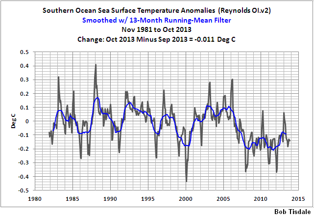
Will we believe that while the ocean somewhere cools (-as Bob Tisdale shows for southern ocean – see the footnote – and there is virtually nothing else there than ocean between the Antarctica and the 60S) – which looks quite confirmed by the rising sea ice extent there and while the tropics cool too with quite impressive rate and moeover we do not find a rising temperature trend in Arctic in any of the two satellite datasets – will we really believe there is a warming trend? A warming somewhere (maybe in Antarctica and around, and most likely not) somehow able to change the whole most likely flat or descending global surface temperature anomaly trend into a warming one – moreover with a “hypothesis that warming has accelerated…four times as likely as the hypothesis that warming has stopped“? Or we will rather take it as for other reasons than a global warming overheated Cowtan and Way computers dream?
To put it differently: Besides the data, isn’t the pathetic effort to manufacture a global warming trend using HadCRUT4 dataset and cherrypicked satellite data perhaps to allow the CAGW meme persist a little bit more, deliberately or not, the best sign of cooling?
————————————————
* If one wants to brush up on how it relates to the sea ice I recommend the final note from Bob Tisdale’s article here, which, to make this bit shorter, I allow myself to point out just one sentence from: “GISS masks (effectively deletes) sea surface temperature data anywhere sea ice has existed.”
I also note that he also shows quite consistent temperature decline for southern ocean SST from yet other data-set (Reynolds Ol.v2) – see his graph here – from here.
Discover more from Watts Up With That?
Subscribe to get the latest posts sent to your email.
F.A.H.. you are in error.
Once you introduced this abbreviation. “Qualified Climate Scientist (QCS). “,
You should thereafter, used said abbreviation, meaningless as it is !
I would have been much more impressed that Cowtan & Way had got something of interest if they had managed to align the two data sets they were using (UAH and HadCRUt4) before they did any of their infilling.
The fact that we still have not achieved even that small measure of agreement to date says an awful lot about climate science.
The two data sets are supposed to be representative of the same ‘Global Temperature over time’ after all.
I keep wondering if I’m missing something critical. If you use kriging to infer absent data-points from near by (or not so near by) data points, how does that work in a dynamical system? I could see the value maybe where one was inferring, say, ore concentration in geological deposits, because the ore will still likely be there when you go to dig it up.
But when, for example, ice melts and/or moves elsewhere under the influence of wind-/currents-/salinity-/temperature-changes, what can you learn about the system by kriging as though the variables are fixed or vary in a constant and predictable manner? Or is learning about a dynamical system not the point of the exercise?
Treating the two data sets in question as the true ‘proxies’ they are for the notional ‘Global Temperature’, aligning them by OLS, scale and offset to produce the least differences in the period of overlap and then assuming that the UAH data set is the more accurate (because it has the greatest coverage without using estimated or extrapolated values) we get this graph
http://woodfortrees.org/plot/uah/plot/hadcrut4gl/offset:-0.285/scale:0.9/from:1979.
Given that the above methodology is the one used throughout climate to align data sets I think that is more likely to be accurate than point by point infilling.
Can be extended to add RSS, GIST, etc. with ease 🙂
@AndyG55
Oh wow, thanks for pointing out that error. Climate science is just so hard. I bet everybody was totally freaked out when they got to the part where I said Qualifying Climate Scientist after I already said that meant QCS and they just had no clue what I was trying to say. I mean they must have wondered did I leave out like a 2 or III or something, like did I mean a QCS III or QCS 2 or what. It must have been so confusing.
And this googling just doesn’t work all the time. I keep googling for “style guide for comment submission to WUWT” and it just doesn’t find anything for it. There’s all these other style guides for other places, but now I am so scared I made lots of other errors. I forgot to put in the line numbers, and the corresponding author, and the reference list and on an on. Climate science is just so hard. Now I am just sure nobody understood a word I said.
Anyway, thanks for pointing out the error.
Negative Arctic amplification yes. If you check the Arctic ocean UAH trend from late 2004 instead of the high point at Jan 2005, you’ll see a positive trend at least till early 2013:
http://vortex.nsstc.uah.edu/data/msu/t2lt/uahncdc_lt_5.6.txt
There really isn’t much mystery about the Cowtan and Way paper. Hadcrut 4 omits a lot of grid cells from the global average because of lack of data. The effect of omission is as if the cells were infilled with the global average. That is often not a good thing to do. Here the Arctic and Antarctic trends have been quite high, so filling polar cells with the global average is not good. Any local average would be better. That is the main effect of what C&W do.
I’ve shown here the effect if you make a very simple change – just infill with the appropriate latitude average rather than the global. It substantially increases the HADCRUT trend – not as much as C&W, because it is still not a very local approximation. If you don’t like the idea of infilling, it’s arithmetically equivalent to calculating latitude means, and then forming the global as an area-weighted sum of those means.
You can see from the graph that both this simple change and also the uAH data set give a polar amplification similar to, though somewhat less, than C&W.
I see that this post shows a discrepancy between HAD4 and C&W post 2005, and goes on to claim the trend in this period was negative. What it doesn’t show is what the C&W claimed trend actually was. HAD 4 was quite negative – -0.088C/decade. If the C&W correction makes it positive, it isn’t by much. And yes, UAH shows a rise.
Show us data (instrument readings, not “adjusted” temperatures) from a global network of properly sited, properly designed, properly calibrated, properly installed temperature sensors. That way we would know how much the globe has warmed.
Show us a universally accepted climate model which accurately replicates the instrumented temperature history. That way we might have some confidence in the modeled future scenarios.
We have spent well over $100 billion analyzing data that aren’t and models that don’t. How much more must we spend to obtain real data and functional models? The ensemble climate models continue to diverge from even the “adjusted” global temperature anomalies, which are themselves inconsistent. This situation hardly constitutes a rational basis for revising the global energy economy.
People know that info gathered by way of torture is seldom reliable. Yet AGW promoters rely on torture of data- not to mention disappearing, fabricating and ‘adjusting’ data- as a matter of course. And the inability of AGW hypesters to reconcile their conclusions about climate crisis with the problem that none of their trends are significant is unavoidable, No matter their name calling, arguments from authority, hiding from FOI requests or their $billion per day money advantage. All they can rely on is pathetic attempts to re-brand and communicate their message.
Cowtan and Way are merely the latest is a series of wannabe, modern day, much improved embodiments of Rumpelstiltskin, purportedly able not only to weave straw (bad data) into gold (good data), but also to weave nothing (missing data) into gold (good data). Just another reason to believe that the status of what purports to be climate science is Grimm.
@F.A.H. Best piece of satire I’ve seen here, or anywhere for that matter, in a long time. Thanks.
Maybe i found something to proof global warming bogus. But the strange ting that how easy it looks like its still difficult to work whit. But what i have done now the numbers show that global warming and cold winter,s don’t go to getter that well for proofing global warming.
In fairness to Cowtan and Way, readers should keep in mind that Phil Jones contributed to the design of HadCRUT4 and it should not be considered sacrosanct as an estimator of global temperature. Its omission of Arctic gridcells will result in a downward bias in periods where the Arctic is warming faster than the global average and will exacerbate model-data discrepancies. Cowtan and Way estimated the effect of HadCRUT4 leaving out gridcells. I haven’t parsed the details of their method; but any method that includes the Arctic gridcells will increase the trend – there’s no reason for suspicion of this result. In a relatively quick look at the data, it seems to me that the proposed differences are pretty much immaterial for models running hot relative to observations, which, in my opinion, is the issue of primary interest.
Is somone going to be able to drive from Iceland to Greenland this year?
Nick Stokes says:
December 4, 2013 at 5:26 am
(summarised)
A even more suspicious model than C&W given that it takes no account of average vertical height for Latitude bands, i.e. Lapse Rate (which Dr Way was kind enough to point out is not the least of the problems with trivial models such as this). More likely to get data near the coasts than on the mountain tops you know.
If you were to go the Dr Spencer’s site and download the UAH data for 60 North to 85 North (the best summary that UAH can give for the Arctic I think other than gridded), you would observe that the trend for the last decade for that column (over 2003-2013) was something like 0.0007C which I think we can all agree is flat. Indeed the last year’s figures were almost all below the trend line. Something I suspect that Artic Ice this year is also showing us.
To somehow translate that into a recent Artic Polar rise does take some believing for either C&W or you but…..
Ulric Lyons says:
December 4, 2013 at 4:54 am
“Negative Arctic amplification yes. If you check the Arctic ocean UAH trend from late 2004 instead of the high point at Jan 2005, you’ll see a positive trend at least till early 2013:
http://vortex.nsstc.uah.edu/data/msu/t2lt/uahncdc_lt_5.6.txt”
But if you check the same data since 2003 to date you get ‘flat’ (0.0007C) as a trend with a tail down during this year.
Will that continue? Who knows.
Now if C&W can omit the CET area from their data and get the figures that it produces I might be more impressed. http://www.metoffice.gov.uk/hadobs/hadcet/ That’s been in ‘free fall’ since 2006 and show no sign of stopping yet! It will of course eventually. The question is, when?
Cowtan-Way is in many ways an admirable attempt at filling in missing temperature data, but one feels referees should have queried the way the discrepancies with HADCRUT4 widened so markedly after some point in 2007-2009, see figure 5 ((b) seems particularly revealing). There is not that much data presentation in the paper and it is figures 5 and 6 which deal with the real issue of comparison between their ‘hybrid’ extrapolation and the existing global temperature record. The hybrid method is estimating small temperature differences, before adding them back to the UAH record. The scope for statistical mishaps is obviously considerable. And kriging is not a robust technique in this regard, as acknowledged by the extra care taken in Rohde et al(2013). Taking this into account, referees really should have asked for, and the authors provided, a more detailed explanation of why close agreement over 25 or so years turns into a big discrepancy in the last few years.
@ur momisugly FAH –
“Belief in Global Warming is Correlated with Belief in Socialism at 0.85.”
Well, yeah, but that is only because the supposed “cure” for Global Warming matches a Socialist agenda.
If the “cure” was something that didn’t promote Socialism, the correlation would not be so good. The real idea isn’t to “save the world”.
If more of the environmentalists realized this, they wouldn’t be so supportive of CAGW by CO2.
I suspect you already know this though.
🙂
Anthony says:
“I was not much interested in their methods (since I’m not much interested in methods of data torture..”
To be consistent, this comment applies, as well, to some of this site’s most often posted authors. I understand how the temptation to attempt to drag some meaning out of meaningless data can overcome one as I have in my youthful days of data analysis done the same. Perhaps you could simply note “DT” when the data is being tortured to save some of us from spending too much time reading the essay before throwing our hands up and screaming or pulling our hair out. Today’s desktop computing power and speed make data torture too easy. Try it with punch cards sometime.
I started reading this to see if there would be an interesting examination of the Cowtan and Way “result” and found a completely unwarranted and ill informed attack on the UAH dataset. I mean holy crap, you cannot have read any of the many papers examining the satellite data carefully at all.
A regional warming trend is what C&W are claiming to define a global warming trend. This is a Computational Reality, i.e. the math works out this way when you get a global average. The Representational Reality, i.e. what is really going on, is that the “globe” has warming and cooling, and the warming is slightly greater than the cooling, but it is not global. Regionality rules in a strange science where a global blanket is supposed to warm all points equally through additional back-radiation.
According to the alarmists, math rules while nature drools.
F.A.H. says:
“So first, by googling, I found this site: http://www.isidewith.com/poll/965637 . It asks people “Is Global Warming a threat to the environment?” Yes or No. I thought cool, that’s just what I want. I clicked on the results for different political parties and the numbers (statistics!!) are:
Party % Yes %No
Democrat 97 3
Republican 16 84
Libertarian 36 64
Green 97 3
Socialist 97 3″
Please note that “Green, Socialist and Democrat” are redundant. One of the problems in public perception is the use of anomalies, ie delta T’s, in graphical presentations, which automatically introduce scale bias into the visual which result in “hockey sticks”. Though it is necessary to analyse changes, perhaps some graphical depictions of actual temperature should accompany these analyses to ensure that folks understand the actual magnitude of what is happening. Which ain’t much in the real world.
My favorite post here continues to be the fellow who recently posted that he constructed a model based upon his historical footprints and it tells him where he’ll be in the future. What a great comment! Too much of that exact thing is going on, on both sides of this debate. Goes along with Anthony’s “Data Torture” comment. Reminds me of what Leif told me once when I accused him of being an ass#### (not in so many words) and used it to be one myself and though he admitted the accusation (kind of) he indicated it was no excuse for me to “stoop to his level”. One of my favorite Leif comments. We need to be agressive in our promotion of the truth while avoiding the missuse of data. Calling out the warmists data transgressions is always valid and admirable, as this post does quite well.
Something that I haven’t seen mentioned yet.
Let’s suppose, for a moment that Cowtan and Way have identified significant warming in the Arctic which significantly increases the global temperature anomaly. Would that not constitute some regional warming affect, rather than global warming?
I am very inspired by the robust “blitzfitzkrieging” methodology F.A.H. describes. I will have to check that my tax accountant is up to speed with best practice 😉