In the post Is Ocean Heat Content Data All It’s Stacked Up to Be? I explained all of the problems associated with Ocean Heat Content data, in great detail. For that post, I created three gif animations that showed where temperature measurements were taken at three different depths. The intent of the animations was to show how few samples existed at depth throughout the global oceans before the introduction of ARGO floats.
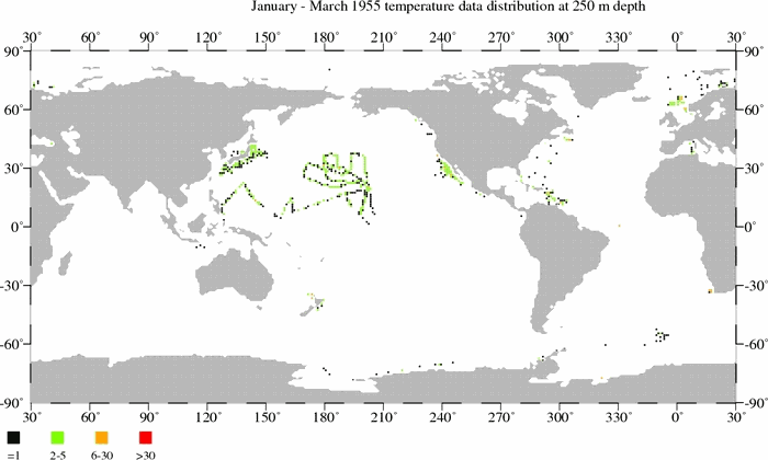
- Temperature sample maps at 250 meters (11MB).
- Temperature sample maps at 500 meters (9MB).
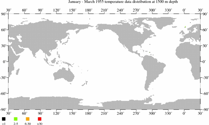
- Temperature sample maps at 1500 meters (6MB).
I was examining the approved Chapter 3 (Observations: Ocean) of the IPCC’s 5th Assessment Report when I came across their Figure 3.A.2. I was amazed, especially with the bottom 2 cells. Figure 3.A.2 appears to be a realistic presentation of temperature sampling at depth.

A larger-sized version is here.
The bottom cell shows that temperature samples at depth did not rise above 20% coverage of the oceans in the Southern Hemisphere until the ARGO floats were introduced in the mid-2000s, and at depths below 900 meters the coverage was less than 5% before ARGO.
The Northern Hemisphere (middle cell) was better sampled, but anything is better than nothing. Most of the sampling there was confined to depths of less than 500 meters from the late-1960s to present.
And looking at the top cell, sampling at depths of 0-1500 meters and 0-1800 meters did not rise above 8% of the global oceans until the ARGO era. Consider that the next time you see the NODC’s ocean heat content data for 0-2000 meters extending back in time to 1955. Measurements for 0-900 meters had less than 16% coverage before ARGO. Sampling at depths of 0-700 meters did not reach 20% coverage of the global oceans until about 1990.
CLOSING
I’ve noted this a number of times before: the NODC should be commended for the amount of work that went into assembling all of the data required for their ocean heat content datasets.
But the NODC cannot be praised for their portrayal of their ocean heat content data as a globally complete dataset with little uncertainty.
ADDITIONAL READING
In addition to Is Ocean Heat Content Data All It’s Stacked Up to Be?, refer to the following posts about ocean heat content. And for those who like to read at comments on blog threads, I’ve also included the cross posts at WattsUpWithThat in parentheses:
- NODC’s Pentadal Ocean Heat Content Data (0-2000m) Creates Warming That Doesn’t Exist in the Annual Data – A Lot of Warming (WattsUpWithThat cross post here)
- Trenberth Still Searching for Missing Heat (WattsUpWithThat cross post here)
- More on Trenberth’s Missing Heat (WattsUpWithThat cross post here)
- A Different Perspective on Trenberth’s Missing Heat: The Warming of the Global Oceans (0-2000 Meters) in Deg C (WattsUpWithThat cross post here)
- Ocean Heat Content (0-2000 Meters) – Why Aren’t Northern Hemisphere Oceans Warming During the ARGO Era? (WattsUpWithThat cross post here)
- Even More About Trenberth’s Missing Heat – An Eye Opening Comment by Roger Pielke, Sr. (WattsUpWithThat cross post here)
- Rough Estimate of the Annual Changes in Ocean Temperatures from 700 to 2000 Meters Based on NODC Data (WattsUpWithThat cross post here)
Refer also to the discussions of the natural warming of the global oceans (including ocean heat content) in my illustrated essay “The Manmade Global Warming Challenge” (42mb).
Speaking of amazing, I haven’t promoted my ebooks Climate Models Fail or Who Turned on the Heat? anywhere in this post.
So what does 5% coverage mean? It is pretty clear that 20% of the ocean area or volume is not filled with Argo floats. How big a range are they assuming for each float at 100%?
MikeN says:
“what does 5% coverage mean? It is pretty clear that 20% of the ocean area or volume is not filled with Argo floats. How big a range are they assuming for each float at 100%?”
I thing this is an excellent point and one that applies to all temperature data sets. I’m not convinced that the average of sparse measurements will ever give us any global temperature because heat is simply not uniformly distributed on earth. If you figure the amount of area a thermometer is measuring it is probably a few square centimeters around the thermometer. Any further interpretation of that temperature a distance away requires an ever increasing error bar until the data becomes useless. We know the temperature on one side of a house can vary by several degrees to the other side of the house.
Just by taking the gridded measurements from one ARGO area and finding the variance within the area it is suppose to represent we should be able to find the true error of the measurement. I suspect this would be many times larger than the accuracy of the thermometer.
I think it’s probable that nearly all the anomolies measured are dominated by the distrubution of heat transfers across a non-uniformly heated area. Another words the heat can come in and out of the area covered by our thermometers and we would have no idea since 99.9999% of the earth is not measured.
MikeN:
I think Greg clarified that above – 100% coverage is one Argo float in each 3 degree x 3 degree grid.
I love his analogy – Lake Michigan would get a half an Argo float.
Will we see “Tisdale says IPCC got it right!” as a recurring meme the way we’ve seen endless variations on “Trenberth looking for missing heat!” now that they’ve both made essentially the same point?
MarkB says: “Will we see ‘Tisdale says IPCC got it right!’ as a recurring meme the way we’ve seen endless variations on ‘Trenberth looking for missing heat!’ now that they’ve both made essentially the same point?”
MarkB, you apparently missed the point of this post. This post supports my past posts that concluded ocean heat content is a contrived dataset. I’m not sure how you could have missed that.
Regards
Thank you again Bob for your diligent, informative work.
I suggest that spatial coverage of the Terrestrial Surface Temperature (TST) data may be more dense that the oceanic temperature database, but the TST data is also highly erratic and subject to a serious warming bias due to poor instrument siting, growing urbanization and UHI effects, etc.
When we examine the IPCC’s reports, we are certainly seeing humanmade global warming… …but much of it is instrument and analytical error.
Best regards, Allan
@ur momisugly paulinsay “From the ARGO website each float is intended to cover a 3 x 3 degree^2 square. At the equator this is approximately 40,000 square miles. For comparison, Lake Michigan has a surface area of 23,000 square miles. So it would get one half an Argo float to measure its temperature. The coverage is incredibly sparse.”
Those are stunning figures, but in fact “it is even worse than we thought!” 🙂
Remember that we are actually measuring a volume, approximately 100,000 km2 in area but 2 km deep, for each float. The volume of all the Great Lakes together is approximately 23,000 km3. Each Argo float is (supposedly) measuring about 9 times as much water as the total of all the Great Lakes.
Dear Bob, thanks for another excellent post! WUWT readers are enriched by your input and we appreciate it greatly.
One thing regarding physics – warm water is less dense than cold water, so what are the proposed mechanisms for heat in the atmosphere to transfer to the abyss(AR5 language)? Also, how do the IPCC claim to differentiate between AGW heat input and heat in the deep ocean from thermal vents & volcanic activity? Thanks and best, Charles the DrPH
No wonder whales go crazy.
This is WHOPPER! This is not a shot across the bow. This is a direct hit on the good ship Climate Hysteria. You would have to commit statistical fraud to even think you had an inkling of an idea on long term ocean heat content. Or just outright lie. So we have ginned land temp and ocean heat content records. Now we just need to sink the ocean acidification meme and that will effectively cut off all three legs of their tottering stool.
What might we learn if all the argo floats were deployed in one grid?
excellent post bob,your work is is much appreciated. i have to agree with allan macrae,whilst there may be a higher density of measurement on land,the extrapolation required to assume total coverage is still ridiculous.
gonzo,you are spot on,i personally believe they have no problem just telling outright lies.
Bob’s earlier post has some interesting graphs, but misses out something that can properly relate this heat to temperature. According to the post, the Argo floats showing the top 700m oceans heating up a the rate of 1.392*10^22 Joules a decade. What does this actually relate to in celsius? I will stick to metric here.
The total area of the oceans is roughly 325 million km^2
Allowing for the shallows, that is about 200 million km^3 of water.
As 1 km^3 is 10^9 (billion) tonnes of water, that is about 2*10^17 tonnes of water. As there are 1000 kilos in a tonne and 1000 grams in a kilo, there are about 2*10^23 grams of water in the top 700m of ocean.
Why the calculation in grams? I looked up that it takes 4.184 joules of heat (= 1 Calorie) to heat 1 gram of water through 1 degree celsius. So that 1.392*10^22 Joules a decade equates to .0017 celsius a year on average, or about 600 years for the oceans to rise by 1 degree.
Is that about right? Or am I out by 10^n times?
If so, what is the calibrated accuracy of an Argo buoy? Given on average 3 buoys cover an area the size of Britain, and only sample at each depth every few days, an average trend of 1/600 of a degree celsius per year (when areas of ocean can show seasonally adjusted fluctuations of over 1000 times that amount from Bob’s animation) does not strike me as awfully robust.
http://bobtisdale.wordpress.com/2013/03/11/is-ocean-heat-content-data-all-its-stacked-up-to-be/
http://bobtisdale.wordpress.com/2011/03/15/the-electric-kool-aid-ocean-heat-content-animation/
Once again the IPPC have produced images for the illiterate masses of 190 countries that expect to see hockey sticks and rapidly increasing red orange areas on graphs, that will be translated to them by others who don’t read English well. It just isn’t global atmospheric temps this time around.
manicbeancounter says: “Bob’s earlier post has some interesting graphs, but misses out something that can properly relate this heat to temperature. According to the post, the Argo floats showing the top 700m oceans heating up a the rate of 1.392*10^22 Joules a decade. What does this actually relate to in celsius?”
Already covered that topic in a few posts linked above:
http://bobtisdale.wordpress.com/2013/04/17/a-different-perspective-on-trenberths-missing-heat-the-warming-of-the-global-oceans-0-to-2000-meters-in-deg-c/
And:
http://bobtisdale.wordpress.com/2013/07/04/rough-estimate-of-the-annual-changes-in-ocean-temperatures-from-700-to-2000-meters-based-on-nodc-data/
Regards