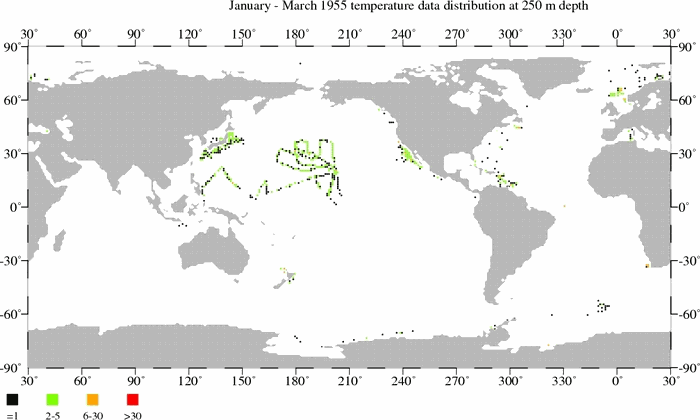
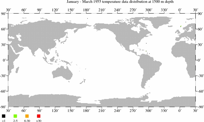
In the post Is Ocean Heat Content Data All It’s Stacked Up to Be? I explained all of the problems associated with Ocean Heat Content data, in great detail. For that post, I created three gif animations that showed where temperature measurements were taken at three different depths. The intent of the animations was to show how few samples existed at depth throughout the global oceans before the introduction of ARGO floats.
- Temperature sample maps at 250 meters (11MB).
- Temperature sample maps at 500 meters (9MB).
- Temperature sample maps at 1500 meters (6MB).
I was examining the approved Chapter 3 (Observations: Ocean) of the IPCC’s 5th Assessment Report when I came across their Figure 3.A.2. I was amazed, especially with the bottom 2 cells. Figure 3.A.2 appears to be a realistic presentation of temperature sampling at depth.
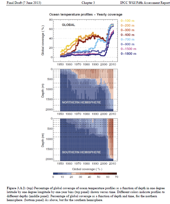
A larger-sized version is here.
The bottom cell shows that temperature samples at depth did not rise above 20% coverage of the oceans in the Southern Hemisphere until the ARGO floats were introduced in the mid-2000s, and at depths below 900 meters the coverage was less than 5% before ARGO.
The Northern Hemisphere (middle cell) was better sampled, but anything is better than nothing. Most of the sampling there was confined to depths of less than 500 meters from the late-1960s to present.
And looking at the top cell, sampling at depths of 0-1500 meters and 0-1800 meters did not rise above 8% of the global oceans until the ARGO era. Consider that the next time you see the NODC’s ocean heat content data for 0-2000 meters extending back in time to 1955. Measurements for 0-900 meters had less than 16% coverage before ARGO. Sampling at depths of 0-700 meters did not reach 20% coverage of the global oceans until about 1990.
CLOSING
I’ve noted this a number of times before: the NODC should be commended for the amount of work that went into assembling all of the data required for their ocean heat content datasets.
But the NODC cannot be praised for their portrayal of their ocean heat content data as a globally complete dataset with little uncertainty.
ADDITIONAL READING
In addition to Is Ocean Heat Content Data All It’s Stacked Up to Be?, refer to the following posts about ocean heat content. And for those who like to read at comments on blog threads, I’ve also included the cross posts at WattsUpWithThat in parentheses:
- NODC’s Pentadal Ocean Heat Content Data (0-2000m) Creates Warming That Doesn’t Exist in the Annual Data – A Lot of Warming (WattsUpWithThat cross post here)
- Trenberth Still Searching for Missing Heat (WattsUpWithThat cross post here)
- More on Trenberth’s Missing Heat (WattsUpWithThat cross post here)
- A Different Perspective on Trenberth’s Missing Heat: The Warming of the Global Oceans (0-2000 Meters) in Deg C (WattsUpWithThat cross post here)
- Ocean Heat Content (0-2000 Meters) – Why Aren’t Northern Hemisphere Oceans Warming During the ARGO Era? (WattsUpWithThat cross post here)
- Even More About Trenberth’s Missing Heat – An Eye Opening Comment by Roger Pielke, Sr. (WattsUpWithThat cross post here)
- Rough Estimate of the Annual Changes in Ocean Temperatures from 700 to 2000 Meters Based on NODC Data (WattsUpWithThat cross post here)
Refer also to the discussions of the natural warming of the global oceans (including ocean heat content) in my illustrated essay “The Manmade Global Warming Challenge” (42mb).
Speaking of amazing, I haven’t promoted my ebooks Climate Models Fail or Who Turned on the Heat? anywhere in this post.
5% coverage can be plenty if the sample is representative and consistent with time. I would doubt this, however.
Dear Bob,
You do an absolutely wonderful job in collecting and analysing data which most of us do not have the time or energy to do ourselves.
The deep ocean temperature measurements are astonishing. The Pacific does seem to be seriously undersampled.and how anyone can say anything about its heat content is amazing.
I really do believe that it is people like yourslf who is turning the tide of CAGW by exposing data that allows us to be properly sceptical.
Just love their choice of colors in the bottom two charts. It’s as though the blues / oranges were meant to suggest temperature differences, not the mere presence-of-thermometers.
In discussing the issues around global sea temperature data with a friend, I posed the question ‘if you had a thermometer accurate to three decimal places, how accurately could you measure the temperature of an olympic size swimming pool?’ After we had gone over the problems involved with the task, I then pointed out how much more difficult it is to take the ocean’s temperature. After that, my friends views on the veracity of IPCC claims of rising ocean heat content were less than complimentary.
braddles: Most of the coverage in the Southern Hemisphere before ARGO is in the tropics. Additionally, 5% coverage would never capture how ENSO distributes heat within the oceans. See the post “The Electric Kool-Aid Ocean Heat Content Animation”:
http://bobtisdale.wordpress.com/2011/03/15/the-electric-kool-aid-ocean-heat-content-animation/
I’ll try to update those animations one of these days.
Thanks Bob, I always enjoy your posts.
I think praise needs to go to the person who created the gif animations as well. A lot of work went into making it easy to read and understand for everyone. Thanks Bob.
Bob, thank you. It appears heat content in the past has largely been the blind men and the elephant exercise.
Good work Bob.
The next point is would does “100% coverage” mean in this language ? One reading per 5×5 degree grid cell or what?
Each individual temperature reading is supposed to represent what volume of water?
How many million cubic km of ocean has been measured to with 5mK by one thermistor?
Again substitute statistical sigma calculations for experimental uncertainly.
Comparing your animations and Fig. 3.A.2 puts the lie to their claims of coverage. It’s only a fraction of a percent even with ARGO. The size of the dots in your figures, of neccessity, greatly exagerate the area covered by each float. Have these people ever thought to build a string of thermometers, one every 100 feet, that went from the ocean floor to the surface? They could get baseline understanding of how much temperatures fluctuate over time and give them a more realistic idea of what, if anything, the ARGO numbers mean.
Having at least 1 sample per grid cell should definitely NOT constitute 100% coverage. Sure it gives you a value for each cell, but you have no idea what the variability is within the cell, so your error bars are likely too large to be useful given the minute differences being analyzed. I would love to see a study that calculates the undersampling error involved, which is a function of both the variability of the cell and number of samples in the cell. I doubt even the Argo probes provide enough samples to narrow down the accuracy lower than the anomaly we are attempting to investigate. And how the heck do they handle the majority of cells that don’t even have a single measurement?
Frank Ch. Eigler says:
October 9, 2013 at 4:16 am
Just love their choice of colors in the bottom two charts. It’s as though the blues / oranges were meant to suggest temperature differences, not the mere presence-of-thermometers.
——-
Agreed – the unwary reader will assume, if skimming, that these graphs represent increasing global ocean temperatures at depth. That’s what my lying eyes saw before I looked again.
Thanks, Bob, for your great work.
From the ARGO website each float is intended to cover a 3 x 3 degree^2 square. At the equator this is approximately 40,000 square miles. For comparison, Lake Michigan has a surface area of 23,000 square miles. So it would get one half an Argo float to measure its temperature. The coverage is incredibly sparse.
We humans have a history of coming to sweeping conclusions with very little information. These conclusions invariably turn out to be wrong, yet we continue to believe we will be spot on the next time we do it. Quite remarkable, really.
vigilantfish says: “Agreed – the unwary reader will assume, if skimming, that these graphs represent increasing global ocean temperatures at depth. ”
Bingo!
Is the dark blue really representing less than 5% or zero? Those graphs would be much clearer if 0 was white.
Perhaps the IPCC has only published these diagrams to demonstrate that the ‘missing’ heat could be stored in the unmeasured depths.
In reality, we are unlikely ever to find out since we are unable to measure temperature accurately enough or with sufficient coverage – especially when there are those giant maelstroms hiding in the South Atlantic:
http://wattsupwiththat.com/2013/09/05/a-descent-into-the-maelstrom-black-hole-whirlpools-seen-for-the-first-time-in-the-south-atlantic/
Dang! Screwed up the formatting. Correct version:
Perhaps the IPCC has only published these diagrams to demonstrate that the ‘missing’ heat could be stored in the unmeasured depths.
In reality, we are unlikely ever to find out since we are unable to measure temperature accurately enough or with sufficient coverage – especially when there are those giant maelstroms hiding in the South Atlantic:
http://wattsupwiththat.com/2013/09/05/a-descent-into-the-maelstrom-black-hole-whirlpools-seen-for-the-first-time-in-the-south-atlantic/
I also got fooled by the blue-red coloring and said “Why is Bob T presenting data that shows abrupt heating in the deep ocean?”
I would have done red-yellow-green like MS Excel, but to be fair blue-yellow-red might be the default pattern for the intensity charts they use. And the blue does look “oceany”.
The IPCC provides an accurate and balanced view of some aspect of climate science?
Well, we always knew that their reports were shot full of errors…
@Greg,
Good point
Greg, that was my thinking when I looked at the charts. As a result the IPCC is still way over-stating the coverage. In reality most of the numbers would round to zero. The only way we will ever understand ocean heat pre-ARGO is with some kind of proxy.
Mr. Tisdale : Please email me at kip at my domain i4.net, I have a collaboration project to discuss. Thanks.
” Figure 3.A.2 appears to be a realistic presentation of temperature sampling at depth.”
peter thorne has done an excellent job on the observation chapter, unlike the job that jones and trenberth did for Ar4. Folks should give credit where credit is due.
The less we know, the hotter it “is”.