INITIAL NOTE: If you have not had the opportunity to view a model-data comparison of global surface temperature anomalies, where the models and data are compared during the two warming periods and two cooling (or warming-slowdown) periods since 1880, please take the time to run through this post. It presents model-data comparisons of global sea surface temperature anomalies using time-series and zonal-mean graphs, and trend maps. It is a long post—about 3300 words with 20 illustrations—but the models perform so poorly you’ll wonder how the IPCC has gotten away with claiming climate models can be used to attribute global warming to manmade greenhouse gases. (This initial note does not appear in the pdf version of the post, which is linked at the end.)
PREFACE
The IPCC saved the most misleading graph in their approved final version of the AR5 Summary for Policymakers for last. It’s their Figure SPM.10, included here as my Figure 1. It presents global surface temperature anomalies as a function of cumulative manmade carbon dioxide emissions.

Figure 1
The accompanying text begins:
Global mean surface temperature increase as a function of cumulative total global CO2 emissions from various lines of evidence. Multi-model results from a hierarchy of climate-carbon cycle models…
That’s as far as anyone needs to read. The illustration is based on climate models.
Climate models are so far removed from reality that they cannot be used to attribute global warming to natural processes or to human-induced factors and cannot be used for predictions of future climate based on projections of manmade greenhouse gases.
Climate scientists/modelers have only proven they are capable of creating complex numerical models and that they are able to tune those models to roughly approximate the rate of warming during the last warming period that started in the mid-1970s and ended about the turn of the century, but only during that period. Further, even the rates of numerical warming created within the models during that last warming period are flawed.
NOTE: Much of this post is background information. It shows how poorly the climate models simulated global sea surface temperatures since 1880. If you’re not interested in how, where and why climate models are not capable of simulating the surface temperatures for about 70% of the planet, then please scroll forward to the heading of CLIMATE MODELS DO NOT SUPPORT THE HYPOTHESIS OF HUMAN-INDUCED GLOBAL WARMING after Figure 15.
INTRODUCTION
We compared data and climate model outputs of global surface temperatures (land and ocean) since 1880 in the post Model-Data Comparison with Trend Maps: CMIP5 (IPCC AR5) Models vs New GISS Land-Ocean Temperature Index. For my book Climate Models Fail, I revised the breakpoints in the comparisons to 1914, 1945 and 1975 (instead of 1917, 1944 and 1976). The breakpoints of 1914 and 1945 were determined by Dr. Leif Svalgaard. See his April 20, 2013 at 2:20 pm and April 20, 2013 at 4:21 pm comments on the WattsUpWithThat cross post. And for 1975, I referred to statistician Tamino. Using those breakpoints will hopefully avoid the claims of cherry-picking.
In this post, we’ll be looking at global sea surface temperature anomalies starting in 1880 and ending in year-to-date (YTD) 2013. The dataset is ERSST.v3b—which is used by GISS in their Land-Ocean Temperature Index—for consistency with the previous post and with Climate Models Fail. The models are the multi-model ensemble mean of the simulations of sea surface temperatures for the CMIP5 (IPCC AR5) models, using the historic and RCP6.0 scenarios. (See the post On the Use of the Multi-Model Mean.) We’ll break the data and models down into the two warming periods and two cooling/reduced warming periods using the same breakpoints of 1914, 1945 and 1975. Because global land-plus-sea surface temperature data and sea surface temperature data don’t have the same breakpoints, 1914, 1945 and 1975 will look at little odd. Refer to Figure 2.

Figure 2
Yes, the models perform that poorly.
It’s pretty remarkable that climate modelers have been trying for a couple of decades to reproduce the global surface temperature record and babbling on and on about CO2 driving global surface temperature warming—when, bottom line, climate models cannot simulate surface temperatures for 70% of the surface of the globe since 1880. The only reason the modelers even come close during the recent warm period is because the modelers tune the models to that period. (See Mauritsen, et al. “Tuning the Climate of a Global Model” [paywalled]. (Preprint edition is here.))
The linear trends are as calculated by EXCEL.
For the discussion of each period, the models are compared to observations-based data using:
- time-series graphs,
- trend maps that show warming and cooling rates in deg C/year, and
- trends on a zonal-mean (latitude average) basis. (For those new to the zonal-mean graphs, I provide an overview in the first discussion.)
Let’s start with the period when models performed best, and then work out way back in time.
RECENT WARMING PERIOD (1975 to YTD 2013)
Global (land+sea) surface temperatures stopped warming in 2001. (See the post here.) Even so, the models show the warming continuing to present times. So we’ll use (year-to-date) 2013 as the end year for the recent warming period.
As shown in Figure 3, the modeled warming rate of global sea surface temperatures is about 40% higher than the observed trend during the period of 1975 to (YTD) 2013. Keep in mind the models had been tuned to the observed surface temperatures during much of this period.
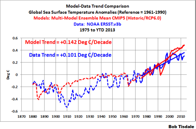
Figure 3
Not only do the models overestimate the overall warming during this period, they fail to capture where sea surface temperatures warmed (and cooled) and the extent of that warming (or cooling). (See Figure 4.)

Figure 4
The patterns in time and the spatial patterns of sea surface temperature warming (or cooling) contribute to when and where land surface temperatures vary. Therefore, based on the models’ failures to simulate sea surface temperatures properly, it is unlikely that they can properly simulate land surface air temperature anomalies.
The climate models used by the IPCC in their 5th Assessment Report failed to capture:
- the extra warming of the North Atlantic caused by the Atlantic Multidecadal Oscillation. (See Ruiz-Barradas et al. (2013)) This helps to explain why models cannot simulate the rate of polar amplification in the Northern Hemisphere and why they cannot simulate the rate of Arctic sea ice loss (See Stroeve, et al. (2012) “Trends in Arctic sea ice extent from CMIP5, CMIP3 and Observations” [paywalled]),
- the cooling in the Southern Ocean, which explains why climate models cannot simulate sea ice area in the oceans surrounding Antarctica,
- the pattern of warming and cooling in the Pacific. This is caused by the model failures to properly simulate the coupled ocean-atmosphere processes associated with El Niño and La Niña events. (See Guilyardi et al. (2009) and Bellenger, et al. (2013))
Note: For further information about the Atlantic Multidecadal Oscillation, see NOAA’s AOML (Atlantic Oceanographic and Meteorological Laboratory) Frequently Asked Questions webpage here, and my blog post here and my introduction to the Atlantic Multidecadal Oscillation here.
In Figure 5, the warming and cooling rates are shown on a zonal mean basis. The variable for the zonal mean graphs in this post are the trends in deg C/decade and it is shown in the (vertical) y-axis. The (horizontal) x-axis is latitude, so the South Pole is (at -90) on the left, the North Pole is (at 90) on the right, and the equator is at zero deg latitude. Basically, the zonal mean graphs in this post present the warming (and cooling) rates of sea surface temperatures at the different latitudes.

Figure 5
As shown in Figure 5, for the period of 1975 to (YTD) 2013, the models:
- overestimated the warming of tropical sea surface temperatures by about 50%,
- underestimated the warming in the mid-latitudes of the Northern Hemisphere, and
- show no similarity to the warming and cooling rates in the surface temperatures of the Southern Hemisphere oceans south of about 35S.
That poor performance makes one wonder how the modelers could ever hope to attempt to simulate land surface air temperatures.
Figures 3, 4 and 5 showed how poorly the latest generation of climate models (CMIP5) simulated the warming (and cooling) of global sea surface temperatures during the recent warming period of 1975 to (YTD) 2013 — a period to which they are “tuned”. The models are not going to show improvement as we look at the earlier periods.
MID-20th CENTURY REDUCED-WARMING PERIOD (1945 to 1975)
According to the ERSST.v3b data, Figure 6, sea surface temperatures warmed at a reduced rate from 1945 to 1975. (Also see the discussion of HADSST3 data following Figure 8.) The models estimated cooling during this period, basically a response to the eruption of Mount Agung in 1963-64.
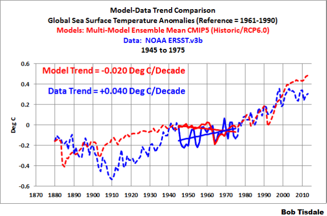
Figure 6
The differences are even more obvious when we look at the maps of warming and cooling trends during this period. (See Figure 7.)

Figure 7
For the period of 1945 to 1975, the climate models used by the IPCC for their 5th Assessment Report failed to simulate:
- the cooling of sea surface temperatures in the North Atlantic associated with the Atlantic Multidecadal Oscillation, and
- the warming of sea surface temperatures in the entire Southern Hemisphere.
This is further illustrated by the warming and cooling rates when the data and model outputs are presented on a zonal mean basis, Figure 8.

Figure 8
NOTE: The UKMO (UK Met Office) revised their sea surface temperature dataset in response to the findings of Thompson et al (2009) Identifying signatures of natural climate variability in time series of global-mean surface temperature: Methodology and Insights. (See Kennedy et al. (2013) Part 1 and Part 2.)
The greatest changes to the HADSST data occurred from the 1940s to the 1960s. The adjusted UKMO HADSST3 sea surface temperature data now shows cooling during the period of 1945 to 1975 — a cooling that is magically in line with the models. (See Figure 9.)

Figure 9
EARLY 20th CENTURY WARMING PERIOD (1914 to 1945)
The most obvious model failing occurs during the early 20th Century warming period of 1914-1945. It stood out like a sore thumb in Figure 2, and it looks no better in Figure 10. Global sea surface temperature anomalies warmed at a rate of 0.125 deg C/decade, but the models indicated that they should only have warmed at a rate of 0.036 deg C/decade IF sea surfaces were warmed by manmade greenhouse gases, including carbon dioxide. The observed warming was about 3.5 times greater than the modeled warming. That additional observed warming, therefore, has to result from natural variability — it can’t be explained by the assumed impacts of anthropogenic warming shown by the models. And that’s a gigantic problem for hypothesis of human-induced global warming, which we’ll discuss later in this post.

Figure 10
Looking at the trend maps, Figure 11, there’s no reason to go into any great detail about where the models failed. They failed to capture the warming just about everywhere. How pathetic is that!
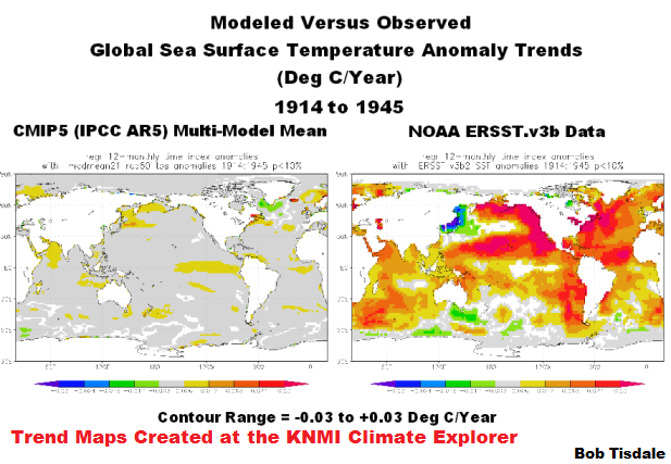
Figure 11
And as shown in Figure 12, the failings are further confirmed by the trends on zonal mean (latitude average) basis.

Figure 12
EARLY COOLING PERIOD (1880 to 1914)
The models used by the IPCC for their 5th Assessment Report indicate global sea surface temperatures should have warmed at a rate of about 0.03 deg C per decade from 1880 to 1914, Figure 13, but according to NOAA’s ERSST.v3b data (used by GISS for their Land-Ocean Temperature Index) sea surface temperatures cooled at a strong rate of more than -0.1 deg C/decade. The models missed their mark by about 0.13 deg C/decade during this early cooling period.
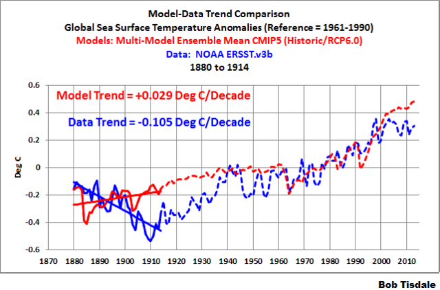
Figure 13
The trend maps in Figure 14 and the modeled and observed trends on a zonal mean basis, Figure 15, show how poorly the models simulated sea surface temperatures during this period.
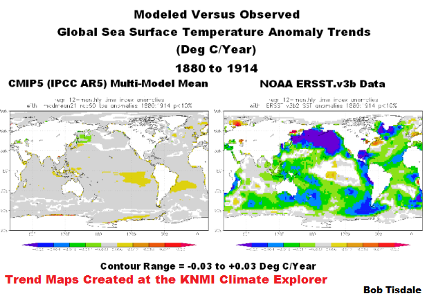
Figure 14
###

Figure 15
CLIMATE MODELS DO NOT SUPPORT THE HYPOTHESIS OF HUMAN-INDUCED GLOBAL WARMING
Much of the post to this point was background information for this portion.
Recall that in Figure 1, the IPCC presented their climate model-based assumptions that (1) global surface temperatures warmed in response to accumulated manmade carbon dioxide emissions from 1850 to present and (2) that global surface temperatures would continue to warm into the future based on climate model projections.
The virtual sea surface temperatures in climate models are forced to warm primarily by the assumed impacts of well-mixed anthropogenic greenhouse gases, with carbon dioxide the dominant manmade greenhouse gas. (See Figure 16) For example, according to the forcings used by GISS in their climate models, the climate forcings associated with well-mixed greenhouse gases increased at a rate that was about 3.8 times faster during the later warming period of 1975 to 2011 than during the early warming period of 1914 to 1945.
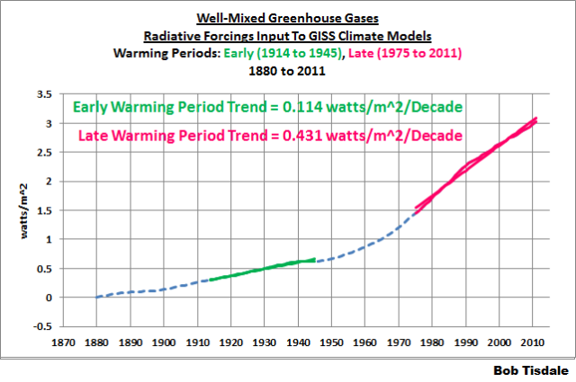
Figure 16
Climate modelers then suppress the hypothetical warming in the climate models with other manufactured climate forcing datasets. (See Figure 17) Using the GISS forcings again, however, we can see that the Net Forcings still show the higher rate of increase during the later warming period, and that it’s still about 3.8 times faster during the later warming period of 1975-2011 than during the early warming period.

Figure 17
Then, based on all the gazillions of programming assumptions made by the climate modelers, the climate models run through their programmed routines and regurgitate virtual number-crunched sea surface temperatures. (See Figure 18) By no strange coincidence, the modeled sea surface temperatures warmed at a rate during the later warming period that was about 3.9 times faster than during the early warming period of 1914 to 1945. (Note that there are 2 more years of model outputs for the later warming period in Figure 18 than for the forcing graphs in Figures 16 and 17. GISS has not updated their forcings through 2013.)

Figure 18
Bottom line for the models: according the forcings used as inputs and according to the multi-model ensemble member mean output of the latest and greatest (CMIP5) generation of climate models, global sea surface temperatures during the later warming period (1975 to YTD 2013) should have warmed almost 4 times faster than they did during the early warming period (1914 to 1945).
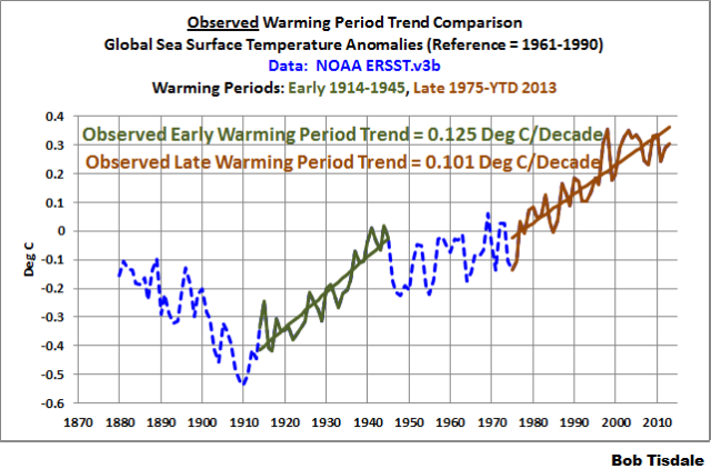
Figure 19
But, unfortunately for the models, Figure 19, the actual observed warming rate during the later warming period was less than during the early warming period. That is, the sea surface temperatures warmed about 25% faster during the early warming period than during the late warming period.
Granted, during the last 12 years of the late warming period, global sea surface temperatures have not warmed. We could eliminate the data for the current hiatus period (2002 to 2013 for example) and show the warming during the abridged late warming period (1975 to 2001) was comparable to the trend during the early period. But, that still doesn’t help the models.
Note: The following is the Summary of Chapter 4.4 from Climate Models Fail. Though Chapter 4.4 presented the combined global (land+ocean) surface temperatures, the conclusion of that chapter also applies to this post.
The fact that the models simulated the warming better during the more recent warming period does not mean that manmade greenhouse gases caused that warming — it simply reveals that the modelers managed to tune their models to perform better for the more recent warming period.
The climate models cannot simulate the observed rate of warming during the early warming period (1914-1945), which warmed at about the same rate as the recent warming period (1975-2012). This illustrates that global surface temperatures can warm without being forced — unlike climate models which must be driven by the natural and anthropogenic forcings used as inputs. And the similarities between the observed warming rates during the early and late warming periods indicate that the much higher anthropogenic forcings during the late warming period had little impact on the rate at which observed temperatures warmed.
In other words, the climate models and data do not support the hypothesis of anthropogenic forcing-driven global warming; they contradict it.
The world portrayed by all those number-crunching climate models is a fantasy world — with little or no relationship to the real world.
LET’S ADD INSULT TO INJURY
For more than 4 years, I have presented how, once ocean heat content data and satellite-era sea surface temperature data are broken down into logical subsets, they no longer support the hypothesis of human-induced global warming. That is, the NODC’s ocean heat content data for the depths of 0-700 meters and NOAA’s satellite-enhanced (Reynolds OI.v2) sea surface temperature data indicate that the oceans warmed in response to naturally occurring, sunlight-fueled, coupled ocean-atmosphere processes—not via manmade greenhouse gases. If this subject is new to you, refer to my illustrated essay “The Global Warming Challenge” (42MB pdf).
The natural warming of the global oceans was also the subject of two YouTube videos — for those who would like to listen and watch me explain how that happens. I prepared those well-illustrated videos for the WUWT-TV special last year. Part 1 is here and Part 2 is here.
I referred to my latest book Climate Models Fail a number of times in this post. Climate models Fail is a collection of model-data comparisons, and it includes a chapter about research papers that are very critical of climate model performance. In addition, I also present the natural warming of the oceans in Section 9. See the Table of Contents in the Free Preview to Climate Models Fail. About 60 pages of the 350-page pdf edition, including 40 illustrations, pertain to this topic. (Climate Models Fail is also available in Kindle format, through Amazon.) While the subject matter (natural warming of the global oceans) is the same as past presentations, in Climate Models Fail, I presented the discussion in a different order, which will hopefully make it easier to understand. Climate Models Fail was also edited by someone without a technical background so it is definitely easier to read.
And of course there is much more detail in my book Who Turned on the Heat? — The Unsuspected Global Warming Culprit: El Niño-Southern Oscillation.
MODEL-DATA DIFFERENCE
Figure 20 illustrates the observed annual global sea surface temperature anomalies from 1880 to (YTD) 2013. Also shown is the difference between the modeled and observed global sea surface temperature anomalies, with the data subtracted from the mean of the model outputs. I’ve changed the base years for anomalies to the full period of the data (1880 to 2012) so that the base years did not influence the difference.

Figure 20
Somehow, the climate science community, under the direction of the IPCC, would like the public and policymakers to believe that their climate models are realistic representations of climate.
CLOSING
Global sea surface temperatures warmed faster during the early 20th Century warming period of 1914 to 1945 than during the recent warming period of 1975 to (YTD) 2013. On the other hand, the climate models used by the IPCC for their 5th Assessment Report indicate something else entirely. The models indicate sea surface temperatures should have warmed almost 4 times faster from 1975 to present than they did from 1914 to 1945. Clearly, the climate models used by the IPCC cannot be employed to attribute global warming to manmade greenhouse gases like carbon dioxide, and they definitely cannot be used to forecast climate over any time period based on projections of future manmade greenhouse gas emissions.
Yet, the climate scientists who prepared the 5th Assessment Report for the IPCC create illustrations like their SPM.10 (my Figure 1), which amusingly use climate models as “proof” that past global warming was caused by carbon dioxide emissions and that global temperatures will continue to warm in response to future CO2 emissions. The climate scientists’ unwavering belief that carbon dioxide drives global warming, despite the climate models clearly showing otherwise, is evidence of their delusions about CO2 or their need to misrepresent their models (for any number of reasons). Personally, I think it’s a combination of the two.
SOURCE
The model outputs and data, including the trend maps, are available through the KNMI Climate Explorer.
SUPPLEMENT TO CLIMATE MODELS FAIL
This post is available here in pdf format for those readers who would like to file it as a supplement to Climate Models Fail.
Very informative post, Bob.
I appreciate your efforts to pull this together.
The plain truth. Skeptics must give it to the IPCC every day until the IPCC is disbanded. Thanks, Mr. Tisdale.
CO2 doesn’t control the climate. But some want to use CO2 to control the planet.
Until something better comes along.
I’m glad reality is not made up of two dimensional boxes such as Fig.SPM. 10 in the IPCC report.
Bob: You’ve given the IPCC the answers, so now they know we know they are liars. This should have them shaking in their boots… But as politicians, they are used to this and hope that other politicians are either liars or too dumb to admit it. Thank you!
Nonsense. Everyone knows Big Oil controls the Weather. You can prove it yourself by designing an overbalanced wheel on the principles of Arrhenius and Tesla.
/flees
Nice work, Bob.
“Global mean surface temperature increase as a function of cumulative total global CO2 emissions from various lies [fixed that typo] of evidence. Multi-model results from a hierarchy of climate-carbon cycle models…” –IPCC
“…A hierarchy of climate-carbon cycle models” is obviously a list of models ranked by their ability to give the result they wanted and truncated to eliminate the ones that didn’t. (I’m surprised they didn’t call this “robust” in some way or other.)
Gunga Din says “until something better comes along”….IPCC will never give up and the UN’s Agenda 21 will help to keep their CAGW in the media into the future to eventually “control the planet”
The UN IPCC no longer performs any good at all. Kill it.
http://stevengoddard.wordpress.com/2013/10/07/ipcc-reaches-a-tipping-point-2/#comment-280491
Global warming / climate change is caused by climate models.
The “Climate Council” now run by Flannery et.al. here in Australia is even more delusional than the IPCC if that is possible.
Dear Bob Tisdale
What a huge effort has gone into this. Your post has vastly clarified, for me at least, another aspect of how the climate’s natural changes occur. Maybe it’s just me but it seems as though the release of the latest IPCC report has spawned a steam roller of evidence which contradicts that report. A good sign! It’s a wonder that the so called consensus somehow holds together. I’m guessing that many of the participants are re-evaluating their career options and assembling the arguments for a graceful exit. Can’t wait!
FrankK,
A radio news item this morning noted that a couple of large municipal Councils in Oz were ready to put money into Flannery’s now-private Climate Council.
There is still a lot of work to put out these spot fires that feed the larger bushfire.
gregole says: The UN IPCC no longer performs any good at all. Kill it.
Why stop there?
The UN
Democracies have been a minority within the UN since 1958.
The UN is controlled by a bunch of corrupt, anti-semetic mysogonistic, dictatorial countries.
Last year……
Libya had a chair on the Human Rights Council.
China, Russia, Cuba,Saudi Arabia and Cameroon all had seats on the Human Rights Council.
North Korea had the presidency of the UN Conference on Disarmament
Iran had a seat on the UN’s Commission on the Status of Women.
Pakistan served as acting head of a U.N. body called the Counter-Terrorism Implementation Task Force.
Hardly an organisation that can be taken seriously on anything.
And then there’s option # three, their fear of being chased down by mobs with torches & pitchforks as their BS machine runs out of gas -:)
Excellent post, Bob. The alarmists can’t keep up, and ever more people are turning to the Net and sites like this one for the real story. The collapse is underway, those trying to prop up the beast will be crushed beneath it – and good riddance.
@ Geoff Sherrington – please let it be known which municipal Councils are willing to financially support Flannery, I’m sure their voters would just love to hear about that. They might even write in and let them know what they think about it. Either way, Flannery and his mob won’t be getting anywhere near the money they are used to, and tolerance for such flagrant wasters is getting thinner.
The graph goes from 0 to 1 Celsius, then it extrapolates like crazy.
Reminds me of this xkcd comic: http://xkcd.com/605/
Hey Pachauri,
Computer models are not the same thing as reality. Can you say: circular reasoning?
The SPM.10 chart looks pretty serious, but real CO2 makes up only the first 18% of its width. The other 82% is imaginary: output from unvalidated climate models.
I do wonder though, how our cumulative emissions went down from 1870 to 1890, and then declined again from 1950 to 1970. That means that during those periods we were somehow sequestering CO2 bigtime.
I only read as far as figure 2. That is enough.
Models’ total failure to reproduce even vaguely the natural variation beyond the calibration period back to 1960 which they are tuned to fit says it all.
Until they can hind case, why should be imagine they have any ability to forecast. They don’t.
@Mike McMillan
I wish I could see the real CO2 effect. I’m stuck with the collision induced translational energy in the CO2 molecule preventing it absorbing 15u radiation but not preventing it emitting 15u radiation. I see this as an effective cooling mechanism in the atmosphere. No warming there at all.
Doubling down on a bad hand.
Where did they find the temperature increase between 2000 and 2010 ?
Climate model mismatch to reality quite successfully falsifies the highly water vapor amplified greenhouse hypothesis that contemporary climate alarm is based upon. If skeptics had created these models to prove their point, they would be locked out of peer review as mavericks with all their lines of code mocked publicly as being evidence of schizophrenia or at least of a sophisticated disinformation campaign. Without the models, the argument that recent variation has near perfect precedence would amount to mere incidental hand waving no matter how well the old and new halves of the global average temperature mirror each other, as seen in a divided plot:
http://www.woodfortrees.org/plot/hadcrut4gl/from:1955/to:2012/plot/hadcrut4gl/from:1895/to:1950
If I fill a light bulb with air then put it in a freezer and adjust the input voltage to raise the temperature of the element to 55F; and if I then replace the air with carbon dioxide and keep the voltage the same would the element be hotter?
There is so much about the presentation of this graph SPM.10 that is misleading and I believe the way it was presented at the AR5 press conference was downright fraudulent. This has been discussed in my article at Tallbloke’s Talkshop here:
http://tallbloke.wordpress.com/2013/10/01/andrew-cooper-ipcc-using-differing-graph-versions/comment-page-1/#comment-60173
This article, along with the comments, addresses the fact that there are in fact TWO versions of this graph: the print version (p. 36 of the SPM) and a doctored version, shown by Thomas Stocker at the AR5 release press conference.
The article asks the following awkward questions.
1) Why is the entire ‘historical’ plot in the press conference graph dropped by 0.15 C as compared with the print version? That is the equivalent of one or two decades of warming.
2) Why is there an enormous hike in temperature between 2000 and 2010 of 0.33 C when temperatures have been flat during that period? This 0.33 C hike occurs in both versions, one shadowing 0.15 C below the other.
3) Why is the black, dotted line labelled as ‘historical’ when it is a modelled hindcast, leaving a billion viewers under the impression that warming has accelerated to 0.33 C per decade in the last decade.
4) Why did Thomas Stocker refrain from mentioning, during the press conference presentation of the graph, that the black, dotted line from 1860 to 2010 was a modelled hindcast, leaving viewers under the distinct impression that this line represented the real temperature from 1860 to present (including the 0.33 hike between 2000 and 2010)?
5) Why did Thomas Stocker add to that confusion by referring to the temperature scale as,
“you see on the vertical, temperature anomaly relative to the late 19th century.”
That statement doesn’t even give a nod to the fact that it’s a bevy of models all the way from 1860 to the present. Also he makes a curious omission of the definite article, ‘the’ in relation to temperature which would get him off the hook by citing a grammatical technicality.
6) Why are the data points on the plot, especially the ‘historical’ plot, labelled as single years without the clarification that they are in fact the value of the (modeled) decadal means for the preceding 10 years up to each date? This question was answered in the comments by Tim Osborn of the CRU, East Anglia, throwing up a raft of other disturbing questions such as the fact that the graph in question had a caption that was to be found fully 16 pages before the graph itself. This had protected Stocker’s unhelpful press conference statements from being called out- the counterveiling evidence was hidden.
Stocker presented the SPM.10 graph at the press conference as being agreed upon “after much deliberation and preparation by the scientists”. I believe the words “deliberation” and “preparation” are euphemisms for “arguing” and “manipulation”.
I believe the way in which this graph was presented at the press conference was tantamount to fraud and Stocker, along with “the scientists” should be called on it.
Scute
P.S. I refer to Bob Tisdale in the comments.
Excellent post. “Multimodel ensemble mean” ? How many wrongs must be averaged to get a right?
When I’ve built process models that didn’t predict, I fixed them. Never considered averaging various versions.
As as been asked many times, how does one distinguish between anthropogenic CO2 and natural CO2?
Nicola Scafetta: Climate Models Used By IPCC Fail To Reproduce Decadal & Multidecadal Patterns Since 1850
http://www.thegwpf.org/nicola-scafetta-climate-models-ipcc-fail-reproduce-decadal-multidecadal-patterns-1850/
Paper
http://people.duke.edu/~ns2002/pdf/EARTH_1890.pdf
Dr Burns says: “Where did they find the temperature increase between 2000 and 2010 ?”
Good question. Between the decade of 1991-2000 and the decade of 2001-2010, global surface temperatures (average of GISS, NCDC and HADCRUT) rose about 0.21 deg C. The IPCC appears to have gotten a little creative.
Sounds like the fuel for yet another post — a very short post.
Dr. Burns, IIRC 2000 was a La Niña year and 2010 was an El Niño year. Looks like cherry picking.
I have been looking into the models used by IPCC at each report juncture and have discovered interesting similarities and differences that look like a confused hide and seek search for the magic formula. At the beginning of each new IPCC period a panel lays out the types of input parameters they want used to drive models and which General/Global Circulation Model ensembles to use. These are then sent out to various researchers who agree to do the work. It has not been easy finding model information and some of the descriptions are just not available anymore (IE the OSU model study used for the first IPCC report).
The big error in their models upon which CAGW is based, is the assumption that anthropogenic emissions accumulate in the atmosphere. To regress an assumed temperature increase on an assumed accumulation is truly grasping at straws. That figure has no scientific basis. They could get similar results plotting against world population.
Richard M says: “Dr. Burns, IIRC 2000 was a La Niña year and 2010 was an El Niño year. Looks like cherry picking.”
Sorry if I didn’t note it in the post, but the IPCC is illustrating decadal average temperatures, using the last year. So 2010 is the average of 2001 to 2010.
Regards
Dr. Burns: See the hot-off-the-press post “IPCC Misrepresents the Instrument Temperature Record”:
http://bobtisdale.wordpress.com/2013/10/08/ipcc-misrepresents-the-instrument-temperature-record/
Thanks.
Oops, I corrected the errors in the post I linked for Dr. Burns above.
fhhaynie says:
October 8, 2013 at 6:24 am
And, you were one of the first guys to show it. Kudos.
Look Bob, these neo-coms cannot give up CO2 from fossil fuels as the gimmick to unite the world to form a one world socialist gov’t, AKA as a dictatorship. They know it’s not really about climate change but gaining control. Admitting that CO2 has a minimal effect on temperature means their meme fails. The IPCC charter was set up with all this in mind. They have to lie and cheat, that is what neo-coms do. The end justifies anything.
Interesting – I thought that at least their corrupt models “supported” the AGWers’ case. Now it turns out that even their corrupt models don’t support their claims – let alone the observational evidence. That makes them twice liars, once with respect to the facts and again in re their concoctions. What planet are they on?
I do wonder though, how our cumulative emissions went down from 1870 to 1890, and then declined again from 1950 to 1970. That means that during those periods we were somehow sequestering CO2 bigtime.
++++++++++++
Temperatures went down and CO2 followed?
Bob’s clearly illuminating early/late modeled/observed contrast is on the money.
“Somehow, the climate science community, under the direction of the IPCC, would like the public and policymakers to believe that their climate models are realistic representations of climate.”
Judith Curry has suggested shutting down the IPCC, but it’s clear that the roots of the problem (i.e. patently false assumptions about natural climate variations) are in the climate & solar “science” (so they call it) communities. Eliminating the IPCC doesn’t get to the roots: The false modeling assumptions will still exist where they originated with or without an IPCC. I suggest we focus primarily on strategies & tactics that eliminate the bad roots.
@Bob Tisdale: You wrote “Good question. (Thanks, Dr. Burns.) The decade ending in 2010 appears to be more than 0.25 deg C warmer than the decade ending in 2000, according to the IPCC. That’s about 0.05 deg C higher than reality.”
++++++++++++
Now I totally confused. That 2000 and 2010 there is close to 0 not 0.25C and not 0.2C warmer. Am I confused? They are off by 0.25C right???
On any of the “projection” graphs, the “tuning” period should be given a disinctive b/g, to isolate the actual prediction period. That period cannot start earlier than the date on which the prediction was made public.