Plus notes on the ARCUS sea ice forecasting contest
As I pointed out on September 16th in Sea Ice News Volume 4 Number 5: No ice free Arctic this year – it appears that Arctic sea ice has turned the corner sea ice has most definitely turned the corner now.
 Japan Aerospace Exploration Agency (JAXA) – International Arctic Research Center (IARC) – Click the pic to view at source
Details and raw data on this graph product here
From NSIDC, who finally made the call yesterday:
====================================================================
Arctic sea ice reaches lowest extent for 2013
On September 13, Arctic sea ice reached its likely minimum extent for 2013. The minimum ice extent was the sixth lowest* in the satellite record, and reinforces the long-term downward trend in Arctic ice extent. Sea ice extent will now begin its seasonal increase through autumn and winter. Meanwhile, in the Antarctic, sea ice extent reached a record high on September 18, tied with last year’s maximum.
Please note that this is a preliminary announcement. Changing winds could still push ice floes together, reducing ice extent further. NSIDC scientists will release a full analysis of the melt season in early October, once monthly data are available for September.
Overview of conditions

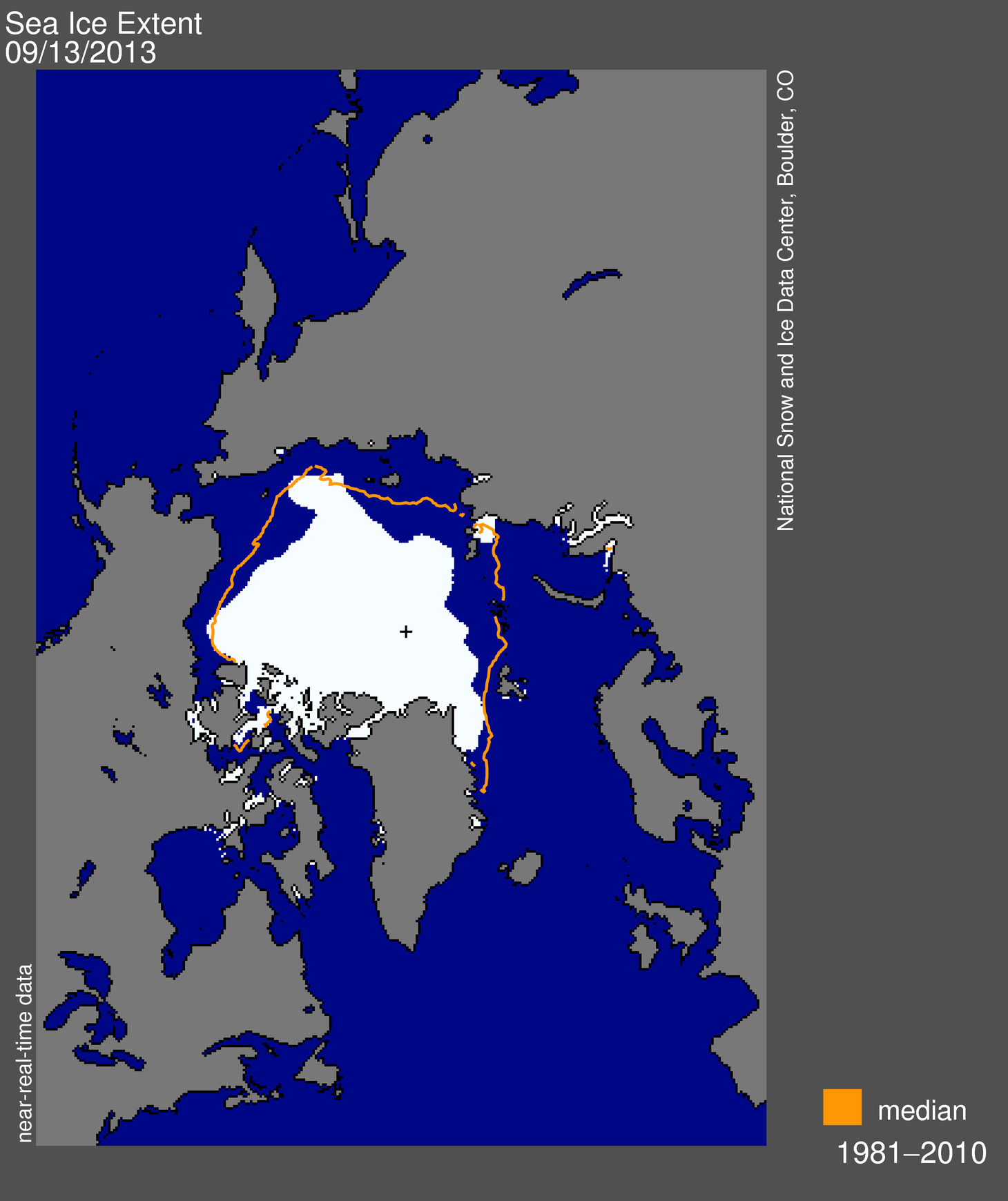
Figure 1. Arctic sea ice extent for September 13, 2013 was 5.10 million square kilometers (1.97 million square miles). The orange line shows the 1981 to 2010 median extent for that day. The black cross indicates the geographic North Pole. Sea Ice Index data. About the data
Credit: National Snow and Ice Data Center
On September 13, 2013, sea ice extent dropped to 5.10 million square kilometers (1.97 million square miles). This appears to have been the lowest extent of the year. In response to the setting sun and falling temperatures, ice extent will now climb through autumn and winter. However, a shift in wind patterns or a period of late season melt could still push the ice extent lower. The minimum extent was reached two days earlier than the 1981 to 2010 average minimum date of September 15.
Conditions in context

Figure 2. The graph above shows Arctic sea ice extent as of September 19, 2013, along with daily ice extent data for five previous years. 2013 is shown in blue, 2012 in green, 2011 in orange, 2010 in pink, 2009 in navy, and 2008 in purple. The 1981 to 2010 average is in dark gray. Sea Ice Index data.
Credit: National Snow and Ice Data Center
This year’s minimum was 1.69 million square kilometers (653,000 square miles) above the record minimum extent in the satellite era, which occurred on September 16, 2012, and 1.12 million square kilometers (432,000 square miles) below the 1981 to 2010 average minimum.
Varying distribution of ice in 2013 versus 2012

Figure 3. This image compares differences in ice-covered areas between September 13, 2013, the date of this year’s minimum, and September 16, 2012, the record low minimum extent. Light gray shading indicates the region where ice occurred in both 2013 and 2012, while white and dark gray areas show ice cover unique to 2013 and to 2012, respectively. Sea Ice Index data. About the data
Credit: National Snow and Ice Data Center
Comparing this year’s minimum extent to 2012, while extent was higher on average this year, there were variations from region to region. There was considerably higher sea ice extent in the Beaufort, Chukchi, and East Siberian sea regions, with the ice edge several hundred kilometers farther south compared to last year. This year the Canadian Archipelago also retained much more ice, keeping the Northwest Passage closed. The most notable area of less ice this year compared to last was off the east coast of Greenland, south of Fram Strait. Other small areas of decreased extent were found north of the Kara and Laptev seas.
See an animation of this summer’s sea ice extent produced by the NASA Scientific Visualization Studio at http://svs.gsfc.nasa.gov/goto?4104.
Previous minimum Arctic sea ice extents**
| YEAR | MINIMUM ICE EXTENT | DATE | |
|---|---|---|---|
| IN MILLIONS OF SQUARE KILOMETERS | IN MILLIONS OF SQUARE MILES | ||
| 2007 | 4.17 | 1.61 | September 18 |
| 2008 | 4.59 | 1.77 | September 20 |
| 2009 | 5.13 | 1.98 | September 13 |
| 2010 | 4.63 | 1.79 | September 21 |
| 2011 | 4.33 | 1.67 | September 11 |
| 2012 | 3.41 | 1.32 | September 16 |
| 2013 | 5.10 | 1.97 | September 13 |
| 1979 to 2000 average | 6.70 | 2.59 | September 13 |
| 1981 to 2010 average | 6.22 | 2.40 | September 15 |
* According to near-real-time data, this year’s minimum extent is slightly lower than 2009. However, the ranking between 2009 and 2013 is close, and may change once the final version of the data are processed. See our Frequently Asked Questions: Do your data undergo quality control? for more information about near-real-time data.
** Note that the dates and extents of the minimums have been re-calculated from what we posted in previous years; see our Frequently Asked Questions for more information.
====================================================================
The ARCUS sea ice forecasting contest
WUWT’s ARCUS Arctic sea ice forecast wasn’t far off the mark in June 2013, we actually did better than most with 4.8 million sqkm:
 for September 2013 sea ice extent (values are rounded to the tenths).")
Download High Resolution Version of Figure 1.
I had to laugh at the Met Office forecast. So much for supercomputer driven model skill.
WUWT didn’t participate in July due to scheduling conflicts with 4th of July holiday I had in making the deadline, but here are the entries:
 for September 2013 mean sea ice extent (values are rounded to the tenths).")
Download High Resolution Version of Figure 1.
The gloom and doom forecast of the Met Office didn’t change at 3.4, but it was bested by ultra-gloomer “Neven” at the Arctic Sea Ice Blog who said 3.2 would be the value.
WUWT did participate in August, essentially no change for the averaged top 5 vote.
Since ARCUS didn’t plot them, I’ve plotted all the participant forecasts below.

Figure 5: plot of September Arctic Sea Ice Extent Mean forecasts submitted to ARCUS in August 2013.
WUWT’s value is based on a weighted calculation of the top five vote getters in our poll here: http://wattsupwiththat.com/2013/08/11/sea-ice-news-volume-4-3-2013-sea-ice-forecast-contest/
The most popular value picked by WUWT readers was 5.0 msq/km 8.9% (94 votes), though it wasn’t a runaway vote, hence I opted for a weighted average of the top 5 vote getters.
The Met Office seems to have bowed out, and even at the late date, “Neven” was firmly in the gloom category again with 3.6.
The NCAR model ensemble guess didn’t do much better.
It should be noted that ARCUS has not made the final report yet, and that their forecast contest is based on the NSIDC September extent average, which has yet to be recorded. I’ll report that when it is available. Overall though, I’d say WUWT readers did better than gloomers, modelers, and of course, Wieslaw Maslowski.
Most certainly, even though the counter on the sidebar has not reached the Autumnal equinox indicating the end of summer, clearly Maslowski is falsified for 2013:
BBC – 12 December 2007
“Our projection of 2013 for the removal of ice in summer is not accounting for the last two minima, in 2005 and 2007,”…….”So given that fact, you can argue that may be our projection of 2013 is already too conservative.”
[Professor Wieslaw Maslowski]

Maslowski joins NASA’s Jay Zwally in the Hall of Lame:
National Geographic – 12 December 2007
“NASA climate scientist Jay Zwally said: “At this rate, the Arctic Ocean could be nearly ice-free at the end of summer by 2012, much faster than previous predictions.” ”
[Dr. Jay Zwally – NASA]
And of course, let’s not forget the Sierra Club:
Sierra Club – March 23, 2013
“For the record—I do not think that any sea ice will survive this summer. An event unprecedented in human history is today, this very moment, transpiring in the Arctic Ocean….”
[Paul Beckwith – PhD student paleoclimatology and climatology – part-time professor]

Source: http://www.sierraclub.ca/en/AdultDiscussionPlease
Read more on the ARCUS forecast here: http://www.arcus.org/search/seaiceoutlook
And of course, the WUWT sea ice reference page: http://wattsupwiththat.com/reference-pages/sea-ice-page/
If you extrapolate that rate of recovery, we’ll be in a full glacial in a decade or two.
So yesterday, Sept. 21, the sun went below the horizon in the Arctic, and ice will build up from here on. NIC reports the annual minimum of 5.511 M was reached on Sept. 14, though Sept. 20 was close at 5.514 M. Packed ice is at 4.9 M.
Since 2006 only 2009 and 2010 exceeded this year at the equinox, the most typical date for the minimum.
M Courtney says:
September 21, 2013 at 12:39 pm
Let’s not get carried away here.
The long-term trend in Arctic Ice is till, most definitely, down.
==============
…and the long term trend in global temps is also down
as Gail had pointed out to you
Well, fall is here…and when i shovel snow out of my driveway this winter ,will that mean less snow cover for my driveway and just anomalys for the grass areas just to the sides,with the general trend being down…?
“This change in the ______ may well be manmade and permanent” –
Thanks for the interesting articles and comments.
A lot has been made of the PIOMAS chart of average ice thickness being half what it was. Keep in mind that averages often aren’t useful metrics. In this case the average is heavily reduced because of the significant increase in ice extent — thin first year ice.
Nevan’s blog sure spends a lot of time talking about….us. I didn’t know his blog existed till Anthony mentioned it in the post above. So I wandered over there to take a look. Seems a lot of posts deal with closeups of this and that (the hole, etc), with an occasional view of regional weather pattern variations related to semi-permanent atmospheric pressure systems, some of which are well done.
It seems to me that worry is a key atmosphere in many AGWing blogs, while here we attempt to understand Earth’s intrinsic weather pattern variation random walk first and foremost before getting our knickers in a twist over the Sun, impending ice ages, etc. (though some here do engage in that sort of worry).
I am reminded of the fact that global circulation models set to pre-industrial conditions don’t work worth beans. So maybe the climate science community oughta spend more time on that before worrying over projected anthropogenic CO2 warming scenarios hooked up to GCM that don’t work? Can you imagine where we would be if Henry Ford tried to get his assembly line to work assbackwards?
Why is anyone surprised that the ice pattern is following the ~60 year cycle? Scientific amnesia?Lowest average for the cycle would have been in the 1970s if the NSIDC had been taking measurements then. The 30 years of warming are over.
Jimbo
I have some simple questions:
Did the Arctic recover after the 1920s to 1940s Arctic Warm Period?
you mean this arctic recovery?
note: red dots are “boots on the ice” physical observations of the arctic ice pack.
If you look at august ice values since 2000 you will see that ice levels have been much lower than the peak of your supposed arctic warming event.
I think it is very interesting that you would contest the statement regarding lies with an obvious exaggeration. I was talking about somebody I heard recently stating that the Sea Ice is at levels not seen since 1980 (because it went into the 2-sigma range of the 1980-2010 average–obviously doesn’t know how to read a graph) and another time when someone said that this year’s 60% increase (from zero) compared to last year is a “recovery” even though it is about half of the actual average that was found in the 1980’s.
a “recovery” to 1/2 of the average that we have had up there for the last two thousand years isn’t a real recovery.
Gail Combs
You said,
No they are not!
Quantifying The Size Of The USHCN Adjustment Fraud This shows 0.6 degrees C
we are talking apples and oranges here.
What I was saying is that the time series you posted in your graph that supposedly shows us “cooling” from the Holocene optimum only goes to 0 years “before present”
in paleoclimate studies the convention of “before present” is from the carbon-14 dating science:
http://www.elsevier.com/journals/quaternary-research/0033-5894/guide-for-authors
Guide for Authors
Calibrated (‘calendar’) radiocarbon dates are preferred to uncalibrated (‘raw’) dates. Raw 14C dates should be expressed as 14C yr BP (or 14C ka BP). “BP” (“before present”) should only be used in reporting 14C dates, for which “present” refers to AD 1950.
your argument that the temperatures have been adjusted doesn’t fly when you compare the surface temperatures to the satellite temperatures.
http://www.woodfortrees.org/plot/hadcrut4gl/last:500/mean:13/plot/hadcrut4gl/last:500/trend/plot/uah/last:500/mean:13/plot/uah/last:500/trend
Both show a large temperature increase, since they track closely, it is confirmed that their temperatures are “close enough” and certainly more accurate than saying that a graph that ends in 1950 (before present) is actually going into 2000 (cutting off 50 years of warming)
I mean, you DO concede that the planet has warmed over the last 50 years, right?
I mean, Dr. Roy Spencer certainly believes it, his own graph from his senate testimony shows a warming of .8C since 2050.
http://www.drroyspencer.com/wp-content/uploads/2000-yr-temperature-variations.png
Another ‘barbecue summer’ for the UKMO?
They are so bad you can almost guarantee that whatever they say will happen, won’t.
I can’t wait for November 30 to see how their ‘above average’ Atlantic hurricane season forecast turns out – only 7 more hurricanes to go!
http://en.wikipedia.org/wiki/2013_Atlantic_hurricane_season#Pre-season_forecasts
When will they notice that the tree they’re barking up isn’t the right one?
You have to wonder about Professor Peter Wadhams. Big Oil shill for 16 years:
He received continuous support from British Petroleum Co. from 1976 until 1992 …
http://www.damtp.cam.ac.uk/user/pw11/
He has spent a lifetime researching the Arctic and the Antarctic from above, below and on the surface. How can he be so spectacularly wrong about the changes we are seeing?
Perhaps the alarmism is simply theatre to achieve high levels of funding from sympathetic politicians and organisations – he certainly seems to have a thriving relationship with Greenpeace.
Who doesn’t believe the Arctic sea ice is melting all away? Just look at this image from a Yahoo! Canada slideshow “The Arctic Ocean’s shrinking ice”, and see how a walrus bravely defies gravity on a thin ice platform whittled down from an iceberg:
http://ca.news.yahoo.com/photos/the-arctic-ocean-slideshow/the-arctic-ocean-photo-1379704539196.html
That caught my eye as a photoshopping candidate, as otherwise it’d likely have to be a concealed structural steel construct to hold that weight. Physics alone says that whole piece would need to be resting on the bottom or connected underwater to a much larger chunk of ice, it should clearly be tipping over.
The photo credit to Greenpeace did not allay my suspicions.
Well, the picture is not showing the current ice, nor any recent ice. The caption honestly says it’s at least 14 years old: “…released by the environmental organization Wednesday 5th August 1999”. Was it altered?
Google Images got me closer to the original. It was used in a December 5, 2003 Greenpeace piece, What is the cryosphere, and why should we care? Iceworld melting into Waterworld?
They’re hyping some alarming CAGW book:
I haven’t heard of the authors before, not surprising, their conclusions are far from catastrophasizing enough for modern propaganda purposes:
You can click on the little pic. I found a direct link to the archive copy. Embedded info reveals it’s the Chukchi Sea, taken on July 13 in 1999, and the Greenpeace ship in the background is the “Arctic Sunrise”.
http://www.greenpeace.org/international/en/multimedia/photos/walrus-on-ice-floe-greenpeace/
Notice the manipulations of the version used by Yahoo! and many other sites. First one, it was cropped. They whacked off the right side which shows much more ice, and also the obvious Greenpeace watermark.
The other is more subtle. They made it blue. In the original, the ice looks dirty. The lighting is closer to sunrise/sunset, more reddish. But the word is spreading, Arctic sea ice is melting due to black carbon (soot) emissions. Dirty ice melts faster with or without CAGW.
Some magical photo tweaks later as the reddish-brown tones are muted, the ice is virtually pristine, of a bluish natural perfection well known from freshly-calved glaciers and swimming pools.
The bluing apparently comes from Greenpeace, as an uncropped blued version credited to them without the obvious Greenpeace watermark was used in a September 29, 2005 Sydney Morning Herald piece, Arctic melting: greenhouse effect blamed. The Yahoo! slideshow also said their blued version was released by Greenpeace in 1999. Then why did Greenpeace place the un-blued version in their own archive and use it in 2003? So far Greenpeace has established plausible deniability.
Fourteen year old photo showing a normal Arctic scene, catastrophasized to a poignant reminder of the imminent Arctic Apocalypse. With incontrovertible evidence like this, how can you not accept the inevitable absolute demise of the summer sea ice?
From Billy Liar on September 22, 2013 at 11:28 am:
The Met Office is hard at work establishing a scientifically proven negative correlation between their climate models and reality. Once completed, all they have to do is establish the parameters for inverting the outputs and their projections will be absolute perfection.
From jai mitchell on September 22, 2013 at 11:05 am:
Rookie mistake, all data sources do not report at the same time, “last 500” can lead to a mismatch. Call out “From” times, and “To” times as well to lock-in results like trends.
Sure enough, the Raw Data shows UAH is up to 2013.67, HADCRUT4 only to 2013.58. A call-out like this is better:
http://www.woodfortrees.org/plot/hadcrut4gl/from:1979/to:2013/plot/hadcrut4gl/from:1979/to:2013/trend/plot/uah/from:1979/to:2013/plot/uah/from:1979/to:2013/trend
You should also note WFT is still using UAH v5.5, UAH moved on to v5.6.
It’s also good to do a comparison like this, splitting the examined section. I used 2000 since, well, it is the millennium.
http://www.woodfortrees.org/plot/hadcrut4gl/from:1979/to:2000/plot/hadcrut4gl/from:1979/to:2000/trend/plot/uah/from:1979/to:2000/plot/uah/from:1979/to:2000/trend/plot/hadcrut4gl/from:2000/to:2013/plot/hadcrut4gl/from:2000/to:2013/trend/plot/uah/from:2000/to:2013/plot/uah/from:2000/to:2013/trend
Looks like HADCRUT4 warmed faster in the past, but to even out with UAH they slowed down recently.
Of course HADCRUT4 is a new shiny thing, for a more properly historical match you should use the older HADCRUT3.
http://www.woodfortrees.org/plot/hadcrut3vgl/from:1979/to:2000/plot/hadcrut3vgl/from:1979/to:2000/trend/plot/uah/from:1979/to:2000/plot/uah/from:1979/to:2000/trend/plot/hadcrut3vgl/from:2000/to:2013/plot/hadcrut3vgl/from:2000/to:2013/trend/plot/uah/from:2000/to:2013/plot/uah/from:2000/to:2013/trend
Ye-ouch! No wonder they changed versions, HADCRUT3 was showing so much more warming the most-recent rate had to slow to virtually nothing to match up!
Data manipulation is so much easier when you can just declare a new version and cover up the previous misdeeds.
NSIDC’s September ice extent average is coming in at 5.24M km^2. So, it will be higher than the WUWT poll for the Arcus Sea Ice Outlook prediction game and higher than all but 1 other guess.
The ice extent has very closely followed the historic climatology since mid-July. This is quite a bit different than the last few years which showed much more melt late in the season compared to the average.
http://s21.postimg.org/kwvgcknd3/NSIDC_Sept_Min_Proj_Sept21_2013.png
Kadaka,
I agree with you that Greenpeace have been photoshopping the walrus pic.
I’ll try to find the original for comparison. One attempt led me to an alarmist poem here: http://allpoetry.com/poem/1733988-Sleeping-Giant-by-Mark_Rickerby
Apparently you and I – and the poet (correction not poet but “”poet””) – are a cancer:
She will surely survive us
And begin to heal
After the cancer is destroyed. How very rude!
kadaka (KD Knoebel) says:
September 22, 2013 at 12:00 pm
That’s definitely grounded ice with a little wave-cut platform. I would guess that there isn’t much tidal range there either.
The largest known tidal range at Point Barrow is 0.17m 0.6 feet.
http://www.tide-forecast.com/locations/Point-Barrow-Alaska/tides/latest
… and another thing; that walrus didn’t jump up there, the lazy beast has been there for hours – since the last high tide.
I think Al Gore also asserted ice free artic in 2013 back in 2008. “5 years!” was his catchphrase.
At this seasonal turning point, since 2013’s Arctic sea-ice minimum is above those of previous years, winter 2014’s maximum should also be commensurately higher. Any bets on that one?
jai mitchell says:
September 22, 2013 at 10:40 am
a “recovery” to 1/2 of the average that we have had up there for the last two thousand years isn’t a real recovery.
=============================================================
You are quite well known for posting tendentious rubbish, but this one takes the biscuit. Are you seriously trying to con us into believing that you have the data which demonstrates clearly the amount of ice in the Arctic since the year 13 CE (or AD depending on your world view)? You’ll need that in order to back up your statement, otherwise we might think that you’re spouting complete [self snip – but it starts with ‘bo’ ends in ‘ocks’ and has the letter ‘l’ repeated in the middle of it].
Or is it maybe, in light of your comment above the above extract [even though it is about half of the actual average that was found in the 1980′s], that you believe that the 1980’s (sic) lasted for 2000 years?
As Private Eye might put it, “I think we should be told.”
jai mitchell says:
September 22, 2013 at 11:05 am
Gail Combs
You said,
No they are not!
Quantifying The Size Of The USHCN Adjustment Fraud This shows 0.6 degrees C
we are talking apples and oranges here…..
>>>>>>>>>>>>>>>>>>>>>>
Nice try at changing the subject.
You know darn well I was addressing your claim at September 21, 2013 at 7:27 pm that I highlighted:
As the Köppen Map as well as the raw data shows the last half of the 20th century is no different than the first half.
The ‘dramatic’ increase in temperatures is caused by man alright. A Mann with a very heavy thumb on the scale. The fact that the Climate Catastrophe Crowd has to ‘Adjust’ historic and current data AND all adjustments ADD to current ‘High’ temperatures is enough to make any true scientist into a skeptic.
When it became rather obvious they were making those type of ‘Adjustments’ because the surface temperature measurements were diverging more and more from the satellite measurements they had to stop making their ‘Adjustments’ and so we now have “The Pause’
There is plenty of information on the data manipulation shennanigans at WUWT, Diggingintheclay and Chiefio. (See sidebar)
Oh no, man fails again to get it right…..my 12 year old even see’s through this fraud.
Gail Combs, Greg Goodman and Latitude.
Latitude: Agreed, the global temperatures are going down. I don’t see what that necessarily has to do with Arctic ice. And Arctic Ice is in decline.
Greg Goodman: Agreed, the Arctic Ice is not dropping linearly. I don’t see why it would be expected to fall in a straight line. But Arctic Ice is in decline.
Gail Combs: Perhaps or perhaps not. There have been changes in the Arctic regions related to occupation that have not been seen before. There needs evidence to rule them out as potential causes for the decline in Arctic Ice. I do not assert that these changes are the cause in the decline in Arctic Ice but they may be as Arctic Ice is in decline.
Newcomers reading this thread may think me an alarmist. But actually I am sceptical of the impact of CO2 on global temperatures. That does not mean that I think the Arctic Ice is eternal.
Arctic Ice is in decline.
So why hold the end of the decline in Arctic Ice as the proof of the weakness in AGW theory?
It isn’t proof related to AGW and it wouldn’t be a strong suit for sceptics if it were.
On that chart you linked to I also see “The chart from August 1932”. Thank you for the one month sample from one year. I also read: “both direct observations (marked in red) and the presumed but not observed ice edge (the white edge).”