
Guest post submitted by Ken Gregory, Friends of Science.org
An analysis of NASA satellite data shows that water vapor, the most important greenhouse gas, has declined in the upper atmosphere causing a cooling effect that is 16 times greater than the warming effect from man-made greenhouse gas emissions during the period 1990 to 2001.
The world has spent over $ 1 trillion on climate change mitigation based on climate models that don’t work. They are notoriously poor at simulating the 20th century warming because they do not include natural causes of climate change – mainly due to the changing sun – and they grossly exaggerate the feedback effects of greenhouse gas emissions.
Most scientists agree that doubling the amount of carbon dioxide (CO2) in the atmosphere, which takes about 150 years, would theoretically warm the earth by one degree Celsius if there were no change in evaporation, the amount or distribution of water vapor and clouds. Climate models amplify the initial CO2 effect by a factor of three by assuming positive feedbacks from water vapor and clouds, for which there is little direct evidence. Most of the amplification by the climate models is due to an increase in upper atmosphere water vapor.
The Satellite Data
The NASA water vapor project (NVAP) uses multiple satellite sensors to create a standard climate dataset to measure long-term variability of global water vapor.
NASA recently released the Heritage NVAP data which gives water vapor measurement from 1988 to 2001 on a 1 degree by 1 degree grid, in three vertical layers.1 The NVAP-M project, which is not yet available, extends the analysis to 2009 and gives five vertical layers.
From the NVAP project page:
The NASA MEaSUREs program began in 2008 and has the goal of creating stable, community accepted Earth System Data Records (ESDRs) for a variety of geophysical time series. A reanalysis and extension of the NASA Water Vapor Project (NVAP), called NVAP-M is being performed as part of this program. When processing is complete, NVAP-M will span 1987-2010. Read about changes in the new version.
Water vapor content of an atmospheric layer is represented by the height in millimeters (mm) that would result from precipitating all the water vapor in a vertical column to liquid water. The near-surface layer is from the surface to where the atmospheric pressure is 700 millibar (mb), or about 3 km altitude. The middle layer is from 700 mb to 500 mb air pressure, or from 3 km to 6 km attitude. The upper layer is from 500 mb to 300 mb air pressure, or from 6 km to 10 km altitude.
The global annual average precipitable water vapor by atmospheric layer and by hemisphere from 1988 to 2001 is shown in Figure 1.
The graph is presented on a logarithmic scale so the vertical change of the curves approximately represents the forcing effect of the change. For a steady earth temperature, the amount of incoming solar energy absorbed by the climate system must be balanced by an equal amount of outgoing longwave radiation (OLR) at the top of the atmosphere. An increase of water vapor in the upper atmosphere would temporarily reduce the OLR, creating a forcing of more incoming than outgoing energy, which raises the temperature of the atmosphere until the balance is restored.

Figure 1. Precipitable water vapor by layer, global and by hemisphere.
The graph shows a significant percentage decline in upper and middle layer water vapor from 1995 to 2001. The near-surface layer shows a smaller percentage increase, but a larger absolute increase in water vapor than the other layers. The upper and middle layer water vapor decreases are greater in the Southern Hemisphere than in the Northern Hemisphere.
Table 1 below shows the precipitable water vapor for the three layers of the Heritage NVAP and the CO2 content for the years 1990 and 2001, and the change.
| Layer | L1 near-surface | L2 middle | L3 upper | Sum | CO2 |
| 1013-700 | 700-500 | 500-300 | |||
| mm | mm | mm | mm | ppmv | |
| 1990 | 18.99 | 4.6 | 1.49 | 25.08 | 354.16 |
| 2001 | 20.72 | 4.03 | 0.94 | 25.69 | 371.07 |
| change | 1.73 | -0.57 | -0.55 | 0.61 | 16.91 |
Table 1. Heritage NVAP 1990 and 2001 water vapour and CO2.
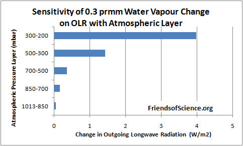
Dr. Ferenc Miskolczi performed computations using the HARTCODE line-by-line radiative code to determine the sensitivity of OLR to a 0.3 mm change in precipitable water vapor in each of 5 layers of the NVAP-M project. The program uses thousands of measured absorption lines and is capable of doing accurate radiative flux calculations. Figure 2 shows the effect on OLR of a change of 0.3 mm in each layer.
The results show that a water vapor change in the 500-300 mb layer has 29 times the effect on OLR than the same change in the 1013-850 mb near-surface layer. A water vapor change in the 300-200 mb layer has 81 times the effect on OLR than the same change in the 1013-850 mb near-surface layer.

Figure 2. Sensitivity of 0.3 mm precipitable water vapor change on outgoing longwave radiation by atmospheric layer.
Table 2 below shows the change in OLR per change in water vapor in each layer, and the change in OLR from 1990 to 2001 due to the change in precipitable water vapor (PWV).
| L1 | L2 | L3 | Sum | CO2 | ||
| OLR/PWV | W/m2/mm | -0.329 | -1.192 | -4.75 | ||
| OLR/CO2 | W/m2/ppmv | -0.0101 | ||||
| OLR change | W/m2 | -0.569 | 0.679 | 2.613 | 2.723 | -0.171 |
Table 2. Change of OLR by layer from water vapor and from CO2 from 1990 to 2001.
The calculations show that the cooling effect of the water vapor changes on OLR is 16 times greater than the warming effect of CO2 during this 11-year period. The cooling effect of the two upper layers is 5.8 times greater than the warming effect of the lowest layer.
These results highlight the fact that changes in the total water vapor column, from surface to the top of the atmosphere, is of little relevance to climate change because the sensitivity of OLR to water vapor changes in the upper atmosphere overwhelms changes in the lower atmosphere.
The precipitable water vapour by layer versus latitude by one degree bands for the year 1991 is shown in Figure 3. The North Pole is at the right side of the figure. The water vapor amount in the Arctic in the 500 to 300 mb layer goes to a minimum of 0.53 mm at 68.5 degrees North, then increases to 0.94 mm near the North Pole.

Figure 3. Precipitable water vapor by layer in 1991.
The NVAP-M project extends the analysis to 2009 and reprocesses the Heritage NVAP data. This layered data is not publicly available. The total precipitable water (TPW) data is shown in Figure 4, reproduced from the paper Vonder Haar et al (2012) here. There is no evidence of increasing water vapor to enhance the small warming effect from CO2.

Figure 4. Global month total precipitable water vapor NVAP-M.
The Radiosonde Data
Water vapor humidity data is measured by radiosonde (on weather balloons) and by satellites. The radiosonde humidity data is from the NOAA Earth System Research Laboratory here.

Figure 5. Global relative humidity, middle and upper atmosphere, from radiosonde data, NOAA Earth System Research Laboratory.
A graph of the global average annual relative humidity (RH) from 300 mb to 700 mb is shown in Figure 5. The specific humidity in g/kg of moist air at 400 mb (8 km) is shown in Figure 6. It shows that specific humidity has declined by 14% since 1948 using the best fit line.

Figure 6. Specific humidity at 400 mb pressure level
In contrast, climate models all show RH staying constant, implying that specific humidity is forecast to increase with warming. So climate models show positive feedback and rising specific humidity with warming in the upper troposphere, but the data shows falling specific humidity and negative feedback.
Many climate scientists dismiss the radiosonde data because of changing instrumentation and the declining humidity conflicts with the climate model simulations. However, the radiosonde instruments were calibrated and the data corrected for changes in response times. The data before 1960 should be regarded as unreliable due to poor global coverage and inferior instruments. The near surface radiosonde measurements from 1960 to date show no change in relative humidity which is consistent with theory. Both the satellite and radiosonde data shows declining upper atmosphere humidity, so there is no reason to dismiss the radiosonde data. The radiosonde data only measures humidity over land stations, so it is interesting to compare to the satellite measurements which have global coverage.
Comparison Between Radiosonde and Satellite Data
The specific humidity radiosonde data was converted to precipitable water vapor for comparison with the satellite data. Figure 7 compares the satellite data to the radiosonde data for the years 1988 to 2001.

Figure 7. Comparison between NOAA radiosonde and NVAP satellite derived precipitable water vapor.
The NOAA and NVAP data compares very well for the period 1988 to 1995. The NVAP satellite data shows less water vapor in the upper and middle layers than the NOAA data. In 2000 and 2001 the NVAP data shows more water vapor in the near-surface layer than the NOAA data. The vertical change on the logarithmic graph is roughly equal to the forcing effect of each layer, so the NVAP data shows water vapor has a greater cooling effect than the radiosonde data.
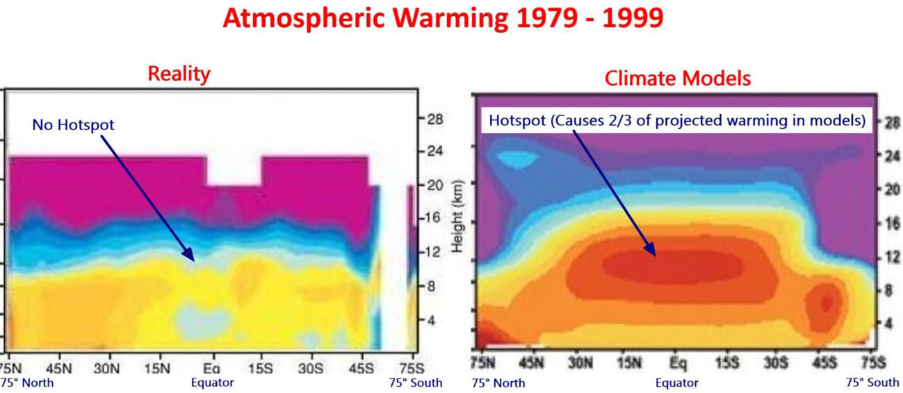
The Tropical Hot Spot
The models predict a distinctive pattern of warming – a “hot-spot” of enhanced warming in the upper atmosphere at 8 km to 13 km over the tropics, shown as the large red spot in Figure 8. The temperature at this “hot-spot” is projected to increase at a rate of two to three times faster than at the surface. However, the Hadley Centre’s real-world plot of radiosonde temperature observations from weather balloons shown below does not show the projected hot-spot at all. The predicted hot-spot is entirely absent from the observational record. If it was there it would have been easily detected.
The hot-spot is forecast in climate models due to the theory that the water vapor profile in the tropics is dominated by the moist adiabatic lapse rate, which requires that water vapor increases in the upper atmosphere with warming. The moist adiabatic lapse rate describes how the temperature of a parcel of water-saturated air changes as it move up in the atmosphere by convection such as within a thunder cloud. A graph here shows two lapse rate profiles with a larger temperature difference in the upper atmosphere than at the surface. The projected water vapor increase creates the hot-spot and is responsible for half to two-thirds of the surface warming in the IPCC climate models.

Figure 8. Climate models predict a hot spot of enhanced warming rate in the tropics, 8 km to 13 km altitude. Radiosonde data shows the hot spot does not exist. Red indicates the fastest warming rate. Source: http://joannenova.com.au
The projected upper atmosphere water vapor trends and temperature amplification at the hot-spot are intricately linked in the IPCC climate theory. The declining upper atmosphere humidity is consistent with the lack of a tropical hot spot, and both observations prove that the IPCC climate theory is wrong.
A recent technical paper Po-Chedley and Fu (2012) here compares the temperature trends of the lower and upper troposphere in the tropics from satellite data to the climate model projections from the period 1981 to 2008.2 The upper troposphere is the part of the atmosphere where the pressure ranges from 500 mb to 100 mb, or from about 6 km to 15 km. The paper reports that the warming trend during 1981 to 2008 in the upper troposphere simulated by climate models is 1.19 times the simulated warming trend of the lower atmosphere in the tropics. (Note this comparison is to the lower atmosphere, not the surface, and includes 10 years of no warming to 2008.) Using the most current version (5.5) of the satellite temperature data from the University of Alabama in Huntsville (UAH), the warming trend of the upper troposphere is only 0.973 of the lower troposphere in the tropics for the same period. This is different from that reported in the paper because the authors used an obsolete version (5.4) of the data. The satellite data shows not only a lack of a hot-spot, it shows a cold-spot just where a hot-spot was predicted.
Conclusion
Climate models predict upper atmosphere moistening which triples the greenhouse effect from man-made carbon dioxide emissions. The new satellite data from the NASA water vapor project shows declining upper atmosphere water vapor during the period 1988 to 2001. It is the best available data for water vapor because it has global coverage. Calculations by a line-by-line radiative code show that upper atmosphere water vapor changes at 500 mb to 300 mb have 29 times greater effect on OLR and temperatures than the same change near the surface. The cooling effect of the water vapor changes on OLR is 16 times greater than the warming effect of CO2 during the 1990 to 2001 period. Radiosonde data shows that upper atmosphere water vapor declines with warming. The IPCC dismisses the radiosonde data as the decline is inconsistent with theory. During the 1990 to 2001 period, upper atmosphere water vapor from satellite data declines more than that from radiosonde data, so there is no reason to dismiss the radiosonde data. Changes in water vapor are linked to temperature trends in the upper atmosphere. Both satellite data and radiosonde data confirm the absence of any tropical upper atmosphere temperature amplification, contrary to IPCC theory. Four independent data sets demonstrate that the IPCC theory is wrong. CO2 does not cause significant global warming.
Note 1. The NVAP data in Excel format is here.
Note 2. The lower troposphere data is: http://www.nsstc.uah.edu/public/msu/t2lt/uahncdc.lt
The upper troposphere data is calculated as 1.1 x middle troposphere – 0.1 x lower stratosphere; where middle troposphere is: http://www.nsstc.uah.edu/public/msu/t2/uahncdc.mt and the lower stratosphere is:http://www.nsstc.uah.edu/public/msu/t4/uahncdc.ls
============================================================
The original article is located at http://www.friendsofscience.org/index.php?id=483
“The world has spent over $ 1 trillion on climate change mitigation based on climate models that don’t work. They are notoriously poor at simulating the 20th century warming because they do not include natural causes of climate change – mainly due to the changing sun – and they grossly exaggerate the feedback effects of greenhouse gas emissions.”
You mean like these models?
http://www.ipcc.ch/publications_and_data/ar4/wg1/en/figure-9-5.html
http://web.archive.org/web/20100322194954/http://tamino.wordpress.com/2010/01/13/models-2/
Hmm, looks like enough decline to have added to sea level rise.
So grandpa was right. It’s not the heat, it’s the humidity.
Is HARTCODE available for anyone to download and run? If so how does one get it?
But still the burning question of our times remains- Can we possibly adapt?
http://news.nationalpost.com/2013/03/05/giant-ancient-camel-remains-discovered-in-canadian-arctic/
Rattus Norvegicus says:
“You might want to read NASA’s statement on using NVAP for multidecadal trends:
http://nvap.stcnet.com/NVAP_Trend_Statement.pdf
Quick summary: don’t do it!”
Thank you Rattus. NASA’s statement is quite insightful:
“There are several natural events and especially data and algorithmic time-dependent biases that cause us to conclude that the extant NVAP dataset is not currently suitable for detecting trends in total precipitable water (TPW) or layered water vapor on decadal scales. These include:
• Several changes in the NOAA Tiros Operational Vertical Sounder (TOVS) retrievals during the 1990’s. And lack of any instrument-to-instrument calibration when the dataset was produced. TOVS data provides much of the information over land.
• Changes in the microwave ocean algorithm and supporting data (sea ice, sea surface temperature), and lack of any intercalibration of the Special Sensor Microwave / Imager (SSM/I) instruments onboard six different satellites. Radiance intercalibration of this important dataset is just beginning to appear in 2010.
• Production of NVAP in four steps during the 1990’s, with new instruments as they became available.
• Large natural geophysical events occurring during the time period (1987 ENSO and transition to 1988 La Nina at the beginning of the record; Pinatubo eruption in 1991, large 1997-1998 El Nino. Whether or not one uses these events in a trend study can impact the slope of the trend line.
The NVAP dataset now available to the public has never been reanalyzed. A reanalysis effort should be a natural part of a climate dataset, as the first trend studies often uncover previously unknown errors in the data. At this time, we cannot prove or disprove a robust trend due to atmospheric changes with NVAP…”
Wow! Now there’s a smokescreen of doubt that includes: equipment calibration errors, algorithm errors, La Nina events, volcanic eruptions and El Nino events. NASA concludes that without adjusting, er… ‘reanalyzing’ the data, they can’t be sure of anything!
Where have we heard this before? Oh yeah… these are the same excuses invoked for sea levels not rising and for temperatures not increasing according to the model projections. But luckily, once the ‘corrections’ were factored in (during adjustment, er… reanalysis of the data), both sea levels and temperatures increased in almost exact accordance with the models. TaDa!!
Miss Cleo, my psychic friend assures me that after NASA adjusts, er… ‘reanalyzes’ this data, it will show water vapor concentrations increased almost exactly the way the models predicted as well. TaDa!!
I don’t believe in CAGW like other folk here but even I am a bit skeptical of this article and the charts they’ve put up or their interpretations. They look wonky to me. If everything is pointing to cooling for the period shown, then why did it actually warm so much?
(I’m also curious about what was included in the $1 trillion dollars of climate mitigation works. Was that things like the movable barriers built after Katrina?)
Some of the other articles on WUWT make more sense. I don’t think these people are very credible and might be why other people sometimes make fun of this site.
Bob Tisdale, tell that to the people living along the coast of Queensland! Some are up over a metre this year.
The failing of the models no doubt explains the sudden push to confirm Global Warming by ABC Australia and, it seems, other country’s media
Martin,
I don’t know where the $trillion came from, but the U.S. alone has spent well over $100 billion just since 2000. There are 196 other countries and lots of them spend money on that nonsense, especially in the EU.
As to why it warmed, the most reasonable explanation is the recovery from the LIA. The real question is: what caused the LIA?
And if anyone is making fun of WUWT, then you are inhabiting the wrong blogs.
Interesting stuff. Much more interesting than what I should be doing, (my taxes.)
My hyperactive mind can come up with around ten different theories about what might be altering the moisture in the atmosphere. If I stated what they were, I could activate the WUWT immune system, and see my ten theories questioned, probed and shot down in flames.
However if I was a Climate Scientist, and lived in a rarified la-la land where such intellectual antibodies were not allowed to question a theory, I would find a way to link the change in moisture with the change in CO2. For example, without any real knowledge of the chemistry or biology involved, I, as a layman, can dream up an action-and-reaction scenario wherein the increase in CO2 makes plants “drink more water.”
Sounds reasonable to me, and likely mainstream media would run with the story, which would be something like this:
CO2 caused plants to get hyper and “eat” more water, and when the water was gone the planet got colder, so Global Warming is causing an ice age.
I’m just giving you fellows a heads-up. After all, Alarmists want their carbon taxes really badly, and will desperately fabricate, (like the best snake-oil salesman amidst a angry lynch mob,) to survive.
The stuff Alarmists are dreaming up to cover their hindquarters, as Global Warming is confronted by a colder planet, is, in one way, a big joke, but in another way Alarmists are expertly playing a dangerous game, and are doing a fine job of bluffing when their hand doesn’t even hold a pair of deuces.
However they can’t withstand the WUWT immune system. Keep up the good work, fellows.
I was going to suggest if the extreme weather catastrophists have coopted the polar bear as their iconic symbol, climate realists adopt the intrepid camel as ours. Our ship of the science desert.
It is well known that there are many good scientists at NASA. It is also well known that many of these scientists resent the circus Jimbo Hansen has created. One wonders if they work especially hard on projects which might embarass Hansen or, perhaps, look for research with the potiential to embarass Hansen. One wonders?
As an aside, all of the climate research should have created alot of new information which would increase our knowledge and predictive ability of the weather. Unfortunately the reaserch has been so corrupted by “adjustments”, lost data and politics that it may be useless. One wonders of Anthony has ever considered this notion??
Where does all that water vapor move to in the end anyhow?
Philip Shehan says:
March 6, 2013 at 5:46 pm
When comparing climate model simulations to measurements it is best to use sea surface temperatures because these measurements are not contaminated by the urban heat island effect.
During the period 1982 to 2011, the global average model trend was similar to the global average observations, but on a zonal basis, the simulations were notoriously poor. See Bob Tisdales graph:
http://www.friendsofscience.org/assets/documents/FOS%20Essay/Tisdale_Lat_SST_Model.jpg
The models greatly underestimated warming in the north regions 50 to 70 degrees North, but greatly overestimated warming in the tropics 25 degrees South to 25 North, and the Southern Oceans 70 South to 40 South. There was no increase in the greenhouse effect from 60 to 85 North, so the northern warming was not caused by greenhouse gases. See:
http://www.friendsofscience.org/assets/documents/The_Melting_North.htm
The climate model sea surface warming trend at the equator from 1982 is 6 times higher than measured by satellites. The models failed to simulate the southern ocean cooling. The average of three big fails is not a win.
The oceans cooled from 1945 to 1975, but the models simulate warming during this period even though some scientists say the models have too much aerosol cooling during the period. From 1910 to 1945, the SST actual warming rate was was 4.5 times greater than the modeled trend. The models cannot replicate the measurements because they do not include natural causes of climate change. See graph:
http://www.friendsofscience.org/assets/documents/FOS%20Essay/Tisdale_NA_SST_Model_1910-44.jpg
And what about the last 15 years? See the HUGE discrepancy between models and measurements here:
http://www.friendsofscience.org/assets/documents/ClimateModels_Obs.jpg
For the life of me…..I can’t see how anyone can look at this and worry about a 1/2 degree..even if that 1/2 degree was accurate
http://www.foresight.org/nanodot/wp-content/uploads/2009/12/histo2.png
D.B. Stealey says:
March 6, 2013 at 6:48 pm
“I don’t know where the $trillion came from, but the U.S. alone has spent well over $100 billion just since 2000. There are 196 other countries and lots of them spend money on that nonsense, especially in the EU.”
——————————————————————————————————————-
I would suggest consideration be applied to the tertiary costs of associated policy, regulation, and behavior modification as dictated by such funding.
Take the corn for gas philosophy as was driven by climate science theory and provided by funding for some government project.. It does not make “physics” sense and costs all end users money that ultimately re-funds a failed scientific ideology. Let alone moving food for some, to gas tanks for others. Painful to watch.
That is just one example of the exponential influence of science actually making policy that cost all of us in the end. After all, governments don’t make money, they just spend it. When government makes policy that forcibly changes consumer behavior and the companies that provide for them, that is a cost we all pay in the end, not the government or business involved. . Right or wrong, it is what it is.
I would say the number expended on such is in the 10’s of Trillions globally and in aggregate.
Just my take ~
The edifice is crumbling…
If water vapor is decreasing, then…
How can storms be more intense in a warming world because the air holds more moisture?
How can the greenhouse effect be increased positive feedback from extra water vapor?
Ken Gregory says:
March 6, 2013 at 2:39 pm
Theo Goodwin says:
March 6, 2013 at 12:22 pm
“The no-feedback climate sensitivity to double CO2 is calculated by climate models where water vapor, clouds, ice, evaporation etc. are held constant. It is about 1 C.”
Calculations made in the environment of “models where water vapor, clouds, ice, evaporation etc. are held constant” is not even as good as a laboratory calculation. It is not only an “a priori” calculation but a calculation in a toy. In the atmosphere, CO2, water vapor, the other GHGs, the other forcings such as clouds, and temperature all interact with one another and a change in one will affect some or all of the others. In reality, there is no such thing as holding everything else constant while calculating a value for a doubling of C02.
For example, Alarmists claim that rising concentrations of CO2 cause rising temperatures that, in turn, cause increases in water vapor and that the increasing water vapor causes additional increases in temperature. But the Alarmist claim might be false either because increasing CO2 does not cause increases in water vapor or because an increase in water vapor proves to be a negative feedback. One strong negative feedback can cause a doubling of CO2 to produce a rise in global average temperature that is seriously less than 1C.
If genuine empirical research over the next few decades reveals, as a matter of good old fashioned science, that a doubling of C02 causes an increase in global average temperature of 0.01C in the real world, would you then say that the value for a doubling is 1C? Why would you care what the model said?
The use of 1C is simply a convenient fiction, a starting point, for the modelers. As long as we recognize that it is a fiction then it is a harmless one.
Note that I also wrote that legend has it that Arrhenius made the estimate of 1C from his laboratory work. That legend is just as good as a convenient fiction and it contains the phrase “laboratory work” which sounds like science.
I also said that some say that Richard Lindzen’s best guess is 1C. If you are actually looking for a reason for holding the 1C figure, Lindzen is as good a reason as you will find.
D.B. Stealey says:
March 6, 2013 at 6:48 pm
The $trillion dollars came from an ICSC news release by Steve Goreham
http://www.climatescienceinternational.org/index.php?option=com_content&view=article&id=674
I asked Steve Goreham for the source of this estimate and he sent me a report by the Pew Energy Trust Report.
http://www.pewenvironment.org/uploadedFiles/PEG/Publications/Report/G-20Report-LOWRes-FINAL.pdf
The estimate of the 10 year cost is based on the chart on page 4 (pdf page 6) that shows 2004 to 2010. On page 4, the estimate for 2010 “finance and investment” is $243 billion. But the chart excludes financing, research and development in renewable energy. I built an Excel file to extrapolate the total costs to 10 years and to include finance cost, assuming the ratio of finance/total cost remains constant. Total cost is $1062 billion including finance and investment costs in Wind and Solar projects to reduce CO2 emissions from 2001 to 2010. It does not include any costs for climate research or IPCC type activities.
The article mentions Ferenc Miskolczi.
A former NASA scientist ,forced to resign.
Whose published peer reviewed work on declining water vapor and optical depth was ignored by science and the media.
The empirical evidence speaks for itself .
Even if one wants to dispute Miskolczi’s hypothesis .
But if Miskolczi was ignored ,why would the MSM take notice now?
I
” Michael R. Moon says:
March 6, 2013 at 4:00 pm
“Trying not to be a conspiracy nut, but since NASA is a government funded organization, and US taxpayers fund it i.e. – We paid for this information. Why and who has been sitting on this information for the entire “Global Warming” time period. The data start in 1988 and from the shown graph by 1995 the “causes more water” theory was shot down.
Talk about hide the decline.”
Hear, hear! NASA is sitting on this as it will end Hansen, expose a lot of nonsense in a lot of models, and rearrange a lot of people’s careers. Wonder if Obomination has anything to do with it? He does have his fingers in a lot of pies. FOIA, anyone? Ken Gregory, you know where the bodies are buried?”
Caleb says:
March 6, 2013 at 6:50 pm
“…Alarmists are expertly playing a dangerous game, and are doing a fine job of bluffing when their hand doesn’t even hold a pair of deuces.”
They are bluffing. We spend much of our time pealing their onions. They have been bluffing for years. When is the last time that an Alarmist published a paper that made a contribution to any part of the debate with skeptics? Many years. They have been the same old same old for many years.
paullinsay says:
March 6, 2013 at 6:26 pm
It is difficult to run. I just provide Ferenc Miskolczi the data and ask him to run it.
“Well, it’s just like I always thought, the IPCC’s theories don’t hold water!” ~William McClenny
Magnificent… ok folks, we can shut it all down and go home, William just won the internets.
Question:
What would habe been the OLR change [W/m2] for the radiosonde data between 1990-2001 ?
So, between 1990-2001, there was a radiation change of -2.723 W/m2 due to water vapour.
This number is huge !
Its absolut value is higher than the total radiative forcing change between 1750-2011 given in the leaked AR5 report, which is about +2.4 W/m2.
http://i81.photobucket.com/albums/j237/hausfath/ScreenShot2012-12-13at43419PM_zps4a925dbf.png
So why did temperatures then not go back to little ice age temperatures around 2001 ?
1. The sun may have prevented temperatures from plunging. Though there is excellent evidence for some solar amplification mechanism, such a giant effect over such a short time frame is hard to swallow.
2. There is something wrong with satellite data after 1995 and radiosonde data is correct. Then the radiation change would be smaller but still opposite to climate model assumptions.
3. Forcing of water vapour is much lower than thought
I’m not sure this is good news. A 1.0 C increase in GMT, without an subsequent increase in precipitation, would stress the planet’s bio-sphere (increased desertification etc.) On the other hand, if increased GMT does not cause increased absolute humidity, doesn’t that mean rainfall must have increased preventing an accumulation of atmospheric water vapor, over the study period? Otherwise, as another poster mentioned, if it doesn’t fall as rain/precipitation… then it has gone missing… Antarctic?!?
I think, I will sit on the fence, regarding these results, until further digested by the community. GK