
Guest post submitted by Ken Gregory, Friends of Science.org
An analysis of NASA satellite data shows that water vapor, the most important greenhouse gas, has declined in the upper atmosphere causing a cooling effect that is 16 times greater than the warming effect from man-made greenhouse gas emissions during the period 1990 to 2001.
The world has spent over $ 1 trillion on climate change mitigation based on climate models that don’t work. They are notoriously poor at simulating the 20th century warming because they do not include natural causes of climate change – mainly due to the changing sun – and they grossly exaggerate the feedback effects of greenhouse gas emissions.
Most scientists agree that doubling the amount of carbon dioxide (CO2) in the atmosphere, which takes about 150 years, would theoretically warm the earth by one degree Celsius if there were no change in evaporation, the amount or distribution of water vapor and clouds. Climate models amplify the initial CO2 effect by a factor of three by assuming positive feedbacks from water vapor and clouds, for which there is little direct evidence. Most of the amplification by the climate models is due to an increase in upper atmosphere water vapor.
The Satellite Data
The NASA water vapor project (NVAP) uses multiple satellite sensors to create a standard climate dataset to measure long-term variability of global water vapor.
NASA recently released the Heritage NVAP data which gives water vapor measurement from 1988 to 2001 on a 1 degree by 1 degree grid, in three vertical layers.1 The NVAP-M project, which is not yet available, extends the analysis to 2009 and gives five vertical layers.
From the NVAP project page:
The NASA MEaSUREs program began in 2008 and has the goal of creating stable, community accepted Earth System Data Records (ESDRs) for a variety of geophysical time series. A reanalysis and extension of the NASA Water Vapor Project (NVAP), called NVAP-M is being performed as part of this program. When processing is complete, NVAP-M will span 1987-2010. Read about changes in the new version.
Water vapor content of an atmospheric layer is represented by the height in millimeters (mm) that would result from precipitating all the water vapor in a vertical column to liquid water. The near-surface layer is from the surface to where the atmospheric pressure is 700 millibar (mb), or about 3 km altitude. The middle layer is from 700 mb to 500 mb air pressure, or from 3 km to 6 km attitude. The upper layer is from 500 mb to 300 mb air pressure, or from 6 km to 10 km altitude.
The global annual average precipitable water vapor by atmospheric layer and by hemisphere from 1988 to 2001 is shown in Figure 1.
The graph is presented on a logarithmic scale so the vertical change of the curves approximately represents the forcing effect of the change. For a steady earth temperature, the amount of incoming solar energy absorbed by the climate system must be balanced by an equal amount of outgoing longwave radiation (OLR) at the top of the atmosphere. An increase of water vapor in the upper atmosphere would temporarily reduce the OLR, creating a forcing of more incoming than outgoing energy, which raises the temperature of the atmosphere until the balance is restored.

Figure 1. Precipitable water vapor by layer, global and by hemisphere.
The graph shows a significant percentage decline in upper and middle layer water vapor from 1995 to 2001. The near-surface layer shows a smaller percentage increase, but a larger absolute increase in water vapor than the other layers. The upper and middle layer water vapor decreases are greater in the Southern Hemisphere than in the Northern Hemisphere.
Table 1 below shows the precipitable water vapor for the three layers of the Heritage NVAP and the CO2 content for the years 1990 and 2001, and the change.
| Layer | L1 near-surface | L2 middle | L3 upper | Sum | CO2 |
| 1013-700 | 700-500 | 500-300 | |||
| mm | mm | mm | mm | ppmv | |
| 1990 | 18.99 | 4.6 | 1.49 | 25.08 | 354.16 |
| 2001 | 20.72 | 4.03 | 0.94 | 25.69 | 371.07 |
| change | 1.73 | -0.57 | -0.55 | 0.61 | 16.91 |
Table 1. Heritage NVAP 1990 and 2001 water vapour and CO2.
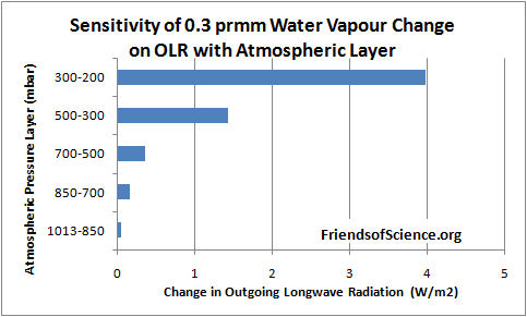
Dr. Ferenc Miskolczi performed computations using the HARTCODE line-by-line radiative code to determine the sensitivity of OLR to a 0.3 mm change in precipitable water vapor in each of 5 layers of the NVAP-M project. The program uses thousands of measured absorption lines and is capable of doing accurate radiative flux calculations. Figure 2 shows the effect on OLR of a change of 0.3 mm in each layer.
The results show that a water vapor change in the 500-300 mb layer has 29 times the effect on OLR than the same change in the 1013-850 mb near-surface layer. A water vapor change in the 300-200 mb layer has 81 times the effect on OLR than the same change in the 1013-850 mb near-surface layer.

Figure 2. Sensitivity of 0.3 mm precipitable water vapor change on outgoing longwave radiation by atmospheric layer.
Table 2 below shows the change in OLR per change in water vapor in each layer, and the change in OLR from 1990 to 2001 due to the change in precipitable water vapor (PWV).
| L1 | L2 | L3 | Sum | CO2 | ||
| OLR/PWV | W/m2/mm | -0.329 | -1.192 | -4.75 | ||
| OLR/CO2 | W/m2/ppmv | -0.0101 | ||||
| OLR change | W/m2 | -0.569 | 0.679 | 2.613 | 2.723 | -0.171 |
Table 2. Change of OLR by layer from water vapor and from CO2 from 1990 to 2001.
The calculations show that the cooling effect of the water vapor changes on OLR is 16 times greater than the warming effect of CO2 during this 11-year period. The cooling effect of the two upper layers is 5.8 times greater than the warming effect of the lowest layer.
These results highlight the fact that changes in the total water vapor column, from surface to the top of the atmosphere, is of little relevance to climate change because the sensitivity of OLR to water vapor changes in the upper atmosphere overwhelms changes in the lower atmosphere.
The precipitable water vapour by layer versus latitude by one degree bands for the year 1991 is shown in Figure 3. The North Pole is at the right side of the figure. The water vapor amount in the Arctic in the 500 to 300 mb layer goes to a minimum of 0.53 mm at 68.5 degrees North, then increases to 0.94 mm near the North Pole.

Figure 3. Precipitable water vapor by layer in 1991.
The NVAP-M project extends the analysis to 2009 and reprocesses the Heritage NVAP data. This layered data is not publicly available. The total precipitable water (TPW) data is shown in Figure 4, reproduced from the paper Vonder Haar et al (2012) here. There is no evidence of increasing water vapor to enhance the small warming effect from CO2.

Figure 4. Global month total precipitable water vapor NVAP-M.
The Radiosonde Data
Water vapor humidity data is measured by radiosonde (on weather balloons) and by satellites. The radiosonde humidity data is from the NOAA Earth System Research Laboratory here.

Figure 5. Global relative humidity, middle and upper atmosphere, from radiosonde data, NOAA Earth System Research Laboratory.
A graph of the global average annual relative humidity (RH) from 300 mb to 700 mb is shown in Figure 5. The specific humidity in g/kg of moist air at 400 mb (8 km) is shown in Figure 6. It shows that specific humidity has declined by 14% since 1948 using the best fit line.

Figure 6. Specific humidity at 400 mb pressure level
In contrast, climate models all show RH staying constant, implying that specific humidity is forecast to increase with warming. So climate models show positive feedback and rising specific humidity with warming in the upper troposphere, but the data shows falling specific humidity and negative feedback.
Many climate scientists dismiss the radiosonde data because of changing instrumentation and the declining humidity conflicts with the climate model simulations. However, the radiosonde instruments were calibrated and the data corrected for changes in response times. The data before 1960 should be regarded as unreliable due to poor global coverage and inferior instruments. The near surface radiosonde measurements from 1960 to date show no change in relative humidity which is consistent with theory. Both the satellite and radiosonde data shows declining upper atmosphere humidity, so there is no reason to dismiss the radiosonde data. The radiosonde data only measures humidity over land stations, so it is interesting to compare to the satellite measurements which have global coverage.
Comparison Between Radiosonde and Satellite Data
The specific humidity radiosonde data was converted to precipitable water vapor for comparison with the satellite data. Figure 7 compares the satellite data to the radiosonde data for the years 1988 to 2001.

Figure 7. Comparison between NOAA radiosonde and NVAP satellite derived precipitable water vapor.
The NOAA and NVAP data compares very well for the period 1988 to 1995. The NVAP satellite data shows less water vapor in the upper and middle layers than the NOAA data. In 2000 and 2001 the NVAP data shows more water vapor in the near-surface layer than the NOAA data. The vertical change on the logarithmic graph is roughly equal to the forcing effect of each layer, so the NVAP data shows water vapor has a greater cooling effect than the radiosonde data.
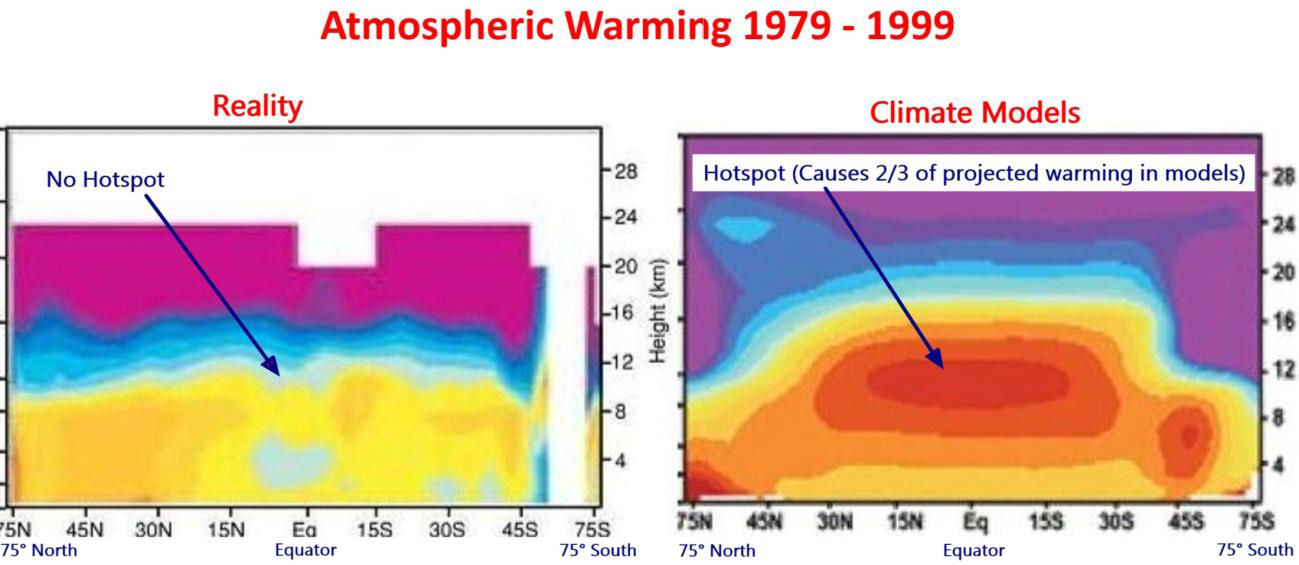
The Tropical Hot Spot
The models predict a distinctive pattern of warming – a “hot-spot” of enhanced warming in the upper atmosphere at 8 km to 13 km over the tropics, shown as the large red spot in Figure 8. The temperature at this “hot-spot” is projected to increase at a rate of two to three times faster than at the surface. However, the Hadley Centre’s real-world plot of radiosonde temperature observations from weather balloons shown below does not show the projected hot-spot at all. The predicted hot-spot is entirely absent from the observational record. If it was there it would have been easily detected.
The hot-spot is forecast in climate models due to the theory that the water vapor profile in the tropics is dominated by the moist adiabatic lapse rate, which requires that water vapor increases in the upper atmosphere with warming. The moist adiabatic lapse rate describes how the temperature of a parcel of water-saturated air changes as it move up in the atmosphere by convection such as within a thunder cloud. A graph here shows two lapse rate profiles with a larger temperature difference in the upper atmosphere than at the surface. The projected water vapor increase creates the hot-spot and is responsible for half to two-thirds of the surface warming in the IPCC climate models.

Figure 8. Climate models predict a hot spot of enhanced warming rate in the tropics, 8 km to 13 km altitude. Radiosonde data shows the hot spot does not exist. Red indicates the fastest warming rate. Source: http://joannenova.com.au
The projected upper atmosphere water vapor trends and temperature amplification at the hot-spot are intricately linked in the IPCC climate theory. The declining upper atmosphere humidity is consistent with the lack of a tropical hot spot, and both observations prove that the IPCC climate theory is wrong.
A recent technical paper Po-Chedley and Fu (2012) here compares the temperature trends of the lower and upper troposphere in the tropics from satellite data to the climate model projections from the period 1981 to 2008.2 The upper troposphere is the part of the atmosphere where the pressure ranges from 500 mb to 100 mb, or from about 6 km to 15 km. The paper reports that the warming trend during 1981 to 2008 in the upper troposphere simulated by climate models is 1.19 times the simulated warming trend of the lower atmosphere in the tropics. (Note this comparison is to the lower atmosphere, not the surface, and includes 10 years of no warming to 2008.) Using the most current version (5.5) of the satellite temperature data from the University of Alabama in Huntsville (UAH), the warming trend of the upper troposphere is only 0.973 of the lower troposphere in the tropics for the same period. This is different from that reported in the paper because the authors used an obsolete version (5.4) of the data. The satellite data shows not only a lack of a hot-spot, it shows a cold-spot just where a hot-spot was predicted.
Conclusion
Climate models predict upper atmosphere moistening which triples the greenhouse effect from man-made carbon dioxide emissions. The new satellite data from the NASA water vapor project shows declining upper atmosphere water vapor during the period 1988 to 2001. It is the best available data for water vapor because it has global coverage. Calculations by a line-by-line radiative code show that upper atmosphere water vapor changes at 500 mb to 300 mb have 29 times greater effect on OLR and temperatures than the same change near the surface. The cooling effect of the water vapor changes on OLR is 16 times greater than the warming effect of CO2 during the 1990 to 2001 period. Radiosonde data shows that upper atmosphere water vapor declines with warming. The IPCC dismisses the radiosonde data as the decline is inconsistent with theory. During the 1990 to 2001 period, upper atmosphere water vapor from satellite data declines more than that from radiosonde data, so there is no reason to dismiss the radiosonde data. Changes in water vapor are linked to temperature trends in the upper atmosphere. Both satellite data and radiosonde data confirm the absence of any tropical upper atmosphere temperature amplification, contrary to IPCC theory. Four independent data sets demonstrate that the IPCC theory is wrong. CO2 does not cause significant global warming.
Note 1. The NVAP data in Excel format is here.
Note 2. The lower troposphere data is: http://www.nsstc.uah.edu/public/msu/t2lt/uahncdc.lt
The upper troposphere data is calculated as 1.1 x middle troposphere – 0.1 x lower stratosphere; where middle troposphere is: http://www.nsstc.uah.edu/public/msu/t2/uahncdc.mt and the lower stratosphere is:http://www.nsstc.uah.edu/public/msu/t4/uahncdc.ls
============================================================
The original article is located at http://www.friendsofscience.org/index.php?id=483
alex says:
March 6, 2013 at 11:56 am
Sorry, where is the “decline”?
——————-
The near surface increse has next to no effect upon OLR. The lower part of that chart showns the least moisture, ie, at high alltitudes. where the effect on OLR is extreme. That is where the decline is. in other words, a very big cooling effect of the decline in humidity. Does any of it relate to CO2? Who knows!(the science is settled is it not?/sarc off)
Myron Mesecke at 11:11 am. The IPCC may look for more overwhelming evidence, hoping that this overwhelms the falsifications. Go to the beach and you will get overwhelming evidence that the earth is flat, and ask Al Gore to twitter this over the internet. From the pre-post-modern Age we still have a logical asymmetry. A false theory may have both true and false consequences. A true theory only has true consequences. Therefore, if a theory makes false predictions, it must be false, whereas nothing follows from overwhelming evidence. Also late Karl Popper would have said ‘stick a fork in it. It’s done’ and the IPCC can be disbanded.
Alex, you must have missed the section below. It explains why a slight increase at near-ground levels is not as important as the decreases at higher levels.
Sara Hindle says:
March 6, 2013 at 11:33 am
The upper atmosphere (500 to 300 mbar level) water vapor is quite variable over space and time, as shown in this animation I made:
http://www.friendsofscience.org/assets/documents/FOS%20Essay/NVap300-500mb1988-99.gif
from:
http://www.friendsofscience.org/assets/documents/FOS%20Essay/Climate_Change_Science.html#Water_vapour
The study of decline water vapor in the Stratosphere by Solomon et al (January 2010) blames the water vapor decline on El Nino. The paper says,
So I expect that ocean process are also responsible for more water vapor decline in the upper troposphere over oceans than over land.
Of course, part of the decline could be due to instrumentation and calibration problems, but this is currently the best data available. Our theories and policy decisions should be based on the best available data.
Ole Humlum’s site, http://www.climate4you.com/ , has lots of data on water vapor in the upper atmosphere. Go to his Climate and Clouds section. Water vapor and relative humidity have been declining for many, many years.
shows declining upper atmosphere water vapor during the period 1998 to 2001
======
doesn’t fit CO2 (opposite), doesn’t fit sun spots, doesn’t fit temps, ENSO, nada etc
…can anyone think of a biological fit? plants? bacteria?
What would make water vapor levels steadily fall…..as CO2 levels steadily increase?
“IPCC dismisses the radiosonde data as the decline is inconsistent with theory.” I take sound empirical data over numeric models that are known to be inaccurate any day. That is how science is supposed to be done, not by crystal ball and faith.
Justthinkin says:
March 6, 2013 at 11:50 am
No, table 1 shows there was an increase of total water vapor between 1990 to 2001 of 0.61 mm. But there is less upper atmosphere water vapor (700 to 30 mb) which has a 5.8 times greater effect on OLR, and surface temperatures, than the increased water vapor in the lower atmosphere (1013 to 700 mb).
The amount of upper atmosphere water vapor has little to do with the precipitation and evaporation rates.
Cold periods always have more severe weather. The theory of CO2-induced warming would increase temperatures in polar regions more than temperate or tropical regions, so reducing the temperature differences that powers storms. The storm Sandy was made large by a very cold front colliding with a tropical storm.
You might want to read NASA’s statement on using NVAP for multidecadal trends:
http://nvap.stcnet.com/NVAP_Trend_Statement.pdf
Quick summary: don’t do it!
Is there an easy way to spatially overlay the CO2 distribution data with this water vapor content?
“Many climate scientists dismiss the radiosonde data because of changing instrumentation and the declining humidity conflicts with the climate model simulations. ”
An inconvenient truth, so to speak?
Richard says:
March 6, 2013 at 11:15 am
“Most scientists agree that doubling the amount of carbon dioxide (CO2) in the atmosphere, which takes about 150 years, would theoretically warm the earth by one degree Celsius if there were no change in evaporation”
Why? are they really sure?
===========
Are they sure? Of course they’re sure. Do they have the slightest idea what they are talking about? Not necessarily. 1.6 degrees per doubling is what Svante Arrhenius predicted back in 1906 or so (after scaling back his initial, larger, estimates) and the CO2 increase rate is measured by the measurement program set up by Charles Keeling in the 1950s. If there is any science at all in climate science Arrhenius and Keeling are surely part of it.
weather postpones climate:
6 March: Washington Times: Stephen Dinan: Hill hearing on global warming cancelled by D.C. snowstorm
An unusually chilly March day and the snowstorm it spawned have shut down much of official Washington on Wednesday — including a hearing House Republicans had called to examine global warming.
“Postponed due to weather,” read the notice from the House Science, Space and Technology Committee sent in the morning.
The hearing was scheduled to give House lawmakers a comprehensive briefing on how well scientists understand the climate and humans’ effects on it as a means “to inform decision-making on potential mitigation options.”…
http://www.washingtontimes.com/blog/inside-politics/2013/mar/6/hill-hearing-global-warming-cancelled-dc-snowstorm/
My ebook, The Arts of Truth, made the same observations last year using data other than NVAP (since not enough NVAP years were publicly available). What is more interesting is how IPCC AR4 chose to dismiss or ignore all of the contrary evidence that existed then, strengthened since by what we know now. Extreme selection and confirmation bias. Yet it continues in the leaked AR5 SOD. Proof not just of uncertain science, but of deliberately bad science. Mannian, one might say.
This should comprehensively disprove the Global Warming theory.
But nobody will ask the critical question. So it will not disprove the theory.
I suggest that readers here send a letter/email to their local political representatives – Congressmen or Senators in the US, MPs in the UK, and so on, describing how the theory critically depends on increased water vapour, how research is showing that water vapour is not increasing, and asking why this does not disprove the hypothesis. If enough politicians ask the relevant government scientists questions like this something is going to have to give…
Alex,
According to the IPCC draft there is “no trend” in the total column in spite of (at least until very recently) increasing average ocean surface temperature and enthalpy.
Myron: http://wattsupwiththat.com/2013/03/06/nasa-satellite-data-shows-a-decline-in-water-vapor/#comment-1240820
The last thing that they will never admit is that man did not cause it . . . .
Translated, it IS still man made . . . . humans CAN/DO control the changes (variations).
Logically, climate models say that precipitation should also have increased over that period, but satellite- and rain guage-based precipitation data shows that global preciptation has decreased:
http://bobtisdale.wordpress.com/2012/12/27/model-data-precipitation-comparison-cmip5-ipcc-ar5-model-simulations-versus-satellite-era-observations/
Wow. A killer blow, it is.
Moreover, water vapor is not a well mixed gas, its distribution is fractal-like. It means average water vapor concentration in a layer / grid box only puts a lower bound on transparency of that volume in IR bands dominated by water vapor absorptivity / emissivity. That is, it can be arbitrarily transparent if distribution is sufficiently uneven (a wire fence is much more transparent than a thin metal plate, even if it contains the same amount of material per unit area).
Scale invariant features of distribution (e.g. fractal dimension) are not well represented in a gridded database.
The reason water vapor distribution is a fractal is that water vapor content of each parcel is determined by its history, that is, by its temperature the last time it got saturated. This event might have occurred several days or weeks ago. In the meantime turbulent flows distorted that, originally bulky parcel into a mesh of thin threads, interwoven by other parcels of a completely different history. That’s how water vapor distribution looks like at any specific moment and this is why shape of clouds is always fractal-like, for the “surface” of a cloud is nothing else but the surface separating a region of saturation from others with lower relative humidity. Geometry of each constant relative humidity surface is like that, even if most of them are invisible to the naked eye.
Trying not to be a conspiracy nut, but since NASA is a government funded organization, and US taxpayers fund it i.e. – We paid for this information. Why and who has been sitting on this information for the entire “Global Warming” time period. The data start in 1988 and from the shown graph by 1995 the “causes more water” theory was shot down.
Talk about hide the decline.
Reblogged this on UNCOVER777.
@ur momisugly Dodgy Geezer:
One would think that this would signal the beginning of the end for the AGW hypothesis. The problem, though, is not one of proving or disproving the science. Progressive Green – environmentalism – is an ideology bordering on a religion. They will not give up their beliefs and their collectivist objectives so easily.
alex says:
March 6, 2013 at 11:56 am
The main point of the post is to dispel this myth. The total water vapor column amount is of little relevance to the forcing and global warming. A small water vapor change in the upper atmosphere has a large effect on OLR. Have a look at Figure 2.
Cees de Valk says:
March 6, 2013 at 11:58 am
Temperatures have risen from 1975 to 2002 because the sun reached a maximum magnetic flux activity in 1990, causing a maximum temperature response in about 2002.
http://www.friendsofscience.org/assets/documents/FOS%20Essay/Rao_CR_HMF.jpg
In 1990, the sun was more active than at any time in the past 8000 years.
http://www.friendsofscience.org/assets/documents/FOS%20Essay/SolarActivity8000Years.gif
The sun’s magnetic flux affects the cosmic ray flux to earth, which changes cloud cover. It also has an effect on upper atmosphere electric currents, and ozone levels which affects climate.
The upper atmosphere water vapor change was a negative feedback to the warming effects of both CO2 and the sun-induced warming.
The Other Phil says:
March 6, 2013 at 12:17 pm
See Clive Best’s comment March 6, 2013 at 12:01 pm.
Generally, outside of the atmospheric window, a photon of radiation emitted by the lower atmosphere can travel only a short distance before being absorbed by water vapor. Most of the heat energy from the lower atmosphere must move up by convection to an altitude high enough in the atmosphere where the water vapor concentration is low enough that it can escape to space without being absorbed by a greenhouse gas molecule. All this is calculated by line-by-line radiative code computer programs that use thousands of measured absorption lines from the HITRAN data base.
O/T but RSS confirm the sharp fall in temps that UAH did in Feb.
Temps are back to Nov/Dec levels, i.e by historical levels, pretty low.
http://notalotofpeopleknowthat.wordpress.com/2013/03/06/satellite-temperatures-latest/